

Ocean boat blue sits right in the sweet spot between deep nautical navy and bright sea-sky blue. It feels trustworthy, crisp, and modern—perfect for branding that needs calm confidence.
Below are 20 ocean boat blue color palette ideas with HEX codes, plus practical pairing tips for whites, sands, teals, and warm accents.
In this article
Why Ocean Boat Blue Palettes Work So Well
Ocean boat blue reads as capable and composed, which is why it’s widely used in maritime brands, travel, tech, and corporate UI. It carries the authority of navy, but feels more open and approachable than near-black blues.
It also pairs naturally with coastal neutrals—sail whites, foamy off-whites, sands, rope beiges—so designs feel clean without becoming cold. That balance makes it easy to build hierarchy: dark for headings, mid-blue for actions, pale tints for backgrounds.
Finally, it supports bold accents (coral, brass, sun yellow, peach) without losing legibility. When you need contrast and clarity, ocean boat blue gives you a stable anchor color.
20+ Ocean Boat Blue Color Palette Ideas (with HEX Codes)
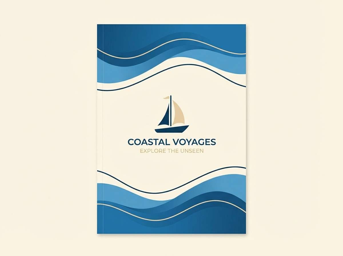
1) Harbor Dawn
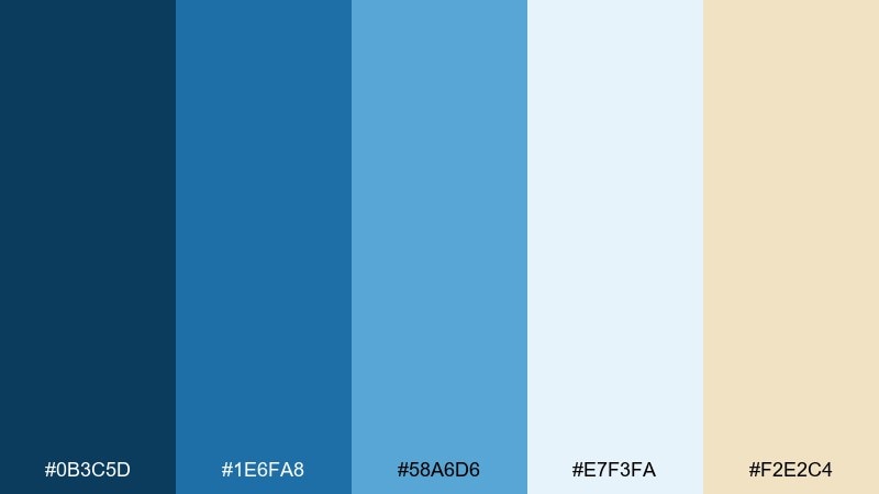
HEX: #0B3C5D #1E6FA8 #58A6D6 #E7F3FA #F2E2C4
Mood: fresh, coastal, optimistic
Best for: travel brochure cover design
Fresh morning air and a quiet marina come to mind, with crisp blues softened by airy white and a sandy beige. It works beautifully for tourism layouts, coastal events, and any design that needs clean trust plus warmth. Pair it with thin navy rules and plenty of whitespace so the light blue can breathe. Usage tip: reserve the beige for small highlights like badges or price callouts to keep the sea tones dominant.
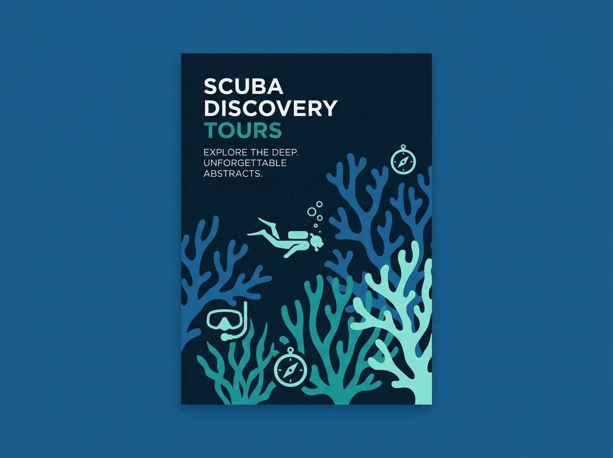
Image example of harbor dawn generated using media.io
Media.io is an online AI studio for creating and editing video, image, and audio in your browser.

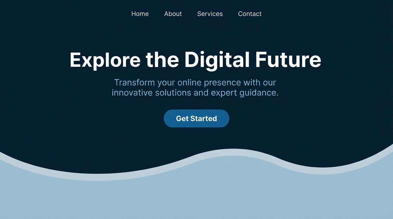
2) Deep Keel
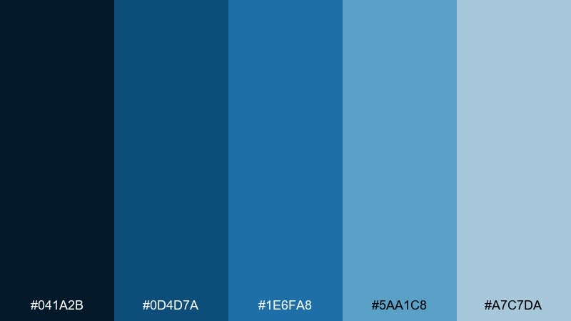
HEX: #041A2B #0D4D7A #1E6FA8 #5AA1C8 #A7C7DA
Mood: serious, maritime, confident
Best for: corporate website hero section
Dark water and steel-blue depth give this set a grounded, professional feel. The mid blues add clarity without getting playful, making it ideal for corporate sites, logistics, and technical services. Combine the near-black navy with large blocks of light blue for strong hierarchy. Usage tip: keep body text on the palest blue for comfort, and use the darkest tone for headings and CTAs.
Image example of deep keel generated using media.io
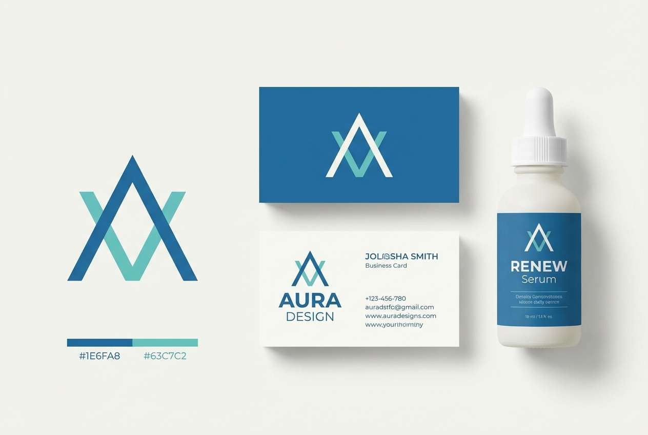
3) Sea Glass Deck
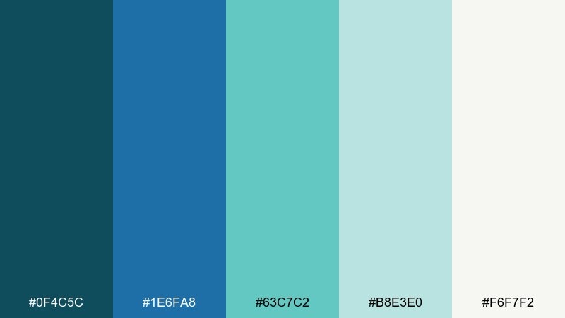
HEX: #0F4C5C #1E6FA8 #63C7C2 #B8E3E0 #F6F7F2
Mood: relaxed, breezy, modern coastal
Best for: spa and wellness brand identity
Cool sea-glass greens and clean blues evoke a calm deckside breeze. The soft off-white keeps it gentle, perfect for wellness, skincare, and mindful lifestyle branding. Pair with simple sans-serif type and rounded shapes to reinforce the soothing vibe. Usage tip: use the aqua as the primary accent on icons and dividers, not as large text blocks.
Image example of sea glass deck generated using media.io
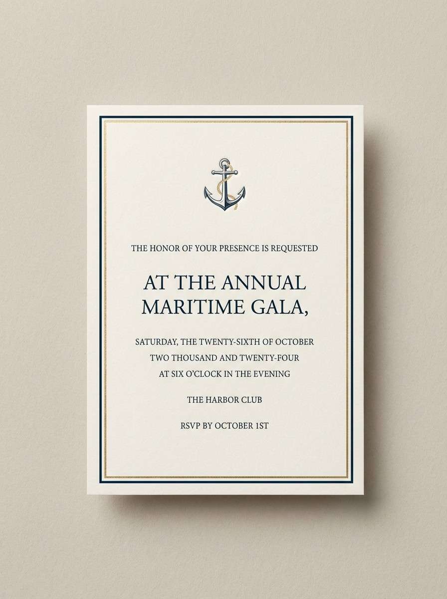
4) Captains Jacket
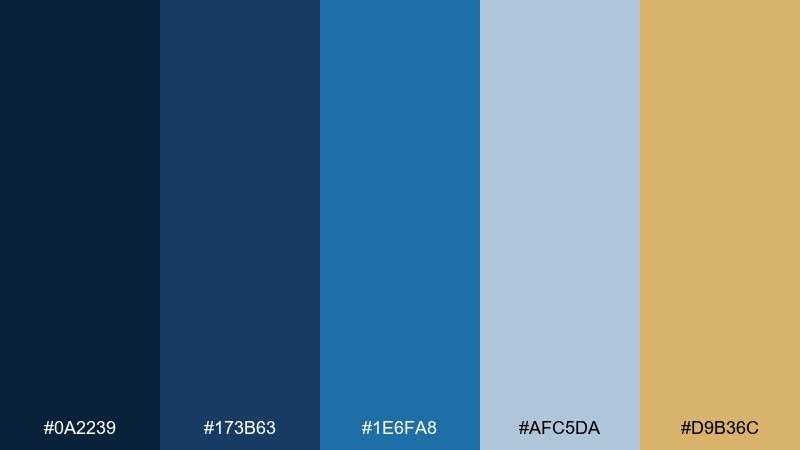
HEX: #0A2239 #173B63 #1E6FA8 #AFC5DA #D9B36C
Mood: classic, nautical, refined
Best for: yacht club invitation card
Crisp uniform blues with a brass-like gold feel instantly classic and upscale. This ocean boat blue color palette suits yacht clubs, formal dinners, and premium hospitality where tradition matters. Pair it with textured paper, small caps typography, and thin line borders for a tailored look. Usage tip: let the gold appear only in key details like monograms or date lines to keep it elegant.
Image example of captains jacket generated using media.io
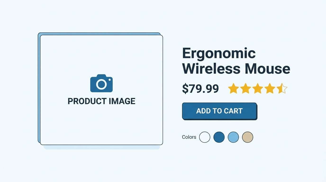
5) Foam and Rope
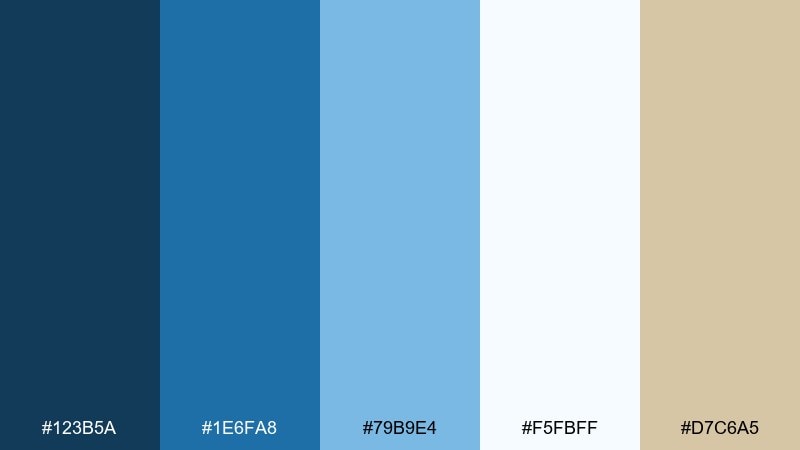
HEX: #123B5A #1E6FA8 #79B9E4 #F5FBFF #D7C6A5
Mood: clean, airy, beachy
Best for: ecommerce product page layout
White foam and sun-bleached rope set a light, approachable tone. The blues feel friendly and bright, while the beige adds a natural, tactile warmth. It fits product pages and marketplaces that want clarity and trust without looking sterile. Usage tip: use the near-white as the main background and keep the darker blue for buttons and price emphasis.
Image example of foam and rope generated using media.io
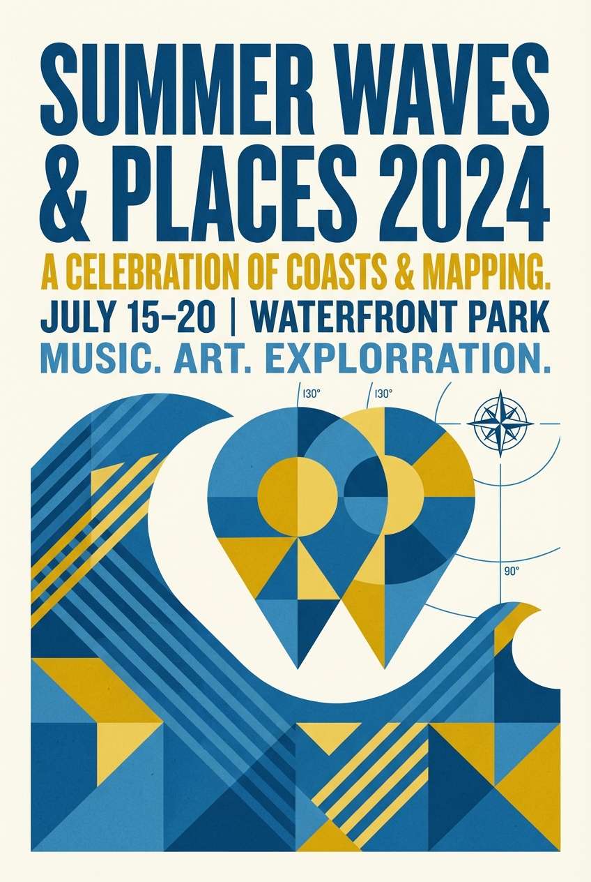
6) Coastal Chart
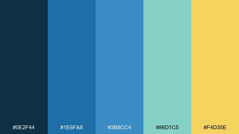
HEX: #0E2F44 #1E6FA8 #3B8CC4 #86D1C5 #F4D35E
Mood: adventurous, bright, energetic
Best for: summer event poster design
Map-like blues with a sunlit yellow accent feel upbeat and ready for a day on the water. This ocean boat blue color scheme is great for posters, festivals, and outdoor promotions that need strong contrast from a distance. Pair it with bold geometric shapes and simplified icons like pins, waves, or buoys. Usage tip: keep the yellow for headlines and key dates so the layout stays punchy but readable.
Image example of coastal chart generated using media.io
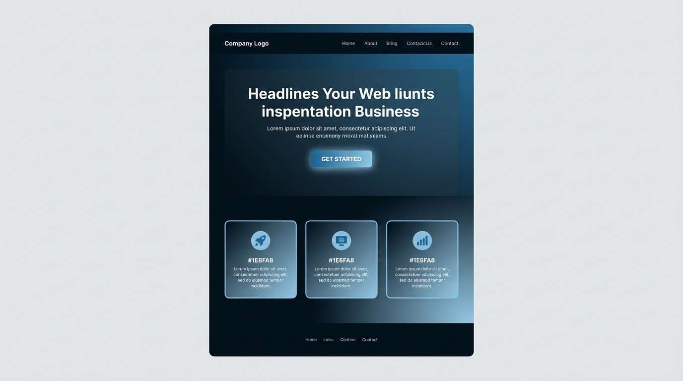
7) Midnight Wake
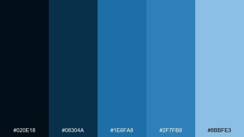
HEX: #020E18 #08304A #1E6FA8 #2F7FB8 #8BBFE3
Mood: moody, cinematic, sleek
Best for: tech startup landing page UI
Inky midnight tones and a sharp boat-blue core create a cinematic, high-end feel. It works well for tech, fintech, and SaaS brands that want authority without going fully monochrome. Pair with subtle gradients and thin line icons to keep it polished. Usage tip: use the lightest blue for hover states and micro-interactions so the UI feels responsive.
Image example of midnight wake generated using media.io
8) Lagoon Canvas
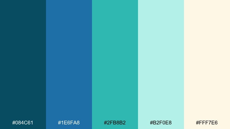
HEX: #084C61 #1E6FA8 #2FB8B2 #B2F0E8 #FFF7E6
Mood: tropical, light, playful
Best for: beach resort social media templates
Lagoon teal and soft cream bring a sunny, vacation-ready vibe. The blues stay cool and refreshing, while the minty tones keep it fun for lifestyle content. Pair with rounded stickers, simple wave motifs, and big photo blocks framed in cream. Usage tip: limit the teal to accents and overlays so skin tones and photography stay natural.
Image example of lagoon canvas generated using media.io
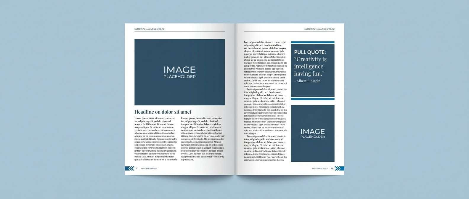
9) Stormy Pier
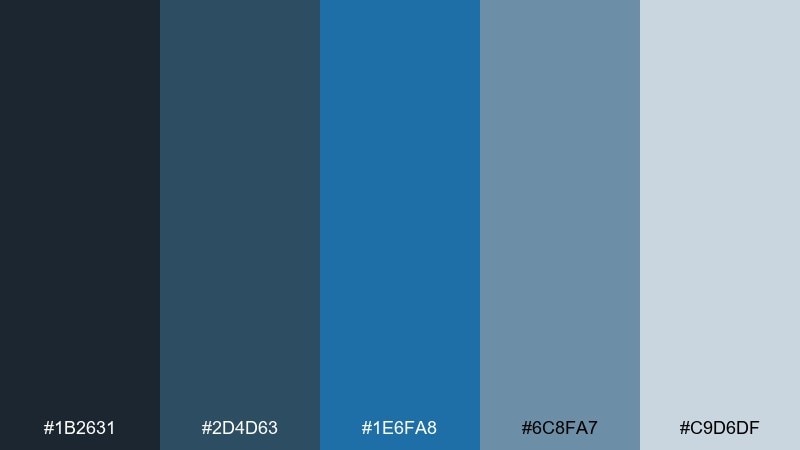
HEX: #1B2631 #2D4D63 #1E6FA8 #6C8FA7 #C9D6DF
Mood: cool, understated, urban coastal
Best for: editorial magazine spread layout
A stormy pier mood shows up through muted slate blues and a steady mid-blue anchor. It feels contemporary and a little rugged, great for editorial design, architecture features, or documentary-style branding. Pair with crisp grids, high-contrast black type, and plenty of margins. Usage tip: keep images cooler in temperature so they harmonize with the grays and dusty blues.
Image example of stormy pier generated using media.io
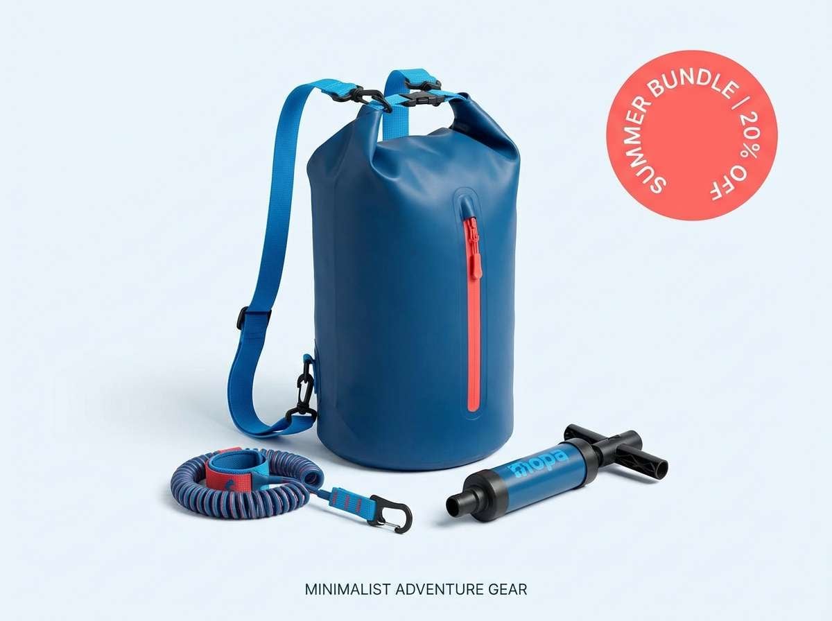
10) Blue Buoy
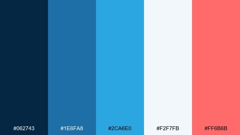
HEX: #062743 #1E6FA8 #2CA6E0 #F2F7FB #FF6B6B
Mood: bold, sporty, attention-grabbing
Best for: water sports product ad creative
Sporty blues with a coral pop feel like a buoy cutting through bright water. These ocean boat blue color combinations are perfect for ads, outdoor gear, and energetic campaigns that need a clear focal point. Pair the coral with simple shapes and short headlines to avoid visual clutter. Usage tip: use coral only once per layout, such as a single CTA button or promo badge, to maximize impact.
Image example of blue buoy generated using media.io
11) Sailcloth Whisper
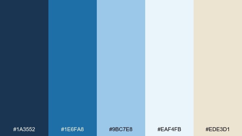
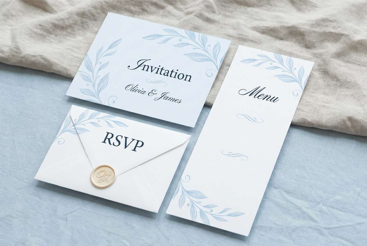
HEX: #1A3552 #1E6FA8 #9BC7E8 #EAF4FB #EDE3D1
Mood: soft, elegant, breezy
Best for: wedding website and stationery
Light sailcloth tones and powdery blues create a romantic, airy impression. The cream-beige keeps it warm enough for invitations, menus, and ceremony signage. Pair it with delicate serif fonts and subtle line art florals for a refined coastal feel. Usage tip: choose the palest blue for backgrounds and reserve the darker navy for names and key headings.
Image example of sailcloth whisper generated using media.io
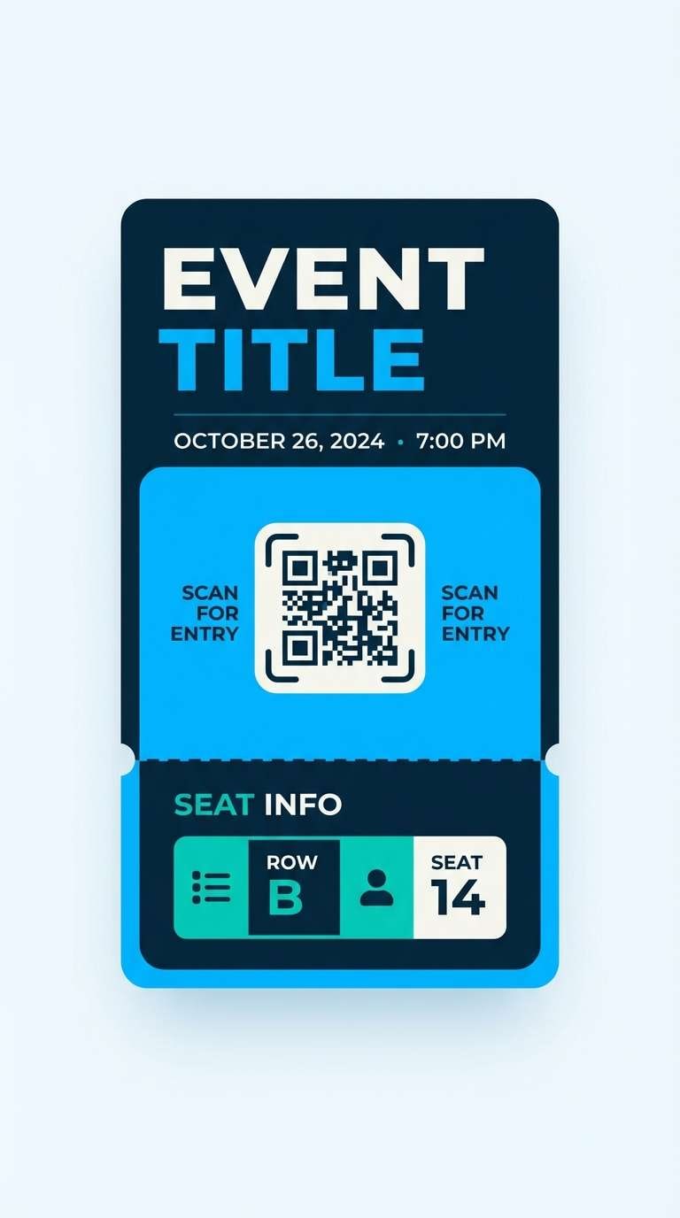
12) Marina Neon
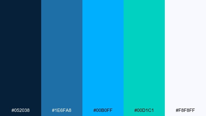
HEX: #052038 #1E6FA8 #00B0FF #00D1C1 #F8F8FF
Mood: electric, modern, nightlife marina
Best for: music festival ticket UI
Neon sea tones against deep navy feel like lights reflecting on water at night. The bright cyan and aqua add instant energy, ideal for tickets, event apps, and bold digital products. Pair with condensed type and high-contrast blocks for a modern edge. Usage tip: set the background in the darkest navy and use neon only for highlights like QR areas, icons, or active states.
Image example of marina neon generated using media.io
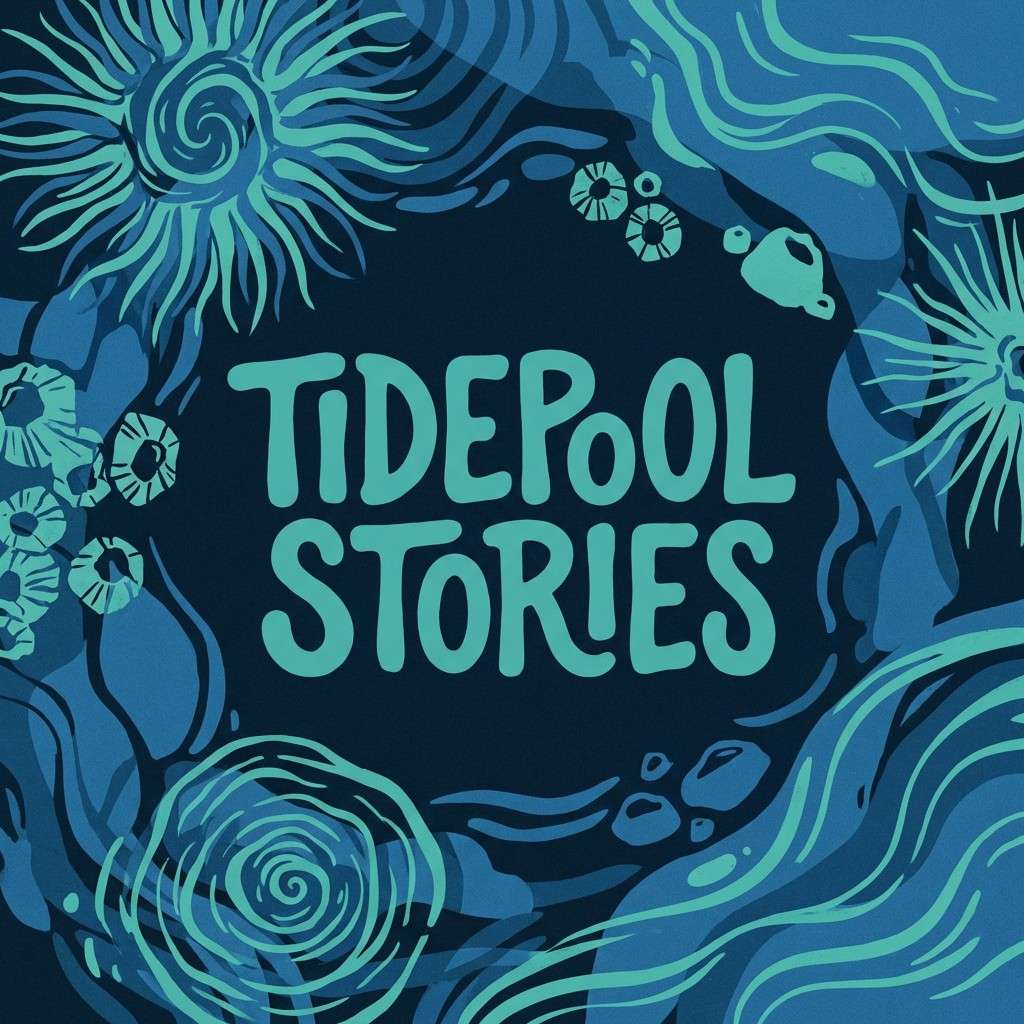
13) Tidepool Ink
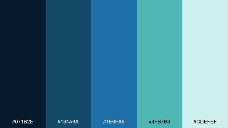
HEX: #071B2E #134A6A #1E6FA8 #4FB7B3 #CDEFEF
Mood: cool, creative, oceanic
Best for: podcast cover artwork
Deep ink blues and tidepool teal feel thoughtful and creative, like sketching by the shoreline. It suits podcasts, book covers, and storytelling brands that want calm depth with a hint of color. Pair with illustrated textures and a single bold title line. Usage tip: place the title in the lightest tint to keep it legible against the darker ink base.
Image example of tidepool ink generated using media.io
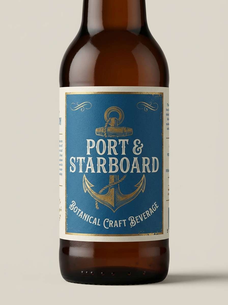
14) Anchor Brass
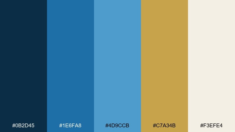
HEX: #0B2D45 #1E6FA8 #4D9CCB #C7A34B #F3EFE4
Mood: heritage, warm nautical, premium
Best for: craft beverage label design
Brass warmth against marine blues feels like vintage hardware on a well-kept boat. The cream background keeps it label-friendly and helps type stay crisp. Pair it with engraved-style line art and a classic serif for a heritage look. Usage tip: use the brass tone for borders and emblem details, while the blues carry the main brand blocks.
Image example of anchor brass generated using media.io
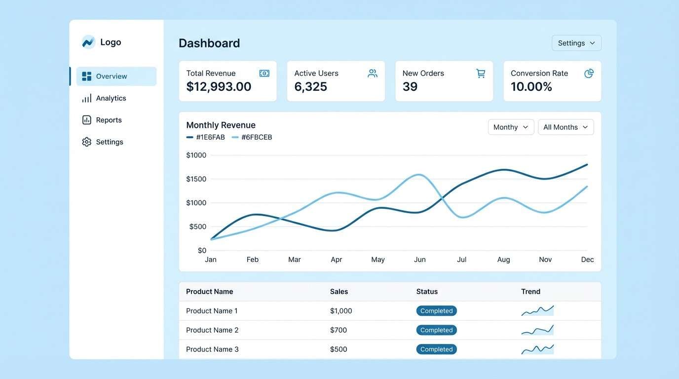
15) Polar Current
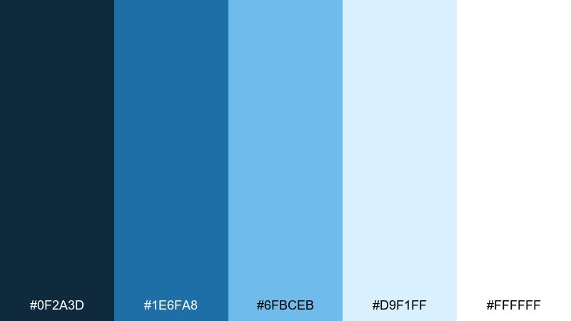
HEX: #0F2A3D #1E6FA8 #6FBCEB #D9F1FF #FFFFFF
Mood: icy, crisp, minimalist
Best for: dashboard UI for analytics
Icy light blues and bright white feel sharp, clean, and highly legible. The palette is ideal for analytics dashboards where data needs breathing room and calm contrast. Pair with thin dividers and consistent icon weights for a tidy system. Usage tip: use the mid-blue for charts and the darkest tone only for navigation and key labels.
Image example of polar current generated using media.io
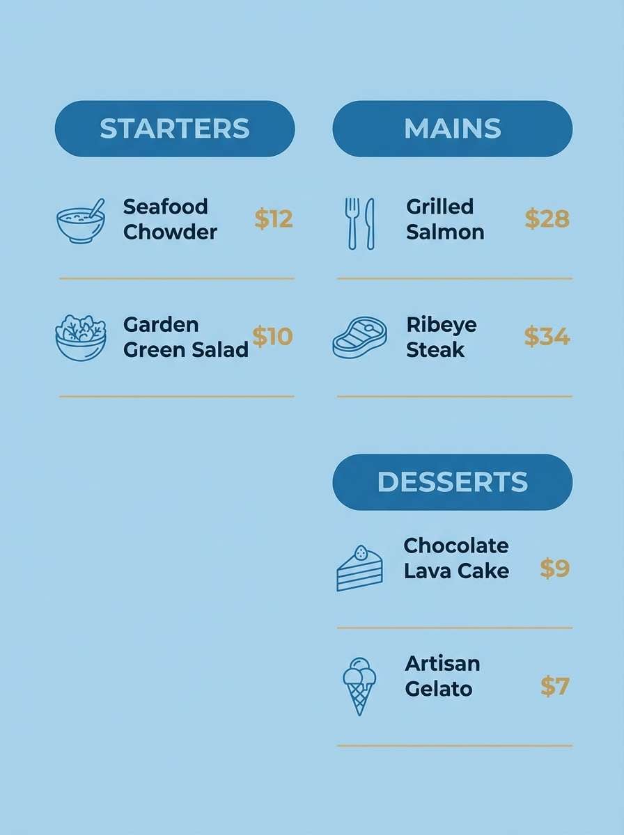
16) Blue Horizon
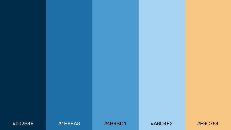
HEX: #002B49 #1E6FA8 #4B9BD1 #A6D4F2 #F9C784
Mood: sunlit, friendly, coastal modern
Best for: restaurant menu design
A bright horizon blue paired with a peachy warmth feels welcoming, like seaside dining at golden hour. These ocean boat blue color combinations work well for menus, cafe branding, and hospitality layouts that need both freshness and appetite appeal. Pair with simple iconography and generous spacing to keep it airy. Usage tip: use the peach as a section header highlight and let the blues handle the structure and body text.
Image example of blue horizon generated using media.io
17) Wavecrest Minimal
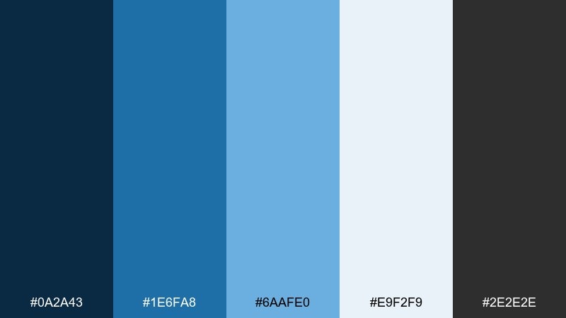
HEX: #0A2A43 #1E6FA8 #6AAFE0 #E9F2F9 #2E2E2E
Mood: minimal, modern, design-forward
Best for: portfolio website UI kit
Clean blue tones with a charcoal anchor feel modern and deliberate. The near-white blue keeps layouts light, while the gray adds editorial sharpness without going harsh. Pair with large type, simple grids, and a single accent button color. Usage tip: keep the charcoal for text only and let the mid-blue carry interactive elements like links and toggles.
Image example of wavecrest minimal generated using media.io
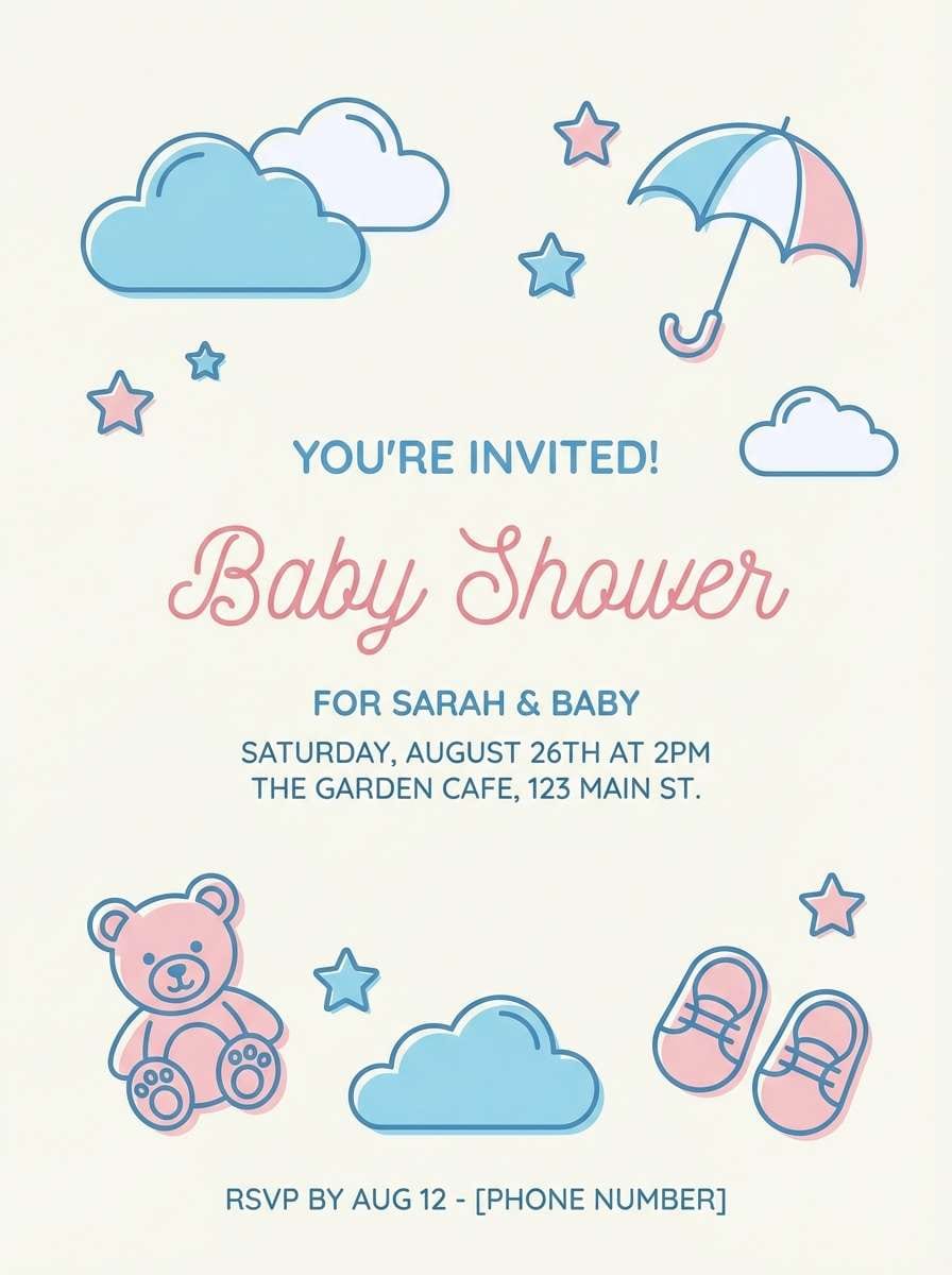
18) Portside Pastels
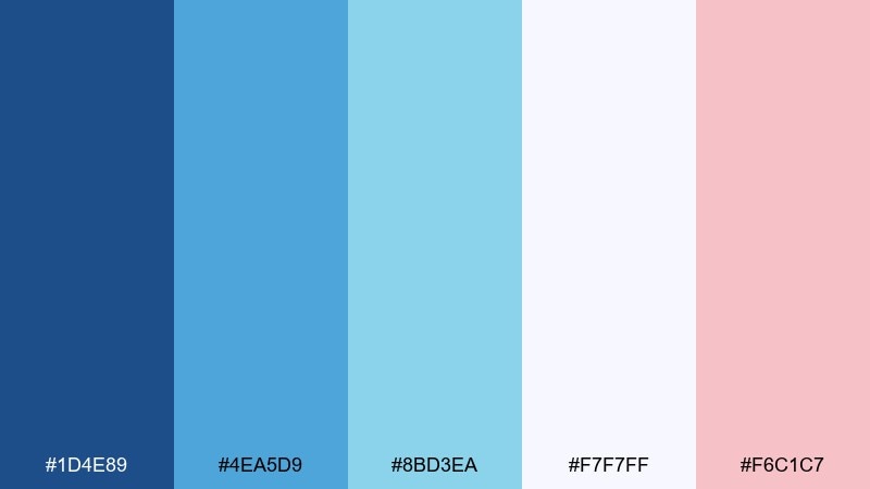
HEX: #1D4E89 #4EA5D9 #8BD3EA #F7F7FF #F6C1C7
Mood: soft, cheerful, contemporary
Best for: baby shower invitation design
Gentle portside blues with a blush accent feel sweet, light, and celebratory. This ocean boat blue color palette is a great fit for baby showers, spring events, and playful stationery that still looks polished. Pair with rounded illustrations, soft gradients, and friendly sans-serif type. Usage tip: use the blush only for one focal element like the name or date to keep the overall look airy.
Image example of portside pastels generated using media.io
19) Reef Shadow
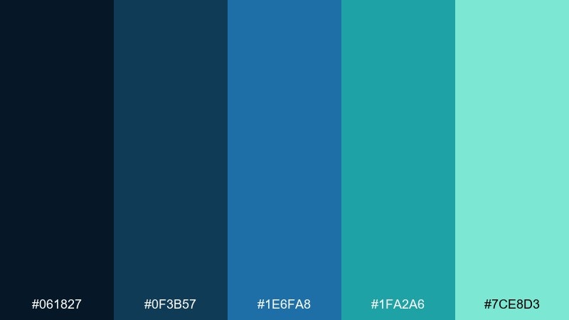
HEX: #061827 #0F3B57 #1E6FA8 #1FA2A6 #7CE8D3
Mood: deep, aquatic, vibrant
Best for: scuba tour brochure design
Reef shadows and bright underwater teal create a vivid, adventurous mood. The darker blues give depth, while the minty highlights feel like sunlight through water. Pair with high-contrast photography frames and simple infographics for routes or dive levels. Usage tip: use the brightest mint for icons and callouts so details pop against the deep navy background.
Image example of reef shadow generated using media.io
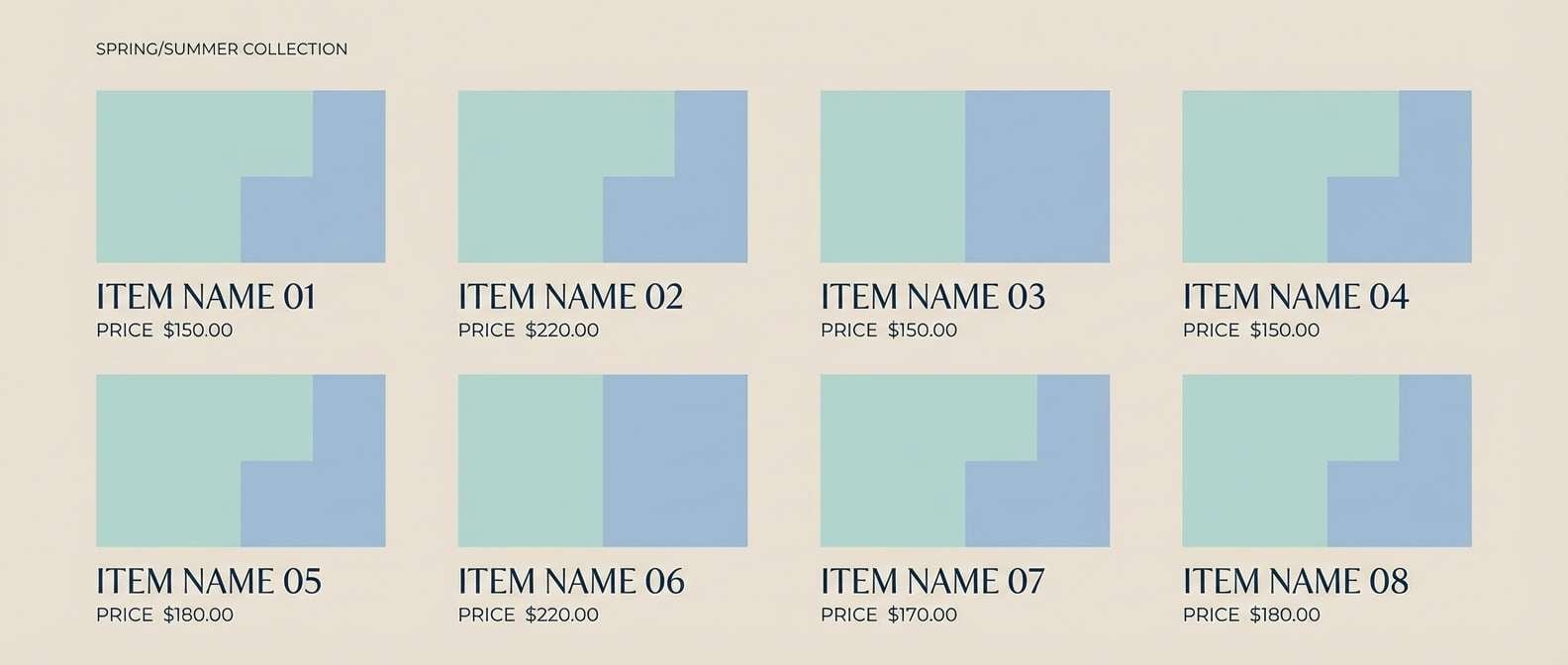
20) Skippers Denim
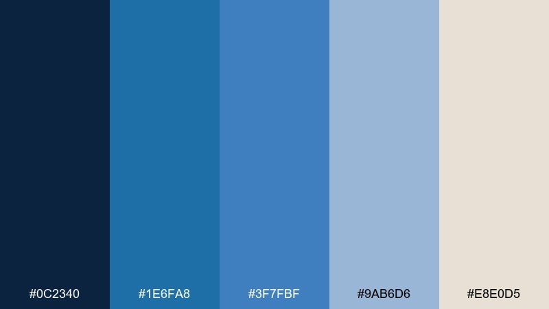
HEX: #0C2340 #1E6FA8 #3F7FBF #9AB6D6 #E8E0D5
Mood: casual, dependable, classic
Best for: outdoor apparel lookbook layout
Denim-like blues and a warm neutral feel familiar, durable, and easy to wear. The lighter blue keeps it approachable, while the deep navy brings structure for headlines and section breaks. Pair with simple product grids and plenty of negative space for a catalog-style look. Usage tip: use the warm neutral as a background panel behind pricing or size details to improve readability.
Image example of skippers denim generated using media.io
What Colors Go Well with Ocean Boat Blue?
Ocean boat blue pairs best with crisp whites and cool off-whites (foam, ice, sailcloth) for a clean coastal look. These lighter neutrals help it feel fresh and keep interfaces readable.
For warmth, try sand, rope beige, brass, peach, or soft cream—small doses add hospitality and premium cues. If you want a more aquatic direction, mint, sea-glass teal, and turquoise accents keep the palette oceanic without turning overly saturated.
For high-contrast modern designs, add charcoal or near-black navy to strengthen typography and create a strong visual hierarchy around CTAs and navigation.
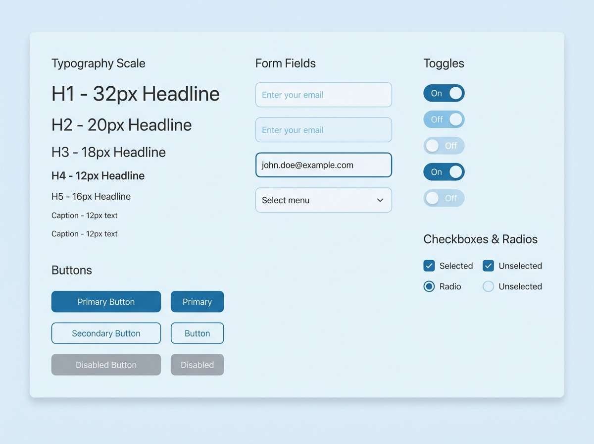
How to Use a Ocean Boat Blue Color Palette in Real Designs
In UI design, treat ocean boat blue as your primary action color (buttons, links, active states) and rely on pale blue tints for backgrounds and cards. Reserve the darkest navy for headers and key labels to keep the layout structured.
In print and branding, pair it with textured neutrals (cream, sand) to avoid a sterile feel. Thin lines, simple icons (waves, anchors, pins), and generous whitespace reinforce the nautical clarity.
For campaigns and ads, introduce one bold accent (coral, sun yellow, or brass) as a single focal point—like a badge or CTA—so the blue system stays cohesive and easy to scan.
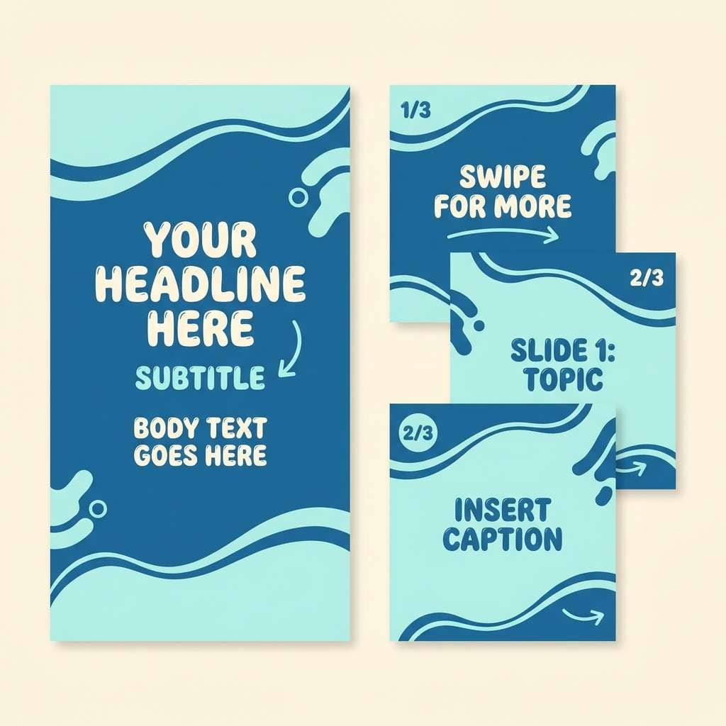
Create Ocean Boat Blue Palette Visuals with AI
If you want to preview these ocean boat blue color combinations fast, generate mockups with AI before committing to a full design system. It’s a practical way to test contrast, mood, and typography styles across formats.
With Media.io, you can turn a short prompt into clean posters, UI sections, labels, invitations, and social templates—then iterate by swapping HEX colors or changing the layout style.
Ocean Boat Blue Color Palette FAQs
-
What is the HEX code for ocean boat blue?
In this collection, ocean boat blue is represented by #1E6FA8, which sits between deep marine blue and bright coastal blue for a clean, trustworthy look. -
Is ocean boat blue good for website UI and apps?
Yes. Ocean boat blue works especially well for UI because it supports strong contrast with white backgrounds and remains readable when used for buttons, links, and navigation elements. -
What neutral colors pair best with ocean boat blue?
Top neutrals include crisp white, off-white (foam/ice), sand beige, and warm cream. These keep the design airy while letting ocean boat blue stay dominant. -
What accent colors look good with ocean boat blue?
Coral, sun yellow, brass/gold, and peach are excellent warm accents. For cooler accents, try sea-glass teal, mint, or turquoise—use them sparingly for highlights. -
How do I keep an ocean boat blue palette from feeling too cold?
Add one warm neutral (like rope beige or cream) and use softer tints for backgrounds. Limiting large blocks of dark navy also helps maintain a welcoming tone. -
Which palette is best for a dark, modern landing page?
Midnight Wake and Deep Keel are strong choices. They combine near-black navies with a clear mid-blue, ideal for sleek SaaS or fintech layouts. -
Can I generate ocean boat blue palette mockups with AI?
Yes. Use Media.io’s text-to-image tool to generate posters, UI sections, or brand mockups, then refine the prompt and swap HEX colors to match your brand system.


