

Blue and light blue palettes feel open, modern, and easy to read—perfect for interfaces, branding, and print layouts that need a clean, airy mood.
Below are 20 blue and light blue color combinations with HEX codes, plus practical pairing tips and AI prompts you can use to generate matching visuals in minutes.
In this article
Why Blue and Light Blue Color Combinations Work So Well
Blue and light blue color combinations naturally communicate clarity, calm, and trust. Because most shades sit on the “cool” side, they read as clean and professional without feeling stark.
These palettes are also friendly for UI design: pale tints create spacious surfaces, while mid blues provide clear states (hover, active, selected) and accessible emphasis.
In print and branding, soft blues look premium when balanced with a dark anchor (navy/indigo) and one restrained accent, helping layouts feel polished rather than washed out.
20+ Blue Light Blue Color Palette Ideas (with HEX Codes)
1) Glacier Mist
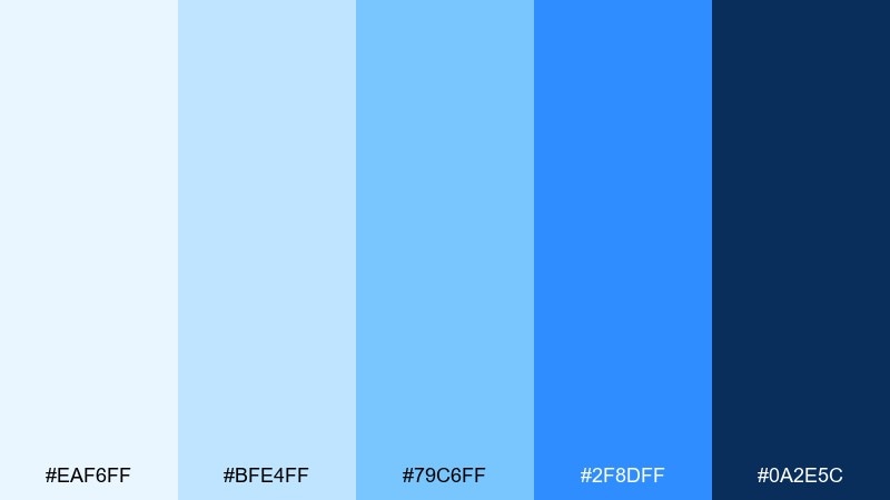
HEX: #EAF6FF #BFE4FF #79C6FF #2F8DFF #0A2E5C
Mood: crisp, airy, clean
Best for: SaaS landing page and hero section
Crisp and airy like sunlight over fresh snow, these blues feel clean and optimistic. Use the pale tints for generous whitespace and let the bright azure handle buttons and key links. Pair with cool grays or soft white typography for a modern, breathable look. Tip: reserve the deep navy for headers and footers to keep contrast strong without making the page feel heavy.
Image example of glacier mist generated using media.io

Media.io is an online AI studio for creating and editing video, image, and audio in your browser.

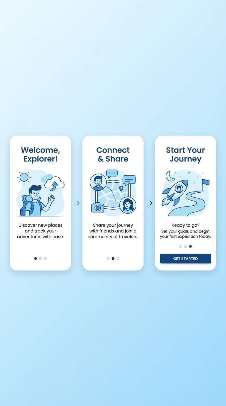
2) Sky Harbor
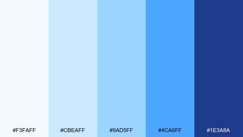
HEX: #F3FAFF #CBEAFF #9AD5FF #4CA6FF #1E3A8A
Mood: open, friendly, dependable
Best for: mobile app onboarding screens
Open and friendly like a clear morning sky, this set stays upbeat without feeling childish. The soft ice blues work beautifully for onboarding backgrounds, while the mid blues guide progress states and highlights. Pair with charcoal text and simple line illustrations to keep readability high. Tip: keep gradients subtle and use the deep indigo only for the final call to action.
Image example of sky harbor generated using media.io
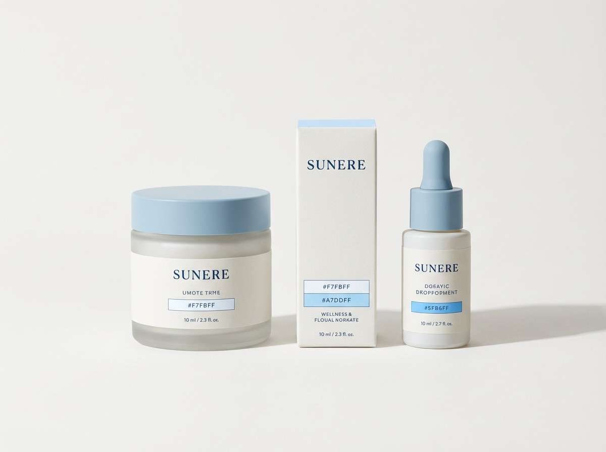
3) Polar Calm
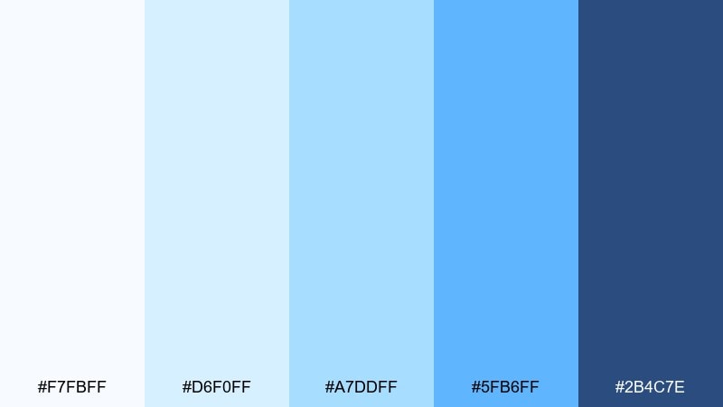
HEX: #F7FBFF #D6F0FF #A7DDFF #5FB6FF #2B4C7E
Mood: calm, reflective, soothing
Best for: wellness brand identity and packaging accents
Calm and reflective like still water under winter light, these tones bring instant serenity. As a blue and light blue color palette, it shines on wellness labels, gentle packaging accents, and minimal brand marks. Pair it with matte white stock, silver foil, or soft stone neutrals to keep the mood premium. Tip: use the brightest blue sparingly on seals or icons so the overall look stays quiet.
Image example of polar calm generated using media.io
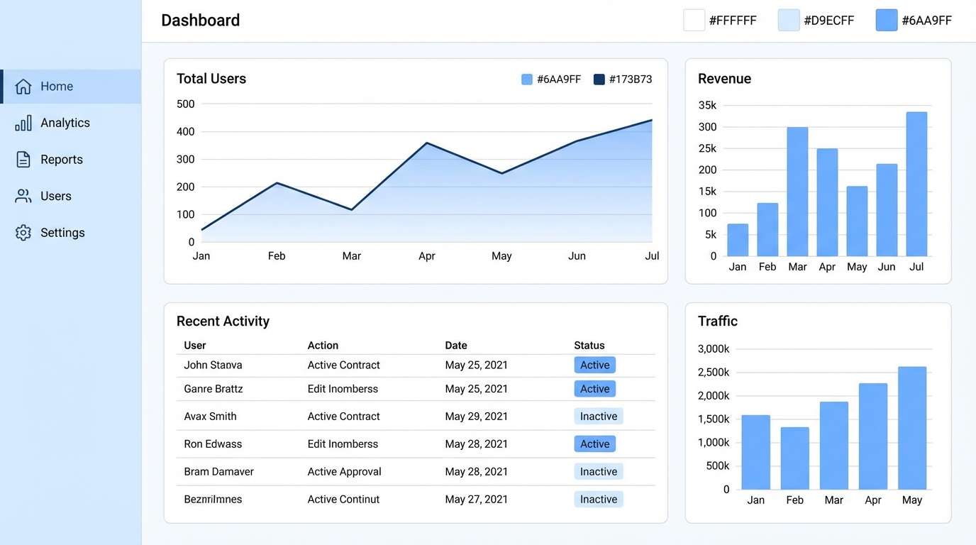
4) Nordic Minimal
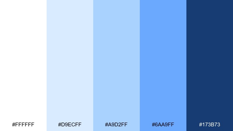
HEX: #FFFFFF #D9ECFF #A9D2FF #6AA9FF #173B73
Mood: minimal, fresh, structured
Best for: dashboard UI for analytics
Minimal and fresh with a Nordic clarity, this combination of blue and light blue reads structured and modern. Use the white and pale blue for tables and panels, then bring in the mid blues for selection states and charts. Pair with light gray dividers and one strong type weight to keep hierarchy clear. Tip: apply the deep blue to navigation and active tabs so users always know where they are.
Image example of nordic minimal generated using media.io
5) Summer Linen
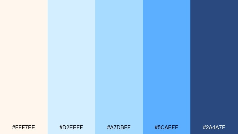
HEX: #FFF7EE #D2EEFF #A7DBFF #5CAEFF #2A4A7F
Mood: sunlit, relaxed, approachable
Best for: lifestyle blog header and banner graphics
Sunlit and relaxed like linen curtains in a coastal room, these blues feel welcoming and soft. The warm cream keeps the palette from going icy, making it great for blog headers and gentle promo banners. Pair with sandy neutrals, soft photography, and minimal serif type for an editorial touch. Tip: keep the bright blue for small graphic elements like underlines and badges.
Image example of summer linen generated using media.io
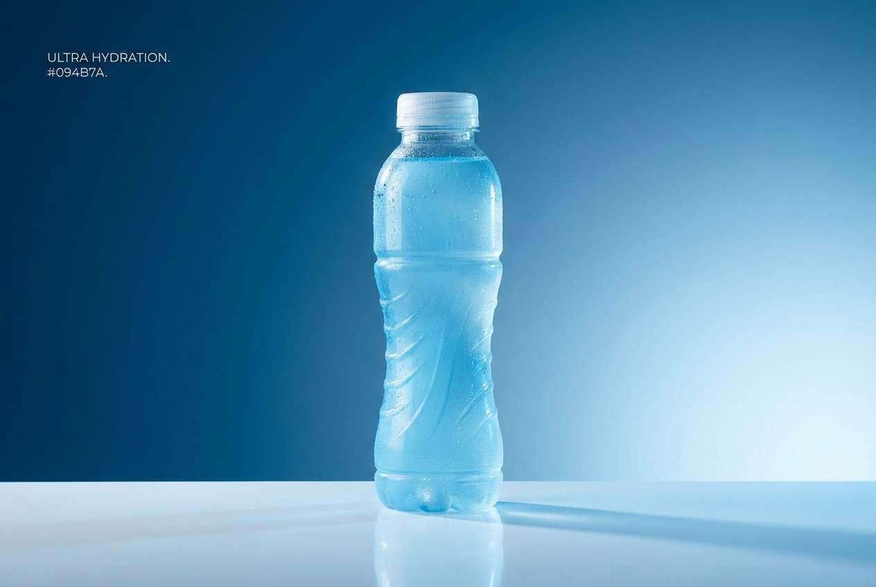
6) Ocean Glass
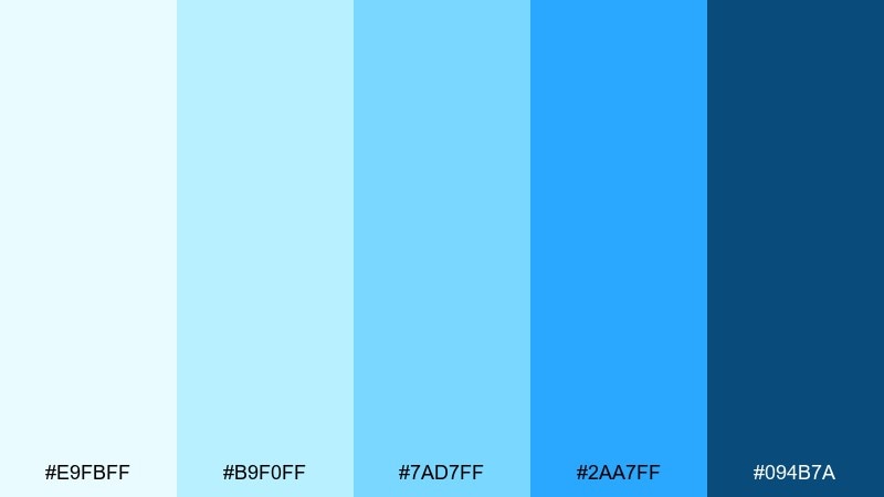
HEX: #E9FBFF #B9F0FF #7AD7FF #2AA7FF #094B7A
Mood: bright, aquatic, energetic
Best for: sports drink product ad
Bright and aquatic like sunlight hitting sea glass, this blue and light blue set feels energetic and clean. The cyan-leaning mid tones are perfect for glossy highlights, while the deep blue anchors headlines and ingredient callouts. Pair with white space and sharp sans serif type to maintain a sporty edge. Tip: keep reflections and gradients controlled so the ad stays fresh, not neon.
Image example of ocean glass generated using media.io
7) Cotton Candy Current
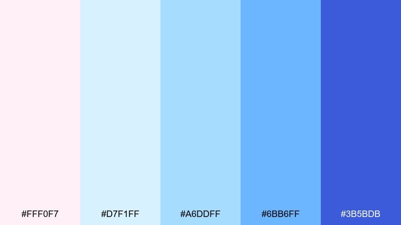
HEX: #FFF0F7 #D7F1FF #A6DDFF #6BB6FF #3B5BDB
Mood: playful, light, dreamy
Best for: event flyer for a summer pop-up
Playful and dreamy like pastel lights at dusk, this blue and light blue mix adds a sweet lift to cool blues. It is one of those blue light blue color combinations that works especially well when you want friendly energy without losing readability. Pair with rounded typography, simple icons, and lots of negative space so the pink stays a soft accent. Tip: use the indigo for dates and location to keep the flyer instantly scannable.
Image example of cotton candy current generated using media.io

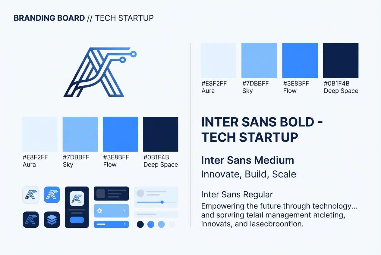
8) Blueprint Breeze
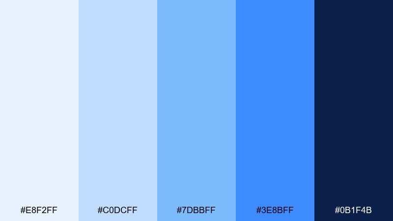
HEX: #E8F2FF #C0DCFF #7DBBFF #3E8BFF #0B1F4B
Mood: confident, technical, modern
Best for: tech startup branding and logo background
Confident and technical like a clean blueprint, these blues feel built for modern products. The darker navy gives logos a strong base, while the lighter tints keep brand systems flexible across web and print. Pair with geometric shapes and a single accent neutral like cool gray to avoid visual noise. Tip: test the mid blue as a link color to ensure accessible contrast on the lightest background.
Image example of blueprint breeze generated using media.io
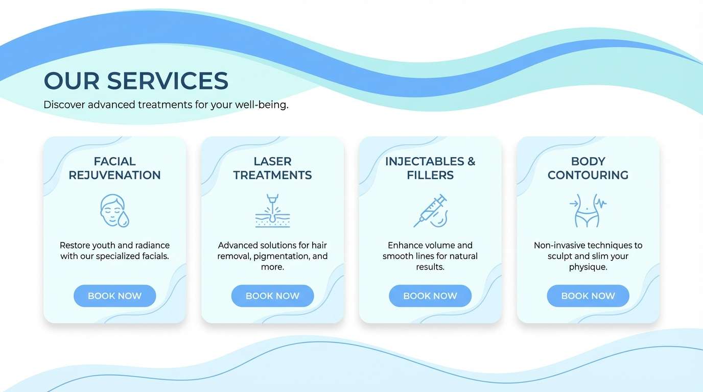
9) Spa Day Blue
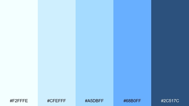
HEX: #F2FFFE #CFEFFF #A5DBFF #68B0FF #2C517C
Mood: refreshing, gentle, restorative
Best for: med spa website and service cards
Refreshing and restorative like chilled water and clean towels, these blue and light blue color combinations set a calm, trustworthy tone. The pale aqua-blue makes an excellent background for service cards, while the mid blue can highlight booking buttons. Pair with soft photography, rounded corners, and plenty of breathing room for a premium feel. Tip: keep body text in the deep slate blue to avoid harsh black on such light surfaces.
Image example of spa day blue generated using media.io
10) Morning Rain

HEX: #F6F8FF #D2DEFF #A7C4FF #5B8CFF #223A6B
Mood: cool, thoughtful, balanced
Best for: corporate presentation template
Cool and thoughtful like a quiet rainy commute, these blue and light blue tones feel balanced and professional. Use the light lavenders and blues for slide backgrounds and subtle section breaks, then let the stronger blue handle charts and emphasis. Pair with clean sans serif fonts and simple iconography for clarity. Tip: keep charts to two blues and one neutral so data stays readable from the back of the room.
Image example of morning rain generated using media.io
11) Iceberg Tech
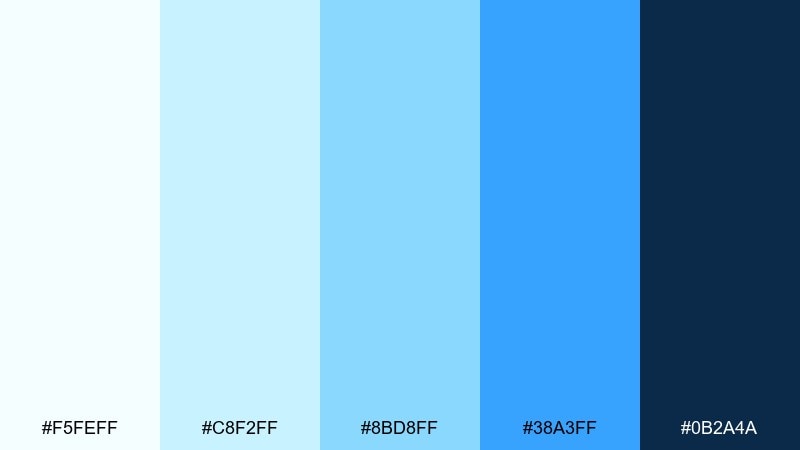
HEX: #F5FEFF #C8F2FF #8BD8FF #38A3FF #0B2A4A
Mood: clean, futuristic, high-clarity
Best for: fintech app UI kit
Clean and futuristic like glassy ice edges, this blue and light blue palette delivers high clarity for interfaces. Use the lightest tone for surfaces, the mid blues for states and badges, and the vivid blue for primary actions. Pair with thin dividers and plenty of spacing to keep the UI feeling premium, not busy. Tip: apply the deep blue to critical numbers and totals for instant hierarchy.
Image example of iceberg tech generated using media.io
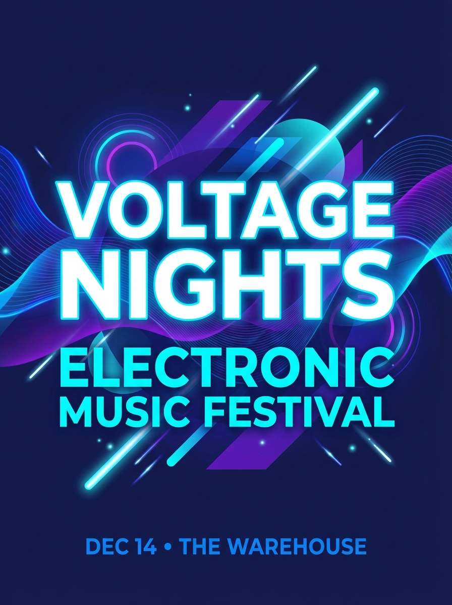
12) Harbor Night
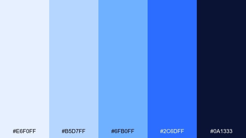
HEX: #E6F0FF #B5D7FF #6FB0FF #2C6DFF #0A1333
Mood: bold, nautical, dramatic
Best for: music poster for an electronic night
Bold and nautical like lights across a late harbor, these blues feel dramatic and modern. The near-black navy sets a strong stage for big type, while the electric blue delivers punchy highlights. Pair with minimal shapes and high-contrast typography for a club-ready look. Tip: use the lightest blue only as a glow or gradient edge so the poster stays moody.
Image example of harbor night generated using media.io
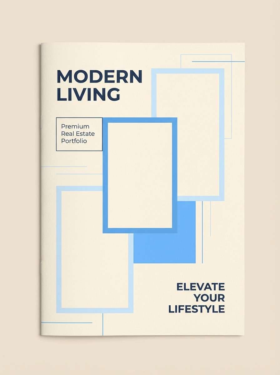
13) Blueprint & Sand
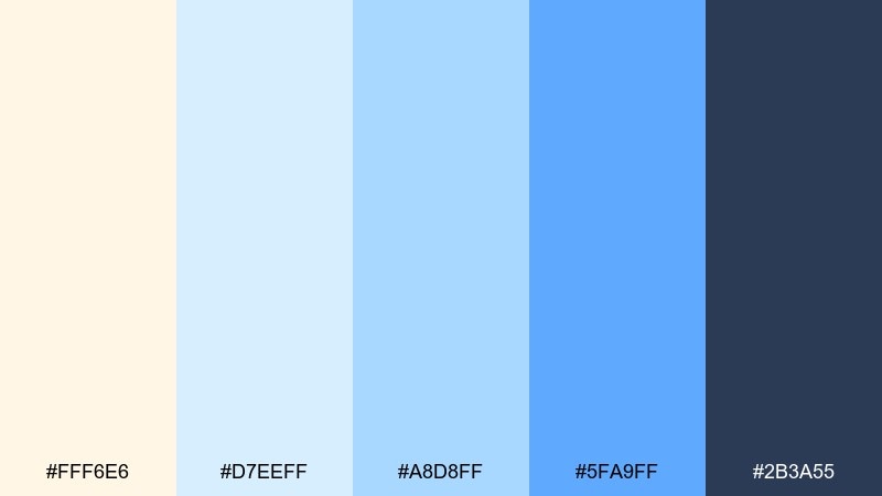
HEX: #FFF6E6 #D7EEFF #A8D8FF #5FA9FF #2B3A55
Mood: coastal, warm, polished
Best for: real estate brochure and brand accents
Coastal and polished like a seaside home tour, these blues sit beautifully next to warm sand tones. Use the cream for brochure backgrounds and the mid blues for section headers, maps, and callouts. Pair with clean photography and understated typography for a premium real estate feel. Tip: keep the darkest blue for fine print and contact details to maintain legibility on the light stock.
Image example of blueprint & sand generated using media.io
14) Quiet Library
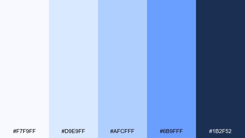
HEX: #F7F9FF #D9E9FF #AFCFFF #6B9FFF #1B2F52
Mood: soft, academic, refined
Best for: editorial magazine layout
Soft and refined like a quiet reading room, these tones feel intelligent and calm. As a blue and light blue color palette, it supports long-form pages with gentle sectioning and clear hierarchy. Pair with off-white paper textures, serif headlines, and minimal rules for an elevated editorial look. Tip: use the mid blue for pull quotes and the deep navy for captions to keep the pacing consistent.
Image example of quiet library generated using media.io
15) Stadium Lights
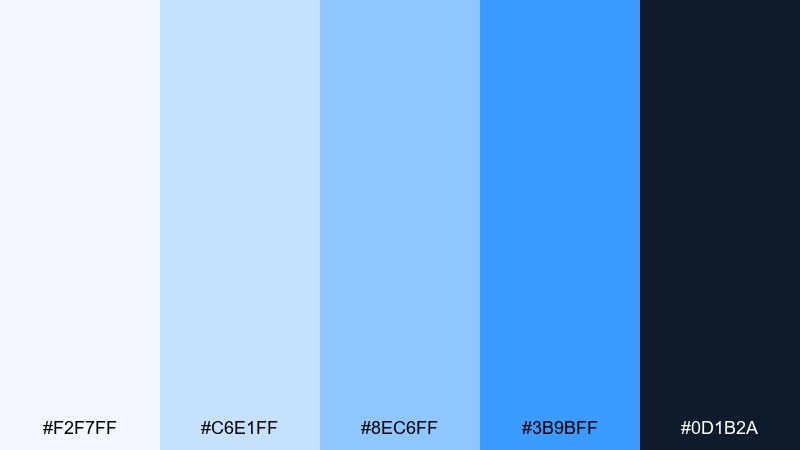
HEX: #F2F7FF #C6E1FF #8EC6FF #3B9BFF #0D1B2A
Mood: high-energy, sporty, bold
Best for: social media ad for a fitness app
High-energy and sporty like bright lights on an evening field, these blues feel fast and motivating. Use the vivid blue for calls to action and performance stats, while the pale tones keep the layout clean on small screens. Pair with strong typography and simple, punchy icons for quick scanning. Tip: add a dark overlay behind text when placing it over imagery to maintain contrast.
Image example of stadium lights generated using media.io

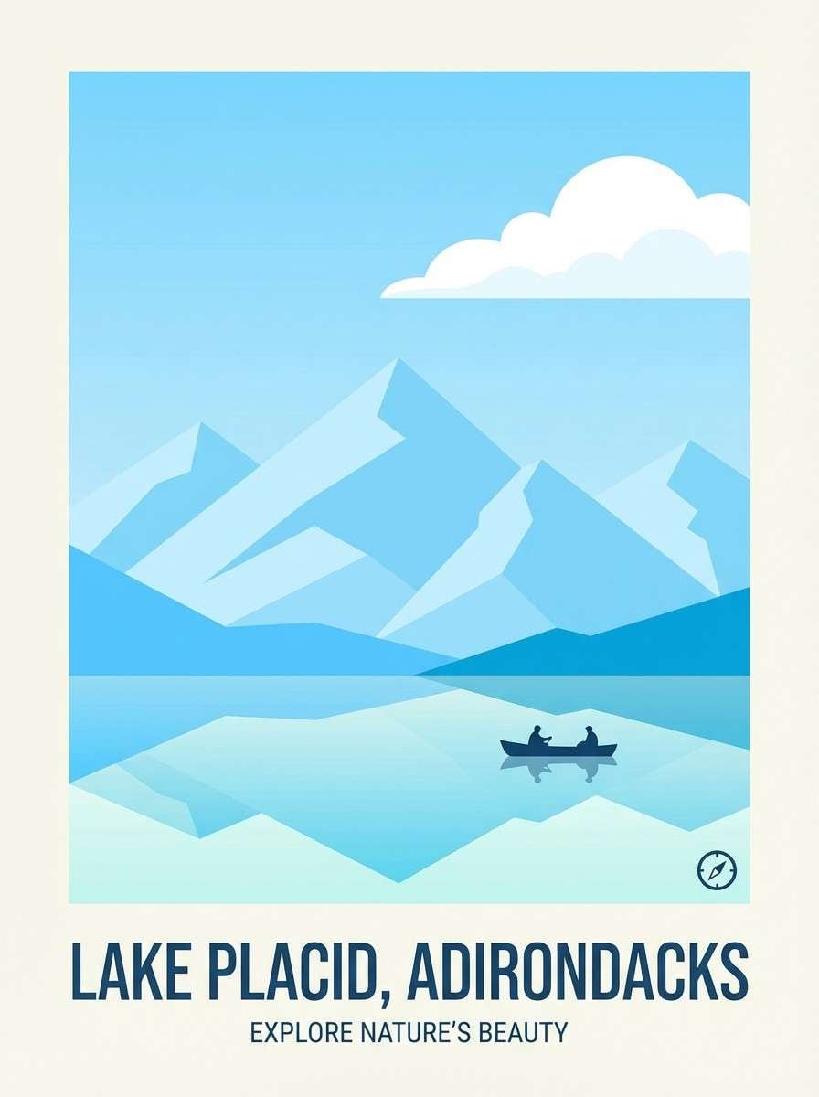
16) Alpine Lake
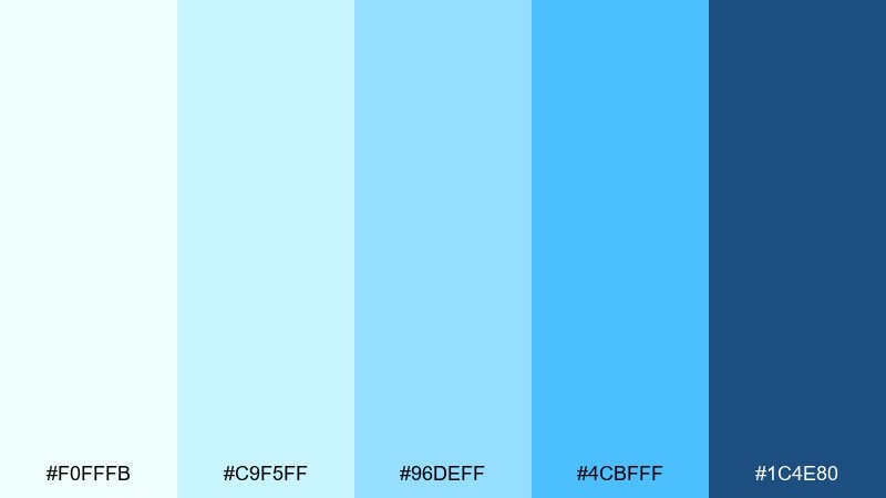
HEX: #F0FFFB #C9F5FF #96DEFF #4CBFFF #1C4E80
Mood: fresh, outdoorsy, uplifting
Best for: travel poster for a mountain destination
Fresh and outdoorsy like a clear alpine lake, this combination of blue and light blue feels uplifting and crisp. The aqua tints are great for skies and water shapes, while the deeper blue can define silhouettes and type. Pair with clean illustration styles and a touch of white to keep it bright. Tip: limit gradients to the water area so the poster remains sharp and graphic.
Image example of alpine lake generated using media.io
17) Paper Airplane
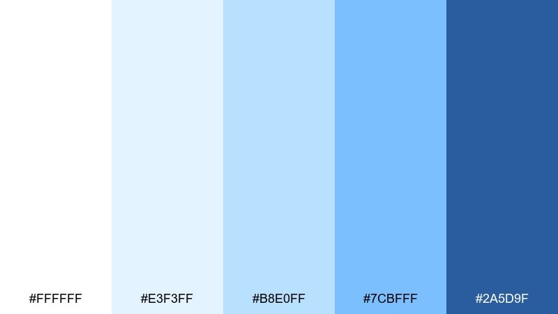
HEX: #FFFFFF #E3F3FF #B8E0FF #7CBFFF #2A5D9F
Mood: light, youthful, optimistic
Best for: education platform UI
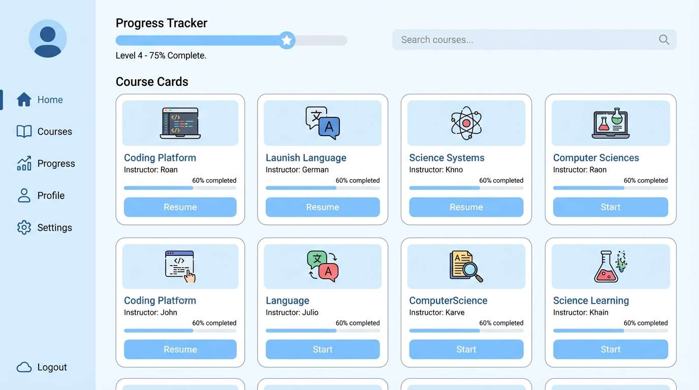
Light and optimistic like paper planes in a bright classroom, these blues feel friendly and clear. Use the softest tints for lesson cards and background sections, and apply the mid blues for active states and progress. Pair with rounded components and simple illustrations for a welcoming learning vibe. Tip: keep the darkest blue for links and headings to improve readability for long sessions.
Image example of paper airplane generated using media.io
18) Frosted Denim
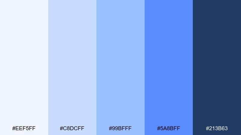
HEX: #EEF5FF #C8DCFF #99BFFF #5A8BFF #213B63
Mood: practical, modern, confident
Best for: ecommerce category page design
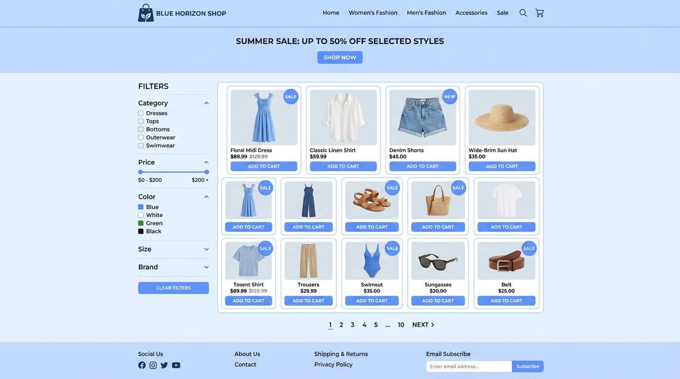
Practical and confident like a favorite denim jacket in winter light, this range feels modern and wearable. The mid blues work well for filters, badges, and category highlights, while the pale tint keeps product grids bright. Pair with neutral product photography and subtle shadows for a clean shopping experience. Tip: use the darkest blue for price and rating text so key details pop instantly.
Image example of frosted denim generated using media.io
19) Neon Aquila
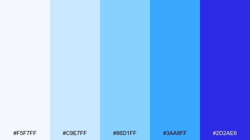
HEX: #F5F7FF #C9E7FF #86D1FF #3AA8FF #2D2AE6
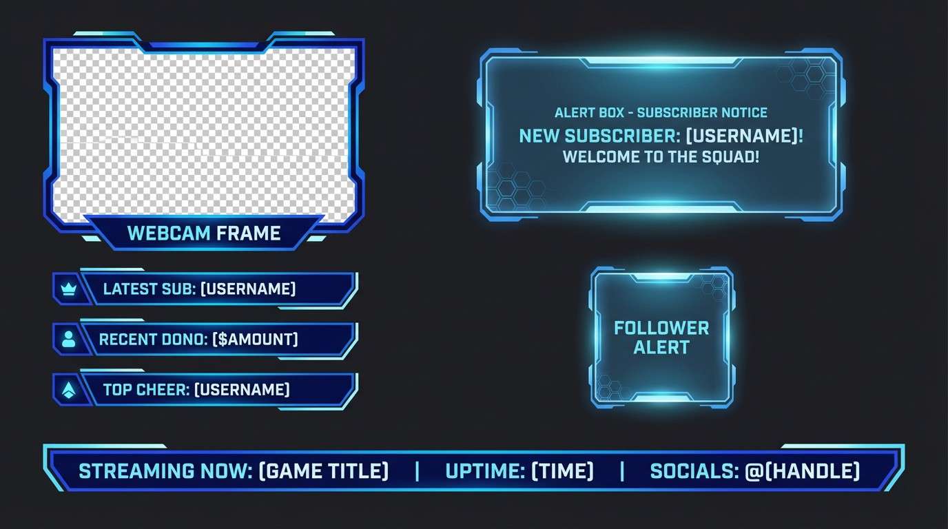
Mood: electric, youthful, future-forward
Best for: gaming stream overlay graphics
Electric and future-forward like city lights after rain, this mix brings energy without going full neon. These blue and light blue color combinations are ideal for stream overlays where you want pop, clarity, and a techy edge. Pair with dark backgrounds, clean HUD-style lines, and bold condensed type for instant impact. Tip: keep the purple-blue as the main accent and let the lighter blues do the supporting glow.
Image example of neon aquila generated using media.io
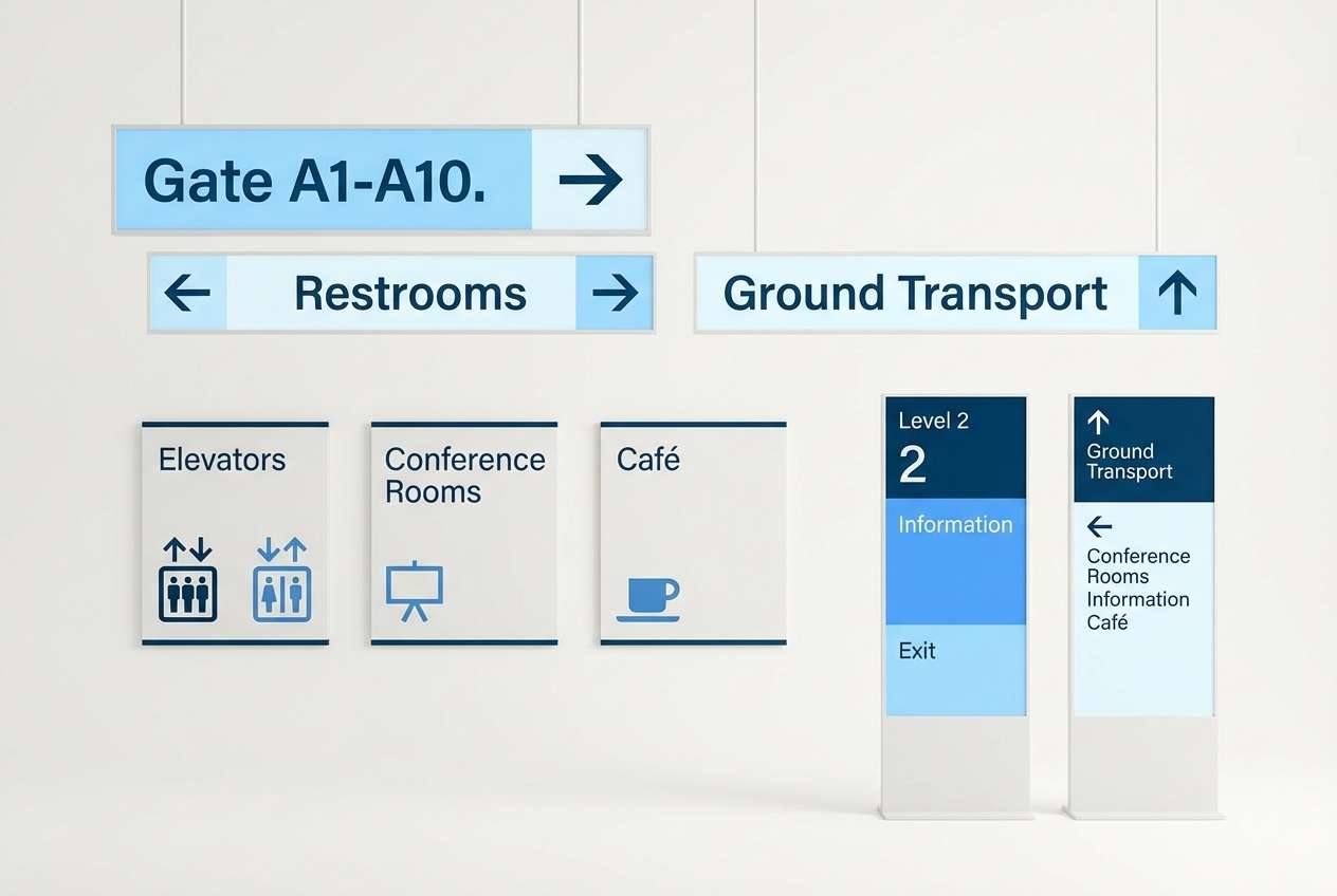
20) Coastal Signage

HEX: #F7FDFF #CDEEFF #98D7FF #4FAEFF #063A63
Mood: clear, breezy, trustworthy
Best for: wayfinding signage system
Clear and breezy like a seaside boardwalk, these hues stay readable from a distance. The pale blues work well for large background panels, while the stronger blue can mark routes, categories, and arrows. Pair with high-contrast typography and simple pictograms for quick navigation. Tip: test the darkest blue for ADA-style contrast on the lightest background before final production.
Image example of coastal signage generated using media.io
What Colors Go Well with Blue Light Blue?
Neutrals are the easiest win: crisp white, soft off-white, cool grays, and charcoal help light blues stay readable and modern. For print, warm whites and cream can keep the palette from feeling icy.
For accents, try deep navy/indigo for structure, or a muted teal/cyan for a fresh “aquatic” feel. If you want a friendlier tone, small touches of blush pink or sandy beige add warmth without overpowering the blues.
When in doubt, keep accents limited: one dark anchor + one warm or bright accent is usually enough to avoid a washed-out or overly playful look.
How to Use a Blue and Light Blue Combination in Real Designs
In UI, assign roles: lightest tint for page background, a slightly darker tint for cards, mid blue for interactive states, and a deep blue for headings and key numbers. This keeps hierarchy clear while maintaining a calm vibe.
For branding, use light blue as the “space” color and let a darker blue carry your logo lockups, icons, and type. This makes the system flexible across digital and print without losing contrast.
In marketing graphics, be careful with saturation: a single vivid blue for CTAs or badges can pop strongly against soft tints, especially when paired with simple typography and generous whitespace.
Create Blue Light Blue Palette Visuals with AI
If you want to see these palettes in context (web sections, posters, packaging, UI kits), generating quick mock visuals helps you validate mood, contrast, and typography choices before design production.
Use the included prompts as a starting point, then tweak layout terms (e.g., “dashboard,” “brochure cover,” “onboarding screens”) to match your project. Keep the HEX codes in the prompt so the output stays on-palette.
Once you get a direction you like, create a small set of variations (light, dark, and high-contrast) to test accessibility and consistency across components.
Blue Light Blue Color Palette FAQs
-
What does a blue light blue color palette communicate in branding?
It usually signals trust, clarity, calm, and professionalism. Lighter blues feel airy and friendly, while a dark navy anchor adds authority and improves readability. -
Which text color works best on very light blue backgrounds?
Use a deep navy, slate, or charcoal instead of pure black for a softer look. Always verify contrast for body text; dark blues like #0A2E5C or #1B2F52 often read cleanly on pale tints. -
How do I keep light blue designs from looking “too cold”?
Add a warm neutral (cream, sand, warm gray) or a small warm accent (blush, peach) and keep it subtle. Warm paper stock or warm-white backgrounds can also soften the overall feel. -
What’s a good accent color for light blue besides navy?
Muted teal/cyan for a fresh look, soft pink for playful contrast, or a warm beige for an approachable coastal vibe. Keep the accent to buttons, badges, or small highlights to avoid visual noise. -
Are pastel blue hex codes good for UI accessibility?
They can be, but pastel surfaces often need darker text and stronger UI states. Use mid-to-deep blues for interactive elements and confirm contrast ratios for text, icons, and key controls. -
How many blues should I use in one interface?
Commonly 3–5 works well: two light tints for surfaces, one mid blue for states, one vivid blue for primary actions, and one deep blue for headings/navigation. -
Can I use a blue light blue palette for print projects?
Yes—pair light blues with an ink-friendly dark blue for type and consider warm whites or cream for the base. Do a proof if possible, since very light tints can shift depending on paper and printing method.
Next: Blue Cyan Color Palette


