

New Year design is all about contrast: midnight-dark backdrops, bright sparkles, and calm winter neutrals that keep layouts readable.
Below are 20+ new year color palette ideas (with HEX codes) you can use for invitations, social posts, banners, UI, and packaging—whether you want classic black-tie elegance or bold firework energy.
In this article
- Why New Year Palettes Work So Well
-
- midnight countdown
- champagne toast
- firework fuchsia
- silver sparklers
- winter pine
- ice crystal
- confetti pop
- velvet ruby
- golden hour glam
- frosted lavender
- cocoa and cream
- urban fireworks
- pearl and graphite
- citrus resolution
- neon nightcap
- snowy sage
- classic black tie
- rose gold party
- arctic mint
- sunrise reset
- aurora glitter
- clockwork gold
- What Colors Go Well with New Year?
- How to Use a New Year Color Palette in Real Designs
- Create New Year Palette Visuals with AI
Why New Year Palettes Work So Well
New Year visuals naturally lean on high contrast—dark “midnight” bases paired with metallics and bright accents—so headlines, dates, and countdown details stay crystal-clear.
They also balance celebration with elegance. Gold, champagne, and silver signal sparkle, while winter whites, grays, and deep blues keep the mood polished instead of chaotic.
Most importantly, New Year color schemes are flexible: the same palette can shift from formal invites to social promos or UI just by changing the accent ratio and typography weight.
20+ New Year Color Palette Ideas (with HEX Codes)
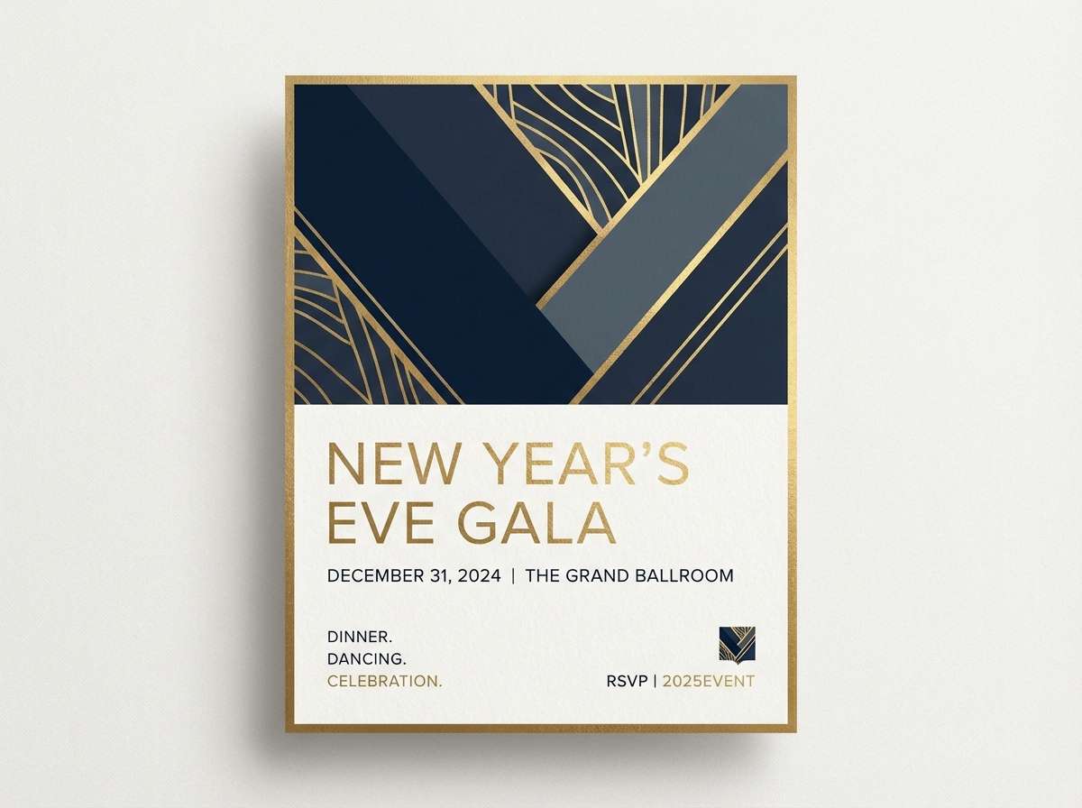
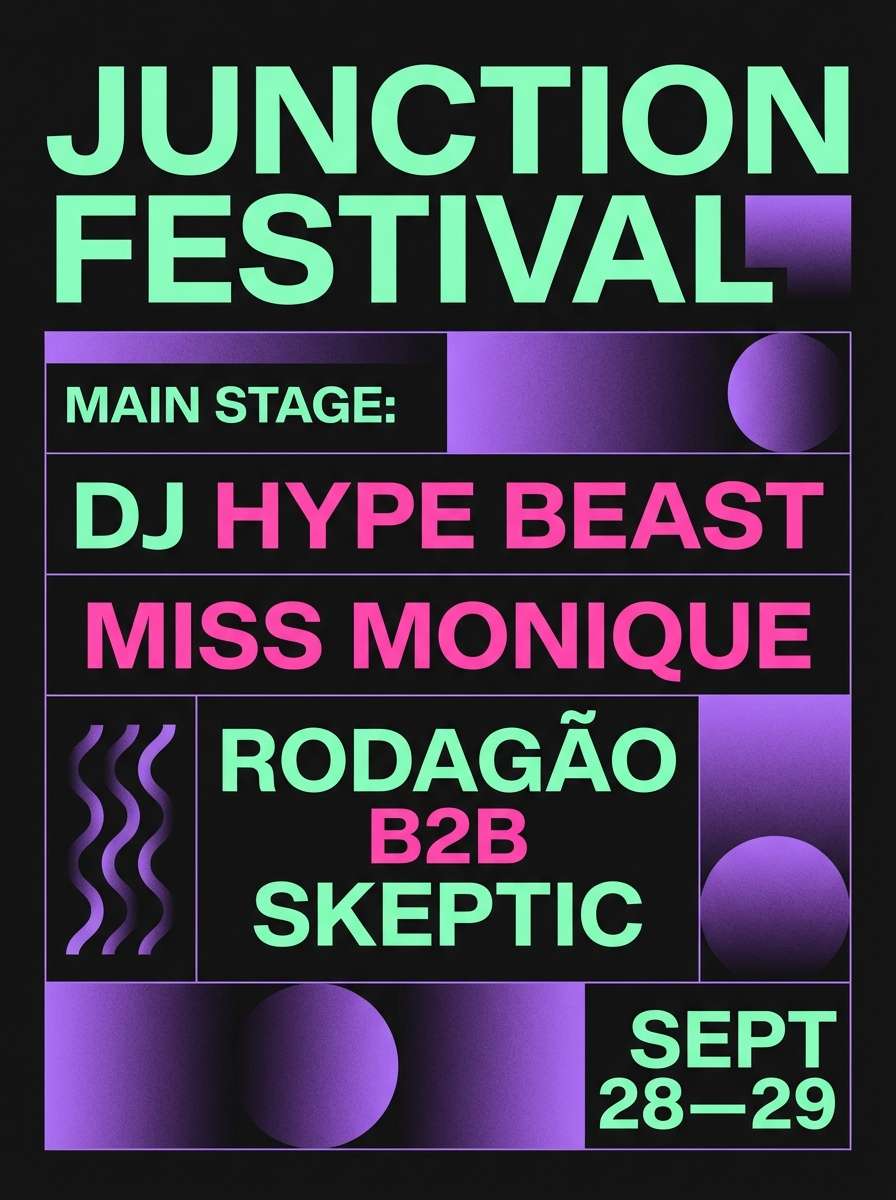
1) Midnight Countdown
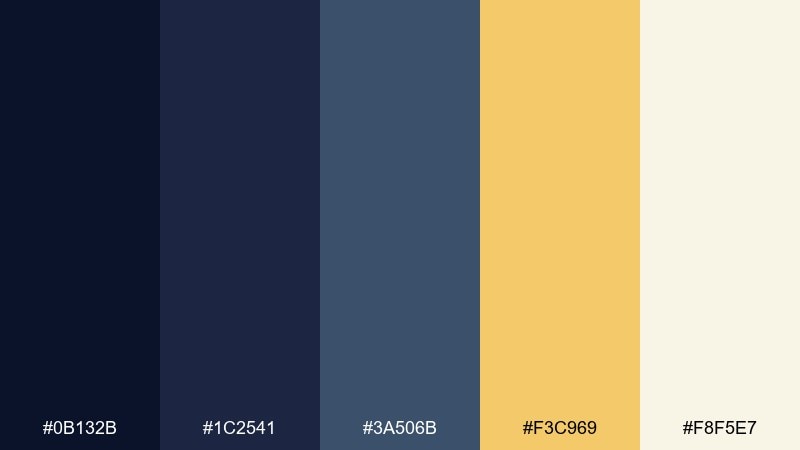
HEX: #0B132B #1C2541 #3A506B #F3C969 #F8F5E7
Mood: dramatic, polished, celebratory
Best for: event invitation design
Dramatic midnight blues with a warm gold glint feel like the last seconds before the countdown hits zero. Use the dark tones for backgrounds and let the gold act as your confetti highlight on dates, dividers, or icons. Pair with generous ivory space so the design stays premium instead of heavy. Tip: keep gold to 10 to 15 percent of the layout for maximum sparkle.
Image example of midnight countdown generated using media.io
Media.io is an online AI studio for creating and editing video, image, and audio in your browser.

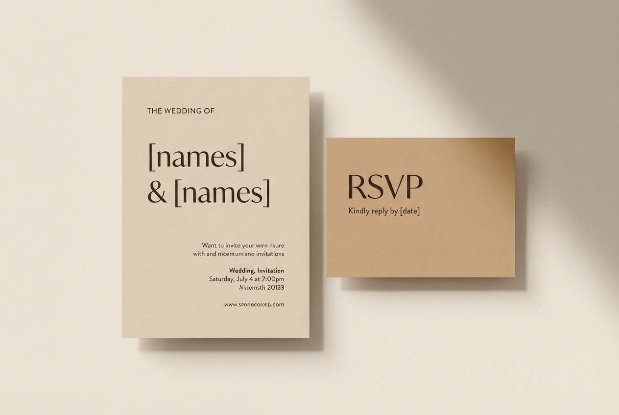
2) Champagne Toast
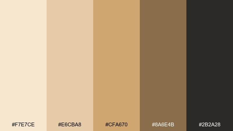
HEX: #F7E7CE #E6CBA8 #CFA670 #8A6E4B #2B2A28
Mood: warm, elegant, intimate
Best for: wedding and party stationery
Warm champagne creams and toasted caramel tones evoke clinking glasses and soft candlelight. For a new year color palette that feels grown-up, use the pale creams as the base and reserve the deep espresso for headings and monograms. Add the mid gold-brown as a subtle border or wax-seal color to tie everything together. Tip: choose uncoated paper textures to make these hues look richer.
Image example of champagne toast generated using media.io
3) Firework Fuchsia
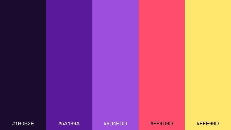
HEX: #1B0B2E #5A189A #9D4EDD #FF4D6D #FFE66D
Mood: electric, playful, bold
Best for: social media promo post
Electric purples and hot fuchsia pop like fireworks against a night sky. Keep the deepest violet as the background so the pink and yellow read as bright bursts rather than noise. This set works best with chunky sans-serif type and high-contrast shapes like stars, bursts, and dots. Tip: limit gradients to one focal element so the post stays crisp on mobile.
Image example of firework fuchsia generated using media.io

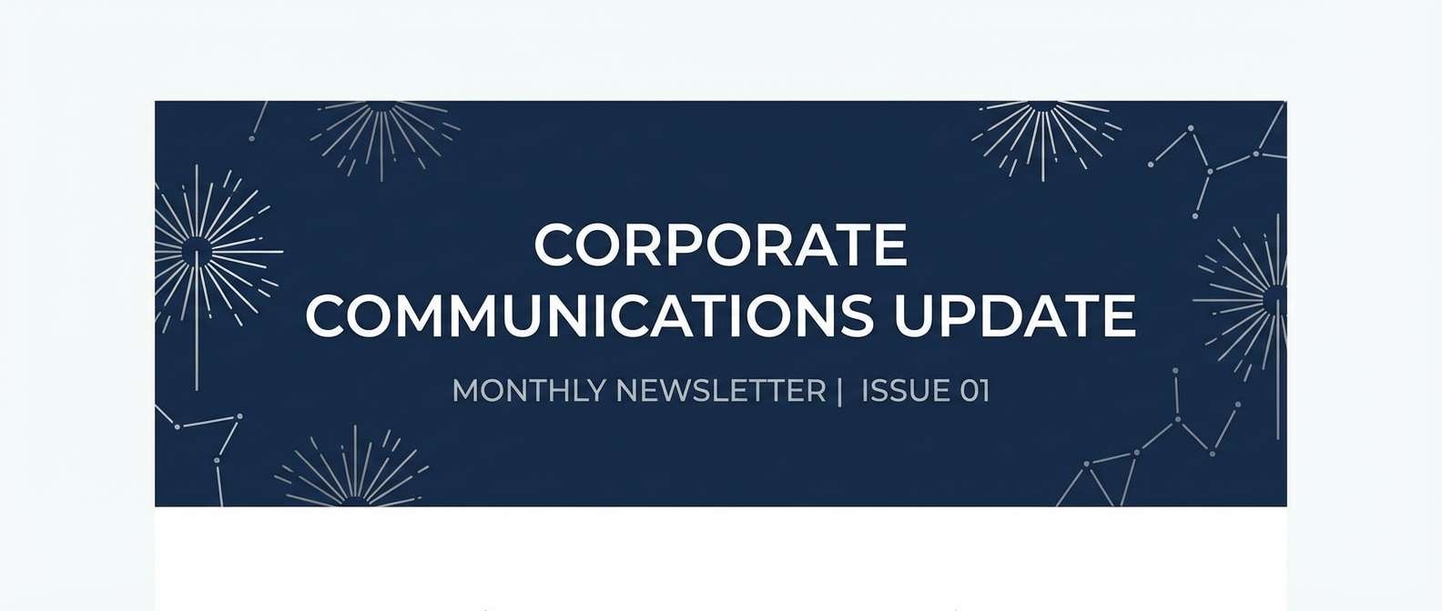
4) Silver Sparklers
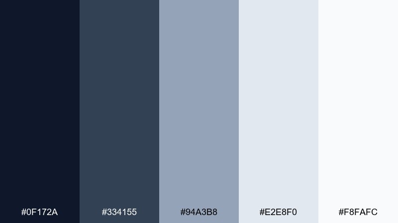
HEX: #0F172A #334155 #94A3B8 #E2E8F0 #F8FAFC
Mood: clean, modern, wintry
Best for: corporate email header
Cool silvers and blue-grays feel like sparklers fading into winter air. Use the near-black navy for the headline and anchor bar, then layer the pale grays for subtle depth. This palette is ideal when you want festive energy without loud color. Tip: add a thin gradient from #E2E8F0 to #F8FAFC to mimic a metallic sheen.
Image example of silver sparklers generated using media.io
5) Winter Pine
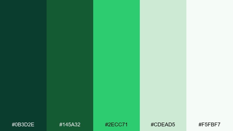
HEX: #0B3D2E #145A32 #2ECC71 #CDEAD5 #F5FBF7
Mood: fresh, grounded, hopeful
Best for: eco brand landing page
Evergreen depths with a bright sprout green feel like a reset walk through pine woods. Use the dark green for navigation and footer, then let the minty tints open up the hero area. The vivid green works best as a single call-to-action color, not a full background. Tip: pair with plenty of white space and simple icons for a clean, sustainable look.
Image example of winter pine generated using media.io
6) Ice Crystal
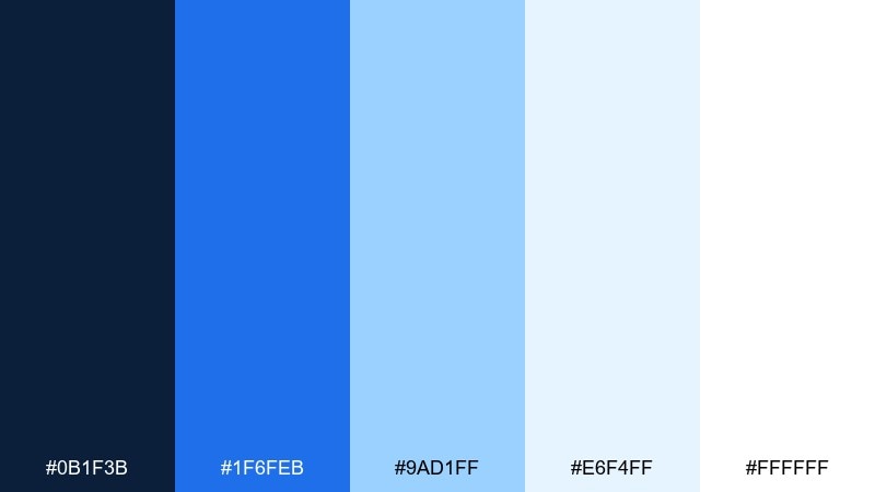
HEX: #0B1F3B #1F6FEB #9AD1FF #E6F4FF #FFFFFF
Mood: crisp, airy, optimistic
Best for: app onboarding UI
Crisp blues and icy tints read like frosted glass catching morning light. Use the navy as your primary text color for strong readability, and let the bright blue lead buttons and progress states. The pale tints are perfect for cards, banners, and subtle separators. Tip: keep shadows soft and rely on tint layers to avoid a heavy look.
Image example of ice crystal generated using media.io
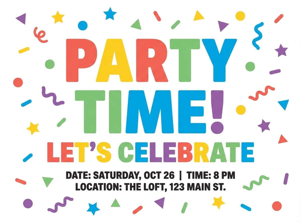
7) Confetti Pop
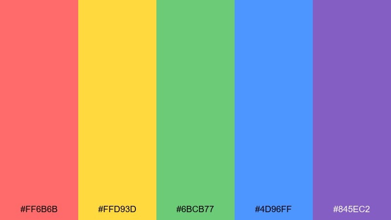
HEX: #FF6B6B #FFD93D #6BCB77 #4D96FF #845EC2
Mood: joyful, energetic, youthful
Best for: party flyer design
Joyful brights scatter like confetti across the dance floor. These new year color combinations work best when you pick one dominant hue, then use the others as small bursts for icons, dots, and corner shapes. Keep typography simple and bold so it holds up against the color energy. Tip: set a neutral white or near-black background to stop the flyer from feeling chaotic.
Image example of confetti pop generated using media.io
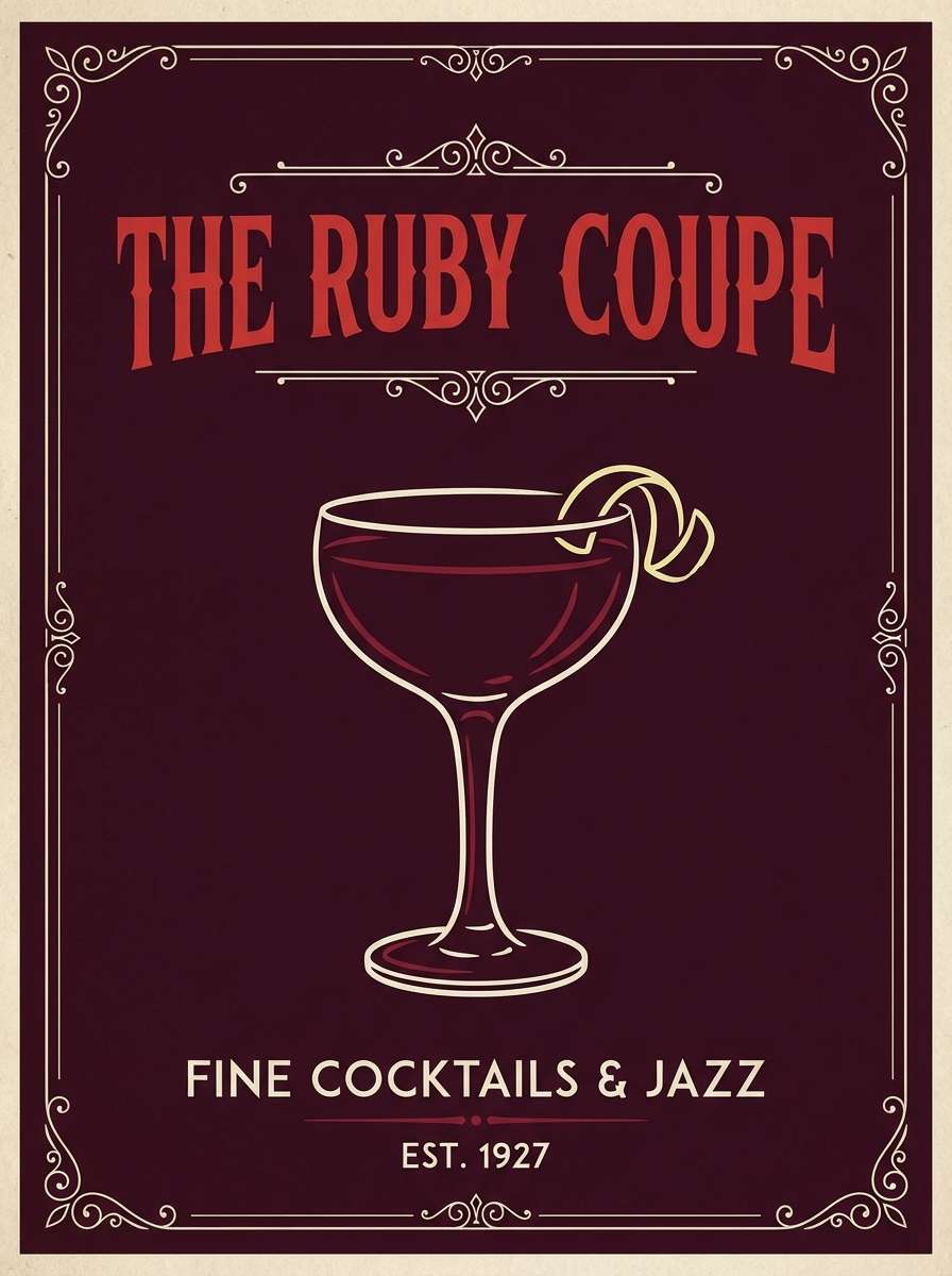
8) Velvet Ruby
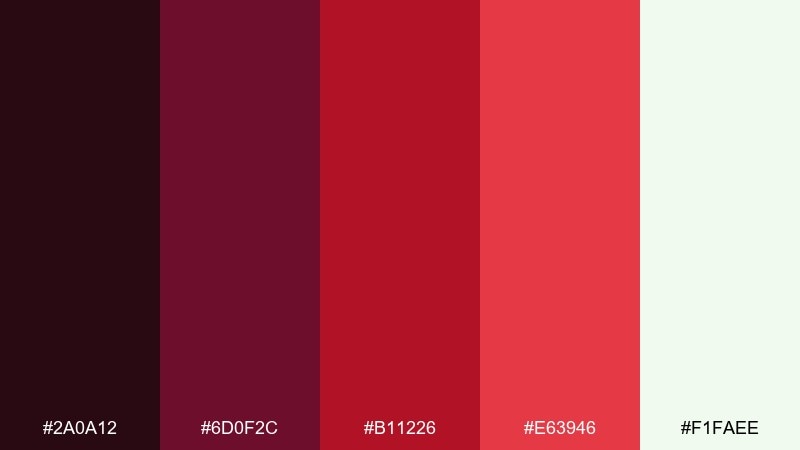
HEX: #2A0A12 #6D0F2C #B11226 #E63946 #F1FAEE
Mood: romantic, luxe, dramatic
Best for: cocktail bar poster
Velvet reds with an inky base bring a candlelit lounge vibe to life. Use the darkest shade for the background and set the brighter reds on top for titles, stamps, or drink highlights. The soft off-white keeps copy readable and gives the whole piece breathing room. Tip: add a subtle grain texture to mimic vintage print and deepen the mood.
Image example of velvet ruby generated using media.io
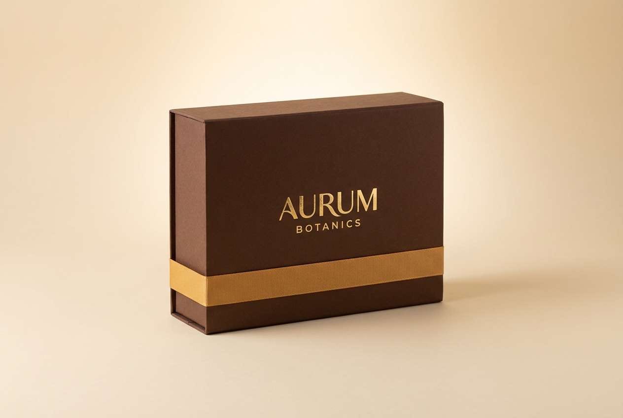
9) Golden Hour Glam
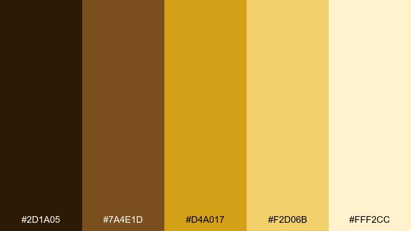
HEX: #2D1A05 #7A4E1D #D4A017 #F2D06B #FFF2CC
Mood: glamorous, warm, premium
Best for: beauty product packaging
Warm golds and honeyed browns feel like sunset light on metallic foil. Use the deep brown as your base for instant luxury, then let the brighter gold carry logos and key claims. The pale butter tint works as a clean highlight for ingredient lists or side panels. Tip: keep finishes consistent by using one foil tone and one matte tone, not multiple metallics.
Image example of golden hour glam generated using media.io
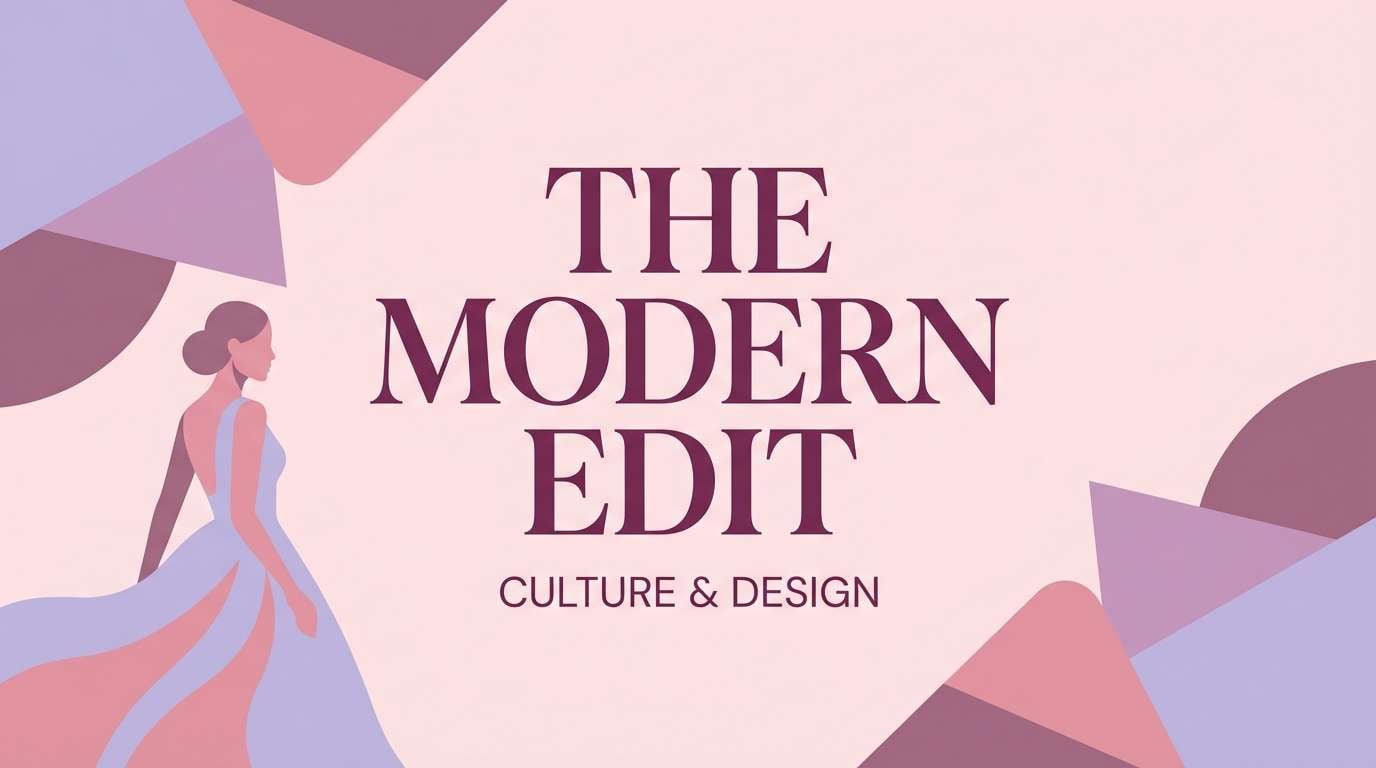
10) Frosted Lavender
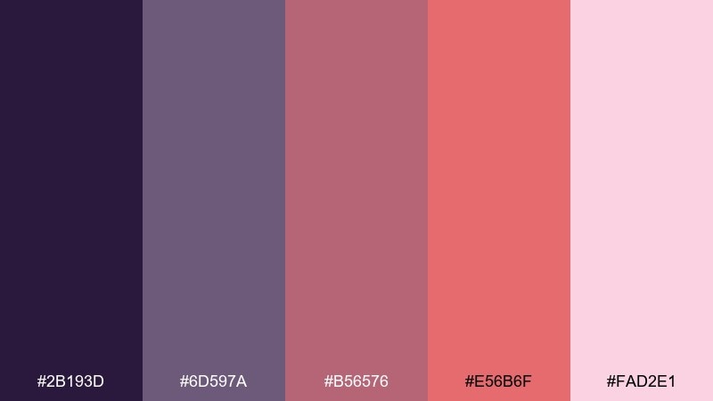
HEX: #2B193D #6D597A #B56576 #E56B6F #FAD2E1
Mood: soft, dreamy, playful
Best for: editorial banner
Dreamy lavender and rosy tones feel like a pastel haze after midnight celebrations. For new year color combinations with a gentler vibe, build your background with the pale pink and keep the plum shade for headings. The warmer rose works nicely for buttons or pull quotes without shouting. Tip: add thin line dividers in #6D597A to keep sections tidy.
Image example of frosted lavender generated using media.io
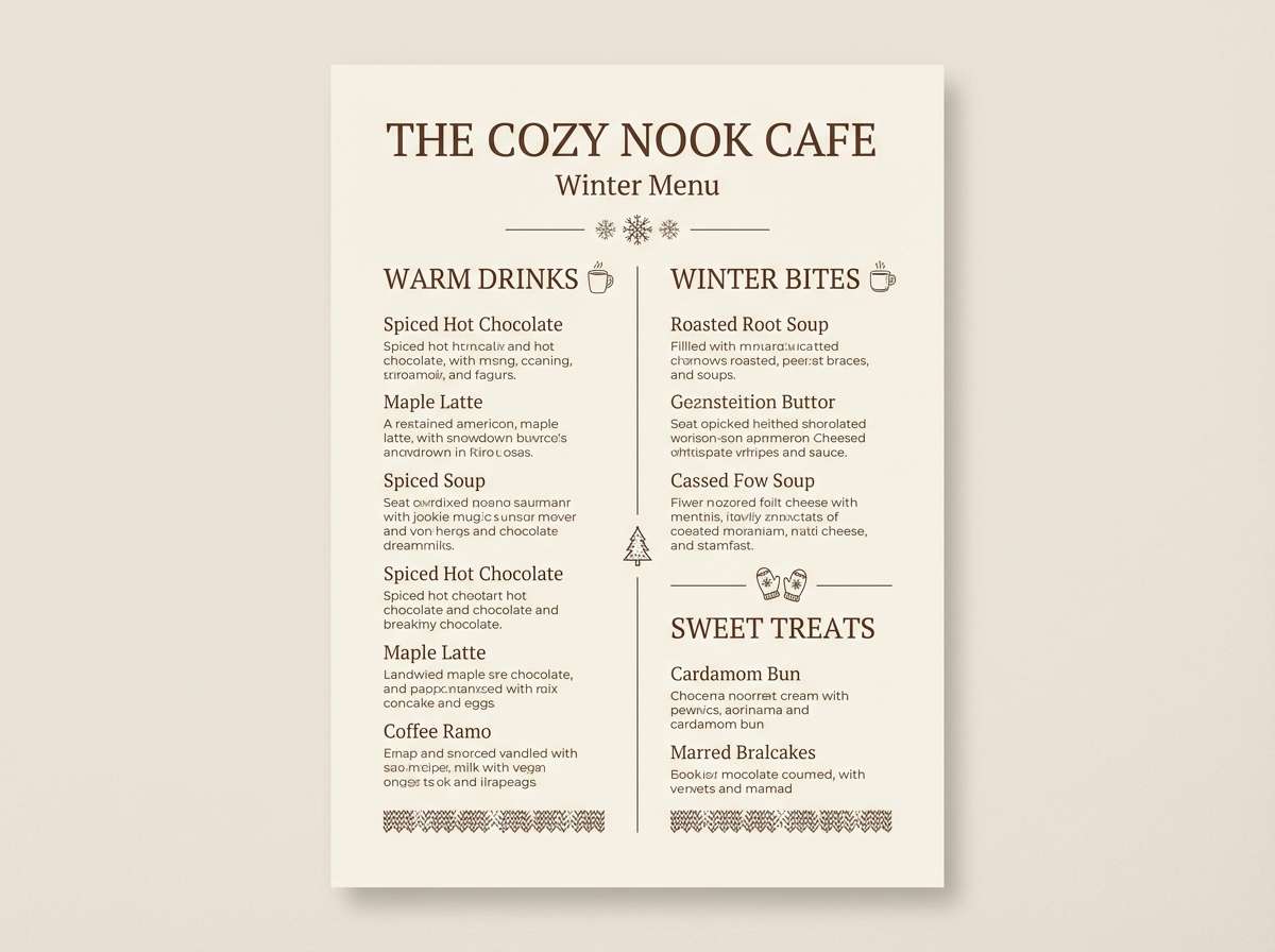
11) Cocoa and Cream
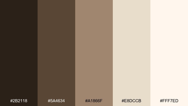
HEX: #2B2118 #5A4634 #A1866F #E8DCCB #FFF7ED
Mood: cozy, calm, welcoming
Best for: winter menu design
Cozy cocoa browns and creamy neutrals evoke warm drinks and slow evenings. Use the darkest brown for section titles and small icons, then let the creamy tones handle the background and spacing. This pairing is especially strong for menus where readability matters more than flash. Tip: add a thin border in #A1866F to frame the menu without making it feel boxed in.
Image example of cocoa and cream generated using media.io
12) Urban Fireworks
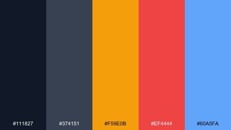
HEX: #111827 #374151 #F59E0B #EF4444 #60A5FA
Mood: streetwise, bold, modern
Best for: event ticket design
Charcoal neutrals with hot amber, red, and cool blue feel like city lights reflecting on glass. Keep the background in the dark grays and use the accents to code sections like seating, dates, and QR callouts. The contrast makes small text and micro-details easy to scan. Tip: repeat the amber accent consistently for the most important action or entry info.
Image example of urban fireworks generated using media.io
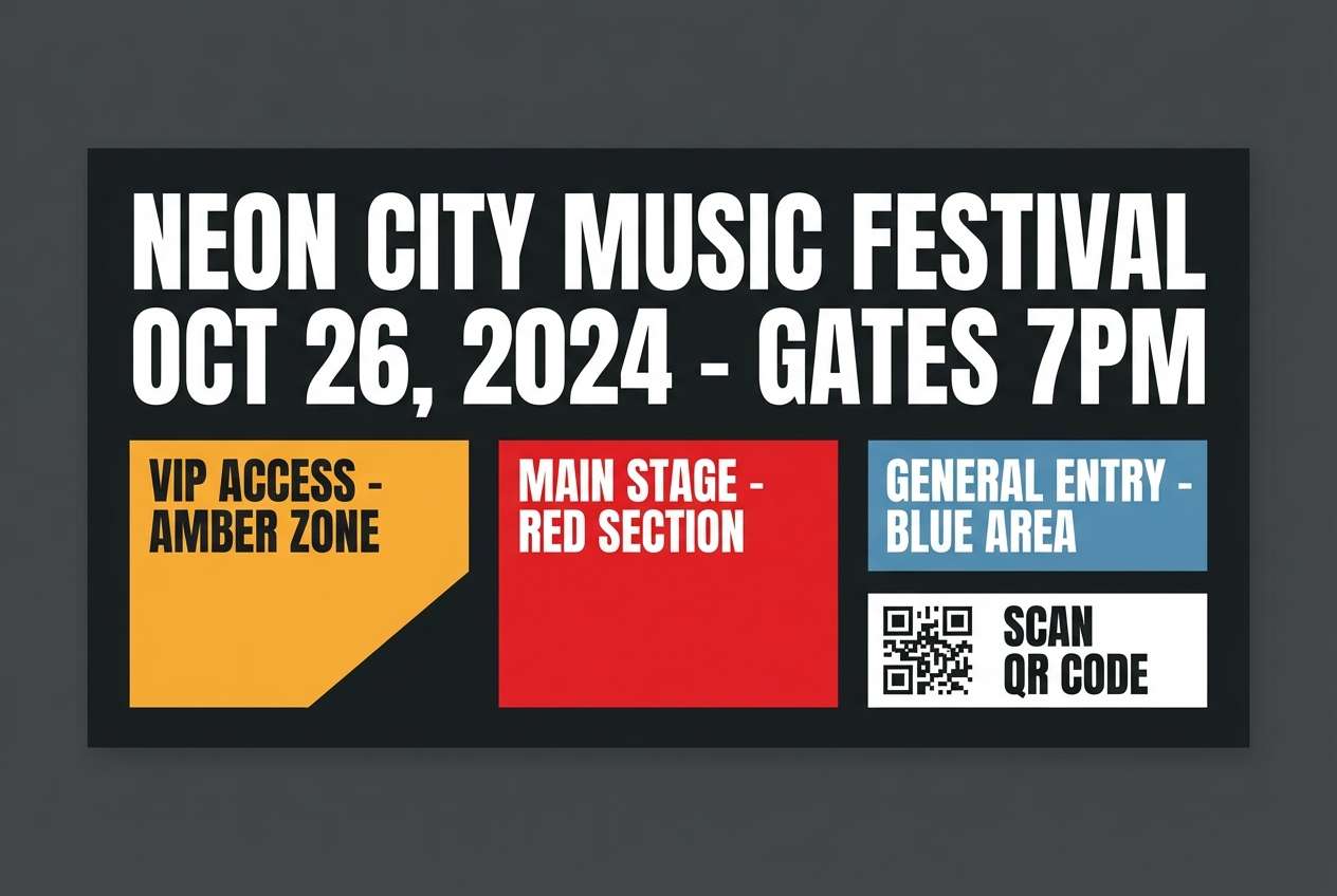
13) Pearl and Graphite
HEX: #111111 #3F3F46 #A1A1AA #E5E7EB #F5F5F4
Mood: minimal, timeless, high-end
Best for: portfolio website UI
Pearl grays and graphite blacks create a refined, gallery-like atmosphere. Use the darkest tone sparingly for navigation and key text, then rely on mid-grays for subtle UI states. The pale neutrals make images and project cards feel curated and quiet. Tip: add one accent color outside this set only for links if you need stronger affordance.
Image example of pearl and graphite generated using media.io
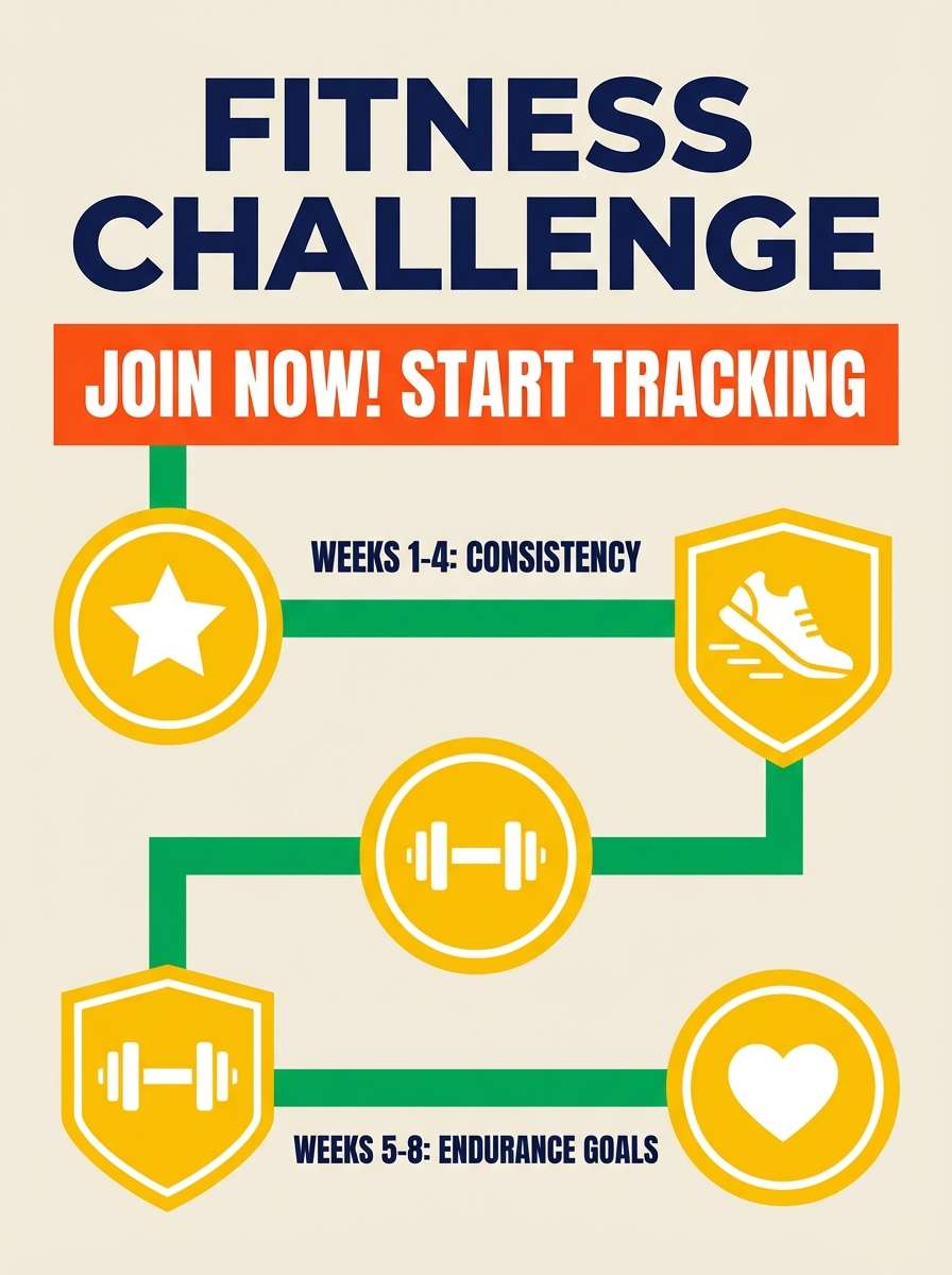
14) Citrus Resolution
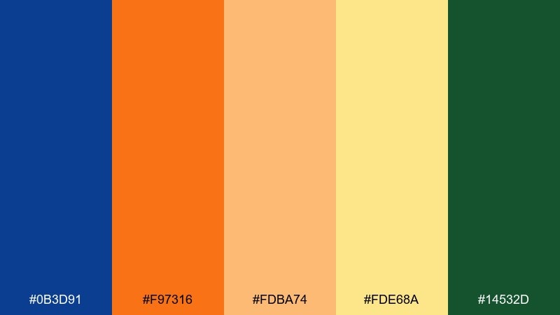
HEX: #0B3D91 #F97316 #FDBA74 #FDE68A #14532D
Mood: fresh, motivated, upbeat
Best for: fitness challenge poster
Bright citrus orange and sunny yellow feel like a high-energy restart, grounded by deep blue and green. Use the navy for structure and text so the warm tones stay punchy as highlights. This mix is great for motivational layouts with clear hierarchy and strong CTA buttons. Tip: keep orange for the main action and use yellow only for supportive callouts or badges.
Image example of citrus resolution generated using media.io
15) Neon Nightcap
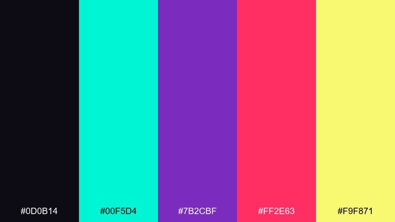
HEX: #0D0B14 #00F5D4 #7B2CBF #FF2E63 #F9F871
Mood: clubby, edgy, high-contrast
Best for: DJ lineup poster
Neon accents on a near-black base feel like a late-night set under LED lights. Use the dark tone for the full background and pick two neons as your primary pairing to avoid visual overload. The mint works beautifully for outlines and icons, while the yellow can spotlight the headliner. Tip: keep text blocks in one neon and reserve the others for small graphic hits.
Image example of neon nightcap generated using media.io
16) Snowy Sage
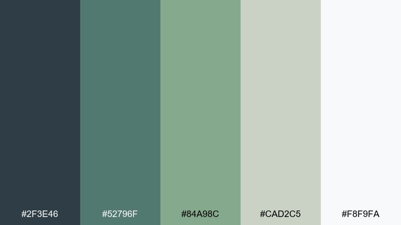
HEX: #2F3E46 #52796F #84A98C #CAD2C5 #F8F9FA
Mood: calm, natural, modern
Best for: mindfulness app UI
Muted sage greens with soft gray-whites feel like quiet snowfall on evergreen branches. Use the slate tone for headers and nav, then layer the lighter sages for cards and progress components. This set is soothing enough for long sessions without feeling dull. Tip: use the deepest color only for key text so the interface stays airy.
Image example of snowy sage generated using media.io
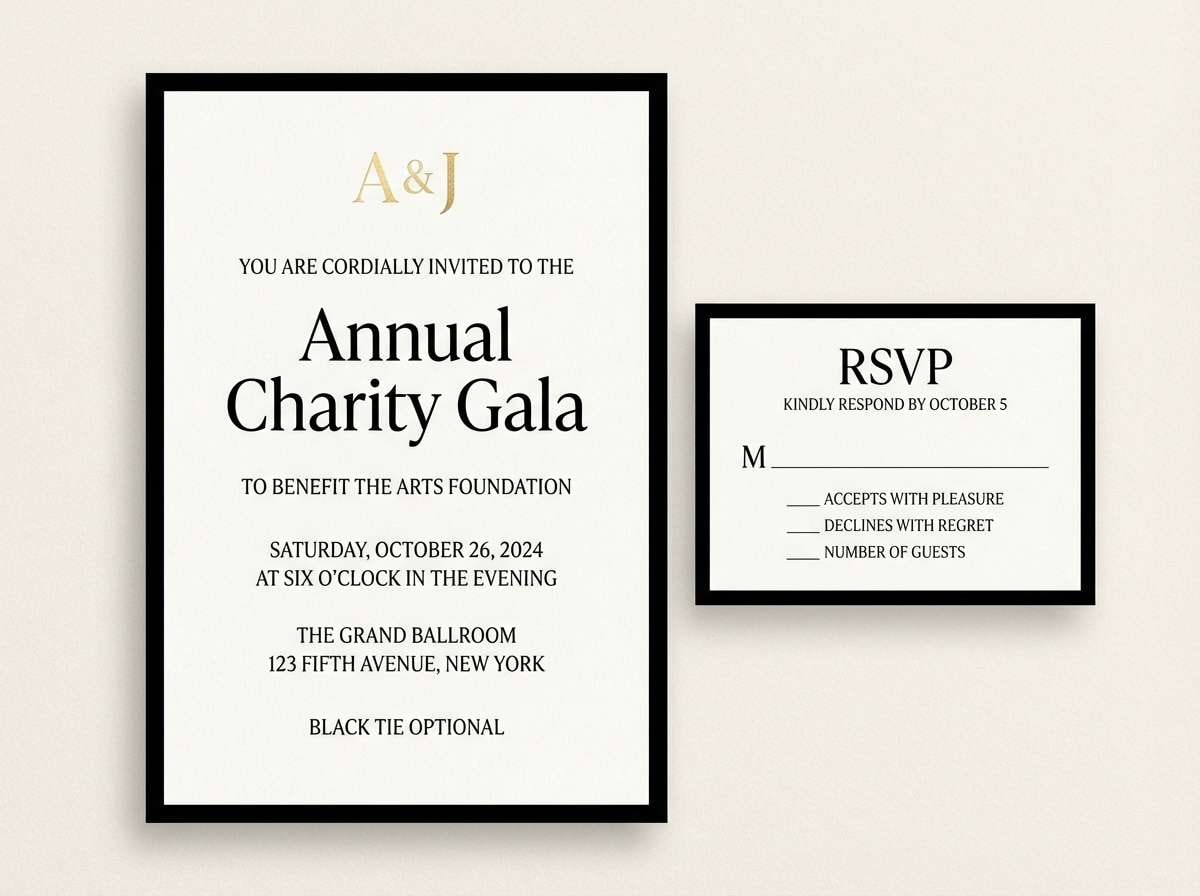
17) Classic Black Tie
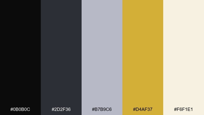
HEX: #0B0B0C #2D2F36 #B7B9C6 #D4AF37 #F6F1E1
Mood: formal, luxurious, timeless
Best for: gala invitation and RSVP
Black-tie neutrals with a refined gold accent evoke tuxedos, satin, and warm ballroom light. Use black for the background or border, then set type in cream for a crisp upscale contrast. The gold is strongest as a monogram, rule line, or small seal rather than a full headline. Tip: add extra letter spacing to headings to make the layout feel more premium.
Image example of classic black tie generated using media.io
18) Rose Gold Party
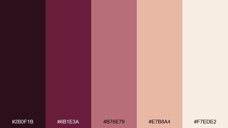
HEX: #2B0F1B #6B1E3A #B76E79 #E7B8A4 #F7EDE2
Mood: chic, warm, romantic
Best for: beauty sale banner
Rose gold tones with a deep berry base feel like metallic balloons and satin ribbons. Use the dark berry for contrast in headlines and price tags, then let the rose gold shades fill backgrounds and shapes. This set pairs nicely with thin line icons and soft gradients that mimic shimmer. Tip: keep the lightest cream for negative space so the banner stays readable.
Image example of rose gold party generated using media.io

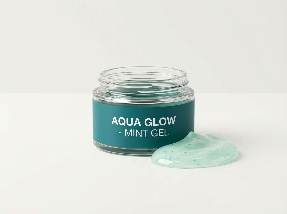
19) Arctic Mint
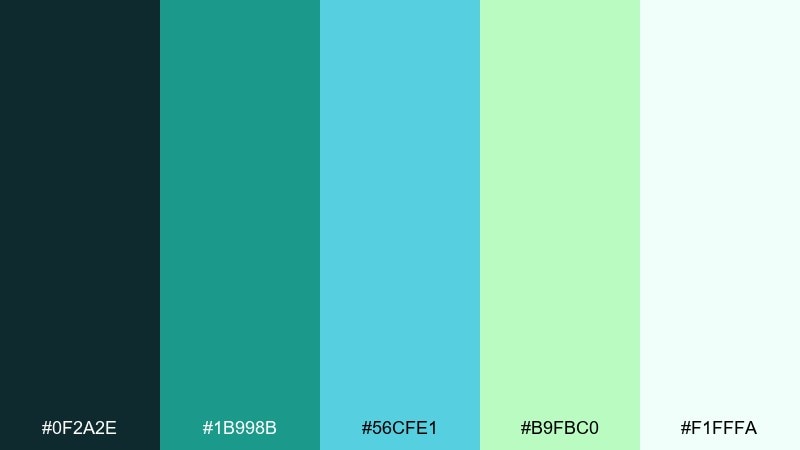
HEX: #0F2A2E #1B998B #56CFE1 #B9FBC0 #F1FFFA
Mood: refreshing, clean, energetic
Best for: skincare product ad
Cool teals and minty tints feel like a splash of icy water and a clean reset. Use the deep teal for the brand block and typography, with the brighter aqua for highlights and droplets. The pale mint works as a soft backdrop that keeps the ad looking airy and hygienic. Tip: choose glossy lighting so the cool tones read crisp, not dull.
Image example of arctic mint generated using media.io
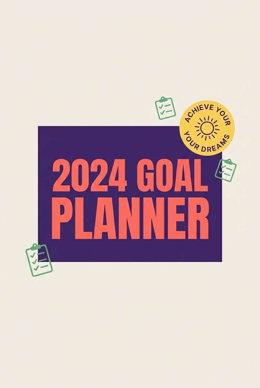
20) Sunrise Reset
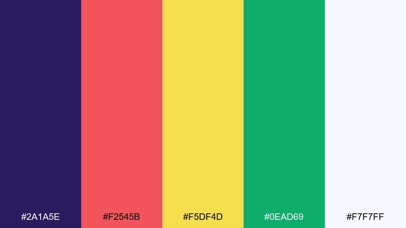
HEX: #2A1A5E #F2545B #F5DF4D #0EAD69 #F7F7FF
Mood: optimistic, modern, bold
Best for: goal planner cover
Bright sunrise tones with a confident purple base feel like a fresh start and clear intentions. Use purple for the cover background, then let coral and yellow lead the title and key badges. The green works best as a small progress or checklist accent to signal completion. Tip: keep the layout simple with one large title and one secondary badge for a clean, modern cover.
Image example of sunrise reset generated using media.io
21) Aurora Glitter
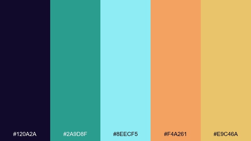
HEX: #120A2A #2A9D8F #8EECF5 #F4A261 #E9C46A
Mood: magical, luminous, modern
Best for: website hero banner
Luminous aqua and warm gold-orange feel like an aurora shimmering over a winter horizon. Use the deep purple as the hero background and set the icy cyan as glow accents around key headlines. The warm tones bring balance and work well for buttons and tiny decorative sparks. Tip: apply a soft radial glow behind the headline to enhance the aurora effect without adding clutter.
Image example of aurora glitter generated using media.io

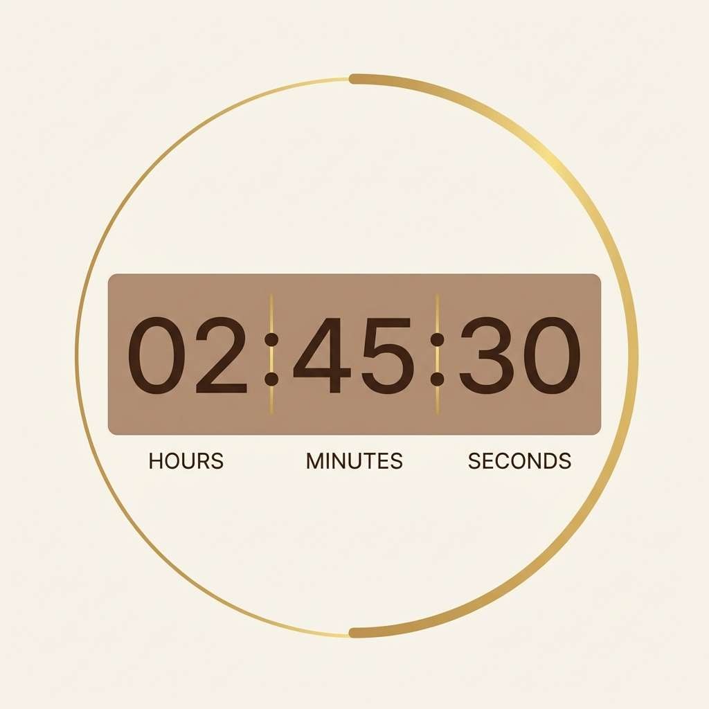
22) Clockwork Gold
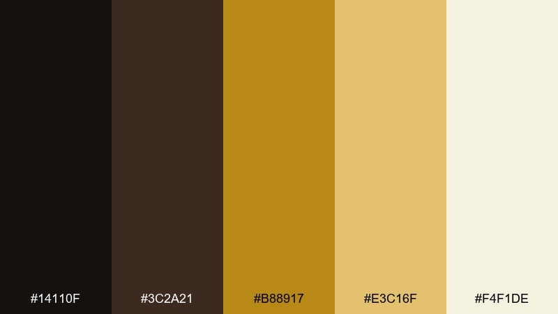
HEX: #14110F #3C2A21 #B88917 #E3C16F #F4F1DE
Mood: vintage, refined, celebratory
Best for: countdown timer UI
Vintage browns and clockwork gold evoke antique gears and a dramatic countdown. For a high-contrast new year color palette, place the timer on the cream background and use the darkest tones for numerals and labels. Gold accents shine best on rings, progress arcs, or tiny separators around the clock face. Tip: keep gold as an accent layer only, so the UI stays readable at a glance.
Image example of clockwork gold generated using media.io
What Colors Go Well with New Year?
Classic New Year colors pair well when you mix a deep base (navy, charcoal, black, deep plum) with one “spark” accent (gold, silver, champagne, neon pink, bright cyan). That contrast instantly feels like night sky + fireworks.
For softer looks, combine warm neutrals (cream, cocoa, caramel) with one metallic-like highlight (muted gold or pale gray) to keep the design elegant and readable.
If you want a modern twist, try cool winter hues (icy blue, slate, sage, mint) and use a single warm accent (amber or coral) to create a fresh, optimistic start-of-year vibe.
How to Use a New Year Color Palette in Real Designs
Start with hierarchy: pick one dominant background color, one primary text color, and one accent color for CTAs or key details like dates, prices, or countdown numbers. This keeps even bold new year color combinations organized.
Control the “sparkle” ratio. Metallic tones (gold/champagne/silver) and neon brights work best in small doses—think icons, thin dividers, badges, or confetti shapes—so the layout still feels premium.
Match finish to medium: for print, consider texture and ink coverage; for digital, check contrast for accessibility and test how the palette looks on mobile in dark mode and bright daylight.
Create New Year Palette Visuals with AI
If you already have HEX codes, you can turn them into ready-to-post visuals by generating banners, flyers, invitations, and UI mockups with AI—then refine details like typography, spacing, and lighting.
Try prompting with your use case (invite, hero banner, poster) and mention your color vibe (black-tie, champagne, neon club) to get variations quickly without rebuilding layouts from scratch.
New Year Color Palette FAQs
-
What are the best new year colors for a classy invitation?
Deep navy or black with cream and a restrained gold accent is the safest “black-tie” combination. Try palettes like Midnight Countdown, Classic Black Tie, or Champagne Toast for a premium look. -
How do I make gold look elegant instead of loud?
Use gold as a 10–15% accent (rules, icons, borders, small badges) and keep the rest of the design in dark neutrals and warm whites. Avoid stacking multiple metallic shades in the same layout. -
Which palette works best for New Year social media posts?
High-contrast, saturated sets like Firework Fuchsia, Confetti Pop, or Neon Nightcap stand out on feeds. Keep the background dark and reserve bright colors for bursts and headlines. -
What’s a good New Year color scheme for corporate designs?
Cool neutrals with subtle metallic feel work well—Silver Sparklers or Pearl and Graphite are clean, readable, and still festive when you add minimal spark elements. -
Can I use winter greens for New Year branding?
Yes. Deep pine or sage reads like “fresh start” and “new chapter,” especially when paired with whites and a single bright CTA color. Winter Pine and Snowy Sage are strong options. -
How many colors should I use in one New Year design?
For most layouts, use 3 functional roles: background, text, and accent. You can still pull from a 5-color palette, but keep the extras for subtle tints, cards, and separators. -
How can I quickly generate New Year graphics from a palette?
Use Media.io’s text-to-image generator and include your design type (banner, poster, invite) plus the mood (black-tie, champagne, neon). Then iterate prompts for composition and typography while keeping colors consistent.


