

Midnight green is the kind of deep, blue-leaning green that instantly feels premium, calm, and modern. It can read as nautical, botanical, cinematic, or tech-forward depending on the accents you pair with it.
Below are 20 midnight green color palette ideas with HEX codes, plus practical tips for branding, UI, print, and interiors—so you can choose a combination that looks intentional (not just “dark green”).
In this article
- Why Midnight Green Palettes Work So Well
-
- deep harbor
- emerald after dark
- rainy conservatory
- brass library
- coastal fog
- velvet orchid accent
- graphite mint tech
- copper kelp packaging
- sage stone minimal
- midnight green and blush
- pine and lemon zest
- stormglass neutrals
- antique gold ceremony
- winter sea glass
- terracotta garden walls
- neon teal nightlife
- walnut ink stationery
- glacier type
- museum night poster
- charcoal rose luxe
- What Colors Go Well with Midnight Green?
- How to Use a Midnight Green Color Palette in Real Designs
- Create Midnight Green Palette Visuals with AI
Why Midnight Green Palettes Work So Well
Midnight green sits in the sweet spot between “serious” and “inviting.” It has the authority of near-black, but with a cooler, more natural character—so it feels premium without being harsh.
Because it’s dark and slightly teal, it pairs cleanly with both warm accents (gold, tan, terracotta) and cool accents (mint, sea-glass, icy blues). That range makes it a flexible base for brand systems and UI themes.
Most importantly, midnight green supports hierarchy. You can anchor layouts with deep green, keep reading areas calm with off-whites, and reserve brighter accents for calls-to-action and key details.
20+ Midnight Green Color Palette Ideas (with HEX Codes)
1) Deep Harbor
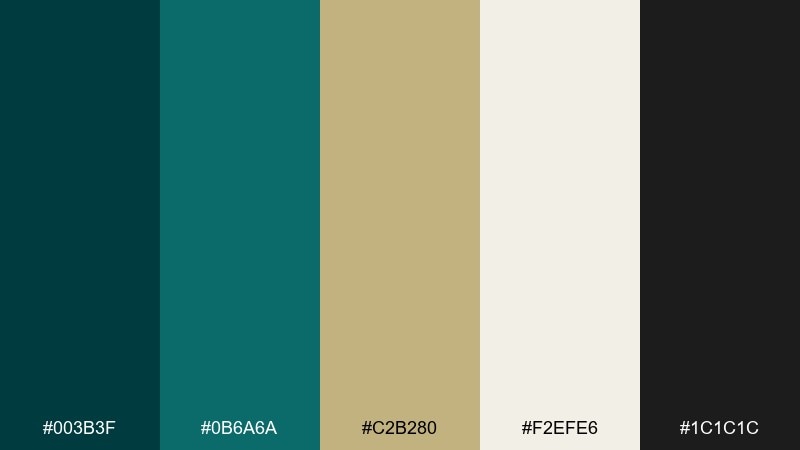
HEX: #003b3f #0b6a6a #c2b280 #f2efe6 #1c1c1c
Mood: nautical, grounded, refined
Best for: brand identity for premium services
Nautical and composed, this mix feels like dockside air, weathered rope, and polished metal. Use the deep green as your anchor, then bring in sand and warm neutrals for readability. It works beautifully for consulting, finance, and boutique hospitality branding. Tip: keep type mostly charcoal or off-white and reserve the tan for small highlights and dividers.
Image example of deep harbor generated using media.io
Media.io is an online AI studio for creating and editing video, image, and audio in your browser.

2) Emerald After Dark
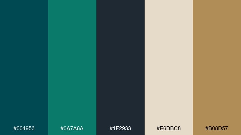
HEX: #004953 #0a7a6a #1f2933 #e6dbc8 #b08d57
Mood: sleek, modern, high-contrast
Best for: dark mode dashboard UI
Sleek and city-lit, these tones evoke glass towers, deep water, and warm brass reflections. Pair the dark base with muted cream for text blocks, then use teal for interactive states. It is a strong fit for analytics, fintech, and admin panels that need clarity without glare. Tip: use the brass tone only for key metrics or small badges to avoid visual noise.
Image example of emerald after dark generated using media.io
3) Rainy Conservatory
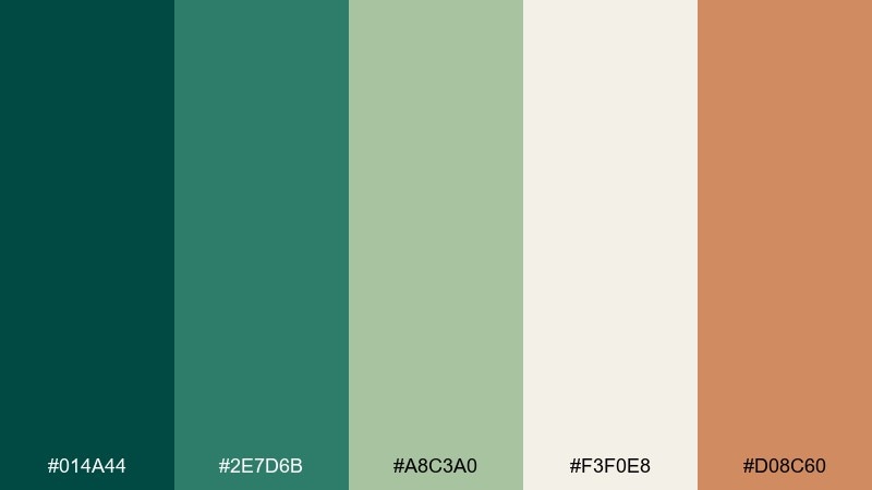
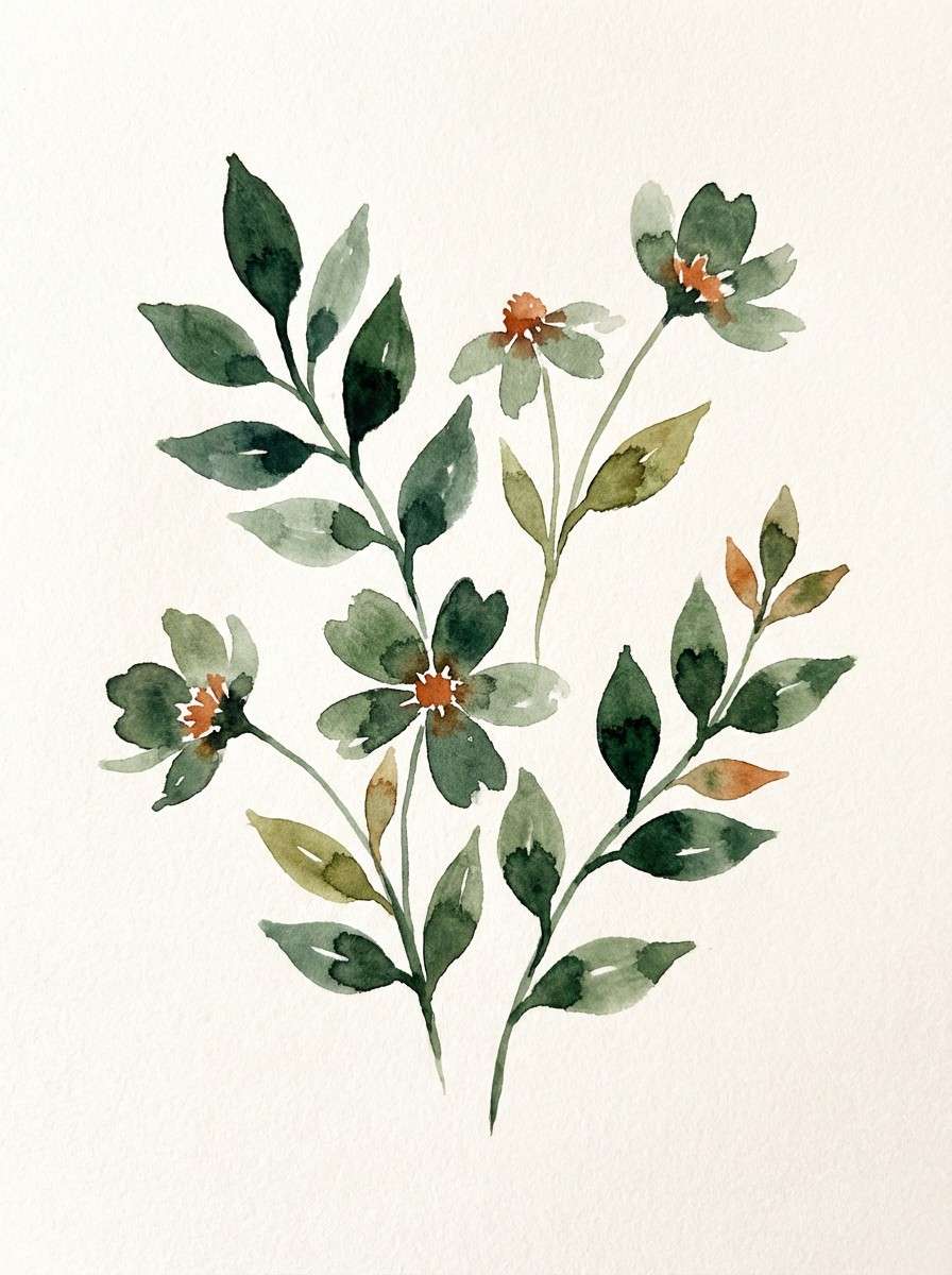
HEX: #014a44 #2e7d6b #a8c3a0 #f3f0e8 #d08c60
Mood: fresh, botanical, calm
Best for: watercolor botanical illustrations
Fresh and misty, this set feels like greenhouse leaves after rain with a soft clay pot nearby. Let the deeper green define stems and shadows, while the light sage and ivory keep the page airy. It suits packaging illustrations, stationery, and gentle lifestyle content. Tip: keep the terracotta as a small focal point so the greens stay serene.
Image example of rainy conservatory generated using media.io
4) Brass Library
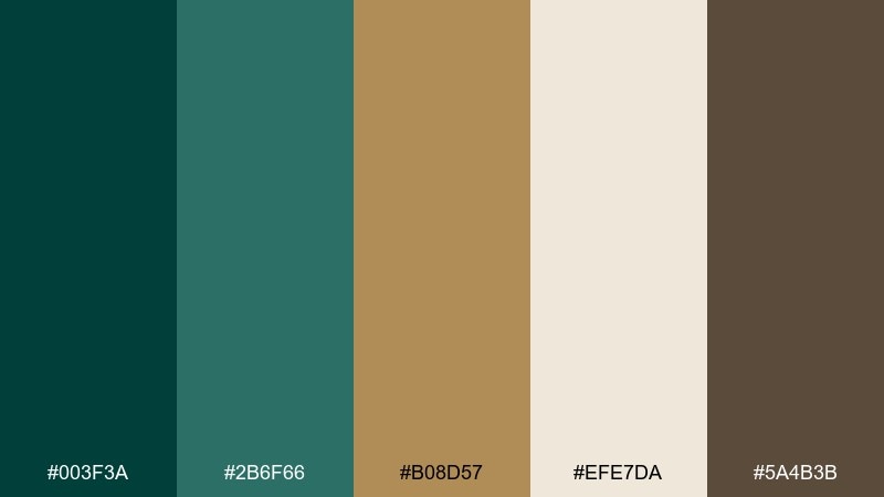
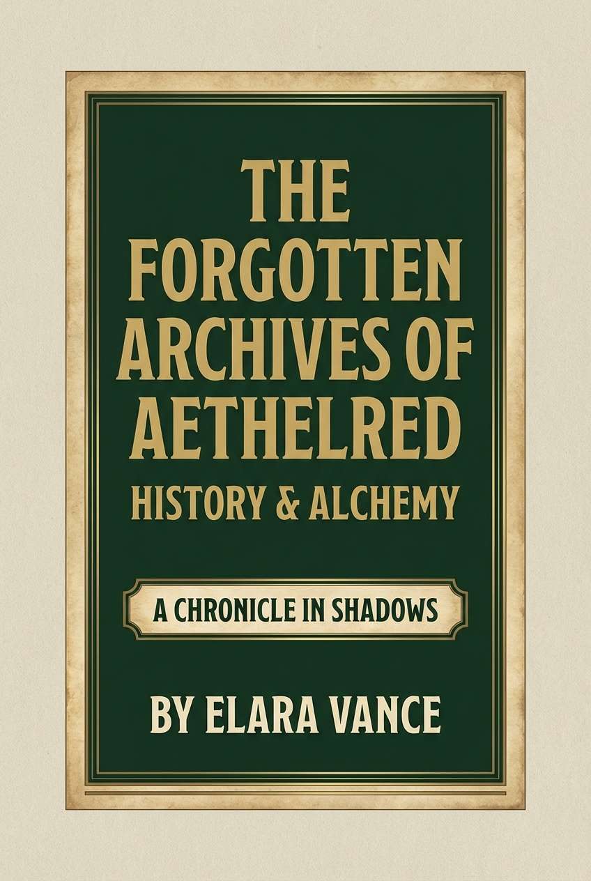
HEX: #003f3a #2b6f66 #b08d57 #efe7da #5a4b3b
Mood: academic, warm, classic
Best for: editorial book cover design
Academic and warm, it brings to mind leather spines, brass lamps, and quiet late-night reading. For a midnight green color palette like this, balance the depth with parchment beige and only a few metallic-like accents. It fits book covers, journals, and heritage-inspired brands. Tip: set headings in the brown for a softer contrast than pure black.
Image example of brass library generated using media.io
5) Coastal Fog
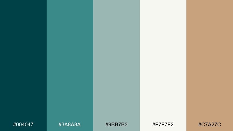
HEX: #004047 #3a8a8a #9bb7b3 #f7f7f2 #c7a27c
Mood: airy, coastal, relaxed
Best for: spa interior mood boards
Airy and coastal, these hues feel like sea mist rolling over stones with sun-bleached driftwood. Use the pale neutrals for large surfaces, then bring in the deeper green for cabinetry, signage, or a feature wall. It works well for wellness spaces, hotel lobbies, and calming home offices. Tip: repeat the warm tan in textures like linen or wood to keep the look inviting.
Image example of coastal fog generated using media.io
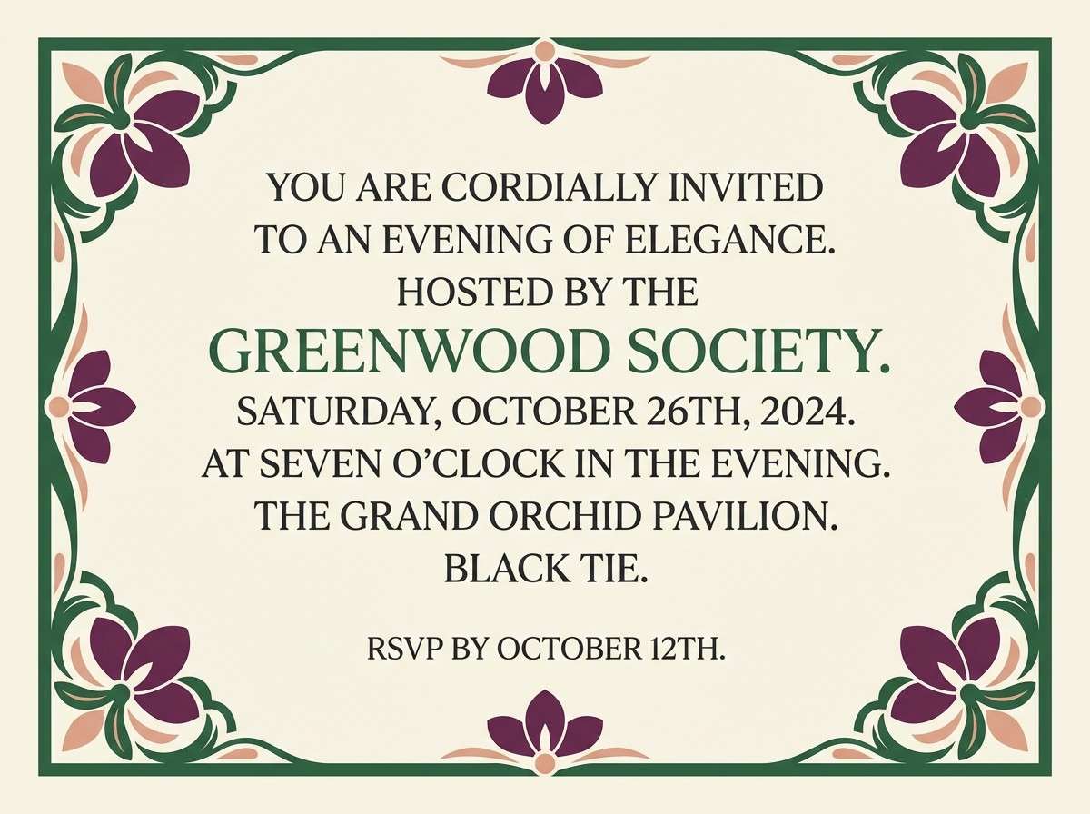
6) Velvet Orchid Accent
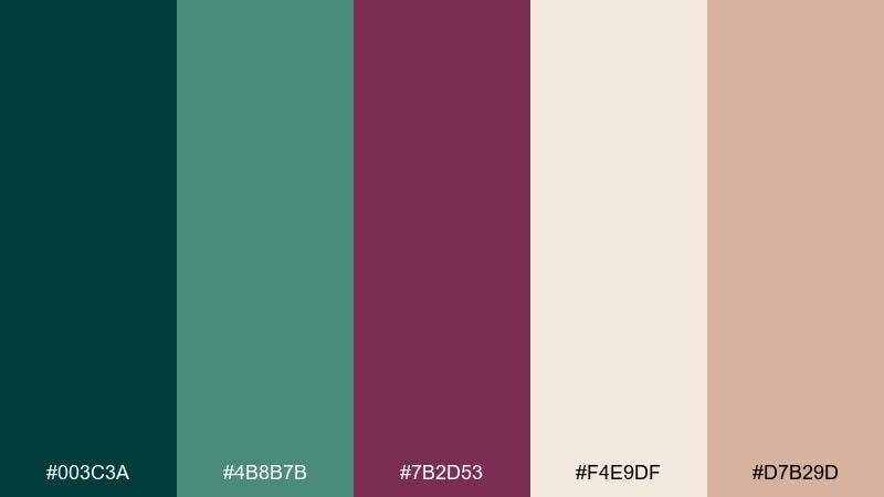
HEX: #003c3a #4b8b7b #7b2d53 #f4e9df #d7b29d
Mood: romantic, dramatic, luxe
Best for: evening event invitations
Romantic and dramatic, the tones suggest velvet drapes, candlelight, and a single orchid on a dark table. This midnight green color combination shines when you let the plum take over for florals or monograms. It is ideal for gala invitations, cocktail menus, and upscale event signage. Tip: print the cream as the main paper tone and use the dark green for borders to keep it readable.
Image example of velvet orchid accent generated using media.io
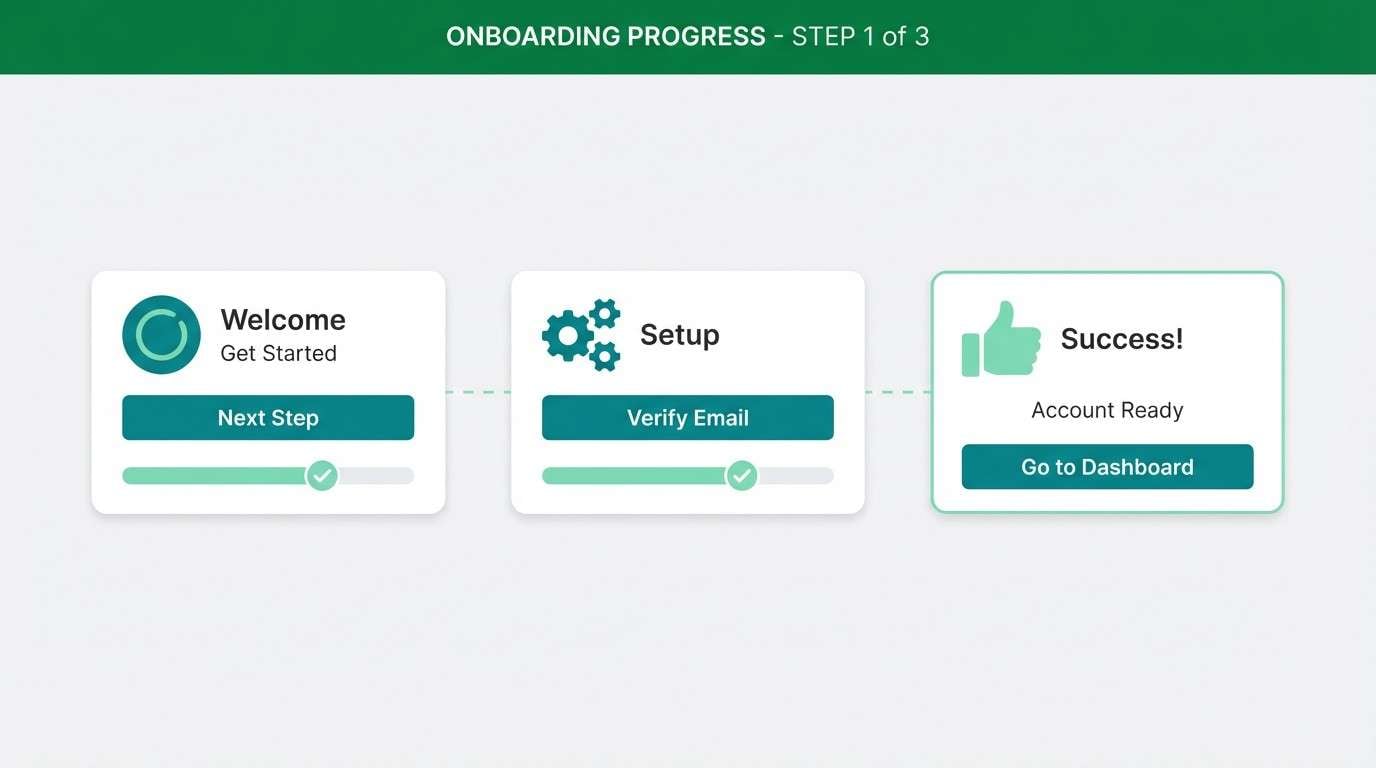
7) Graphite Mint Tech
HEX: #003a3a #1f6f6a #90bfb3 #2b2f36 #f5f5f5
Mood: clean, technical, confident
Best for: SaaS product UI and onboarding
Clean and technical, it feels like polished interfaces, quiet confidence, and crisp micro-interactions. A midnight green color scheme like this works best with graphite for structure and mint for success states and highlights. Use the light gray as your canvas to avoid the dark tones feeling heavy. Tip: keep primary buttons in teal and reserve mint for secondary confirmations.
Image example of graphite mint tech generated using media.io
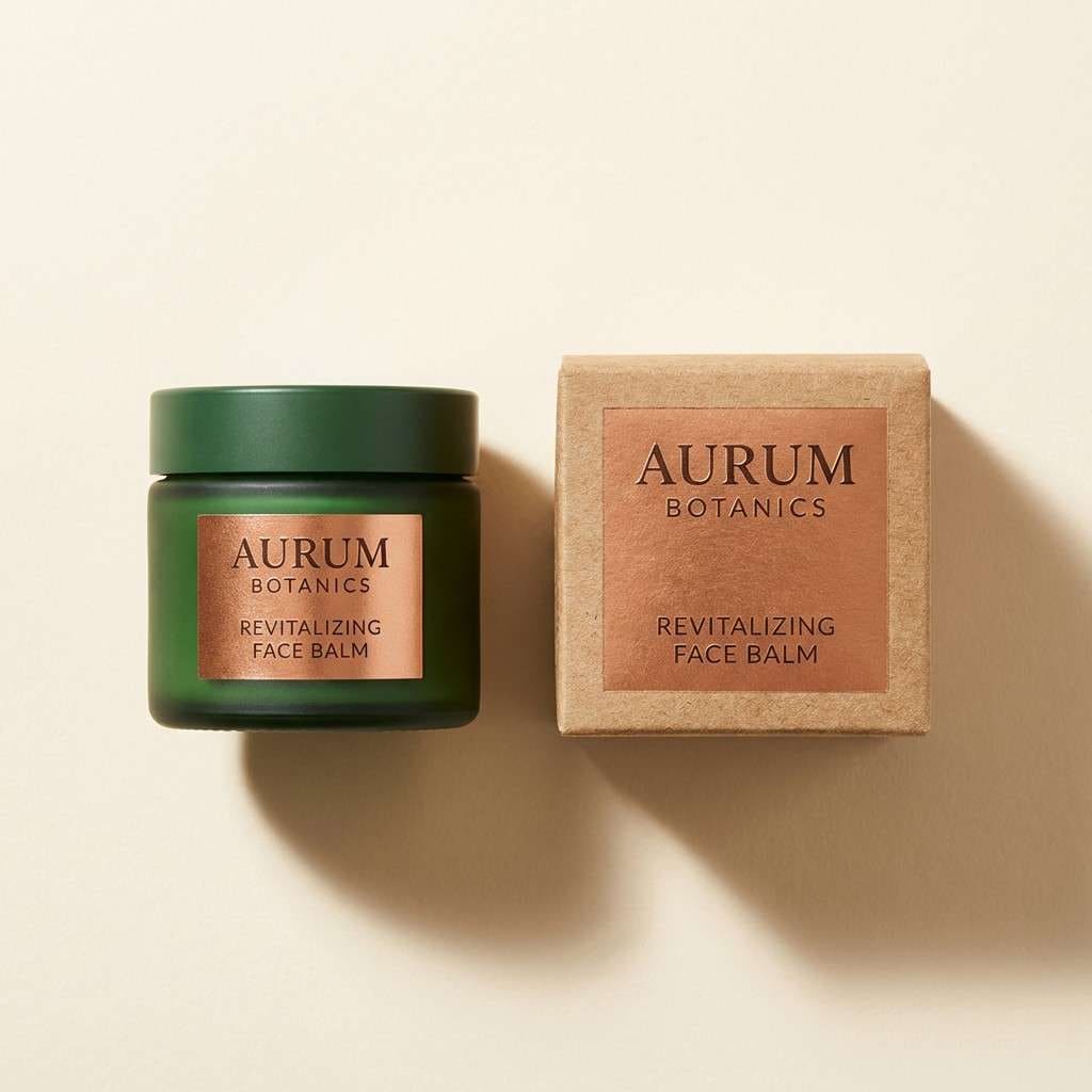
8) Copper Kelp Packaging
HEX: #004043 #0f5f5a #c06c3e #f3ede2 #3b2d2a
Mood: earthy, artisanal, bold
Best for: food or skincare packaging
Earthy and artisanal, it recalls kelp forests, clay-fired glaze, and hand-stamped labels. The copper tone adds appetite appeal against the deep greens, while the creamy neutral keeps the design approachable. It works for coffee, chocolate, sea-salt skincare, and small-batch goods. Tip: place copper on the product name and use the darkest brown for ingredient text to improve legibility.
Image example of copper kelp packaging generated using media.io
9) Sage Stone Minimal
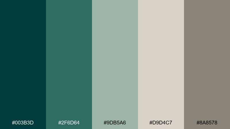
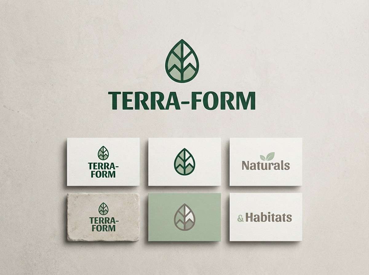
HEX: #003b3d #2f6d64 #9db5a6 #d9d4c7 #8a8578
Mood: minimal, calm, balanced
Best for: minimalist logo systems
Minimal and calm, these colors feel like river stones, soft moss, and matte ceramics. Use the deep green sparingly for marks and rules, then let the warm grays carry the bulk of the layout. It is excellent for architects, wellness coaches, and modern stationery. Tip: keep backgrounds in the light stone tone so the greens read crisp, not muddy.
Image example of sage stone minimal generated using media.io
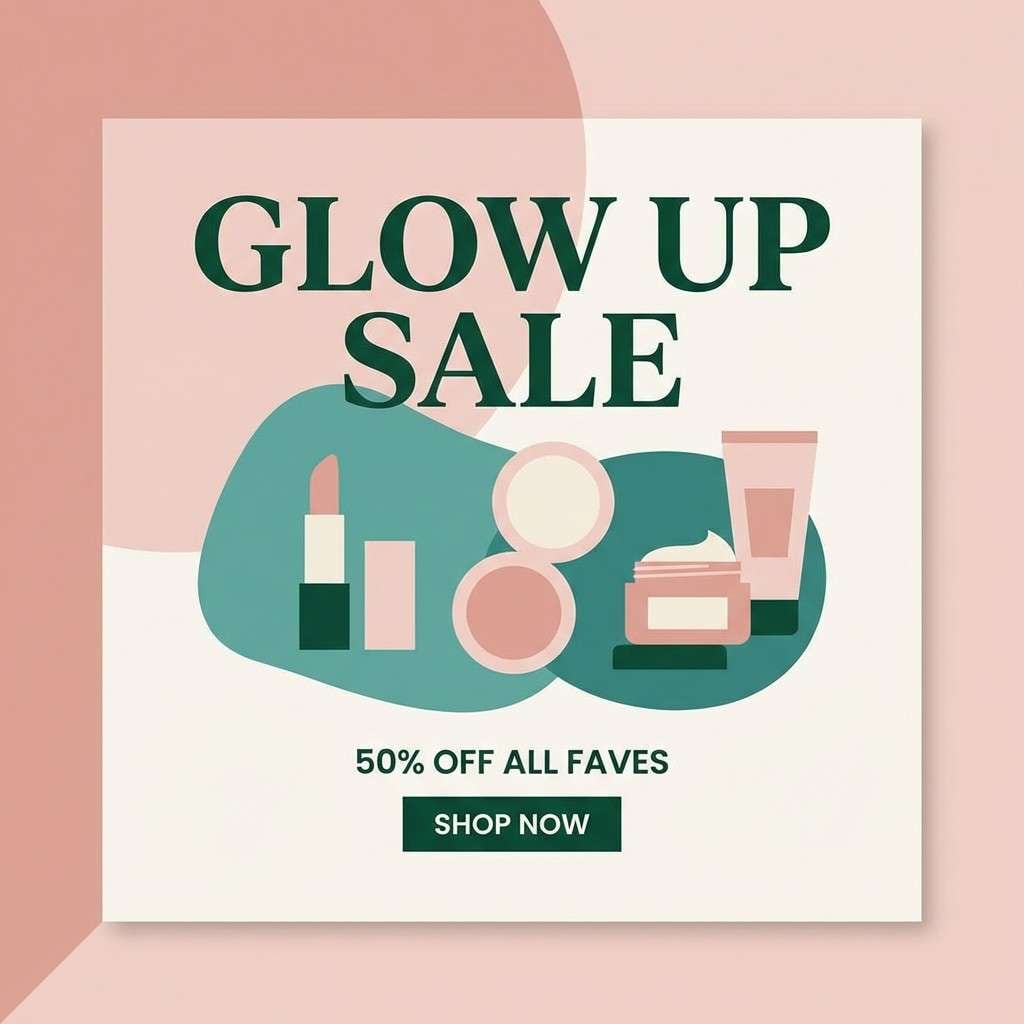
10) Midnight Green and Blush
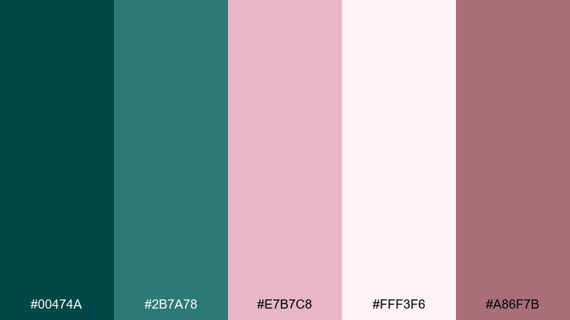
HEX: #00474a #2b7a78 #e7b7c8 #fff3f6 #a86f7b
Mood: soft, modern, romantic
Best for: beauty social media graphics
Soft and modern, it feels like rose petals against cool evening air. Midnight green color combinations with blush work especially well when you keep the pinks light and let teal handle contrast. Use it for skincare drops, salon promos, and gentle quote cards. Tip: set body text in the deep green and keep blush for background panels or subtle gradients.
Image example of midnight green and blush generated using media.io
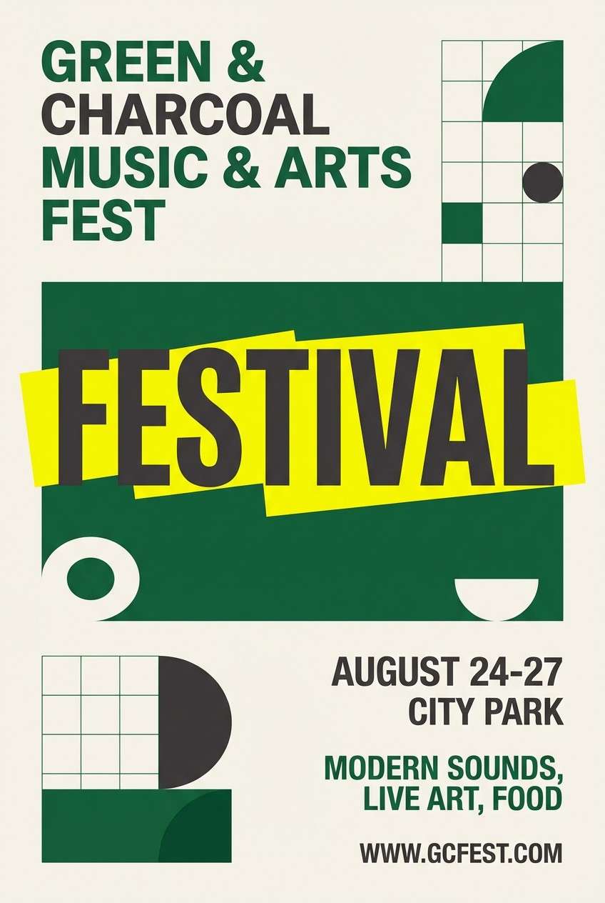
11) Pine and Lemon Zest
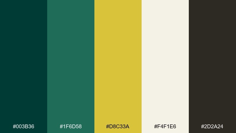
HEX: #003b36 #1f6d58 #d8c33a #f4f1e6 #2d2a24
Mood: energetic, outdoorsy, punchy
Best for: festival posters and promo art
Energetic and outdoorsy, it reads like pine needles lit by a sharp beam of sun. The lemon tone gives instant punch, while the deep green keeps the design grounded and mature. It is great for pop-up events, summer campaigns, and bold headlines. Tip: use lemon for only one key element per layout, like the date or call-to-action, to avoid visual fatigue.
Image example of pine and lemon zest generated using media.io
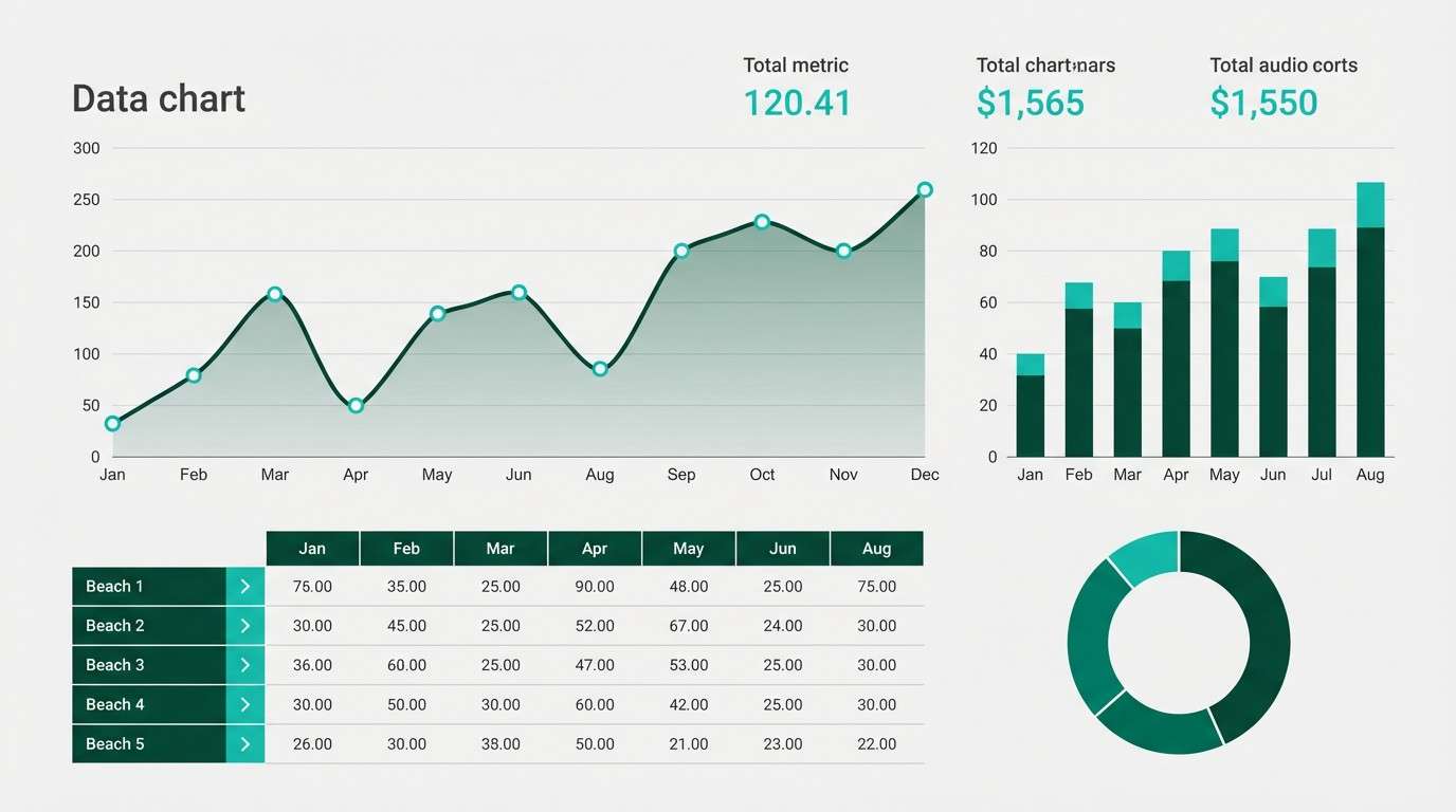
12) Stormglass Neutrals
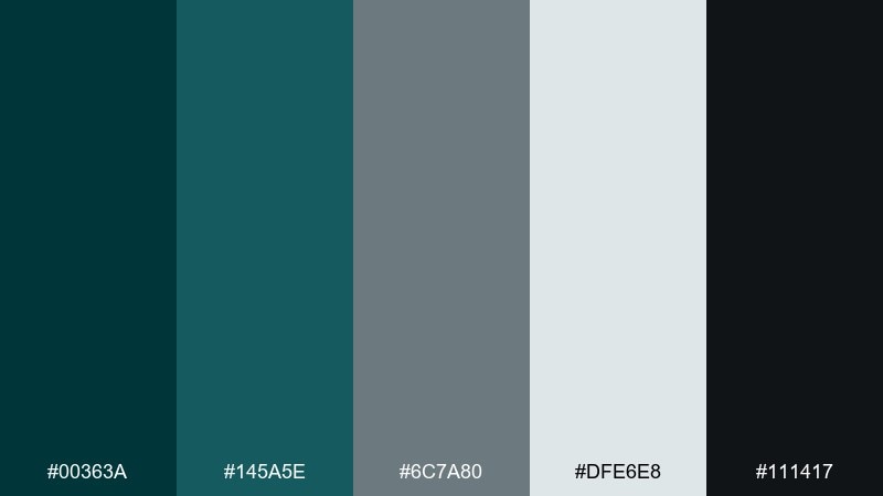
HEX: #00363a #145a5e #6c7a80 #dfe6e8 #111417
Mood: serious, cool, analytical
Best for: data visualization themes
Serious and cool, the palette feels like storm clouds over dark water with a clean, glassy finish. Use the light gray for chart backgrounds and grid lines, then deploy teal for your primary data series. It is a dependable set for reports, dashboards, and investor decks. Tip: keep the pure black only for titles so the rest of the content stays soft and readable.
Image example of stormglass neutrals generated using media.io
13) Antique Gold Ceremony
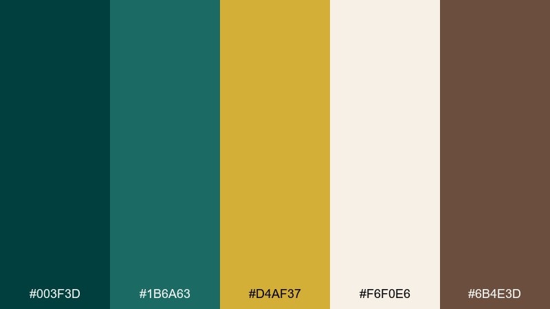
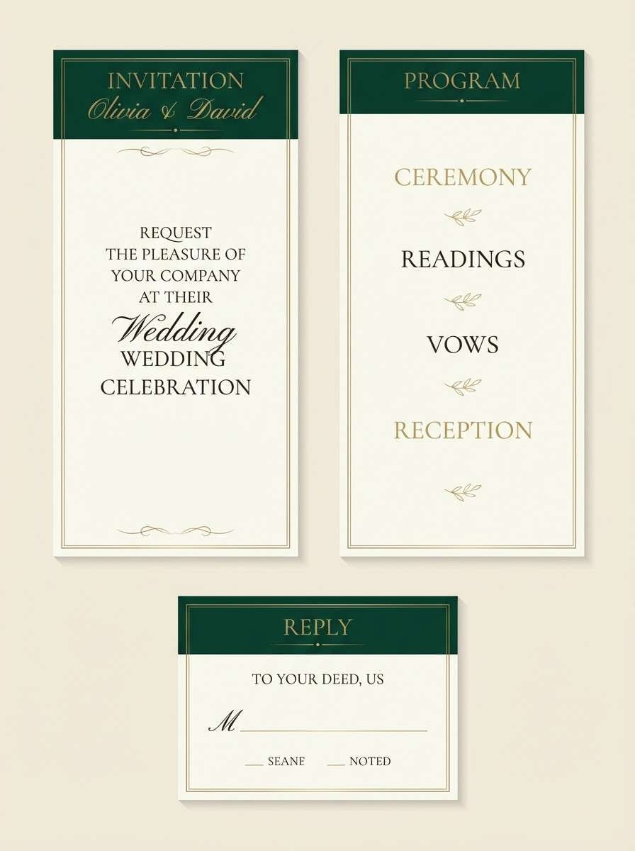
HEX: #003f3d #1b6a63 #d4af37 #f6f0e6 #6b4e3d
Mood: formal, celebratory, timeless
Best for: wedding suites and programs
Formal and celebratory, it evokes candlelit vows, gilded edges, and evergreen arrangements. Let the gold act as a thin foil-like accent around names or separators, while cream handles the page space. It is a strong fit for wedding programs, menus, and save-the-dates with a classic tone. Tip: keep gold to lines and small icons, and print main copy in brown for a softer luxury feel.
Image example of antique gold ceremony generated using media.io
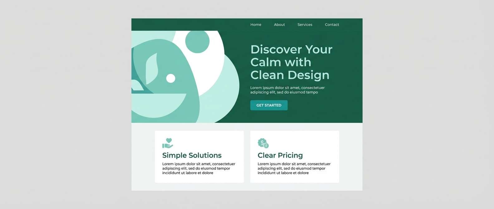
14) Winter Sea Glass
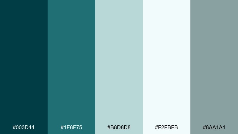
HEX: #003d44 #1f6f75 #b8d8d8 #f2fbfb #8aa1a1
Mood: crisp, coastal, serene
Best for: modern website landing pages
Crisp and serene, it suggests winter shoreline glass and clean ocean air. A midnight green color palette like this excels on websites where you want calm trust plus a touch of freshness. Use the icy tones for spacious sections and the deeper greens for navigation and key buttons. Tip: add contrast by keeping CTAs in the medium teal and reserving the darkest shade for headers only.
Image example of winter sea glass generated using media.io
15) Terracotta Garden Walls
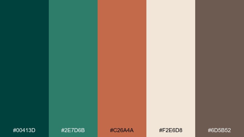
HEX: #00413d #2e7d6b #c26a4a #f2e6d8 #6d5b52
Mood: sun-warmed, earthy, welcoming
Best for: home decor and interior styling
Sun-warmed and welcoming, these tones feel like garden walls, herbs, and clay planters in late afternoon light. Use terracotta for textiles and small decor while the deeper greens handle cabinetry or accent paint. It is great for kitchen refreshes, patios, and Mediterranean-inspired styling. Tip: repeat the cream tone across large surfaces to keep the earthy accents from getting too heavy.
Image example of terracotta garden walls generated using media.io
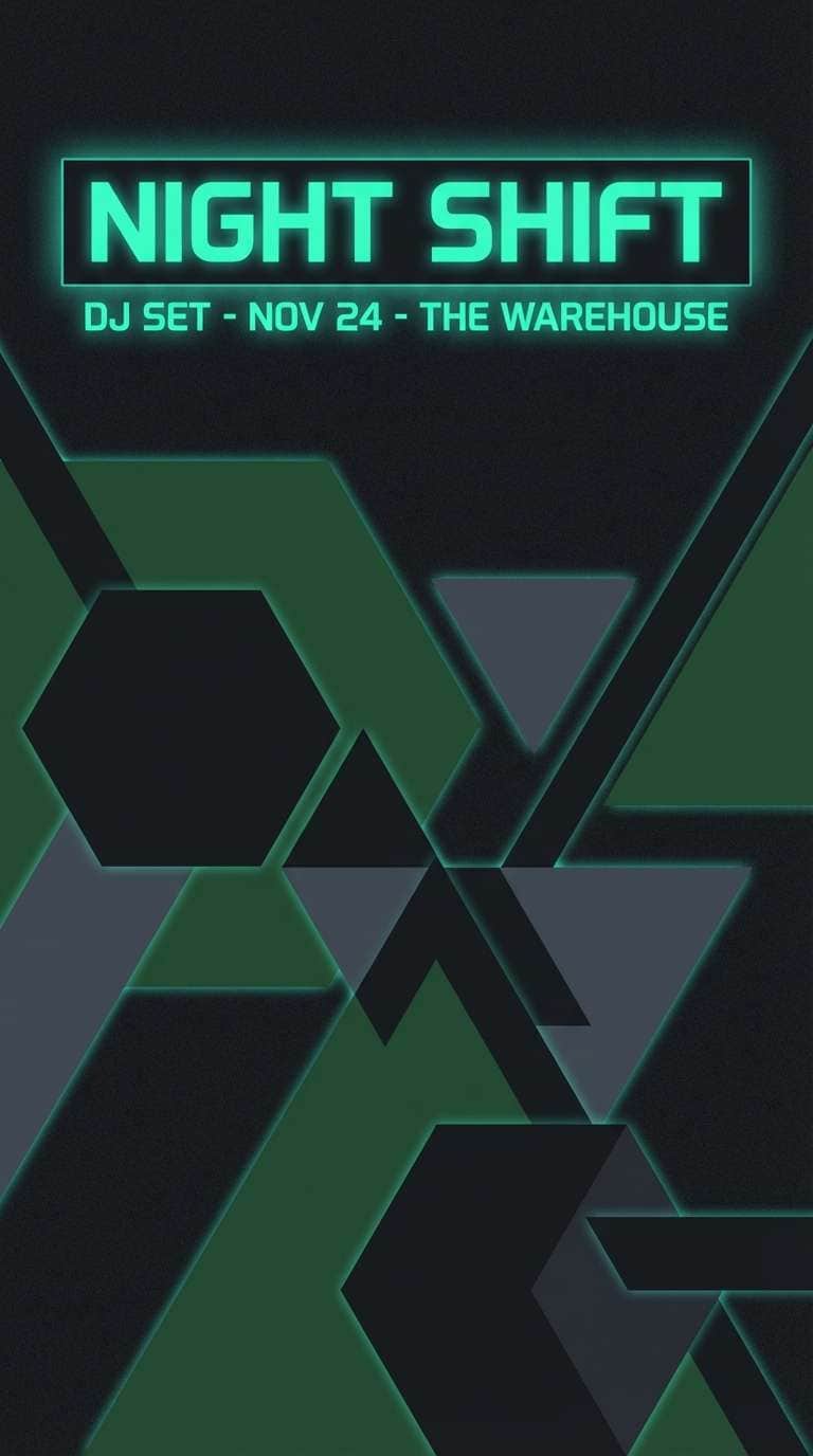
16) Neon Teal Nightlife
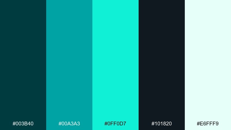
HEX: #003b40 #00a3a3 #0ff0d7 #101820 #e6fff9
Mood: electric, futuristic, nightlife
Best for: club flyers and DJ posters
Electric and futuristic, it feels like neon signage cutting through a dark alley. Keep the brightest teal for one headline or a glow effect, and let the near-black carry the background. It suits DJ posters, nightlife promos, and tech event graphics. Tip: limit gradients to small areas so the glow reads intentional rather than noisy.
Image example of neon teal nightlife generated using media.io
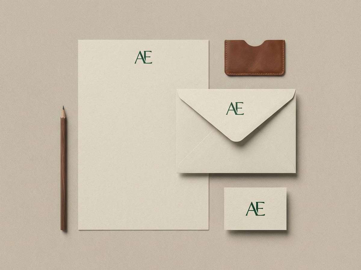
17) Walnut Ink Stationery
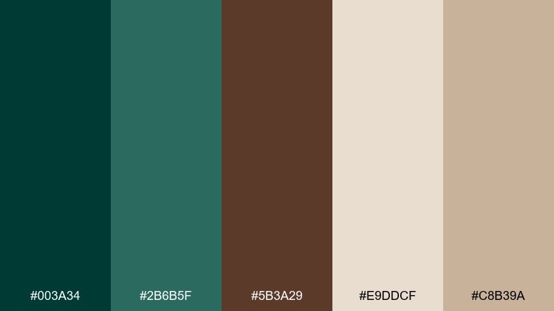
HEX: #003a34 #2b6b5f #5b3a29 #e9ddcf #c8b39a
Mood: cozy, handcrafted, classic
Best for: personal stationery sets
Cozy and handcrafted, it brings to mind fountain pen ink, walnut wood, and textured paper. Use the deep green for monograms and envelopes, then let warm beige and tan do the heavy lifting for the paper stock. It is ideal for thank-you cards, small business notes, and artisan labels. Tip: add the brown as a secondary ink for signatures and small icons to keep contrast gentle.
Image example of walnut ink stationery generated using media.io
18) Glacier Type
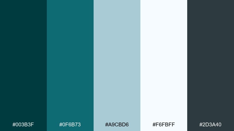
HEX: #003b3f #0f6b73 #a9cbd6 #f6fbff #2d3a40
Mood: fresh, professional, airy
Best for: mobile app UI typography systems
Fresh and professional, this set feels like cold air, clean glass, and sharp typography. Use the pale blue-gray for surfaces, then rely on the deep green and slate for text hierarchy. It is excellent for productivity apps, reading experiences, and tool-focused interfaces. Tip: keep interactive states in the medium teal so the UI stays consistent and easy to scan.
Image example of glacier type generated using media.io
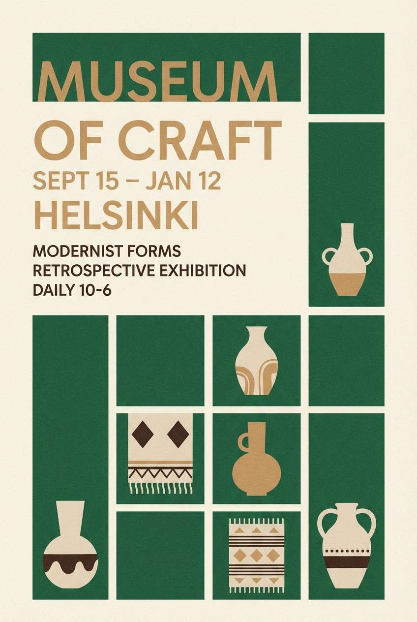
19) Museum Night Poster
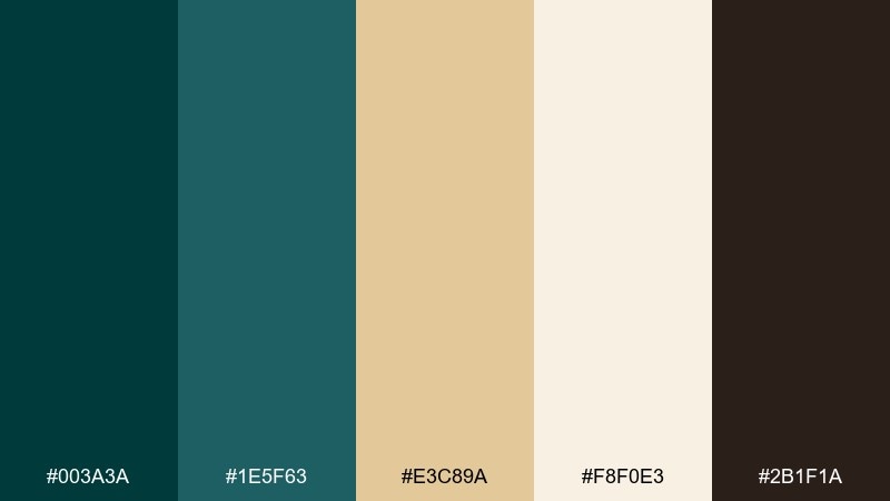
HEX: #003a3a #1e5f63 #e3c89a #f8f0e3 #2b1f1a
Mood: cultured, moody, cinematic
Best for: museum exhibition posters
Cultured and cinematic, it evokes dim galleries, spotlighted artifacts, and warm ticket stubs. Use the creamy tone for negative space and the tan for dates or exhibit details, keeping the greens for large blocks and framing. It works well for posters, cultural events, and film-inspired campaigns. Tip: add texture subtly with grain in the background so the palette stays elegant, not flat.
Image example of museum night poster generated using media.io
20) Charcoal Rose Luxe
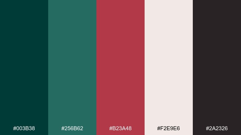
HEX: #003b38 #256b62 #b23a48 #f2e9e6 #2a2326
Mood: luxury, confident, fashion-forward
Best for: luxury branding and product ads
Luxury and confident, it feels like a tailored suit with a single rose detail. The muted rose adds personality without turning overly sweet, while charcoal keeps everything grounded. It is a strong choice for fashion labels, cosmetics, and premium subscription boxes. Tip: use the rose only for one signature element, like a logo stamp or price callout, to keep the look high-end.
Image example of charcoal rose luxe generated using media.io
What Colors Go Well with Midnight Green?
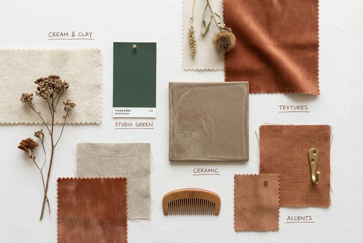
Warm metallics and earth tones are a natural match: antique gold, brass, tan, camel, terracotta, and walnut help midnight green feel richer and more classic. These pairings work especially well for wedding suites, premium packaging, and heritage branding.
If you want a fresher, more modern look, go cooler with sea-glass, mint, pale blue-gray, and clean off-white. Midnight green also plays nicely with charcoal for structure, creating a sharp, tech-forward contrast that stays easy on the eyes.
For a bolder statement, try a single vivid accent—lemon zest, neon teal, or a muted rose. The key is restraint: one standout color, supported by neutrals, keeps the palette polished.
How to Use a Midnight Green Color Palette in Real Designs
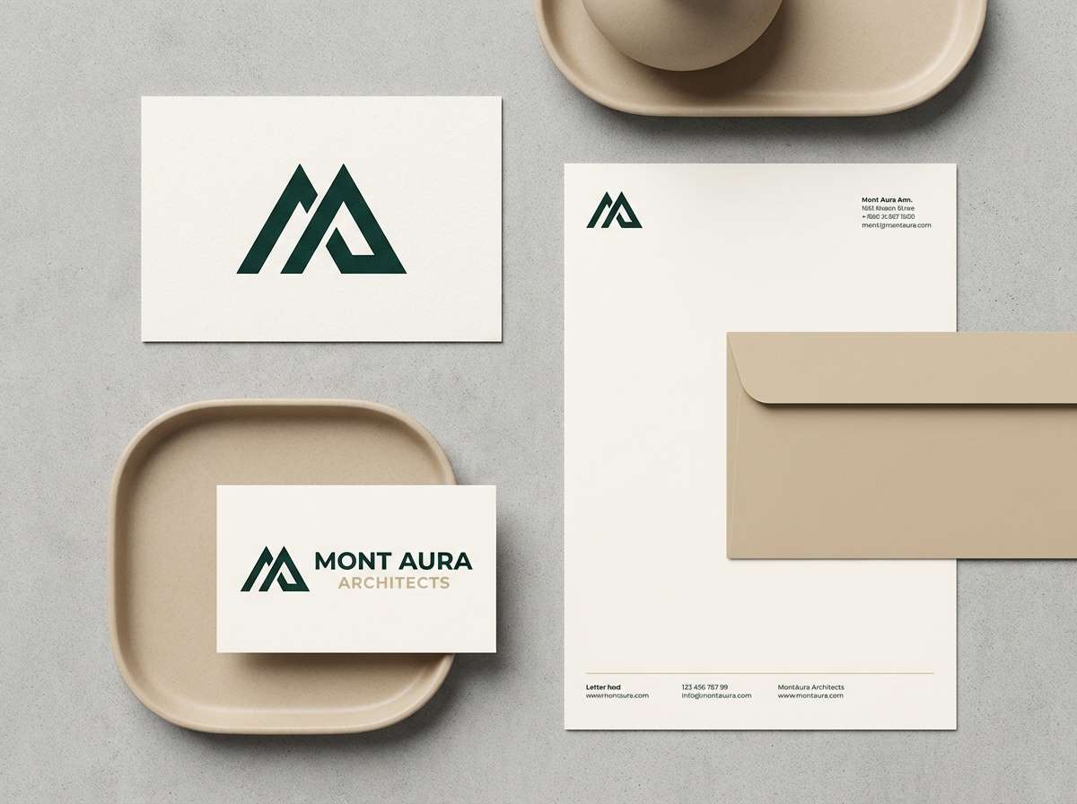
In branding, use midnight green as the primary “anchor” color for logos, headers, and key panels, then choose one warm accent (gold/copper/terracotta) for small highlights. Pair with an off-white background so typography stays crisp and premium.
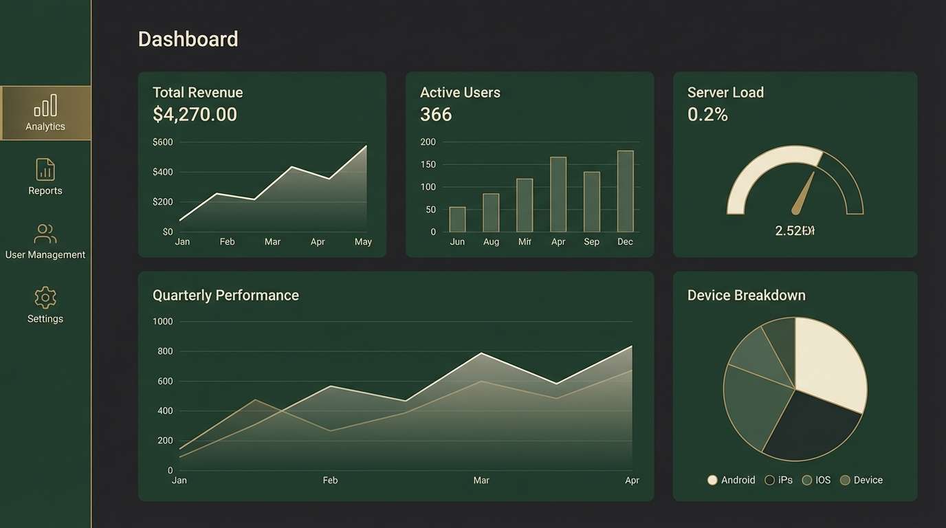
For UI, midnight green works well in both light and dark themes: use it for navigation and primary buttons, keep surfaces light gray/ivory for readability, and reserve brighter teals or mint for interactive states (hover, success, focus).
In interiors and print, balance is everything. Large areas in cream or soft stone prevent the deep green from feeling heavy, while wood textures and brass fixtures add warmth and depth without increasing saturation.
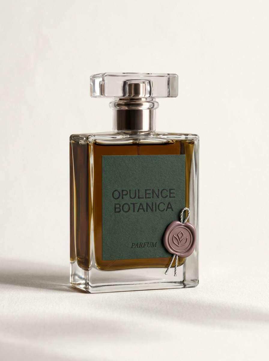
Create Midnight Green Palette Visuals with AI
If you already have HEX codes, the fastest way to validate a midnight green palette is to see it in context—on a landing page, invitation, product label, or poster layout. Visual mockups reveal contrast issues and help you decide where accents should appear.
With Media.io, you can generate palette-based design examples from a prompt, then iterate quickly by changing one accent color at a time. This is especially useful when you’re comparing “gold vs. copper” or “blush vs. rose” for the same base green.
Start with one of the prompts above, swap in your brand keywords, and keep the output consistent using a fixed aspect ratio.
Midnight Green Color Palette FAQs
-
What is the HEX code for midnight green?
Midnight green is a deep teal-leaning green, and common “midnight green” bases in this article include #003b3f, #004047, and #003f3d. Choose the exact shade based on whether you want it to feel more teal (cooler) or more green (earthier). -
Is midnight green more teal or more green?
It usually leans teal because it contains noticeable blue/blue-gray undertones. That’s why it pairs so well with sea-glass, mint, and cool neutrals, while still working with earthy accents like tan and terracotta. -
What colors pair best with midnight green for branding?
For premium branding, pair midnight green with cream/off-white and a warm accent like brass, antique gold, or copper. Add charcoal or deep brown for typography to keep contrast elegant rather than stark. -
Can I use midnight green in a dark mode UI?
Yes—midnight green is excellent in dark mode when you separate surfaces (cards) with slightly lighter charcoal or teal-grays, and keep text in soft cream instead of pure white. Use one accent color for interactive states to avoid visual noise. -
What’s a good complementary accent for midnight green?
Warm golds and yellow-leaning accents pop against midnight green because they contrast both in hue and perceived temperature. If you want a modern twist, try a controlled neon teal or a muted rose as a single signature highlight. -
How do I keep a midnight green palette from feeling too heavy?
Increase the amount of light neutrals (ivory, off-white, pale gray) and use midnight green as a frame: navigation bars, borders, headings, or feature areas. Limiting saturated accents to small elements also keeps the overall look airy. -
How can I preview a midnight green color palette before designing?
Generate a few mockups—like a landing page hero, product label, or invitation—using the same palette and consistent layout. Seeing the colors in context helps you confirm readability, contrast, and whether the accent color is too loud or too subtle.
Next: Lust Color Palette


