

Neon color palettes are built for impact: they glow, pop, and instantly pull attention toward headlines, buttons, and hero graphics. Used well, they can feel modern, premium, and surprisingly readable.
Below are 20+ neon palette ideas with HEX codes, plus practical tips for balancing fluorescent colors with neutrals so your UI, branding, or posters look intentional—not chaotic.
In this article
- Why Neon Palettes Work So Well
-
- electric citrus
- cyber pop
- acid sunset
- laser lagoon
- ultraviolet punch
- neon noir
- arcade glow
- tropical rave
- hologram drift
- radiant coral lime
- synthetic orchard
- plasma peach
- nightclub violet
- hyperline teal
- candy voltage
- future dusk
- prism party
- glowstick garden
- electric sakura
- highlighter heat
- photon freeze
- voltage velvet
- What Colors Go Well with Neon?
- How to Use a Neon Color Palette in Real Designs
- Create Neon Palette Visuals with AI
Why Neon Palettes Work So Well
Neon palettes win attention because they sit near the brightest edge of the color spectrum. Against dark backgrounds or clean neutrals, fluorescent colors create instant hierarchy—your eyes naturally go to the “glow” first.
They also signal specific aesthetics quickly: cyberpunk, club nightlife, retro arcade, festival posters, and modern tech branding. That emotional shortcut makes neon color combinations great for posters, splash screens, and bold marketing moments.
With a little restraint—one hero neon, one support neon, and a stable neutral—you get high contrast colors that still feel polished and readable across screens.
20+ Neon Color Palette Ideas (with HEX Codes)
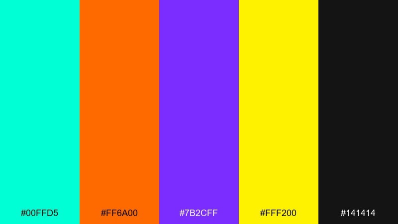
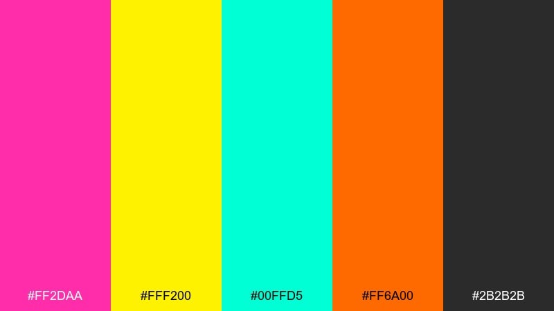
1) Electric Citrus
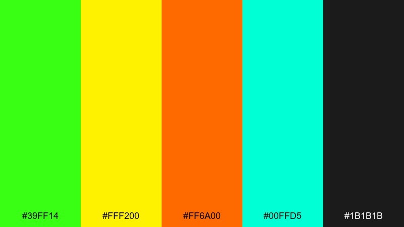
HEX: #39FF14 #FFF200 #FF6A00 #00FFD5 #1B1B1B
Mood: zesty, high-energy, attention-grabbing
Best for: product promo poster
Zesty and high-energy, it feels like citrus peel under blacklight and a late-night street fair. This neon color palette works best when you let the lime and yellow lead and keep the charcoal for breathing room. Use it for product promos, price tags, and bold CTAs, then pair with clean sans-serif type. Tip: reserve the orange for highlights so the layout stays punchy, not chaotic.
Image example of electric citrus generated using media.io
Media.io is an online AI studio for creating and editing video, image, and audio in your browser.

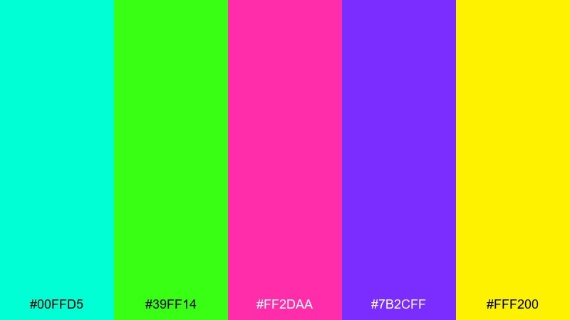
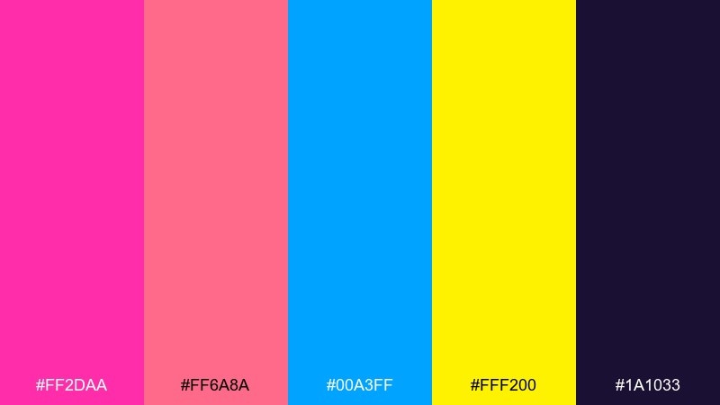
2) Cyber Pop
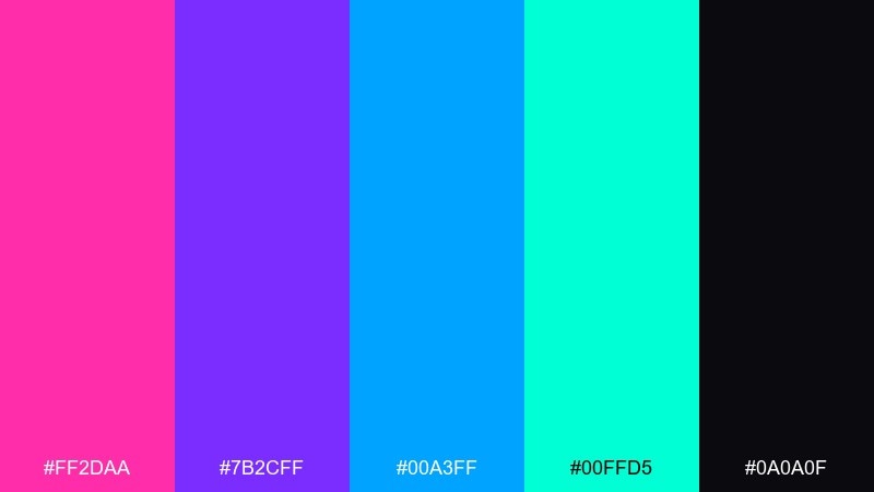
HEX: #FF2DAA #7B2CFF #00A3FF #00FFD5 #0A0A0F
Mood: futuristic, playful, club-lit
Best for: music event flyer
Futuristic and playful, it evokes LED signs, synth hooks, and glossy dance floors. Push the pink and violet as the hero tones, then let cyan and blue carry the motion in gradients or stripes. It shines on music flyers, DJ lineups, and social story promos with big type blocks. Tip: use the near-black as a framing border to keep the glow controlled.
Image example of cyber pop generated using media.io
3) Acid Sunset
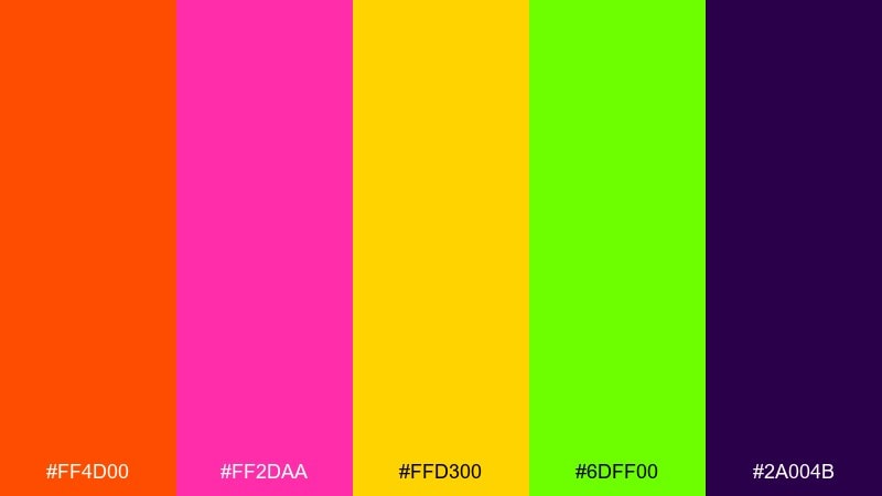
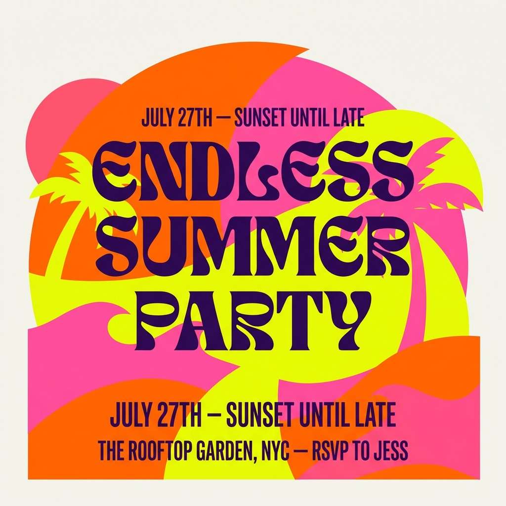
HEX: #FF4D00 #FF2DAA #FFD300 #6DFF00 #2A004B
Mood: wild, warm, rave-sunset
Best for: summer party invitation
Wild and warm, it looks like a sunset melting into a rave horizon. Keep the purple as the anchor so the orange and pink feel intentional rather than loud. Great for summer invitations, pool-party graphics, and energetic headers where you want instant heat. Tip: set body text in purple on yellow for readable contrast without losing the vibe.
Image example of acid sunset generated using media.io
4) Laser Lagoon
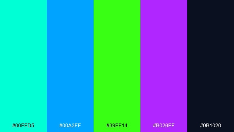
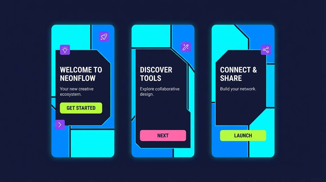
HEX: #00FFD5 #00A3FF #39FF14 #B026FF #0B1020
Mood: cool, aquatic, sci-fi glow
Best for: app onboarding screens
Cool and aquatic, it brings to mind laser reflections on dark water and futuristic pool lights. Use the deep navy as the base, then layer cyan and blue for primary surfaces with lime as your action color. It fits app onboarding, feature callouts, and motion graphics where clarity matters. Tip: keep gradients subtle so the lime accents stay unmistakably clickable.
Image example of laser lagoon generated using media.io
5) Ultraviolet Punch
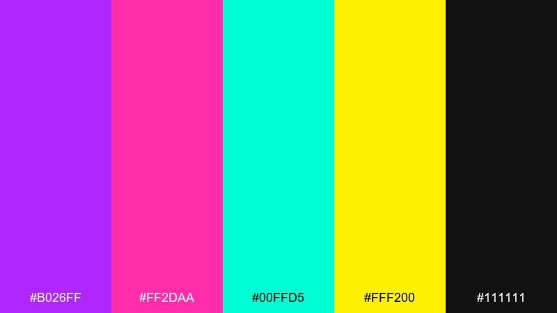
HEX: #B026FF #FF2DAA #00FFD5 #FFF200 #111111
Mood: bold, punchy, nightlife-forward
Best for: nightclub poster
Bold and punchy, it feels like ultraviolet tubes, glossy lips, and a packed dancefloor. These neon color combinations look best with violet as the stage light and pink as the headline, while cyan adds sharp contrast. Use it for nightclub posters, cover art, and announcement graphics that need instant impact. Tip: keep backgrounds near-black and avoid heavy textures so the colors stay razor clean.
Image example of ultraviolet punch generated using media.io
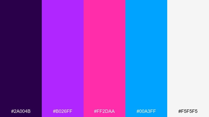
6) Neon Noir
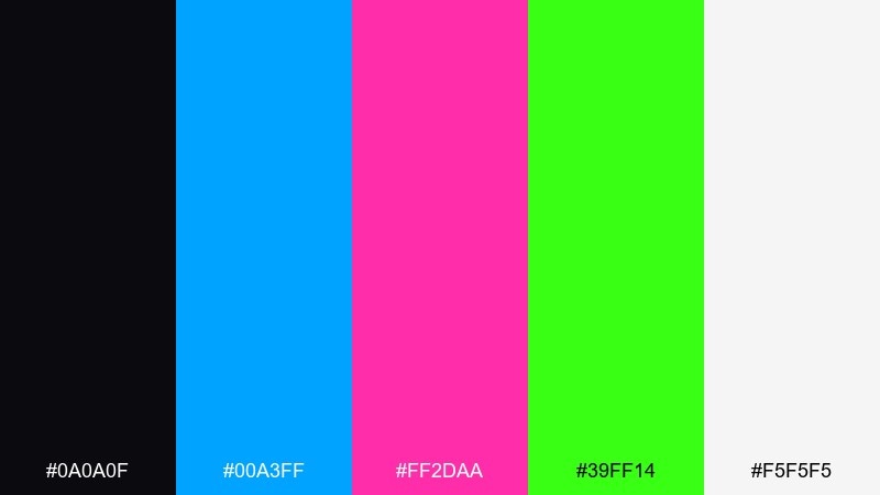
HEX: #0A0A0F #00A3FF #FF2DAA #39FF14 #F5F5F5
Mood: moody, cinematic, high-contrast
Best for: gaming stream overlay
Moody and cinematic, it channels rain-slick streets with glowing signage. Keep the background nearly black, then let one bright hue lead per section for a clean hierarchy. Perfect for gaming overlays, esports banners, and profile headers where readability matters. Tip: use off-white for small labels so the neon accents can stay sparse and dramatic.
Image example of neon noir generated using media.io
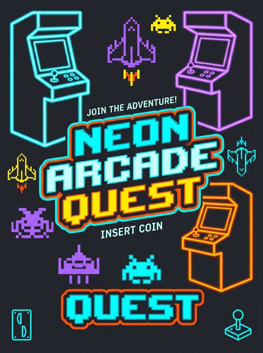
7) Arcade Glow
HEX: #00FFD5 #FF6A00 #7B2CFF #FFF200 #141414
Mood: retro, playful, coin-op bright
Best for: retro game poster
Retro and playful, it recalls coin-op cabinets, pixel blasts, and glowing scoreboards. Use cyan and violet for the main blocks, then sprinkle yellow like tokens and orange like bonus hits. Ideal for retro game posters, tournament announcements, or playful merch graphics. Tip: add thick outlines in charcoal to keep shapes crisp at a distance.
Image example of arcade glow generated using media.io
8) Tropical Rave
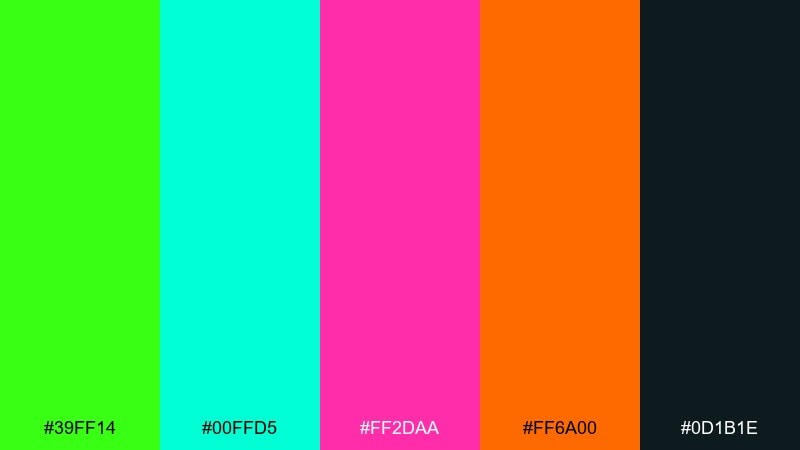
HEX: #39FF14 #00FFD5 #FF2DAA #FF6A00 #0D1B1E
Mood: humid, energetic, beach-night
Best for: cocktail menu design
Humid and energetic, it feels like palm leaves under LEDs and a beach party after dark. Let the teal and lime set the base, then bring in pink for section headers and orange for prices or icons. Great for cocktail menus, pool-bar signage, and summer social graphics. Tip: keep the background deep teal and limit gradients to small accents for a clean read.
Image example of tropical rave generated using media.io
9) Hologram Drift
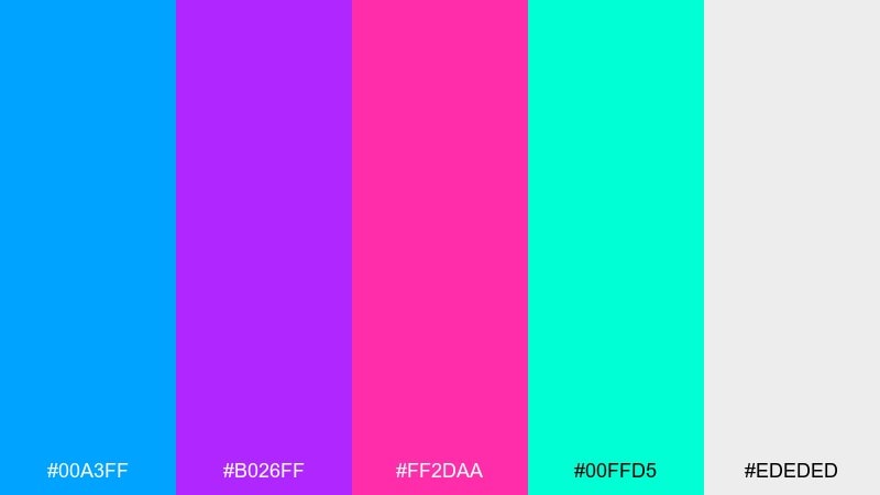
HEX: #00A3FF #B026FF #FF2DAA #00FFD5 #EDEDED
Mood: dreamy, glossy, futuristic
Best for: tech conference landing page
Dreamy and glossy, it suggests holographic film, soft reflections, and futuristic product reveals. These neon color combinations work best with blue and violet as the core, then pink and cyan as drifting highlights. Use it for tech landing pages, speaker sections, and hero banners that need modern flair without clutter. Tip: keep plenty of light neutral space so gradients feel premium, not busy.
Image example of hologram drift generated using media.io
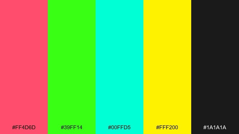
10) Radiant Coral Lime
HEX: #FF4D6D #39FF14 #00FFD5 #FFF200 #1A1A1A
Mood: fresh, sporty, highlighter-bright
Best for: fitness app UI
Fresh and sporty, it reads like highlighter marks on a clean training plan. Use lime for primary actions, coral for emphasis, and cyan for progress indicators while black handles text clarity. It fits fitness dashboards, streak badges, and motivational banners. Tip: avoid using yellow for long text blocks and keep it for icons or small metrics callouts.
Image example of radiant coral lime generated using media.io
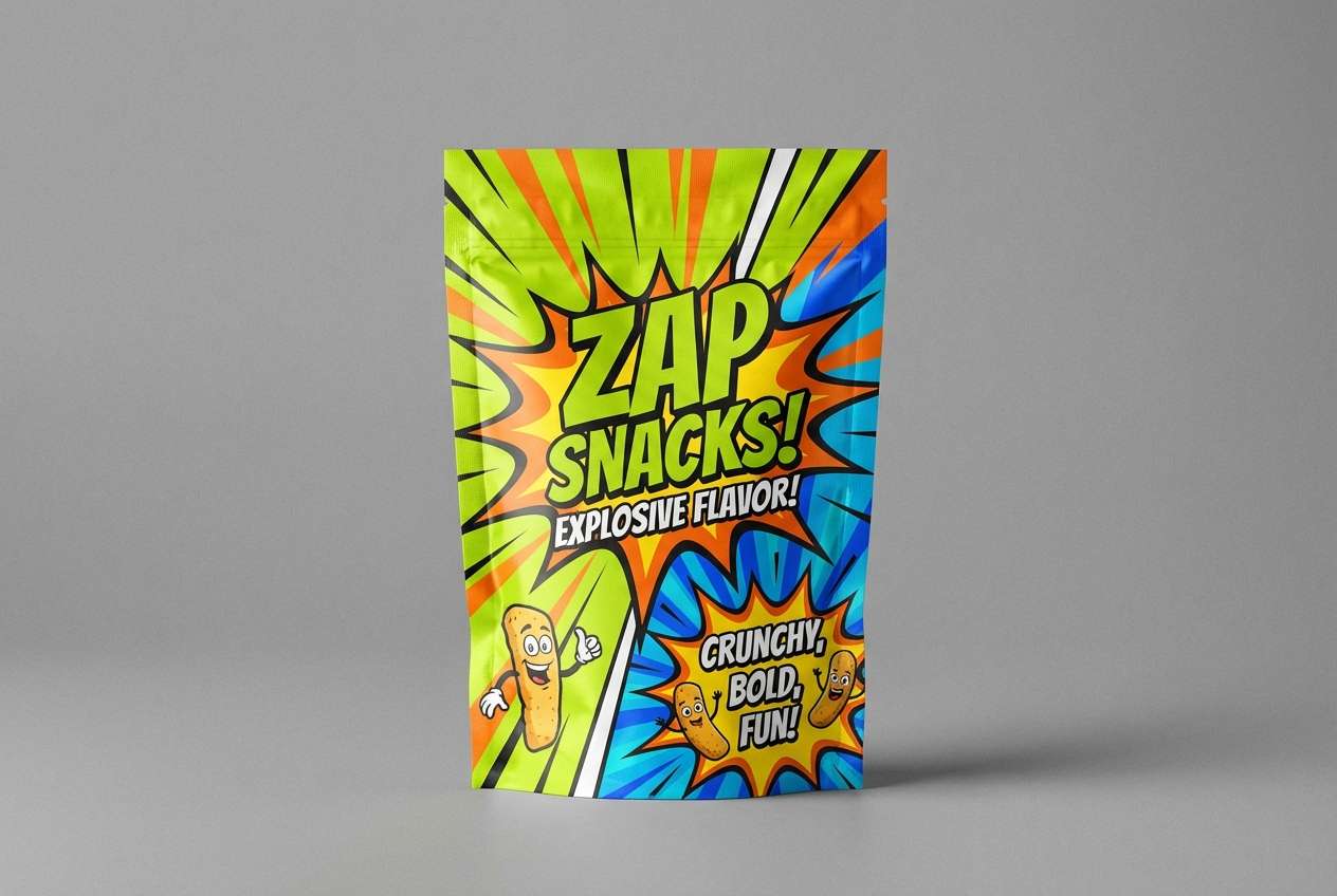
11) Synthetic Orchard
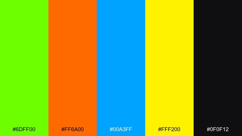
HEX: #6DFF00 #FF6A00 #00A3FF #FFF200 #0F0F12
Mood: quirky, upbeat, pop-art
Best for: snack packaging concept
Quirky and upbeat, it feels like pop-art fruit stickers and candy-coated energy. Let lime and orange do the heavy lifting, then use electric blue for contrast blocks and yellow for small bursts. Strong for snack packaging, limited-edition labels, and shelf-ready mockups. Tip: keep one side panel mostly dark so your product name stays legible from afar.
Image example of synthetic orchard generated using media.io
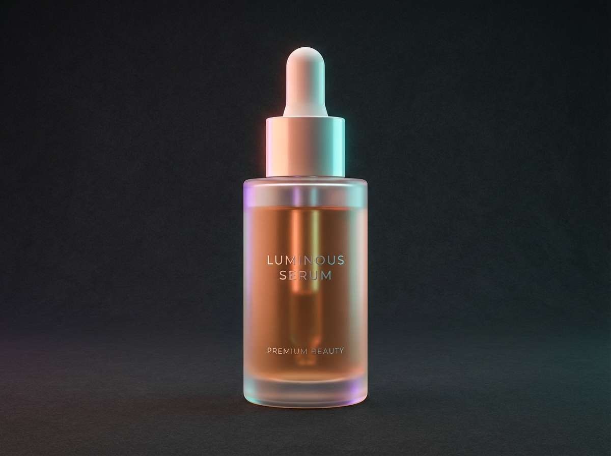
12) Plasma Peach
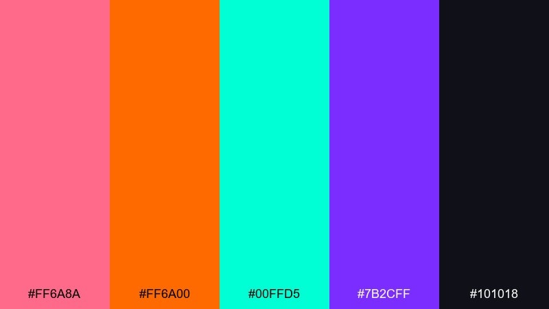
HEX: #FF6A8A #FF6A00 #00FFD5 #7B2CFF #101018
Mood: sweet, electric, modern-pop
Best for: beauty product ad
Sweet yet electric, it suggests peach soda fizz with a violet afterglow. Make peach the hero for product areas, then use cyan for shine and violet for depth and shadows. Great for beauty ads, launch graphics, and glossy promo banners. Tip: keep type in near-black and use cyan only for small reflective details to avoid glare.
Image example of plasma peach generated using media.io
13) Nightclub Violet
HEX: #2A004B #B026FF #FF2DAA #00A3FF #F5F5F5
Mood: dramatic, luxe, late-night
Best for: editorial cover layout
Dramatic and luxe, it feels like velvet curtains lit by violet spots and pink neon signs. Use the deep purple for large fields, then layer violet and pink for headlines and pull quotes. It suits editorial covers, fashion features, and announcement spreads that need a nightlife edge. Tip: keep margins generous and let off-white do the quiet work of readability.
Image example of nightclub violet generated using media.io
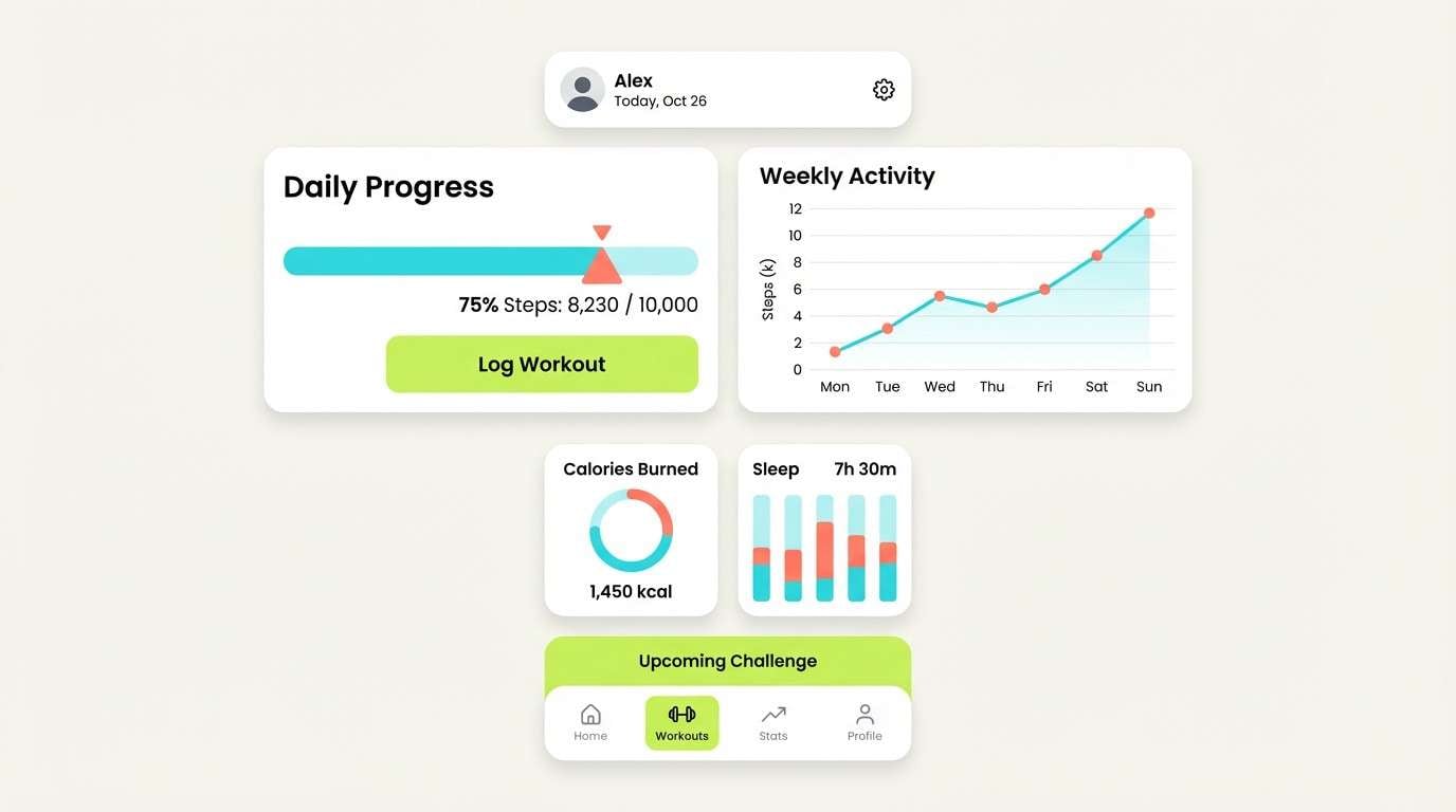
14) Hyperline Teal
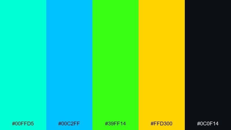
HEX: #00FFD5 #00C2FF #39FF14 #FFD300 #0C0F14
Mood: fast, technical, energized
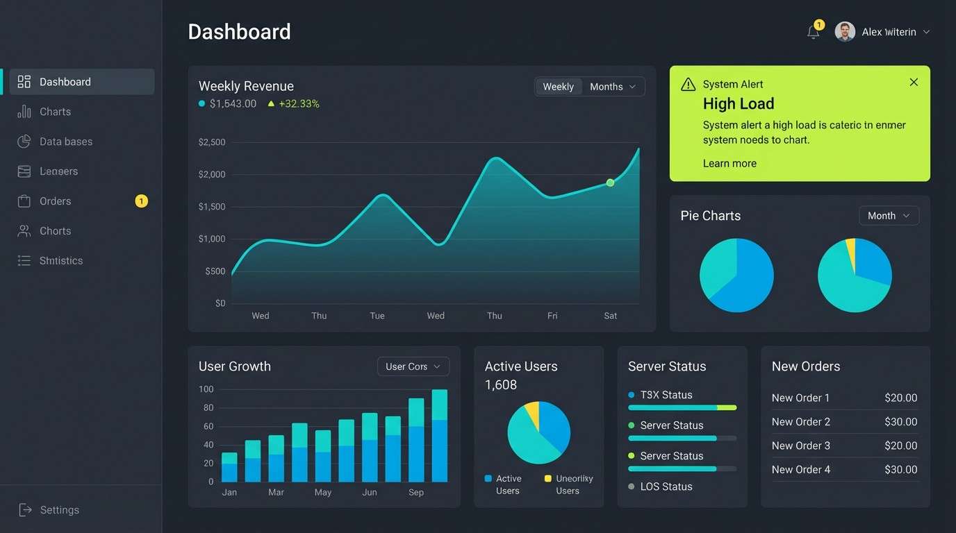
Best for: data dashboard UI
Fast and technical, it evokes HUD lines, glowing charts, and a late-night monitoring room. Let teal and sky-blue carry the panels, with lime and yellow reserved for alerts and key metrics. Perfect for dashboards, analytics widgets, and status screens where contrast equals clarity. Tip: keep chart backgrounds dark and use thin gridlines so the data feels sharp, not noisy.
Image example of hyperline teal generated using media.io
15) Candy Voltage
HEX: #FF2DAA #FFF200 #00FFD5 #FF6A00 #2B2B2B
Mood: sweet, loud, playful
Best for: kids app splash screen
Sweet and loud, it looks like gummy candy under a bright sign. Put yellow behind key illustrations, then let pink and cyan carry buttons and playful icons while charcoal keeps text readable. Great for kids apps, playful splash screens, and fun promo tiles. Tip: avoid using all four brights at once on the same element and rotate emphasis by section.
Image example of candy voltage generated using media.io
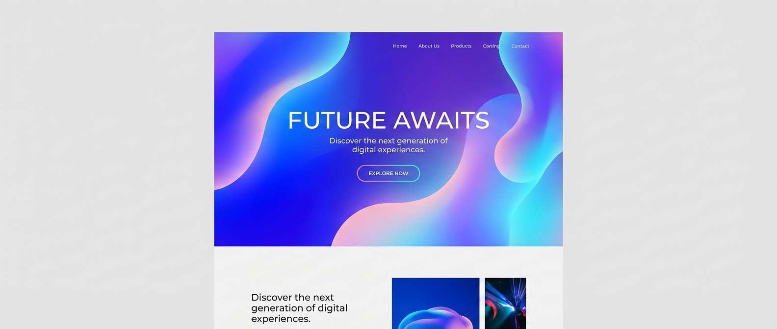
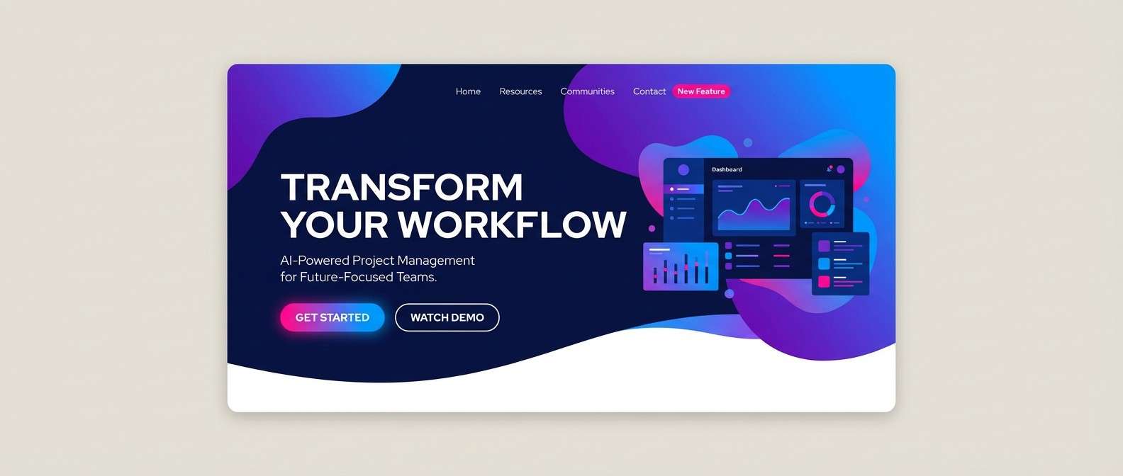
16) Future Dusk
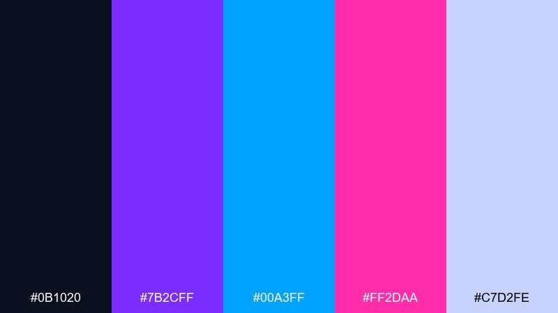
HEX: #0B1020 #7B2CFF #00A3FF #FF2DAA #C7D2FE
Mood: sleek, twilight, futuristic
Best for: SaaS hero section
Sleek and twilight-toned, it feels like the moment city lights flicker on. Use navy for structure, then violet and blue for gradients that suggest depth, with pink as a controlled accent. Ideal for SaaS hero sections, feature highlights, and motion headers. Tip: set body copy in the soft periwinkle so the page stays readable without losing the night vibe.
Image example of future dusk generated using media.io
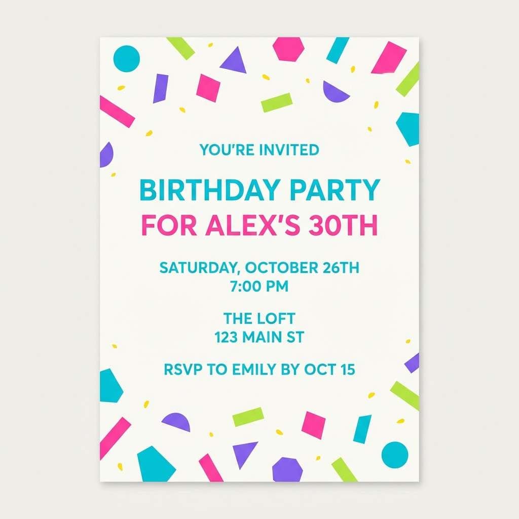
17) Prism Party
HEX: #00FFD5 #39FF14 #FF2DAA #7B2CFF #FFF200
Mood: celebratory, chaotic-fun, radiant
Best for: birthday invitation
Celebratory and radiant, it looks like confetti catching stage lights from every angle. Pick two main tones for the headline and background, then use the remaining colors as small bursts for icons and borders. Great for birthday invites, announcements, and punchy social posts. Tip: keep plenty of white or very light space so the confetti effect stays joyful, not overwhelming.
Image example of prism party generated using media.io
18) Glowstick Garden
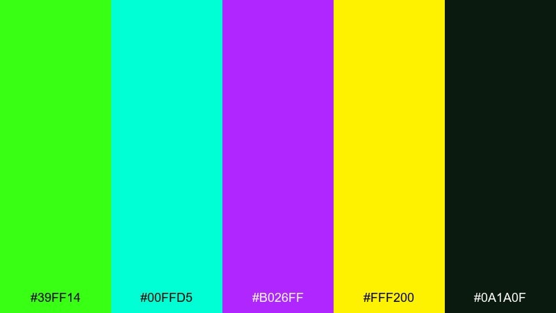
HEX: #39FF14 #00FFD5 #B026FF #FFF200 #0A1A0F
Mood: botanical, magical, night-bloom
Best for: watercolor botanical illustration
Botanical and magical, it evokes night-blooming leaves lit by glowsticks. Let deep green ground the piece, then paint lime and cyan highlights with violet for dreamy shadows. Perfect for botanical posters, spring-themed art, and sticker illustrations with a twist. Tip: keep yellow to tiny pollen-like dots so it reads as sparkle rather than a fill color.
Image example of glowstick garden generated using media.io
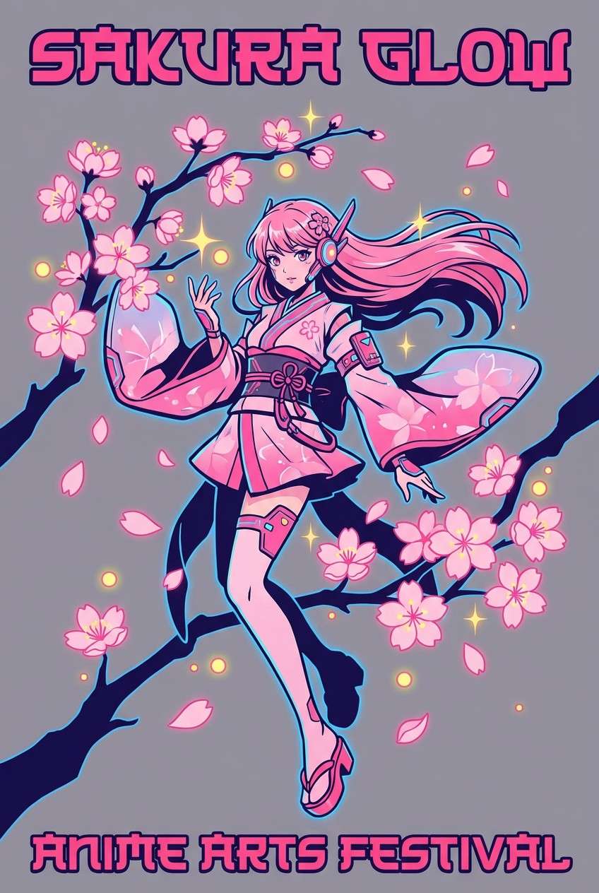
19) Electric Sakura
HEX: #FF2DAA #FF6A8A #00A3FF #FFF200 #1A1033
Mood: romantic, electric, pop-anime
Best for: anime poster artwork
Romantic and electric, it feels like cherry blossoms in a neon-lit city. Use the deep indigo as a night base, then layer pinks for petals and electric blue for glow effects. Great for anime poster art, fan events, and character cards with vivid contrast. Tip: keep yellow as a tiny highlight on eyes, jewelry, or titles to avoid washing out the pinks.
Image example of electric sakura generated using media.io
20) Highlighter Heat
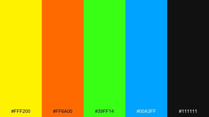
HEX: #FFF200 #FF6A00 #39FF14 #00A3FF #111111
Mood: hot, sporty, loud
Best for: streetwear product ad
Hot and sporty, it reads like highlighter ink on a black sketchbook page. This neon color palette is strongest when you choose either yellow or lime as the main hero and use the other as a secondary accent. Great for streetwear ads, drop announcements, and bold typographic layouts. Tip: keep the blue for small badges or links so it does not compete with the warm heat.
Image example of highlighter heat generated using media.io
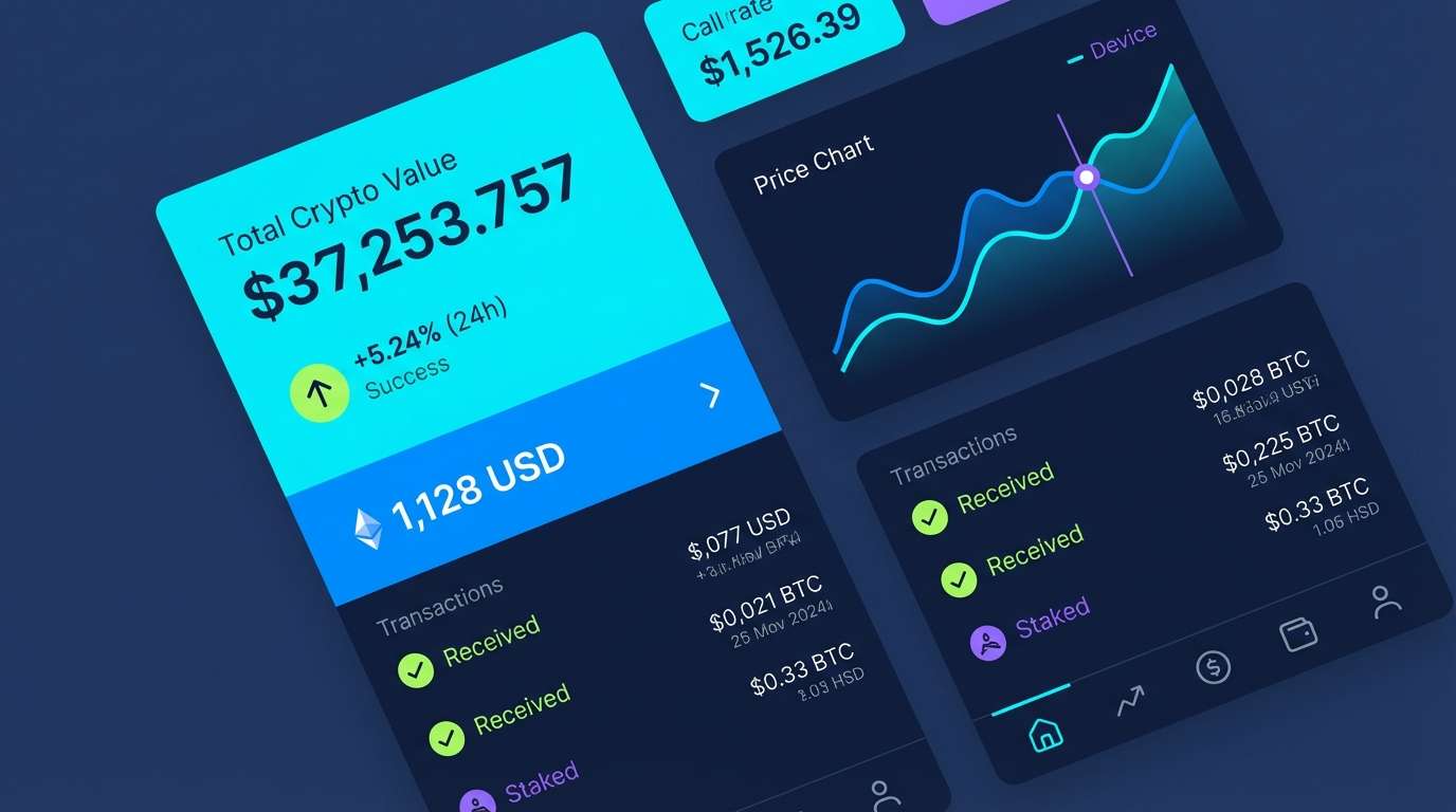
21) Photon Freeze
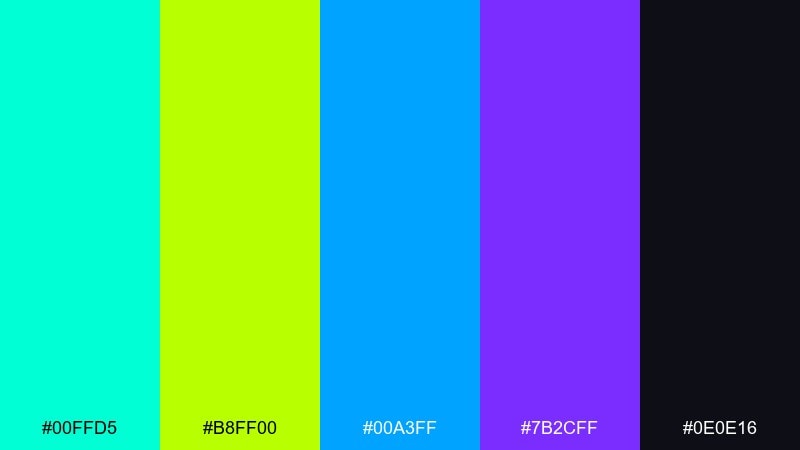
HEX: #00FFD5 #B8FF00 #00A3FF #7B2CFF #0E0E16
Mood: icy, electric, ultra-modern
Best for: crypto app UI
Icy and electric, it looks like frozen light cutting through a dark room. A neon color scheme like this benefits from strict hierarchy: cyan for surfaces, blue for navigation, and lime only for success states. It works well for crypto apps, fintech widgets, and charts that need quick scanning. Tip: keep violet minimal and use it for secondary emphasis like tags or toggles.
Image example of photon freeze generated using media.io
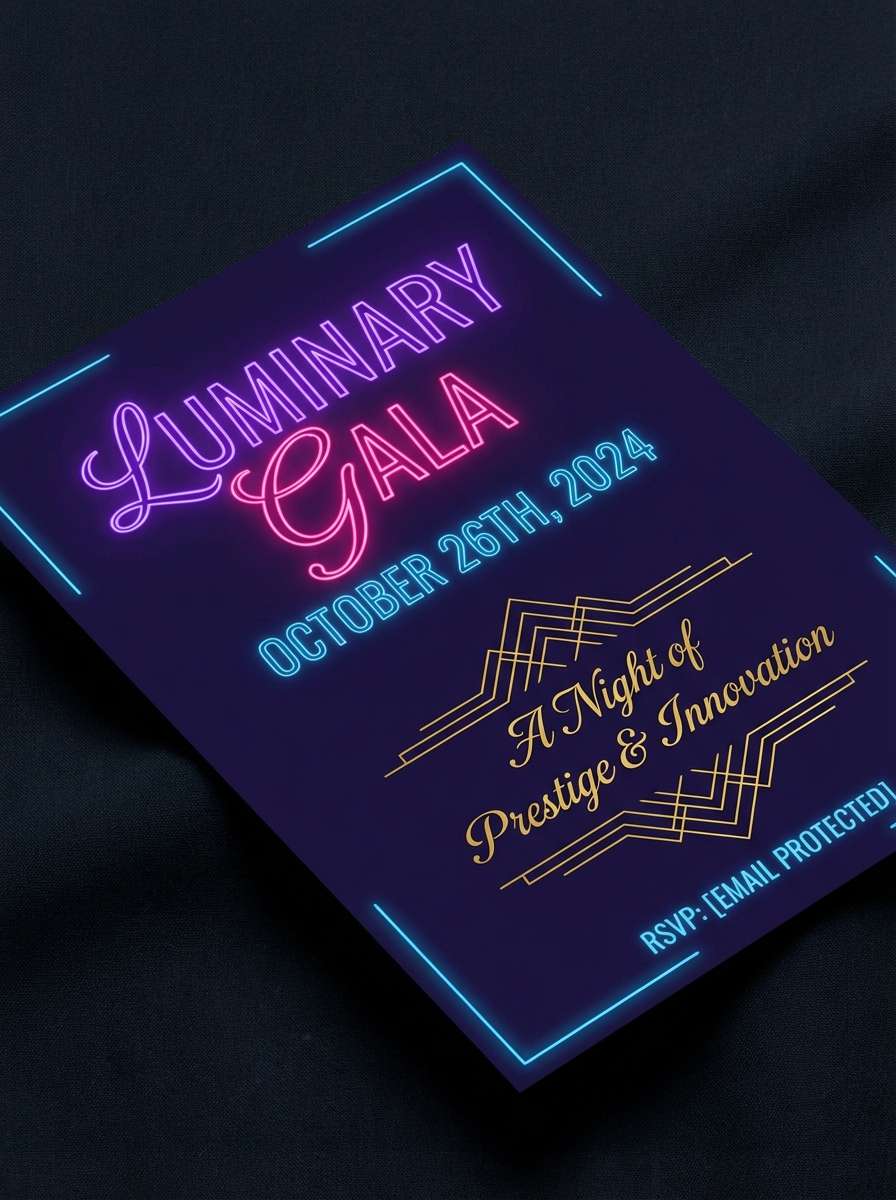
22) Voltage Velvet
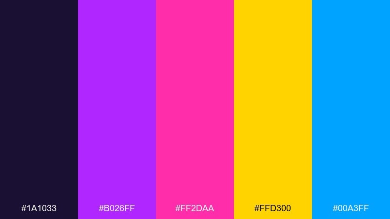
HEX: #1A1033 #B026FF #FF2DAA #FFD300 #00A3FF
Mood: luxurious, dramatic, electric
Best for: luxury event invitation
Luxurious and dramatic, it feels like velvet fabric catching electric spotlight edges. Keep the deep indigo dominant, then use violet and pink for typography and small graphic flourishes. Ideal for upscale invitations, VIP passes, and premium announcements that still want a modern jolt. Tip: use gold-yellow sparingly as a seal or border line to maintain the luxe feel.
Image example of voltage velvet generated using media.io
What Colors Go Well with Neon?
Neon plays best with stabilizers: near-black, deep navy, charcoal, and clean whites/off-whites. These neutrals create “space” so fluorescent colors read as intentional highlights instead of constant noise.
Cool neons (cyan, electric blue, violet) pair naturally with dark bases for a sleek sci-fi look, while warm neons (yellow, orange, hot pink) feel more festival, sporty, or retro. Mixing warm and cool can work—just pick a clear hero color.
For a premium feel, add one soft neutral tint (light gray, periwinkle, or warm white) for body copy and large surfaces, then reserve the glow for CTAs, icons, and key numbers.
How to Use a Neon Color Palette in Real Designs
Start with hierarchy: choose one primary neon (buttons/headlines), one secondary neon (links/badges), and a neutral base (background/cards). This keeps vibrant UI colors readable, especially on mobile.
Control contrast with spacing and type. Neon backgrounds can reduce legibility, so put text on dark panels, use thicker font weights, and avoid thin outlines that vibrate against bright hues.
Use glow effects sparingly. A subtle outer glow or gradient edge can sell the “glow aesthetic,” but too much blur makes layouts feel soft and less professional.
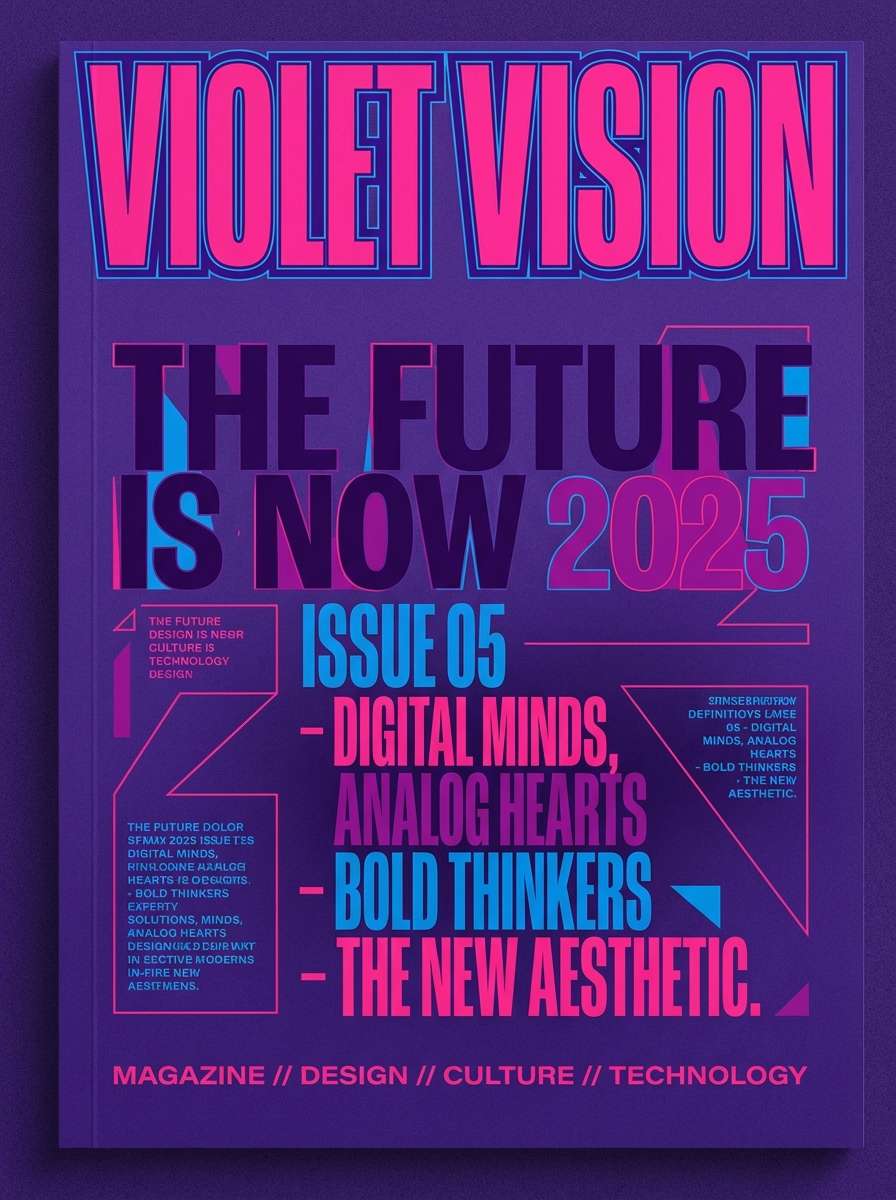
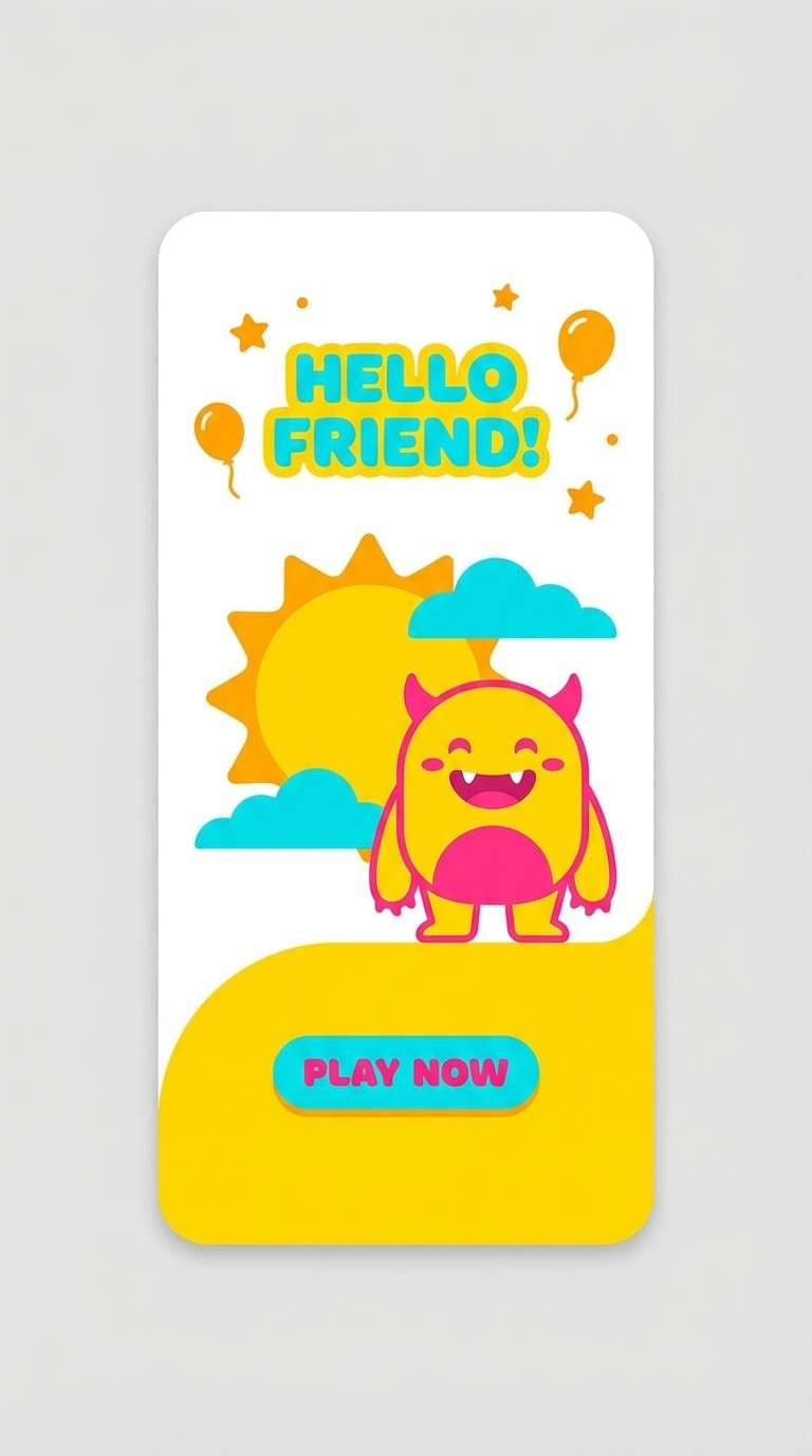
Create Neon Palette Visuals with AI
If you want to see how a neon scheme looks in a poster, landing page, or UI mockup, generate quick visuals first. It’s the fastest way to test balance, contrast, and whether your hero neon should be pink, lime, or cyan.
With Media.io Text to Image, you can paste a short prompt, specify a style (vector, realistic, watercolor), and iterate until the glow feels clean and controlled—then export for your design workflow.
Neon Color Palette FAQs
-
What is a neon color palette?
A neon color palette is a set of high-saturation, high-brightness colors (like lime, hot pink, and electric cyan) designed to look fluorescent and create strong contrast—especially on dark backgrounds. -
Are neon colors good for UI design?
Yes, if you use them for emphasis (CTAs, status states, highlights) and keep most surfaces neutral. Too many neon fills can hurt readability and make interfaces feel noisy. -
What background works best with neon palettes?
Near-black, deep navy, and charcoal make neon hues look brighter and cleaner. Light backgrounds can work too, but you’ll usually need more whitespace and fewer neon blocks. -
How many neon colors should I use at once?
A practical rule is 1 hero neon + 1 support neon + 1 neutral base, then introduce other neons only as small accents. This keeps hierarchy clear and prevents “everything shouting.” -
Do neon palettes work for print?
They can, but some neon-looking RGB colors won’t reproduce the same intensity in CMYK. For print, test proofs early or consider fluorescent spot inks if you need true “glow” impact. -
What colors pair well with neon pink?
Neon pink pairs well with deep purple/indigo, near-black, electric blue, and crisp off-white. Add neon cyan sparingly for a sharp, cyber look. -
How can I quickly visualize a neon color scheme?
Use an AI generator to mock up a poster, UI screen, or product ad with your exact HEX colors as guidance. This helps you validate contrast, spacing, and which neon should dominate before you design the final asset.
Next: Mint Color Palette


