

Mint is a versatile, feel-good color that reads clean, modern, and calming all at once. It works as a soft background, a UI highlight, or a fresh brand accent without feeling loud.
Below are mint pairing ideas you can use for websites, packaging, weddings, posters, and more—each with ready-to-use HEX codes and an AI prompt to generate matching visuals.
In this article
- Why Mint Palettes Work So Well
-
- seafoam studio
- mint & cream minimal
- retro soda pop
- garden party pastels
- coastal mint navy
- eucalyptus & sand
- spearmint rosewater
- modern mint charcoal
- mint citrus spark
- alpine mint pine
- minty lilac haze
- matcha marble
- tropical mint coral
- frosted mint silver
- mint clay terracotta
- mint denim drift
- neon mint night
- vintage apothecary
- mint buttercup glow
- quiet mint monochrome
- cucumber tonic
- mint champagne blush
- What Colors Go Well with Mint?
- How to Use a Mint Color Palette in Real Designs
- Create Mint Palette Visuals with AI
Why Mint Palettes Work So Well
Mint sits in a “sweet spot” between green and blue, so it can feel botanical, watery, or even futuristic depending on what you pair it with. That flexibility makes it a reliable base for branding and UI.
Because mint is naturally light and airy, it helps designs feel spacious and friendly. It’s especially effective for wellness, skincare, lifestyle, and product experiences where clarity and calm matter.
Mint also plays well with contrast: deep navies and charcoals add structure, warm neutrals add softness, and bright accents (coral, buttercup, cobalt) turn it into an attention-grabbing statement.
20+ Mint Color Palette Ideas (with HEX Codes)
1) Seafoam Studio
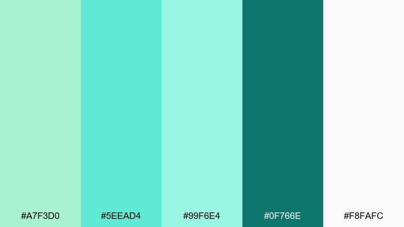
HEX: #A7F3D0 #5EEAD4 #99F6E4 #0F766E #F8FAFC
Mood: clean, airy, coastal
Best for: wellness website hero sections
Clean and airy like saltwater light on a calm morning. These mint-leaning aquas feel fresh against crisp white and grounded teal. Use it for wellness or skincare pages where clarity matters, and pair it with soft gray typography or brushed metal accents. Tip: keep the darkest teal for buttons and navigation so the lighter tones can breathe.
Image example of seafoam studio generated using media.io

Media.io is an online AI studio for creating and editing video, image, and audio in your browser.

2) Mint & Cream Minimal
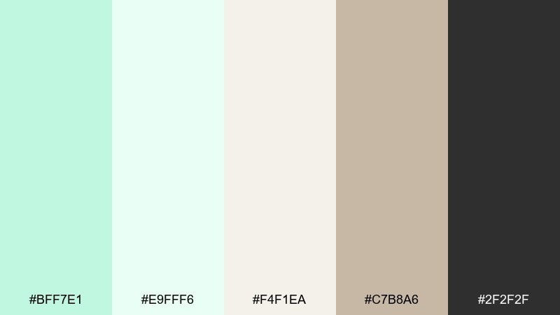
HEX: #BFF7E1 #E9FFF6 #F4F1EA #C7B8A6 #2F2F2F
Mood: soft, minimal, elevated
Best for: minimal UI kits and landing pages
Soft and elevated, like linen fabric with a hint of fresh mint. This mint color palette shines in minimal interfaces where whitespace does the heavy lifting. Pair it with warm neutrals and charcoal text for an editorial feel, then reserve the mint tint for highlights and states. Tip: use the cream tones for cards and the darker gray for accessibility-safe contrast.
Image example of mint & cream minimal generated using media.io
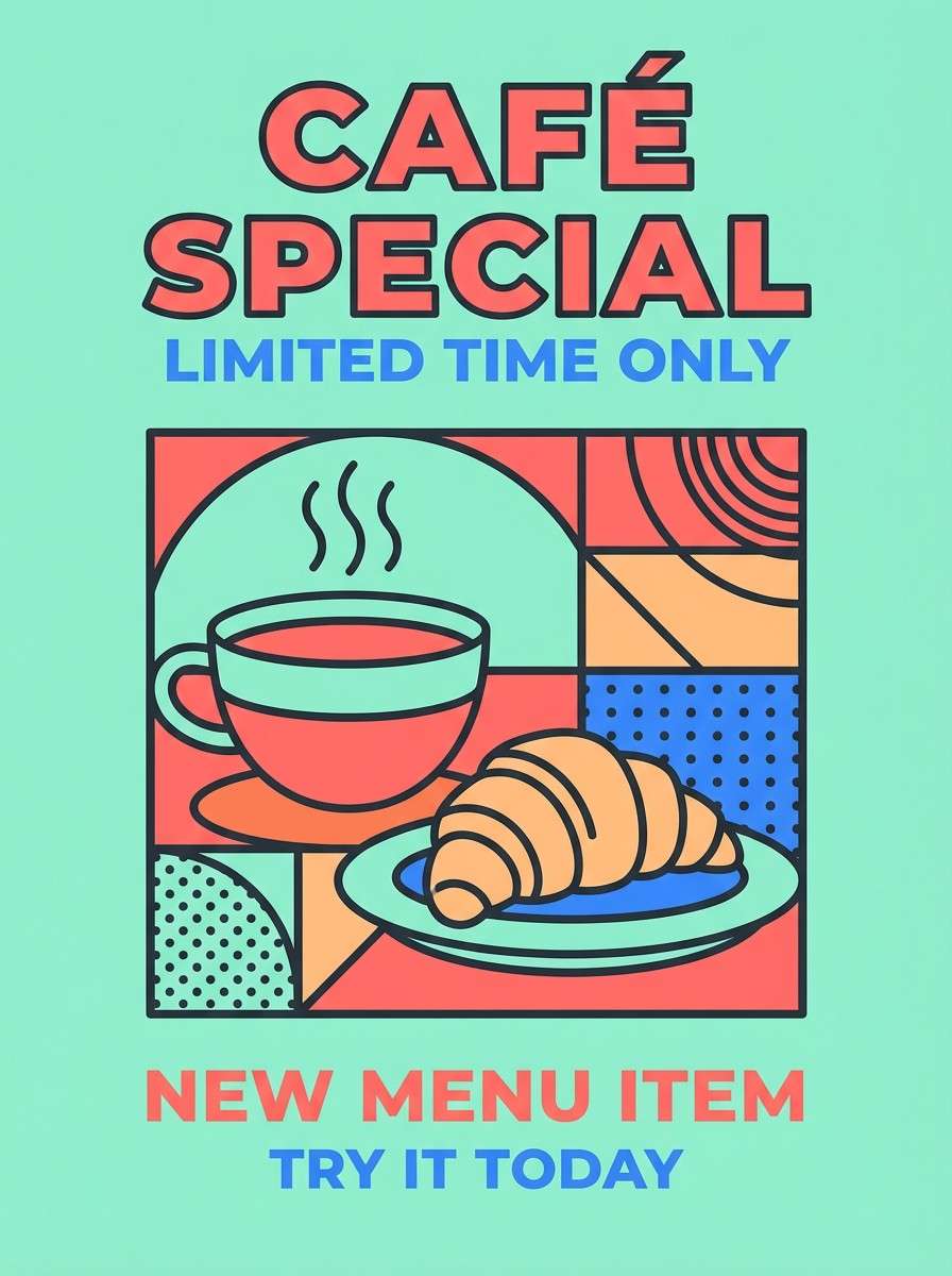
3) Retro Soda Pop
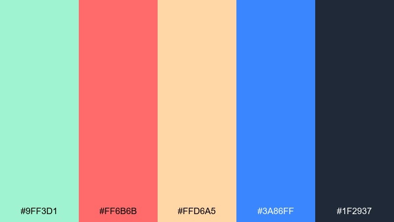
HEX: #9FF3D1 #FF6B6B #FFD6A5 #3A86FF #1F2937
Mood: playful, retro, energetic
Best for: cafe posters and social promos
Playful and retro, like a fizzy drink label from a sunny corner shop. The mint base keeps the brights from feeling too loud, while coral and citrus add instant punch. These mint color combinations work best for posters, stickers, and social graphics where you want quick, happy contrast. Tip: let mint and charcoal hold the layout, then use coral for one bold focal element.
Image example of retro soda pop generated using media.io
4) Garden Party Pastels
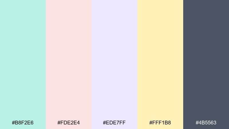
HEX: #B8F2E6 #FDE2E4 #EDE7FF #FFF1B8 #4B5563
Mood: romantic, springy, light
Best for: wedding invitation suites
Romantic and springy, like petals scattered over minty lemonade. The pastel mix keeps everything light, while the deep gray provides readable type. Use it for invitations, shower stationery, or event signage, and pair with delicate serif fonts and thin line icons. Tip: keep backgrounds mostly pale and use the darkest gray only for names and key details.
Image example of garden party pastels generated using media.io
5) Coastal Mint Navy
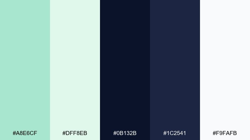
HEX: #A8E6CF #DFF8EB #0B132B #1C2541 #F9FAFB
Mood: crisp, nautical, modern
Best for: travel blog headers and thumbnails
Crisp and nautical, like sea glass against a deep evening tide. Mint and near-white keep things bright, while layered navy tones add structure and sophistication. Use it for travel branding, editorial headers, or maps, and pair with clean sans-serif type and simple icons. Tip: make navy your text and grid color, and save mint for badges or highlights.
Image example of coastal mint navy generated using media.io

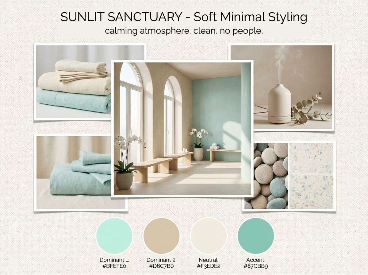
6) Eucalyptus & Sand
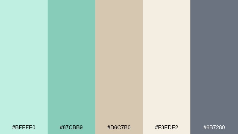
HEX: #BFEFE0 #87CBB9 #D6C7B0 #F3EDE2 #6B7280
Mood: calm, natural, spa-like
Best for: spa interiors and mood boards
Calm and natural, like eucalyptus leaves on warm sand. The muted mint tones feel grounded when paired with beige and soft stone neutrals. Use it for spa branding, interior mood boards, or lifestyle blogs, and complement it with matte textures and minimal photography. Tip: keep the beige as the main background so the mint reads as a refreshing accent.
Image example of eucalyptus & sand generated using media.io
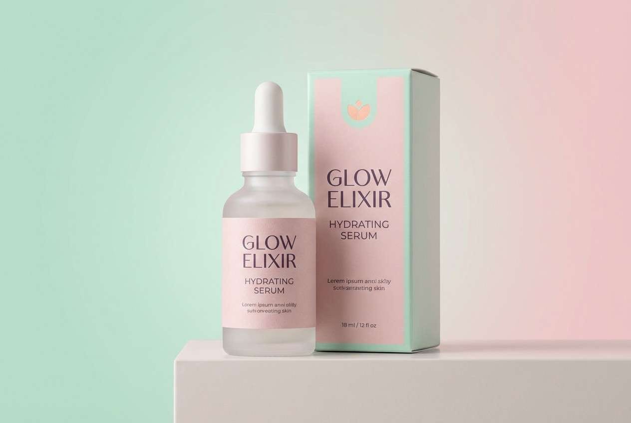
7) Spearmint Rosewater
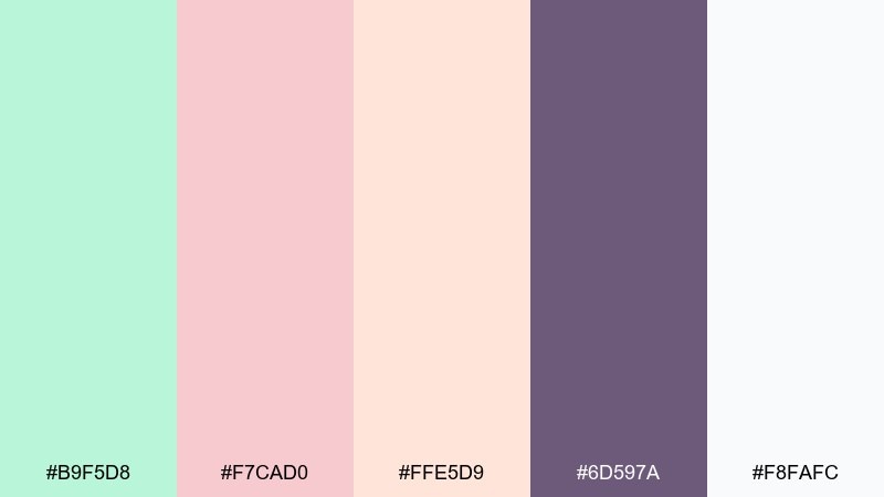
HEX: #B9F5D8 #F7CAD0 #FFE5D9 #6D597A #F8FAFC
Mood: sweet, modern, romantic
Best for: beauty product ads
Sweet and modern, like rosewater mist with a spearmint twist. The blush and cream keep it friendly, while the muted plum adds a luxe anchor. Use it for cosmetics ads, influencer media kits, or boutique packaging, and pair with rounded typography and soft gradients. Tip: keep plum limited to headlines and logos so the overall look stays airy.
Image example of spearmint rosewater generated using media.io
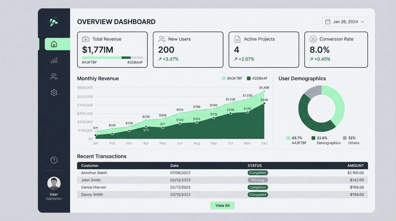
8) Modern Mint Charcoal
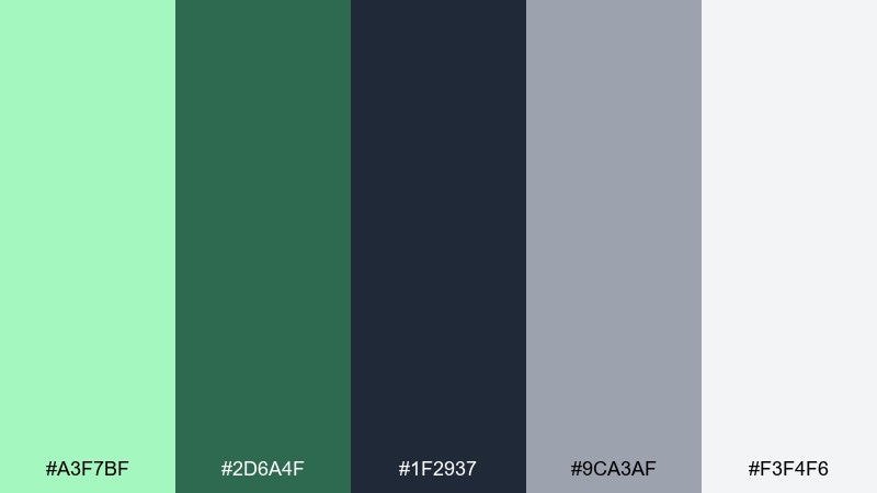
HEX: #A3F7BF #2D6A4F #1F2937 #9CA3AF #F3F4F6
Mood: confident, sleek, tech-forward
Best for: SaaS dashboard UI
Confident and sleek, like a modern workspace with a fresh plant on the desk. This mint color palette pairs bright highlights with charcoal structure, making data-heavy screens feel approachable. Use it for dashboards, admin panels, and analytics pages, then add subtle gray surfaces to separate sections without clutter. Tip: reserve the brightest mint for success states and active navigation to guide attention.
Image example of modern mint charcoal generated using media.io
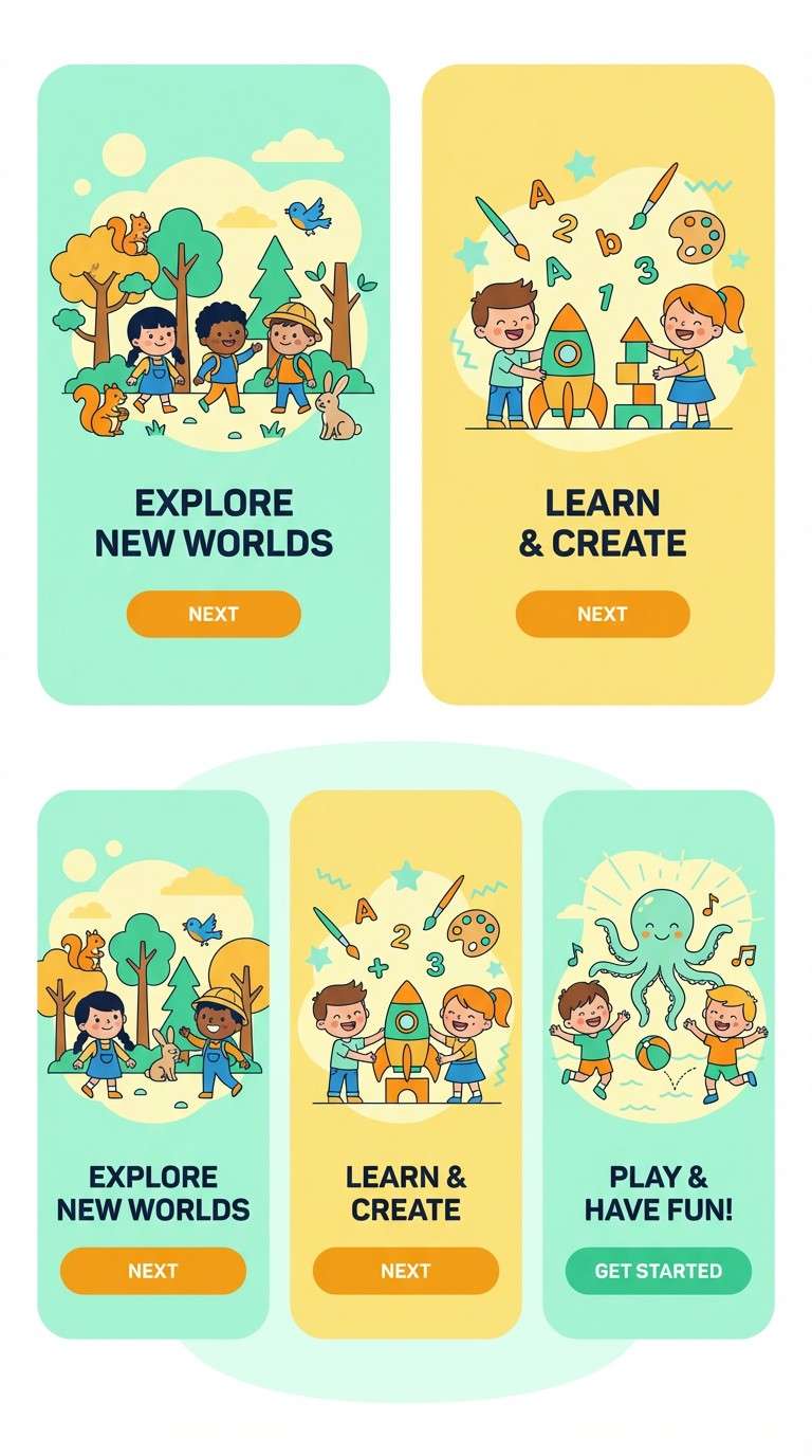
9) Mint Citrus Spark
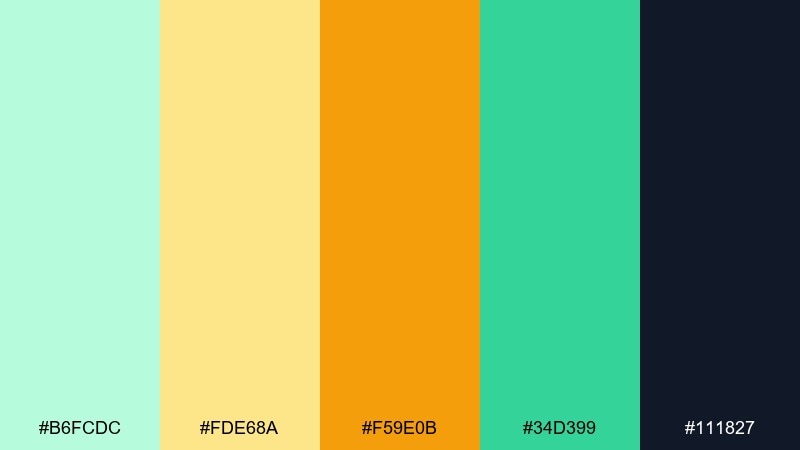
HEX: #B6FCDC #FDE68A #F59E0B #34D399 #111827
Mood: bright, upbeat, sunny
Best for: kids app onboarding screens
Bright and upbeat, like citrus slices floating in sparkling water. The yellow tones bring warmth, while mint and green keep the energy friendly rather than neon. Use it for kids apps, onboarding flows, or playful icon sets, and pair with rounded shapes and big spacing. Tip: keep the dark ink color for key text so the cheerful accents stay readable.
Image example of mint citrus spark generated using media.io
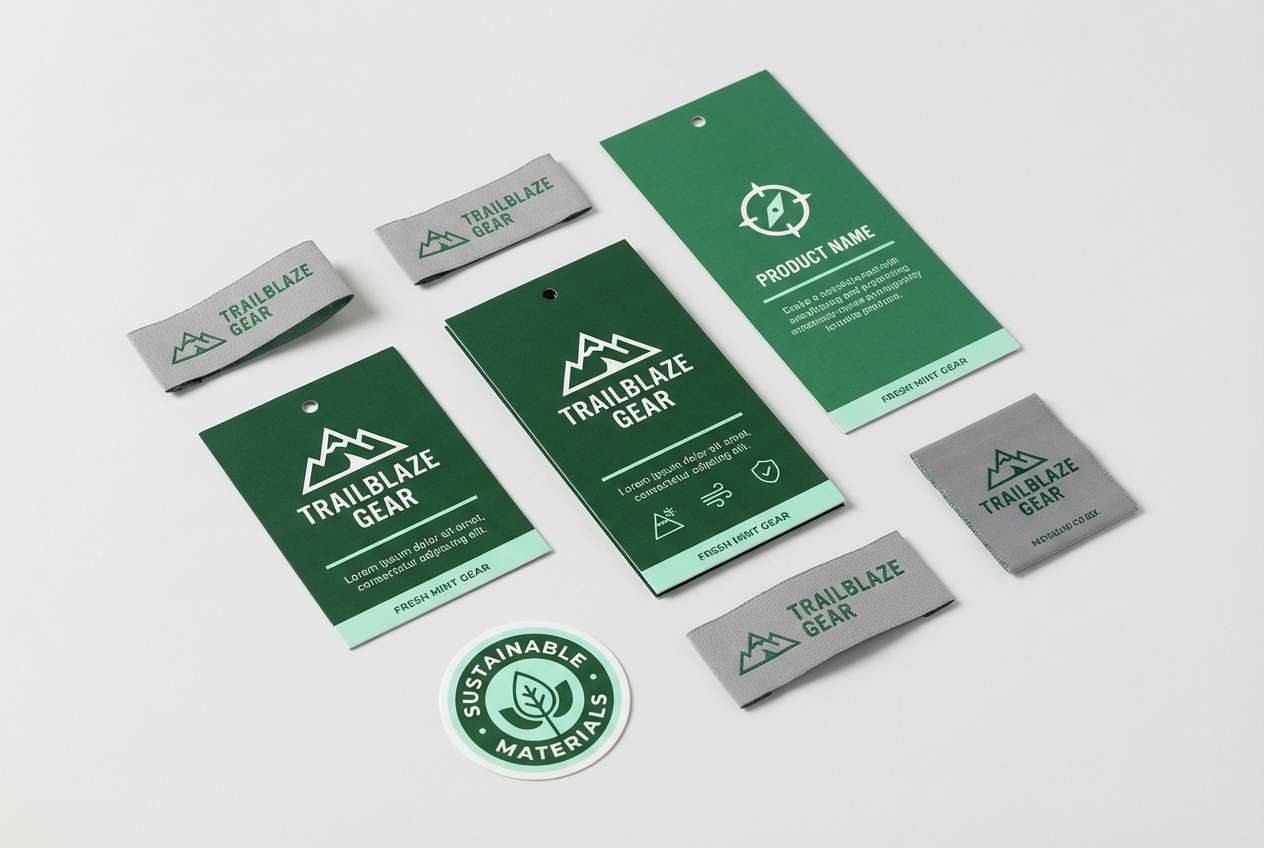
10) Alpine Mint Pine
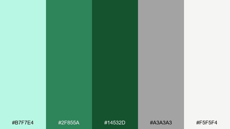
HEX: #B7F7E4 #2F855A #14532D #A3A3A3 #F5F5F4
Mood: outdoorsy, grounded, refreshing
Best for: outdoor gear branding
Outdoorsy and grounded, like cold air and pine needles after a hike. Mint gives the palette a fresh lift, while deep greens bring durability and trust. Use it for camping brands, sustainability messaging, or product spec sheets, and pair it with strong typography and simple badges. Tip: use the darkest green for logos and the mint tint for highlights on labels.
Image example of alpine mint pine generated using media.io
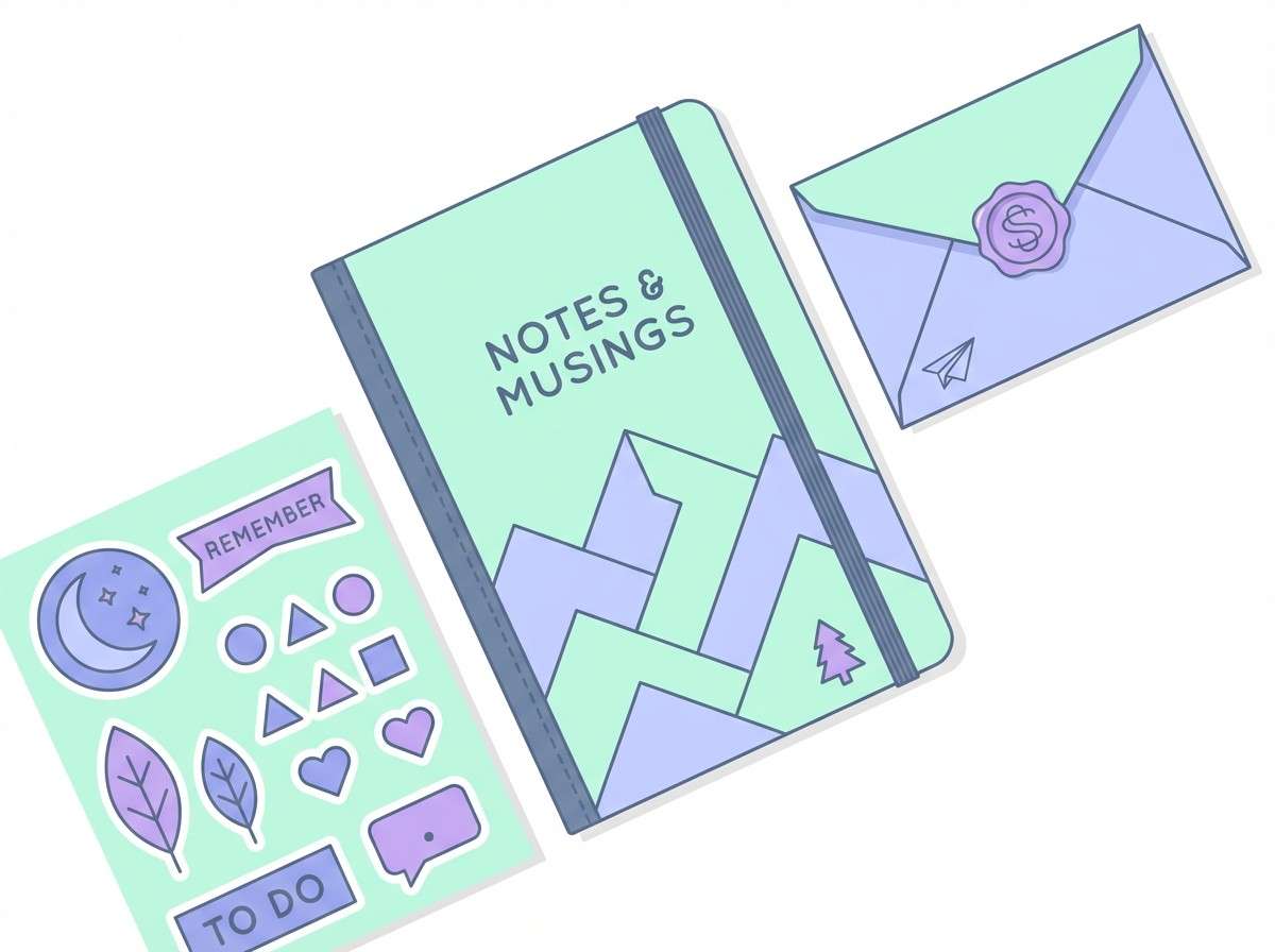
11) Minty Lilac Haze
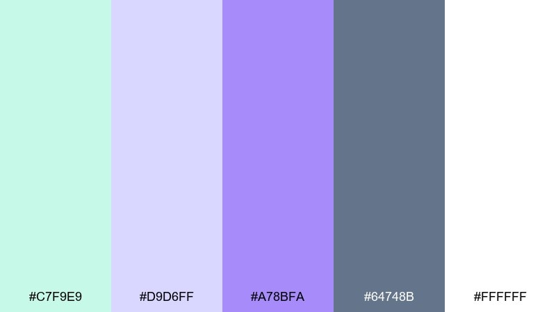
HEX: #C7F9E9 #D9D6FF #A78BFA #64748B #FFFFFF
Mood: dreamy, gentle, creative
Best for: stationery and notebook designs
Dreamy and gentle, like a watercolor wash drifting across paper. Mint and lilac together feel creative without being overly sweet, and the slate gray keeps details sharp. Use it for stationery sets, notebook covers, or creator branding, and pair with soft gradients or subtle patterns. Tip: print the darker purple sparingly so the overall look stays light.
Image example of minty lilac haze generated using media.io
12) Matcha Marble
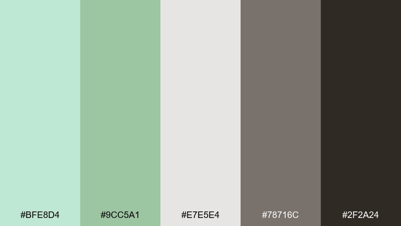
HEX: #BFE8D4 #9CC5A1 #E7E5E4 #78716C #2F2A24
Mood: earthy, refined, calm
Best for: eco startup logo systems
Earthy and refined, like matcha foam against cool stone. The dusty mint-green tones feel mature when supported by warm charcoal and marble-like neutrals. Use it for eco startups, artisan goods, or premium sustainable brands, and pair with serif logotypes or minimal marks. Tip: keep backgrounds light gray and use the darkest brown only for wordmarks and key icons.
Image example of matcha marble generated using media.io
13) Tropical Mint Coral
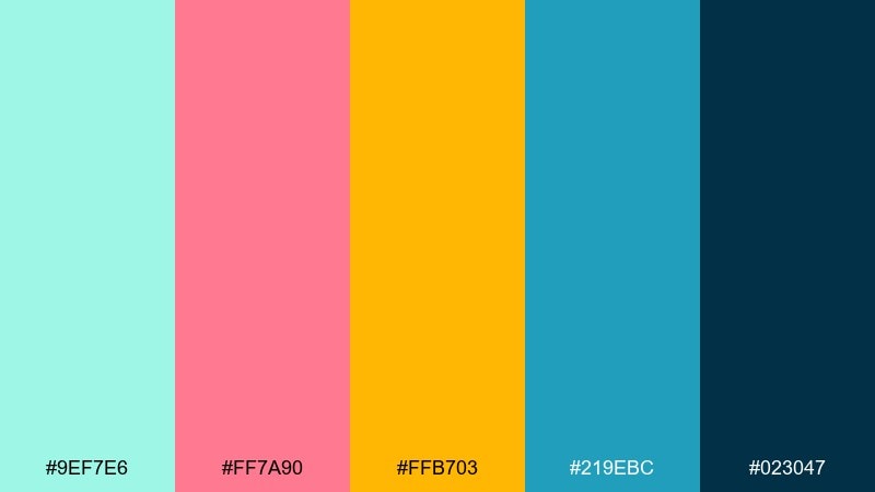
HEX: #9EF7E6 #FF7A90 #FFB703 #219EBC #023047
Mood: tropical, bold, fun
Best for: swimwear campaign ads
Tropical and bold, like a poolside sign under bright sun. Mint keeps the palette cool, while coral and golden yellow add confident, summery heat. Use it for swimwear launches, event promos, or punchy social ads, and pair with big type and high-contrast layouts. Tip: let the dark navy handle text so the brights can stay saturated without hurting readability.
Image example of tropical mint coral generated using media.io

14) Frosted Mint Silver
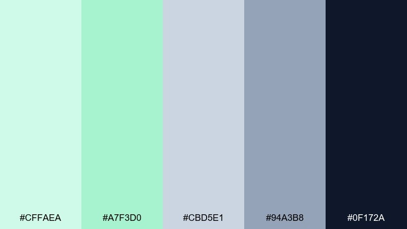
HEX: #CFFAEA #A7F3D0 #CBD5E1 #94A3B8 #0F172A
Mood: cool, polished, premium
Best for: tech product packaging
Cool and polished, like frosted glass with a metallic edge. The mint tints feel fresh next to silvery grays, while deep navy adds premium contrast. Use it for tech packaging, hardware landing pages, or app splash screens, and pair with geometric shapes and crisp spacing. Tip: use silver-gray for large surfaces and keep mint as a highlight stripe or icon color.
Image example of frosted mint silver generated using media.io
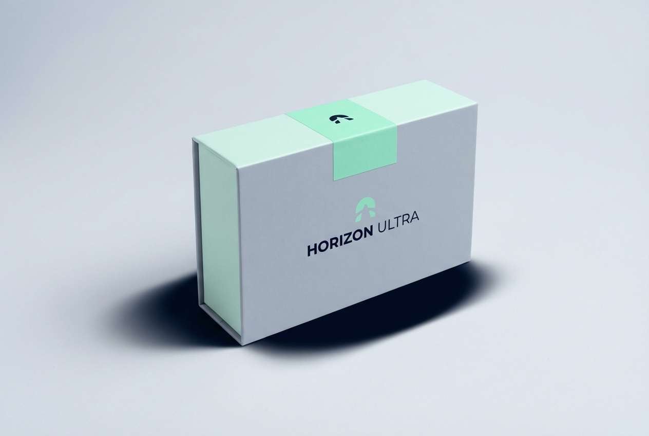
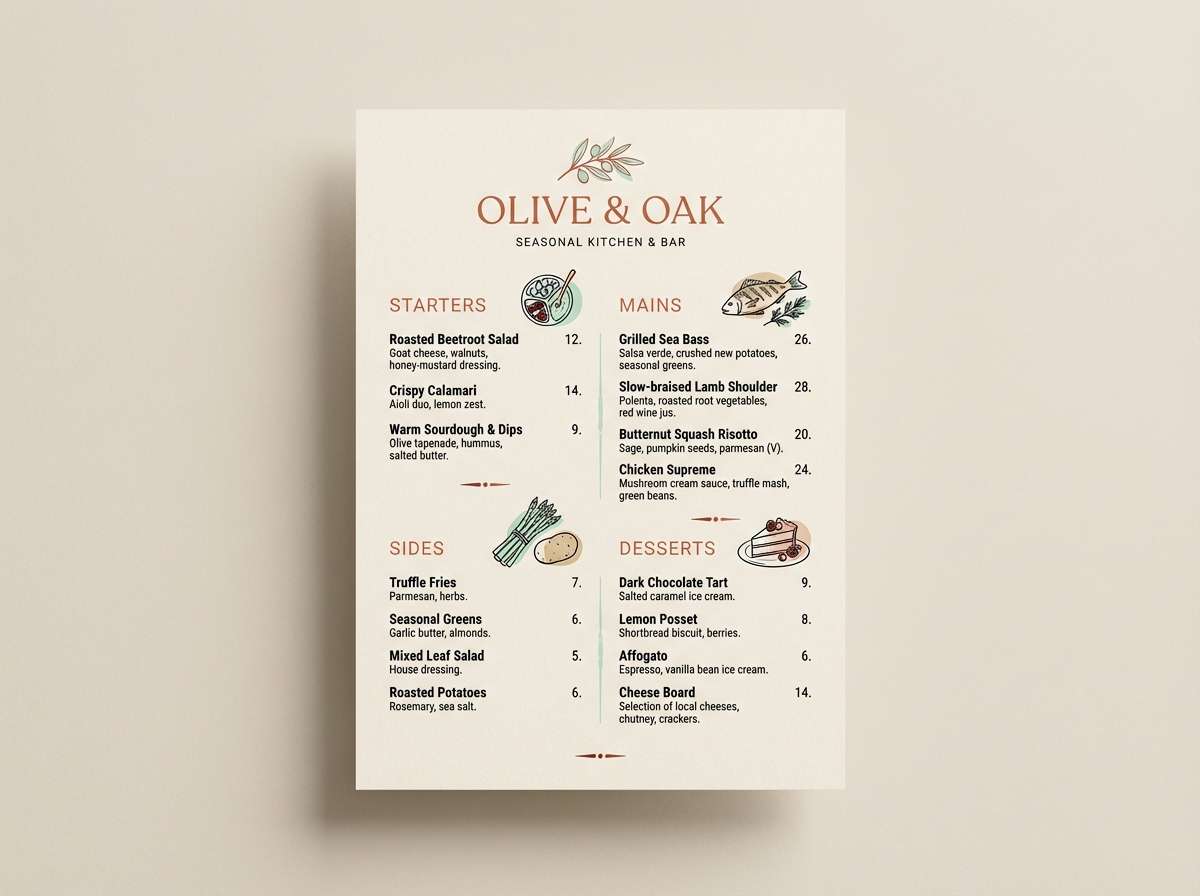
15) Mint Clay Terracotta
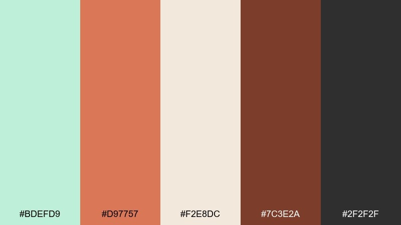
HEX: #BDEFD9 #D97757 #F2E8DC #7C3E2A #2F2F2F
Mood: warm, artisanal, inviting
Best for: restaurant menu design
Warm and artisanal, like handmade pottery beside fresh herbs. The terracotta brings comfort, while mint adds a crisp counterbalance that keeps the page feeling modern. These mint color combinations fit restaurant menus, craft markets, and food packaging, especially with textured backgrounds and simple illustrations. Tip: use terracotta for section headers and keep the mint tint for small dividers or icons.
Image example of mint clay terracotta generated using media.io
16) Mint Denim Drift
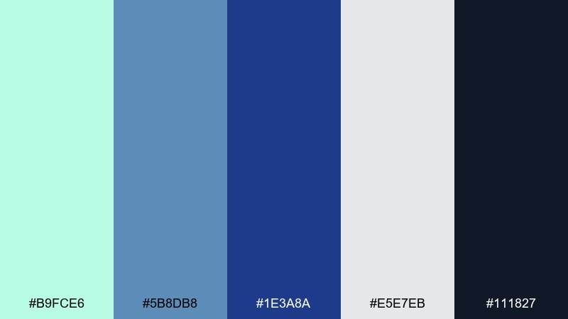
HEX: #B9FCE6 #5B8DB8 #1E3A8A #E5E7EB #111827
Mood: cool, casual, confident
Best for: denim brand lookbooks
Cool and casual, like faded denim with a breath of mint. The blues feel trustworthy and classic, while the pale mint lifts the overall tone. Use it for fashion lookbooks, ecommerce banners, or streetwear branding, and pair with bold grid layouts and minimal copy. Tip: keep the darkest navy for typography and let the mint sit in backgrounds or highlight blocks.
Image example of mint denim drift generated using media.io
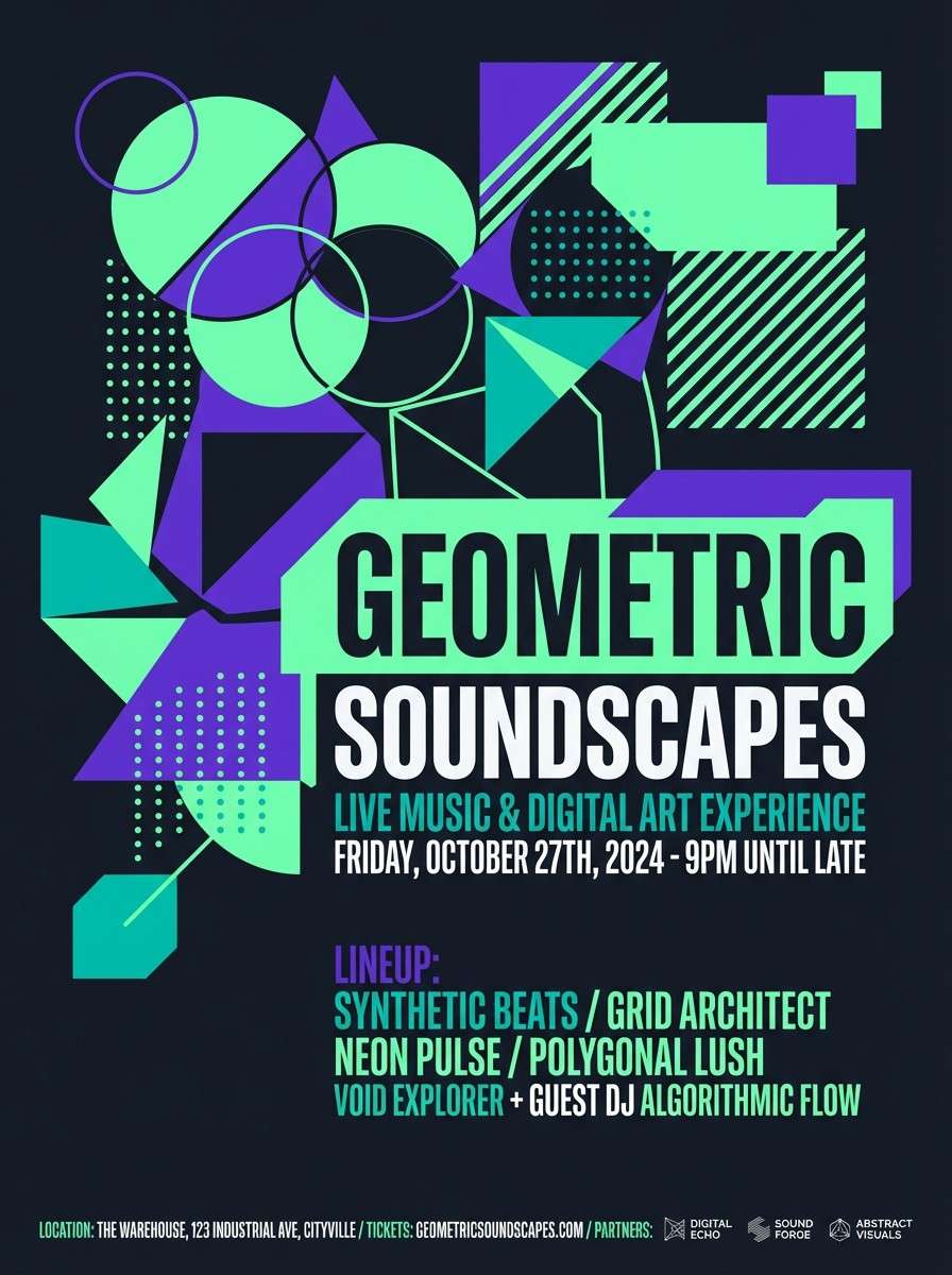
17) Neon Mint Night
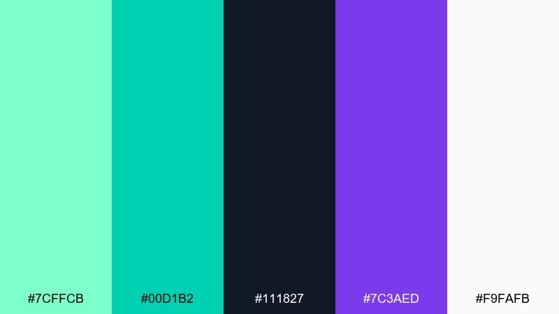
HEX: #7CFFCB #00D1B2 #111827 #7C3AED #F9FAFB
Mood: electric, nightlife, edgy
Best for: music event posters
Electric and edgy, like neon signage glowing in a dark club hallway. The vivid mint pops hard against near-black, while violet adds an after-hours twist. Use it for music posters, nightlife promos, or streamer overlays, and pair with condensed type and sharp geometric shapes. Tip: limit white to tiny highlights so the neon tones stay the main attraction.
Image example of neon mint night generated using media.io
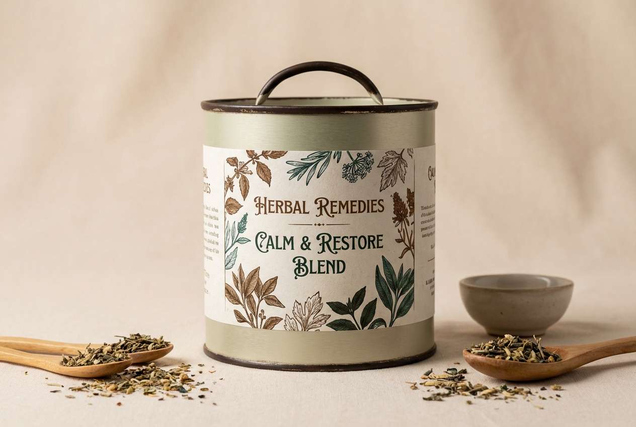
18) Vintage Apothecary
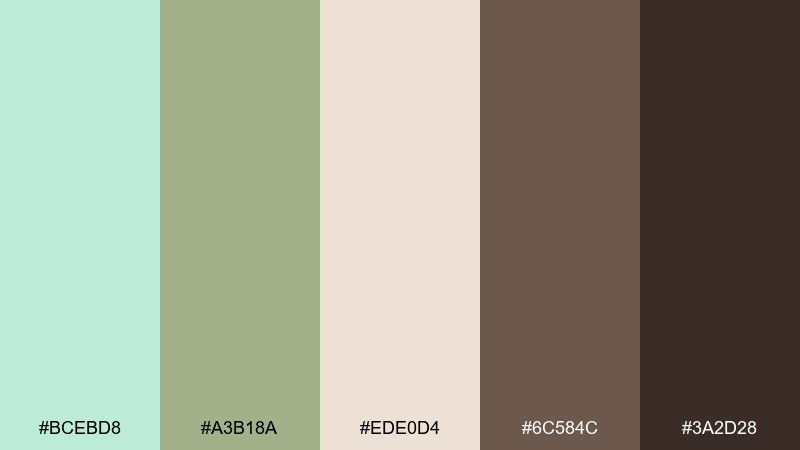
HEX: #BCEBD8 #A3B18A #EDE0D4 #6C584C #3A2D28
Mood: vintage, herbal, cozy
Best for: herbal tea packaging
Vintage and herbal, like dried leaves in glass jars on a wooden shelf. The muted mint and olive tones feel trustworthy, while warm creams and browns add nostalgia. Use it for tea labels, apothecary-style branding, or farmers market goods, and pair with classic serif type and stamped icons. Tip: print the darkest brown only for the logo and key claims to keep the label readable.
Image example of vintage apothecary generated using media.io
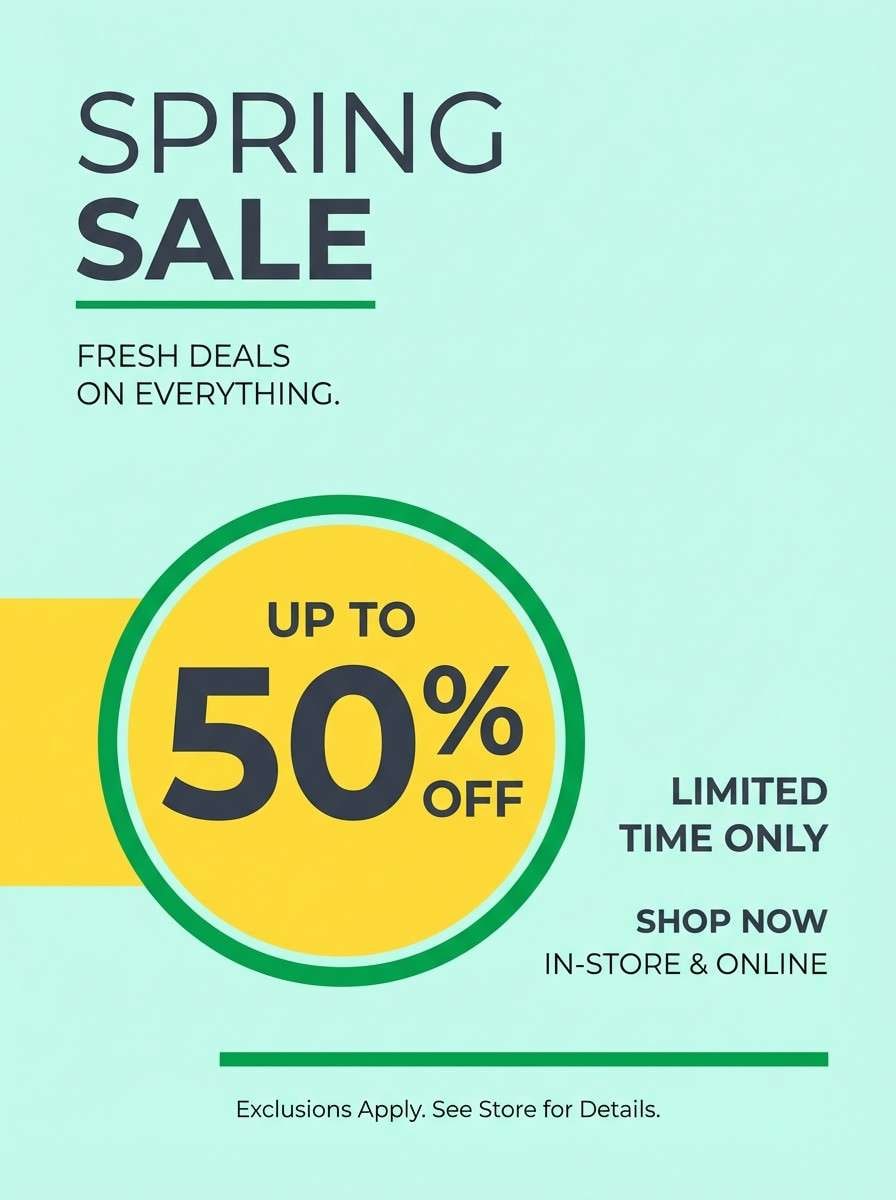
19) Mint Buttercup Glow
HEX: #C8FCEB #FDE047 #F7F7F7 #16A34A #374151
Mood: cheerful, optimistic, fresh
Best for: spring sale flyers
Cheerful and optimistic, like the first sunny weekend of spring. Mint and buttercup yellow create a friendly contrast that feels both fresh and attention-grabbing. Use it for retail flyers, email headers, or seasonal social posts, and pair with simple iconography and lots of whitespace. Tip: keep yellow for price tags and calls to action so the message lands instantly.
Image example of mint buttercup glow generated using media.io
20) Quiet Mint Monochrome
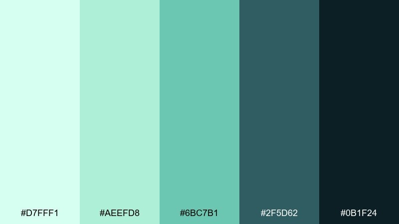
HEX: #D7FFF1 #AEEFD8 #6BC7B1 #2F5D62 #0B1F24
Mood: quiet, focused, sophisticated
Best for: presentation templates
Quiet and focused, like a calm studio with soft shadows. The near-monochrome range makes slides feel cohesive, while the deep teal keeps titles crisp and professional. Use it for pitch decks, reports, and case studies, and pair with simple charts and generous margins. Tip: set body text in the darkest tone and use the lightest mint only for section breaks and callouts.
Image example of quiet mint monochrome generated using media.io
21) Cucumber Tonic
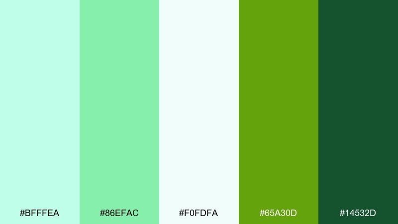
HEX: #BFFFEA #86EFAC #F0FDFA #65A30D #14532D
Mood: crisp, botanical, hydrating
Best for: botanical illustrations and labels
Crisp and botanical, like cucumber slices in a chilled glass. The pale minty whites keep it clean, while leafy greens add a natural, healthy cue. Use it for juice labels, wellness blogs, or ingredient callouts, and pair with hand-drawn icons and airy spacing. Tip: lean on the lightest tones for backgrounds so the greens read fresh rather than heavy.
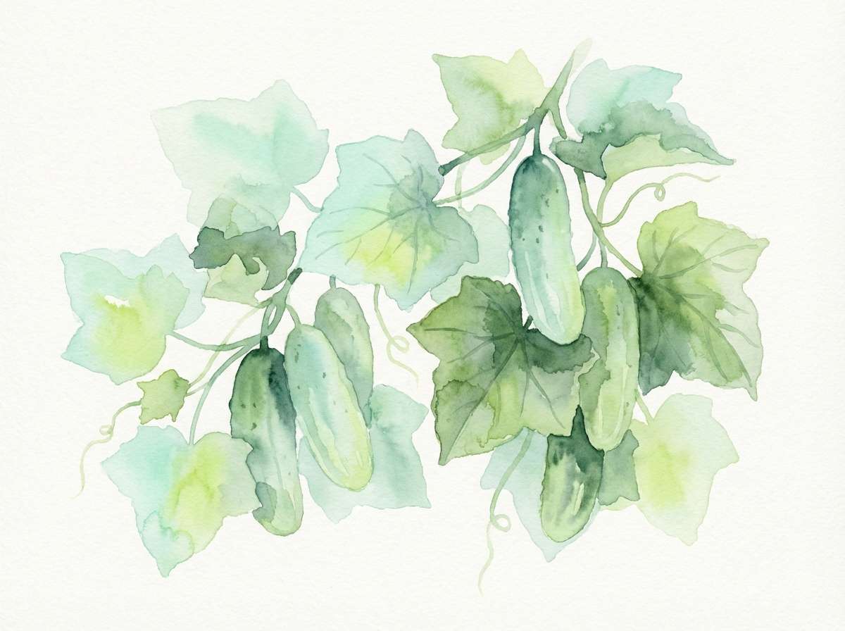
Image example of cucumber tonic generated using media.io
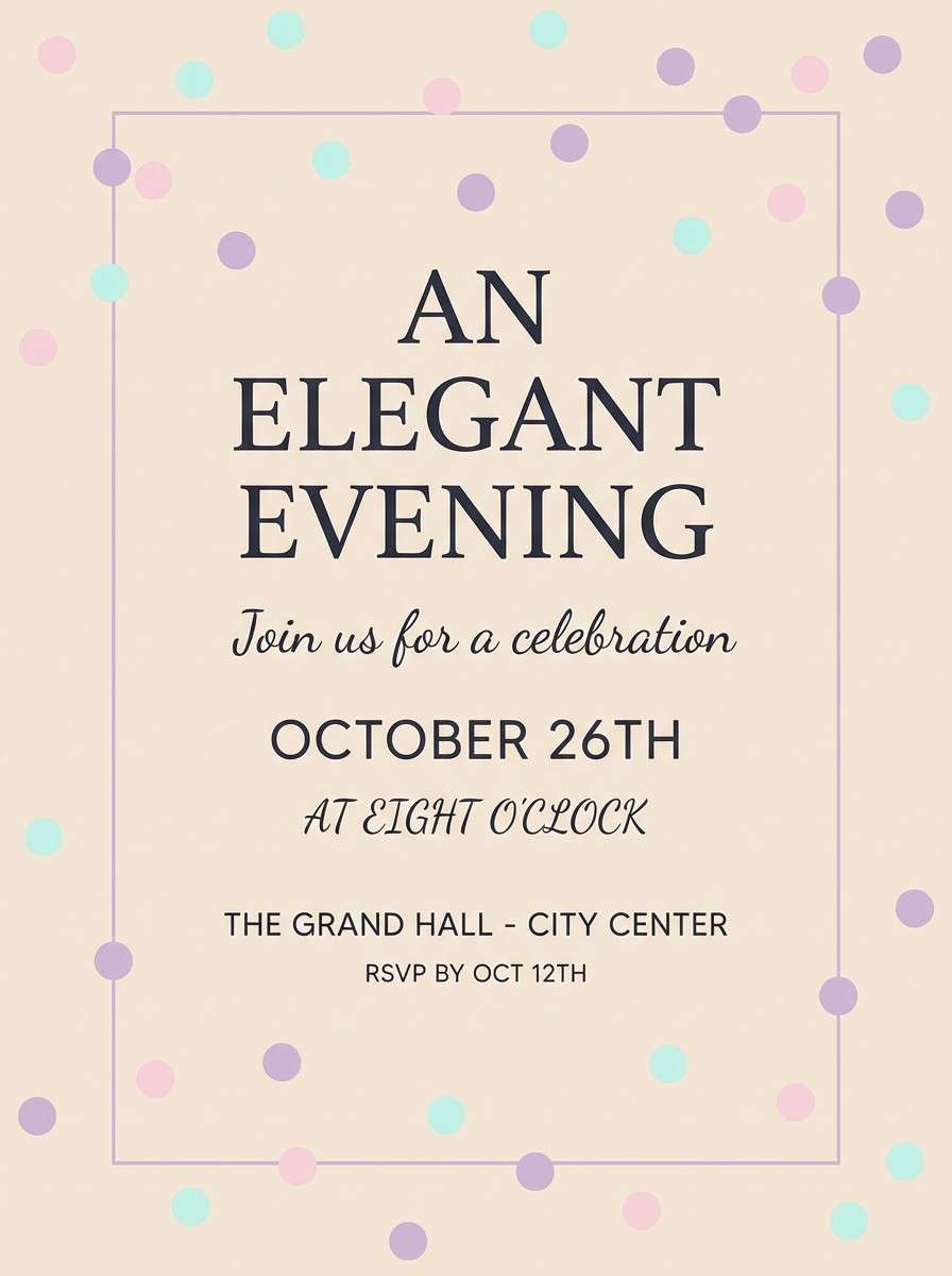
22) Mint Champagne Blush
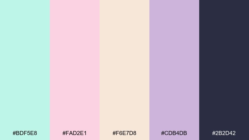
HEX: #BDF5E8 #FAD2E1 #F6E7D8 #CDB4DB #2B2D42
Mood: celebratory, soft, stylish
Best for: event flyers and RSVP pages
Celebratory and soft, like champagne bubbles with a blush tint. Mint keeps it fresh, while mauve and deep ink add an upscale edge. Use it for birthday events, brunch invites, or RSVP pages, and pair with elegant typography and subtle sparkles. Tip: keep the dark ink for headings and dates to maintain a polished, readable hierarchy.
Image example of mint champagne blush generated using media.io
What Colors Go Well with Mint?
Mint pairs beautifully with deep anchors like navy, charcoal, and deep teal—these darker tones keep mint from feeling washed out and make text, buttons, and logos look crisp.
If you want a softer, more premium feel, combine mint with warm neutrals like cream, beige, sand, or light gray. This is a common approach for skincare, spa, and minimal editorial layouts.
For bold contrast, mint can support energetic accents like coral, buttercup yellow, cobalt blue, or violet. The key is hierarchy: let mint and a dark neutral structure the layout, then use the bright color sparingly for focal points.
How to Use a Mint Color Palette in Real Designs
In UI design, mint works best as a highlight color for active states, success messages, tags, and subtle background sections. Pair it with a dark “ink” color for typography to maintain accessible contrast.
For branding and packaging, use mint as the freshness cue and bring in neutrals (cream/stone/silver) to control saturation. One deeper accent (navy, forest green, plum) helps logos and claims stand out.
In events and print (like invitations or flyers), keep mint backgrounds light and airy, then set important details in a dark gray or deep teal. This avoids low-contrast text while preserving the soft mint vibe.
Create Mint Palette Visuals with AI
If you already have HEX codes, you can turn them into on-brand visuals fast by generating mockups, ads, UI screens, and posters from a single prompt. This is a great way to test multiple mint color combinations before committing to a final direction.
Start with one palette above, paste its prompt, then tweak the subject (packaging, landing page, invitation) and keep the same five colors for consistency. Iterate by changing only one element at a time—like lighting, layout density, or typography style.
When your visuals look right, you can align your design system: mint tints for backgrounds, deep tones for text, and one bright accent for CTA moments. That keeps mint feeling fresh without sacrificing readability.
Mint Color Palette FAQs
-
What is the HEX code for a classic mint color?
A widely used mint shade is #A7F3D0. It’s a light, pastel-leaning mint that works well for backgrounds, highlights, and soft brand accents. -
Does mint work better with warm or cool colors?
Both. Cool pairings (navy, teal, silver) make mint feel crisp and modern, while warm pairings (cream, sand, terracotta, blush) make it feel cozy and lifestyle-oriented. -
What is the best text color on a mint background?
Use a deep neutral like charcoal, deep teal, or navy (for example, #111827 or #0F172A). Light text on mint usually lacks contrast unless the mint is much darker. -
Is mint a good color for branding?
Yes—mint often signals freshness, cleanliness, and calm. It’s popular for wellness, skincare, eco brands, and modern SaaS products when balanced with strong dark typography. -
How do I keep a mint palette from looking “too pastel”?
Add a strong anchor (navy/charcoal/forest green) and introduce one saturated accent (coral, yellow, violet). Keep mint as the base, but let contrast define hierarchy. -
What are common mint color combinations for UI design?
Mint + charcoal + light gray is a reliable UI mix for dashboards and apps. Use mint for active navigation, success states, or badges, and keep body text in a dark “ink” color. -
Can I generate mint palette images for ads and mockups quickly?
Yes. With Media.io text-to-image, you can paste a prompt (like the ones above), keep the same HEX colors, and generate consistent campaign visuals, UI concepts, or packaging mockups in minutes.


