

Fire and ice palettes are all about contrast: cool, crisp blues and teals against warm ember reds, oranges, or pinks. Used well, they create instant focus, modern energy, and clear visual hierarchy.
Below are 20 curated fire and ice color palette combinations with HEX codes, plus practical tips for UI, branding, posters, packaging, and more.
In this article
Why Fire and Ice Palettes Work So Well
Fire and ice color schemes feel “designed” because they naturally separate roles: cool hues create depth and space, while warm hues pull elements forward. That built-in push-and-pull makes calls to action, headlines, and key data points easier to notice.
They also balance emotion. Icy blues signal clarity, trust, and modernity; ember tones add urgency, excitement, and warmth. Together, you get a look that’s both premium and energetic.
Most importantly, these palettes are flexible. You can go minimalist (mostly cool tones with one warm accent) or expressive (multiple warm accents) depending on whether you’re building a UI system, a poster, or a brand identity.
20+ Fire and Ice Color Palette Ideas (with HEX Codes)
1) Ember Glacier
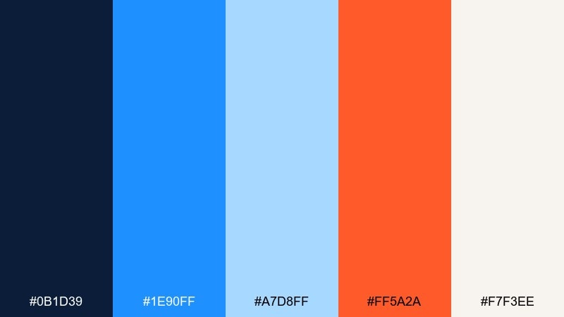
HEX: #0B1D39 #1E90FF #A7D8FF #FF5A2A #F7F3EE
Mood: bold, crisp, high-contrast
Best for: hero banner design for a winter sale landing page
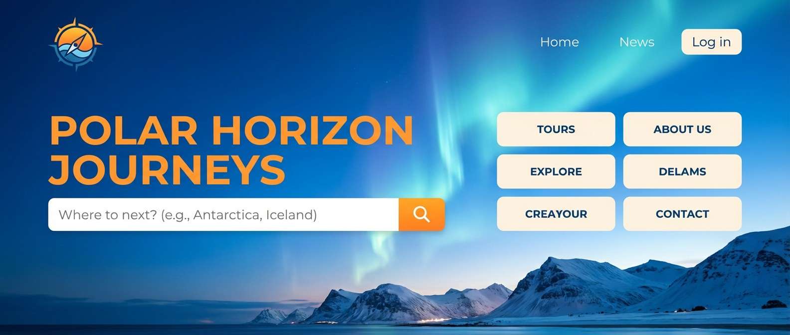
Crisp arctic blues crash into a bright ember accent, like sparks over frozen water at night. The deep navy keeps the look premium while the offwhite gives breathing room for type. Use this fire and ice color palette for landing pages, tech promos, or event headers where you need instant contrast. Tip: keep the orange to buttons and price tags so the cool tones stay dominant.
Image example of ember glacier generated using media.io

Media.io is an online AI studio for creating and editing video, image, and audio in your browser.

2) Polar Flame
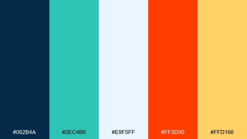
HEX: #062B4A #2EC4B6 #E9F5FF #FF3D00 #FFD166
Mood: energetic, clean, optimistic
Best for: app onboarding screens for a fitness brand
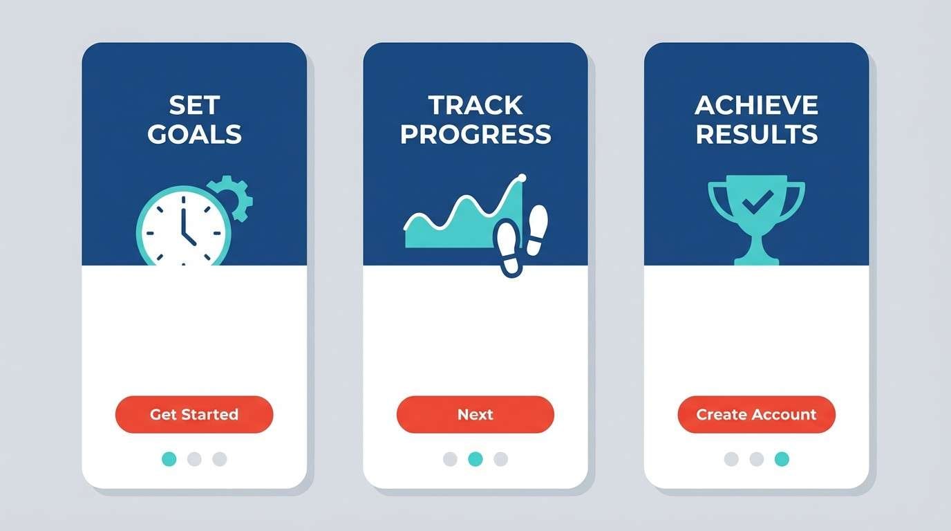
Bright aqua and frosty white feel like clean air, while the flame red adds a hit of adrenaline. The warm sand tone softens transitions between cold and hot accents. It works especially well for onboarding, feature highlights, and progress states. Tip: use the red for one primary action per screen and let aqua handle secondary UI elements.
Image example of polar flame generated using media.io
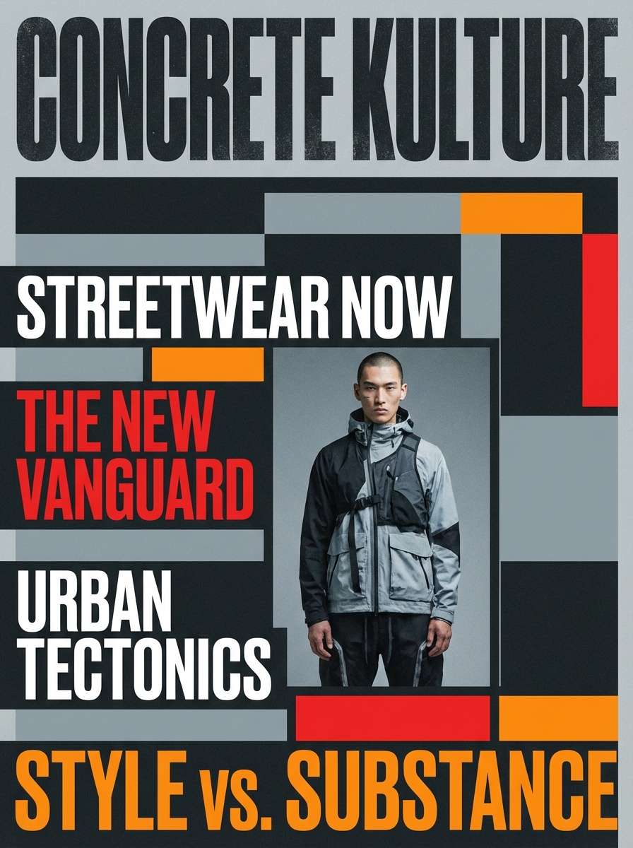
3) Frosted Cinders
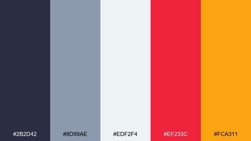
HEX: #2B2D42 #8D99AE #EDF2F4 #EF233C #FCA311
Mood: urban, gritty, editorial
Best for: magazine cover layout for a streetwear feature
Smoky charcoal and cool gray read like winter concrete, then the red and orange hit like fresh graffiti. The near-white keeps the page looking print-ready and crisp. This mix shines in editorial layouts, lookbooks, and high-impact typography. Tip: keep images slightly desaturated so the warm accents stay in control.
Image example of frosted cinders generated using media.io
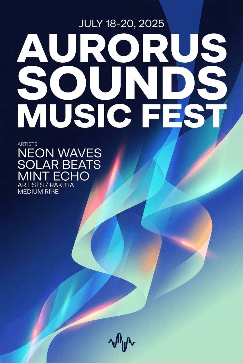
4) Aurora Spark
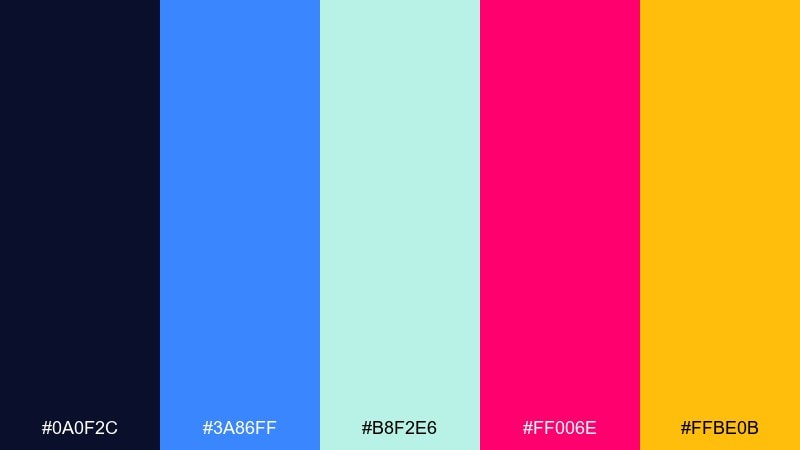
HEX: #0A0F2C #3A86FF #B8F2E6 #FF006E #FFBE0B
Mood: electric, playful, night-sky
Best for: music festival poster design on a plain background
Midnight tones set a night-sky stage, then neon blue and mint glow like an aurora sweep. The pink and amber feel like stage lights cutting through cold air. Use it for posters, social graphics, and event branding that needs energy without looking messy. Tip: choose one warm accent per layout and reserve the other for small highlights or icons.
Image example of aurora spark generated using media.io
5) Iceberg Sunset
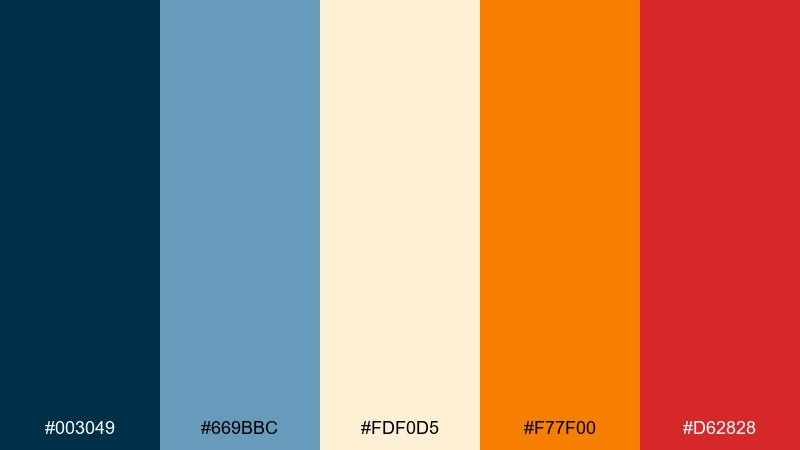
HEX: #003049 #669BBC #FDF0D5 #F77F00 #D62828
Mood: cinematic, warm-cool balance
Best for: travel brand homepage header for cold-destination tours
Deep ocean blues and airy sky tones feel like icebergs at dusk, with a sunset flare from orange and red. The cream neutral keeps it inviting instead of harsh. This pairing suits travel headers, tour ads, and storytelling sections with big photography. Tip: place warm tones as overlay gradients near text so readability stays strong on images.
Image example of iceberg sunset generated using media.io
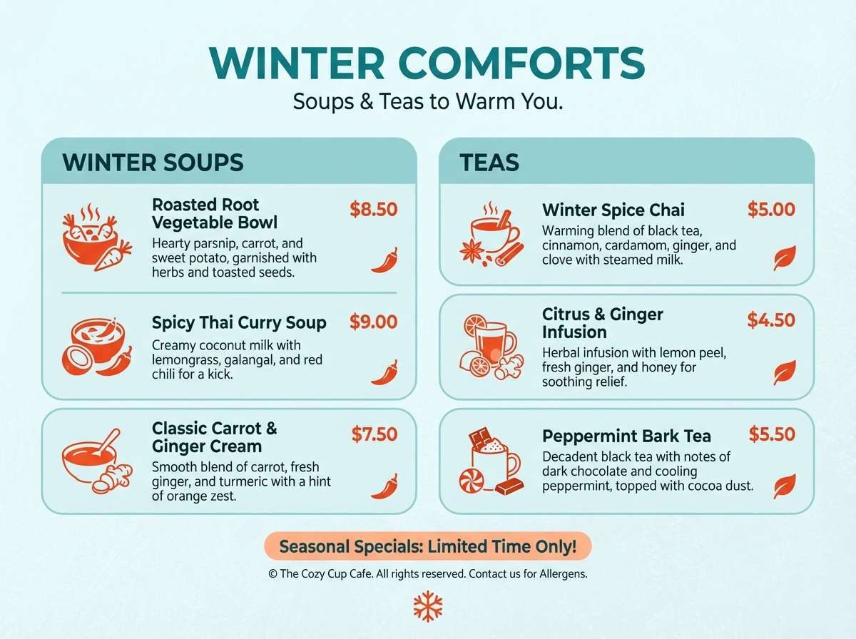
6) Arctic Chili
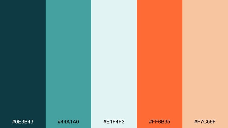
HEX: #0E3B43 #44A1A0 #E1F4F3 #FF6B35 #F7C59F
Mood: fresh, friendly, contemporary
Best for: cafe menu design for winter soups and teas
Cool teals feel like frosted glass, warmed up by a chili-orange pop and soft peach. The pale ice tone gives you a clean base for menu sections and pricing. Great for cafes, seasonal promos, and packaging where you want cozy without going rustic. Tip: use teal for section headers and keep orange for featured items only.
Image example of arctic chili generated using media.io
7) Blueberry Bonfire
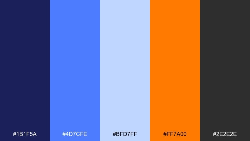
HEX: #1B1F5A #4D7CFE #BFD7FF #FF7A00 #2E2E2E
Mood: sporty, punchy, modern
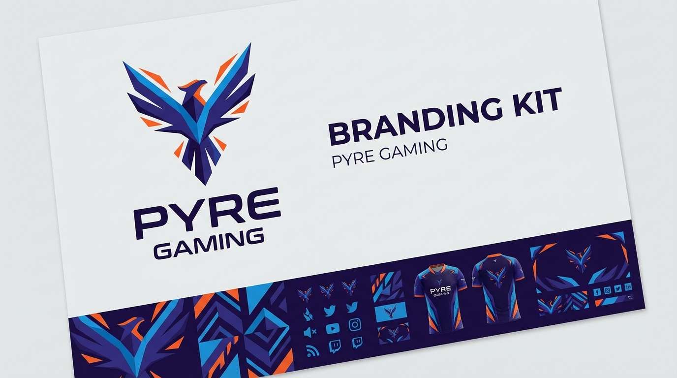
Best for: esports team branding kit with logo and banner
Inky blueberry blues set a competitive tone, while the bonfire orange snaps the whole look into focus. The light blue keeps gradients smooth and the graphite adds toughness for outlines and text. These fire and ice color combination choices work well for esports, streaming overlays, and high-contrast logos. Tip: outline orange elements with the dark blue or graphite to avoid color bleed on screens.
Image example of blueberry bonfire generated using media.io
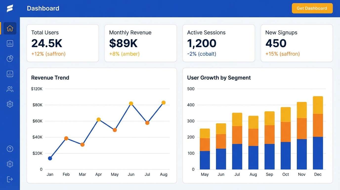
8) Saffron Snow
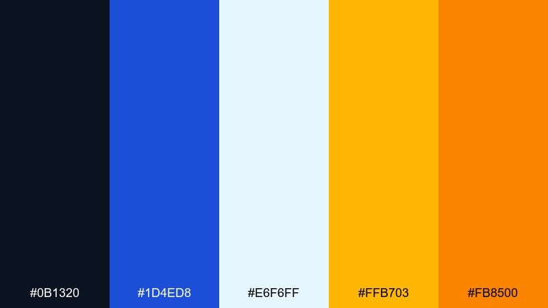
HEX: #0B1320 #1D4ED8 #E6F6FF #FFB703 #FB8500
Mood: clear, sunny, confident
Best for: SaaS dashboard UI for analytics
Cold cobalt and snow-white feel sharp and reliable, like a clean winter morning. Saffron and amber add warmth without making the interface feel busy. It is a strong fit for dashboards, data cards, and alert states where hierarchy matters. Tip: use the warm tones for notifications and key metrics, and keep the background mostly snow and cobalt.
Image example of saffron snow generated using media.io
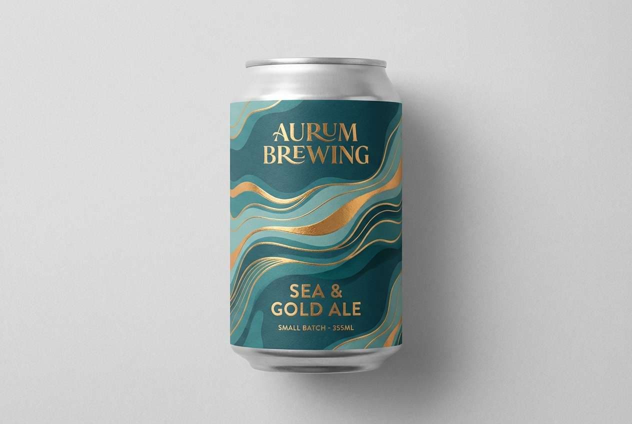
9) Lava Lagoon
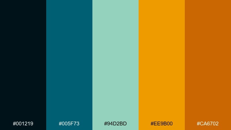
HEX: #001219 #005F73 #94D2BD #EE9B00 #CA6702
Mood: earthy, aquatic, grounded
Best for: craft beverage can label design
Deep lagoon blues and seafoam feel cool and mineral, like water over volcanic rock. The lava gold and burnt orange add a toasted glow that looks great in print. Ideal for beverage labels, outdoor brands, and rustic-modern packaging. Tip: keep gold as the main highlight color and use burnt orange for small stamps or badges.
Image example of lava lagoon generated using media.io
10) Winter Torch
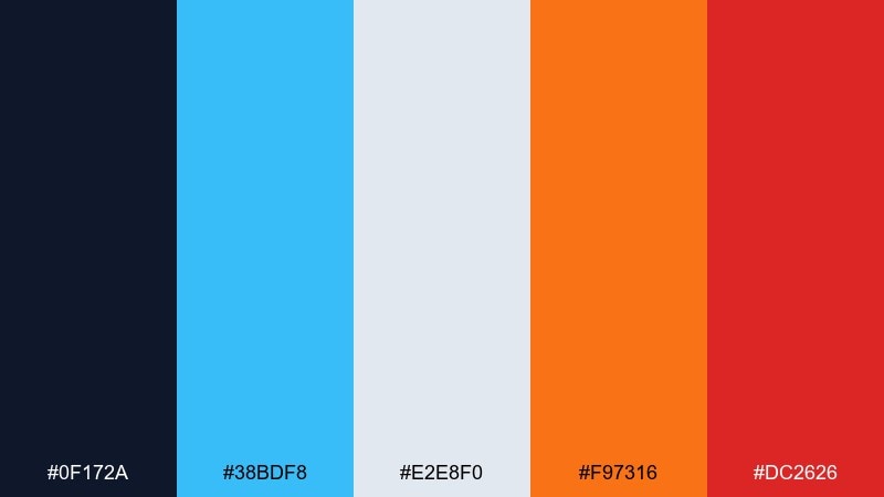
HEX: #0F172A #38BDF8 #E2E8F0 #F97316 #DC2626
Mood: confident, tech-forward, sharp
Best for: product feature section for a cybersecurity website
Cold cyan and slate feel precise and secure, then torch orange and ember red add urgency. The frosty gray makes space for long-form copy and icons. Use it for tech marketing pages, security badges, and pricing tables. Tip: reserve red for warning states and keep orange for primary buttons to avoid competing signals.
Image example of winter torch generated using media.io

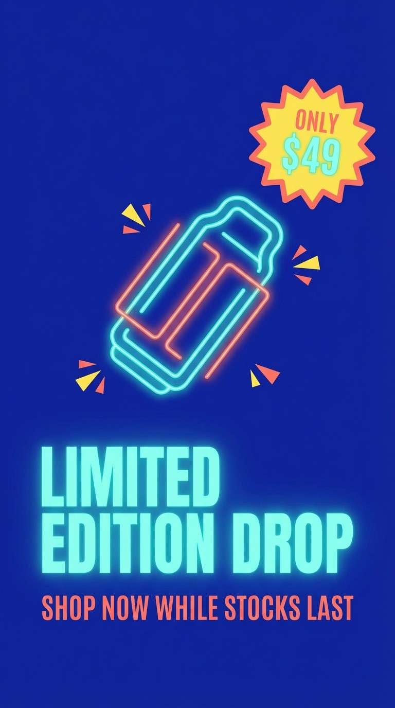
11) Neon Tundra
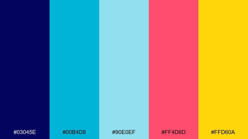
HEX: #03045E #00B4D8 #90E0EF #FF4D6D #FFD60A
Mood: youthful, neon, high-energy
Best for: social media ad creative for a limited drop
Ultramarine and neon aqua feel icy and futuristic, like LED light on snow. Coral and bright yellow bring the heat, perfect for urgency and drop culture. This set works best for social ads, short headlines, and bold stickers or bursts. Tip: keep body text in ultramarine on pale blue so the neon accents can stay loud without hurting readability.
Image example of neon tundra generated using media.io
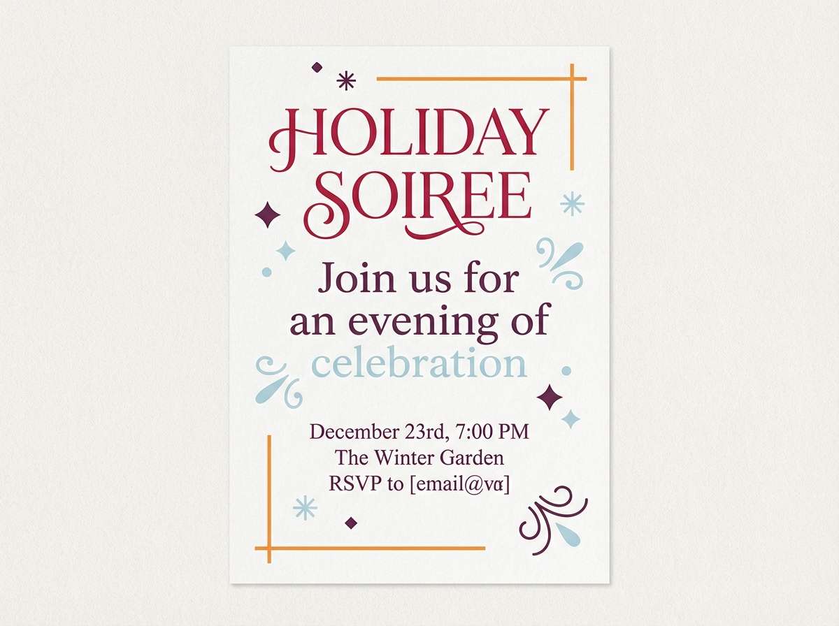
12) Cranberry Ice
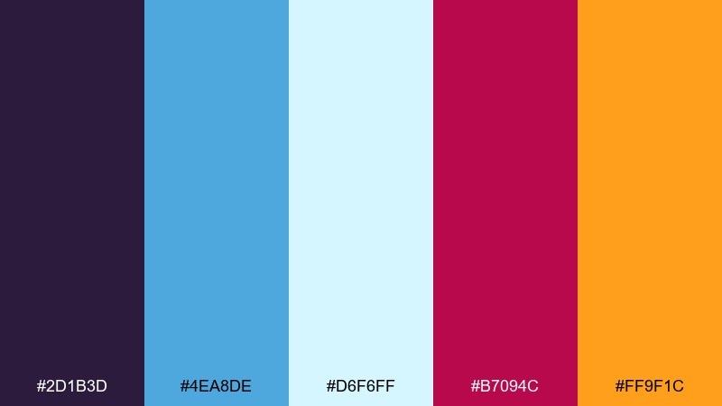
HEX: #2D1B3D #4EA8DE #D6F6FF #B7094C #FF9F1C
Mood: festive, rich, slightly moody
Best for: holiday party invitation design
Plum and icy blue feel like a frosted cocktail at a dim lounge, with cranberry and tangerine adding sparkle. The pale ice tint keeps the layout airy for event details. Perfect for invitations, seasonal email headers, and party posters that want elegance with a punch. Tip: use cranberry for the main title and save tangerine for small date or RSVP highlights.
Image example of cranberry ice generated using media.io
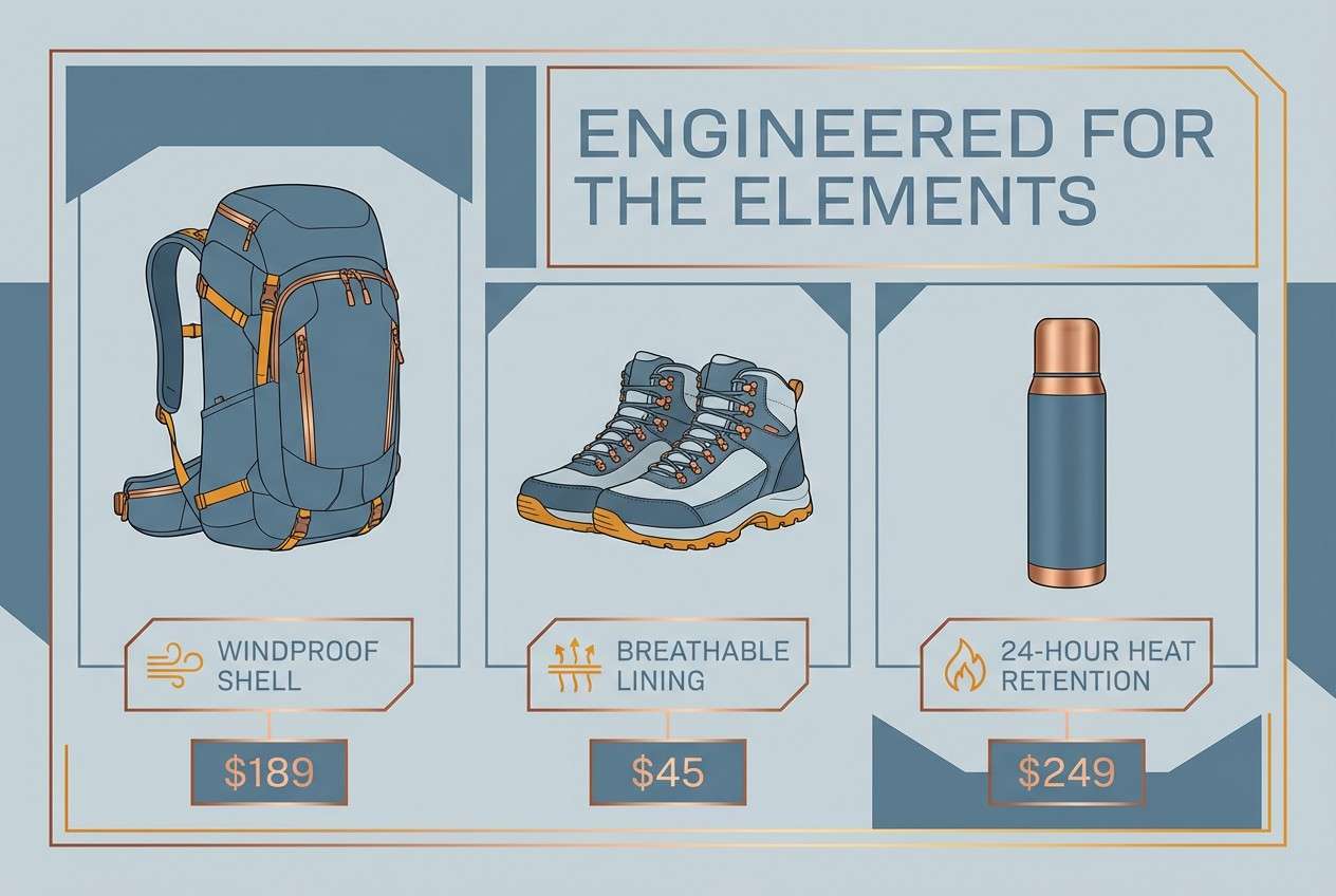
13) Copper Fjord
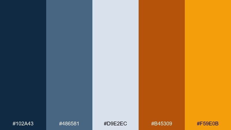
HEX: #102A43 #486581 #D9E2EC #B45309 #F59E0B
Mood: heritage, practical, outdoorsy
Best for: outdoor gear product ad layout
Steel blues read like cold fjord water, while copper and amber feel like worn metal by a campfire. The light ice tone provides a clean base for specs, pricing, and feature callouts. Use it for outdoor gear ads, catalog pages, and rugged lifestyle branding. Tip: pair it with textured paper or subtle grain to lean into the heritage feel.
Image example of copper fjord generated using media.io
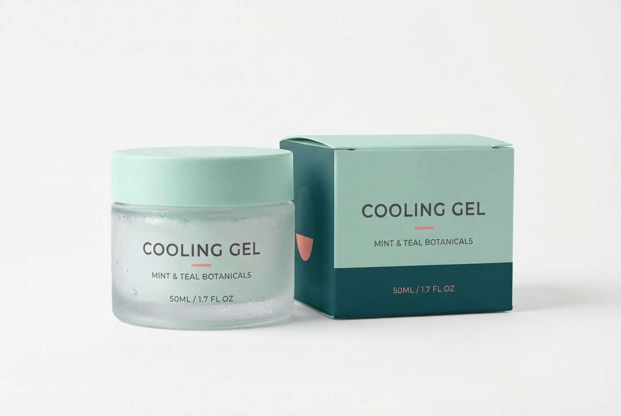
14) Minted Ember
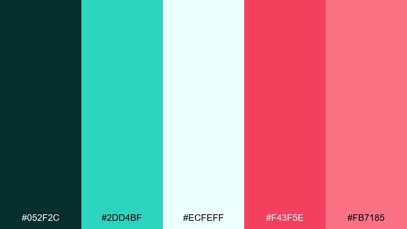
HEX: #052F2C #2DD4BF #ECFEFF #F43F5E #FB7185
Mood: fresh, modern, friendly
Best for: skincare packaging for a cooling gel
Mint and deep teal feel clean and cooling, like gel over ice, while the ember pinks add a healthy glow. The near-white ice tint keeps the design clinical enough for skincare without going sterile. These fire and ice color combinations are great for beauty labels, product pages, and gentle promotional banners. Tip: keep the pinks as small seals or brand marks so the mint stays the hero.
Image example of minted ember generated using media.io
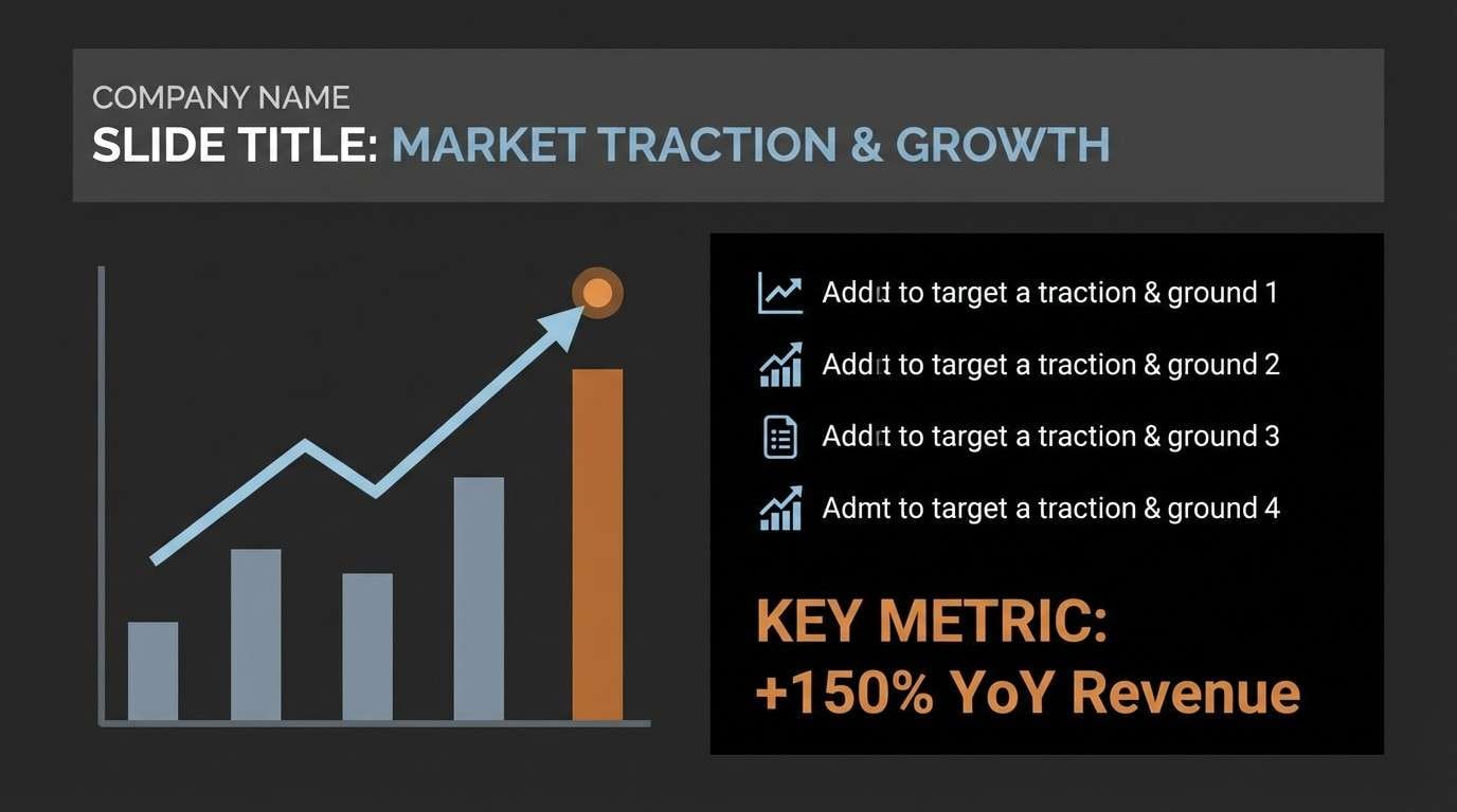
15) Steel and Sienna
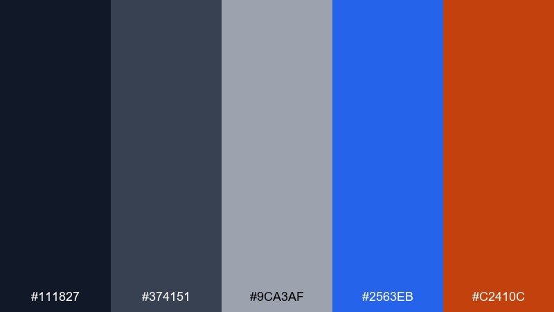
HEX: #111827 #374151 #9CA3AF #2563EB #C2410C
Mood: professional, sturdy, understated
Best for: B2B pitch deck slide template
Steel grays and near-black feel corporate and stable, with an icy blue for clarity and a sienna accent for warmth. The neutral backbone makes charts and tables easy to read. Use it for decks, reports, and enterprise landing pages that want a human touch. Tip: apply sienna only to key numbers or section dividers to keep the tone credible.
Image example of steel and sienna generated using media.io
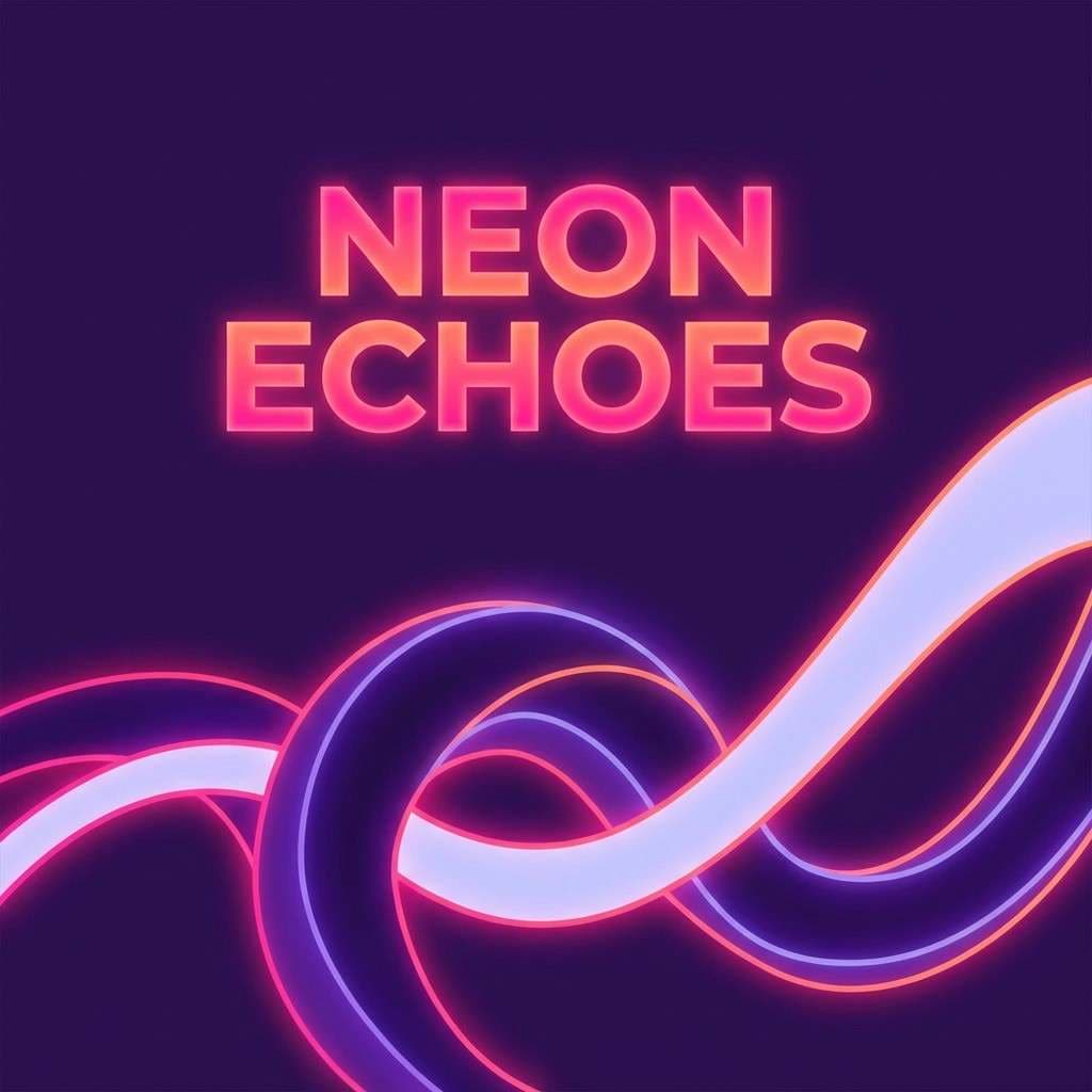
16) Violet Icefire
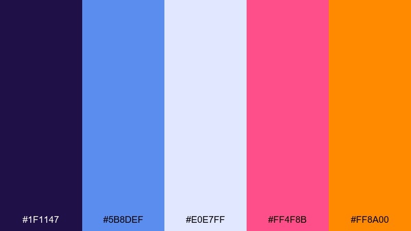
HEX: #1F1147 #5B8DEF #E0E7FF #FF4F8B #FF8A00
Mood: creative, dreamy, high-impact
Best for: album cover artwork layout
Deep violet and ice lavender feel like winter haze under colored lights. Hot rose and orange add a fiery pulse that reads instantly from a distance. It is ideal for album covers, creative portfolios, and bold typographic experiments. Tip: keep the background in violet gradients and let the warm tones form the focal point around the title.
Image example of violet icefire generated using media.io
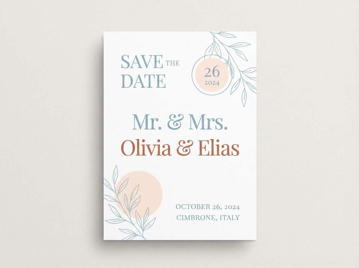
17) Peach Permafrost
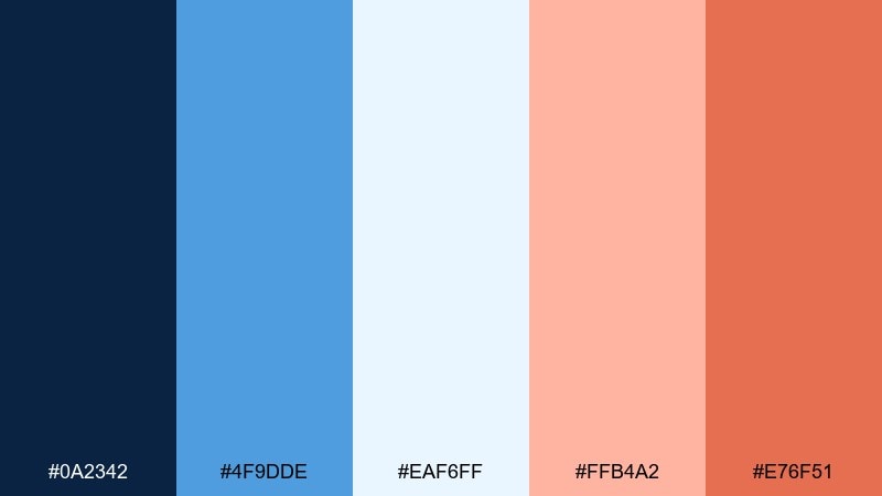
HEX: #0A2342 #4F9DDE #EAF6FF #FFB4A2 #E76F51
Mood: soft, cozy, approachable
Best for: wedding save the date card
Gentle icy blues feel calm and airy, while peach and terracotta bring a romantic warmth. The light ice tint makes plenty of room for delicate typography and monograms. Great for stationery, lifestyle branding, and soft landing pages. Tip: use terracotta for names and headings, and keep peach for small decorative shapes to avoid a sugary look.
Image example of peach permafrost generated using media.io
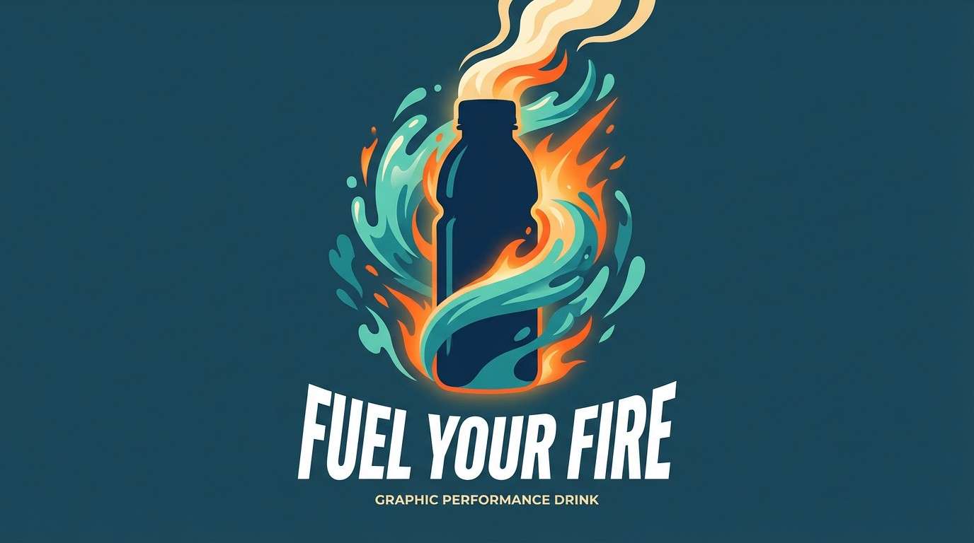
18) Teal Inferno
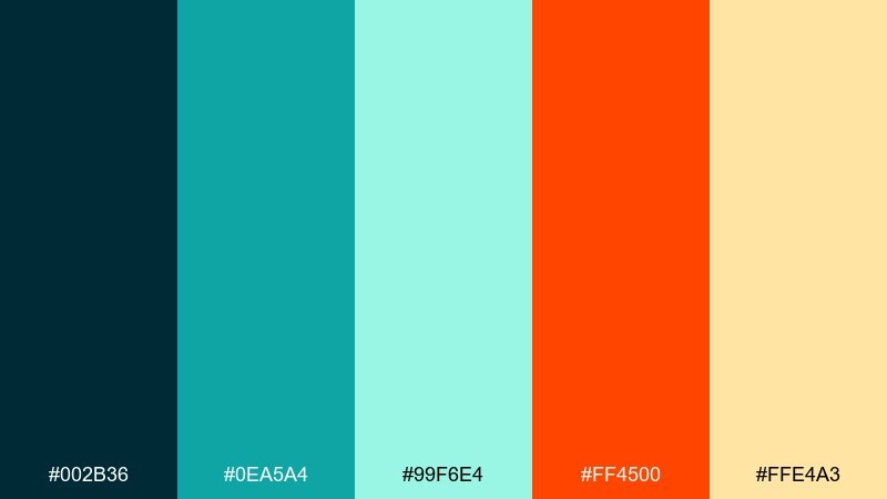
HEX: #002B36 #0EA5A4 #99F6E4 #FF4500 #FFE4A3
Mood: bold, adventurous, tropical-winter
Best for: sports drink product ad with splash graphic
Dark teal and bright aqua feel like cold water, then inferno orange erupts like a heatwave. The warm cream keeps highlights smooth and helps the orange pop without looking harsh. Ideal for beverage ads, performance branding, and punchy social graphics. Tip: keep the orange in one strong shape or splash so the composition stays clean.
Image example of teal inferno generated using media.io
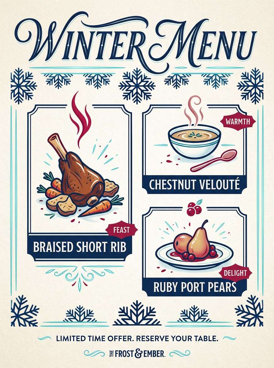
19) Ruby Rime
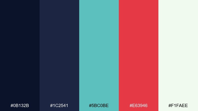
HEX: #0B132B #1C2541 #5BC0BE #E63946 #F1FAEE
Mood: classic, dramatic, polished
Best for: restaurant promo poster for a winter menu
Dark navy and rime-white feel refined like candlelight in a snowstorm, while ruby red brings appetite and urgency. The ice teal adds a clean modern note for borders, icons, and small highlights. Great for posters, menu promos, and premium food branding. Tip: set type in navy on the pale background and use ruby only for dish names or limited-time badges.
Image example of ruby rime generated using media.io
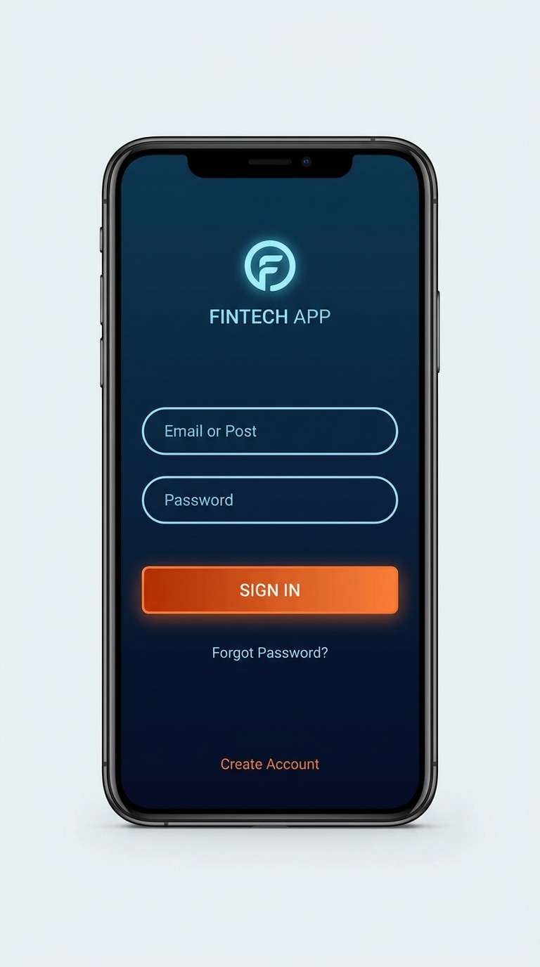
20) Midnight Ember
HEX: #050A30 #1B2A41 #00A6FB #FF6D00 #FFEEDB
Mood: sleek, futuristic, premium
Best for: fintech app login screen UI
Midnight blues feel secure and high-end, like a city skyline in winter. The icy blue brings clarity for inputs, while ember orange adds the perfect focal point for a sign-in button. Use it for fintech, SaaS, and any product that needs a confident, modern edge. Tip: keep backgrounds dark and let the warm accent mark only the primary action.
Image example of midnight ember generated using media.io
What Colors Go Well with Fire and Ice?
Fire and ice palettes pair best with strong neutrals: deep navy, charcoal, slate, and soft off-white. These keep your design grounded so the warm accent can “spark” without overwhelming the composition.
For richer variations, add a supporting cool tone (mint, seafoam, or periwinkle) to smooth gradients and backgrounds. Then choose one warm accent family (ember orange, ruby red, hot pink, or saffron) to maintain a clear focal system.
If you need a more natural look, introduce earthy warms like copper, sienna, or burnt orange. If you want a futuristic vibe, lean into neon aqua + coral with darker blues for contrast.
How to Use a Fire and Ice Color Palette in Real Designs
Start with a simple ratio: 70–80% cool base (backgrounds, large shapes), 15–25% light neutral (cards, content areas), and 5–10% warm accent (CTA buttons, badges, key numbers). This keeps the “ice” dominant while the “fire” stays purposeful.
In UI, use cool tones for structure (navigation, panels) and reserve warm colors for actions and states (primary buttons, alerts). In posters and branding, use warm colors to create the focal point and let cool colors build atmosphere and depth.
For accessibility, test contrast on text-heavy areas and avoid placing saturated warm text on saturated cool backgrounds. When in doubt, put type on off-white or deep navy for reliable readability.
Create Fire and Ice Palette Visuals with AI
If you already have HEX codes, you can turn them into polished mockups fast by generating banner concepts, UI screens, posters, or packaging previews. The key is to describe the layout, the mood, and which colors should be dominant versus accent.
Use prompts like “dominant deep navy and ice blue with ember orange accents” to control the balance. Add a target format (poster, hero header, app UI) and a clear aspect ratio to get consistent outputs.
With Media.io, you can iterate quickly: generate multiple variations, compare compositions, and keep your brand’s fire-and-ice contrast consistent across assets.
Fire and Ice Color Palette FAQs
-
What is a fire and ice color palette?
A fire and ice color palette combines cool hues (like navy, icy blue, aqua, or mint) with warm accents (like ember orange, flame red, saffron, or hot pink) to create strong contrast and visual energy. -
Which colors should be dominant in a fire and ice design?
Usually the cool “ice” colors should dominate backgrounds and large areas, while the warm “fire” colors work best as accents for CTAs, highlights, badges, or focal elements. -
Are fire and ice palettes good for UI and dashboards?
Yes. Cool tones feel stable and clean for structure, and warm accents are excellent for primary actions, alerts, and key metrics—just keep the warm colors limited to avoid noisy screens. -
How do I keep a fire and ice palette from looking too harsh?
Add a soft neutral like off-white, snow, or light gray to create breathing room, and use only one warm accent as the primary “spark” while keeping other warm tones minimal. -
What neutrals pair best with icy blues and ember oranges?
Deep navy, charcoal, graphite, slate, and warm off-white are the easiest neutrals to balance cold/warm contrast while keeping typography readable. -
Can I use gradients with fire and ice colors?
Yes. Cool-to-cool gradients (navy to ice blue) are great for backgrounds, and small warm overlays (orange/red) work well near focal text or buttons for emphasis. -
How can I generate fire and ice palette visuals quickly?
Use an AI text-to-image tool and specify dominance (e.g., “dominant deep navy and ice blue with ember orange accents”), the design type (poster/UI/packaging), and the aspect ratio for consistent results.


