

A lust color palette is built around passionate reds—bold, romantic, and instantly attention-grabbing. It’s a go-to choice when you want designs to feel confident, premium, and emotionally charged.
Below are lust color palette ideas with HEX codes, plus practical tips for applying them to UI, posters, and packaging—without overwhelming the viewer.
In this article
Why Lust Palettes Work So Well
Lust palettes work because red naturally signals urgency, desire, and importance—so it directs attention fast. When paired with neutrals, it feels elevated rather than loud.
These palettes also offer flexible contrast: deep reds read as luxurious and grounded, while blush tones soften layouts for beauty, lifestyle, and editorial design.
Most importantly, lust reds create clear hierarchy in UI and print—perfect for CTAs, headlines, badges, and focal elements that must stand out.
20+ Lust Color Palette Ideas (with HEX Codes)
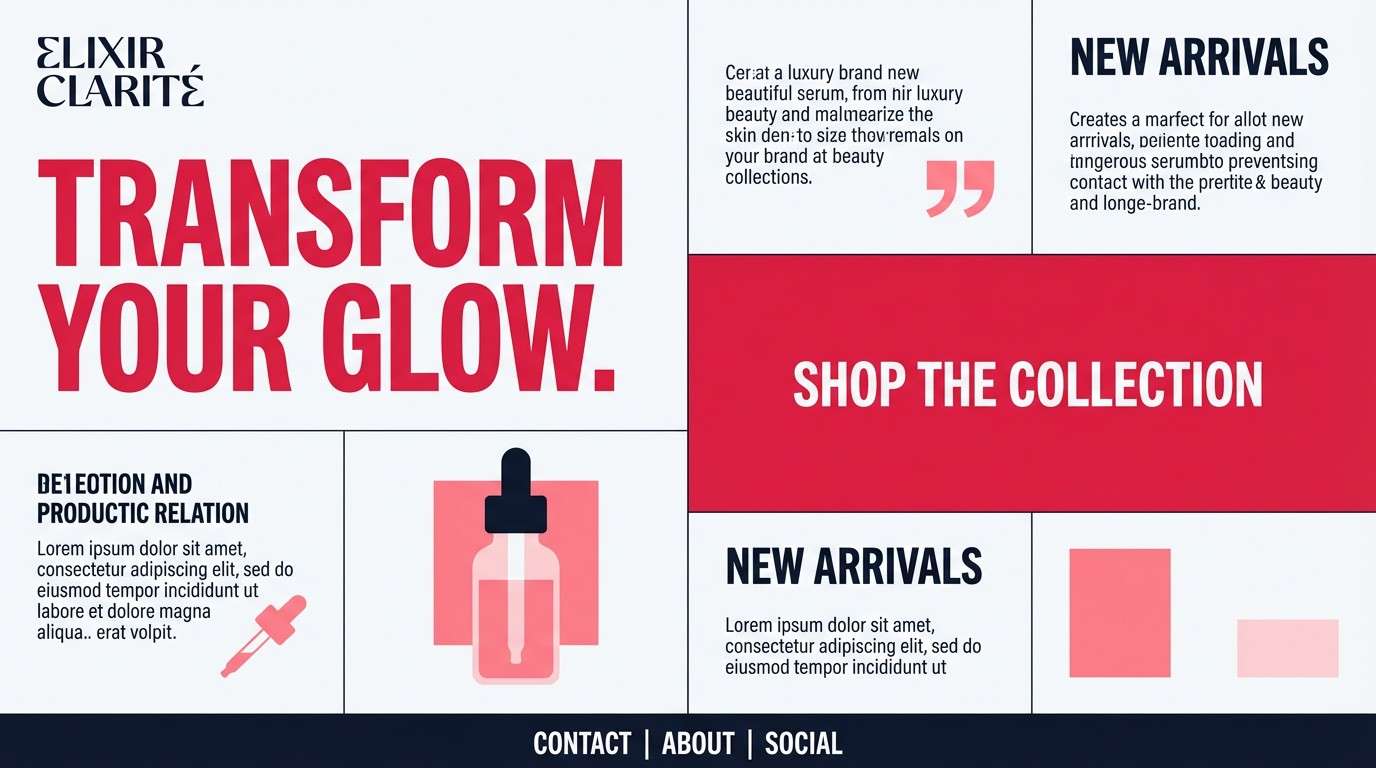
1) Velvet Rose
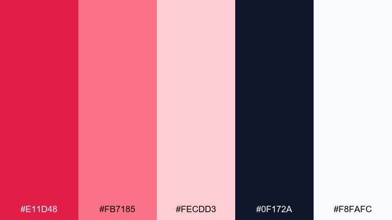
HEX: #e11d48 #fb7185 #fecdd3 #0f172a #f8fafc
Mood: romantic and confident
Best for: beauty brand landing page UI
Romantic and confident, these tones feel like velvet petals against a midnight backdrop. Use the deep lust red for CTAs and headlines, then soften sections with blush and airy white. Pair with charcoal navigation to keep the page grounded and premium. Tip: reserve the brightest pink for hover states so the interface stays elegant.
Image example of velvet rose generated using media.io
Media.io is an online AI studio for creating and editing video, image, and audio in your browser.

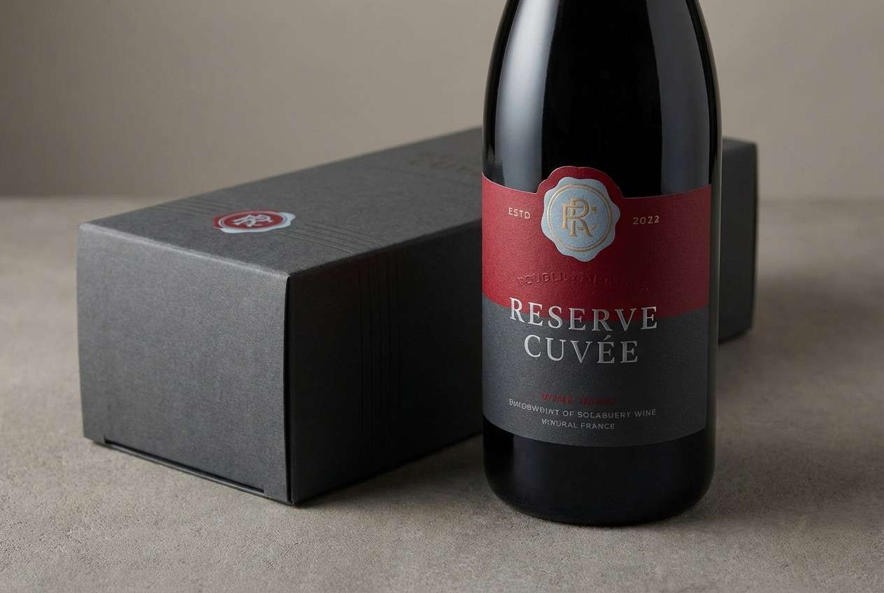
2) Noir Garnet
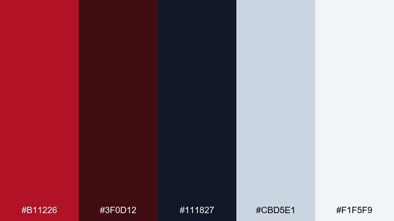
HEX: #b11226 #3f0d12 #111827 #cbd5e1 #f1f5f9
Mood: moody and luxurious
Best for: high-end wine label packaging
Moody and luxurious, it evokes garnet glass, dark wood, and candlelit tastings. Let the garnet red carry the brand mark while near-black and graphite create a high-contrast frame. Use cool silver-gray for small type and regulatory text without losing sophistication. Tip: add subtle embossed textures to the darkest tones to amplify the premium feel.
Image example of noir garnet generated using media.io
3) Blush Copper
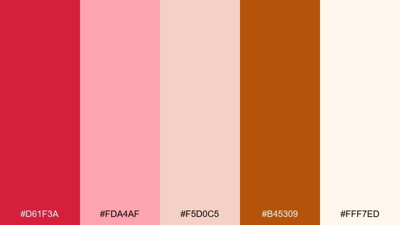
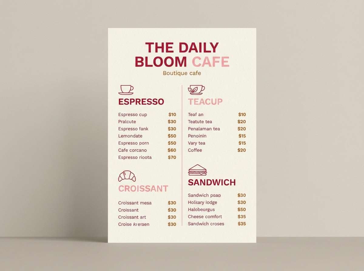
HEX: #d61f3a #fda4af #f5d0c5 #b45309 #fff7ed
Mood: warm and approachable
Best for: boutique cafe menu design
Warm and approachable, these shades feel like rose pastries and copper espresso machines. Use the red for section headers and callouts, then lean on creamy off-white for readability. Copper and clay tones make great icon fills and dividers without overwhelming the layout. Tip: keep body text in a dark neutral to prevent the warm palette from feeling washed out.
Image example of blush copper generated using media.io
4) Cherry Latte
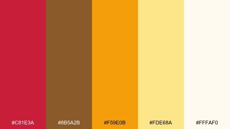
HEX: #c81e3a #8b5a2b #f59e0b #fde68a #fffaf0
Mood: cozy and playful
Best for: seasonal social media promo post
Cozy and playful, it brings to mind cherry syrup swirls in a golden latte. Anchor the design with rich red, then add caramel-brown for warmth and depth. Use honey yellow sparingly for price tags, stickers, or limited-time badges. Tip: keep the background creamy to make the reds look richer rather than harsh.
Image example of cherry latte generated using media.io

5) Crimson Garden
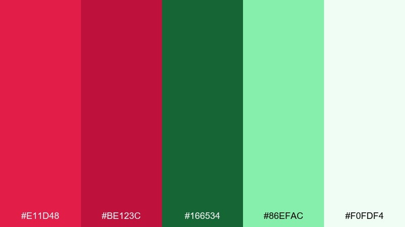
HEX: #e11d48 #be123c #166534 #86efac #f0fdf4
Mood: fresh and dramatic
Best for: botanical illustration poster
Fresh and dramatic, it feels like crimson blooms cutting through glossy leaves. Balance the reds with deep forest green for stems, frames, or title bands. Minty greens work best as highlights and negative space to keep the print breathable. Tip: limit gradients and lean on flat botanical shapes for a crisp, modern finish.
Image example of crimson garden generated using media.io
6) Satin Berry
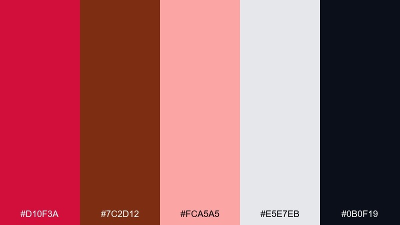
HEX: #d10f3a #7c2d12 #fca5a5 #e5e7eb #0b0f19
Mood: sensual and refined
Best for: fashion editorial magazine layout
Sensual and refined, it reads like satin fabric under studio lights. Use the berry red for pull quotes and section numbers, then rely on cool gray for margins and grids. A near-black base makes photography captions feel crisp and high-fashion. Tip: keep accent pink to small details so the layout stays editorial, not sweet.
Image example of satin berry generated using media.io
7) Spiced Terracotta
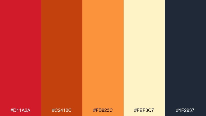
HEX: #d11a2a #c2410c #fb923c #fef3c7 #1f2937
Mood: earthy and energetic
Best for: restaurant flyer design
Earthy and energetic, it suggests fire-roasted spice, clay ovens, and lively dinner service. This lust color palette works well for bold headers, while terracotta and orange handle subheads and feature callouts. Add pale cream for breathing room and dark slate for body copy. Tip: keep the red to one or two focal zones so the flyer reads fast from a distance.
Image example of spiced terracotta generated using media.io

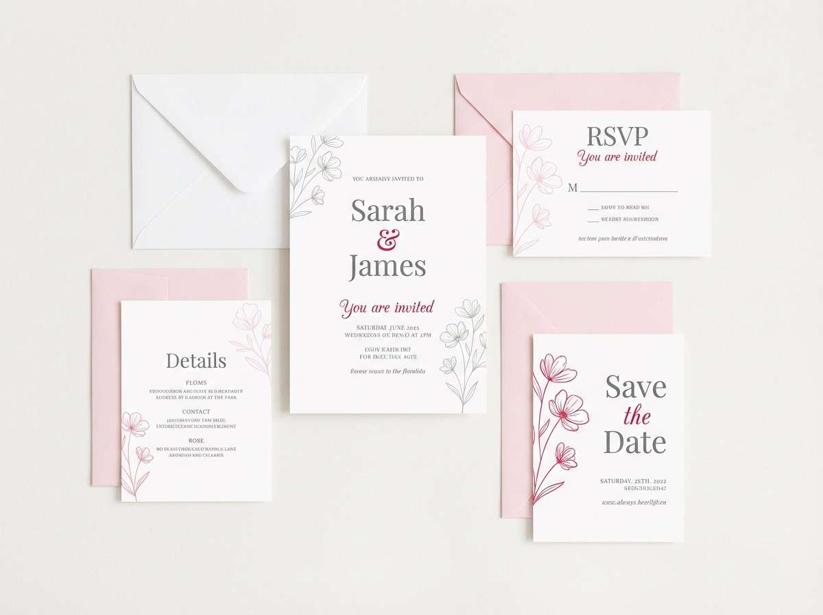
8) Rosé Quartz
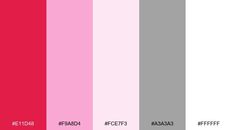
HEX: #e11d48 #f9a8d4 #fce7f3 #a3a3a3 #ffffff
Mood: soft and polished
Best for: wedding invitation set
Soft and polished, it feels like rosé bubbles and pale quartz shimmer. Use the deep red for names or monograms, then keep most of the layout in blush and white. Light gray is ideal for fine lines, borders, and RSVP details without stealing attention. Tip: choose one elegant serif and avoid heavy weights so the invitation stays airy.
Image example of rosé quartz generated using media.io
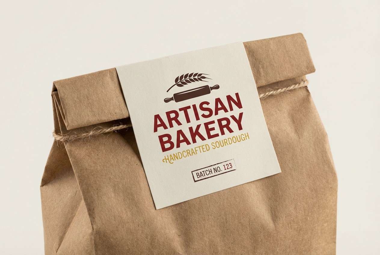
9) Wine & Wheat
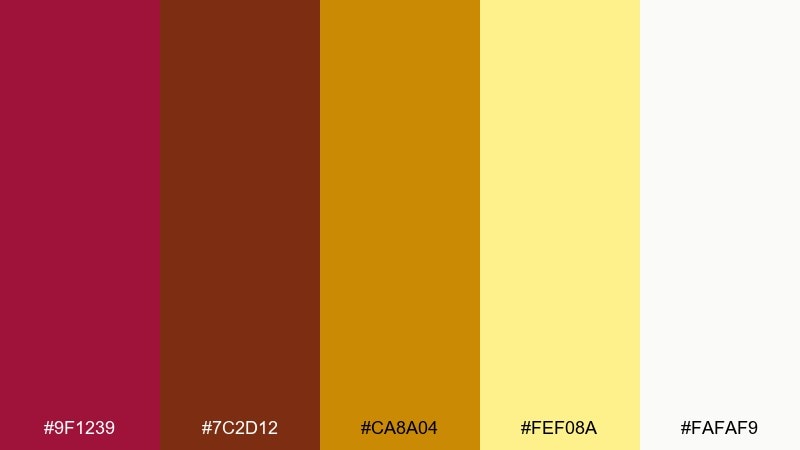
HEX: #9f1239 #7c2d12 #ca8a04 #fef08a #fafaf9
Mood: rustic and inviting
Best for: artisan bakery packaging label
Rustic and inviting, it recalls mulled wine, toasted crust, and late-afternoon warmth. The wine red carries logos beautifully, while wheat yellow adds a friendly handmade tone. Use off-white as the main field for ingredient lists and nutrition blocks. Tip: add small illustrated stamps in brown to reinforce an artisan feel.
Image example of wine & wheat generated using media.io
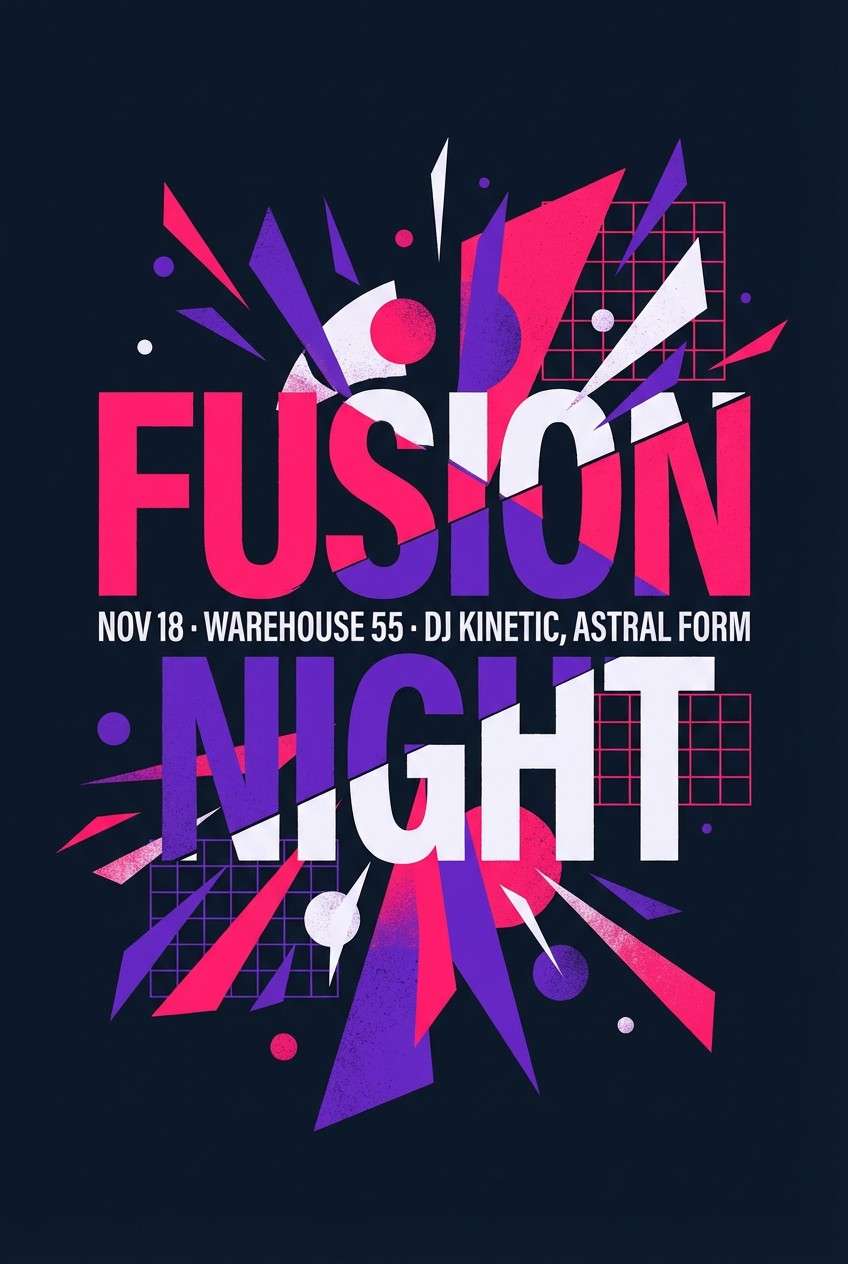
10) Neon Cabaret
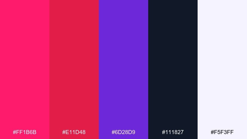
HEX: #ff1b6b #e11d48 #6d28d9 #111827 #f5f3ff
Mood: bold and nightlife-ready
Best for: event poster for a club night
Bold and nightlife-ready, it feels like neon signage glowing in a dark hallway. Let hot pink lead the headline, then use violet for secondary acts and date blocks. Keep the background near-black so the colors stay electric and legible. Tip: use tight letter spacing and simple geometric shapes to avoid visual clutter.
Image example of neon cabaret generated using media.io
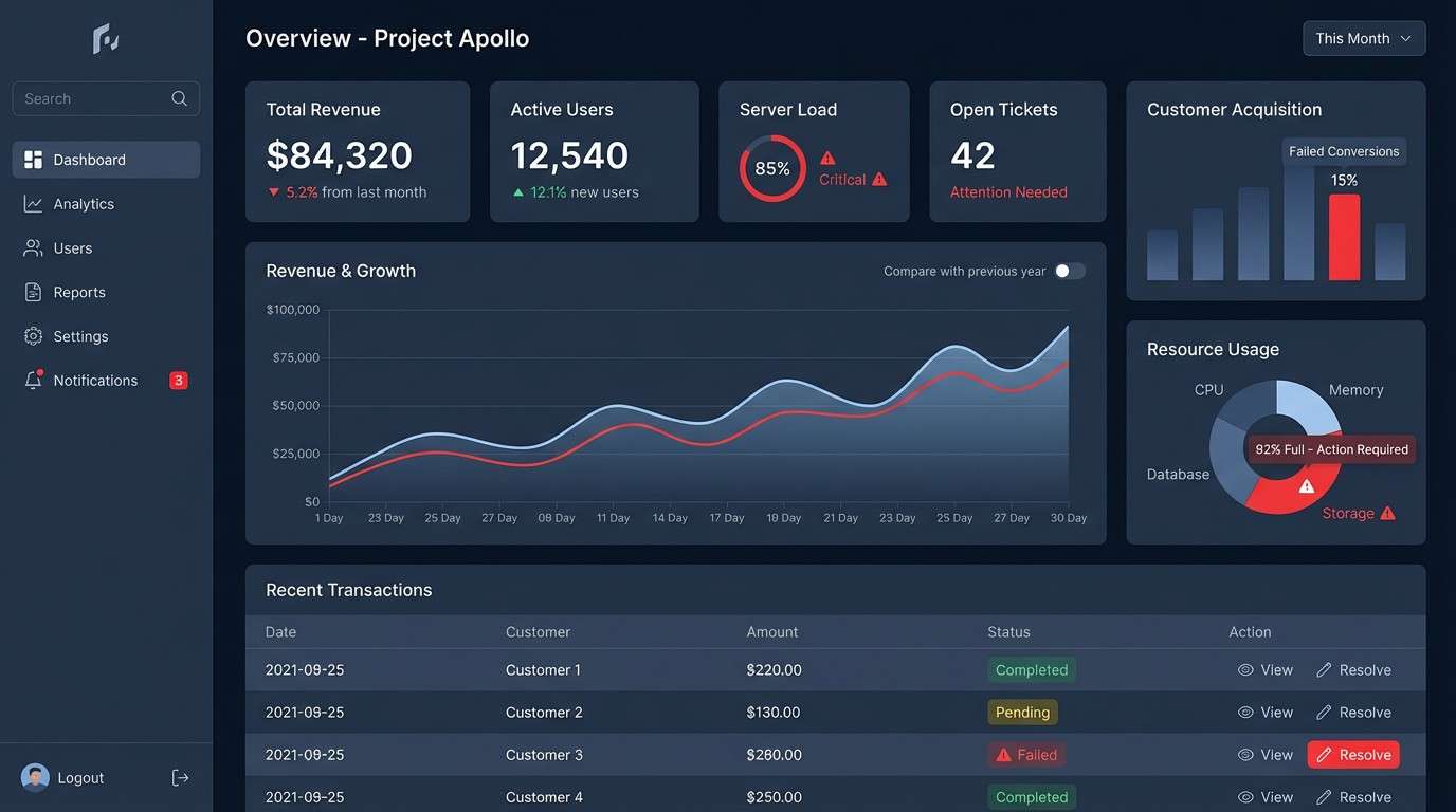
11) Ember & Ink
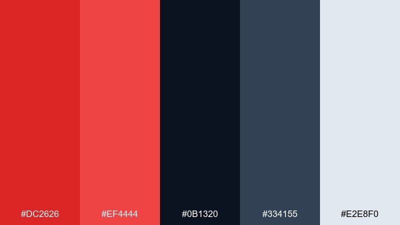
HEX: #dc2626 #ef4444 #0b1320 #334155 #e2e8f0
Mood: powerful and technical
Best for: SaaS dashboard UI
Powerful and technical, it reads like glowing embers against ink-black code. Use red for alerts and key metrics, and keep most surfaces in deep navy to reduce eye strain. Steel blue-gray helps with dividers and secondary labels without washing out. Tip: reserve the brightest red for critical states only to maintain trust and clarity.
Image example of ember & ink generated using media.io
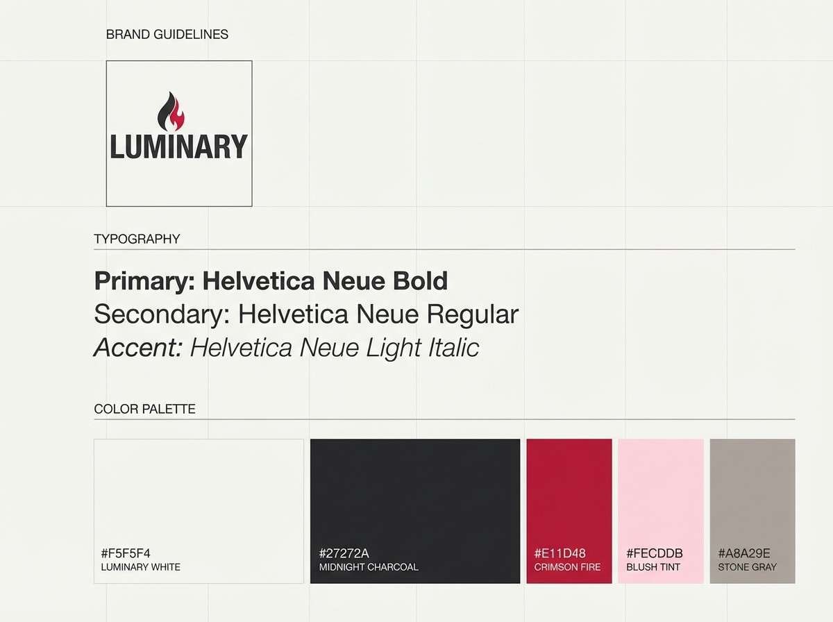
12) Romantic Minimal
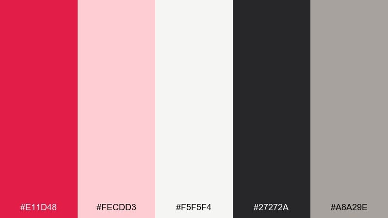
HEX: #e11d48 #fecdd3 #f5f5f4 #27272a #a8a29e
Mood: clean and intimate
Best for: brand guidelines one-page sheet
Clean and intimate, it feels like a handwritten note on fine paper. This lust color scheme is ideal when you want a single confident accent without losing minimalism. Use charcoal for typography, warm gray for rules, and blush for spacious blocks. Tip: keep the red to logos and section markers so the guideline sheet stays calm and premium.
Image example of romantic minimal generated using media.io
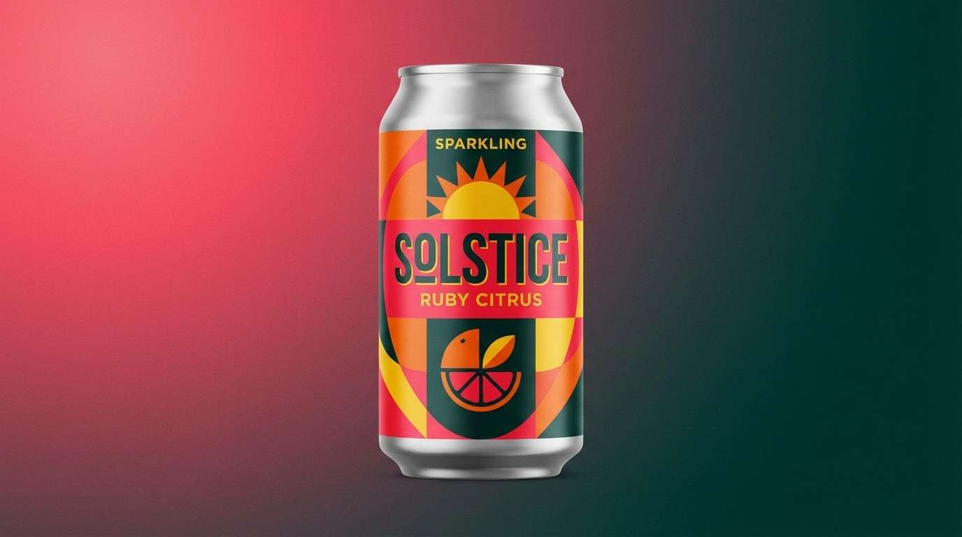
13) Tropical Punch
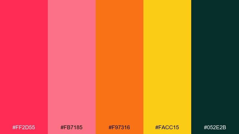
HEX: #ff2d55 #fb7185 #f97316 #facc15 #052e2b
Mood: bright and celebratory
Best for: summer drink product ad
Bright and celebratory, it evokes fruit punch, citrus peel, and late-summer sunsets. Use pink-red for the hero headline and let orange and yellow support flavor cues and badges. A deep teal-green base keeps the whole look modern instead of sugary. Tip: limit gradients and use big color blocks for strong shelf impact.
Image example of tropical punch generated using media.io
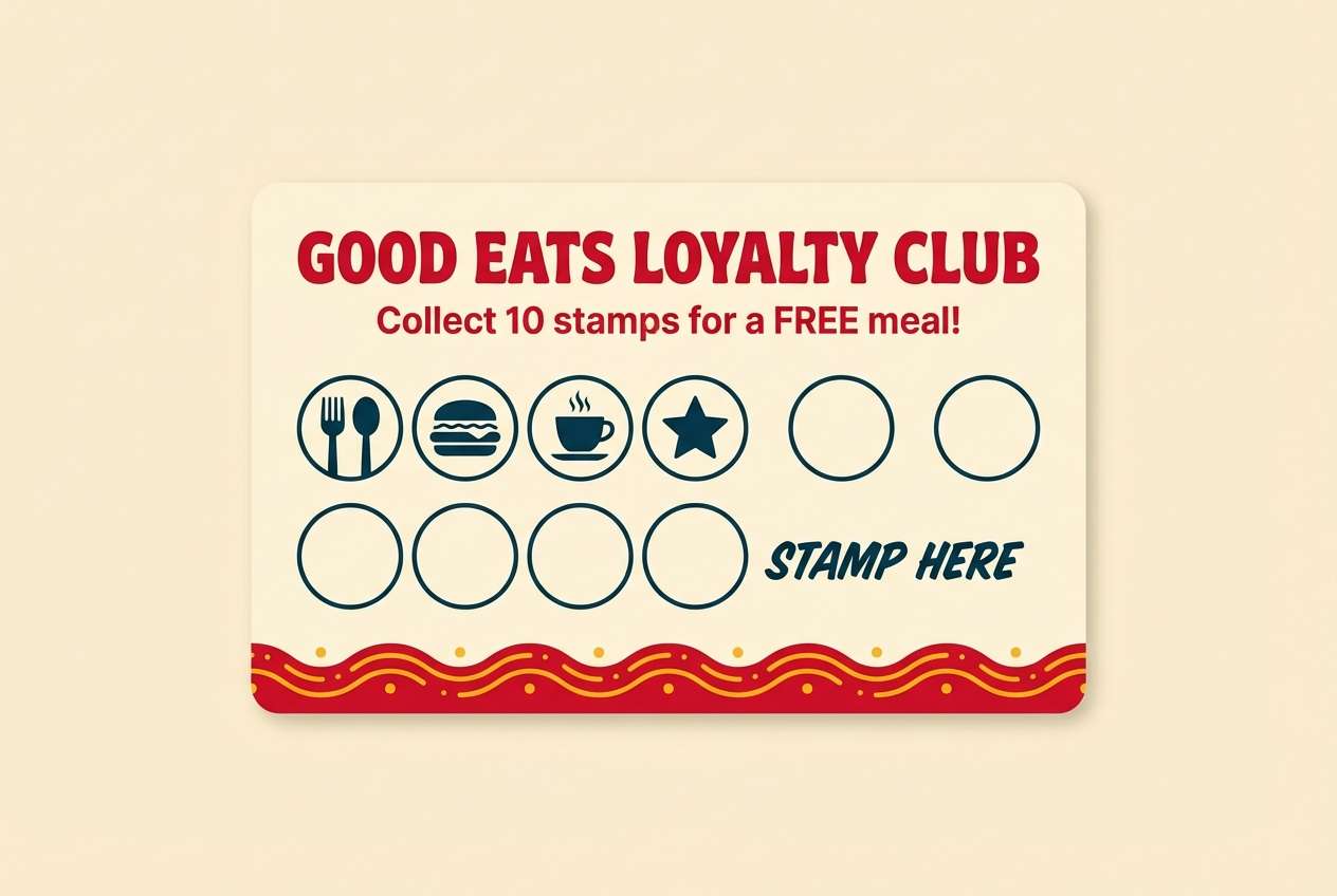
14) Retro Diner
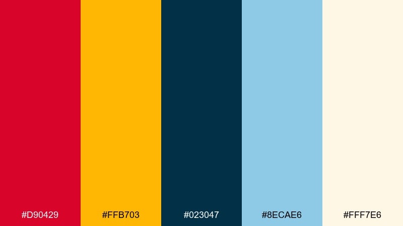
HEX: #d90429 #ffb703 #023047 #8ecae6 #fff7e6
Mood: retro and upbeat
Best for: restaurant loyalty card design
Retro and upbeat, it channels diner booths, chrome details, and classic signage. Use the red for the logo stamp and key offers, then balance with creamy paper tones. Navy and light blue are great for borders, icons, and small patterns without fighting the warm accents. Tip: add a simple checker stripe using navy and cream for instant nostalgia.
Image example of retro diner generated using media.io
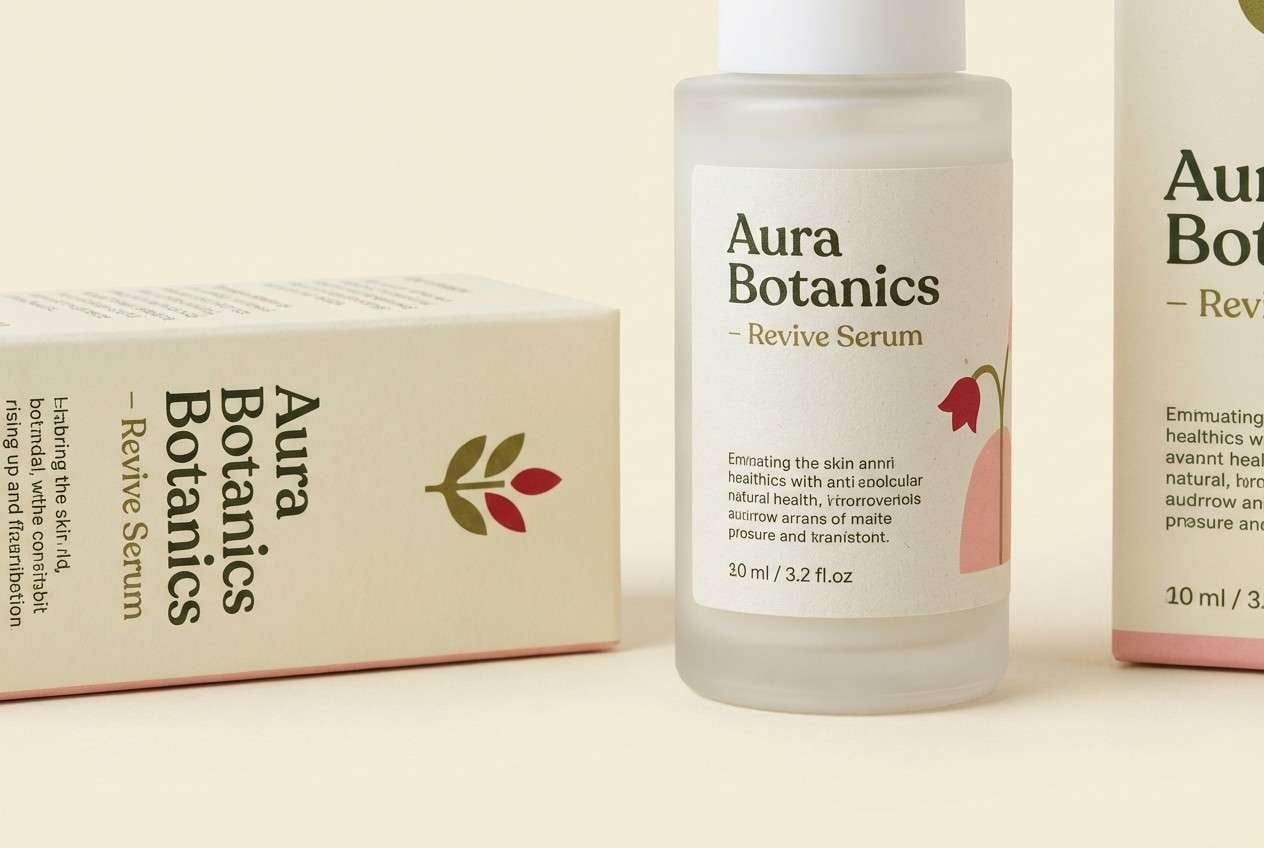
15) Botanical Rouge
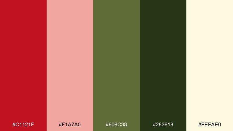
HEX: #c1121f #f1a7a0 #606c38 #283618 #fefae0
Mood: natural and romantic
Best for: skincare label and box packaging
Natural and romantic, it feels like pressed petals on recycled paper. These lust color combinations shine on skincare packaging when you want warmth without looking loud. Use olive and deep green for ingredient credibility, and keep the background creamy for a clean apothecary vibe. Tip: print the red in a slightly muted finish to avoid a glossy, artificial look.
Image example of botanical rouge generated using media.io
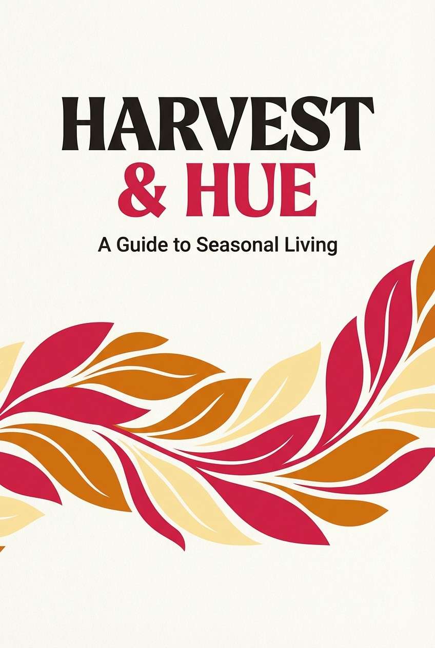
16) Autumn Kiss
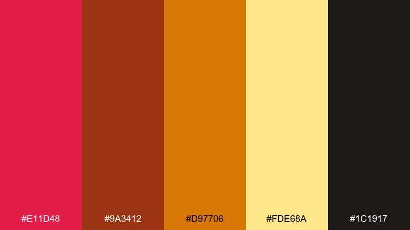
HEX: #e11d48 #9a3412 #d97706 #fde68a #1c1917
Mood: cozy and cinematic
Best for: book cover design
Cozy and cinematic, it looks like falling leaves lit by a streetlamp. Use deep brown-black for the title area, then bring in red for the author name or a key motif. Amber and gold tones work well for subtitle highlights and small illustration details. Tip: keep contrast high by placing warm accents on the darkest background areas.
Image example of autumn kiss generated using media.io
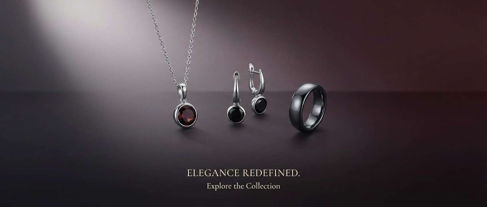
17) Luxe Burgundy
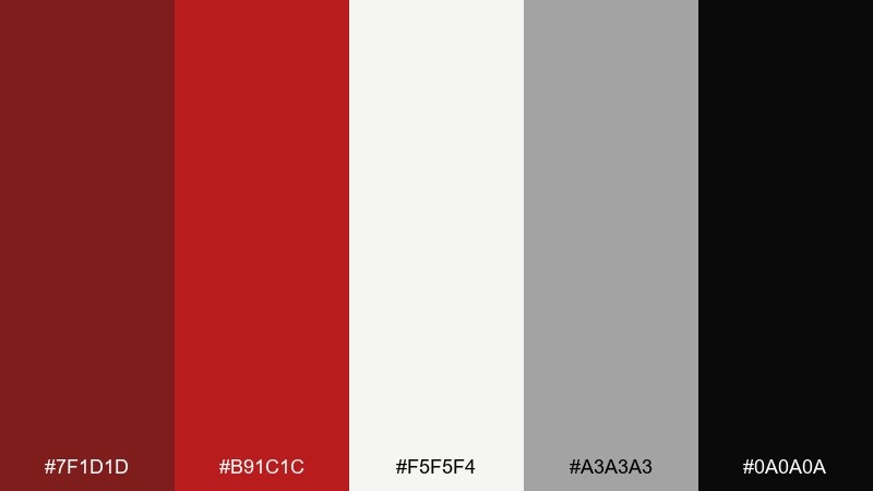
HEX: #7f1d1d #b91c1c #f5f5f4 #a3a3a3 #0a0a0a
Mood: elegant and timeless
Best for: jewelry product ad banner
Elegant and timeless, it evokes burgundy velvet and soft spotlight reflections. Let burgundy and black carry the mood, then use warm off-white for product details and pricing. A touch of gray keeps the typography understated and luxe. Tip: keep the background mostly dark and place one off-white panel for sharp readability.
Image example of luxe burgundy generated using media.io
18) Candy Valentine
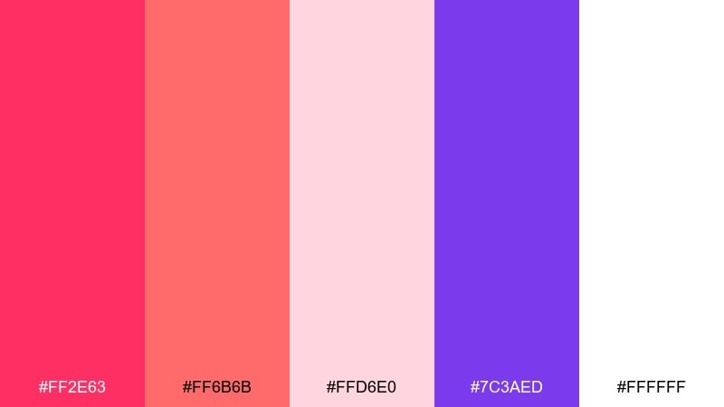
HEX: #ff2e63 #ff6b6b #ffd6e0 #7c3aed #ffffff
Mood: sweet and playful
Best for: Valentine email header graphic
Sweet and playful, it feels like candy hearts and glossy icing. Use the hot pink for the main greeting, then layer softer blush shapes behind it for depth. Purple makes a great supporting accent for buttons or small icons when you want contrast. Tip: keep copy minimal and let the big shapes do most of the work.
Image example of candy valentine generated using media.io

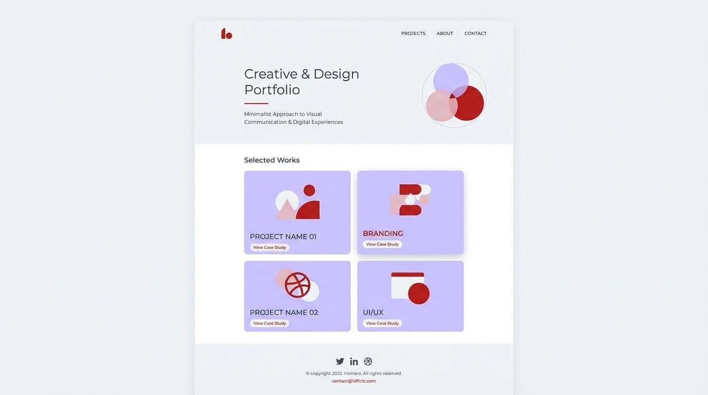
19) Dusty Drama
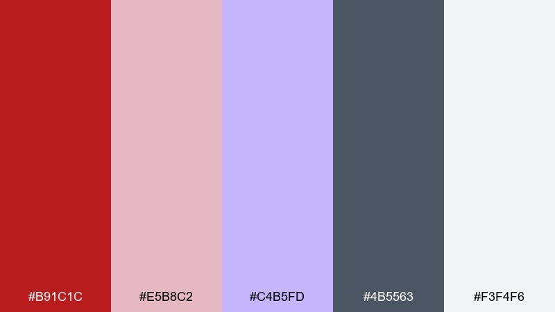
HEX: #b91c1c #e5b8c2 #c4b5fd #4b5563 #f3f4f6
Mood: artful and modern
Best for: portfolio website UI
Artful and modern, it suggests a gallery wall with soft lighting and dramatic accents. Use muted red for highlights like selected states and project tags, while dusty lavender adds a distinctive personal touch. Cool gray keeps navigation and captions readable across sections. Tip: place the boldest color only on the most important links so the portfolio feels curated.
Image example of dusty drama generated using media.io
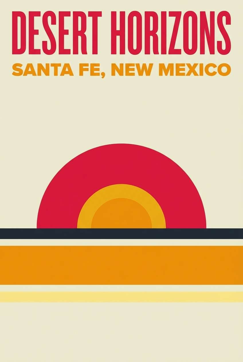
20) Sunset Romance
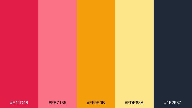
HEX: #e11d48 #fb7185 #f59e0b #fde68a #1f2937
Mood: glowing and optimistic
Best for: travel poster design
Glowing and optimistic, it feels like a coastal sunset with warm air and bright reflections. These lust color combinations work best when red leads the headline and amber supports the horizon-like accents. Use deep slate for small print and route details so the warm tones stay front and center. Tip: keep the layout simple with one large focal shape to mimic a sun disk.
Image example of sunset romance generated using media.io
What Colors Go Well with Lust?
Lust reds pair beautifully with deep neutrals like charcoal, near-black, and navy because they increase contrast and make the red feel more premium. These combinations are ideal for luxury branding, editorial layouts, and dark-mode UI.
For softer looks, add blush pinks and warm off-whites to reduce intensity while keeping the romantic vibe. This approach works especially well for weddings, beauty, and lifestyle products.
If you want something more unexpected, try balancing lust red with greens (forest, olive, mint) or violet accents—both add depth and keep the palette from feeling overly classic.
How to Use a Lust Color Palette in Real Designs
Use lust red as an accent, not a background default: think CTAs, price tags, section headers, or a single hero element. This keeps the design readable and prevents “red fatigue.”
Control the temperature with neutrals: cool grays and navies make lust feel sharper and more modern, while creams and warm browns make it feel cozy and handcrafted.
Finally, keep your hierarchy consistent—one primary red, one supporting accent (blush/orange/violet), and two neutrals for text and surfaces. That structure makes the palette easy to scale across assets.
Create Lust Palette Visuals with AI
If you have HEX codes but need real mockups—posters, landing pages, packaging, or social ads—AI generation is a fast way to explore variations before you commit to production.
With Media.io Text to Image, you can paste a prompt, specify your lust palette colors, and generate on-brand visuals in different aspect ratios for print and digital.
Iterate quickly by adjusting one element at a time (background, contrast, or accent color) to find the version that feels romantic, bold, or luxe—without redesigning from scratch.
Lust Color Palette FAQs
-
What is a lust color palette?
A lust color palette centers on passionate reds (from crimson to berry) supported by blush tones and grounding neutrals like charcoal, navy, gray, or warm off-white. -
Is lust red better for accents or backgrounds?
Most designs look cleaner when lust red is used as an accent (CTAs, headlines, badges). For backgrounds, choose blush or off-white and reserve saturated red for focal areas. -
What neutrals pair best with lust tones?
Charcoal, near-black, deep navy, cool gray, and warm cream are the most reliable. They keep contrast high and prevent the palette from feeling overly bright. -
What are good complementary colors for lust red?
Deep greens (forest/olive) and violets are strong complements for lust red in modern designs. Use them sparingly as supporting accents to avoid competing focal points. -
How do I keep a lust color scheme from looking too harsh?
Add soft blush tints and plenty of negative space (white or cream). Also reduce the number of saturated elements—one strong red area is often enough. -
Can lust palettes work for UI design?
Yes—use reds for key actions and critical states, while keeping most surfaces neutral (light UI) or deep navy/charcoal (dark UI). This preserves usability and trust. -
How can I generate lust palette mockups quickly?
Use Media.io Text to Image: describe your design (UI, poster, packaging), include the HEX codes in the prompt, and generate multiple variations to compare layout and contrast.
Next: Alice Blue Color Palette


