

Champagne pink is a soft, warm blush with a “toasted” undertone—elegant enough for luxury, but gentle enough for everyday UI and branding.
Below are 20+ champagne pink color combinations with HEX codes, plus practical pairing tips for weddings, packaging, and modern digital design.
In this article
- Why Champagne Pink Color Combinations Work So Well
-
- bridal bubbles
- rosé velvet
- pearl boutique
- blush bistro
- sunset champagne
- soft gallery
- petal powder
- modern romance
- luxe satin
- apricot fizz
- dusty boudoir
- minimal marzipan
- copper kiss
- creamy peony
- warm clay rose
- ethereal ballet
- silk & sage
- café macaron
- gilded blush
- nightfall rosé
- powdered sandstone
- rosewater studio
- champagne peony pop
- What Colors Go Well with Champagne Pink?
- How to Use a Champagne Pink Color Combination in Real Designs
- Create Champagne Pink Palette Visuals with AI
Why Champagne Pink Color Combinations Work So Well
Champagne pink sits in a flattering middle ground: it’s romantic like blush, but softened by warm beige notes that keep it from feeling overly sweet or “baby pink.” That makes it versatile across fashion, weddings, beauty, and modern product design.
It also pairs naturally with neutrals (cream, taupe, cocoa) for clean readability, while still leaving room for a statement accent (coral, gold, sage, or deep plum) when you need contrast.
Most importantly, champagne pink supports both minimal and luxe aesthetics—so you can push it toward airy editorial layouts, cozy artisan branding, or sleek UI without changing the core vibe.
20+ Champagne Pink Color Palette Ideas (with HEX Codes)
1) Bridal Bubbles
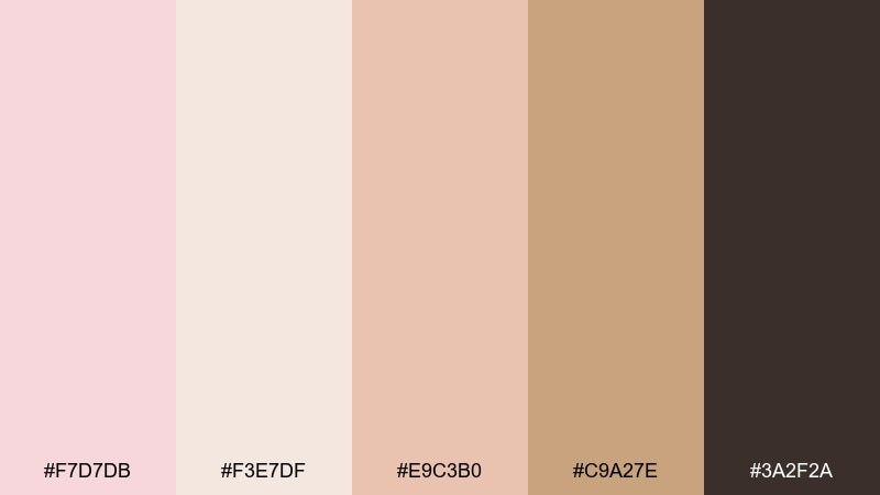
HEX: #F7D7DB #F3E7DF #E9C3B0 #C9A27E #3A2F2A
Mood: airy, romantic, polished
Best for: wedding invitation design
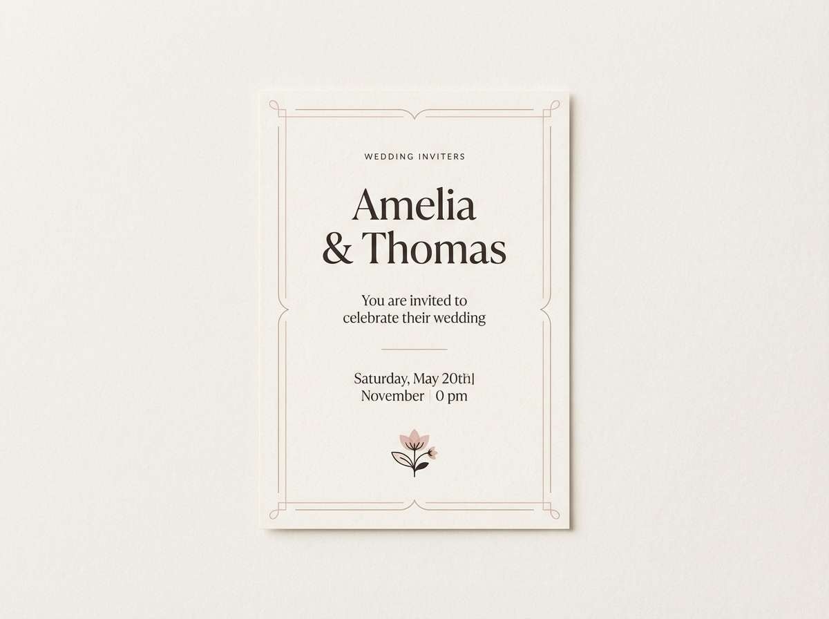
Airy and romantic like a toast at golden hour, these champagne pink color combinations feel polished without trying too hard. Use the soft pink and cream as your base, then bring in warm beige for typography blocks or borders. Espresso brown keeps names and dates crisp and readable, especially on textured paper. Tip: add a thin foil-like line in the tan shade to mimic champagne sparkle.
Image example of bridal bubbles generated using media.io
Media.io is an online AI studio for creating and editing video, image, and audio in your browser.

2) Rosé Velvet
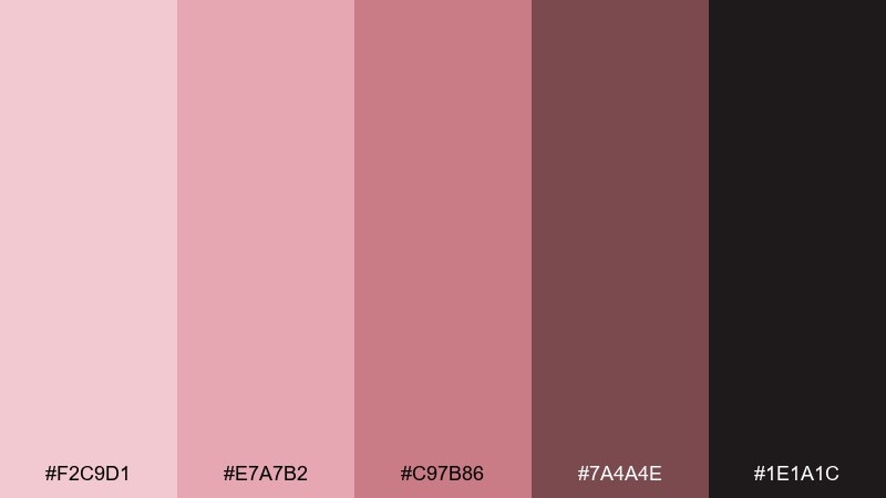
HEX: #F2C9D1 #E7A7B2 #C97B86 #7A4A4E #1E1A1C
Mood: lush, dramatic, modern
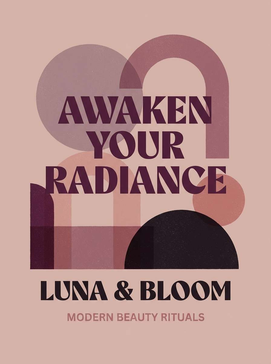
Best for: beauty brand campaign poster
Lush and dramatic like crushed rose petals on velvet, this champagne and pink mix leans editorial and bold. Let the deep plum and near-black carry headlines, while the mid rose shade supports secondary text and shapes. The pale blush works best as negative space so the darker tones feel intentional, not heavy. Tip: keep gradients subtle and use solid color blocks for a premium print look.
Image example of rosé velvet generated using media.io
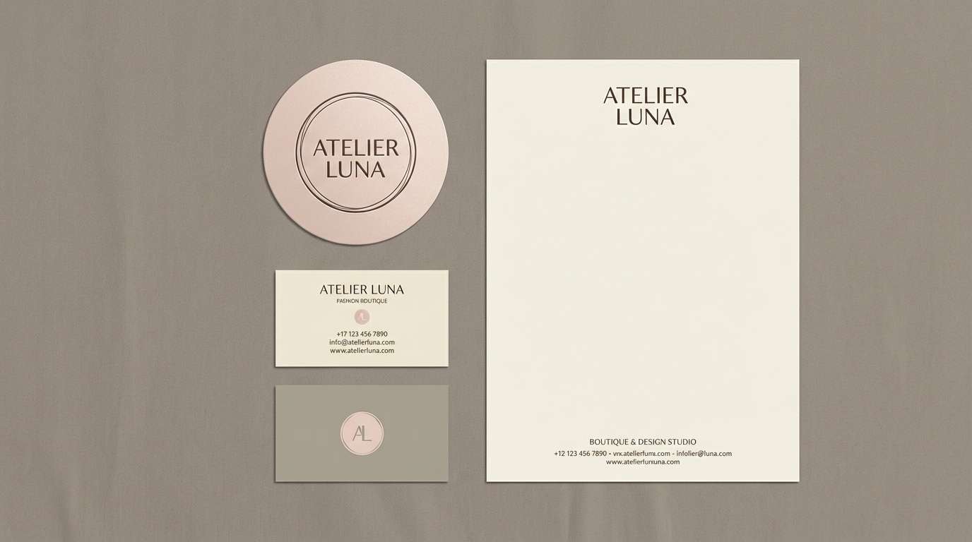
3) Pearl Boutique
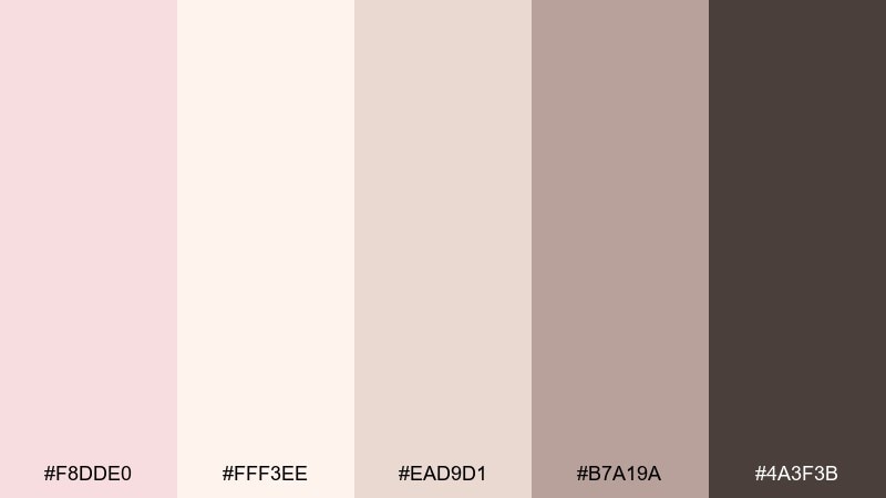
HEX: #F8DDE0 #FFF3EE #EAD9D1 #B7A19A #4A3F3B
Mood: soft, refined, boutique
Best for: fashion boutique logo and stationery
Soft and refined like pearls against silk, these neutrals keep everything elegant and approachable. Use the pale blush and cream for background areas, then bring in taupe for icons and linework. Charcoal-brown makes small type readable on both digital and print. Tip: pair with thin serif lettering and lots of spacing to preserve the boutique feel.
Image example of pearl boutique generated using media.io
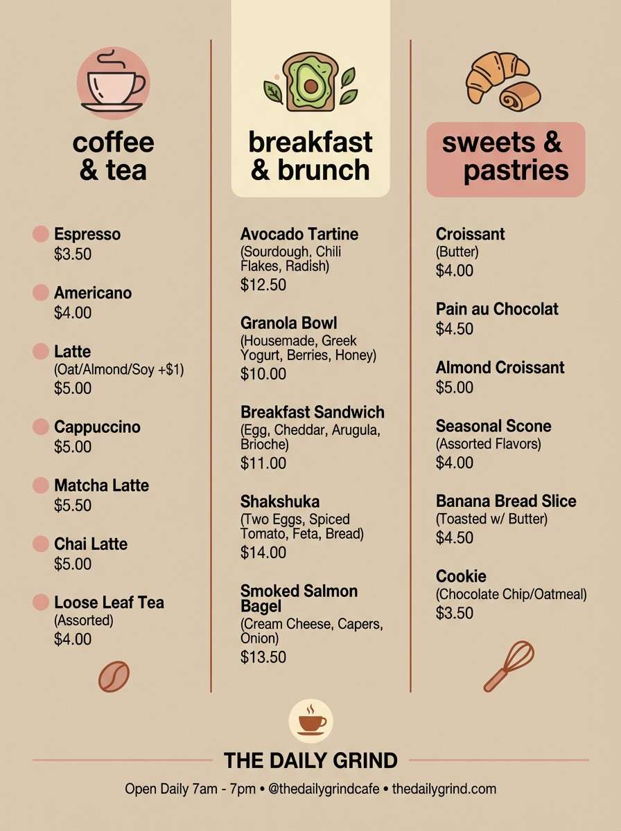
4) Blush Bistro
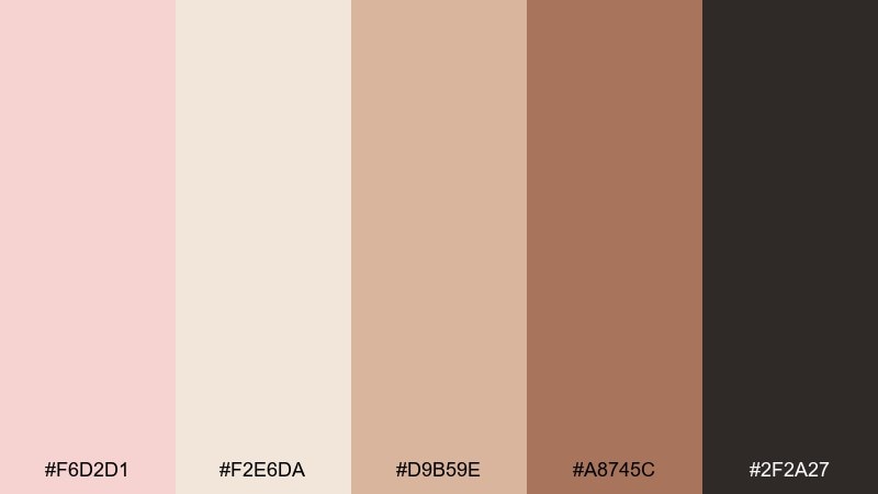
HEX: #F6D2D1 #F2E6DA #D9B59E #A8745C #2F2A27
Mood: cozy, appetizing, artisanal
Best for: cafe menu design
Cozy and appetizing like warm pastry and a rosy latte, this champagne pink palette feels artisanal and welcoming. Start with the cream as your menu background, then use blush and sandy beige for section headers and dividers. The terracotta-brown is perfect for pricing and callouts, while the deep charcoal anchors the hierarchy. Tip: keep the blush subtle and let the darker brown do the heavy lifting for readability.
Image example of blush bistro generated using media.io
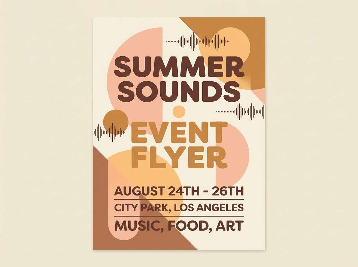
5) Sunset Champagne
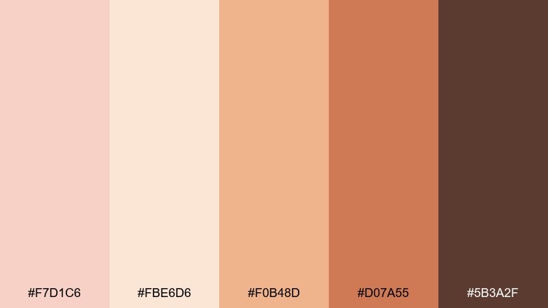
HEX: #F7D1C6 #FBE6D6 #F0B48D #D07A55 #5B3A2F
Mood: glowing, warm, celebratory
Best for: summer event flyer
Glowing and celebratory like a sunset toast, these warm tones read instantly festive. Use the light peach and cream for big open areas, then punch up accents with apricot and burnt caramel. A cocoa brown headline keeps the flyer grounded and avoids looking too sweet. Tip: use one bold apricot shape behind key details to guide the eye.
Image example of sunset champagne generated using media.io
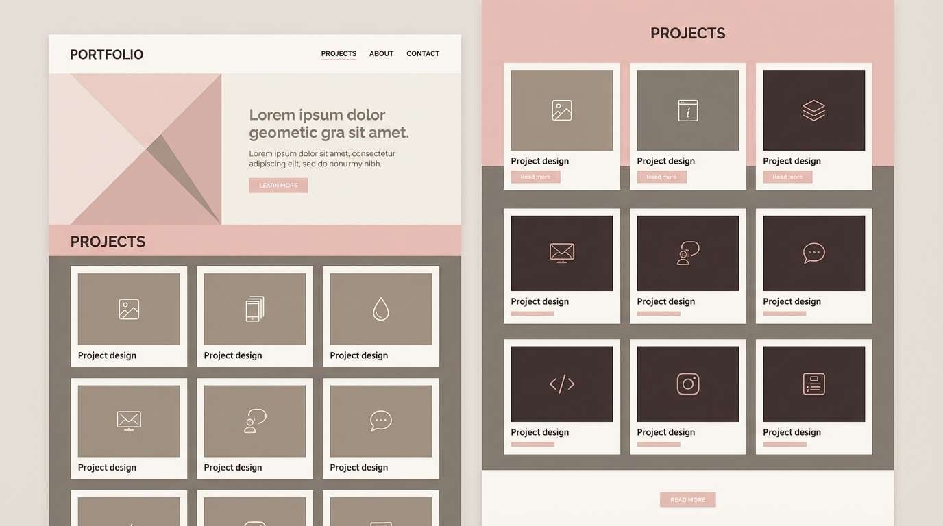
6) Soft Gallery
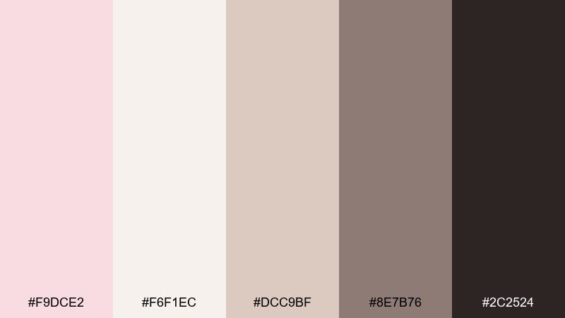
HEX: #F9DCE2 #F6F1EC #DCC9BF #8E7B76 #2C2524
Mood: calm, minimal, curated
Best for: portfolio website UI mockup
Calm and curated like a quiet gallery wall, this mix makes content feel intentional. Keep the near-white as the canvas, then use blush for gentle highlights like tags and hover states. Mid taupe works well for cards and separators, while the deep brown is ideal for text and navigation. Tip: reserve blush for interaction cues so the interface stays minimal but lively.
Image example of soft gallery generated using media.io
7) Petal Powder
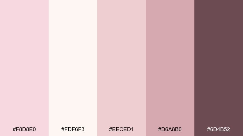
HEX: #F8D8E0 #FDF6F3 #EECED1 #D6A8B0 #6D4B52
Mood: delicate, clean, powdery
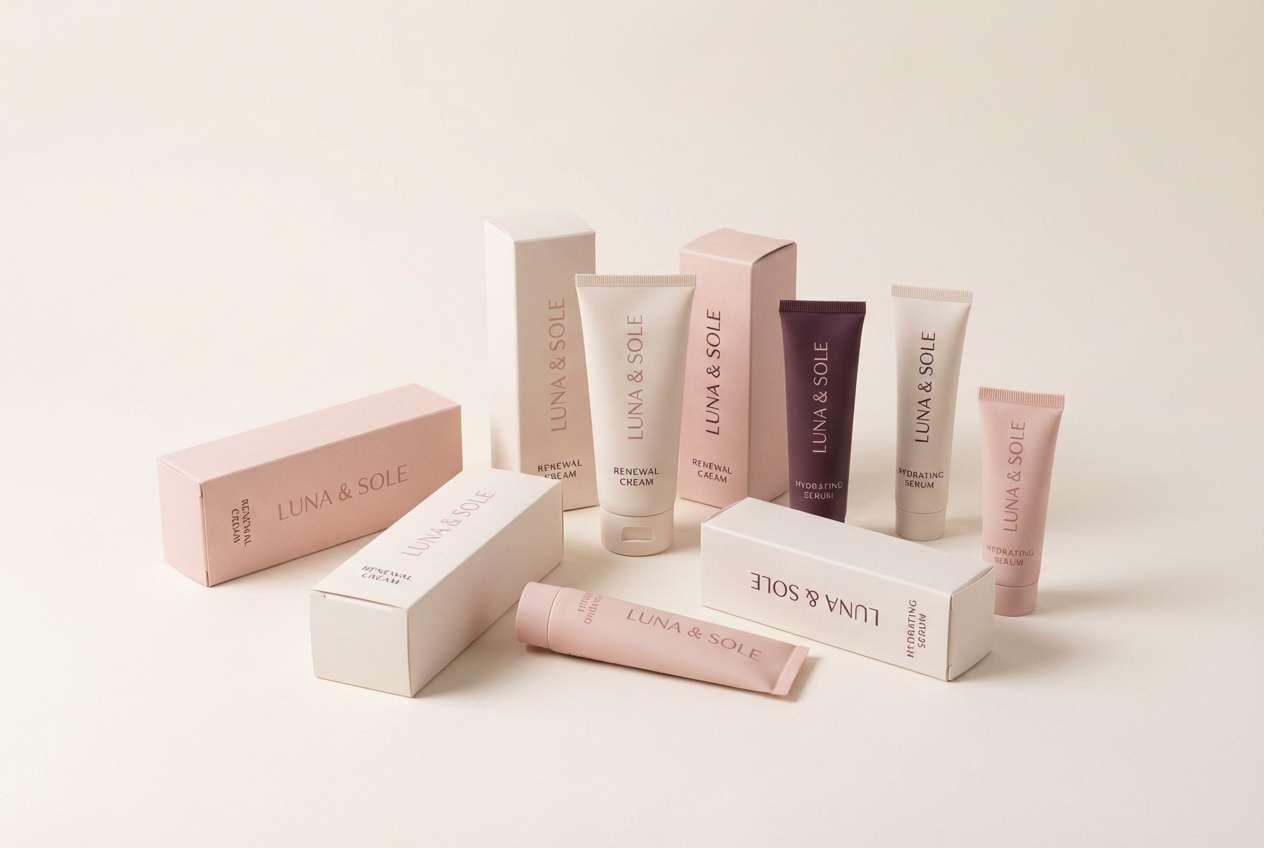
Best for: skincare packaging design
Delicate and powdery like fresh petals pressed into paper, these champagne pink tones feel clean and gentle. Use the off-white for labels and the light blush for box backgrounds to keep the look airy. The mauve-rose shades add structure for icons and ingredient panels without getting loud. Tip: keep finish matte and use the deepest plum for only the smallest text for a soft luxury vibe.
Image example of petal powder generated using media.io
8) Modern Romance
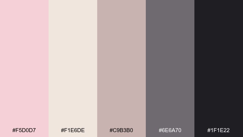
HEX: #F5D0D7 #F1E6DE #C9B3B0 #6E6A70 #1F1E22
Mood: romantic, urban, sleek
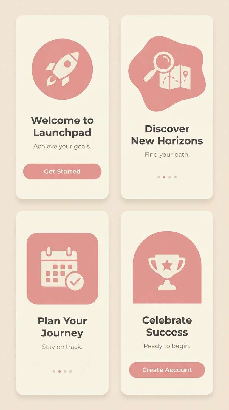
Best for: app onboarding UI screens
Romantic but urban, like a bouquet set against concrete, this pink and champagne set balances softness with a sleek edge. The blush and warm cream keep screens friendly, while the greige and charcoal add modern contrast for buttons and headings. It also supports a clean dark mode variant by leaning on the two deepest shades. Tip: use blush only for primary CTAs and keep secondary actions in greige to reduce visual noise.
Image example of modern romance generated using media.io
9) Luxe Satin
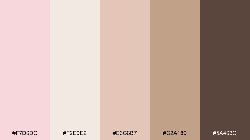
HEX: #F7D6DC #F2E9E2 #E3C6B7 #C2A189 #5A463C
Mood: luxurious, warm, understated
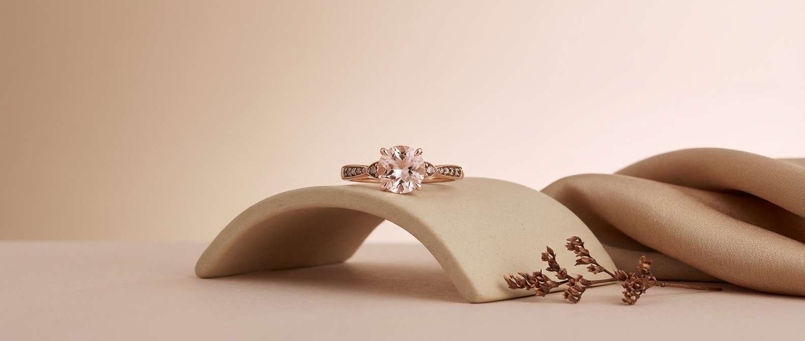
Best for: jewelry product ad
Luxurious and understated like satin under warm lights, these champagne pink hues feel instantly premium. Use the pale blush as the backdrop tone and let champagne beige carry supporting shapes. The richer tan and cocoa shades are perfect for shadows, product details, and headline contrast. Tip: keep backgrounds smooth and let one metallic prop match the warm tan for cohesion.
Image example of luxe satin generated using media.io
10) Apricot Fizz
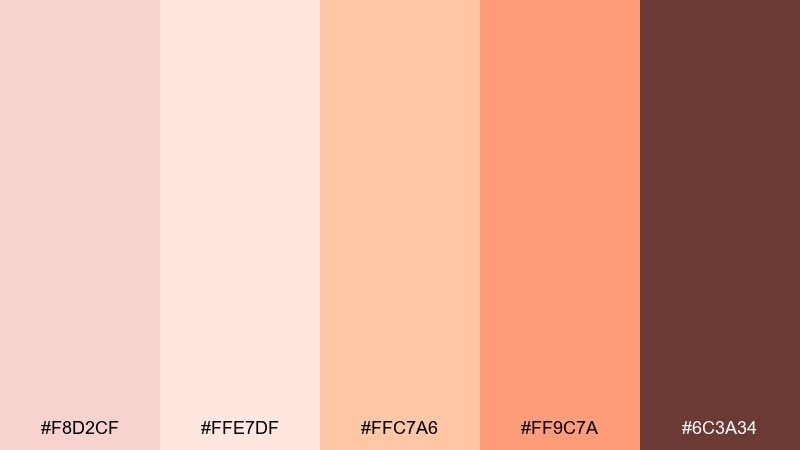
HEX: #F8D2CF #FFE7DF #FFC7A6 #FF9C7A #6C3A34
Mood: playful, bright, energetic
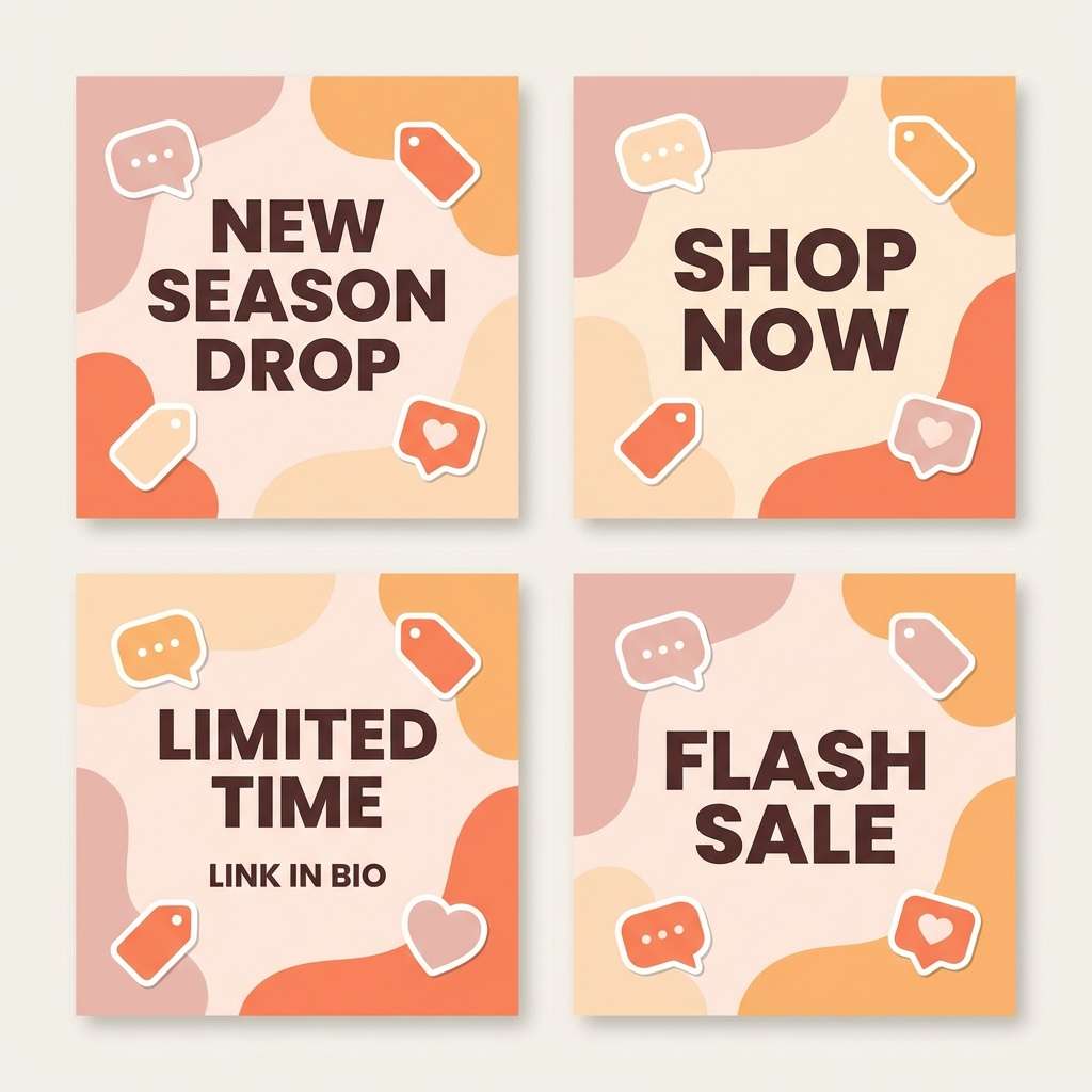
Best for: social media promo graphics
Playful and energetic like sparkling soda over ice, these champagne pink colors pop without turning neon. Let the creamy peach act as breathing room, then push contrast with the punchy coral for stickers and sale badges. Deep cocoa keeps captions legible and prevents the design from feeling too sugary. Tip: limit coral to one focal element per post and repeat it consistently for brand recall.
Image example of apricot fizz generated using media.io
11) Dusty Boudoir
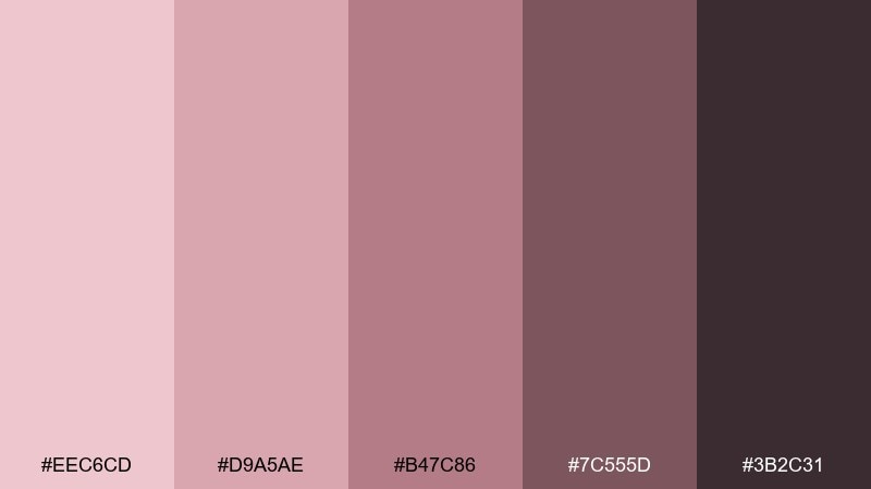
HEX: #EEC6CD #D9A5AE #B47C86 #7C555D #3B2C31
Mood: intimate, vintage, moody
Best for: boudoir photography brand identity
Intimate and vintage like faded lipstick on film, these dusty roses create a moody, confident tone. Use the lightest pink for negative space and the mid rose for monograms and patterns. The two deeper shades work beautifully for wordmarks and watermark stamps. Tip: pair with a classic serif and keep textures subtle so the palette stays sophisticated.
Image example of dusty boudoir generated using media.io
12) Minimal Marzipan
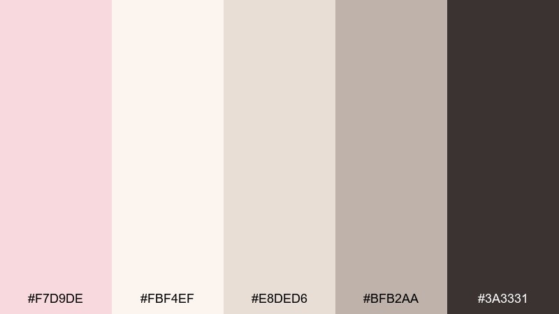
HEX: #F7D9DE #FBF4EF #E8DED6 #BFB2AA #3A3331
Mood: clean, quiet, modern
Best for: product landing page UI
Clean and quiet like marzipan on porcelain, this champagne pink color palette is made for minimal layouts. Use warm off-white for large sections and apply blush sparingly to highlight new features or key stats. The soft gray-beige handles borders and cards, while the dark brown keeps typography accessible. Tip: increase line height and use generous padding so the neutrals feel intentional, not empty.
Image example of minimal marzipan generated using media.io
13) Copper Kiss
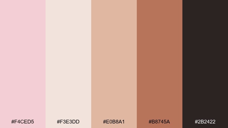
HEX: #F4CED5 #F3E3DD #E0B8A1 #B8745A #2B2422
Mood: glam, warm, metallic
Best for: cosmetics product packaging
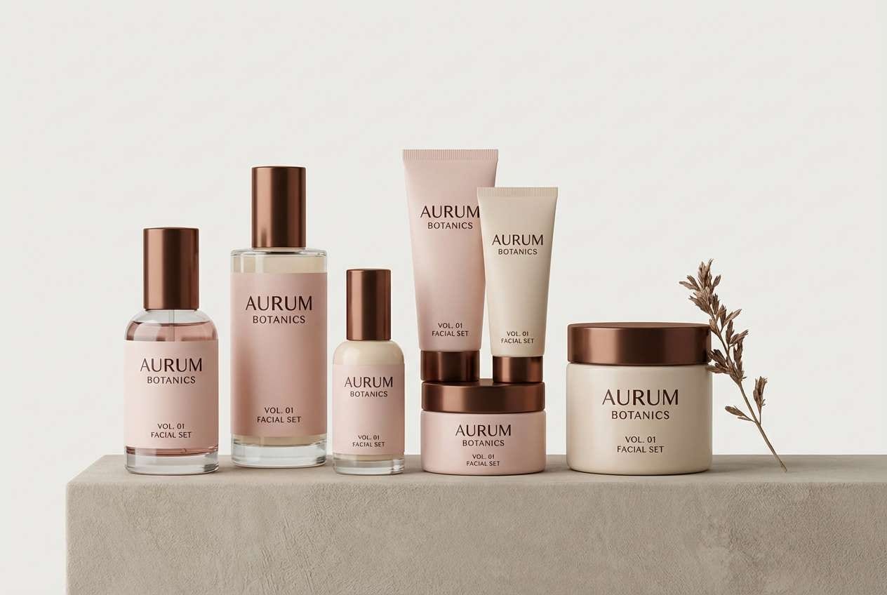
Glam and warm like copper shimmer on skin, these champagne pink color combinations give packaging instant shelf appeal. Build the base with blush and creamy beige, then lean on copper brown for caps, logos, and accent stripes. The deep espresso shade helps small print stay readable on curved surfaces. Tip: keep copper elements consistent across SKUs so the range looks unified in a lineup.
Image example of copper kiss generated using media.io
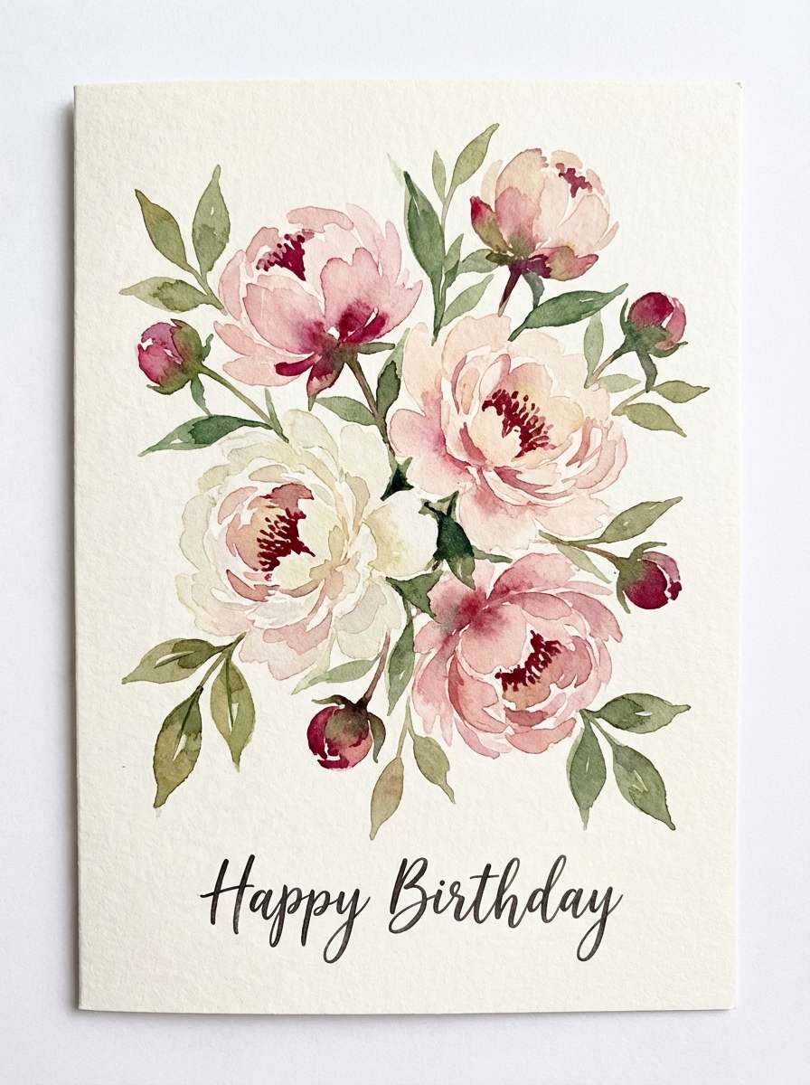
14) Creamy Peony
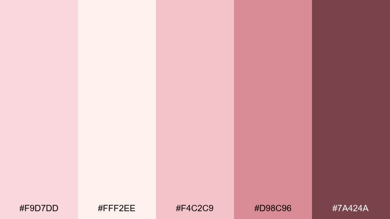
HEX: #F9D7DD #FFF2EE #F4C2C9 #D98C96 #7A424A
Mood: floral, sweet, inviting
Best for: botanical greeting card illustration
Floral and inviting like peonies in a ceramic vase, these pinks stay sweet without feeling childish. The creamy off-white makes a perfect paper tone, while the mid pink and rose add petal depth. Use the deepest berry shade for stems, outlines, or small type so details stay crisp. Tip: keep watercolor blooms soft-edged and reserve hard lines only for focal flowers.
Image example of creamy peony generated using media.io
15) Warm Clay Rose
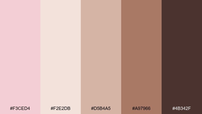
HEX: #F3CED4 #F2E2DB #D5B4A5 #A97966 #4B342F
Mood: earthy, calm, artisan
Best for: ceramic studio branding
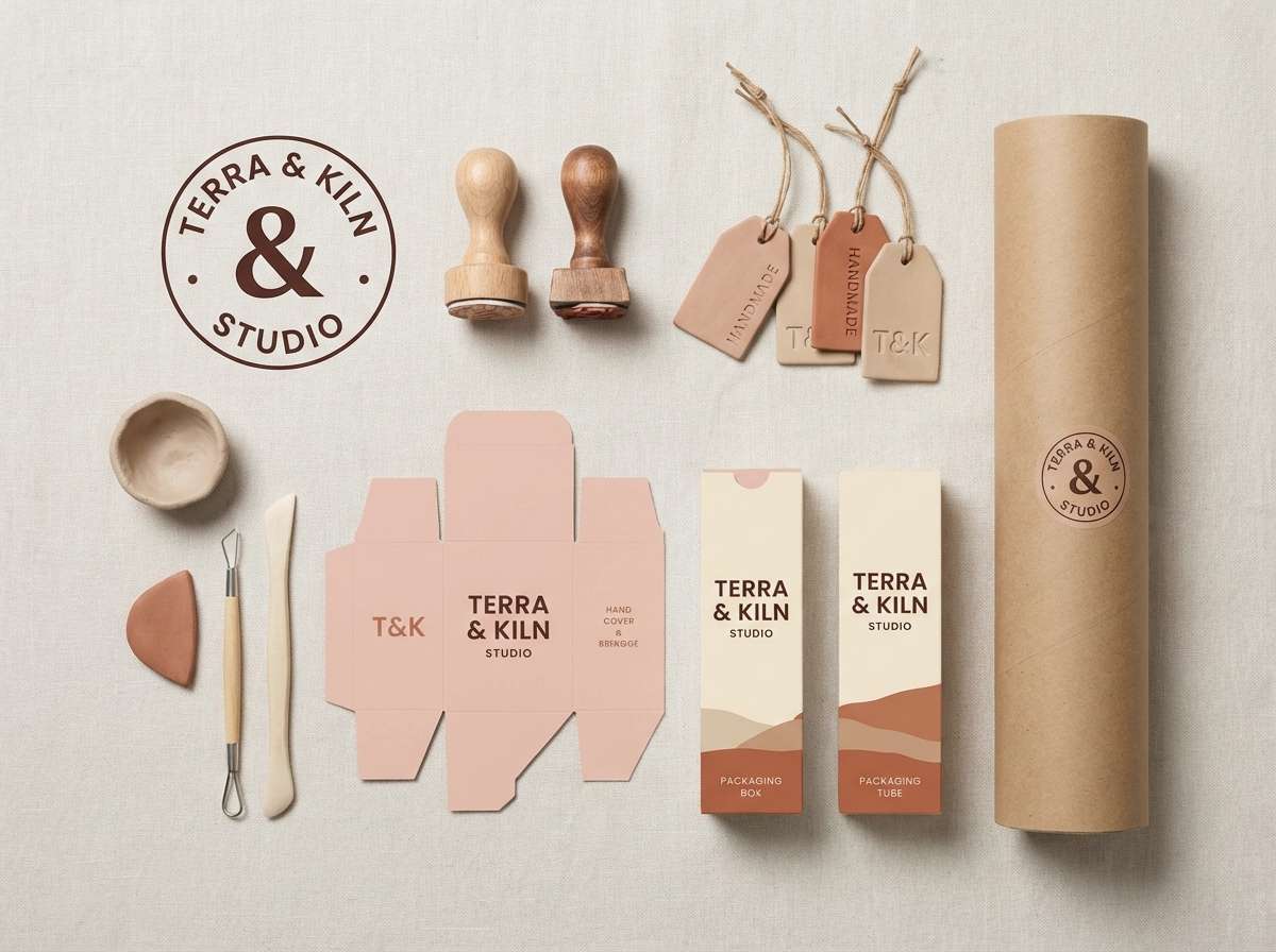
Earthy and calm like wet clay and rose-tinted glaze, this mix feels handmade and grounded. Start with the warm cream for backgrounds, then use blush for soft accents and highlights. Clay and terracotta shades work well for stamps, labels, and pattern fills, while the deep brown gives you a reliable text color. Tip: combine with natural paper textures and simple line icons for an authentic studio look.
Image example of warm clay rose generated using media.io
16) Ethereal Ballet
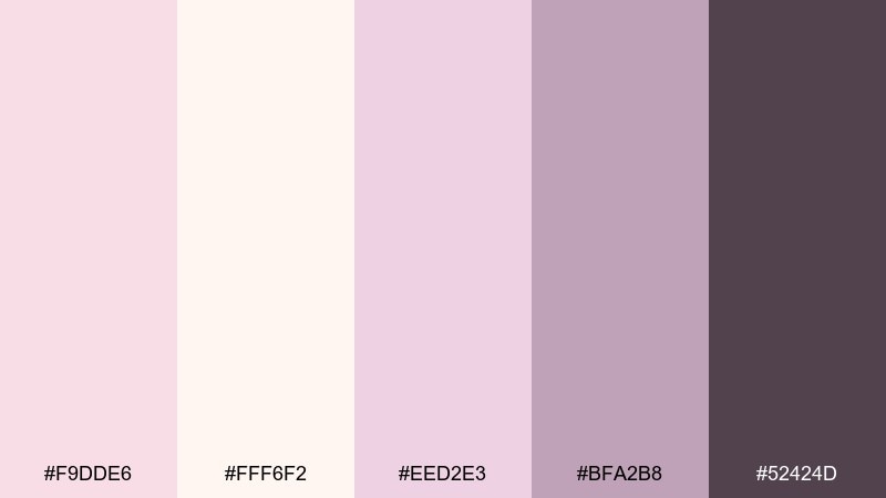
HEX: #F9DDE6 #FFF6F2 #EED2E3 #BFA2B8 #52424D
Mood: dreamy, graceful, airy
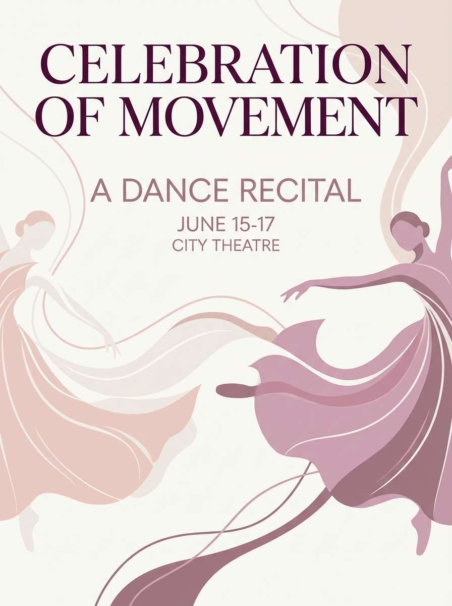
Best for: dance recital poster
Dreamy and graceful like tulle and stage lights, this champagne pink palette reads soft yet composed. Use the pale blush and off-white for airy space, then add lilac-rose for decorative flourishes. The muted mauve keeps typography elegant, while the deep plum anchors the title from a distance. Tip: choose one flowing script for the show name and keep all other text clean and minimal.
Image example of ethereal ballet generated using media.io
17) Silk & Sage
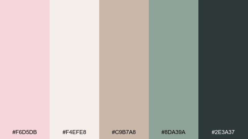
HEX: #F6D5DB #F4EFE8 #C9B7A8 #8DA39A #2E3A37
Mood: fresh, balanced, calming
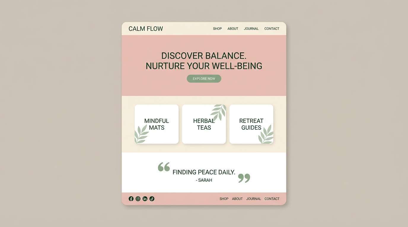
Best for: wellness brand website
Fresh and balanced like sage leaves on a linen tablecloth, this pairing feels instantly calming. Blush and warm cream keep the tone gentle, while tan brings structure to sections and cards. Sage green is your hero accent for links and badges, and the deep green-black supports accessible body text. Tip: use sage for interactive elements so the site feels soothing but still navigable.
Image example of silk & sage generated using media.io
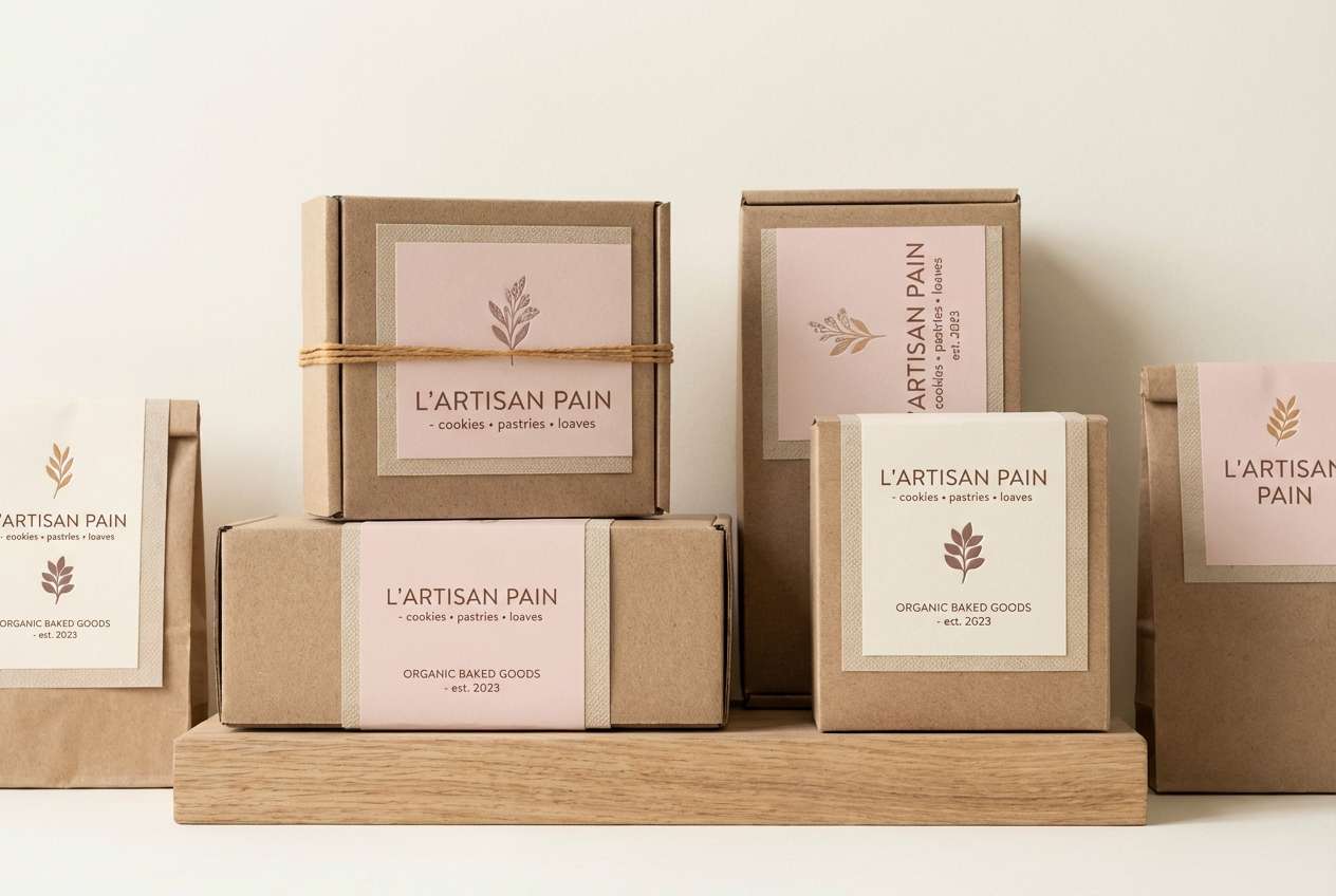
18) Café Macaron
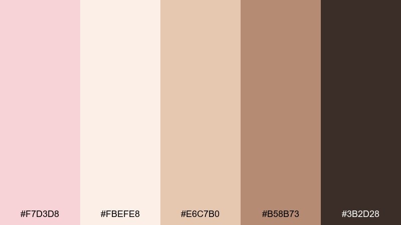
HEX: #F7D3D8 #FBEFE8 #E6C7B0 #B58B73 #3B2D28
Mood: sweet, cozy, Parisian
Best for: bakery packaging labels
Sweet and cozy like macarons in a pastry box, these champagne and pink combinations feel warm and friendly. Use cream for label bases, then bring in blush for borders and brand marks. Caramel and cocoa shades work well for flavor callouts and ingredient info without overpowering the design. Tip: add a simple pattern in the beige tone to create depth while keeping print costs low.
Image example of café macaron generated using media.io
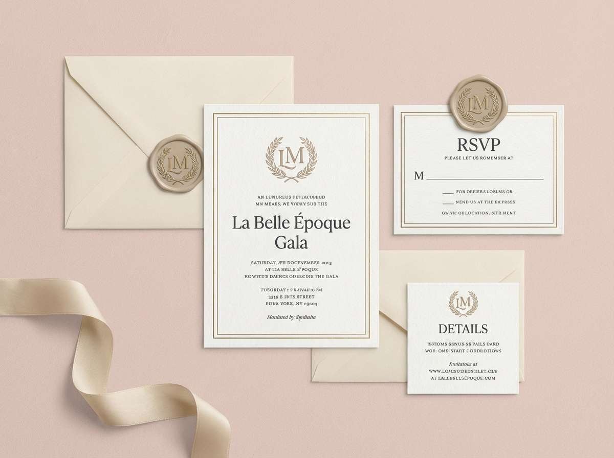
19) Gilded Blush
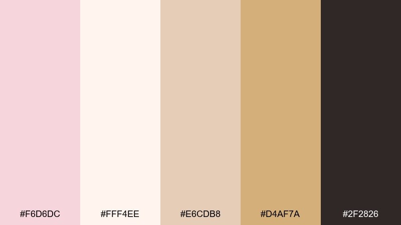
HEX: #F6D6DC #FFF4EE #E6CDB8 #D4AF7A #2F2826
Mood: elegant, celebratory, upscale
Best for: luxury event invitation suite
Elegant and celebratory like gilded edges on blush paper, this set is built for upscale moments. It is a champagne pink color palette that looks best with restrained gold accents and generous whitespace. Use the warm cream for backgrounds, bring in beige for borders, and reserve the gold tone for thin lines or monograms. Tip: keep body text in deep charcoal and limit gold to one focal detail per piece.
Image example of gilded blush generated using media.io
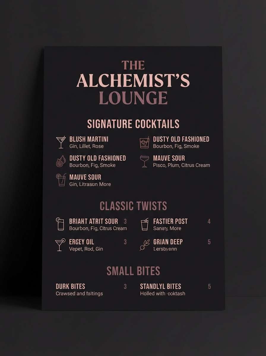
20) Nightfall Rosé
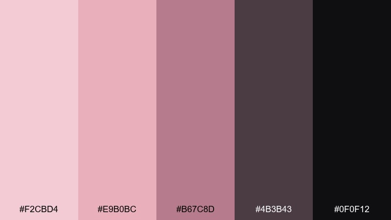
HEX: #F2CBD4 #E9B0BC #B67C8D #4B3B43 #0F0F12
Mood: bold, nocturnal, chic
Best for: cocktail bar menu and signage
Bold and nocturnal like a rosé cocktail under dim lights, these shades feel chic and a little mysterious. For strong contrast, use the near-black as the base and layer blush and dusty rose for highlights and icons. The mauve-brown adds a sophisticated midtone for secondary sections and small dividers. Tip: this champagne pink color combination works best with high-contrast type and minimal illustrations to keep the mood upscale.
Image example of nightfall rosé generated using media.io
21) Powdered Sandstone
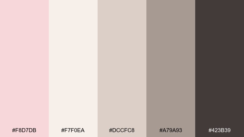
HEX: #F8D7DB #F7F0EA #DCCFC8 #A79A93 #423B39
Mood: neutral, airy, architectural
Best for: interior design moodboard
Neutral and airy like sandstone dust in morning light, these pink and champagne tones feel architectural and calm. Use blush as a subtle warmth against the off-white, then layer soft stone grays for furniture swatches and captions. The deep brown keeps labels readable on printed boards and digital slides alike. Tip: add one matte black accessory only if you need extra contrast beyond the brown.
Image example of powdered sandstone generated using media.io
22) Rosewater Studio
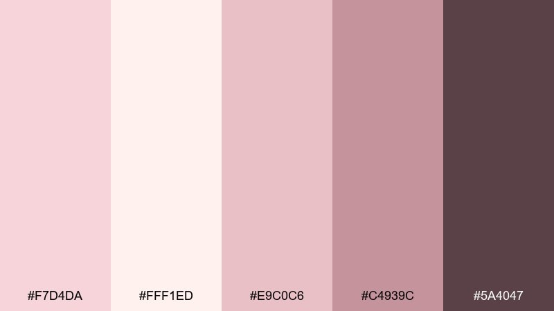
HEX: #F7D4DA #FFF1ED #E9C0C6 #C4939C #5A4047
Mood: soft, creative, contemporary
Best for: creative agency brand kit
Soft and contemporary like rosewater ink on textured stock, this set feels creative without being loud. It is a champagne pink color palette that supports clean layouts, especially when the off-white leads the composition. Use the mid rose for shapes and highlights, and the deeper mauve for headers and key UI states in your brand kit. Tip: keep photography warm and desaturated so it harmonizes with the pinks instead of fighting them.
Image example of rosewater studio generated using media.io
23) Champagne Peony Pop

HEX: #F6D2D9 #FDF3EE #F2B7C2 #E57E8C #3E2B30
Mood: cheerful, feminine, punchy
Best for: ecommerce sale banner set
Cheerful and punchy like peonies in a storefront window, this pink and champagne color scheme is made for attention without harshness. Use the soft base tones for breathing room and bring in the bright rose for price tags and discount bursts. If you are testing champagne pink color combinations for conversion-focused banners, this set gives you a strong accent plus a dependable dark for text. Tip: keep the bright rose to one or two components per banner so the layout stays premium.
Image example of champagne peony pop generated using media.io
What Colors Go Well with Champagne Pink?
Champagne pink pairs beautifully with warm neutrals like cream, ivory, beige, taupe, and cocoa brown—these keep the palette sophisticated and make text easy to read in both print and UI.
For elevated contrast, add deep anchors such as espresso, charcoal, or near-black. This gives you hierarchy for headlines, navigation, and small text without losing the soft, romantic mood.
If you want a more modern twist, try a cool counterbalance like sage green or muted teal, or add a celebratory accent like soft gold. These options keep champagne pink from feeling too monochrome.
How to Use a Champagne Pink Color Combination in Real Designs
Start with a light base (off-white or pale blush) for backgrounds, then choose one midtone (rose, taupe, or beige) for cards, dividers, and secondary blocks. This builds structure without making the layout feel heavy.
Reserve your darkest shade for typography and critical UI elements (primary text, headers, key icons). Champagne pink looks best when it supports the content, not when it competes with readability.
Finally, pick one accent color and use it consistently: CTA buttons, discount badges, or invitation foil lines. Repetition is what makes the palette feel like a cohesive brand system.
Create Champagne Pink Palette Visuals with AI
If you have HEX codes but need real visuals—posters, packaging mockups, banners, or UI screens—AI generation can help you prototype styles quickly before you commit to a full design system.
With Media.io, you can turn a palette into multiple layout directions (minimal, luxe, editorial, or playful) just by adjusting the prompt and aspect ratio.
Use the palette name as a theme, add your design type (invitation, landing page, label), and specify “graphic design only” when you want clean, layout-ready results.
Champagne Pink Color Palette FAQs
-
What is champagne pink (and how is it different from blush pink)?
Champagne pink is a warm, muted pink with beige/peach undertones, while blush pink is usually cooler and more purely pink. Champagne pink tends to feel more “neutral” and upscale in branding and UI. -
Is champagne pink a good color for modern UI design?
Yes—especially when paired with off-white backgrounds and dark text (espresso/charcoal). Use champagne pink as an accent for CTAs, tags, and highlights so the interface stays clean and accessible. -
What neutral colors match champagne pink best?
Cream, ivory, warm beige, greige, taupe, and cocoa brown are the easiest matches. These neutrals keep the palette soft while adding structure for layouts and typography. -
What bold accent colors go with champagne pink?
Deep plum, near-black, muted teal, sage green, coral, and muted gold can all work. The best choice depends on the mood: plum/black for drama, sage/teal for modern calm, coral for energetic promos, and gold for luxury. -
How do I keep champagne pink designs from looking “too sweet”?
Increase contrast with a dark anchor (espresso, charcoal, near-black), reduce the amount of saturated pink on the page, and use more warm neutrals for breathing room. Clean typography also helps the palette feel mature. -
Is champagne pink suitable for wedding palettes?
Absolutely. Champagne pink is popular for invitations and decor because it feels romantic but refined. Pair it with cream and tan for softness, then add espresso or muted gold for readable text and elegant details. -
Can I generate palette mockups from HEX codes using AI?
Yes. Add your design type (invitation, packaging, website UI), list the colors you want dominant, and specify the style (minimal, luxury, vintage). Media.io’s text-to-image tool can generate multiple visual directions quickly.


