

A great coffee shop color palette does two jobs at once: it makes people feel comfortable enough to stay, and it makes your brand recognizable at a glance. Warm neutrals (latte, oat, cocoa, espresso) are especially effective because they match what customers already associate with cafés.
Below are 20 coffee shop color scheme ideas with HEX codes—each paired with a practical use case (menus, signage, packaging, UI) and an AI image prompt you can reuse to visualize the look.
In this article
Why Coffee Shop Palettes Work So Well
Coffee shop color combinations are naturally brand-friendly because they’re rooted in familiar materials: roasted beans, steamed milk, wood, paper, ceramic, and warm lighting. That familiarity makes a space feel inviting even before a customer reads a single word.
Warm neutrals also scale well across touchpoints. The same latte-to-espresso range can look premium on packaging, calm in an app UI, and bold on storefront signage—especially when you reserve one accent color (rose, gold, mint) for highlights.
Most importantly, these palettes support readability. Dark roast browns and near-black espresso tones provide strong contrast for pricing, menus, and wayfinding, while creams and beiges keep backgrounds soft and uncluttered.
20+ Coffee Shop Color Palette Ideas (with HEX Codes)
1) Rose Latte
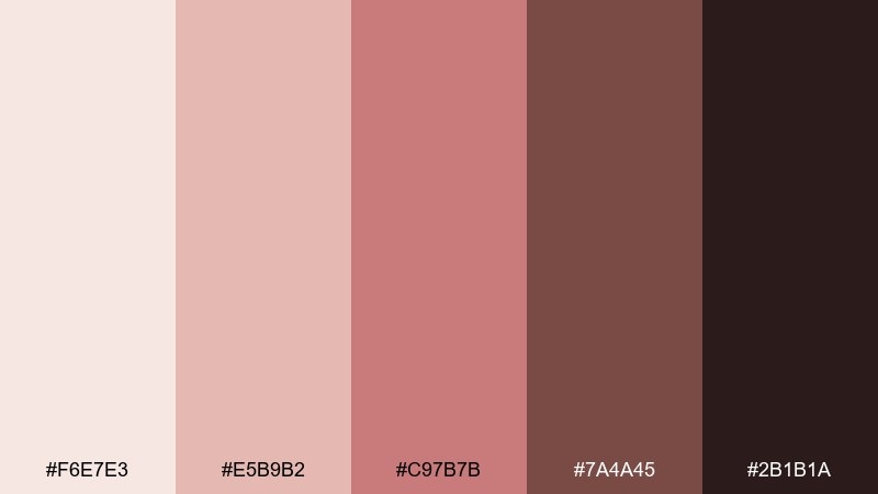
HEX: #F6E7E3 #E5B9B2 #C97B7B #7A4A45 #2B1B1A
Mood: soft, welcoming, romantic
Best for: menu design and loyalty cards
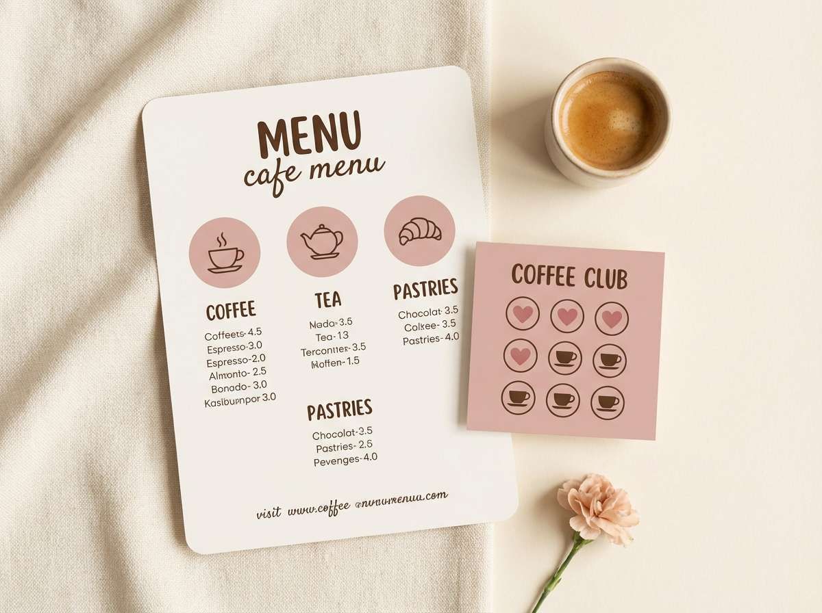
Soft and welcoming like steamed milk with a rosy swirl, this mix feels friendly without turning sugary. Use it for menus, table tents, and loyalty cards where warmth matters more than contrast. Pair the blush tones with the deep espresso shade for readable type and clear hierarchy. Tip: keep the darkest brown for headlines and prices, and let the rose act as a small accent for callouts.
Image example of rose latte generated using media.io
Media.io is an online AI studio for creating and editing video, image, and audio in your browser.

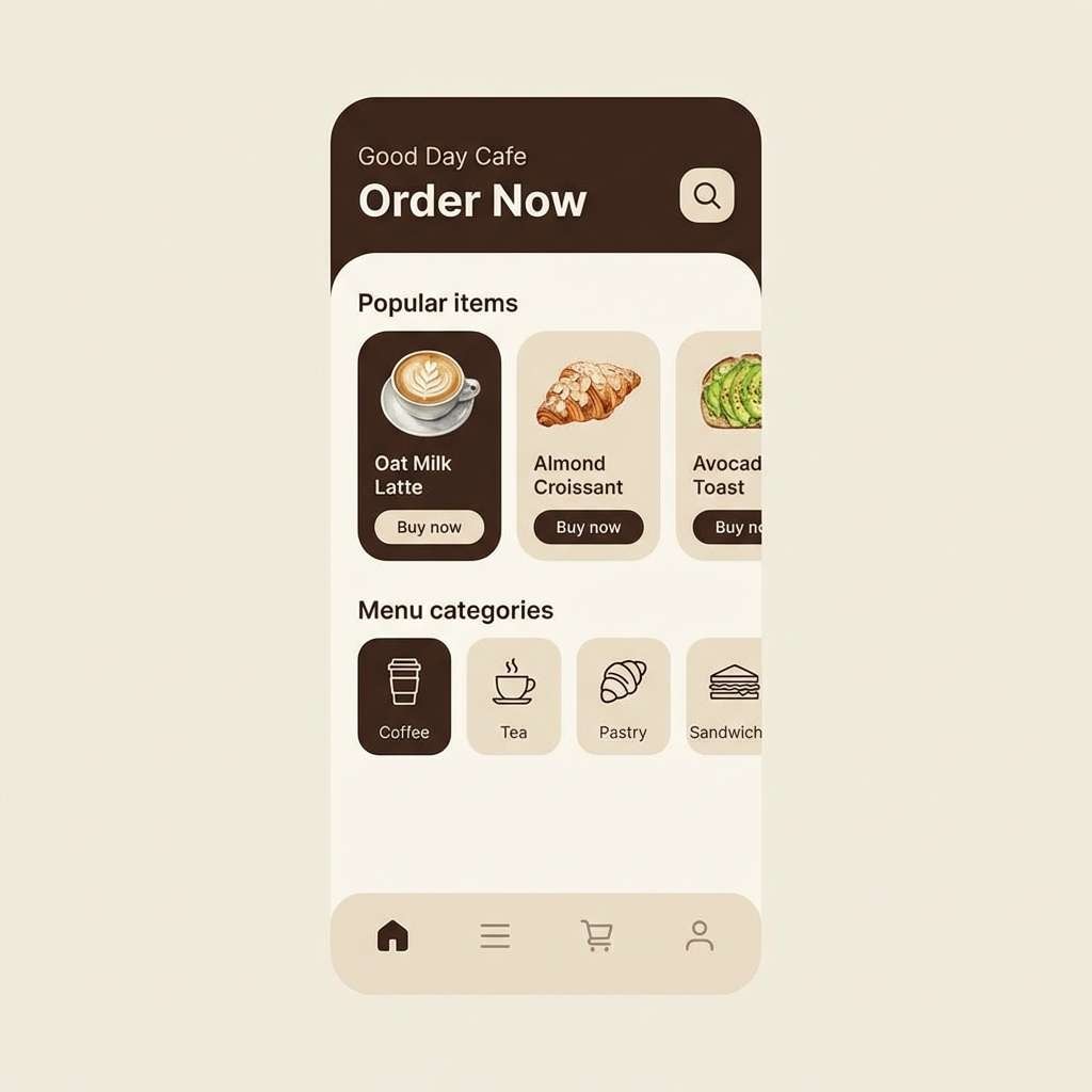
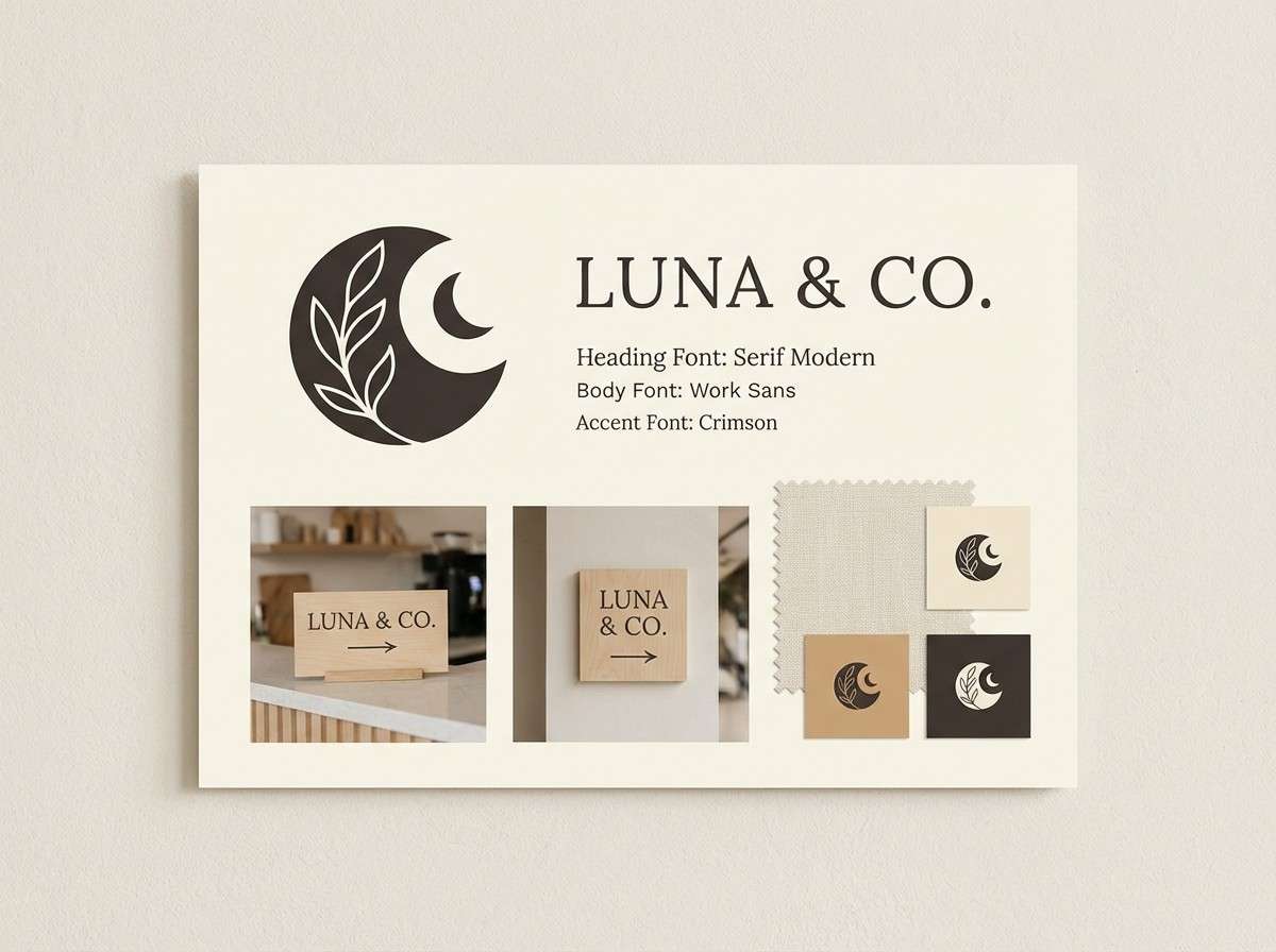
2) Oat Milk Minimal
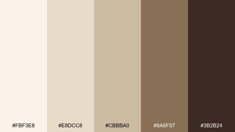
HEX: #FBF3E8 #E8DCC8 #CBBBA0 #8A6F57 #3B2B24
Mood: clean, calm, modern
Best for: ordering app UI and web components
Clean and calm like a bright morning counter, these oat and wood tones feel quietly premium. They work best in UI where spacing and typography do the heavy lifting. Pair the light creams with the dark roast brown for accessible buttons and navigation. Tip: use the mid beige for cards and dividers so the interface feels layered without getting busy.
Image example of oat milk minimal generated using media.io
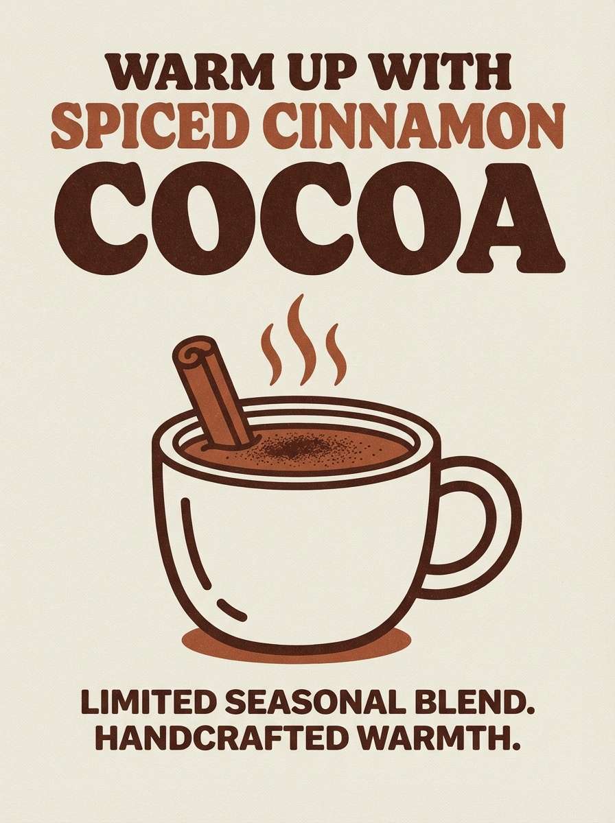
3) Cinnamon Cocoa
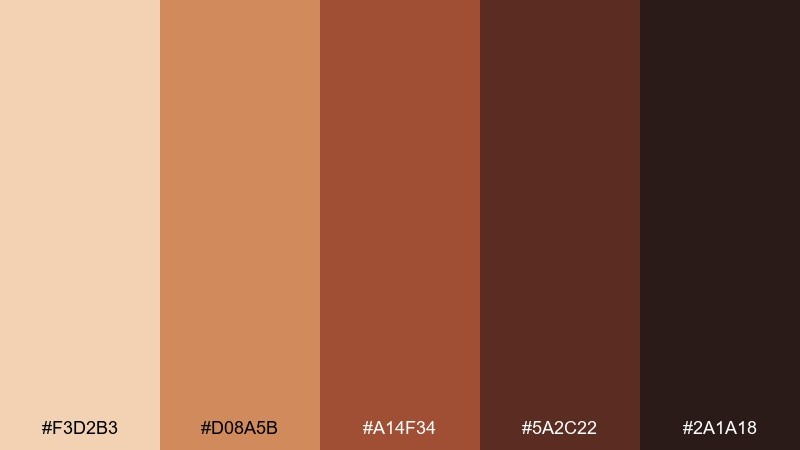
HEX: #F3D2B3 #D08A5B #A14F34 #5A2C22 #2A1A18
Mood: toasty, energetic, handcrafted
Best for: seasonal drink promos and chalkboard-style graphics
Toasty and energetic like cinnamon dust over hot cocoa, these shades feel handcrafted and a little bold. They make coffee shop color combinations that pop on promo boards, social posts, and limited-time drink graphics. Pair the cinnamon orange with the deep cocoa brown to keep headlines punchy and still easy to read. Tip: reserve the brightest tone for one focal badge like new or limited so the design stays appetizing, not noisy.
Image example of cinnamon cocoa generated using media.io
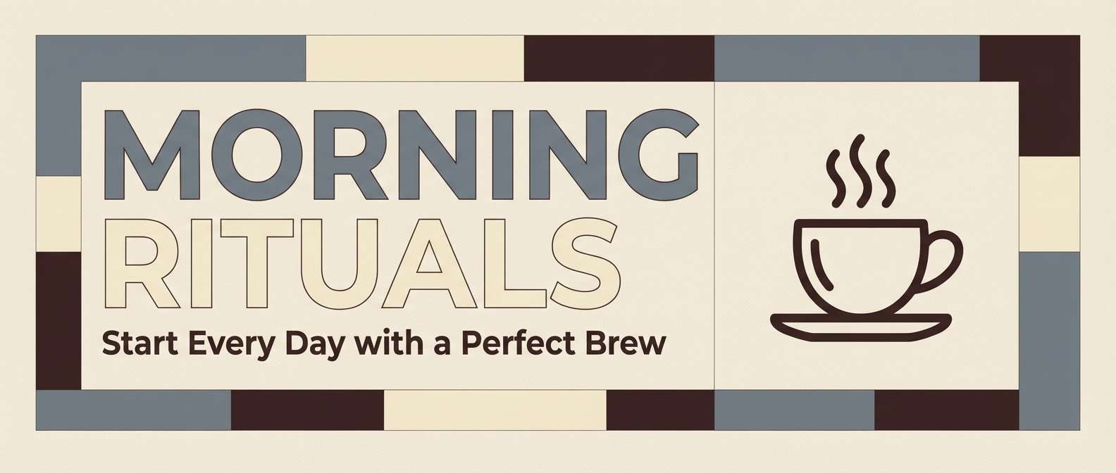
4) Espresso Slate
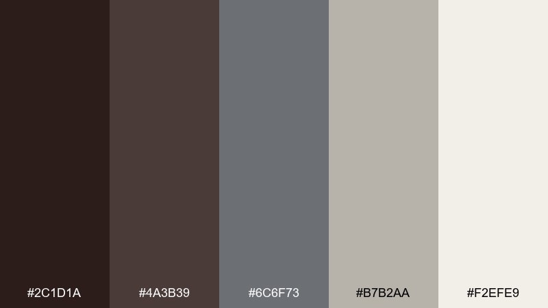
HEX: #2C1D1A #4A3B39 #6C6F73 #B7B2AA #F2EFE9
Mood: urban, grounded, sophisticated
Best for: website hero sections and brand systems
Urban and grounded like a concrete wall beside a dark espresso bar, this set feels modern and composed. Use it for web hero sections, brand guidelines, and signage where you want a mature tone. Pair the slate gray with warm cream to avoid a cold finish, then anchor everything with the near-black brown. Tip: keep backgrounds light and push contrast through typography weight rather than extra colors.
Image example of espresso slate generated using media.io
5) Caramel Terracotta
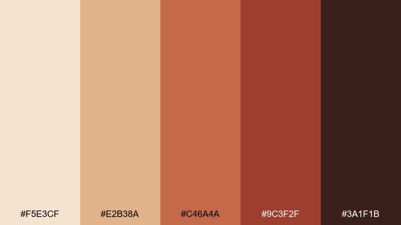
HEX: #F5E3CF #E2B38A #C46A4A #9C3F2F #3A1F1B
Mood: sunny, rustic, bold
Best for: event posters and weekend specials
Sunny and rustic like caramel drips on a clay mug, these tones bring instant warmth. They shine on posters, window decals, and weekend special signage where you want distance readability. Pair the pale caramel with terracotta for big shapes, then add the dark brown for crisp type. Tip: limit the red-brown to one or two large blocks so it feels intentional, not heavy.
Image example of caramel terracotta generated using media.io

6) Matcha Pastry
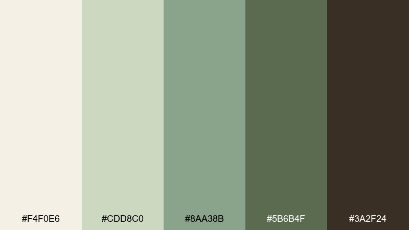
HEX: #F4F0E6 #CDD8C0 #8AA38B #5B6B4F #3A2F24
Mood: fresh, cozy, natural
Best for: bakery packaging and coffee bean labels
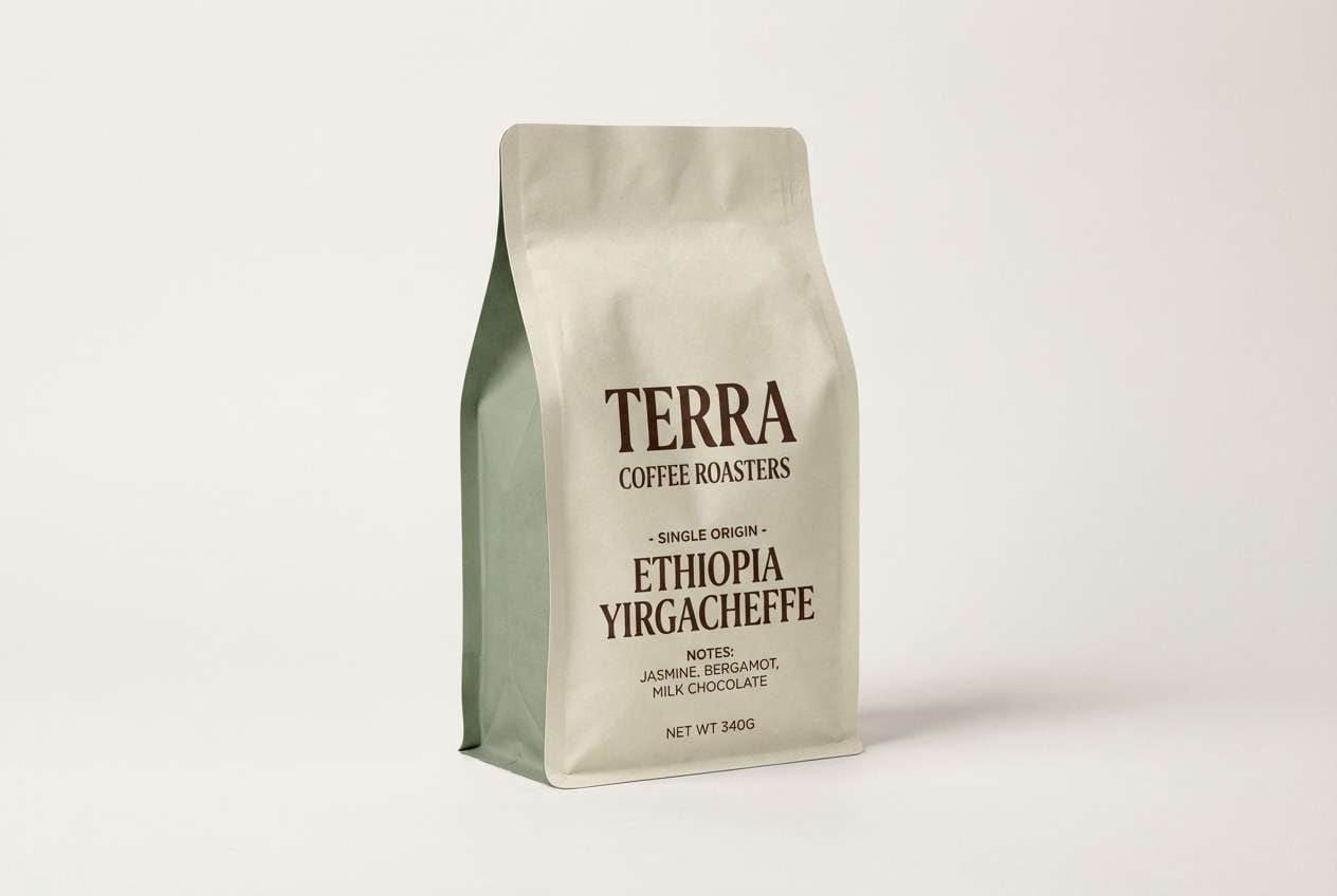
Fresh and cozy like matcha next to a warm pastry case, this palette feels natural and modern. It works beautifully on packaging where a soft green can signal herbal or seasonal flavors. Pair the sage tones with the deep coffee brown for structure and legible label text. Tip: use the light cream for the main label field and keep green for bands, stamps, or ingredient highlights.
Image example of matcha pastry generated using media.io
7) Vanilla Bean
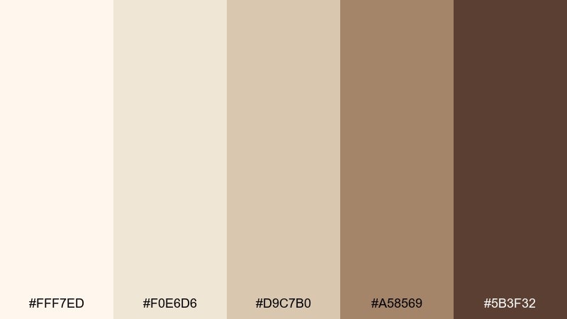
HEX: #FFF7ED #F0E6D6 #D9C7B0 #A58569 #5B3F32
Mood: airy, friendly, timeless
Best for: brand identity and in-store signage
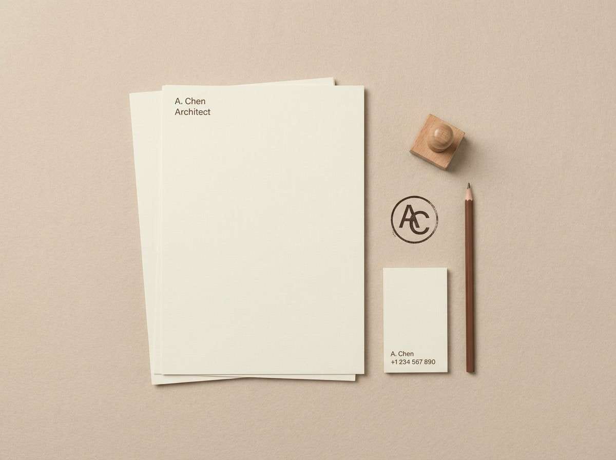
Airy and friendly like vanilla foam on a cappuccino, these neutrals stay timeless across seasons. Use them for logos, wayfinding, and price boards when you want a gentle, approachable look. Pair the mid tan with deep brown to keep contrast strong, especially for small text. Tip: introduce texture through paper grain or wood patterns instead of adding extra colors.
Image example of vanilla bean generated using media.io
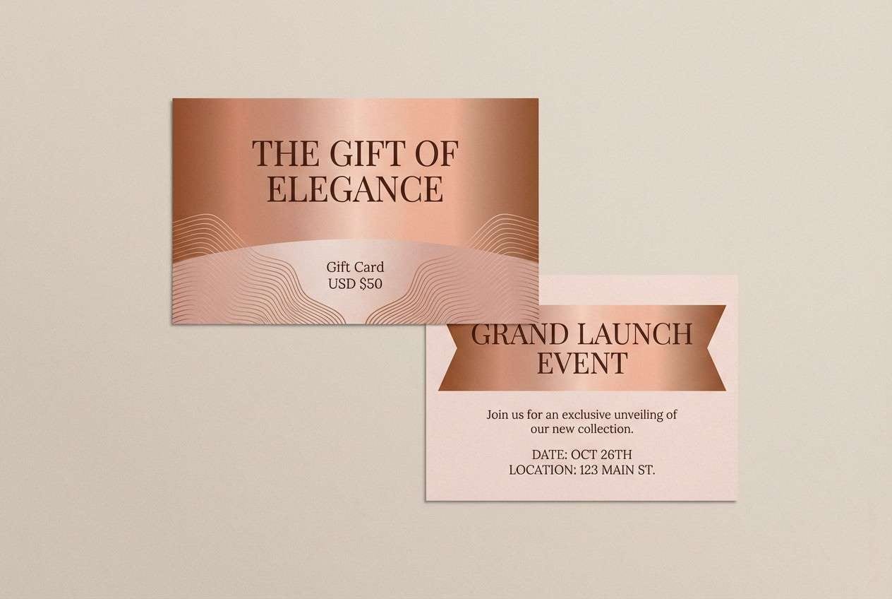
8) Copper Bloom
HEX: #F8EFE8 #E8C7B8 #CF8A6A #A65340 #3D2420
Mood: warm, artistic, boutique
Best for: gift cards and premium drink launches
Warm and artistic like copper lights reflecting on a porcelain cup, these tones feel boutique. They suit gift cards, premium launch graphics, and tasting flight menus. Pair the soft blush base with copper accents to create depth without losing a refined look. Tip: use metallic-like gradients sparingly and keep the darkest brown as your consistent text color.
Image example of copper bloom generated using media.io
9) Biscotti Bluegray
HEX: #F4F0EA #D8D1C7 #A8A7AD #6A6467 #2E2A2D
Mood: quiet, modern, slightly cool
Best for: editorial layouts and coffee education guides
Quiet and modern with a cool edge, these biscotti and blue-gray tones feel like a calm study corner. They are great for editorial layouts, brew guides, and educational carousels where clarity matters. Pair the pale neutral with charcoal for strong reading contrast, then use the mid gray for diagrams and callouts. Tip: keep imagery warm-toned so the overall feel stays inviting rather than sterile.
Image example of biscotti bluegray generated using media.io
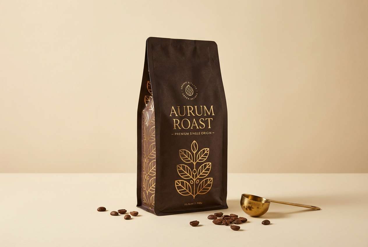
10) Dark Roast Gold
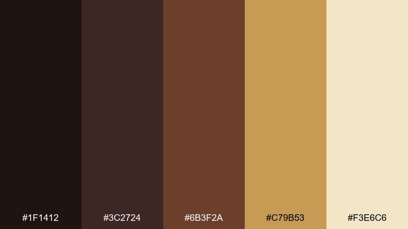
HEX: #1F1412 #3C2724 #6B3F2A #C79B53 #F3E6C6
Mood: luxury, dramatic, confident
Best for: coffee bean ads and premium packaging
Luxury and dramatic like a dark roast under warm spotlight, this set feels confident and upscale. It works well for bean ads, premium packaging, and limited reserve releases. Pair the gold with near-black for bold contrast, and soften large areas with the pale cream. Tip: treat gold as an accent for seals, borders, or small icons so it reads premium instead of flashy.
Image example of dark roast gold generated using media.io
11) Berry Mocha
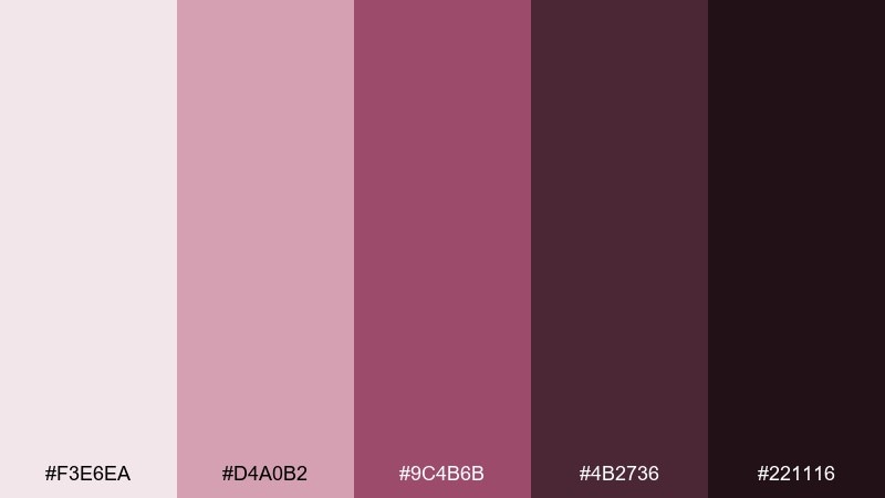
HEX: #F3E6EA #D4A0B2 #9C4B6B #4B2736 #221116
Mood: moody, playful, date-night
Best for: valentine promos and dessert menus
Moody and playful like berry syrup stirred into a mocha, these shades lean romantic without feeling childish. Use them for dessert menus, valentine promos, and evening events. Pair the soft pink with the deep plum for high contrast headlines and elegant borders. Tip: keep photos warm and low-saturation so the berry tones stay the star.
Image example of berry mocha generated using media.io
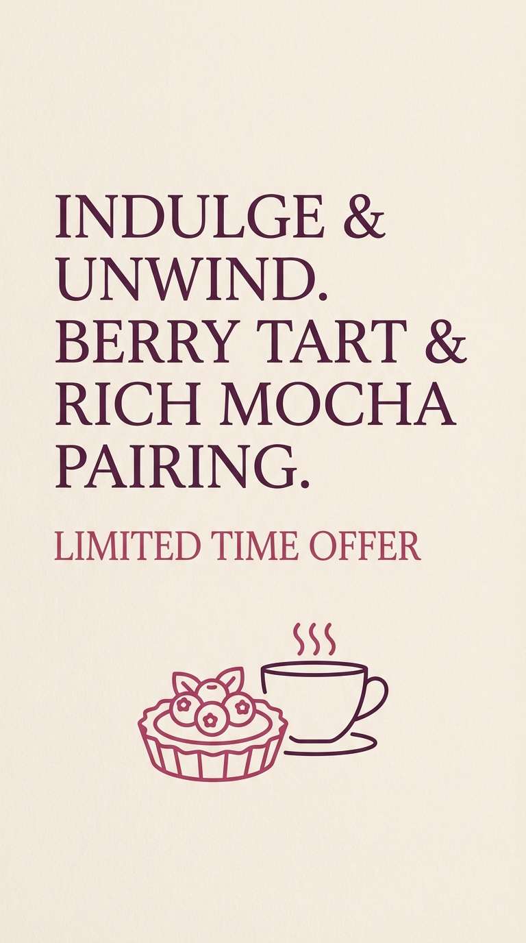
12) Rosewood Counter
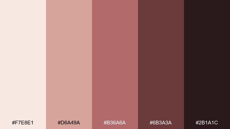
HEX: #F7E8E1 #D6A49A #B36A6A #6B3A3A #2B1A1C
Mood: cozy, vintage, intimate
Best for: interior moodboards and brand photography direction
Cozy and vintage like polished rosewood and soft lamp light, these tones create an intimate atmosphere. They are a strong fit for interior moodboards and photo direction where you want warmth without orange. As a coffee shop color palette, it pairs well with brass fixtures, walnut wood, and off-white walls. Tip: use the darkest shade sparingly for framing and signage so the space still feels open.
Image example of rosewood counter generated using media.io
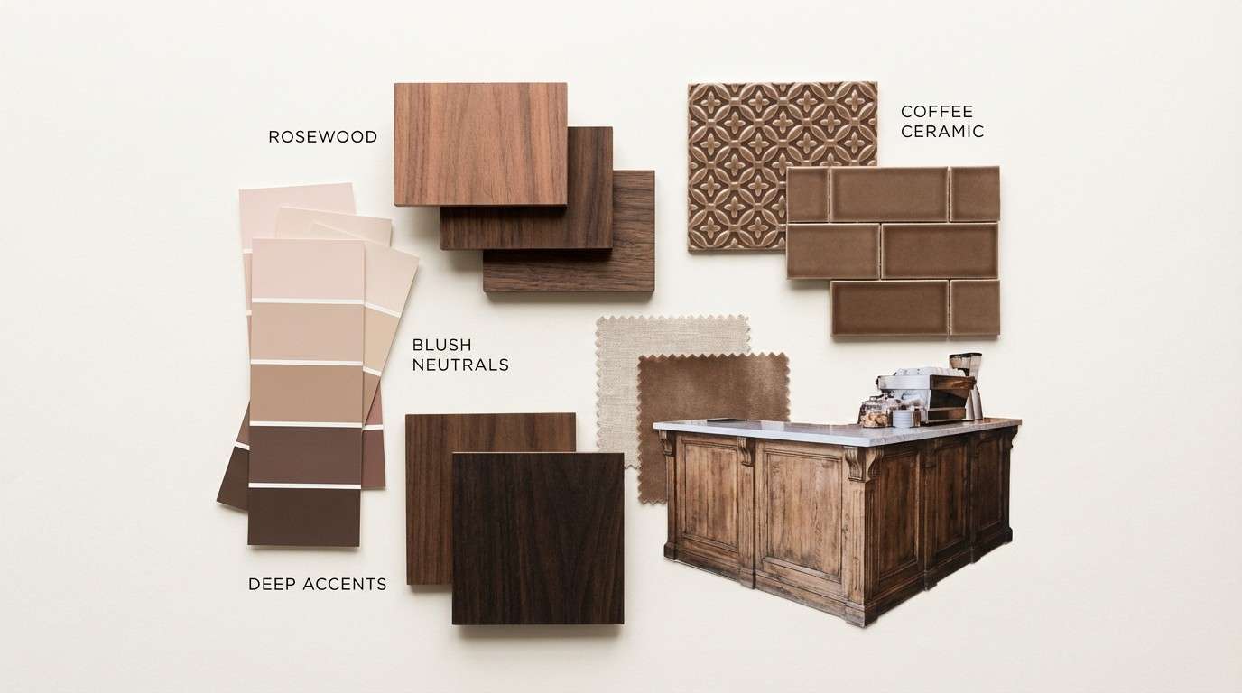
13) Linen and Wood
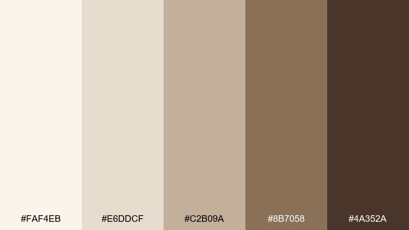
HEX: #FAF4EB #E6DDCF #C2B09A #8B7058 #4A352A
Mood: natural, relaxed, Scandinavian
Best for: stationery sets and takeaway stamp designs
Natural and relaxed like linen napkins on a wooden table, these hues feel effortless. They work especially well for stationery, takeaway stamps, and minimal merch tags. Pair the pale linen with the darkest brown for crisp logos, and use the mid tan for secondary text. Tip: add plenty of whitespace so the palette reads clean instead of dusty.
Image example of linen and wood generated using media.io
14) Pumpkin Spice
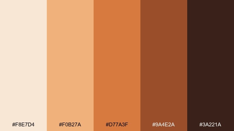
HEX: #F8E7D4 #F0B27A #D77A3F #9A4E2A #3A221A
Mood: seasonal, cheerful, comforting
Best for: autumn illustrations and limited-time menus
Seasonal and cheerful like an autumn latte in a warm cup, these colors feel instantly comforting. They are ideal for illustrated menus, seasonal stickers, and limited-time signage. Pair the soft cream with pumpkin orange to keep it bright, then ground the layout with the deep brown. Tip: use the orange for shapes and icons, and keep text mostly in brown to avoid eye fatigue.
Image example of pumpkin spice generated using media.io

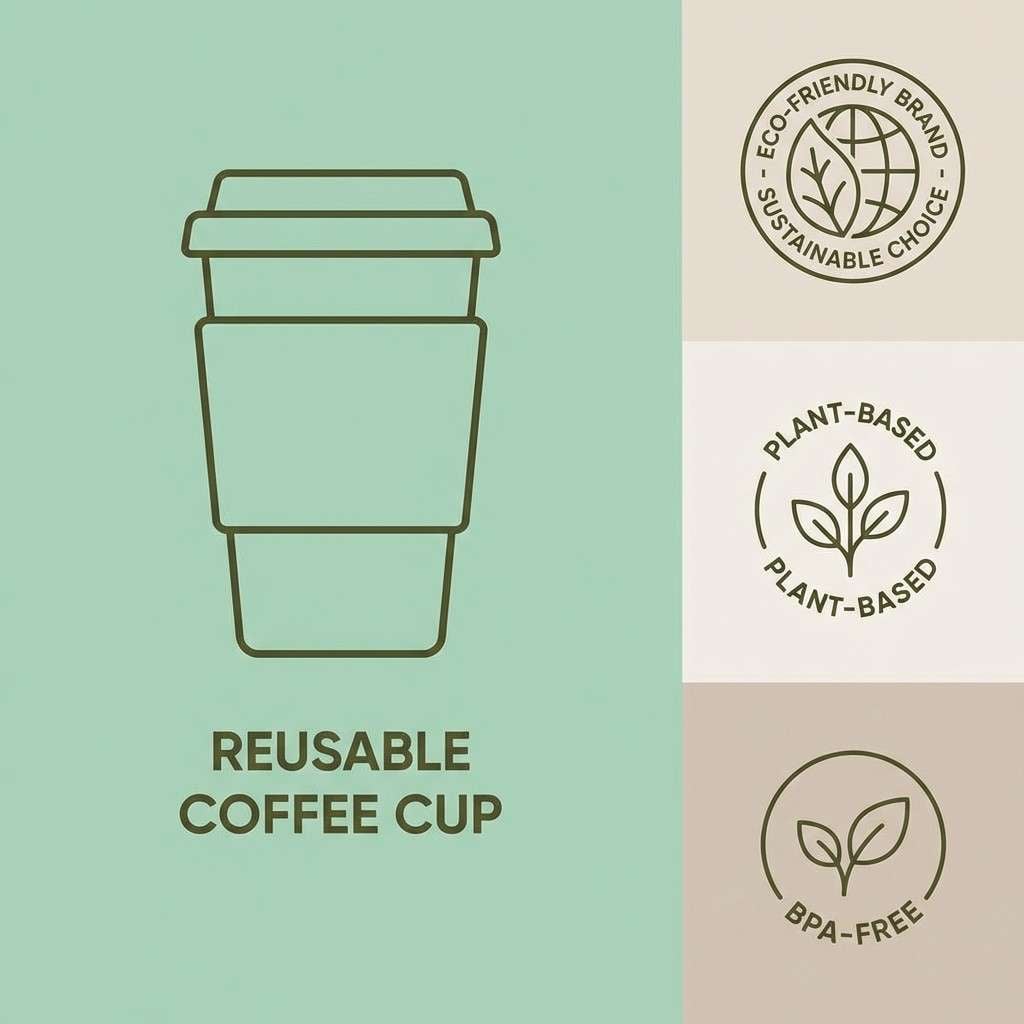
15) Cocoa Mint
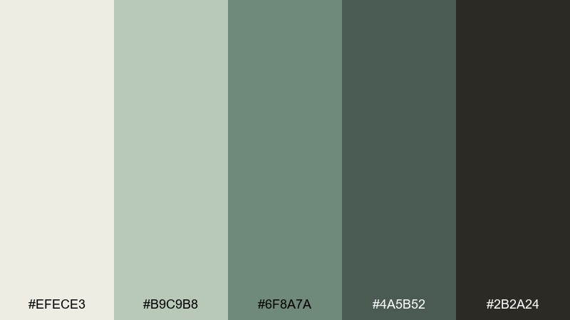
HEX: #EFECE3 #B9C9B8 #6F8A7A #4A5B52 #2B2A24
Mood: refreshing, balanced, modern
Best for: eco-friendly branding and reusable cup designs
Refreshing and balanced like mint beside rich cocoa, this mix feels modern and eco-minded. It fits sustainable branding, reusable cup graphics, and tone-on-tone patterns. Pair the light neutral with the deep charcoal-olive for clean contrast, then let mint carry small highlights. Tip: keep greens slightly desaturated in print to avoid a harsh, plasticky look.
Image example of cocoa mint generated using media.io
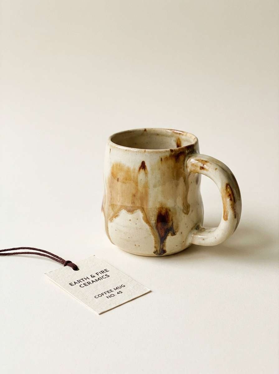
16) Chicory Cream
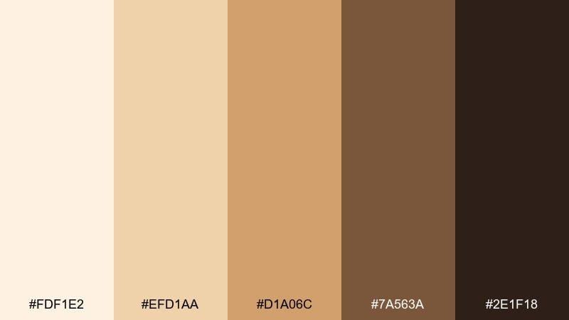
HEX: #FDF1E2 #EFD1AA #D1A06C #7A563A #2E1F18
Mood: smooth, nostalgic, homey
Best for: ceramic mug product photos and merch pages
Smooth and nostalgic like chicory coffee with a splash of cream, these tones feel homey. They are great for merch pages, ceramic mug promos, and warm product storytelling. Pair the creamy base with the caramel midtone for gentle depth, then use the deep brown for type and shadows. Tip: use soft lighting and matte textures so the palette stays buttery rather than glossy.
Image example of chicory cream generated using media.io
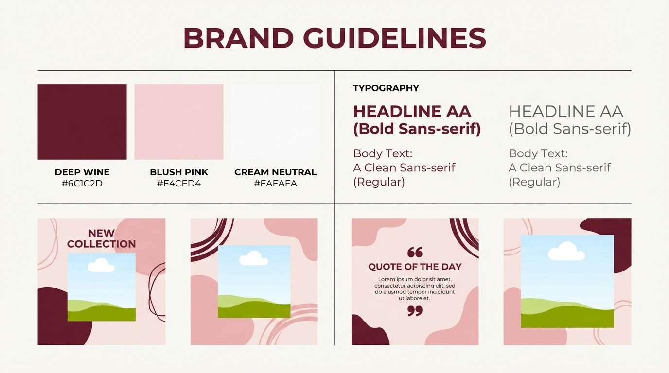
17) Blush Espresso
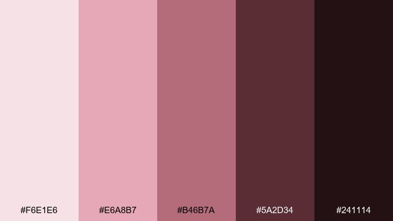
HEX: #F6E1E6 #E6A8B7 #B46B7A #5A2D34 #241114
Mood: elegant, intimate, boutique
Best for: brand guidelines and social templates
Elegant and intimate like a blush macaron beside an espresso shot, these tones read boutique and refined. They create coffee shop color combinations that work beautifully in brand guidelines and reusable social templates. Pair the pale blush with deep wine for typography and icon strokes, keeping the mid rose for buttons and tags. Tip: if photos are busy, place text on the light blush and outline in the darkest shade for clarity.
Image example of blush espresso generated using media.io
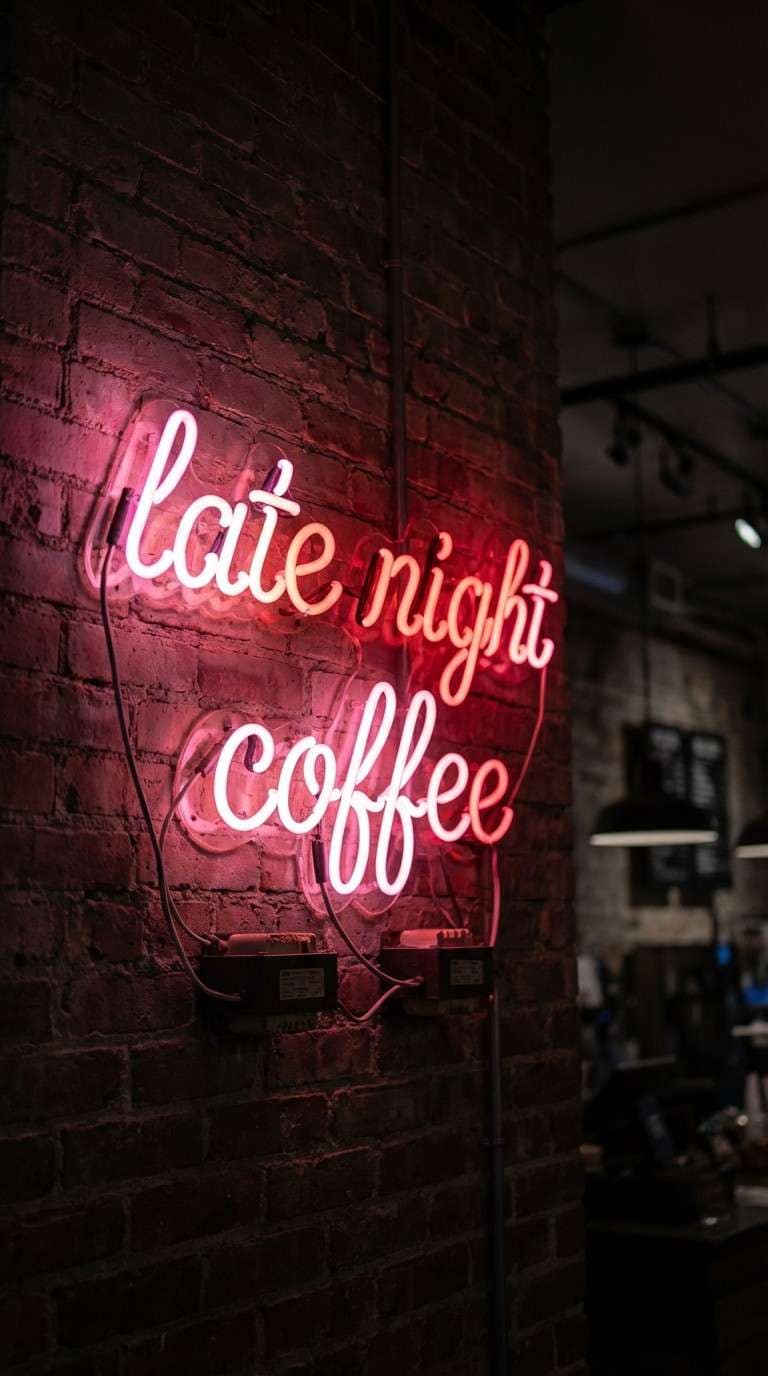
18) Neon Sign Rose
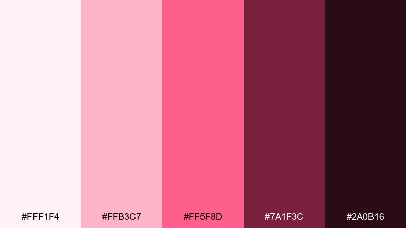
HEX: #FFF1F4 #FFB3C7 #FF5F8D #7A1F3C #2A0B16
Mood: trendy, vibrant, nightlife
Best for: late-night promo ads and neon-style signage concepts
Trendy and vibrant like a neon sign glowing through a rainy window, this set leans nightlife-ready. Use it for late-night promos, special events, and punchy digital ads. Pair the hot pink with the deep wine to keep contrast sharp, then soften with the pale blush as breathing room. Tip: keep gradients subtle and avoid extra bright colors so the neon effect stays believable.
Image example of neon sign rose generated using media.io
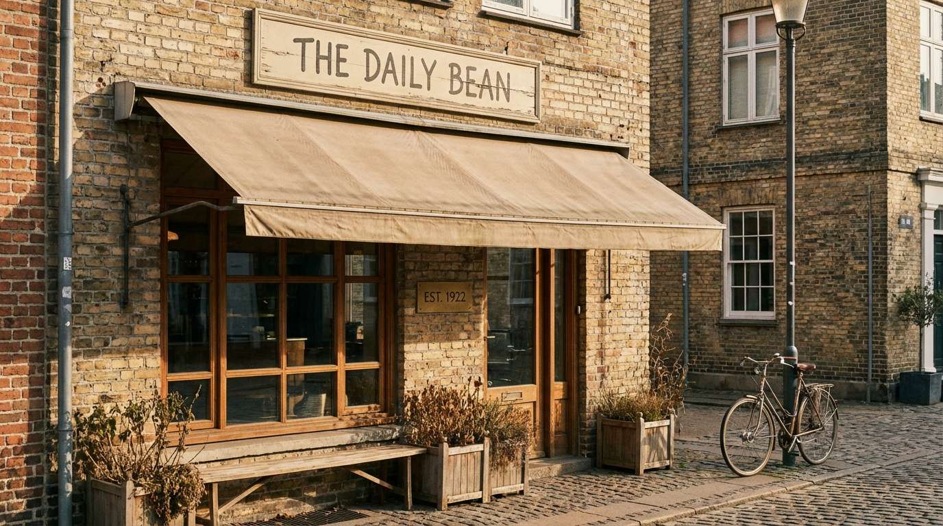
19) Rustic Brick
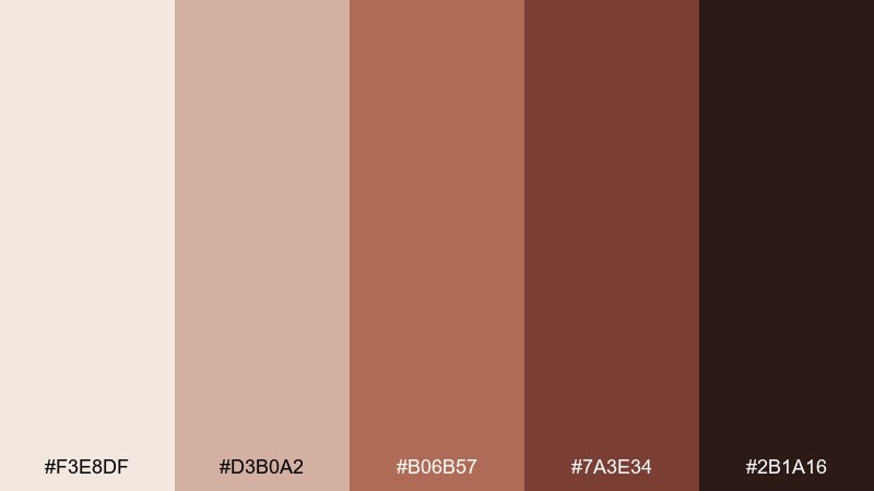
HEX: #F3E8DF #D3B0A2 #B06B57 #7A3E34 #2B1A16
Mood: earthy, dependable, artisan
Best for: storefront visuals and outdoor signage
Earthy and dependable like weathered brick and roasted beans, these tones feel artisan and grounded. They work well for storefront visuals, awnings, and outdoor signage where warmth helps attract foot traffic. Pair the dusty blush-beige with brick red for large shapes, and keep the darkest shade for type and outlines. Tip: test legibility at distance by using the deepest color for critical info like hours and location.
Image example of rustic brick generated using media.io
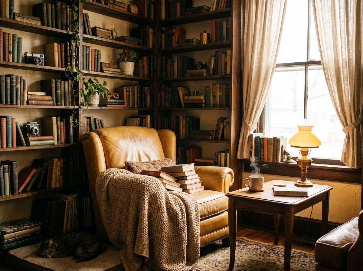
20) Autumn Library
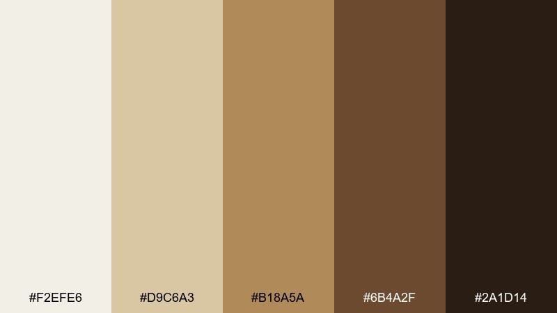
HEX: #F2EFE6 #D9C6A3 #B18A5A #6B4A2F #2A1D14
Mood: quiet, cozy, intellectual
Best for: reading corner interiors and long-form content
Quiet and cozy like an autumn reading nook with a mug nearby, these tones feel thoughtful and warm. They suit long-form content, blog graphics, and interiors that lean bookish and calm. Pair the parchment light with deep brown for comfortable contrast, and use the golden tan to highlight pull quotes or section headers. Tip: keep shadows warm and soft so the palette stays inviting rather than sepia-heavy.
Image example of autumn library generated using media.io
What Colors Go Well with Coffee Shop?
Warm neutrals are the backbone of most café branding: cream, oat, beige, caramel, cocoa, and espresso brown. They feel natural on paper menus, textured packaging, and wood-heavy interiors.
For accents, rose and blush create a modern boutique feel, while muted greens (sage/mint) suggest freshness and sustainability. Gold works well for premium product lines, especially when used sparingly for seals, borders, or small icons.
If you want a more urban look, introduce slate or blue-gray—but balance it with warm cream so the overall mood still reads cozy instead of cold.
How to Use a Coffee Shop Color Palette in Real Designs
Start with roles, not colors: pick 1 background (light cream), 1 primary text color (deep espresso), 1 secondary neutral (tan/wood), and 1 accent (rose, gold, or green). This keeps your coffee shop color scheme consistent across menus, signage, and social templates.
Design for readability first. Prices, hours, and navigation elements should use your darkest shade on a light background; save midtones for dividers, cards, and large shapes so layouts feel layered without clutter.
Finally, let materials do some of the work. Uncoated paper, kraft textures, and matte finishes make warm neutrals look richer—so you can stay minimal while still feeling premium.
Create Coffee Shop Palette Visuals with AI
If you’re pitching a café rebrand or testing new menu design directions, generating quick palette-based mockups is the fastest way to compare options. You can visualize signage, packaging, social promos, or an ordering UI in minutes.
Reuse the prompts above and swap in your shop name, layout type, and ratio. Keep one palette as the “control” and only change one variable (accent color, background shade, or typography) so feedback stays clear.
When you’re ready, turn any coffee shop color palette into consistent visuals without jumping between tools.
Coffee Shop Color Palette FAQs
-
What are the best colors for a coffee shop brand?
Warm neutrals (cream, beige, caramel, cocoa, espresso) are the most reliable because they match coffee and café materials. Add one accent—like rose, sage, or gold—for brand recognition. -
Which coffee shop colors feel most “cozy”?
Soft creams plus mid browns and warm wood tones create instant coziness. Palettes like Vanilla Bean, Linen and Wood, and Autumn Library lean especially inviting. -
What’s a modern coffee shop color scheme for 2026?
Minimal oat/cream bases with deep espresso typography and a muted accent (dusty rose, sage, slate) feel current. Oat Milk Minimal, Espresso Slate, and Blush Espresso are strong modern options. -
How do I keep my menu readable with warm colors?
Use a very light background (cream) and reserve the darkest shade (espresso/near-black) for body text and prices. Keep accent colors for small callouts like “new,” “limited,” or section headers. -
What accent color works best with coffee brown?
Rose/blush adds a boutique feel, sage/mint adds a fresh eco vibe, and gold signals premium. Choose based on your positioning, then use the accent sparingly for consistency. -
Are cool grays okay in a café palette?
Yes, if balanced with warm creams so the space still feels inviting. Espresso Slate and Biscotti Bluegray work best when imagery and materials stay warm-toned. -
How can I preview coffee shop color combinations before printing?
Create quick mockups (menu, cup, bag, poster) using AI prompts, then check contrast on different screens. For print, test a small proof on your paper stock because warm neutrals shift with lighting and texture.
Next: Rose Color Palette


