

Alice blue is a near-white pastel that keeps designs feeling open, clean, and gently modern. It’s a go-to base for UI, branding, print, and decor when you want calm without looking cold.
Below are 20+ ready-to-use alice blue color palette ideas with HEX codes, plus AI prompt examples you can recreate in seconds.
In this article
- Why Alice Blue Palettes Work So Well
-
- cloudy studio
- coastal linen
- blush porcelain
- minty daybreak
- lavender haze
- citrus ice
- graphite calm
- nordic wood
- sage mist
- sunset gelato
- ink and ice ui
- vintage tea party
- winter bloom
- museum minimal
- arctic editorial
- ocean copper
- playroom pastels
- botanical sketch
- night sky soft
- marble and gold
- spring market
- What Colors Go Well with Alice Blue?
- How to Use a Alice Blue Color Palette in Real Designs
- Create Alice Blue Palette Visuals with AI
Why Alice Blue Palettes Work So Well
Alice blue sits right on the edge of white, which makes it incredibly versatile as a background color. It adds a soft hint of color temperature while keeping layouts bright and minimal.
Because it’s so light, it pairs well with both cool accents (navy, slate, teal, lavender) and warm neutrals (sand, tan, cocoa). That balance helps branding feel calm and premium rather than sterile.
In digital design, alice blue also supports readability when you anchor the palette with a strong dark for text and navigation. Done well, it delivers an airy look without sacrificing contrast.
20+ Alice Blue Color Palette Ideas (with HEX Codes)
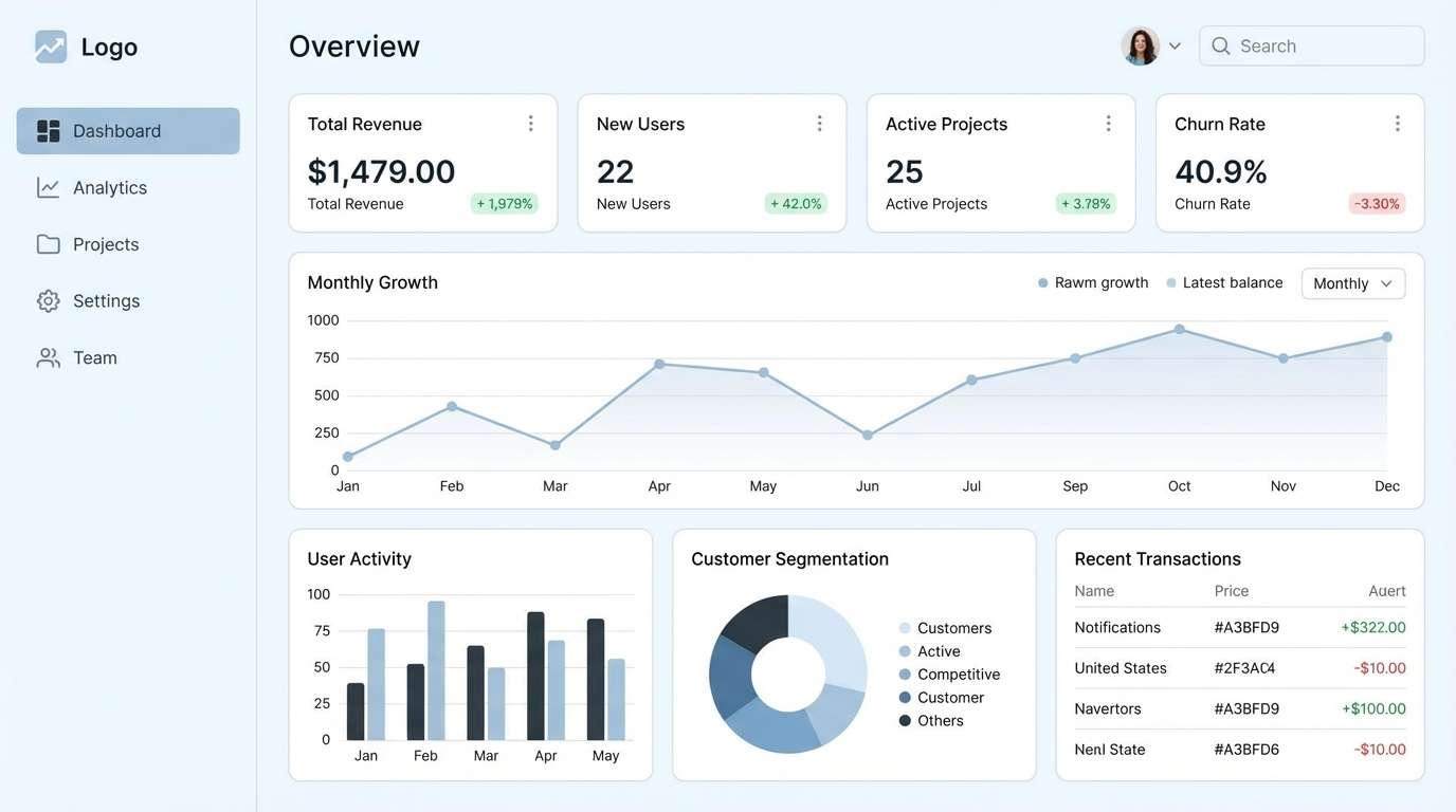
1) Cloudy Studio
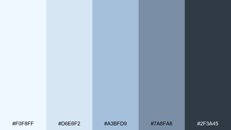
HEX: #F0F8FF #D6E6F2 #A3BFD9 #7A8FA6 #2F3A45
Mood: calm, airy, professional
Best for: SaaS dashboard UI
Calm and airy like morning light through a studio window, these tones keep interfaces feeling spacious and focused. Use it for analytics dashboards, admin panels, and data-heavy screens where clarity matters. Pair the deeper slate with white space to create hierarchy, then use the mid blues for buttons and charts. Tip: reserve the darkest tone for text and navigation to maintain crisp contrast.
Image example of cloudy studio generated using media.io
Media.io is an online AI studio for creating and editing video, image, and audio in your browser.

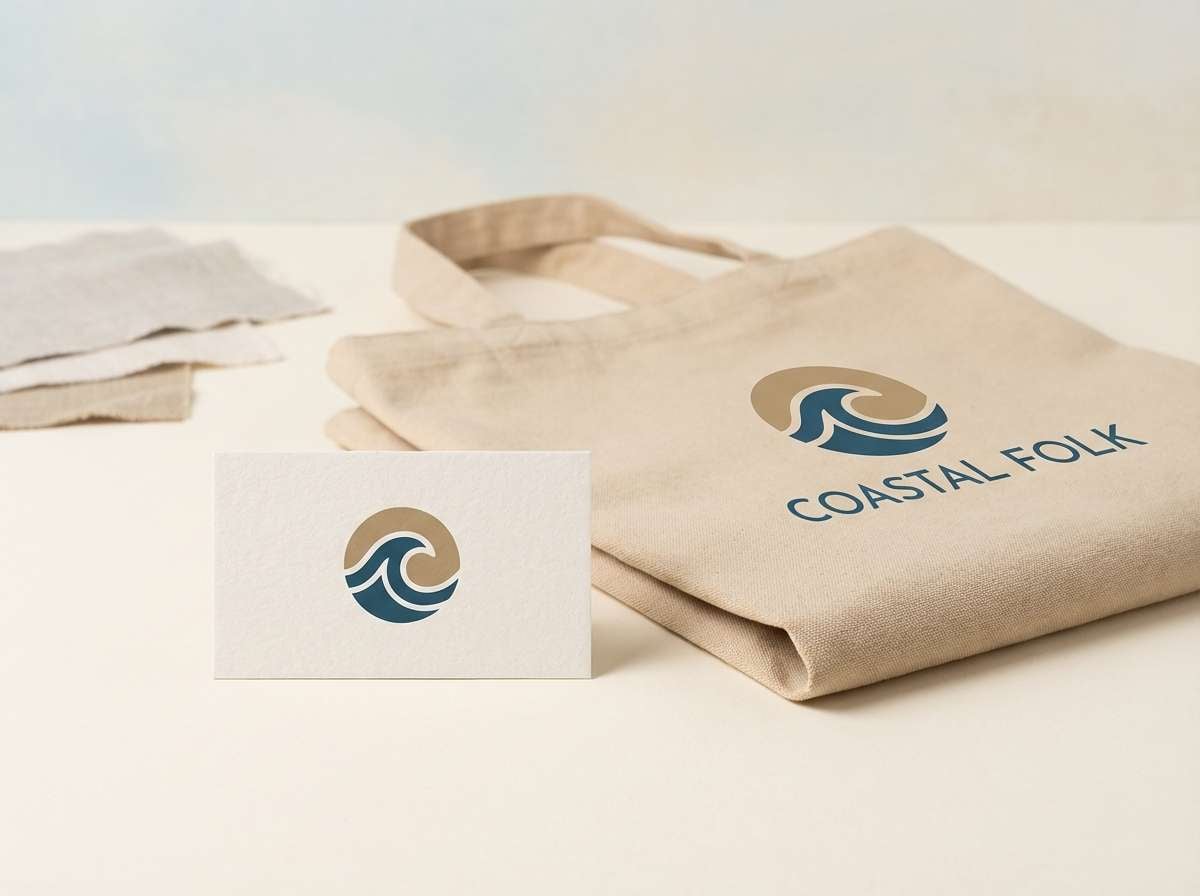
2) Coastal Linen
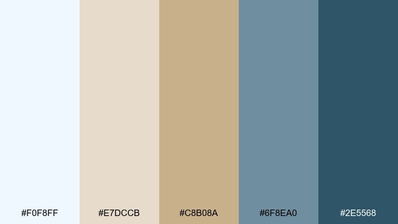
HEX: #F0F8FF #E7DCCB #C8B08A #6F8EA0 #2E5568
Mood: breezy, natural, relaxed
Best for: lifestyle brand identity
Breezy and sun-washed, it feels like sea air over linen and driftwood. These hues work beautifully for wellness, coastal retail, and slow-living branding where warmth should stay subtle. Ground the look with deep teal in typography and let sand tones soften backgrounds and packaging. Tip: use the tan as a secondary neutral to keep the blue from turning too cold.
Image example of coastal linen generated using media.io
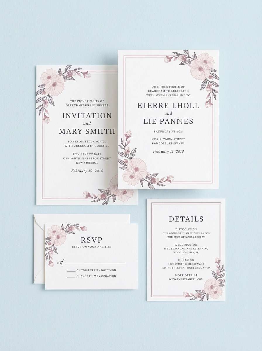
3) Blush Porcelain
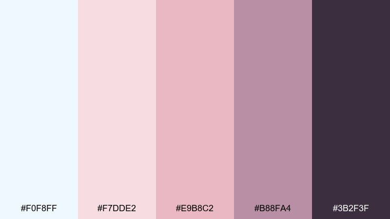
HEX: #F0F8FF #F7DDE2 #E9B8C2 #B88FA4 #3B2F3F
Mood: romantic, soft, polished
Best for: wedding invitation suite
Romantic and polished, it evokes blush petals on glossy porcelain with a cool, airy finish. It shines on invitations, RSVP cards, and menus where you want elegance without heavy contrast. Use the deep plum for names and headings, and keep body copy in a softened gray-black for readability. Tip: add a tiny border line in mauve to tie every piece together.
Image example of blush porcelain generated using media.io
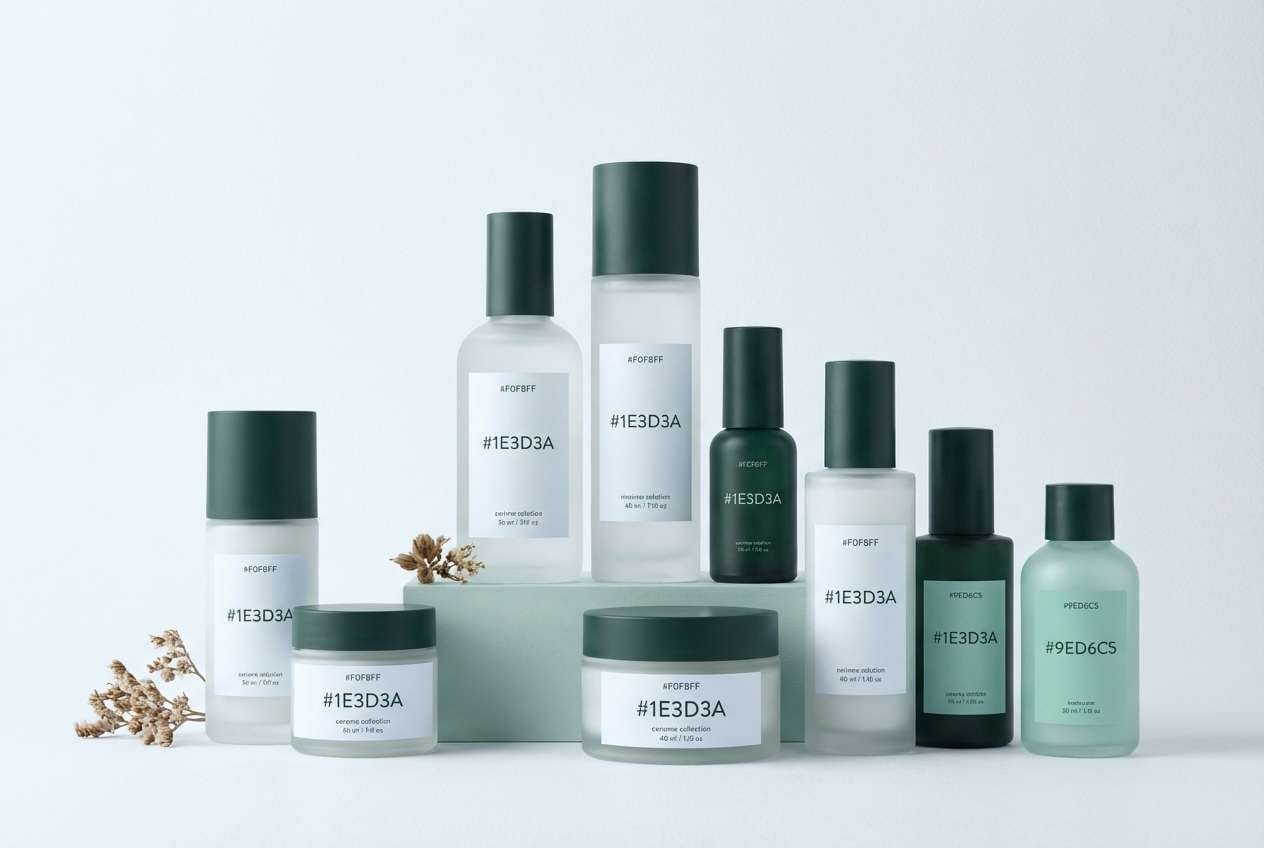
4) Minty Daybreak
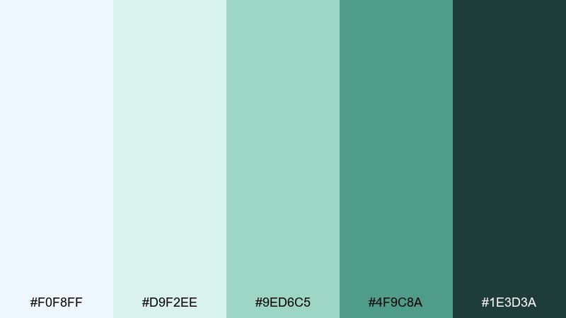
HEX: #F0F8FF #D9F2EE #9ED6C5 #4F9C8A #1E3D3A
Mood: fresh, clean, uplifting
Best for: skincare product packaging
Fresh and clean like a cool splash at daybreak, these tones feel hygienic and modern. They are ideal for skincare, spa goods, and refillable packaging that needs a gentle eco cue. Let the pale blue and mint carry the label background, then use the deep green for ingredient callouts. Tip: keep finishes matte to preserve the soft, airy effect.
Image example of minty daybreak generated using media.io
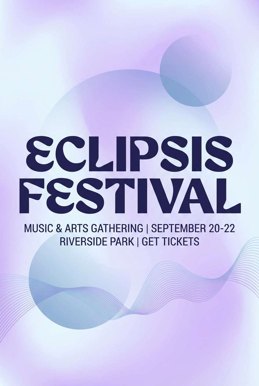
5) Lavender Haze
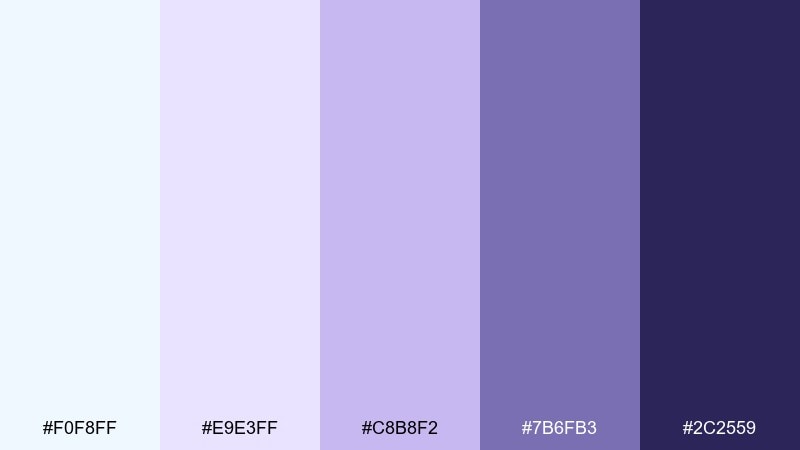
HEX: #F0F8FF #E9E3FF #C8B8F2 #7B6FB3 #2C2559
Mood: dreamy, creative, gentle
Best for: music event poster
Dreamy and slightly cosmic, it brings to mind lavender fog against a pale winter sky. Use these tones on posters and social creatives where you want softness but still need depth for type. The navy-purple anchors headlines, while the lilac shades make gradients look smooth and modern. Tip: apply a subtle grain texture to keep large pastel areas from feeling flat.
Image example of lavender haze generated using media.io
6) Citrus Ice
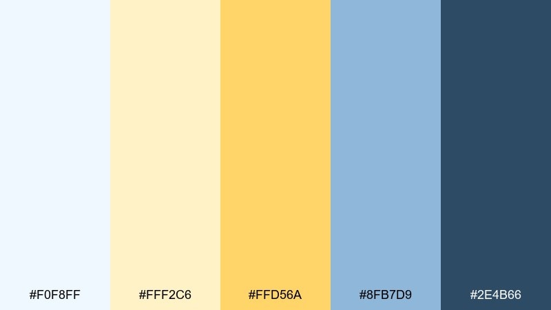
HEX: #F0F8FF #FFF2C6 #FFD56A #8FB7D9 #2E4B66
Mood: cheerful, bright, crisp
Best for: summer promo banner
Cheerful and crisp, it feels like sparkling lemonade poured over ice. These colors suit seasonal promos, ecommerce hero banners, and upbeat campaigns that need friendly energy. Keep the yellow as a controlled accent for CTAs and price tags, while blue tones handle the layout and readability. Tip: limit saturated yellow to small areas so it stays premium, not loud.
Image example of citrus ice generated using media.io

7) Graphite Calm
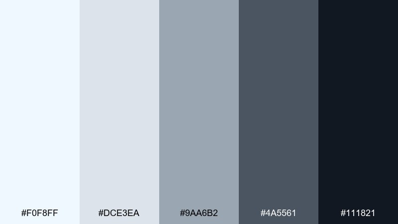
HEX: #F0F8FF #DCE3EA #9AA6B2 #4A5561 #111821
Mood: minimal, modern, confident
Best for: portfolio website
Minimal and confident, it reads like polished graphite on crisp paper. Use it for portfolios, agency sites, and case studies where the work needs to stay center stage. The light blues keep sections airy, while charcoal and near-black deliver strong type contrast. Tip: add a single mid-gray divider system to create rhythm without visual noise.
Image example of graphite calm generated using media.io
8) Nordic Wood
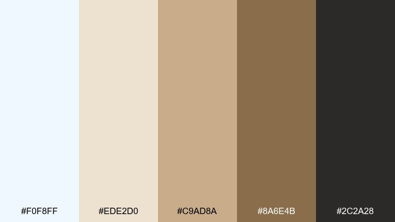
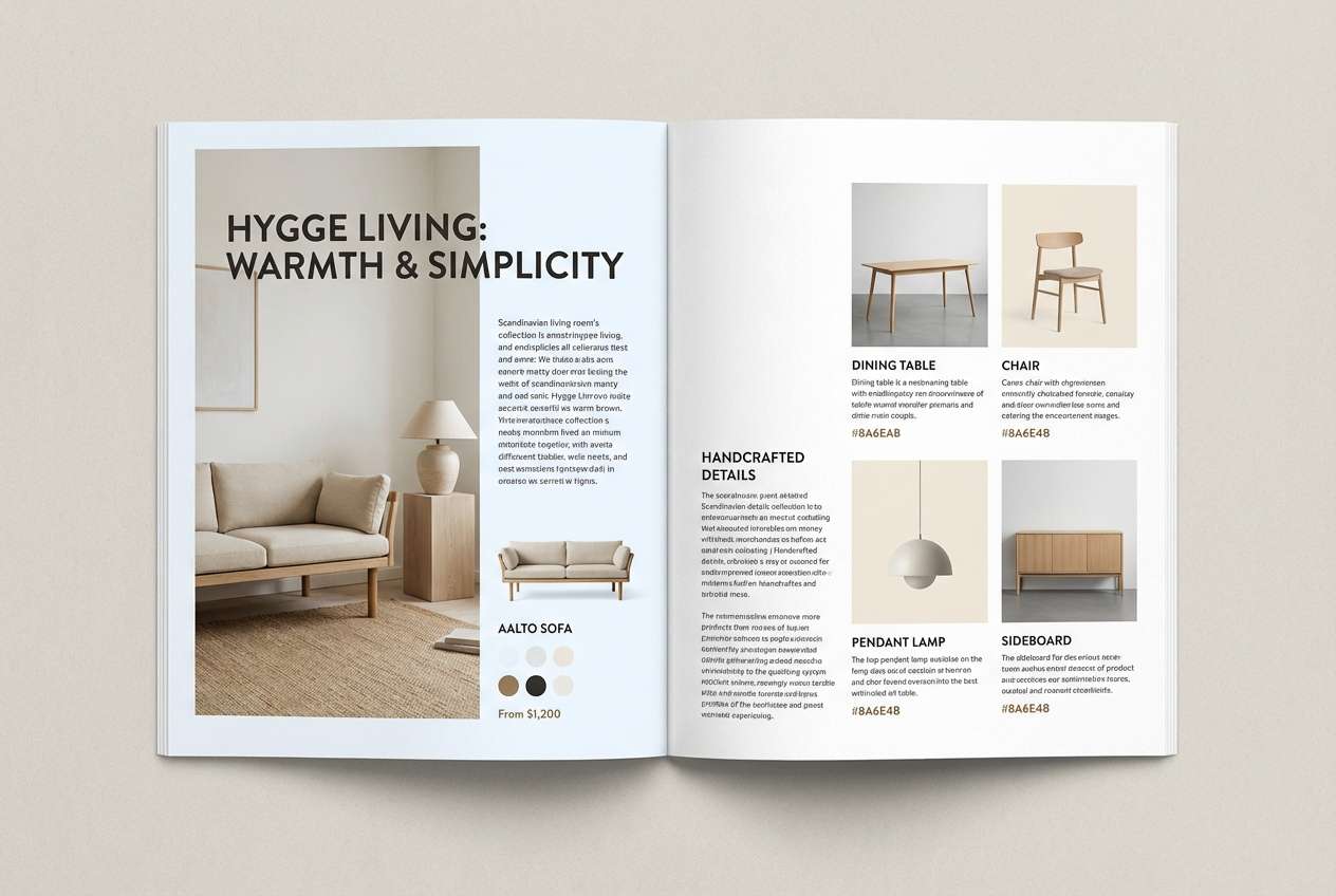
HEX: #F0F8FF #EDE2D0 #C9AD8A #8A6E4B #2C2A28
Mood: cozy, grounded, Scandinavian
Best for: home decor catalog layout
Cozy and grounded, it suggests pale winter skies over warm timber. These shades fit catalogs, lookbooks, and editorial layouts for furniture and interiors. Use the soft blue as negative space, then bring in wood browns for headings and callouts. Tip: keep imagery bright and desaturated so the palette stays calm and Scandinavian.
Image example of nordic wood generated using media.io
9) Sage Mist
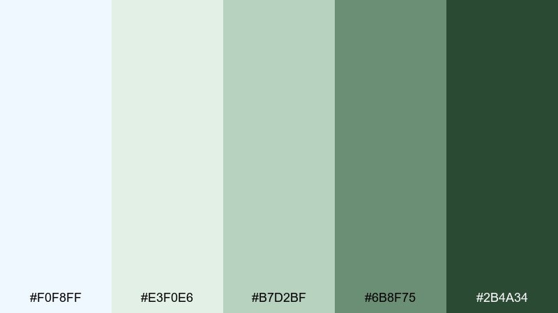
HEX: #F0F8FF #E3F0E6 #B7D2BF #6B8F75 #2B4A34
Mood: peaceful, botanical, balanced
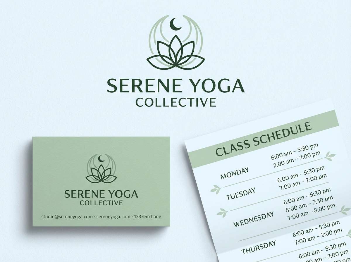
Best for: yoga studio branding
Peaceful and botanical, it feels like fog drifting through a herb garden. For a soothing alice blue color palette in wellness branding, these greens add gentle life without overpowering the airy base. Use sage tones for icons and patterns, and keep the darkest green for logos and signage. Tip: pair with uncoated paper or soft-touch finishes to reinforce the calm mood.
Image example of sage mist generated using media.io
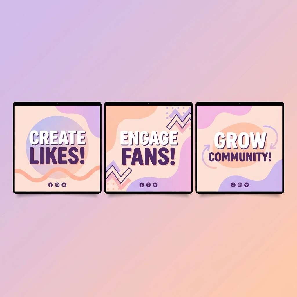
10) Sunset Gelato
HEX: #F0F8FF #FFD6C9 #FF9FB1 #B68BD4 #3B2C5A
Mood: playful, sweet, modern
Best for: social media carousel
Playful and sweet, it recalls gelato shades melting into a cool blue bowl. These tones are great for carousel posts, creator templates, and pop-forward launches that still feel clean. The berry purple makes strong headline type, while peach and pink work best in blocks and stickers. Tip: keep one slide mostly pale to give the brighter accents a place to pop.
Image example of sunset gelato generated using media.io
11) Ink and Ice UI
HEX: #F0F8FF #CFE2F3 #7AA5C9 #244A64 #0B1B2A
Mood: sharp, techy, trustworthy
Best for: finance app onboarding UI
Sharp and trustworthy, it looks like dark ink cutting through clear ice. These tones support fintech onboarding, login flows, and product tours where you want confidence and calm. One of the easiest alice blue color combinations is pairing the pale base with deep navy for primary actions and headers. Tip: use the mid blue for secondary buttons to keep the interface from feeling too heavy.
Image example of ink and ice ui generated using media.io
12) Vintage Tea Party
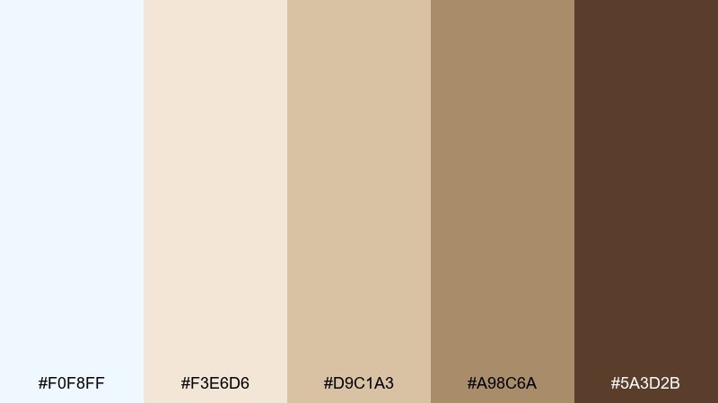
HEX: #F0F8FF #F3E6D6 #D9C1A3 #A98C6A #5A3D2B
Mood: nostalgic, warm, inviting
Best for: cafe menu design
Nostalgic and warm, it brings to mind tea-stained paper and a pale blue china set. Use it for cafe menus, bakery boards, and packaging labels that lean artisanal. The cocoa brown is perfect for type and icons, while cream tones keep the layout soft and readable. Tip: add small illustrated separators in tan for a handcrafted feel.
Image example of vintage tea party generated using media.io
13) Winter Bloom
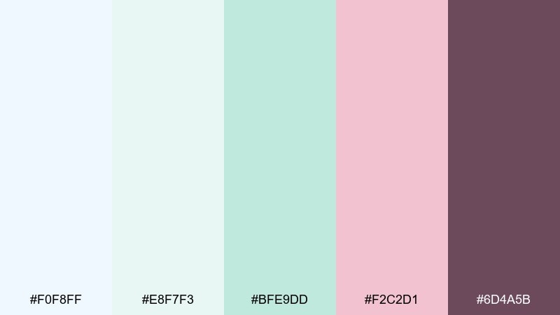
HEX: #F0F8FF #E8F7F3 #BFE9DD #F2C2D1 #6D4A5B
Mood: soft, optimistic, airy
Best for: spring floral illustration
Soft and optimistic, it feels like early blossoms pushing through late frost. These hues work beautifully for watercolor florals, greeting cards, and seasonal stationery. Keep the pale blue as the paper tone, then layer mint and blush as petals and leaves for gentle contrast. Tip: let one deep berry detail appear sparingly to add focal points.
Image example of winter bloom generated using media.io
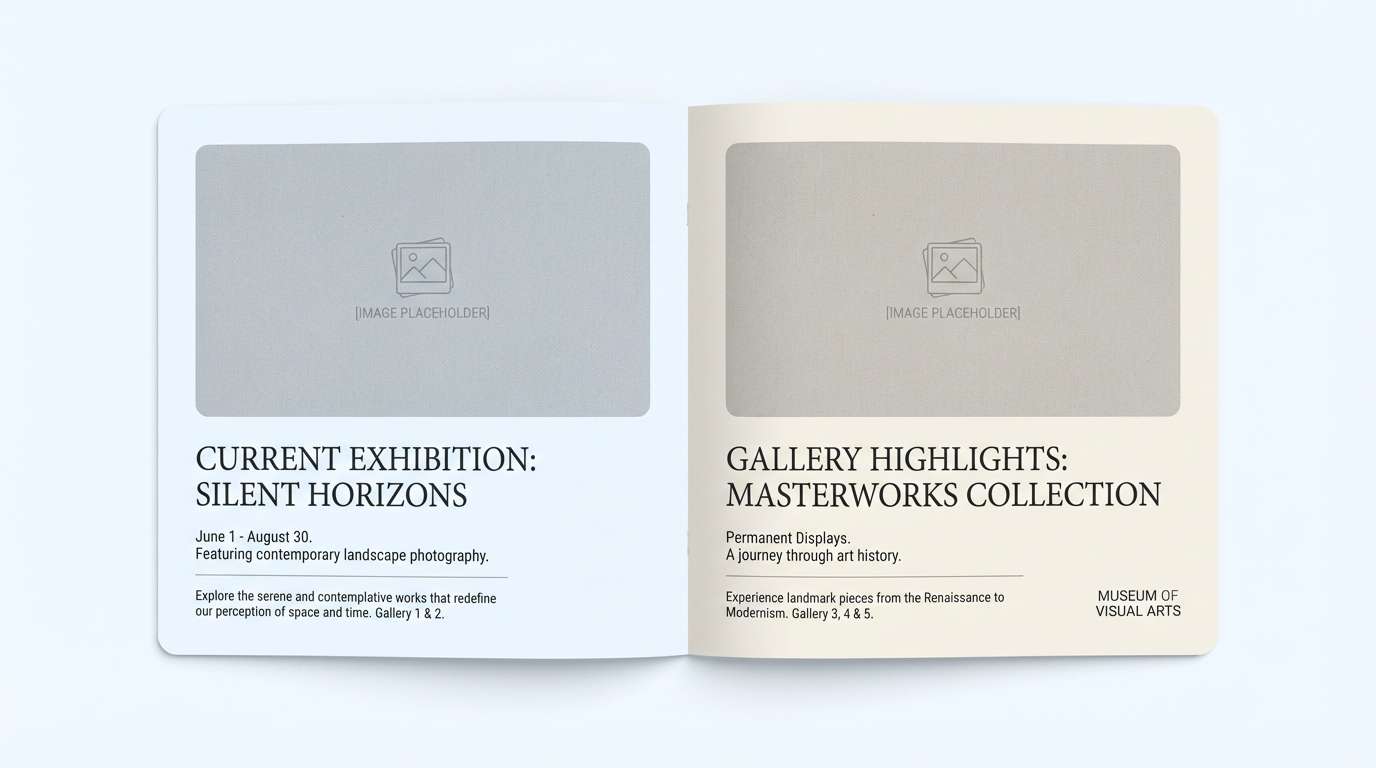
14) Museum Minimal
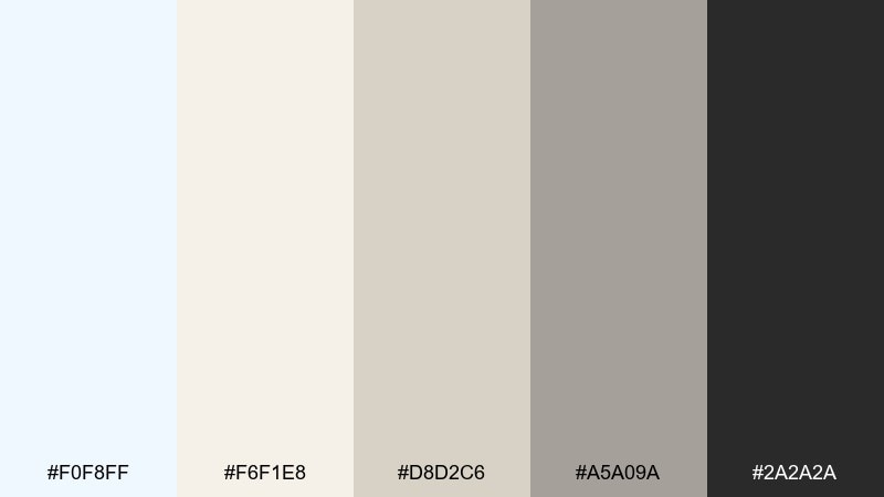
HEX: #F0F8FF #F6F1E8 #D8D2C6 #A5A09A #2A2A2A
Mood: quiet, curated, refined
Best for: art gallery brochure
Quiet and curated, it suggests clean walls, soft daylight, and calm captions beside artwork. Use it for brochures, exhibition guides, and premium print where restraint is part of the message. Warm off-whites keep the page from feeling sterile, while charcoal locks in legibility. Tip: use wide margins and a strict grid to make the palette feel intentional.
Image example of museum minimal generated using media.io
15) Arctic Editorial
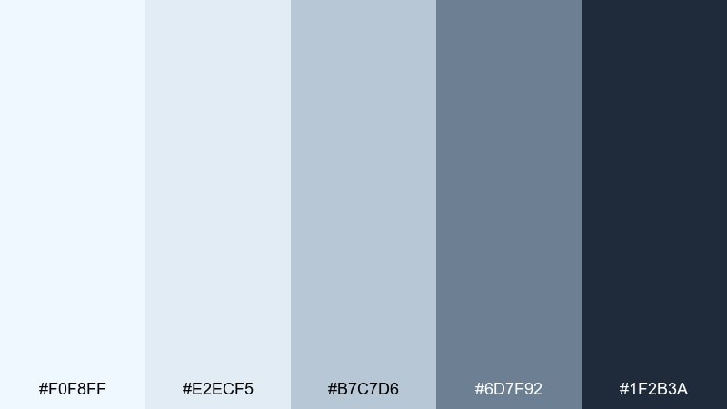
HEX: #F0F8FF #E2ECF5 #B7C7D6 #6D7F92 #1F2B3A
Mood: crisp, modern, journalistic
Best for: magazine feature layout
Crisp and modern, it reads like cold air and clean headlines. This set suits long-form layouts, interviews, and reports where structure and readability come first. Use the pale tones for column backgrounds and pull quotes, and anchor titles with the deep blue-gray. Tip: keep accent color use to rules and lines so the page stays editorial, not decorative.
Image example of arctic editorial generated using media.io
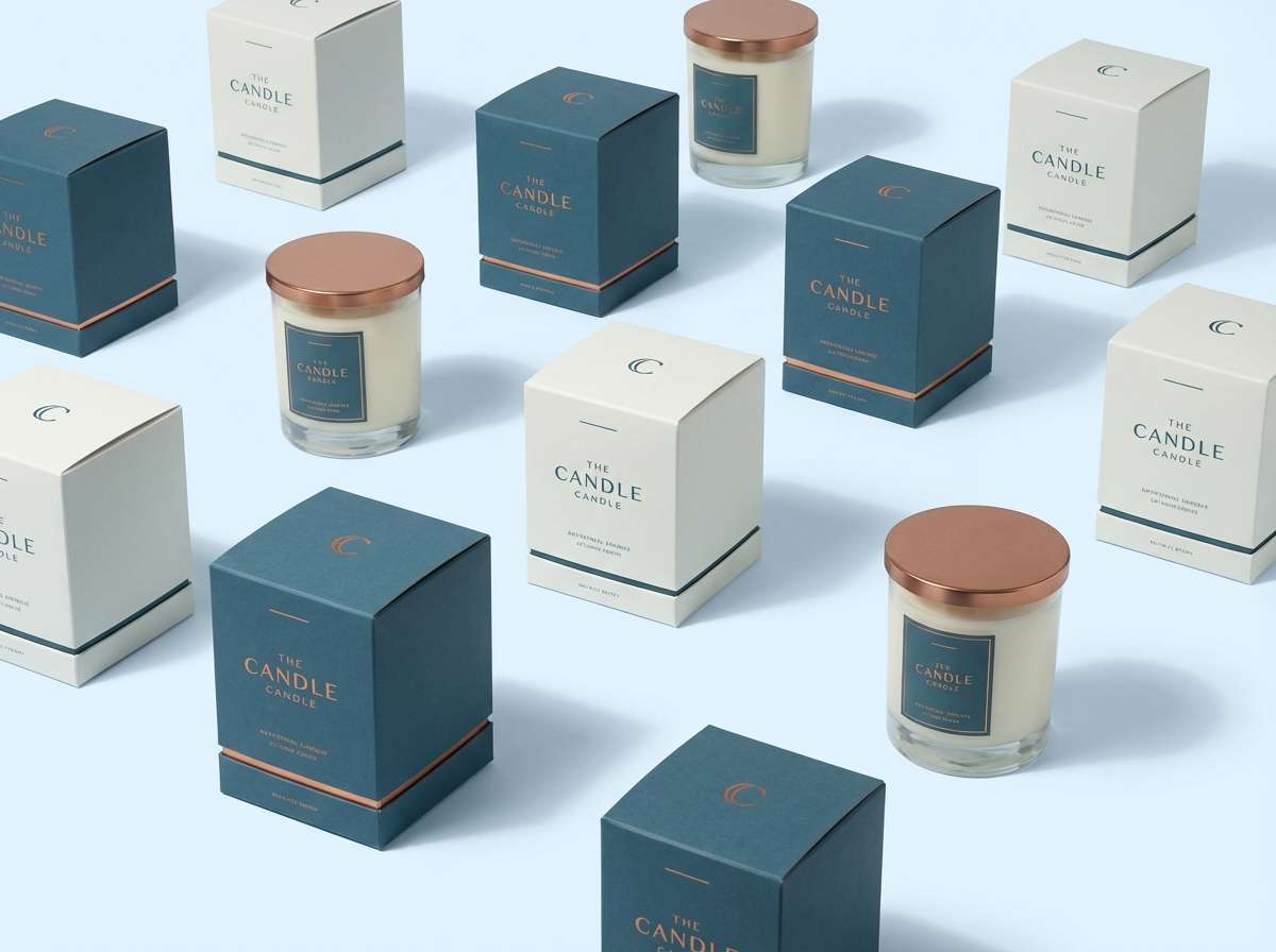
16) Ocean Copper
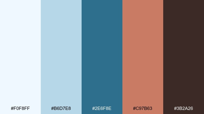
HEX: #F0F8FF #B6D7E8 #2E6F8E #C97B63 #3B2A26
Mood: crafted, nautical, sophisticated
Best for: premium candle packaging
Crafted and sophisticated, it feels like sea glass beside warm copper hardware. These tones are strong for premium packaging, especially candles, fragrances, and small-batch goods. The teal builds depth, while the copper tone adds a luxe highlight for foils and seals. Tip: use copper only on logos or small details to keep it refined.
Image example of ocean copper generated using media.io
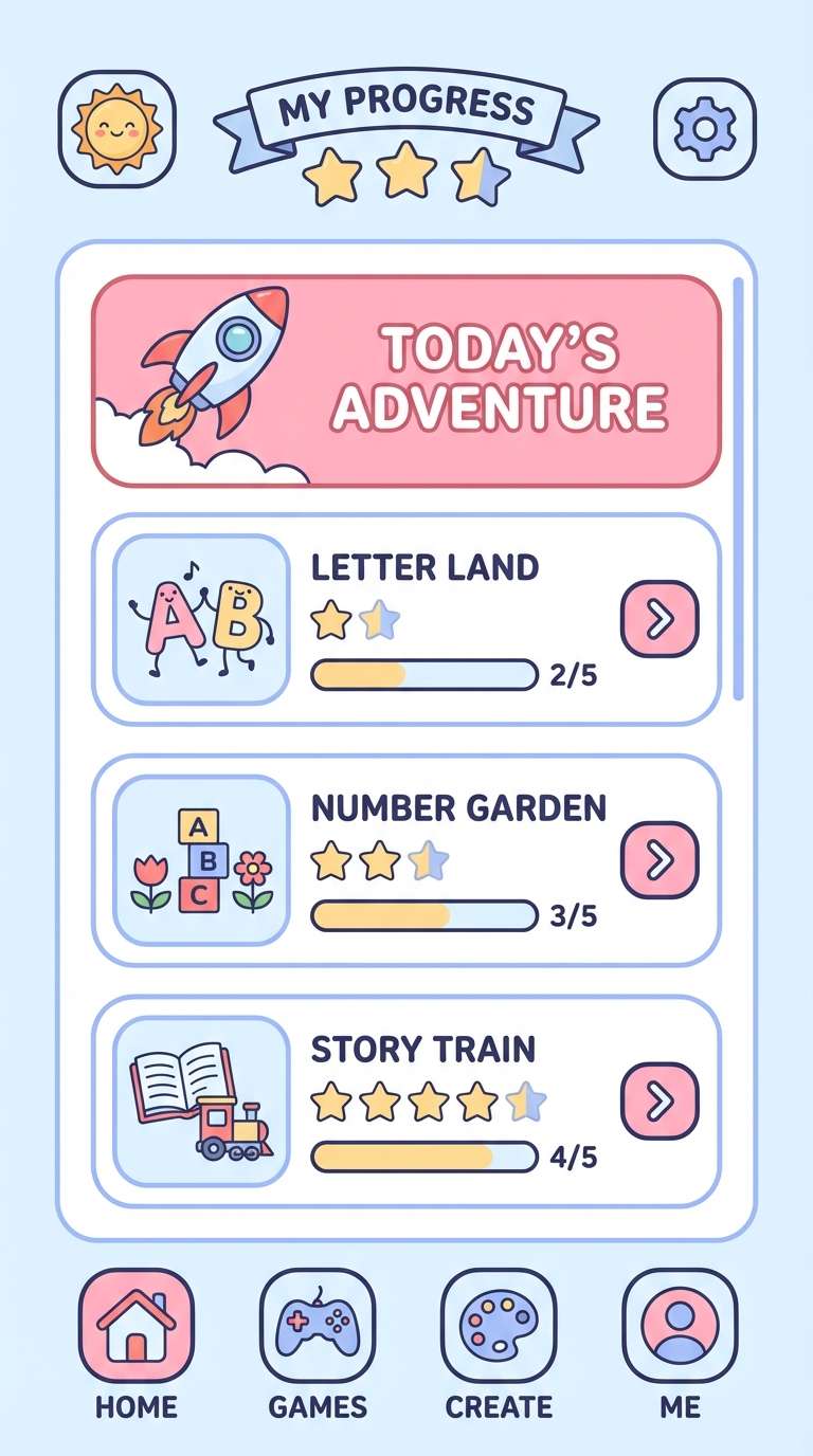
17) Playroom Pastels
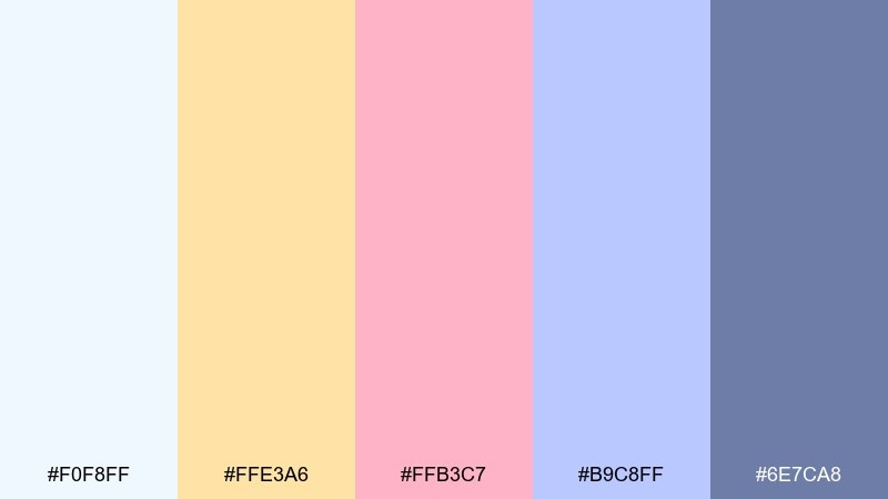
HEX: #F0F8FF #FFE3A6 #FFB3C7 #B9C8FF #6E7CA8
Mood: friendly, playful, soft
Best for: kids learning app UI
Friendly and playful, it looks like pastel blocks on a bright classroom wall. These colors work well in kids apps and learning tools because they stay soft while still being distinct. For an approachable alice blue color combination, use the pale base for screens and bring in peach and pink as rewards and badges. Tip: keep the darker periwinkle for navigation so interactions stay clear.
Image example of playroom pastels generated using media.io
18) Botanical Sketch
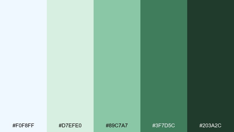
HEX: #F0F8FF #D7EFE0 #89C7A7 #3F7D5C #203A2C
Mood: earthy, fresh, handcrafted
Best for: herbal tea label illustration
Earthy and fresh, it evokes hand-drawn leaves washed with cool daylight. These shades are ideal for illustrated labels, eco products, and botanical packaging that needs authenticity. Let the pale blue stay as breathing room around drawings, then build depth with layered greens. Tip: use the darkest green for linework so the illustration remains crisp when printed small.
Image example of botanical sketch generated using media.io
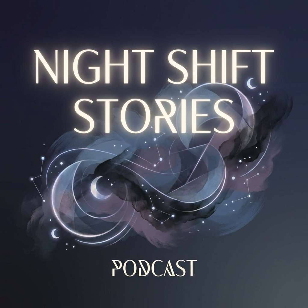
19) Night Sky Soft
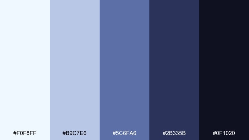
HEX: #F0F8FF #B9C7E6 #5C6FA6 #2B335B #0F1020
Mood: moody, calm, cinematic
Best for: podcast cover art
Moody and calm, it feels like twilight settling over a pale horizon. This palette works for podcast covers, album art, and streaming thumbnails where depth helps the title stand out. Use the lightest tones for subtle glow effects and the darkest navy for bold typography. Tip: add a gentle vignette so the center stays readable at small sizes.
Image example of night sky soft generated using media.io
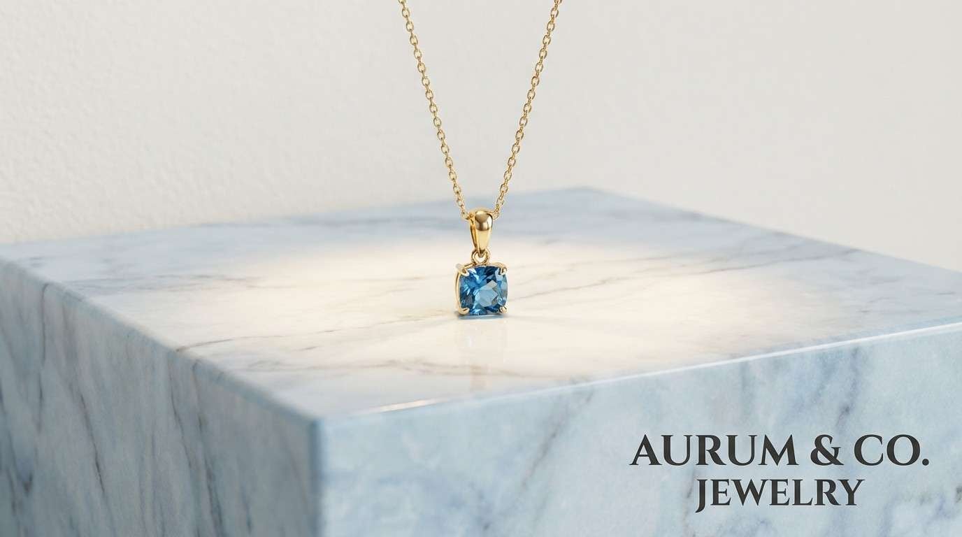
20) Marble and Gold
HEX: #F0F8FF #E6E6E6 #B9C0C8 #D4AF37 #2B2B2B
Mood: luxury, clean, elevated
Best for: jewelry product ad
Luxury and clean, it suggests cool marble with a restrained gold glint. These tones are perfect for jewelry ads, premium landing pages, and high-end lookbooks. One refined alice blue color combinations approach is keeping gold strictly as an accent while letting blue-gray neutrals do the heavy lifting. Tip: use gold for tiny highlights or rules, not large fills, to avoid a brassy look.
Image example of marble and gold generated using media.io
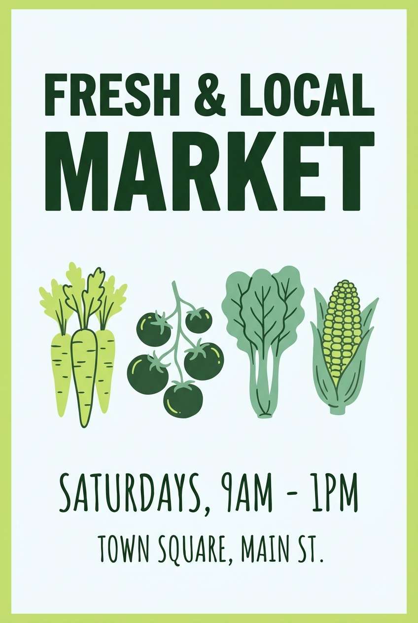
21) Spring Market
HEX: #F0F8FF #EAF9D9 #BDE47A #6FA86B #2E5D3A
Mood: bright, wholesome, outdoorsy
Best for: farmers market flyer
Bright and wholesome, it feels like fresh greens under a clear sky. Use this alice blue color palette for flyers and posters promoting local markets, eco events, or community classes. Pair the lime and leafy greens with simple sans-serif type, keeping the pale blue as the breathing room. Tip: add illustrated produce icons in the mid green to keep the design friendly and readable.
Image example of spring market generated using media.io
What Colors Go Well with Alice Blue?
Alice blue pairs naturally with deep navies, blue-grays, and charcoal because they create clean contrast for typography and UI components. This is one of the safest directions when you want a modern, trustworthy look.
For warmer balance, bring in sand, tan, cream, or cocoa tones to prevent the palette from feeling too icy. This works especially well in packaging, print layouts, and interior mood boards.
If you want a more expressive alice blue color scheme, add controlled accents like blush, lavender, mint, or even a small touch of gold. The key is keeping alice blue as the breathing room so accents feel intentional.
How to Use a Alice Blue Color Palette in Real Designs
Start with alice blue as your primary background, then choose one dark anchor (navy, slate, or near-black) for text, navigation, and key UI structure. This keeps your design legible and avoids the “washed out” look.
Use mid-tones for components (cards, chips, secondary buttons) and reserve your brightest accent for actions like CTAs, highlights, or small decorative elements. In print, alice blue works best when you let it behave like “tinted paper” rather than a loud color.
When building gradients, keep transitions subtle by staying within pastel ranges (alice blue → lilac → periwinkle, or alice blue → mint → sage). Soft grain or texture can help large light areas feel richer and less flat.
Create Alice Blue Palette Visuals with AI
If you already have HEX codes, you can turn them into mockups fast with AI prompts for UI screens, posters, packaging, and brand kits. This helps you test mood and contrast before committing to a full design system.
With Media.io’s text-to-image tool, you can paste a prompt, specify dominant colors, and generate multiple variations to compare. It’s especially useful for exploring alice blue color combinations across different styles.
Try generating a few versions of the same concept (for example: “minimal,” “luxury,” “playful”) while keeping the same palette to see how typography and layout change the vibe.
Alice Blue Color Palette FAQs
-
What is the HEX code for Alice Blue?
Alice Blue is commonly represented as #F0F8FF. It’s a very light, cool-tinted blue that often reads like a soft white in UI and print. -
Is Alice Blue considered a pastel color?
Yes. Alice blue is a pastel blue (very low saturation and high brightness), which makes it ideal for airy backgrounds and gentle, calming color schemes. -
What colors pair best with Alice Blue for modern UI?
For UI, pair alice blue with deep navy or charcoal for text, plus a mid blue-gray for components. Add one controlled accent (mint, gold, or soft yellow) for CTAs and highlights. -
How do I keep an Alice Blue palette from looking too pale?
Use a strong dark anchor for type and structure, and add mid-tones (slate/blue-gray) for cards and separators. Reserve bright accents for small areas so the design still feels clean. -
Can Alice Blue work for branding and packaging?
Absolutely. Alice blue feels clean and premium, especially when paired with warm neutrals (cream, sand, tan) or luxe accents (copper/gold) and minimal typography. -
What’s a good complementary accent for Alice Blue?
Warm accents like soft peach, blush, or muted gold add balance, while cool accents like lavender or teal keep the palette crisp. Choose based on whether you want warmth (brand-friendly) or clarity (tech-friendly). -
How can I preview Alice Blue palette ideas before designing?
Generate quick mockups using Media.io text-to-image by describing the layout (poster, app screen, packaging) and listing your HEX colors as dominant and accent tones. This lets you compare styles and contrast quickly.
Next: Fern Green Color Palette


