

Love color palettes are more than “pink and red.” They can feel playful, cinematic, cozy, modern, or lux depending on saturation, contrast, and the neutrals you pair them with.
Below are 20+ love color palette ideas with HEX codes you can copy fast, plus practical tips for branding, invitations, UI accents, and social designs.
In this article
- Why Love Palettes Work So Well
-
- romantic blush
- velvet rose
- candlelit champagne
- berry truffle
- cupid coral
- petal peach
- raspberry macaron
- vintage valentine
- rosewater linen
- garnet noir
- sweetheart sorbet
- dusty mauve
- scarlet silk
- soft berry gray
- cherry cream
- wild rose meadow
- plum kiss
- pink quartz
- mocha rose
- peony punch
- heartfelt harmony
- What Colors Go Well with Love?
- How to Use a Love Color Palette in Real Designs
- Create Love Palette Visuals with AI
Why Love Palettes Work So Well
Love palettes instantly communicate emotion because warm hues (pinks, reds, corals) are naturally attention-grabbing and psychologically tied to closeness, affection, and celebration.
They’re also flexible: soften them with creams and blush for weddings, push them toward deep berry and noir for drama, or mix with warm neutrals for modern lifestyle brands.
Most importantly, love color combinations are easy to systematize—light tones for backgrounds, mid tones for accents, and deep tones for typography—so your designs stay consistent across print and digital.
20+ Love Color Palette Ideas (with HEX Codes)
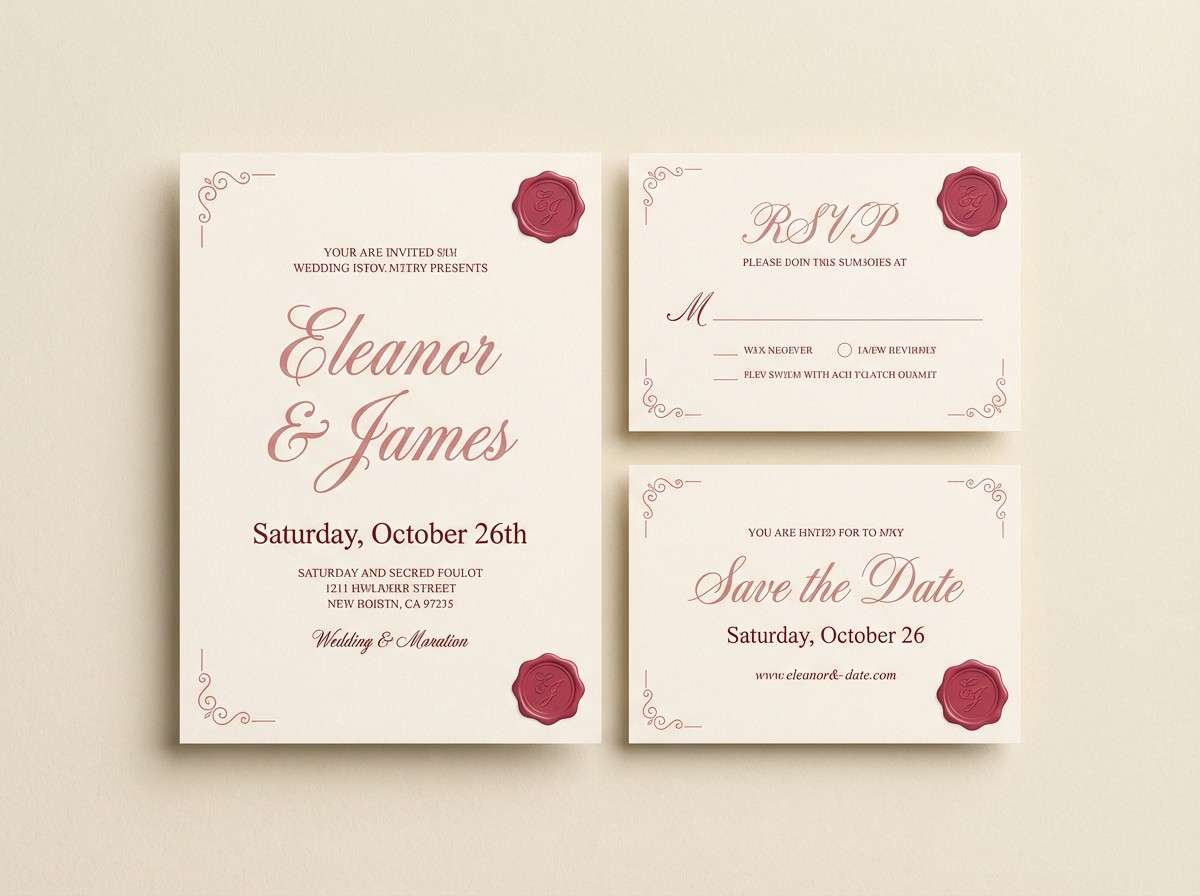
1) Romantic Blush
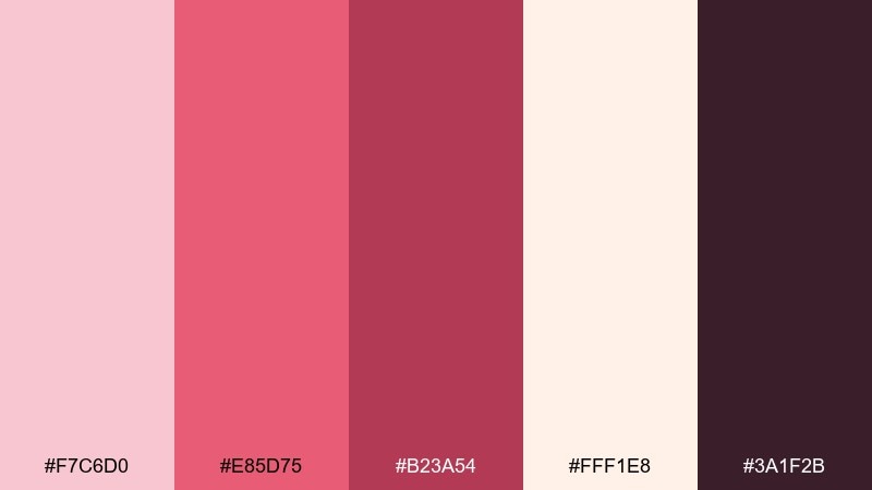
HEX: #F7C6D0 #E85D75 #B23A54 #FFF1E8 #3A1F2B
Mood: tender, flirty, classic
Best for: wedding invitation suite
Tender blush and rose tones feel like fresh petals and handwritten vows. Use the deep berry shade for names and headings, and let the cream keep everything airy. Pair with thin serif typography and a touch of gold foil for a timeless finish. Tip: keep the darkest color to under 15 percent so the suite stays soft.
Image example of romantic blush generated using media.io
Media.io is an online AI studio for creating and editing video, image, and audio in your browser.

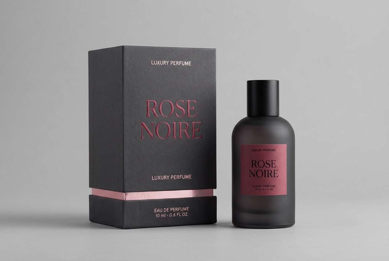
2) Velvet Rose
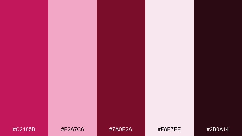
HEX: #C2185B #F2A7C6 #7A0E2A #F8E7EE #2B0A14
Mood: luxurious, dramatic, date-night
Best for: luxury perfume packaging
Velvet rose reds and inky shadows evoke a dimly lit boutique counter and rich florals. Let the hot pink act as a highlight color on labels, while the near-black anchors the premium feel. Pair with embossed textures and minimal copy to keep the look expensive. Tip: print the darkest shade slightly warmer to avoid a flat black.
Image example of velvet rose generated using media.io
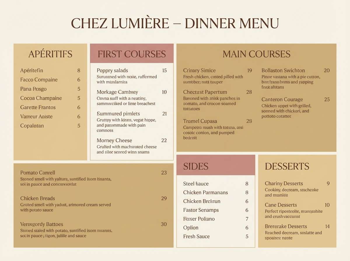
3) Candlelit Champagne
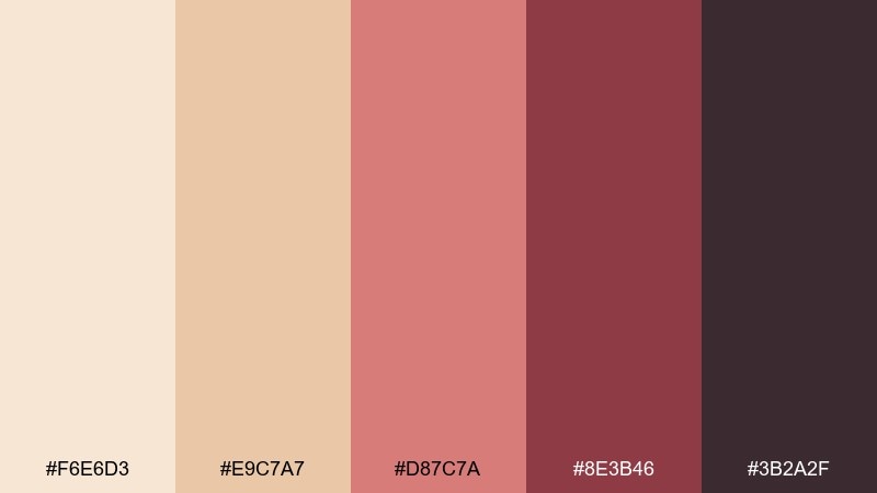
HEX: #F6E6D3 #E9C7A7 #D87C7A #8E3B46 #3B2A2F
Mood: warm, intimate, softly vintage
Best for: restaurant menu design
Warm champagne neutrals with a muted rose glow feel like candlelight on linen. Use the tan and cream for the base, then bring in rose for section headers and callouts. Pair with classic serif fonts and plenty of spacing for an upscale vibe. Tip: keep body text in the cocoa shade for readability without harsh contrast.
Image example of candlelit champagne generated using media.io
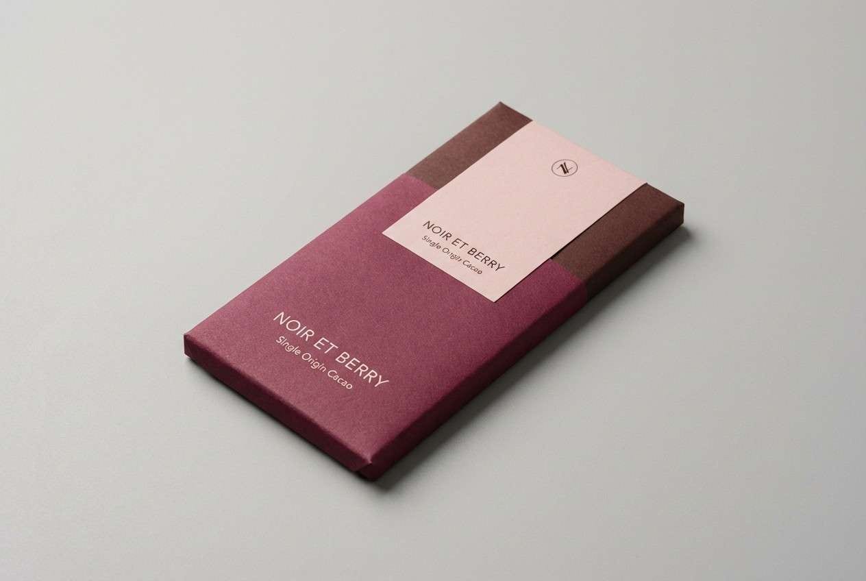
4) Berry Truffle
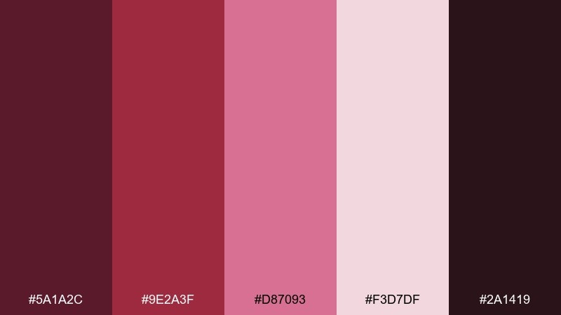
HEX: #5A1A2C #9E2A3F #D87093 #F3D7DF #2A1419
Mood: rich, cozy, indulgent
Best for: chocolate brand identity
Rich berry and cocoa tones bring to mind truffles in a satin box and late-night treats. This love color palette works beautifully with matte finishes, foil stamps, and simple iconography. Balance the depth with the pale blush for negative space and product info panels. Tip: reserve the darkest shade for logos and borders to make the pinks feel even sweeter.
Image example of berry truffle generated using media.io
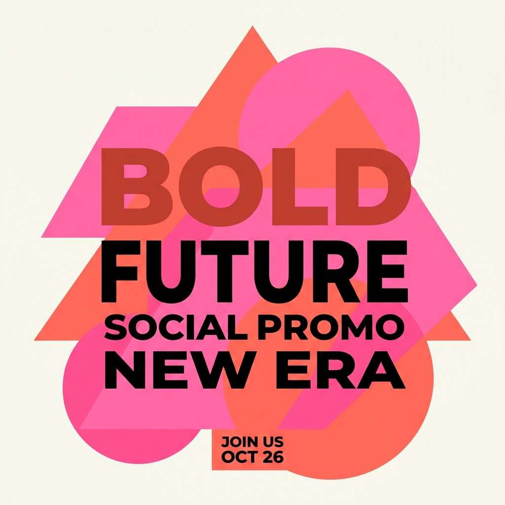
5) Cupid Coral
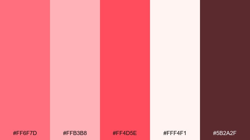
HEX: #FF6F7D #FFB3B8 #FF4D5E #FFF4F1 #5B2A2F
Mood: playful, energetic, pop
Best for: social promo poster
Bright coral and candy pink feel like confetti, giggles, and bold headlines. Use the vivid red-coral for the primary call to action and the pale pink for supporting panels. Pair with chunky sans-serif type and simple shapes for a modern promo look. Tip: add a thin cocoa outline around text when it sits on the coral blocks.
Image example of cupid coral generated using media.io
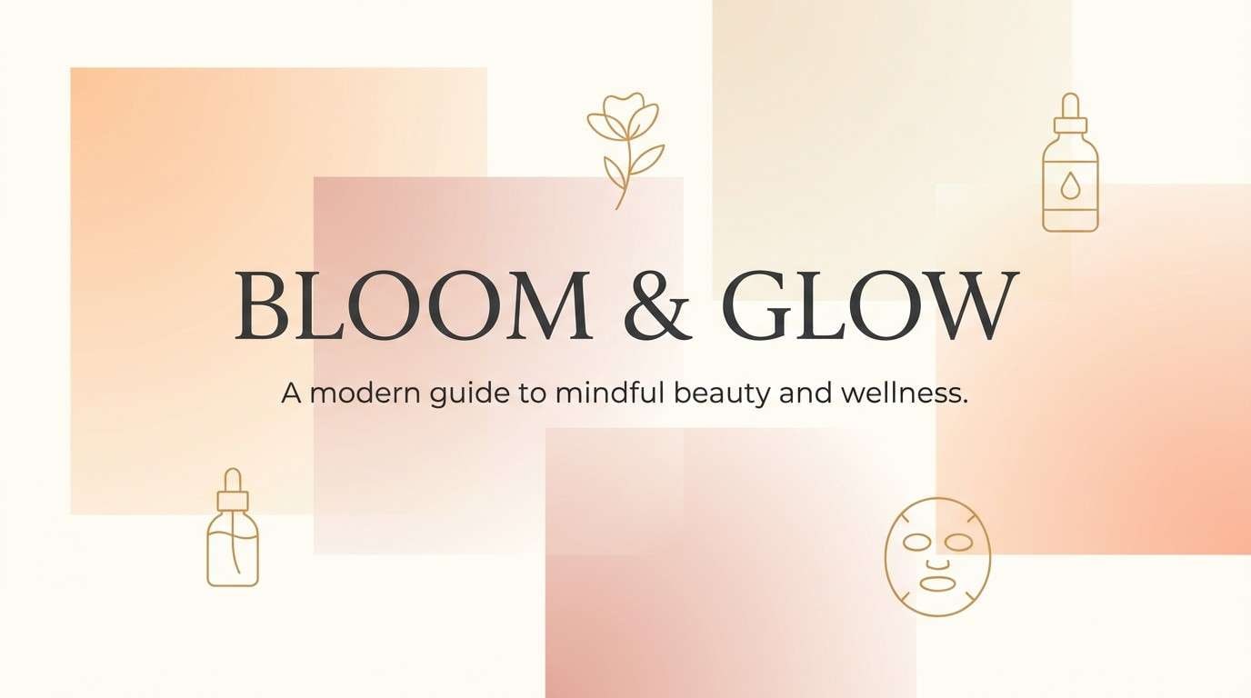
6) Petal Peach
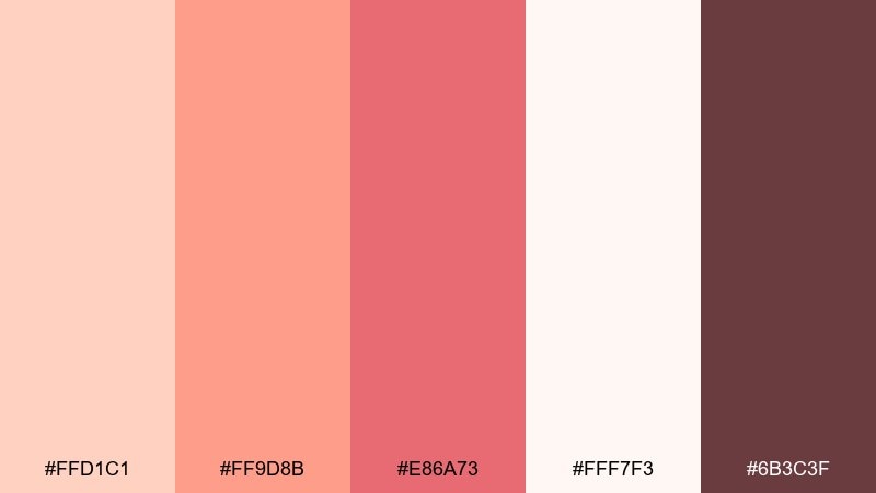
HEX: #FFD1C1 #FF9D8B #E86A73 #FFF7F3 #6B3C3F
Mood: sunlit, gentle, friendly
Best for: beauty blog header
Peachy petals and warm blush evoke soft morning light and skincare routines. Keep the background airy with the creamy white, then layer peach and salmon for banners and buttons. Pair with minimal line illustrations and warm-gray body text for a calm editorial feel. Tip: use the deeper rose as a single accent for links so the page stays light.
Image example of petal peach generated using media.io
7) Raspberry Macaron
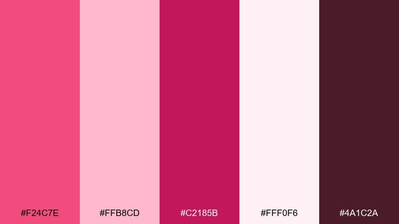
HEX: #F24C7E #FFB8CD #C2185B #FFF0F6 #4A1C2A
Mood: sweet, glossy, youthful
Best for: lip gloss product ad
Raspberry pinks and glossy magentas feel like dessert displays and shiny tubes. Use the brightest tone for the hero product and keep copy on the soft blush so it stays readable. Pair with rounded shapes and short punchy headlines for a playful vibe. Tip: limit gradients to one area, like a highlight behind the product, to avoid visual clutter.
Image example of raspberry macaron generated using media.io
8) Vintage Valentine
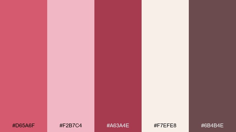
HEX: #D65A6F #F2B7C4 #A63A4E #F7EFE8 #6B4B4E
Mood: nostalgic, handwritten, cozy
Best for: greeting card design
Dusty rose and muted red feel like old postcards and soft paper textures. Use the cream and blush as the card base, then bring in the deeper red for the message and small icons. Pair with a hand-lettered script and subtle grain for a vintage print look. Tip: keep the warm gray for envelopes or back-of-card details to stay cohesive.
Image example of vintage valentine generated using media.io

9) Rosewater Linen
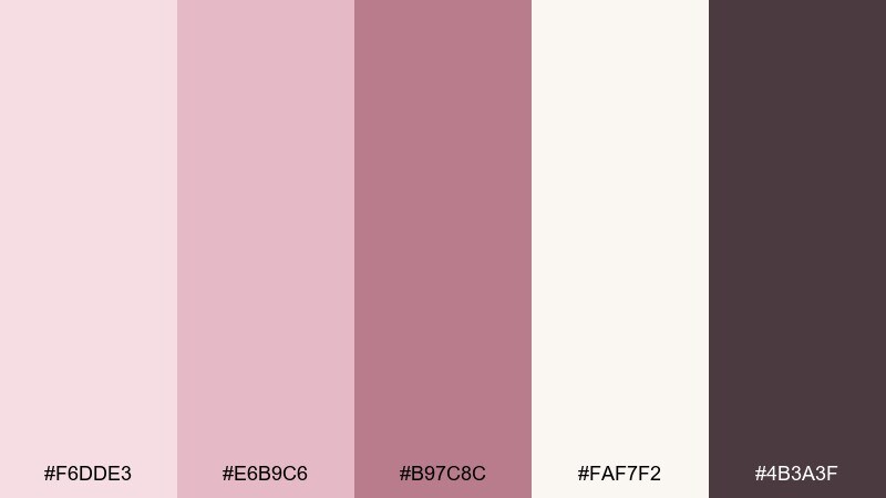
HEX: #F6DDE3 #E6B9C6 #B97C8C #FAF7F2 #4B3A3F
Mood: calm, airy, minimalist
Best for: spa landing page UI
Rosewater pinks on soft linen neutrals evoke quiet self-care and clean towels. These love color combinations shine in UI when you use the lightest tones for backgrounds and the mauve for buttons. Pair with lots of whitespace, thin dividers, and gentle shadows to keep the experience breathable. Tip: set one primary accent color for CTAs and repeat it consistently across the page.
Image example of rosewater linen generated using media.io
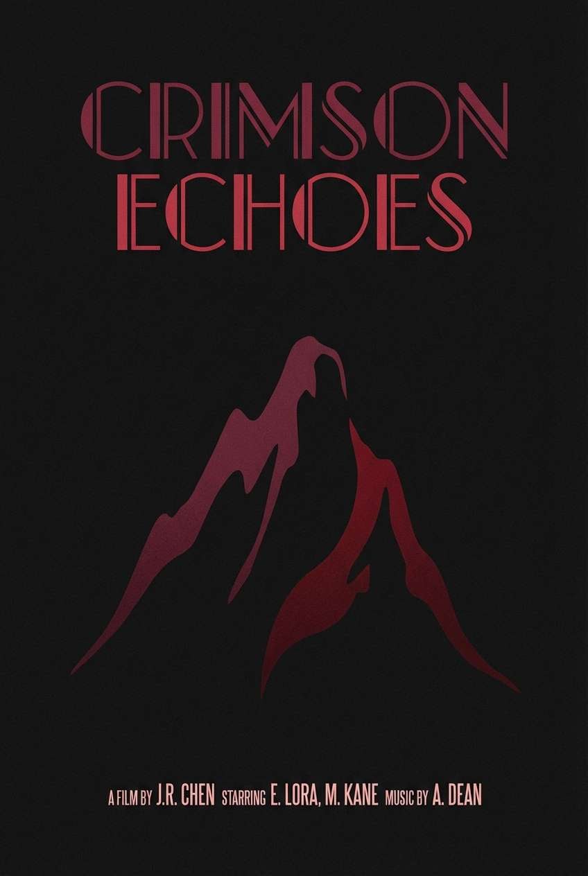
10) Garnet Noir
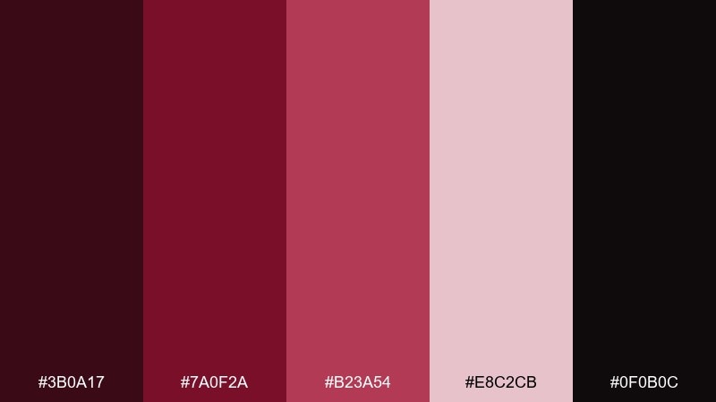
HEX: #3B0A17 #7A0F2A #B23A54 #E8C2CB #0F0B0C
Mood: mysterious, bold, cinematic
Best for: film poster concept
Garnet shadows and noir blacks feel like velvet curtains and dramatic close-ups. Use the near-black for the background and let garnet and ruby handle the title treatment. Pair with high-contrast typography and minimal imagery for a cinematic edge. Tip: add the pale blush only for credits or small highlights so it reads like a spotlight.
Image example of garnet noir generated using media.io
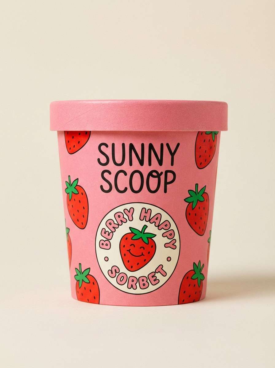
11) Sweetheart Sorbet
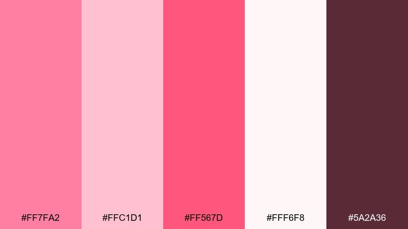
HEX: #FF7FA2 #FFC1D1 #FF567D #FFF6F8 #5A2A36
Mood: cheery, cute, upbeat
Best for: ice cream packaging
Sorbet pinks feel like fruity scoops, sprinkles, and sunny afternoons. Keep the background nearly white so the brighter accents pop without overwhelming the label. Pair with playful illustrations and rounded typography for instant shelf appeal. Tip: use the darker berry-brown for nutrition text so it stays legible on pale pink.
Image example of sweetheart sorbet generated using media.io
12) Dusty Mauve
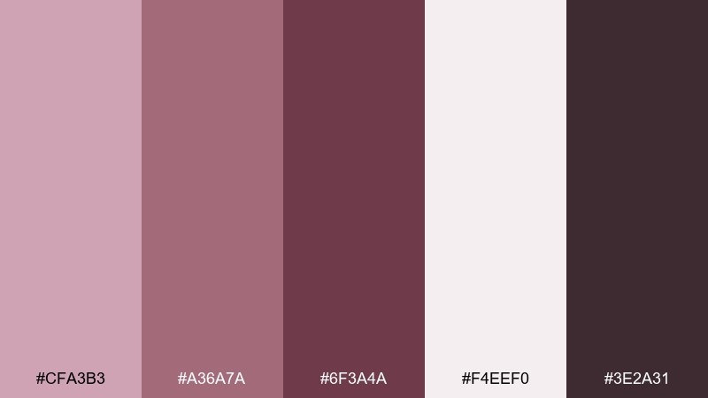
HEX: #CFA3B3 #A36A7A #6F3A4A #F4EEF0 #3E2A31
Mood: moody, mature, understated
Best for: brand moodboard
Dusty mauves and soft grays evoke knitted layers, dried florals, and quiet confidence. Use the pale tone as the canvas, then layer mid-mauve for blocks and the deep plum for typographic emphasis. Pair with neutral photography and simple grid layouts for a refined identity presentation. Tip: keep accent usage intentional, like one strong swatch per slide, to avoid a heavy look.
Image example of dusty mauve generated using media.io
13) Scarlet Silk
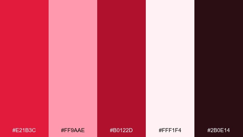
HEX: #E21B3C #FF9AAE #B0122D #FFF1F4 #2B0E14
Mood: confident, glamorous, statement
Best for: fashion sale banner
Scarlet silk reds feel like runway lighting and a bold lip. Use the bright red as the hero stripe and keep the blush and soft white for breathing room around the copy. Pair with high-contrast sans serif type and crisp spacing for a modern luxury sale vibe. Tip: keep the black-wine shade for small text and price details so the banner stays clean.
Image example of scarlet silk generated using media.io
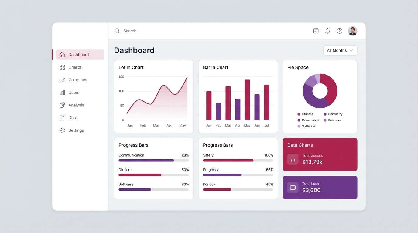
14) Soft Berry Gray
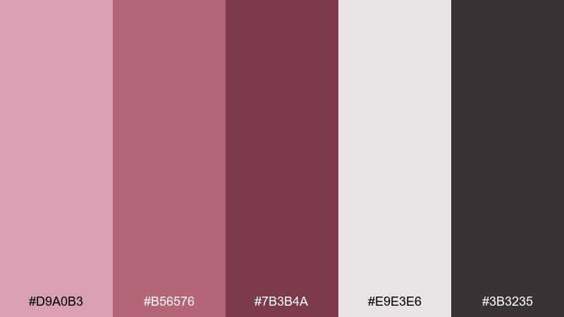
HEX: #D9A0B3 #B56576 #7B3B4A #E9E3E6 #3B3235
Mood: balanced, modern, calm
Best for: app dashboard UI
Soft berry tones against gentle gray feel polished, organized, and quietly romantic. Use the gray as the main background, then assign berry shades to status chips, charts, and active states. Pair with simple icons and medium-weight type to keep the dashboard professional. Tip: test contrast on small text and swap to the darkest berry for labels if needed.
Image example of soft berry gray generated using media.io
15) Cherry Cream
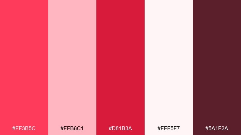
HEX: #FF3B5C #FFB6C1 #D81B3A #FFF5F7 #5A1F2A
Mood: bright, romantic, punchy
Best for: valentines email header
Cherry reds with whipped-cream pinks evoke candy hearts and glossy ribbons. Use the brightest red for one focal element, like a button or badge, and keep the rest in soft pinks for balance. Pair with simple heart icons and short copy so the header reads fast on mobile. Tip: add a cream margin around the design to prevent the reds from feeling too loud.
Image example of cherry cream generated using media.io

16) Wild Rose Meadow
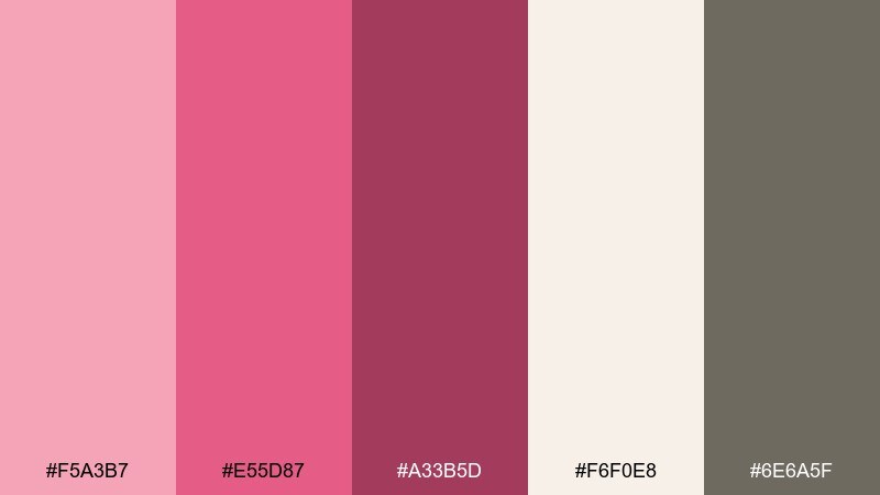
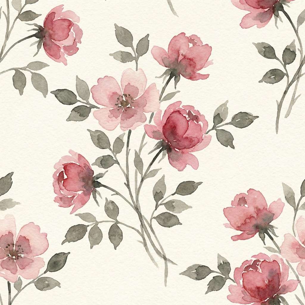
HEX: #F5A3B7 #E55D87 #A33B5D #F6F0E8 #6E6A5F
Mood: romantic, natural, storybook
Best for: watercolor floral pattern
Wild rose pinks and earthy neutrals feel like a meadow bouquet pressed into a journal. Use the blush as the main bloom color, then add the deeper rose for petal shadows and focal flowers. Pair with warm cream paper texture for a handcrafted look. Tip: repeat the gray-green neutral as stems and leaves to keep the pattern grounded.
Image example of wild rose meadow generated using media.io
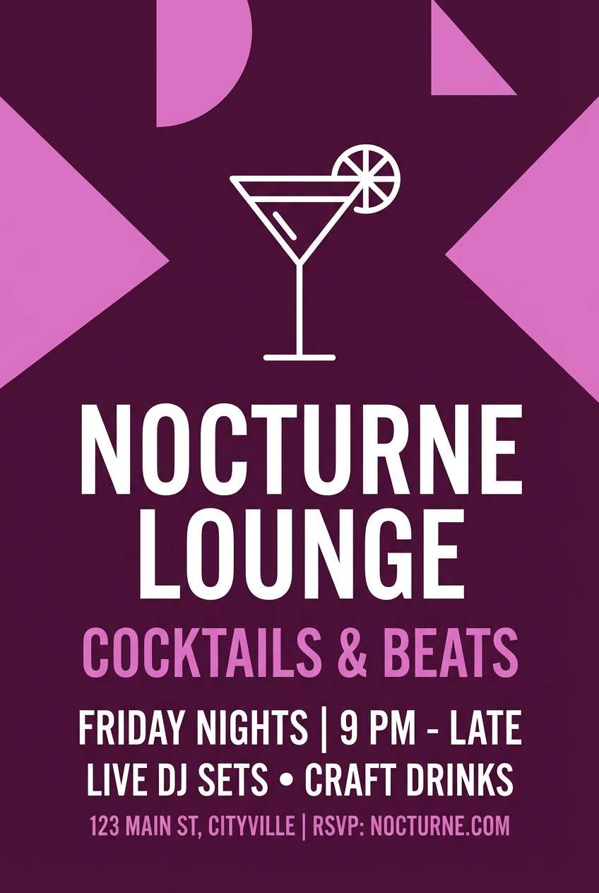
17) Plum Kiss
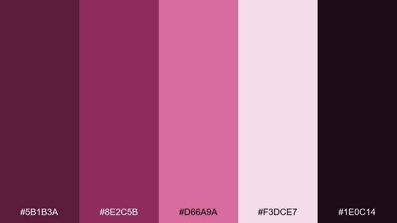
HEX: #5B1B3A #8E2C5B #D66A9A #F3DCE7 #1E0C14
Mood: sensual, artistic, night-out
Best for: cocktail bar flyer
Plum and orchid tones evoke velvet booths, neon reflections, and a bold signature drink. These love color combinations work best with dark backgrounds, where the pinks glow as accents. Pair with minimal line art and condensed type for a modern nightlife feel. Tip: keep the light blush for event details so they stay readable against the deep plum.
Image example of plum kiss generated using media.io
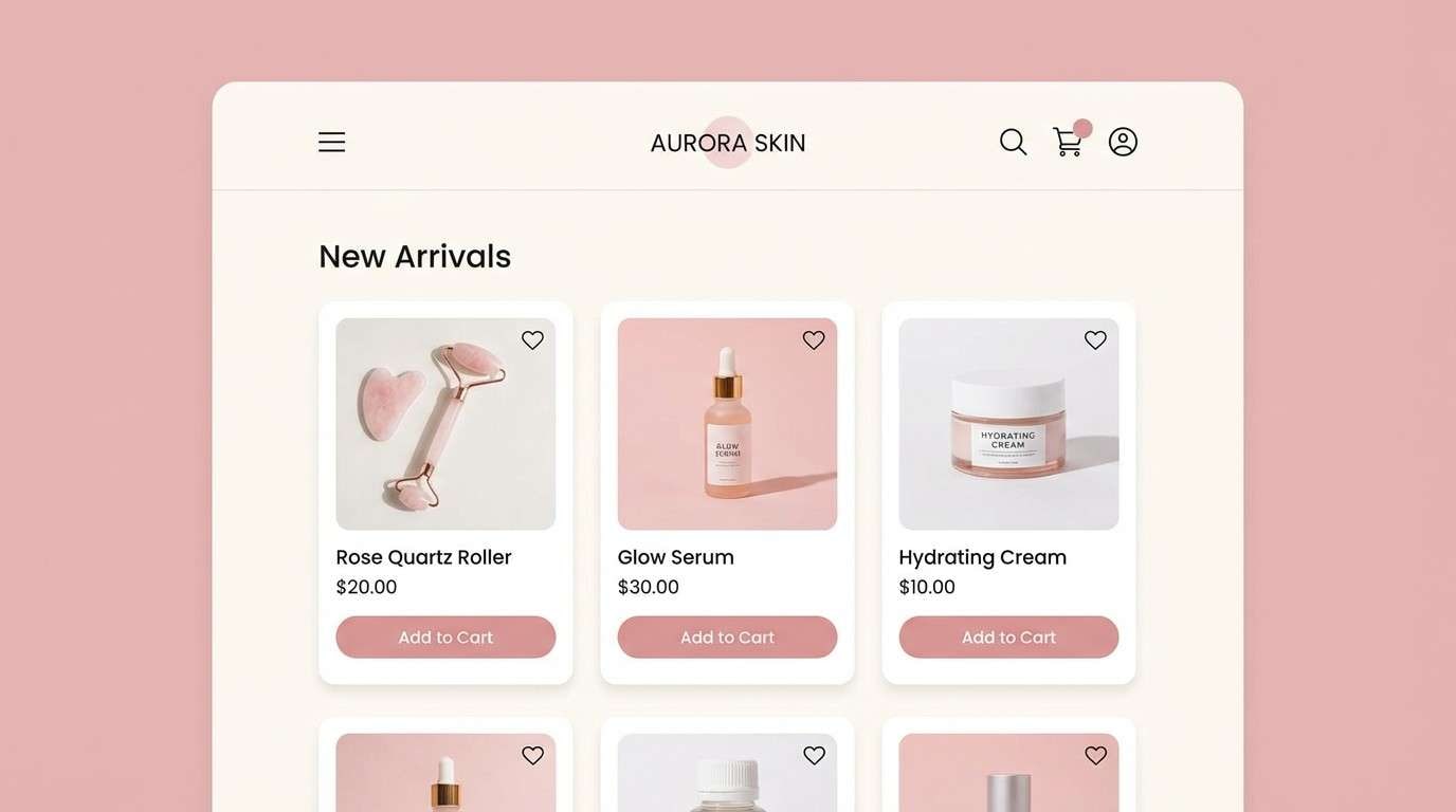
18) Pink Quartz
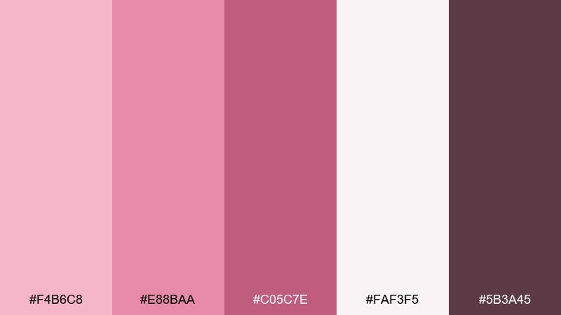
HEX: #F4B6C8 #E88BAA #C05C7E #FAF3F5 #5B3A45
Mood: clean, modern, gentle
Best for: skincare ecommerce UI
Pink quartz tones feel clean and luminous, like frosted glass and fresh lotion. Use the soft white as your main background, then bring in rose for buttons and product tags. Pair with simple product photography and thin dividers to keep the layout premium. Tip: use the darker mauve for prices and key labels to maintain contrast.
Image example of pink quartz generated using media.io
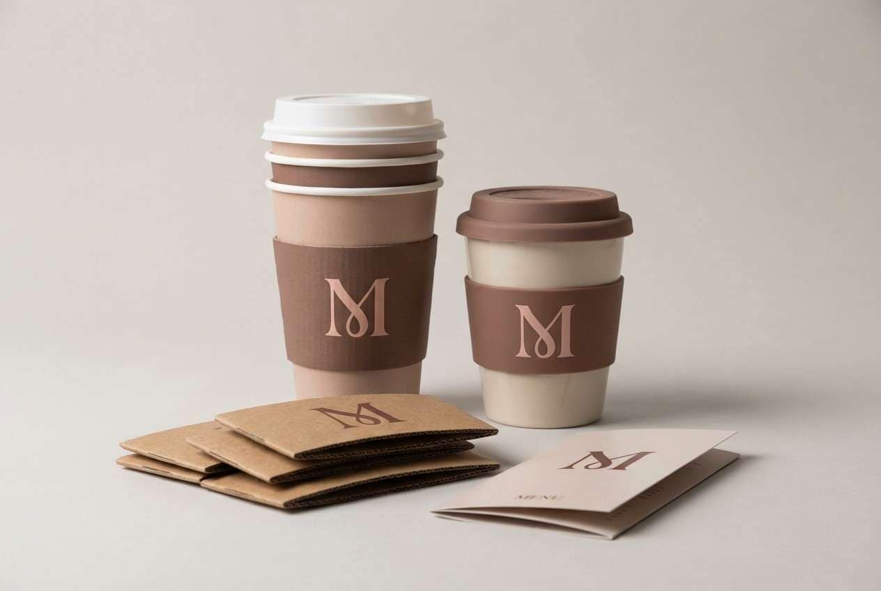
19) Mocha Rose
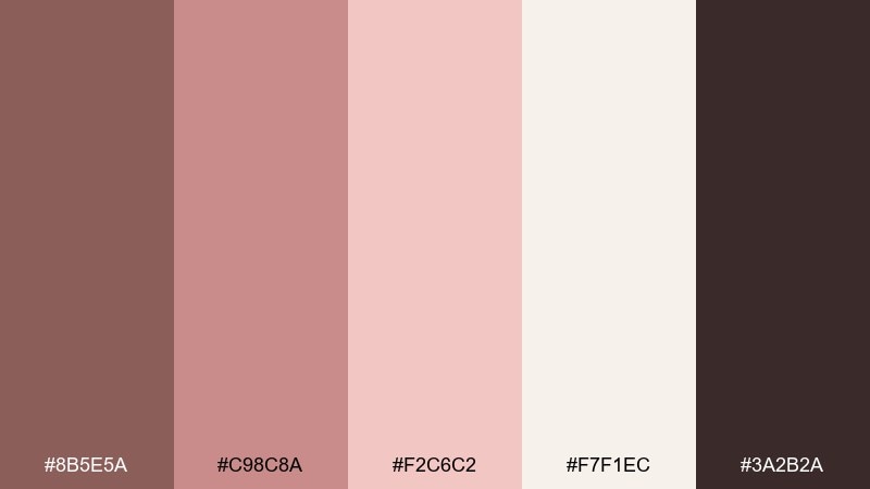
HEX: #8B5E5A #C98C8A #F2C6C2 #F7F1EC #3A2B2A
Mood: cozy, grounded, sophisticated
Best for: coffee shop logo and cups
Mocha browns with rosy cream accents feel like warm mugs and soft knit scarves. Use the darkest coffee tone for the logo mark and the creamy neutral for cup backgrounds. Pair with simple stamps, minimal patterns, and a hint of rose as a highlight color. Tip: keep the mid-rose for seasonal promos so your core identity stays consistent.
Image example of mocha rose generated using media.io
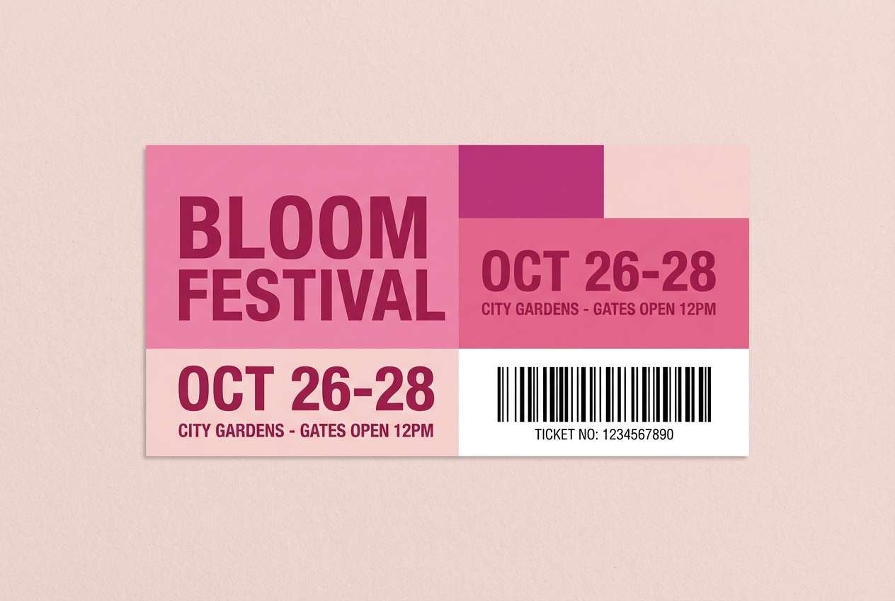
20) Peony Punch
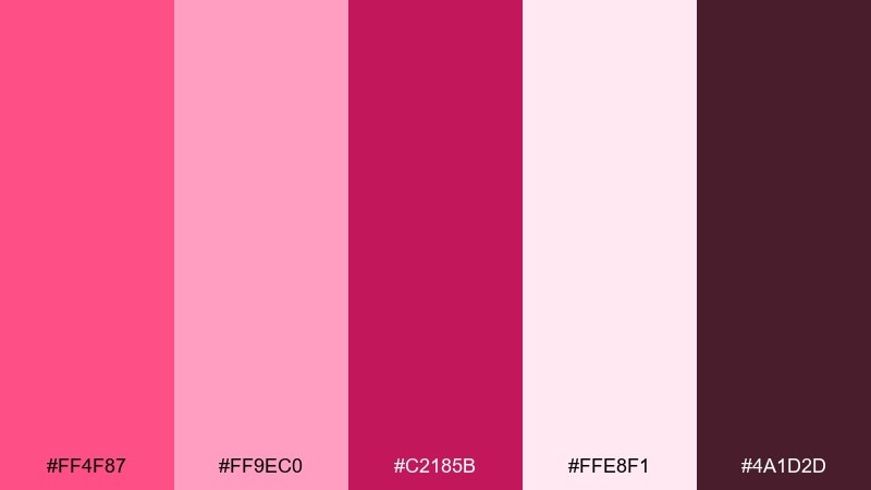
HEX: #FF4F87 #FF9EC0 #C2185B #FFE8F1 #4A1D2D
Mood: bold, fun, attention-grabbing
Best for: event ticket design
Peony pinks with a punchy magenta feel like dance floors, bright lights, and big moments. Love color combinations like these work best when you choose one dominant shade and let the lighter pink support it. Pair with clean barcode placement and strong typographic hierarchy for quick scanning. Tip: use the dark wine tone for small print so details stay crisp.
Image example of peony punch generated using media.io
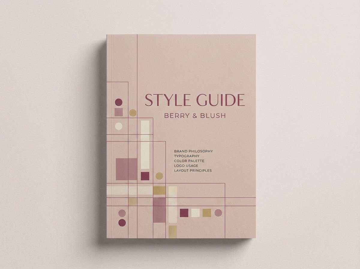
21) Heartfelt Harmony
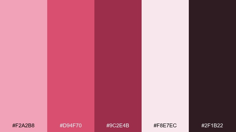
HEX: #F2A2B8 #D94F70 #9C2E4B #F8E7EC #2F1B22
Mood: romantic, balanced, versatile
Best for: brand style guide cover
Warm blush and confident berry tones feel like a well-edited romance novel cover. A love color palette like this is easy to systematize: light for backgrounds, mid for UI accents, and deep for headings. Pair with one neutral typeface family and a few geometric shapes for consistency across pages. Tip: define two button states using the mid and deep shades to keep interactions clear.
Image example of heartfelt harmony generated using media.io
What Colors Go Well with Love?
Love palettes pair beautifully with warm neutrals like cream, champagne, oat, and cocoa—these tones soften bright reds and keep layouts feeling premium instead of loud.
For modern contrast, add grounded darks (wine, plum, near-black) for headlines and logos, then let blush or pink act as the supporting background. This creates a clear hierarchy and improves readability.
If you want a fresher, “storybook” direction, mix love pinks with earthy accents like muted gray-green, dusty taupe, or warm stone to keep the palette romantic but not overly sweet.
How to Use a Love Color Palette in Real Designs
Start by assigning roles: pick one light color for backgrounds, one mid color for UI accents or shapes, and one deep shade for text. This prevents “everything is pink” designs and makes your work easier to scale.
For print pieces like invitations, menus, and packaging, use neutrals as the main paper space and reserve saturated reds for focal points (names, seals, price badges). The result feels intentional and expensive.
For digital (ads, social, landing pages), test contrast early. Small text often needs the darkest berry/cocoa shade, while buttons can use a saturated coral or cherry to drive clicks.
Create Love Palette Visuals with AI
If you already have HEX codes, you can turn them into on-brand visuals fast by generating layouts (posters, UI mockups, labels, banners) that match your palette’s mood and use case.
With Media.io’s text-to-image, describe the format, background, typography style, and where you want your love colors to appear (dominant blocks, accents, button color). Then iterate by adjusting lighting, texture, and contrast.
To stay consistent, reuse the same prompt structure and swap only a few descriptors—like “luxury,” “minimal,” or “vintage grain”—to produce a cohesive set of assets.
Love Color Palette FAQs
-
What is a love color palette?
A love color palette is a set of romantic, affection-coded colors—often pinks, reds, corals, and warm neutrals—chosen to communicate intimacy, celebration, and warmth in a consistent way. -
Are love palettes only for Valentine’s Day designs?
No. Love palettes work year-round for weddings, beauty brands, food packaging, date-night promos, lifestyle UI, and any design that needs warmth or emotional storytelling. -
How do I keep a love color scheme from looking too “sweet”?
Add grounding neutrals (cream, taupe, gray) and a deep anchor (plum, wine, near-black). Use bright pink or red as a single focal accent instead of the whole background. -
What are the best neutral colors to pair with pink and red?
Warm creams, champagne, soft grays, cocoa browns, and muted mauves pair especially well. They reduce visual noise and make saturated reds feel more premium. -
Which love palette is best for branding?
Try balanced sets with clear roles, like Heartfelt Harmony or Dusty Mauve. They include light background tones, mid accents, and deep text colors that scale across web, print, and social. -
How many colors should I use from a 5-color palette?
In most designs, use 2–3 as the main system (background, text, primary accent) and keep the other 1–2 for highlights like buttons, badges, icons, or small decorative shapes. -
Can I generate love-themed visuals that match my HEX codes?
Yes. Use Media.io’s AI image generation to create posters, packaging mockups, UI sections, or invitation layouts, then refine prompts to match the palette’s mood (vintage, luxury, minimal, playful).


