

Lime is a high-energy color that brings instant freshness to branding, UI, and marketing creative. It sits between green and yellow, so it reads as both “natural” and “attention-grabbing” depending on what you pair it with.
Below are 20+ lime color palette ideas with ready-to-use HEX codes, plus practical notes on mood, pairing, and where each set shines in real design work.
In this article
- Why Lime Palettes Work So Well
-
- citrus pop
- matcha minimal
- neon spritz
- lime and charcoal
- tropical zest
- garden morning
- electric arcade
- pear sorbet
- retro tennis
- lime copper luxe
- fresh office
- spa citrus calm
- streetwear acid
- eco market
- lime lavender twist
- sunlit kitchen
- modern poster punch
- tech gradient glow
- lime sandstone neutral
- night garden glow
- citrus wedding
- urban transit
- What Colors Go Well with Lime?
- How to Use a Lime Color Palette in Real Designs
- Create Lime Palette Visuals with AI
Why Lime Palettes Work So Well
Lime is naturally “loud,” so it creates clear hierarchy fast—perfect for CTAs, status states, tags, and anything that needs to read at a glance. Even small amounts can make a layout feel modern and active.
Because lime leans yellow, it can feel sunny and optimistic; because it’s still green, it also signals freshness, growth, and eco-friendly cues. That flexibility makes lime color combinations useful across industries—from tech to wellness to retail.
The key is contrast control: pair lime with charcoal, deep green, or navy for readability, and use warm off-whites or creams to keep the overall look premium instead of harsh.
20+ Lime Color Palette Ideas (with HEX Codes)
1) Citrus Pop
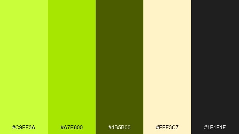
HEX: #C9FF3A #A7E600 #4B5B00 #FFF3C7 #1F1F1F
Mood: energetic, punchy, upbeat
Best for: Branding and social ads for new product launches
Energetic and punchy, it feels like a fresh squeeze of citrus with a sharp, modern edge. Use the bright lime as your hero color, then anchor layouts with near-black for instant contrast. The warm cream keeps headlines and icons readable without turning the design cold. Tip: reserve the brightest swatch for CTAs and highlight badges so it stays impactful.
Image example of citrus pop generated using media.io
Media.io is an online AI studio for creating and editing video, image, and audio in your browser.

2) Matcha Minimal
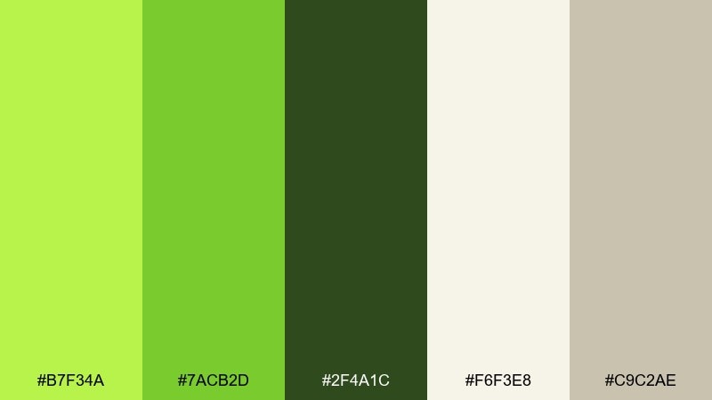
HEX: #B7F34A #7ACB2D #2F4A1C #F6F3E8 #C9C2AE
Mood: clean, calm, modern
Best for: Minimal UI for wellness apps and dashboards
Clean and calm, these tones evoke matcha foam, soft paper, and quiet focus. The pale lime works beautifully for selected states, progress, and subtle success messaging. Pair it with warm off-white backgrounds and a deep green for text and icons to avoid eye fatigue. Tip: keep lime usage under 15 percent of the screen for a polished, premium feel.
Image example of matcha minimal generated using media.io
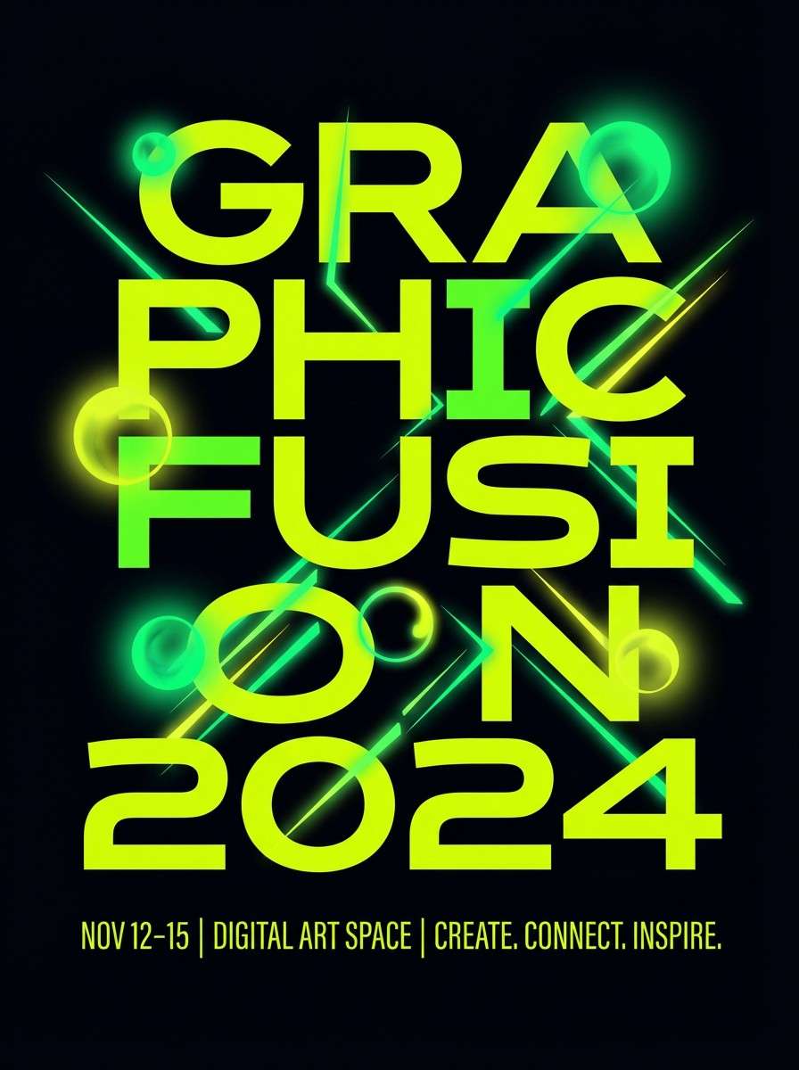
3) Neon Spritz
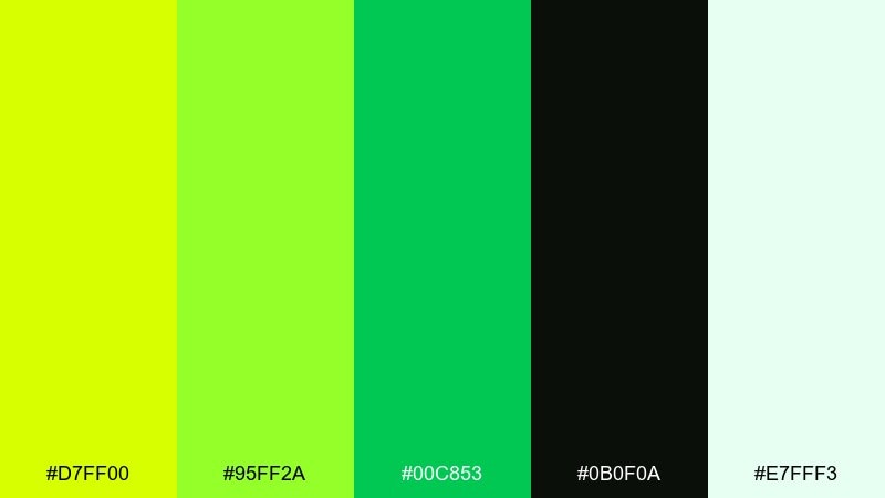
HEX: #D7FF00 #95FF2A #00C853 #0B0F0A #E7FFF3
Mood: neon, high-voltage, nightlife
Best for: Event posters and DJ flyers
Neon and high-voltage, it reads like club lights cutting through a late-night haze. Use the yellow-lime as the headline color and let the black-green background do the heavy lifting. A cool minty white keeps small text crisp without stealing attention. Tip: add thin lines or glow-like shapes in the brightest lime to guide the eye down the layout.
Image example of neon spritz generated using media.io
4) Lime and Charcoal
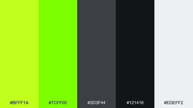
HEX: #BFFF1A #7CFF00 #3D3F44 #121418 #EDEFF2
Mood: bold, technical, confident
Best for: B2B SaaS landing pages and feature callouts
Bold and technical, the vibe is like a high-performance tool with a clean factory finish. Lime pops brightest against charcoal, making it perfect for feature tags, toggles, and key metrics. Keep the light gray for generous negative space so the contrast does not feel harsh. Tip: use one lime tone consistently for primary buttons and keep the second lime for hover and active states.
Image example of lime and charcoal generated using media.io

5) Tropical Zest
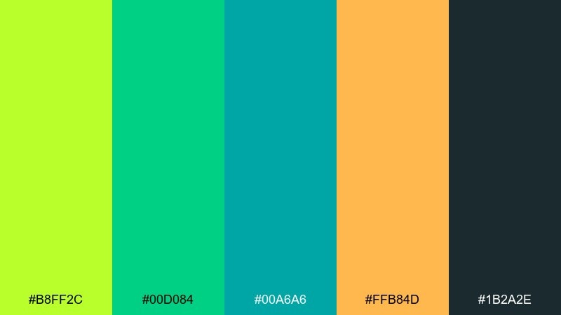
HEX: #B8FF2C #00D084 #00A6A6 #FFB84D #1B2A2E
Mood: sunny, playful, vacation-ready
Best for: Travel branding and summer campaign creative
Sunny and playful, it brings to mind palm leaves, fizzy fruit drinks, and warm sand at noon. These lime color combinations sing when you balance the bright green with deep teal for structure and readability. The orange swatch is a great accent for limited-time badges or itinerary highlights. Tip: use teal for body text and reserve lime for icons, tabs, and brand marks.
Image example of tropical zest generated using media.io

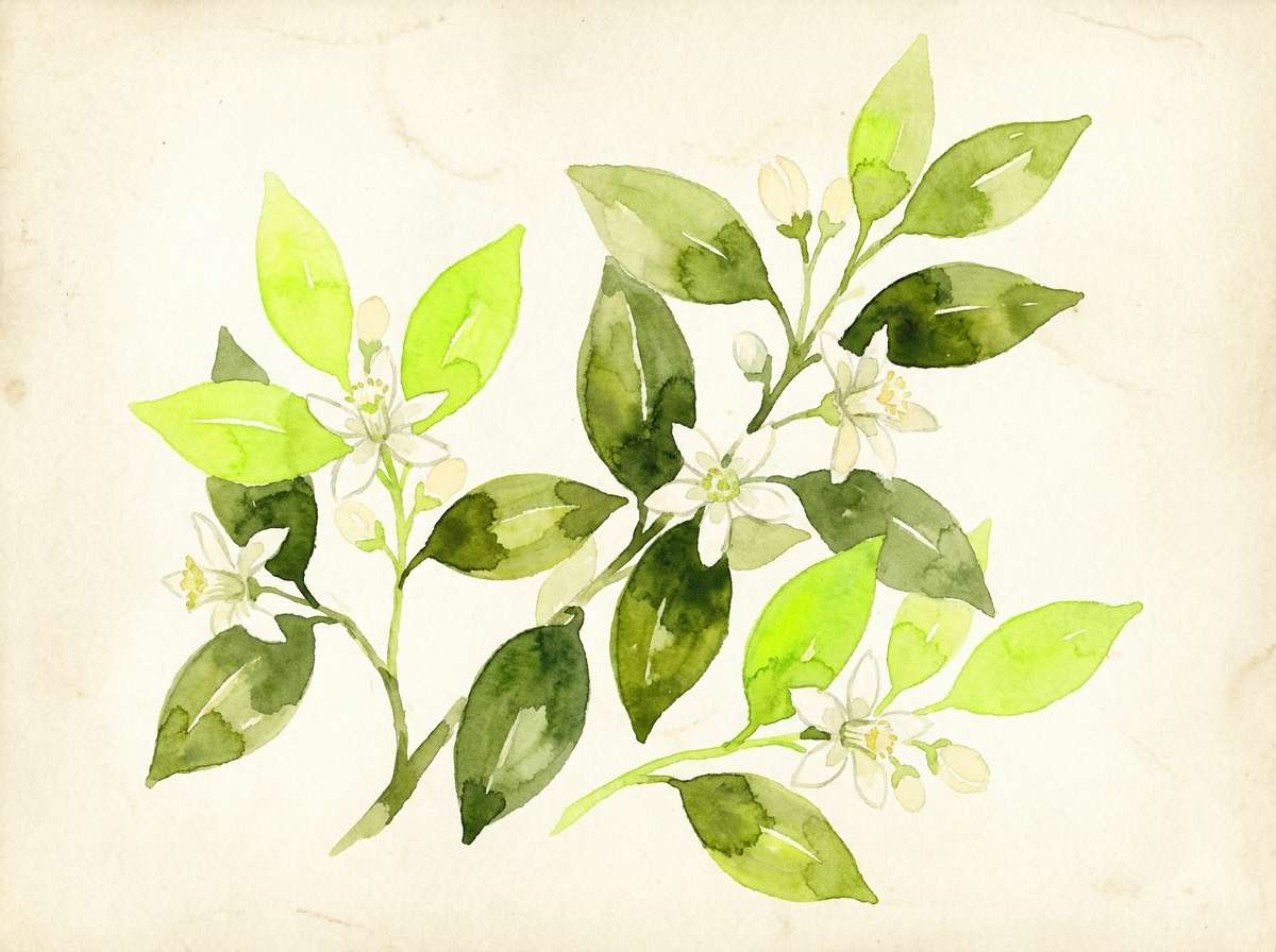
6) Garden Morning
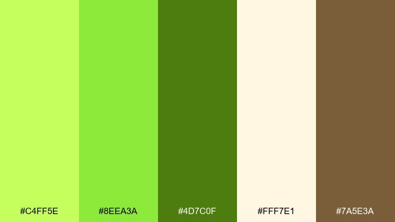
HEX: #C4FF5E #8EEA3A #4D7C0F #FFF7E1 #7A5E3A
Mood: fresh, earthy, optimistic
Best for: Botanical illustrations and spring packaging
Fresh and earthy, it feels like dew on leaves with warm soil underneath. The creamy neutral softens the greens, making labels and patterns feel welcoming rather than loud. Pair the deeper olive with the brown for natural outlines, type, and small details. Tip: keep the brightest green for leaf highlights so the artwork stays dimensional.
Image example of garden morning generated using media.io
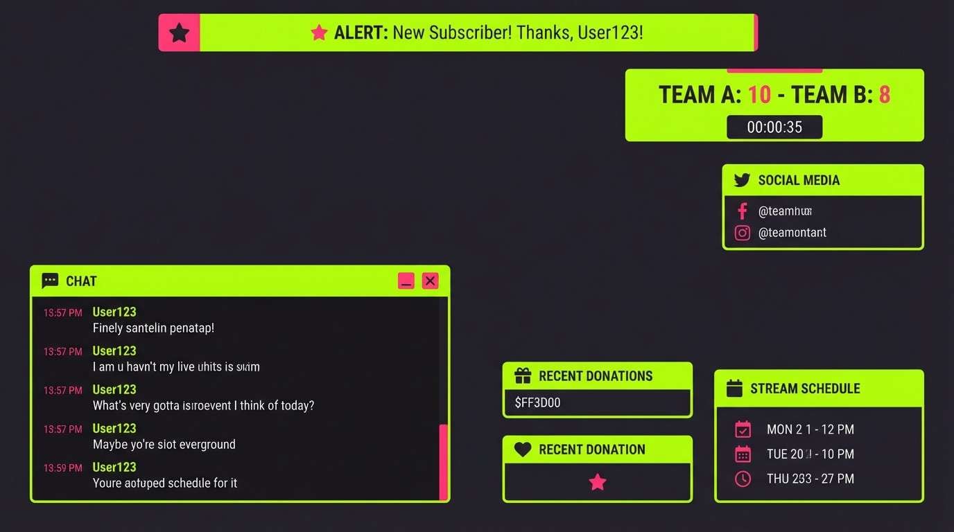
7) Electric Arcade
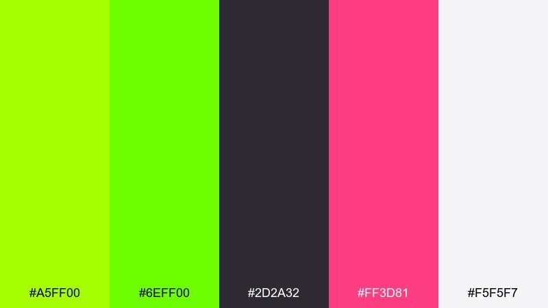
HEX: #A5FF00 #6EFF00 #2D2A32 #FF3D81 #F5F5F7
Mood: retro-futuristic, loud, playful
Best for: Gaming overlays and streamer graphics
Retro-futuristic and loud, it recalls arcade cabinets, neon signs, and high-score screens. Lime reads as the primary glow, while the pink gives you a punchy secondary highlight for alerts. Keep the off-white for labels so text stays legible over dark panels. Tip: use lime for borders and focus rings to make interactive elements feel responsive.
Image example of electric arcade generated using media.io
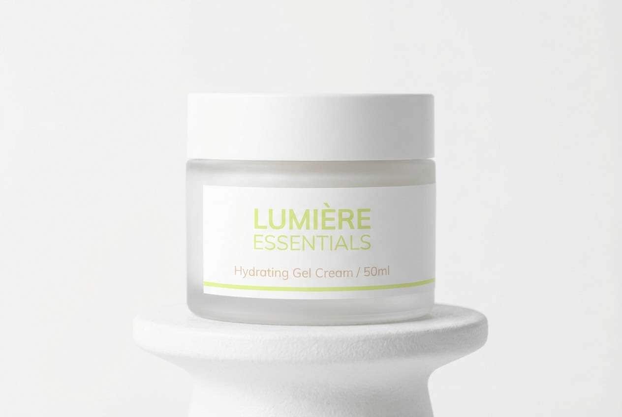
8) Pear Sorbet
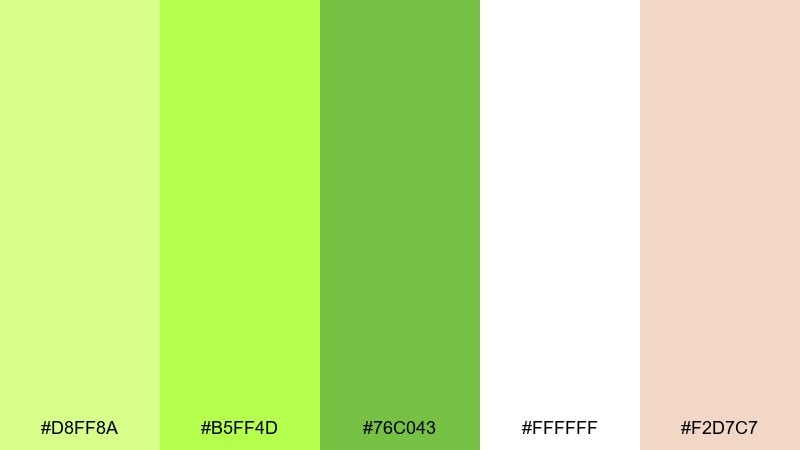
HEX: #D8FF8A #B5FF4D #76C043 #FFFFFF #F2D7C7
Mood: sweet, airy, friendly
Best for: Skincare packaging and gentle product pages
Sweet and airy, the colors feel like chilled sorbet with a soft blush finish. The white and pale peach keep everything light, while the mid-green adds enough structure for headings and labels. It works well with rounded typography and plenty of spacing for a clean, approachable look. Tip: use the blush tone only for small accents like seals or ingredient callouts.
Image example of pear sorbet generated using media.io
9) Retro Tennis
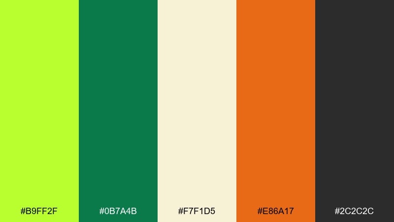
HEX: #B9FF2F #0B7A4B #F7F1D5 #E86A17 #2C2C2C
Mood: sporty, vintage, confident
Best for: Athletic apparel graphics and club flyers
Sporty and vintage, it channels sunlit courts, classic polos, and bold stripe trims. Lime energizes the layout, while deep green grounds it like an old-school crest. The warm cream and orange feel authentic for retro-inspired prints and badges. Tip: keep orange for small numbers or patch details so it stays a highlight, not a competitor.
Image example of retro tennis generated using media.io

10) Lime Copper Luxe
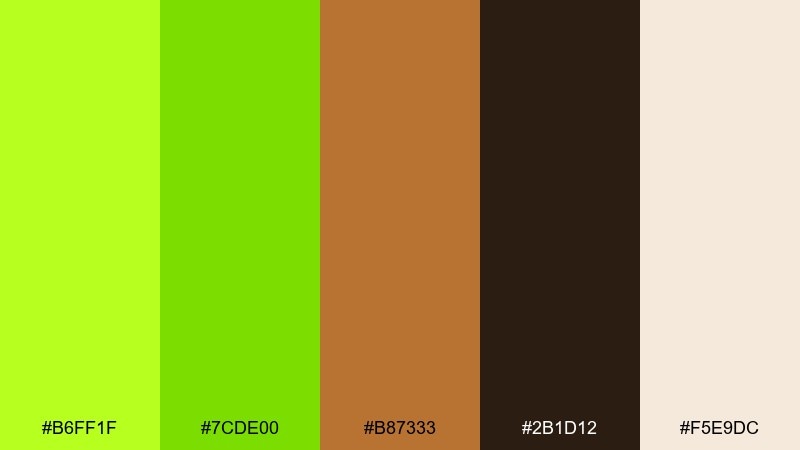
HEX: #B6FF1F #7CDE00 #B87333 #2B1D12 #F5E9DC
Mood: luxurious, warm, modern
Best for: Premium packaging and boutique branding
Luxurious and warm, it mixes crisp green sparkle with the glow of polished copper. The cream background makes metallic-inspired elements feel expensive, while the dark brown adds depth for typography. Use lime as an accent rather than a fill to keep the overall look refined. Tip: apply copper to borders and foil-like logos, then reserve lime for a single standout detail.
Image example of lime copper luxe generated using media.io
11) Fresh Office
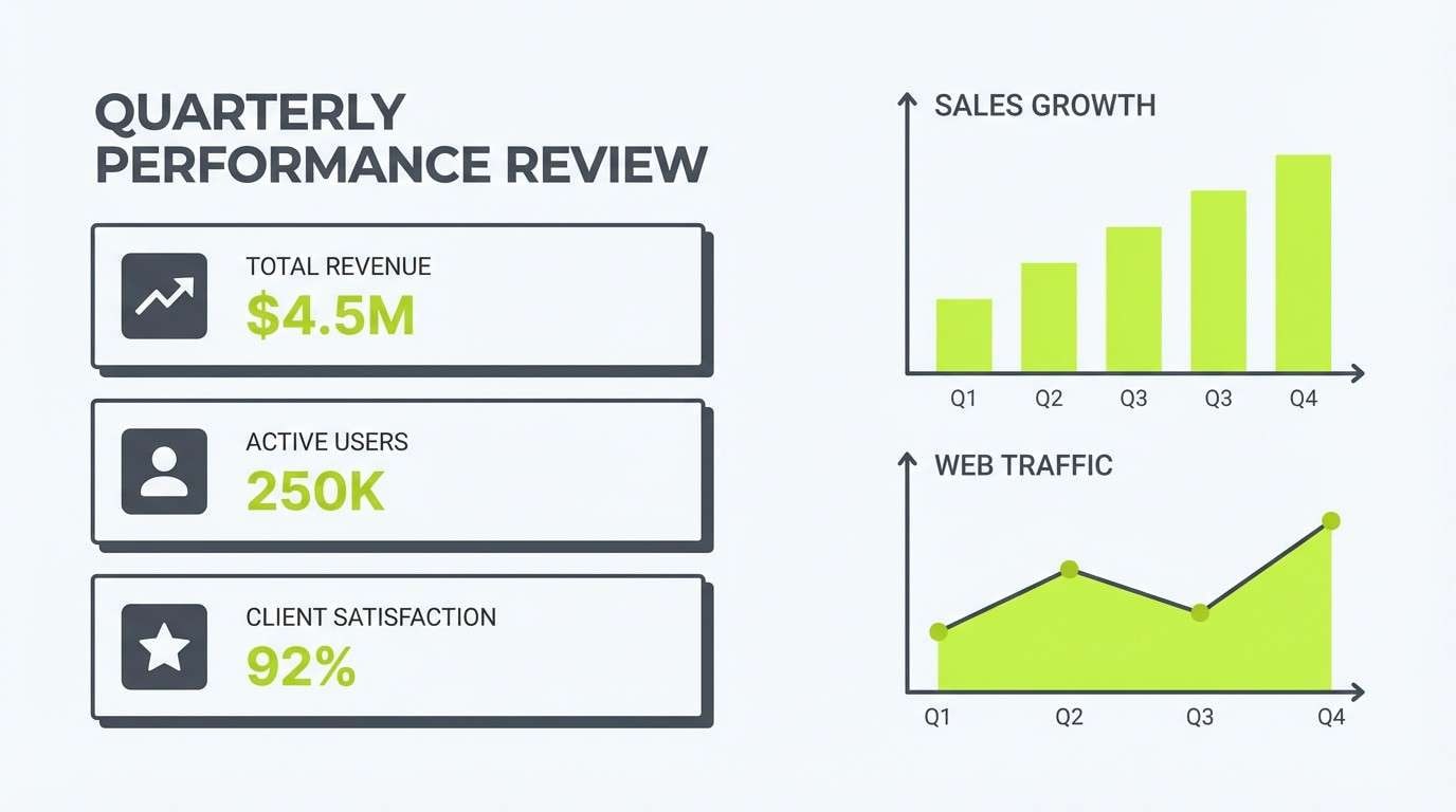
HEX: #C1FF3C #8AE234 #4B5563 #F9FAFB #CBD5E1
Mood: clear, productive, approachable
Best for: Presentation templates and report charts
Clear and productive, it feels like a tidy desk, a sharp plan, and a fresh start. Lime works especially well for chart highlights, success states, and key bullets against cool grays. Keep the off-white for slides so the palette stays breathable in long decks. Tip: use only one green in data visualizations and save the brighter one for totals and KPIs.
Image example of fresh office generated using media.io
12) Spa Citrus Calm
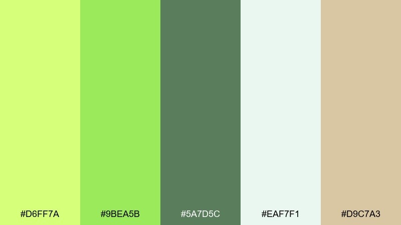
HEX: #D6FF7A #9BEA5B #5A7D5C #EAF7F1 #D9C7A3
Mood: soothing, natural, restorative
Best for: Spa menus and wellness editorial layouts
Soothing and natural, it evokes citrus-infused water, eucalyptus steam, and quiet mornings. The soft mint background keeps the greens gentle, while the sand tone adds warmth for a grounded, organic feel. Use the muted green for body copy and the brighter lime for section dividers or service highlights. Tip: pair with thin serif headings and lots of whitespace to keep the calm intact.
Image example of spa citrus calm generated using media.io
13) Streetwear Acid
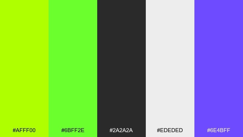
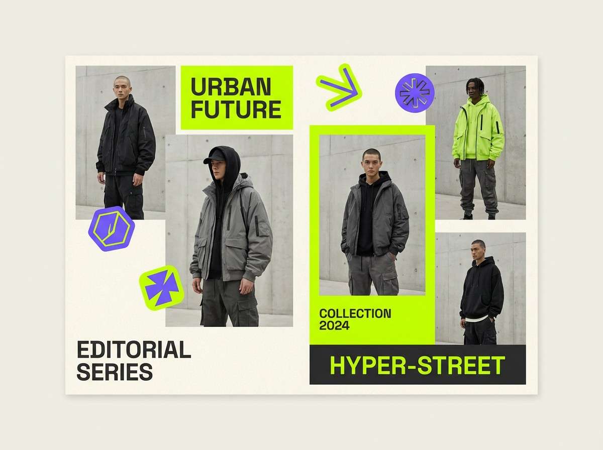
HEX: #AFFF00 #6BFF2E #2A2A2A #EDEDED #6E4BFF
Mood: edgy, urban, high-contrast
Best for: Streetwear lookbooks and merch graphics
Edgy and urban, it looks like acid ink on concrete with a flash of ultraviolet. The gray neutrals make the lime feel louder without becoming messy, and the purple gives you a signature twist. Use lime for big type, stickers, and price tags, then rely on dark gray for structure. Tip: keep purple to one element per page so the brand stays instantly recognizable.
Image example of streetwear acid generated using media.io
14) Eco Market
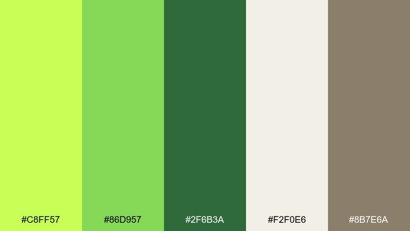
HEX: #C8FF57 #86D957 #2F6B3A #F2F0E6 #8B7E6A
Mood: wholesome, sustainable, down-to-earth
Best for: Farmers market signage and eco product labels
Wholesome and down-to-earth, it feels like reusable bags, fresh herbs, and kraft paper tags. The warm neutrals help the greens look organic instead of neon, perfect for sustainable messaging. Use the darker green for headings and ingredient lists, and keep the brightest tint for stamps or callout bubbles. Tip: add subtle texture in the background to reinforce the handmade vibe.
Image example of eco market generated using media.io
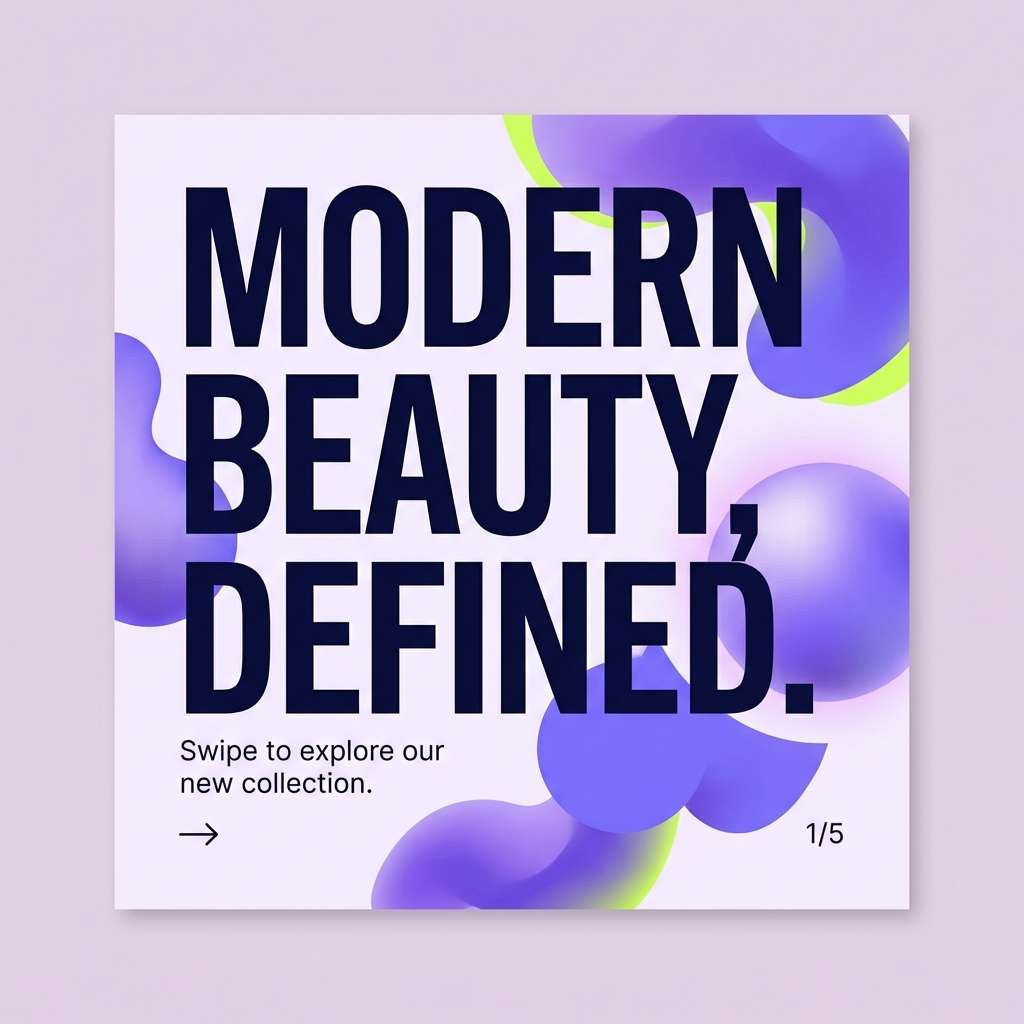
15) Lime Lavender Twist
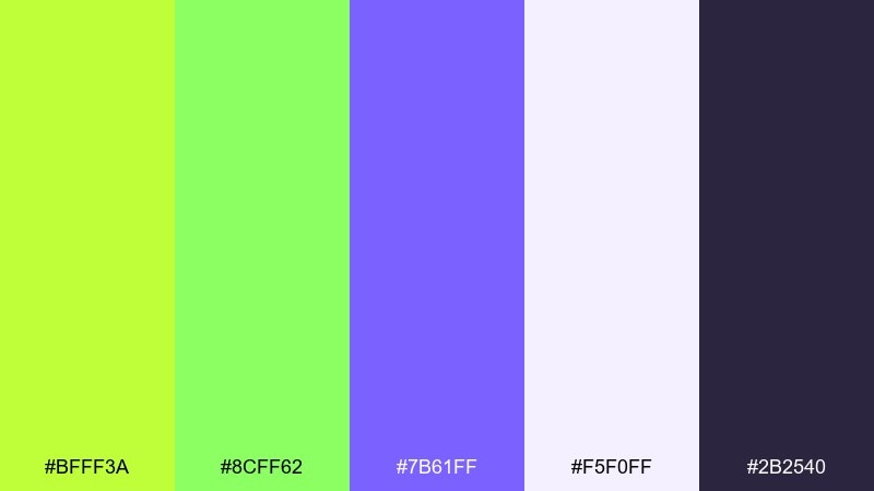
HEX: #BFFF3A #8CFF62 #7B61FF #F5F0FF #2B2540
Mood: creative, trendy, playful
Best for: Beauty branding and social carousel posts
Creative and trendy, it mixes bright citrus energy with a soft lavender haze. These lime color combinations work best when purple is used for depth and lime is kept for pop and movement. The pale lilac background keeps the feed cohesive and easy to scan. Tip: alternate lime and lavender buttons across slides to create rhythm without overwhelming the audience.
Image example of lime lavender twist generated using media.io
16) Sunlit Kitchen
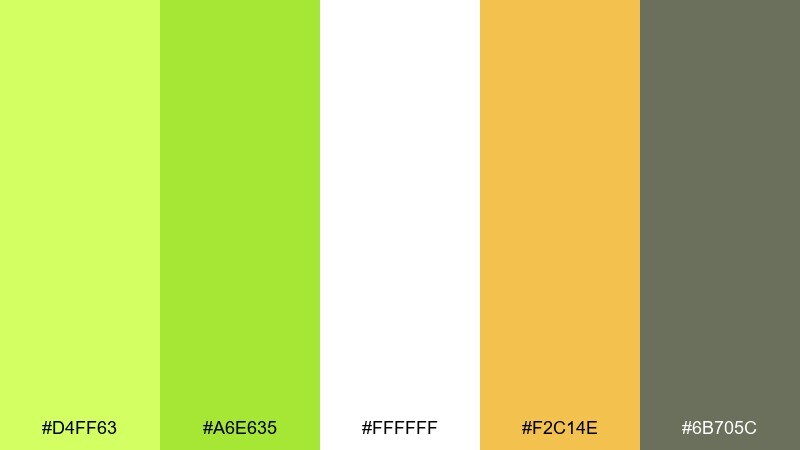
HEX: #D4FF63 #A6E635 #FFFFFF #F2C14E #6B705C
Mood: homey, bright, cheerful
Best for: Recipe cards and food blog headers
Homey and bright, it feels like sunlight on a countertop with a bowl of fresh limes nearby. The white base gives plenty of breathing room, while the warm yellow adds a friendly, appetizing note. Use the muted sage for body text and ingredient lists so readability stays strong. Tip: keep lime as a small garnish color for icons, section labels, and ratings.
Image example of sunlit kitchen generated using media.io
17) Modern Poster Punch
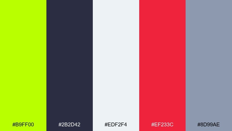
HEX: #B9FF00 #2B2D42 #EDF2F4 #EF233C #8D99AE
Mood: bold, graphic, gallery-ready
Best for: Minimal posters and announcement flyers
Bold and graphic, it looks like a gallery wall with one statement color doing all the talking. Lime delivers instant punch on cool grays, while the red is perfect for a single urgent detail like a date or location. Keep type mostly charcoal for a clean editorial feel. Tip: use lime as a large shape behind the headline, then keep the rest of the layout restrained.
Image example of modern poster punch generated using media.io

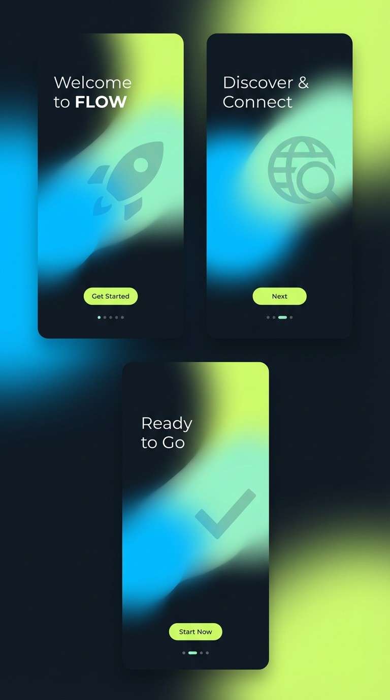
18) Tech Gradient Glow
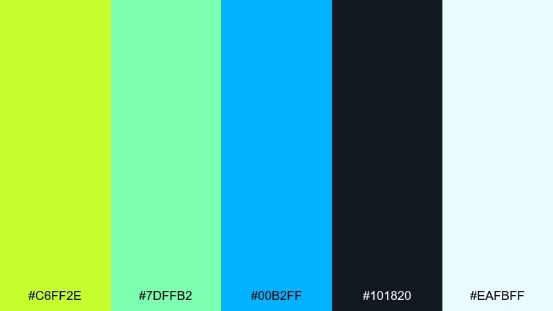
HEX: #C6FF2E #7DFFB2 #00B2FF #101820 #EAFBFF
Mood: futuristic, airy, innovative
Best for: App onboarding screens and hero sections
Futuristic and airy, it feels like light passing through glass and floating gradients. Lime works beautifully as a glow point when paired with deep navy-black for contrast. Use the cyan and mint for gradient transitions and subtle illustrations that feel tech-forward. Tip: keep gradients large and soft, and reserve flat lime for buttons and key icons.
Image example of tech gradient glow generated using media.io
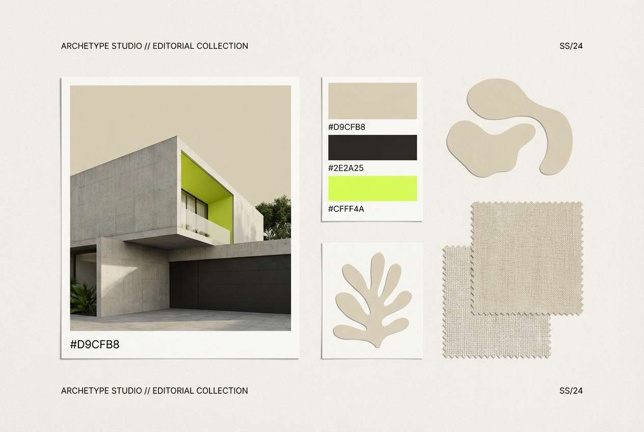
19) Lime Sandstone Neutral
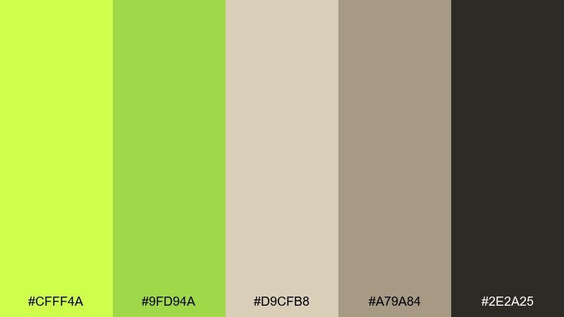
HEX: #CFFF4A #9FD94A #D9CFB8 #A79A84 #2E2A25
Mood: balanced, earthy, architectural
Best for: Interior mood boards and lifestyle branding
Balanced and architectural, it suggests modern stone, sun-washed walls, and a single green plant as the focal point. The sandy neutrals keep the green grounded and sophisticated, ideal for calm lifestyle visuals. Use the near-black for typography and the beige tones for large areas like backgrounds and panels. Tip: treat lime as a small accent on buttons, tags, or one hero object to maintain restraint.
Image example of lime sandstone neutral generated using media.io
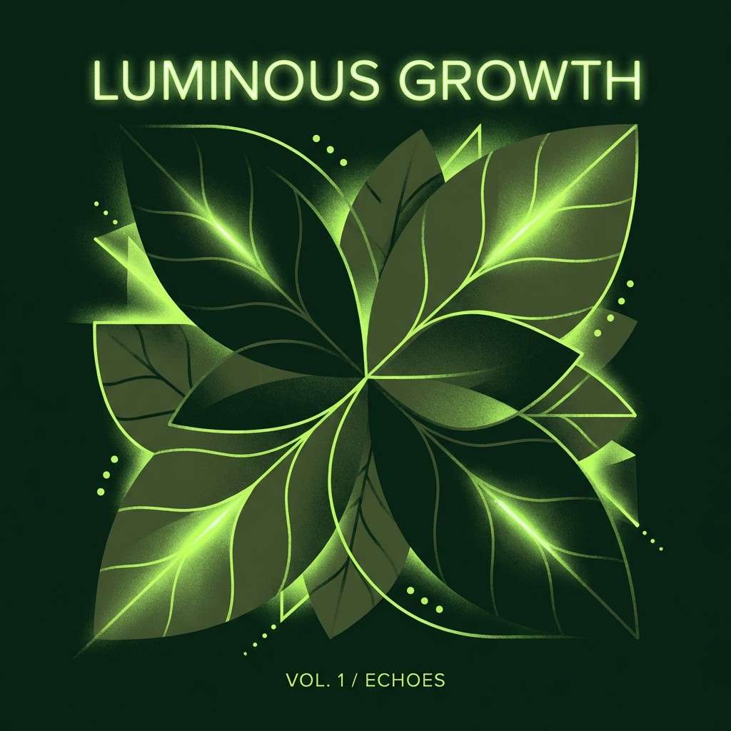
20) Night Garden Glow
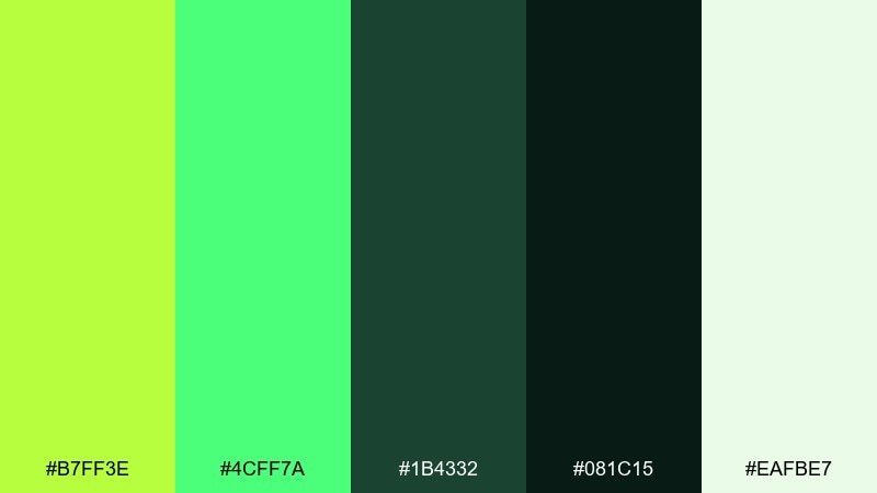
HEX: #B7FF3E #4CFF7A #1B4332 #081C15 #EAFBE7
Mood: mysterious, lush, modern
Best for: Music cover art and moody brand visuals
Mysterious and lush, it feels like a garden at night with bioluminescent leaves. The dark greens create depth, letting the bright lime read like a glow effect without using gradients. Use the pale mint for small text, credits, and subtle framing lines. Tip: keep most of the canvas dark, then place lime on one focal element for maximum drama.
Image example of night garden glow generated using media.io
21) Citrus Wedding
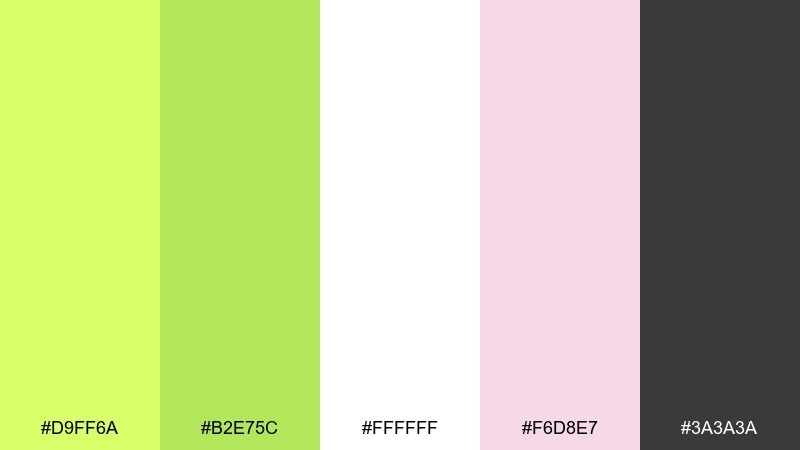
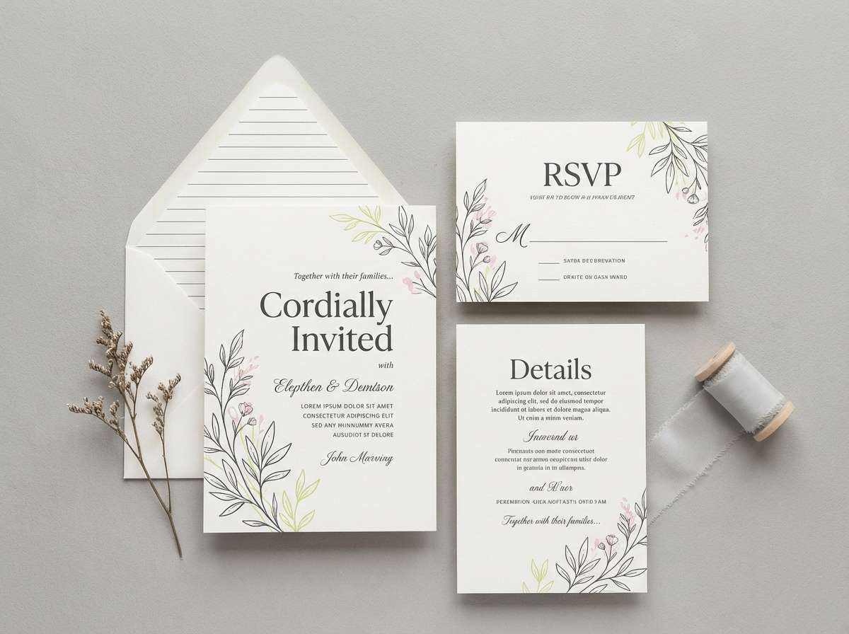
HEX: #D9FF6A #B2E75C #FFFFFF #F6D8E7 #3A3A3A
Mood: romantic, fresh, airy
Best for: Wedding invitations and spring stationery
Romantic and fresh, it brings to mind garden vows, citrus blossoms, and soft daylight. The blush pink keeps the greens gentle, while charcoal makes names and details crisp. Use lime as a small motif in borders, monograms, or illustrated leaves rather than big blocks of color. Tip: print on bright white stock to keep the palette airy and elegant.
Image example of citrus wedding generated using media.io
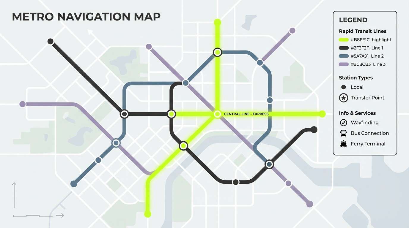
22) Urban Transit
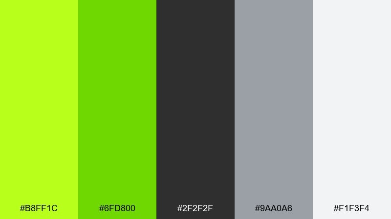
HEX: #B8FF1C #6FD800 #2F2F2F #9AA0A6 #F1F3F4
Mood: functional, modern, high-clarity
Best for: Wayfinding signage and map UI
Functional and modern, it feels like clear signage under bright station lights. Lime is excellent for routes, active lines, and status indicators because it stays visible against both light and dark neutrals. Use the grays for grids and secondary labels to keep hierarchy obvious. Tip: standardize lime usage for one meaning only, such as active or available, to avoid confusion.
Image example of urban transit generated using media.io
What Colors Go Well with Lime?
Neutrals are the easiest win: charcoal, near-black, cool gray, and warm off-white make lime look intentional and keep text readable. This is why lime and charcoal palettes work so well for SaaS, dashboards, and product UI.
For a more natural vibe, pair lime with deep greens, olive, sand, beige, and kraft-paper browns. These combinations pull lime away from “neon” and toward “fresh plant” energy.
For high-impact contrast, try purple/lavender, hot pink, or a small hit of red—best used sparingly for secondary highlights so lime remains the main attention color.
How to Use a Lime Color Palette in Real Designs
Assign lime a job, not a decoration: CTAs, active states, success indicators, route lines, or key data points. When lime has a consistent meaning, your design feels clearer and more premium.
Balance intensity with space and structure. Use large neutral backgrounds (white, cream, gray, or deep green) and keep lime concentrated in buttons, icons, tabs, borders, or one hero shape.
Watch accessibility: lime-on-white often lacks contrast for body text. Use lime for accents and pair it with dark typography (charcoal, deep green, or near-black) for comfortable reading.
Create Lime Palette Visuals with AI
If you already have HEX codes, the fastest way to preview them is to generate a few realistic mockups (ads, packaging, posters, UI screens) and compare which palette “feels right” for your brand.
With Media.io’s text-to-image, you can paste a prompt, include your lime swatches, choose an aspect ratio, and generate consistent concept visuals for campaigns, product pages, or design mood boards.
Start with one palette above, generate 3–5 variations, then refine the prompt by adding materials (paper, metal, plastic), lighting (soft studio, neon glow), and layout hints (minimal grid, bold typography).
Lime Color Palette FAQs
-
What is the best background color for lime green?
Charcoal, near-black, and deep green give lime the strongest contrast and a modern look. For softer designs, warm off-white or cream backgrounds keep lime fresh without feeling neon. -
Is lime the same as neon green?
Not always. “Lime” typically sits between yellow and green, while “neon green” is often more saturated and fluorescent. Many lime palettes can be toned down with neutrals to avoid the neon feel. -
What colors complement lime?
Deep greens, charcoal/black, warm creams, sandy beiges, and cool grays are reliable complements. For bold contrast, purple/lavender and hot pink can work as small accent colors. -
Can I use lime in a professional UI design?
Yes—use lime for CTAs, toggles, focus rings, progress, and key metrics, then rely on grays or deep greens for the main UI surfaces and typography. Keeping lime usage limited (often 10–20%) helps it feel polished. -
Does lime work for eco or sustainable branding?
It can, especially when paired with warm neutrals like kraft beige, sand, or muted browns. Those supporting tones shift lime from “electric” to “organic.” -
What’s a good lime palette for posters and events?
High-contrast sets like Neon Spritz or Modern Poster Punch are strong options because lime stays readable at a distance. Use dark backgrounds and reserve lime for headlines and guiding shapes. -
How do I keep lime from overpowering my design?
Give lime a specific role (CTA, highlight, status) and keep most large areas neutral. Use one primary lime tone consistently, and treat any extra bright swatches as hover/active or small detail colors.
Next: Volcano Color Palette


