

A lighthouse-inspired color palette balances crisp contrast (navy, white, beacon red) with coastal neutrals (sand, driftwood, fog gray) and water tones (seafoam, steel blue). The result feels timeless, readable, and instantly “seaside” without relying on clichés.
Below are 20+ lighthouse color palette ideas with HEX codes, plus practical tips for branding, UI, posters, and packaging—and AI prompts you can reuse to visualize each look.
In this article
- Why Lighthouse Palettes Work So Well
-
- beacon dusk
- saltwashed white
- harbor stripe
- foggy breakwater
- seaglass calm
- rusted lantern
- storm signal
- sunrise buoy
- nautical ink
- sandbar soft
- tidepool pop
- coastal cottage
- cliffside granite
- sunset pier
- marina pastels
- kelp & canvas
- vintage beacon
- modern boardwalk
- winter headland
- coral alert
- signal & surf
- lantern room glow
- What Colors Go Well with Lighthouse?
- How to Use a Lighthouse Color Palette in Real Designs
- Create Lighthouse Palette Visuals with AI
Why Lighthouse Palettes Work So Well
Lighthouse palettes are built on strong hierarchy: deep navies and charcoals create structure, off-whites open up space, and a single “signal” accent (red, coral, or gold) gives instant focus. That makes them ideal for layouts where clarity matters.
They also carry a natural storytelling vibe—coastline fog, weathered paint, rope, sand, and sea glass. Even modern interfaces feel more human when these coastal neutrals and ocean blues soften the edges.
Most importantly, lighthouse color schemes translate well across mediums: print, web, packaging, and signage. You can keep the palette minimal for premium branding or push the accents for energetic campaigns.
20+ Lighthouse Color Palette Ideas (with HEX Codes)
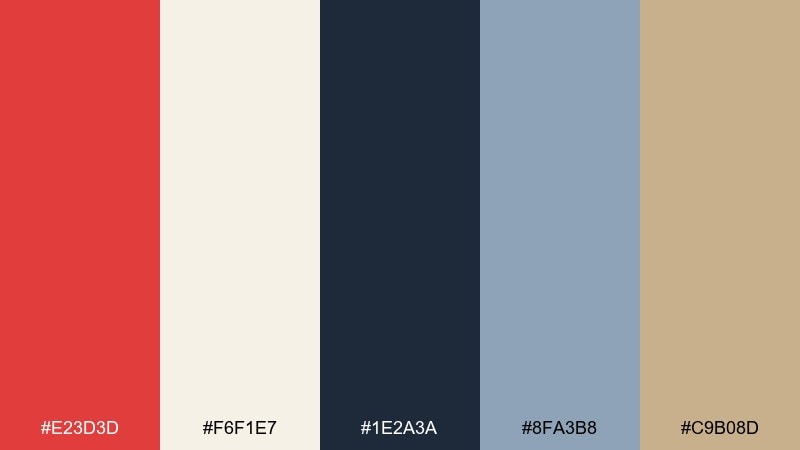
1) Beacon Dusk
HEX: #E23D3D #F6F1E7 #1E2A3A #8FA3B8 #C9B08D
Mood: bold, coastal, confident
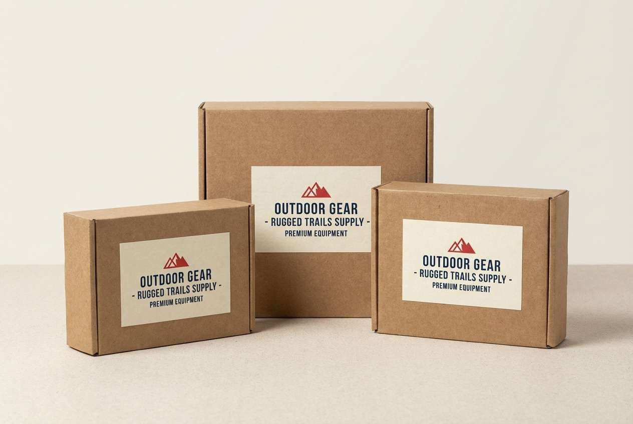
Best for: brand hero sections and outdoor gear packaging
Bold and coastal like a beacon cutting through blue-hour haze. Use the red as a controlled accent against navy to keep layouts sharp and readable. Pair the creams and sand tones for whitespace and warm product callouts. Tip: reserve the red for primary CTAs and one key icon style so it feels intentional, not loud.
Image example of beacon dusk generated using media.io
Media.io is an online AI studio for creating and editing video, image, and audio in your browser.

2) Saltwashed White
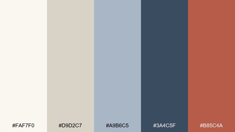
HEX: #FAF7F0 #D9D2C7 #A9B6C5 #3A4C5F #B85C4A
Mood: airy, clean, heritage
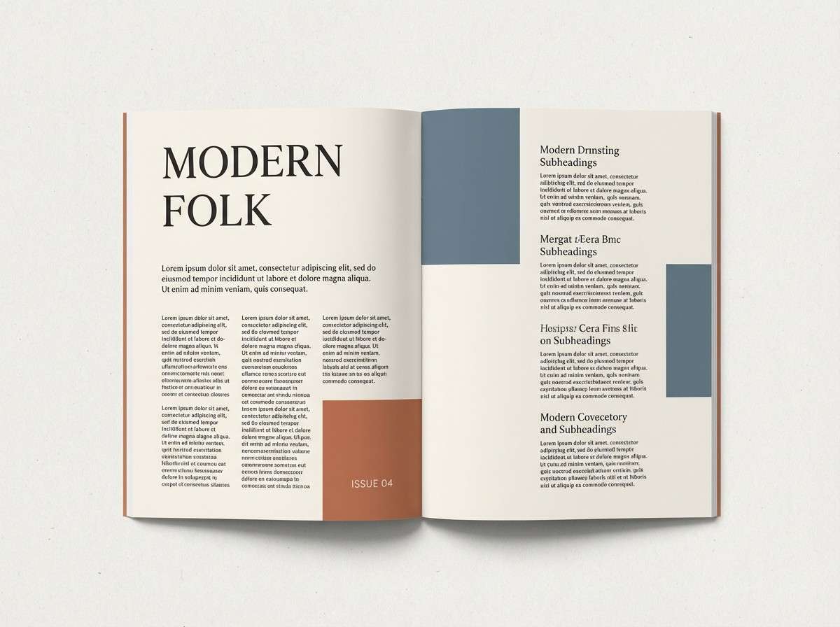
Best for: editorial layouts and minimalist logos
Airy and clean like sun-bleached paint on weathered boards. Let the off-whites carry the page, then anchor typography with slate blue-gray for contrast. A muted terracotta works best as a small seal, underline, or navigation highlight. Tip: keep line weights thin and spacing generous to preserve the calm, editorial feel.
Image example of saltwashed white generated using media.io
3) Harbor Stripe
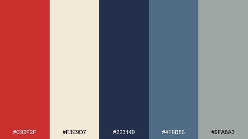
HEX: #C92F2F #F3E9D7 #223149 #4F6B86 #9FA8A3
Mood: nautical, structured, punchy
Best for: website headers and signage systems
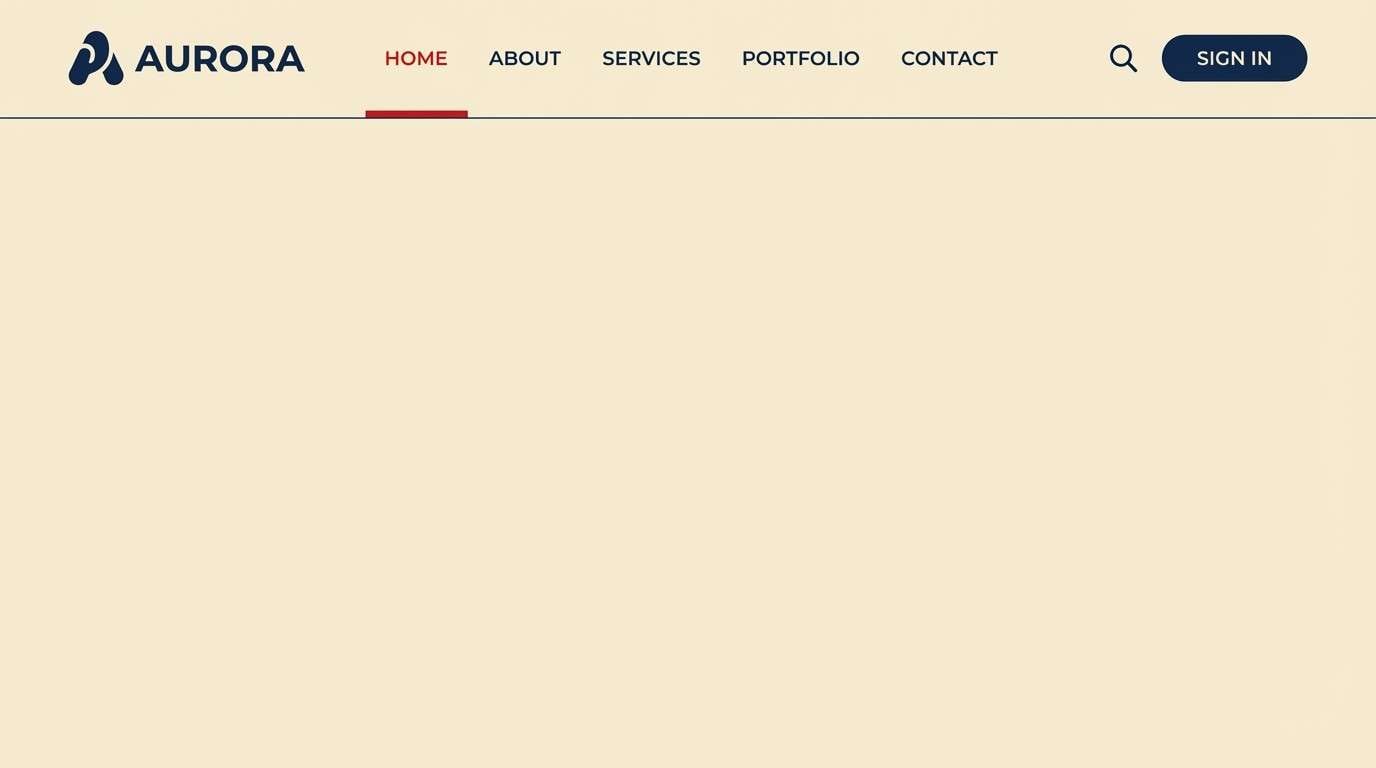
Nautical and structured, like painted stripes and rope-worn rails at the dock. Use navy for the base, cream for breathing room, and the red for navigation states or wayfinding markers. The steel blue supports secondary panels without competing for attention. Tip: apply the red in consistent stripe widths across components to make the system feel cohesive.
Image example of harbor stripe generated using media.io
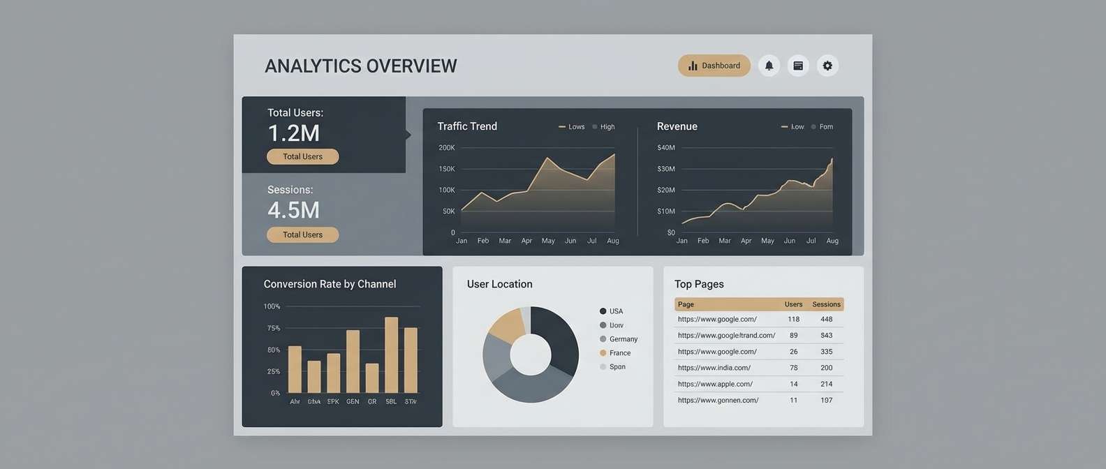
4) Foggy Breakwater
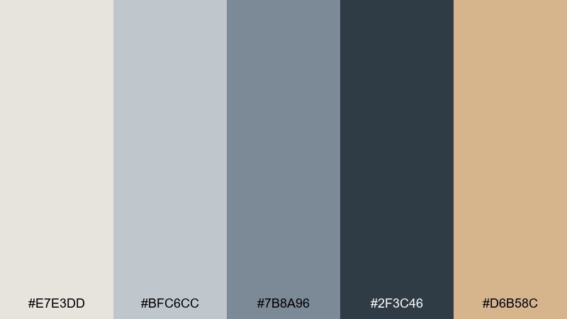
HEX: #E7E3DD #BFC6CC #7B8A96 #2F3C46 #D6B58C
Mood: misty, modern, grounded
Best for: architecture presentations and calm dashboards
Misty and modern, like a breakwater fading into morning fog. This lighthouse color palette leans on layered grays, so structure your hierarchy with depth rather than saturation. Bring in the sandy tan for highlights, badges, or data emphasis. Tip: use the darkest charcoal only for headings and key numbers to avoid a heavy interface.
Image example of foggy breakwater generated using media.io
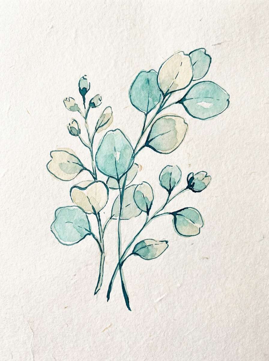
5) Seaglass Calm
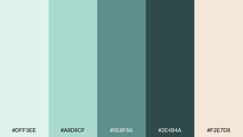
HEX: #DFF3EE #A9D9CF #5E8F8A #2E4B4A #F2E7D8
Mood: soothing, fresh, spa-like
Best for: wellness branding and botanical illustrations
Soothing and fresh, like sea glass smoothed by tides. Let the pale aqua and cream lead, then use the deeper teal for type, outlines, and icons. This mix pairs beautifully with simple line art, paper textures, and soft gradients. Tip: keep contrast accessible by reserving the darkest teal for body text and key buttons.
Image example of seaglass calm generated using media.io
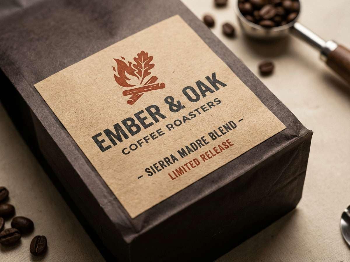
6) Rusted Lantern
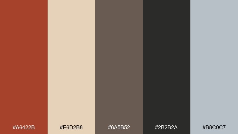
HEX: #A6422B #E6D2B8 #6A5B52 #2B2B2A #B8C0C7
Mood: vintage, tactile, rugged
Best for: craft coffee labels and heritage posters
Vintage and tactile, like a rusted lantern and worn leather straps. These lighthouse color combinations shine on textured paper, letterpress styles, and bold stamps. Use the warm tan for background fields and the deep near-black for type and barcodes. Tip: add subtle grain and keep color blocks large to make the palette feel intentional and premium.
Image example of rusted lantern generated using media.io
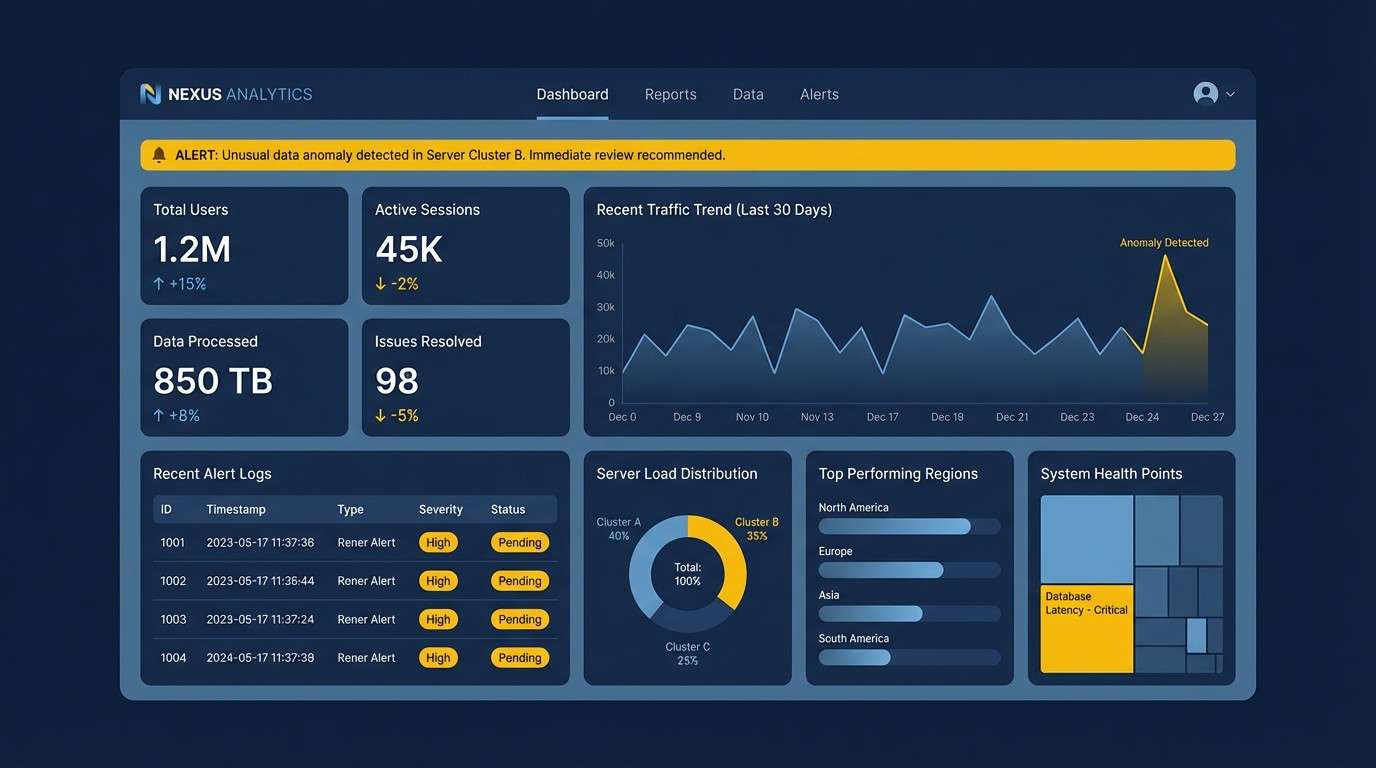
7) Storm Signal
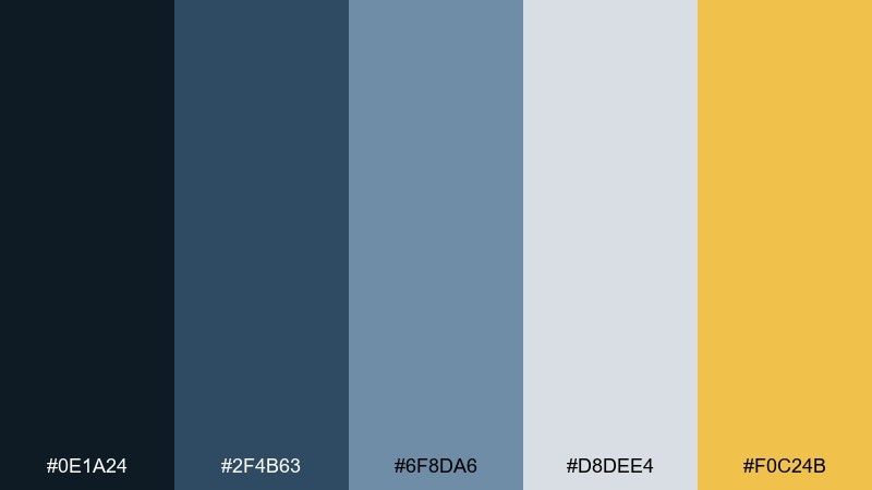
HEX: #0E1A24 #2F4B63 #6F8DA6 #D8DEE4 #F0C24B
Mood: dramatic, crisp, high-contrast
Best for: sports promos and data-heavy UI
Dramatic and crisp, like storm clouds split by a single warning light. Build the base with deep navy and steel blue, then lift readability with cool light gray panels. The golden yellow works best for alerts, progress indicators, and small graphic hits. Tip: keep the yellow under 10 percent of the layout so it stays impactful.
Image example of storm signal generated using media.io
8) Sunrise Buoy
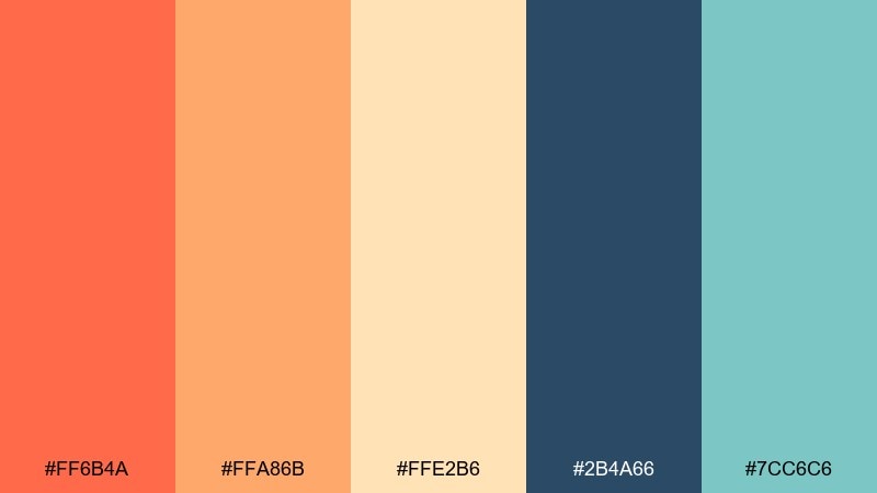
HEX: #FF6B4A #FFA86B #FFE2B6 #2B4A66 #7CC6C6
Mood: optimistic, warm, playful
Best for: event flyers and summer campaigns
Optimistic and warm, like sunrise reflecting off a buoy in calm water. Use coral and apricot as your hero duo, then balance them with deep blue for type and structure. The soft aqua is perfect for secondary shapes, dividers, or sticker-style badges. Tip: keep gradients subtle and short, moving from coral to apricot for a modern look.
Image example of sunrise buoy generated using media.io

9) Nautical Ink
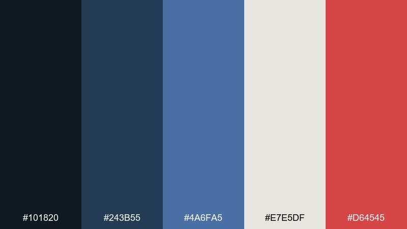
HEX: #101820 #243B55 #4A6FA5 #E7E5DF #D64545
Mood: sleek, assertive, classic
Best for: SaaS landing pages and fintech branding
Sleek and assertive, like ink-dark waves with a clean painted trim. Let the near-black and navy handle the foundation, then use the mid blue for charts and link states. The soft off-white keeps sections readable without looking stark. Tip: use the red only for one action tier, such as primary buttons, to avoid visual conflict.
Image example of nautical ink generated using media.io
10) Sandbar Soft
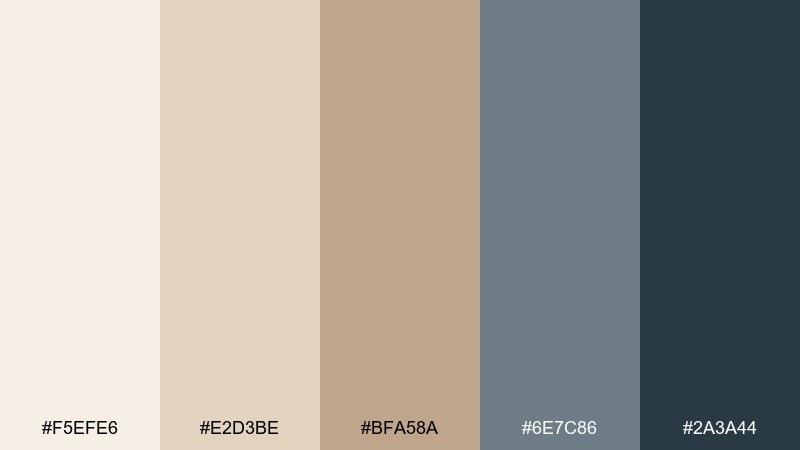
HEX: #F5EFE6 #E2D3BE #BFA58A #6E7C86 #2A3A44
Mood: soft, warm, understated
Best for: interiors mood boards and lifestyle blogs
Soft and warm, like rippled sand with cool shadows at low tide. Use the creamy neutrals for large backgrounds and the taupe for cards, frames, or captions. The slate and deep blue-gray create a dependable type system without feeling harsh. Tip: add natural textures like linen or recycled paper to amplify the relaxed tone.
Image example of sandbar soft generated using media.io
11) Tidepool Pop
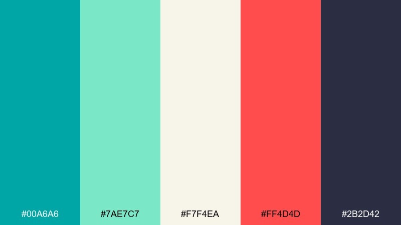
HEX: #00A6A6 #7AE7C7 #F7F4EA #FF4D4D #2B2D42
Mood: energetic, modern, punchy
Best for: app icons and social graphics
Energetic and modern, like bright tidepool life against dark rock. Lean on teal and near-navy for structure, then let coral-red punch through for key highlights. The soft cream keeps the palette from turning too techy or cold. Tip: use the mint as a glow or outline color around icons to create crisp separation.
Image example of tidepool pop generated using media.io

12) Coastal Cottage
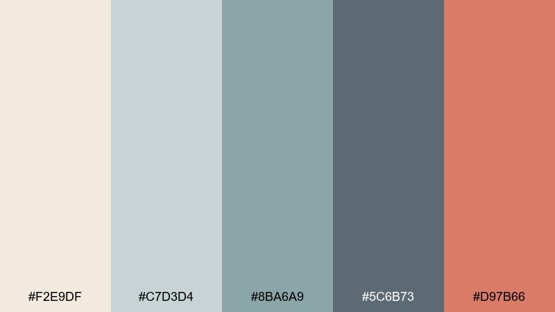
HEX: #F2E9DF #C7D3D4 #8BA6A9 #5C6B73 #D97B66
Mood: cozy, friendly, relaxed
Best for: hospitality branding and menu designs
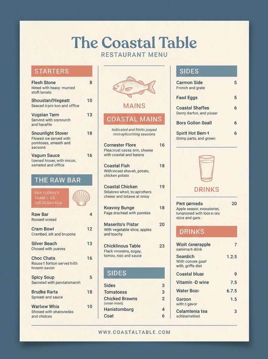
Cozy and friendly, like a cottage porch with weathered paint and warm light inside. Use the pale cream for menus or stationery, then layer the sea-gray blues for section headers and borders. The muted coral reads as welcoming for specials, stamps, or small illustration details. Tip: combine with hand-drawn coastal icons to keep the tone approachable.
Image example of coastal cottage generated using media.io
13) Cliffside Granite
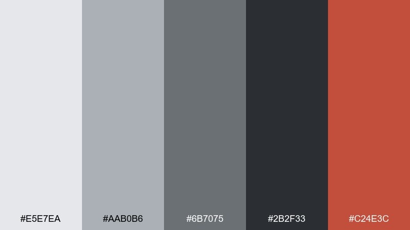
HEX: #E5E7EA #AAB0B6 #6B7075 #2B2F33 #C24E3C
Mood: industrial, steady, bold accents
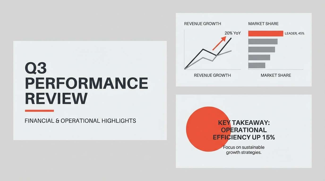
Best for: architecture firms and presentation decks
Industrial and steady, like granite cliffs under a sharp wind. This lighthouse color palette is built for clean grids, monochrome diagrams, and strong typography. Use the red-orange as a single-point accent for callouts, section dividers, or map pins. Tip: keep backgrounds light gray instead of pure white for a more refined, print-ready finish.
Image example of cliffside granite generated using media.io
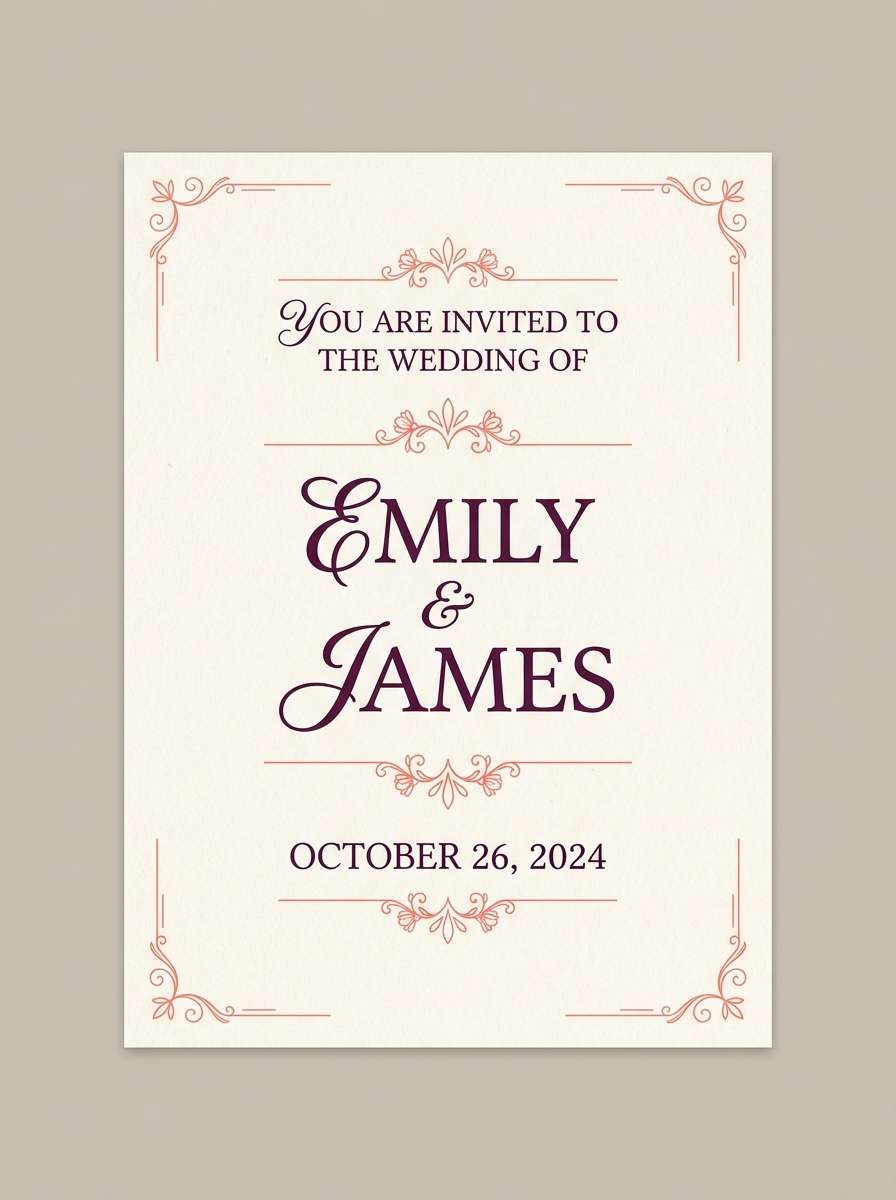
14) Sunset Pier
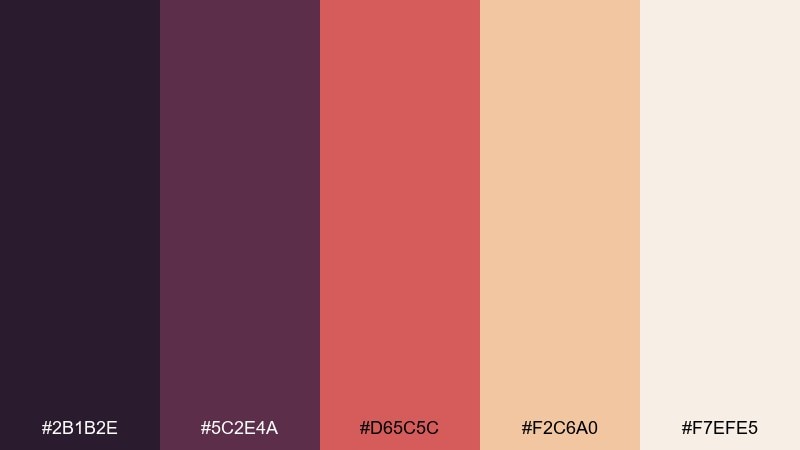
HEX: #2B1B2E #5C2E4A #D65C5C #F2C6A0 #F7EFE5
Mood: romantic, warm, cinematic
Best for: wedding invites and boutique posters
Romantic and cinematic, like a pier at sunset with the last light on the horizon. The deep plum and wine tones create a luxe base, while coral and peach soften the edges. Use the pale cream as your paper color to keep everything airy. Tip: foil or embossed accents work beautifully here, especially in plum on cream stock.
Image example of sunset pier generated using media.io
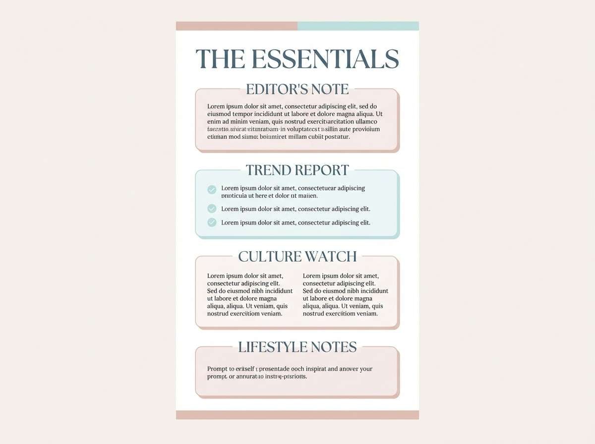
15) Marina Pastels
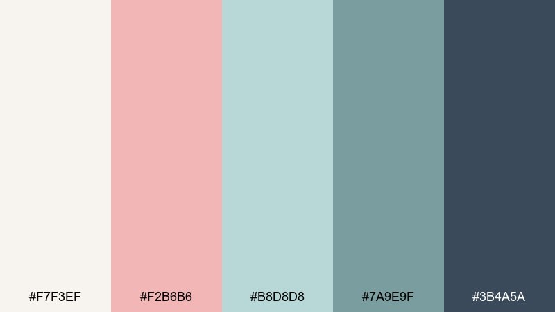
HEX: #F7F3EF #F2B6B6 #B8D8D8 #7A9E9F #3B4A5A
Mood: soft, cheerful, breezy
Best for: beauty launches and lifestyle newsletters
Soft and breezy, like pastel boats lined up in a quiet marina. Use blush and pale aqua for large blocks and illustrations, then ground the layout with a deep blue-gray for type. The clean off-white keeps it modern rather than sugary. Tip: limit the darkest color to headlines and small UI elements so the pastels stay dominant.
Image example of marina pastels generated using media.io
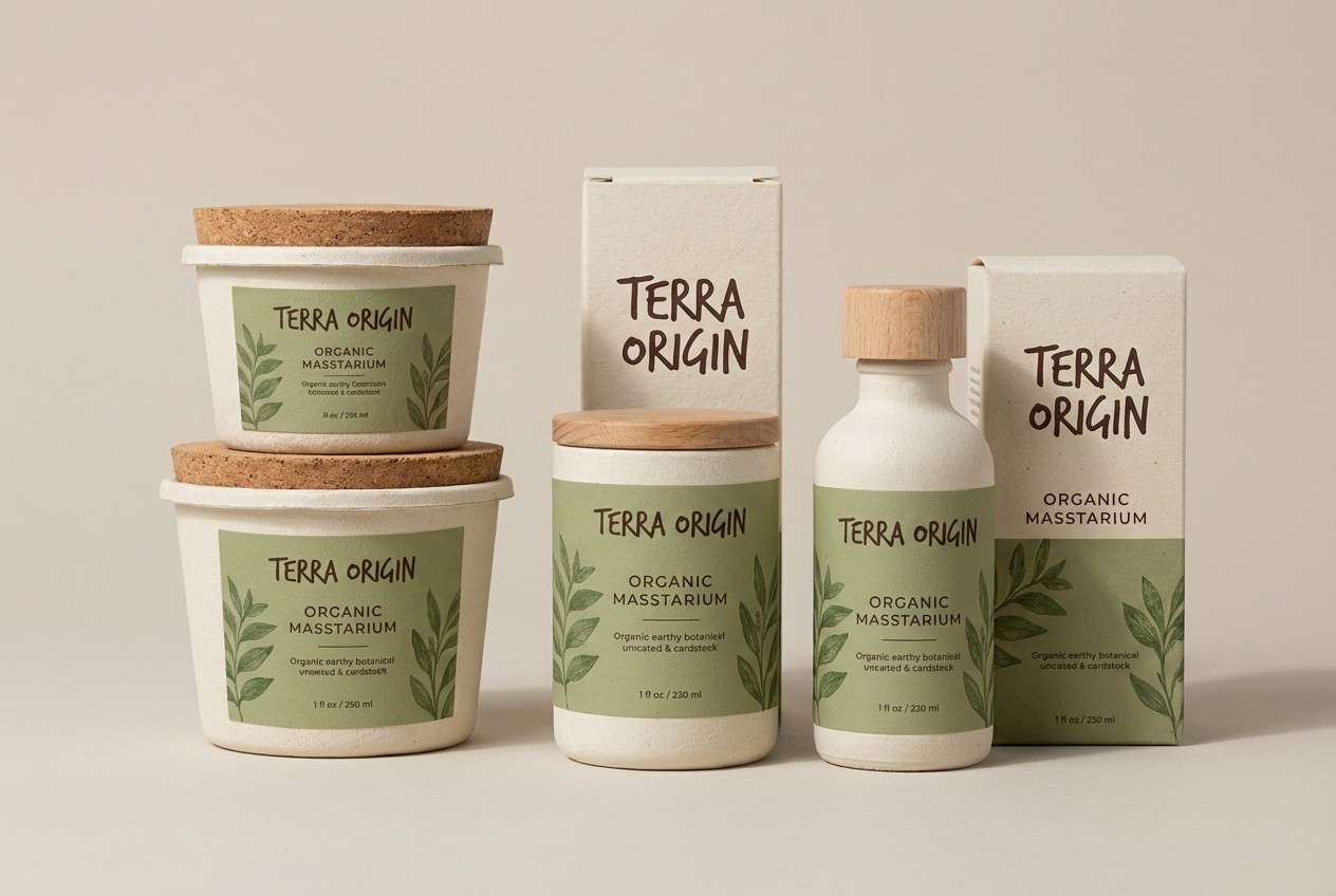
16) Kelp & Canvas
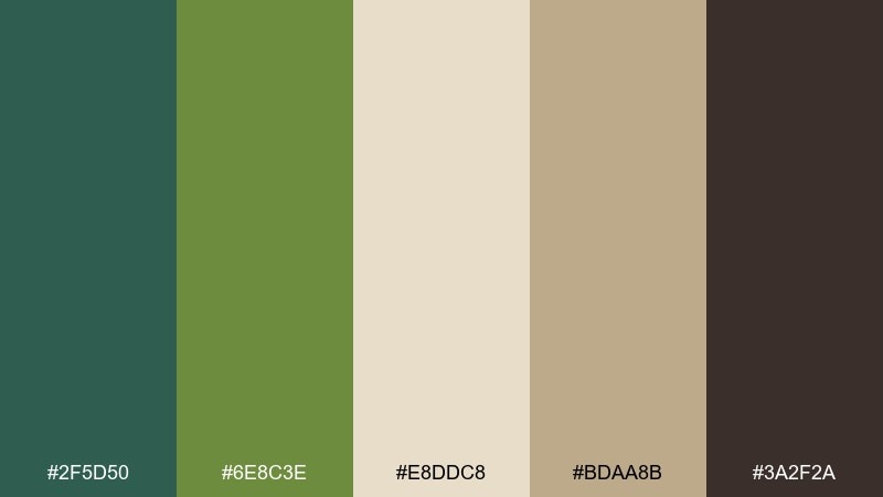
HEX: #2F5D50 #6E8C3E #E8DDC8 #BDAA8B #3A2F2A
Mood: earthy, natural, artisanal
Best for: eco packaging and outdoor brands
Earthy and artisanal, like kelp greens against canvas sails and driftwood. The greens work best in broad shapes, while the creams and tans keep copy legible. Use the deep brown for stamps, headlines, and thin rules to add craft character. Tip: pair with uncoated paper and simple block illustrations for a grounded, sustainable look.
Image example of kelp & canvas generated using media.io
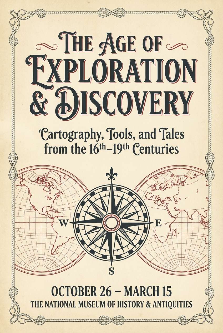
17) Vintage Beacon
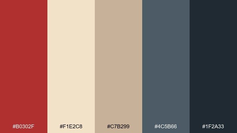
HEX: #B0302F #F1E2C8 #C7B299 #4C5B66 #1F2A33
Mood: nostalgic, sturdy, maritime
Best for: museum exhibits and heritage branding
Nostalgic and sturdy, like a historic beacon painted by hand and cared for over decades. The red feels classic rather than bright, making it ideal for seals, signage, and section titles. Balance it with parchment cream and muted taupe for a genuine, archival vibe. Tip: use slightly warm grays for body text to avoid a cold, modern feel.
Image example of vintage beacon generated using media.io
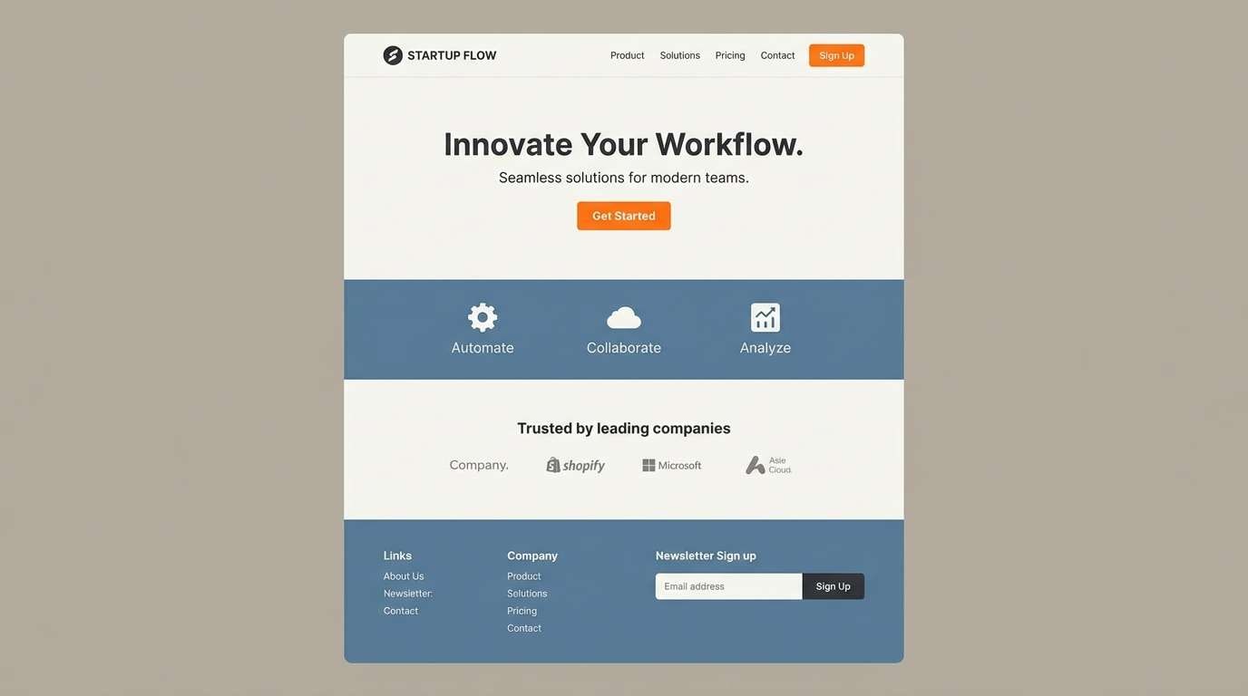
18) Modern Boardwalk
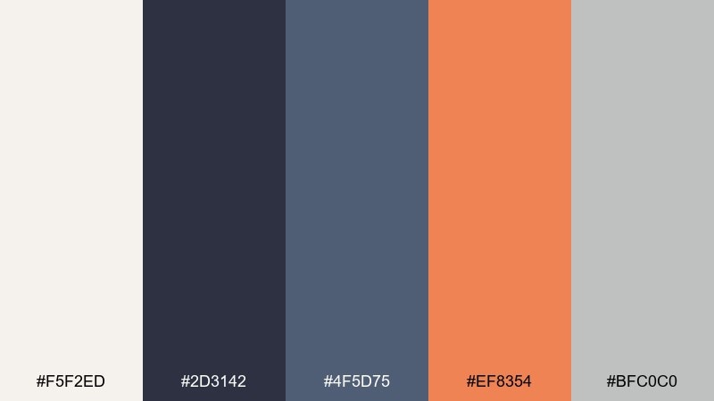
HEX: #F5F2ED #2D3142 #4F5D75 #EF8354 #BFC0C0
Mood: modern, clean, slightly sporty
Best for: startup branding and landing pages
Modern and clean, like fresh boardwalk planks with a pop of sunset orange. Use charcoal and steel blue for a strong typographic system, then brighten key sections with the orange accent. The off-white keeps spacing airy, while the light gray supports cards and dividers. Tip: build a two-tone button set using charcoal for default and orange for primary actions.
Image example of modern boardwalk generated using media.io
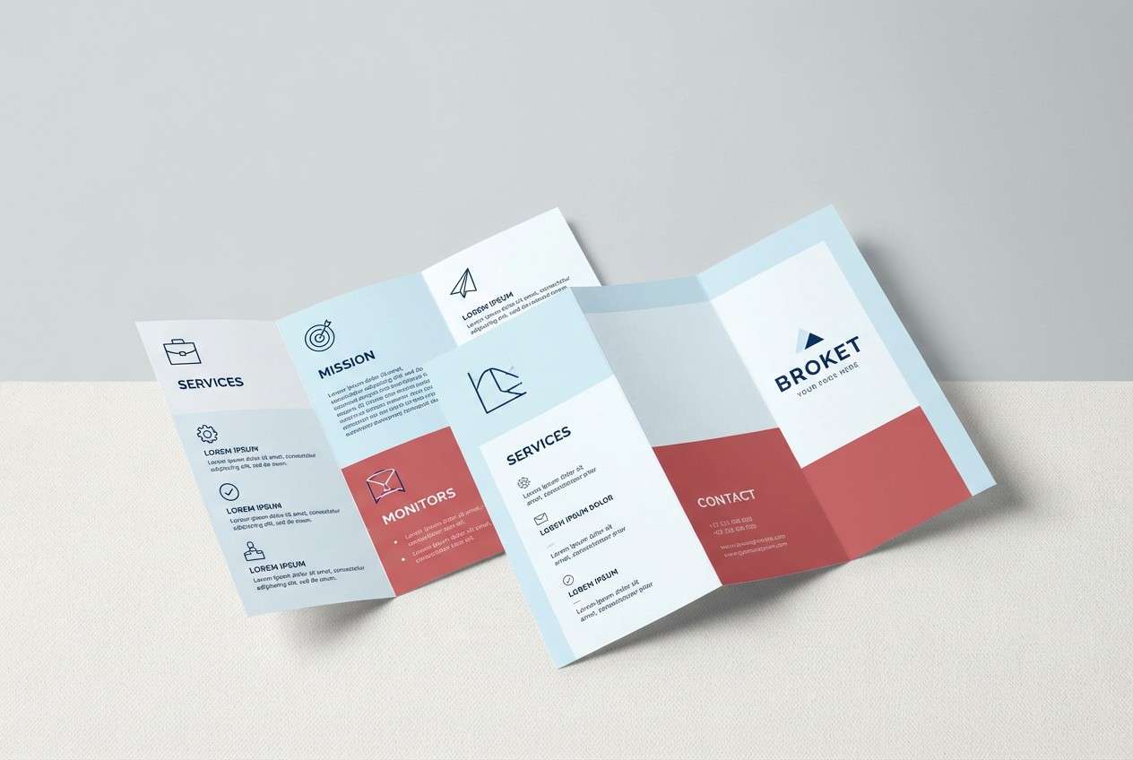
19) Winter Headland
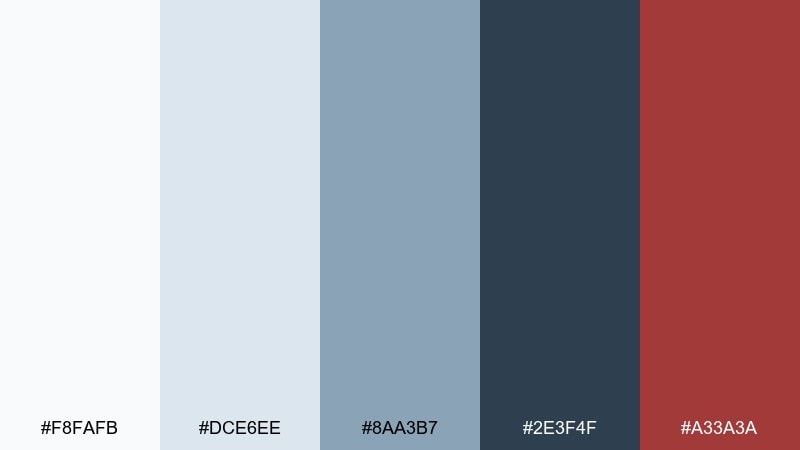
HEX: #F8FAFB #DCE6EE #8AA3B7 #2E3F4F #A33A3A
Mood: crisp, quiet, wintry
Best for: seasonal campaigns and clean brochures
Crisp and quiet, like a winter headland under pale skies. The icy whites and light blues set a clean stage for deep navy typography and structured layouts. A muted red makes a strong seasonal accent without turning festive. Tip: use the lightest blue as a subtle section tint to separate content while keeping the page bright.
Image example of winter headland generated using media.io
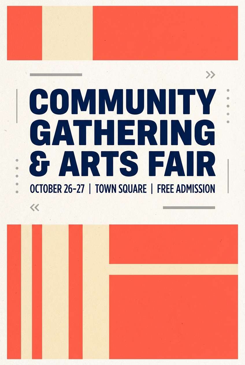
20) Coral Alert
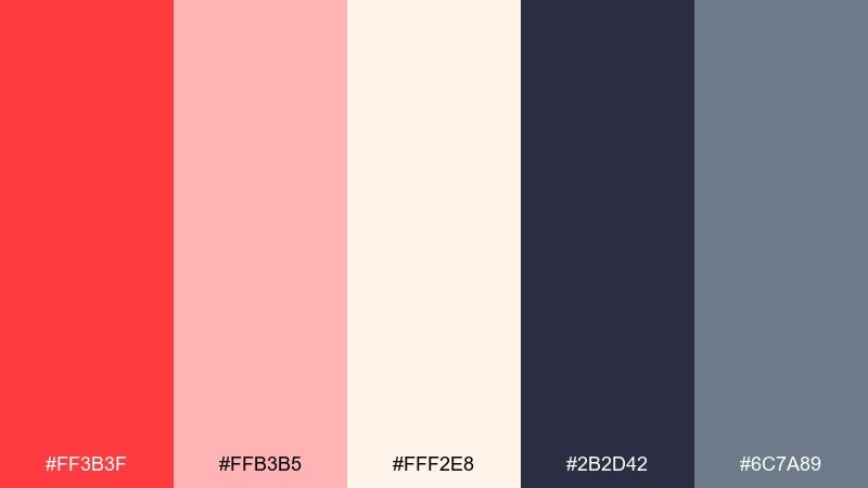
HEX: #FF3B3F #FFB3B5 #FFF2E8 #2B2D42 #6C7A89
Mood: urgent, modern, editorial
Best for: announcement posters and call-to-action banners
Urgent and modern, like a bright signal flag against a calm overcast sea. These lighthouse color combinations work best when coral leads and the navy stays in a supporting role for text and structure. Use blush as a softer background field to stretch the palette across multiple sections. Tip: keep body copy in navy on cream for readability, and reserve coral for headings and CTA blocks only.
Image example of coral alert generated using media.io
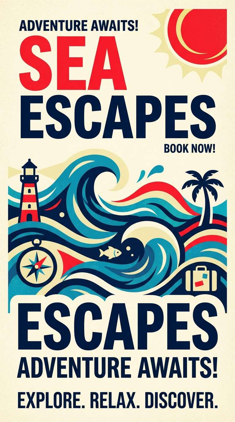
21) Signal & Surf
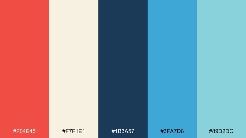
HEX: #F04E45 #F7F1E1 #1B3A57 #3FA7D6 #89D2DC
Mood: fresh, sporty, coastal
Best for: sports clubs and travel promos
Fresh and sporty, like a bright signal over lively surf. Try this lighthouse color combination when you want strong contrast without going too dark: navy for text, cream for base, and red for energy. The two blues layer nicely for stripes, waves, and friendly infographics. Tip: use the lighter blue for backgrounds and the brighter blue for icons to keep visual order.
Image example of signal & surf generated using media.io
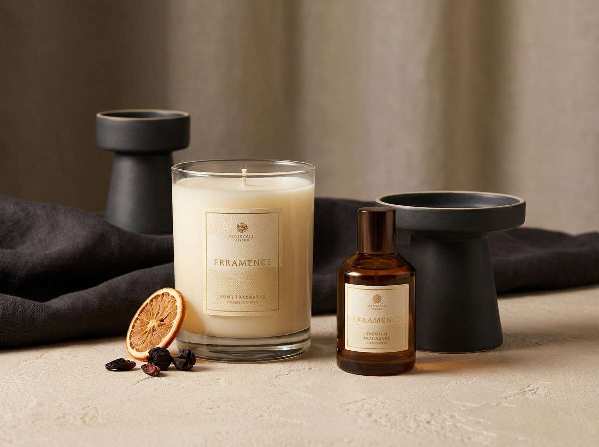
22) Lantern Room Glow
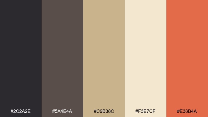
HEX: #2C2A2E #5A4E4A #C9B38C #F3E7CF #E36B4A
Mood: warm, cinematic, intimate
Best for: restaurant branding and product ads
Warm and intimate, like a lantern room glow against night air. The deep charcoals and browns create a moody base, while gold and cream bring soft illumination. A restrained orange accent adds a modern edge for buttons, badges, or price highlights. Tip: use warm lighting in photography so the palette feels cohesive across print and digital.
Image example of lantern room glow generated using media.io
What Colors Go Well with Lighthouse?
Lighthouse palettes pair best with high-contrast staples like navy, charcoal, and off-white—these echo painted towers, maritime uniforms, and clean coastal signage. Add sand, taupe, or driftwood beige to warm things up and keep the scheme grounded.
For accents, classic beacon red is the most iconic choice, but coral, terracotta, or golden yellow can feel more modern while still “signal-like.” If you want a softer coastal vibe, sea-glass aqua, steel blue, and misty grays blend naturally.
To keep the look intentional, pick one accent family (red/coral OR yellow OR aqua) and let neutrals do most of the work. That’s how you get the lighthouse feel without visual clutter.
How to Use a Lighthouse Color Palette in Real Designs
For branding, treat navy/charcoal as your typography and logo base, then reserve beacon red (or coral) for one primary action: CTA buttons, seals, or packaging callouts. This mirrors real lighthouse contrast—simple forms, strong signals.
For UI, use off-white or light fog-gray panels to maintain readability, with slate/steel blues for secondary navigation and charts. Keep the darkest tone for headings and key metrics, so interfaces feel crisp, not heavy.
For print (posters, menus, invites), lean into paper-like creams and warm neutrals, then add a controlled accent stripe or stamp. Subtle texture (grain, uncoated stock) makes coastal palettes feel premium and tactile.
Create Lighthouse Palette Visuals with AI
If you want to preview a lighthouse color scheme before designing, generate fast mockups using AI—menus, packaging, landing pages, posters, and icon sets. This is especially helpful when you’re choosing between a bold beacon-red direction and a softer fog-and-sand neutral approach.
Start with a clear subject (e.g., “website header,” “coffee label,” “wedding invitation”), then specify dominant colors and one accent. Reuse the prompts above and swap the palette names or color roles to iterate quickly.
Once you find a direction you like, keep the same layout prompt and only change the HEX-inspired color words (navy, cream, coral, sand, fog gray) to maintain consistent comparisons.
Lighthouse Color Palette FAQs
-
What is a lighthouse color palette?
A lighthouse color palette is a coastal-inspired scheme built around strong contrast (often navy + white) with a “signal” accent like beacon red, coral, or golden yellow, plus supporting neutrals such as sand, fog gray, or driftwood beige. -
What are the most classic lighthouse colors?
Red, white (or warm cream), and navy are the most iconic lighthouse colors. They’re easy to read at distance and translate well to logos, signage, and web UI. -
How do I keep beacon red from overpowering my design?
Use red as a controlled accent: primary CTA buttons, active navigation, small icons, or a single stripe element. Let navy/charcoal and off-white carry most of the layout for balance and readability. -
Are lighthouse palettes good for modern UI design?
Yes—especially palettes that use fog grays and steel blues with one alert color (gold or coral). They create clear hierarchy, accessible contrast, and a clean “nautical” structure. -
What background color works best in a lighthouse theme?
Warm off-white, cream, or very light fog gray tends to work best. These backgrounds feel coastal and print-like while avoiding the harshness of pure white. -
Can I use lighthouse palettes for packaging?
Absolutely. Navy + cream looks premium on labels, while sand/tan tones pair well with kraft and uncoated materials. Add a single signal accent (red or orange) for product highlights and badges. -
How can I generate lighthouse palette mockups quickly?
Use Media.io’s text-to-image tool with prompts that specify the design type (poster, label, landing page) and the dominant colors plus one accent. Generate a few variations to compare mood before finalizing your brand system.


