

Coffee cream is a warm neutral that brings instant softness to branding, UI, and interiors. It sits between beige and latte foam—clean enough for modern layouts, but cozy enough for welcoming spaces.
Below are ready-to-use coffee cream color palette ideas with HEX codes, plus practical guidance for pairing, contrast, and real design applications.
In this article
- Why Coffee Cream Palettes Work So Well
-
- latte foam
- biscotti cream
- oat milk mocha
- caramel drizzle
- espresso cream
- toffee linen
- hazelnut latte
- cocoa dust
- chai cream
- maple macchiato
- cafe au lait
- honey roast
- sage latte
- cinnamon cream
- nougat beige
- mocha stone
- creamy walnut
- cafe noir cream
- almond cortado
- bronze cream
- brown sugar cream
- cocoa caramel mix
- What Colors Go Well with Coffee Cream?
- How to Use a Coffee Cream Color Palette in Real Designs
- Create Coffee Cream Palette Visuals with AI
Why Coffee Cream Palettes Work So Well
Coffee cream palettes are built on warm neutrals that feel human and approachable. They soften sharp layouts, reduce visual fatigue, and add a premium “crafted” mood without relying on loud colors.
Because these tones span from near-white cream to deep espresso, they naturally include usable contrast. That makes them practical for UI text, packaging hierarchy, and editorial typography where readability matters.
They also pair well with common materials and finishes—kraft paper, linen, wood, stone, and matte ceramics—so the same palette can move from digital design to print and interior styling with minimal adjustment.
20+ Coffee Cream Color Palette Ideas (with HEX Codes)
1) Latte Foam
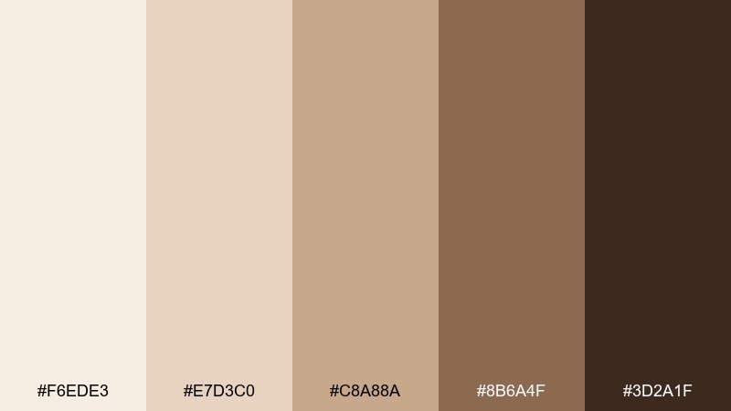
HEX: #F6EDE3 #E7D3C0 #C8A88A #8B6A4F #3D2A1F
Mood: clean, cozy, modern
Best for: cafe branding and packaging
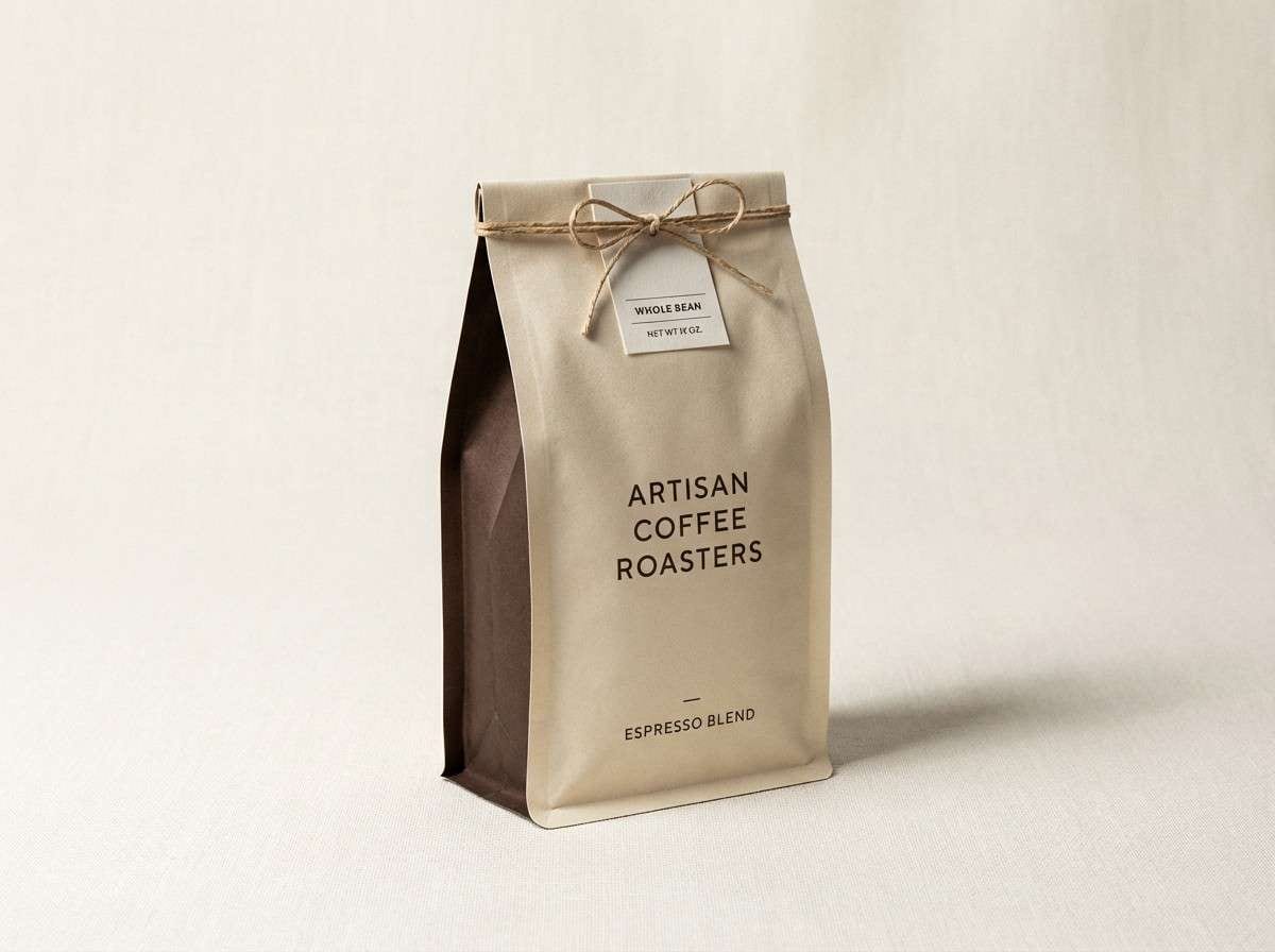
Soft latte foam tones feel warm and welcoming, like sunlight on a marble counter. Use the lighter creams for backgrounds and let the espresso brown anchor logos and headlines. Caramel tan works beautifully for secondary accents on labels and stickers. Tip: keep contrast high by pairing #F6EDE3 with #3D2A1F for key text.
Image example of latte foam generated using media.io
Media.io is an online AI studio for creating and editing video, image, and audio in your browser.

2) Biscotti Cream
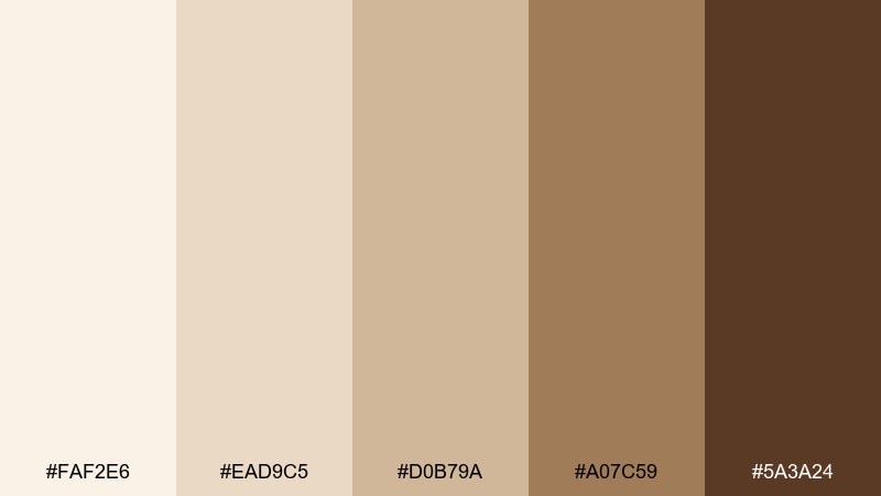
HEX: #FAF2E6 #EAD9C5 #D0B79A #A07C59 #5A3A24
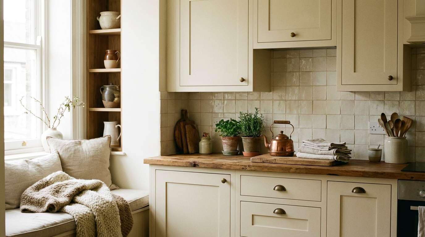
Mood: homey, comforting, timeless
Best for: kitchen and dining room interiors
Buttery biscotti neutrals evoke a calm, lived-in kitchen and the scent of baked sugar. Paint walls with #FAF2E6 and use #A07C59 on wood cabinets or open shelving for gentle depth. The deeper cocoa brown is perfect for hardware, frames, or a feature island. Tip: repeat #D0B79A in textiles to make the room feel intentionally layered.
Image example of biscotti cream generated using media.io
3) Oat Milk Mocha
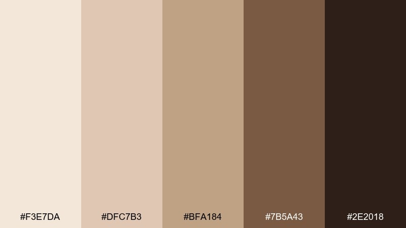
HEX: #F3E7DA #DFC7B3 #BFA184 #7B5A43 #2E2018
Mood: grounded, calm, refined
Best for: editorial layout and magazines
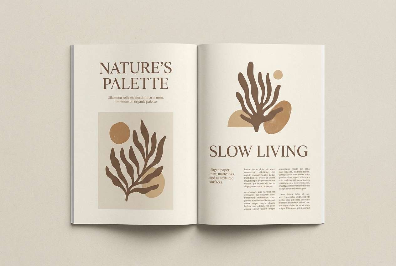
Oat milk warmth and mocha depth create an elegant, editorial feel that reads premium without trying too hard. Use #F3E7DA for page margins and negative space, then set body text in #2E2018 for crisp readability. The mid-tone tan works well for pull quotes, section dividers, and subtle blocks. Tip: keep imagery slightly desaturated so the palette stays in control.
Image example of oat milk mocha generated using media.io
4) Caramel Drizzle
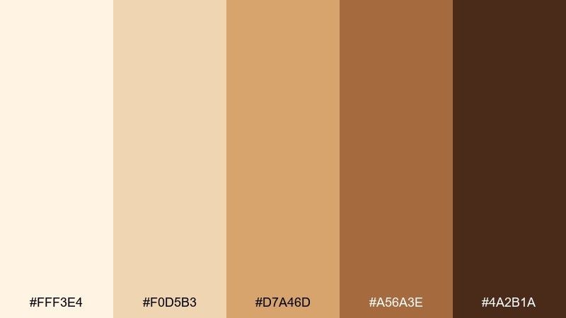
HEX: #FFF3E4 #F0D5B3 #D7A46D #A56A3E #4A2B1A
Mood: sweet, upbeat, inviting
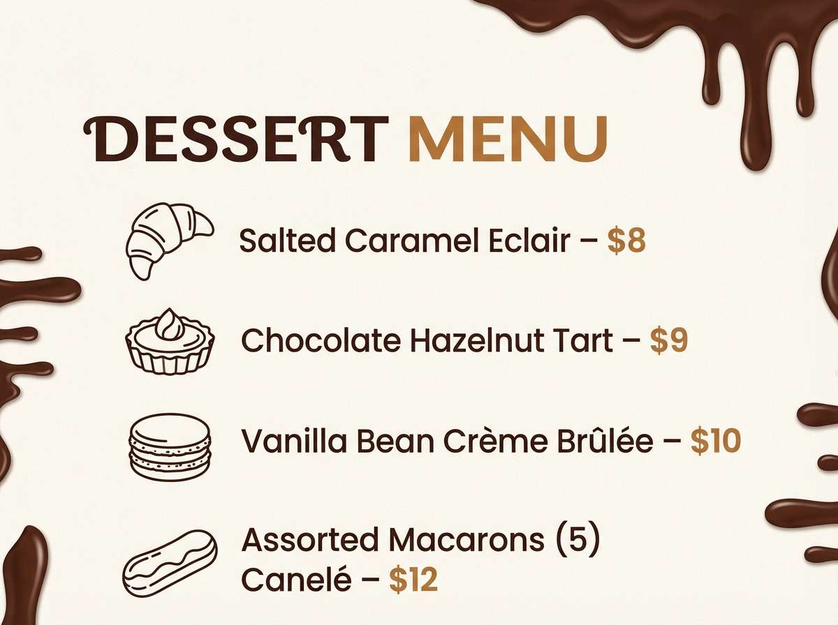
Best for: dessert shop menus
Golden caramel highlights feel playful and mouthwatering, like a fresh pastry display under warm lights. This coffee cream color palette works best when #FFF3E4 carries the background and #A56A3E takes the spotlight for headings and prices. Use #F0D5B3 for panels and callouts to keep the layout airy. Tip: add small icons in #4A2B1A to keep the menu readable at a glance.
Image example of caramel drizzle generated using media.io
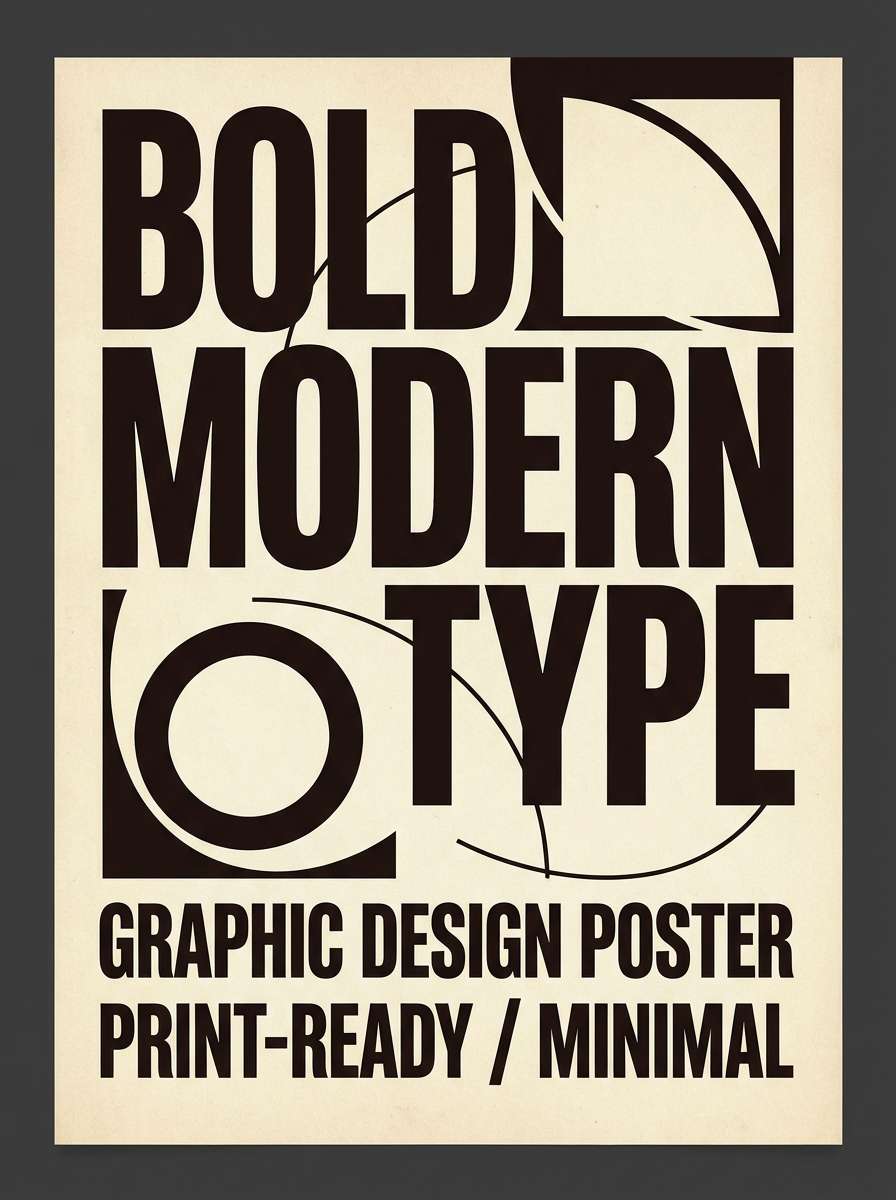
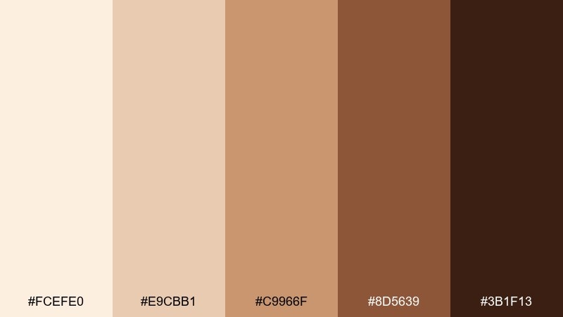
5) Espresso Cream
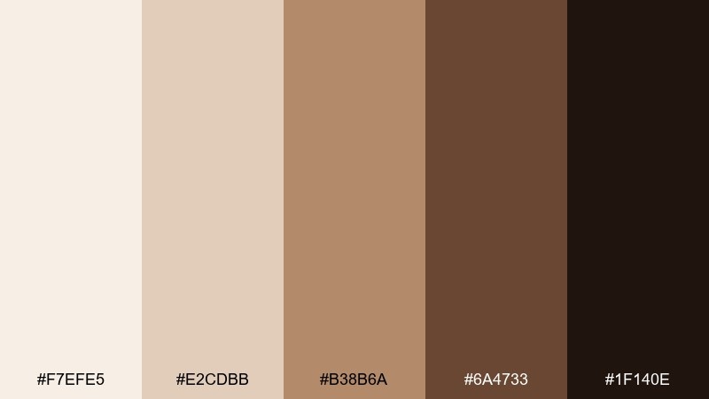
HEX: #F7EFE5 #E2CDBB #B38B6A #6A4733 #1F140E
Mood: bold, luxe, confident
Best for: premium typography posters
High-contrast espresso and cream feels like a late-night cafe with glossy wood and rich aroma. Let #1F140E carry oversized type while #F7EFE5 keeps the background clean and gallery-like. The warm mid browns are ideal for subtle gradients or small rules that add polish. Tip: use #B38B6A sparingly so the poster stays sharp and modern.
Image example of espresso cream generated using media.io
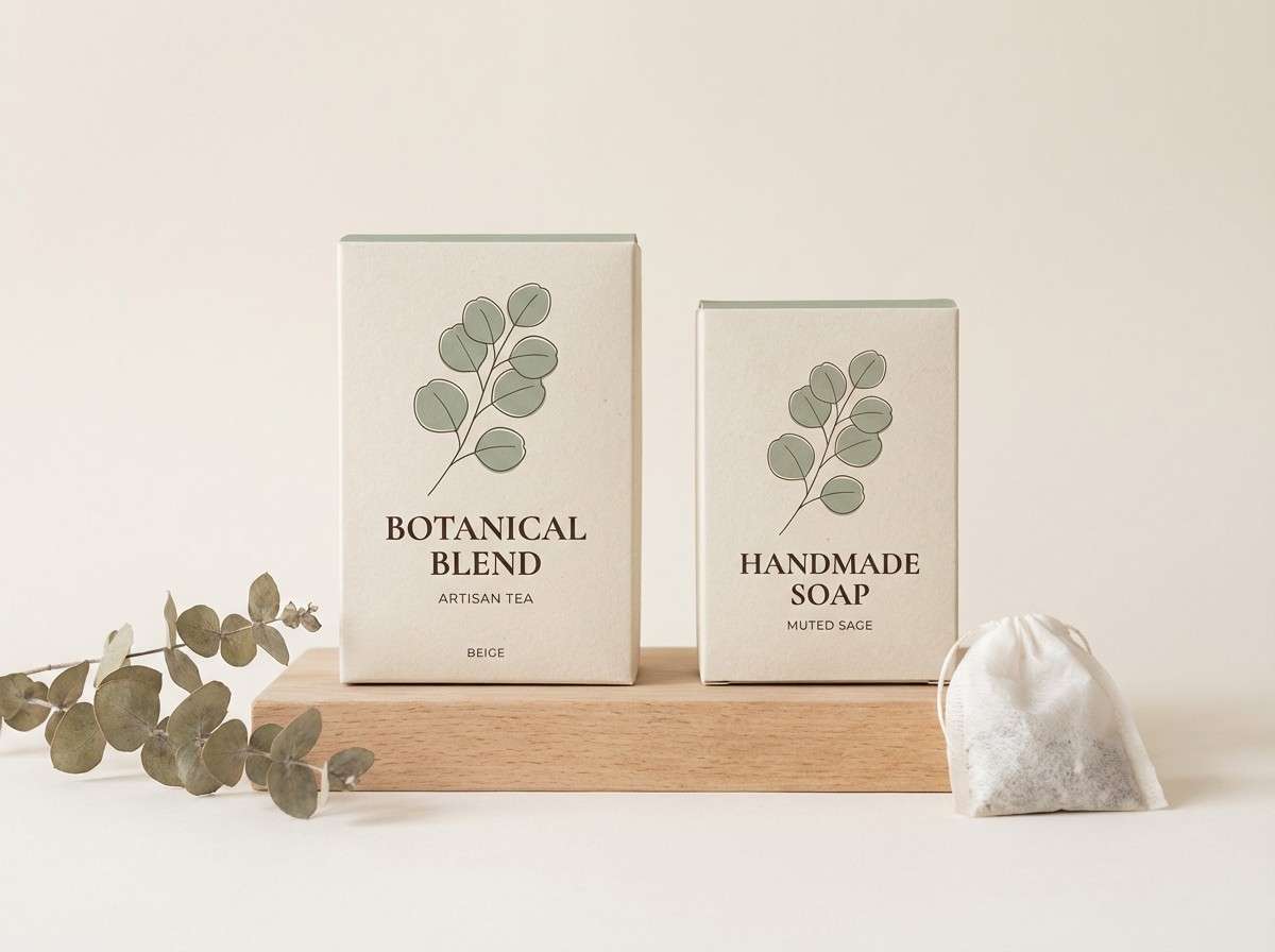
6) Toffee Linen
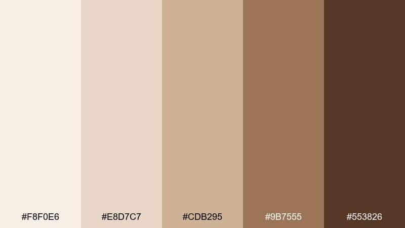
HEX: #F8F0E6 #E8D7C7 #CDB295 #9B7555 #553826
Mood: soft, artisanal, calm
Best for: handmade product packaging
Toffee and linen neutrals suggest craft paper, stitched tags, and a slow-made aesthetic. Use #F8F0E6 as the main label base, then build hierarchy with #9B7555 for headings and stamp marks. The deep brown works well for small text and barcodes without looking harsh. Tip: add texture through matte finishes rather than extra colors.
Image example of toffee linen generated using media.io
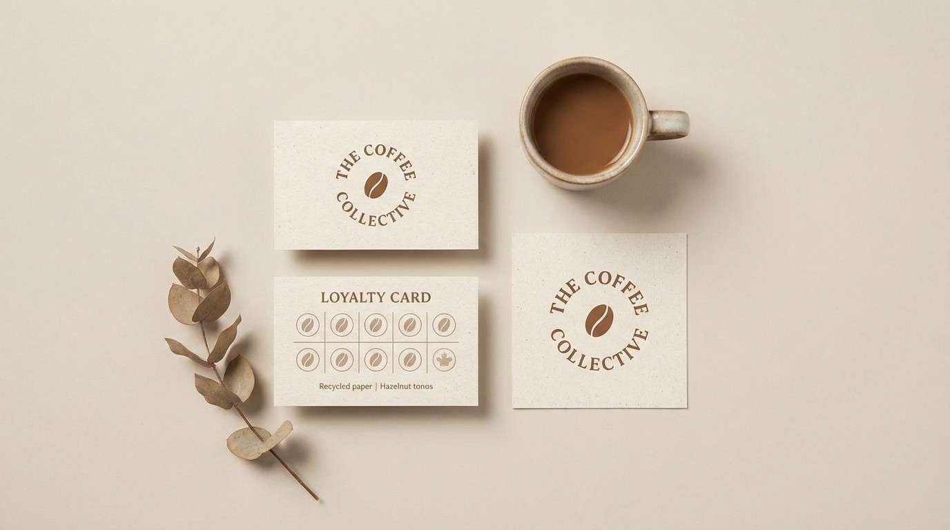
7) Hazelnut Latte
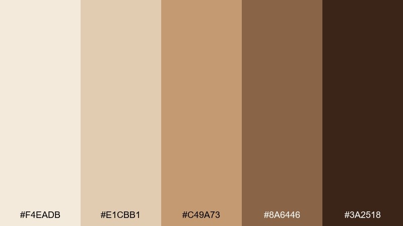
HEX: #F4EADB #E1CBB1 #C49A73 #8A6446 #3A2518
Mood: approachable, warm, friendly
Best for: small business brand kits
Hazelnut warmth feels friendly and familiar, like a neighborhood spot that remembers your order. These coffee cream color combinations shine on business cards, loyalty stamps, and social templates where you want a cozy tone. Keep #F4EADB for open space and use #8A6446 as the core brand color for buttons and badges. Tip: pair with off-white paper stock to maintain the soft vibe.
Image example of hazelnut latte generated using media.io
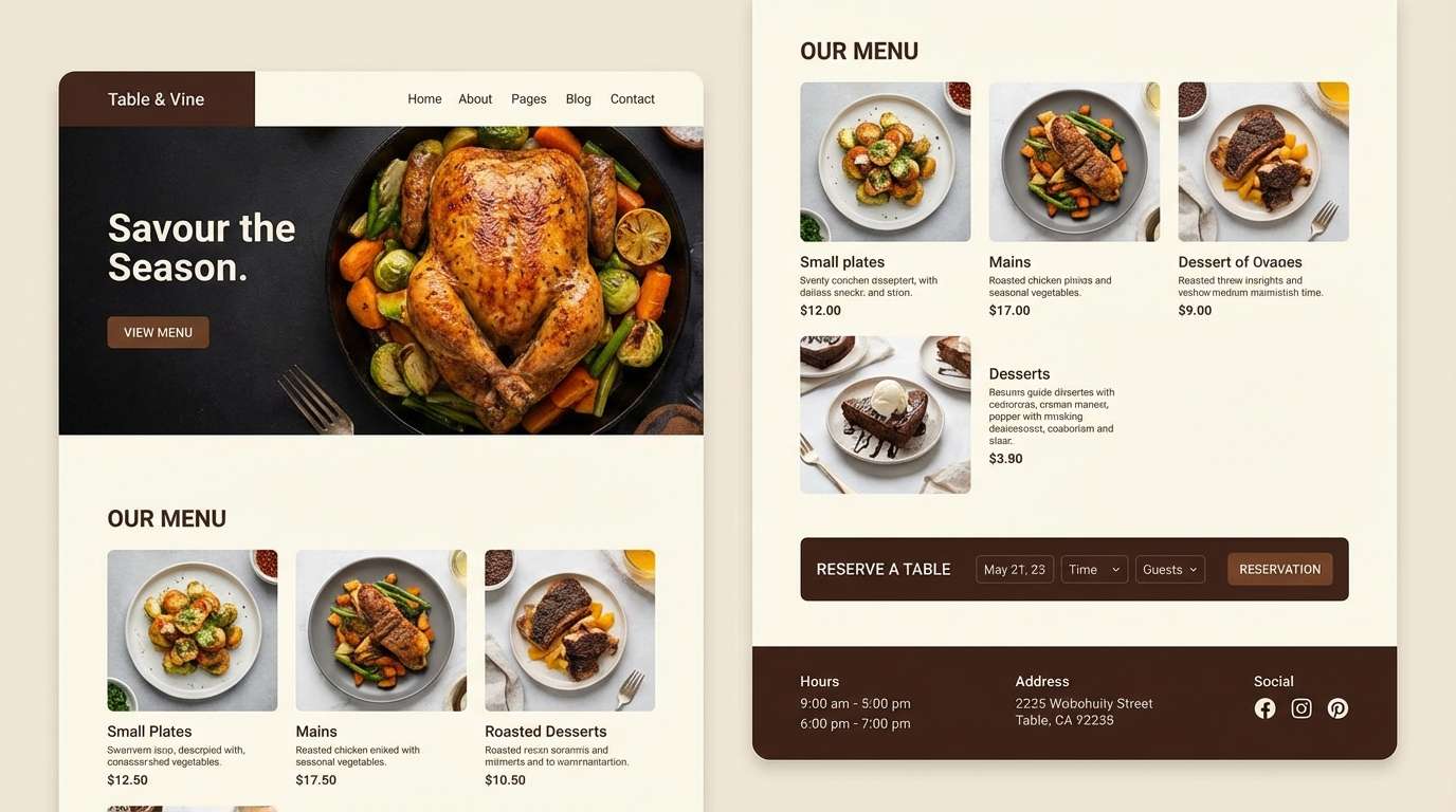
8) Cocoa Dust
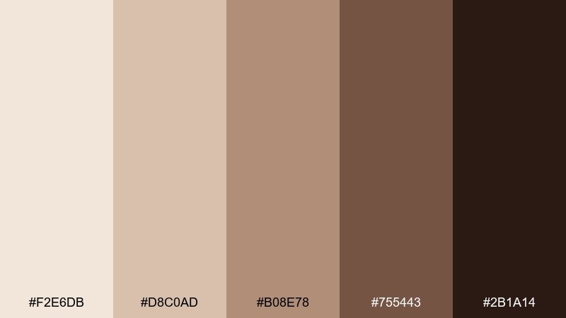
HEX: #F2E6DB #D8C0AD #B08E78 #755443 #2B1A14
Mood: moody, intimate, sophisticated
Best for: restaurant website UI
Cocoa dust tones feel intimate and upscale, like candlelight against dark wood. Use #F2E6DB for content cards and let #2B1A14 drive navigation and hero text for a refined contrast. The mid browns make great hover states and subtle separators. Tip: keep photography warm and low-saturation so the interface feels cohesive.
Image example of cocoa dust generated using media.io
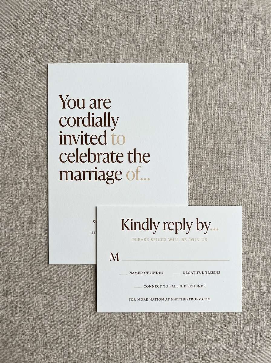
9) Chai Cream
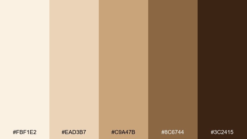
HEX: #FBF1E2 #EAD3B7 #C9A47B #8C6744 #3C2415
Mood: spiced, sunny, cozy
Best for: fall invitation suites
Spiced chai warmth brings to mind cinnamon steam and golden late-afternoon light. Use #FBF1E2 as the paper tone and #8C6744 for elegant serif headings and monograms. The darker brown is ideal for RSVP details to keep the suite readable. Tip: add a thin border in #C9A47B to give the cards a finished, classic edge.
Image example of chai cream generated using media.io
10) Maple Macchiato
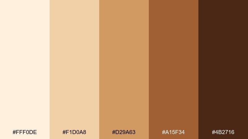
HEX: #FFF0DE #F1D0A8 #D29A63 #A15F34 #4B2716
Mood: bright, optimistic, appetizing
Best for: seasonal drink promo posters
Maple sweetness feels energetic and craveable, like a limited-time drink reveal. Keep the background creamy and let the maple brown take center stage for the product name and pricing. Use the dark cocoa shade for fine print so it stays legible from a distance. Tip: limit gradients to one area so the poster still looks clean and modern.
Image example of maple macchiato generated using media.io

11) Cafe Au Lait
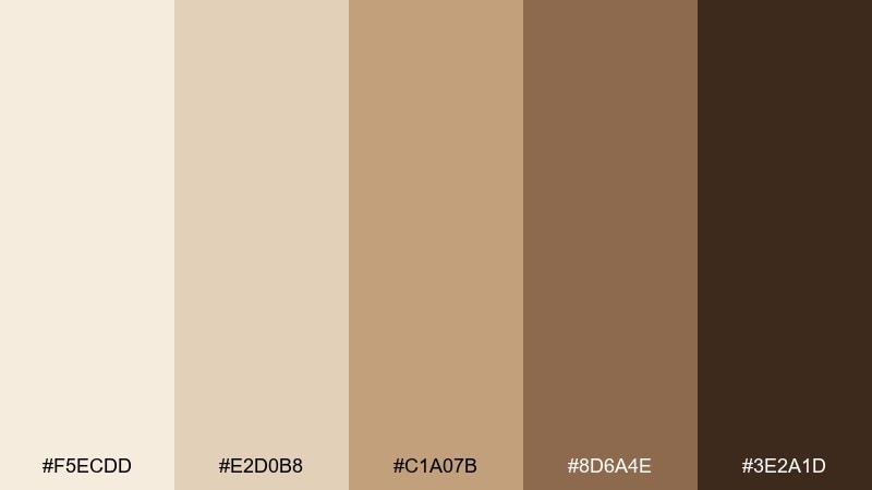
HEX: #F5ECDD #E2D0B8 #C1A07B #8D6A4E #3E2A1D
Mood: balanced, classic, versatile
Best for: neutral home decor styling
Cafe au lait neutrals feel effortlessly classic, like linen curtains and worn leather. Use the lightest tones across walls and large furniture, then layer #8D6A4E in wood, baskets, or throw pillows. The deep brown makes a great grounding accent for frames and lamps. Tip: repeat one mid-tone (#C1A07B) in three places to create a cohesive room story.
Image example of cafe au lait generated using media.io
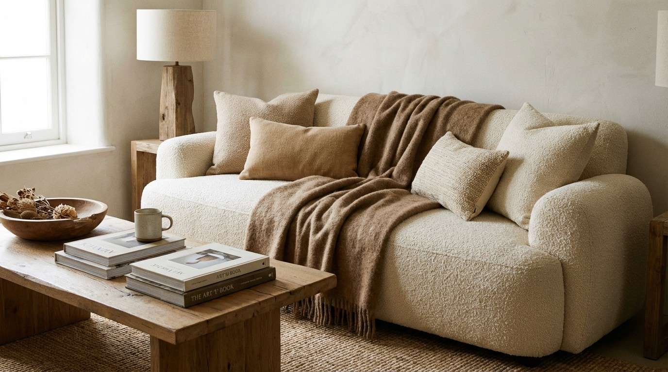
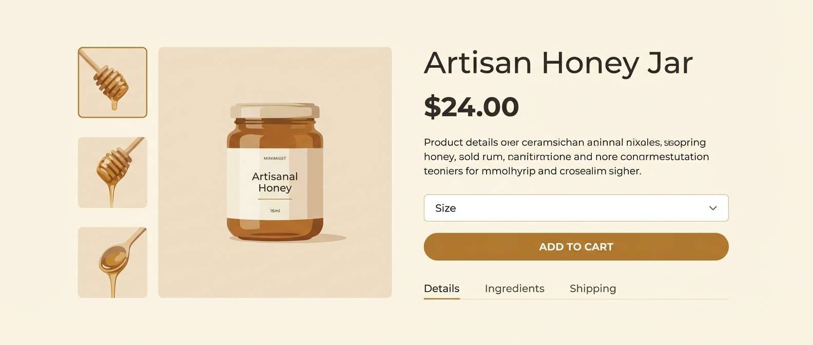
12) Honey Roast
HEX: #FFF1E1 #F1D5B2 #D9AE7A #9D6C3E #402412
Mood: golden, friendly, energetic
Best for: ecommerce product page UI
Honey roast golds feel bright and friendly, like warm light hitting a fresh roast. These coffee cream color combinations are great for ecommerce pages where you want soft warmth without losing clarity. Use #FFF1E1 for page backgrounds, #402412 for text, and #9D6C3E for primary buttons. Tip: keep button states within one shade step to avoid a noisy UI.
Image example of honey roast generated using media.io
13) Sage Latte
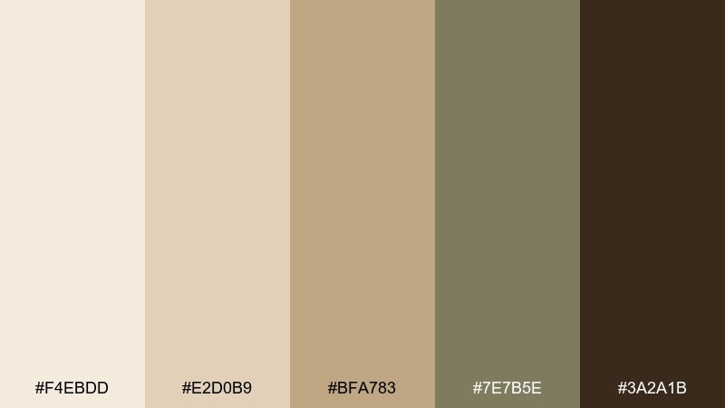
HEX: #F4EBDD #E2D0B9 #BFA783 #7E7B5E #3A2A1B
Mood: calm, organic, balanced
Best for: botanical packaging design
Creamy neutrals with a sage twist feel fresh and botanical, like dried herbs on a cafe shelf. Pair the muted green (#7E7B5E) with cream backgrounds for labels that look clean and natural. The deep brown keeps ingredient lists and small text readable. Tip: use the green only for icons or borders so it stays subtle and refined.
Image example of sage latte generated using media.io
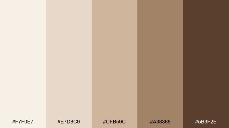
14) Cinnamon Cream
HEX: #FCEFE0 #E9CBB1 #C9966F #8D5639 #3B1F13
Mood: spicy, cozy, nostalgic
Best for: holiday social media templates
Cinnamon warmth feels nostalgic, like handwritten recipes and cozy evenings. Use the pale cream for post backgrounds and save the cinnamon brown for headlines, stickers, and highlight shapes. The darkest shade is ideal for body copy and small UI-like elements in carousels. Tip: keep photos warm and lightly desaturated so the palette stays consistent.
Image example of cinnamon cream generated using media.io

15) Nougat Beige
HEX: #F7F0E7 #E7D8C9 #CFB59C #A38368 #5B3F2E
Mood: soft, airy, understated
Best for: wedding website UI
Nougat beige feels airy and romantic, like silk ribbon and warm paper stock. Use #F7F0E7 for generous whitespace, then build sections with #E7D8C9 panels and #A38368 buttons. The deep brown adds contrast for navigation and footer text without turning harsh. Tip: choose one elegant serif and keep other typography minimal for a timeless look.
Image example of nougat beige generated using media.io
16) Mocha Stone
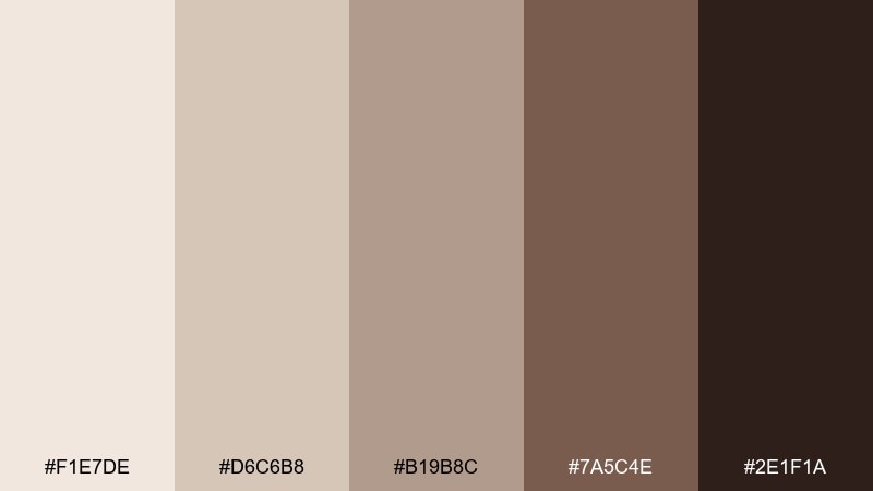
HEX: #F1E7DE #D6C6B8 #B19B8C #7A5C4E #2E1F1A
Mood: earthy, mature, architectural
Best for: modern interior moodboards
Mocha stone tones feel architectural, like polished concrete warmed by timber. Use #D6C6B8 and #B19B8C to create layered neutrals in tiles, rugs, and upholstery. Reserve the deep brown for metal finishes, shelving, or a single statement piece. Tip: add texture through stone, linen, and matte ceramics to avoid a flat look.
Image example of mocha stone generated using media.io
17) Creamy Walnut
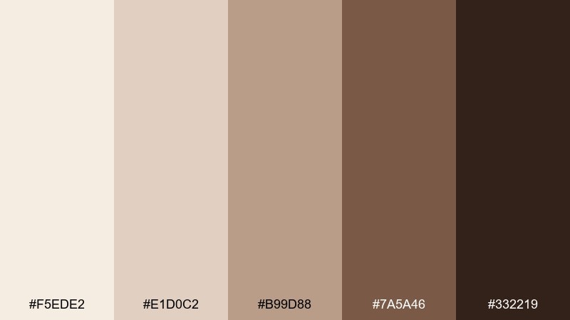
HEX: #F5EDE2 #E1D0C2 #B99D88 #7A5A46 #332219
Mood: rich, classic, dependable
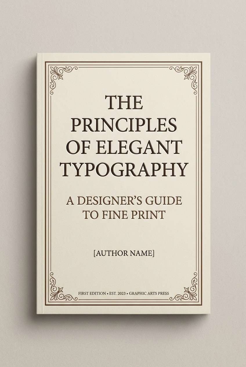
Best for: book covers and stationery
Creamy walnut reads classic and dependable, like a well-loved notebook and a strong pour-over. Set titles in #332219 for a grounded, literary feel, and use #F5EDE2 as the cover field to keep it airy. The mid browns create tasteful bands, borders, or small illustrations. Tip: foil or embossing pairs beautifully with these warm browns.
Image example of creamy walnut generated using media.io
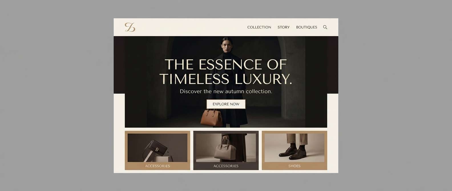
18) Cafe Noir Cream
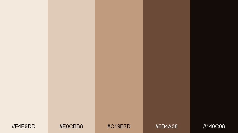
HEX: #F4E9DD #E0CBB8 #C19B7D #6B4A38 #140C08
Mood: dramatic, chic, high-contrast
Best for: luxury brand landing pages
Deep cafe noir against creamy highlights feels dramatic and fashion-forward, like glossy espresso in a dark cup. This coffee cream color palette excels on landing pages where you want bold contrast and a premium edge. Use #140C08 for hero sections and #F4E9DD for typography blocks and cards to keep the layout readable. Tip: limit accents to #C19B7D for links or small badges so the design stays sleek.
Image example of cafe noir cream generated using media.io
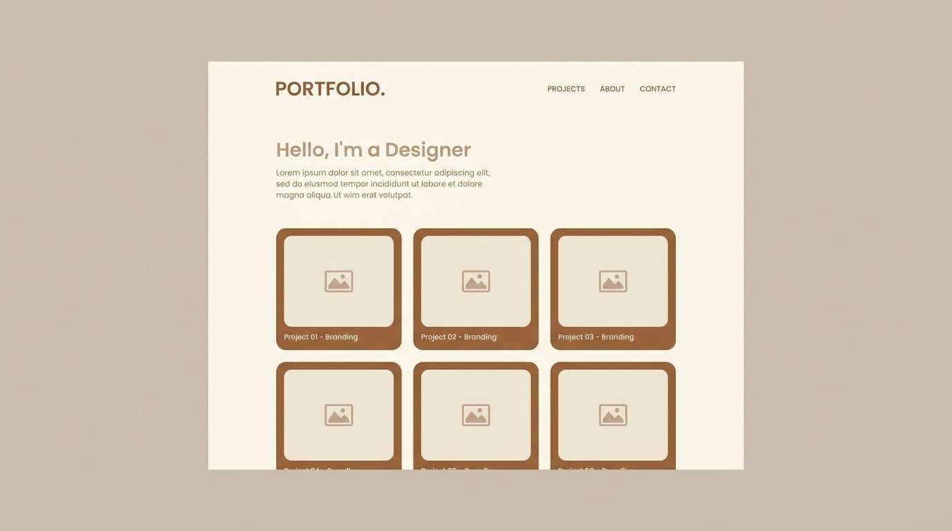
19) Almond Cortado
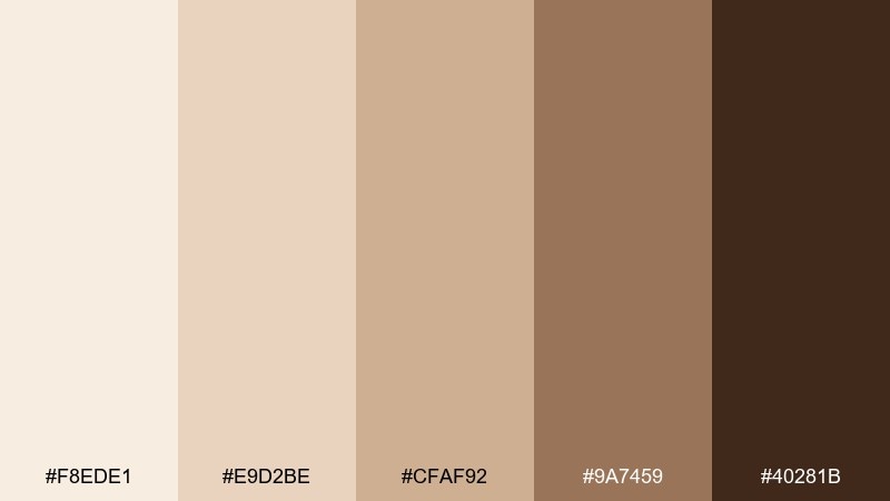
HEX: #F8EDE1 #E9D2BE #CFAF92 #9A7459 #40281B
Mood: smooth, friendly, polished
Best for: portfolio website UI
Almond cortado tones feel smooth and polished, like a tidy desk and warm lamp light. Use #F8EDE1 for the page canvas and #40281B for navigation and headings to keep contrast crisp. The mid tones are great for cards, tags, and subtle section backgrounds. Tip: choose one accent shade (#9A7459) for active states so the UI feels consistent.
Image example of almond cortado generated using media.io
20) Bronze Cream
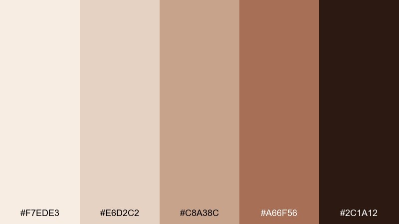
HEX: #F7EDE3 #E6D2C2 #C8A38C #A66F56 #2C1A12
Mood: elegant, warm, elevated
Best for: beauty product ads
Bronze warmth feels elegant and elevated, like soft shimmer on skin and satin fabric. These coffee cream color combinations work well for beauty ads where you want warmth without loud color. Use #F7EDE3 as the backdrop, #A66F56 for the product focus, and #2C1A12 for clean typography. Tip: keep highlights subtle and avoid glossy whites so the bronze stays believable.
Image example of bronze cream generated using media.io
21) Brown Sugar Cream
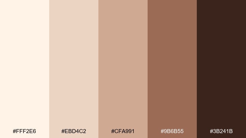
HEX: #FFF2E6 #EBD4C2 #CFA991 #9B6B55 #3B241B
Mood: sweet, cozy, approachable
Best for: bakery logo and stamp set
Brown sugar softness feels approachable, like a fresh loaf and a warm greeting at the counter. Use this coffee cream color palette for logos, stamps, and simple icons where legibility matters. Keep #FFF2E6 as the base and use #3B241B for the mark so it prints cleanly on paper bags and boxes. Tip: test the mid-tone #CFA991 on kraft paper to make sure it still shows up.
Image example of brown sugar cream generated using media.io

22) Cocoa Caramel Mix
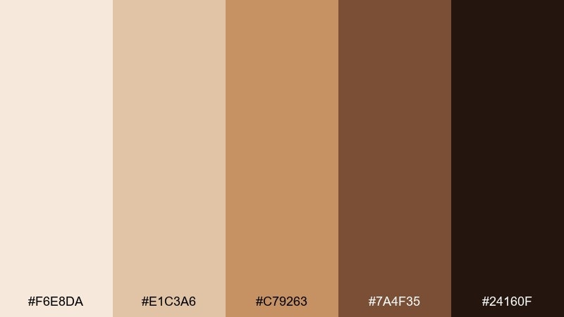
HEX: #F6E8DA #E1C3A6 #C79263 #7A4F35 #24160F
Mood: bold, tasty, contemporary
Best for: food truck wrap design
Cocoa and caramel together feel bold and tasty, like a toasted dessert with a dark drizzle. This coffee cream color combination is ideal for big, readable graphics on a truck wrap where contrast matters at speed. Use #F6E8DA for large background areas, then set the main brand name in #24160F for punch. Tip: keep secondary text in #7A4F35 so it stays warm but still legible.
Image example of cocoa caramel mix generated using media.io

What Colors Go Well with Coffee Cream?
Coffee cream pairs naturally with deeper coffee-inspired tones like mocha, cocoa, and espresso because they create comfortable, readable contrast. This is the easiest route for premium branding, menus, and typography-forward layouts.
For a fresher look, add muted greens (sage, olive, eucalyptus) or dusty blues; they cool the warmth slightly while keeping the palette calm. If you want something trendier, a small amount of terracotta, copper, or bronze can add a modern “glow.”
When in doubt, treat coffee cream as your background and choose one dark anchor (for text and structure) plus one mid-tone accent (for buttons, highlights, or borders) to keep the system consistent.
How to Use a Coffee Cream Color Palette in Real Designs
In UI, start with coffee cream as the canvas, then reserve the darkest brown for text and navigation so accessibility stays strong. Use mid browns for cards, dividers, and hover states to avoid stark contrast jumps.
In packaging and print, coffee cream reads like premium paper stock and helps products feel handcrafted. Pair it with one rich espresso shade for logos and ingredient lists, and repeat a caramel or tan accent for stamps, seals, or callouts.
In interiors, coffee cream works best as a wall or large-surface neutral, with walnut/espresso accents to ground the room. Layer textures (linen, wood grain, matte ceramics) so the neutral palette still feels dimensional.
Create Coffee Cream Palette Visuals with AI
If you want to preview how a coffee cream color palette looks on a poster, label, UI screen, or moodboard, generating quick mock visuals can save hours. You can iterate on lighting, materials, and typography style while keeping the same warm-neutral direction.
Try writing prompts that mention “cream background,” “espresso typography,” and the design format you need (menu, landing page, label, invitation). Then refine the vibe with terms like “matte,” “soft shadows,” “premium,” or “minimal.”
Create consistent brand-ready visuals faster by testing multiple palette moods in one session.
Coffee Cream Color Palette FAQs
-
What is a coffee cream color?
Coffee cream is a warm, light beige inspired by latte foam and light creamers. It’s typically an off-white with yellow/brown undertones that feels softer than pure white. -
Is coffee cream a good background color for UI?
Yes—coffee cream works well as a UI background because it reduces glare and adds warmth. Use a deep espresso/brown for text to keep contrast and readability strong. -
What accent colors pair best with coffee cream?
Top accents include espresso brown, caramel/tan, bronze/copper, muted sage green, and dusty blue. Pick one primary accent and keep the rest neutral to avoid a muddy look. -
How do I keep a coffee cream palette from looking flat?
Use a clear value range: very light cream for backgrounds, a mid tan for panels, and a dark brown for anchors (type/nav). Add texture (paper grain, linen, wood, matte finishes) rather than adding extra colors. -
What’s the best coffee cream palette for luxury branding?
High-contrast sets like Cafe Noir Cream or Espresso Cream feel most luxurious because they combine creamy highlights with near-black espresso anchors and controlled tan accents. -
Can coffee cream work for print packaging on kraft paper?
It can, but test mid tones: light creams may disappear on kraft stock. Use the darkest brown for logos/text, and ensure your “cream” elements are either inked outlines or left as paper where appropriate. -
How can I generate coffee cream palette mockups quickly?
Use an AI text-to-image tool to create posters, labels, and UI mockups from prompts that specify “warm cream background” plus “espresso typography” and your format (menu, landing page, invitation). Iterate by adjusting lighting and materials.
Next: Dark Coral Color Palette


