A library color palette blends warm neutrals, aged paper creams, and ink-dark accents to create designs that feel intelligent, calm, and timeless.
Whether you’re building a bookish brand identity, an editorial layout, or a quiet UI, these library color combinations help typography and content feel instantly “collected” and premium.
In this article
- Why Library Palettes Work So Well
-
- stacked oak
- parchment whisper
- midnight catalog
- brass bookmark
- velvet reading chair
- ink and linen
- autumn stacks
- scholarly sage
- mahogany study
- dusty globe
- poets burgundy
- cardigan gray
- lampglow amber
- quiet archives
- marble steps
- tea and paper
- campus courtyard
- leather bound
- typewriter ribbon
- sunlit atrium
- What Colors Go Well with Library?
- How to Use a Library Color Palette in Real Designs
- Create Library Palette Visuals with AI
Why Library Palettes Work So Well
Library palettes feel “designed” without feeling trendy. They borrow from real materials—oak shelves, parchment paper, leather bindings, and ink—so the colors read as believable and grounded.
They’re also typography-friendly. Most sets combine a strong dark for text and structure with soft creams for backgrounds, giving you dependable contrast for covers, posters, and calm UI layouts.
Finally, these tones are emotionally specific: quiet, studious, and comforting. That’s why a library color scheme works for academia-inspired branding, editorial design, and any product that needs trust and timelessness.
20+ Library Color Palette Ideas (with HEX Codes)
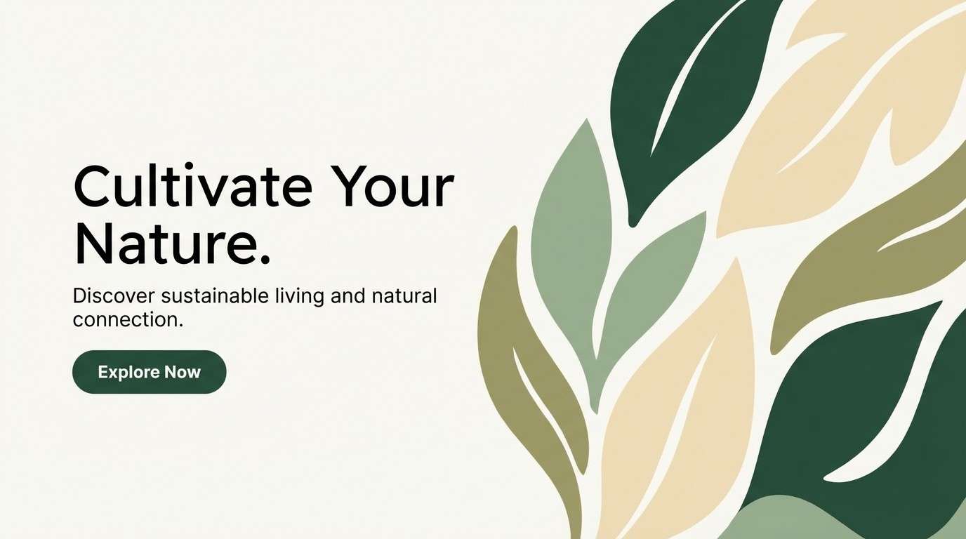
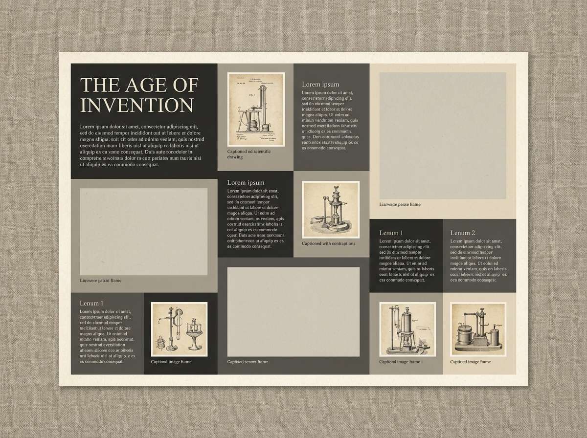
1) Stacked Oak
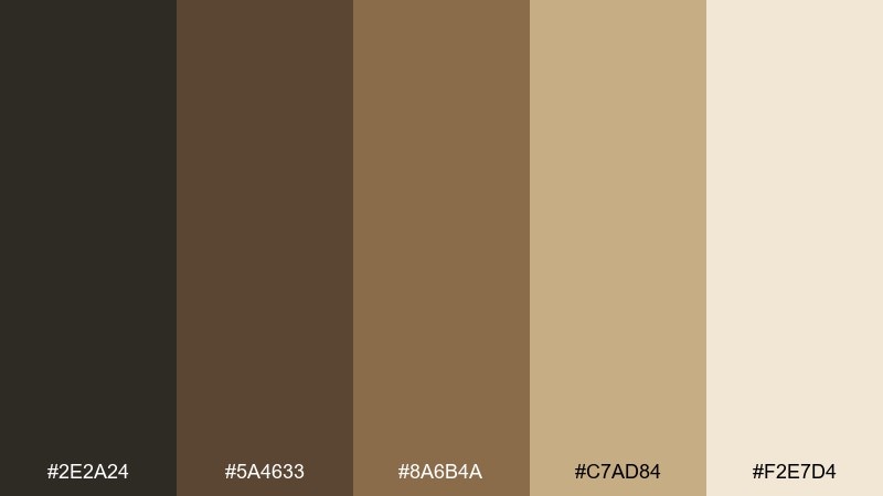
HEX: #2e2a24 #5a4633 #8a6b4a #c7ad84 #f2e7d4
Mood: grounded, cozy, classic
Best for: book cover design
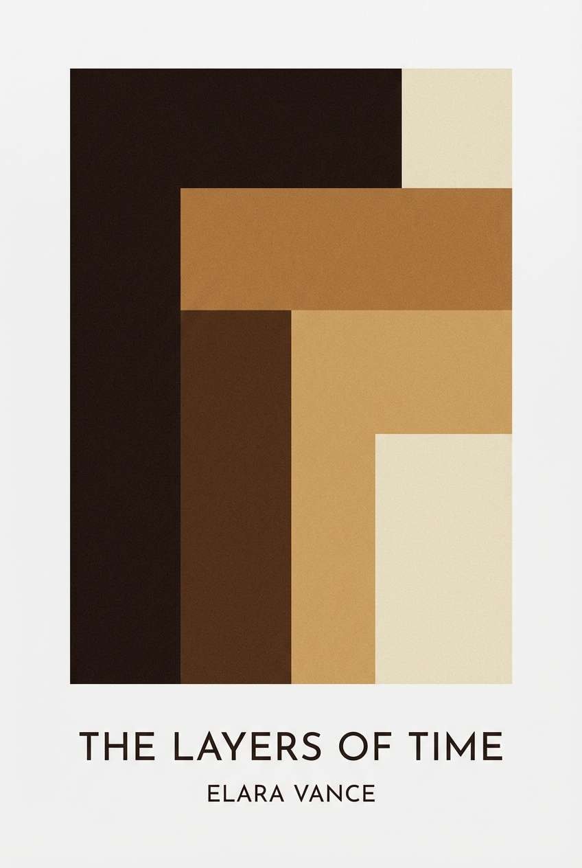
Grounded and cozy like oak shelves warmed by late-afternoon light. These tones read instantly classic, with enough contrast for crisp typography on covers. Pair the dark brown with parchment as your main text-and-background duo, then use the honey tan for small highlights. Usage tip: keep the lightest cream dominant so the design feels inviting, not heavy.
Image example of stacked oak generated using media.io
Media.io is an online AI studio for creating and editing video, image, and audio in your browser.

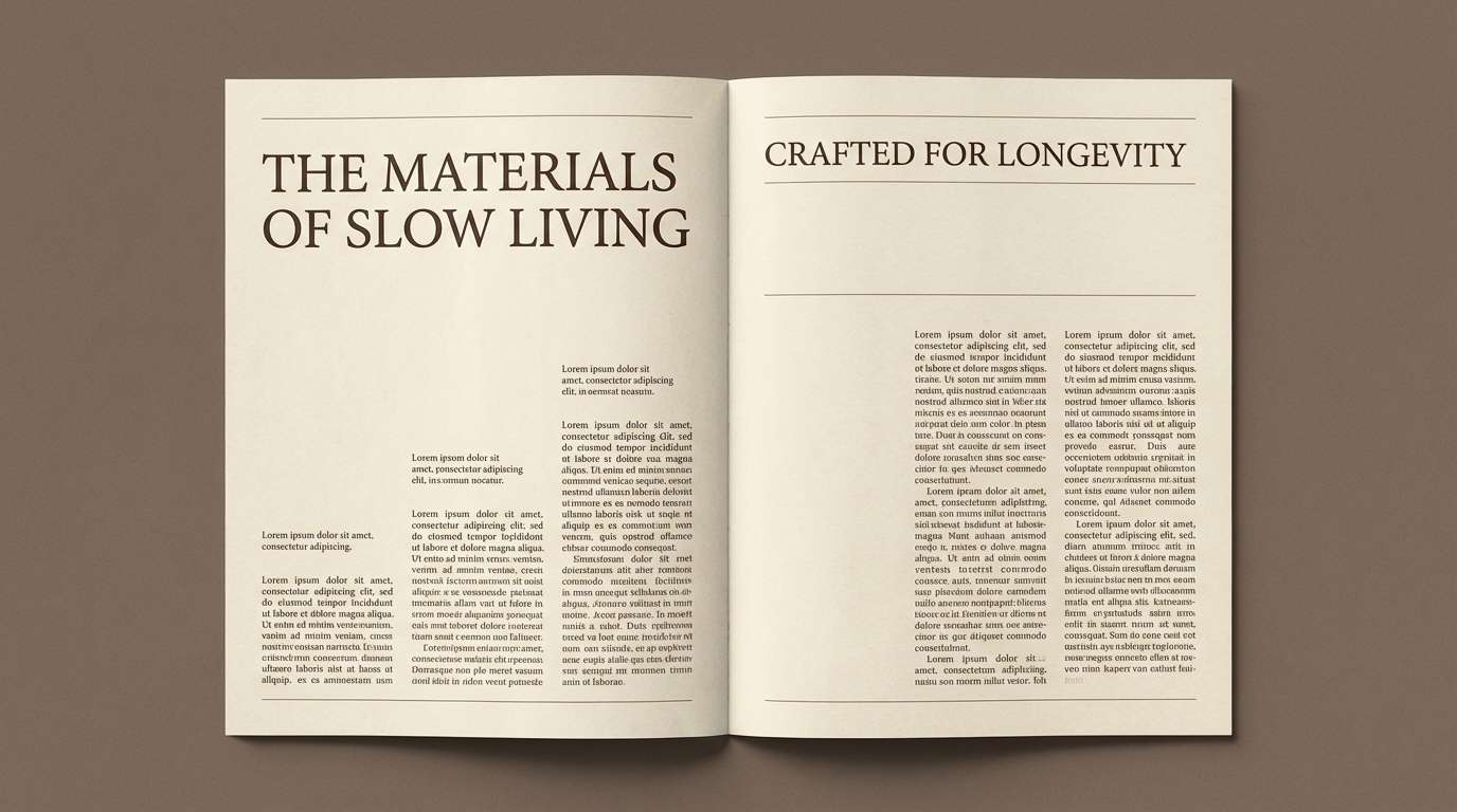
2) Parchment Whisper
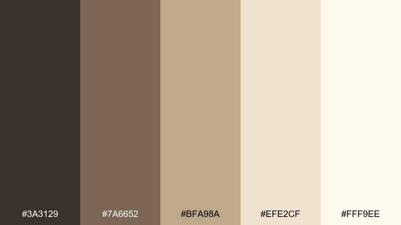
HEX: #3a3129 #7a6652 #bfa98a #efe2cf #fff9ee
Mood: soft, airy, nostalgic
Best for: editorial magazine layout
Soft and airy, like turned pages and quiet margins. The warm neutrals keep long-form layouts readable while the cocoa brown anchors headlines and captions. Pair the two lightest creams for generous whitespace and let the mid-tan handle rules, pull quotes, and section dividers. Usage tip: choose one dark tone for text and stick to it for a more premium, consistent rhythm.
Image example of parchment whisper generated using media.io
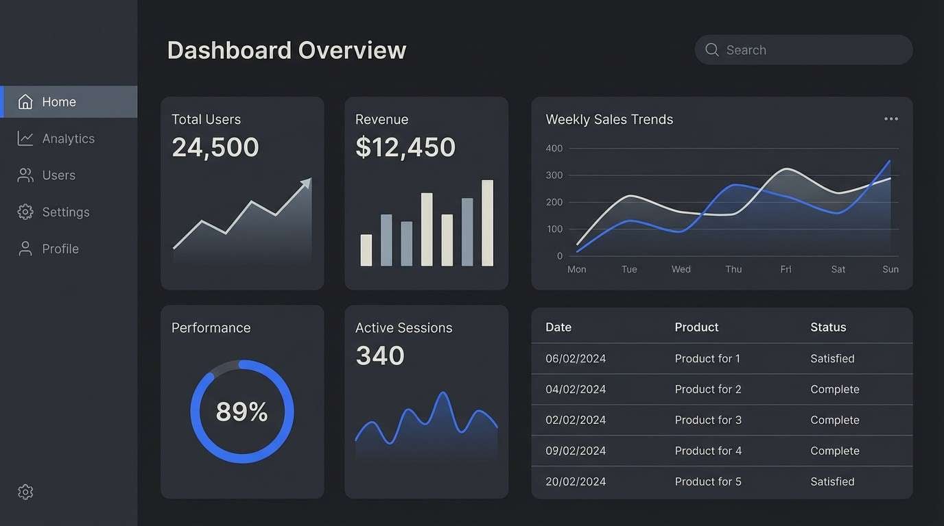
3) Midnight Catalog
HEX: #111214 #2b2f35 #565c63 #c7c9c8 #f6f5f1
Mood: sleek, quiet, modern
Best for: 2D UI dashboard mockup
Sleek and quiet, like a midnight catalog search in a dim room. The near-black and graphite create strong hierarchy for navigation, while soft gray keeps cards and dividers subtle. Pair the off-white with charcoal for accessible contrast, then reserve the mid-gray for secondary labels. Usage tip: add breathing room around dark panels so the interface feels calm instead of cramped.
Image example of midnight catalog generated using media.io
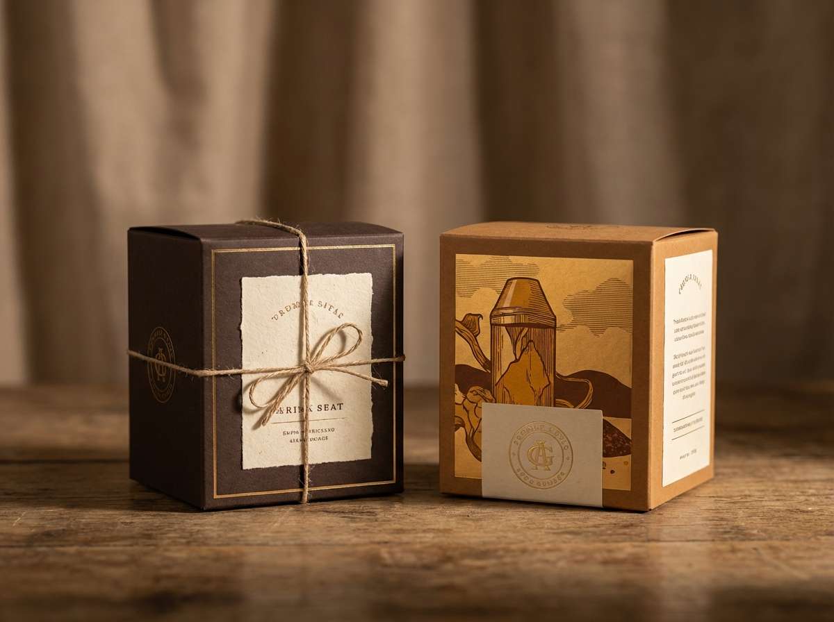
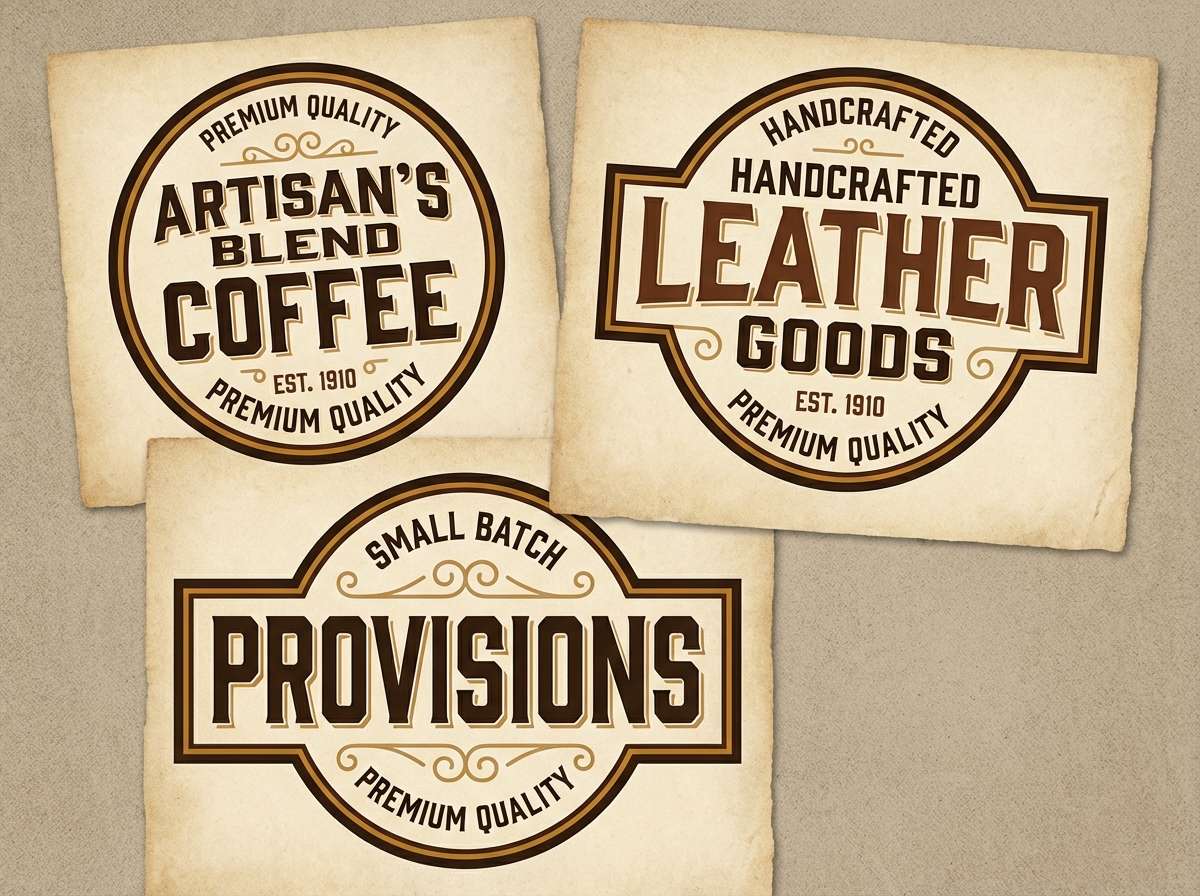
4) Brass Bookmark
HEX: #2a2320 #6b4b2a #b27a2a #e0c078 #fff3da
Mood: warm, polished, vintage-luxe
Best for: product packaging design
Warm and polished, like a brass bookmark catching a beam of light. The caramel-to-gold range adds an upscale feel without shouting, especially against the creamy base. Pair deep espresso with muted gold for logos, seals, and borders, and keep the brightest highlight for small foil-like accents. Usage tip: limit the most saturated amber to under 10% so it stays elegant.
Image example of brass bookmark generated using media.io
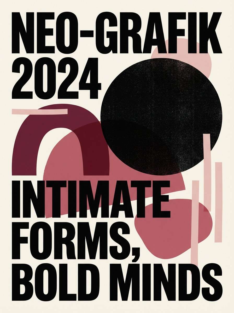
5) Velvet Reading Chair
HEX: #1f1b1c #4a2b36 #7b3f4c #c58d8d #f4e7e6
Mood: moody, romantic, intimate
Best for: event poster design
Moody and romantic, like a velvet chair tucked into a quiet corner. The burgundy family brings drama while the blush and pale rose keep it approachable for public-facing designs. Pair the near-black with blush for high-contrast headings, then use the mid-rose for background shapes and gradients. Usage tip: avoid tiny burgundy text on dark backgrounds; switch to the pale rose for legibility.
Image example of velvet reading chair generated using media.io
6) Ink and Linen
HEX: #151515 #3f3b35 #8b847b #d8d1c6 #fbf7f0
Mood: minimal, calm, refined
Best for: brand identity system
Minimal and refined, like black ink on fresh linen. The contrast is strong enough for logos and lettermarks, while the warm grays prevent the set from feeling cold. Pair the deepest black with the softest off-white for primary marks, and let the taupe handle secondary text and packaging patterns. Usage tip: test your grays in print, since paper warmth can shift them more than expected.
Image example of ink and linen generated using media.io
7) Autumn Stacks
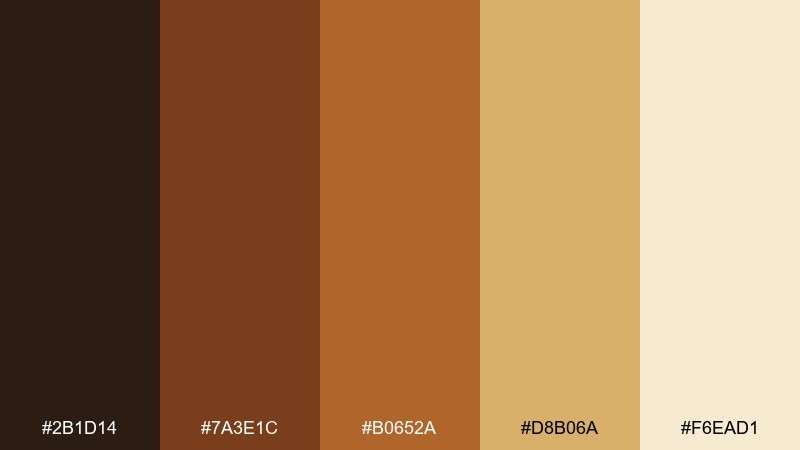
HEX: #2b1d14 #7a3e1c #b0652a #d8b06a #f6ead1
Mood: rustic, energetic, seasonal
Best for: flyer design
Rustic and energetic, like fall light across a stack of well-loved spines. The rusty browns bring instant warmth, while the wheat and cream keep layouts bright and friendly. Pair the dark cocoa with wheat for bold titles, and use the orange-brown as a callout color for dates and location. Usage tip: add thin cream margins around warm blocks to stop the page from feeling too dense.
Image example of autumn stacks generated using media.io
8) Scholarly Sage
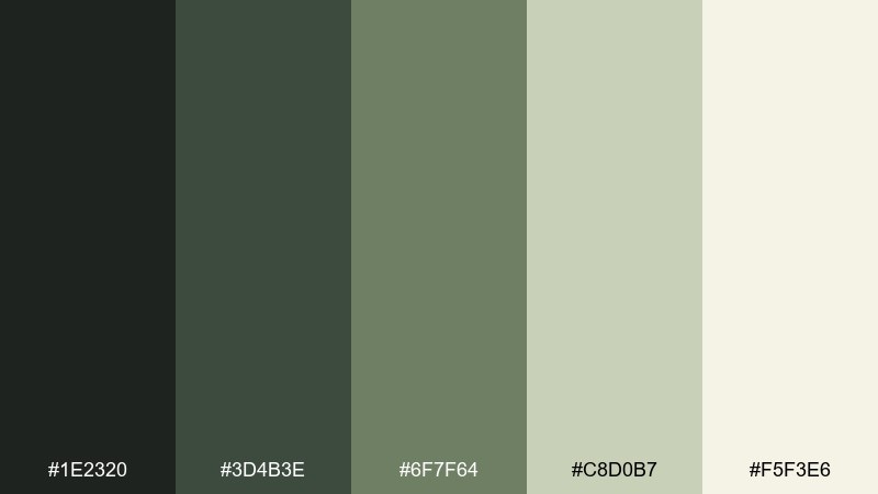
HEX: #1e2320 #3d4b3e #6f7f64 #c8d0b7 #f5f3e6
Mood: studious, natural, balanced
Best for: website hero section
Studious and natural, like sage leaves pressed in an old notebook. The greens feel grounded and restorative, especially when supported by soft cream and muted olive. Pair the deep forest with cream for hero headlines, and use the pale green for buttons or highlights that still feel understated. Usage tip: keep body text on the cream rather than the pale green for clearer readability.
Image example of scholarly sage generated using media.io
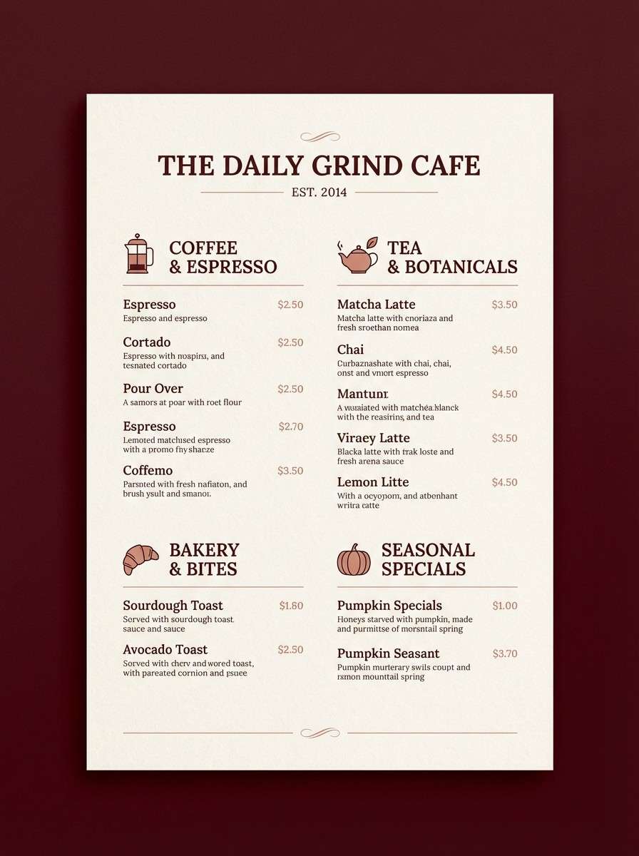
9) Mahogany Study
HEX: #201412 #4c1f1a #7b3a2d #b38b7a #efe4dc
Mood: rich, intimate, traditional
Best for: coffee shop menu design
Rich and intimate, like mahogany panels and soft lamplight. The deep reds and browns feel luxurious, while the dusty rose-tan keeps menus approachable and easy to scan. Pair the darkest tone with the pale blush for section headers and pricing, then use the mid-mahogany for dividers and icons. Usage tip: choose matte paper so the darker shades stay readable under overhead lighting.
Image example of mahogany study generated using media.io
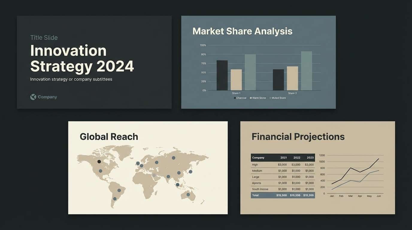
10) Dusty Globe
HEX: #2a2c2f #4c5861 #7b8b8b #c6c2b4 #f3efe6
Mood: wanderlust, quiet, academic
Best for: presentation slide deck
Wanderlust and quiet, like a dusty globe in a reading room. The blue-grays bring a cooler scholarly edge, balanced by warm stone and soft ivory for comfort. Pair the slate with ivory for titles, then use the teal-gray for charts and key metrics that need to stand out without feeling loud. Usage tip: keep chart backgrounds ivory and use the midtones for data series to maintain clarity.
Image example of dusty globe generated using media.io
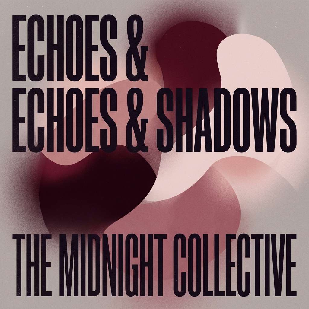
11) Poets Burgundy
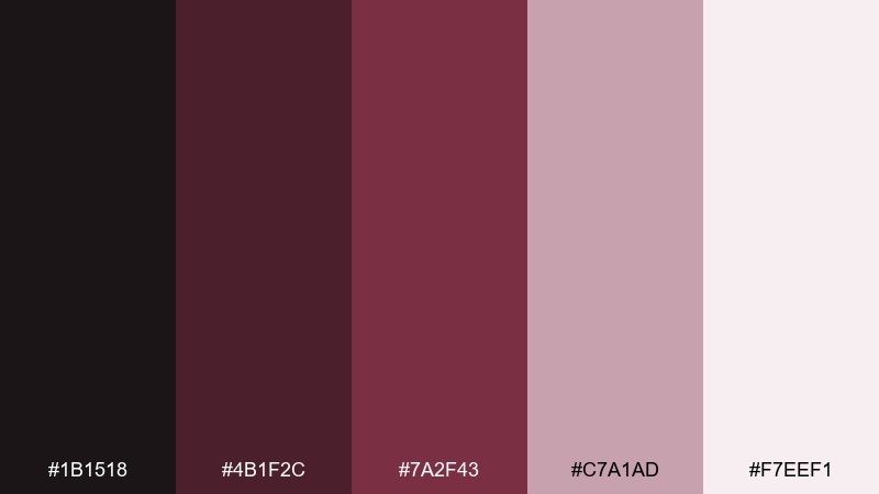
HEX: #1b1518 #4b1f2c #7a2f43 #c7a1ad #f7eef1
Mood: dramatic, literary, elegant
Best for: album cover artwork
Dramatic and literary, like inked verses and a glass of red wine. The burgundy core creates instant emotion, while the pink-tinted neutrals soften the edges for a modern finish. Pair the darkest tone with the pale blush for the title, and use the mid-burgundy as a bold shape behind the artist name. Usage tip: add subtle grain to the light background so the cover feels tactile, not flat.
Image example of poets burgundy generated using media.io
12) Cardigan Gray
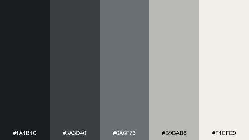
HEX: #1a1b1c #3a3d40 #6a6f73 #b9bab8 #f1efe9
Mood: quiet, dependable, modern-neutral
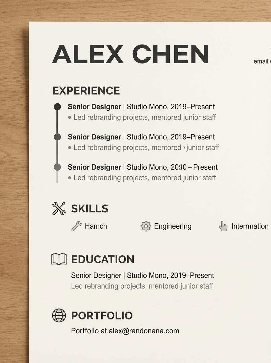
Best for: resume and CV template
Quiet and dependable, like a favorite cardigan on a rainy day. The grays create clean structure for typography and make scanning headings and timelines effortless. Pair near-black with the off-white for body text, and reserve the mid-gray for dates, labels, and secondary information. Usage tip: keep accent elements minimal so the template stays professional across industries.
Image example of cardigan gray generated using media.io
13) Lampglow Amber
HEX: #241a12 #5a3a1f #a66a2a #e3b867 #fff0cf
Mood: inviting, golden, warm-night
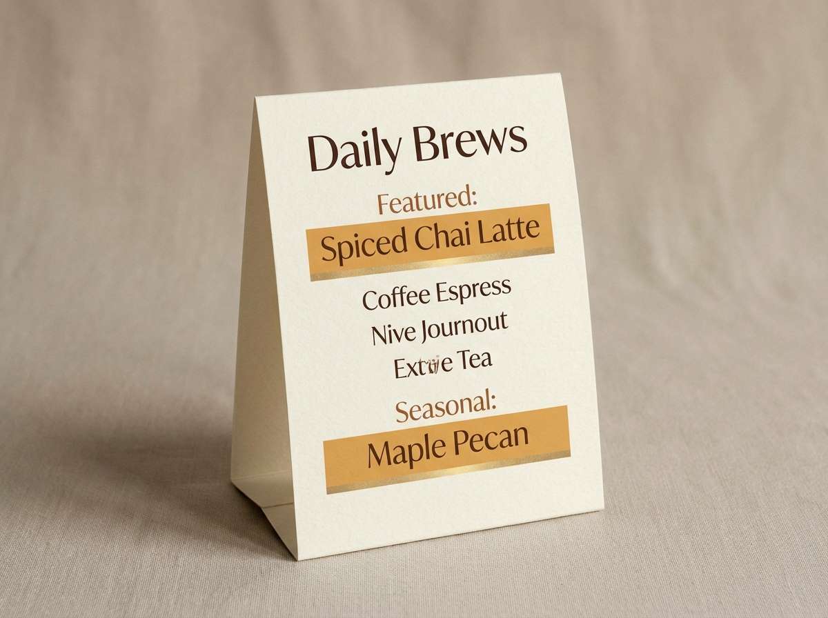
Best for: restaurant table tent card
Inviting and golden, like a desk lamp glowing over notes. The amber and brass notes feel friendly and appetizing, especially when anchored by a deep brown. Pair the cream background with dark brown text for readability, then use amber for featured items or special offers. Usage tip: keep gradients subtle so printed pieces do not band on textured stock.
Image example of lampglow amber generated using media.io
14) Quiet Archives
HEX: #20201e #4c463b #8a7f6a #d8ccb7 #faf4e6
Mood: timeless, calm, heritage
Best for: museum exhibit brochure
Timeless and calm, like quiet archives and labeled drawers. The warm grays and sand tones feel authentic, making information-heavy brochures feel more human. For a timeless library color palette, use the dark charcoal for headings, the creamy base for pages, and the sand tone for section tabs. Usage tip: keep photos slightly warm-toned so they blend naturally with the paper-like neutrals.
Image example of quiet archives generated using media.io
15) Marble Steps
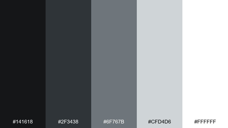
HEX: #141618 #2f3438 #6f767b #cfd4d6 #ffffff
Mood: crisp, architectural, contemporary
Best for: portfolio website UI
Crisp and architectural, like marble steps and sharp shadows. The cool grays create a modern frame that makes photography, case studies, and typography feel elevated. Pair white with near-black for primary content, and use the light gray for cards and image borders. Usage tip: keep one accent element per page, such as a single dark button, to maintain the gallery-like feel.
Image example of marble steps generated using media.io
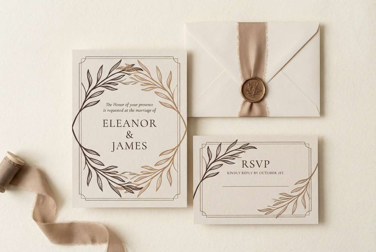
16) Tea and Paper
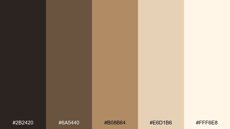
HEX: #2b2420 #6a5440 #b08b64 #e6d1b6 #fff6e8
Mood: comforting, handmade, gentle
Best for: wedding invitation suite
Comforting and handmade, like milky tea beside a fresh notebook. The soft browns and creams make invitations feel intimate without looking dated. Pair the darkest brown with the lightest cream for names and details, then use the caramel tan for small flourishes like lines, monograms, or envelope liners. Usage tip: print on uncoated stock to keep the palette warm and tactile.
Image example of tea and paper generated using media.io
17) Campus Courtyard
HEX: #1f2520 #3e4f3c #7b7a55 #cbbf8a #f6f1dc
Mood: earthy, outdoorsy, studious
Best for: campus event banner
Earthy and studious, like stone paths and trimmed hedges outside a lecture hall. The greens and muted olive feel grounded, while the sand and cream keep banners readable from a distance. These library color combinations work well when the darker green is used for large text and the sand tone becomes a supporting panel. Usage tip: avoid ultra-thin fonts; the mid-olive needs strong letterforms to stay crisp.
Image example of campus courtyard generated using media.io
18) Leather Bound
HEX: #1d130c #5b2c14 #8a4a22 #c89a66 #f3e2c6
Mood: heritage, bold, tactile
Best for: craft product label
Heritage and tactile, like a leather-bound volume with worn corners. The deep umber and saddle browns feel confident for labels, stamps, and badges. Pair the darkest umber with the pale tan for legible text, then bring in the golden brown as a border or emblem fill. Usage tip: add subtle emboss-style shadows to mimic pressed leather without overdoing detail.
Image example of leather bound generated using media.io
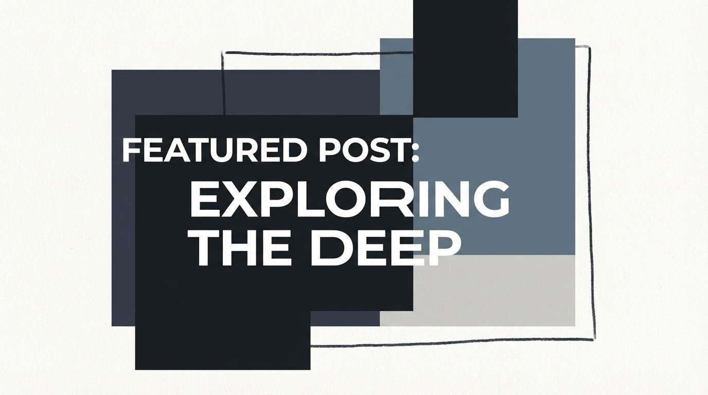
19) Typewriter Ribbon
HEX: #0f1114 #2a2f3a #515a6a #c9ccd3 #f7f7f6
Mood: sharp, editorial, slightly retro
Best for: blog header and featured image
Sharp and editorial, like a fresh ribbon in a typewriter. The cool navy-grays add depth that feels modern, while the pale grays keep the composition clean and publishable. Use the darkest tone for headlines and overlays, and let the lightest gray carry backgrounds so text stays crisp. Usage tip: when placing photos, desaturate them slightly so the navy-grays remain the visual anchor.
Image example of typewriter ribbon generated using media.io
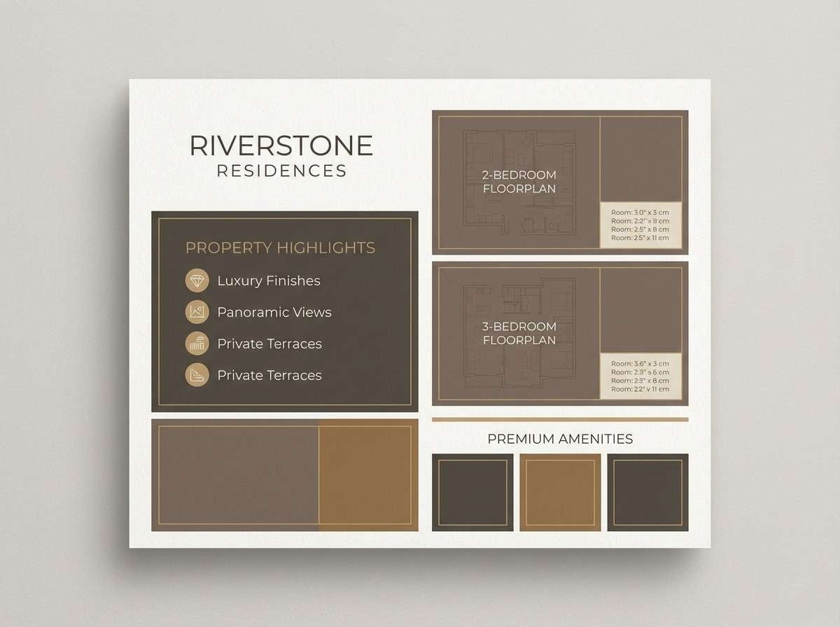
20) Sunlit Atrium
HEX: #2a2622 #6a5a45 #b39a73 #e9d8bf #fffaf0
Mood: bright, welcoming, modern-classic
Best for: real estate brochure
Bright and welcoming, like sunlight spilling across a quiet atrium. The warm taupes and soft creams give pages a premium, airy feel without losing structure. A library color combination like this shines when you keep the cream as the main field and use the darker brown only for headings and key figures. Usage tip: add thin linework in the mid-tan to guide the eye through floorplans and feature lists.
Image example of sunlit atrium generated using media.io
What Colors Go Well with Library?
Library tones pair best with warm neutrals (parchment, sand, linen) and strong dark anchors (espresso, charcoal, near-black). This balance gives you a classic text-and-background pairing that stays readable across print and UI.
To add depth, layer midtones like taupe, warm gray, or muted olive. These help create sections, borders, and subtle hierarchy without breaking the calm, bookish feel.
If you need a modern twist, introduce cooler slate or blue-gray accents for charts, navigation, or secondary labels—keeping saturation low so it still feels scholarly and refined.
How to Use a Library Color Palette in Real Designs
Start with a simple structure: one light base (cream), one dark ink (espresso/charcoal), and one midtone for dividers and UI components. This creates a dependable rhythm for editorial layouts, brochures, and long-form pages.
Use warmer browns and ambers for highlights only—think badges, buttons, small icons, or drop caps—so the design feels curated rather than heavy. For posters and covers, let the darkest tone carry big type and pair it with a generous light margin.
In UI, keep large surfaces light (or consistently dark in dark mode) and reserve accent colors for active states. Library color schemes shine when they’re restrained and content-first.
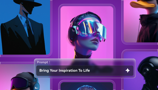
Create Library Palette Visuals with AI
If you want to see these library color palette ideas as covers, posters, UI screens, or branding boards, generating quick mockups helps you choose the right mood before committing to production.
With Media.io, you can turn a short prompt into on-style visuals, iterate faster, and keep your color direction consistent across multiple assets—especially useful for editorial systems and brand kits.
Pick a palette above, copy its prompt, and tweak the subject (book cover, brochure, UI, packaging) to match your project.
Library Color Palette FAQs
-
What is a library color palette?
A library color palette is a set of warm neutrals and ink-like dark tones inspired by books, paper, wood shelves, and quiet study spaces—typically creams, browns, charcoals, and muted greens or blue-grays. -
What is the best background color for a library color scheme?
Soft creams and parchment off-whites are the most flexible backgrounds because they keep layouts bright and readable while still feeling vintage and calm. -
What colors should I use for text in library-themed designs?
Use near-black, charcoal, or deep espresso for primary text. These shades give you strong contrast against cream backgrounds without the harshness of pure black in print. -
How do I make a library palette feel modern, not old-fashioned?
Keep saturation low, use clean typography, and add cool slate or graphite accents (like in a catalog UI). Modern layouts plus restrained neutrals create a contemporary library vibe. -
Are library palettes good for UI and dashboards?
Yes—library palettes work especially well for content-heavy UI. Choose a high-contrast pair for text and surfaces, then use mid-grays or muted greens for secondary labels and subtle components. -
What accent colors work with a library color palette?
Muted brass/amber, dusty rose, sage, and slate blue-gray are strong accent choices. Use them sparingly for buttons, badges, or callouts so the overall look stays calm. -
How can I generate library-themed visuals with consistent colors?
Use an AI image generator and include your palette direction in the prompt (e.g., “parchment cream, espresso brown, muted brass”). Then iterate on layout and subject while keeping the same color keywords.
