

Cosmic latte is a warm, creamy neutral family that sits between soft ivory and gentle beige—easy on the eyes and naturally premium.
Below are 20 modern cosmic latte color palette ideas (with HEX codes) you can use for branding, UI, interiors, and print—plus AI prompts to generate matching visuals fast.
In this article
- Why Cosmic Latte Palettes Work So Well
-
- milky nebula
- warm starglow
- lunar linen
- almond orbit
- cosmic cappuccino
- vanilla dust
- solar sandstone
- cream and sage drift
- apricot comet
- blush galaxy
- cocoa eclipse
- golden parchment
- porcelain night
- oat and ink
- coral ledger
- harbor driftwood
- pistachio cream
- terracotta aurora
- champagne graphite
- saffron cinema
- What Colors Go Well with Cosmic Latte?
- How to Use a Cosmic Latte Color Palette in Real Designs
- Create Cosmic Latte Palette Visuals with AI
Why Cosmic Latte Palettes Work So Well
Cosmic latte palettes are built around creamy off-whites and warm neutrals, so they feel clean without the sterile vibe of pure white. That makes them a reliable base for modern design systems and print layouts.
They also support readability: you can keep backgrounds light and introduce contrast with espresso browns, charcoal, or deep slate for text and UI states. The result is soft, premium, and still accessible.
Because cosmic latte sits in the “quiet neutral” zone, it pairs easily with accents—sage, terracotta, blush, saffron, or cool graphite—letting you set the mood without fighting the base color.
20+ Cosmic Latte Color Palette Ideas (with HEX Codes)
1) Milky Nebula
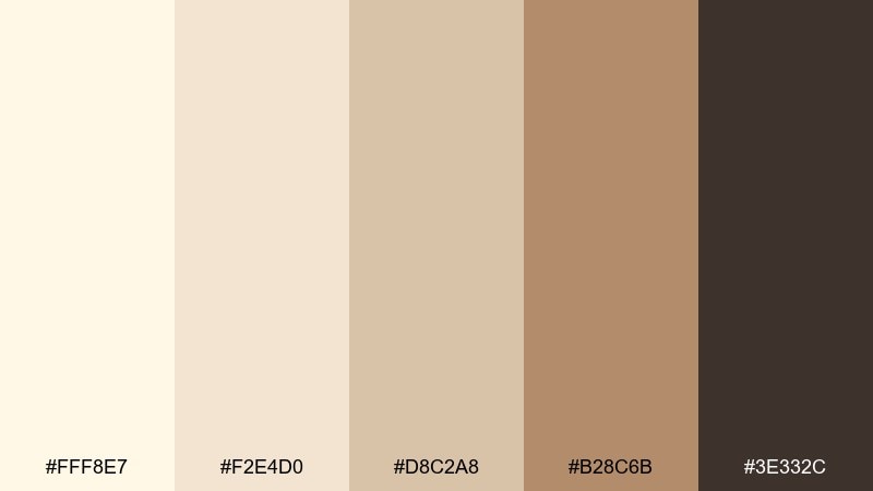
HEX: #FFF8E7 #F2E4D0 #D8C2A8 #B28C6B #3E332C
Mood: airy, creamy, calm
Best for: minimal website UI mockup
Airy cream tones with a toasted-brown edge feel like starlight filtered through linen. Use it for clean layouts where readability matters and you want warmth without looking yellow. Pair the mid tan with charcoal text and reserve the deeper brown for buttons or nav highlights. Tip: keep backgrounds in the two lightest shades and push contrast with the darkest swatch for accessibility.
Image example of milky nebula generated using media.io
Media.io is an online AI studio for creating and editing video, image, and audio in your browser.

2) Warm Starglow
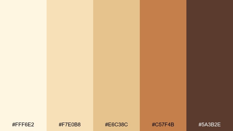
HEX: #FFF6E2 #F7E0B8 #E6C38C #C57F4B #5A3B2E
Mood: sunlit, cozy, inviting
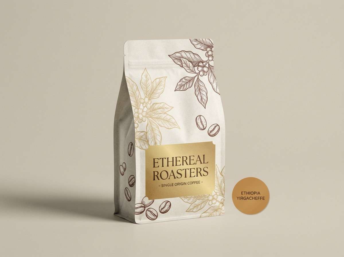
Best for: coffee brand packaging
Sunlit cream and roasted caramel create a cozy counter-top warmth. These cosmic latte color combinations work beautifully for labels where you need appetite appeal without loud primaries. Pair the caramel and cocoa shades with plenty of negative space and a simple badge logo. Tip: use the darkest brown for ingredient text so the lighter tones can stay soft and premium.
Image example of warm starglow generated using media.io
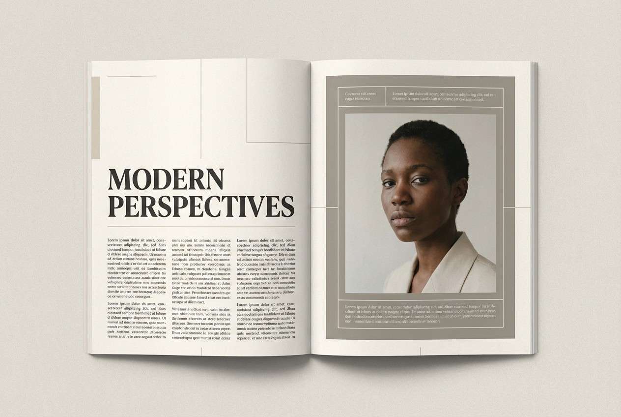
3) Lunar Linen
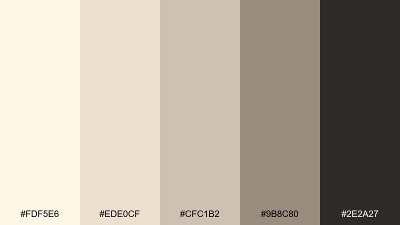
HEX: #FDF5E6 #EDE0CF #CFC1B2 #9B8C80 #2E2A27
Mood: quiet, refined, editorial
Best for: magazine feature layout
Quiet linen neutrals and soft taupe shadows feel polished and slow. The range supports long-form reading, captions, and pull quotes without eye fatigue. Pair it with a serif headline and subtle hairline rules in the mid gray-taupe. Tip: keep photo frames in the lightest cream to avoid harsh boxes on the page.
Image example of lunar linen generated using media.io
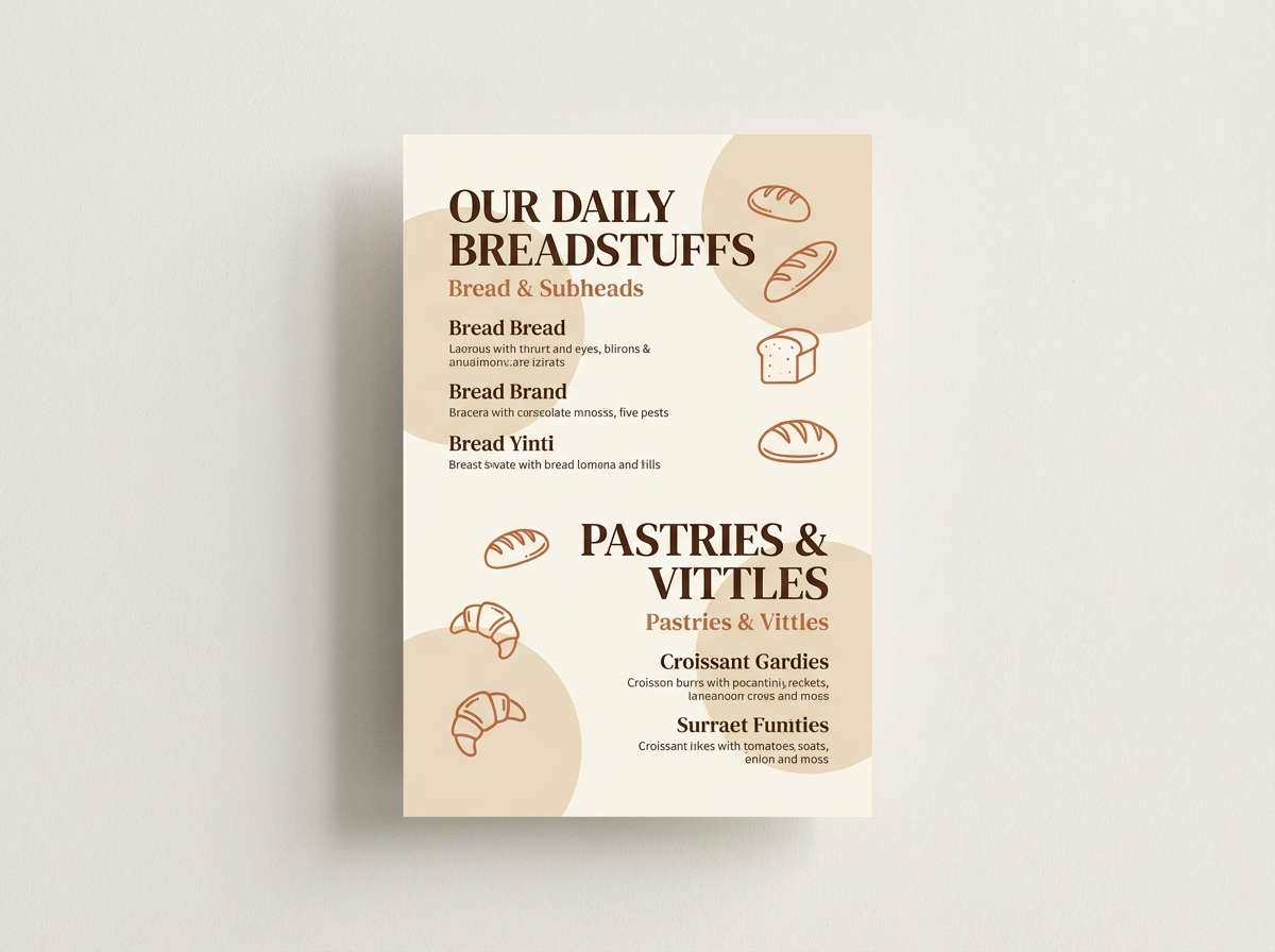
4) Almond Orbit
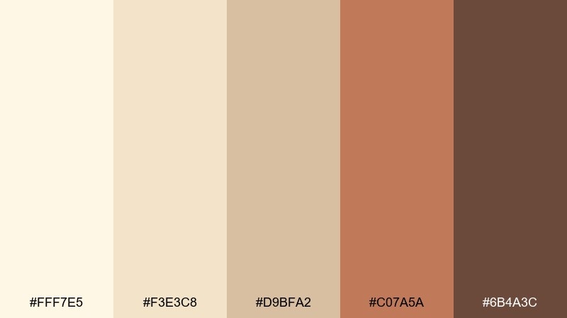
HEX: #FFF7E5 #F3E3C8 #D9BFA2 #C07A5A #6B4A3C
Mood: warm, handmade, grounded
Best for: artisan bakery menu
Warm almond cream with a clay accent brings a handmade, oven-fresh vibe. It suits menus that need clarity while still feeling rustic and personal. Pair the clay shade with simple line icons and use the deeper brown for headings and prices. Tip: set the menu background in the lightest cream to keep the layout bright under indoor lighting.
Image example of almond orbit generated using media.io
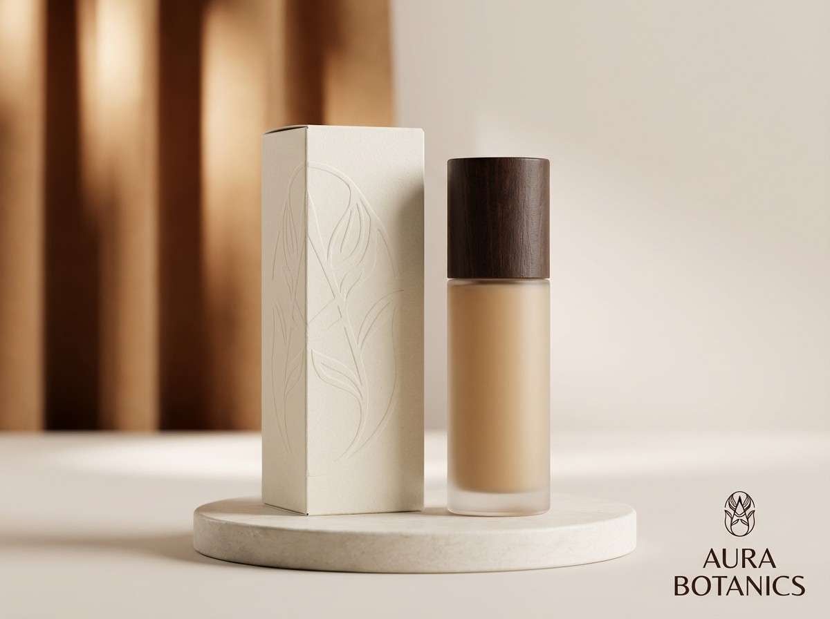
5) Cosmic Cappuccino
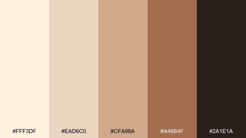
HEX: #FFF3DF #EAD6C0 #CFA98A #A46B4F #2A1E1A
Mood: rich, comforting, premium
Best for: skincare product ad
Rich crema and coffee-brown contrast feels comforting and quietly premium. This cosmic latte color palette is great for skincare or wellness ads where you want warmth without the heavy look of true browns. Pair it with minimal product photography and thin sans-serif type to keep it modern. Tip: use the near-black only for key claims, letting the mid tones carry most of the design.
Image example of cosmic cappuccino generated using media.io
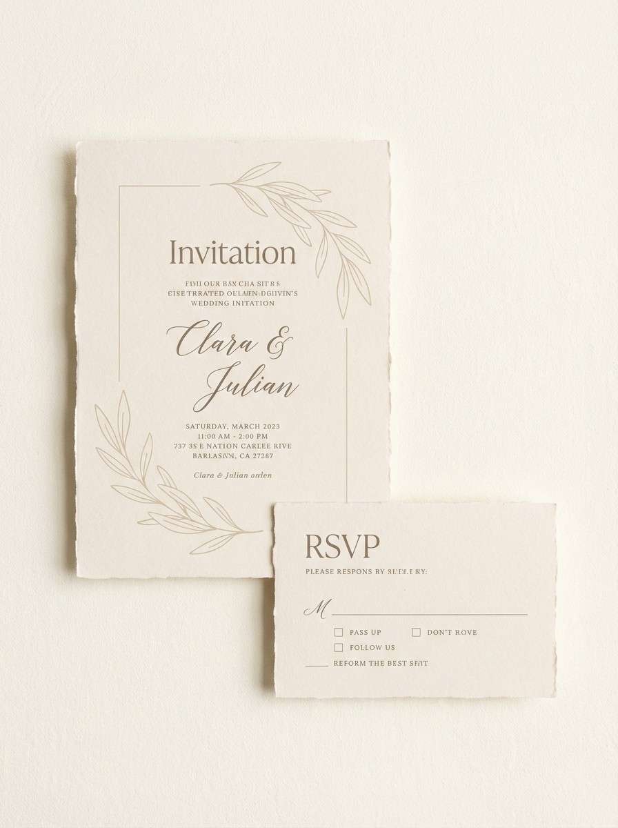
6) Vanilla Dust
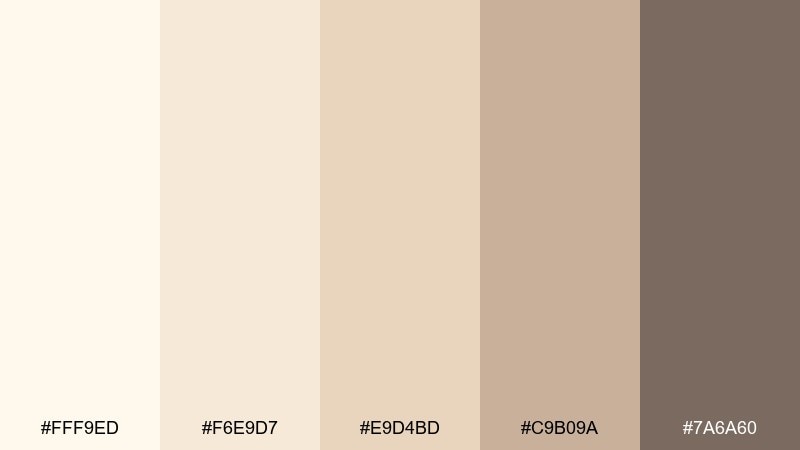
HEX: #FFF9ED #F6E9D7 #E9D4BD #C9B09A #7A6A60
Mood: soft, airy, gentle
Best for: wedding invitation suite
Soft vanilla paper tones with gentle taupe shadows feel romantic and weightless. They fit invitation suites, RSVP cards, and envelopes where texture and whitespace do the heavy lifting. Pair with delicate script for names and a clean serif for details. Tip: print the darkest taupe as the main text to keep contrast crisp on cream stock.
Image example of vanilla dust generated using media.io
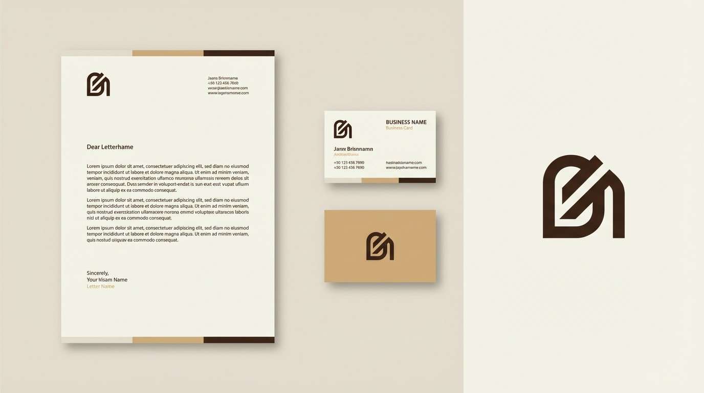
7) Solar Sandstone
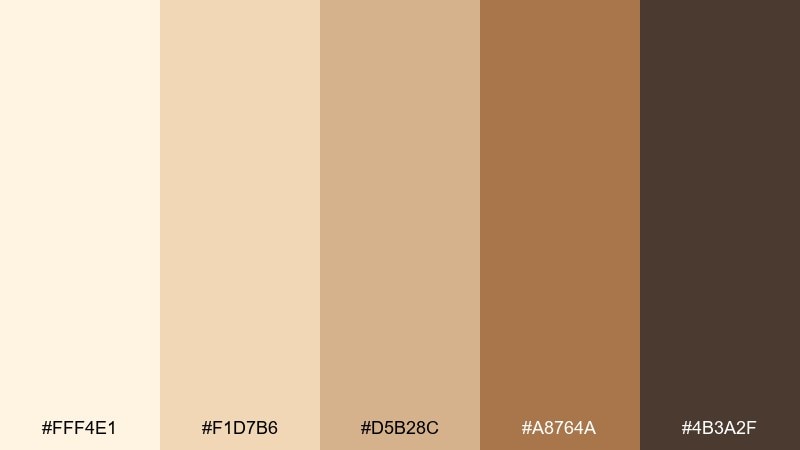
HEX: #FFF4E1 #F1D7B6 #D5B28C #A8764A #4B3A2F
Mood: earthy, sunbaked, confident
Best for: outdoor brand logo and stationery
Sunbaked sandstone neutrals feel outdoorsy without turning rugged. Use the lighter creams for stationery and the warm brown for a logo mark that still reads as friendly. Pair with deep green photography or kraft textures if you want a more natural direction. Tip: keep the accent brown limited to stamps, icons, and underlines so it stays intentional.
Image example of solar sandstone generated using media.io
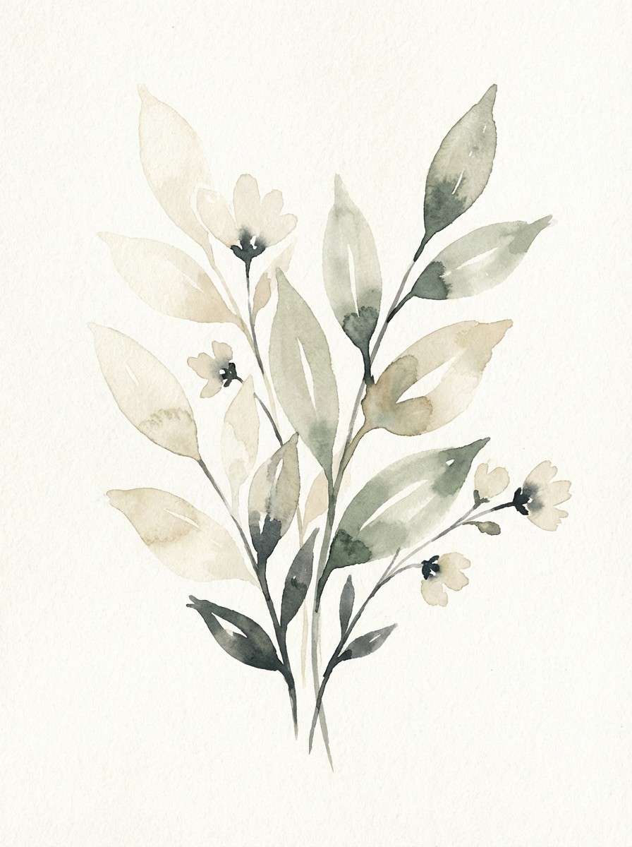
8) Cream and Sage Drift
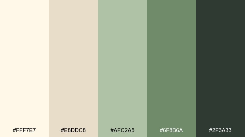
HEX: #FFF7E7 #E8DDC8 #AFC2A5 #6F8B6A #2F3A33
Mood: fresh, botanical, calming
Best for: botanical watercolor print
Creamy neutrals with muted sage feel like a quiet greenhouse morning. The green pair adds freshness while the espresso-gray keeps it grounded. Pair with fine line illustrations, pressed-flower motifs, or subtle grain. Tip: let the cream serve as breathing room so the sage stays airy rather than muddy.
Image example of cream and sage drift generated using media.io
9) Apricot Comet
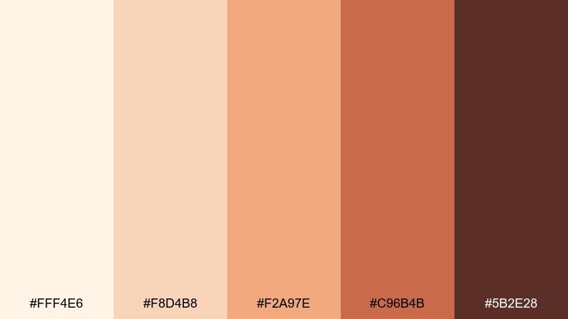
HEX: #FFF4E6 #F8D4B8 #F2A97E #C96B4B #5B2E28
Mood: playful, warm, upbeat
Best for: event flyer design
Apricot and toasted clay create a cheerful, sunset-forward pop against creamy neutrals. It works for flyers that need warmth and energy without neon brightness. Pair with bold sans headlines and rounded shapes to lean into the friendly feel. Tip: use the darkest brown for date and location details so the bright apricot can stay decorative.
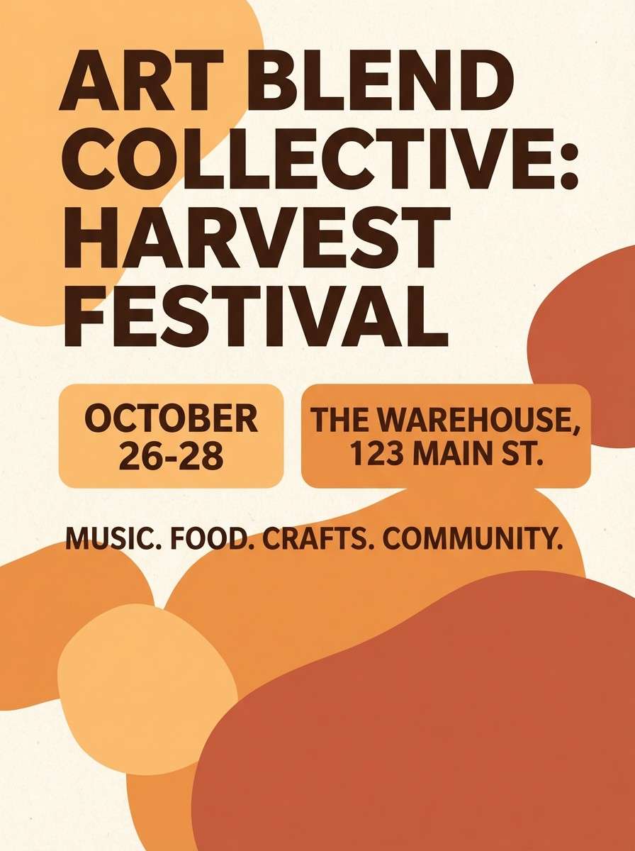
Image example of apricot comet generated using media.io
10) Blush Galaxy
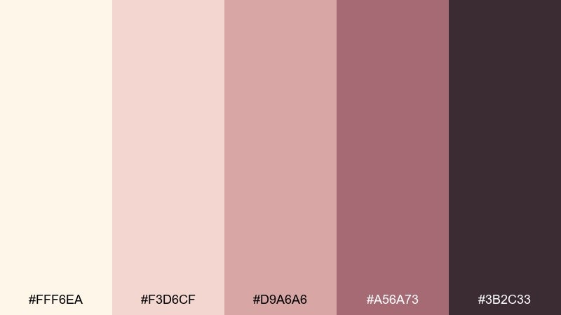
HEX: #FFF6EA #F3D6CF #D9A6A6 #A56A73 #3B2C33
Mood: romantic, modern, soft
Best for: beauty brand social ad
Blush cream with rose-tinted shadows feels modern, romantic, and a little dreamy. It suits beauty ads where you want a gentle glow rather than high contrast. Pair with close-cropped product shots and minimal copy to keep it elevated. Tip: use the deepest plum-brown sparingly for logos and small callouts so the blush stays light.
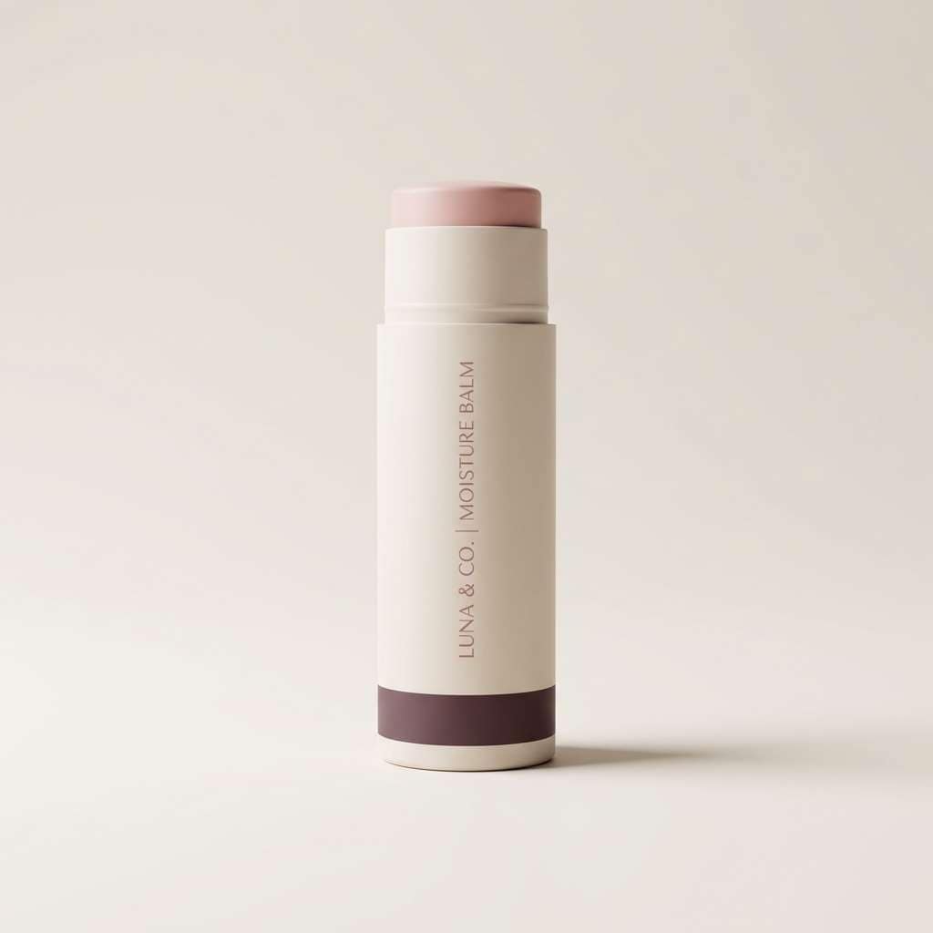
Image example of blush galaxy generated using media.io
11) Cocoa Eclipse
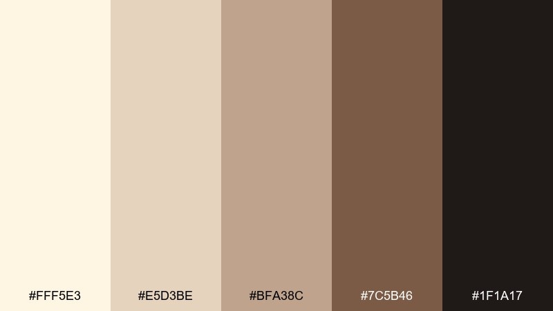
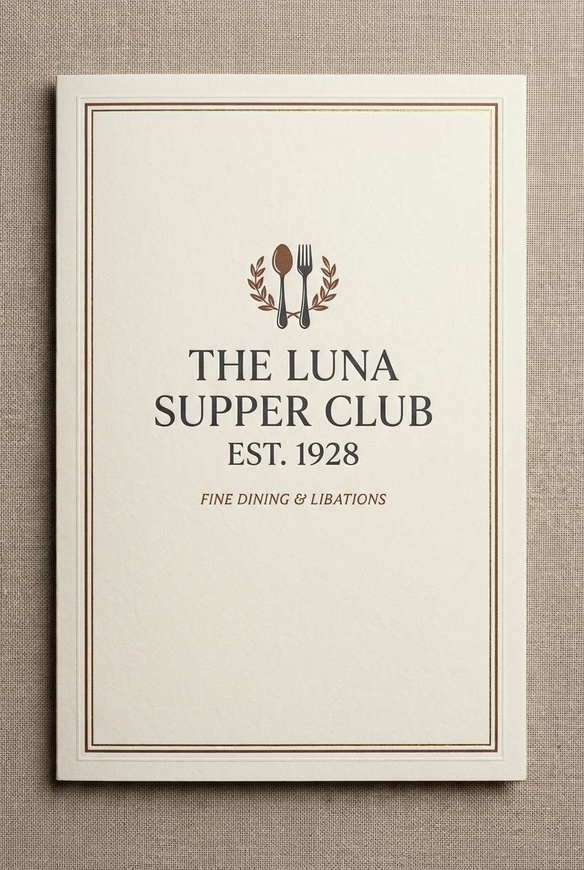
HEX: #FFF5E3 #E5D3BE #BFA38C #7C5B46 #1F1A17
Mood: moody, luxe, intimate
Best for: restaurant menu cover
Creamy highlights and deep cocoa shadows feel intimate, like a candlelit table. Use it for menu covers, tasting notes, or premium hospitality branding. Pair with embossed textures and a single accent line in the warm brown for a refined finish. Tip: keep interior pages lighter and reserve the darkest shade for the cover to create a reveal effect.
Image example of cocoa eclipse generated using media.io
12) Golden Parchment
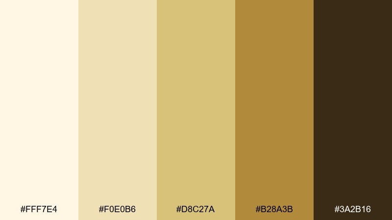
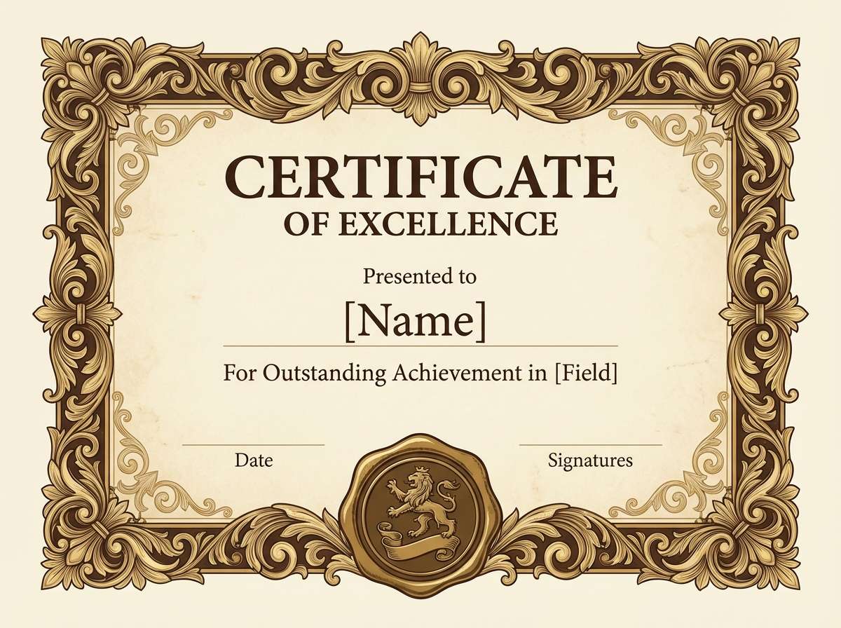
HEX: #FFF7E4 #F0E0B6 #D8C27A #B28A3B #3A2B16
Mood: classic, optimistic, heritage
Best for: premium certificate design
Golden parchment tones feel classic and quietly celebratory. The soft golds bring warmth while still reading as formal for awards and certificates. Pair with black-brown typography, a seal mark, and subtle border work. Tip: use the mid gold for ornamental lines and keep body text in the deepest shade for clarity.
Image example of golden parchment generated using media.io
13) Porcelain Night
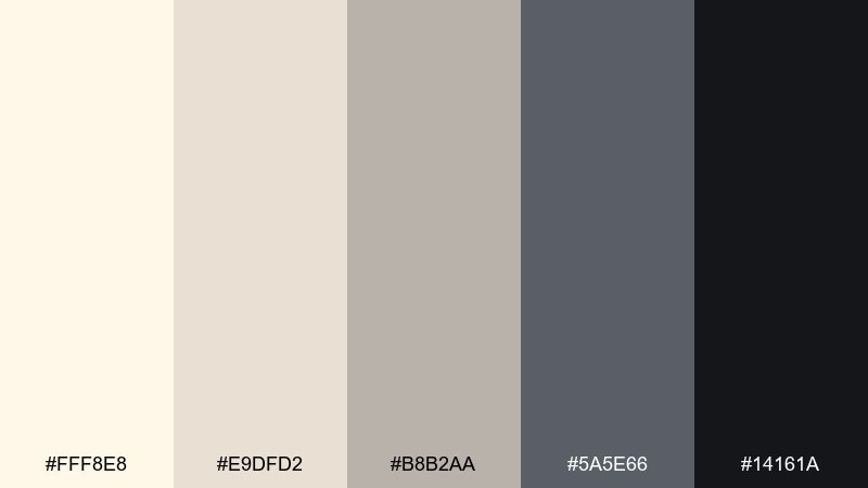
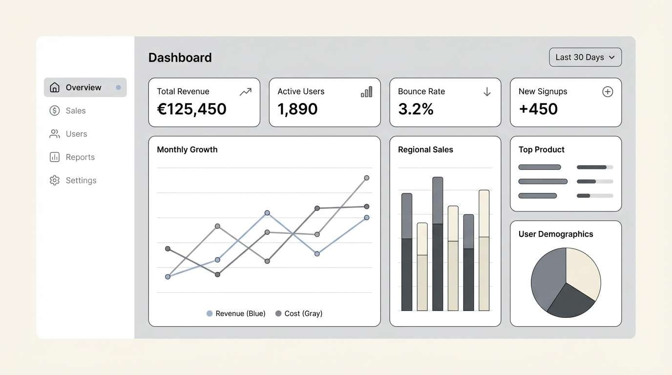
HEX: #FFF8E8 #E9DFD2 #B8B2AA #5A5E66 #14161A
Mood: cool, modern, understated
Best for: dashboard UI for analytics
Porcelain creams and cool grays feel crisp, modern, and slightly nocturnal. This cosmic latte color scheme is ideal for dashboards where you need calm surfaces with confident contrast. Pair light panels with graphite headers and keep data highlights minimal to avoid clutter. Tip: reserve the near-black for key numbers and active states so the interface stays breathable.
Image example of porcelain night generated using media.io
14) Oat and Ink
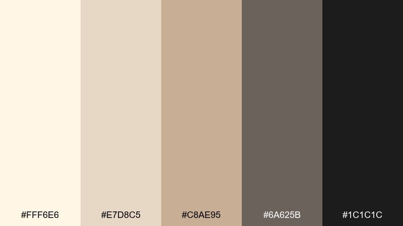
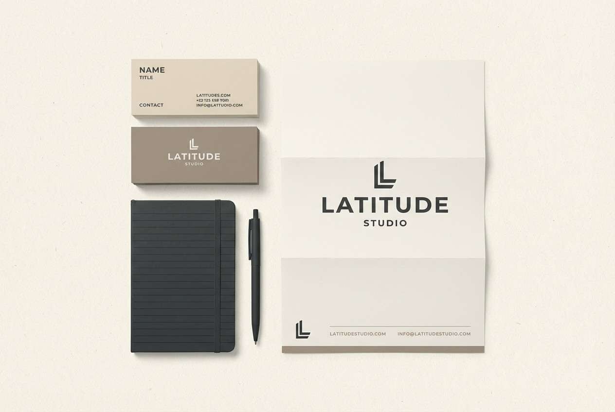
HEX: #FFF6E6 #E7D8C5 #C8AE95 #6A625B #1C1C1C
Mood: smart, balanced, professional
Best for: legal firm brand kit
Oat cream with inky neutrals feels trustworthy and straightforward. It works for professional branding where warmth matters but you still need authority. Pair with sharp typography, generous margins, and a single monogram mark. Tip: put the darkest ink on headings and keep body text in the charcoal-gray to soften the overall look.
Image example of oat and ink generated using media.io
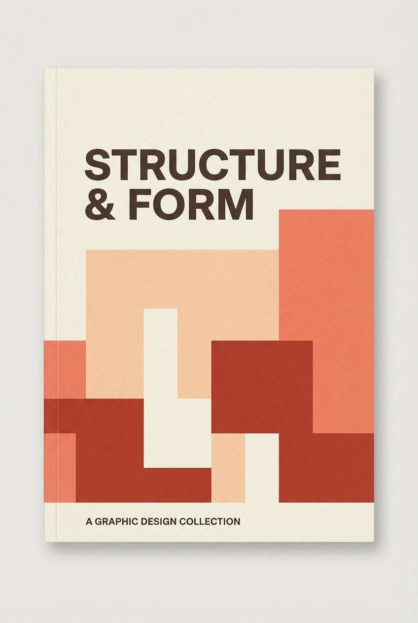
15) Coral Ledger
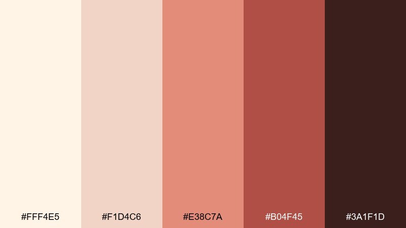
HEX: #FFF4E5 #F1D4C6 #E38C7A #B04F45 #3A1F1D
Mood: confident, warm, creative
Best for: book cover design
Cream and coral tones bring a confident, story-forward warmth. These cosmic latte color combinations suit book covers where you want approachability with a strong focal color. Pair the coral with bold type and simple geometry to keep it contemporary. Tip: use the deepest shade for the title only, letting the lighter coral handle background shapes.
Image example of coral ledger generated using media.io
16) Harbor Driftwood
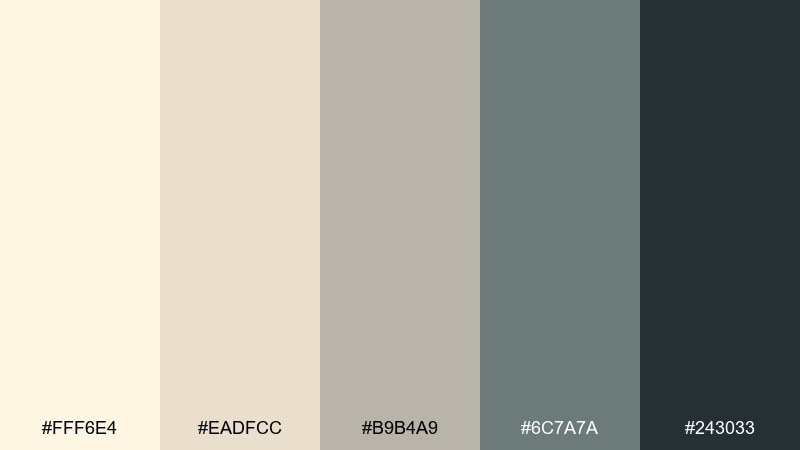
HEX: #FFF6E4 #EADFCC #B9B4A9 #6C7A7A #243033
Mood: coastal, muted, steady
Best for: interior design moodboard
Creamy driftwood and sea-worn gray-blue feels calm and coastal without turning beachy. It fits moodboards, lookbooks, and calm lifestyle branding that needs a cooler neutral base. Pair with natural textures like linen and light oak, and keep accents in the slate tone. Tip: use the darkest blue-gray for small labels and swatches so the board stays light.
Image example of harbor driftwood generated using media.io
17) Pistachio Cream
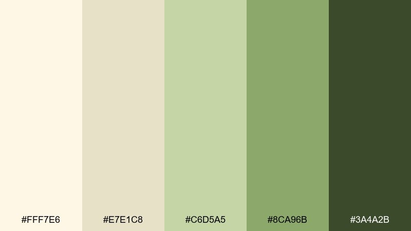
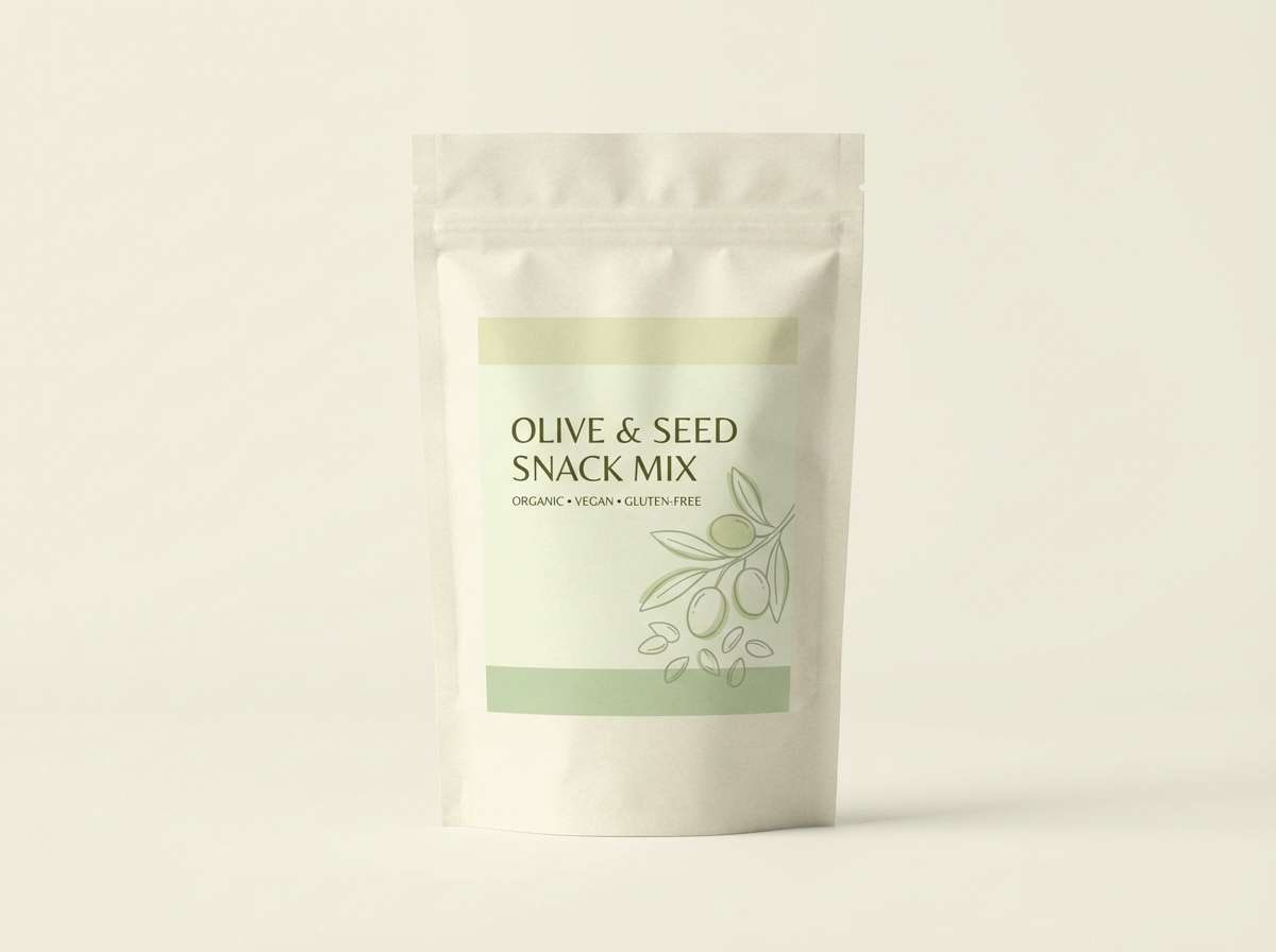
HEX: #FFF7E6 #E7E1C8 #C6D5A5 #8CA96B #3A4A2B
Mood: fresh, wholesome, light
Best for: healthy snack packaging
Creamy oat and pistachio greens feel wholesome and clean. It works well for snack packaging that needs to signal freshness without screaming bright green. Pair with simple ingredient illustrations and wide margins to keep it modern. Tip: make the darkest green your nutrition panel text color for strong readability.
Image example of pistachio cream generated using media.io
18) Terracotta Aurora
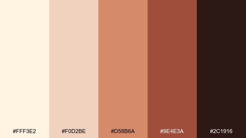
HEX: #FFF3E2 #F0D2BE #D58B6A #9E4E3A #2C1916
Mood: warm, rustic, artistic
Best for: ceramics studio poster
Terracotta warmth against creamy clay tones feels handmade and artistic. It is a natural fit for ceramics studios, workshops, and maker markets. Pair with bold blocks of terracotta, a simple pot silhouette, and deep brown type for a grounded finish. Tip: keep the darkest shade for text only so the poster stays warm rather than heavy.
Image example of terracotta aurora generated using media.io

19) Champagne Graphite
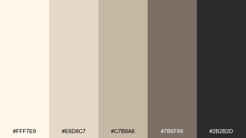
HEX: #FFF7E9 #E6D8C7 #C7B8A6 #7B6F66 #2B2B2D
Mood: sleek, neutral, elevated
Best for: portfolio website UI
Champagne cream with graphite depth feels sleek and elevated, like a gallery wall. It is great for portfolios where images need to shine while the UI stays understated. Pair the mid taupe with thin dividers and keep the darkest graphite for navigation and hover states. Tip: use large whitespace and small type sizes to maximize the refined feel.
Image example of champagne graphite generated using media.io
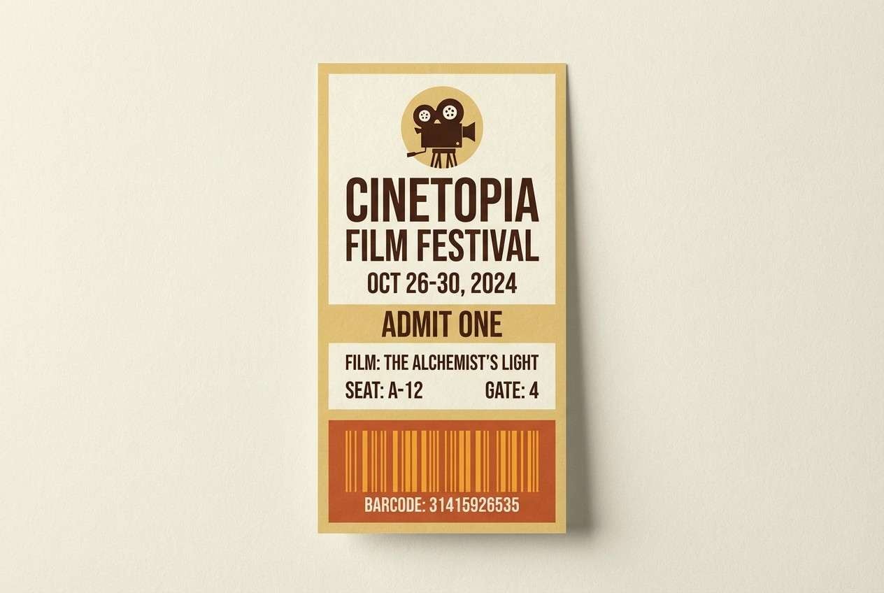
20) Saffron Cinema
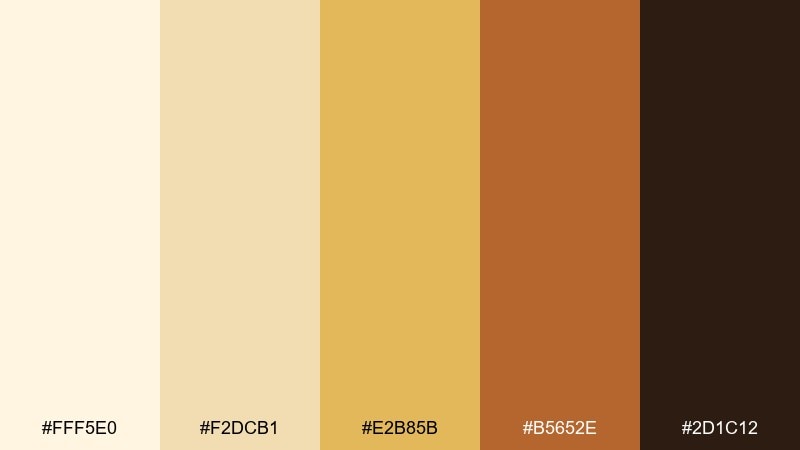
HEX: #FFF5E0 #F2DCB1 #E2B85B #B5652E #2D1C12
Mood: bold, golden, retro-modern
Best for: film festival ticket design
Golden saffron against creamy neutrals feels cinematic and slightly retro. Use it for tickets, passes, or promos that need energy while staying classy. Pair with condensed typography and a simple icon mark for a festival-ready look. Tip: keep the saffron as the hero accent and let cream handle most of the background for legibility.
Image example of saffron cinema generated using media.io
What Colors Go Well with Cosmic Latte?
Cosmic latte works best with grounded darks for contrast—espresso, charcoal, near-black, and slate—especially for typography, icons, and navigation. These anchors keep creamy backgrounds from looking washed out.
For accents, muted botanicals (sage, olive, eucalyptus) add calm freshness, while warm highlights (terracotta, coral, apricot, saffron) bring energy without overpowering the neutral base.
If you want a cooler, modern direction, pair cosmic latte with graphite grays and blue-grays. This creates a clean, editorial feel that still reads warmer than a standard gray UI.
How to Use a Cosmic Latte Color Palette in Real Designs
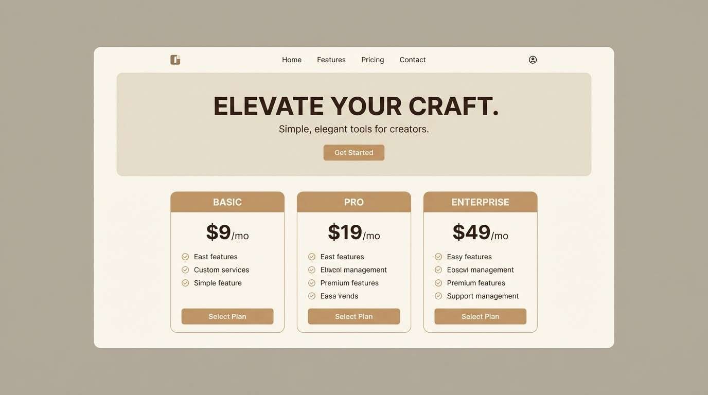
Start with the lightest cream as your primary background, then step down one shade for surfaces like cards, panels, or paper texture. Reserve the darkest tone for text and key UI states to protect readability.
For branding, keep logos and typography in the deepest brown/graphite and use mid tones for borders, dividers, and subtle shapes. One accent color is usually enough to make the system feel intentional.
In print (menus, invitations, certificates), cosmic latte shines when you lean into whitespace and texture. Use the mid-taupe range for lines and ornaments, and keep body text dark for crisp legibility on cream stock.
Create Cosmic Latte Palette Visuals with AI
If you already have HEX codes, you can quickly turn them into on-brand mockups, posters, packaging scenes, and UI concepts by prompting an AI image generator with the exact tones you want.
Use the included prompts as templates: swap the subject (menu, dashboard, invitation) while keeping the “dominant tones” list aligned to your palette. This helps results stay cohesive across a full brand system.
When you find a palette you like, generate a few variations (different ratios, lighting, and compositions) so you have consistent visuals for web, social, and print.
Cosmic Latte Color Palette FAQs
-
What is the cosmic latte color?
Cosmic latte is a warm, creamy off-white often described as a “universal average” light neutral. In design, it typically sits between ivory and beige, giving layouts warmth without looking yellow. -
Is cosmic latte the same as beige?
Not exactly. Beige is a broader family that can run darker, more yellow, or more brown. Cosmic latte usually refers to a lighter, cream-forward neutral that’s cleaner and more “milky.” -
What text color is best on cosmic latte backgrounds?
Deep espresso, charcoal, or near-black provide the most reliable contrast for body text and UI labels. For softer looks, use a dark gray-taupe for secondary text—but keep critical text in the darkest shade. -
What accent colors pair well with cosmic latte?
Muted sage/olive, terracotta/clay, blush/rose, apricot/coral, and saffron/gold all pair naturally with cosmic latte. Cool graphite and slate-blue accents also work well for modern, understated designs. -
Is cosmic latte good for UI design?
Yes—cosmic latte palettes are great for UI because they reduce glare compared to pure white and feel premium. Just ensure accessible contrast by using a dark text color and reserving mid tones for surfaces, not typography. -
How do I keep a cosmic latte palette from feeling flat?
Add one clear accent color, introduce texture (paper grain, linen, subtle shadows), and create depth with a wider value range—from cream highlights to a strong dark anchor. Small touches like dividers and borders in mid taupe also help. -
Can I generate cosmic latte palette mockups with AI?
Yes. Include your HEX codes or “dominant tones” in the prompt, specify the design type (UI, packaging, invitation), and set an aspect ratio. Tools like Media.io Text-to-Image help you iterate quickly while keeping the palette consistent.


