

Lavender and purple sit in the sweet spot between calm and creative, making it a versatile choice for modern brands, UI, and events. With the right supporting tones, it can read airy and minimal or deep and luxurious.
Below are 20+ lavender purple color combinations with HEX codes, plus practical ways to apply them in real-world design—especially for web, print, and social graphics.
In this article
- Why Lavender and Purple Combinations Work So Well
-
- misty lilac morning
- violet tea party
- orchid glow
- lavender gray minimal
- pastel meadow
- night bloom
- cozy mauve knit
- modern amethyst ui
- iris and cream
- dusty provence
- neon lavender pop
- lavender sage calm
- plumberry accent
- silver lilac tech
- sunset lavender
- berry sorbet
- antique lilac paper
- lavender denim
- royal lavender drama
- lavender cocoa
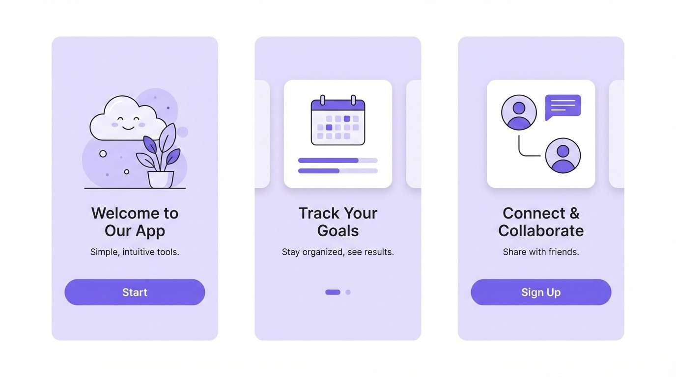
- lilac cloud interface
- velvet lavender night
- What Colors Go Well with Lavender Purple?
- How to Use a Lavender Purple Color Palette in Real Designs
- Create Lavender Purple Palette Visuals with AI
Why Lavender and Purple Combinations Work So Well
Lavender purple is naturally flexible: it can feel soft and comforting in pastel form, or bold and premium when paired with deep plums and near-black. That range makes it a strong “core color” for brands that need both calm and personality.
It also pairs beautifully with neutrals. Warm creams make lavender feel romantic and artisanal, while cool grays and whites make it look modern and tech-forward—ideal for UI palettes and SaaS layouts.
Finally, lavender purple photographs well and holds up across mediums. With the right contrast (often a deep eggplant or indigo), it stays legible in web interfaces, packaging labels, and printed invitations.
20+ Lavender Purple Color Palette Ideas (with HEX Codes)
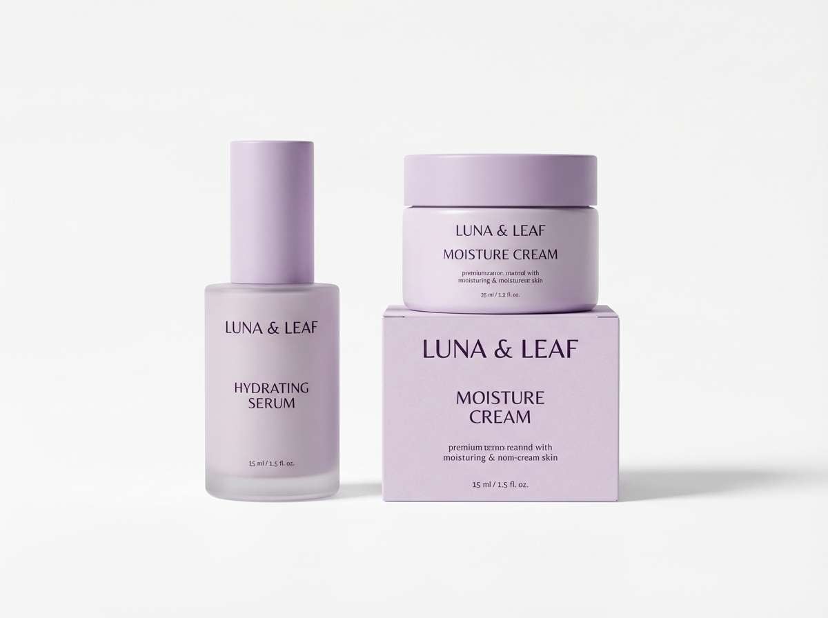
1) Misty Lilac Morning
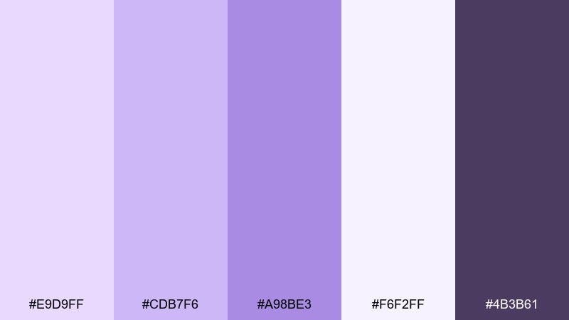
HEX: #E9D9FF #CDB7F6 #A98BE3 #F6F2FF #4B3B61
Mood: airy, gentle, fresh
Best for: skincare branding and packaging
Airy lilac light and soft foggy whites evoke a calm morning routine and clean beauty shelves. This lavender purple color palette works beautifully on minimalist labels, pump bottles, and hero banners where clarity matters. Pair it with crisp white space and a deep eggplant type color for legibility. Usage tip: keep gradients subtle and reserve the darkest shade for ingredients and small text.
Image example of misty lilac morning generated using media.io
Media.io is an online AI studio for creating and editing video, image, and audio in your browser.

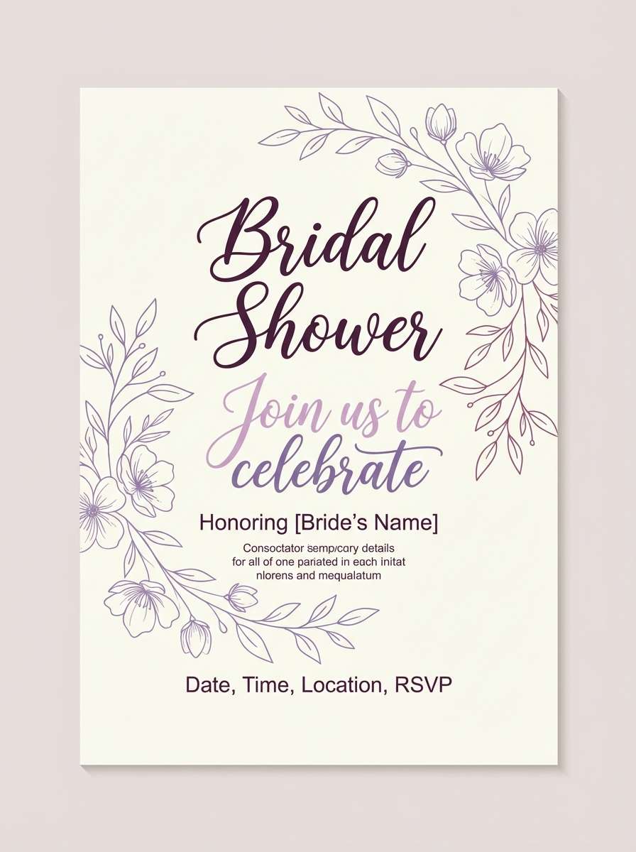
2) Violet Tea Party
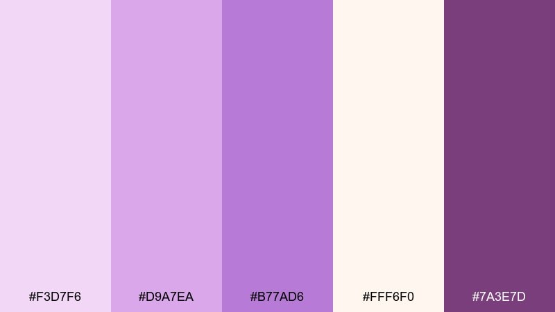
HEX: #F3D7F6 #D9A7EA #B77AD6 #FFF6F0 #7A3E7D
Mood: playful, sweet, charming
Best for: bridal shower invitation design
Sugared lilacs and berry violet feel like macarons, ribbons, and a table set for afternoon tea. Use these tones on invitations, menus, and place cards with warm cream as the paper base. Pair with delicate line art and a serif headline for a romantic finish. Usage tip: print the darkest violet in small doses to keep the look light and celebratory.
Image example of violet tea party generated using media.io
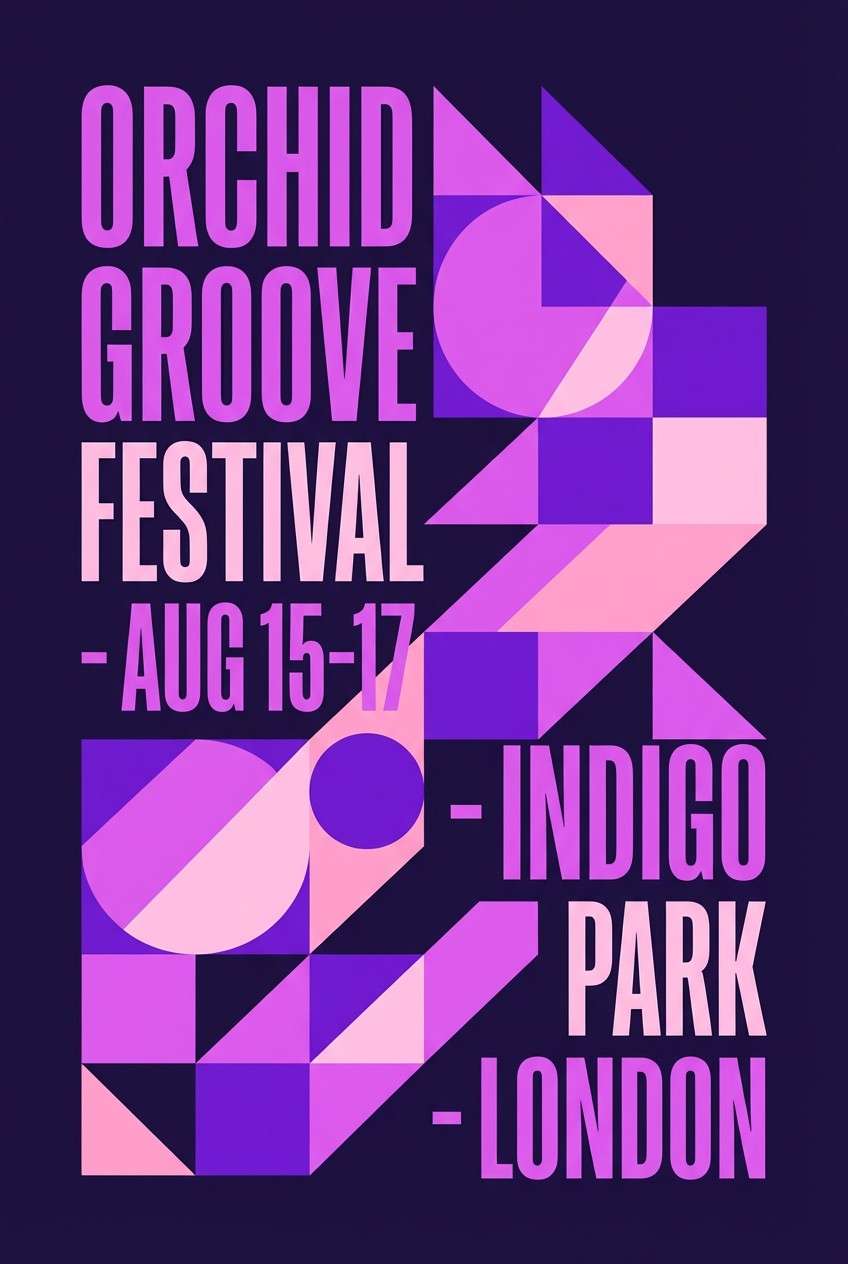
3) Orchid Glow
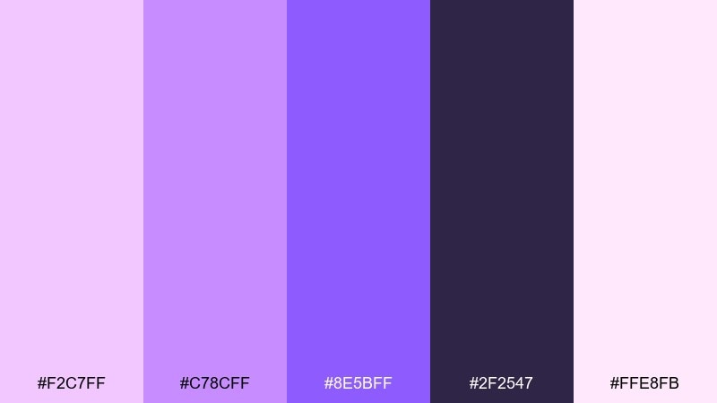
HEX: #F2C7FF #C78CFF #8E5BFF #2F2547 #FFE8FB
Mood: radiant, bold, dreamy
Best for: music festival poster
Electric orchid and saturated violet create a neon glow that feels late-night and cinematic. Use the darkest indigo as the stage-like backdrop and let the bright tones carry the headline and key details. Pair with condensed sans fonts and simple geometric shapes for impact. Usage tip: keep body copy on the light pink to avoid eye strain.
Image example of orchid glow generated using media.io
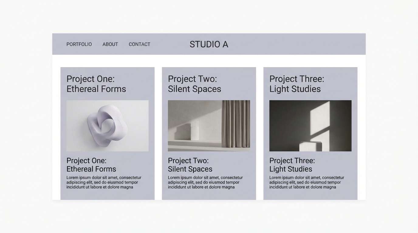
4) Lavender Gray Minimal
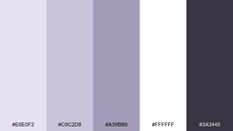
HEX: #E6E0F2 #C9C2D8 #A39BB8 #FFFFFF #3A3445
Mood: modern, quiet, refined
Best for: professional portfolio website
Muted lavender-grays feel polished and architectural, like matte paper and soft shadow. These tones suit portfolio layouts where the work needs to lead and the UI should stay understated. Pair with plenty of white space and charcoal text for readability. Usage tip: use the mid gray-lavender for dividers and hover states rather than large blocks.
Image example of lavender gray minimal generated using media.io
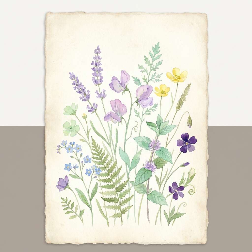
5) Pastel Meadow
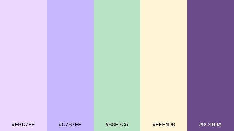
HEX: #EBD7FF #C7B7FF #B8E3C5 #FFF4D6 #6C4B8A
Mood: springy, soft, optimistic
Best for: botanical illustration set
Soft lilac with minty green and buttery yellow feels like wildflowers in early spring. It shines in watercolor botanicals, sticker packs, and gentle social posts for wellness brands. Pair lilac shadows with the deep violet for stems and line work to keep forms crisp. Usage tip: limit yellow to highlights so the overall mix stays soothing.
Image example of pastel meadow generated using media.io
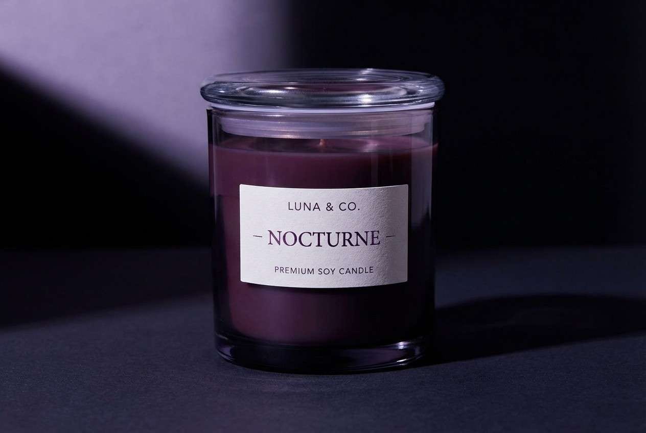
6) Night Bloom
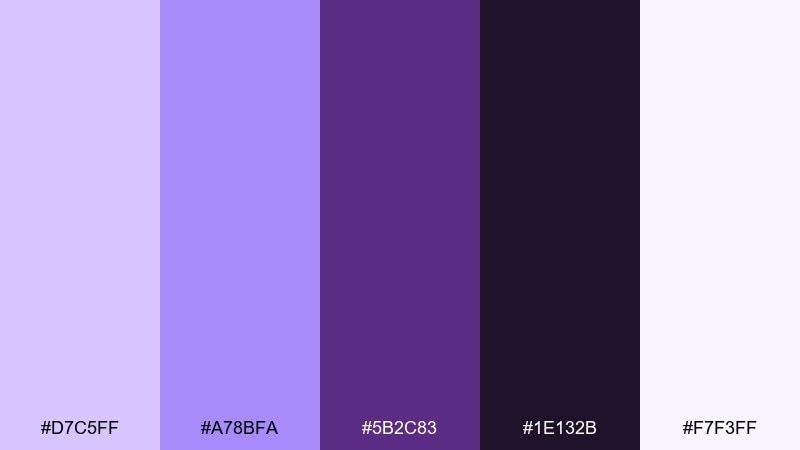
HEX: #D7C5FF #A78BFA #5B2C83 #1E132B #F7F3FF
Mood: moody, luxe, dramatic
Best for: premium candle product ad
Deep plum shadows with lavender highlights evoke night-blooming florals and velvet interiors. These lavender purple color combinations are ideal for luxury ads where contrast and mood do the selling. Pair with matte black or near-black backgrounds and minimalist serif type. Usage tip: add a small lavender rim light to make dark packaging feel dimensional.
Image example of night bloom generated using media.io
7) Cozy Mauve Knit
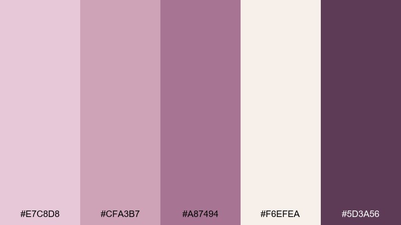
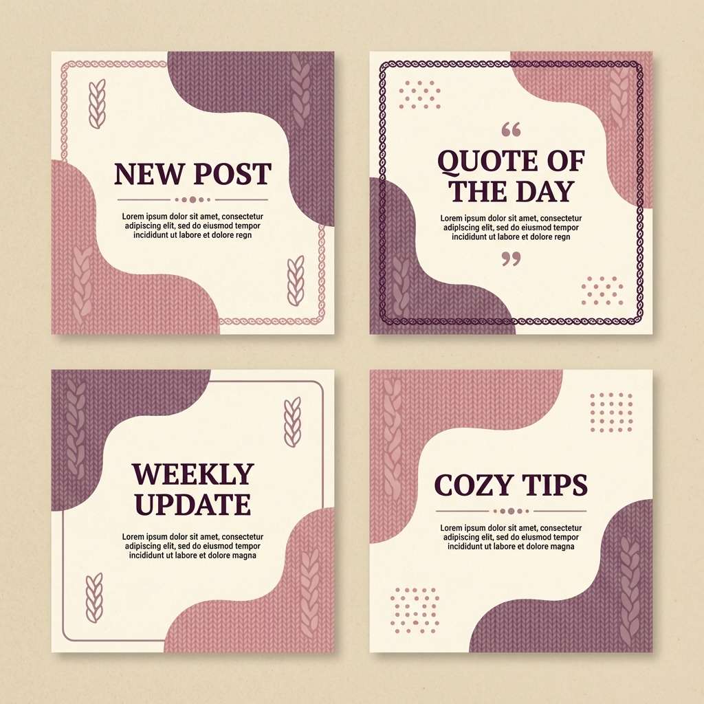
HEX: #E7C8D8 #CFA3B7 #A87494 #F6EFEA #5D3A56
Mood: cozy, comforting, handmade
Best for: knitting shop social templates
Warm mauve and dusty rose feel like soft yarn, winter light, and a well-loved sweater. Use the cream tone as the canvas, then layer mauve blocks for captions and product callouts. Pair with textured paper overlays and friendly rounded type. Usage tip: keep contrast high by using the deep aubergine only for headings and prices.
Image example of cozy mauve knit generated using media.io
8) Modern Amethyst UI
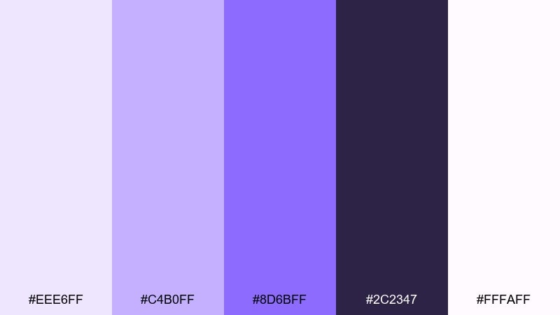
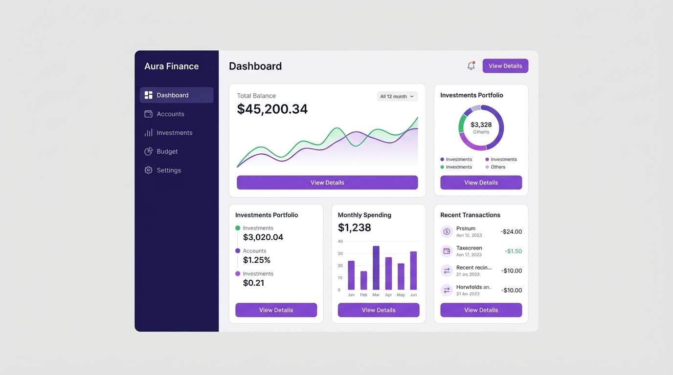
HEX: #EEE6FF #C4B0FF #8D6BFF #2C2347 #FFFAFF
Mood: sleek, modern, tech-forward
Best for: finance app dashboard UI
Clean amethyst accents against near-white panels feel crisp, contemporary, and trustworthy. Use the dark indigo as a nav anchor, then apply violet for primary buttons and key metrics. Pair with thin dividers and generous spacing for a premium dashboard look. Usage tip: reserve the brightest violet for one action per screen to guide attention.
Image example of modern amethyst ui generated using media.io
9) Iris and Cream
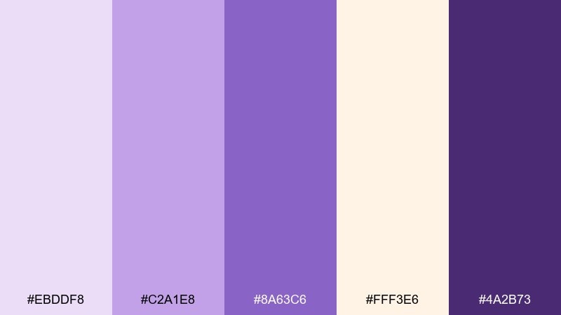
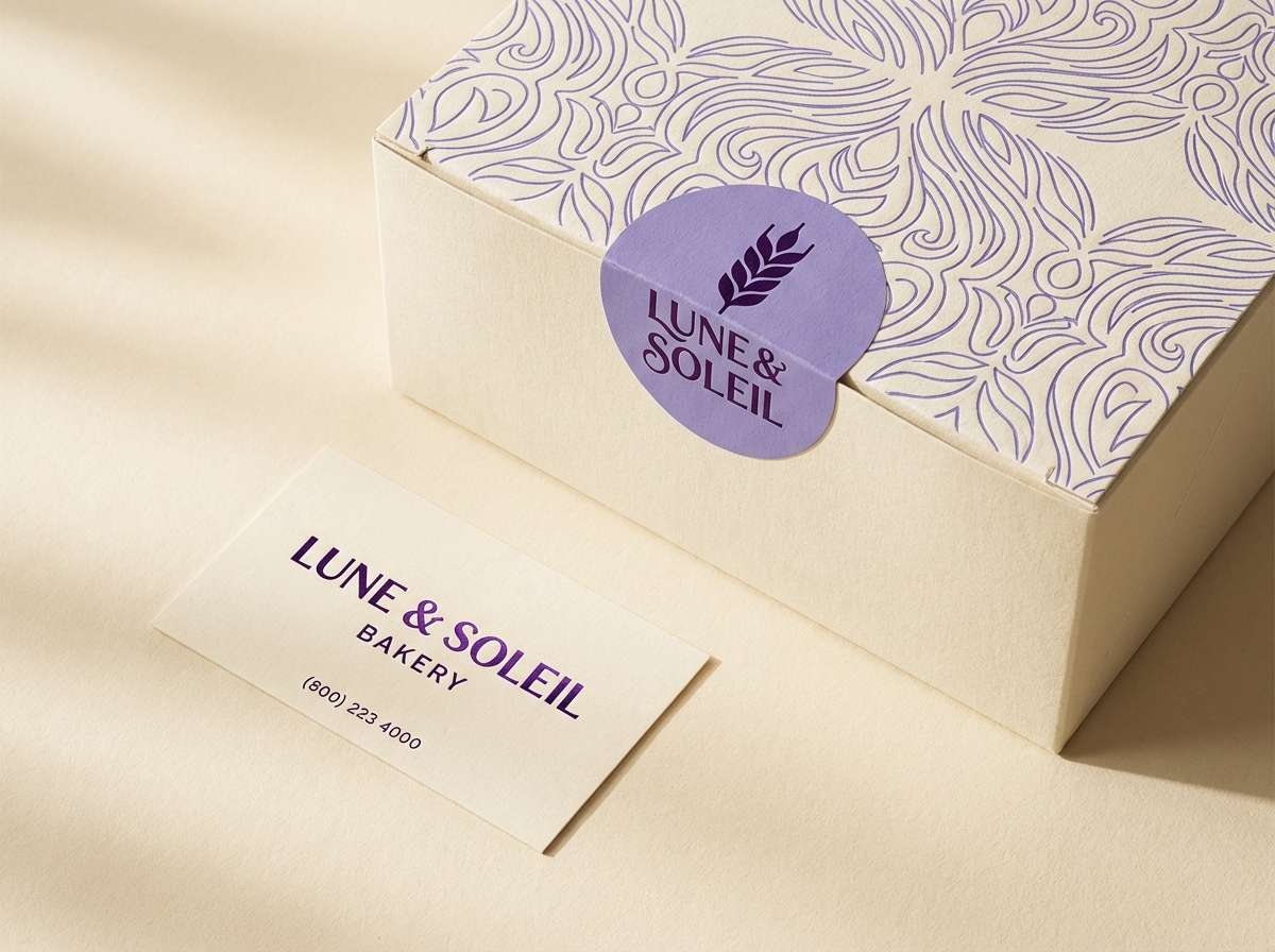
HEX: #EBDDF8 #C2A1E8 #8A63C6 #FFF3E6 #4A2B73
Mood: romantic, elegant, soft
Best for: bakery brand identity
Iris purple on warm cream feels like frosted cakes, piping, and delicate florals. It works well for bakery logos, pastry boxes, and menu boards where you want sweetness without going overly pastel. Pair with simple iconography and a deep purple for stamps and seals. Usage tip: keep cream dominant so the violet reads as a premium accent.
Image example of iris and cream generated using media.io
10) Dusty Provence
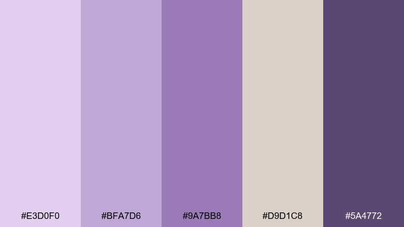
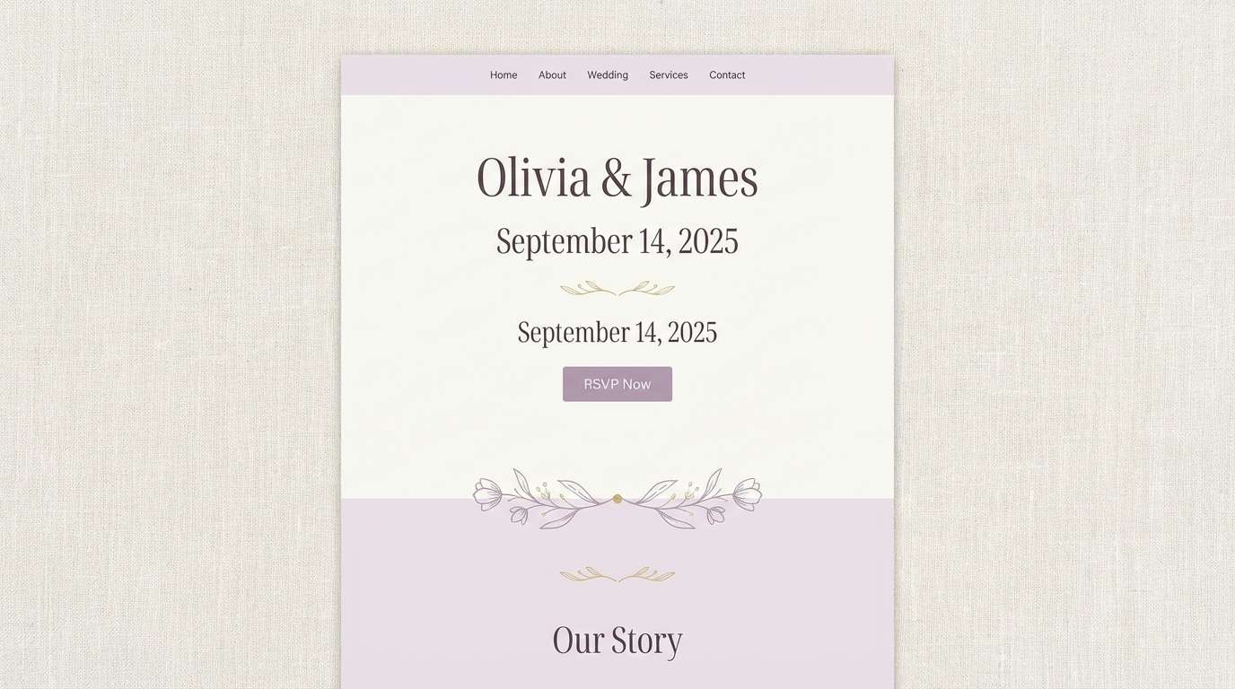
HEX: #E3D0F0 #BFA7D6 #9A7BB8 #D9D1C8 #5A4772
Mood: rustic, calm, timeless
Best for: wedding website theme
Dusty lilac with linen-like taupe evokes countryside lavender fields and vintage stationery. Use these tones for wedding websites, save-the-dates, and photo galleries where a soft frame flatters images. Pair with warm gray neutrals and understated florals for cohesion. Usage tip: set body text in the darkest purple and avoid using the mid tones for long paragraphs.
Image example of dusty provence generated using media.io
11) Neon Lavender Pop
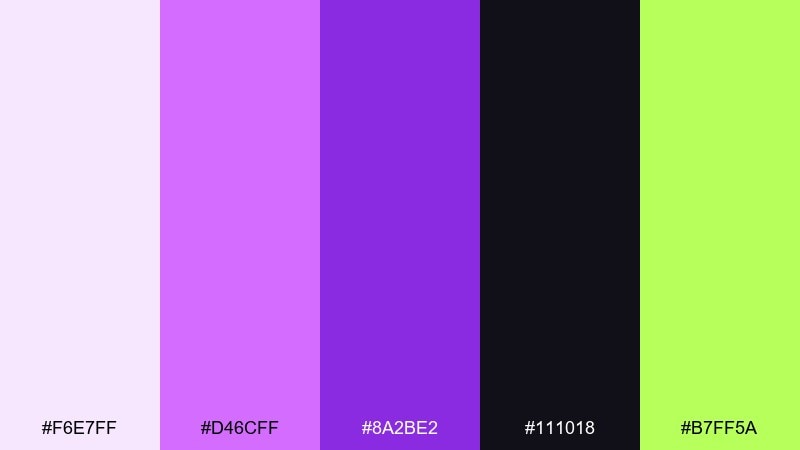
HEX: #F6E7FF #D46CFF #8A2BE2 #111018 #B7FF5A
Mood: energetic, edgy, youth
Best for: streetwear drop announcement
Hot lavender neon against near-black feels like club lights, stickers, and a midnight launch. The lime accent adds punch for dates, prices, and drop-time badges without losing the purple focus. Pair with bold condensed type and high-contrast shapes. Usage tip: keep neon areas flat (no gradients) so the design stays sharp on mobile.
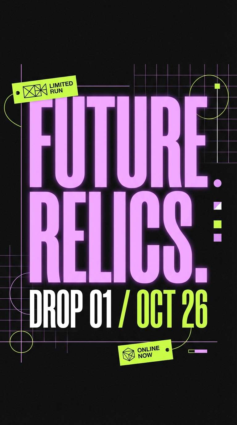
Image example of neon lavender pop generated using media.io
12) Lavender Sage Calm
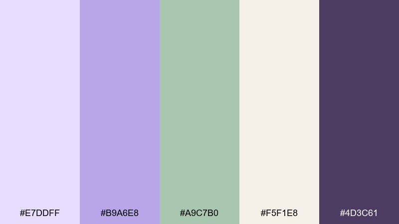
HEX: #E7DDFF #B9A6E8 #A9C7B0 #F5F1E8 #4D3C61
Mood: balanced, soothing, natural
Best for: wellness blog branding
Lavender and sage tones feel like slow mornings, herbal tea, and a tidy journal page. This mix suits wellness blogs and coaching brands that want soft color without looking childish. Pair with warm off-white backgrounds and charcoal body text for clarity. Usage tip: use sage for secondary buttons and lavender for primary calls to action.
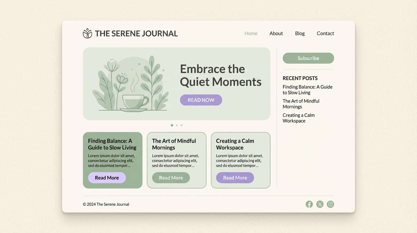
Image example of lavender sage calm generated using media.io
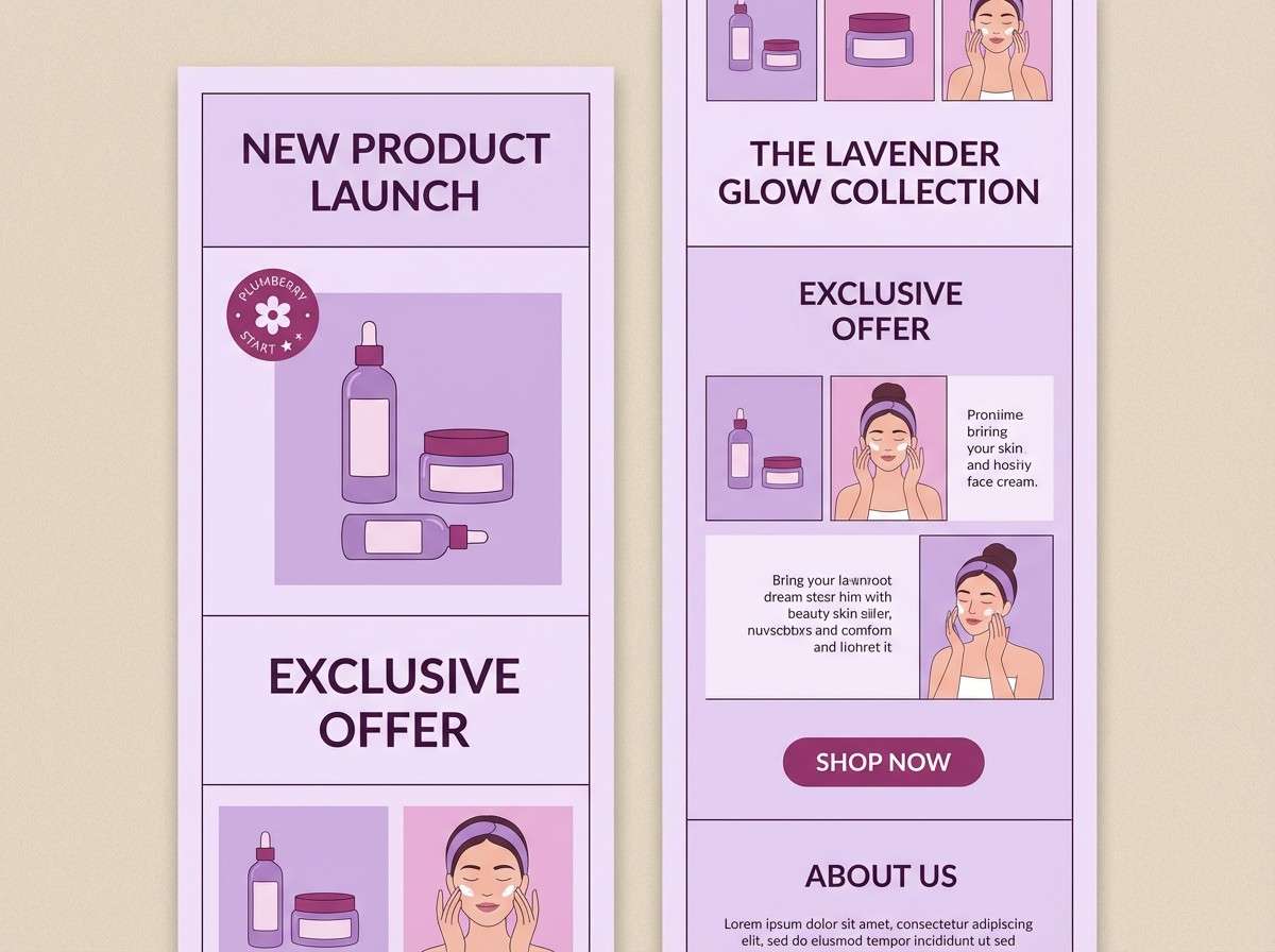
13) Plumberry Accent
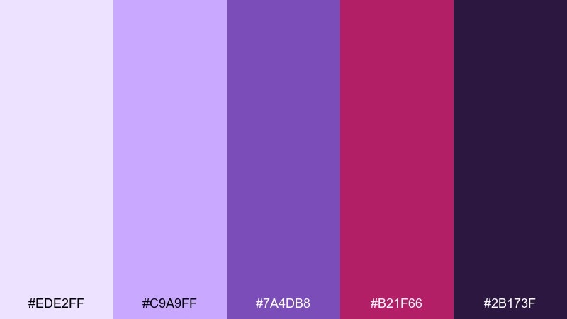
HEX: #EDE2FF #C9A9FF #7A4DB8 #B21F66 #2B173F
Mood: confident, stylish, editorial
Best for: beauty product launch email
Soft lavender with a punchy plumberry accent feels fashionable and a little daring. Use the berry shade for price tags, limited-time badges, or one hero button, and let lavender carry the supporting sections. Pair with high-contrast photography and clean sans typography. Usage tip: keep the darkest purple for headers so the berry can stay the spotlight.
Image example of plumberry accent generated using media.io
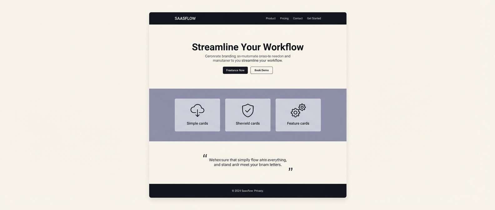
14) Silver Lilac Tech
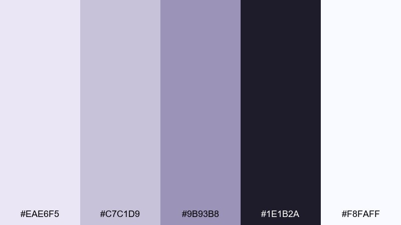
HEX: #EAE6F5 #C7C1D9 #9B93B8 #1E1B2A #F8FAFF
Mood: cool, precise, professional
Best for: SaaS landing page
Cool lilac-grays and silver tones suggest precision, reliability, and a clean product experience. Use the near-black for navigation and the pale lilac for section backgrounds to keep the page airy. Pair with minimal icons and subtle shadows for depth. Usage tip: apply the mid lilac-gray to charts and feature callouts for consistent hierarchy.
Image example of silver lilac tech generated using media.io
15) Sunset Lavender
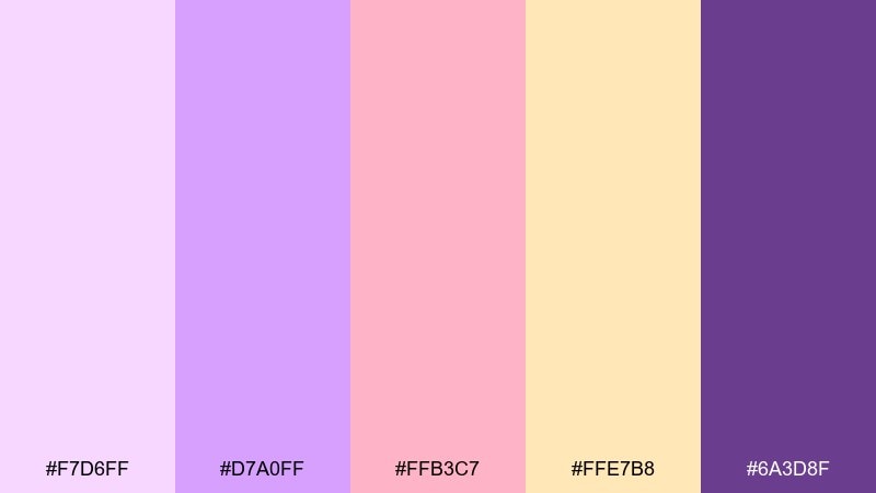
HEX: #F7D6FF #D7A0FF #FFB3C7 #FFE7B8 #6A3D8F
Mood: warm, glowing, optimistic
Best for: summer event flyer
Lavender at golden hour with peachy pink and soft sunlit yellow feels warm and welcoming. It works for summer flyers, community events, and upbeat promotions where you want friendly energy. Pair with rounded display type and simple abstract shapes to echo the sunset vibe. Usage tip: place dark purple text on the pale yellow for maximum readability.
Image example of sunset lavender generated using media.io

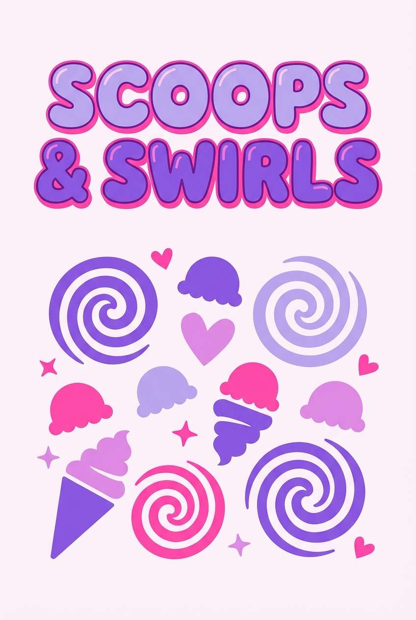
16) Berry Sorbet
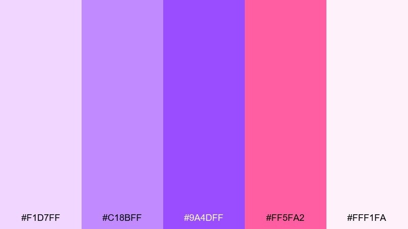
HEX: #F1D7FF #C18BFF #9A4DFF #FF5FA2 #FFF1FA
Mood: fun, vibrant, sweet
Best for: ice cream shop poster
Bright berry and lavender tones feel like sorbet swirls and glossy candy wrappers. Use the hot pink as a playful accent for flavors and pricing, while lavender keeps the design cohesive. Pair with chunky type and simple illustrated shapes. Usage tip: avoid overusing the most saturated violet in backgrounds; keep it for headings and icons.
Image example of berry sorbet generated using media.io
17) Antique Lilac Paper
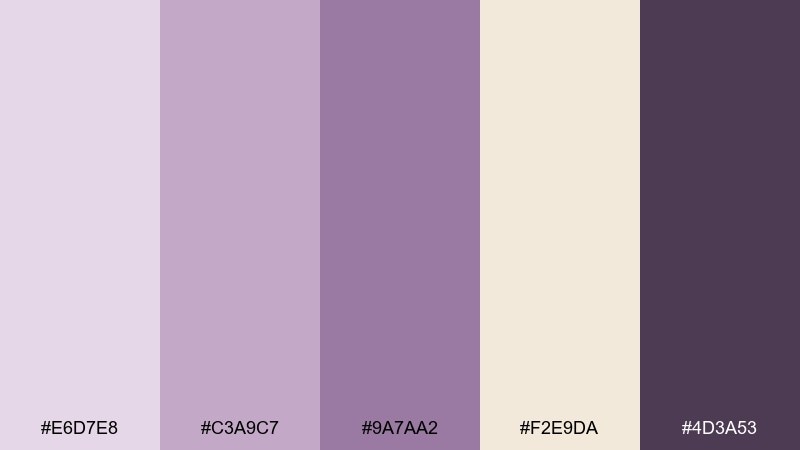
HEX: #E6D7E8 #C3A9C7 #9A7AA2 #F2E9DA #4D3A53
Mood: vintage, soft, literary
Best for: book cover design
Antique lilac and warm parchment tones evoke dusty libraries and pressed flowers tucked in old pages. Use this palette for book covers, journals, and editorial layouts with a classic, gentle feel. Pair with textured backgrounds and a dark plum for title contrast. Usage tip: add subtle grain to the light tones to keep the vintage mood consistent.
Image example of antique lilac paper generated using media.io
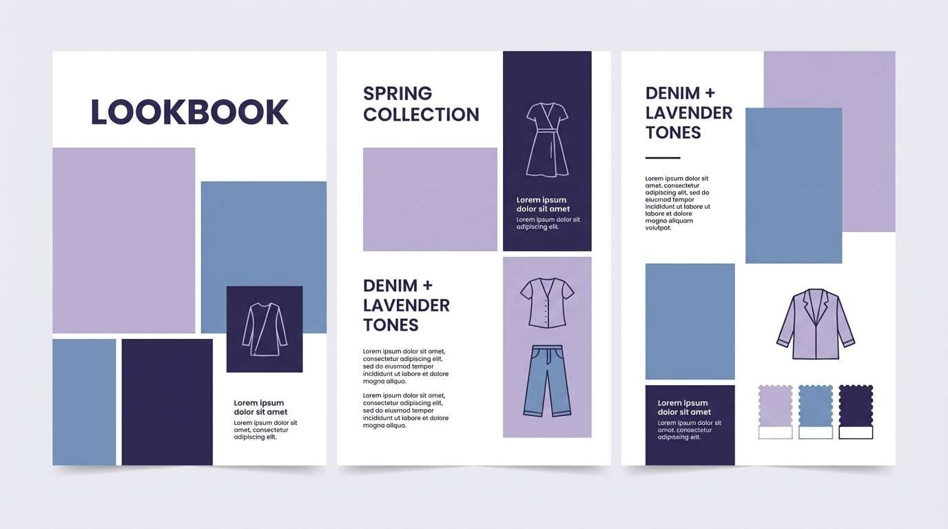
18) Lavender Denim
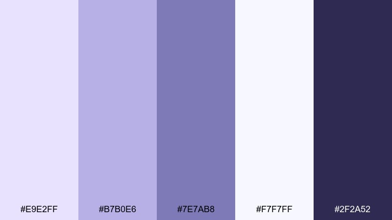
HEX: #E9E2FF #B7B0E6 #7E7AB8 #F7F7FF #2F2A52
Mood: casual, cool, contemporary
Best for: fashion lookbook layout
Cool lavender-blues feel like faded denim, clean seams, and modern street style. Use these tones for lookbooks and catalog layouts where neutral coolness keeps attention on silhouettes. Pair with crisp white margins and deep navy-purple for headings. Usage tip: use the mid denim-lavender for section tabs and captions to create a steady rhythm across pages.
Image example of lavender denim generated using media.io
19) Royal Lavender Drama
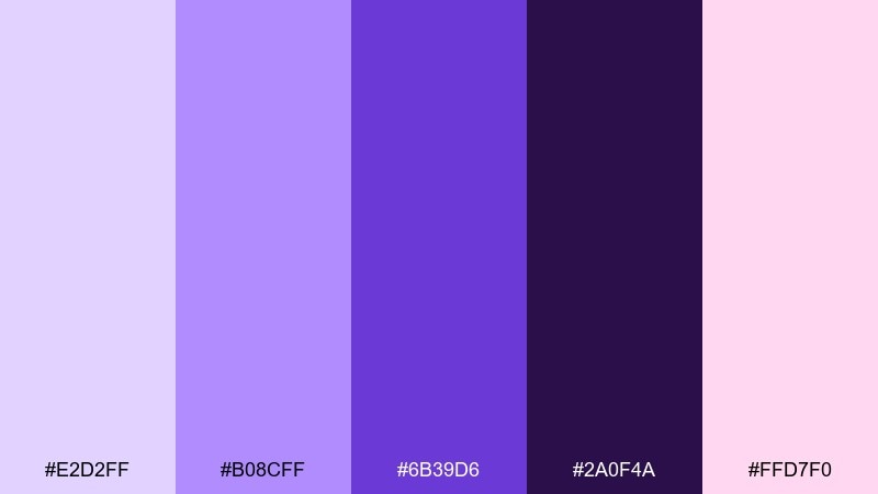
HEX: #E2D2FF #B08CFF #6B39D6 #2A0F4A #FFD7F0
Mood: regal, high-contrast, dramatic
Best for: theater show poster
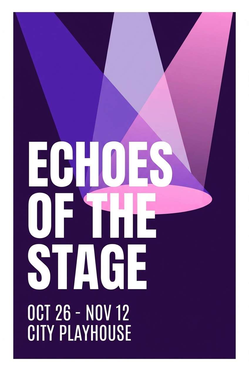
Royal violet and deep grape shadows create a stage-ready, spotlighted drama. These lavender purple color combinations work well when you want elegance with high contrast for distance readability. Pair with gold-leaning neutrals if you need extra luxury, or keep it modern with clean sans type. Usage tip: place the lightest lavender behind key billing to make names pop instantly.
Image example of royal lavender drama generated using media.io
20) Lavender Cocoa
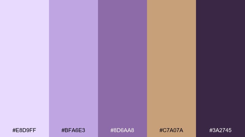
HEX: #E8D9FF #BFA6E3 #8D6AA8 #C7A07A #3A2745
Mood: cozy, grounded, sophisticated
Best for: coffee shop brand kit
Lavender with cocoa browns feels like a warm latte with a floral twist. The blend is great for coffee branding, seasonal menus, and loyalty cards that need warmth without going beige. Pair with dark aubergine for typography and use the caramel tone for highlights and badges. Usage tip: print lavender as a light tint on kraft paper to keep the look artisanal.
Image example of lavender cocoa generated using media.io
21) Lilac Cloud Interface
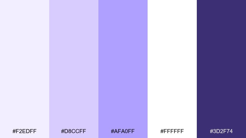
HEX: #F2EDFF #D8CCFF #AFA0FF #FFFFFF #3D2F74
Mood: light, friendly, approachable
Best for: product onboarding screens
Pale lilac clouds and clean whites feel friendly, airy, and easy to follow. Use these tones for onboarding where clarity matters, with violet reserved for progress dots and primary buttons. Pair with simple illustrations and lots of whitespace to reduce cognitive load. Usage tip: keep text on white or very light lilac and use the darkest purple only for headings.
Image example of lilac cloud interface generated using media.io
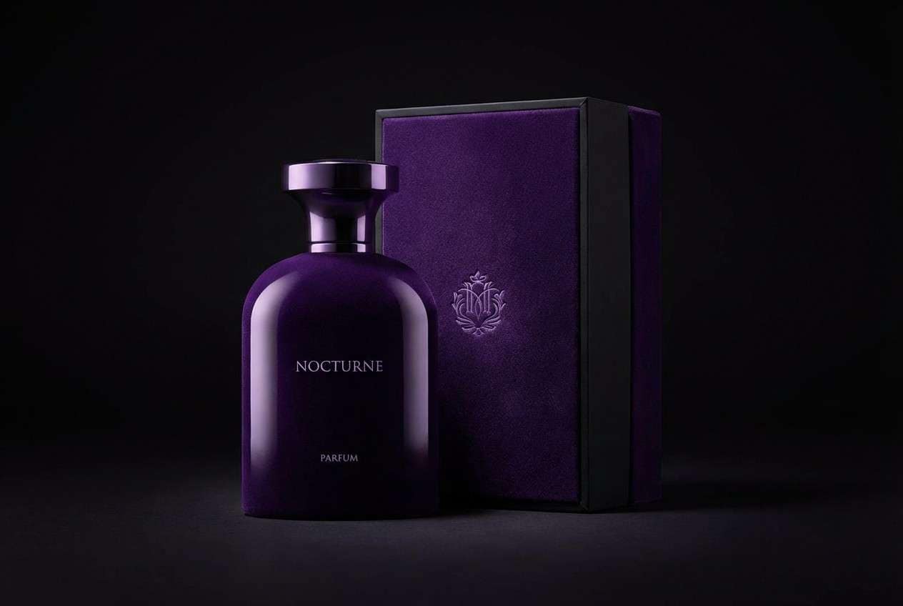
22) Velvet Lavender Night
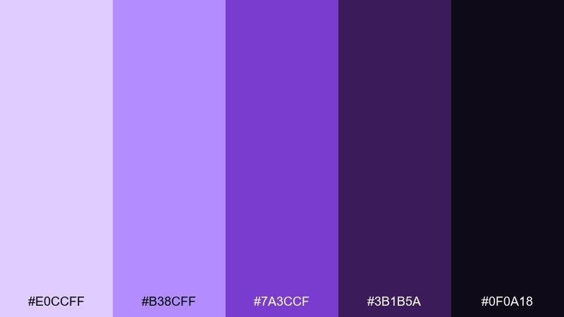
HEX: #E0CCFF #B38CFF #7A3CCF #3B1B5A #0F0A18
Mood: intense, luxurious, nocturnal
Best for: high-end fragrance packaging
Velvet violet and near-black shadows evoke night air, mystery, and a boutique fragrance counter. This lavender purple color palette feels premium when paired with minimal type and plenty of dark space. Add subtle glossy finishes or embossing to let the lighter lavender catch the light. Usage tip: keep one hero panel in the mid violet so the design does not disappear into black.
Image example of velvet lavender night generated using media.io
What Colors Go Well with Lavender Purple?
Lavender purple pairs naturally with soft neutrals like white, warm cream, and pale gray—these keep layouts breathable and help lavender feel modern rather than overly “cute.” For clean UI, try lavender + cool gray + near-black for dependable contrast.
For a more botanical or lifestyle look, add muted greens such as sage, eucalyptus, or mint. These hues bring balance and make lavender feel grounded and natural, especially in wellness branding and spring graphics.
If you want drama, combine lavender with deep plum, eggplant, or indigo. A small accent of chartreuse/lime or hot pink can also work—best used sparingly for badges, CTAs, or limited-time highlights.
How to Use a Lavender Purple Color Palette in Real Designs
Start with role-based color decisions: let a light lavender or off-white be your background, a mid lavender be your supporting UI color (cards, dividers, chips), and a deep plum/indigo handle text and navigation for readability.
For print (invitations, packaging, posters), keep the darkest tone reserved for typography and fine details. Lavender tints can shift in different paper stocks, so test small swatches and maintain strong contrast where information matters.
In branding systems, pick one “signature lavender” and build the rest as supporting tones. Consistency across social templates, web sections, and product visuals is what makes lavender purple look premium and intentional.
Create Lavender Purple Palette Visuals with AI
If you have HEX codes but need polished visuals—mockups, posters, UI screens, or product scenes—AI generation helps you iterate faster while staying on-palette. You can reuse the prompts above or swap subjects (e.g., “email header,” “app onboarding,” “label design”) while keeping the same color direction.
For best results, describe the setting, style (flat, realistic, editorial), lighting, and where lavender purple should appear (background, accents, typography). Then generate multiple options and refine with small prompt changes.
Media.io makes it easy to create lavender purple palette visuals directly in your browser—no software installs needed.
Lavender Purple Color Palette FAQs
-
What is the best lavender purple HEX code to start a palette?
A reliable starting point is a soft lavender tint like #E9D9FF or #E7DDFF, then add a darker anchor (such as #4B3B61 or #1E132B) to ensure text and UI contrast. -
Is lavender purple suitable for professional branding?
Yes. Pair lavender with cool grays, white space, and a near-black/indigo for typography to keep the look refined (for example, “Lavender Gray Minimal” or “Silver Lilac Tech”). -
What colors complement lavender purple the most?
Cream, off-white, and light gray are the easiest complements. Sage green adds a natural balance, while deep plum/indigo adds luxury and contrast for premium designs. -
How do I keep lavender designs from looking too pastel or childish?
Increase contrast and structure: use a dark anchor color for headings/navigation, reduce the number of mid-pastels, and add neutrals (cream, gray, near-black) to keep the palette mature. -
Which lavender purple palettes work best for UI design?
Choose palettes with clear light backgrounds and a strong dark text color, such as “Modern Amethyst UI,” “Lilac Cloud Interface,” and “Silver Lilac Tech.” -
Can lavender purple work for bold, high-energy posters?
Absolutely. Use saturated violets and near-black backgrounds for punch, and add a single neon accent (like lime) for highlights—similar to “Neon Lavender Pop” or “Orchid Glow.” -
How can I generate images that match my lavender purple palette?
Use a text-to-image tool and specify the subject, style, and “dominant colors,” then iterate. With Media.io, you can paste a prompt like the examples above and generate multiple on-brand visuals quickly.


