

Burgundy plum is a rich, moody blend of wine red and deep purple that instantly feels elevated. It’s a go-to for designs that need warmth, depth, and a touch of romance without leaning too bright.
Below are 20 curated burgundy plum color palette ideas with HEX codes, plus practical tips for pairing and using them across branding, interiors, and modern UI.
In this article
- Why Burgundy Plum Palettes Work So Well
-
- velvet merlot
- plum truffle
- rosewood latte
- garnet sage
- midnight mulberry
- dusty orchid cream
- cabernet gold foil
- fig and stone
- cranberry clay
- aubergine noir
- mauve mist
- spiced berry neutrals
- vintage wine poster
- blooming peony plum
- minimal plum ui
- cozy burgundy cabin
- berry sorbet
- botanical plum garden
- modern winery label
- soft plum wedding
- What Colors Go Well with Burgundy Plum?
- How to Use a Burgundy Plum Color Palette in Real Designs
- Create Burgundy Plum Palette Visuals with AI
Why Burgundy Plum Palettes Work So Well
Burgundy plum palettes feel premium because they naturally sit in a “low-light” range: deep bases, softened midtones, and creamy highlights. That contrast creates instant hierarchy in layouts while still looking polished.
They also balance emotion and professionalism. Burgundy brings warmth and confidence, while plum adds a modern, slightly artistic edge—great for branding that wants to feel intimate but not overly sweet.
Finally, these palettes play well with neutrals (cream, greige, near-black), which makes them flexible for everything from editorial pages to UI components and packaging.
20+ Burgundy Plum Color Palette Ideas (with HEX Codes)
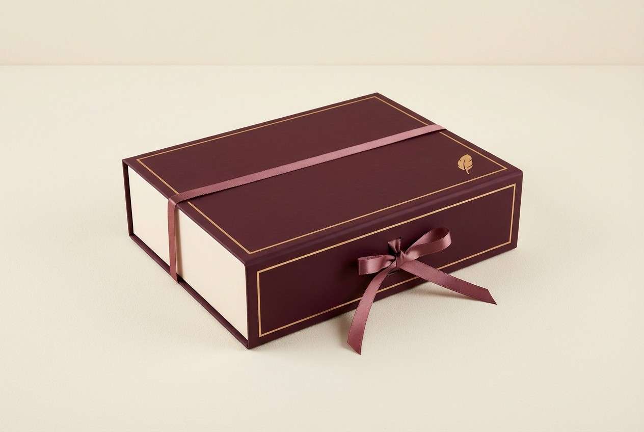
1) Velvet Merlot
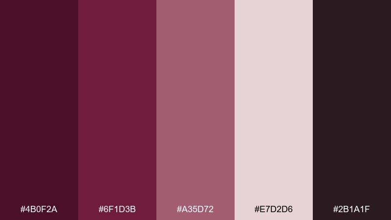
HEX: #4B0F2A #6F1D3B #A35D72 #E7D2D6 #2B1A1F
Mood: luxurious and intimate
Best for: boutique branding
Luxurious and intimate like a candlelit tasting room, these tones feel plush and confident. Use the deep merlot as your anchor, then let the rosy midtone soften headings and badges. Pair with warm off-white for breathing space and a near-black for typography that stays crisp. Tip: keep gradients subtle so the richness reads premium, not heavy.
Image example of velvet merlot generated using media.io
Media.io is an online AI studio for creating and editing video, image, and audio in your browser.

2) Plum Truffle
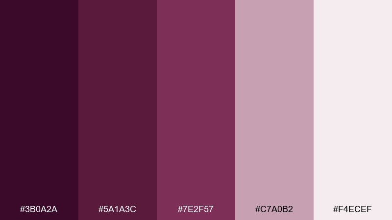
HEX: #3B0A2A #5A1A3C #7E2F57 #C7A0B2 #F4ECEF
Mood: decadent and smooth
Best for: luxury skincare product ad
Decadent and smooth, this mix feels like plum ganache with a soft blush finish. The dark base works beautifully for premium backdrops, while the pale pink lifts product copy and highlights. Keep metals and props minimal so the mauve tones stay the star. Tip: use the lightest shade as negative space around the product to make the bottle pop.
Image example of plum truffle generated using media.io
3) Rosewood Latte
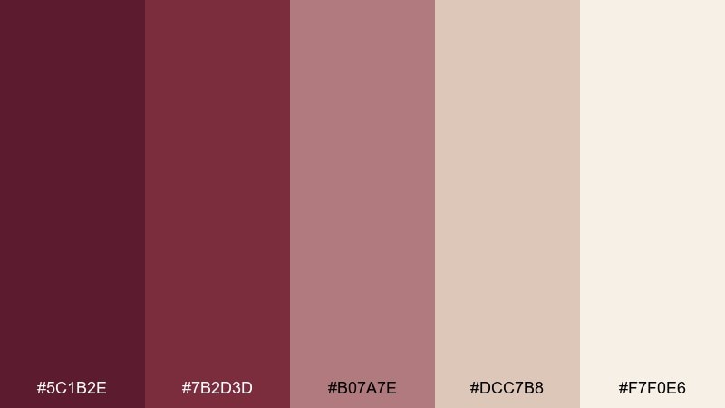
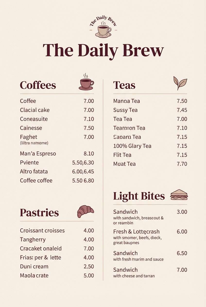
HEX: #5C1B2E #7B2D3D #B07A7E #DCC7B8 #F7F0E6
Mood: warm and grounded
Best for: cozy cafe menu design
Warm and grounded, it evokes rosewood tables, steamed milk, and a quiet afternoon. These burgundy plum color combination notes work especially well for menus where readability matters. Pair the creamy beige as the paper tone, then reserve the deeper reds for section headers and pricing. Tip: stick to one accent color per page to keep the layout calm.
Image example of rosewood latte generated using media.io
4) Garnet Sage
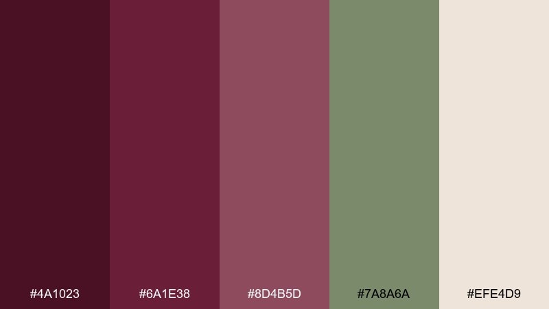
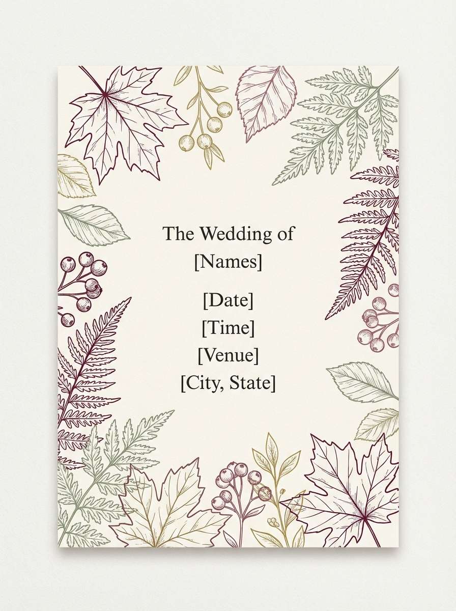
HEX: #4A1023 #6A1E38 #8D4B5D #7A8A6A #EFE4D9
Mood: earthy and elegant
Best for: fall wedding invitation
Earthy and elegant, it feels like dried leaves, dark berries, and fresh herbs. The muted sage gives the reds a modern balance and keeps the look from going too sweet. Use the cream tone as the card stock base, and bring garnet into names and monograms. Tip: add a thin sage border to frame the invitation without stealing attention.
Image example of garnet sage generated using media.io
5) Midnight Mulberry
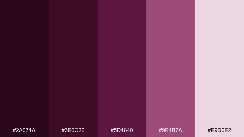
HEX: #2A071A #3E0C26 #5D1640 #9E4B7A #E9D6E2
Mood: dramatic and nocturnal
Best for: music event poster
Dramatic and nocturnal, it suggests velvet curtains and late-night city lights. Use the inky tones for the background to create instant contrast, then let mulberry and soft pink carry the key details. It suits bold typography and minimalist shapes better than busy imagery. Tip: keep spacing generous so the dark palette still feels premium and readable.
Image example of midnight mulberry generated using media.io

6) Dusty Orchid Cream
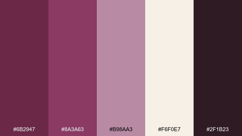
HEX: #6B2947 #8A3A63 #B98AA3 #F6F0E7 #2F1B23
Mood: soft and romantic
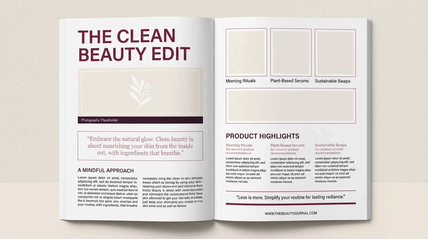
Best for: beauty blog editorial layout
Soft and romantic, these dusty orchid tones feel like silk ribbon and blurred florals. The cream background keeps long-form text comfortable, while the deep plum adds structure to headlines and pull quotes. Pair with delicate line icons and plenty of margin for an airy editorial vibe. Tip: use the muted mauve for highlights instead of bright underlines.
Image example of dusty orchid cream generated using media.io
7) Cabernet Gold Foil
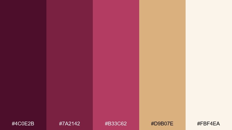
HEX: #4C0E2B #7A2142 #B33C62 #D9B07E #FBF4EA
Mood: opulent and celebratory
Best for: premium gift box packaging
Opulent and celebratory, it reads like cabernet velvet with a warm gilded glow. These burgundy plum color combinations shine on packaging where you want instant shelf appeal. Use the cream as the base, then bring in gold as a foil-like accent against deep wine tones. Tip: keep the bright berry shade for small marks like seals or callouts so it feels intentional.
Image example of cabernet gold foil generated using media.io
8) Fig and Stone
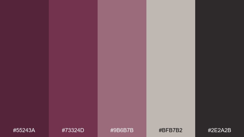
HEX: #55243A #73324D #9B6B7B #BFB7B2 #2E2A2B
Mood: modern and muted
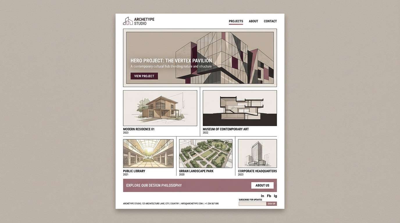
Best for: architectural portfolio website
Modern and muted, it feels like fig skin against cool stone and shadow. The warm plum notes add personality without overwhelming photography or project diagrams. Let gray-beige handle backgrounds and spacing, then use the darker tones for navigation and captions. Tip: keep buttons in the mid plum for a clear, consistent call to action.
Image example of fig and stone generated using media.io
9) Cranberry Clay
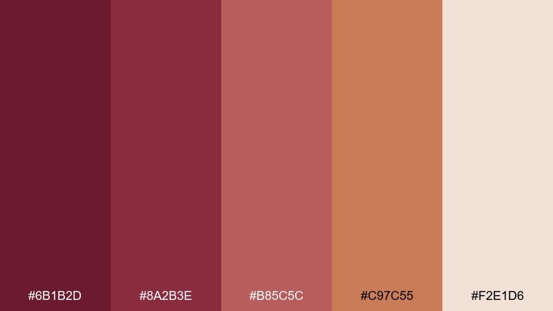
HEX: #6B1B2D #8A2B3E #B85C5C #C97C55 #F2E1D6
Mood: rustic and inviting
Best for: seasonal food flyer
Rustic and inviting, it brings to mind cranberry chutney, baked clay, and warm kitchens. The terracotta accent adds a hearty twist that works great for autumn and holiday promotions. Use the light beige as the flyer base and set bold offers in the deeper red for instant contrast. Tip: keep food photos warm-toned so they harmonize with the palette.
Image example of cranberry clay generated using media.io
10) Aubergine Noir
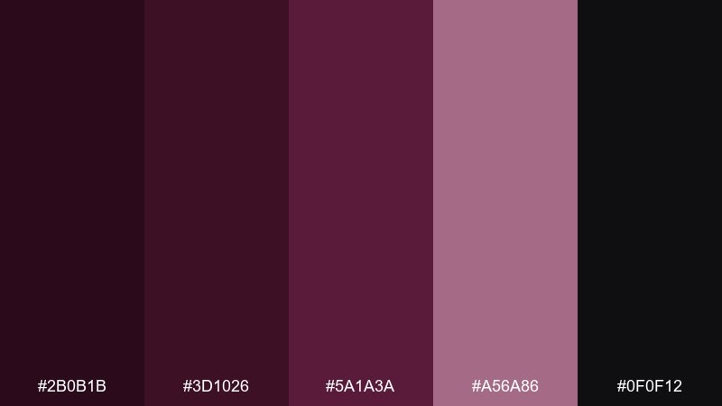
HEX: #2B0B1B #3D1026 #5A1A3A #A56A86 #0F0F12
Mood: bold and cinematic
Best for: luxury fashion lookbook cover
Bold and cinematic, it feels like backstage shadows with a flash of satin. The near-black makes typography sharp and editorial, while the mauve accent adds a refined highlight. Pair with monochrome photography and minimal type weights for a runway-ready finish. Tip: reserve the light mauve for one focal element, like the season title or a small sticker.
Image example of aubergine noir generated using media.io
11) Mauve Mist
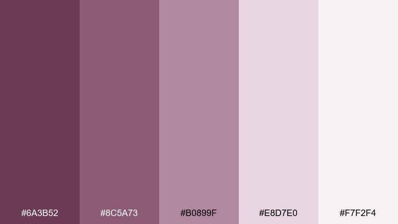
HEX: #6A3B52 #8C5A73 #B0899F #E8D7E0 #F7F2F4
Mood: calm and airy
Best for: wellness app onboarding screens
Calm and airy, it looks like morning mist over soft mauve petals. The gentle contrast is ideal for onboarding flows where you want a soothing pace and clear hierarchy. Use the palest shades for backgrounds, then lean on the deeper mauves for buttons and progress states. Tip: add micro-illustrations in one midtone to keep screens cohesive.
Image example of mauve mist generated using media.io
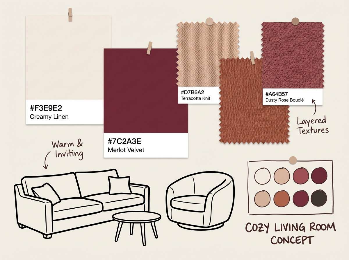
12) Spiced Berry Neutrals
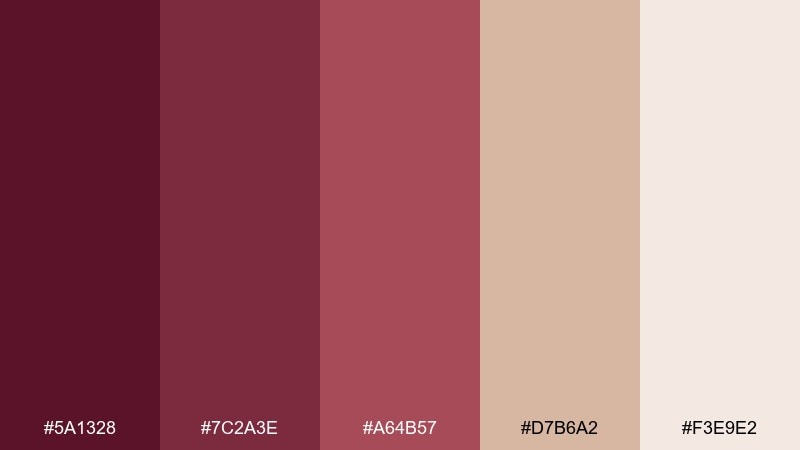
HEX: #5A1328 #7C2A3E #A64B57 #D7B6A2 #F3E9E2
Mood: cozy and refined
Best for: living room interior concept board
Cozy and refined, it evokes spiced berries, linen throws, and warm lamplight. The beige neutrals make the deeper reds feel sophisticated rather than loud. Use the darkest tone for small decor accents like frames or vases, and keep walls in the palest shade. Tip: repeat the mid berry tone in two places only to maintain a designer look.
Image example of spiced berry neutrals generated using media.io
13) Vintage Wine Poster
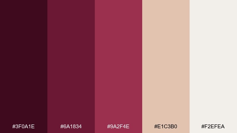
HEX: #3F0A1E #6A1834 #9A2F4E #E1C3B0 #F2EFEA
Mood: nostalgic and artsy
Best for: retro product poster
Nostalgic and artsy, it channels old wine labels and letterpress texture. The warm paper tones keep the reds from feeling too modern, perfect for vintage-inspired graphics. Pair with serif type, simple illustration, and a slightly worn grain effect. Tip: use the mid red for stamps and badges to guide the eye.
Image example of vintage wine poster generated using media.io
14) Blooming Peony Plum
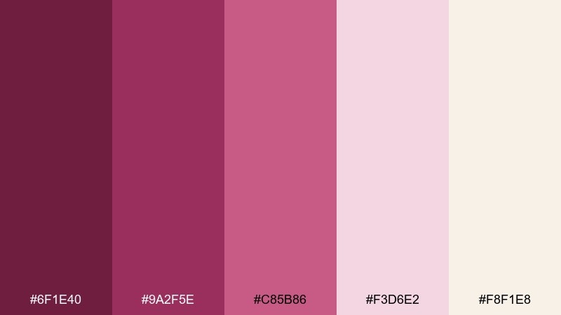
HEX: #6F1E40 #9A2F5E #C85B86 #F3D6E2 #F8F1E8
Mood: bright and romantic
Best for: spring floral illustration
Bright and romantic, it feels like peonies opening in late spring. The blush and petal-pink tones make the plum shades look fresh rather than heavy. Use it for florals, beauty banners, or gift wrap patterns, and pair with fine linework for detail. Tip: keep backgrounds in the warm off-white so the petals stay luminous.
Image example of blooming peony plum generated using media.io
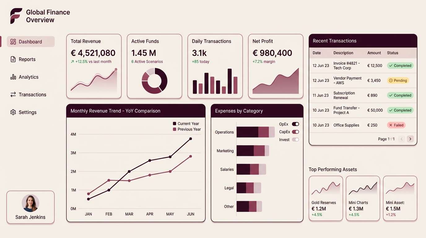
15) Minimal Plum UI
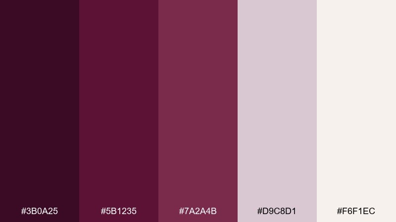
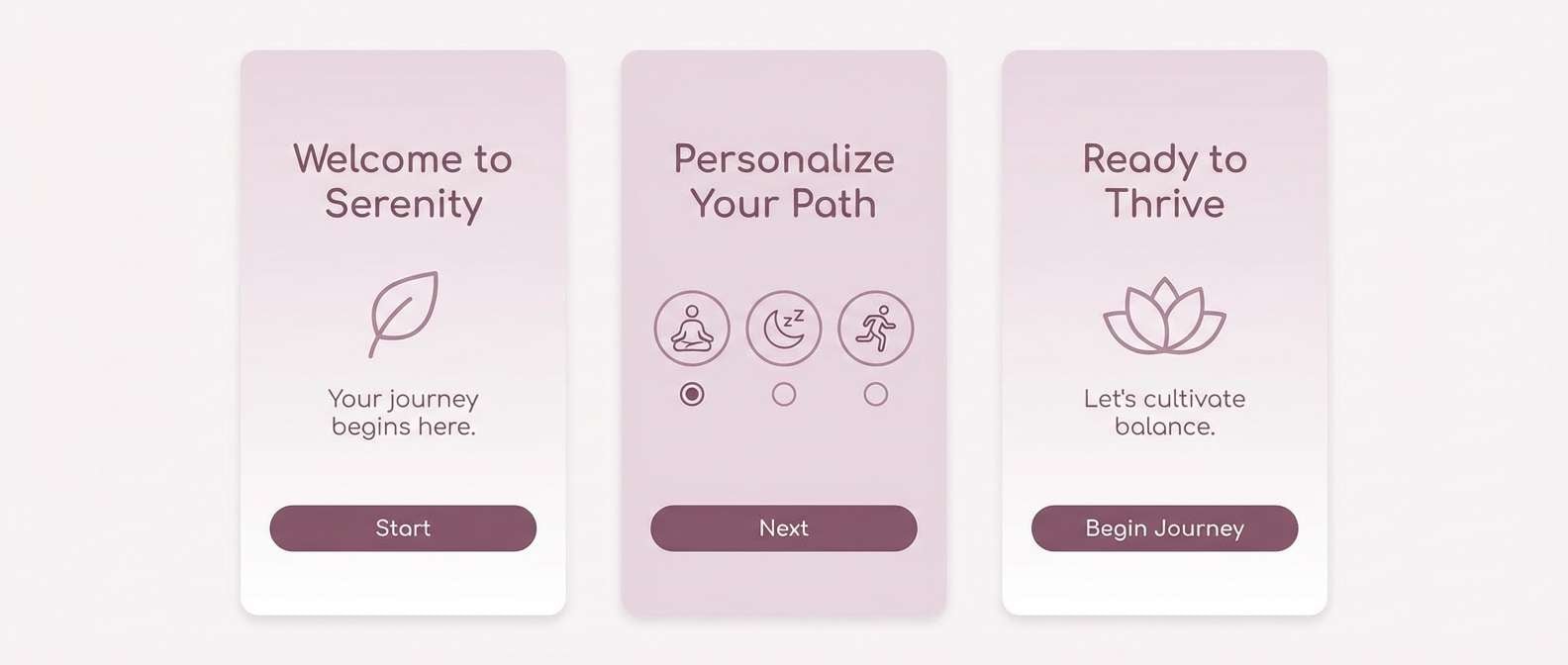
HEX: #3B0A25 #5B1235 #7A2A4B #D9C8D1 #F6F1EC
Mood: sleek and modern
Best for: finance dashboard UI
Sleek and modern, it reads like polished plum glass against warm paper. This burgundy plum color palette works beautifully for dashboards that need seriousness without looking cold. Use the dark plum for navigation and key metrics, then rely on the pale neutrals for panels and tables. Tip: make alerts monochrome within the palette to keep the interface cohesive.
Image example of minimal plum ui generated using media.io
16) Cozy Burgundy Cabin
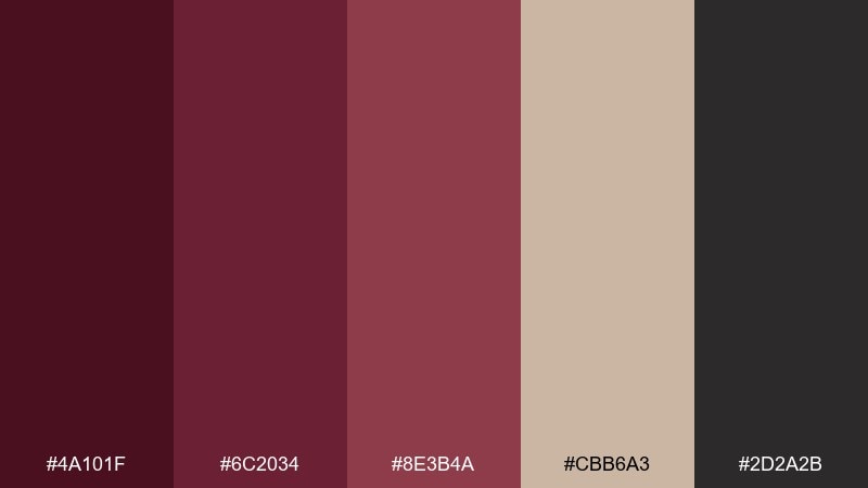
HEX: #4A101F #6C2034 #8E3B4A #CBB6A3 #2D2A2B
Mood: warm and rustic
Best for: holiday rental listing banner
Warm and rustic, it brings up images of knit blankets, wood grain, and mulled wine. The tan neutral keeps the reds from feeling too intense and helps text stay readable on banners. Pair with simple icons and a clean sans serif to avoid a cluttered look. Tip: use the near-black sparingly for small text and separators.
Image example of cozy burgundy cabin generated using media.io
17) Berry Sorbet
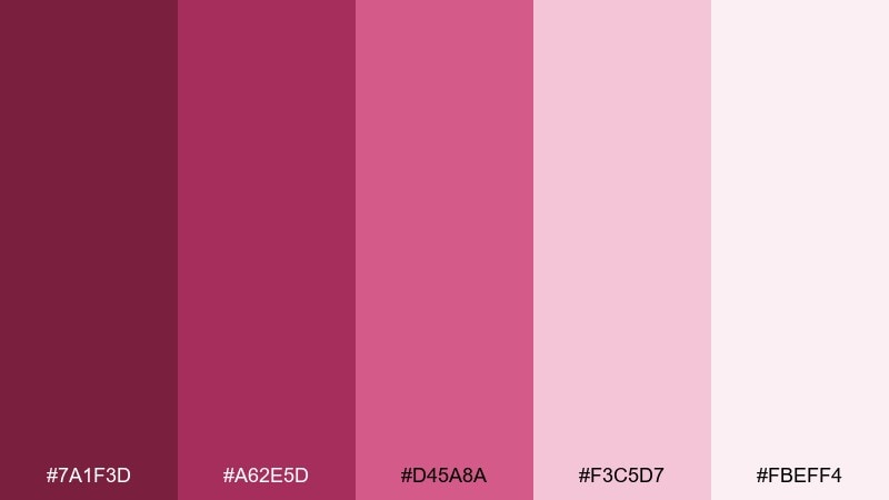
HEX: #7A1F3D #A62E5D #D45A8A #F3C5D7 #FBEFF4
Mood: playful and sweet
Best for: social media promo post
Playful and sweet, it feels like berry sorbet with a rosy foam top. The brighter pinks are great for promos, product drops, or limited-time offers that need quick attention. Balance the pop with plenty of pale background and keep copy short. Tip: use the darkest shade for the call-to-action button so it stays legible.
Image example of berry sorbet generated using media.io

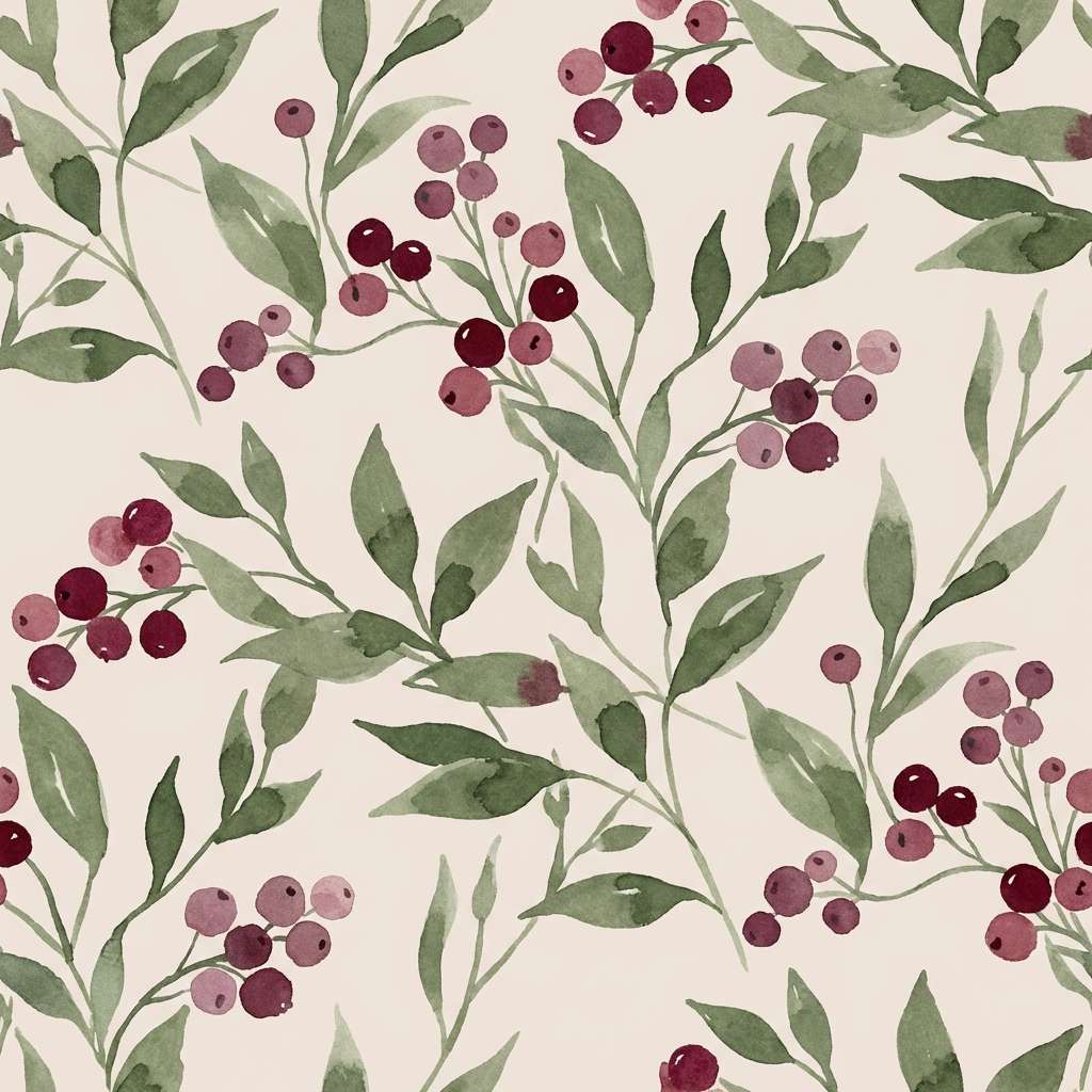
18) Botanical Plum Garden
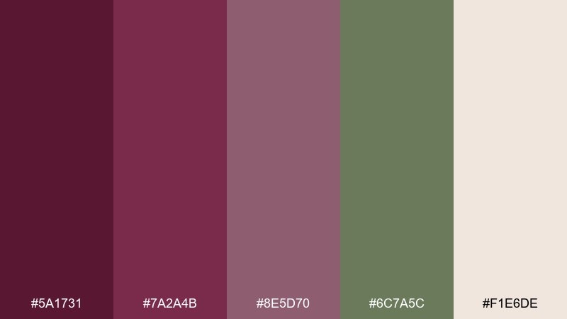
HEX: #5A1731 #7A2A4B #8E5D70 #6C7A5C #F1E6DE
Mood: natural and sophisticated
Best for: botanical pattern design
Natural and sophisticated, it suggests wild berries tucked into green foliage. The olive-sage note makes the plums feel organic and perfect for stationery or fabric prints. Use the light beige as the ground color, then layer leaves and petals in two midtones. Tip: keep outlines minimal so the pattern stays airy and timeless.
Image example of botanical plum garden generated using media.io
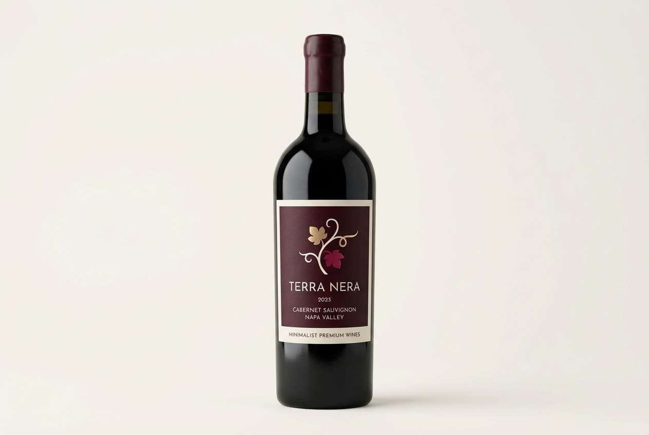
19) Modern Winery Label
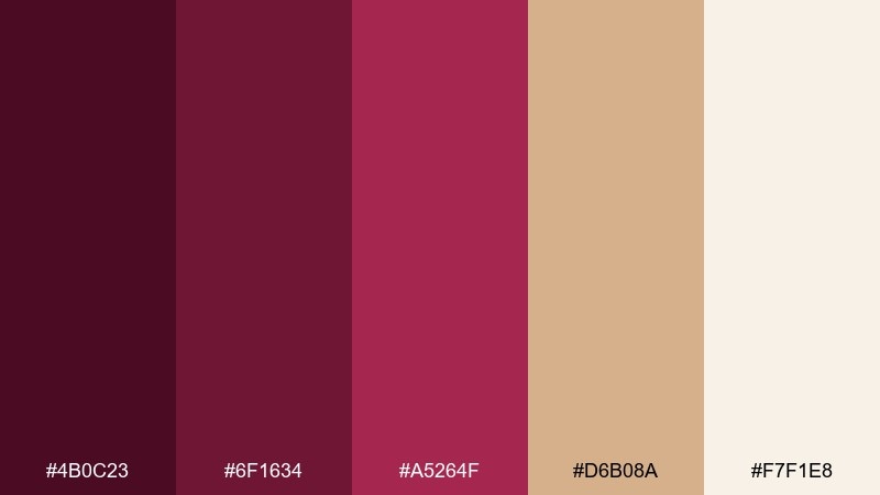
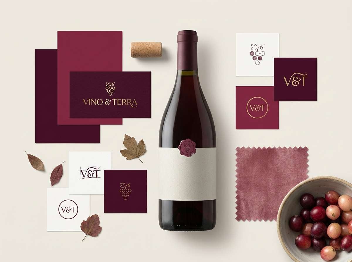
HEX: #4B0C23 #6F1634 #A5264F #D6B08A #F7F1E8
Mood: confident and refined
Best for: wine bottle label design
Confident and refined, it feels like a modern cellar with warm oak and deep fruit notes. Burgundy plum color combinations like this are ideal for labels that need to look premium at a glance. Use the pale tone as negative space, then set the brand name in the darkest shade for authority. Tip: limit the gold-beige to one small emblem so it reads like a crafted detail.
Image example of modern winery label generated using media.io
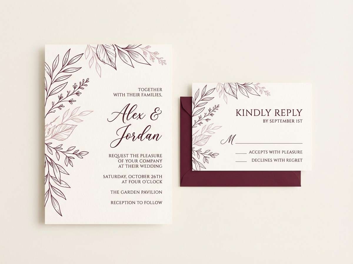
20) Soft Plum Wedding
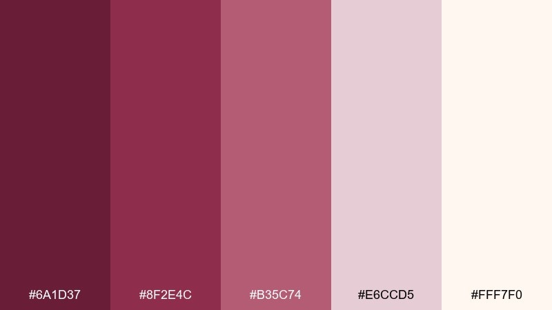
HEX: #6A1D37 #8F2E4C #B35C74 #E6CCD5 #FFF7F0
Mood: tender and timeless
Best for: wedding stationery suite
Tender and timeless, it recalls pressed flowers, satin ribbon, and handwritten vows. This burgundy plum color palette suits stationery suites when you want romance without overly bright pinks. Pair the creamy white with delicate line florals, and use the mid plum for names and RSVP details. Tip: keep envelope liners in the darkest shade for a subtle wow moment.
Image example of soft plum wedding generated using media.io
What Colors Go Well with Burgundy Plum?
Burgundy plum pairs beautifully with warm neutrals like cream, ivory, oat, and soft beige because they lift the palette and keep it from feeling too dark. These are ideal “base” colors for backgrounds, paper textures, and UI surfaces.
For a modern contrast, add near-black (ink, charcoal) for type and structure, or muted greens like sage/olive to create an earthy balance. If you want something more celebratory, gold-beige or brass tones add a tasteful highlight.
For a fresher, lighter direction, lean into blush, dusty rose, and pale mauve. Those pink-leaning tints keep burgundy plum romantic and bright enough for spring visuals.
How to Use a Burgundy Plum Color Palette in Real Designs
Start by choosing a “hero” shade (usually the deepest burgundy or plum) and use it for the highest-impact elements: navigation bars, headings, key labels, or brand marks. Then assign one light neutral as your main background to preserve readability.
Keep accents intentional. A mid-berry or mauve works well for buttons, badges, and highlights, while a single metallic-like beige (or warm tan) can act as a premium detail on packaging or invitations.
If you’re using photography, warm your images slightly and avoid overly cool blue lighting. Burgundy plum looks most cohesive when the overall tone stays warm and softly contrasted.
Create Burgundy Plum Palette Visuals with AI
If you already have HEX codes, you can turn them into brand moodboards, UI mockups, posters, or product scenes in minutes. The trick is to describe both the design type (poster, dashboard, label) and how the colors should be used (dominant, accents, background).
Use one palette as the primary guide, then keep the prompt consistent across variations (same layout, different subject) to build a cohesive set for campaigns or case studies.
To generate on-brand visuals fast, try Media.io’s text-to-image tool and paste one of the prompts above as a starting point.
Burgundy Plum Color Palette FAQs
-
What is a burgundy plum color palette?
A burgundy plum color palette is a coordinated set of shades built around deep wine reds and plum purples, typically supported by soft mauves and warm neutrals (like cream or beige) to keep contrast readable and elegant. -
Is burgundy plum warm or cool?
It can be both, but most burgundy plum palettes read warm because they lean red and pair well with creamy off-whites. If you add more purple-leaning plums and cool grays, the overall feel becomes cooler and more nocturnal. -
What neutral colors match burgundy plum best?
Cream, ivory, warm beige, greige, and soft taupe are the most reliable neutrals. They brighten the palette, add breathing space, and make deep burgundy or plum text and UI elements easier to balance. -
What accent colors work with burgundy plum?
Muted sage/olive greens, gold-beige/brass tones, dusty rose, and soft mauve are strong accents. Choose one main accent and repeat it sparingly for a polished, “designed” look. -
How do I keep burgundy plum designs from looking too dark?
Use a light neutral as the primary background, reserve the darkest shade for small high-contrast areas (type, nav, frames), and add a midtone mauve or blush to soften transitions. Generous spacing also helps the palette feel premium instead of heavy. -
Is burgundy plum good for UI design?
Yes—especially for premium, calm, or editorial interfaces. Use deep plum/burgundy for navigation and key metrics, then place cards and tables on warm off-white panels so contrast stays accessible and clean. -
Can I generate burgundy plum palette images with AI?
Yes. With Media.io, you can describe the design format (moodboard, packaging, UI screens), then specify which HEX codes should be dominant and which should be accents to keep results consistent.
Next: Beige Red Color Palette


