

Citrine is a warm yellow that sits between gold and green, which makes it feel sunny without turning neon. In palettes, it can read energetic, premium, earthy, or modern depending on the neutrals and greens you pair it with.
Below are 20 citrine color palette combinations with HEX codes, plus design-ready prompts you can use to generate consistent visuals for branding, UI, print, and social content.
In this article
Why Citrine Palettes Work So Well
Citrine tones naturally attract attention because they sit in the “sunlight” zone of the spectrum. That makes them perfect for calls to action, badges, highlights, and brand moments where you want instant clarity.
Unlike pure lemon yellow, citrine often carries a slightly earthy or greenish undertone. This helps it pair smoothly with olives, sages, browns, and off-whites, keeping designs warm but grounded.
In print and UI alike, citrine is flexible: use it as a small accent for a premium feel, or as a dominant block color when you balance it with deep neutrals (charcoal, navy, espresso) for readability.
20+ Citrine Color Palette Ideas (with HEX Codes)
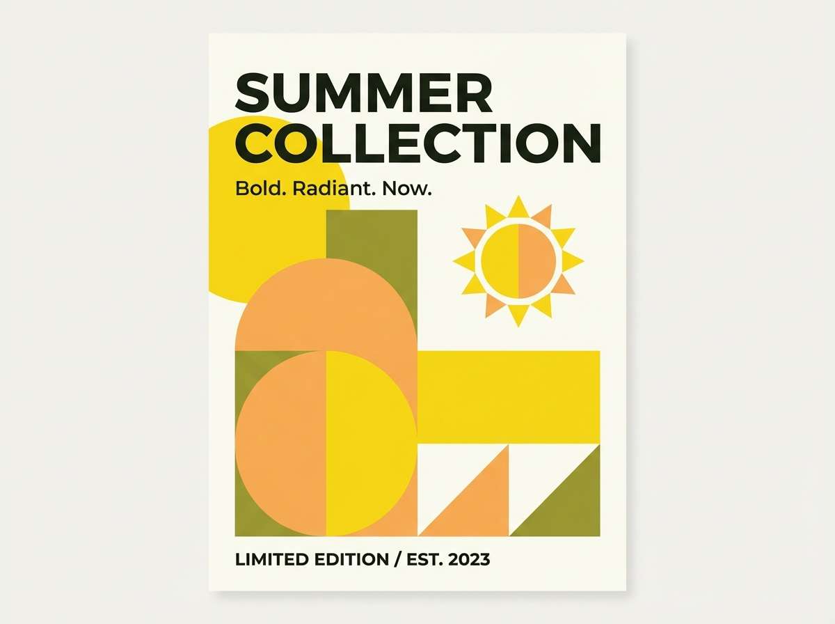
1) Sunlit Saffron
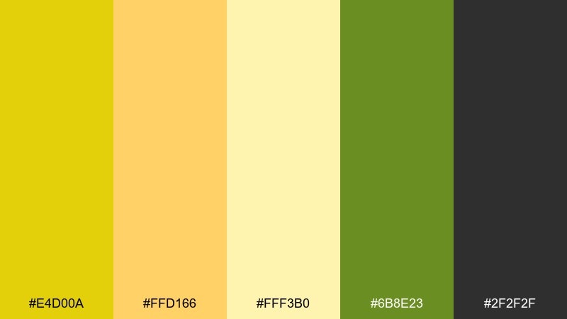
HEX: #E4D00A #FFD166 #FFF3B0 #6B8E23 #2F2F2F
Mood: bright and upbeat
Best for: summer campaign poster
Bright and upbeat, like noon sun on fresh citrus and crisp leaves. Use it for energetic posters, event graphics, and bold social tiles where contrast needs to read fast. Pair the yellow with the olive as a grounding accent, then let the soft cream keep large areas comfortable. Tip: reserve the charcoal for type only to keep the palette feeling airy.
Image example of sunlit saffron generated using media.io
Media.io is an online AI studio for creating and editing video, image, and audio in your browser.

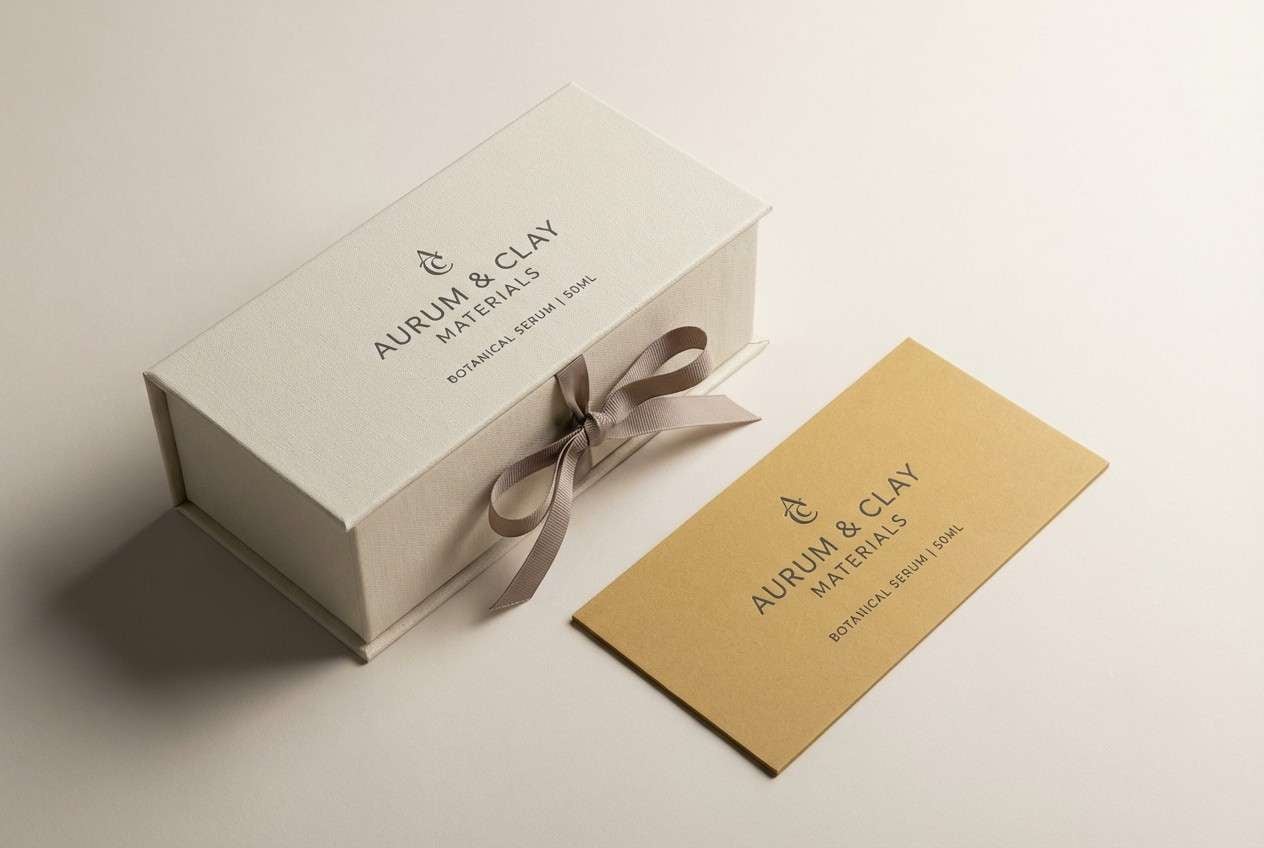
2) Honeyed Linen
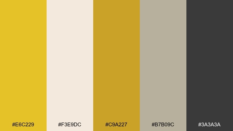
HEX: #E6C229 #F3E9DC #C9A227 #B7B09C #3A3A3A
Mood: soft and refined
Best for: minimal packaging design
Soft and refined, like honey drizzled over natural linen. It works beautifully for minimal packaging, labels, and premium stationery where warmth matters more than saturation. Pair the muted golds with the oatmeal neutral for a calm base, and use the deep gray for crisp readability. Tip: emboss or foil the brighter gold to add depth without adding new colors.
Image example of honeyed linen generated using media.io
3) Golden Orchard
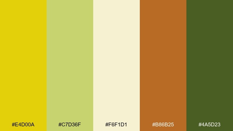
HEX: #E4D00A #C7D36F #F6F1D1 #B86B25 #4A5D23
Mood: fresh and pastoral
Best for: farm-to-table brand identity
Fresh and pastoral, like late-summer fruit stands and sunlit fields. These citrine color combinations feel natural for farm-to-table branding, farmers market signage, and ingredient-forward food labels. Pair the bright yellow with leaf green, then use the warm brown as a harvest note for headers and icons. Tip: keep backgrounds creamy so the yellow stays readable and not overly neon.
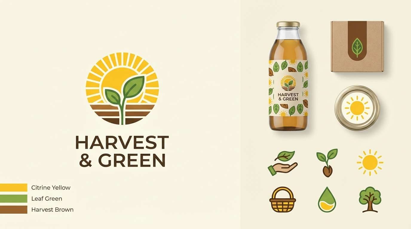
Image example of golden orchard generated using media.io
4) Citrus Grove
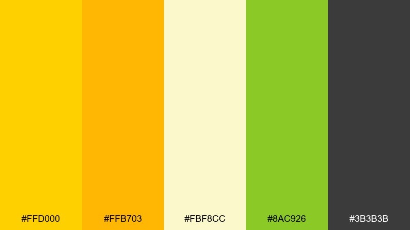
HEX: #FFD000 #FFB703 #FBF8CC #8AC926 #3B3B3B
Mood: zesty and playful
Best for: kids learning app UI
Zesty and playful, like orange peel oils and bright morning snacks. It fits kids learning UI, friendly onboarding screens, and playful icon sets where positivity is the goal. Pair the two warm yellows for buttons and highlights, then use the green for progress states or friendly badges. Tip: keep text in deep gray and use cream panels to reduce glare.
Image example of citrus grove generated using media.io

5) Antique Brass
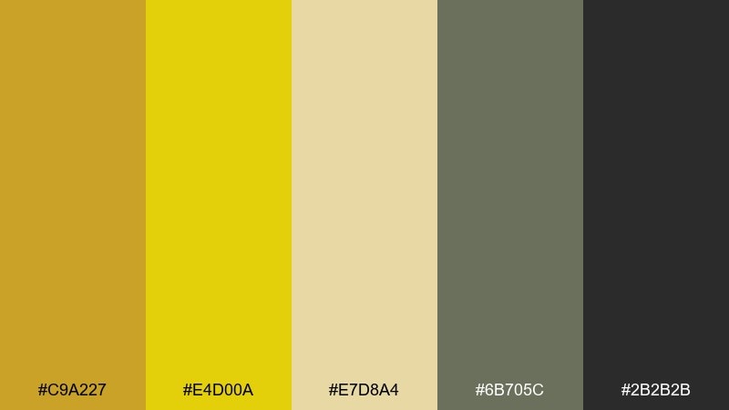
HEX: #C9A227 #E4D00A #E7D8A4 #6B705C #2B2B2B
Mood: heritage and sturdy
Best for: craft brewery label
Heritage and sturdy, like worn brass hardware and old workshop light. Use it for craft beverage labels, heritage logos, and product badges that need a confident, timeless vibe. Pair the brass-gold tones with the slate green to keep it grounded and less flashy. Tip: add texture through paper grain or etching-style linework rather than extra colors.
Image example of antique brass generated using media.io
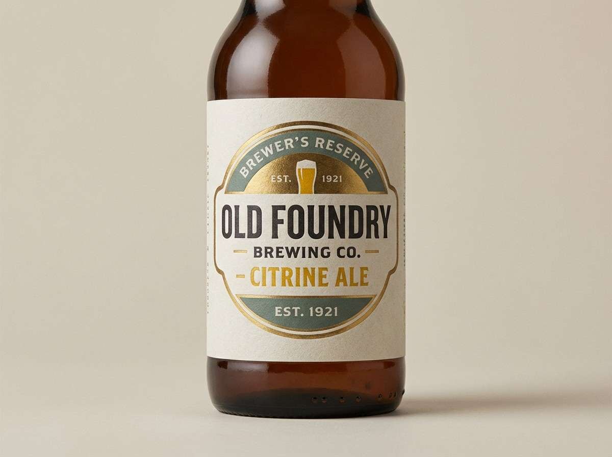
6) Marigold Clay
HEX: #F2C14E #E4D00A #F7F3E3 #C97C5D #6D4C41
Mood: warm and handmade
Best for: ceramics shop promo flyer
Warm and handmade, like sunlit marigolds beside raw terracotta. It suits artisan promos, ceramics branding, and small-batch product stories where tactile color matters. Pair the soft cream with clay browns for the base, then use the brighter yellow to spotlight prices or key details. Tip: keep shapes organic and imperfect to match the earthy mood.
Image example of marigold clay generated using media.io

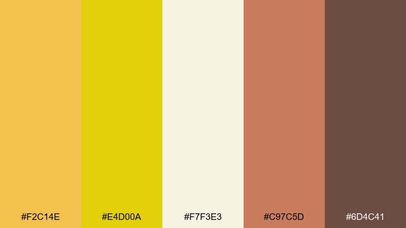
7) Desert Ochre
HEX: #D6A400 #E4D00A #EFE6D0 #A68A64 #5A4A3C
Mood: sunbaked and calm
Best for: interior paint and decor moodboard
Sunbaked and calm, like sandstone trails and golden dust at dusk. This mix is ideal for interior moodboards, paint selection sheets, and decor styling that leans warm without feeling orange. Pair the ochre and sand for walls and textiles, then bring in the darker brown for wood accents and framing. Tip: use the brightest yellow only in small décor pieces so the room stays restful.
Image example of desert ochre generated using media.io
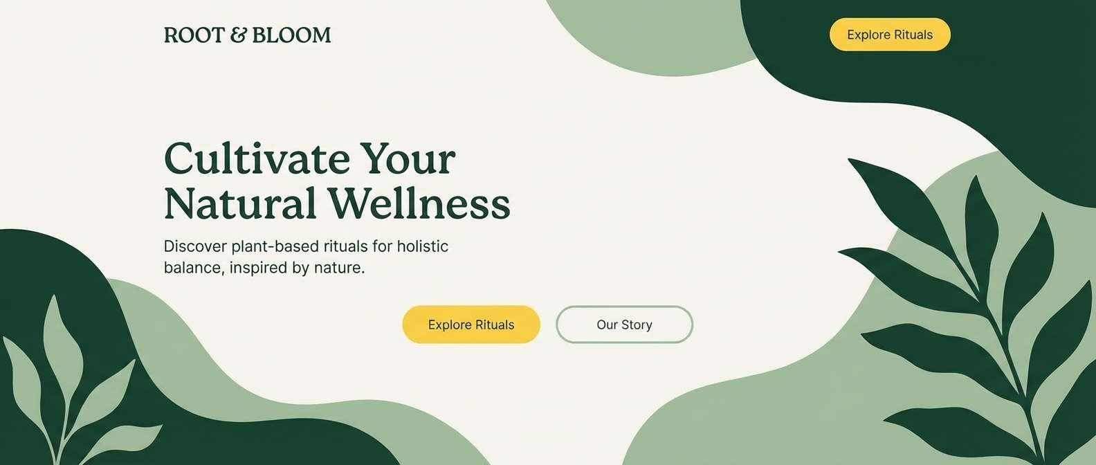
8) Olive Gleam
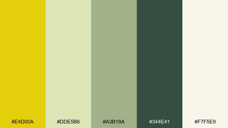
HEX: #E4D00A #DDE5B6 #A3B18A #344E41 #F7F5E9
Mood: botanical and modern
Best for: wellness brand landing page
Botanical and modern, like fresh herbs under warm kitchen light. This citrine color palette is a strong fit for wellness landing pages, eco services, and clean lifestyle branding. Pair the deep forest green with the creamy base for structure, then use the bright yellow as a sparing call-to-action accent. Tip: keep icon strokes thin so the greens feel light, not heavy.
Image example of olive gleam generated using media.io
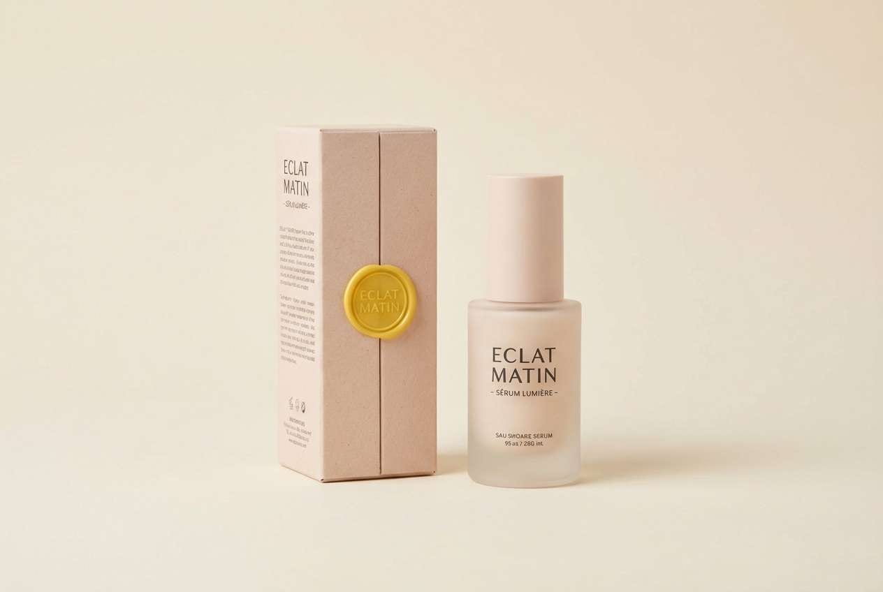
9) Warm Quartz
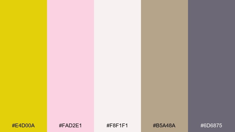
HEX: #E4D00A #FAD2E1 #F8F1F1 #B5A48A #6D6875
Mood: gentle and uplifting
Best for: beauty product ad
Gentle and uplifting, like rosy quartz catching a golden sunbeam. Use it for beauty ads, skincare launches, and lifestyle graphics that need softness with a confident highlight. Pair the blush and cream for backgrounds, then let the yellow pop on seals, callouts, or small graphic motifs. Tip: keep the gray-mauve for typography to avoid harsh contrast against the pink tones.
Image example of warm quartz generated using media.io
10) Solar Pop
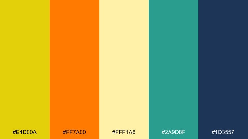
HEX: #E4D00A #FF7A00 #FFF1A8 #2A9D8F #1D3557
Mood: bold and high-energy
Best for: music festival poster
Bold and high-energy, like neon sun flares against deep evening skies. It shines on music posters, merch graphics, and punchy digital ads that need instant movement. Pair the bright yellow with the deep navy for maximum contrast, then use teal as a cool counterbalance to the orange. Tip: limit gradients and keep shapes chunky so the palette stays loud and legible.
Image example of solar pop generated using media.io

11) Vintage Bookplate
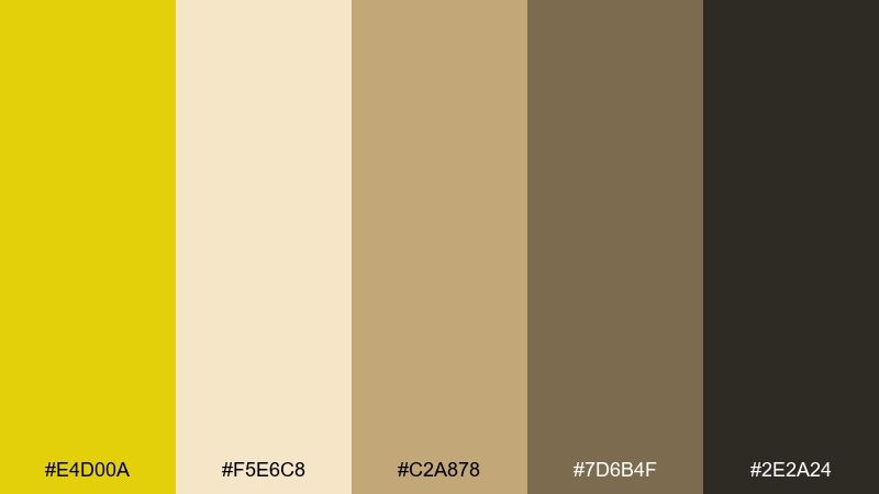
HEX: #E4D00A #F5E6C8 #C2A878 #7D6B4F #2E2A24
Mood: classic and scholarly
Best for: editorial magazine spread
Classic and scholarly, like aged paper with a glint of gold leaf. It works for editorial layouts, book covers, and heritage storytelling where warmth reads as credibility. Pair the parchment and tan as wide margins, then use the deeper browns for serif headlines and dividers. Tip: add small ornamental rules in the yellow to guide the eye without overpowering the page.
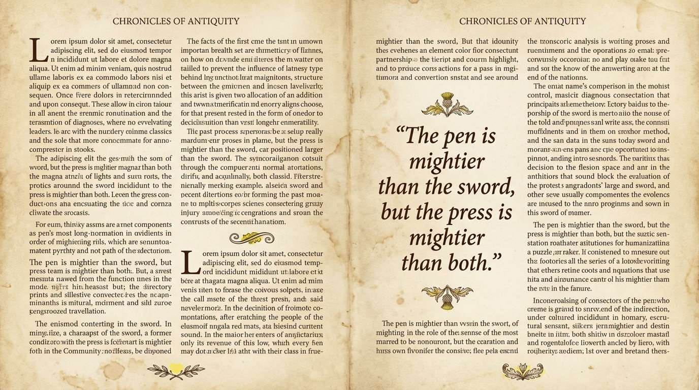
Image example of vintage bookplate generated using media.io
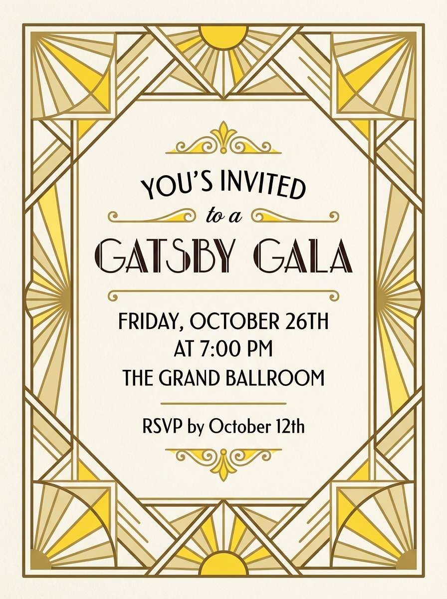
12) Art Deco Gilt
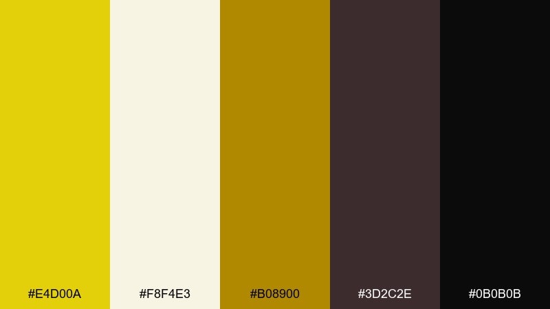
HEX: #E4D00A #F8F4E3 #B08900 #3D2C2E #0B0B0B
Mood: luxurious and dramatic
Best for: gala invitation design
Luxurious and dramatic, like gilded lines on a dark theater curtain. Use it for gala invitations, premium event branding, and elegant menus that need instant sophistication. Pair the cream background with black typography, then add the two gold tones as geometric borders and corner details. Tip: keep gold elements thin and symmetrical to nail the deco feel.
Image example of art deco gilt generated using media.io
13) Botanical Wash
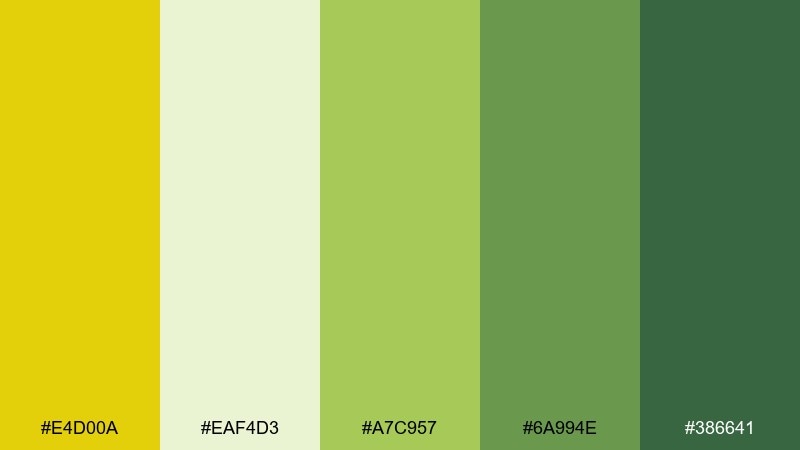
HEX: #E4D00A #EAF4D3 #A7C957 #6A994E #386641
Mood: fresh and painterly
Best for: spring botanical illustration
Fresh and painterly, like watercolor leaves with a sunlight sparkle. It is perfect for spring illustrations, garden workshop promos, and nature-forward blog headers. Pair the pale wash with mid greens for soft depth, then tap the yellow for pollen dots or tiny highlights. Tip: keep edges soft and layered so the greens feel alive rather than flat.
Image example of botanical wash generated using media.io
14) Café Meringue
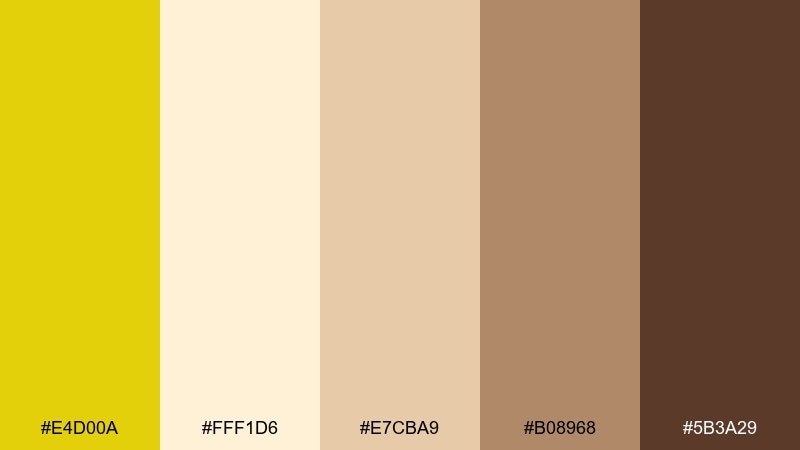
HEX: #E4D00A #FFF1D6 #E7CBA9 #B08968 #5B3A29
Mood: cozy and inviting
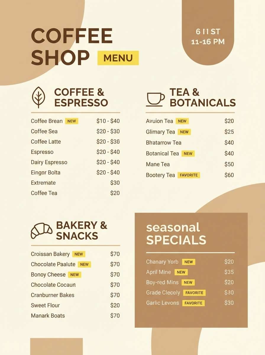
Best for: coffee shop menu design
Cozy and inviting, like toasted meringue and warm café wood. These citrine color combinations suit menus, loyalty cards, and café signage that should feel friendly but polished. Pair the creamy beige with the coffee brown for hierarchy, then use the bright yellow sparingly to highlight seasonal specials. Tip: keep the layout spacious so the warm browns do not feel heavy.
Image example of café meringue generated using media.io
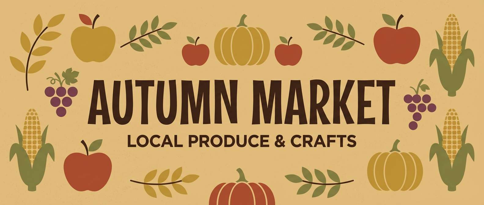
15) Rustic Harvest
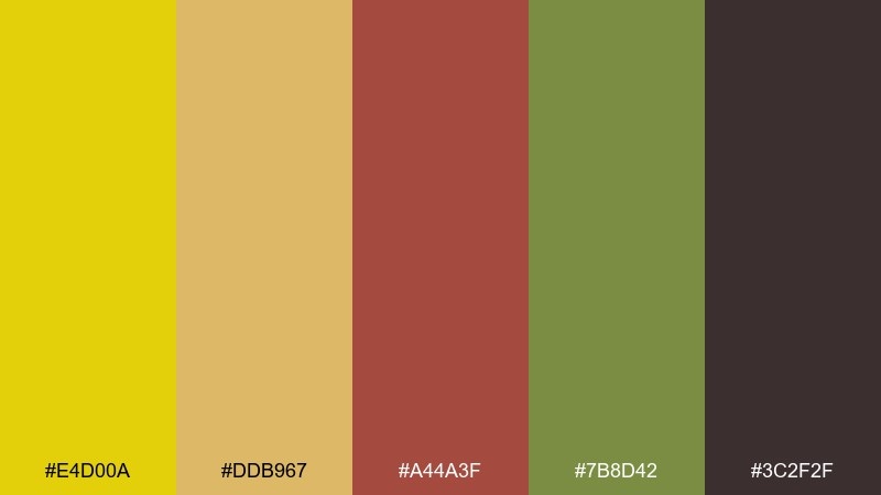
HEX: #E4D00A #DDB967 #A44A3F #7B8D42 #3C2F2F
Mood: earthy and seasonal
Best for: autumn market banner
Earthy and seasonal, like dried corn husks, apples, and field greens. It is a great fit for autumn banners, market signage, and rustic packaging that leans handcrafted. Pair the muted gold with the olive for a grounded base, then use the brick red as a strong accent for headings. Tip: avoid pure white; a warm tan backdrop keeps the harvest vibe consistent.
Image example of rustic harvest generated using media.io
16) Minimal Gold UI
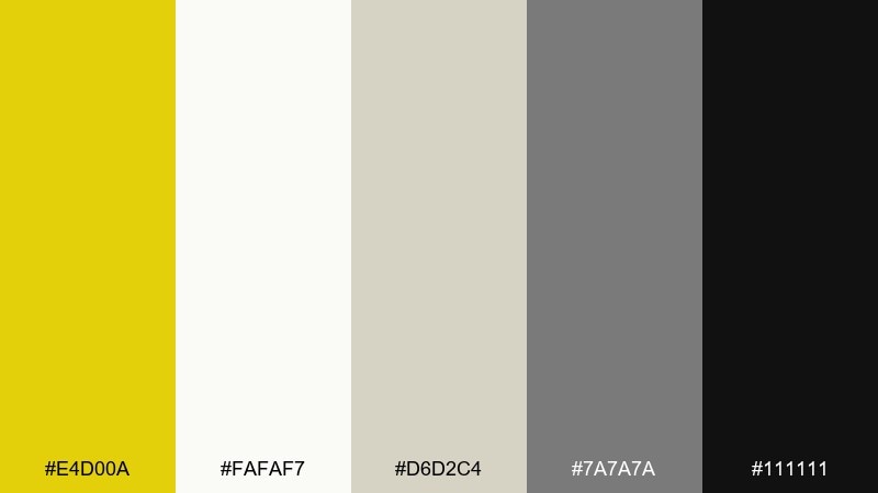
HEX: #E4D00A #FAFAF7 #D6D2C4 #7A7A7A #111111
Mood: clean and professional
Best for: finance dashboard UI
Clean and professional, like a crisp report with a confident gold marker. Use it for dashboards, analytics tools, and product UI where clarity is everything. Pair the off-white and light gray for surfaces, then use the yellow for active states and key metrics. Tip: keep the yellow to one or two components per screen to maintain a calm hierarchy.
Image example of minimal gold ui generated using media.io
17) Festival Lanterns
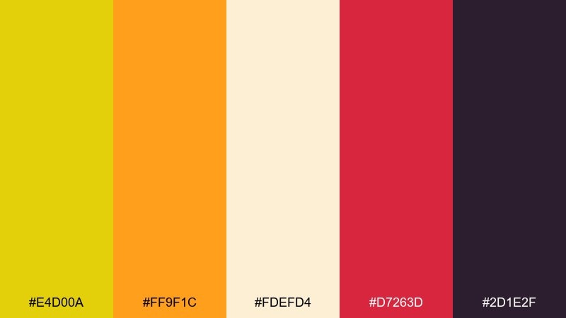
HEX: #E4D00A #FF9F1C #FDEFD4 #D7263D #2D1E2F
Mood: festive and vibrant
Best for: night market poster
Festive and vibrant, like lantern light against a deep night sky. It is ideal for night market posters, cultural event promos, and punchy announcement graphics. Pair the yellow and orange as the glow, then use the crimson for emphasis and the deep purple for strong type contrast. Tip: keep the cream as a small secondary area so the dark background can do the heavy lifting.
Image example of festival lanterns generated using media.io

18) Soft Meadow Light
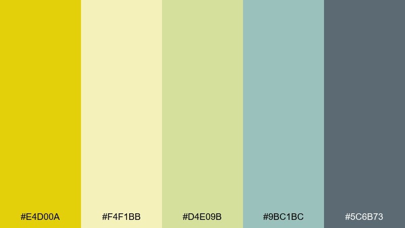
HEX: #E4D00A #F4F1BB #D4E09B #9BC1BC #5C6B73
Mood: calm and airy
Best for: wellness newsletter template
Calm and airy, like sunlight drifting over a quiet meadow. This citrine color palette works well for newsletters, blog templates, and soft lifestyle branding that wants warmth without loud contrast. Pair the pale butter with sage tones for gentle sections, then use the deeper blue-gray for headings and links. Tip: choose generous line spacing so the pastel mix stays readable.
Image example of soft meadow light generated using media.io
19) Spiced Buttercream
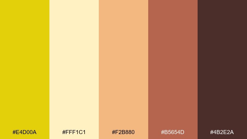
HEX: #E4D00A #FFF1C1 #F2B880 #B5654D #4B2E2A
Mood: sweet and comforting
Best for: bakery social ad
Sweet and comforting, like buttercream swirled with cinnamon and caramel. It is perfect for bakery ads, dessert menus, and packaging stickers that should feel homemade yet polished. Pair the pale yellow with the warm peach for the main background, then use the darker cocoa tones for text and product names. Tip: add a single bold yellow badge for limited-time offers to create a clear focal point.
Image example of spiced buttercream generated using media.io

20) Evening Amber
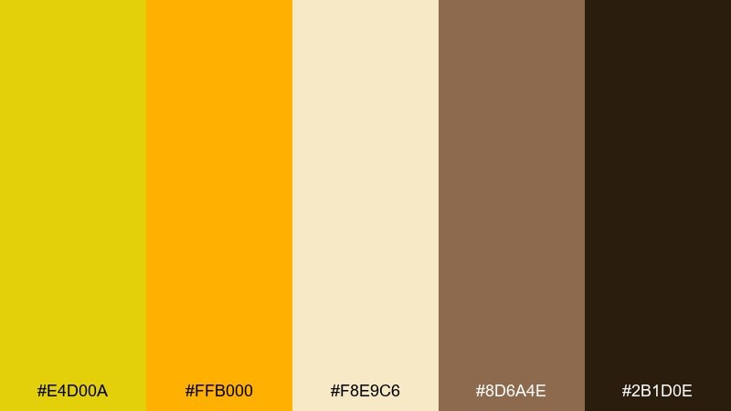
HEX: #E4D00A #FFB000 #F8E9C6 #8D6A4E #2B1D0E
Mood: glowy and intimate
Best for: boutique hotel homepage hero
Glowy and intimate, like amber light pooling on polished wood after sunset. Use it for boutique hotel homepages, hospitality branding, and warm editorial headers that need a premium feel. Pair the cream and amber as the main surfaces, then bring in deep brown for navigation and type to keep contrast sharp. Tip: use the brightest yellow only on one primary button so the hero stays elegant.
Image example of evening amber generated using media.io

What Colors Go Well with Citrine?
Earthy greens (olive, sage, forest) are some of the most natural matches for citrine because they reinforce its subtle green undertone. This pairing is especially strong for eco, wellness, food, and outdoor brands.
Warm neutrals like cream, parchment, taupe, and tan keep citrine readable across large surfaces, while darker anchors (charcoal, espresso, deep navy) add contrast for headlines and UI text.
For more punch, combine citrine with vivid accents like orange, crimson, or teal—but keep those accents controlled so the yellow stays the “hero” instead of competing for attention.
How to Use a Citrine Color Palette in Real Designs
Use citrine as an accent first: buttons, highlights, icons, sale tags, and small rules. When you limit it to a few components per screen or page, it reads intentional and premium instead of overwhelming.
Protect legibility by placing citrine against off-white or deep neutrals, not pure white glare. For typography, choose charcoal, deep brown, or navy rather than true black if the palette is soft and natural.
If you want citrine as a main background, soften it with cream overlays, generous spacing, and muted secondary colors. This keeps the warmth while avoiding a harsh “highlighter yellow” effect.
Create Citrine Palette Visuals with AI
If you already have HEX codes, the fastest way to preview a citrine color scheme is to generate mock visuals (posters, UIs, labels, invitations) with consistent prompts and aspect ratios. That lets you test contrast, hierarchy, and mood before committing to production.
With Media.io’s text-to-image tools, you can iterate quickly: adjust “flat vector” vs “realistic studio shot,” swap backgrounds from cream to charcoal, and keep the same palette feel across multiple assets.
Once you like a direction, generate a few variants for different formats (social, web hero, print) so your citrine brand system stays cohesive.
Citrine Color Palette FAQs
-
What is a citrine color palette?
A citrine color palette is a set of coordinating colors built around citrine—a warm golden yellow with a slight green undertone—often paired with creams, olives, browns, grays, or deep darks for contrast. -
Is citrine closer to yellow or green?
Citrine is primarily yellow, but it often leans slightly toward yellow-green. That subtle undertone is why it pairs especially well with olive and sage. -
What text color works best on citrine backgrounds?
Deep charcoal, espresso brown, or navy usually reads best. Pure white can fail contrast on bright yellow, and pure black can look harsh in softer, natural palettes. -
How do I keep citrine from looking too neon?
Balance it with warm creams and muted neutrals, and use citrine as an accent rather than a full background. Also avoid pairing it with stark white; choose off-white instead. -
What are good accent colors to pair with citrine?
Olive/forest greens for earthy designs, teal for a cool counterbalance, and orange or crimson for high-energy posters and promos. Use accents sparingly so citrine stays dominant. -
Can I use citrine in professional UI design?
Yes—citrine is excellent for active states, key metrics, and CTA buttons when your base UI uses off-whites and grays. Keep the yellow to one or two components per view for a clean hierarchy. -
How can I generate citrine palette mockups quickly?
Use an AI image generator with a consistent prompt style (e.g., “flat vector UI mockup” or “realistic studio shot”), then iterate by adjusting background neutrals and the amount of citrine used for accents.
Next: Umber Color Palette


