

Lapis lazuli is a deep, mineral blue that instantly reads as premium, timeless, and intentional. It can feel regal in branding, calm in UI, or dramatic in posters depending on the accents you pair with it.
Below are 20 lapis lazuli color palette ideas with HEX codes, plus quick guidance on what to pair with lapis (gold, ivory, charcoal, and more) and how to visualize your palette fast with AI.
In this article
- Why Lapis Lazuli Palettes Work So Well
-
- midnight inlay
- golden mosaic
- museum indigo
- saffron accent
- sea-glass lapis
- cathedral night
- porcelain and ink
- cobalt terrace
- desert lapis
- ink and apricot
- astral violet
- lapis and sage calm
- brass compass
- winter harbor
- royal classroom
- charcoal contrast
- coral reef pop
- linen notebook
- midnight garden
- ceramic sunrise
- What Colors Go Well with Lapis Lazuli?
- How to Use a Lapis Lazuli Color Palette in Real Designs
- Create Lapis Lazuli Palette Visuals with AI
Why Lapis Lazuli Palettes Work So Well
Lapis lazuli sits in that rare zone where blue feels both bold and trustworthy. It carries the confidence of navy, but with a gem-like saturation that makes layouts look designed—not default.
Because it’s rooted in a natural stone, lapis also pairs beautifully with tactile neutrals (ivory, linen, warm gray) and metallics (gold, brass). Those pairings quickly create a “crafted” look in branding, packaging, and editorial design.
In digital products, lapis is especially useful for hierarchy: deep lapis for navigation and primary actions, lighter blues for states and data, and soft backgrounds for comfortable reading.
20+ Lapis Lazuli Color Palette Ideas (with HEX Codes)
1) Midnight Inlay
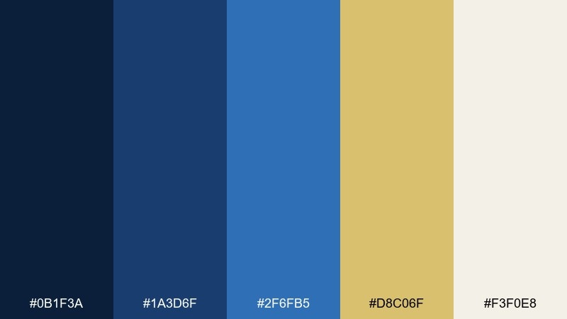
HEX: #0B1F3A #1A3D6F #2F6FB5 #D8C06F #F3F0E8
Mood: dramatic and refined
Best for: luxury jewelry brand packaging
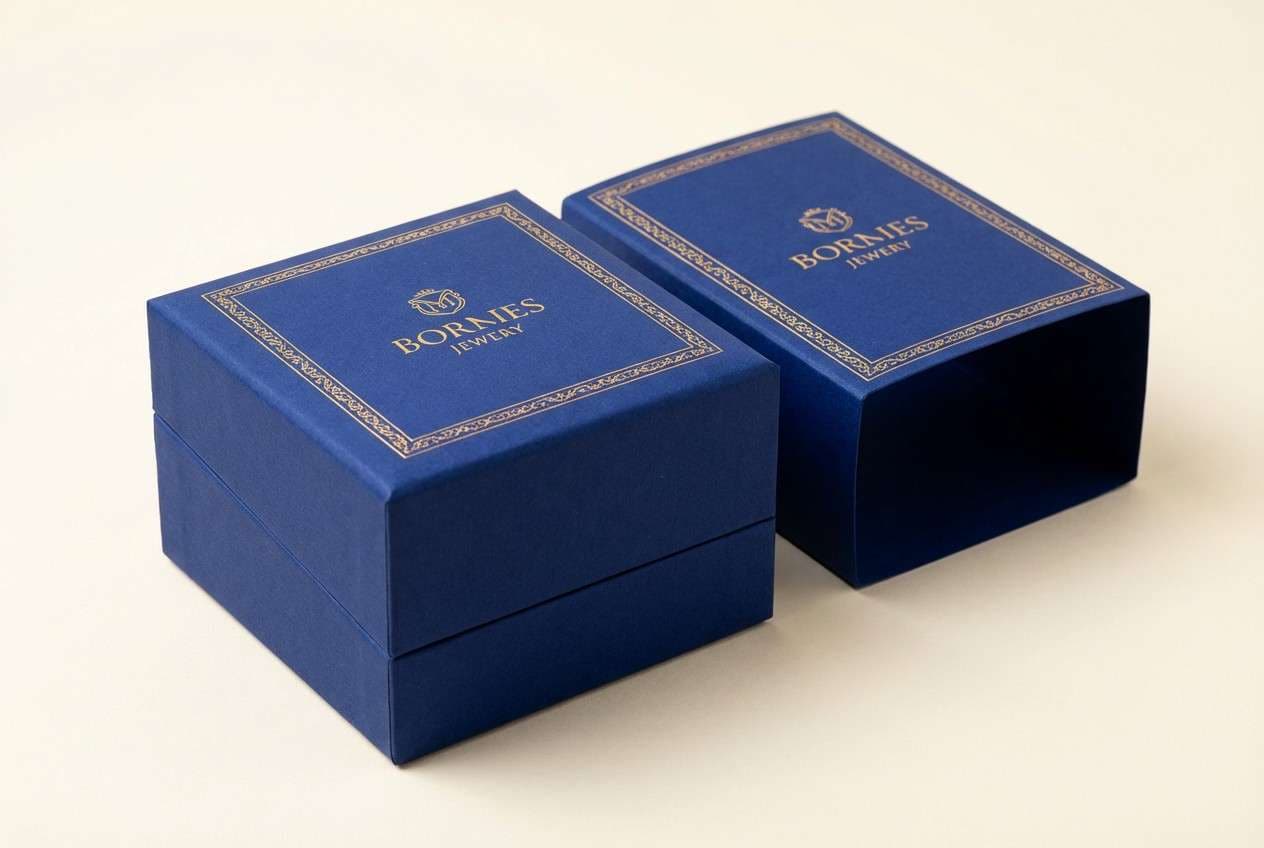
Dramatic midnight blues and a soft gilt highlight evoke carved stone, gold leaf, and quiet museum lighting. Use it on premium packaging, lookbooks, and gift boxes where deep contrast feels intentional. Pair the darker blues with warm ivory for legible type, then reserve the gold tone for seals, edges, or foil accents. Tip: keep the brightest blue as a small pop so the design stays sophisticated, not sporty.
Image example of midnight inlay generated using media.io
Media.io is an online AI studio for creating and editing video, image, and audio in your browser.

2) Golden Mosaic
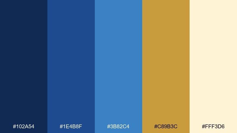
HEX: #102A54 #1E4B8F #3B82C4 #C89B3C #FFF3D6
Mood: opulent and uplifting
Best for: brand identity for a boutique hotel
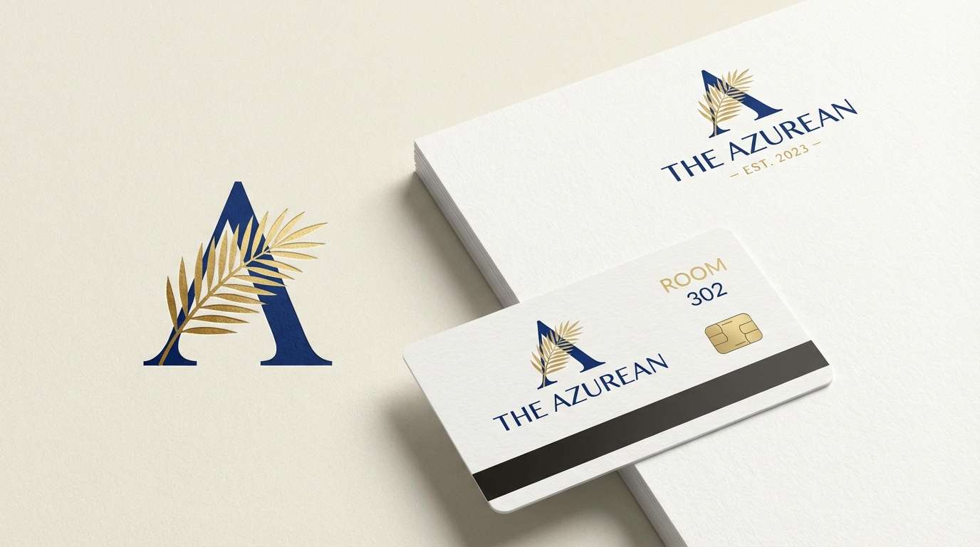
Opulent blues with honeyed gold feel like a tiled courtyard at sunset. These lapis lazuli color combinations work beautifully for hospitality branding, from logos to key cards and wayfinding. Balance the palette by setting headlines in the darkest navy, then use the bright blue for secondary shapes and patterns. Tip: keep the cream tone as the main background to make gold accents read as premium instead of loud.
Image example of golden mosaic generated using media.io
3) Museum Indigo

HEX: #0D223F #244C7A #4F7FB1 #B9B2A7 #F7F6F2
Mood: curated and calm
Best for: editorial magazine layout
Curated indigo tones and muted stone neutrals suggest gallery walls, linen paper, and quiet authority. Use it for long-form editorial layouts, where readability and hierarchy matter more than flash. Pair the mid blue with warm gray for charts, pull quotes, and section dividers. Tip: choose one blue for body text accents and keep the rest for headers and imagery frames to avoid visual fatigue.
Image example of museum indigo generated using media.io
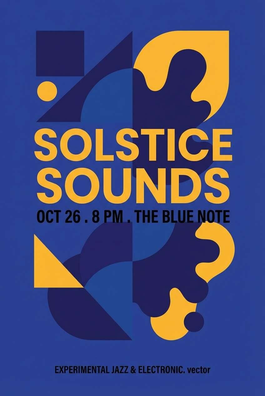
4) Saffron Accent
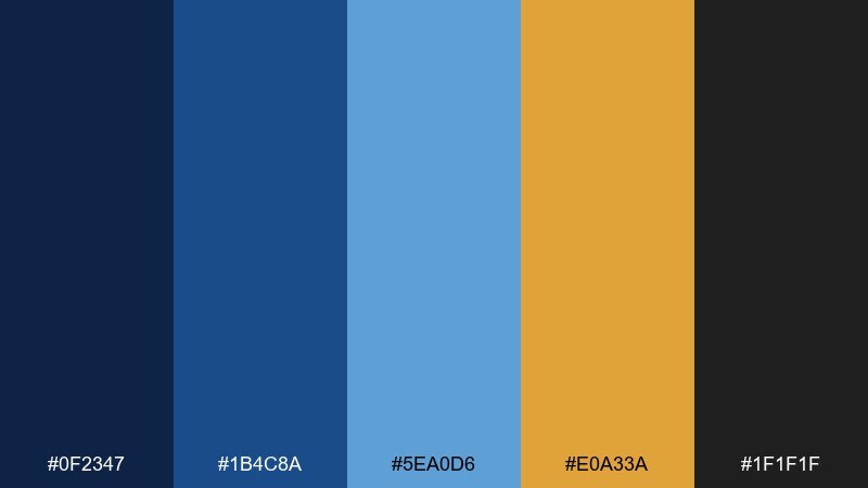
HEX: #0F2347 #1B4C8A #5EA0D6 #E0A33A #1F1F1F
Mood: bold and energetic
Best for: music event poster
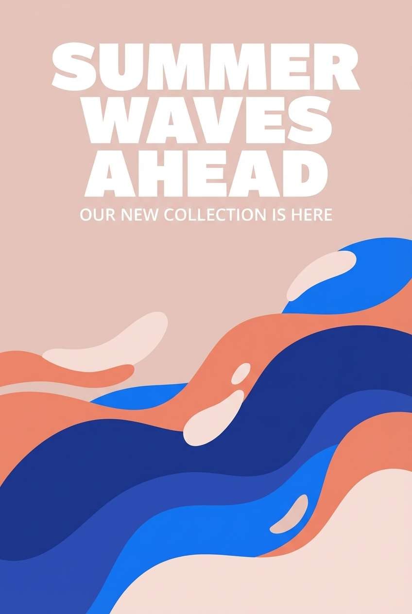
Bold lapis tones with a saffron hit feel like city night lights and a bright stage spotlight. Use it for posters, flyers, and social tiles where you want instant contrast from a distance. Pair the lighter blue with the warm saffron for key info like date and venue, and keep black for small print and QR codes. Tip: try a dark blue background with saffron typography to make the message snap without looking neon.
Image example of saffron accent generated using media.io
5) Sea-Glass Lapis
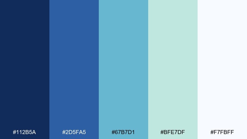
HEX: #112B5A #2D5FA5 #67B7D1 #BFE7DF #F7FBFF
Mood: fresh and restorative
Best for: wellness app UI
Fresh blues softened by sea-glass tints evoke clean water, slow breathing, and morning light. In a lapis lazuli color scheme for wellness UI, the lighter teal and mint make comfortable surfaces for cards and charts. Pair navy with white for navigation and accessibility, then use aqua for progress states or highlights. Tip: reserve the deepest blue for primary buttons so the interface stays calm, not heavy.
Image example of sea-glass lapis generated using media.io
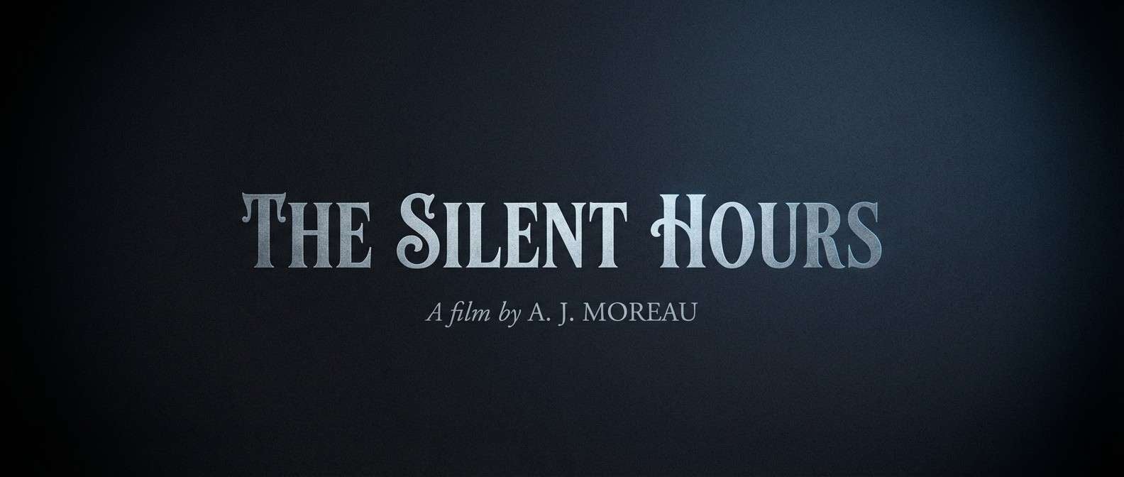
6) Cathedral Night
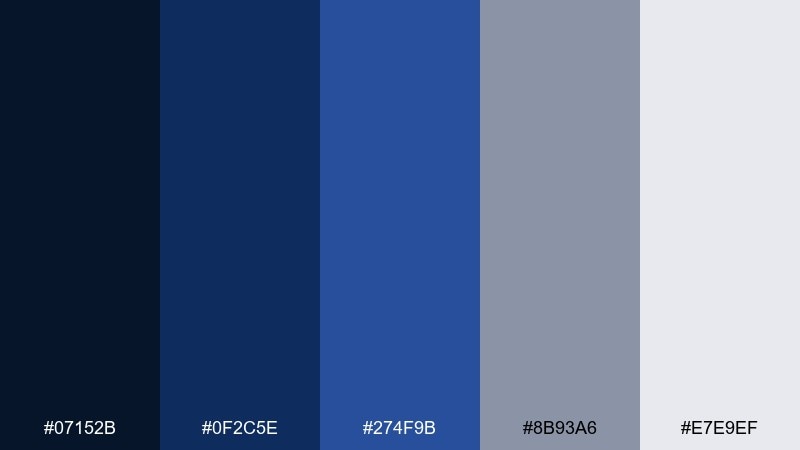
HEX: #07152B #0F2C5E #274F9B #8B93A6 #E7E9EF
Mood: cinematic and solemn
Best for: film title cards
Cinematic dark blues and cool grays feel like vaulted ceilings, candle shadows, and a slow orchestral swell. Use it for title cards, credits, and moody motion graphics where contrast must stay elegant. Pair the light gray with the mid blue for readable type and subtle glow effects. Tip: add grain or soft vignette in the deepest navy to keep flat areas from looking digital.
Image example of cathedral night generated using media.io
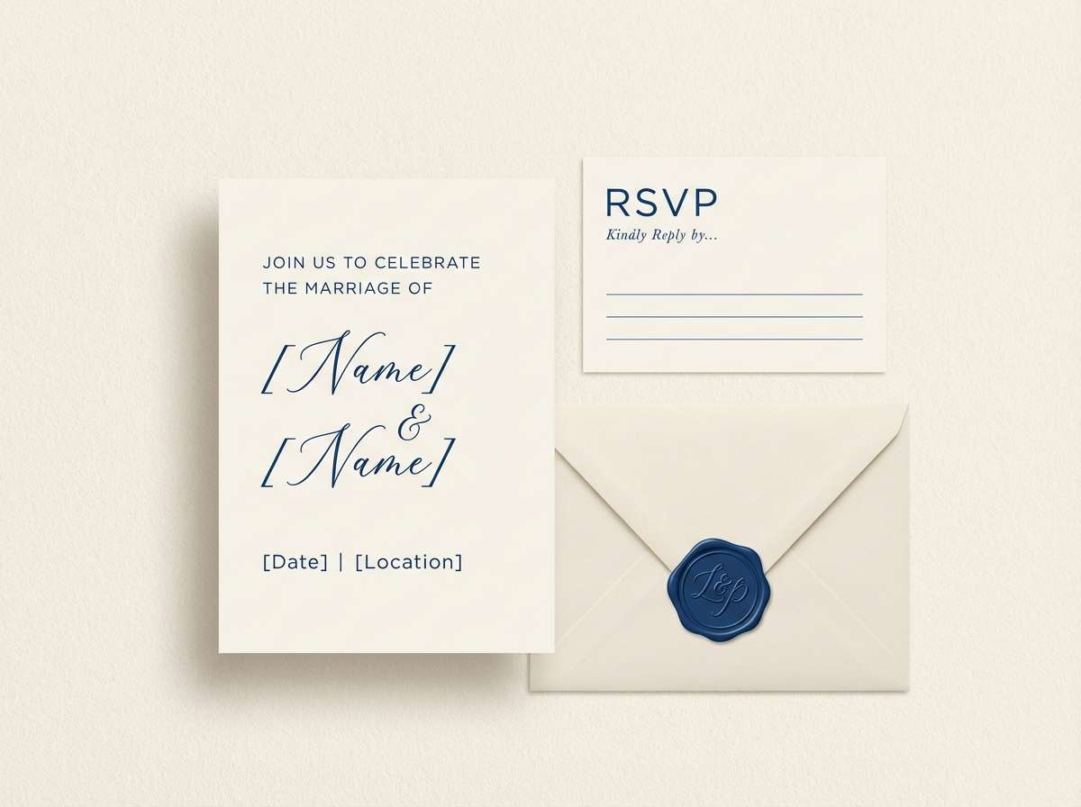
7) Porcelain and Ink
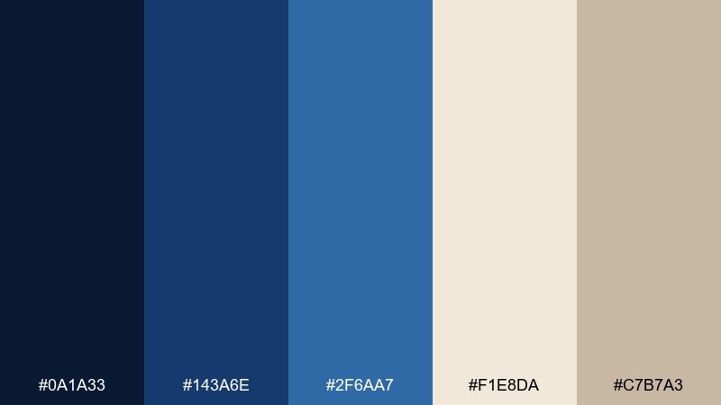
HEX: #0A1A33 #143A6E #2F6AA7 #F1E8DA #C7B7A3
Mood: classic and tactile
Best for: wedding stationery suite
Classic ink blues against porcelain neutrals evoke hand-pressed paper and vintage fountain pens. Use it for invitations, RSVP cards, and envelope liners where detail and texture are the star. Pair the deepest blue for names and headings, then use the warm taupe for borders and monograms. Tip: a blind-emboss pattern in the cream tone adds richness without adding more color.
Image example of porcelain and ink generated using media.io
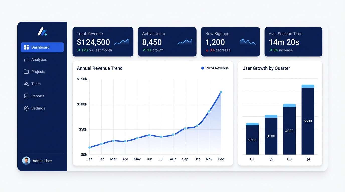
8) Cobalt Terrace
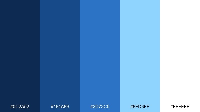
HEX: #0C2A52 #164A89 #2D73C5 #8FD3FF #FFFFFF
Mood: modern and airy
Best for: SaaS dashboard UI mockup
Modern cobalt steps from deep to sky blue feel like open air and glassy surfaces. Use it for dashboards where you need clear states, readable charts, and a crisp tech vibe. Pair the darkest navy with white for navigation, then use the sky tone for data highlights and hover states. Tip: keep the lightest blue for charts only, so it stays informative rather than decorative.
Image example of cobalt terrace generated using media.io
9) Desert Lapis
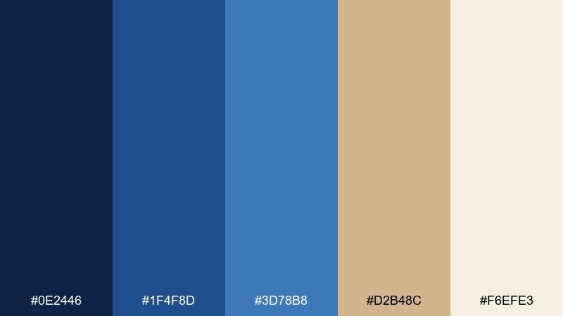
HEX: #0E2446 #1F4F8D #3D78B8 #D2B48C #F6EFE3
Mood: grounded and sun-warmed
Best for: living room interior styling
Grounded blues with sand and plaster tones evoke adobe walls, woven rugs, and a cool evening breeze. A lapis lazuli color palette like this shines in interiors when you want blue without a chilly feel. Pair the sandy beige with the mid blue for textiles, and use the deep navy on a single anchor piece like a cabinet or accent wall. Tip: add natural wood and brass hardware to bridge the warm and cool halves.
Image example of desert lapis generated using media.io
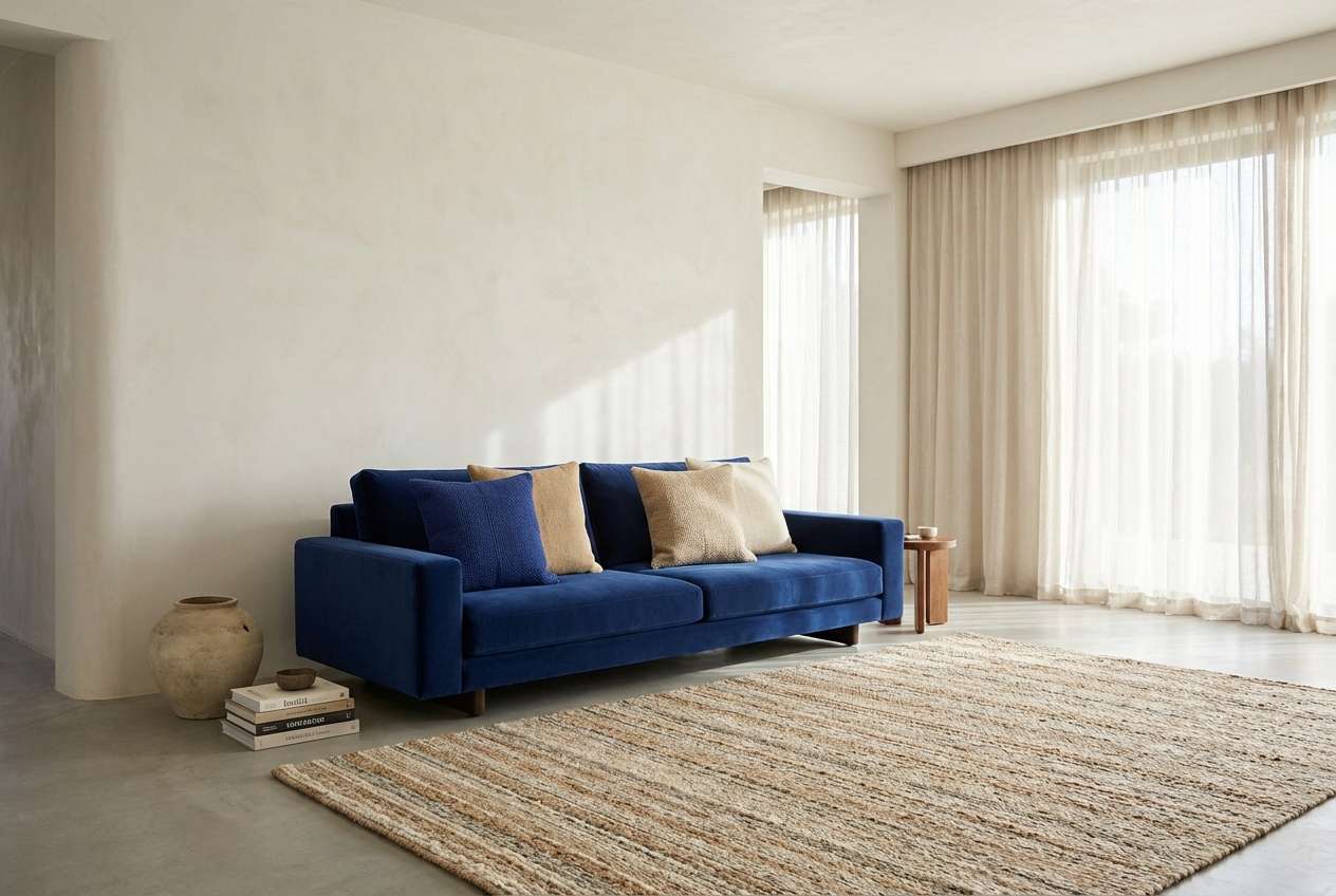
10) Ink and Apricot
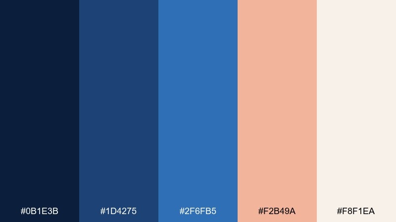
HEX: #0B1E3B #1D4275 #2F6FB5 #F2B49A #F8F1EA
Mood: friendly and creative
Best for: social media templates
Friendly blues with apricot warmth feel like doodles in a sketchbook and a soft sunrise. Use it for social templates, story highlights, and creator brand kits where you want approachable contrast. Pair the apricot with the brighter blue for buttons and stickers, then keep the ink navy for text. Tip: use the cream tone as the default canvas so posts stay light and shareable.
Image example of ink and apricot generated using media.io
11) Astral Violet
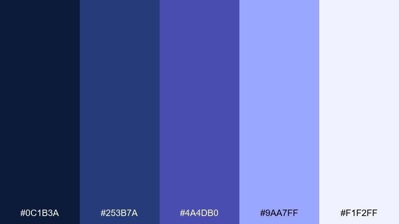
HEX: #0C1B3A #253B7A #4A4DB0 #9AA7FF #F1F2FF
Mood: dreamy and futuristic
Best for: album cover design
Dreamy blues shifting into violet feel like a late-night sky with electric haze. These lapis lazuli color combinations suit album art, podcast covers, and digital posters with a synth or sci-fi edge. Pair the deep navy with lavender for strong type contrast, then use the pale periwinkle as a glow or highlight. Tip: add subtle gradients between blue and violet to make the cover feel dimensional without extra colors.
Image example of astral violet generated using media.io
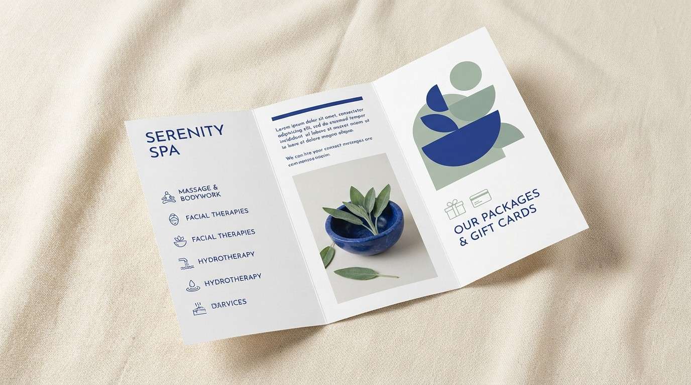
12) Lapis and Sage Calm
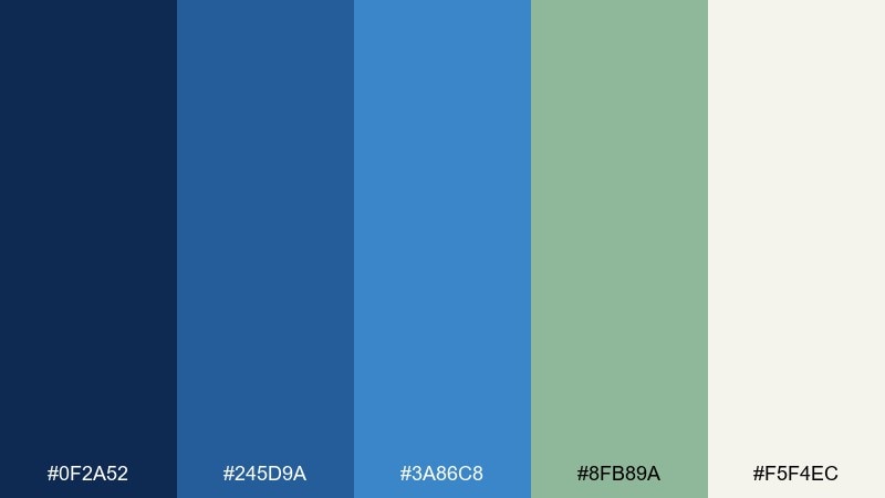
HEX: #0F2A52 #245D9A #3A86C8 #8FB89A #F5F4EC
Mood: balanced and soothing
Best for: spa brochure design
Balanced blues with sage green evoke spa tiles, eucalyptus steam, and clean linen. Use it for brochures, service menus, and signage where calm hierarchy is more important than high contrast. Pair sage with the mid blue for section headers and icons, then keep the cream tone for generous whitespace. Tip: avoid saturating every element; one strong blue block per page is enough to anchor the layout.
Image example of lapis and sage calm generated using media.io
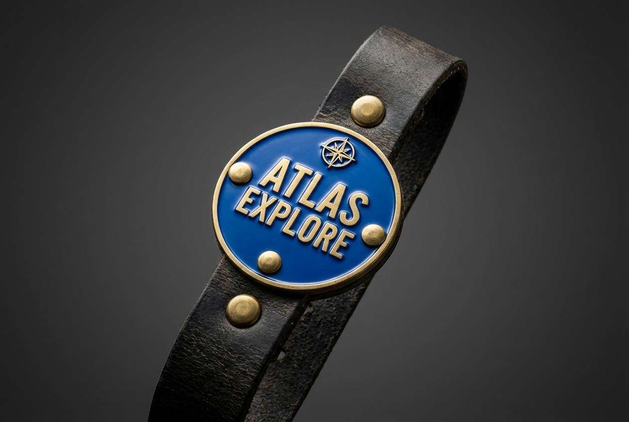
13) Brass Compass
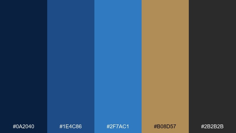
HEX: #0A2040 #1E4C86 #2F7AC1 #B08D57 #2B2B2B
Mood: rugged and confident
Best for: outdoor gear product ad
Rugged blues with brass and charcoal feel like a compass face, worn leather, and night sky navigation. Use it for product ads where you need a strong masculine-leaning contrast without going full black. Pair brass with the brightest blue for callouts, badges, and pricing, while charcoal handles fine print. Tip: keep backgrounds dark and let brass appear only in small, high-impact details.
Image example of brass compass generated using media.io
14) Winter Harbor
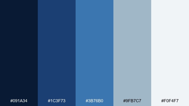
HEX: #091A34 #1C3F73 #3B76B0 #9FB7C7 #F0F4F7
Mood: cool and dependable
Best for: travel blog header and hero image
Cool harbor blues and misty grays evoke fog over water and crisp coastal air. Use it for travel blog headers, newsletter banners, and maps where clarity matters. Pair the mid blue with the pale gray-blue for buttons and tag chips, and save the darkest navy for headlines. Tip: add subtle wave or contour-line patterns in the lightest tone to keep the hero area interesting.
Image example of winter harbor generated using media.io
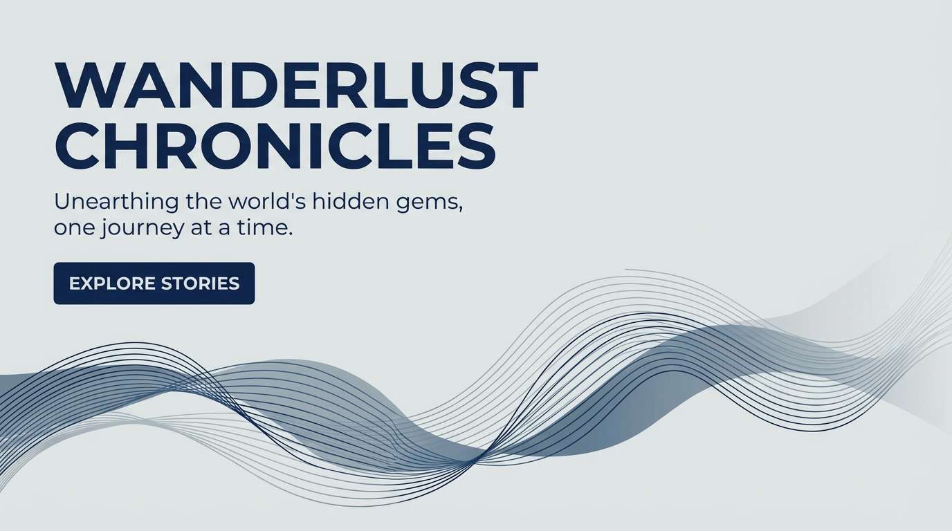
15) Royal Classroom
HEX: #0D2245 #214F97 #3E83D1 #F2D15B #FFF9E6
Mood: bright and instructive
Best for: educational infographic
Bright, confident blues with a sunny yellow feel like classroom posters and clear explanations. Use this lapis lazuli color palette for infographics, lesson slides, and explainer PDFs where scanning is key. Pair navy with cream for body text areas, then use yellow for numbering, icons, and key takeaways. Tip: keep charts mostly blue and use yellow only to highlight the single most important data point.
Image example of royal classroom generated using media.io
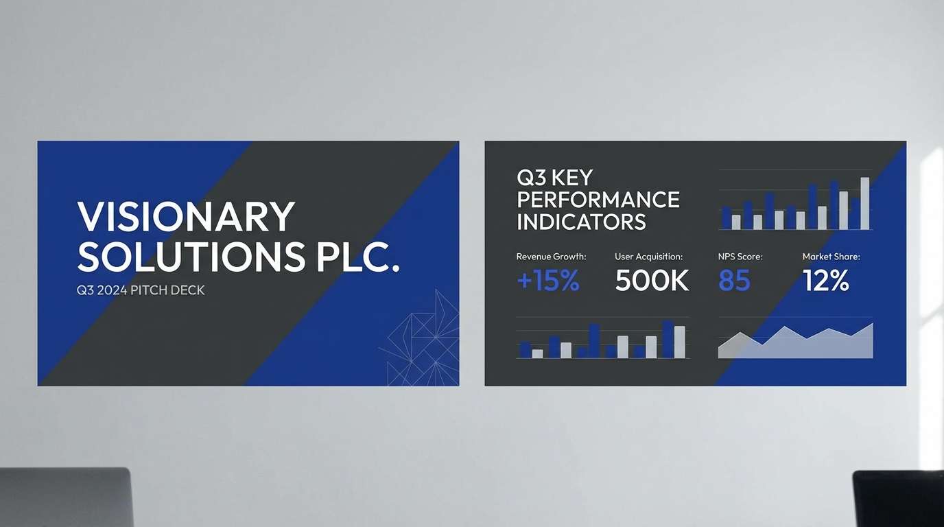
16) Charcoal Contrast
HEX: #0C2348 #225896 #4D8FD0 #2A2F3A #E9EDF2
Mood: professional and sharp
Best for: corporate pitch deck
Sharp blues with charcoal structure evoke crisp suits, polished slides, and confident delivery. Use it for pitch decks and reports where you need modern credibility without feeling cold. Pair charcoal for charts and captions, while the mid blue handles headers and key metrics. Tip: keep one consistent blue for all links and call-to-action buttons so the deck feels cohesive.
Image example of charcoal contrast generated using media.io
17) Coral Reef Pop
HEX: #0B2042 #1E4E8B #2F75C7 #FF6F61 #FFF2EF
Mood: playful and high-contrast
Best for: summer campaign poster
Playful blues with a coral punch feel like ocean water against a bright beach umbrella. Use it for seasonal campaigns, limited drops, and punchy posters that need instant attention. Pair coral with the lighter blue for the main headline and badges, then keep navy for supporting text. Tip: limit coral to one or two elements per layout so it stays fresh and not overwhelming.
Image example of coral reef pop generated using media.io
18) Linen Notebook
HEX: #0E2547 #1F4C86 #3F7FC0 #D9D2C3 #FAF8F3
Mood: minimal and thoughtful
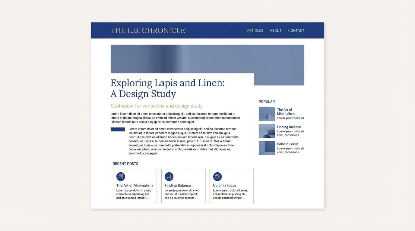
Best for: clean blog theme
Thoughtful blues on linen neutrals evoke margin notes, quiet mornings, and tidy typography. Use it for blogs, portfolios, and knowledge-base sites where long reading sessions matter. Pair the darkest blue for links and headings, and keep the beige for subtle dividers and cards. Tip: use the mid blue sparingly for hover states so the interface stays calm and editorial.
Image example of linen notebook generated using media.io
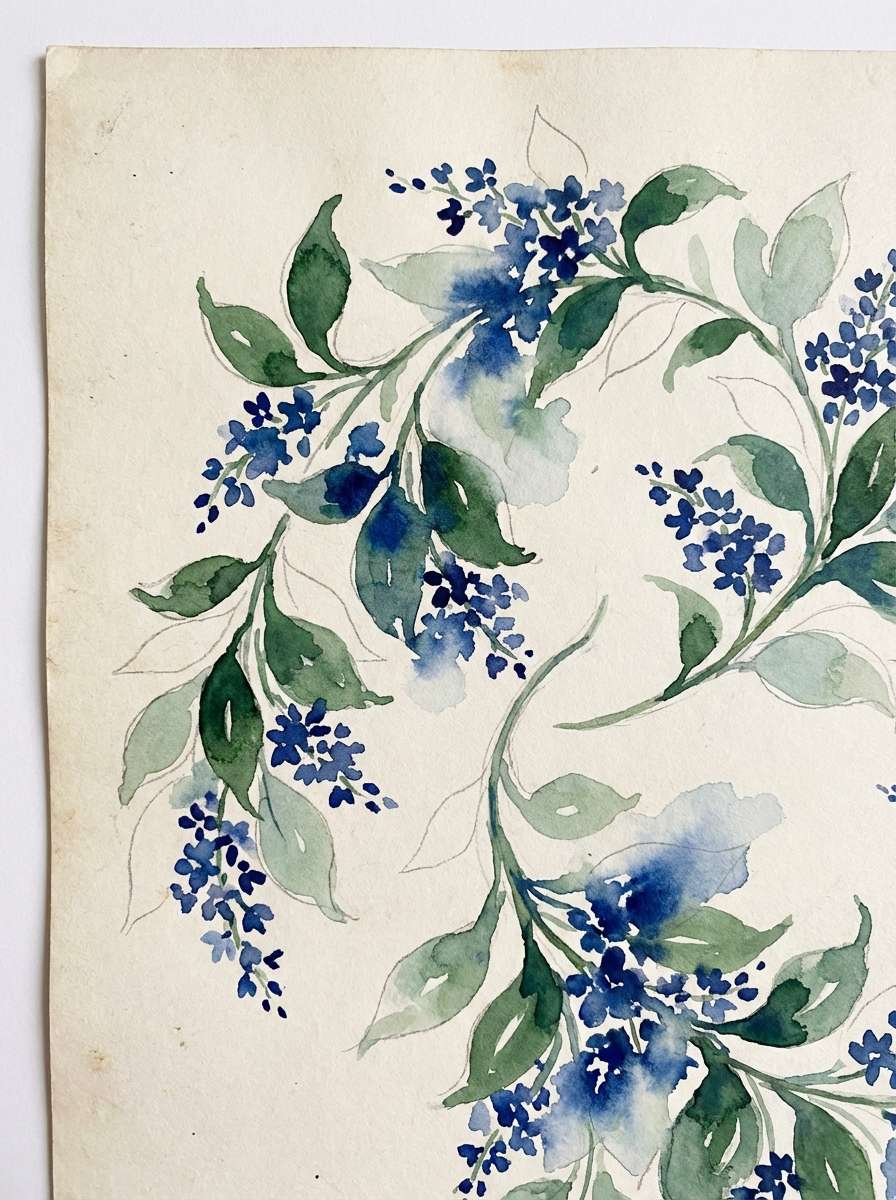
19) Midnight Garden
HEX: #071A2F #163C6E #2B6AA8 #3E6B4D #D7E3D1
Mood: mysterious and botanical
Best for: watercolor botanical illustration
Mysterious blues with deep green feel like moonlit leaves and a hidden garden path. Use it for botanical prints, book covers, and nature-forward branding that wants a darker edge. Pair the green with the medium blue for stems and shadows, then use the pale sage for paper texture and breathing room. Tip: keep outlines minimal and let layered washes do the work for a richer, more natural look.
Image example of midnight garden generated using media.io
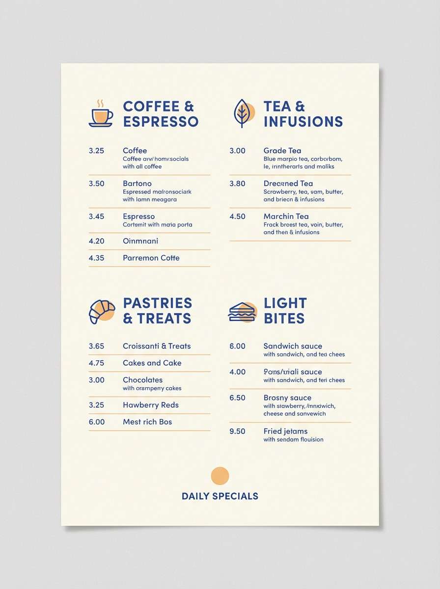
20) Ceramic Sunrise
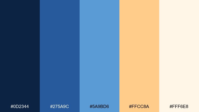
HEX: #0D2344 #275A9C #5A9BD6 #FFCC8A #FFF6E8
Mood: warm and welcoming
Best for: cafe menu design
Warm sunrise apricot with confident blues evokes glazed ceramics, espresso crema, and morning chatter. Use it for cafe menus and tabletop signage where you want friendly energy with clear hierarchy. Pair the dark navy for headings and prices, while the apricot highlights specials and callouts. Tip: set most body text on the soft cream so the menu stays readable under different lighting.
Image example of ceramic sunrise generated using media.io
What Colors Go Well with Lapis Lazuli?
Metallics and warm neutrals are the fastest win: gold/brass for a luxury cue, ivory/cream for airy readability, and warm beige/linen for a crafted, tactile feel. These pairings make lapis look less “corporate blue” and more “gemstone blue.”
For modern contrast, add charcoal or near-black for structure—especially in decks, UI, and type-heavy layouts. If you want a more playful direction, coral, apricot, or saffron create high-impact accents that still feel intentional against deep lapis.
For calmer, nature-forward palettes, try sage, mint, or soft sea-glass tints. They keep the scheme breathable and work well in wellness, editorial, and interior styling.
How to Use a Lapis Lazuli Color Palette in Real Designs
Start by assigning roles: use the deepest lapis as your anchor (navigation, titles, or hero blocks), a mid-blue for supporting UI states or secondary shapes, and a light neutral as the primary background so the design doesn’t feel heavy.
Keep accents small but strategic—gold seals, saffron type, coral badges, or a single chart highlight. Lapis is saturated, so limiting the loudest accents often looks more premium and improves readability.
In print, lapis shines with texture: uncoated paper, emboss/deboss, foil details, and subtle grain. In digital, pair it with enough whitespace and accessible contrast (especially for buttons and small text).
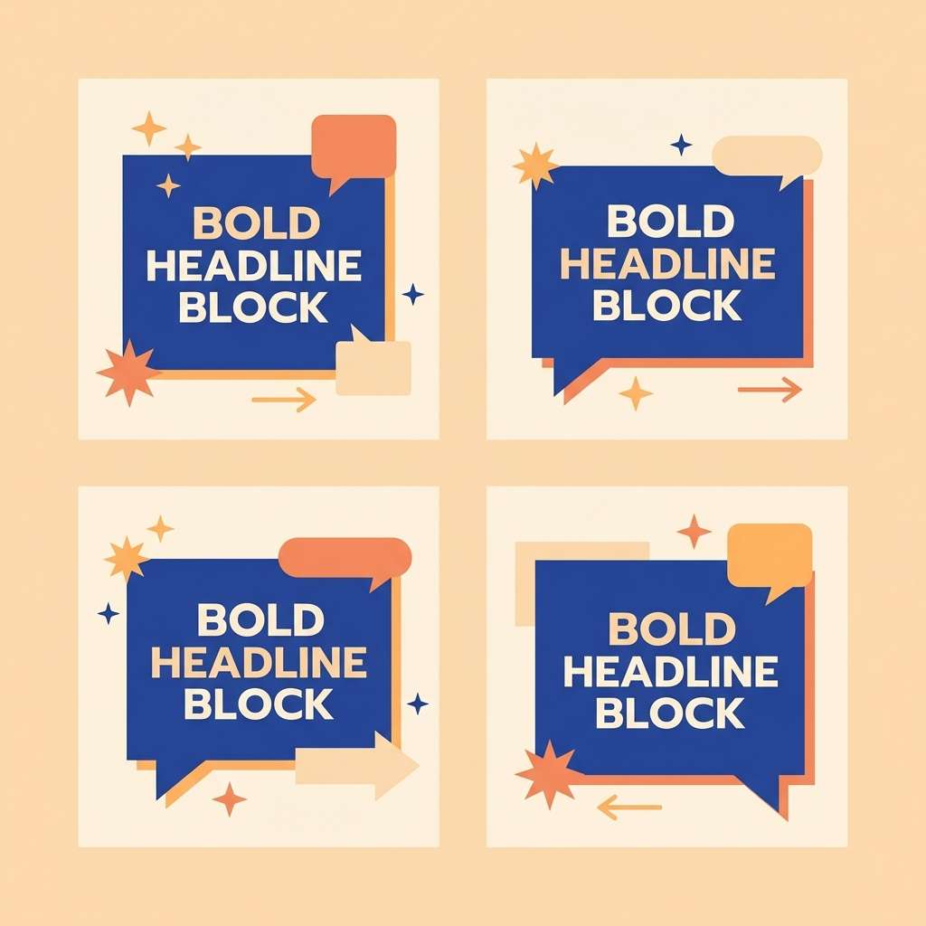
Create Lapis Lazuli Palette Visuals with AI
If you have HEX codes but need real-looking mockups fast, generate palette visuals with AI. You can test how lapis feels on packaging, UI screens, posters, menus, and brand systems before committing to a full design.
With Media.io, you can turn a prompt into an on-style image example in minutes, then iterate by swapping materials (matte, foil, paper), lighting (studio, cinematic, daylight), and composition (flat lay, hero, close-up).
Lapis Lazuli Color Palette FAQs
-
What is a lapis lazuli color palette?
A lapis lazuli color palette is a set of coordinated colors built around deep lapis blue tones—often paired with light neutrals (ivory, linen), dark anchors (navy/charcoal), and accents like gold, saffron, coral, or sage. -
What HEX code is lapis lazuli blue?
Lapis lazuli isn’t one single HEX value, but it typically lives in a deep, saturated blue range. In the palettes above, examples include #0C2348, #0D223F, and #0B2042 depending on how dark or vivid you want the lapis base. -
Does lapis lazuli go with gold?
Yes—blue and gold is one of the most classic lapis pairings. Use gold sparingly (seals, borders, icons, foil accents) and keep an ivory/cream background to maintain a premium look. -
What neutral colors pair best with lapis lazuli?
Ivory, warm off-white, linen beige, and soft stone grays pair best because they balance lapis’s saturation without making the design feel cold. They also improve readability in editorial and UI layouts. -
Can I use lapis lazuli in UI design without it feeling too dark?
Yes. Use lapis mainly for navigation, headings, and primary buttons, then rely on very light backgrounds and softer blue tints for surfaces and charts. This keeps the interface calm while still feeling distinctive. -
What are good accent colors for lapis lazuli?
For high contrast, try saffron/yellow, coral, or apricot. For a calmer vibe, choose sage, mint, or sea-glass aqua. For a business-forward look, use charcoal and cool gray accents. -
How do I generate lapis lazuli palette mockups quickly?
Use an AI text-to-image tool like Media.io: paste a design prompt (e.g., “luxury packaging in deep lapis with gold foil”), then iterate by changing materials, lighting, and layout while keeping your lapis HEX direction consistent.
Next: Ochre Color Palette


