

Cotton candy colors are the classic pastel pink-and-blue duo, often softened with cream, mint, or lavender. They’re sweet, airy, and instantly recognizable—perfect when you want a friendly, playful look without high visual stress.
Below are 20 ready-to-use cotton candy color palette ideas with HEX codes, plus practical notes on mood, best use cases, and AI prompts you can reuse to generate matching visuals.
In this article
- Why Cotton Candy Palettes Work So Well
-
- cloud spun pastels
- fairground frosting
- pink sky parade
- marshmallow mist
- boardwalk sorbet
- sugarplum breeze
- bubble bath daydream
- neon cotton lights
- powder puff picnic
- icing drift
- pink ribbon gelato
- seaside floss
- lullaby lavender
- sugar crystal pop
- vanilla pink float
- macaron marina
- citrus cotton twist
- pastel popcorn
- dreamhouse dusk
- soft serve studio
- What Colors Go Well with Cotton Candy?
- How to Use a Cotton Candy Color Palette in Real Designs
- Create Cotton Candy Palette Visuals with AI
Why Cotton Candy Palettes Work So Well
Cotton candy palettes feel approachable because they sit in the pastel range—high lightness, low aggression, and lots of “breathing room.” That makes them easy to use in branding, UI, and print without overwhelming the viewer.
The pink-and-blue contrast is also naturally balanced: pink brings warmth and friendliness, while blue adds freshness and structure. Together, they create designs that read sweet but still “designed,” not childish by default.
Most cotton candy schemes include a near-white base (cream, blush-white, or icy white), which improves layout clarity and helps typography stay clean—especially when you’re working with illustrations, stickers, or product packaging.
20+ Cotton Candy Color Palette Ideas (with HEX Codes)
1) Cloud Spun Pastels
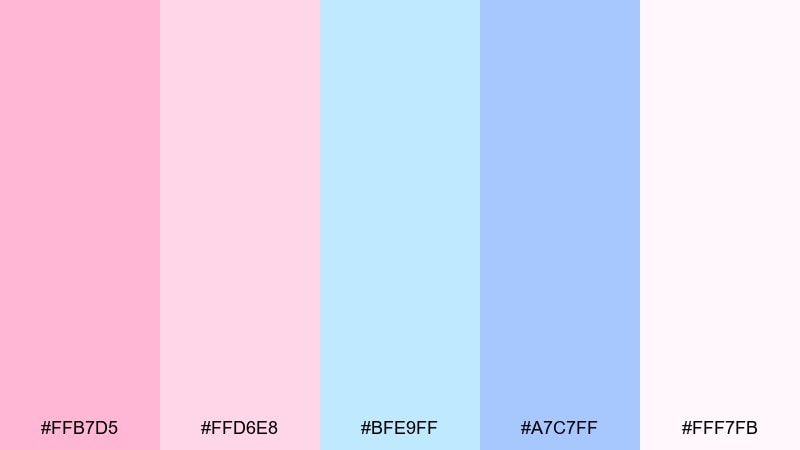
HEX: #FFB7D5 #FFD6E8 #BFE9FF #A7C7FF #FFF7FB
Mood: dreamy and weightless
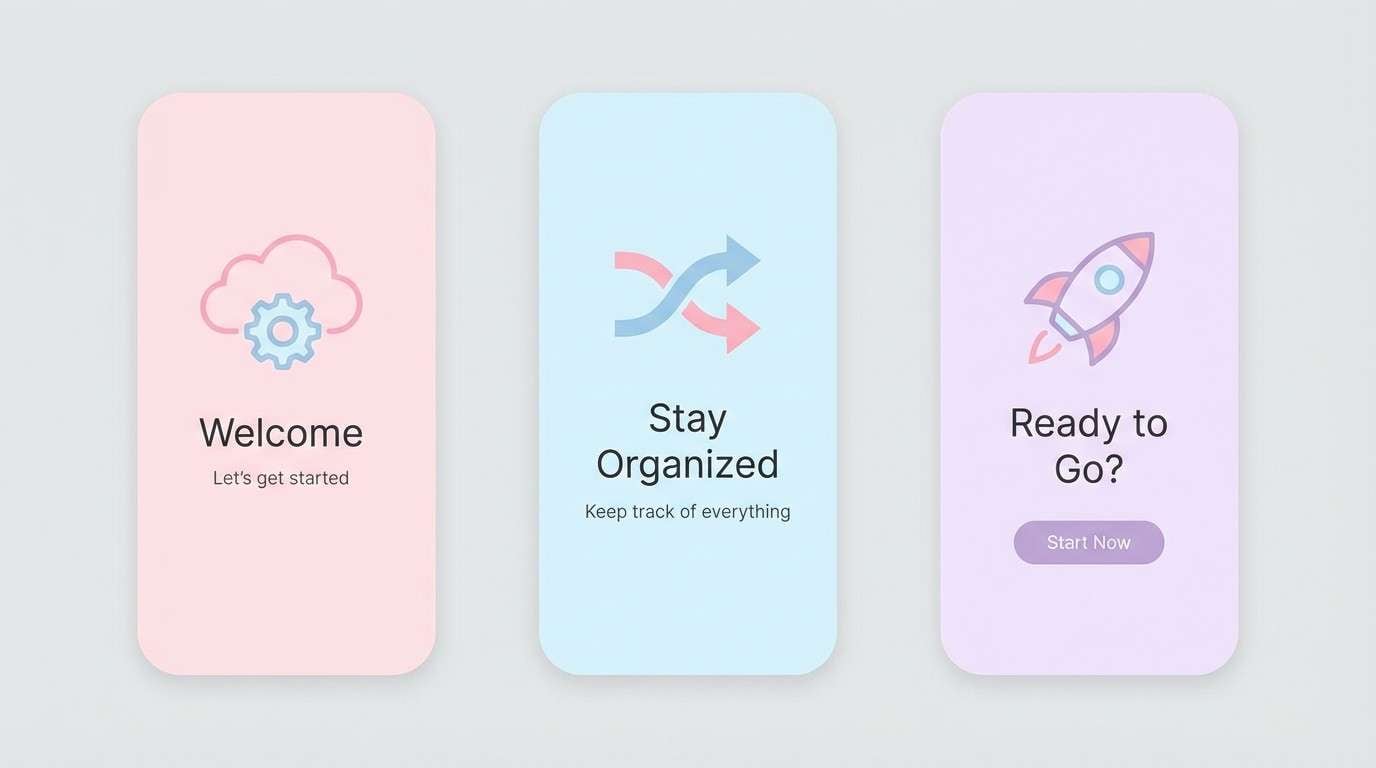
Best for: app onboarding UI
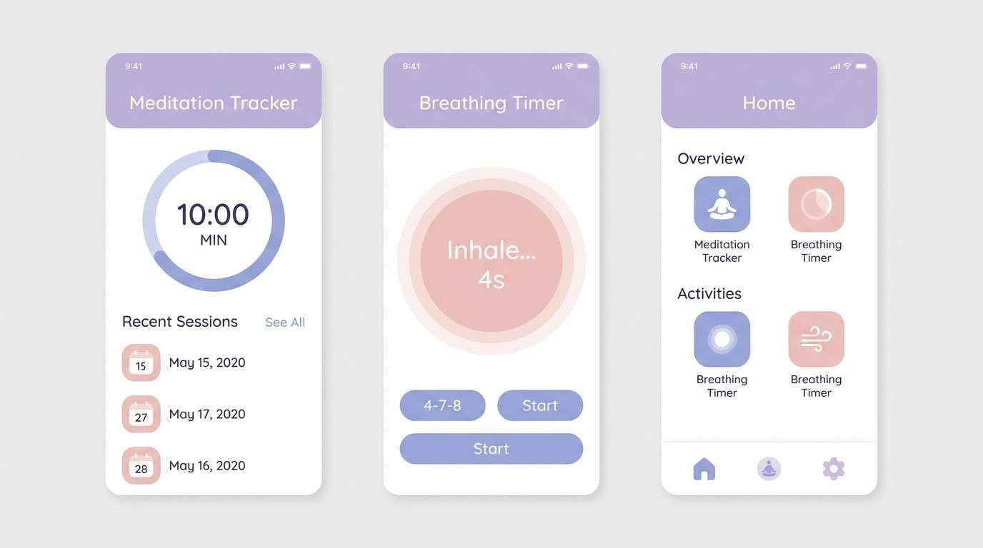
Dreamy and weightless, these tones feel like spun sugar drifting over a clear sky. The mix balances warm pinks with airy blues so screens look sweet without becoming loud. Use it for a gentle cotton candy color palette on onboarding, empty states, and success moments. Pair with a cool gray type color and keep one bright pink as the primary CTA for clarity.
Image example of cloud spun pastels generated using media.io
Media.io is an online AI studio for creating and editing video, image, and audio in your browser.

2) Fairground Frosting
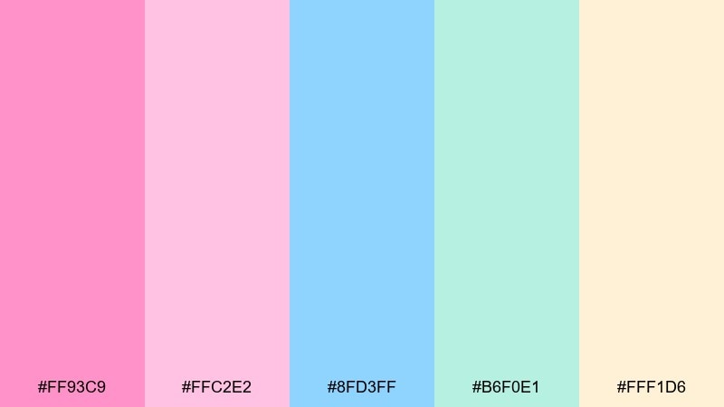
HEX: #FF93C9 #FFC2E2 #8FD3FF #B6F0E1 #FFF1D6
Mood: playful and sunny
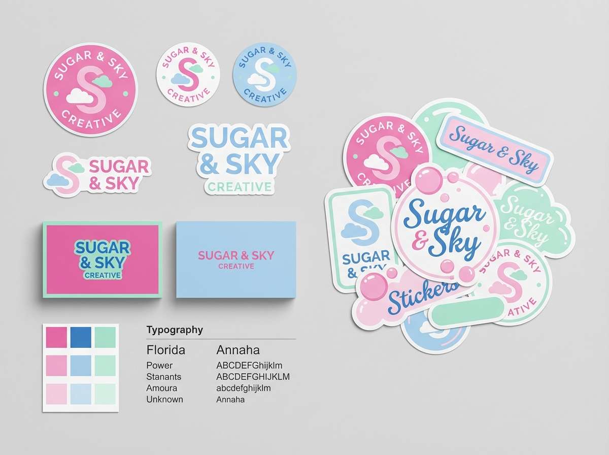
Best for: kids brand logo and identity
Playful and sunny, it brings to mind fairground lights, frosted treats, and weekend joy. The aqua-mint note keeps the pink from feeling too sugary and makes logos read cleaner. Use the bright pink for marks and accents, then lean on the cream for negative space. Pair with a friendly rounded sans and avoid heavy black outlines to keep it soft.
Image example of fairground frosting generated using media.io
3) Pink Sky Parade
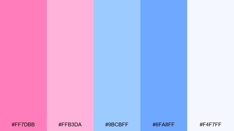
HEX: #FF7DBB #FFB3DA #9BCBFF #6FA8FF #F4F7FF
Mood: uplifting and modern
Best for: social media templates
Uplifting and modern, these shades look like sunset clouds fading into a crisp blue horizon. The stronger blue anchors the softness so posts feel designed, not washed out. Use the pale background for readability and set headlines in the deeper blue for contrast. Add a single bright pink highlight per slide to keep the feed consistent.
Image example of pink sky parade generated using media.io
4) Marshmallow Mist
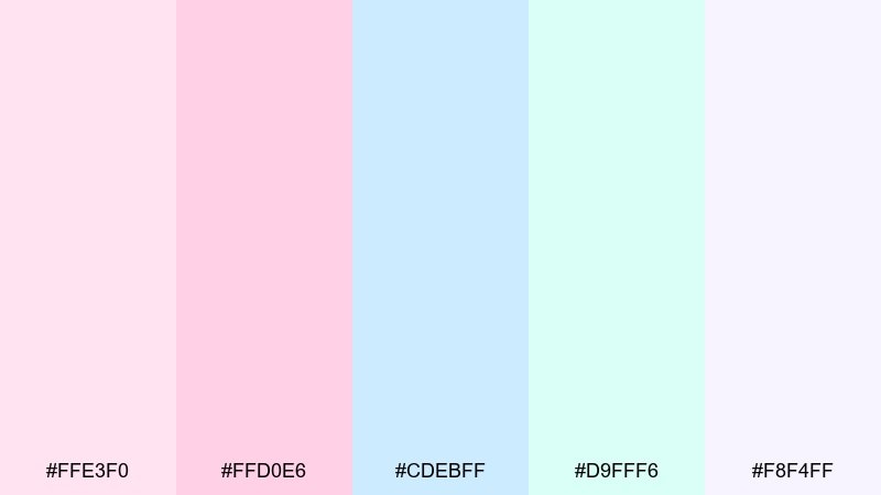
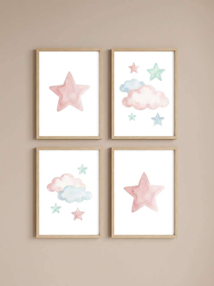
HEX: #FFE3F0 #FFD0E6 #CDEBFF #D9FFF6 #F8F4FF
Mood: calm and soothing
Best for: nursery wall art prints
Calm and soothing, it feels like warm blankets, quiet mornings, and a soft lullaby. The near-white pastels are ideal when you want color without visual noise. Use line art or simple shapes so the delicate contrast does not disappear. Pair with light wood frames and one slightly darker accent for titles.
Image example of marshmallow mist generated using media.io
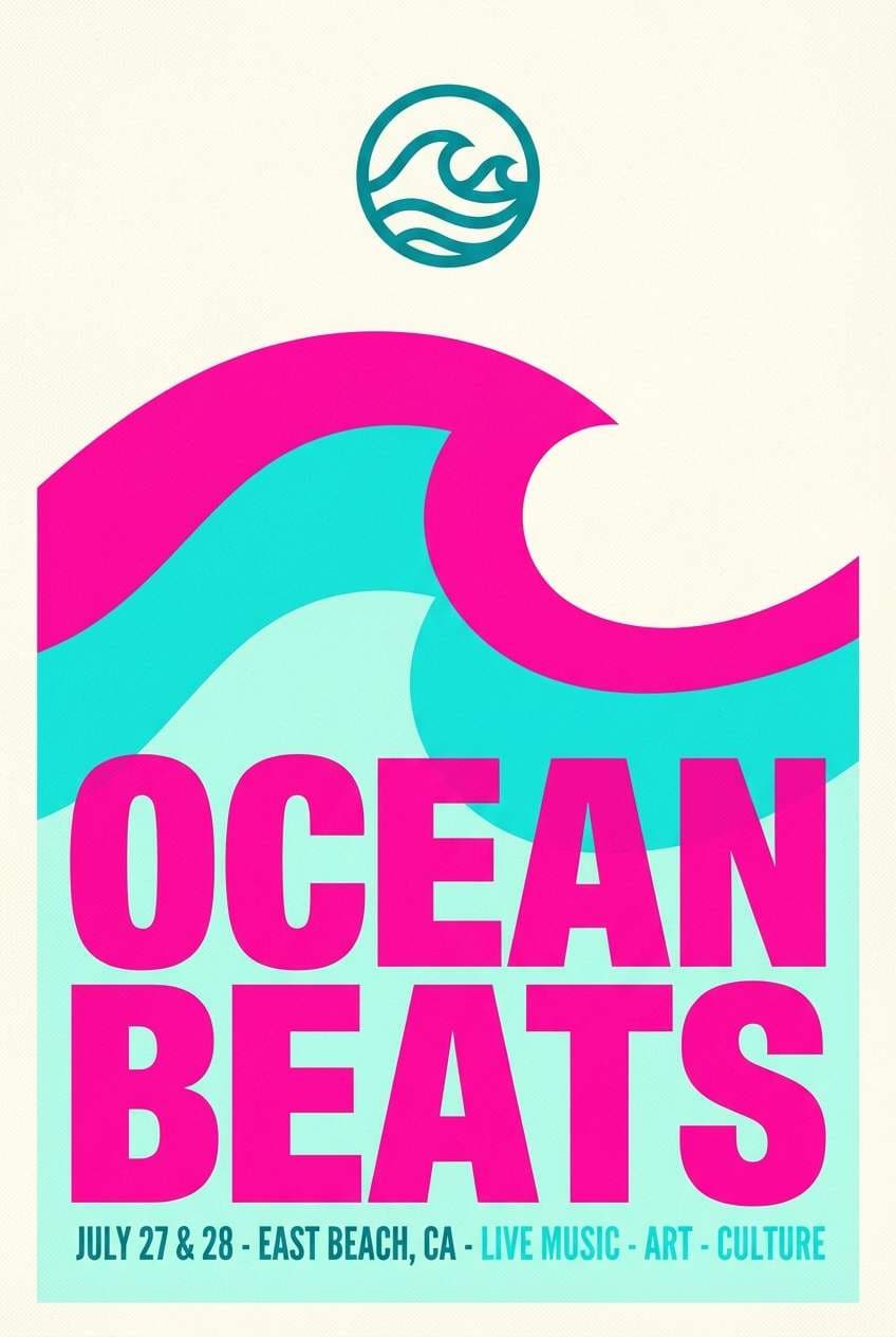
5) Boardwalk Sorbet
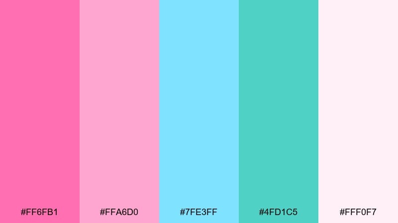
HEX: #FF6FB1 #FFA6D0 #7FE3FF #4FD1C5 #FFF0F7
Mood: fresh and energetic
Best for: summer event poster
Fresh and energetic, it suggests ocean air mixed with sweet kiosk treats on a busy boardwalk. The teal note adds punch, creating cotton candy color combinations that stay lively at a distance. Use the deeper teal for dates and venue info to keep type readable. Keep gradients subtle and let flat blocks of color do the work.
Image example of boardwalk sorbet generated using media.io
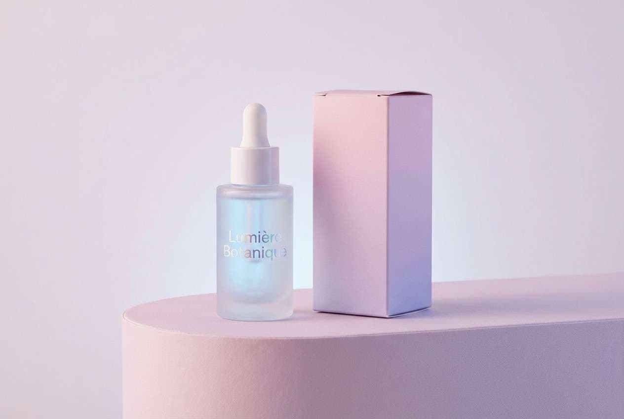
6) Sugarplum Breeze
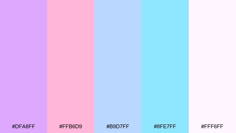
HEX: #DFA8FF #FFB6D9 #B9D7FF #8FE7FF #FFF6FF
Mood: whimsical and airy
Best for: beauty product ad creative
Whimsical and airy, it reads like a light perfume cloud with a spark of lavender. The purple-pink balance flatters skincare and makeup visuals without feeling juvenile. Use the lavender as a secondary brand color and reserve the brighter pink for price or key benefit callouts. Pair with clean white space and glossy highlights for a premium finish.
Image example of sugarplum breeze generated using media.io
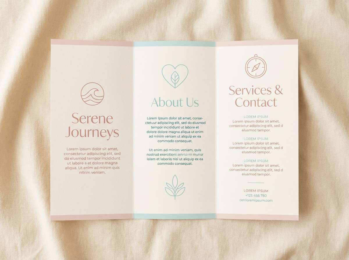
7) Bubble Bath Daydream
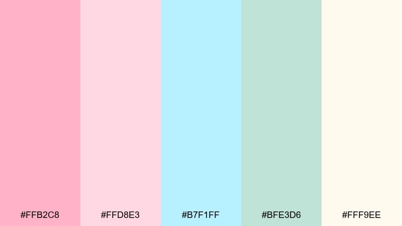
HEX: #FFB2C8 #FFD8E3 #B7F1FF #BFE3D6 #FFF9EE
Mood: clean and comforting
Best for: spa brochure layout
Clean and comforting, it evokes steam, fresh towels, and the quiet hush of a spa. The cream base keeps the pastels from turning cold and supports long-form reading. Use the blue for section headers and the blush for feature blocks or icons. Pair with thin rules and generous margins to maintain a calm rhythm.
Image example of bubble bath daydream generated using media.io
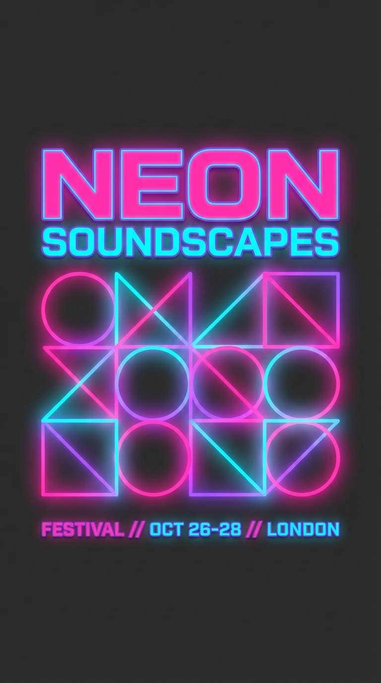
8) Neon Cotton Lights
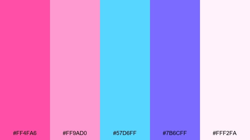
HEX: #FF4FA6 #FF9AD0 #57D6FF #7B6CFF #FFF2FA
Mood: bold and nightlife-ready
Best for: music festival flyer
Bold and nightlife-ready, it feels like glowing signage and late-night carnival rides. The electric blue and violet create a sharper cotton candy color scheme that still keeps a sweet edge. Set titles in violet or blue over the pale blush to hold contrast. Add grain or halftone texture to make the brights feel intentional rather than harsh.
Image example of neon cotton lights generated using media.io
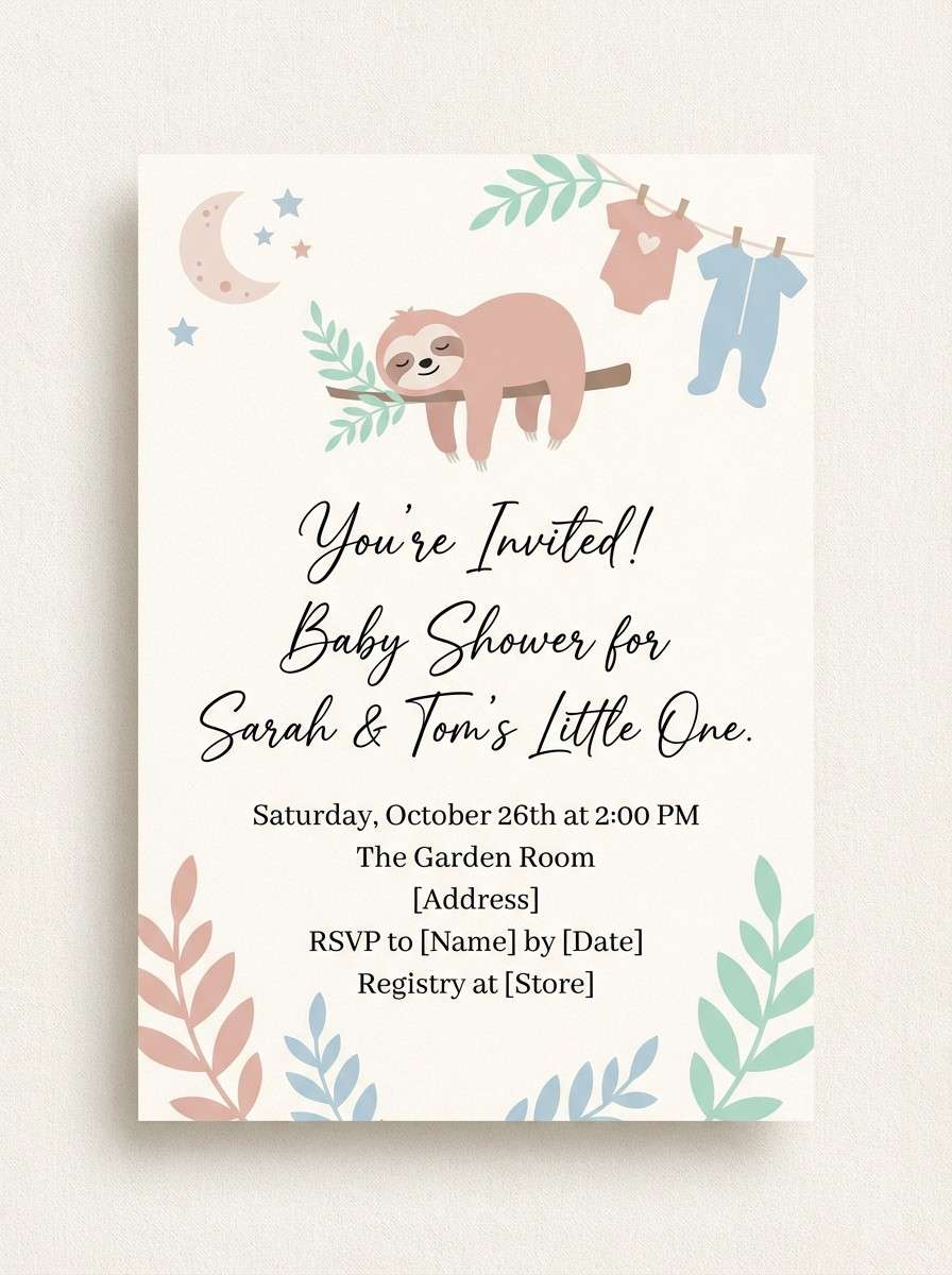
9) Powder Puff Picnic
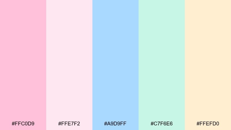
HEX: #FFC0D9 #FFE7F2 #A9D9FF #C7F6E6 #FFEFD0
Mood: gentle and friendly
Best for: baby shower invitation
Gentle and friendly, it brings to mind a picnic blanket, soft frosting, and tiny paper lanterns. The peachy cream helps keep skin tones flattering in photos and prints. Use the blue for the main text and keep decorative elements in blush and mint. For print, choose an uncoated paper so the pastels stay soft.
Image example of powder puff picnic generated using media.io
10) Icing Drift
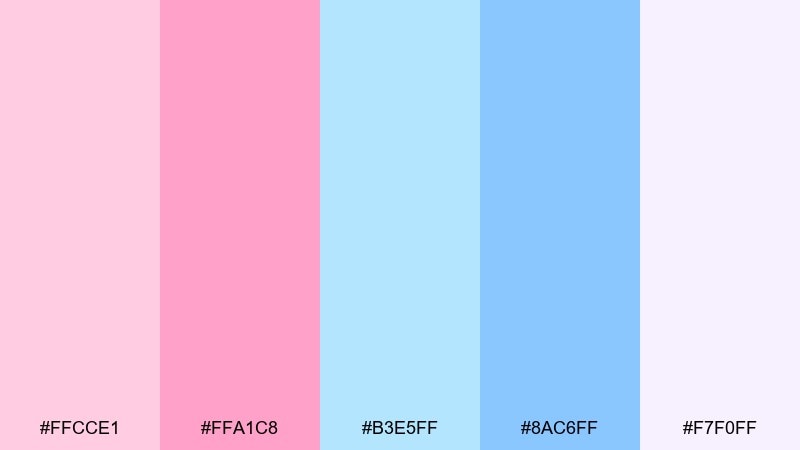
HEX: #FFCCE1 #FFA1C8 #B3E5FF #8AC6FF #F7F0FF
Mood: soft and polished
Best for: SaaS landing page hero
Soft and polished, these hues feel like frosted glass with a hint of sunrise. The stronger blue gives structure, so layouts stay professional while still welcoming. Use the pale pink as the hero background and keep CTAs in the deeper blue for accessibility. Reserve the brighter pink for badges, highlights, or micro-illustrations.
Image example of icing drift generated using media.io

11) Pink Ribbon Gelato
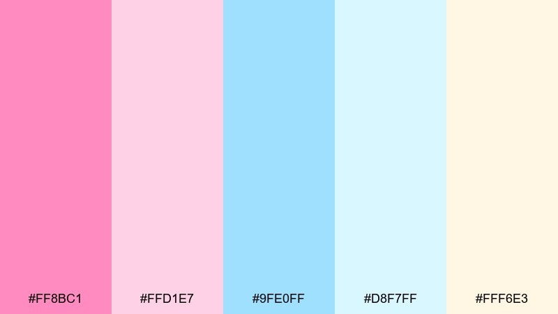
HEX: #FF8BC1 #FFD1E7 #9FE0FF #D8F7FF #FFF6E3
Mood: sweet and inviting
Best for: bakery packaging
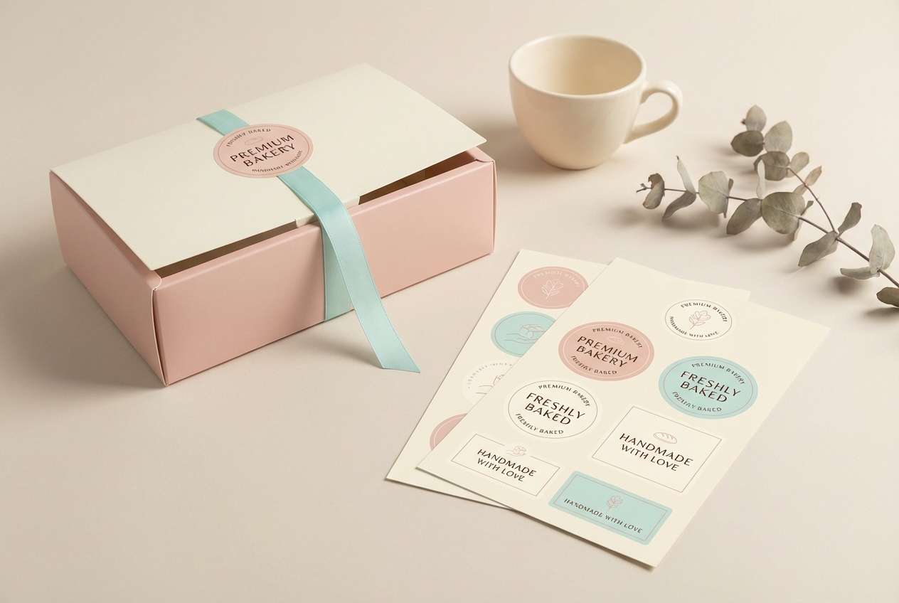
Sweet and inviting, it looks like gelato swirls in a chilled display case. The pale aqua keeps the pink from feeling heavy and makes labels feel fresh. This cotton candy color palette works beautifully on pastry boxes, stickers, and loyalty cards when you keep typography simple. Use the cream for the box base and bring in the brighter pink only for the brand mark.
Image example of pink ribbon gelato generated using media.io
12) Seaside Floss
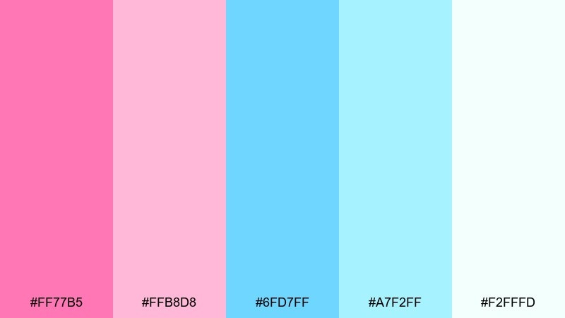
HEX: #FF77B5 #FFB8D8 #6FD7FF #A7F2FF #F2FFFD
Mood: breezy and bright
Best for: travel blog header graphics
Breezy and bright, it feels like sea spray tinted by a rosy sunset. The cyan range is vivid enough for headings while the blush keeps everything warm. Use the lightest tone as a background overlay on photos for better text legibility. Pair with a deep navy for body copy to avoid washed-out contrast.
Image example of seaside floss generated using media.io
13) Lullaby Lavender
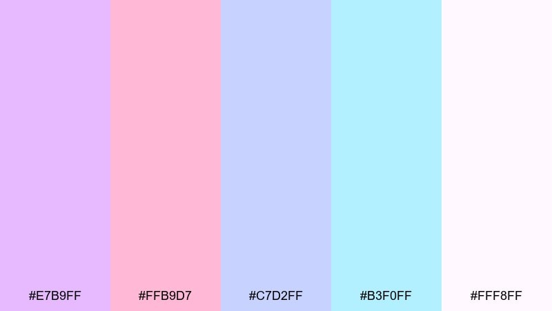
HEX: #E7B9FF #FFB9D7 #C7D2FF #B3F0FF #FFF8FF
Mood: tender and calming
Best for: wellness app theme
Tender and calming, these colors echo lavender sachets and a quiet bedtime routine. The lavender-blue pairing is gentle on the eyes for longer sessions and late-night use. Set primary navigation in the deeper periwinkle and use blush as a progress or highlight color. Keep icons thin and rounded so the theme stays soothing.
Image example of lullaby lavender generated using media.io
14) Sugar Crystal Pop
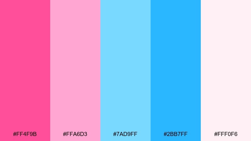
HEX: #FF4F9B #FFA6D3 #7AD9FF #2BB7FF #FFF0F6
Mood: confident and punchy
Best for: ecommerce promo banner
Confident and punchy, it recalls sugar crystals sparkling under bright lights. The stronger blue makes promotions feel crisp, while the pinks keep things upbeat. Use the bold blue for prices and the saturated pink for limited-time badges. Keep the background very light to prevent the palette from overwhelming small text.
Image example of sugar crystal pop generated using media.io

15) Vanilla Pink Float
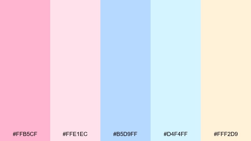
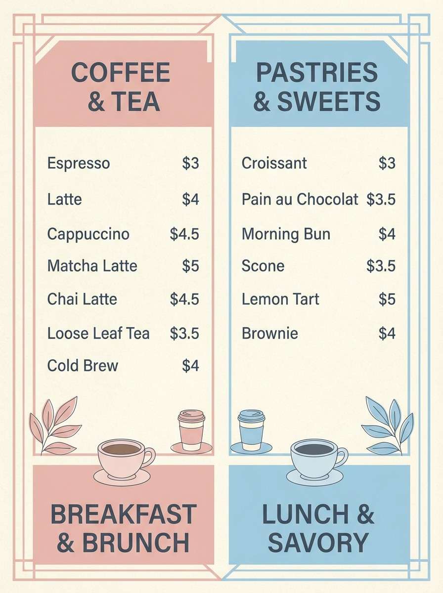
HEX: #FFB5CF #FFE1EC #B5D9FF #D4F4FF #FFF2D9
Mood: cozy and nostalgic
Best for: cafe menu design
Cozy and nostalgic, it looks like a vanilla soda float topped with rosy foam. The warm cream adds a menu-friendly base and makes photos of drinks and desserts pop. Use the blush for section headers and the medium blue for prices and dividers. A simple serif for item names pairs well with the vintage feel.
Image example of vanilla pink float generated using media.io
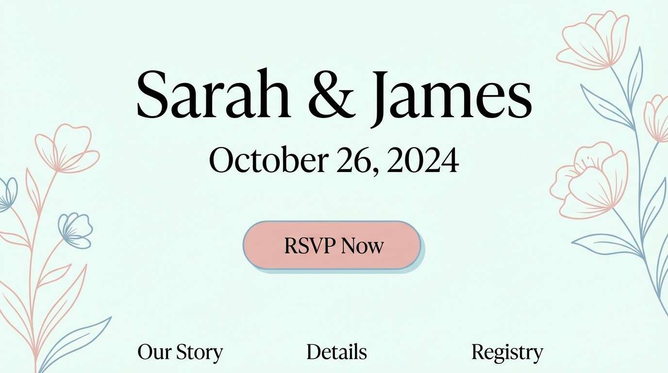
16) Macaron Marina
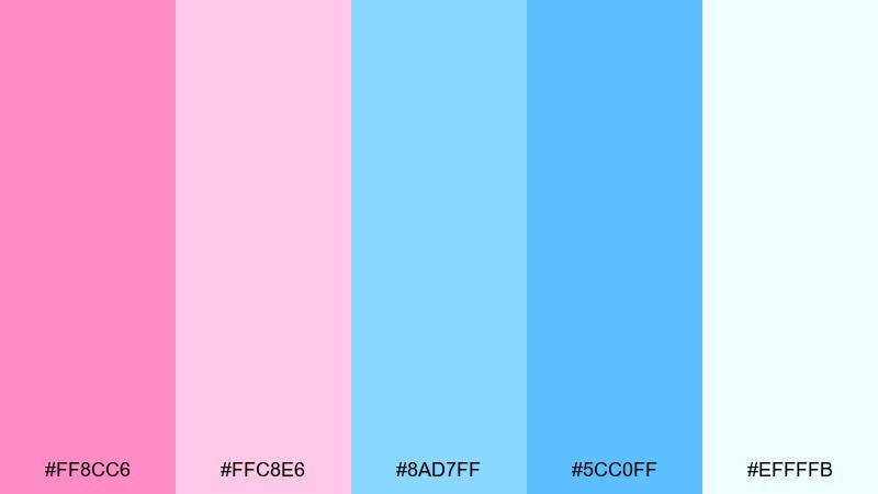
HEX: #FF8CC6 #FFC8E6 #8AD7FF #5CC0FF #EFFFFB
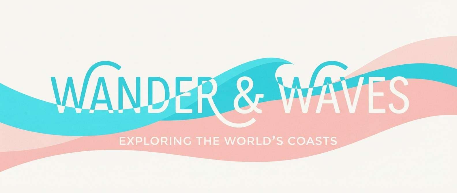
Mood: fresh and coastal
Best for: wedding website design
Fresh and coastal, it feels like macarons on a breezy marina terrace. The brighter blue brings crispness for links and buttons while the blush keeps the tone romantic. Use the palest mint-white as the page background and add the medium pink for section dividers. Keep floral elements minimal so the color story stays modern.
Image example of macaron marina generated using media.io
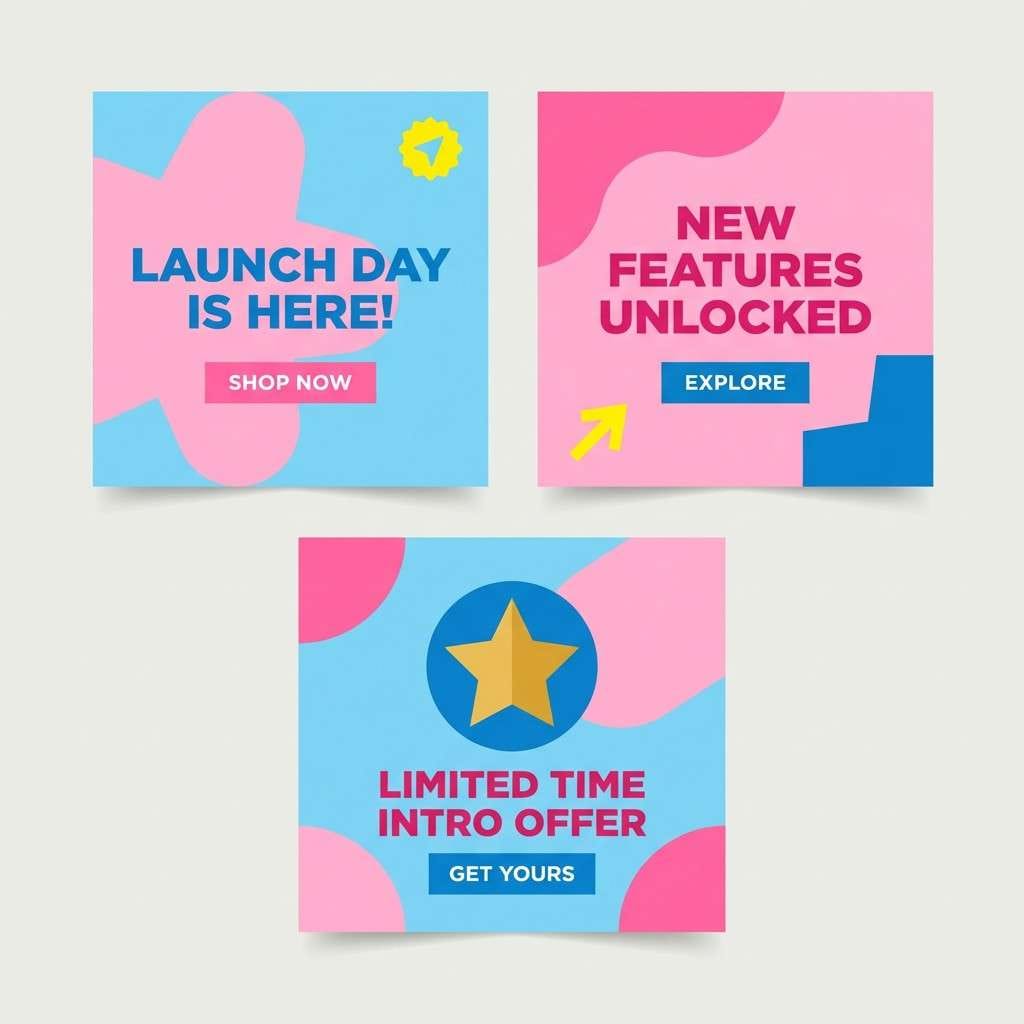
17) Citrus Cotton Twist
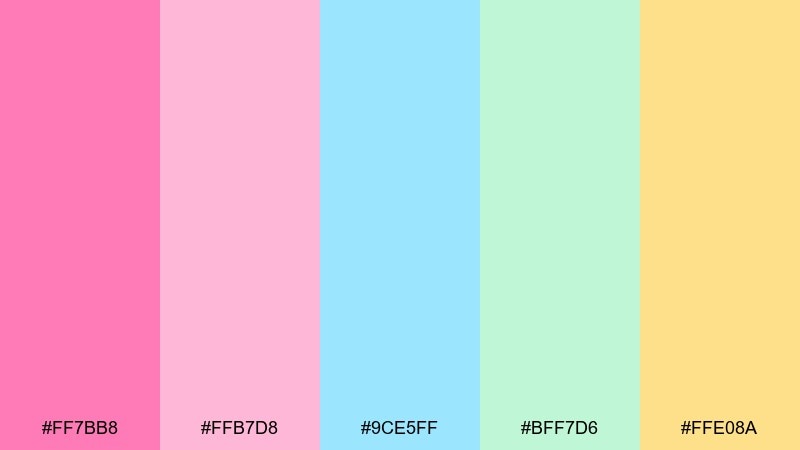
HEX: #FF7BB8 #FFB7D8 #9CE5FF #BFF7D6 #FFE08A
Mood: cheery and attention-grabbing
Best for: product launch social ads
Cheery and attention-grabbing, it mixes sweet pink with a splash of sunny citrus. The yellow is a strategic accent that lifts the whole set and helps CTAs stand out. These cotton candy color combinations work best when yellow is used sparingly for buttons, icons, or key stats. Pair with dark charcoal text to keep the ad readable on mobile.
Image example of citrus cotton twist generated using media.io
18) Pastel Popcorn
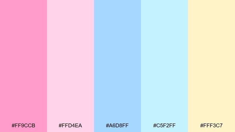
HEX: #FF9CCB #FFD4EA #A6D8FF #C5F2FF #FFF3C7
Mood: fun and family-friendly
Best for: movie night invitation flyer
Fun and family-friendly, it resembles pastel popcorn boxes and fizzy drinks at a cozy movie night. The buttery yellow warms the palette and keeps it from leaning too icy. Use the blue for the main text and the pink for playful icons like stars or tickets. A subtle dotted pattern in the lightest tones adds charm without clutter.
Image example of pastel popcorn generated using media.io

19) Dreamhouse Dusk
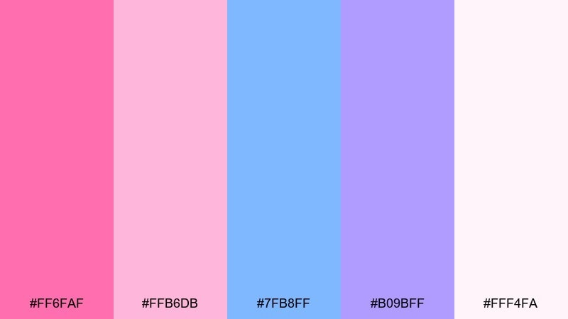
HEX: #FF6FAF #FFB6DB #7FB8FF #B09BFF #FFF4FA
Mood: romantic and slightly dramatic
Best for: editorial magazine spread
Romantic and slightly dramatic, it looks like dusk settling over a pastel city skyline. The violet adds depth that works well with fashion photography and bolder headlines. Use the pale blush as negative space and set feature titles in violet for a premium feel. Keep body text in near-black and reserve the hot pink for pull quotes or page numbers.
Image example of dreamhouse dusk generated using media.io
20) Soft Serve Studio
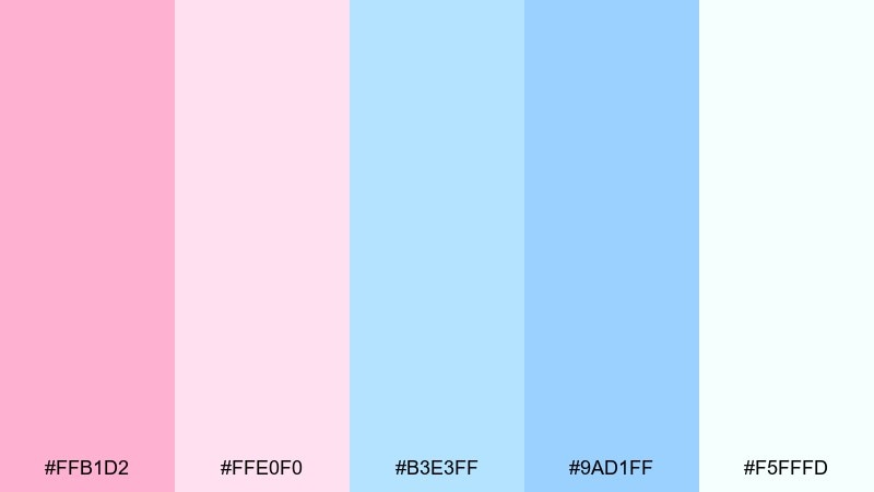
HEX: #FFB1D2 #FFE0F0 #B3E3FF #9AD1FF #F5FFFD
Mood: clean and contemporary
Best for: minimal brand guidelines page
Clean and contemporary, it feels like soft serve swirled into a neat, glossy peak. The blue range gives structure for charts and UI tokens while the blush keeps the brand approachable. Use the deepest blue for typography and accessibility-critical elements. This cotton candy color palette is especially strong for guideline PDFs where consistency matters more than decoration.
Image example of soft serve studio generated using media.io
What Colors Go Well with Cotton Candy?
For clean readability, pair cotton candy pastels with deep neutrals like navy, charcoal, or cool dark gray. These darker anchors keep headlines, UI labels, and body text accessible while still letting the palette feel light.
For a softer, more romantic look, add creamy whites, warm beige, or pale peach—these reduce the “icy” feel that blue pastels can bring. If you want extra depth, a muted lavender or periwinkle works like a bridge between pink and blue.
For high-energy accents, use small doses of saturated hot pink, bright cyan, or a sunny butter yellow. Keep accent colors limited to CTAs, badges, or icons so the design stays cohesive.
How to Use a Cotton Candy Color Palette in Real Designs
Start with a light base (near-white blush/cream) for backgrounds, then choose one medium pink or blue as your primary brand color. Reserve the most saturated shade for “moment” elements like CTAs, limited-time tags, or key stats.
In UI, use blue tones for structure (navigation, links, focus states) and pink for highlights (progress, notifications, decorative illustrations). This makes the interface feel stable while still delivering the sweet cotton candy vibe.
In print (invites, packaging, menus), pick uncoated or lightly textured paper to keep pastels from looking overly glossy. If gradients are needed, keep them subtle and test a proof so the colors don’t wash out.
Create Cotton Candy Palette Visuals with AI
If you already have HEX codes, you can generate matching visuals by describing the design format (poster, UI screen, packaging), the dominant colors (pastel pink and baby blue), and a specific style (minimal, glossy, watercolor, editorial).
Reuse the prompts above as templates—swap the subject (e.g., “wedding website” → “birthday invitation”) and keep the color direction consistent for faster iterations. This helps you test multiple cotton candy color combinations without rebuilding assets from scratch.
When the output looks too pale, ask for stronger contrast in typography and a “very light background” so the pastel accents remain crisp.
Cotton Candy Color Palette FAQs
-
What is a cotton candy color palette?
A cotton candy palette typically blends pastel pink and pastel blue, often supported by creamy whites, soft mint, or light lavender to keep the look airy and sweet. -
Is cotton candy just pink and blue?
Not always. Pink and blue are the core, but many cotton candy color schemes add cream (for warmth), mint (for freshness), or lavender/periwinkle (for depth and smoother transitions). -
What text color works best on cotton candy backgrounds?
Use deep navy, charcoal, or a cool dark gray for readability. Pure black can feel too harsh; a softened near-black often matches the pastel mood better. -
How do I keep cotton candy colors from looking childish?
Limit saturated accents, increase white space, and choose modern typography. Adding a deeper anchor color (navy, indigo, or violet) also makes the palette feel more premium. -
Which cotton candy palette is best for UI design?
Look for sets with a very light base and at least one deeper blue for contrast (for example, Cloud Spun Pastels or Icing Drift). This helps buttons and labels stay accessible. -
Do cotton candy palettes print well?
Yes, but pastels can wash out if contrast is too low. Use a cream base, avoid ultra-light text, and consider uncoated paper to keep the soft look consistent. -
Can I generate cotton candy palette mockups with AI?
Yes—describe the asset type (UI, poster, packaging), specify “pastel pink and baby blue,” and add a style cue (minimal, glossy, watercolor). Reusing a consistent prompt format makes results more cohesive.


