

A holographic color palette blends airy pastels, opal neutrals, and neon-tinted highlights to mimic how light shifts across pearl, film, and chrome.
Below are 20 holographic palette ideas with HEX codes, plus practical ways to use iridescent color combos in UI, packaging, posters, and brand systems.
In this article
Why Holographic Palettes Work So Well
Holographic colors feel “alive” because they suggest movement: cool-to-warm shifts, pearly highlights, and subtle gradients that resemble light refracting on curved surfaces. That visual energy makes even minimal layouts feel dimensional.
They also balance softness with futurism. Pastel tints keep things approachable, while opal grays and electric accents add a modern, tech-forward edge that works for UI, beauty, and event design.
Finally, iridescent palettes are naturally modular. You can keep them calm by leaning on milky neutrals, or turn up the intensity by concentrating saturation in a few high-impact elements like CTAs, titles, and badges.
20+ Holographic Color Palette Ideas (with HEX Codes)
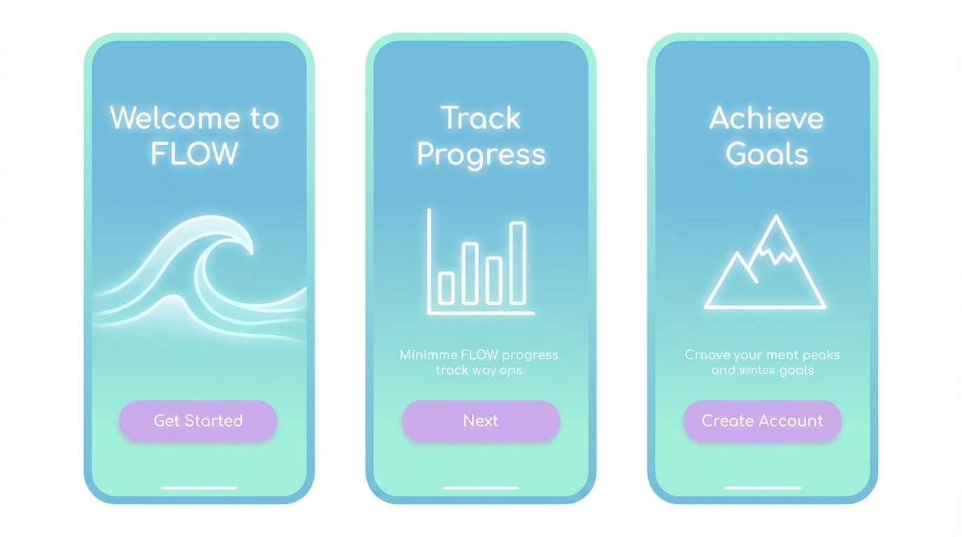
1) Prism Mist
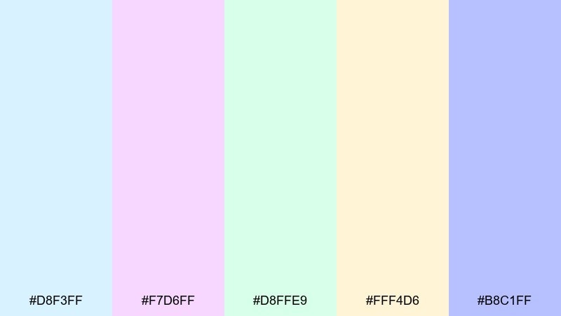
HEX: #D8F3FF #F7D6FF #D8FFE9 #FFF4D6 #B8C1FF
Mood: airy, clean, dreamy
Best for: app onboarding UI
Airy and weightless like light bending through morning fog, these tones read soft but still futuristic. Use the icy blue and mint as your primary surfaces, then add lilac or periwinkle for highlights and interactive states. It works especially well with rounded cards, subtle gradients, and lots of whitespace. Tip: keep contrast accessible by pairing the pastels with deep slate text instead of pure black.
Image example of prism mist generated using media.io
Media.io is an online AI studio for creating and editing video, image, and audio in your browser.

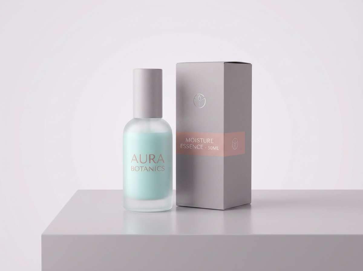
2) Opal Chrome
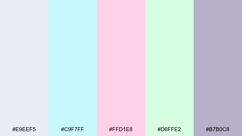
HEX: #E9EEF5 #C9F7FF #FFD1E8 #D6FFE2 #B7B0C8
Mood: polished, calm, premium
Best for: skincare product packaging
Polished and milky like an opal sheen on brushed metal, this mix feels premium without shouting. Let the cool gray-lilac act as the anchor, then layer aqua and blush for soft brand cues. It suits minimalist labels, foil stamping, and clean ingredient layouts. Tip: reserve the pink for small callouts so the pack still reads clinical and luxe.
Image example of opal chrome generated using media.io
3) Aurora Drift
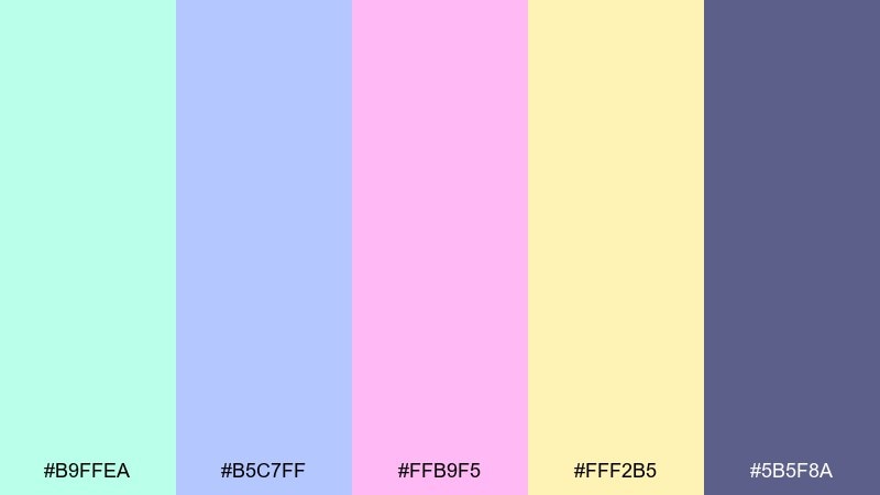
HEX: #B9FFEA #B5C7FF #FFB9F5 #FFF2B5 #5B5F8A
Mood: uplifting, nocturnal, electric-soft
Best for: music festival poster
Uplifting like aurora ribbons over a late-night skyline, these colors balance glow with depth. The mint, pink, and periwinkle make the headline feel alive, while the muted indigo keeps the layout grounded. These holographic color combinations shine on gradient typography, abstract wave shapes, and high-energy linework. Tip: add the buttery yellow only as a spotlight accent to guide the reading order.
Image example of aurora drift generated using media.io

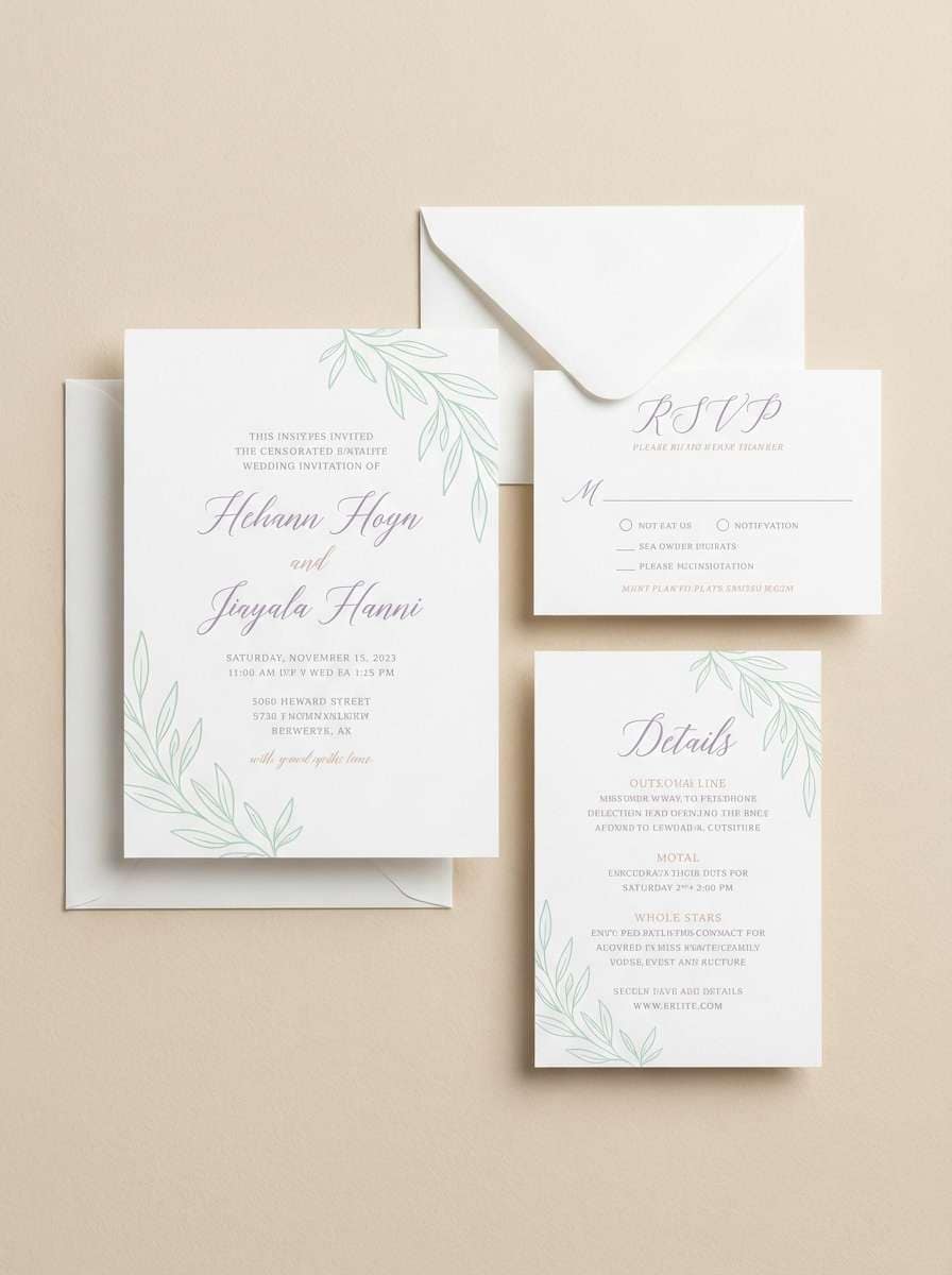
4) Laser Pearl
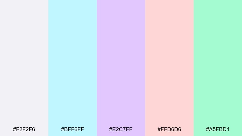
HEX: #F2F2F6 #BFF6FF #E2C7FF #FFD6D6 #A5FBD1
Mood: romantic, modern, luminous
Best for: wedding invitation suite
Romantic and luminous like pearl paper under soft club lights, this set keeps things modern and sweet. Use the near-white as the base, then bring in lavender and blush for flourishes and section dividers. It pairs beautifully with thin serif type, monoline illustrations, and subtle embossed details. Tip: keep the aqua to envelopes or RSVP cards so the suite stays elegant.
Image example of laser pearl generated using media.io
5) Neon Soap
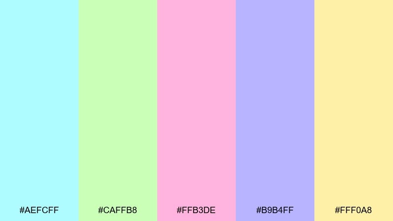
HEX: #AEFCFF #CAFFB8 #FFB3DE #B9B4FF #FFF0A8
Mood: playful, bubbly, upbeat
Best for: bubble tea social media ad
Playful and bubbly like soap film catching light, these pastels feel sweet and energetic. Pick aqua and pink as the main duo, then add periwinkle for depth in shadows and buttons. It works best with chunky rounded type, stickers, and simple vector fruit shapes. Tip: use the pale yellow as a price tag pop so it reads instantly in a feed.
Image example of neon soap generated using media.io
6) Iridescent Fog
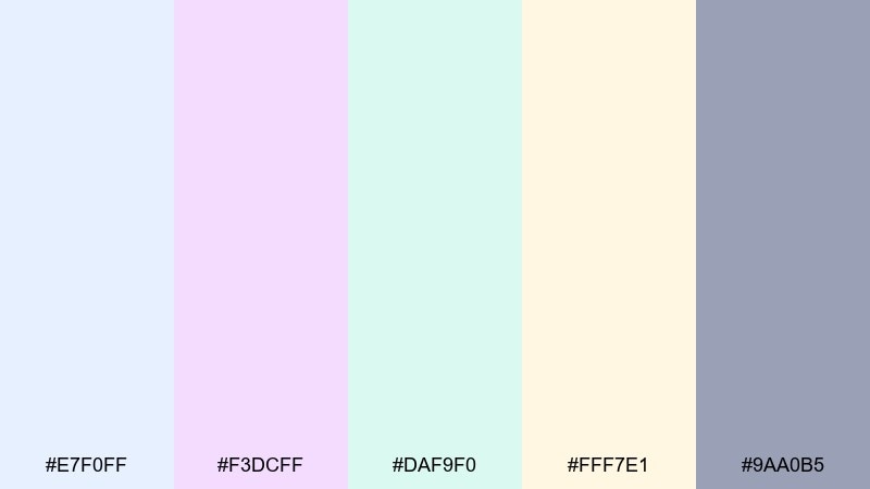
HEX: #E7F0FF #F3DCFF #DAF9F0 #FFF7E1 #9AA0B5
Mood: gentle, spa-like, balanced
Best for: editorial magazine layout
Gentle and spa-like, these colors feel like a soft fog over glass and linen. The cool blue and lavender carry the page, while the warm cream keeps it friendly and readable. Use the gray-blue for rules, captions, and section headers to avoid the layout feeling too sugary. Tip: keep photos neutral so the pastel margins and pull quotes stay in control.
Image example of iridescent fog generated using media.io
7) Candy Circuit
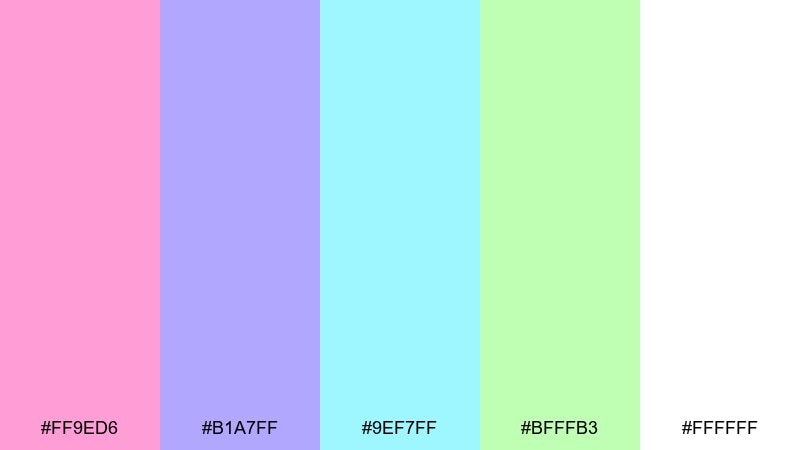
HEX: #FF9ED6 #B1A7FF #9EF7FF #BFFFB3 #FFFFFF
Mood: bright, youthful, arcade-cute
Best for: kids gaming UI mockup
Bright and youthful like candy lights on an arcade cabinet, this mix makes interfaces feel friendly and fast. Use white as the breathing room, then rotate pink, aqua, and lime for playful states and badges. It pairs well with rounded toggles, pill buttons, and simple mascot icons. Tip: reserve periwinkle for navigation so users always know where they are.
Image example of candy circuit generated using media.io
8) Cosmic Sheen
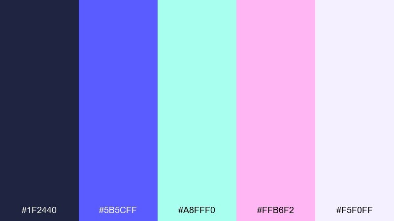
HEX: #1F2440 #5B5CFF #A8FFF0 #FFB6F2 #F5F0FF
Mood: bold, cosmic, high-contrast
Best for: tech conference keynote slide
Bold and cosmic like a deep-space gradient with neon stardust, this set is built for impact. Put the midnight tone behind everything, then bring in periwinkle and mint for charts, icons, and key numbers. Pink works best as a limited highlight for CTAs or speaker names. Tip: use the pale lilac as a soft glow shape to add depth without clutter.
Image example of cosmic sheen generated using media.io

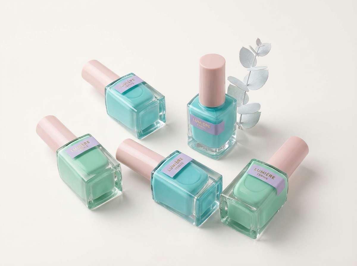
9) Mermaid Glass
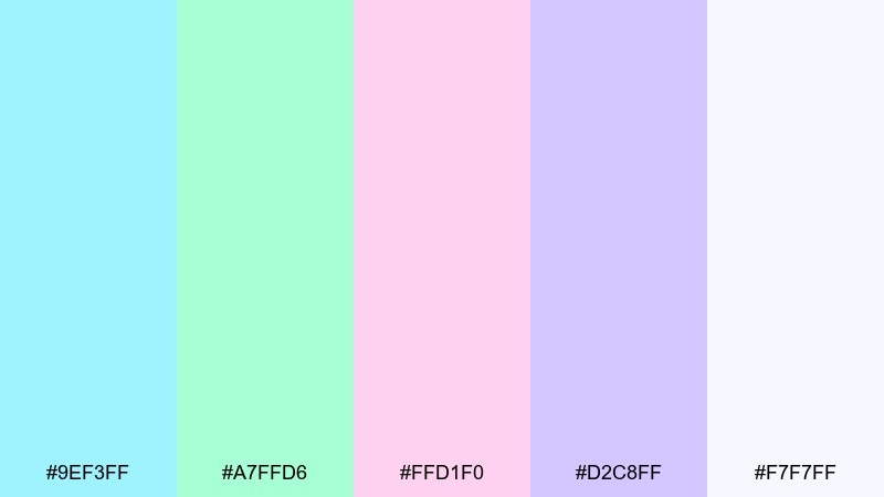
HEX: #9EF3FF #A7FFD6 #FFD1F0 #D2C8FF #F7F7FF
Mood: fresh, watery, whimsical
Best for: nail polish product ad
Fresh and watery like sea glass with a pink shimmer, these tones feel light and whimsical. Use aqua and mint as your hero background, then layer blush and lavender for swatch labels and sparkle cues. It fits beauty ads with clean type, simple shadows, and glossy highlights. Tip: keep the near-white for negative space so the colors look extra translucent.
Image example of mermaid glass generated using media.io
10) Digital Seashell
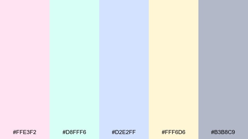
HEX: #FFE3F2 #D8FFF6 #D2E2FF #FFF6D6 #B3B8C9
Mood: soft, friendly, cozy-modern
Best for: stationery brand identity
Soft and friendly like seashell pinks with a cool digital tint, this palette is cozy without feeling vintage. Use blush as the brand base, then add mint and powder blue for secondary panels and patterns. The gray-lavender works well for text and outlines when black feels too harsh. Tip: repeat the butter tone as a consistent highlight across stickers, tags, and headers.
Image example of digital seashell generated using media.io
11) Vaporwave Opal
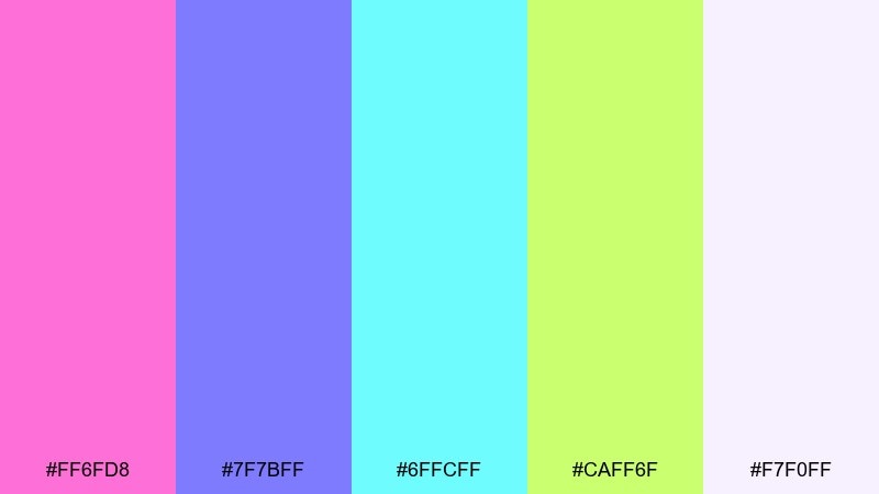
HEX: #FF6FD8 #7F7BFF #6FFCFF #CAFF6F #F7F0FF
Mood: retro-future, loud, energetic
Best for: album cover design
Retro-future and energetic, this set feels like neon reflected on pearly plastic. Anchor the composition with periwinkle, then push hot pink and aqua as the main glow duo. These holographic color combinations are perfect for gradient meshes, chrome text effects, and bold geometric frames. Tip: keep the lime as a tiny punch for track labels so it stays sharp, not chaotic.
Image example of vaporwave opal generated using media.io
12) Polar Glow
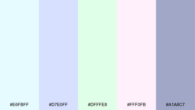
HEX: #E6FBFF #D7E0FF #DFFFE8 #FFF0FB #A1A8C7
Mood: crisp, reassuring, modern-soft
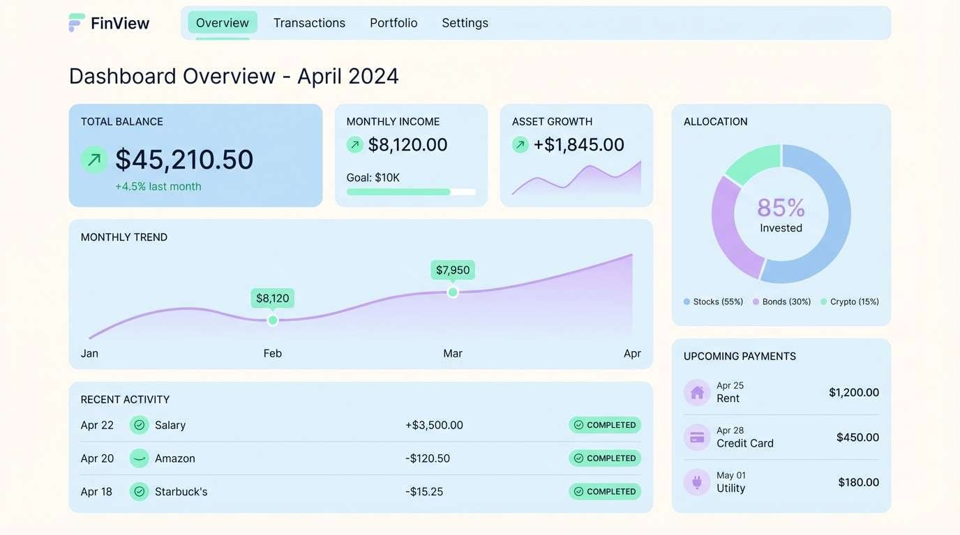
Best for: fintech dashboard UI
Crisp and reassuring like polar light on frosted glass, these tones feel trustworthy and modern. Use the pale blues for surfaces and charts, then add mint for positive states and confirmations. The muted steel-lavender is ideal for dividers, inactive icons, and secondary text. Tip: keep gradients subtle so the data remains the star of the screen.
Image example of polar glow generated using media.io
13) Pearl Skyline
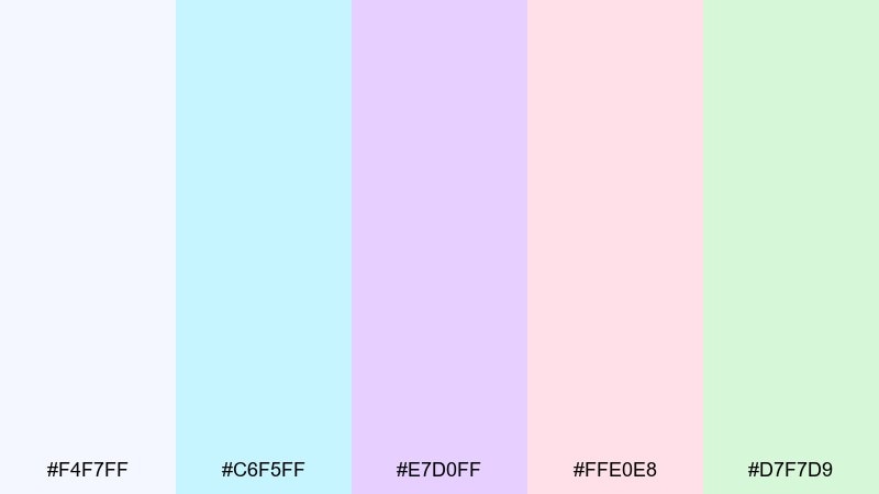
HEX: #F4F7FF #C6F5FF #E7D0FF #FFE0E8 #D7F7D9
Mood: optimistic, airy, city-fresh
Best for: SaaS website landing page
Optimistic and airy, these tones feel like a bright skyline seen through a pearly haze. Use the near-white and aqua for hero sections, then bring in lavender for feature cards and blush for gentle emphasis. The mint is great for trust signals like checkmarks, testimonials, and small micro-animations. Tip: pair with a dark navy type color to keep the layout crisp.
Image example of pearl skyline generated using media.io
14) Quartz Bloom
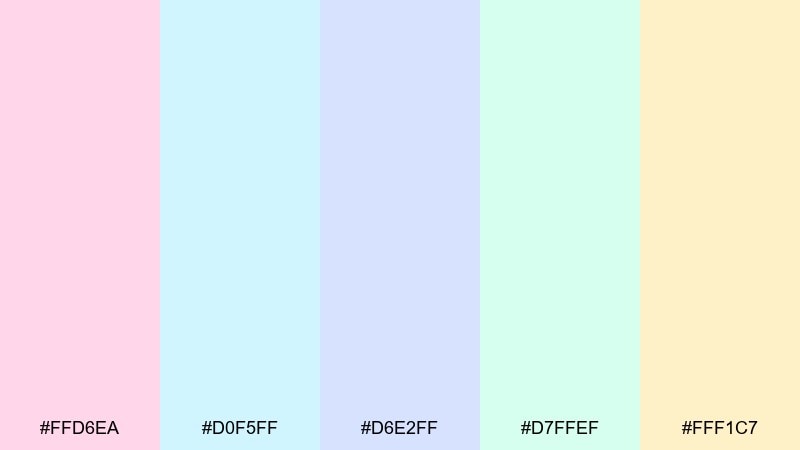
HEX: #FFD6EA #D0F5FF #D6E2FF #D7FFEF #FFF1C7
Mood: springy, delicate, artistic
Best for: spring botanical illustration print
Springy and delicate like petals on translucent quartz, these colors suit airy artwork. Build florals with blush and mint, then shade with powder blue for depth that stays gentle. The butter tone makes a warm highlight for pollen, centers, and tiny details. Tip: keep outlines minimal and let soft washes do the work for a modern watercolor feel.
Image example of quartz bloom generated using media.io
15) Holo Minimal
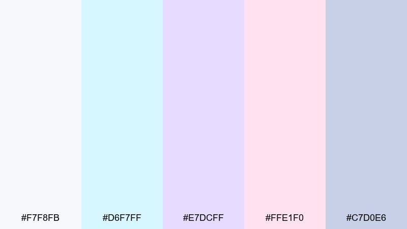
HEX: #F7F8FB #D6F7FF #E7DCFF #FFE1F0 #C7D0E6
Mood: minimal, glossy, calm
Best for: logo and brand style guide
Minimal and glossy like a clean studio reflection, these tints keep branding soft but intentional. The near-white and cool gray-blue make a steady base, while aqua and lavender provide gentle depth for sections and UI tokens. When you need a blush note, use it sparingly for emphasis so it stays refined. Tip: this holographic color palette looks best with simple marks, generous margins, and a single gradient rule.
Image example of holo minimal generated using media.io
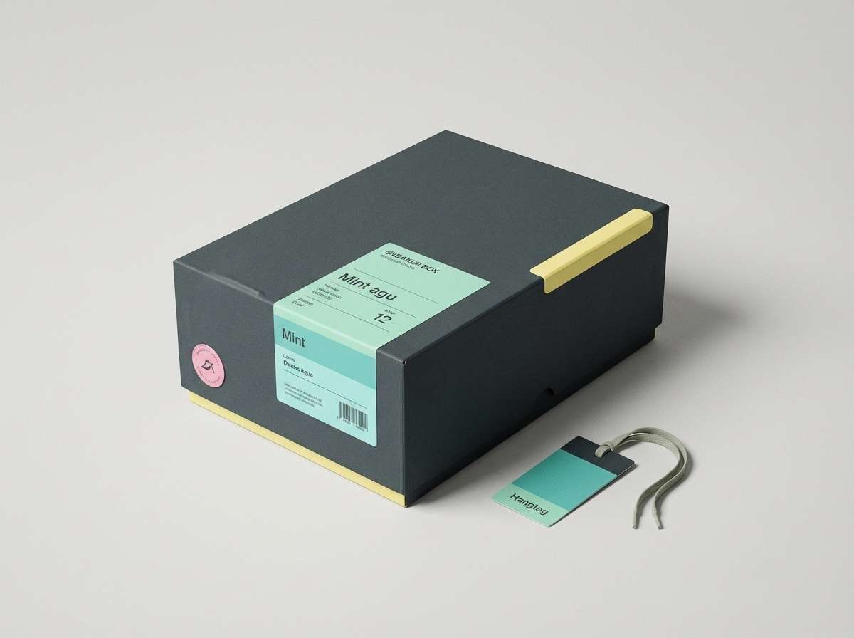
16) Studio Prism
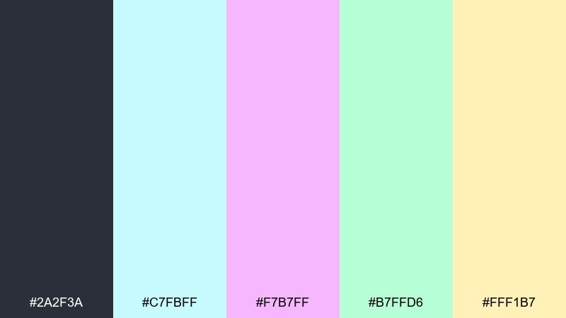
HEX: #2A2F3A #C7FBFF #F7B7FF #B7FFD6 #FFF1B7
Mood: editorial, sharp, high-end playful
Best for: sneaker packaging and hangtag
Sharp and high-end playful, this mix feels like a dark studio with prismatic lights. Use the deep charcoal as the main packaging color, then add mint and aqua for glossy labels and small pattern hits. Pink and butter work best as limited accents for size stickers, QR blocks, or special-edition callouts. Tip: keep finishes consistent (matte base, glossy accents) so the color pops feel intentional.
Image example of studio prism generated using media.io
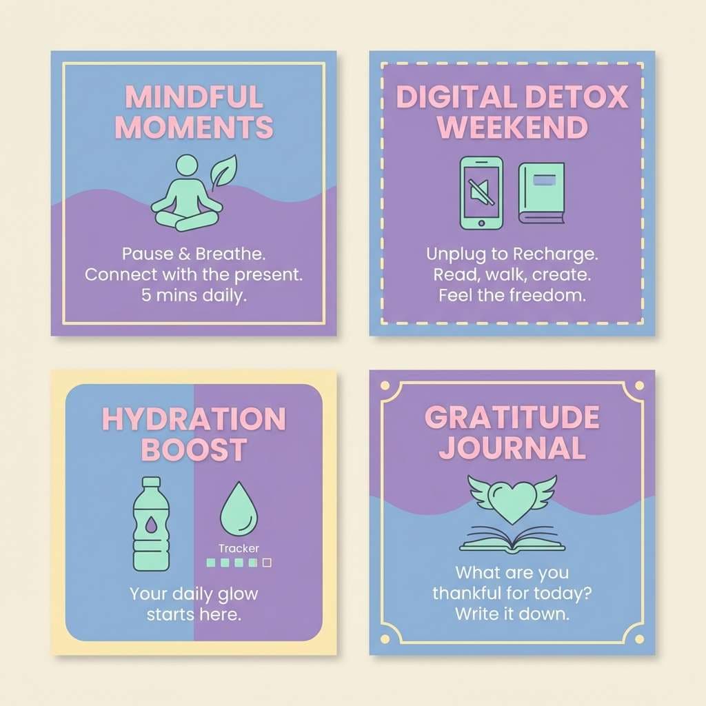
17) Soft Spectrum
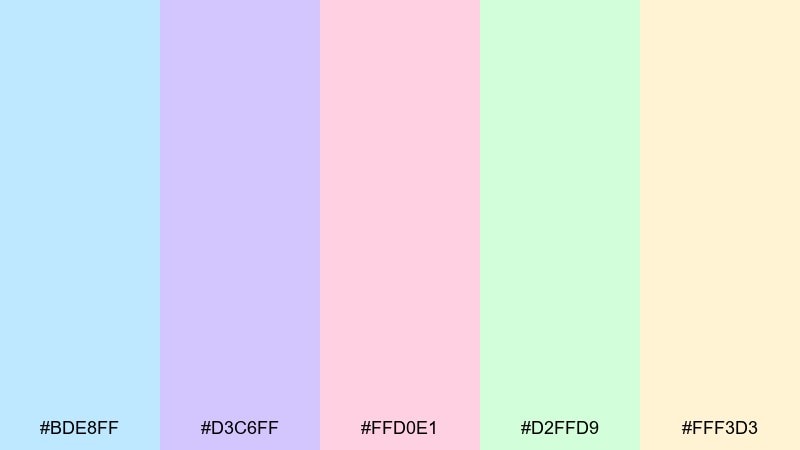
HEX: #BDE8FF #D3C6FF #FFD0E1 #D2FFD9 #FFF3D3
Mood: gentle, cheerful, comforting
Best for: wellness app social posts
Gentle and cheerful like a soft rainbow through sheer fabric, this set is comforting without being childish. Choose one dominant background per post (blue or lavender), then use pink for headers and mint for supportive icons. It pairs nicely with simple illustrations, rounded stickers, and calm affirmations. Tip: keep the butter tone for subtle frames so the feed still looks cohesive.
Image example of soft spectrum generated using media.io
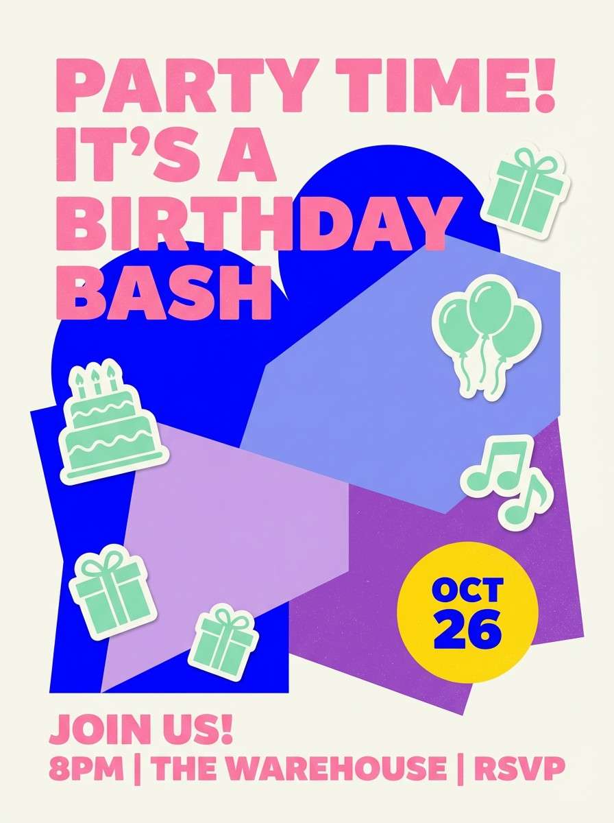
18) Chrome Confetti
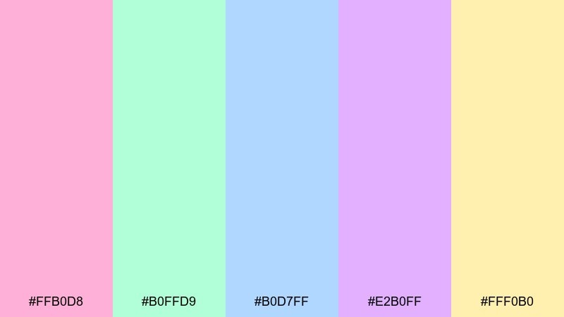
HEX: #FFB0D8 #B0FFD9 #B0D7FF #E2B0FF #FFF0B0
Mood: festive, bright, optimistic
Best for: birthday party flyer
Festive and optimistic, these colors feel like confetti catching a chrome shine. Let blue and lavender carry the background shapes, then use pink for the headline and mint for icons or small stickers. The warm yellow is perfect for date and location badges so the details stand out. Tip: keep the layout bold and simple, with one big type moment and a few playful shapes.
Image example of chrome confetti generated using media.io
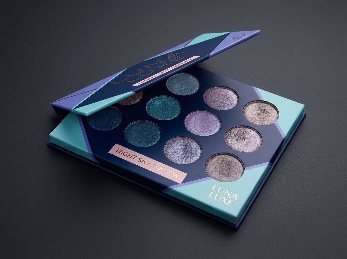
19) Galaxy Film
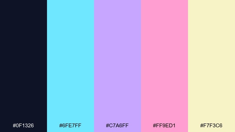
HEX: #0F1326 #6FE7FF #C7A6FF #FF9ED1 #F7F3C6
Mood: cinematic, glossy, dramatic
Best for: eyeshadow palette product shot
Cinematic and glossy like light on camera film, this set blends deep night tones with candy-glow highlights. Use the dark base to make aqua and violet feel electric, then add pink for a soft pop on labels or shade names. The pale gold works as a luxe detail for borders, logos, or shimmer cues. Tip: this holographic color palette looks strongest when you limit gradients to one area and keep the rest crisp and matte.
Image example of galaxy film generated using media.io
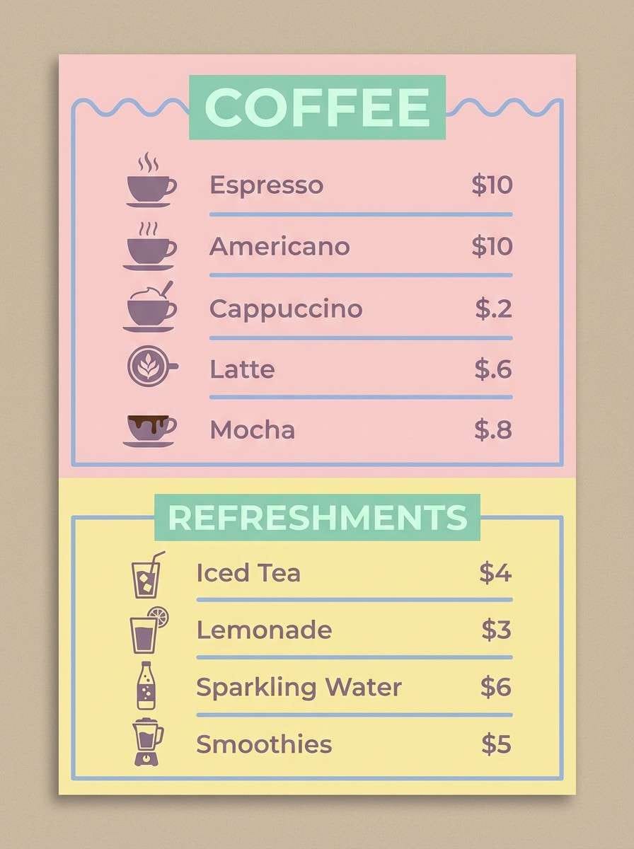
20) Opaline Sunset
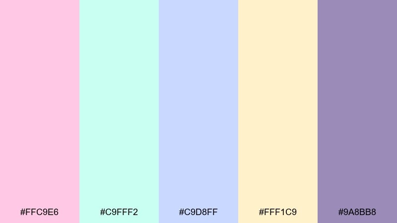
HEX: #FFC9E6 #C9FFF2 #C9D8FF #FFF1C9 #9A8BB8
Mood: warm-soft, inviting, modern cafe
Best for: cafe menu poster
Warm-soft and inviting like an opaline sunset in a shop window, these tones feel friendly and modern. Use blush and butter as the main background and section blocks, then bring in cool mint or blue for category headers and pricing lines. The muted violet makes a great ink alternative for body text and icons. Tip: keep photography minimal or duotone so the menu stays airy and easy to scan.
Image example of opaline sunset generated using media.io
What Colors Go Well with Holographic?
Holographic schemes pair best with grounded neutrals that keep the shimmer effect readable. Think deep navy, slate, charcoal, and cool gray-lavender as “ink” colors for type, borders, and UI chrome.
For accents, choose one saturated highlight (hot pink, electric periwinkle, or neon aqua) and keep everything else milky. That single “spark” color preserves the iridescent vibe without turning the design into a rainbow overload.
Warm balancing tones (butter cream, pale gold, soft peach) also work well—especially in print—because they add a human, premium finish against cool opal pastels.
How to Use a Holographic Color Palette in Real Designs
Start with a calm base: near-white or pearl gray for backgrounds, then place holographic pastels in large, soft areas (cards, hero sections, poster gradients). Keep edges clean so the palette reads “glossy,” not messy.
Control contrast intentionally. Pastels often fail accessibility checks with white text, so use dark slate/navy for typography and reserve light-on-dark moments for larger type or short labels.
In packaging and posters, pick one signature gradient (for a stripe, logo fill, or headline) and keep the rest matte. The mix of restrained layout + selective shimmer is what sells the holographic look.
Create Holographic Palette Visuals with AI
If you’re pitching a concept or building a mood board, AI image generation is a fast way to preview how holographic colors behave across materials like plastic, glass, foil, and pearl paper.
Use prompts that describe both lighting and surface finish (e.g., “soft reflective highlights,” “milky opal sheen,” “subtle glow”) to get more believable iridescent results.
Once you like the direction, generate variations by swapping only one element (background color, accent hue, or aspect ratio) so your palette stays consistent across a full design system.
Holographic Color Palette FAQs
-
What is a holographic color palette?
A holographic color palette is a set of colors that mimics iridescence—usually milky neutrals, soft pastels, and a few neon-leaning accents—often used with gradients or glow effects to suggest light shifting across a surface. -
Are holographic colors the same as pastel colors?
Not exactly. Pastels are often part of holographic palettes, but the holographic look typically needs pearly neutrals and controlled high-chroma highlights (like aqua or hot pink) plus gradient transitions that imply shimmer. -
How do I keep holographic palettes readable in web UI?
Use a dark text color (navy/slate) on pastel surfaces, limit gradients to large background areas, and keep interactive states distinct with one consistent accent color. Always check contrast for buttons, links, and small text. -
What background works best for holographic designs?
Pearl white, very light cool gray, or deep midnight navy work best. Light backgrounds emphasize airy opal tones, while dark backgrounds make neon accents and glow shapes feel more cinematic. -
How many colors should a holographic palette include?
Five is a practical sweet spot: 1 base neutral, 2 main pastels, 1 warm balancing tint (cream/butter), and 1 “spark” accent. You can expand later, but start tight for consistency. -
What finishes pair well with holographic palettes in packaging?
Matte bases with selective glossy varnish, foil stamping, or pearlescent coatings work especially well. Keeping finishes consistent (and using shimmer only in key areas) makes the design feel premium. -
Can I generate holographic mockups with AI?
Yes. Describe the material and lighting (opal sheen, soft reflections, subtle glow) and specify the design context (poster, UI, bottle, box). Then iterate by changing one color at a time to stay on-brand.
Next: Blue Taupe Color Palette


