

Blue taupe is a modern neutral that blends the calm of muted blues with the grounded warmth of taupe. The result feels refined, livable, and easy to apply across interiors, branding, and UI.
Below are 20 curated blue taupe color schemes with HEX codes, plus practical tips and AI prompts you can reuse to generate consistent visuals.
In this article
Why Blue and Taupe Color Schemes Work So Well
Blue taupe color schemes sit in the “muted neutral” zone, so they feel calm without looking washed out. Blue adds clarity and structure, while taupe softens the temperature and keeps the overall look welcoming.
They’re also naturally flexible: you can push them cooler for sleek UI and architecture, or warmer for home interiors and hospitality branding. Because contrast is usually gentle, the palettes help content feel organized without visual noise.
Most blue and taupe schemes pair easily with common materials and finishes—linen, oak, stone, brushed metal—making them a safe, modern default for real-world design systems.
20+ Blue Taupe Color Palette Ideas (with HEX Codes)
1) Misty Harbor
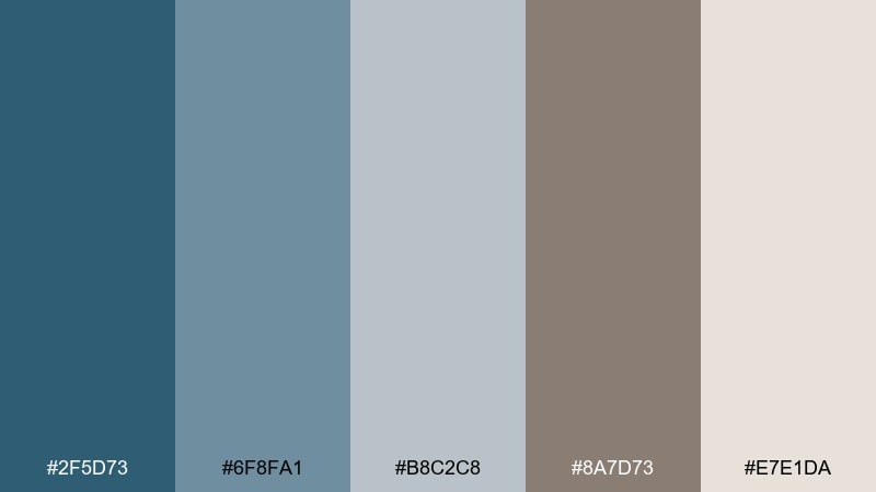
HEX: #2F5D73 #6F8FA1 #B8C2C8 #8A7D73 #E7E1DA
Mood: cool, airy, understated
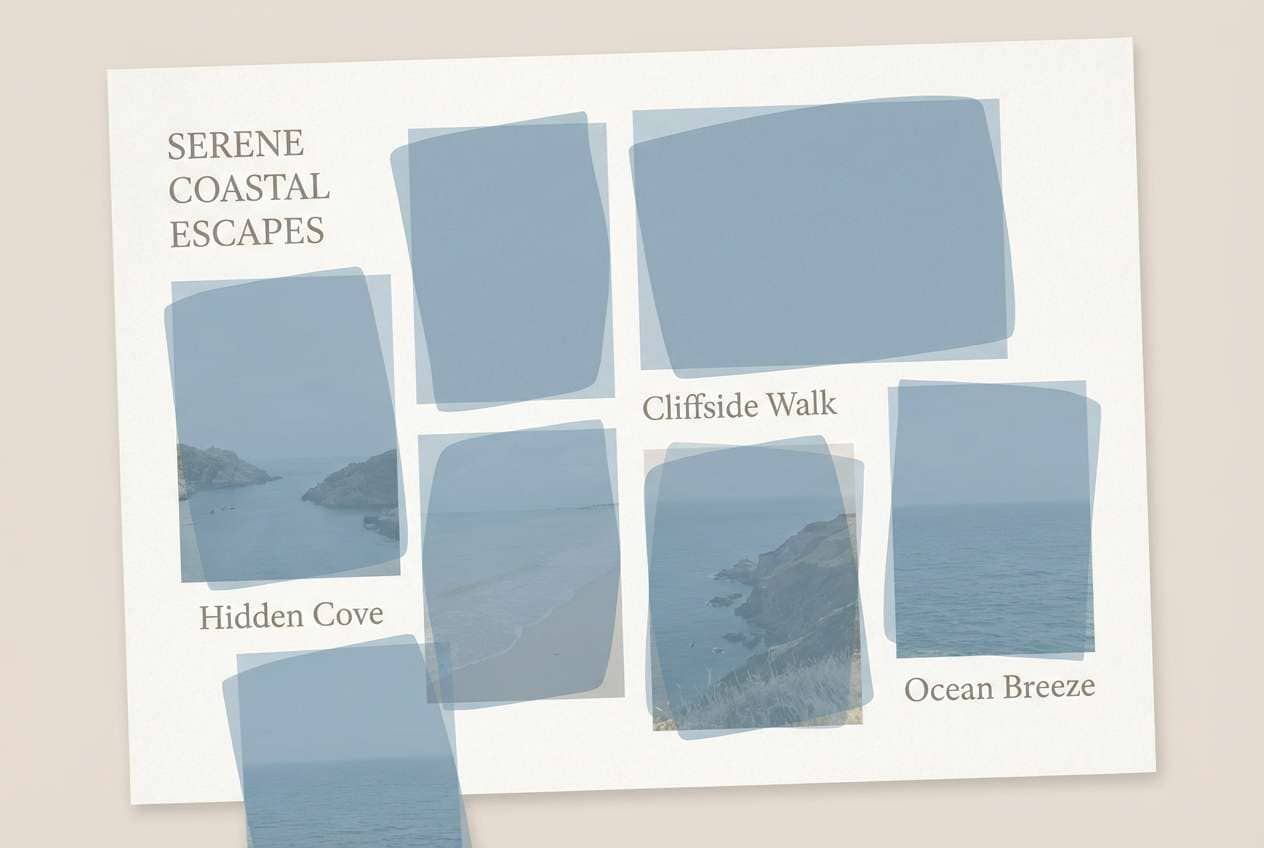
Best for: coastal living room interior styling
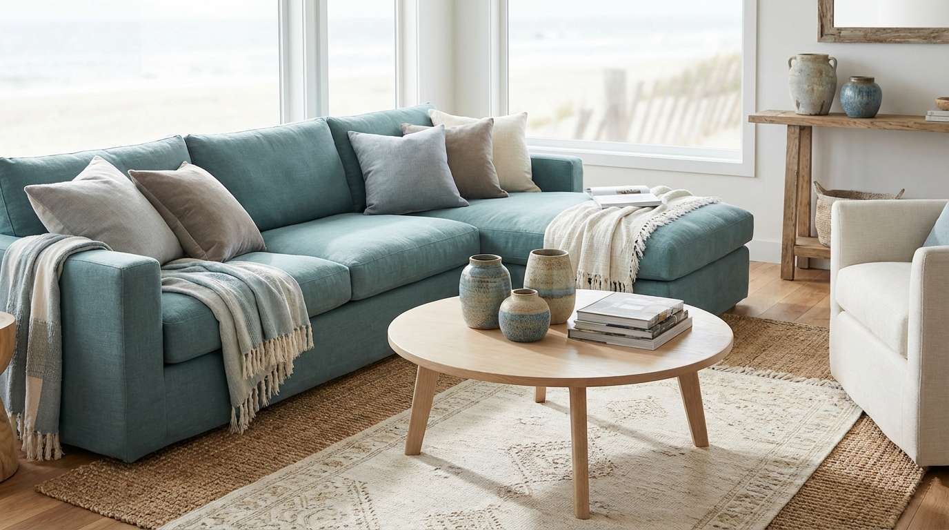
Cool mist and seaside air come through in soft blue-grays balanced by weathered taupe. This blue taupe color palette works beautifully for relaxed interiors, especially linen sofas, pale oak, and matte ceramics. Pair it with brushed nickel and warm white lighting to keep it inviting. Usage tip: use the darkest blue as a grounding accent on built-ins or a feature wall, then repeat the taupe in rugs and throws.
Image example of misty harbor generated using media.io
Media.io is an online AI studio for creating and editing video, image, and audio in your browser.

2) Stonewashed Denim
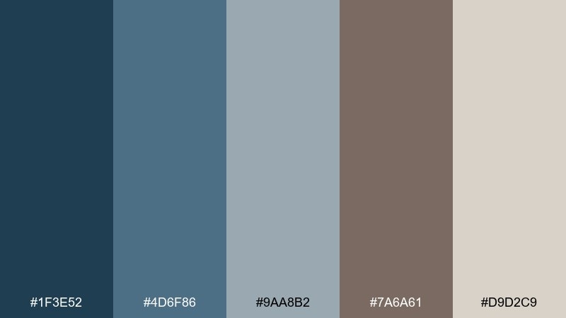
HEX: #1F3E52 #4D6F86 #9AA8B2 #7A6A61 #D9D2C9
Mood: rugged, calm, modern
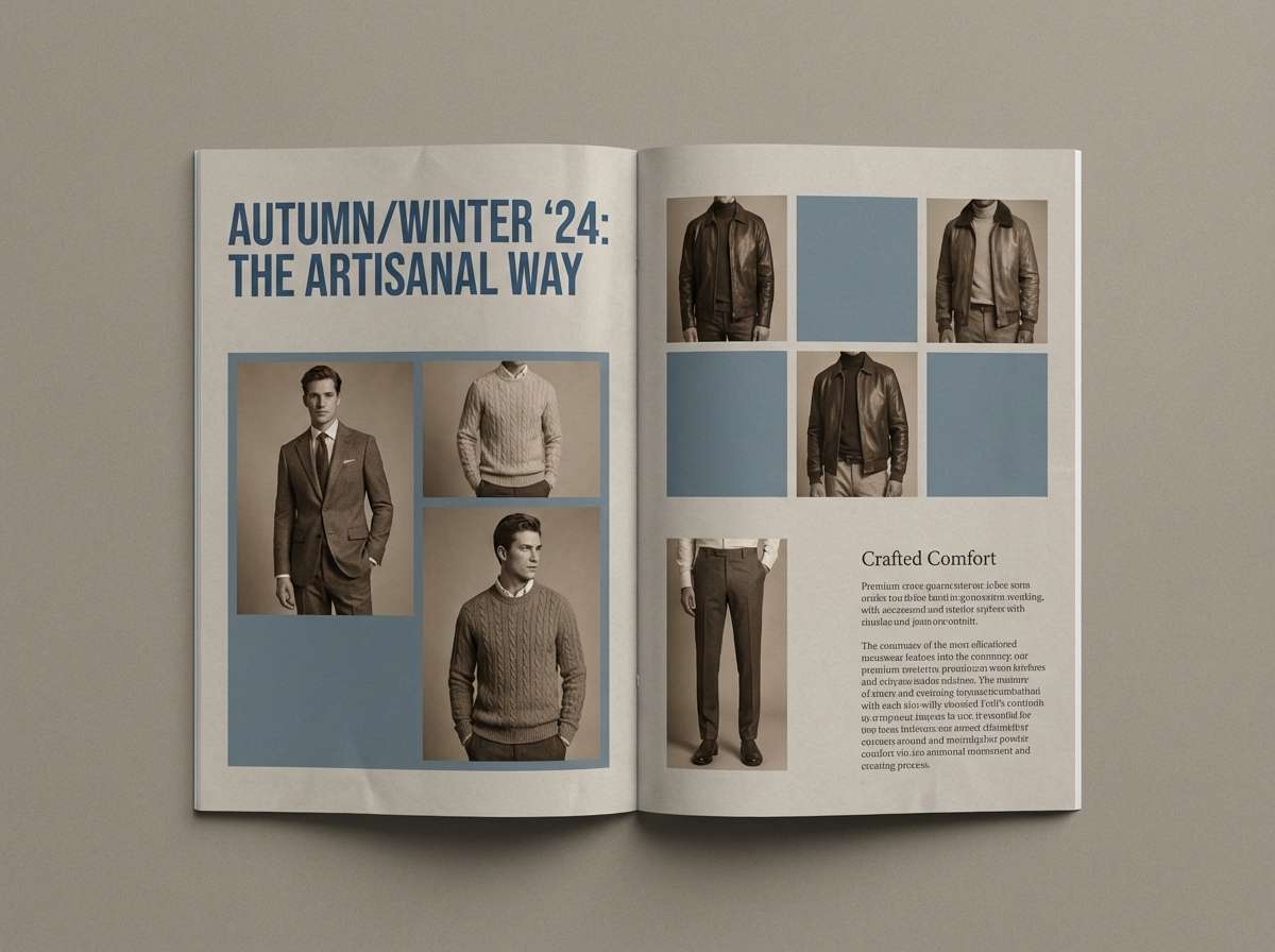
Best for: menswear lookbook editorial layout
Stonewashed denim vibes meet soft, earthy taupe for a confident, grounded feel. These blue taupe tones shine in editorial grids, monochrome photography, and strong typography. Pair with clean sans-serif type and plenty of negative space to keep the look premium. Usage tip: keep taupe as the page background and use the deep blue for headers and section dividers.
Image example of stonewashed denim generated using media.io
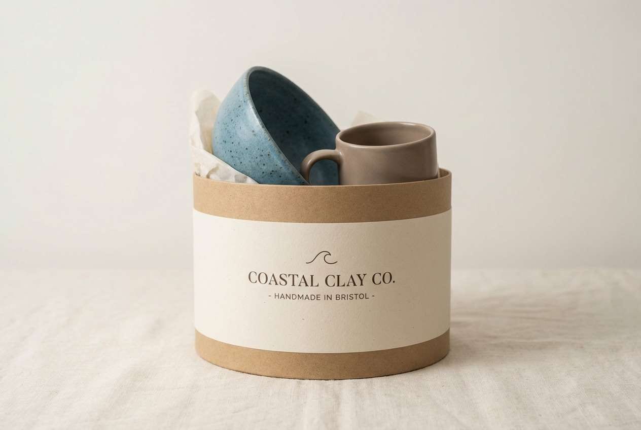
3) Coastal Clay
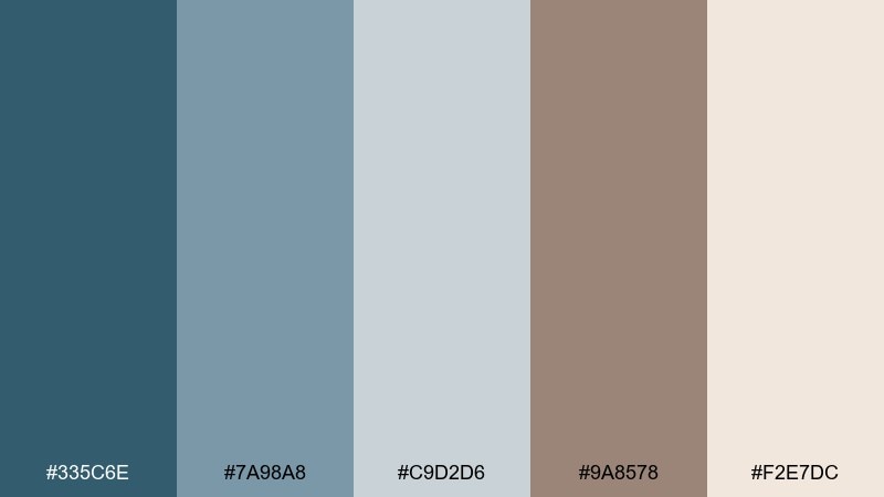
HEX: #335C6E #7A98A8 #C9D2D6 #9A8578 #F2E7DC
Mood: sun-faded, friendly, natural
Best for: handmade pottery product packaging
Sun-faded ocean blues and clay taupe feel handmade and approachable. This blue taupe color scheme is ideal for artisan brands, pottery labels, and eco-minded packaging where texture matters. Pair with kraft paper, embossed details, and a simple mark in the darkest blue. Usage tip: reserve the light cream for breathing room so the muted blues stay soft, not cold.
Image example of coastal clay generated using media.io
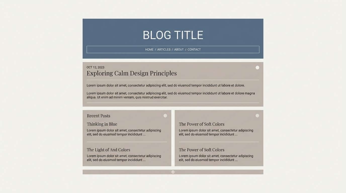
4) Rainy Windowpane
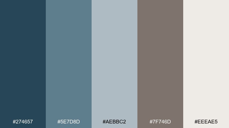
HEX: #274657 #5E7D8D #AEBBC2 #7F746D #EEEAE5
Mood: quiet, reflective, cozy
Best for: minimalist blog header and article template
A rainy-day calm settles in with smoky blue layers and soft taupe neutrals. It suits long-form reading experiences, where contrast needs to be gentle but clear. Pair with warm gray body text and subtle dividers to avoid harsh lines. Usage tip: use the medium blue-gray for cards and callouts so content feels organized without shouting.
Image example of rainy windowpane generated using media.io
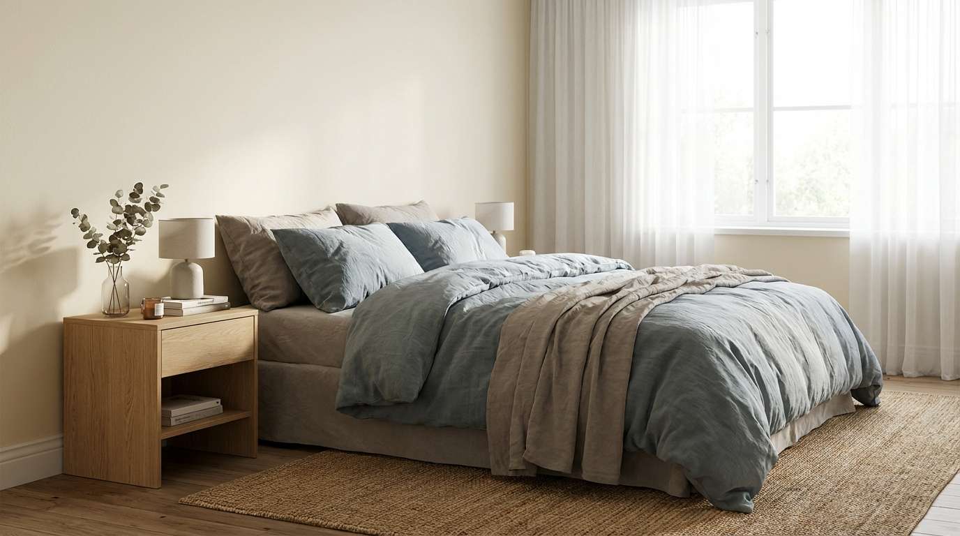
5) Nordic Linen
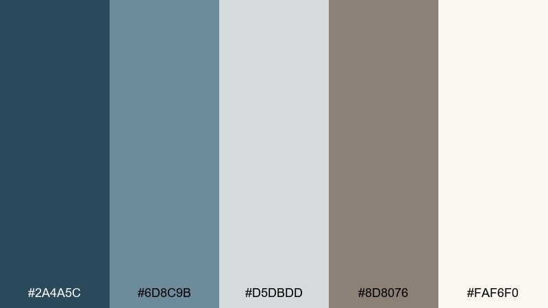
HEX: #2A4A5C #6D8C9B #D5DBDD #8D8076 #FAF6F0
Mood: clean, cozy, Scandinavian
Best for: scandinavian bedroom interior
Crisp Nordic calm comes through in cool blue-gray balanced by linen taupe and warm cream. It is perfect for bedrooms that aim to feel airy but not sterile. Pair with light wood, boucle textures, and matte black hardware for a modern edge. Usage tip: keep the darkest blue limited to small accents like lamps or frames to maintain softness.
Image example of nordic linen generated using media.io
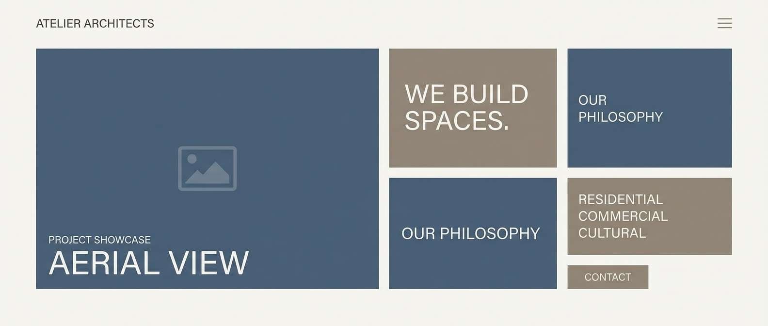
6) Urban Slate
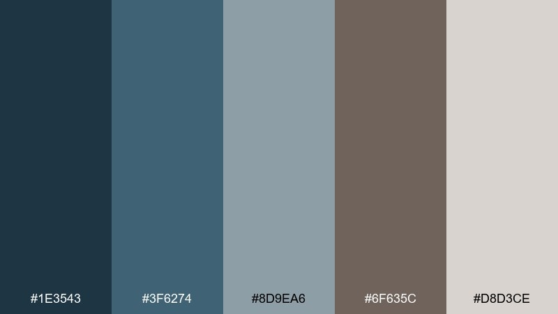
HEX: #1E3543 #3F6274 #8D9EA6 #6F635C #D8D3CE
Mood: architectural, sleek, serious
Best for: architecture firm website hero section
Architectural slate blues with grounded taupe create a polished, city-smart tone. These blue taupe colors work well for portfolio sites, especially with crisp grids and large imagery. Pair with thin line icons and a restrained type scale for a professional finish. Usage tip: use the lightest neutral for whitespace and keep CTA buttons in the mid blue for confident contrast.
Image example of urban slate generated using media.io
7) Tea Room Calm
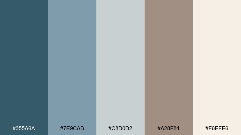
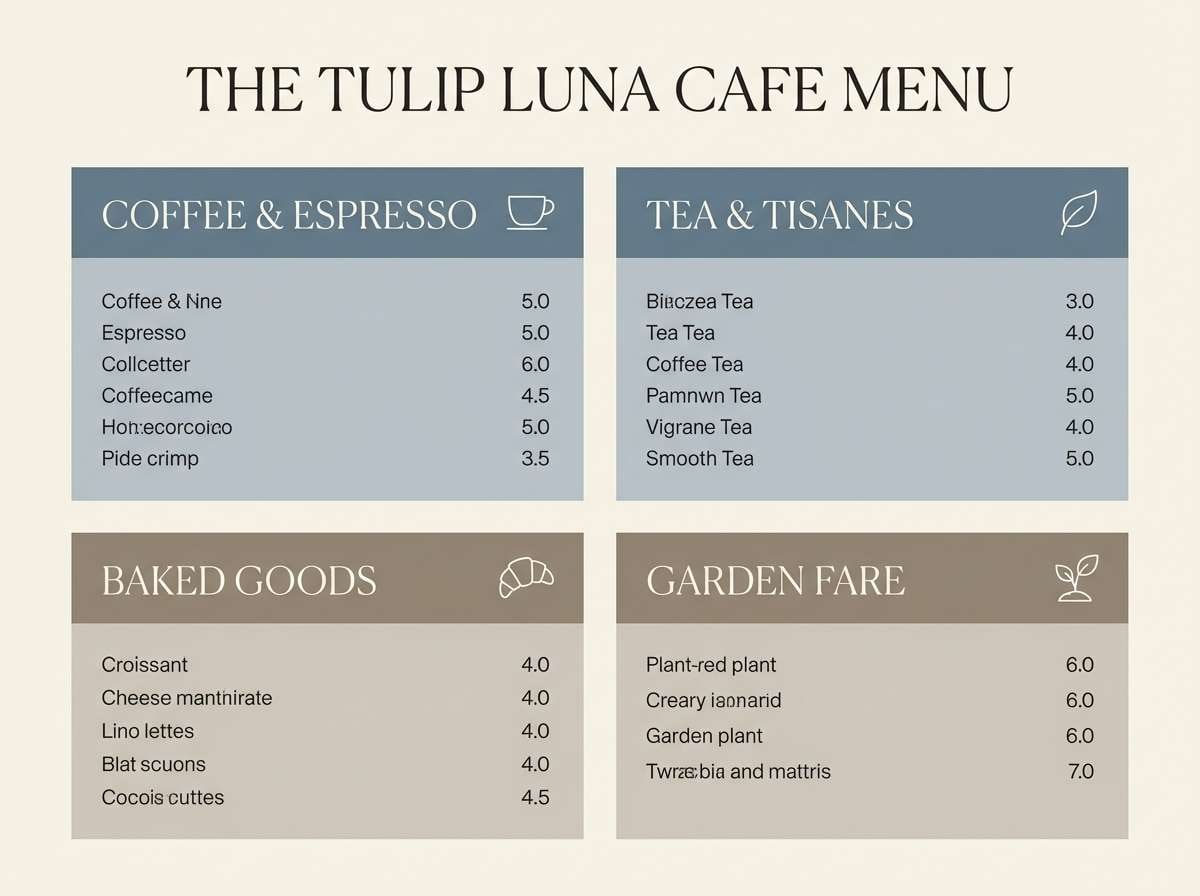
HEX: #355A6A #7E9CAB #C8D0D2 #A28F84 #F6EFE6
Mood: warm, calm, welcoming
Best for: cafe menu design
A welcoming tea-room softness appears in milky blues and warm taupe. It is a great fit for menus, small-batch food brands, and cozy hospitality touchpoints. Pair with serif headings and subtle paper texture for a handcrafted feel. Usage tip: make the cream your base and use taupe for section headers so the blues can highlight specials and icons.
Image example of tea room calm generated using media.io
8) Museum Minimal
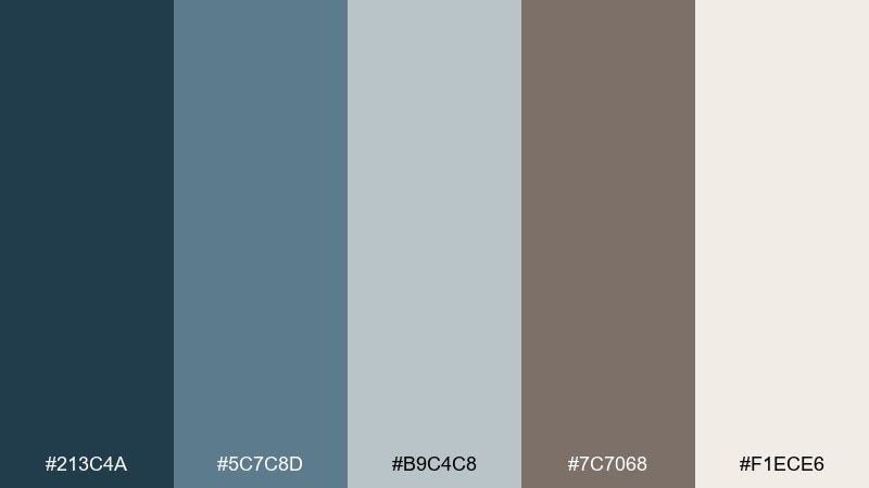
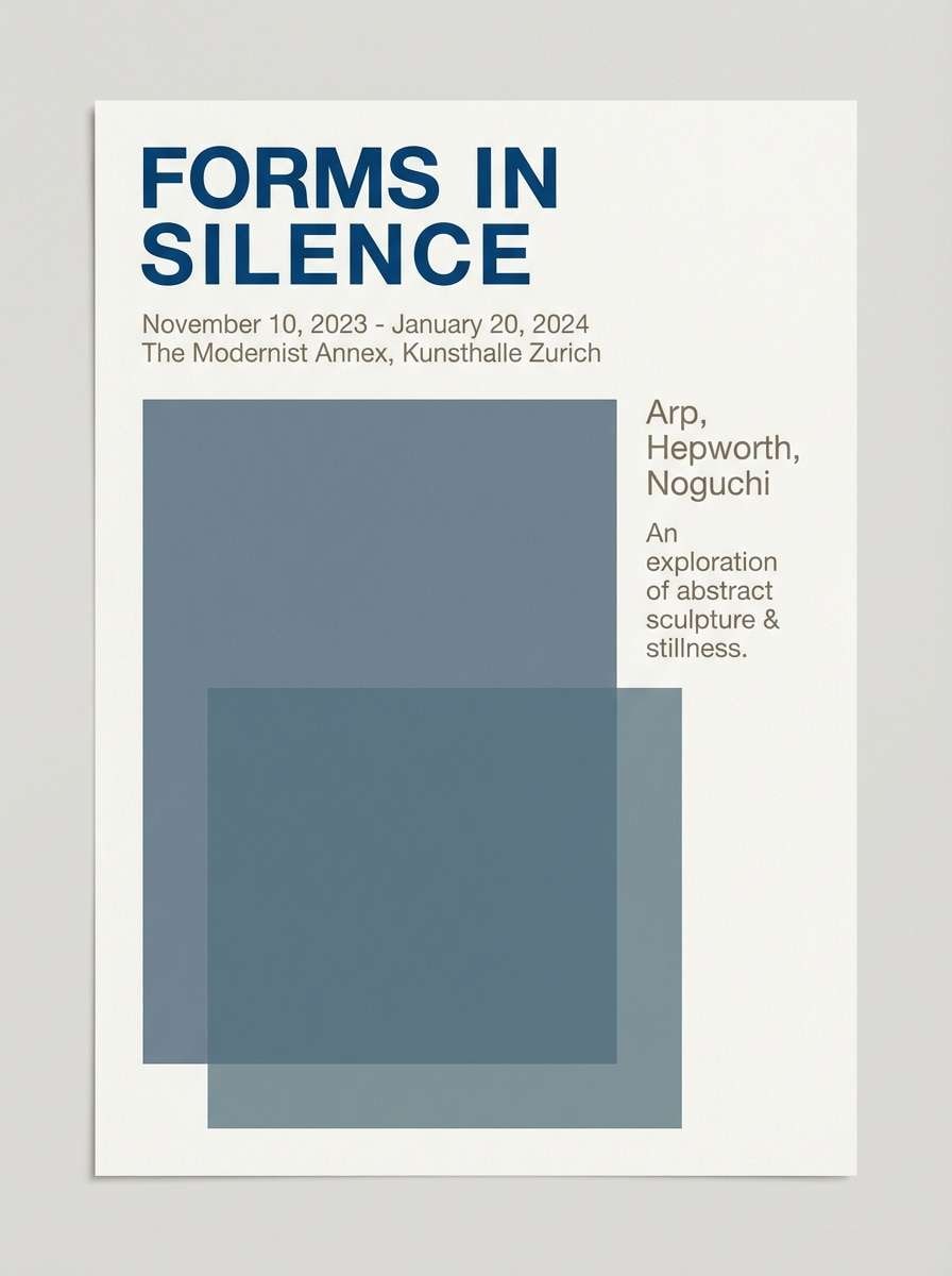
HEX: #213C4A #5C7C8D #B9C4C8 #7C7068 #F1ECE6
Mood: minimal, curated, refined
Best for: art gallery exhibition poster
Curated and quiet, these tones feel like a modern gallery with cool walls and stone accents. This blue taupe color palette suits exhibition posters, museum signage, and refined branding where restraint is the point. Pair with lots of whitespace and a single strong type family to keep it timeless. Usage tip: let the deep blue carry the title while taupe supports secondary details like dates and venue.
Image example of museum minimal generated using media.io
9) Blueprint Studio
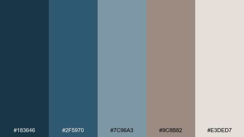
HEX: #183646 #2F5970 #7C96A3 #9C8B82 #E3DED7
Mood: focused, technical, modern
Best for: SaaS dashboard UI kit
Focused and technical, the deeper blues feel like drafting lines against soft taupe neutrals. It is an easy fit for dashboards, analytics views, and admin systems where hierarchy matters. Pair with simple charts, subtle shadows, and accessible contrast for readability. Usage tip: use the darkest blue for navigation and the light neutral for content surfaces to keep screens feeling light.
Image example of blueprint studio generated using media.io

10) Foggy Boardwalk
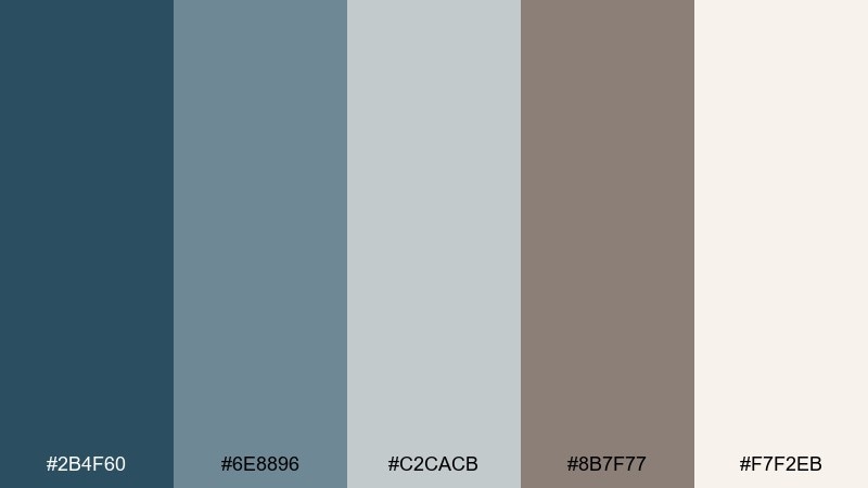
HEX: #2B4F60 #6E8896 #C2CACB #8B7F77 #F7F2EB
Mood: soft, nostalgic, serene
Best for: travel blog feature image collage
A foggy shoreline mood shows up in softened blues and driftwood taupe. These colors are great for travel stories, photo collages, and calm social templates. Pair with warm off-white margins and a muted blue overlay for consistent imagery. Usage tip: keep taupe in captions and labels so photos still feel airy and light.
Image example of foggy boardwalk generated using media.io
11) Twilight Pebble
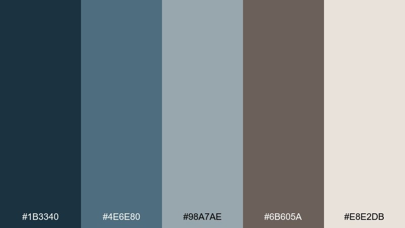
HEX: #1B3340 #4E6E80 #98A7AE #6B605A #E8E2DB
Mood: moody, balanced, sophisticated
Best for: luxury skincare product ad
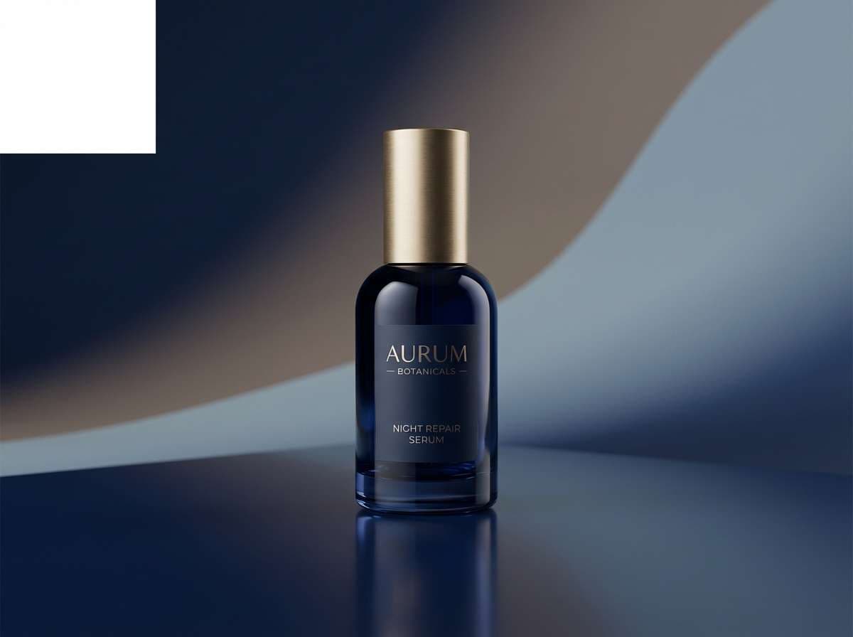
Twilight blues and pebble taupe create a sophisticated, low-noise mood. These blue and taupe color combinations work well for luxury skincare, wellness, and premium product advertising. Pair with minimal copy, glossy highlights, and clean sans-serif type to feel modern. Usage tip: light up the product with neutral reflections and let the deep blue serve as the backdrop for a high-end contrast.
Image example of twilight pebble generated using media.io
12) Sandbar Shadow
HEX: #2D5667 #7F9AA6 #D0D7D8 #B19C8C #FFF7EE
Mood: sunlit, gentle, airy
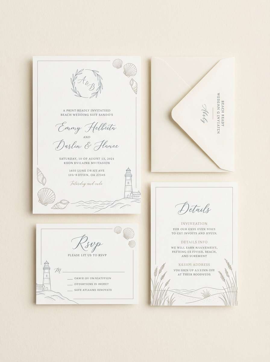
Best for: beach wedding invitation set
Sunlit sandbar warmth meets calm blue-gray for a breezy, romantic feel. It suits wedding suites, save-the-dates, and day-of stationery where elegance should stay relaxed. Pair with deckled edges, soft florals, and fine line motifs in the deeper blue. Usage tip: keep the cream as the paper base and use taupe for names to maintain readability without stark black.
Image example of sandbar shadow generated using media.io
13) Quiet Library
HEX: #223F4D #5A7A8C #B6C1C5 #7D6F66 #EFE9E2
Mood: studious, calm, timeless
Best for: book cover design
A quiet library hush comes through in inked blues softened by bookish taupe. It works well for literary fiction, essays, and memoir covers that need restraint and depth. Pair with classic serif type and a simple geometric motif for a timeless look. Usage tip: use the mid blue for the title block and keep the background in the warm neutral to avoid a heavy cover.
Image example of quiet library generated using media.io
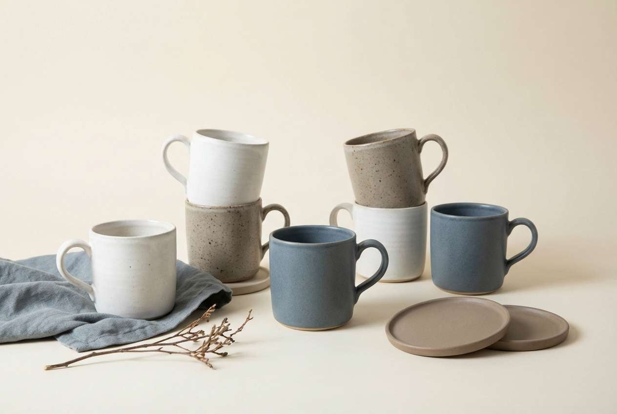
14) Winter Ceramics
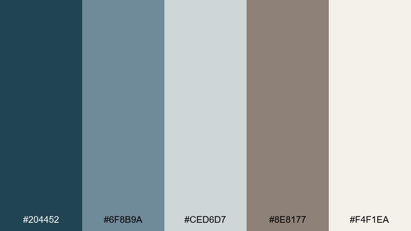
HEX: #204452 #6F8B9A #CED6D7 #8E8177 #F4F1EA
Mood: crisp, artisan, serene
Best for: ceramic mug product photography
Crisp winter light and handmade ceramic tones create a serene, artisanal vibe. This blue and taupe color scheme is ideal for product photography where materials and glaze textures should stand out. Pair with soft shadows and minimal props in matching neutrals to keep attention on the form. Usage tip: choose a cream backdrop and bring in the darkest blue only in a small prop like a folded napkin.
Image example of winter ceramics generated using media.io
15) Modern Heirloom
HEX: #173746 #4C6D7F #A8B6BC #A58F82 #EDE3D7
Mood: classic, elevated, modern
Best for: jewelry brand identity mockup
Classic heirloom energy meets modern restraint in deep blue and warm taupe. It is a strong fit for jewelry branding, monograms, and upscale packaging where subtlety signals quality. Pair with foil stamping and a clean mark to keep it refined. Usage tip: keep the palette mostly neutral, then use the darkest blue sparingly on logos and seals.
Image example of modern heirloom generated using media.io
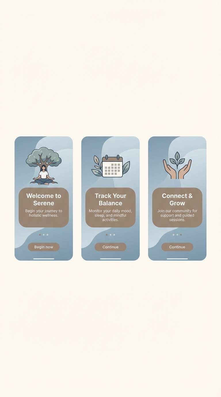
16) Clouded Sage
HEX: #2A515F #7C96A0 #C7D0D0 #8B8076 #F3EEE6
Mood: fresh, gentle, spa-like
Best for: wellness app onboarding screens
Fresh and spa-like, clouded blue tones blend with grounded taupe for a gentle start. This blue taupe color palette is great for wellness onboarding, habit tracking, and calming UI flows. Pair with rounded components and soft gradients to keep the experience friendly. Usage tip: place key actions on the medium blue so buttons feel present without feeling loud.
Image example of clouded sage generated using media.io
17) Harbor Lights
HEX: #102F3D #3B5F72 #7E95A0 #6D625C #DAD3CC
Mood: nighttime, polished, cinematic
Best for: restaurant branding and menu cover
Night harbor blues with warm taupe feel polished and a little cinematic. It is a smart choice for restaurant branding, menu covers, and signage that needs mood without going dark. Pair with soft spotlight photography and understated iconography for a premium impression. Usage tip: use the light neutral for body text areas to keep everything readable in low-light settings.
Image example of harbor lights generated using media.io
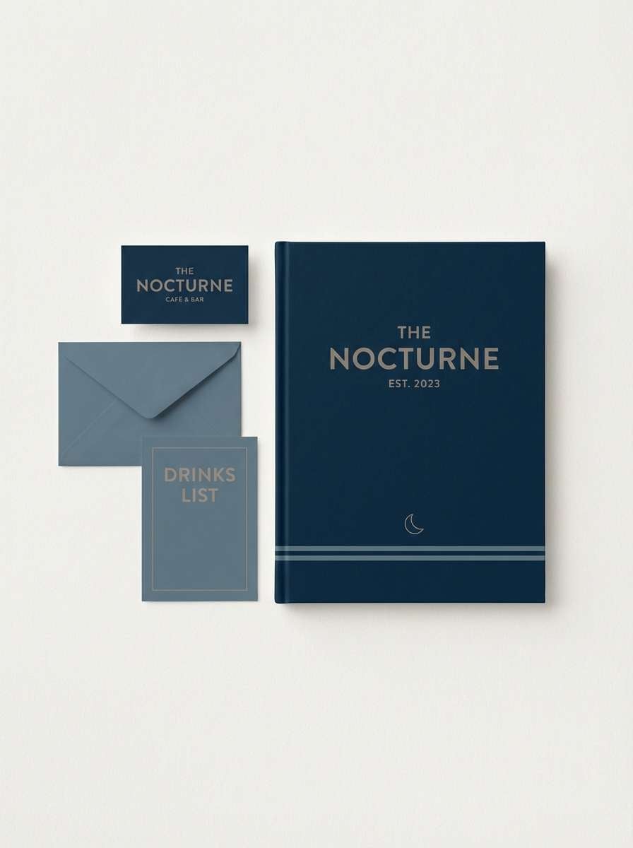
18) Gallery Wall
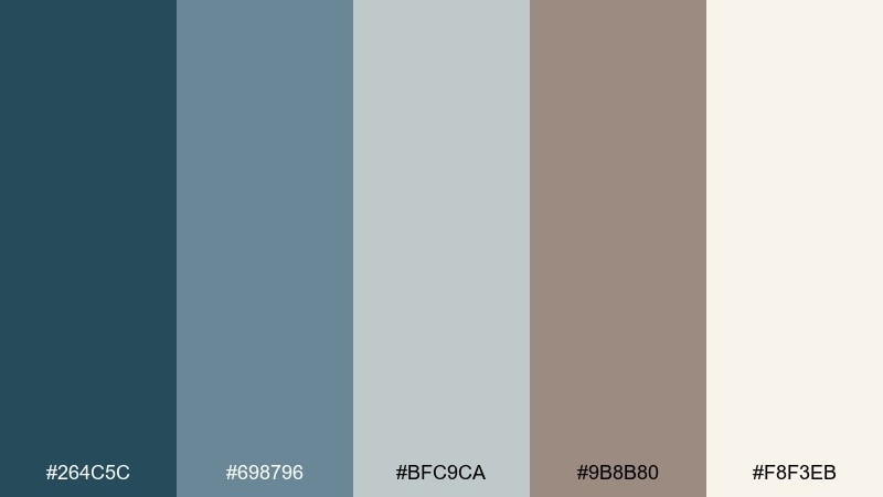
HEX: #264C5C #698796 #BFC9CA #9B8B80 #F8F3EB
Mood: calm, curated, homey
Best for: home decor ecommerce category banner
A calm gallery-wall look emerges with airy blues and warm taupe neutrals. It works well for home decor ecommerce, where imagery and typography need to feel curated and cohesive. Pair with light, natural photography and subtle overlays to keep text legible. Usage tip: set the banner background in cream and use the mid blue for labels and filters.
Image example of gallery wall generated using media.io
19) Soft Hardware
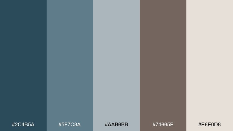
HEX: #2C4B5A #5F7C8A #AAB6BB #74665E #E6E0D8
Mood: practical, modern, dependable
Best for: product spec sheet and datasheet layout
Practical and dependable, the blue-grays feel engineered while taupe keeps things approachable. It is well suited to spec sheets, datasheets, and B2B presentations that need clarity. Pair with clear tables, thin dividers, and consistent icon style for fast scanning. Usage tip: highlight key metrics in the medium blue and keep the rest in neutrals for hierarchy.
Image example of soft hardware generated using media.io
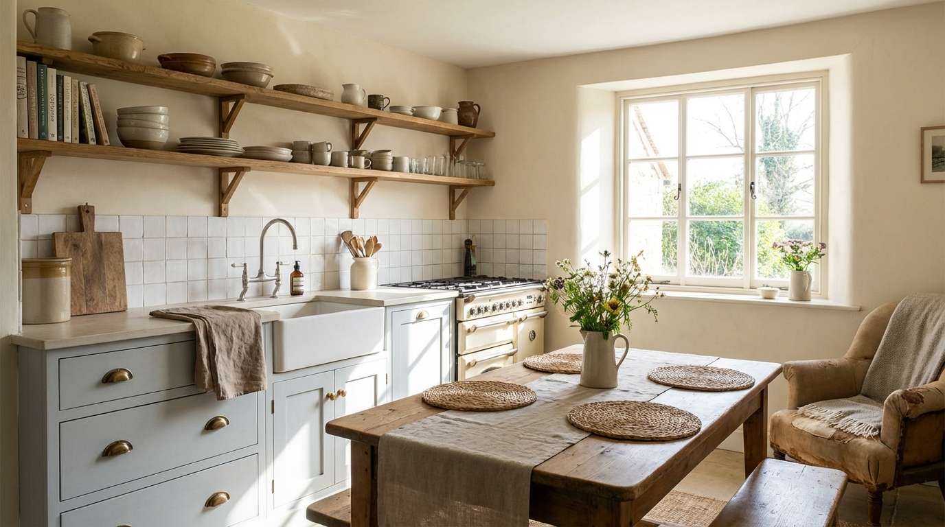
20) Weekend Cottage
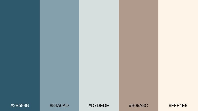
HEX: #2E586B #84A0AD #D7DEDE #B09A8C #FFF4E8
Mood: relaxed, bright, comfortable
Best for: cottage kitchen interior refresh
Relaxed cottage comfort shows up in brightened blues and warm taupe accents. The blue and taupe mix is great for kitchens, especially painted cabinets, tiled backsplashes, and airy textiles. Pair with brass hardware and natural wood to keep it sunny rather than cool. Usage tip: use the soft blue-gray on large surfaces and repeat taupe in stools, runners, or wall art for balance.
Image example of weekend cottage generated using media.io
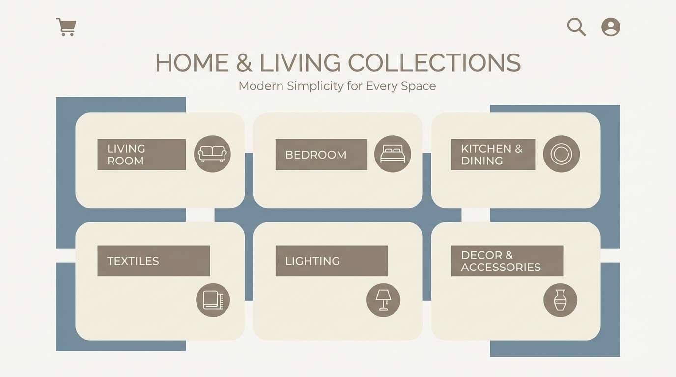
What Colors Go Well with Blue Taupe?
Blue taupe plays nicely with warm off-whites, creams, and light beiges because they keep the scheme soft and breathable. These neutrals also help you avoid harsh black contrast in layouts and interiors.
For a modern edge, pair blue taupe with slate gray, charcoal, or brushed metal finishes (nickel, chrome, matte black). If you want a more inviting look, lean into warm woods, terracotta accents, or sandy tones.
For small “pop” accents, muted sage, dusty rose, or soft brass/gold details can add personality without breaking the calm, neutral mood.
How to Use Blue and Taupe Color Schemes in Real Designs
Start by choosing a light neutral (cream or warm off-white) as your base, then use the mid blue-gray for large secondary surfaces—cards, wall paint, packaging backgrounds, or section blocks. This keeps the overall design bright and readable.
Use deep blue sparingly for anchors like navigation, headlines, or a feature wall. Repeat taupe as the “comfort layer” in supporting elements such as labels, captions, textiles, or secondary typography to make the palette feel cohesive.
When you need contrast (especially for UI), test buttons and text against the lightest neutral first. Blue taupe tends to look best with gentle contrast and clear spacing rather than heavy outlines.
Create Blue Taupe Palette Visuals with AI
If you’re building a moodboard, brand mockup, or UI concept, generating a few consistent images can help you validate the palette fast. The prompts above are designed to produce cohesive lighting, materials, and composition.
With Media.io, you can turn your blue taupe palette idea into visual examples for interiors, packaging, posters, and app screens—then iterate quickly by adjusting style words like “minimal,” “coastal,” or “premium.”
Blue Taupe Color Palette FAQs
-
What is “blue taupe” exactly?
Blue taupe is a muted neutral that mixes cool blue-gray undertones with taupe’s warm brown-gray base. It reads calm, modern, and slightly earthy rather than bright or saturated. -
Is blue taupe a warm or cool color?
It can lean either way depending on the mix. More blue/gray makes it cooler and sleeker; more taupe/brown makes it warmer and cozier. Most palettes work best when you balance both. -
What neutrals pair best with blue taupe?
Warm off-white, cream, beige, and soft greige pair especially well. They keep blue taupe from feeling cold and make layouts and rooms feel brighter. -
Can I use blue taupe for a website or app UI?
Yes—blue taupe works great for dashboards, SaaS, and editorial templates because it supports hierarchy without harsh contrast. Use deeper blues for navigation and CTAs, and keep content areas on light neutrals. -
How do I add accent colors to a blue taupe palette?
Choose low-saturation accents like sage, dusty rose, or soft brass/gold. Keep accents to small areas (icons, highlights, badges) so the palette stays calm and premium. -
Does blue taupe work for interiors?
Very well—especially in bedrooms, living rooms, and kitchens. Pair it with light woods, linen textures, and warm lighting, then use the darkest blue for a few grounding accents. -
How can I generate blue taupe visuals that look consistent?
Reuse a stable prompt structure (scene + materials + lighting + style) and only change a few keywords at a time. Tools like Media.io text-to-image make it easy to iterate while keeping the same overall mood.
Next: Baby Blue Color Palette


