

Halloween design works best when it balances familiar seasonal cues (pumpkin orange, inky blacks, eerie purples) with enough neutral space to stay readable.
Below are 20 fresh Halloween color palette ideas with HEX codes, plus practical tips and AI prompts you can reuse for posters, packaging, UI, and more.
In this article
Why Halloween Palettes Work So Well
Halloween palettes are built on instant recognition: warm oranges suggest lantern light and harvest season, while deep blacks and charcoals add mystery and contrast.
Purple, green, and muted neutrals expand the story—witchy, forest-like, or vintage—so the same “spooky” theme can feel playful, luxe, minimal, or cinematic.
Most importantly, the best Halloween color combinations naturally create hierarchy: one bold accent color for attention, one dark anchor for type, and one light neutral for breathing room.
20+ Halloween Color Palette Ideas (with HEX Codes)
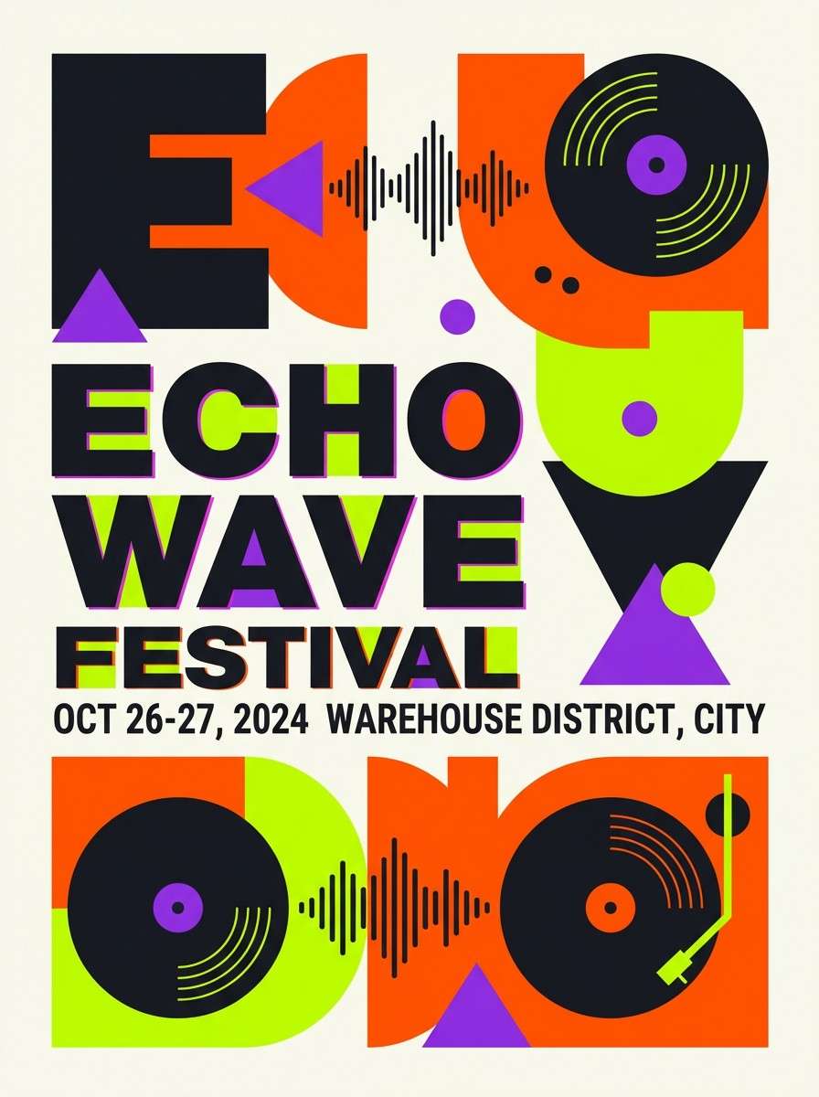
1) Pumpkin Midnight
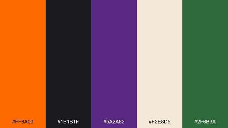
HEX: #ff6a00 #1b1b1f #5a2a82 #f2e8d5 #2f6b3a
Mood: spooky, bold, cinematic
Best for: event poster design
Smoldering pumpkin orange against deep midnight black feels like lantern light cutting through fog. The violet adds a magical edge, while the cream keeps layouts readable and the green brings a subtle forest note. Use this halloween color palette for posters where you want high contrast and a dramatic focal point. Pair it with large type, plenty of negative space, and keep the purple as an accent for dates or callouts.
Image example of pumpkin midnight generated using media.io
Media.io is an online AI studio for creating and editing video, image, and audio in your browser.

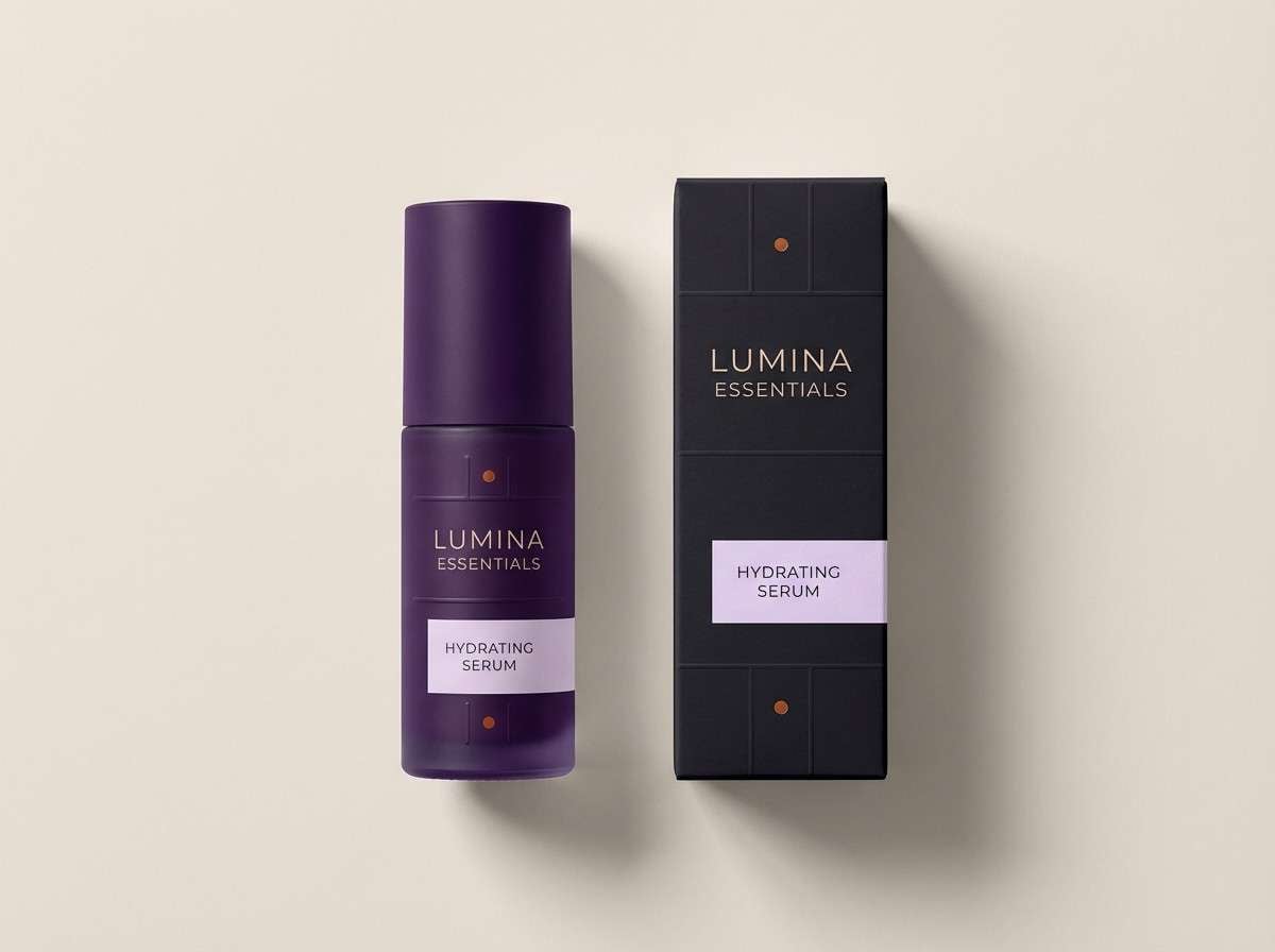
2) Witchy Velvet
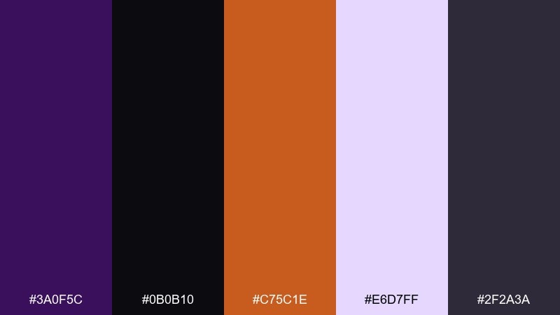
HEX: #3a0f5c #0b0b10 #c75c1e #e6d7ff #2f2a3a
Mood: mysterious, luxe, nocturnal
Best for: beauty product packaging
Velvety purple and near-black tones evoke candlelit rituals and rich fabric textures. A burnt orange accent keeps the look warm, while the pale lilac lifts labels and ingredient text. It works beautifully on matte packaging with spot-gloss details and minimal iconography. Tip: reserve the orange for seals, caps, or a single premium badge to keep the vibe upscale.
Image example of witchy velvet generated using media.io
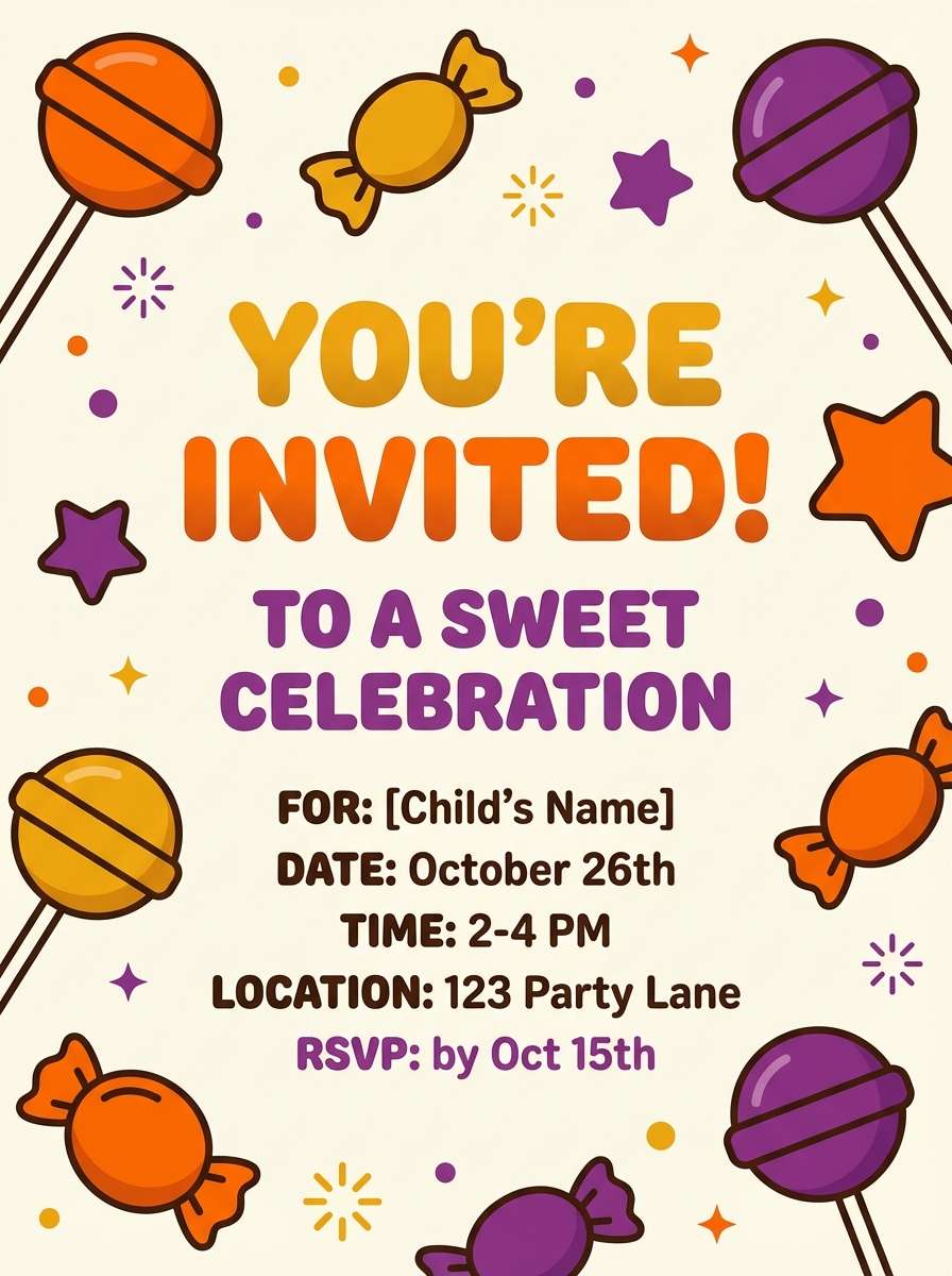
3) Candy Corn Glow
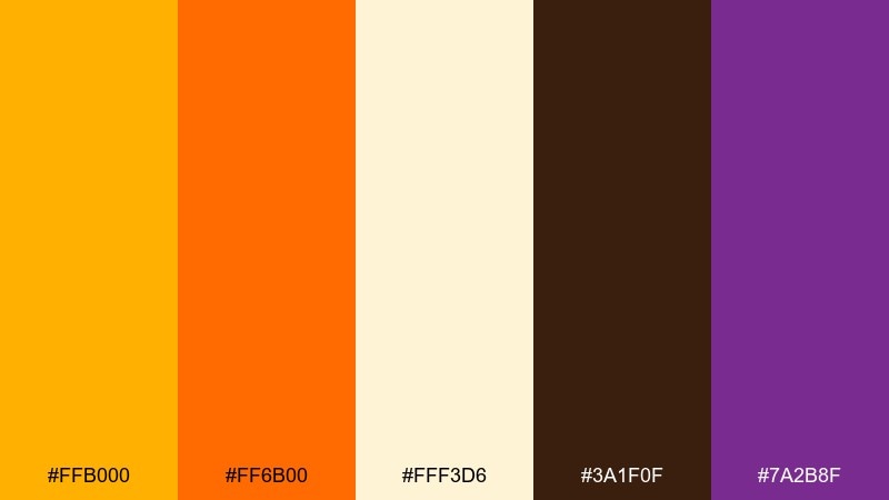
HEX: #ffb000 #ff6b00 #fff3d6 #3a1f0f #7a2b8f
Mood: playful, sweet, retro
Best for: kids party invitation
Buttery yellow and tangerine orange feel like candy bowls and cheerful porch lights. The creamy off-white keeps the design airy, while the cocoa brown grounds it and the purple adds a fun surprise. Use rounded type, sticker-like shapes, and simple patterns for a friendly look. Tip: keep the brown limited to outlines so the invitation stays bright and readable.
Image example of candy corn glow generated using media.io
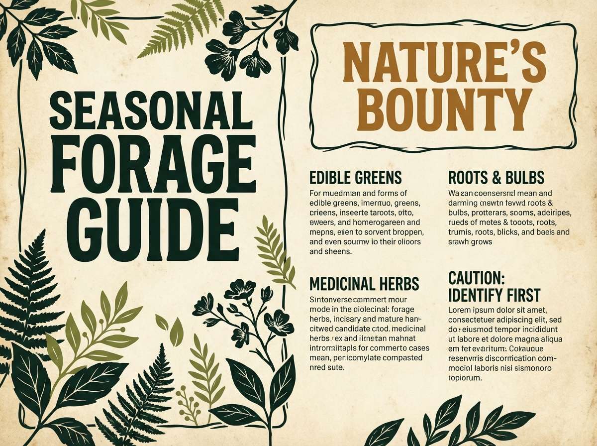
4) Haunted Forest
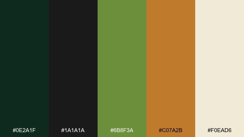
HEX: #0e2a1f #1a1a1a #6b8f3a #c07a2b #f0ead6
Mood: earthy, eerie, natural
Best for: fall market flyer
Deep evergreen and black feel like trees closing in at dusk, with mossy green adding life between shadows. The caramel brown reads like weathered wood, and the soft parchment keeps text from getting lost. This set suits illustrated flyers, rustic signage, and anything with leaf or branch motifs. Tip: use the parchment as the base and let the dark greens frame headings and borders.
Image example of haunted forest generated using media.io
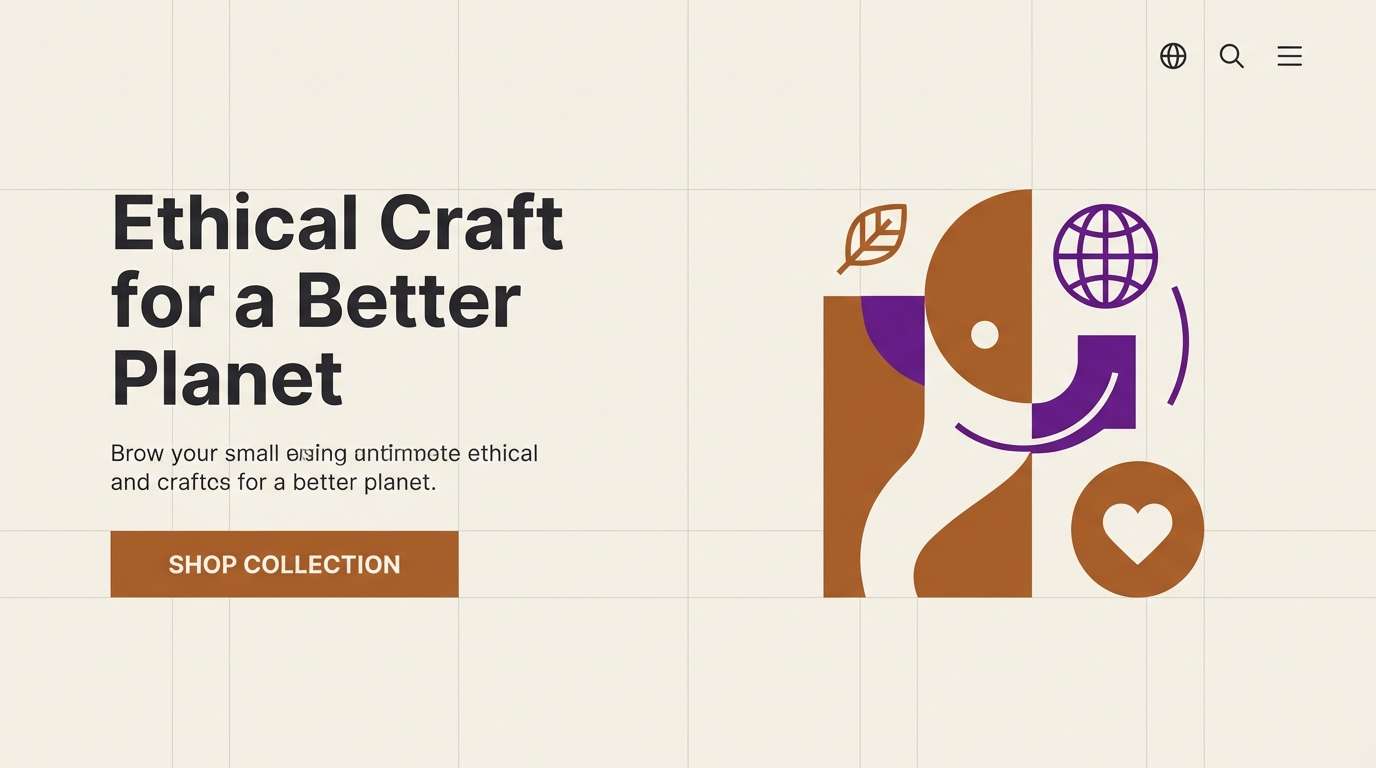
5) Ghostly Neutral
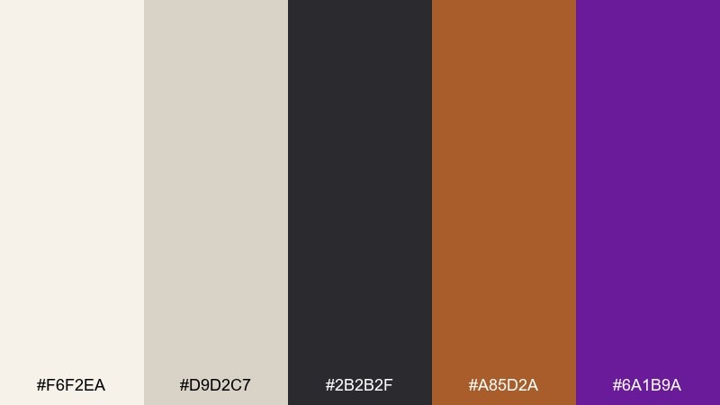
HEX: #f6f2ea #d9d2c7 #2b2b2f #a85d2a #6a1b9a
Mood: minimal, modern, spooky-soft
Best for: website hero section
Soft bone and warm greige create a clean, misty backdrop that feels quietly supernatural. Charcoal anchors typography, while the copper and purple act as crisp interactive accents. It is ideal for landing pages that need a seasonal nod without loud colors. Tip: keep buttons copper, reserve purple for hover states, and let the neutrals do most of the work.
Image example of ghostly neutral generated using media.io
6) Black Cat Gold
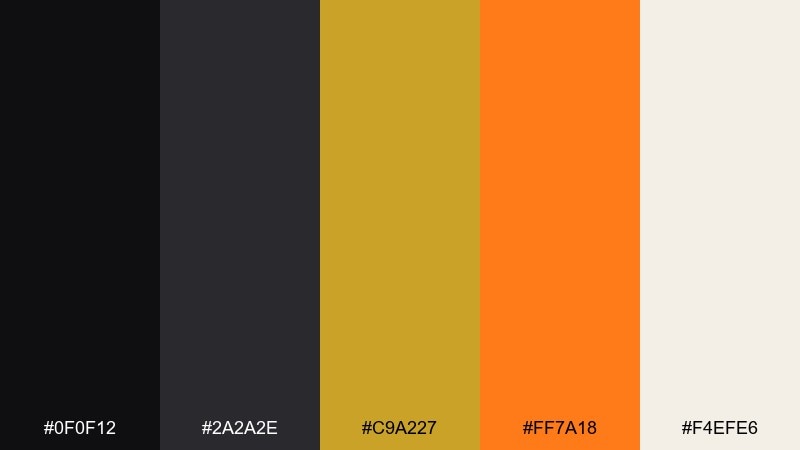
HEX: #0f0f12 #2a2a2e #c9a227 #ff7a18 #f4efe6
Mood: glam, dramatic, high-contrast
Best for: premium sale banner
Inky blacks with antique gold feel like ornate frames, vintage jewelry, and candlelit glamour. A punch of orange keeps the design energetic, while the warm ivory stops it from looking too heavy. Use it for promotional banners where you want a luxe vibe and clear hierarchy. Tip: set the background in black, then use gold for headings and keep orange only for the discount number or CTA.
Image example of black cat gold generated using media.io

7) Vampire Rose
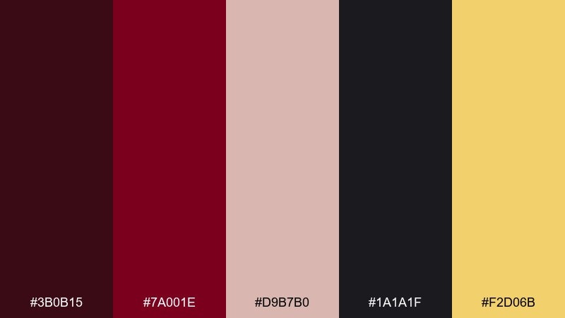
HEX: #3b0b15 #7a001e #d9b7b0 #1a1a1f #f2d06b
Mood: romantic, gothic, moody
Best for: cocktail bar menu
Blood burgundy and black conjure velvet curtains and late-night candlelight, softened by dusty rose. The muted gold adds a refined highlight for section titles and prices. If you want halloween color combinations that feel grown-up, this mix is a strong pick for menus and editorial-style layouts. Tip: print on textured stock and keep gold to thin rules and small icons for an elegant finish.
Image example of vampire rose generated using media.io
8) Moonlit Lavender
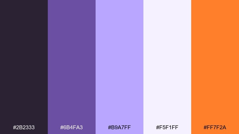
HEX: #2b2333 #6b4fa3 #b9a7ff #f5f1ff #ff7f2a
Mood: dreamy, magical, soft
Best for: social story templates
Lavender gradients and soft white feel like moon haze and gentle fog. The orange accent adds a spark of warmth that keeps the design from drifting too pastel. Use it for story templates with big type, subtle texture, and sticker-style icons. Tip: make the background very light and use the dark plum only for titles to preserve the airy mood.
Image example of moonlit lavender generated using media.io
9) Graveyard Moss
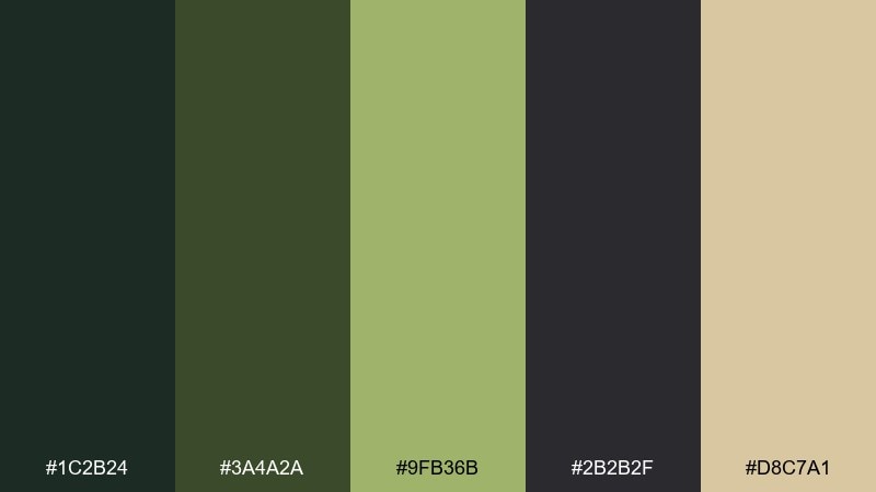
HEX: #1c2b24 #3a4a2a #9fb36b #2b2b2f #d8c7a1
Mood: weathered, muted, atmospheric
Best for: book cover design
Mossy greens and charcoal feel like stone, ivy, and damp earth after rain. The sandy beige reads like aged paper, perfect for titles that need a vintage, literary touch. It works best with serif type, grain textures, and restrained illustration. Tip: keep the light beige behind the title block for contrast and let the darkest green handle shadowy shapes.
Image example of graveyard moss generated using media.io
10) Spiced Cider
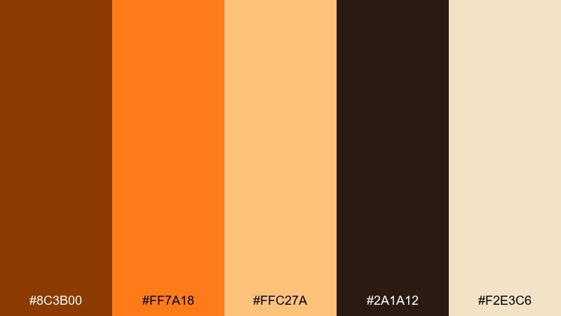
HEX: #8c3b00 #ff7a18 #ffc27a #2a1a12 #f2e3c6
Mood: warm, cozy, inviting
Best for: cafe chalkboard poster
Toasty browns and pumpkin-orange feel like simmering cider and cinnamon sticks. The creamy beige keeps it friendly and legible, while the deep espresso shade adds strong contrast for headlines. This mix is great for seasonal specials, menus, and storefront posters. Tip: use the darkest brown for the main text and reserve the brightest orange for price highlights.
Image example of spiced cider generated using media.io
11) Neon Trick or Treat
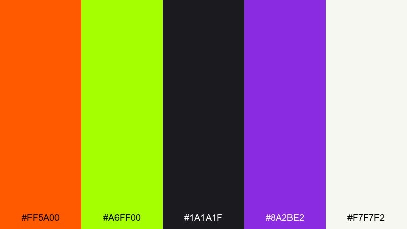
HEX: #ff5a00 #a6ff00 #1a1a1f #8a2be2 #f7f7f2
Mood: energetic, edgy, modern
Best for: music event promo
Hot orange and acid green feel like streetlights, glow sticks, and late-night energy. The deep near-black keeps the palette grounded, while purple adds a club-like punch and off-white supports readable text. Use it for promos that need to feel current and loud without turning into chaos. Tip: pick one neon as the hero and let the other appear only in small badges or underline details.
Image example of neon trick or treat generated using media.io
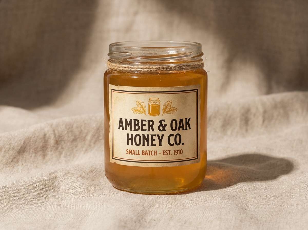
12) Antique Lantern
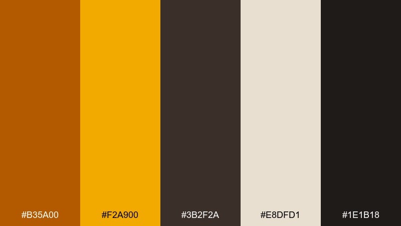
HEX: #b35a00 #f2a900 #3b2f2a #e8dfd1 #1e1b18
Mood: vintage, warm, rustic
Best for: brand label design
Amber and old-gold tones evoke lantern light and aged brass. The deep browns add a handcrafted feel, while the warm linen keeps labels clean and readable. For a cohesive halloween color scheme on packaging, use the gold as your hero and the darker browns for type and borders. Tip: add a subtle paper texture and keep typography classic to sell the vintage vibe.
Image example of antique lantern generated using media.io
13) Cobweb Chic
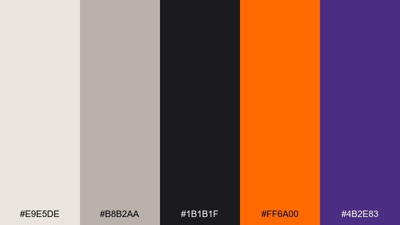
HEX: #e9e5de #b8b2aa #1b1b1f #ff6a00 #4b2e83
Mood: clean, graphic, fashion-forward
Best for: editorial layout
Soft grays and off-whites feel like silk, mist, and fine webbing, with black adding crisp structure. The orange and purple accents create sharp, stylish tension without overwhelming the page. Use it for magazine-like layouts, lookbooks, or blog headers where negative space matters. Tip: keep imagery monochrome and let orange appear only in pull quotes or small markers.
Image example of cobweb chic generated using media.io
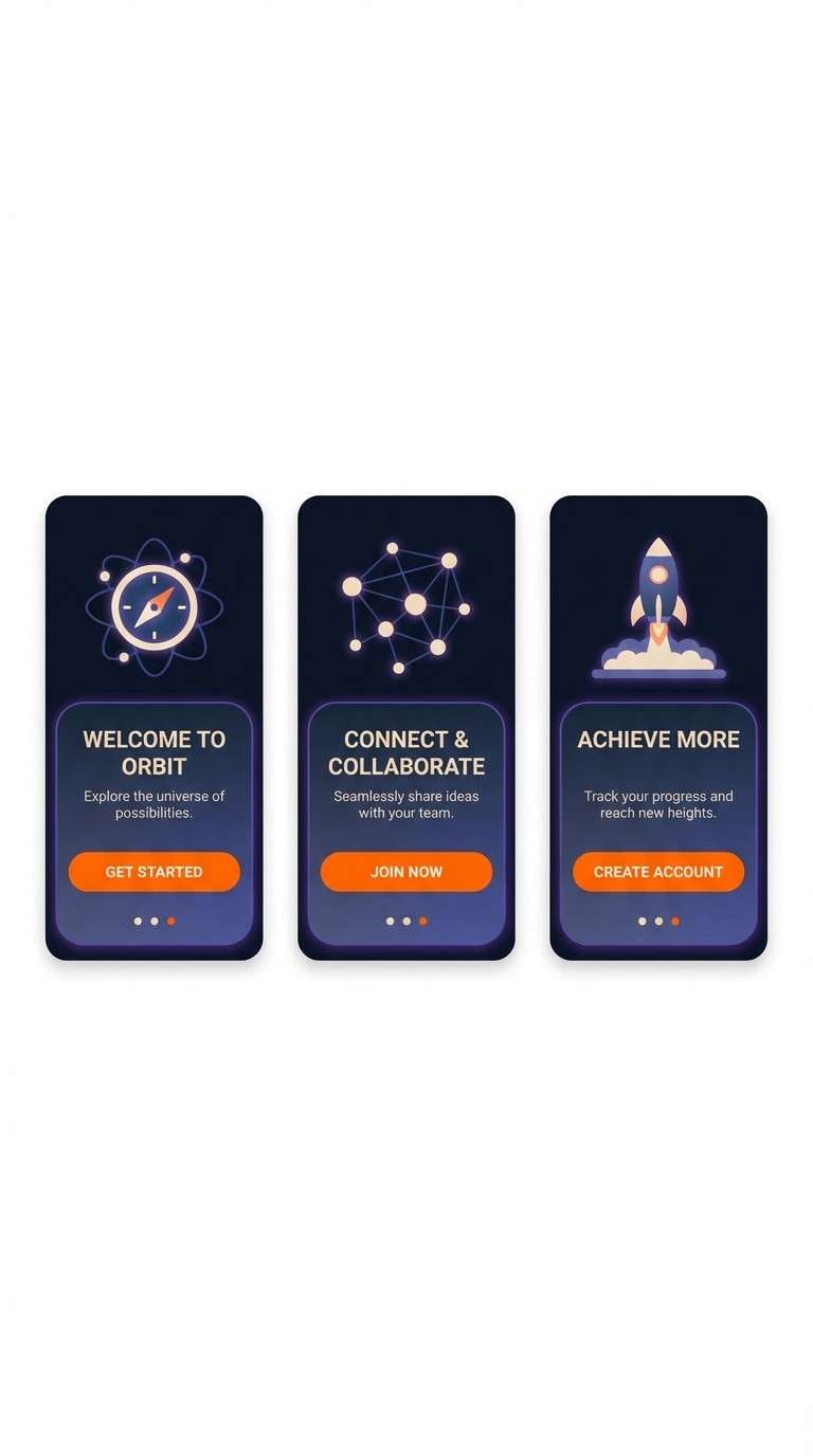
14) Sorcerer Ink
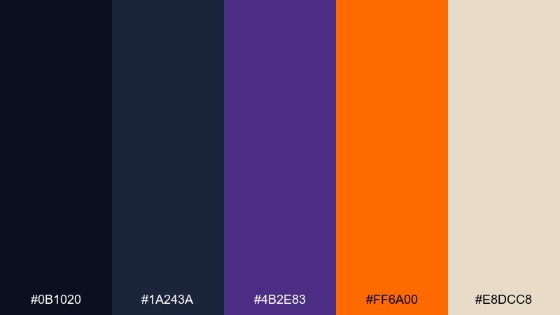
HEX: #0b1020 #1a243a #4b2e83 #ff6a00 #e8dcc8
Mood: arcane, sleek, high-tech
Best for: app onboarding screens
Deep ink blues and twilight tones feel like star maps and secret spells. Purple adds a mystical glow, while the orange works as a confident CTA highlight against the dark UI. It fits onboarding flows, event apps, and login screens that need drama without clutter. Tip: keep backgrounds in the two darkest shades and use the beige only for body text to avoid eye strain.
Image example of sorcerer ink generated using media.io
15) Carved Jack
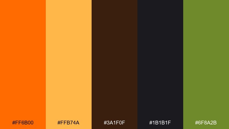
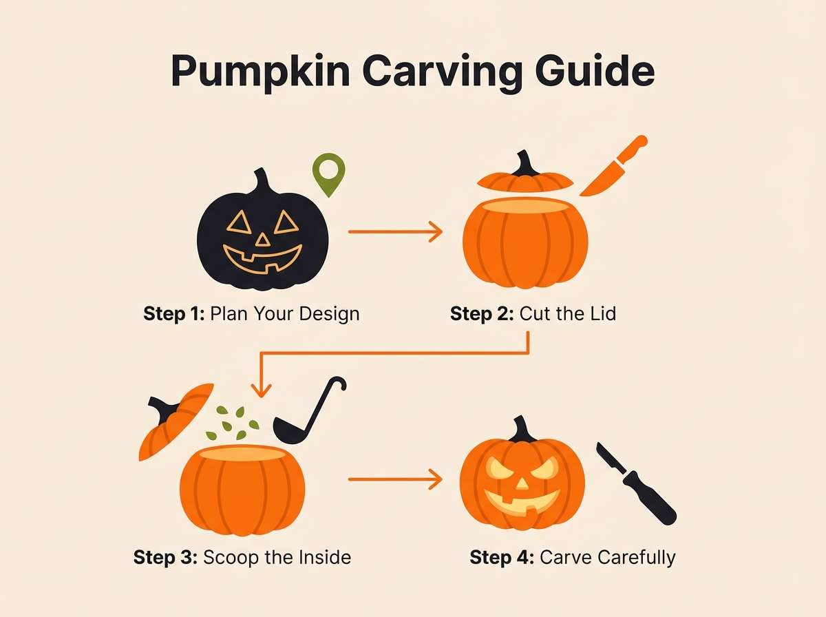
HEX: #ff6b00 #ffb74a #3a1f0f #1b1b1f #6f8a2b
Mood: classic, festive, punchy
Best for: pumpkin carving guide PDF
Bright orange and warm amber evoke fresh-cut pumpkin and glowing carved faces. Cocoa brown and near-black add strong readability for diagrams, while the leafy green brings a seasonal accent. Use it for step-by-step guides, icons, and printable checklists. Tip: keep the page background light and use black for line art so shapes stay crisp when printed.
Image example of carved jack generated using media.io
16) Fog and Ember
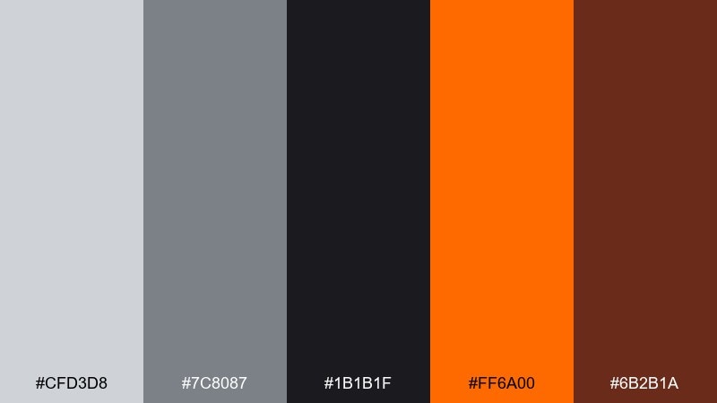
HEX: #cfd3d8 #7c8087 #1b1b1f #ff6a00 #6b2b1a
Mood: industrial, moody, restrained
Best for: YouTube thumbnail design
Cool fog grays with charcoal feel like smoke, concrete, and night air. A single ember orange pops hard for titles, while the deep brown adds warmth without going fully autumnal. This works best for thumbnails that need instant legibility and a gritty vibe. Tip: keep the background grayscale and put orange only on two or three key words to boost click clarity.
Image example of fog and ember generated using media.io

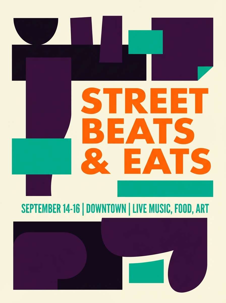
17) Night Parade
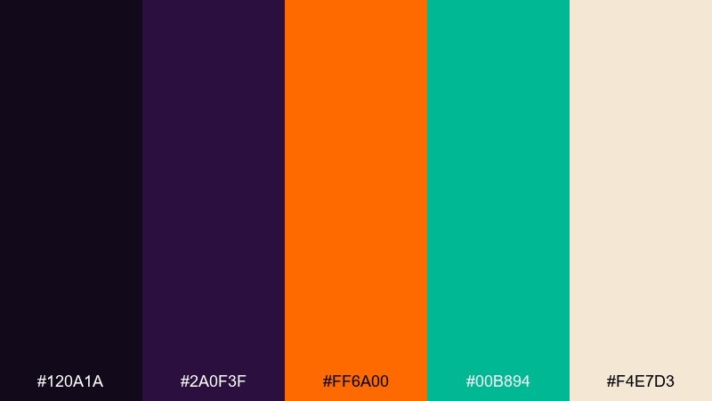
HEX: #120a1a #2a0f3f #ff6a00 #00b894 #f4e7d3
Mood: bold, playful, unexpected
Best for: street festival poster
Dark plum and rich violet set a nighttime stage, while orange and teal feel like parade lights and costumes. The warm cream keeps copy readable and prevents the brights from clashing. For halloween color combinations that feel fresh, lean into the teal as your secondary hero and keep orange for the headline. Tip: use chunky shapes and clear sections so the contrasting accents look intentional, not noisy.
Image example of night parade generated using media.io
18) Broomstick Brown
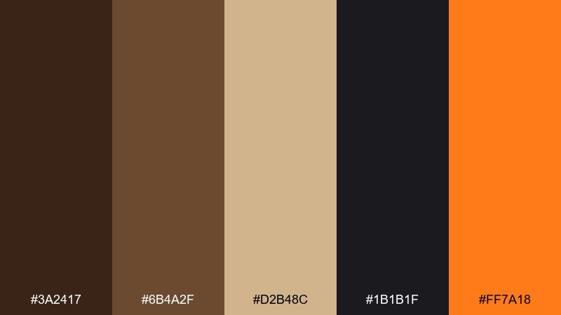
HEX: #3a2417 #6b4a2f #d2b48c #1b1b1f #ff7a18
Mood: cozy, rustic, grounded
Best for: craft workshop flyer
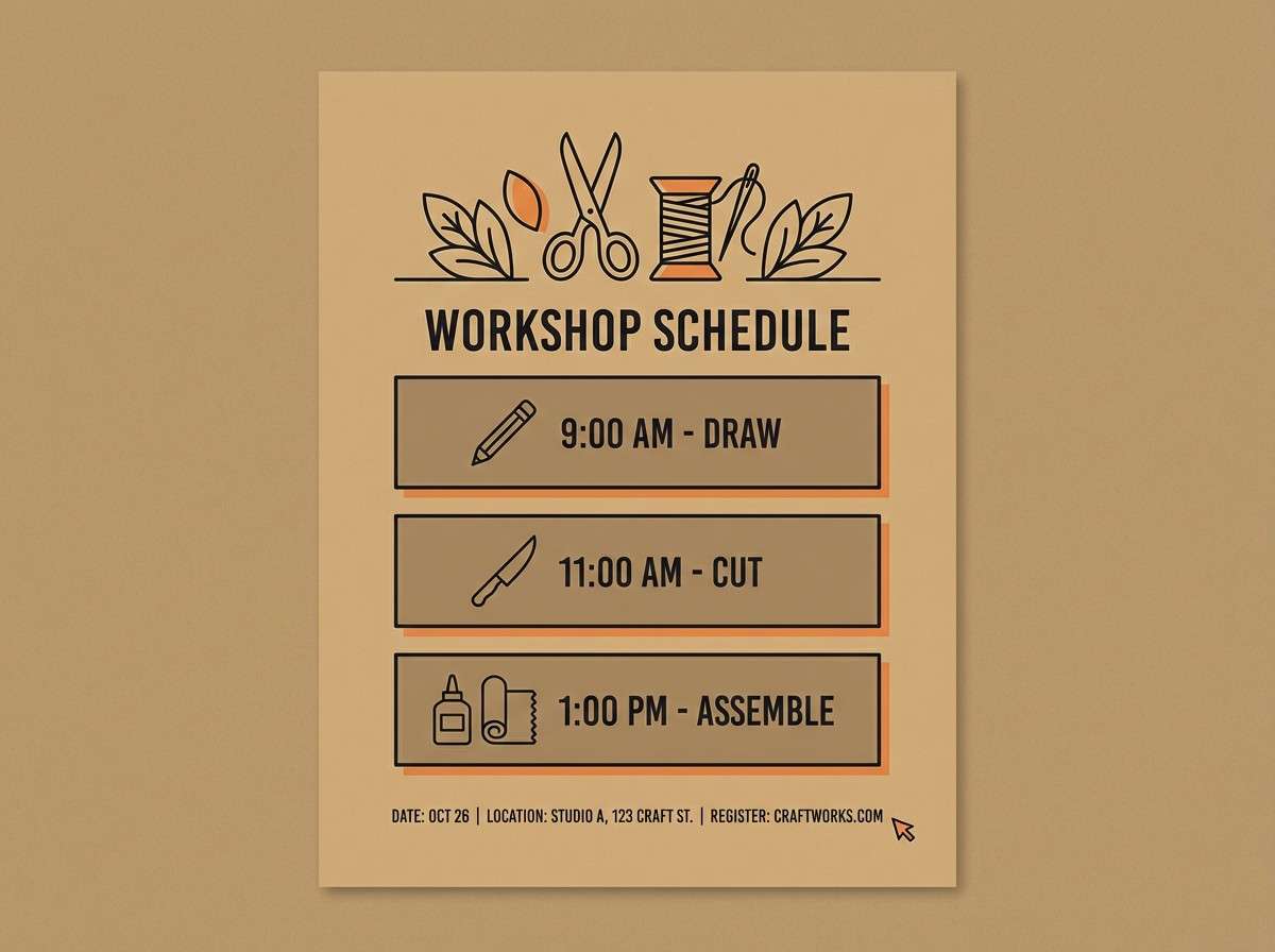
Warm browns and tan evoke twine, wood handles, and handmade decor. The near-black adds clean contrast for schedules and details, while the orange brings a friendly seasonal pop. It is perfect for workshop flyers, class signups, and DIY printable sheets. Tip: use tan as the main background and let orange highlight dates or a single RSVP block.
Image example of broomstick brown generated using media.io
19) Gothic Orchard
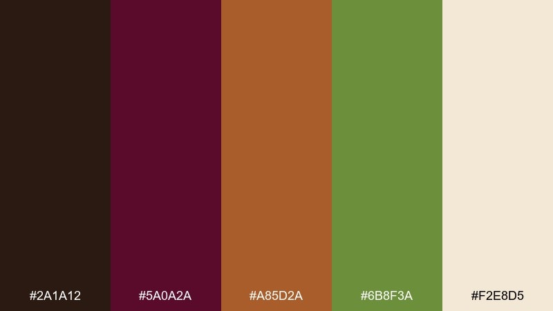
HEX: #2a1a12 #5a0a2a #a85d2a #6b8f3a #f2e8d5
Mood: dark, organic, autumnal
Best for: cider bottle label
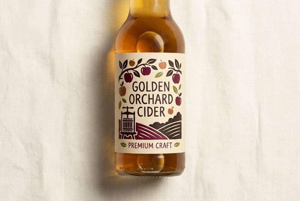
Deep plum and espresso brown feel like ripe fruit and shadowy orchards. The coppery orange reads like peel and spice, balanced by leafy green and a creamy paper base. It works well for labels with illustrated fruit, vines, or woodcut-style textures. Tip: keep the cream as the label field and use the dark plum for the brand mark to elevate the shelf presence.
Image example of gothic orchard generated using media.io
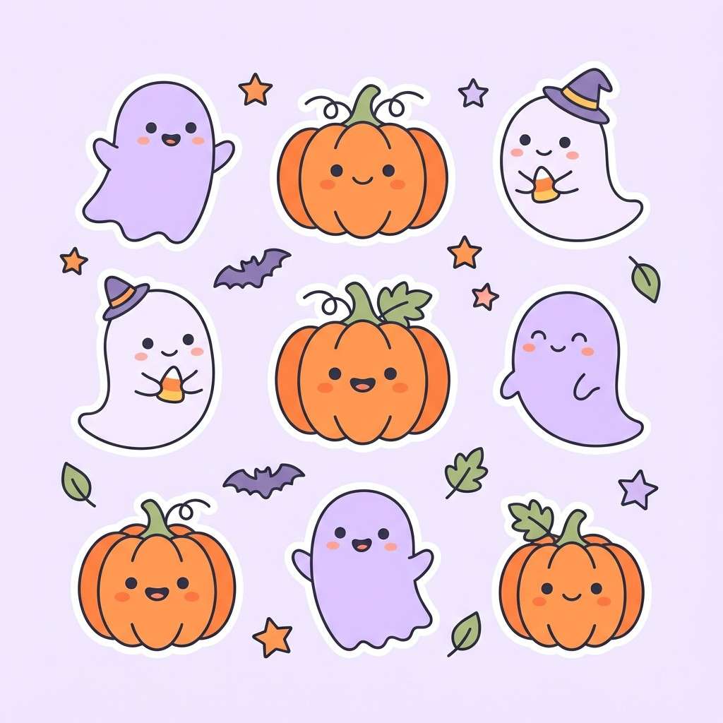
20) Cemetery Pastel
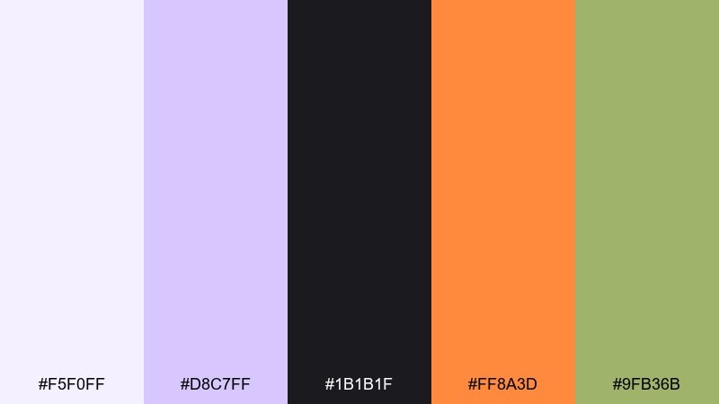
HEX: #f5f0ff #d8c7ff #1b1b1f #ff8a3d #9fb36b
Mood: light, whimsical, modern
Best for: sticker pack illustrations
Soft lilac and pale violet feel like gentle mist, with charcoal providing crisp outlines. The peachy orange adds warmth, while the muted green keeps it grounded and slightly botanical. Use it for cute sticker packs, icon sets, or playful motion graphics where you want spooky-adjacent vibes without going dark. Tip: outline stickers in charcoal and reserve orange for cheeks, stars, or tiny highlight details.
Image example of cemetery pastel generated using media.io
What Colors Go Well with Halloween?
Classic Halloween colors include pumpkin orange, charcoal/black, and a “witchy” purple—this trio creates immediate seasonal recognition and strong contrast for headlines and icons.
To modernize the look, add a neutral base (bone, ivory, greige, or fog gray) for negative space, then use one accent (copper, gold, teal, or acid green) for CTAs, badges, and small highlights.
For a softer vibe, shift dark blacks toward deep plum or ink blue, and pair them with pale lavender or parchment so the palette stays spooky but approachable.
How to Use a Halloween Color Palette in Real Designs
Start with roles, not just colors: pick one background neutral, one dark text color, one primary “seasonal” hero color, and one accent reserved for interaction (buttons, hover states, discount numbers).
Keep contrast in mind for readability—Halloween palettes often include very dark anchors, so balance them with light panels for body copy and ensure CTA colors stand out from both the background and the hero tone.
To avoid visual clutter, limit patterns and textures to one per layout (grain, paper, fog, or spiderweb lines) and let the palette do the storytelling.
Create Halloween Palette Visuals with AI
If you already have HEX codes, you can turn them into posters, labels, UI mockups, or sticker sheets by describing the layout and calling out your dominant and accent colors.
Reuse the prompts above as templates: swap in your palette, choose a format ratio (story, poster, banner), and specify “clean flat layout” or “realistic studio shot” depending on the style you want.
Generate a few variations, then keep the best composition and iterate by changing only one variable at a time (background tone, accent percentage, or typography style).
Halloween Color Palette FAQs
-
What is a good Halloween color palette for modern websites?
Try a neutral base (bone/ivory), charcoal for typography, and one seasonal accent like pumpkin orange, with purple used only for hover states or small UI highlights (similar to “Ghostly Neutral”). -
What colors are considered “spooky” besides black and orange?
Deep plum, ink navy, blood burgundy, moss green, fog gray, and muted gold read as spooky when paired with a dark anchor and a soft neutral for contrast. -
How do I keep Halloween designs readable?
Use a light neutral for most backgrounds, keep dark shades for type and framing, and reserve bright orange/neon accents for short phrases, icons, or CTAs. -
Which Halloween palette works best for kids’ invites?
Go bright and friendly: buttery yellow, tangerine orange, and creamy white with minimal dark outlines (like “Candy Corn Glow”) to keep it playful and clear. -
Can I use pastel Halloween colors without losing the theme?
Yes—pair pale lilac with crisp charcoal outlines and a warm accent like peachy orange (like “Cemetery Pastel”) so the design still feels seasonal. -
What’s a good Halloween palette for luxury branding or sales?
Use inky black with antique gold and a controlled orange pop (like “Black Cat Gold”), keeping orange limited to one focal element such as the CTA or discount. -
How can I generate Halloween palette mockups quickly?
Use Media.io text-to-image and paste a prompt that specifies the design type (poster, label, UI), lists your dominant HEX colors, and notes “clean flat layout” or “realistic studio shot” for consistent results.
Next: Dark Khaki Color Palette


