

Dark khaki (#BDB76B) sits in that sweet spot between olive and sand—grounded, natural, and easy to pair with both warm and cool accents.
Below are 20 curated dark khaki palette ideas for branding, interiors, print, and UI, each with HEX codes plus an AI prompt you can reuse to generate matching visuals.
In this article
- Why Dark Khaki Palettes Work So Well
-
- olive dune minimal
- heritage safari
- botanical study
- modern camo street
- warm clay contrast
- desert afternoon
- moss and mist
- vintage library
- coastal khaki
- night market glow
- stone and lichen
- autumn harvest
- soft sand pastels
- industrial workshop
- forest cabin
- clean corporate neutral
- spice route
- spring field notes
- monochrome khaki
- bold accent teal
- What Colors Go Well with Dark Khaki?
- How to Use a Dark Khaki Color Palette in Real Designs
- Create Dark Khaki Palette Visuals with AI
Why Dark Khaki Palettes Work So Well
Dark khaki reads as stable and practical, which makes it a reliable base for modern design systems. It brings warmth without the heaviness of deep browns and feels less “sterile” than cool grays.
Because #BDB76B lives close to nature tones (dried grass, olive leaves, desert sand), it pairs easily with creams, charcoals, forest greens, terracottas, and muted teals. That flexibility helps it work across branding, packaging, and interface design.
It also supports strong contrast strategies: place dark text on light sand/cream, then use khaki as a field color, chip, tag, or section background to create hierarchy without shouting.
20+ Dark Khaki Color Palette Ideas (with HEX Codes)
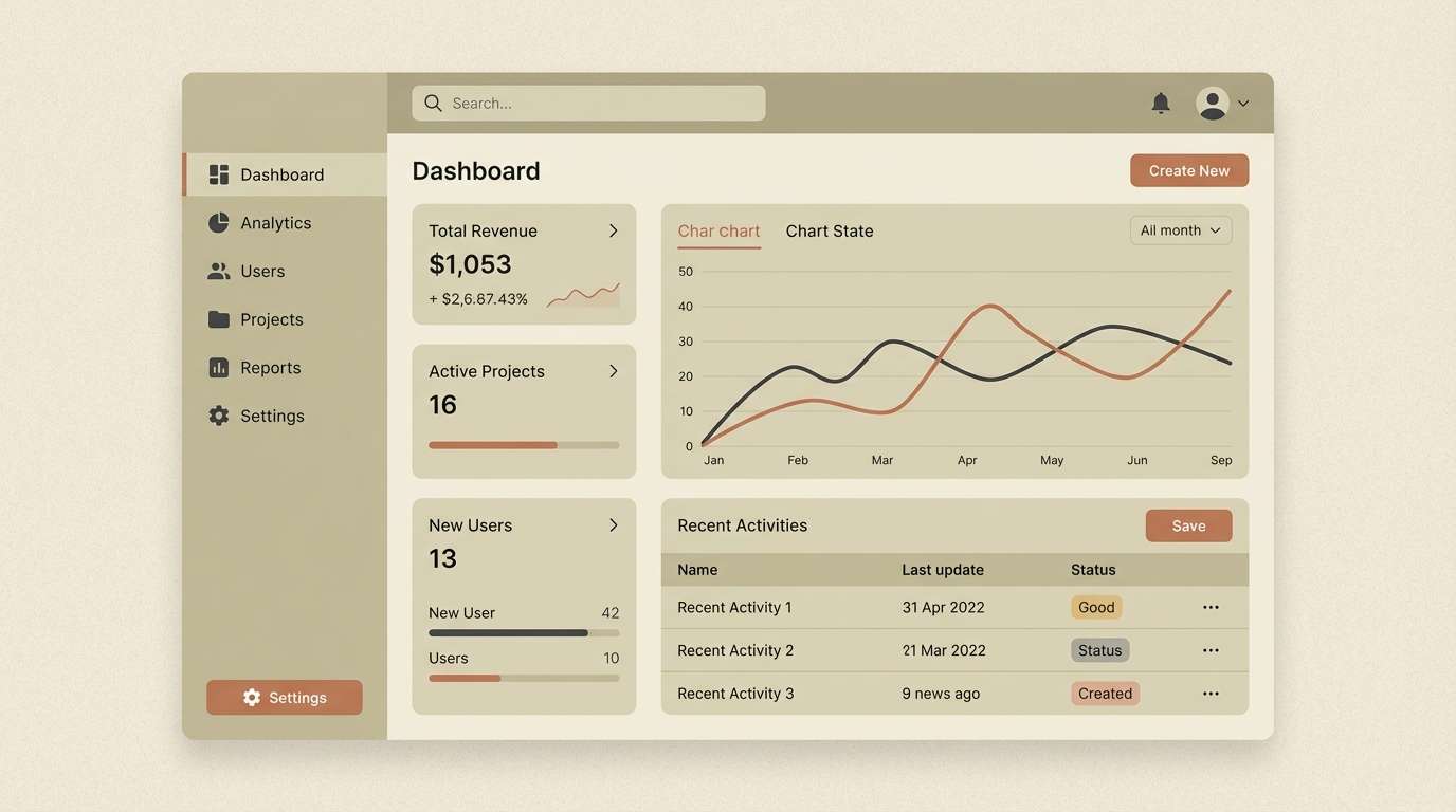
1) Olive Dune Minimal
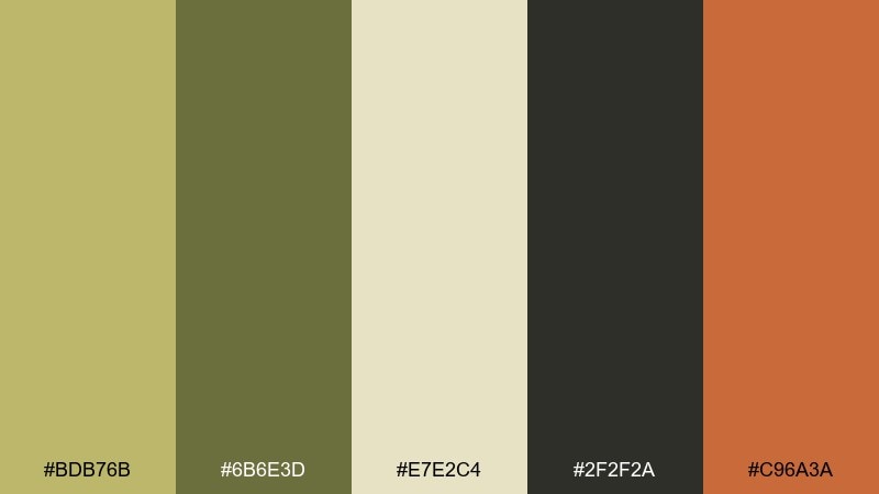
HEX: #BDB76B #6B6E3D #E7E2C4 #2F2F2A #C96A3A
Mood: grounded, minimalist, earthy
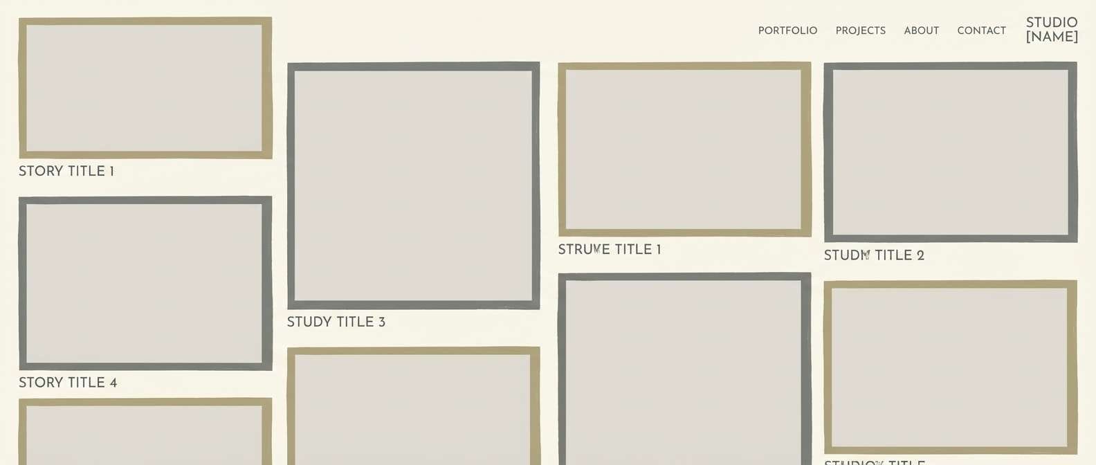
Best for: admin dashboard UI
Grounded dunes and dried-olive tones give this set a calm, functional feel. Use the soft sand tint for backgrounds, then anchor layouts with charcoal text and dividers. The clay accent is ideal for primary buttons, badges, or active states without feeling loud. Tip: keep contrast high by pairing #2F2F2A with #E7E2C4 for body text and tables.
Image example of olive dune minimal generated using media.io
Media.io is an online AI studio for creating and editing video, image, and audio in your browser.

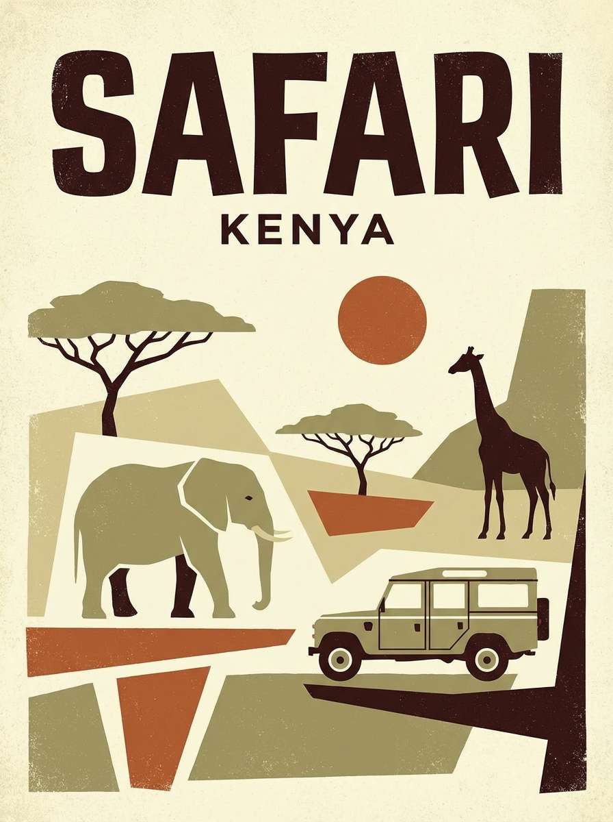
2) Heritage Safari
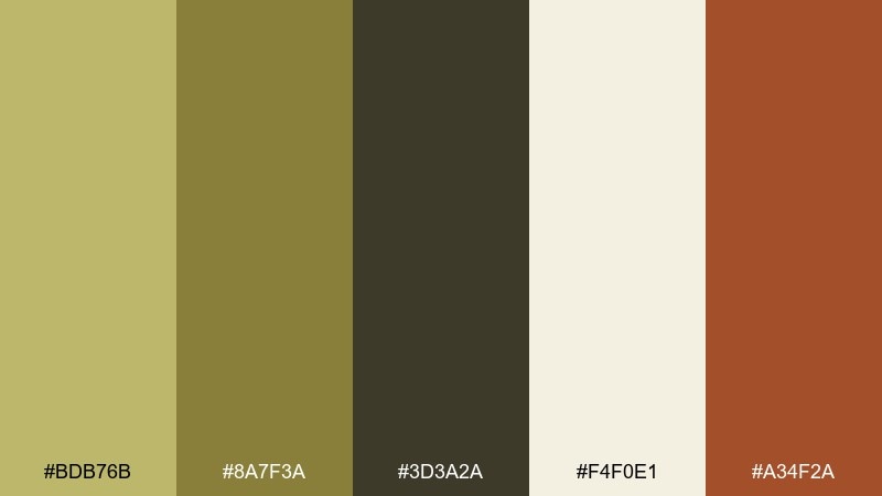
HEX: #BDB76B #8A7F3A #3D3A2A #F4F0E1 #A34F2A
Mood: adventurous, vintage, sunbaked
Best for: travel poster design
Sunbaked trails and worn leather vibes make this palette feel like a classic expedition journal. These dark khaki color combinations shine on travel posters, tour brochures, and heritage-inspired branding. Let the cream act as open space while the deep brown handles headlines and silhouettes. Tip: use the rust tone sparingly for stamps, location pins, or a single bold callout.
Image example of heritage safari generated using media.io
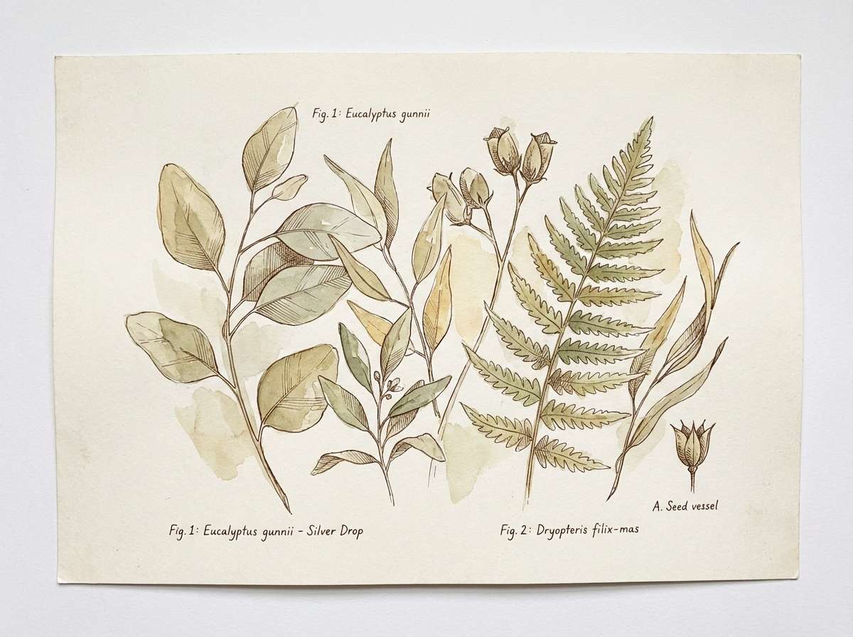
3) Botanical Study
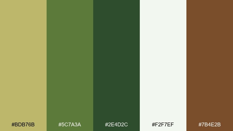
HEX: #BDB76B #5C7A3A #2E4D2C #F2F7EF #7B4E2B
Mood: natural, academic, fresh
Best for: watercolor botanical illustration
Fresh herb greens and muted khaki read like plant presses and field notes. The pale minty white keeps the composition airy, while deeper greens add structure to stems and shadows. Add the warm bark brown for labels, fine lines, or a subtle border. Tip: limit dark green to the focal plant so the artwork stays soft and study-like.
Image example of botanical study generated using media.io
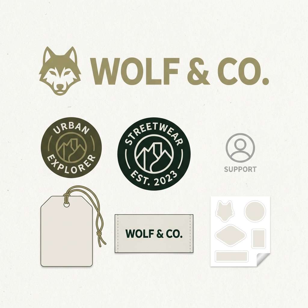
4) Modern Camo Street
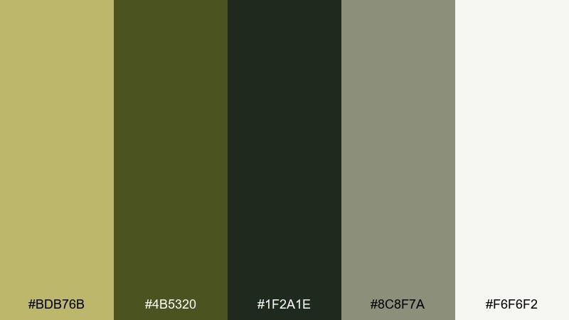
HEX: #BDB76B #4B5320 #1F2A1E #8C8F7A #F6F6F2
Mood: urban, rugged, modern
Best for: streetwear branding kit
Urban camo energy and concrete neutrals give this mix a bold, wearable edge. A dark khaki color palette like this works well for streetwear labels, outdoor collaborations, and punchy merch drops. Use the near-black green for type and logos, then soften large areas with off-white and gray. Tip: keep patterns simple and let one color block do the heavy lifting.
Image example of modern camo street generated using media.io
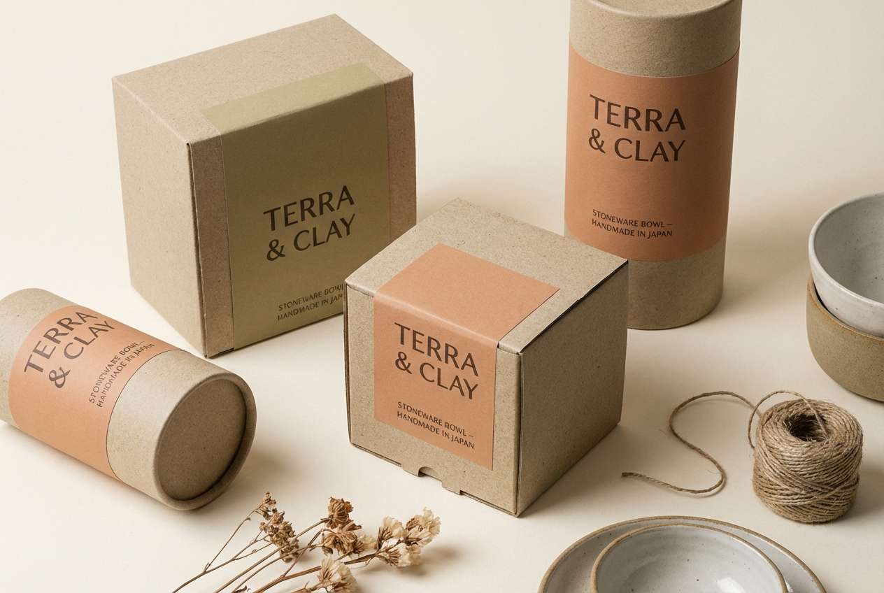
5) Warm Clay Contrast
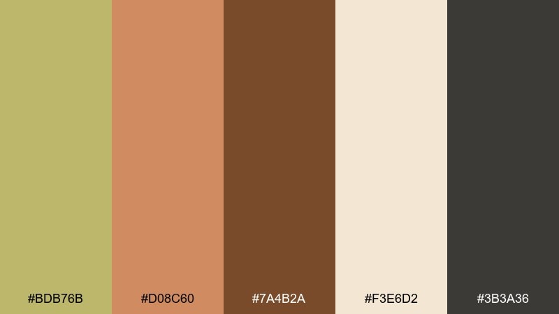
HEX: #BDB76B #D08C60 #7A4B2A #F3E6D2 #3B3A36
Mood: artisanal, warm, tactile
Best for: ceramics product packaging
Hand-thrown pottery warmth comes through in the clay and cocoa tones. The creamy beige keeps labels readable and gives the design a craft-market softness. Use charcoal for ingredient lists and fine print so it stays clean and premium. Tip: print the khaki as a matte background and reserve the clay tone for one standout element like a seal or stripe.
Image example of warm clay contrast generated using media.io
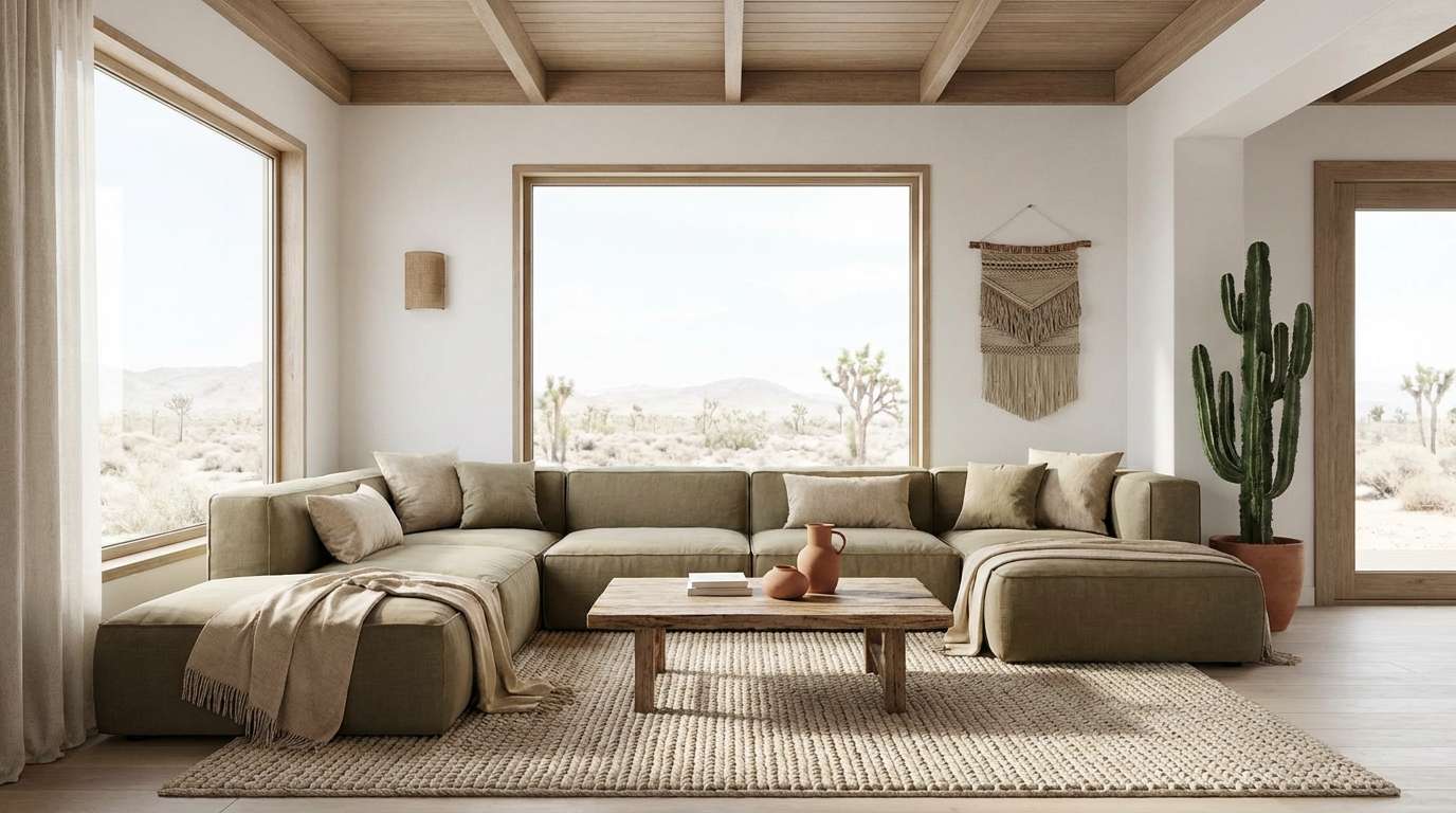
6) Desert Afternoon
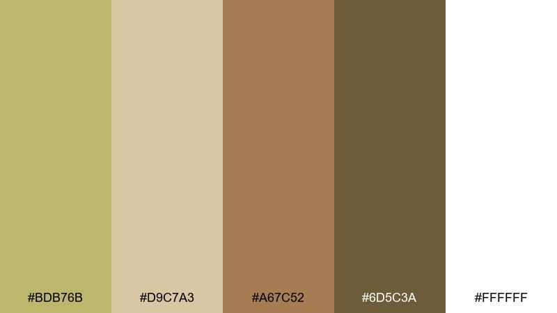
HEX: #BDB76B #D9C7A3 #A67C52 #6D5C3A #FFFFFF
Mood: sunlit, calm, airy
Best for: living room interior styling
Sunlit adobe walls and soft linen textures define this relaxed, open feel. Layer the lighter sand tones across walls, rugs, and curtains, then bring depth with the warm brown and olive-shadow accents. White keeps the space crisp, especially for ceilings and trim. Tip: repeat the darker khaki shade in small doses, like frames or side tables, to avoid a flat look.
Image example of desert afternoon generated using media.io
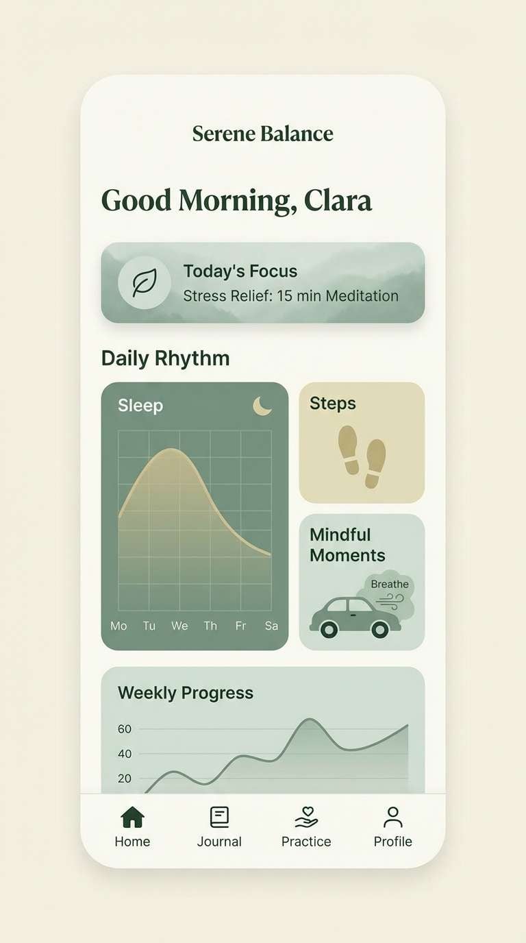
7) Moss and Mist
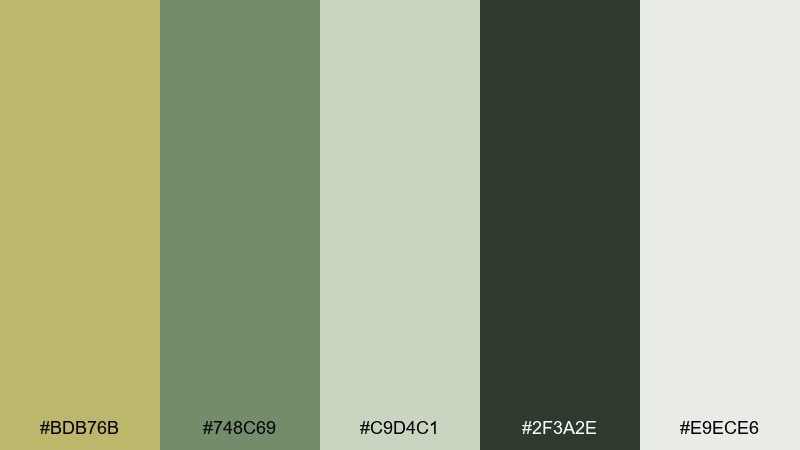
HEX: #BDB76B #748C69 #C9D4C1 #2F3A2E #E9ECE6
Mood: quiet, fresh, restorative
Best for: wellness app UI
Misty greens and softened khaki feel like a slow walk through a foggy garden. Use the pale gray-green as the main canvas, with deep forest for navigation and legible type. The muted khaki works nicely for progress rings, tabs, and subtle highlights. Tip: keep gradients minimal so the interface stays calm and breathable.
Image example of moss and mist generated using media.io
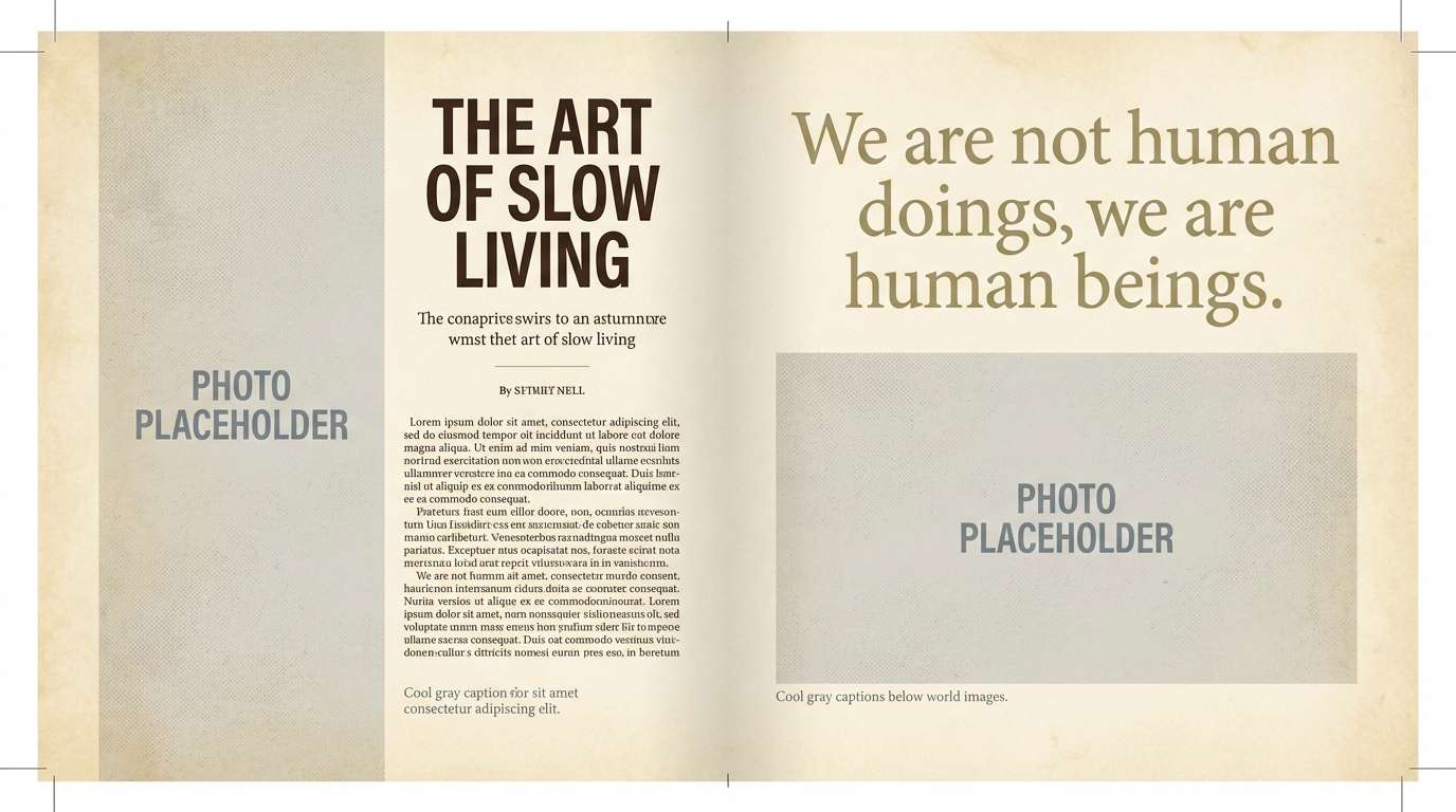
8) Vintage Library
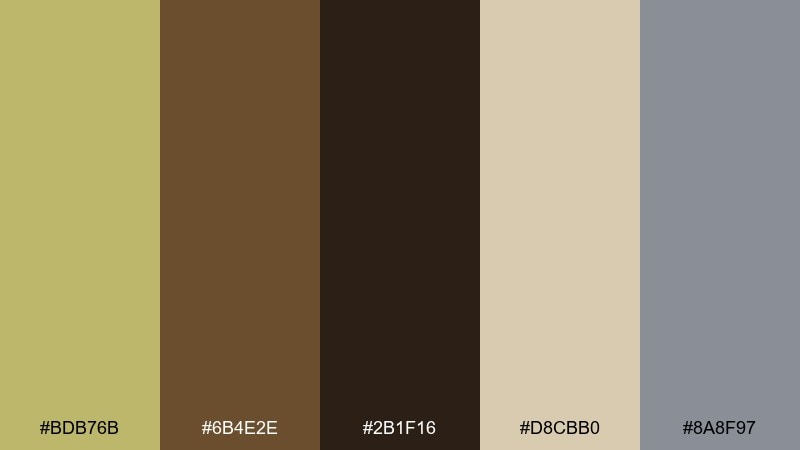
HEX: #BDB76B #6B4E2E #2B1F16 #D8CBB0 #8A8F97
Mood: scholarly, cozy, nostalgic
Best for: editorial magazine spread
Aged paper, leather bindings, and quiet gray notes create a thoughtful, old-world mood. Use the parchment beige for margins and negative space, then set headlines in the deep espresso for authority. The khaki and taupe tones help balance photos or illustration blocks without overpowering them. Tip: keep the gray reserved for captions and page furniture to maintain a classic hierarchy.
Image example of vintage library generated using media.io
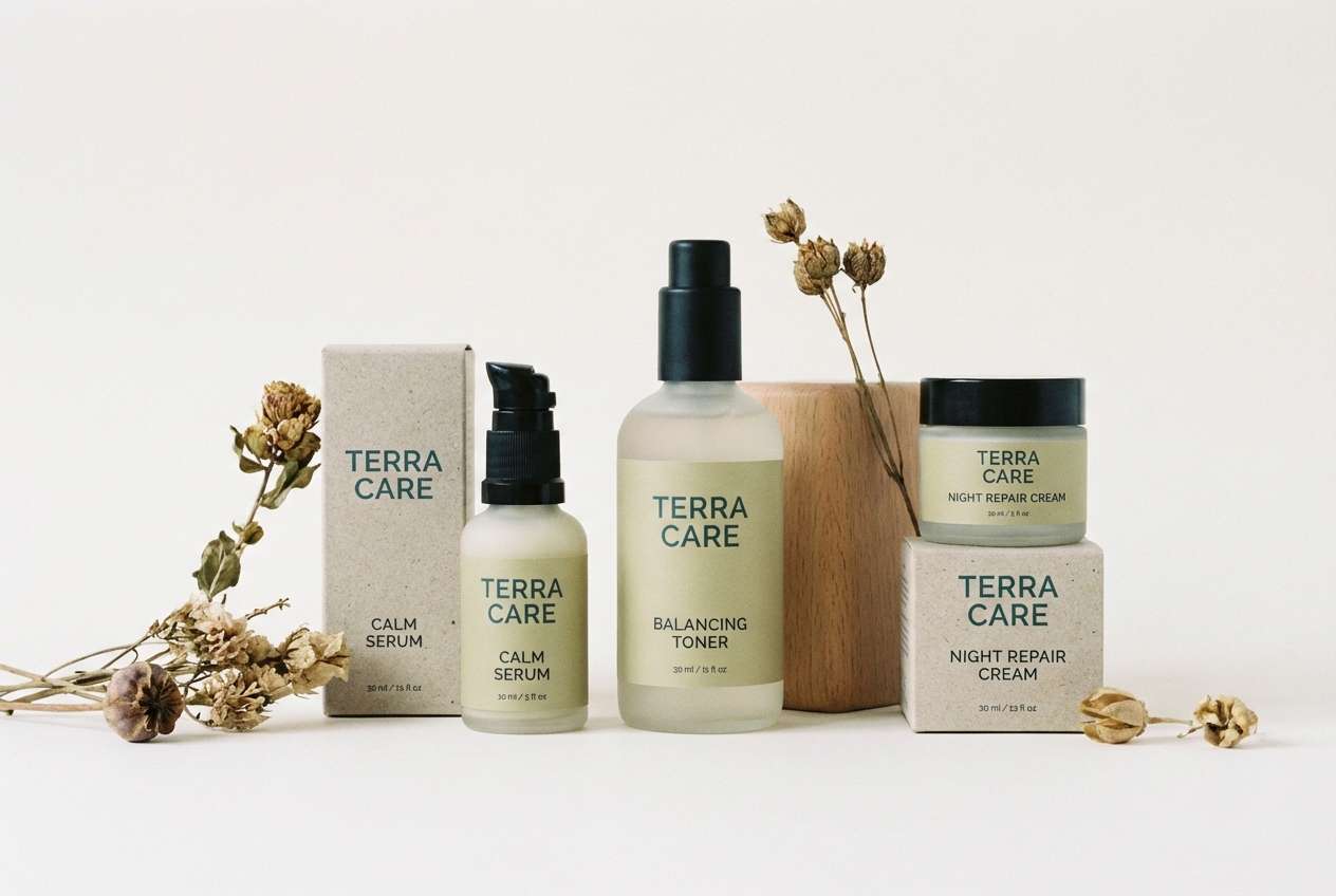
9) Coastal Khaki
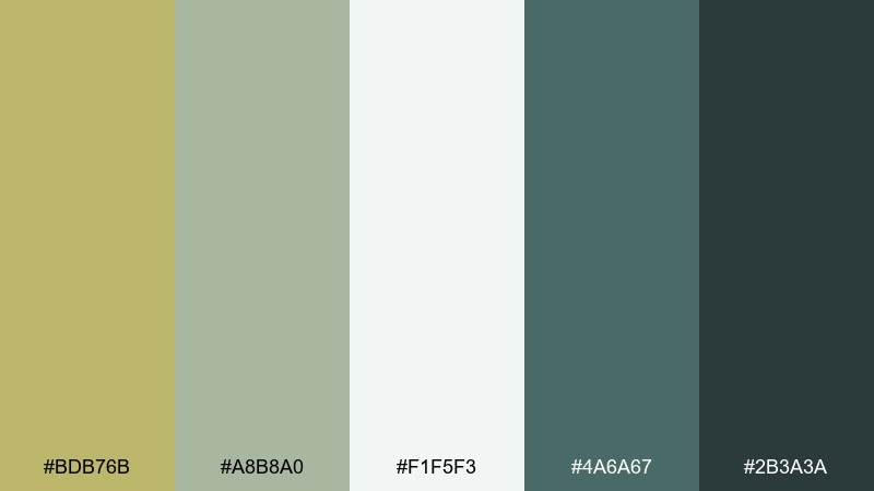
HEX: #BDB76B #A8B8A0 #F1F5F3 #4A6A67 #2B3A3A
Mood: breezy, clean, eco-minded
Best for: skincare product ad
Sea-glass greens and softened khaki feel fresh, clean, and quietly premium. These dark khaki color combinations work especially well for eco skincare, spa branding, and sustainable product lines. Let the near-white carry the background while teal shades handle the hero typography and key claims. Tip: use khaki as a subtle label tint so the design stays coastal, not muddy.
Image example of coastal khaki generated using media.io
10) Night Market Glow
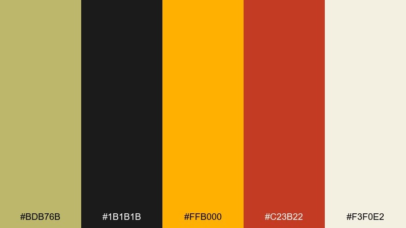
HEX: #BDB76B #1B1B1B #FFB000 #C23B22 #F3F0E2
Mood: lively, bold, cinematic
Best for: event flyer design
Warm street lights and late-night energy give this palette a punchy, cinematic vibe. Use the black for high-contrast type and the creamy tone for breathing room around details. The amber and brick-red are made for headlines, dates, or a single graphic icon that pops. Tip: keep khaki as the supporting field color so the bright accents stay intentional.
Image example of night market glow generated using media.io

11) Stone and Lichen
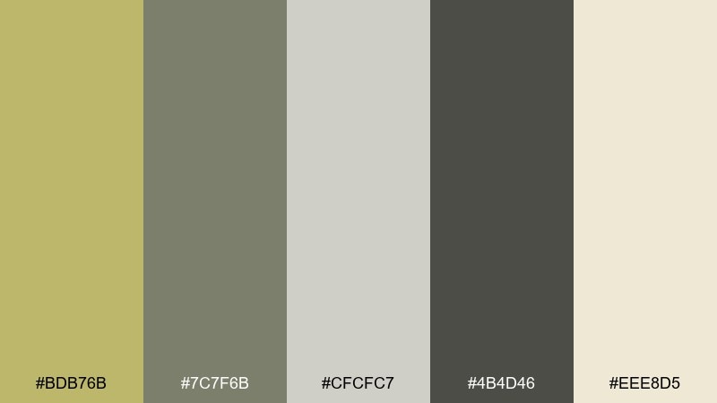
HEX: #BDB76B #7C7F6B #CFCFC7 #4B4D46 #EEE8D5
Mood: quiet, architectural, balanced
Best for: architecture portfolio website
Stone-gray structure and lichen khaki create a restrained, gallery-like mood. Use the pale cream as the page background, then set the grid and navigation in the darker slate. The muted gray-green is perfect for hover states, tags, and subtle UI separators. Tip: pair large photo areas with plenty of cream space so the palette reads intentional and modern.
Image example of stone and lichen generated using media.io
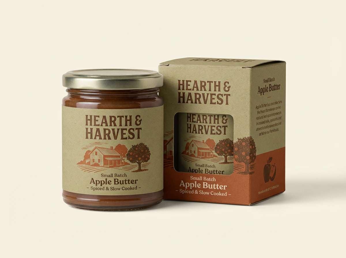
12) Autumn Harvest
HEX: #BDB76B #8F5B2D #C66B3D #3E2A1E #F7E9D2
Mood: cozy, rustic, flavorful
Best for: food brand packaging
Cozy harvest tones evoke roasted spices, dried leaves, and market baskets. A dark khaki color palette pairs beautifully with warm browns for sauces, coffee, baked goods, and pantry staples. Use the pale cream for nutrition panels and whitespace, then layer rust and cinnamon for appetite appeal. Tip: keep the darkest brown for type only to avoid over-darkening the label.
Image example of autumn harvest generated using media.io
13) Soft Sand Pastels
HEX: #BDB76B #F6E9C6 #E7C6B0 #C8D2B4 #6B6E3D
Mood: romantic, gentle, airy
Best for: wedding invitation set
Soft sand pastels feel light, romantic, and quietly elegant. Use the buttery cream as the base, then bring in blush and sage for florals or divider lines. The deeper olive-khaki adds definition for names and key details without turning harsh. Tip: print the khaki as a thin border or monogram to keep the invitation delicate.
Image example of soft sand pastels generated using media.io
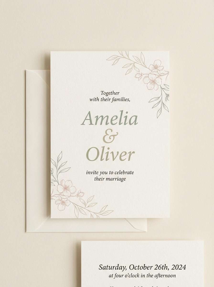
14) Industrial Workshop
HEX: #BDB76B #2C2C2C #6E6E6E #A45D3B #E5E1D6
Mood: sturdy, utilitarian, modern
Best for: tool product ad
Workshop grit and clean engineering lines make this palette feel dependable. Use khaki and warm brown for brand accents, while charcoal and steel gray carry the technical details. The light neutral works well as a studio backdrop that still feels industrial. Tip: keep the gray hierarchy clear by reserving #2C2C2C for the headline and #6E6E6E for specs.
Image example of industrial workshop generated using media.io
15) Forest Cabin
HEX: #BDB76B #3B4A2A #6A3E2B #D7D0B8 #1E1F1B
Mood: rustic, cozy, outdoorsy
Best for: outdoor blog header illustration
Cabin wood, pine shadows, and muted khaki create a cozy off-grid mood. Use the light oatmeal tone for sky or negative space, then layer the deep greens and near-black for trees and type. The warm brown adds a welcoming, handmade touch for icons or badges. Tip: keep the darkest shade to small areas so the header stays readable and not too heavy.
Image example of forest cabin generated using media.io

16) Clean Corporate Neutral
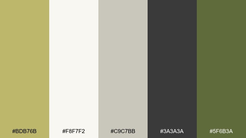
HEX: #BDB76B #F8F7F2 #C9C7BB #3A3A3A #5F6B3A
Mood: professional, calm, trustworthy
Best for: pitch deck template
Clean neutrals with a khaki accent feel polished without going cold. Use the off-white for slide backgrounds, then rely on charcoal for titles and body copy to keep it crisp. The olive accent works well for charts, section dividers, and subtle emphasis. Tip: keep graphs to two tones plus a single khaki highlight so the data reads instantly.
Image example of clean corporate neutral generated using media.io
17) Spice Route
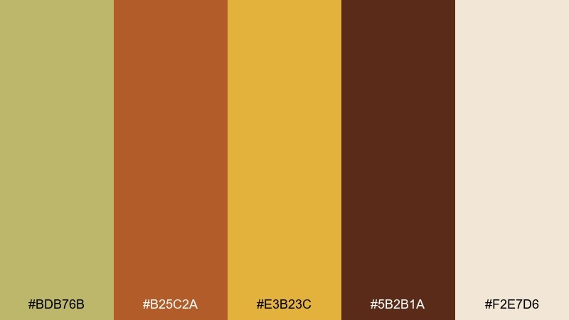
HEX: #BDB76B #B25C2A #E3B23C #5B2B1A #F2E7D6
Mood: rich, appetizing, energetic
Best for: restaurant menu design
Spiced khaki and golden saffron tones feel warm, flavorful, and inviting. Use the creamy base for readability, then bring in the darker cocoa for section headers and prices. The orange and gold work best as small accents for icons, highlights, or a featured dish callout. Tip: limit the brightest yellow to one focal area per page to avoid visual noise.
Image example of spice route generated using media.io
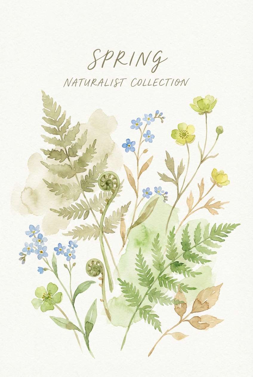
18) Spring Field Notes
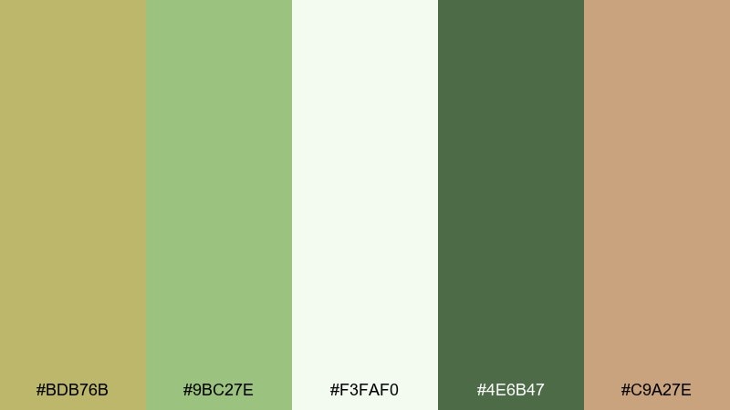
HEX: #BDB76B #9BC27E #F3FAF0 #4E6B47 #C9A27E
Mood: optimistic, light, outdoorsy
Best for: watercolor spring poster
Fresh meadow greens and soft khaki feel like new growth and handwritten notes. Use the pale mint as paper space, then layer watercolor washes with the brighter green for leaves and stems. The warm tan adds a natural touch for seed heads, labels, or a subtle border. Tip: keep edges soft and let the khaki act as the unifying wash under the illustration.
Image example of spring field notes generated using media.io
19) Monochrome Khaki
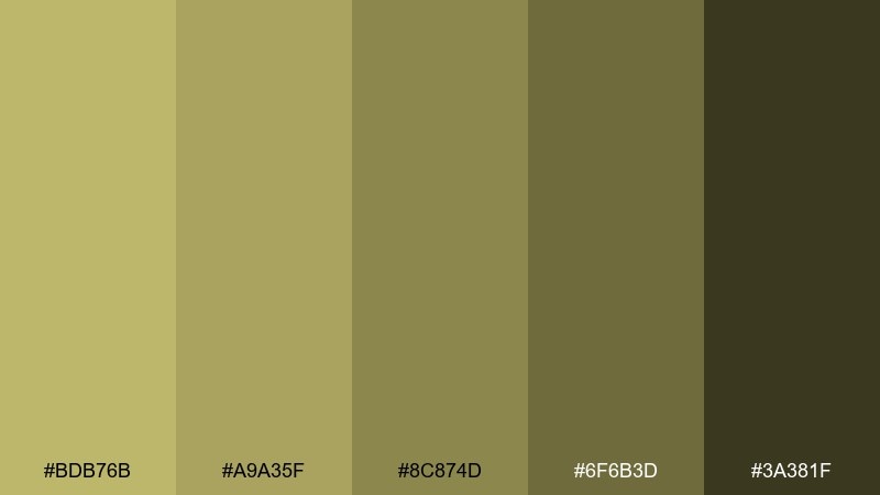
HEX: #BDB76B #A9A35F #8C874D #6F6B3D #3A381F
Mood: tonal, refined, understated
Best for: fashion lookbook layout
Tonal khaki layers feel refined, editorial, and quietly confident. Use the lightest shade for backgrounds and image margins, then step down in value for typography and grid lines. The deepest olive works best for titles and page numbers to keep the lookbook sharp. Tip: add interest through texture and spacing rather than extra colors.
Image example of monochrome khaki generated using media.io
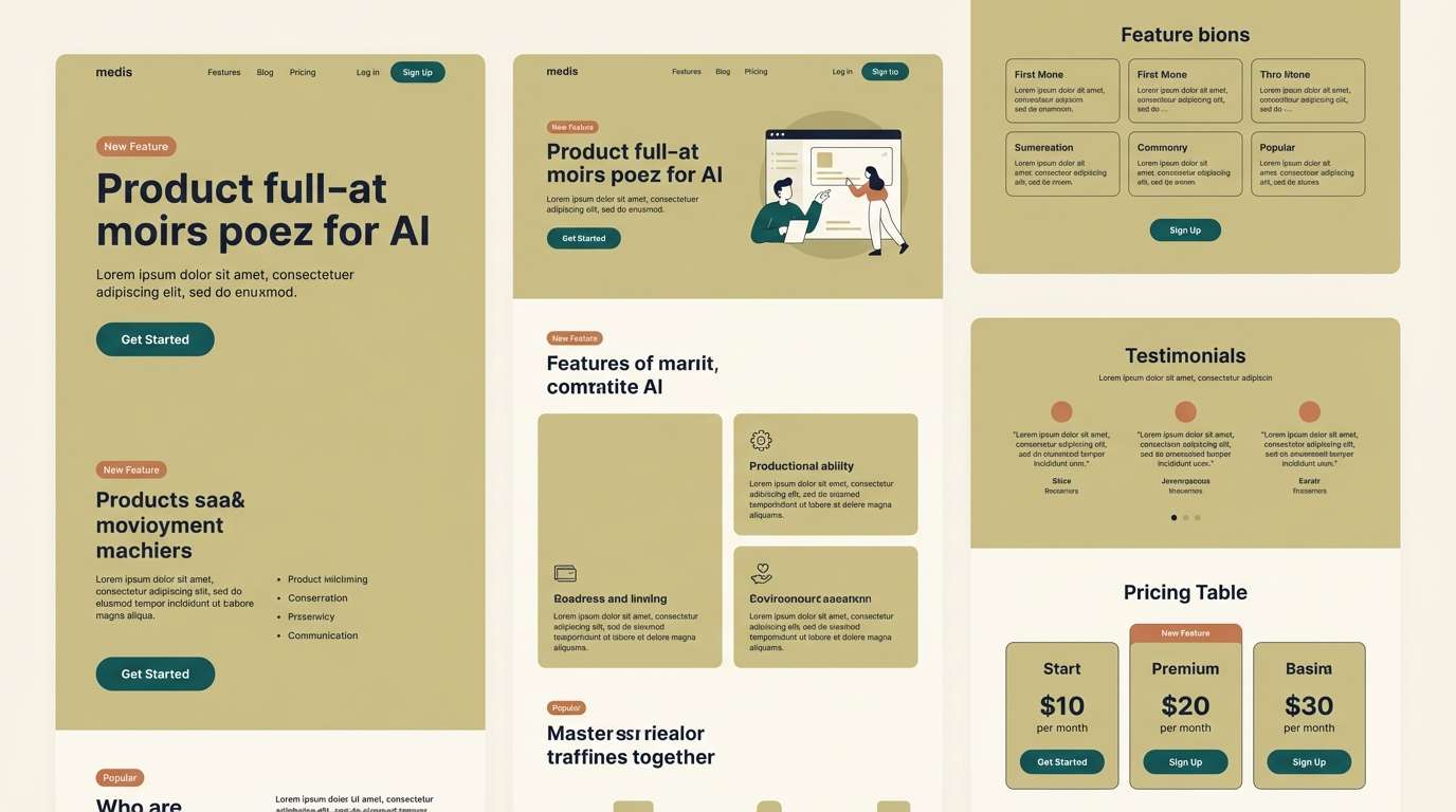
20) Bold Accent Teal
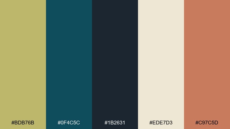
HEX: #BDB76B #0F4C5C #1B2631 #EDE7D3 #C97C5D
Mood: modern, confident, high-contrast
Best for: SaaS landing page UI
Deep teal against khaki feels modern and confident, like a premium outdoor-tech brand. Use the light cream as the main background, then set headings in the navy for clarity and authority. Teal makes a strong primary CTA, while the warm clay accent is ideal for secondary highlights or testimonials. Tip: keep khaki to large sections so the teal reads as the clear action color.
Image example of bold accent teal generated using media.io
What Colors Go Well with Dark Khaki?
Dark khaki pairs beautifully with warm neutrals like cream, oatmeal, camel, and cocoa brown—these keep the palette earthy and cohesive for packaging, interiors, and editorial layouts.
For a cleaner modern look, combine it with charcoal, slate gray, and off-white. This gives you dependable contrast for UI while keeping the overall tone softer than pure black-and-white.
If you want stronger energy, add a focused accent: teal for a cool premium contrast, terracotta/rust for warmth, or saffron/amber for a bold highlight that still feels sunbaked rather than neon.
How to Use a Dark Khaki Color Palette in Real Designs
Use dark khaki as a “field” color: large sections, backgrounds, cards, or packaging panels. Then reserve darker shades (charcoal, espresso, deep green) for typography so readability stays crisp.
Pick one accent color and give it a job—primary CTA, price tags, icons, or highlights. When khaki is the foundation, too many accents can quickly feel muddy or overly vintage.
In print or interiors, lean into texture: matte paper, linen, wood grain, or soft shadows. Dark khaki looks best when it feels tactile, not flat.
Create Dark Khaki Palette Visuals with AI
If you have HEX codes but need on-brand mockups fast, generate palette-matched images with an AI prompt. You can keep the same palette and swap the use case—UI, posters, packaging, or interiors.
Start with one of the prompts above, then adjust subject, layout, and aspect ratio while keeping the color direction consistent (khaki base + one clear accent + readable dark type).
When your visuals look consistent across pages and platforms, the palette feels intentional—especially important for product launches, landing pages, and brand kits.
Dark Khaki Color Palette FAQs
-
What is the dark khaki hex code?
The dark khaki hex code used in these palettes is #BDB76B. It’s an earthy yellow-green neutral that works well as a base color. -
Is dark khaki warm or cool?
Dark khaki is generally warm-leaning because of its yellow content, but it sits near olive so it can feel more neutral depending on surrounding colors. -
What text color is readable on dark khaki backgrounds?
For strong readability, use deep neutrals like charcoal, near-black green, or espresso brown (for example, shades similar to #2F2F2A or #1B1B1B). For large headings, very dark tones will keep contrast clean. -
What are the best accent colors for a dark khaki palette?
Great accents include teal (modern contrast), terracotta/rust (warm artisanal feel), and amber/saffron (bold, sunlit highlight). Keep accents limited to maintain a clean hierarchy. -
Can dark khaki work for modern UI design?
Yes. Use dark khaki as a background section color or subtle UI highlight, then rely on off-whites for surfaces and charcoals for text. A single saturated accent (like teal) can serve as the primary CTA color. -
How do I keep a dark khaki palette from looking muddy?
Add enough light space (cream/off-white), keep dark text truly dark, and choose one accent color with a clear purpose. Avoid stacking too many mid-tones of similar value without contrast. -
What styles or industries fit dark khaki color combinations?
Dark khaki fits outdoor and travel branding, eco and wellness products, editorial layouts, architectural portfolios, and natural interiors—anywhere you want a grounded, trustworthy tone.


