

A green yellow red color palette is instantly recognizable: it signals “go / caution / stop,” but it can also feel fresh, festive, and bold depending on the tones you choose.
Below are 20 practical green yellow red color combinations with HEX codes, plus usage tips and AI prompts you can use to generate matching visuals in minutes.
In this article
- Why Green Yellow Red Palettes Work So Well
-
- citrus garden rally
- spice bazaar
- retro semaphore
- autumn parade
- botanical fiesta
- traffic pop minimal
- stadium energy
- holiday market lights
- desert cactus heat
- classroom primary
- vintage label trio
- neon street signal
- garden picnic soft
- eco alert ux
- rustic orchard
- tropical roadtrip
- urban safety stripe
- cherry lime sorbet
- modern folk art
- warm transit icons
- What Colors Go Well with Green Yellow Red?
- How to Use a Green Yellow Red Color Palette in Real Designs
- Create Green Yellow Red Palette Visuals with AI
Why Green Yellow Red Palettes Work So Well
Green, yellow, and red are high-signal colors that our eyes read quickly, making them ideal for designs that need fast hierarchy—think buttons, badges, signage, headlines, and callouts.
They also form a warm, energetic triad when you pick the right shades: green can add “fresh” and “trusted,” yellow adds “optimistic” glow, and red brings urgency and focus.
With enough neutral space (cream, white, charcoal, or navy), a green yellow red color scheme can feel modern and clean rather than chaotic—especially when you keep red as the smallest accent.
20+ Green Yellow Red Color Palette Ideas (with HEX Codes)
1) Citrus Garden Rally
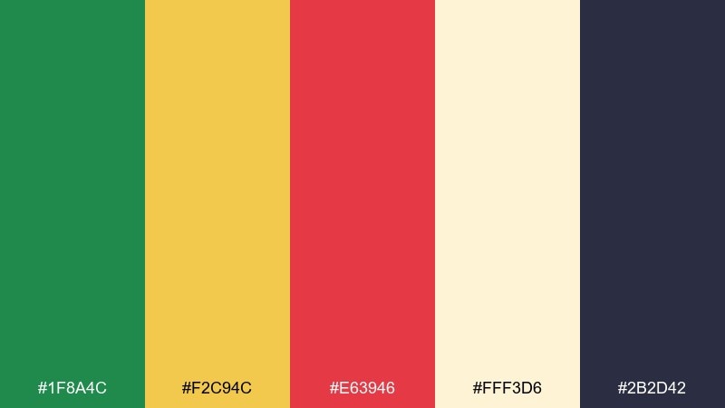
HEX: #1f8a4c #f2c94c #e63946 #fff3d6 #2b2d42
Mood: upbeat, fresh, inviting
Best for: food branding and farmers market posters
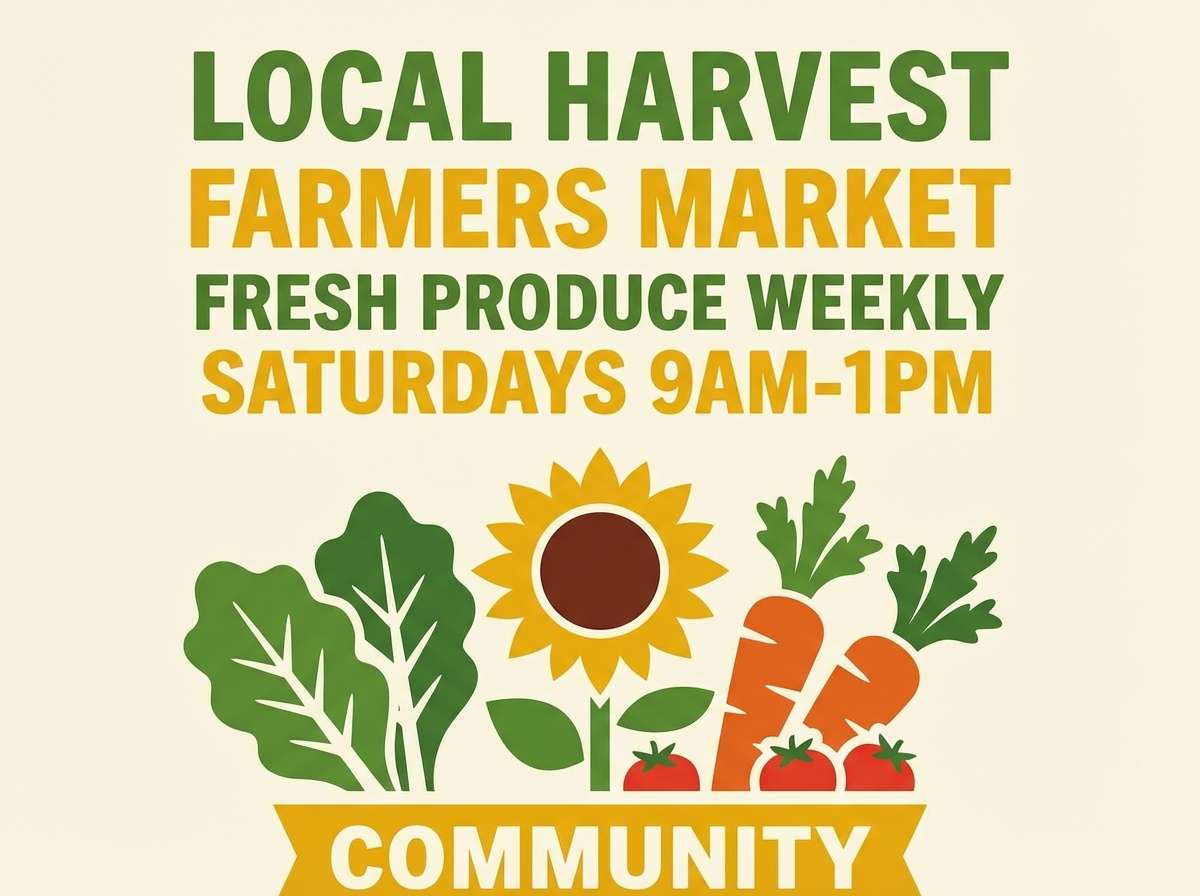
Upbeat and sunlit, this mix feels like citrus crates, leafy greens, and a pop of ripe tomato. It shines on food logos, market signage, and seasonal promos where you need instant appetite appeal. Pair it with clean cream space and a deep charcoal for readable type. Usage tip: keep red as the smallest accent so calls to action stand out without overpowering the greens.
Image example of citrus garden rally generated using media.io
Media.io is an online AI studio for creating and editing video, image, and audio in your browser.

2) Spice Bazaar
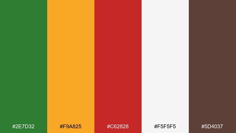
HEX: #2e7d32 #f9a825 #c62828 #f5f5f5 #5d4037
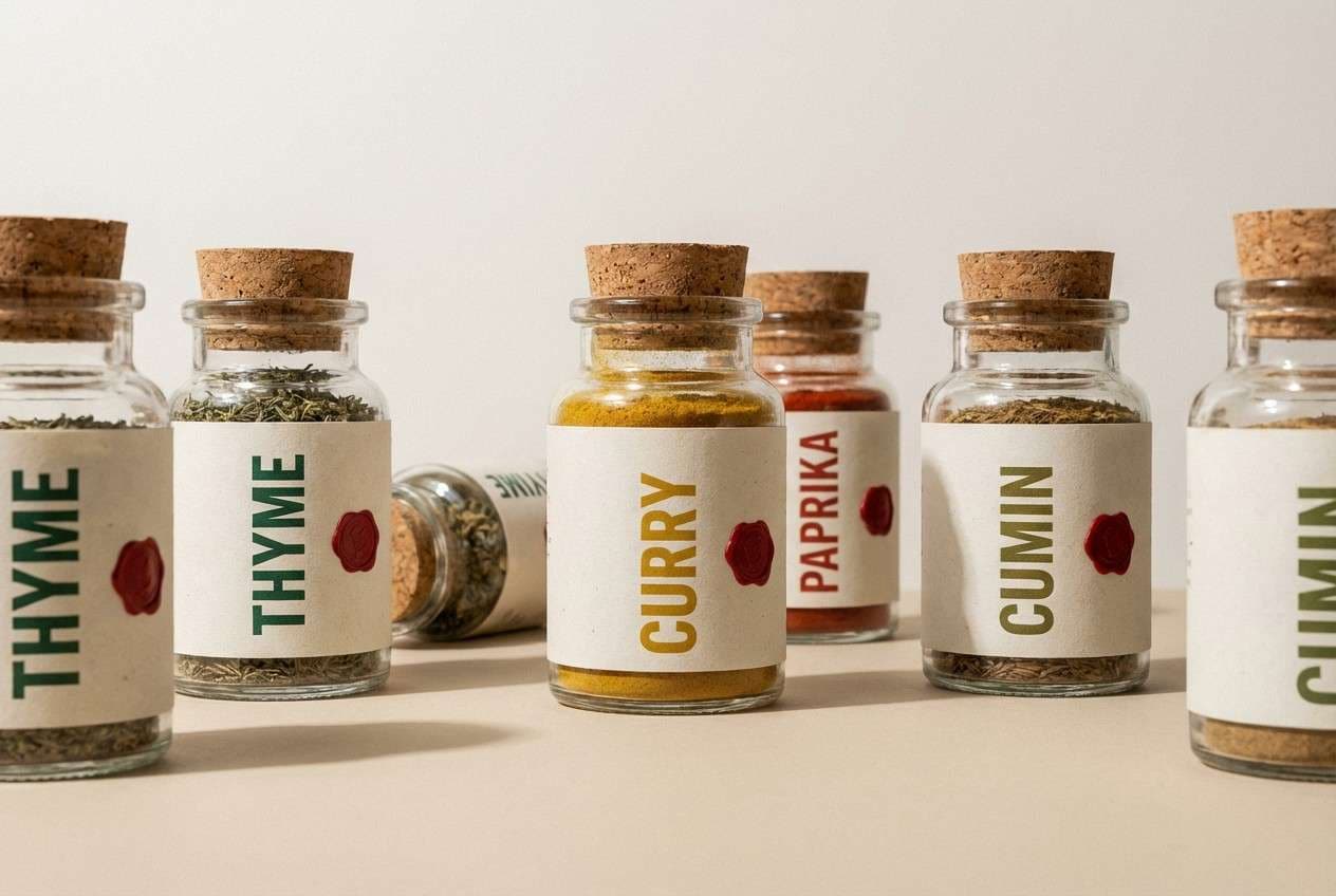
Mood: warm, rustic, flavorful
Best for: spice packaging and product labels
Warm and aromatic, it evokes market stalls, toasted spices, and earthy paper labels. The deep green grounds the palette while mustard yellow adds glow and the red brings heat. It works best for packaging, shelf signage, and product badges that need a handcrafted feel. Usage tip: use the brown for typography and borders to keep the design cohesive and premium.
Image example of spice bazaar generated using media.io
3) Retro Semaphore
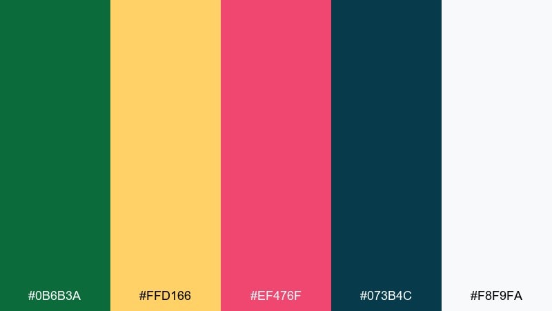
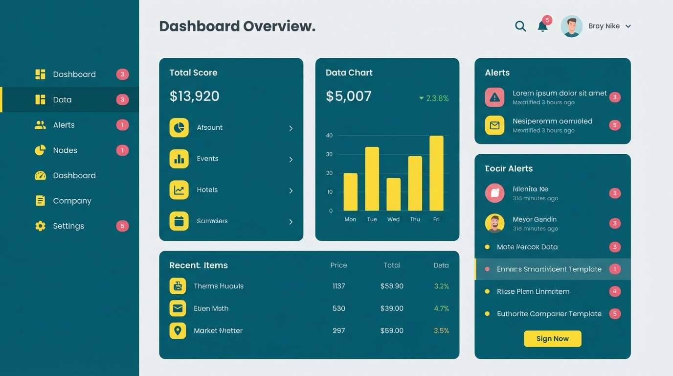
HEX: #0b6b3a #ffd166 #ef476f #073b4c #f8f9fa
Mood: retro, playful, techy
Best for: 2d UI dashboards and data widgets
Retro and playful, it recalls old signal lights, arcade buttons, and crisp printed charts. The contrast between deep teal and bright yellow keeps interfaces energetic without feeling chaotic. Use it for dashboards, analytics cards, and status indicators with clear hierarchy. Usage tip: reserve the pink-red for alerts and key metrics, and keep most surfaces light for accessibility.
Image example of retro semaphore generated using media.io
4) Autumn Parade
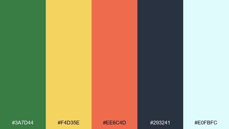
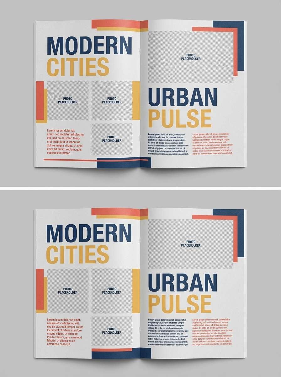
HEX: #3a7d44 #f4d35e #ee6c4d #293241 #e0fbfc
Mood: cozy, editorial, confident
Best for: magazine layouts and seasonal editorials
Cozy and confident, it feels like fall street fairs, warm light, and bold headlines. The navy and pale aqua give your layout breathing room while the yellow and coral-red create punchy callouts. It suits editorials, lookbooks, and feature spreads where color needs to guide the eye. Usage tip: keep imagery warm-toned and let the navy handle most body text for a polished finish.
Image example of autumn parade generated using media.io
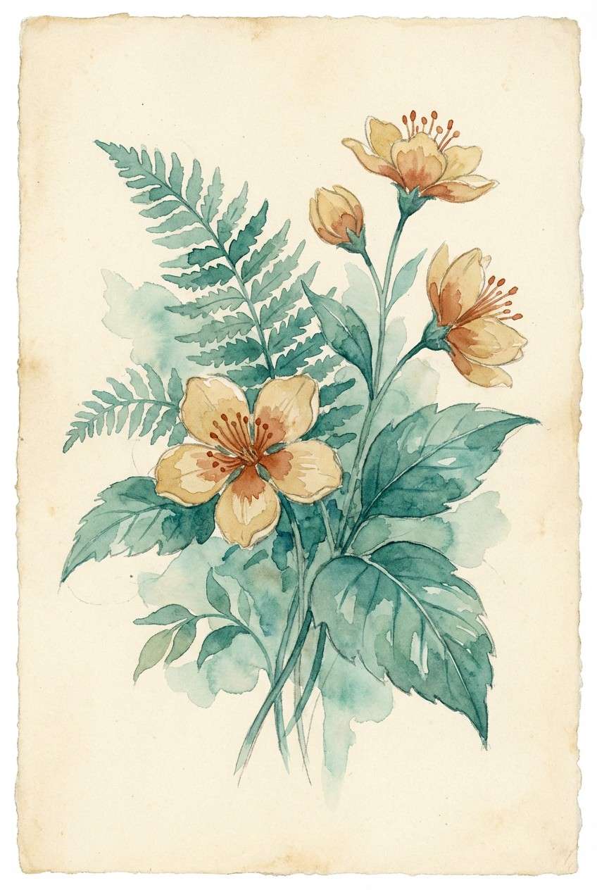
5) Botanical Fiesta
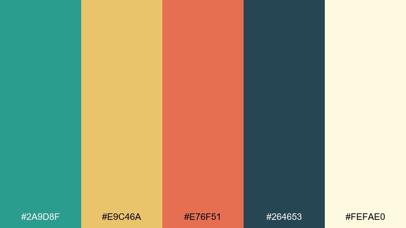
HEX: #2a9d8f #e9c46a #e76f51 #264653 #fefae0
Mood: lively, handcrafted, sunny
Best for: watercolor botanical illustrations
Lively and handcrafted, it suggests painted leaves, golden petals, and a festive terracotta bloom. The teal-green brings freshness while the sandy yellow softens the overall warmth. Use it for botanical prints, wedding floral art, and packaging patterns with an artisanal vibe. Usage tip: let the cream act as paper texture and keep the red-orange for focal flowers only.
Image example of botanical fiesta generated using media.io
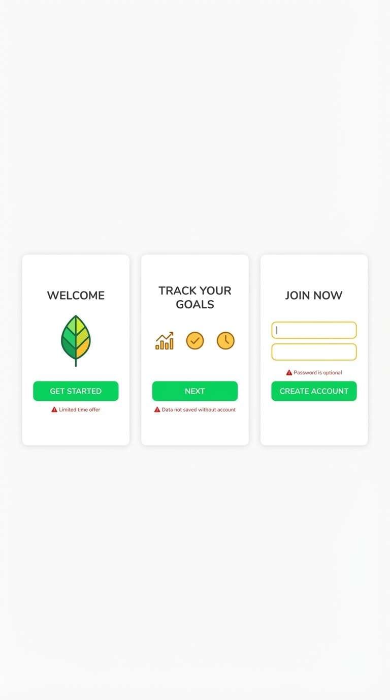
6) Traffic Pop Minimal
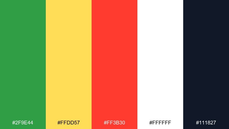
HEX: #2f9e44 #ffdd57 #ff3b30 #ffffff #111827
Mood: bold, clean, high-contrast
Best for: app onboarding screens and feature highlights
Bold and clean, it reads like crisp street signage with a modern app polish. These green yellow red color combinations are perfect when you need instant clarity for next steps, warnings, and confirmations. Pair with lots of white space and a near-black for headings to keep the layout sharp. Usage tip: set yellow as a highlight color rather than a full background to maintain readability.
Image example of traffic pop minimal generated using media.io
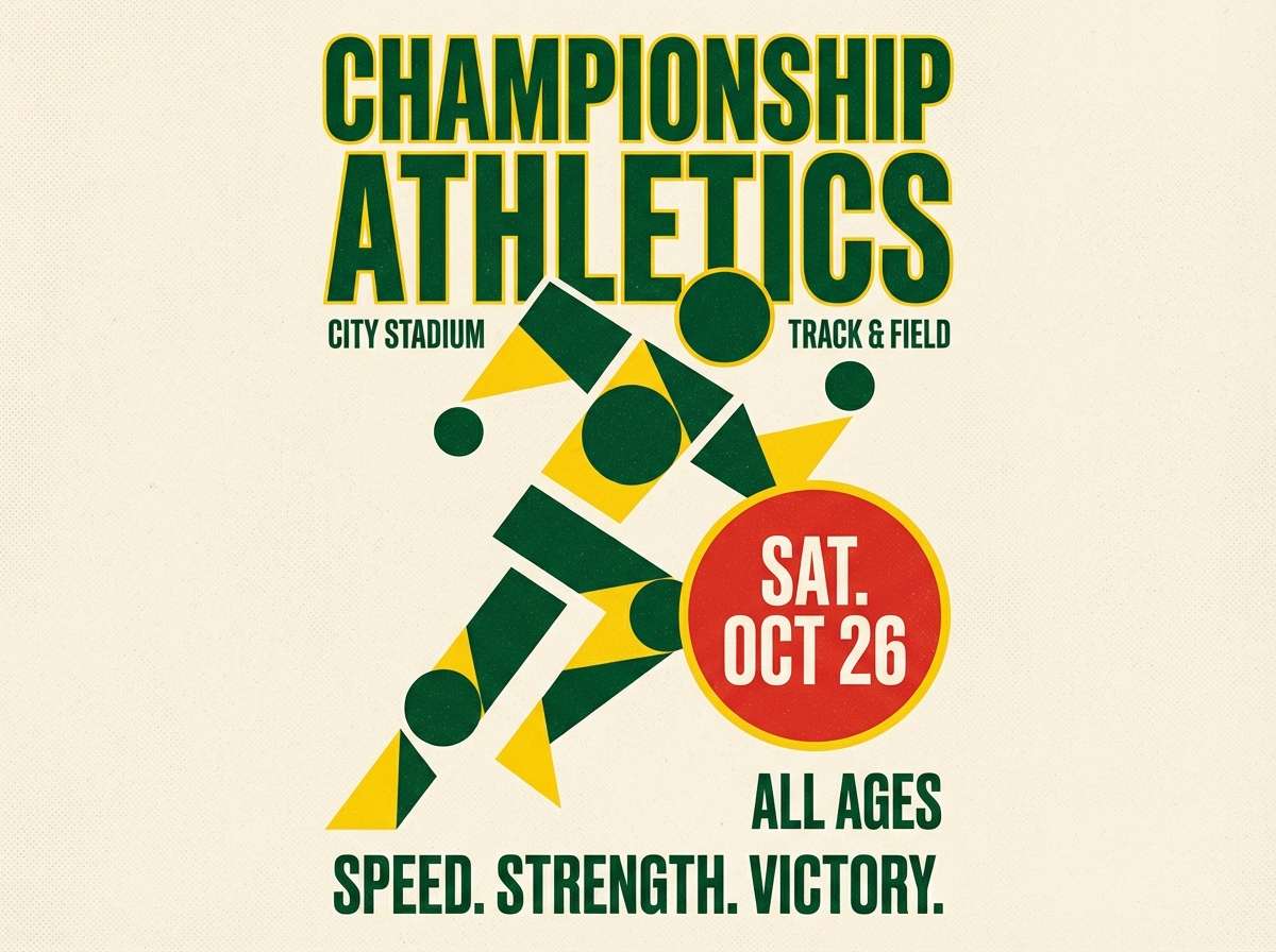
7) Stadium Energy
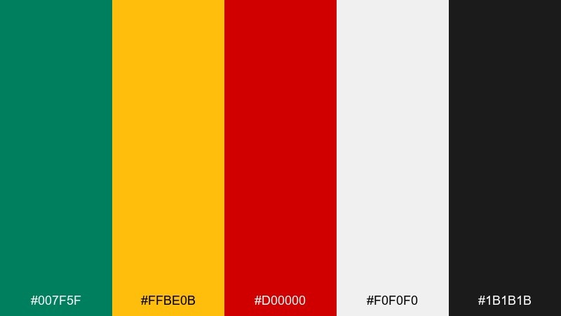
HEX: #007f5f #ffbe0b #d00000 #f0f0f0 #1b1b1b
Mood: competitive, loud, punchy
Best for: sports event flyers and ticket promos
Competitive and loud, it brings to mind stadium lights, chants, and bold jersey graphics. The saturated green and yellow carry the energy, while red delivers urgency for dates and ticket info. It works great for flyers, banners, and promo graphics with big type and simple icons. Usage tip: keep the black for outlines and text so the brights stay crisp at a distance.
Image example of stadium energy generated using media.io
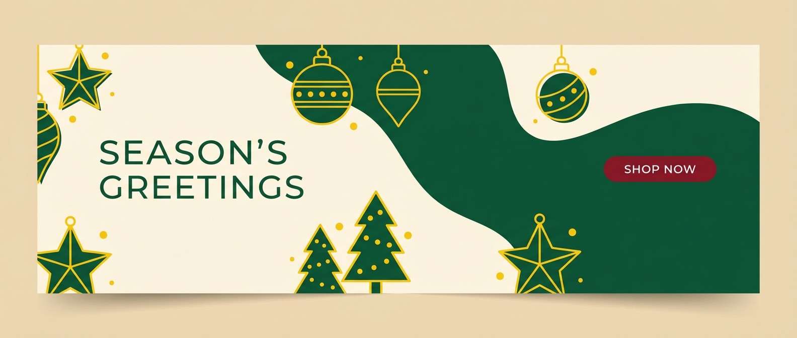
8) Holiday Market Lights
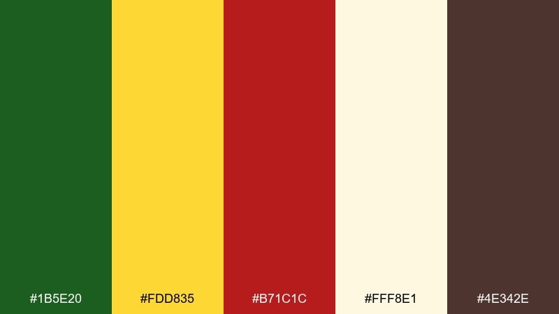
HEX: #1b5e20 #fdd835 #b71c1c #fff8e1 #4e342e
Mood: festive, cozy, nostalgic
Best for: holiday email headers and seasonal promos
Festive and cozy, it feels like garlands, warm bulbs, and cocoa-toned kraft paper. The creamy off-white keeps everything friendly while the deep green anchors the layout. Use it for holiday headers, gift guides, and storewide promo bars. Usage tip: add subtle patterns in the cream area and keep red limited to one key call to action.
Image example of holiday market lights generated using media.io
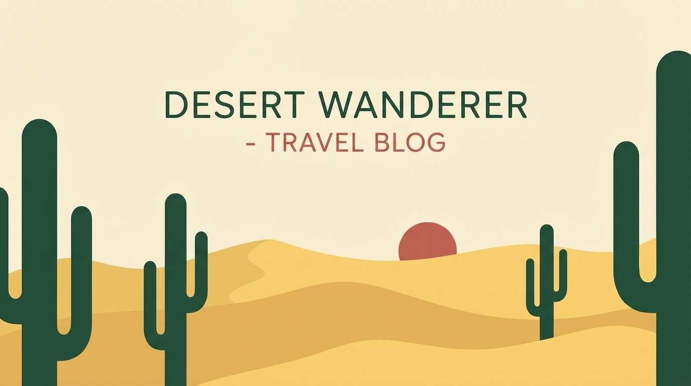
9) Desert Cactus Heat
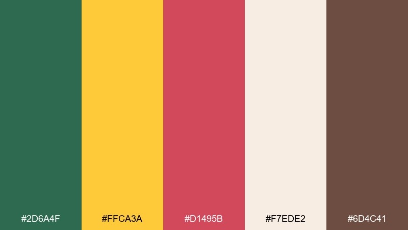
HEX: #2d6a4f #ffca3a #d1495b #f7ede2 #6d4c41
Mood: sunbaked, adventurous, friendly
Best for: travel blog headers and destination graphics
Sunbaked and adventurous, it suggests cactus shadows, golden sand, and a rosy sunset flare. The palette balances warm energy with grounded earthy brown for a natural look. It fits travel blog headers, itinerary covers, and destination thumbnails. Usage tip: use the cream as the sky or negative space, and keep the pink-red for location pins or highlights.
Image example of desert cactus heat generated using media.io
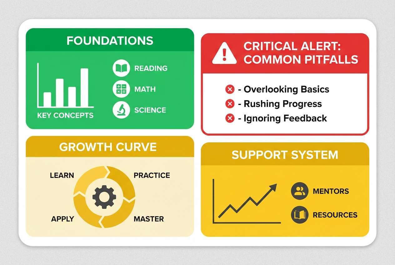
10) Classroom Primary
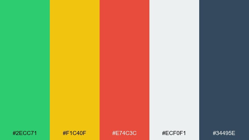
HEX: #2ecc71 #f1c40f #e74c3c #ecf0f1 #34495e
Mood: clear, friendly, instructional
Best for: educational infographics and slide decks
Clear and friendly, it brings back classroom posters and easy-to-scan learning charts. As a green yellow red color scheme, it helps separate categories fast without relying on heavy decoration. Use it for infographics, lesson slides, and simple icon legends, pairing with light gray backgrounds and dark slate text. Usage tip: assign each core color a consistent meaning and stick to it across every page.
Image example of classroom primary generated using media.io
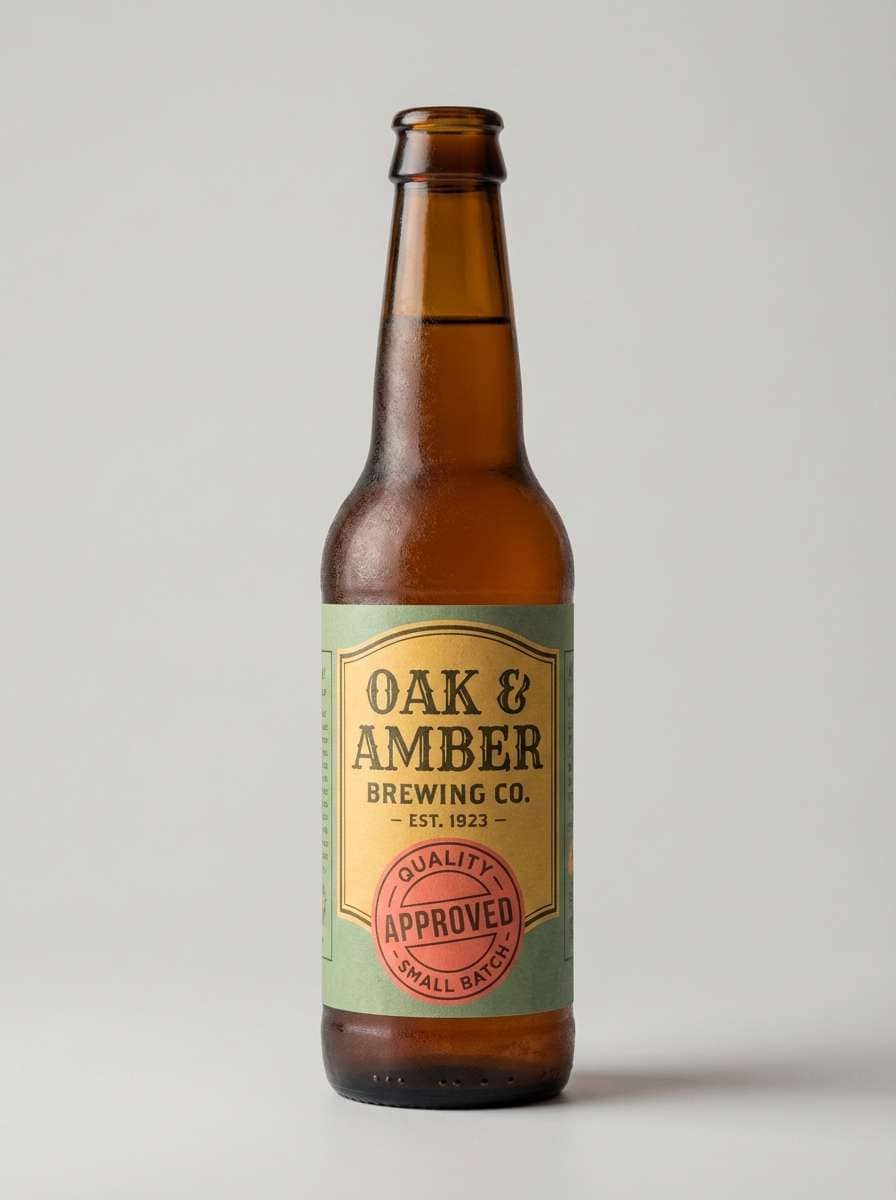
11) Vintage Label Trio
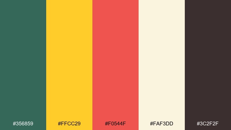
HEX: #356859 #ffcc29 #f0544f #faf3dd #3c2f2f
Mood: nostalgic, crafty, warm
Best for: craft beer labels and bottle branding
Nostalgic and crafty, it feels like letterpress tags, worn paper, and a bright stamp of color. The creamy base makes the set look premium, while the dark brown supports ornate type. It works beautifully for beverage labels, jar branding, and small-batch packaging. Usage tip: add subtle grain or texture in the cream areas to push the vintage vibe without clutter.
Image example of vintage label trio generated using media.io
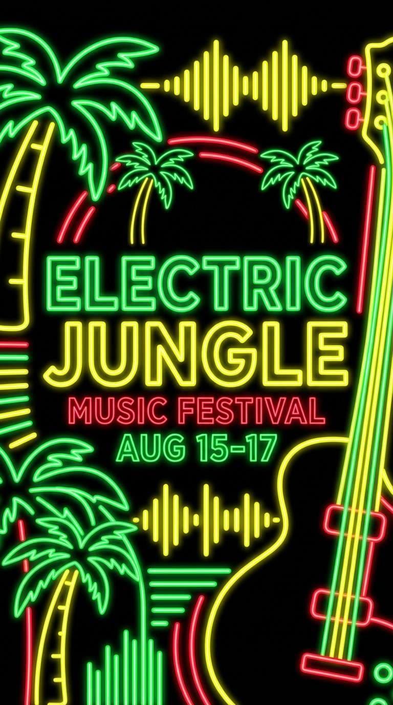
12) Neon Street Signal
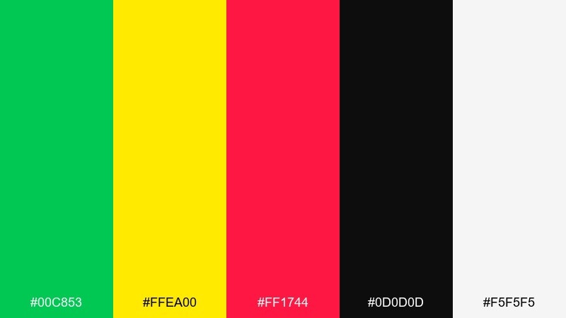
HEX: #00c853 #ffea00 #ff1744 #0d0d0d #f5f5f5
Mood: electric, night-life, energetic
Best for: music festival posters and nightlife promos
Electric and nightlife-ready, it evokes neon tubes against dark asphalt with a bright burst of motion. A green yellow red color palette like this is ideal for posters where hierarchy needs to hit fast from across the room. Pair it with heavy black backgrounds and sharp white type for legibility. Usage tip: keep gradients minimal and lean on solid blocks of color for a crisp, modern edge.
Image example of neon street signal generated using media.io
13) Garden Picnic Soft
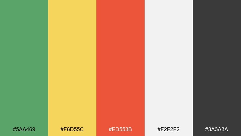
HEX: #5aa469 #f6d55c #ed553b #f2f2f2 #3a3a3a
Mood: relaxed, cheerful, welcoming
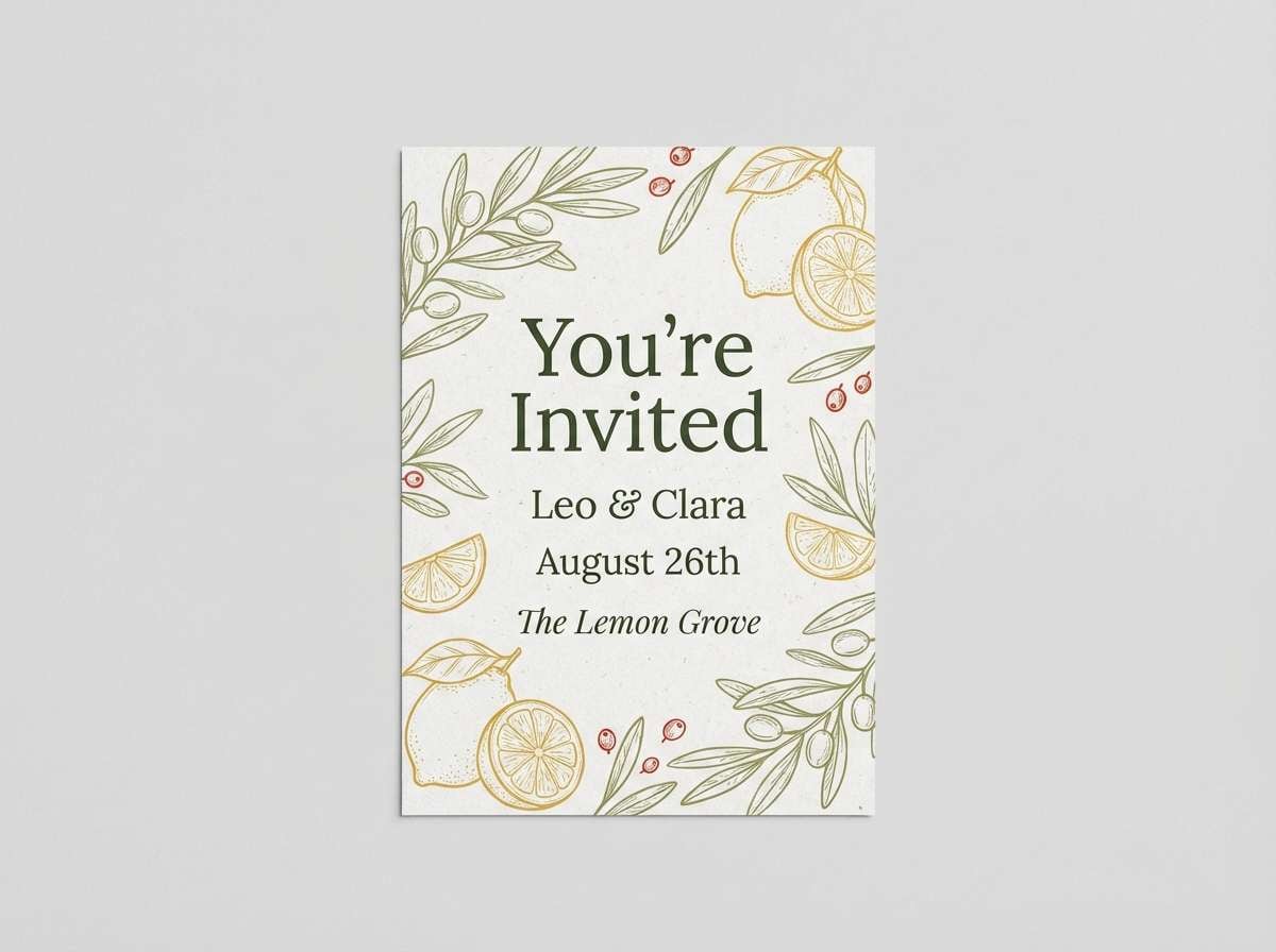
Best for: summer invitation cards and brunch flyers
Relaxed and cheerful, it feels like picnic blankets, lemonade, and a tomato-red garnish. The softened green keeps the palette friendly while the light gray supports airy layouts. Use it for invitations, brunch flyers, and casual event graphics with simple illustrations. Usage tip: set the background to light gray and use the red only for the RSVP or date line.
Image example of garden picnic soft generated using media.io
14) Eco Alert UX
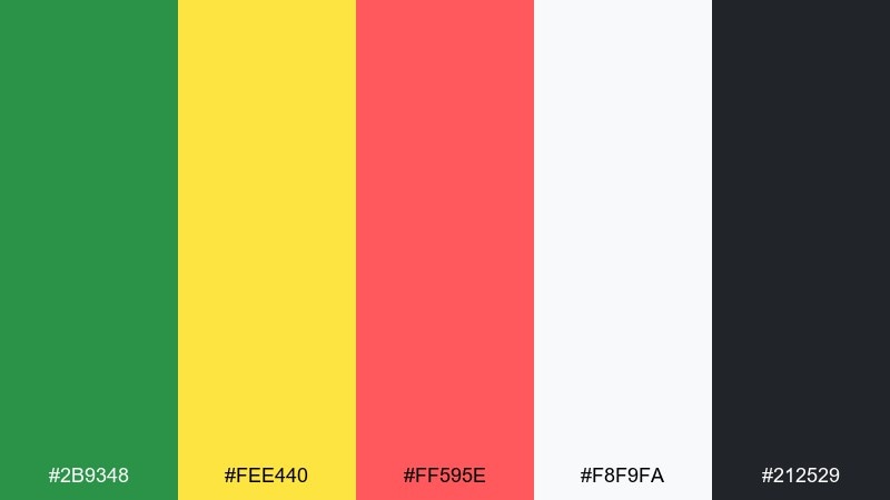
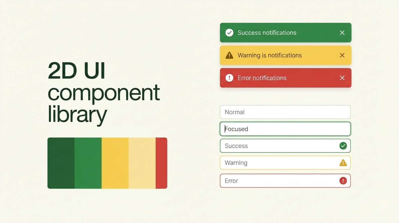
HEX: #2b9348 #fee440 #ff595e #f8f9fa #212529
Mood: modern, clear, action-oriented
Best for: SaaS notification UI components
Modern and action-oriented, it suggests smart status lights with a clean, eco-leaning vibe. These green yellow red color combinations make it easy to communicate success, caution, and error states without extra explanation. Use it for banners, toasts, and inline validation, pairing with soft off-white surfaces and strong dark text. Usage tip: apply red only to critical errors and let yellow cover warnings so the UI feels calmer.
Image example of eco alert ux generated using media.io
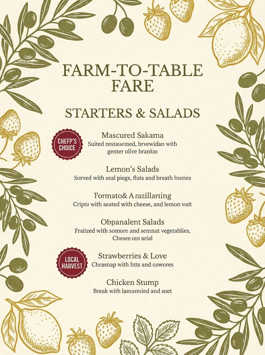
15) Rustic Orchard
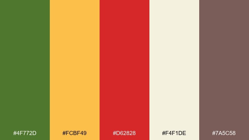
HEX: #4f772d #fcbf49 #d62828 #f4f1de #7a5c58
Mood: homespun, hearty, seasonal
Best for: farm-to-table menus and restaurant specials
Homespun and hearty, it brings to mind orchard rows, baked pies, and handwritten menu boards. The cream base reads like textured paper, while the brown adds a comforting, grounded tone. It works for menus, specials boards, and small restaurant identity systems. Usage tip: use the yellow for section headers and keep the red for featured dishes or limited-time badges.
Image example of rustic orchard generated using media.io
16) Tropical Roadtrip
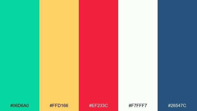
HEX: #06d6a0 #ffd166 #ef233c #f7fff7 #26547c
Mood: bright, breezy, adventurous
Best for: social media carousel templates
Bright and breezy, it feels like roadside fruit stands and sun glare on a windshield. The minty green cools the warmth of yellow and red, while the navy adds structure for type. Use it for carousels, promo tiles, and punchy announcements that need playful energy. Usage tip: alternate mint and off-white backgrounds across slides to keep the feed looking varied but cohesive.
Image example of tropical roadtrip generated using media.io
17) Urban Safety Stripe
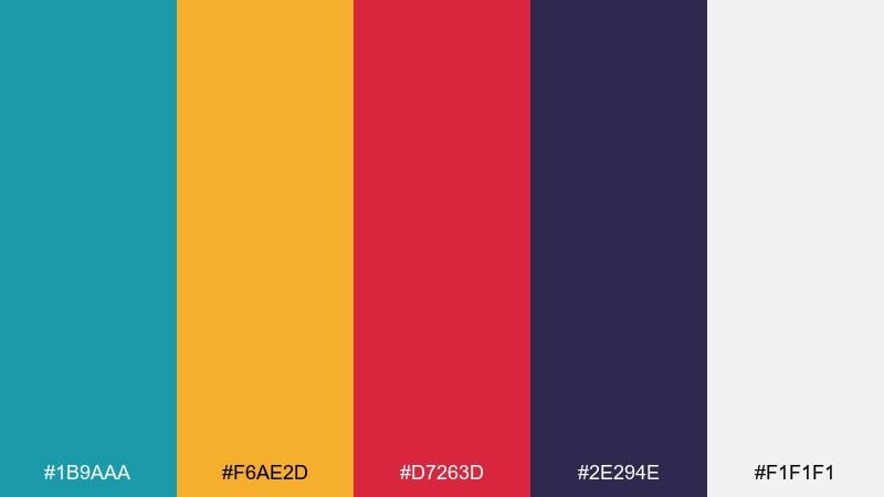
HEX: #1b9aaa #f6ae2d #d7263d #2e294e #f1f1f1
Mood: industrial, confident, high-visibility
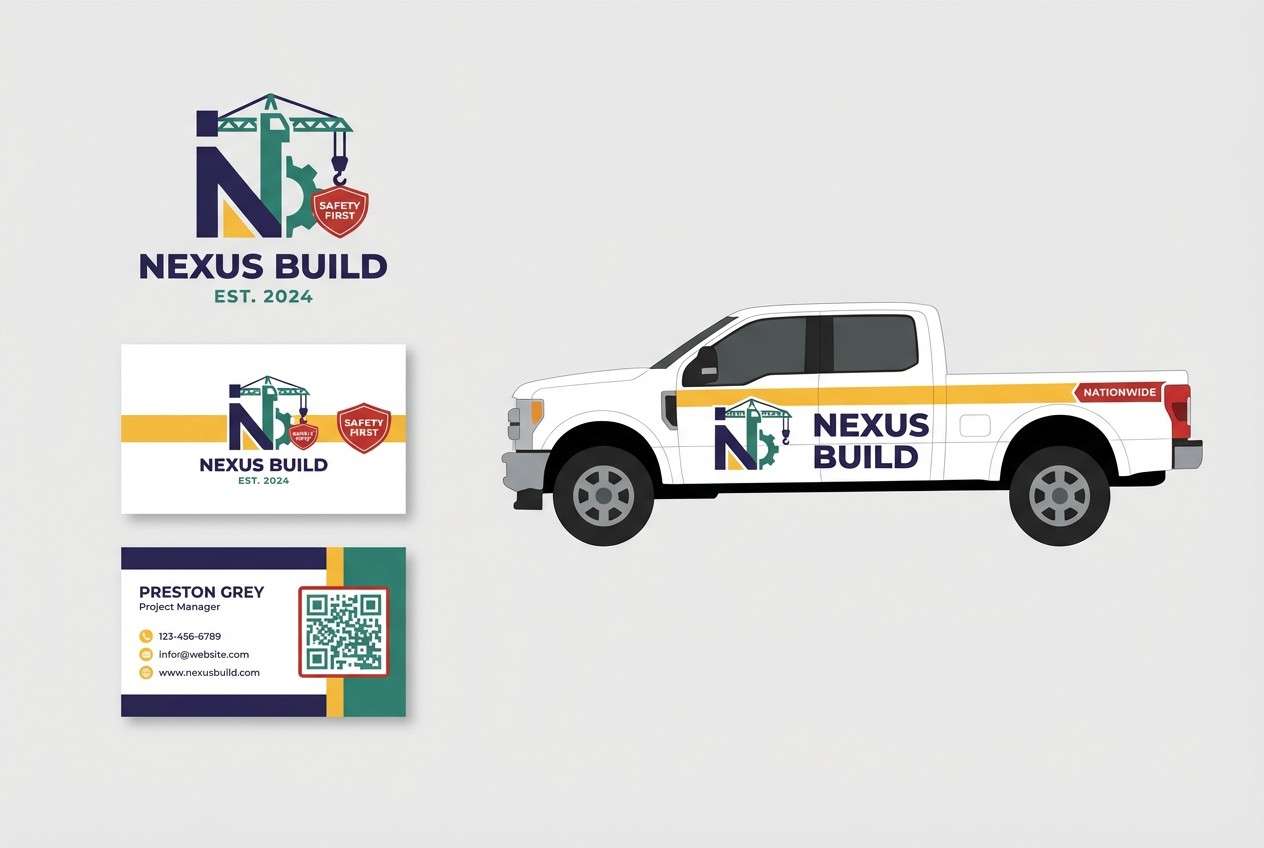
Best for: construction branding and service trucks
Industrial and high-visibility, it recalls safety stripes, city scaffolding, and bold wayfinding. A green yellow red color palette in this direction can feel more modern by letting the deep indigo replace pure black. It fits construction branding, uniforms, and vehicle decals that must read quickly. Usage tip: build layouts with strong diagonal blocks and keep the light gray as a buffer for small text.
Image example of urban safety stripe generated using media.io
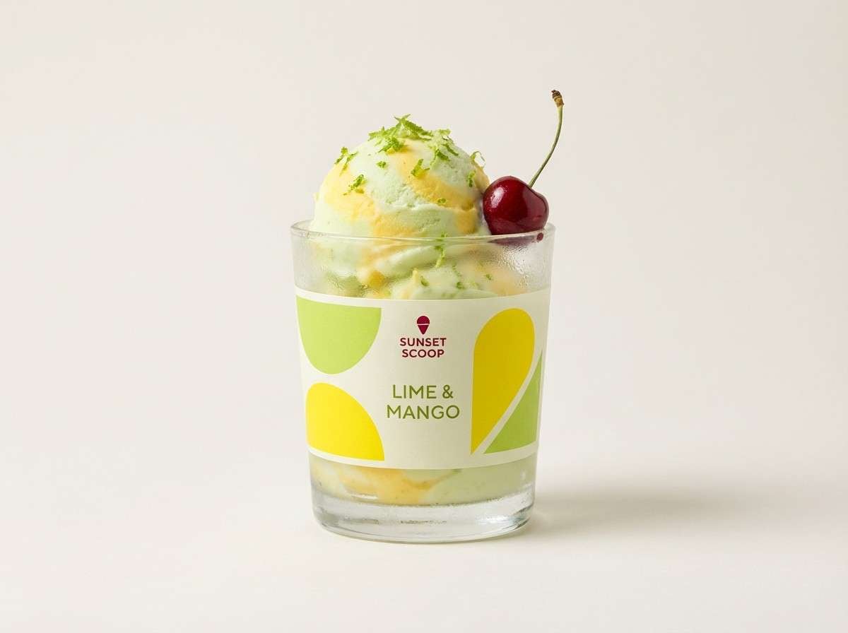
18) Cherry Lime Sorbet
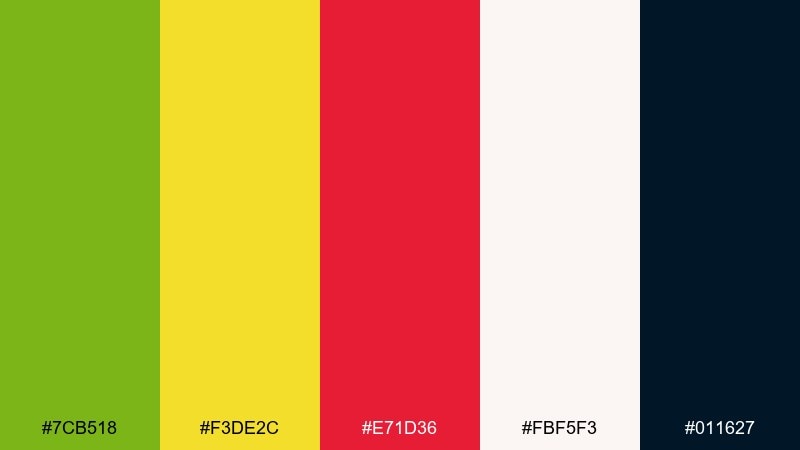
HEX: #7cb518 #f3de2c #e71d36 #fbf5f3 #011627
Mood: sweet, punchy, youthful
Best for: dessert shop ads and product promos
Sweet and punchy, it looks like sorbet swirls with a tart lime twist. The nearly-black adds sophistication so the bright hues feel intentional instead of childish. Use it for dessert ads, menu highlights, and limited flavor drops where you want instant appetite cues. Usage tip: keep the background pale and let the red carry the hero product name for maximum impact.
Image example of cherry lime sorbet generated using media.io
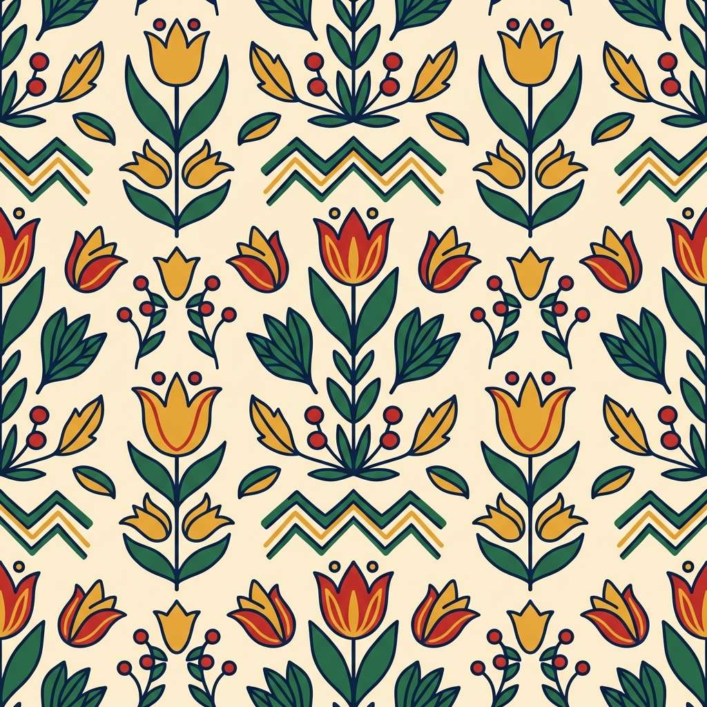
19) Modern Folk Art
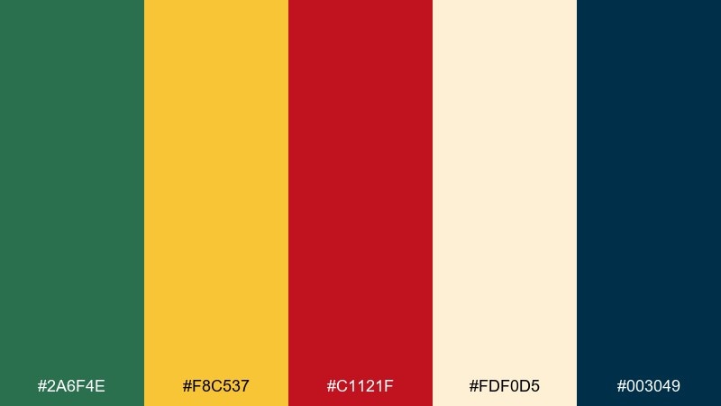
HEX: #2a6f4e #f8c537 #c1121f #fdf0d5 #003049
Mood: artsy, handcrafted, bold
Best for: textile patterns and wallpaper prints
Artsy and handcrafted, it feels like cut-paper shapes and painted motifs with a modern finish. The creamy base keeps the pattern light, while the navy adds depth and outline options. It is ideal for textile repeats, wallpaper, and packaging wraps that need personality. Usage tip: choose two dominant colors per repeat and rotate accents to avoid visual noise.
Image example of modern folk art generated using media.io
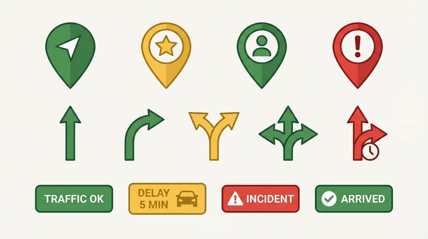
20) Warm Transit Icons
HEX: #198754 #ffc107 #dc3545 #f8f9fa #343a40
Mood: practical, friendly, navigational
Best for: icon sets for navigation apps
Practical and friendly, it evokes transit maps, clear labels, and quick-glance direction cues. The light background and dark gray keep icons readable while the three brights define priority states. Use it for icon systems, map pins, and small UI elements that must work at tiny sizes. Usage tip: test icons at 16px and ensure the yellow always has a dark outline or shadow for contrast.
Image example of warm transit icons generated using media.io
What Colors Go Well with Green Yellow Red?
Neutrals are the easiest stabilizers: white and cream keep the palette airy, while charcoal, black, and deep gray make bright accents feel intentional and readable.
For a more designed look, swap black for navy or deep indigo, or add a muted brown for a crafted, earthy vibe—especially in packaging and editorial layouts.
If you want extra freshness, a pale aqua or cool off-white can soften the heat of red and yellow while still letting green stay the hero.
How to Use a Green Yellow Red Color Palette in Real Designs
Start with a rule of proportion: pick one dominant color (often green), one support (yellow), and keep red as a small accent for CTAs, alerts, or featured labels.
Design for contrast and accessibility—yellow frequently needs a dark outline, shadow, or dark text to pass readability checks, especially in UI and icon sizes.
Keep surfaces neutral and consistent, then use green/yellow/red to communicate meaning (success/warning/error) so users understand your interface or poster at a glance.
Create Green Yellow Red Palette Visuals with AI
If you already have HEX codes, you can quickly generate matching posters, UI mockups, packaging shots, and patterns by describing the composition and where each color should dominate.
Use the prompts above as templates: specify background color, dominant hues, accent placement, and the style (flat vector, studio product shot, editorial layout) for consistent results.
Media.io makes it easy to turn a green yellow red color palette into usable design visuals you can iterate on in seconds.
Green Yellow Red Color Palette FAQs
-
Is green yellow red a good palette for branding?
Yes—this triad is memorable and high-contrast. Use green as the primary brand color, yellow for highlights, and keep red minimal for key actions so the brand feels energetic without becoming overwhelming. -
How do I keep a green yellow red color scheme from looking like a traffic light?
Shift the hues and values: try teal-leaning greens, mustard or sandy yellows, and coral/terracotta reds. Add a strong neutral (cream, navy, charcoal) and limit red to small accents. -
What background works best with green yellow red color combinations?
White, warm cream, light gray, and deep charcoal are the safest choices. Light backgrounds feel modern and clean, while dark backgrounds make the colors feel neon and poster-ready. -
Which text color is most readable with these bright colors?
Charcoal/near-black and deep navy are the most reliable for body text. Avoid placing light text directly on yellow unless you add a dark outline or significantly darken the yellow. -
Can I use green yellow red in UI design for status colors?
Absolutely—green for success, yellow for warnings, and red for errors is a common UI convention. Pair it with neutral surfaces and test contrast ratios, especially for yellow badges and icons. -
What’s the easiest proportion rule for this palette?
Try 70/20/10: 70% neutral or green (base), 20% yellow (support/highlights), and 10% red (CTAs, alerts, or featured labels). Adjust based on your layout and readability needs. -
How can I generate matching images for my palette quickly?
Use Media.io text-to-image and describe the layout plus which colors should be dominant vs. accents. Including your style keywords (flat vector, studio product shot, editorial grid) helps keep outputs consistent.


