

Purple plum is a rich, modern purple with a romantic edge—deep enough for premium branding, but flexible enough for UI, print, and social design. If you’re starting from HEX #5A2A5F, the right supporting colors will decide whether it feels vintage, futuristic, cozy, or editorial.
Below are 20+ curated purple plum color palette ideas with mood notes, pairing tips, and AI-ready prompts you can use to generate matching visuals fast.
In this article
- Why Purple Plum Palettes Work So Well
-
- velvet orchid evening
- plum wine and gold
- dusty mauve minimal
- midnight plum charcoal
- berry sorbet pop
- plum sage balance
- antique plum and linen
- neon plum nightlife
- cocoa plum comfort
- coastal plum and fog
- plum lavender calm
- modern plum and teal
- plum peach glow
- botanical plum and olive
- grape soda gradient
- royal plum and silver
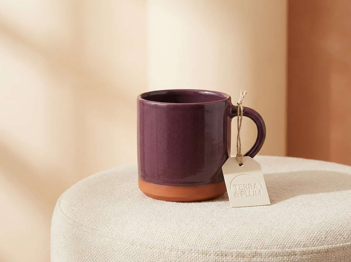
- plum terracotta studio
- soft plum kids pastel
- plum ink editorial
- plum sunset gradient
- plum minimal mono
- What Colors Go Well with Purple Plum?
- How to Use a Purple Plum Color Palette in Real Designs
- Create Purple Plum Palette Visuals with AI
Why Purple Plum Palettes Work So Well
Purple plum sits in a “premium sweet spot”: it has the depth of a dark purple, but with warmer red undertones that feel human and emotive. That makes it ideal for brands that want sophistication without looking cold or overly corporate.
It also plays nicely with both warm and cool companions. You can push it toward romance with blush and peach, toward modern tech with charcoal and silver, or toward earthy wellness with sage and olive.
From a design-system standpoint, plum is excellent for hierarchy. Dark plums create strong headers and navigation, while lilac tints and warm neutrals make soft backgrounds that keep layouts readable and refined.
20+ Purple Plum Color Palette Ideas (with HEX Codes)
1) Velvet Orchid Evening
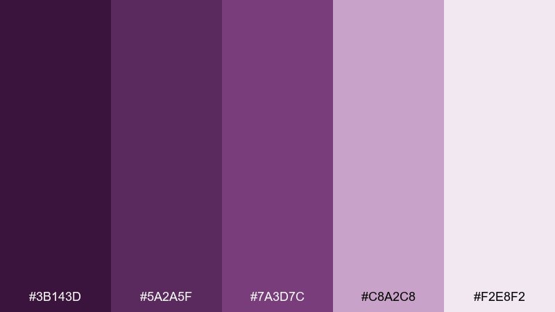
HEX: #3B143D #5A2A5F #7A3D7C #C8A2C8 #F2E8F2
Mood: luxe, romantic, evening
Best for: beauty branding and elegant landing pages
Luxe and candlelit, these orchid and plum tones feel like velvet drapery and soft perfume. The contrast between deep purple and airy lilac gives hierarchy without looking harsh. Pair it with warm white space and subtle grain textures to keep it modern. For a polished purple plum color palette, use the darkest shade for headers and the pale lilac for panels and cards.
Image example of velvet orchid evening generated using media.io
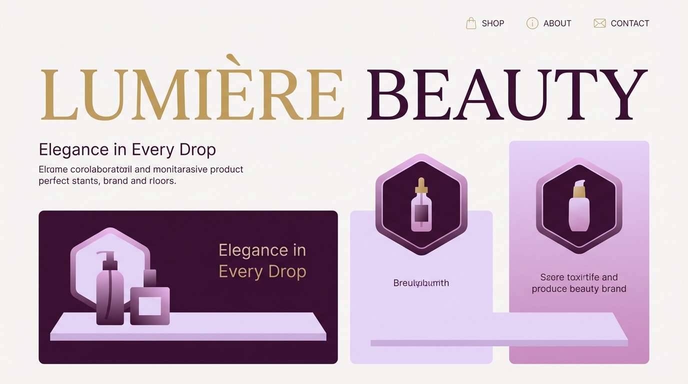
Media.io is an online AI studio for creating and editing video, image, and audio in your browser.

2) Plum Wine and Gold
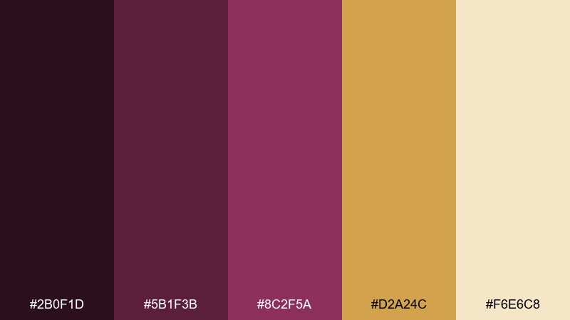
HEX: #2B0F1D #5B1F3B #8C2F5A #D2A24C #F6E6C8
Mood: opulent, warm, festive
Best for: premium packaging and holiday product ads
Opulent and toasty, it reads like mulled wine with a glint of antique brass. The gold accent adds instant value while the creamy beige keeps the palette from feeling heavy. Use gold sparingly for seals, borders, or callouts, and let the wine shades carry the main blocks. A matte finish with a single metallic highlight will make the contrast look intentional.
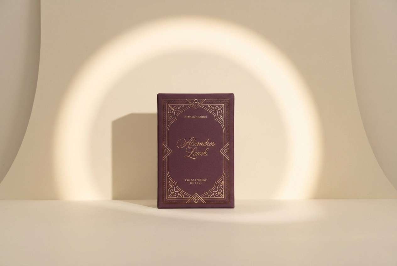
Image example of plum wine and gold generated using media.io
3) Dusty Mauve Minimal
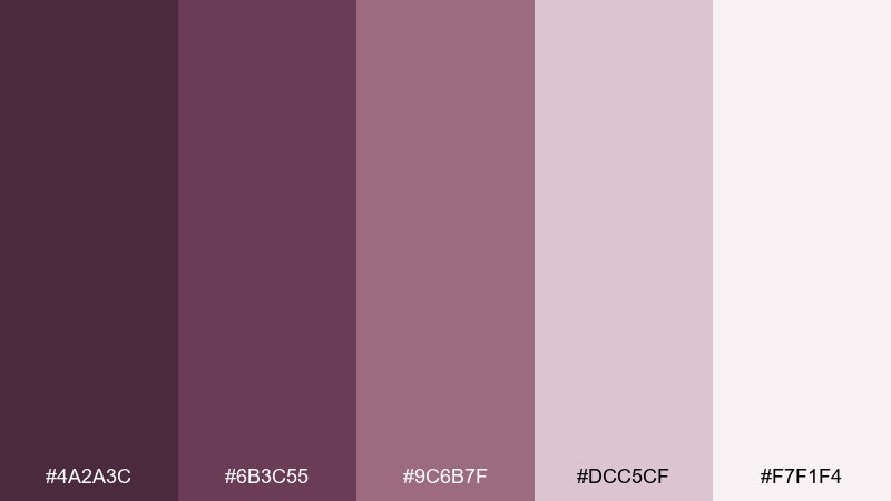
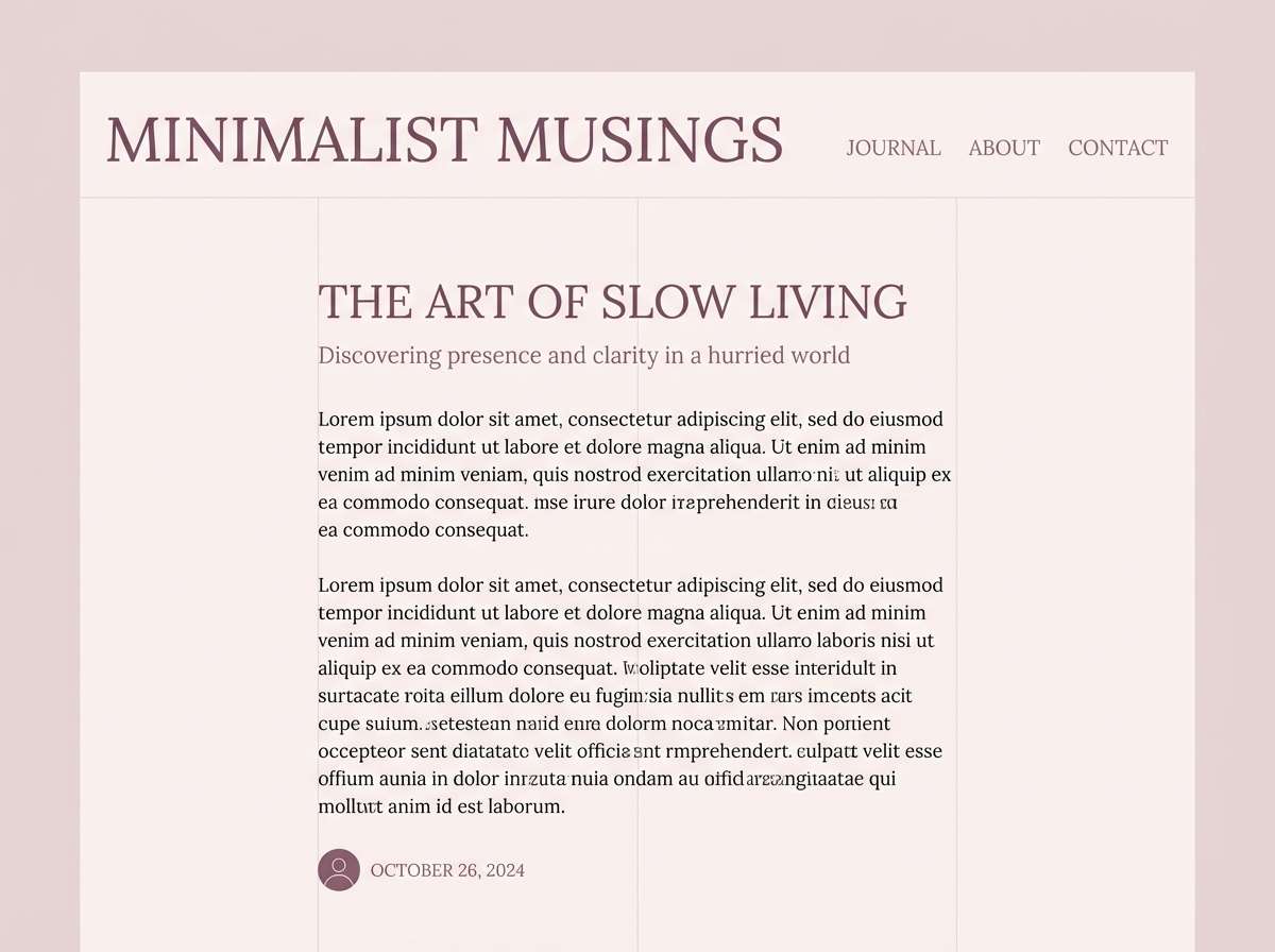
HEX: #4A2A3C #6B3C55 #9C6B7F #DCC5CF #F7F1F4
Mood: soft, modern, editorial
Best for: blog headers, stationery, and calm UI themes
Soft and powdery, these mauve-plum tones feel like dried petals on linen. The mid shades are gentle enough for large areas, while the deeper plum anchors typography. Pair with off-white, thin line icons, and plenty of spacing for a minimalist look. Keep contrast accessible by using the darkest tone for text on the palest background.
Image example of dusty mauve minimal generated using media.io
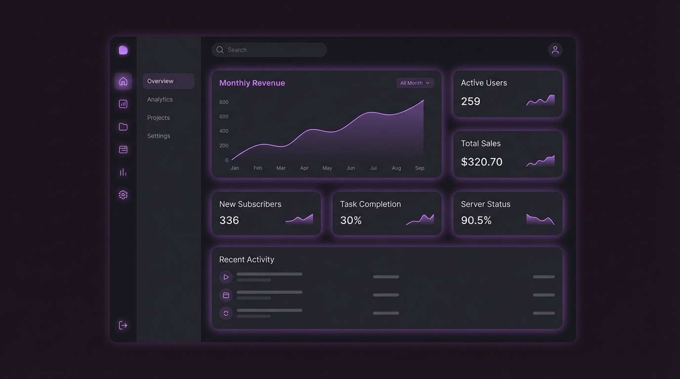
4) Midnight Plum Charcoal
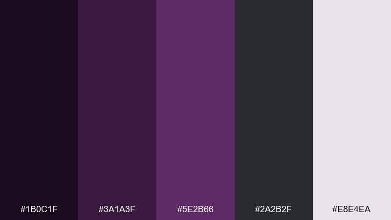
HEX: #1B0C1F #3A1A3F #5E2B66 #2A2B2F #E8E4EA
Mood: dramatic, sleek, cinematic
Best for: tech branding, dark mode UI, and posters
Dramatic and cinematic, it feels like city lights after rain with a violet glow. Charcoal adds a neutral backbone, letting plum accents pop without turning sugary. Pair with crisp off-white type and thin strokes for a premium, modern finish. Use the light gray-lilac as a highlight color for focus states and charts.
Image example of midnight plum charcoal generated using media.io
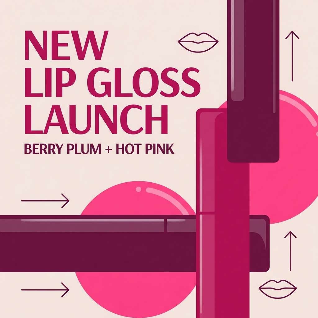
5) Berry Sorbet Pop
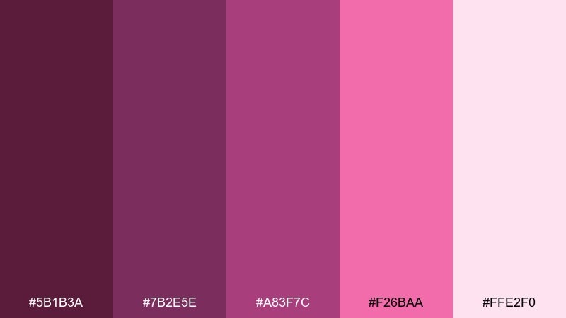
HEX: #5B1B3A #7B2E5E #A83F7C #F26BAA #FFE2F0
Mood: playful, bold, sweet
Best for: cosmetics promos and social ads
Playful and punchy, it evokes berry gelato with bright whipped frosting. The hot pink brings energy, while the pale blush keeps it friendly for backgrounds. Pair with rounded typography and simple shapes so the color does the talking. For ads, reserve the brightest pink for one CTA and keep the rest in deeper berry tones.
Image example of berry sorbet pop generated using media.io
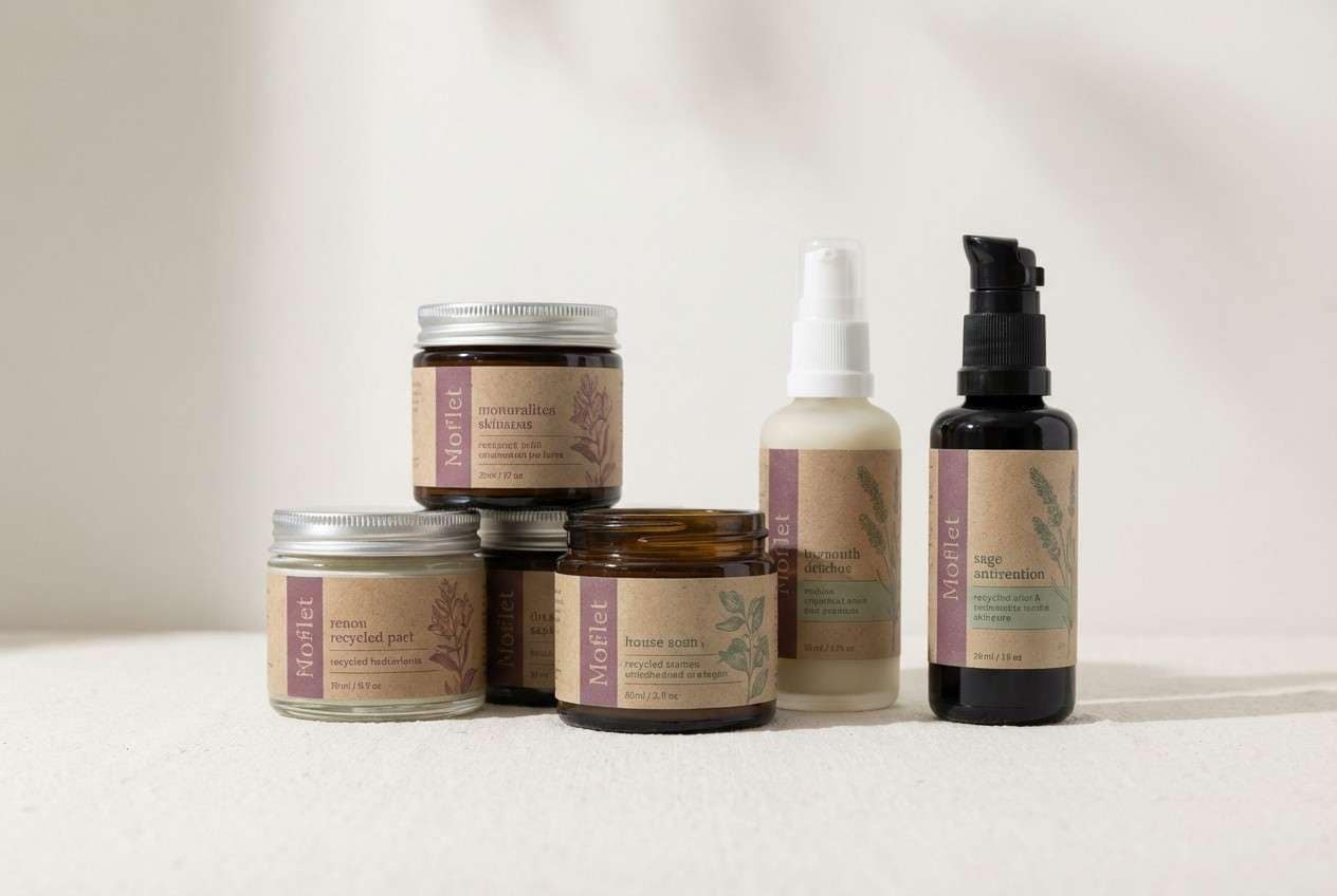
6) Plum Sage Balance
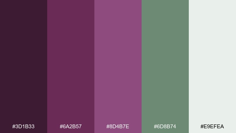
HEX: #3D1B33 #6A2B57 #8D4B7E #6D8B74 #E9EFEA
Mood: grounded, natural, sophisticated
Best for: wellness brands and eco product packaging
Grounded and botanical, it feels like ripe fruit beside crushed sage leaves. The green softens the plum and makes the overall mix look more mature and earthy. Pair with recycled paper textures, muted photography, and minimal iconography. Use sage as the supporting field color and keep plum for logos and key labels.
Image example of plum sage balance generated using media.io
7) Antique Plum and Linen
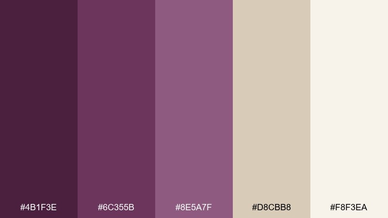
HEX: #4B1F3E #6C355B #8E5A7F #D8CBB8 #F8F3EA
Mood: vintage, cozy, refined
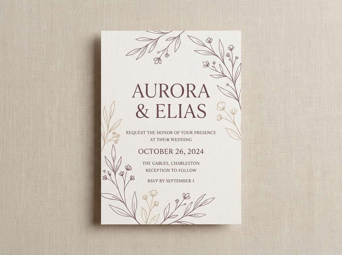
Best for: wedding invitations and artisanal branding
Vintage and cozy, it recalls antique silk, old books, and warm linen. The beige neutrals make the plum feel approachable and timeless rather than dramatic. Pair with serif typography, thin borders, and a touch of embossing or letterpress styling. Keep the mid plum for florals or ornaments and use the light linen tone as the main paper field.
Image example of antique plum and linen generated using media.io
8) Neon Plum Nightlife
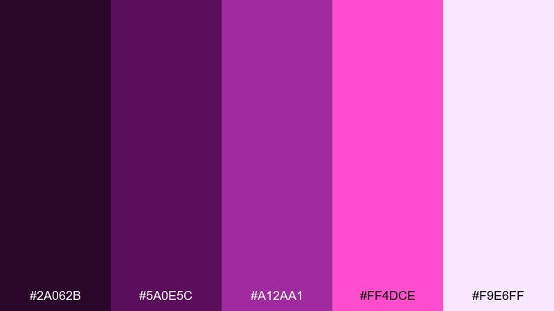
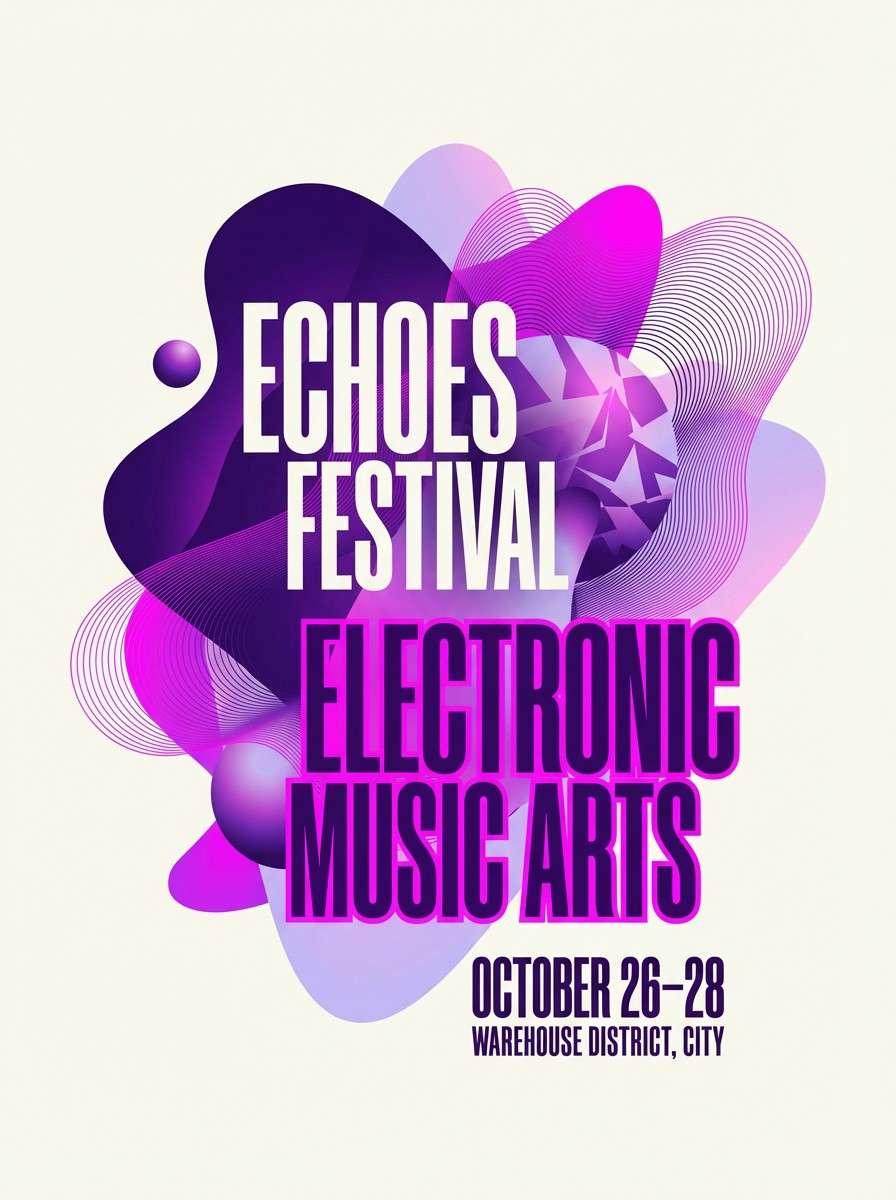
HEX: #2A062B #5A0E5C #A12AA1 #FF4DCE #F9E6FF
Mood: electric, nightlife, futuristic
Best for: event posters and music flyers
Electric and late-night, it feels like neon signage reflecting on glossy pavement. The bright magenta works best as a spotlight, while the deep violet keeps the mood underground. Pair with condensed type, high contrast layouts, and simple gradients for motion. Use the light lavender only as a thin halo or highlight to avoid washing out the punch.
Image example of neon plum nightlife generated using media.io
9) Cocoa Plum Comfort
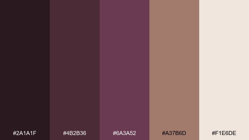
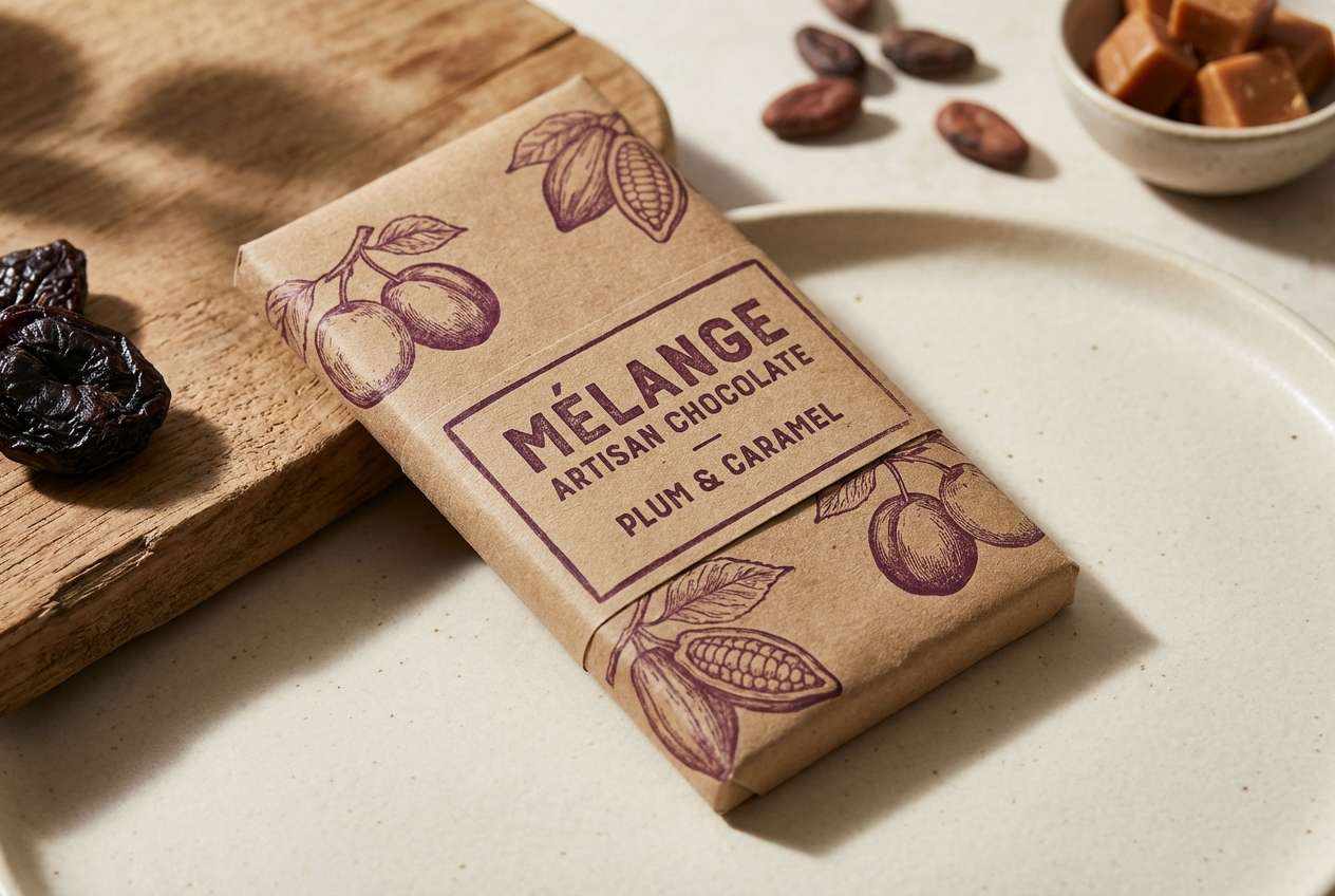
HEX: #2A1A1F #4B2B36 #6A3A52 #A37B6D #F1E6DE
Mood: warm, cozy, understated
Best for: coffee shops, artisan food labels, and menus
Warm and comforting, it suggests cocoa, mulberry jam, and toasted caramel. The brown-leaning plum shades feel inviting and work beautifully with kraft textures. Pair with hand-drawn icons or subtle emboss effects for a small-batch look. For menus, keep the light cream as the base and use the deepest tone for section headers.
Image example of cocoa plum comfort generated using media.io
10) Coastal Plum and Fog
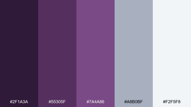
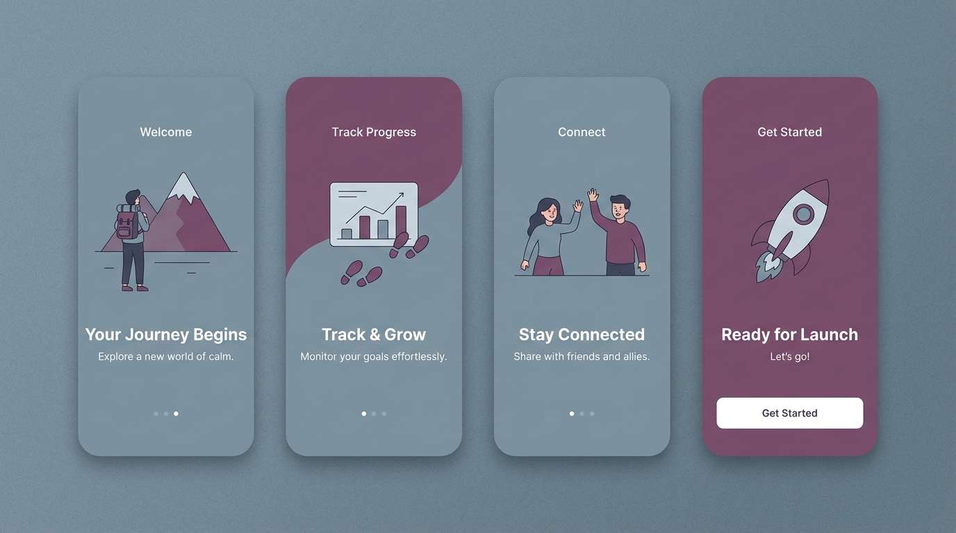
HEX: #2F1A3A #55305F #7A4A86 #A8B0BF #F2F5F8
Mood: cool, airy, contemporary
Best for: app onboarding screens and calm presentations
Cool and airy, it looks like twilight plum drifting into coastal fog. The blue-gray tones give breathing room and keep the purple from feeling too sweet. Pair with clean sans-serif type and soft card shadows for a modern product feel. Use the foggy gray as your primary background and save plum for progress states and key icons.
Image example of coastal plum and fog generated using media.io
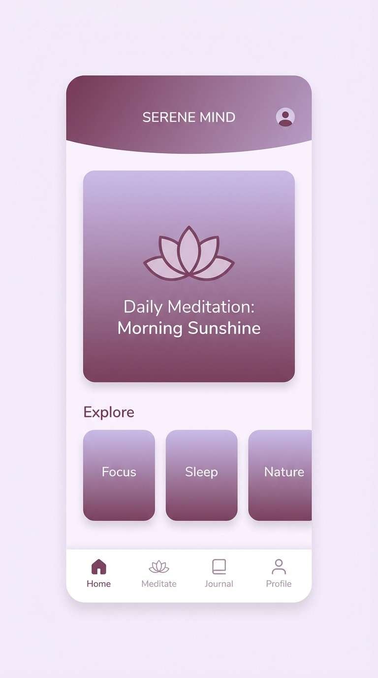
11) Plum Lavender Calm
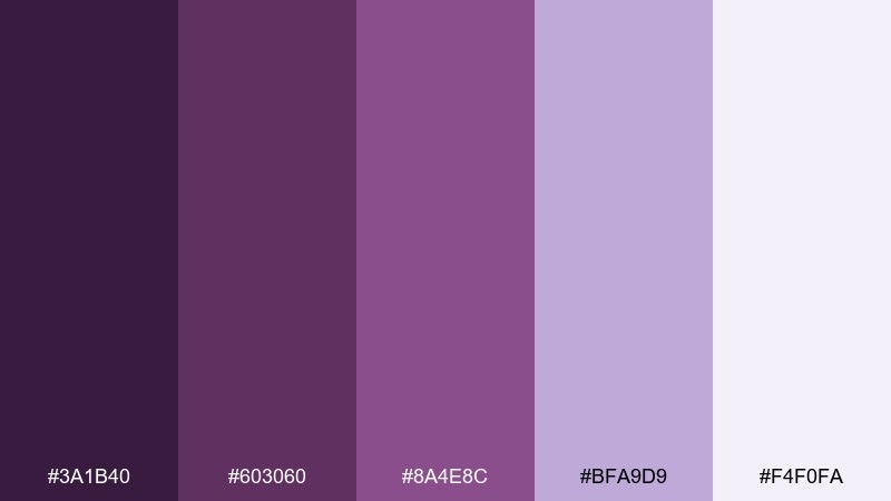
HEX: #3A1B40 #603060 #8A4E8C #BFA9D9 #F4F0FA
Mood: calm, dreamy, soothing
Best for: spa brochures and mindfulness apps
Calm and dreamy, it feels like lavender steam and soft evening light. The gentle gradient from deep plum to pale lilac makes interfaces feel quiet and reassuring. This purple plum color scheme pairs well with warm gray typography and simple line icons. Tip: keep saturation low on large sections, and use the deeper shade only for key navigation and headings.
Image example of plum lavender calm generated using media.io
12) Modern Plum and Teal
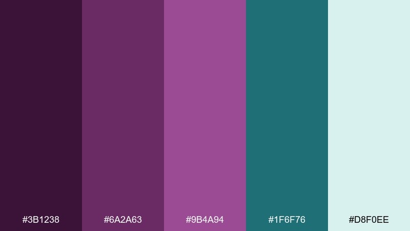
HEX: #3B1238 #6A2A63 #9B4A94 #1F6F76 #D8F0EE
Mood: fresh, confident, modern
Best for: startup branding and web hero sections
Fresh and confident, it mixes juicy plum with a crisp teal that feels modern and decisive. The cool minty tint lifts the set and keeps the darker shades from dominating. Among purple plum color combinations, this pairing works best when teal is the accent and plum carries the brand voice. Try teal for links and badges, then keep backgrounds airy with the pale aqua.
Image example of modern plum and teal generated using media.io

13) Plum Peach Glow
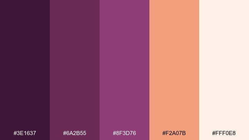
HEX: #3E1637 #6A2B55 #8F3D76 #F2A07B #FFF0E8
Mood: warm, flattering, romantic
Best for: lifestyle newsletters and creator branding
Warm and flattering, it brings to mind peach sunset light against deep plum shadows. The peach accent adds friendliness and works great for highlights and stickers. Pair with creamy backgrounds and soft photography for an approachable, editorial feel. Use peach in small doses for buttons or price tags so it stays special.
Image example of plum peach glow generated using media.io
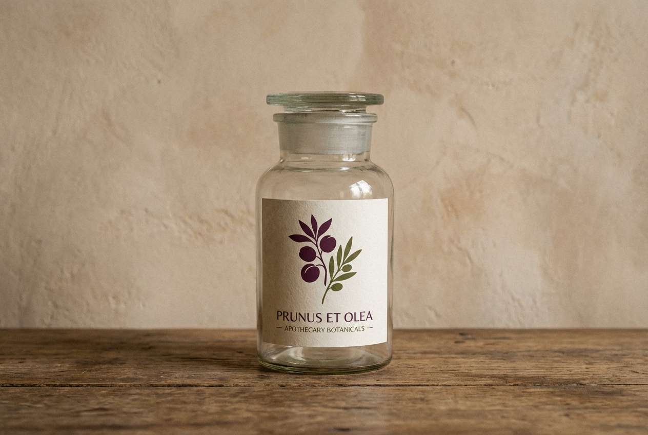
14) Botanical Plum and Olive
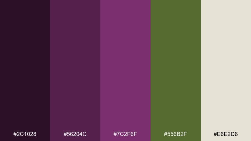
HEX: #2C1028 #56204C #7C2F6F #556B2F #E6E2D6
Mood: earthy, moody, botanical
Best for: herbal packaging and apothecary labels
Earthy and moody, it feels like forest shade with ripe plum skin. Olive green adds a herbal note that makes the set feel grounded and vintage. Pair with textured paper, stamped marks, and simple botanical drawings. For labels, keep text in the darkest plum and use the warm neutral as the main label field.
Image example of botanical plum and olive generated using media.io
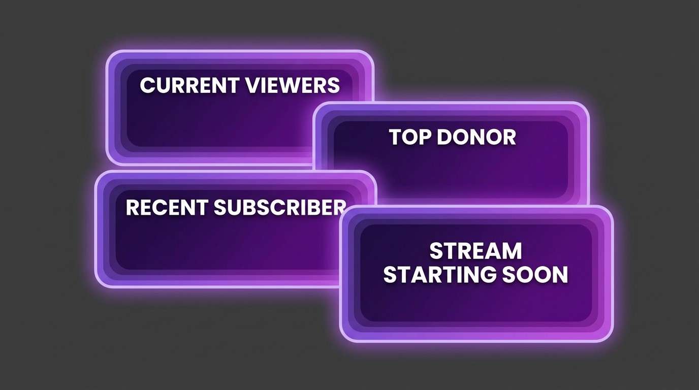
15) Grape Soda Gradient
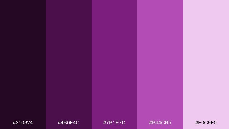
HEX: #250824 #4B0F4C #7B1E7D #B44CB5 #F0C9F0
Mood: vibrant, glossy, youthful
Best for: stream overlays and bold digital banners
Vibrant and glossy, it looks like grape soda bubbles rising through a purple gradient. The stepped values make it easy to build depth with shadows, glows, and layered shapes. Pair with black or very dark plum outlines to keep the bright tones crisp. Tip: use the lightest tint for highlights only, so the gradient stays punchy.
Image example of grape soda gradient generated using media.io
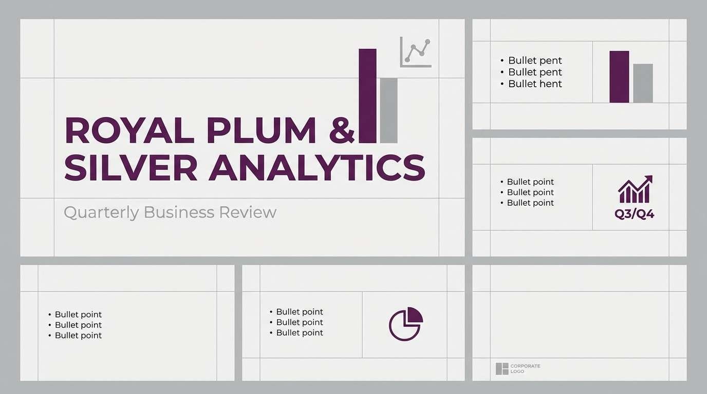
16) Royal Plum and Silver
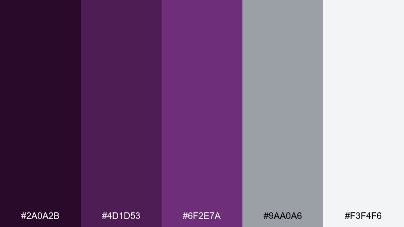
HEX: #2A0A2B #4D1D53 #6F2E7A #9AA0A6 #F3F4F6
Mood: formal, polished, high-end
Best for: corporate branding and keynote templates
Formal and polished, it feels like royal velvet paired with brushed metal. Silver-gray adds structure, making the deep purple look sharp instead of romantic. Pair with geometric layouts, plenty of margins, and a restrained accent style. Use the mid plum for charts and the darkest shade for title bars to keep slides readable.
Image example of royal plum and silver generated using media.io
17) Plum Terracotta Studio
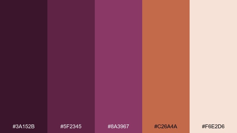
HEX: #3A152B #5F2345 #8A3967 #C26A4A #F6E2D6
Mood: artsy, warm, handcrafted
Best for: ceramics brands and studio product cards
Artsy and warm, it reads like plum ink next to sunbaked terracotta clay. The earthy orange brings a handcrafted vibe that works well for makers and studios. Pair with natural paper, subtle shadows, and simple product photography. Tip: keep terracotta as a small highlight for price tags or stamps and let plum carry the typography.
Image example of plum terracotta studio generated using media.io
18) Soft Plum Kids Pastel
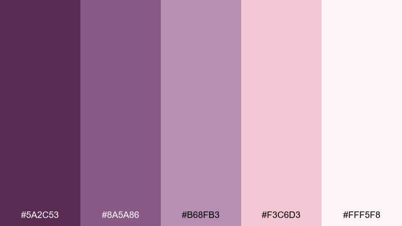
HEX: #5A2C53 #8A5A86 #B68FB3 #F3C6D3 #FFF5F8
Mood: sweet, gentle, friendly
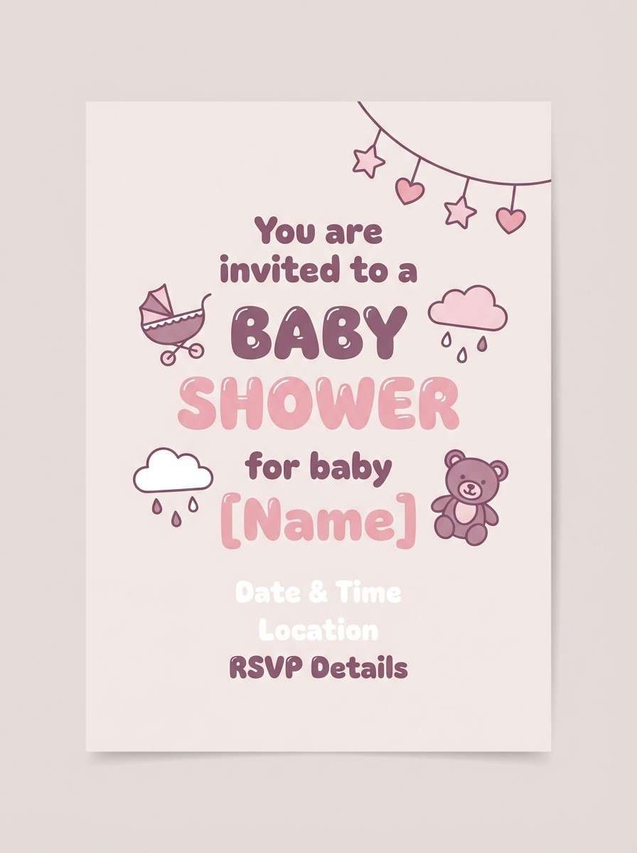
Best for: baby shower invites and kids brand graphics
Sweet and gentle, it feels like pastel crayons and soft fabric. The plums are muted, so the overall look stays friendly and not too grown-up. Pair with rounded fonts, simple illustrations, and lots of white space. For invitations, use the deepest shade for names and keep the light blush for the background.
Image example of soft plum kids pastel generated using media.io
19) Plum Ink Editorial
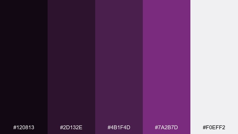
HEX: #120813 #2D132E #4B1F4D #7A2B7D #F0EFF2
Mood: serious, artistic, editorial
Best for: magazine layouts and portfolio sites
Serious and artistic, it feels like ink-stained paper and late-night drafts. The near-black plum makes type look crisp, while the brighter violet works as a confident accent. Pair with structured grids, large headlines, and monochrome imagery for a gallery-like feel. For accessibility, use the light gray as the main page field and avoid violet text on dark backgrounds.
Image example of plum ink editorial generated using media.io
20) Plum Sunset Gradient
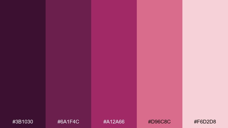
HEX: #3B1030 #6A1F4C #A12A66 #D96C8C #F6D2D8
Mood: romantic, radiant, optimistic
Best for: valentines campaigns and beauty promos
Romantic and radiant, it resembles a sunset fading from deep plum to rose haze. The stepped pinks give you natural highlight levels for buttons, badges, and overlays. Pair with minimal line art and soft blur gradients for a modern campaign look. For a cohesive set of purple plum color combinations, keep one deep anchor and let the lighter tints handle the glow.
Image example of plum sunset gradient generated using media.io

21) Plum Minimal Mono
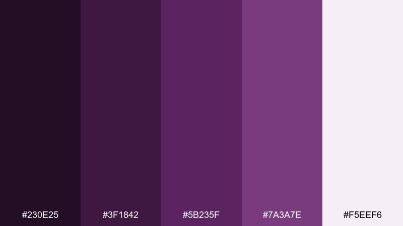
HEX: #230E25 #3F1842 #5B235F #7A3A7E #F5EEF6
Mood: focused, clean, tonal
Best for: brand systems and icon sets
Focused and clean, it stays in one hue family for a tidy tonal look. The range from inky to airy makes it easy to build states without introducing extra colors. Pair with black and white typography and rely on spacing and scale for emphasis. Tip: map the five steps to a design token ladder for consistent UI usage.
Image example of plum minimal mono generated using media.io
What Colors Go Well with Purple Plum?
For a classic, elevated look, pair purple plum with warm neutrals (cream, linen, beige) and metallic accents like gold. This combination is especially strong for packaging, invitations, and premium hero sections.
For modern UI and tech, combine plum with cool grays, charcoal, or silver so the purple reads sharper and more “designed.” If you want contrast without harshness, add foggy blue-gray or soft lilac highlights.
For grounded, natural palettes, plum works beautifully with sage and olive. These greens mute the sweetness and create an earthy, botanical tone that’s ideal for wellness and eco branding.
How to Use a Purple Plum Color Palette in Real Designs
Start by assigning roles: choose one deep plum for headings/navigation, one mid plum for components, and one light tint for backgrounds. This keeps your hierarchy consistent and prevents purple from overpowering the layout.
In print, purple plum looks best when you control texture and finish. Matte stocks make it feel modern and editorial, while a small metallic accent (gold/silver) can create a premium “seal” effect without adding clutter.
In digital, watch contrast and saturation. Use the deepest plum for text or UI chrome, keep large surfaces lighter, and reserve bright pink-magenta accents for a single CTA or focus state so attention stays intentional.
Create Purple Plum Palette Visuals with AI
If you already have a palette, the fastest way to validate it is to see it applied to real layouts—landing pages, packaging mockups, posters, or onboarding screens. That’s where you’ll notice if your accent is too loud, your background too cool, or your contrast too low.
Use the prompts above as templates: swap in your product type, style keywords (minimal, vintage, futuristic), and aspect ratio to generate consistent variations. You can iterate quickly until the plum tone feels exactly right for your brand.
Purple Plum Color Palette FAQs
-
What is the HEX code for purple plum in this guide?
The reference purple plum used here is #5A2A5F, a deep plum-purple that pairs well with lilac tints, warm neutrals, and muted greens. -
Is purple plum warm or cool?
Purple plum is typically slightly warm because it leans toward red-violet. Adding charcoal/silver pushes it cooler; pairing with peach, beige, or gold makes it feel warmer. -
What colors complement purple plum best?
Great complements include sage/olive (earthy contrast), gold (luxury accent), cream/linen (soft balance), and blue-gray (modern, airy contrast). -
How do I keep a purple plum palette from looking too dark?
Use a light neutral (off-white, fog gray, or pale lilac) as the main background and keep deep plums for headers and key elements. Reserve saturated magenta accents for small highlights only. -
Does purple plum work for dark mode UI?
Yes—combine near-black plum with charcoal and a soft off-white for text. Use lilac or muted violet as focus/active states to keep contrast clear without neon glare. -
What’s a good accessible text color with plum backgrounds?
On deep plum backgrounds, use near-white or very light gray text. On pale lilac/cream backgrounds, use the darkest plum (or charcoal) for body text to maintain readable contrast. -
Can I generate matching images for a purple plum palette?
Yes. With Media.io’s text-to-image, you can paste a prompt (like the ones above), specify your subject and layout style, and generate consistent palette-driven visuals for branding, UI, or print mockups.
Next: Denim Color Palette


