

A green peach color palette blends nature’s calm with a warm, human touch—making it a favorite for brands and designs that want to feel fresh, friendly, and modern.
Below are 20 green peach color combinations (with HEX codes) you can use for branding, UI, print, packaging, and more—plus AI prompts to generate matching visuals.
In this article
Why Green Peach Palettes Work So Well
Green brings balance, health, and stability, while peach adds warmth, approachability, and a subtle “glow.” Together, they feel natural—like foliage and fruit—so the combination reads as fresh without being overly loud.
This pairing is also versatile across styles. With mint and warm creams, it becomes airy and pastel; with deep teals and clay browns, it turns grounded and premium.
From a usability standpoint, green peach palettes can support clear hierarchy: darker greens make reliable anchors for headings and navigation, while peach tones work well for highlights, CTAs, and friendly accent moments.
20+ Green Peach Color Palette Ideas (with HEX Codes)
1) Garden Sorbet
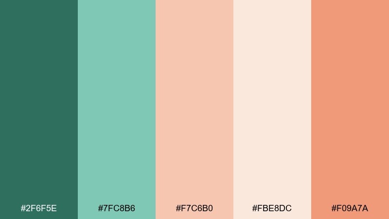
HEX: #2f6f5e #7fc8b6 #f7c6b0 #fbe8dc #f09a7a
Mood: fresh, airy, optimistic
Best for: skincare product ad and landing banner
Fresh and airy like a spring greenhouse with peach sorbet melting into minty leaves. It works beautifully for wellness brands, clean beauty visuals, and lifestyle banners where you want softness without losing clarity. Pair it with warm white space and minimal typography to keep the look light. Tip: use the deep green as the headline anchor, then let the peach carry calls to action.
Image example of garden sorbet generated using media.io
Media.io is an online AI studio for creating and editing video, image, and audio in your browser.

2) Sage Apricot
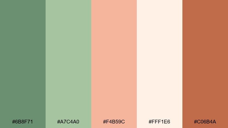
HEX: #6b8f71 #a7c4a0 #f4b59c #fff1e6 #c06b4a
Mood: grounded, cozy, botanical
Best for: cafe menu design
Grounded and cozy like dried herbs beside sliced apricot on a sunlit counter. These tones suit cafe menus, artisanal food labels, and seasonal promos that need warmth without feeling loud. Pair with textured paper backgrounds and a serif font for an elevated, handmade vibe. Tip: reserve the terracotta for prices or small highlights so the menu stays calm and readable.
Image example of sage apricot generated using media.io
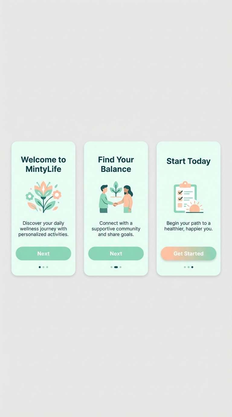
3) Mint Nectar
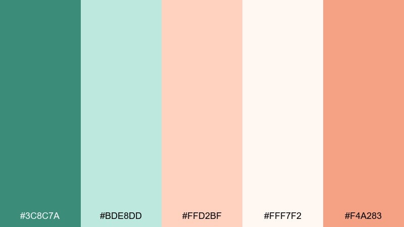
HEX: #3c8c7a #bde8dd #ffd2bf #fff7f2 #f4a283
Mood: clean, breezy, uplifting
Best for: mobile app onboarding UI
Clean and breezy like mint tea with a peach twist, light enough to feel modern but still friendly. It shines in onboarding screens, wellness apps, and habit trackers where calm contrast matters. Pair with charcoal text and generous spacing to keep accessibility strong. Tip: use the coral-peach as the primary button color against the pale mint panels for clear hierarchy.
Image example of mint nectar generated using media.io
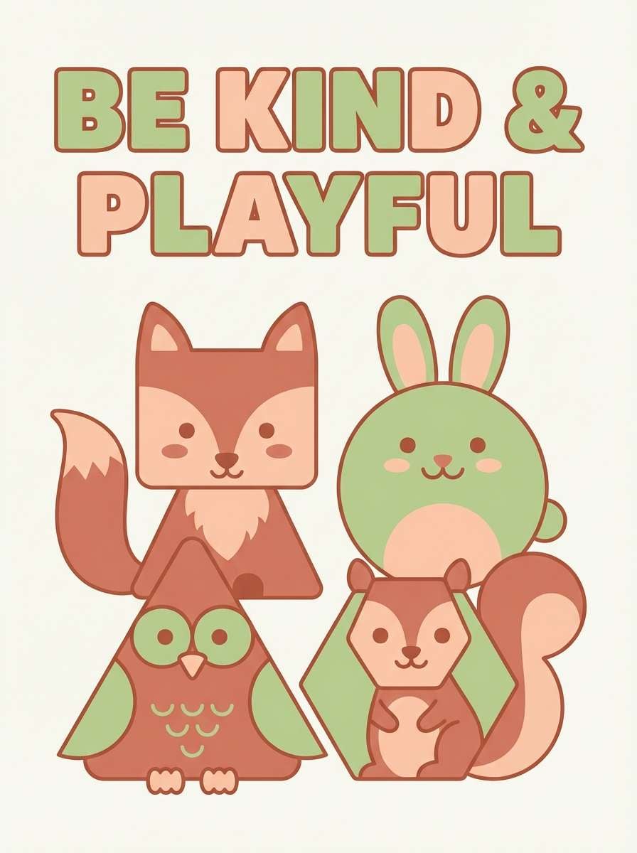
4) Pistachio Blush
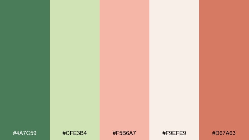
HEX: #4a7c59 #cfe3b4 #f5b6a7 #f9efe9 #d67a63
Mood: soft, playful, approachable
Best for: kids room poster design
Soft and playful like pistachio gelato with a blush swirl, sweet but not sugary. These colors are perfect for kids room posters, cheerful stationery, and friendly classroom prints. Pair with simple shapes and chunky type to keep it fun and legible. Tip: let the pistachio light green dominate the background and pop the characters in peach for instant charm.
Image example of pistachio blush generated using media.io
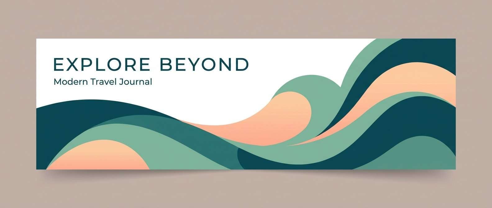
5) Seafoam Sunrise
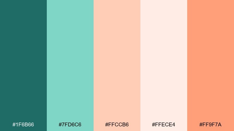
HEX: #1f6b66 #7fd6c6 #ffccb6 #ffece4 #ff9f7a
Mood: bright, coastal, energizing
Best for: travel blog header image
Bright and coastal, like early sun hitting seafoam along a quiet shore. It fits travel headers, summer campaign graphics, and upbeat newsletter hero sections. Pair with crisp white and bold sans-serif type so the colors feel modern rather than beachy-cute. Tip: use the vivid peach as a small accent line or badge to avoid overpowering the seafoam.
Image example of seafoam sunrise generated using media.io
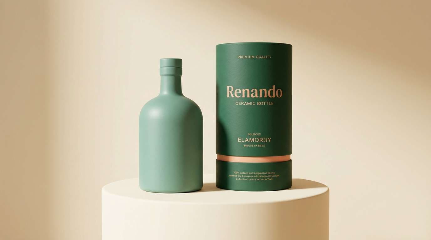
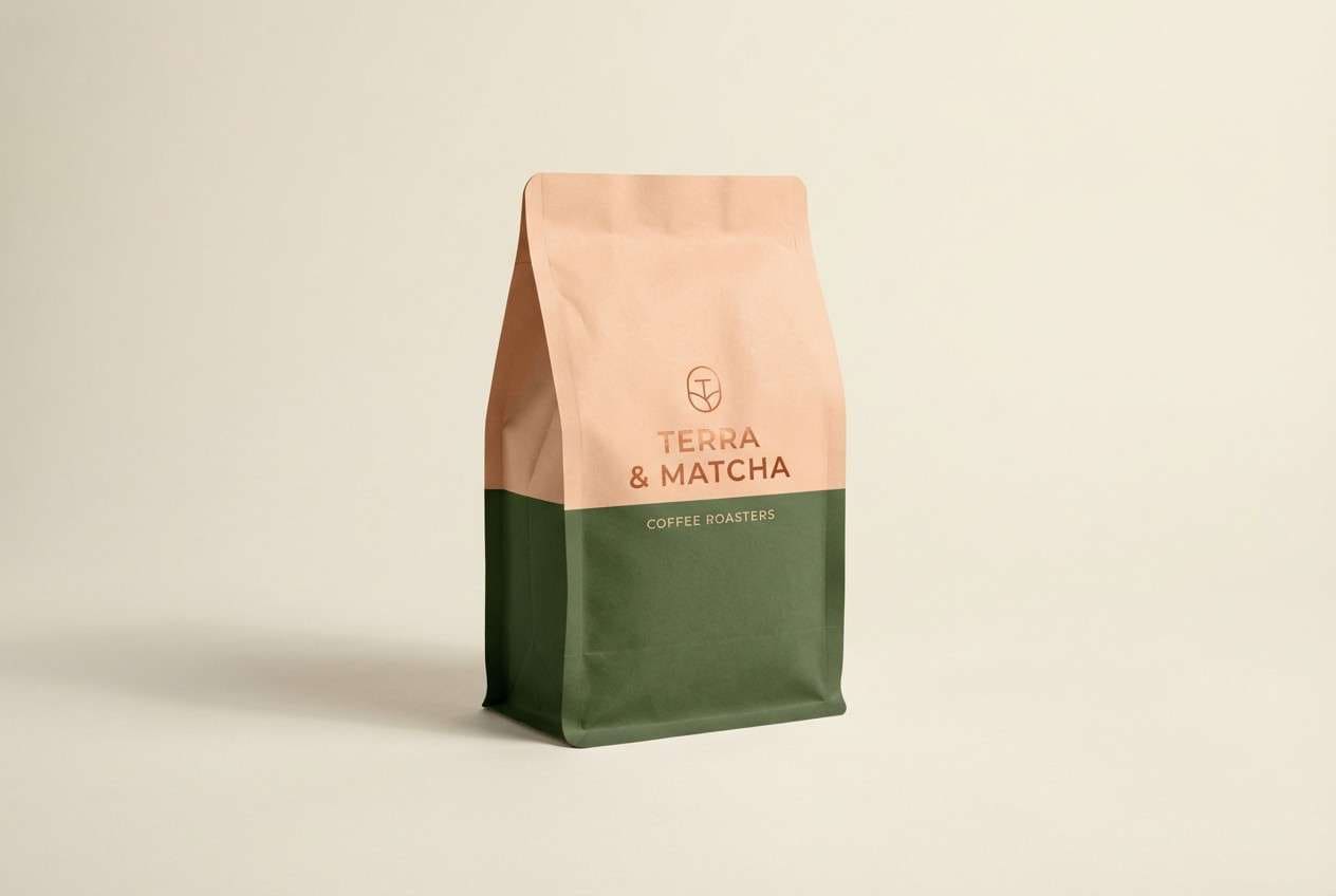
6) Matcha Cream
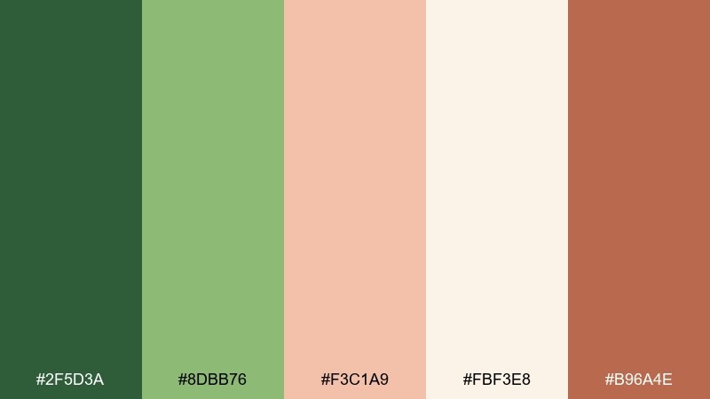
HEX: #2f5d3a #8dbb76 #f3c1a9 #fbf3e8 #b96a4e
Mood: earthy, comforting, premium
Best for: coffee packaging design
Earthy and comforting like matcha whisked into cream with a warm bakery note. For a green peach color palette that feels premium, these tones work well on coffee bags, tea tins, and boutique food packaging. Pair with kraft textures or matte finishes and keep the layout simple so the colors do the storytelling. Tip: print the darkest green as a solid block behind the logo for a high-end shelf read.
Image example of matcha cream generated using media.io
7) Peach Fern
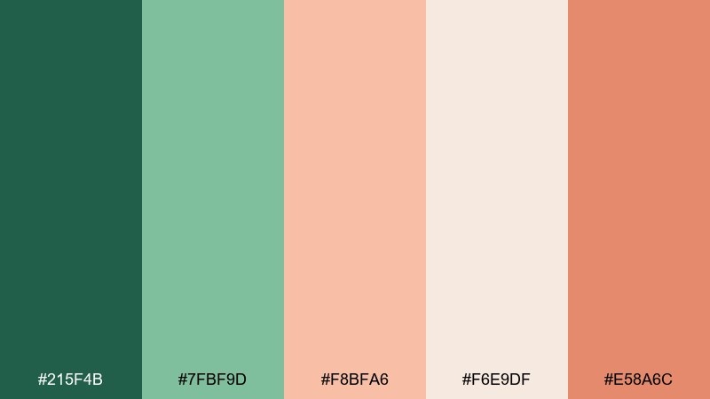
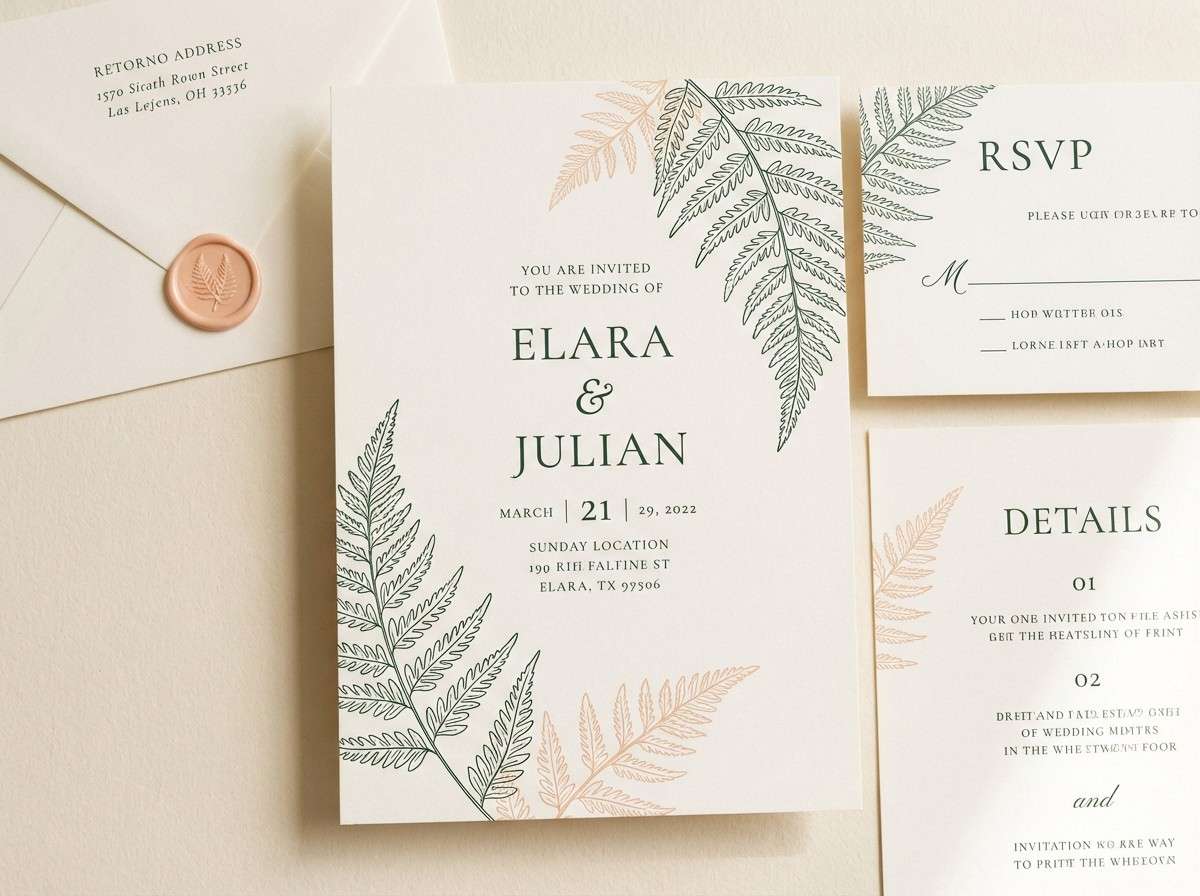
HEX: #215f4b #7fbf9d #f8bfa6 #f6e9df #e58a6c
Mood: calm, leafy, romantic
Best for: wedding invitation suite
Calm and leafy with a romantic blush, like ferns pressed into a keepsake book. It works well for wedding invitations, save-the-dates, and event stationery that wants softness with natural structure. Pair with delicate line art and warm cream paper to keep the palette timeless. Tip: use the deeper green for names and headings so the peach can stay subtle and elegant.
Image example of peach fern generated using media.io
8) Cactus Bloom
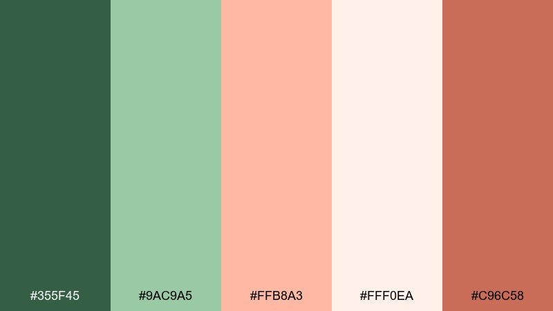
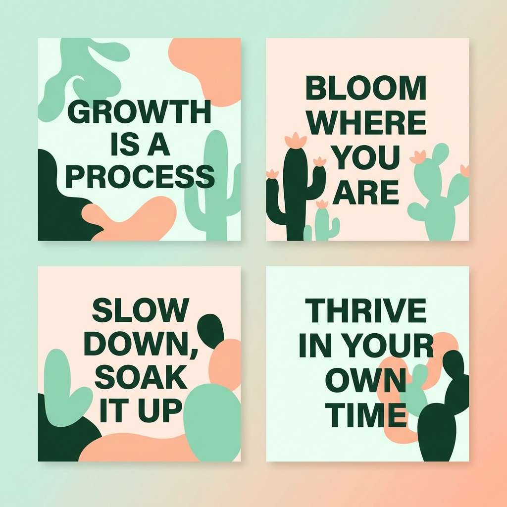
HEX: #355f45 #9ac9a5 #ffb8a3 #fff0ea #c96c58
Mood: sun-warmed, playful, modern
Best for: social media quote template
Sun-warmed and playful, like cactus blooms against pale desert light. These tones are great for social quote templates, creator graphics, and small-batch shop posts. Pair with bold typography and lots of negative space so the soft peach stays punchy. Tip: keep the background near-cream and alternate mint and peach blocks for a clean swipeable series.
Image example of cactus bloom generated using media.io
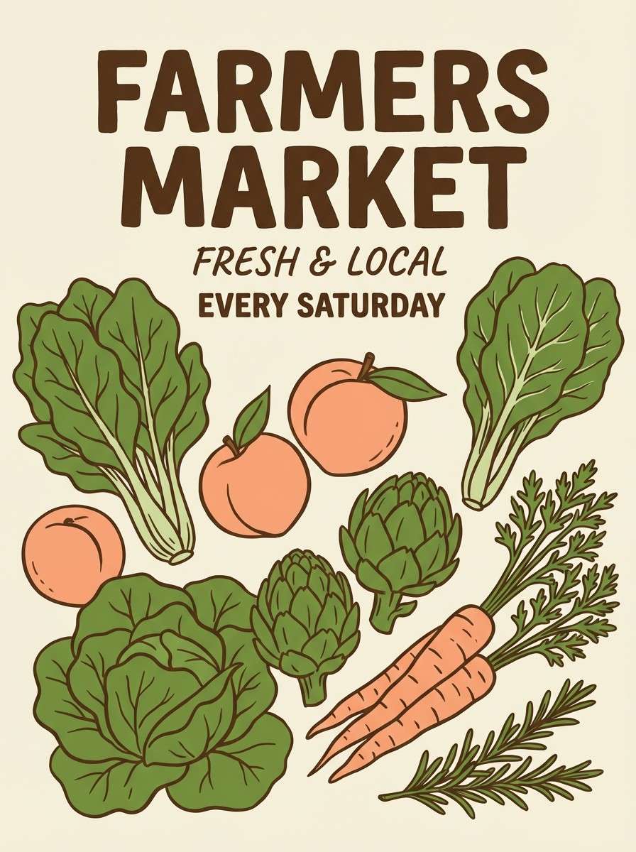
9) Spring Market
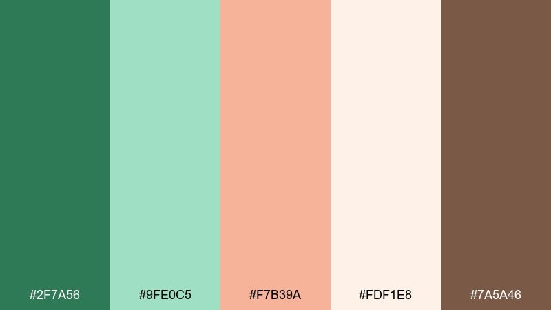
HEX: #2f7a56 #9fe0c5 #f7b39a #fdf1e8 #7a5a46
Mood: lively, friendly, artisanal
Best for: farmers market poster
Lively and friendly like a weekend farmers market with fresh herbs and peach jam samples. These green peach color combinations are ideal for posters, community flyers, and local event promos that need warmth and trust. Pair with a bold headline and simple illustrated produce so the palette feels handcrafted, not messy. Tip: use the warm brown sparingly for key info like dates and locations to improve readability.
Image example of spring market generated using media.io
10) Soft Grove
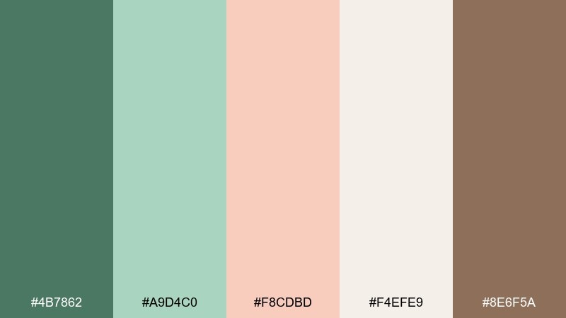
HEX: #4b7862 #a9d4c0 #f8cdbd #f4efe9 #8e6f5a
Mood: quiet, homey, soothing
Best for: interior design mood board
Quiet and homey, like a shaded grove with linen curtains catching warm light. It suits interior design mood boards, calm lifestyle blogs, and soft home goods branding. Pair with natural textures like oak, rattan, and off-white ceramics to reinforce the gentle vibe. Tip: let the muted green be the base and use peach in small decor accents for balance.
Image example of soft grove generated using media.io
11) Coral Canopy
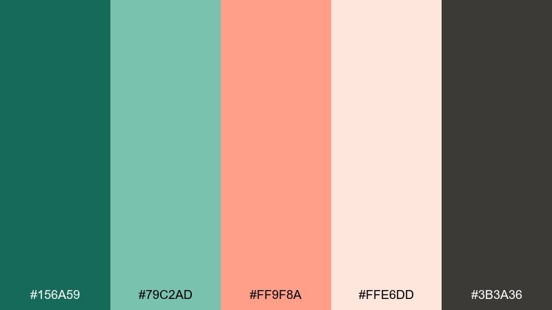
HEX: #156a59 #79c2ad #ff9f8a #ffe6dd #3b3a36
Mood: bold, modern, confident
Best for: brand style guide page
Bold and modern, like coral light filtering through a dense canopy of leaves. The palette is strong for brand systems, startup identity decks, and confident lifestyle labels. Pair with clean grids and lots of white space to keep the dark charcoal from feeling heavy. Tip: use coral for primary CTAs and keep teal-green for navigation and secondary elements.
Image example of coral canopy generated using media.io
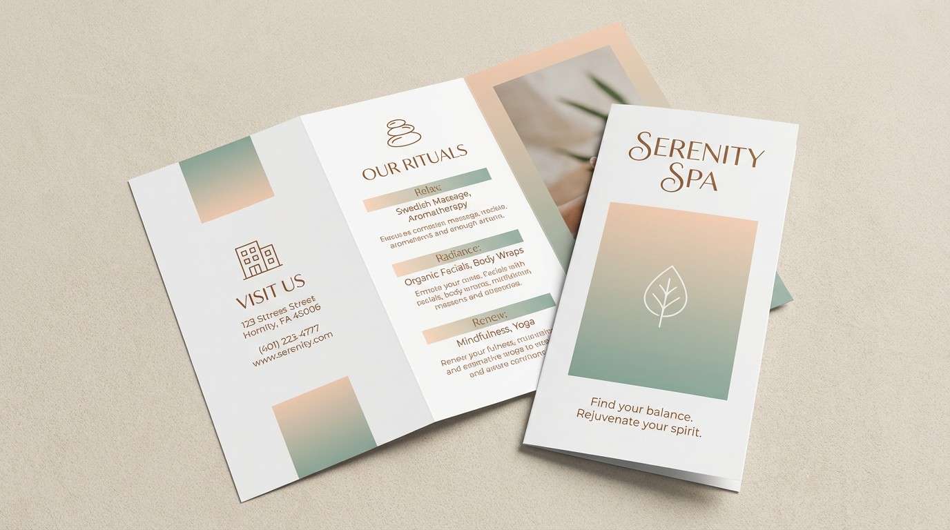
12) Eucalyptus Kiss
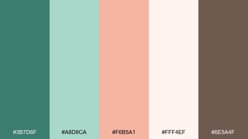
HEX: #3b7d6f #a8d8ca #f6b5a1 #fff4ef #6e5a4f
Mood: spa-like, gentle, refined
Best for: spa brochure layout
Spa-like and gentle, like eucalyptus steam with a soft peach glow. These tones fit brochures, service menus, and calming promotional materials where you want quiet luxury. Pair with thin-line icons and plenty of breathing room for an instantly soothing look. Tip: keep body text in warm brown to avoid harsh contrast while staying readable.
Image example of eucalyptus kiss generated using media.io
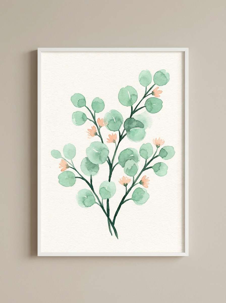
13) Melon Meadow
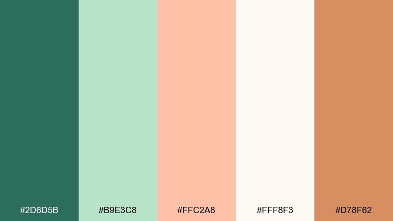
HEX: #2d6d5b #b9e3c8 #ffc2a8 #fff8f3 #d78f62
Mood: sunny, lighthearted, natural
Best for: botanical watercolor wall art
Sunny and lighthearted, like melon slices at a picnic in tall grass. It works wonderfully for botanical illustration prints, spring wall art, and gentle gift wrap patterns. Pair with loose watercolor textures and soft edges so the colors feel organic. Tip: keep the peach as the focal bloom color and use mint as a washed background layer.
Image example of melon meadow generated using media.io
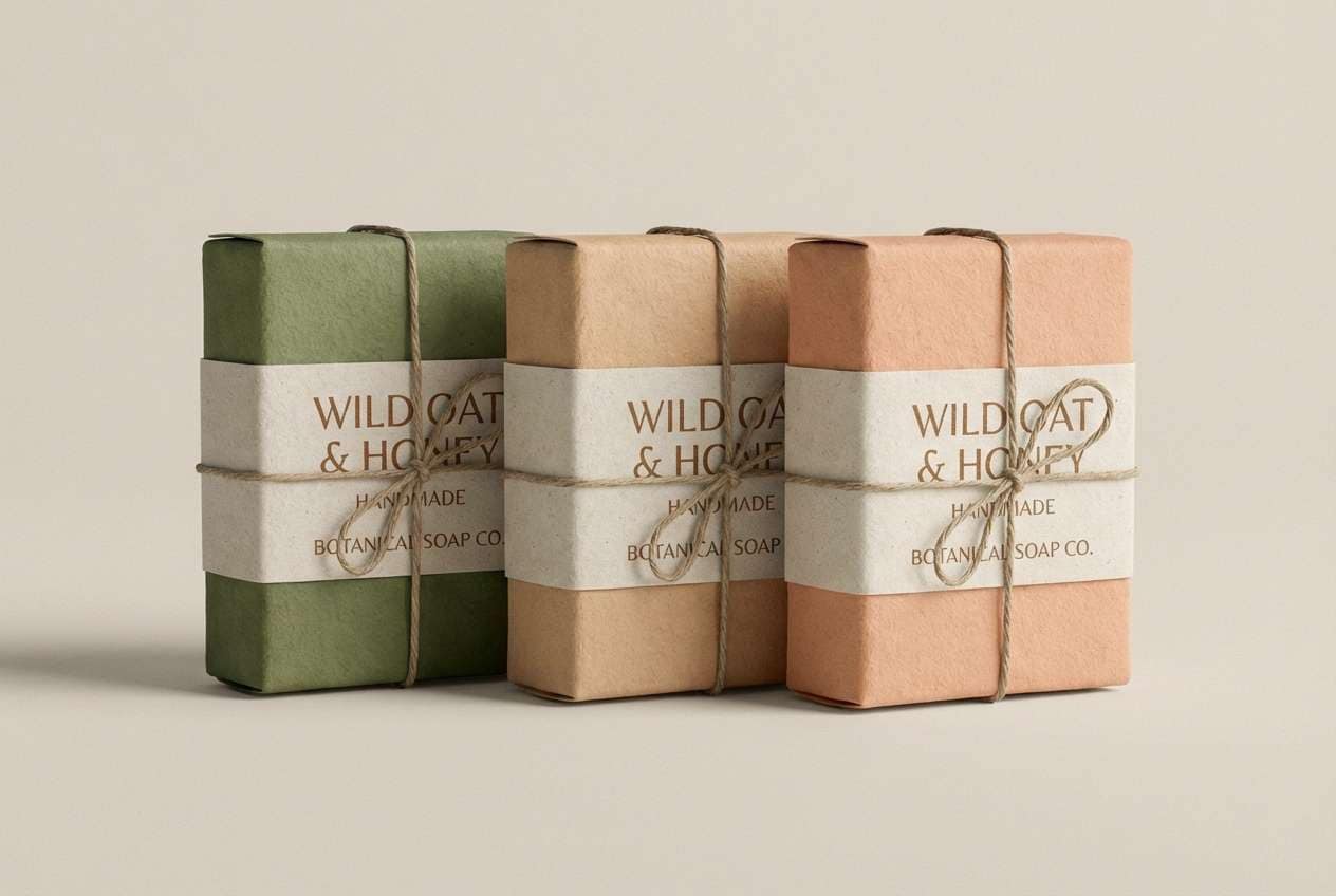
14) Peachy Moss
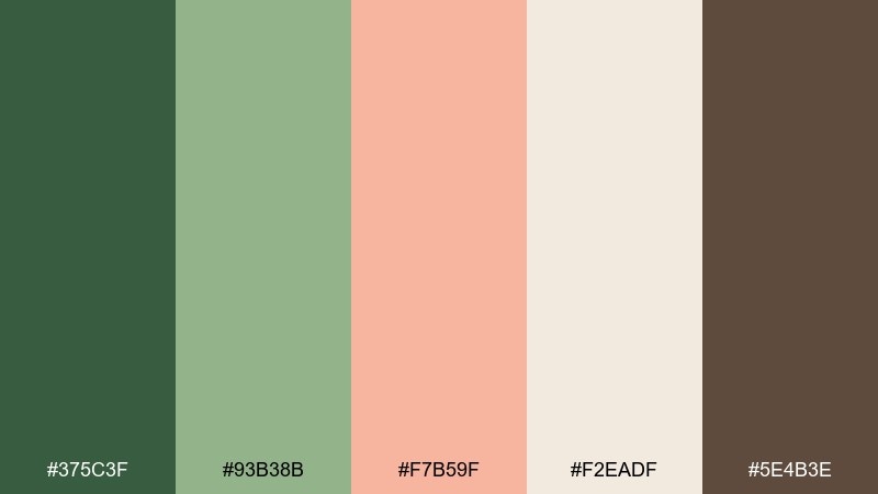
HEX: #375c3f #93b38b #f7b59f #f2eadf #5e4b3e
Mood: earthy, rustic, comforting
Best for: handmade soap label
Earthy and rustic, like mossy stones warmed by late afternoon light. These tones are great for handmade soap labels, apothecary packaging, and farm-to-table product branding. Pair with kraft paper textures and simple stamp-style graphics to keep it authentic. Tip: use the darkest green for the product name and the peach for scent notes or a small badge.
Image example of peachy moss generated using media.io
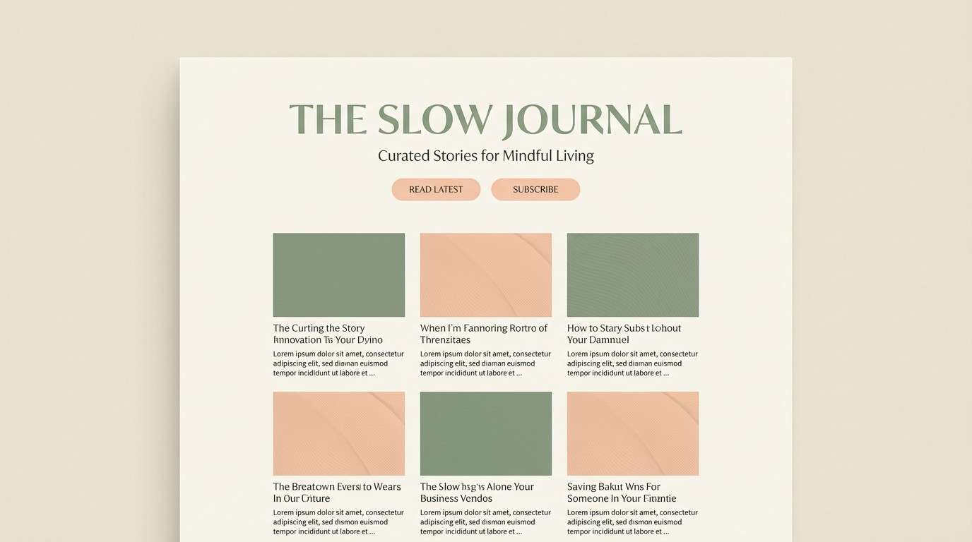
15) Linen Orchard
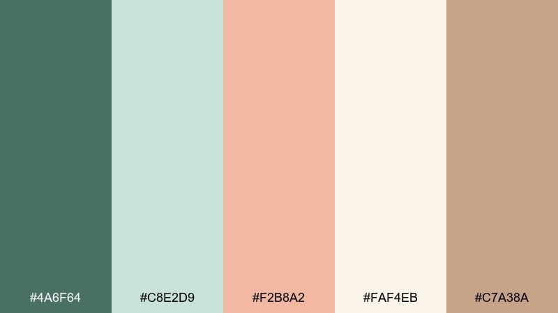
HEX: #4a6f64 #c8e2d9 #f2b8a2 #faf4eb #c7a38a
Mood: soft, airy, elegant
Best for: lifestyle blog theme
Soft and airy like linen napkins laid out under orchard branches. It suits lifestyle blog themes, calm homepage designs, and editorial-feeling personal brands. Pair with warm neutrals and subtle dividers so the mint stays fresh rather than icy. Tip: keep peach for links and hover states to add quiet motion without visual noise.
Image example of linen orchard generated using media.io
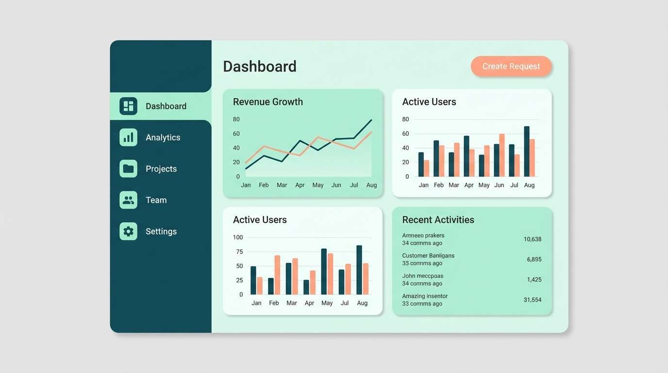
16) Modern Conservatory
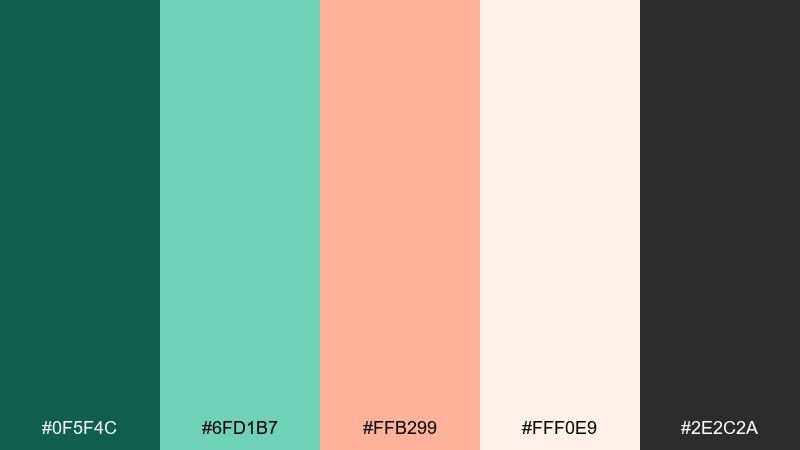
HEX: #0f5f4c #6fd1b7 #ffb299 #fff0e9 #2e2c2a
Mood: sleek, fresh, high-contrast
Best for: SaaS dashboard UI
Sleek and fresh like a modern conservatory with clean glass lines and a warm peach glow. For teams exploring green peach color combinations in UI, this mix gives you strong contrast without going harsh. Pair with crisp charts, thin dividers, and plenty of off-white panels to keep the dashboard breathable. Tip: use charcoal for text and the bright peach only for alerts or key metrics to avoid fatigue.
Image example of modern conservatory generated using media.io
17) Sunset Succulent
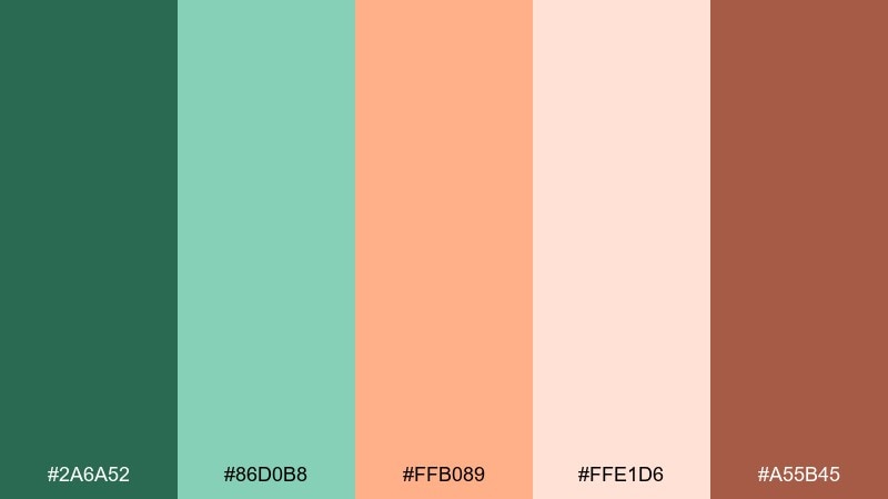
HEX: #2a6a52 #86d0b8 #ffb089 #ffe1d6 #a55b45
Mood: warm, trendy, upbeat
Best for: Instagram story promo
Warm and trendy like a succulent garden at sunset, with peach light bouncing off fresh leaves. It is ideal for story promos, quick sale announcements, and creator launches that need energy but still feel tasteful. Pair with bold type and simple gradients for a modern look. Tip: keep text on the pale peach background and use mint shapes to frame the message.
Image example of sunset succulent generated using media.io

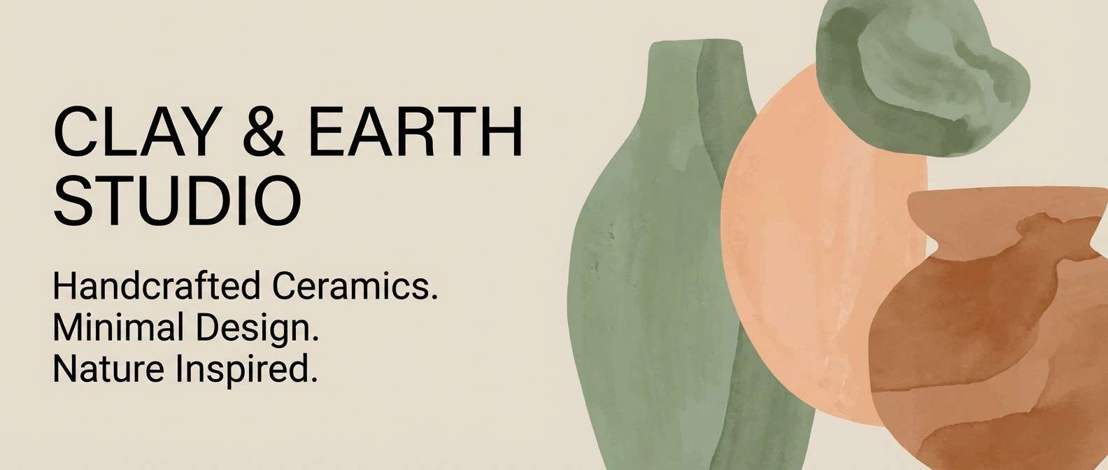
18) Clay & Chlorophyll
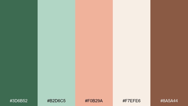
HEX: #3d6b52 #b2d6c5 #f0b29a #f7efe6 #8a5a44
Mood: organic, earthy, creative
Best for: ceramics studio website banner
Organic and creative like wet clay beside leafy stems in a studio window. These tones fit ceramics brands, maker portfolios, and craft workshops that want an earthy but contemporary feel. Pair with tactile photography and simple typography to keep the palette grounded. Tip: use the clay-brown for small UI dividers and icons so the greens stay dominant.
Image example of clay & chlorophyll generated using media.io
19) Pastel Picnic
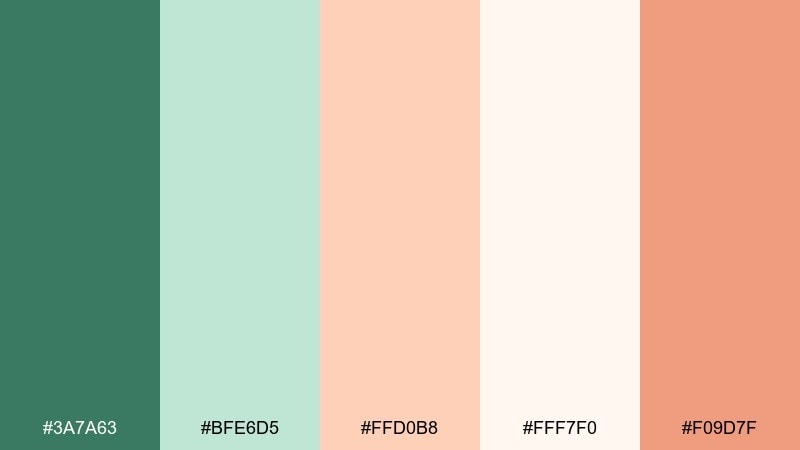
HEX: #3a7a63 #bfe6d5 #ffd0b8 #fff7f0 #f09d7f
Mood: cheerful, light, family-friendly
Best for: birthday invitation
Cheerful and light like a pastel picnic blanket with fruit and lemonade. It works well for birthday invitations, family events, and friendly community gatherings. Pair with rounded fonts and simple illustrations to keep it playful. Tip: use the coral-peach for the RSVP button or QR block so it stands out instantly.
Image example of pastel picnic generated using media.io

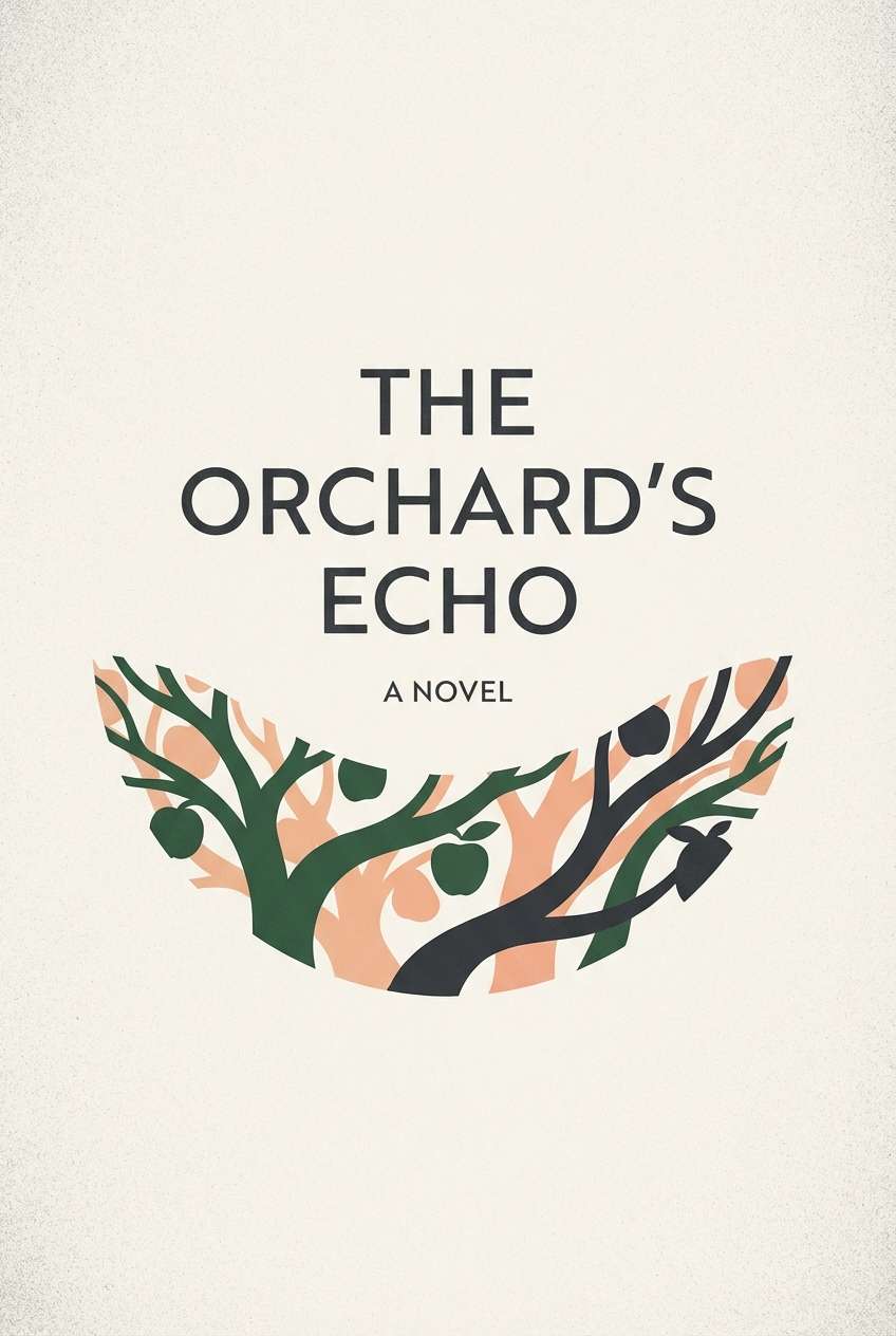
20) Orchard Dusk
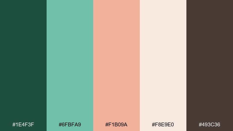
HEX: #1e4f3f #6fbfa9 #f1b09a #f8e9e0 #493c36
Mood: moody, elegant, cinematic
Best for: book cover design
Moody and elegant like an orchard at dusk, where deep greens meet a soft peach sky. It is a strong choice for book covers, album art, and literary posters that need atmosphere. Pair with high-contrast type and restrained ornamentation so the palette stays cinematic. Tip: keep the background in dark green and let peach act as a subtle glow behind the title.
Image example of orchard dusk generated using media.io
What Colors Go Well with Green Peach?
Neutrals are the easiest wins: warm white, cream, and linen keep the look soft, while charcoal and warm browns add structure and legibility. These pairings help green and peach feel intentional rather than “cute.”
For extra freshness, add pale aqua/seafoam or a muted mint—great for wellness, UI, and lifestyle design. For a more grounded, artisanal look, introduce terracotta/clay and kraft-beige tones.
If you want a modern, high-contrast system, combine deep teal green with off-white panels and use peach/coral only as an accent for key actions, badges, or highlights.
How to Use a Green Peach Color Palette in Real Designs
Start by assigning roles: pick a deep green for headers/navigation, a light cream for backgrounds, and a peach tone for CTAs or focal elements. This keeps hierarchy clear and prevents the palette from becoming overly pastel.
In print, green peach works best with texture—uncoated paper, kraft stock, or subtle grain. In digital, pair it with generous spacing and readable type (often charcoal or warm brown) for comfortable contrast.
When in doubt, keep peach as the “moment” color. Small peach accents (buttons, icons, badges) tend to look more premium than filling large areas with peach.
Create Green Peach Palette Visuals with AI
If you already have HEX codes, you can turn them into on-brand mockups fast by generating scenes that match the palette—like packaging, UI screens, posters, or invitations.
Use the prompts above as a starting point, then swap subjects (e.g., “skincare bottle” to “candle jar”) while keeping lighting, background, and dominant colors consistent for a cohesive series.
Media.io makes it simple to create green peach visuals directly in your browser—ideal for quick concepting before you commit to final design files.
Green Peach Color Palette FAQs
-
What does a green peach color palette communicate?
It usually communicates freshness (green) paired with warmth and friendliness (peach). The result feels natural, optimistic, and approachable—popular for wellness, lifestyle, and modern “human” brands. -
Is green and peach a good combination for branding?
Yes. Green can act as a stable core brand color, while peach works well as an accent for CTAs, highlights, and packaging details. Together they can feel both trustworthy and inviting. -
How do I keep a green peach palette from looking too pastel?
Add a deep anchor (dark green/teal or charcoal) and use peach sparingly for emphasis. You can also introduce earthy browns or terracotta to make the overall system feel more grounded. -
What text color works best on peach backgrounds?
Charcoal, deep teal, or warm dark brown are common choices because they stay readable without the harshness of pure black. Always check contrast for accessibility, especially for small UI text. -
What are the best “extra” colors to pair with green peach?
Warm neutrals (cream, beige, linen) for softness; charcoal for modern contrast; terracotta/clay for earthy depth; and pale seafoam/aqua for a breezy, coastal feel. -
Can I use green peach in UI design without hurting usability?
Yes—treat peach as an accent for primary actions and states, keep backgrounds light (cream/off-white), and use darker greens/charcoal for text and navigation. This maintains hierarchy and legibility. -
How can I generate matching green peach visuals quickly?
Use a text-to-image tool and specify dominant colors (deep green/teal, mint, soft peach, warm cream) plus lighting and style (minimal, editorial, flat UI). The prompts in this article are ready to paste into Media.io.
Next: Flame Color Palette


