

A flame color palette captures the heat and motion of fire—think ember orange, molten copper, and smoky reds—making designs feel instantly energetic and attention-grabbing.
Below are 20 flame-inspired color combinations with HEX codes, plus practical tips for balancing contrast, neutrals, and accents in branding, posters, and UI.
In this article
Why Flame Palettes Work So Well
Flame palettes are built around warm hues that naturally signal energy, urgency, and warmth. That makes them ideal for grabbing attention in hero sections, posters, and call-to-action moments where you want fast recognition.
They also pair beautifully with grounding neutrals like charcoal, espresso brown, and warm creams. This balance keeps fiery oranges and reds feeling premium and modern instead of overly loud.
Because flame tones often sit close together on the color wheel, they create smooth gradients and layered depth. You can build hierarchy with subtle shifts—ember to amber to gold—without introducing extra colors.
20+ Flame Color Palette Ideas (with HEX Codes)
1) Ember Glow
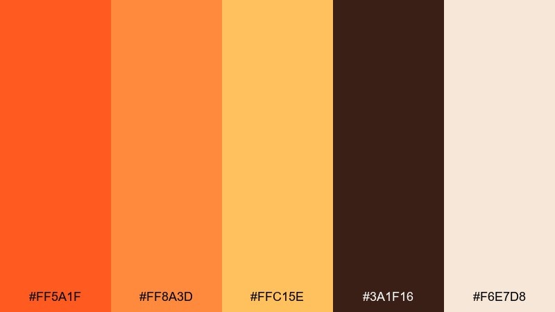
HEX: #FF5A1F #FF8A3D #FFC15E #3A1F16 #F6E7D8
Mood: bold, cozy, energetic
Best for: brand identity and hero banners
Bold and cozy like embers lifting off a late-night bonfire. Use the charcoal brown to ground layouts, then let the orange and amber carry headlines and key CTAs. Pair it with plenty of warm cream negative space to keep it premium, not loud. Usage tip: keep orange as the primary accent and reserve the brightest yellow for small highlights only.
Image example of ember glow generated using media.io
Media.io is an online AI studio for creating and editing video, image, and audio in your browser.

2) Smoked Saffron
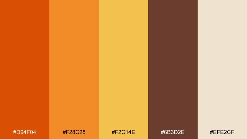
HEX: #D94F04 #F28C28 #F2C14E #6B3D2E #EFE2CF
Mood: earthy, inviting, rustic
Best for: restaurant menus and food packaging
Earthy and inviting, like saffron steeping in a clay pot. The smoky brown gives type excellent weight, while the orange and golden tones make food photos feel richer. Pair with uncoated paper textures or light cream backgrounds for a handcrafted look. Usage tip: print tests matter here, so slightly increase contrast between the golden yellow and the cream on small text.
Image example of smoked saffron generated using media.io
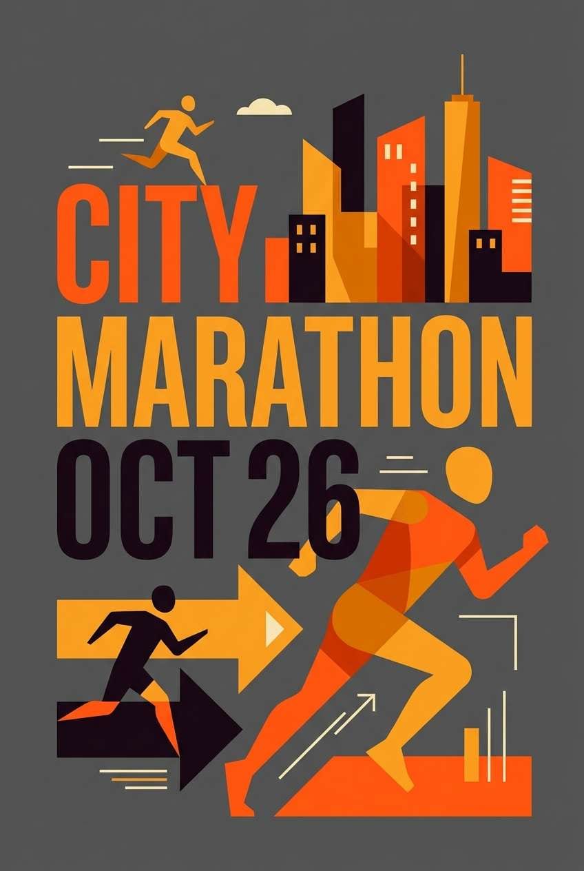
3) Furnace Citrus
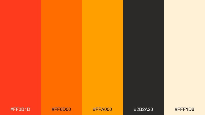
HEX: #FF3B1D #FF6D00 #FFA000 #2B2A28 #FFF1D6
Mood: punchy, modern, high-contrast
Best for: sports posters and event graphics
Punchy and modern, like citrus sparks against black metal. The near-black base makes the oranges feel brighter and more athletic, perfect for bold typography. Pair with simple geometric shapes and keep the cream as a breathing zone around key details. Usage tip: use the brightest orange for dates and prices to create an instant focal point.
Image example of furnace citrus generated using media.io
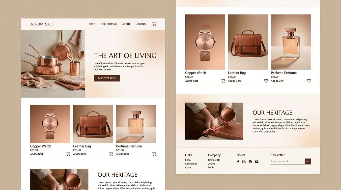
4) Molten Copper
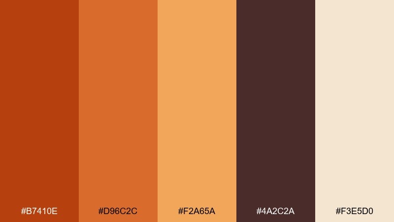
HEX: #B7410E #D96C2C #F2A65A #4A2C2A #F3E5D0
Mood: warm, refined, artisanal
Best for: product landing pages and luxury accents
Warm and refined, like copper catching light in a workshop. This flame color scheme shines when you treat the darker brown as your primary text and the copper tones as metallic-like accents. Pair with elegant serif headings and plenty of soft beige to keep it upscale. Usage tip: add subtle gradients between the copper hues for depth without adding extra colors.
Image example of molten copper generated using media.io
5) Campfire Neutrals
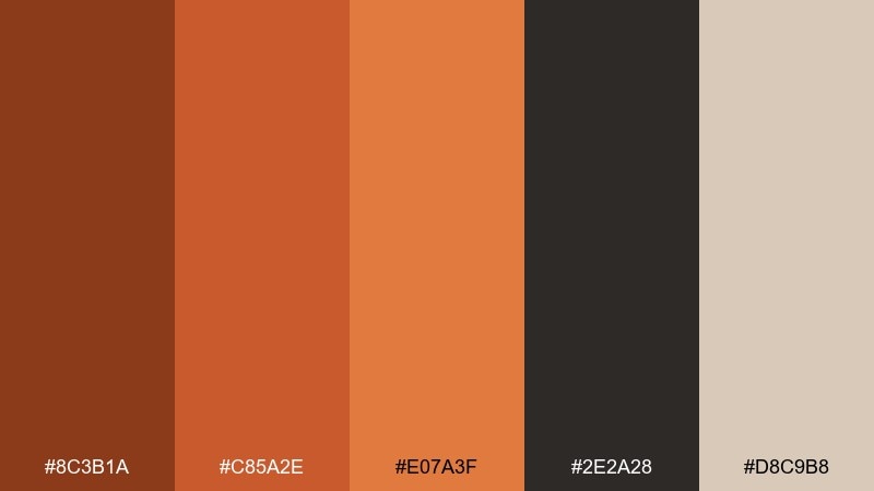
HEX: #8C3B1A #C85A2E #E07A3F #2E2A28 #D8C9B8
Mood: grounded, understated, outdoorsy
Best for: outdoor gear branding and labels
Grounded and outdoorsy, like smoke, wood, and worn leather. The palette stays practical by keeping saturation moderate, making it ideal for logos and label systems. Pair it with kraft paper textures and simple iconography for a reliable, field-tested feel. Usage tip: use the tan as a consistent background so the darker brown and orange remain readable on small tags.
Image example of campfire neutrals generated using media.io
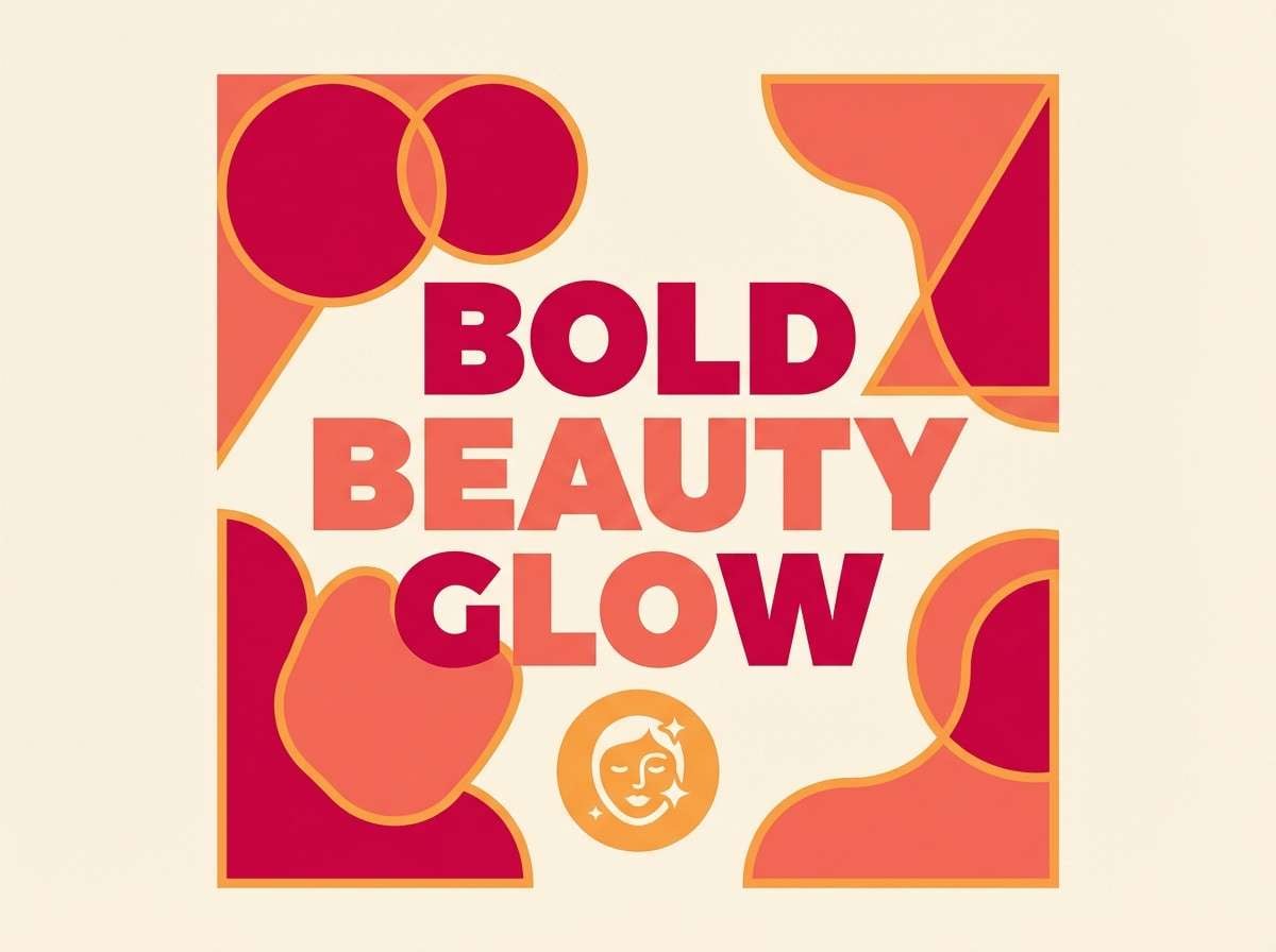
6) Phoenix Petal
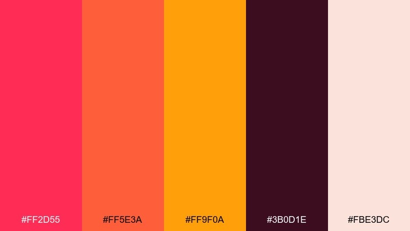
HEX: #FF2D55 #FF5E3A #FF9F0A #3B0D1E #FBE3DC
Mood: dramatic, playful, romantic
Best for: beauty campaigns and social ads
Dramatic and playful, like rose petals caught in heat. The magenta-red adds a flirtier edge, while the orange keeps the overall look punchy and modern. Pair with clean cream backgrounds and tight, editorial typography to avoid visual clutter. Usage tip: limit the dark wine shade to headers and shadows so the bright tones stay the star.
Image example of phoenix petal generated using media.io
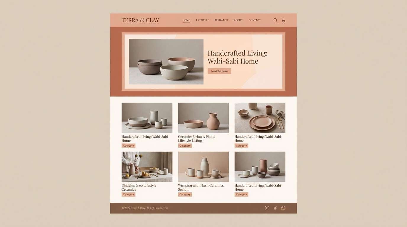
7) Toasted Clay
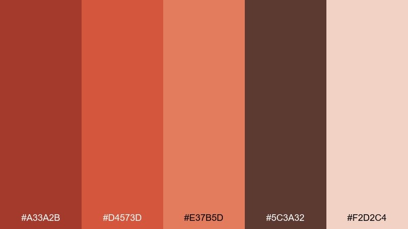
HEX: #A33A2B #D4573D #E37B5D #5C3A32 #F2D2C4
Mood: soft, handmade, comforting
Best for: ceramic shops and lifestyle blogs
Soft and handmade, like sun-warmed terracotta and glazed pottery. The muted reds and peaches feel friendly, especially when paired with the gentle blush base. Use the deep cocoa-brown for body text and the mid tones for buttons or section dividers. Usage tip: keep photos slightly warm to match the clay tones and prevent the design from feeling cold.
Image example of toasted clay generated using media.io
8) Lava Lantern
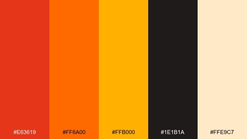
HEX: #E63619 #FF6A00 #FFB000 #1E1B1A #FFE9C7
Mood: electric, festive, confident
Best for: festival flyers and nightlife promos
Electric and festive, like lantern light bouncing off dark streets. These flame color combinations work best with heavy contrast: deep black for the canvas, hot orange for headlines, and gold for supporting details. Pair with chunky sans-serif type and simple gradients to add motion. Usage tip: keep the cream limited to small labels so the flyer stays bold from a distance.
Image example of lava lantern generated using media.io

9) Burnt Honey
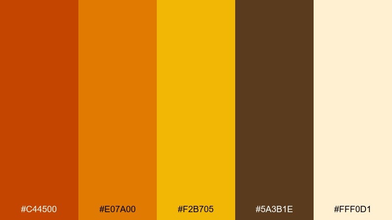
HEX: #C44500 #E07A00 #F2B705 #5A3B1E #FFF0D1
Mood: sweet, nostalgic, sunny
Best for: bakery branding and label design
Sweet and nostalgic, like caramelized sugar and warm pastries. The golden yellow adds a cheerful lift, while the deeper brown keeps it grounded for packaging. Pair with rounded type and simple stamp-style icons for a friendly, local feel. Usage tip: use the darkest brown for ingredient lists to keep readability high on printed labels.
Image example of burnt honey generated using media.io
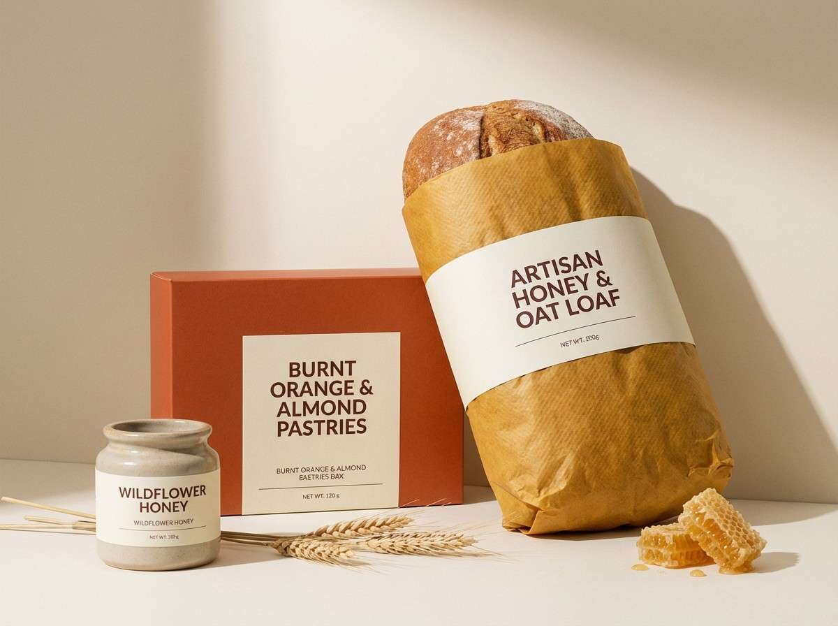
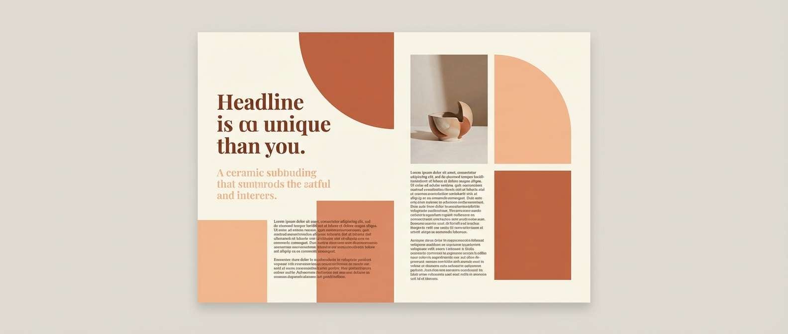
10) Spiced Terracotta
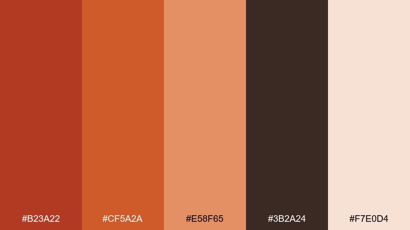
HEX: #B23A22 #CF5A2A #E58F65 #3B2A24 #F7E0D4
Mood: warm, editorial, approachable
Best for: magazine layouts and blog headers
Warm and editorial, like a spice market photographed at golden hour. The mid terracotta tones support large headlines without overpowering long-form reading. Pair with generous margins, cream backgrounds, and a single accent rule line in the brighter orange. Usage tip: keep body text in the dark brown and reserve color for pull quotes and section titles.
Image example of spiced terracotta generated using media.io
11) Crimson Cinder
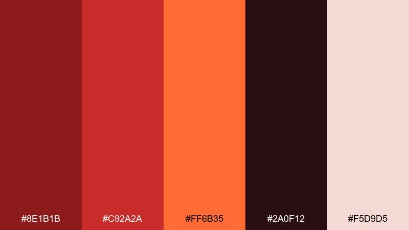
HEX: #8E1B1B #C92A2A #FF6B35 #2A0F12 #F5D9D5
Mood: moody, intense, cinematic
Best for: album covers and dramatic posters
Moody and intense, like cinders under a red glow. The deep maroon and near-black create cinematic contrast, while the orange gives a sharp pop for titles. Pair with minimal imagery and strong typographic scale to keep it striking. Usage tip: use the blush tone as a thin border or subtitle block to prevent the darks from feeling heavy.
Image example of crimson cinder generated using media.io
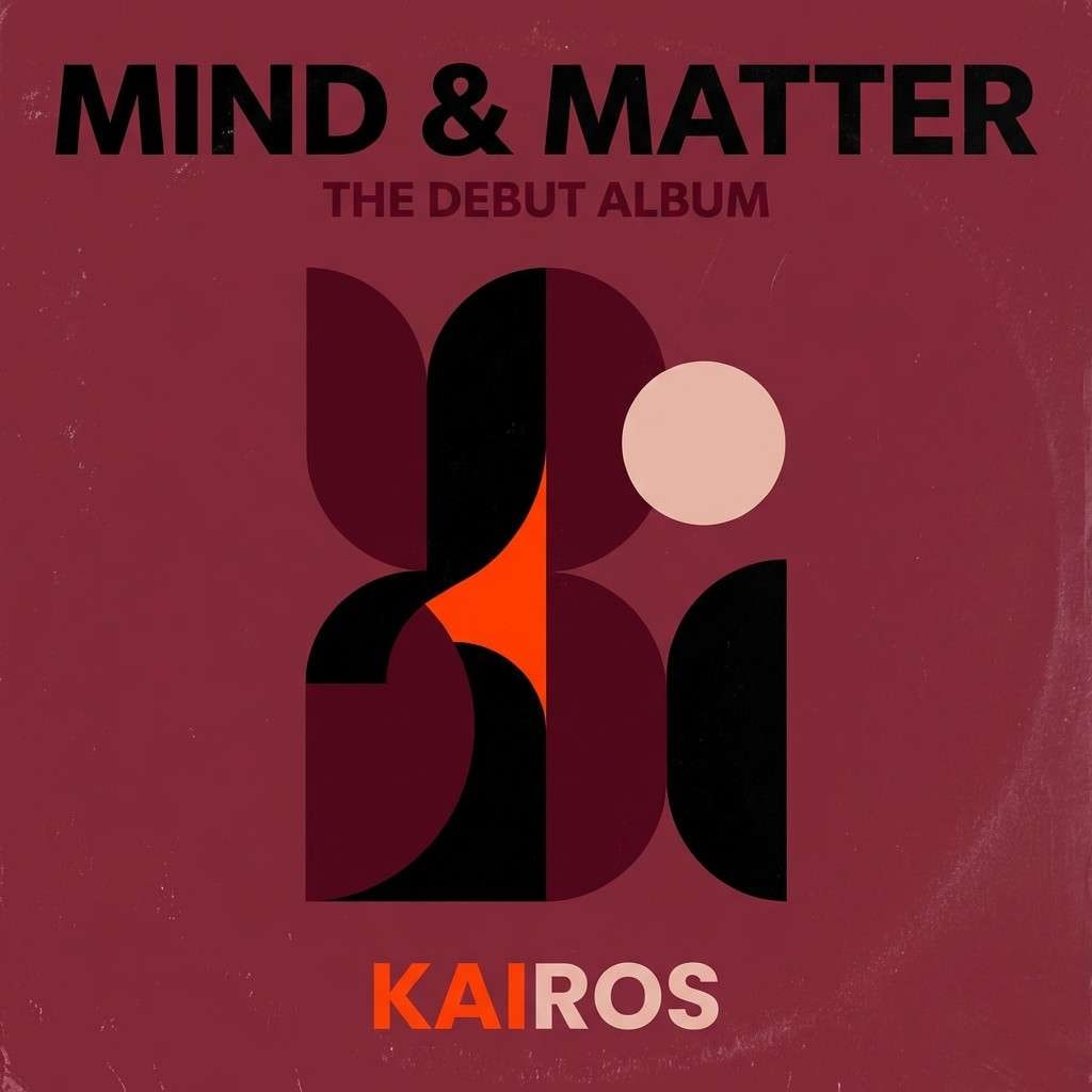
12) Sunbaked Sandstone
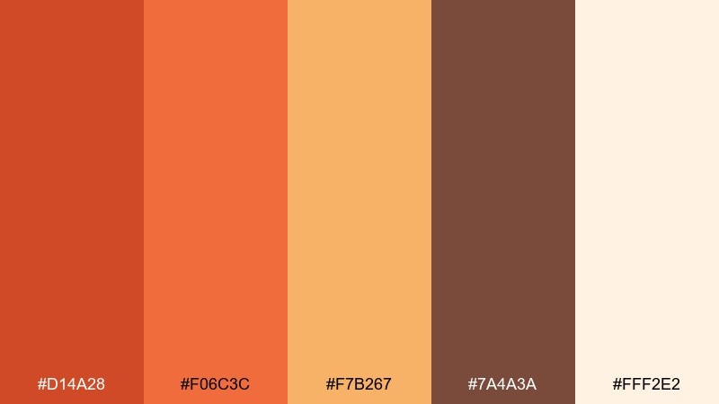
HEX: #D14A28 #F06C3C #F7B267 #7A4A3A #FFF2E2
Mood: sunlit, calm, natural
Best for: travel sites and resort brochures
Sunlit and calm, like sandstone cliffs at dusk. The softer orange range feels welcoming, making it great for lifestyle photography and long scrolling pages. Pair it with airy cream sections and a single darker brown for navigation and captions. Usage tip: keep gradients subtle and wide so the look stays relaxed, not flashy.
Image example of sunbaked sandstone generated using media.io
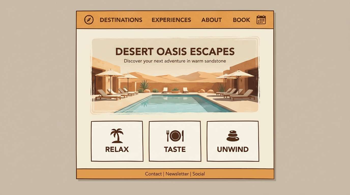
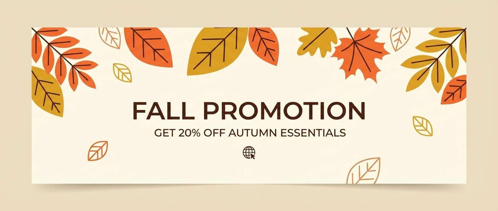
13) Autumn Spark
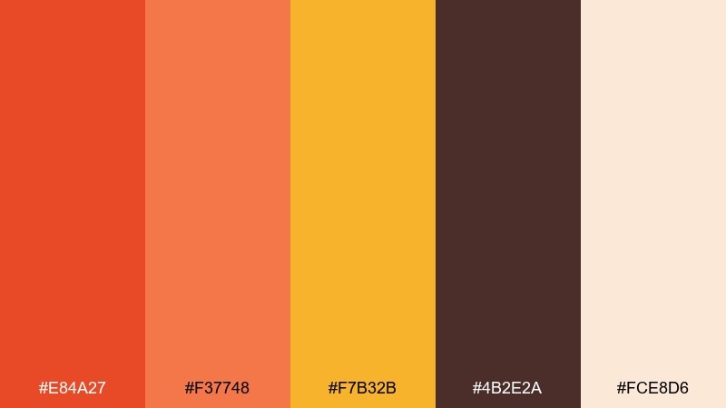
HEX: #E84A27 #F37748 #F7B32B #4B2E2A #FCE8D6
Mood: cheerful, seasonal, lively
Best for: fall promotions and email headers
Cheerful and seasonal, like leaves catching sunlight mid-swirling breeze. The orange and golden tones feel upbeat without going neon, especially against the soft cream. Pair with friendly illustrations and simple patterns for a campaign-ready look. Usage tip: highlight one key offer in the golden yellow, and keep secondary buttons in the softer coral for hierarchy.
Image example of autumn spark generated using media.io
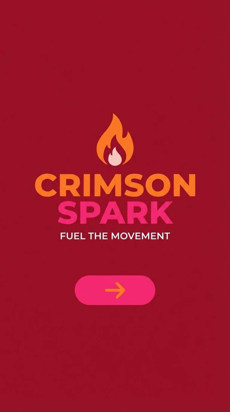
14) Cherry Blaze
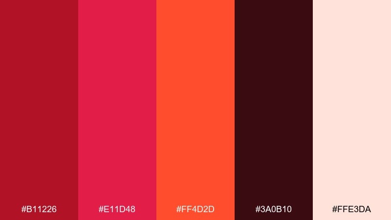
HEX: #B11226 #E11D48 #FF4D2D #3A0B10 #FFE3DA
Mood: bold, trendy, high-energy
Best for: app launch creatives and splash screens
Bold and trendy, like cherry syrup flaring over heat. The hot pink-red adds a modern edge, while the orange keeps it lively and approachable. Pair with dark text blocks or the near-black shade for contrast on bright backgrounds. Usage tip: use the blush as a soft overlay behind icons to reduce glare on saturated screens.
Image example of cherry blaze generated using media.io
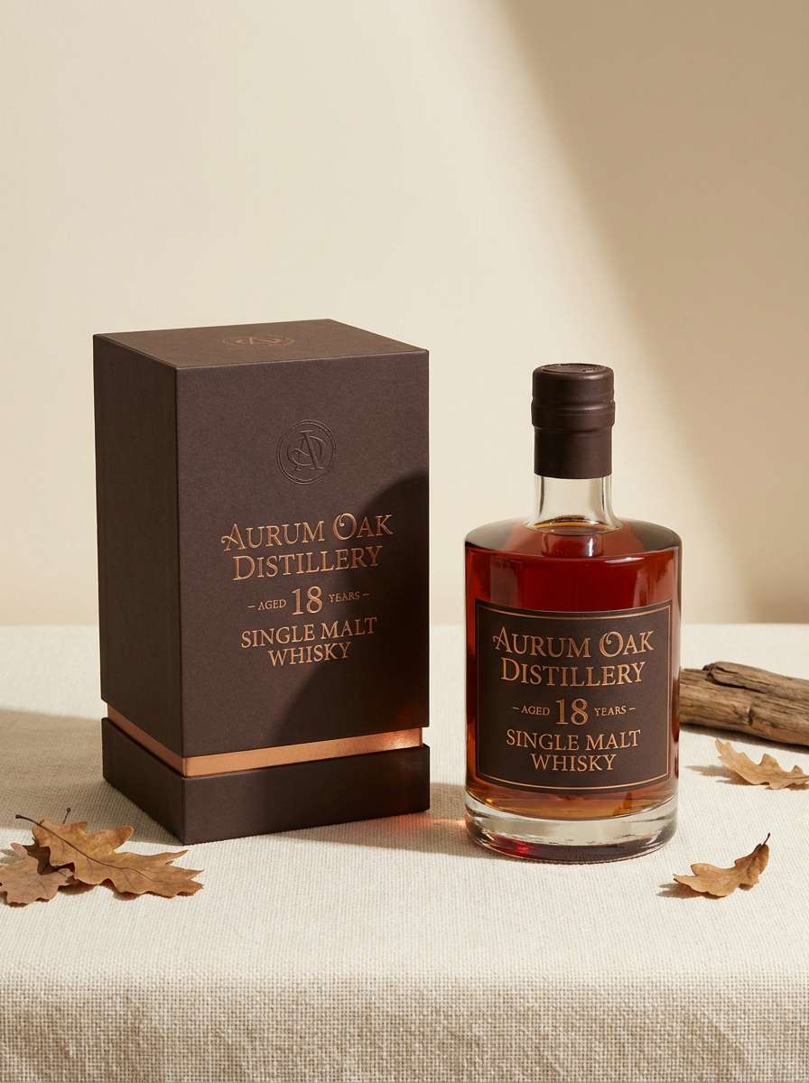
15) Bronze Ash
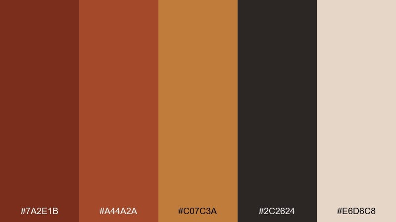
HEX: #7A2E1B #A44A2A #C07C3A #2C2624 #E6D6C8
Mood: mature, earthy, heritage
Best for: whiskey labels and premium packaging
Mature and earthy, like aged barrels and burnished bronze. The deeper browns handle fine print beautifully, while the bronze tone adds a subtle premium cue. Pair with minimal ornamentation and a cream stock to let the colors feel tactile. Usage tip: keep the bronze as a thin foil-like accent line rather than a full background for best elegance.
Image example of bronze ash generated using media.io
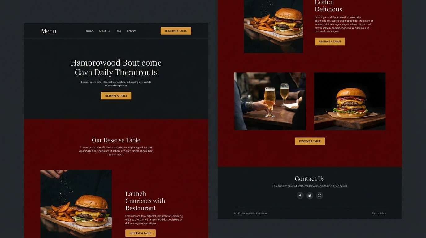
16) Paprika Night
HEX: #C0392B #E74C3C #F39C12 #121212 #F3E5D8
Mood: sleek, dramatic, nightlife
Best for: restaurant websites and reservation CTAs
Sleek and dramatic, like paprika oil glinting in dim light. The near-black background makes the reds feel richer and the amber read like candlelight. Pair with minimal layouts and high-contrast buttons for fast scanning on mobile. Usage tip: keep the amber for primary CTAs only so it stays instantly recognizable.
Image example of paprika night generated using media.io
17) Amber Ashwood
HEX: #A83E00 #D46A1A #F2A541 #3D342F #EADBC8
Mood: warm, balanced, reliable
Best for: craft e-commerce and product cards
Warm and balanced, like amber resin against ashwood grain. The mid amber works well for buttons and badges, while the darker neutral supports readable UI text. Pair with clean product photography and simple borders to keep listings tidy. Usage tip: use the light beige as the default card background so pricing and ratings pop in the darker tones.
Image example of amber ashwood generated using media.io
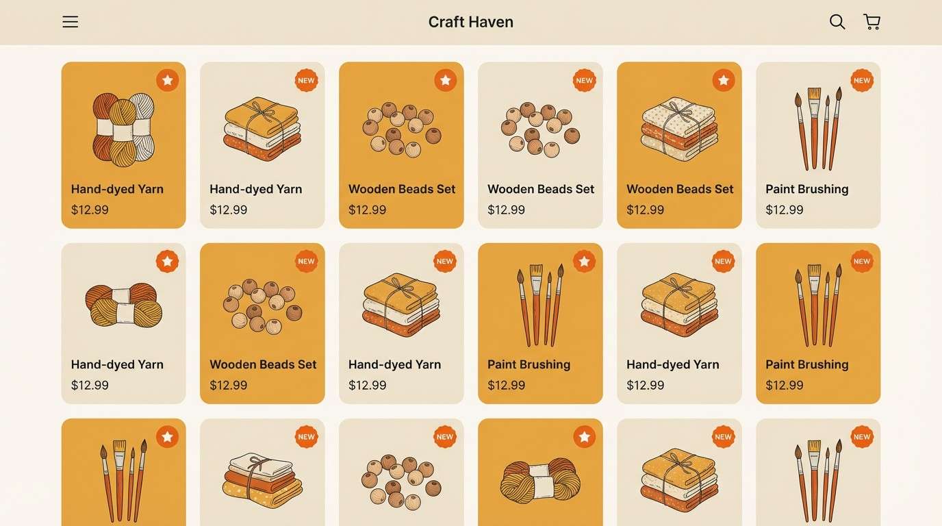
18) Rustic Hearth
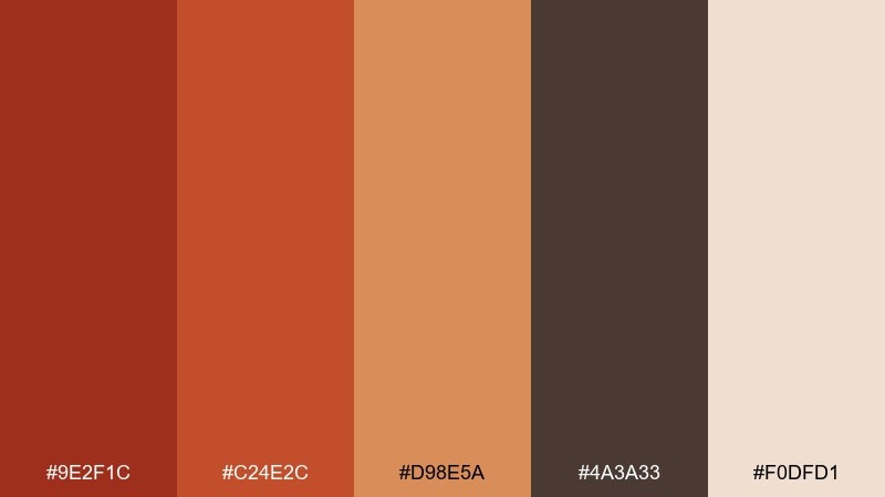
HEX: #9E2F1C #C24E2C #D98E5A #4A3A33 #F0DFD1
Mood: homey, vintage, comforting
Best for: holiday invitations and family events
Homey and vintage, like a hearth-lit room with baked clay and linen. The softer tan-orange keeps the mood friendly, while the darker brown anchors names and dates. Pair with subtle paper grain and classic serif type for a timeless invite. Usage tip: keep the background cream dominant and use the reds sparingly for emphasis on RSVP details.
Image example of rustic hearth generated using media.io

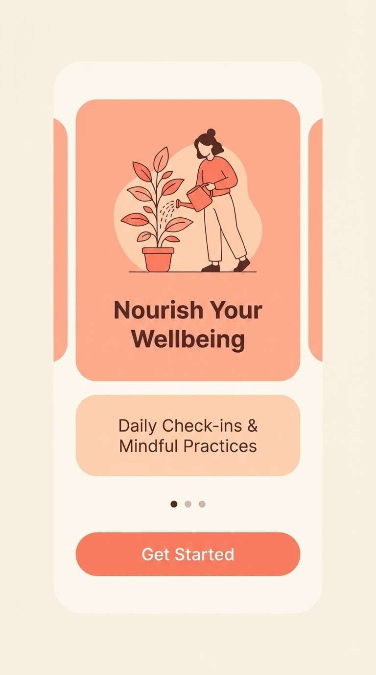
19) Firelight Pastel
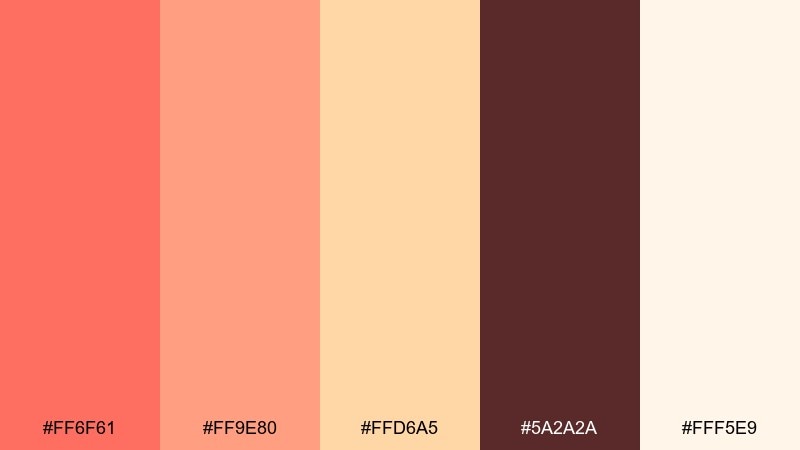
HEX: #FF6F61 #FF9E80 #FFD6A5 #5A2A2A #FFF5E9
Mood: soft, friendly, optimistic
Best for: wellness brands and onboarding screens
Soft and friendly, like firelight diffused through a sheer curtain. The pastel coral and peach are gentle enough for wellness messaging, especially with lots of airy cream. Pair with rounded UI components and minimal line icons for calm clarity. Usage tip: use the dark cocoa shade only for critical text to maintain a soothing, low-contrast feel.
Image example of firelight pastel generated using media.io
20) Inferno Minimal
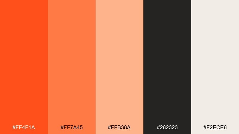
HEX: #FF4F1A #FF7A45 #FFB38A #262323 #F2ECE6
Mood: clean, modern, punchy
Best for: startup branding and minimalist ads
Clean and modern, like a single spark in a calm studio space. The orange trio creates a tidy progression for hover states, badges, and data highlights, while the charcoal keeps everything sharp. Pair with lots of off-white and a strict grid for a contemporary look. Usage tip: use the light peach as a background tint behind key modules to add warmth without losing minimalism.
Image example of inferno minimal generated using media.io

What Colors Go Well with Flame?
Flame tones (orange, red-orange, ember red) look most polished when paired with deep neutrals like charcoal, espresso brown, or near-black. These darker anchors control the intensity and make bright highlights feel intentional.
Warm off-whites and creams also complement flame shades better than stark white, because they keep the overall temperature consistent. This is especially helpful for UI backgrounds, packaging, and editorial layouts.
For accents, try muted golds, sand-beige, or even a small touch of cool contrast (like a desaturated teal) when you need extra separation. Keep cool accents minimal so the palette still reads as flame-first.
How to Use a Flame Color Palette in Real Designs
Start with one “hero” flame hue for primary actions (buttons, key headers), then use adjacent warm tones for hover states, tags, or secondary highlights. This creates hierarchy without visual noise.
Reserve the darkest shade for type, navigation, and framing elements, especially in dense layouts. If you’re designing for print, test contrast early—some warm creams and golds can merge under certain lighting or paper stocks.
When using photography, warm the image slightly so the palette feels cohesive. A consistent warmth across UI and imagery makes flame combinations feel modern rather than overly saturated.
Create Flame Palette Visuals with AI
If you want to preview a flame palette on posters, brand boards, landing pages, or app screens, generating quick mockups can save hours. The fastest approach is to describe the layout and include your flame tones as the dominant colors.
Use the prompts included under each palette as a starting point, then swap in your product type (restaurant, wellness, sports, luxury) and preferred aspect ratio. Keep the background neutral to let ember and amber accents stand out.
Once you find a look you like, generate a few variations to test contrast, spacing, and how the palette reads at different sizes.
Flame Color Palette FAQs
-
What is a flame color palette?
A flame color palette is a set of warm, fire-inspired colors—typically reds, oranges, ambers, and warm neutrals—used to create energetic, heat-like visuals in branding, UI, and print design. -
Which neutral works best with flame tones: white or cream?
Cream and warm off-white usually work better than pure white because they match the warmth of orange and ember reds, making layouts feel more cohesive and less harsh. -
How do I keep flame color combinations from looking too loud?
Use a dark anchor (charcoal, espresso, near-black) for text and structure, keep bright oranges for accents and CTAs, and give the design plenty of negative space on warm neutrals. -
Are flame palettes good for UI design?
Yes—use flame hues for CTAs, highlights, badges, and data emphasis, while relying on dark neutrals for readable typography and warm off-whites for backgrounds to maintain comfort. -
What colors complement flame orange in branding?
Charcoal/black, deep browns, warm beige, sand, and muted gold complement flame orange. For a small contrast accent, a desaturated teal can work if used sparingly. -
How do I choose a flame palette for print packaging?
Prioritize darker browns or near-black for fine print, test the contrast between gold/yellow and cream on real paper, and keep the brightest hues for logos or small callouts. -
Can I generate flame palette mockups with AI?
Yes—use Media.io Text-to-Image to generate posters, brand boards, or UI mockups by describing the scene and specifying ember/orange/amber as dominant colors along with a neutral background.


