

A green blue orange color scheme is one of the easiest ways to balance nature, clarity, and energy in one system. Green feels grounded, blue adds trust and structure, and orange brings the punch that makes layouts feel alive.
Below are 20 curated green blue orange color combinations with HEX codes, plus practical tips for UI, branding, print, and packaging. Use them as ready-to-test starting points, then tweak proportions to match your content and contrast needs.
In this article
- Why Green Blue Orange Color Schemes Work So Well
-
- sea glass citrus
- forest harbor
- retro surf stand
- autumn reef
- neon orchard
- clay pot lagoon
- alpine signal
- botanical pop
- pumpkin tide
- urban park transit
- spice market night
- glacier apricot
- electric trail map
- citrus classroom
- harbor lanterns
- terra cotta marina
- sunrise circuit
- vintage camper
- orchard undersea
- signal & sage
- What Colors Go Well with Green Blue Orange?
- How to Use a Green Blue Orange Color Palette in Real Designs
- Create Green Blue Orange Palette Visuals with AI
Why Green Blue Orange Color Schemes Work So Well
Green and blue sit next to each other on the color wheel, so they naturally harmonize and create a stable base. That makes them ideal for large surfaces like backgrounds, navigation, charts, and packaging fields.
Orange is the controlled “disruptor” that adds warmth and urgency without needing a full neon palette. In UI and marketing layouts, it’s perfect for CTAs, labels, badges, and key data points because it stands out cleanly against most blues and many greens.
When you add a light neutral (cream, off-white, or soft gray), the whole scheme becomes easier to read and scale. You can keep orange minimal while still getting strong hierarchy and a modern, friendly feel.
20+ Green Blue Orange Color Palette Ideas (with HEX Codes)
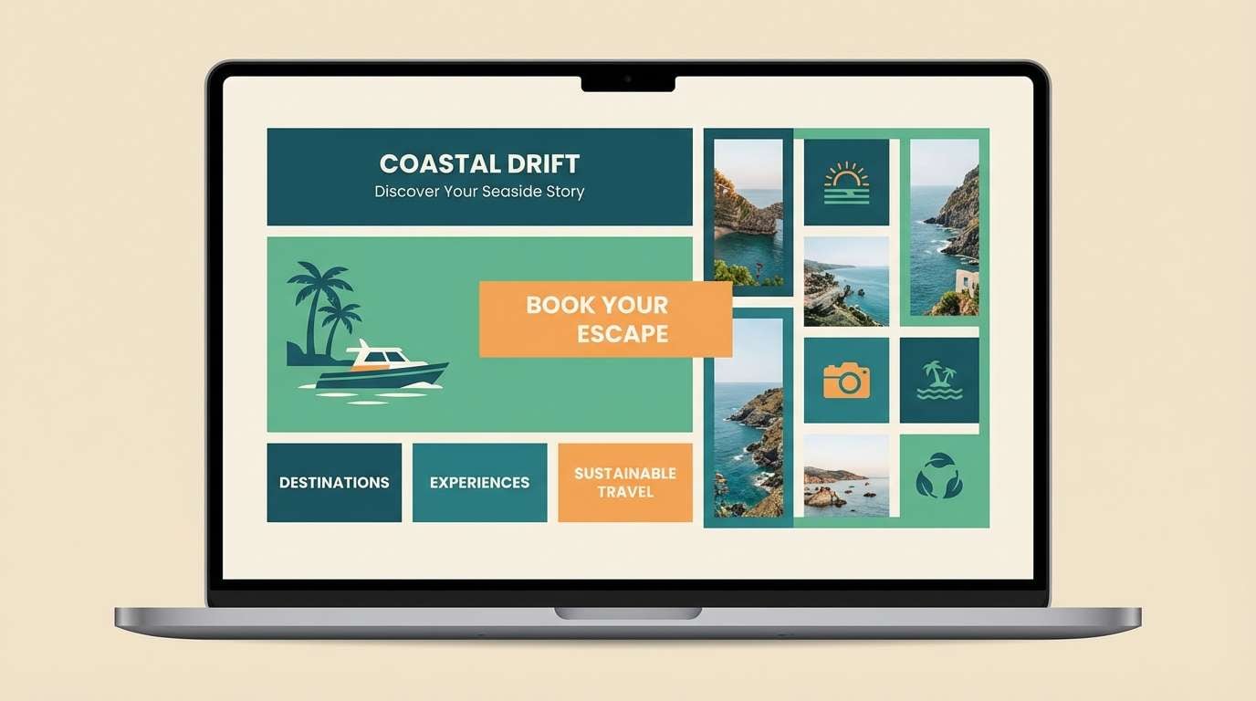
1) Sea Glass Citrus
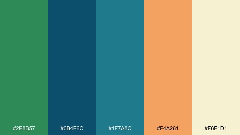
HEX: #2E8B57 #0B4F6C #1F7A8C #F4A261 #F6F1D1
Mood: breezy, coastal, optimistic
Best for: travel branding and website landing pages
Breezy and sunlit, this green blue orange color scheme feels like sea glass on warm sand with a squeeze of citrus. Use the teal-blue tones for headers and navigation, then bring in orange as the call-to-action accent. Pair it with off-white backgrounds and plenty of whitespace to keep the page airy. Tip: reserve the brightest orange for one primary button per screen to protect contrast and hierarchy.
Image example of sea glass citrus generated using media.io
Media.io is an online AI studio for creating and editing video, image, and audio in your browser.

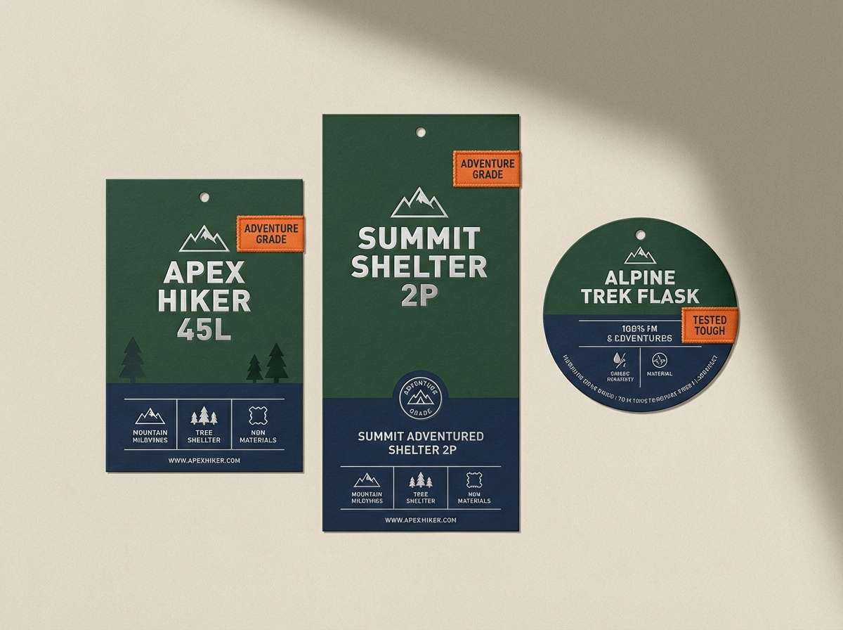
2) Forest Harbor
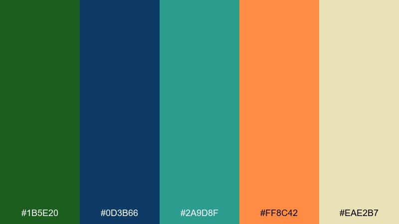
HEX: #1B5E20 #0D3B66 #2A9D8F #FF8C42 #EAE2B7
Mood: rugged, grounded, adventurous
Best for: outdoor product packaging and labels
Rugged and steady, the green blue orange palette brings to mind pine trails meeting a deep-water harbor at dusk. Use the dark green and navy for sturdy label typography and brand marks, and let the orange pop for flavor names or key badges. The pale beige keeps the package readable without turning sterile. Tip: print-test the navy text on beige at small sizes to avoid fill-in on coated stock.
Image example of forest harbor generated using media.io
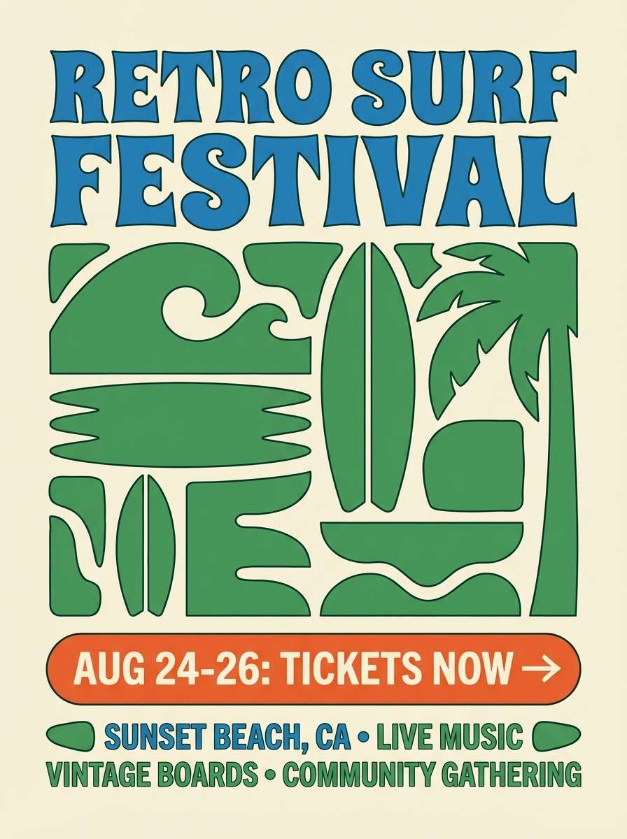
3) Retro Surf Stand
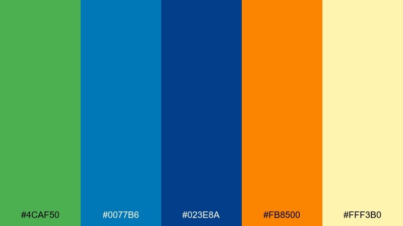
HEX: #4CAF50 #0077B6 #023E8A #FB8500 #FFF3B0
Mood: playful, vintage, sunny
Best for: summer event posters and promo flyers
Playful and throwback, it evokes a retro surf stand with painted boards and bright signage. Let the bold blue handle big headlines while green supports secondary blocks and icons. Use orange for dates and ticket highlights so they read instantly from a distance. Tip: keep the yellow-cream as the poster base to maintain that nostalgic print vibe.
Image example of retro surf stand generated using media.io
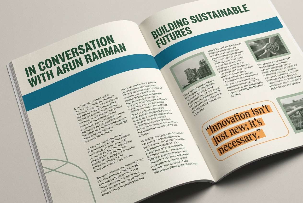
4) Autumn Reef
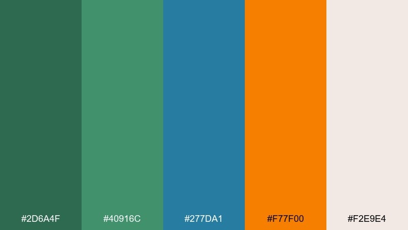
HEX: #2D6A4F #40916C #277DA1 #F77F00 #F2E9E4
Mood: warm, editorial, sophisticated
Best for: magazine layouts and long-form blog editorials
Warm and layered, it feels like coral reefs viewed through late-afternoon light. These green blue orange color combinations work especially well in editorial spreads where you need both energy and restraint. Use the blues for section dividers and pull quotes, then add orange sparingly for callouts or data points. Tip: keep body text on the soft off-white and reserve the darkest green for headings to improve readability.
Image example of autumn reef generated using media.io
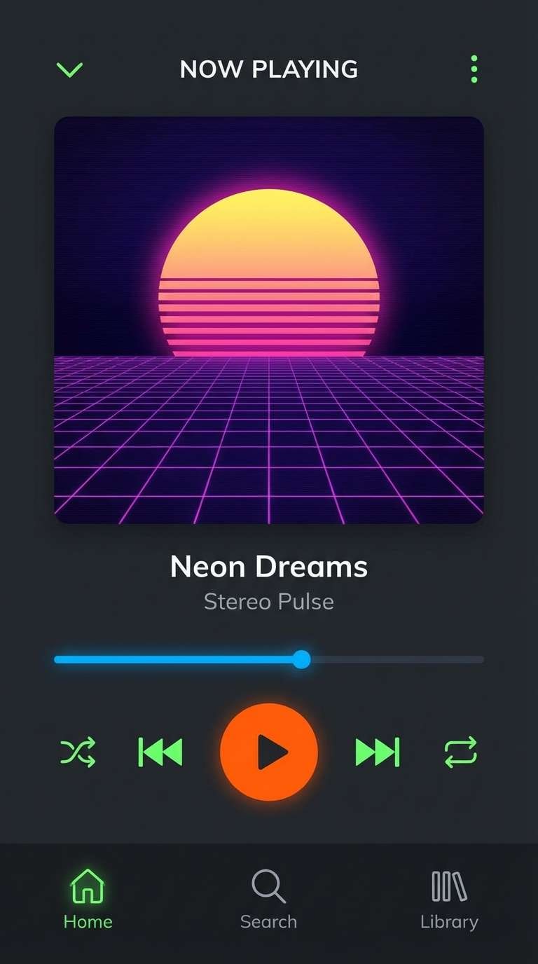
5) Neon Orchard
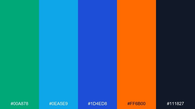
HEX: #00A878 #0EA5E9 #1D4ED8 #FF6B00 #111827
Mood: bold, energetic, night mode
Best for: music app UI and night-themed dashboards
Bold and high-voltage, it suggests neon fruit signs glowing against a midnight street. The near-black base keeps the screen sleek while the green and blues provide clear UI states and progress indicators. Orange becomes your notification or play-button color, so use it consistently for action. Tip: reserve the brightest blue for links and selected tabs to avoid competing highlights.
Image example of neon orchard generated using media.io
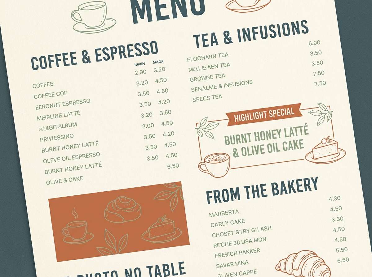
6) Clay Pot Lagoon
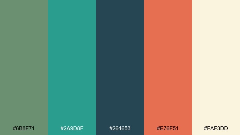
HEX: #6B8F71 #2A9D8F #264653 #E76F51 #FAF3DD
Mood: earthy, relaxed, artisan
Best for: cafe menus and small-batch food branding
Earthy and relaxed, it recalls clay pots by a calm lagoon and a sun-warmed patio. A green blue orange color scheme like this suits menus where you want handcrafted warmth without losing structure. Use the deep slate-teal for menu headings, keep the cream for generous negative space, and let the terracotta-orange mark specials. Tip: add thin teal rules between sections to keep long menus scannable.
Image example of clay pot lagoon generated using media.io
7) Alpine Signal
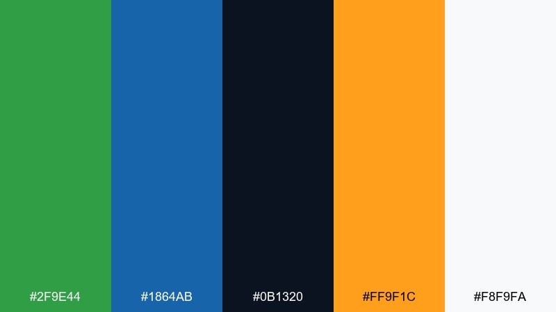
HEX: #2F9E44 #1864AB #0B1320 #FF9F1C #F8F9FA
Mood: crisp, confident, modern
Best for: tech startup branding and identity systems
Crisp and confident, it feels like clear mountain air with a bright summit signal. Use the deep near-black for wordmarks and body copy, with blue for trust-building interface elements. Orange is ideal for a single standout brand accent such as a logo spark or CTA. Tip: build a simple 60-30-10 balance using white, blue, then orange to keep the system clean.
Image example of alpine signal generated using media.io
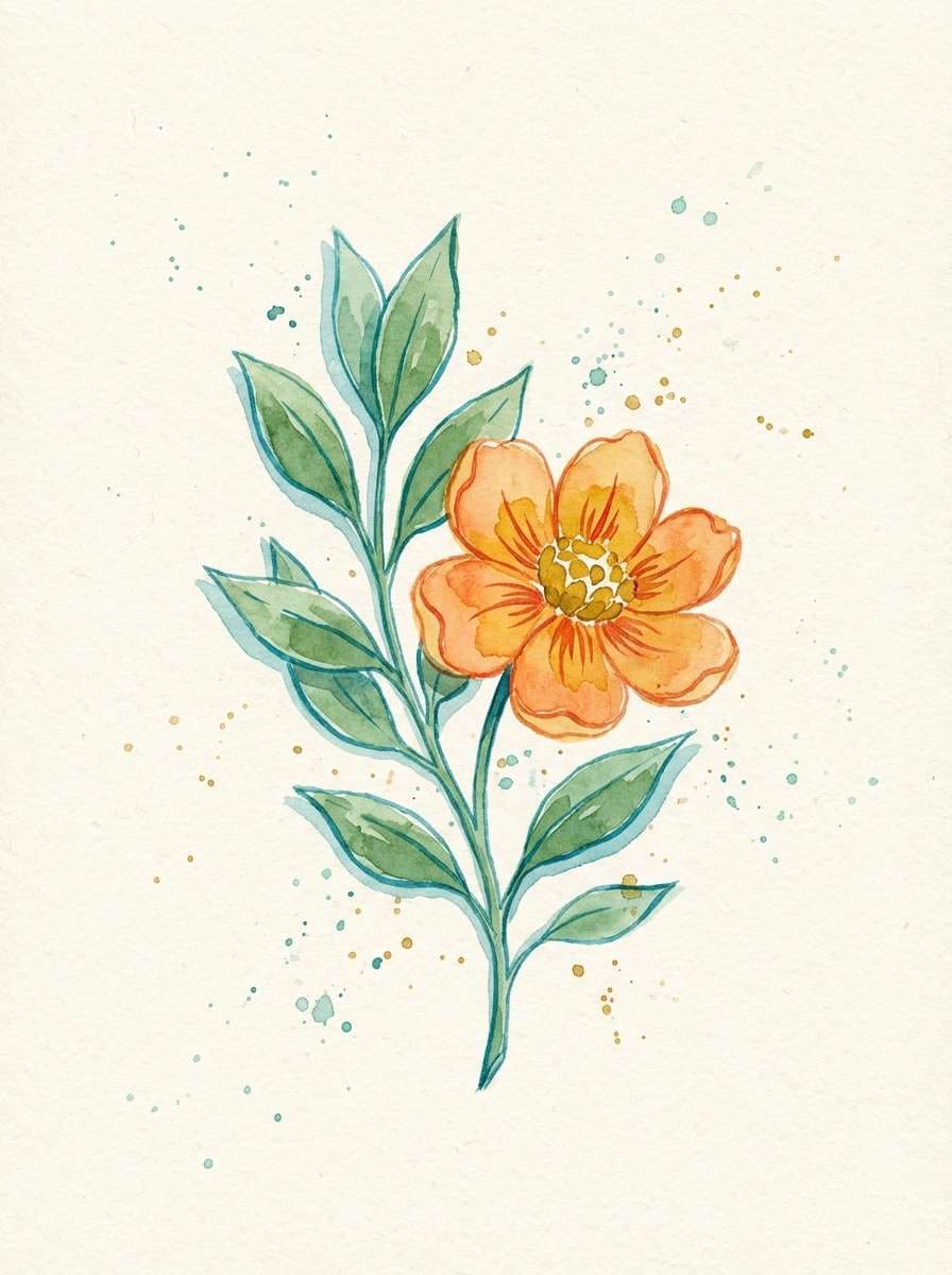
8) Botanical Pop
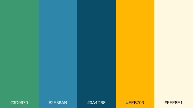
HEX: #3D9970 #2E86AB #0A4D68 #FFB703 #FFF8E1
Mood: fresh, sunny, illustrative
Best for: watercolor botanical art and spring stationery
Fresh and sunny, it looks like leafy stems painted beside a bright marigold bloom. The soft cream background keeps watercolor textures light and readable. Use the teal-blue for shadows and outlines, then let the golden orange bring the focal petals forward. Tip: keep the darkest teal for fine details only so the illustration stays airy.
Image example of botanical pop generated using media.io
9) Pumpkin Tide
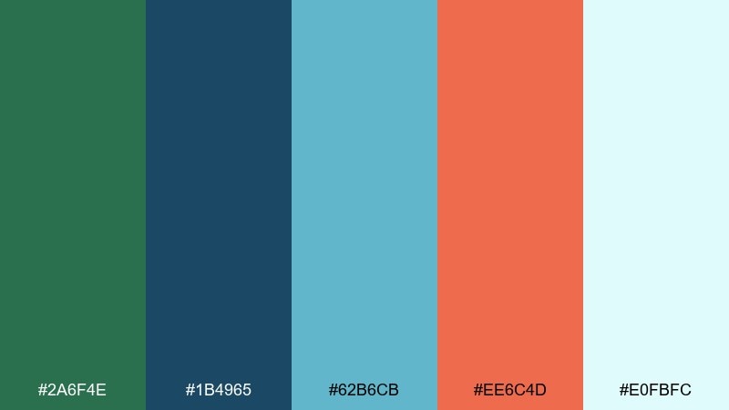
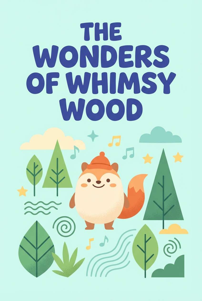
HEX: #2A6F4E #1B4965 #62B6CB #EE6C4D #E0FBFC
Mood: friendly, bright, storybook
Best for: children's book covers and learning graphics
Friendly and storybook, this green blue orange color palette suggests a pumpkin boat floating on a sparkling tide. Use the light aqua as the page field, then anchor titles with the deeper blue for strong readability. Orange works beautifully for character details and playful badges. Tip: keep outlines in the darker blue instead of black to soften the overall look.
Image example of pumpkin tide generated using media.io
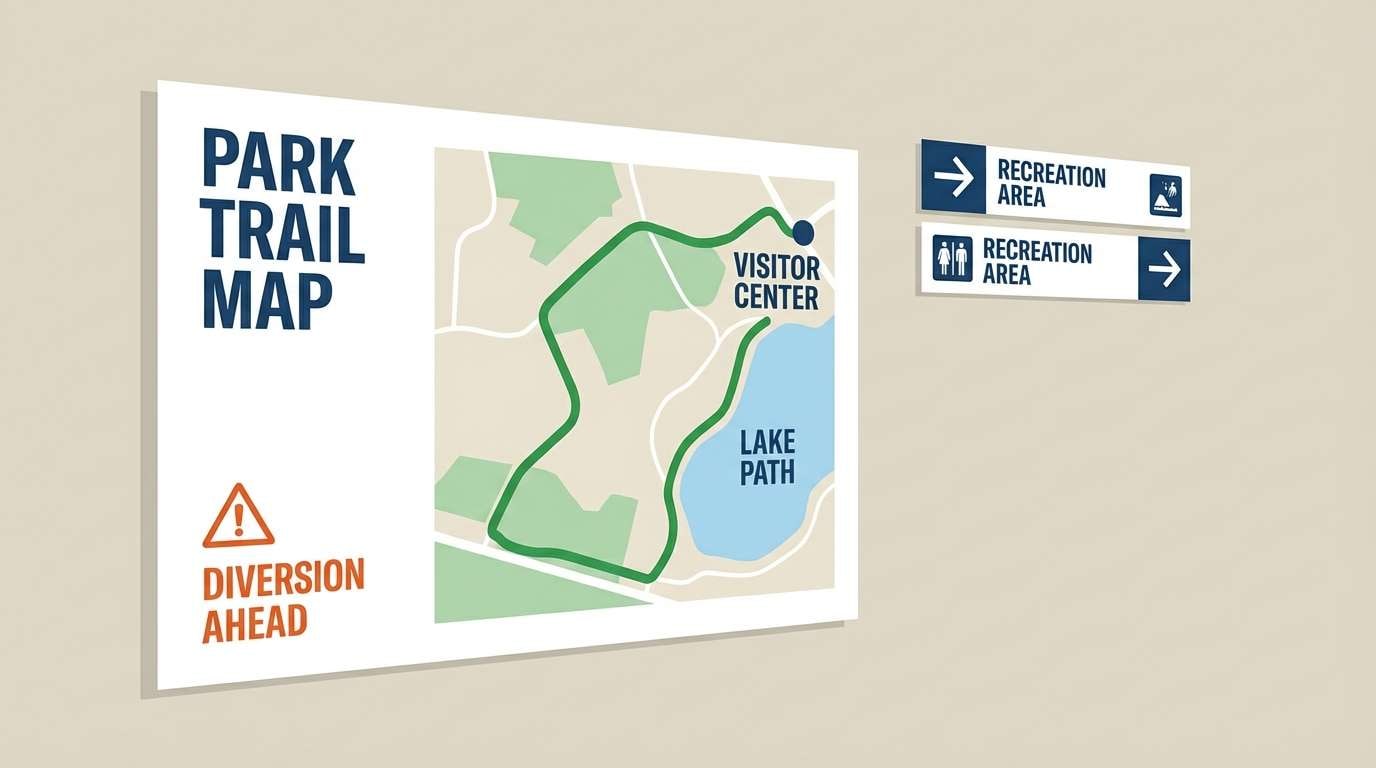
10) Urban Park Transit
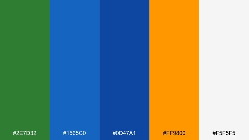
HEX: #2E7D32 #1565C0 #0D47A1 #FF9800 #F5F5F5
Mood: clean, functional, city-smart
Best for: wayfinding signage and public info graphics
Clean and city-smart, it feels like a bike lane cutting through a green park beside a busy boulevard. The blues support clear hierarchy for labels, maps, and icons, while orange makes priority notices instantly visible. Keep the light gray-white as the dominant field to avoid visual noise. Tip: test the orange on white for accessibility and add a blue outline when needed for small symbols.
Image example of urban park transit generated using media.io
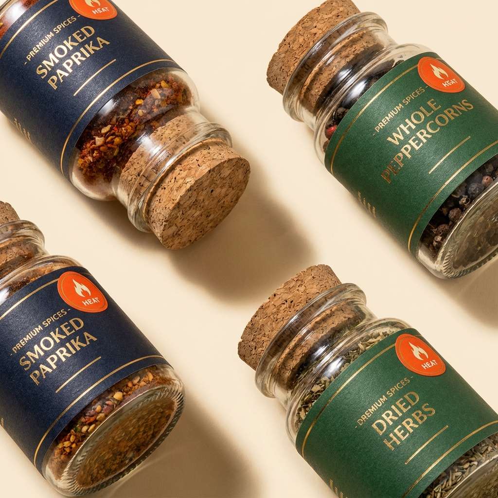
11) Spice Market Night
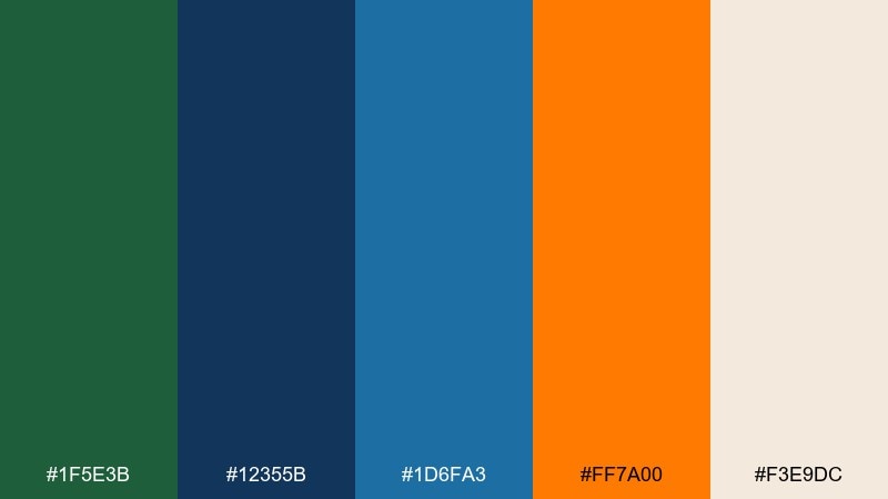
HEX: #1F5E3B #12355B #1D6FA3 #FF7A00 #F3E9DC
Mood: moody, flavorful, premium
Best for: spice jar packaging and product ads
Moody and flavorful, this green blue orange color scheme brings to mind a night market stall lit by warm lanterns. Use the navy and deep green for premium label bases, then let orange highlight heat level or tasting notes. The warm cream is perfect for ingredient lists and small-print compliance text. Tip: keep the orange limited to one badge and one accent line to maintain a high-end feel.
Image example of spice market night generated using media.io
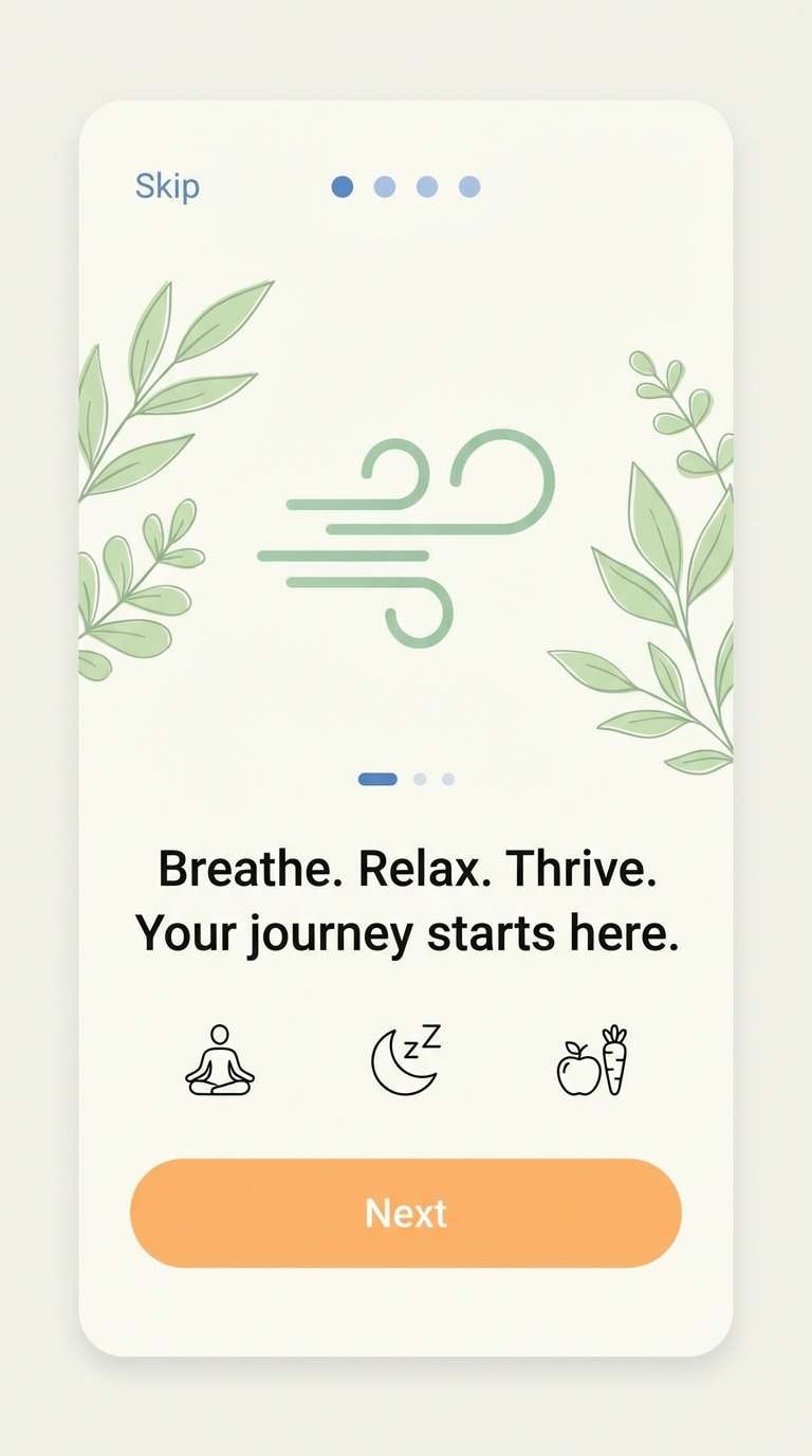
12) Glacier Apricot
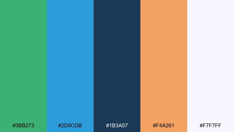
HEX: #3BB273 #2D9CDB #1B3A57 #F4A261 #F7F7FF
Mood: calm, refreshing, friendly
Best for: wellness app UI and onboarding screens
Calm and refreshing, it feels like glacier water with a hint of apricot sweetness. Use the soft off-white for spacious layouts and the mid-blue for primary navigation and progress states. Orange works best for gentle prompts like reminders or next-step buttons. Tip: apply the darkest blue to key text only, so the interface stays light and soothing.
Image example of glacier apricot generated using media.io
13) Electric Trail Map
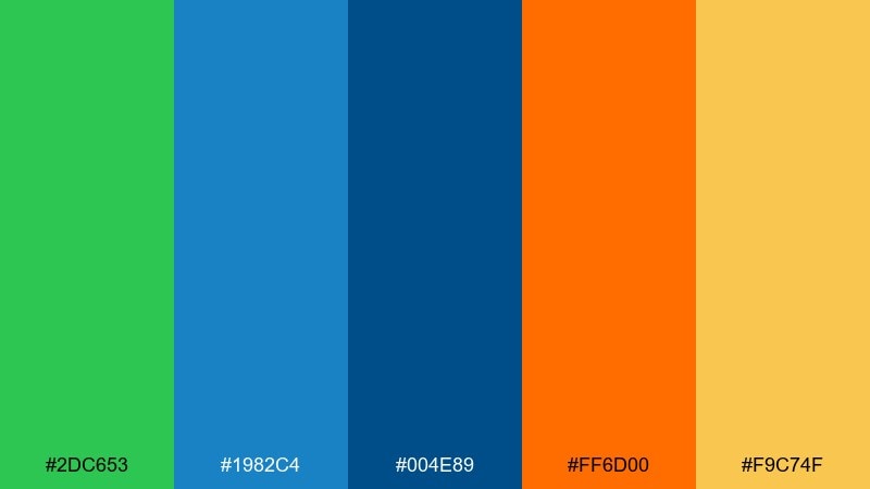
HEX: #2DC653 #1982C4 #004E89 #FF6D00 #F9C74F
Mood: dynamic, sporty, outdoorsy
Best for: infographics and route maps
Dynamic and sporty, this green blue orange color palette looks like a trail map marked with bright pins and high-contrast routes. Use the deep blue for titles and legends, while the brighter blue supports secondary data labels. Orange and yellow make perfect markers for key points and warnings. Tip: keep the green for route lines so users can track paths quickly across a busy layout.
Image example of electric trail map generated using media.io

14) Citrus Classroom
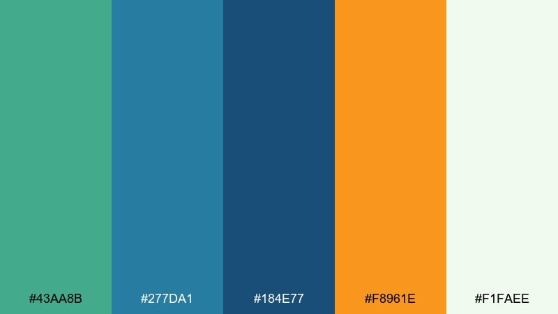
HEX: #43AA8B #277DA1 #184E77 #F8961E #F1FAEE
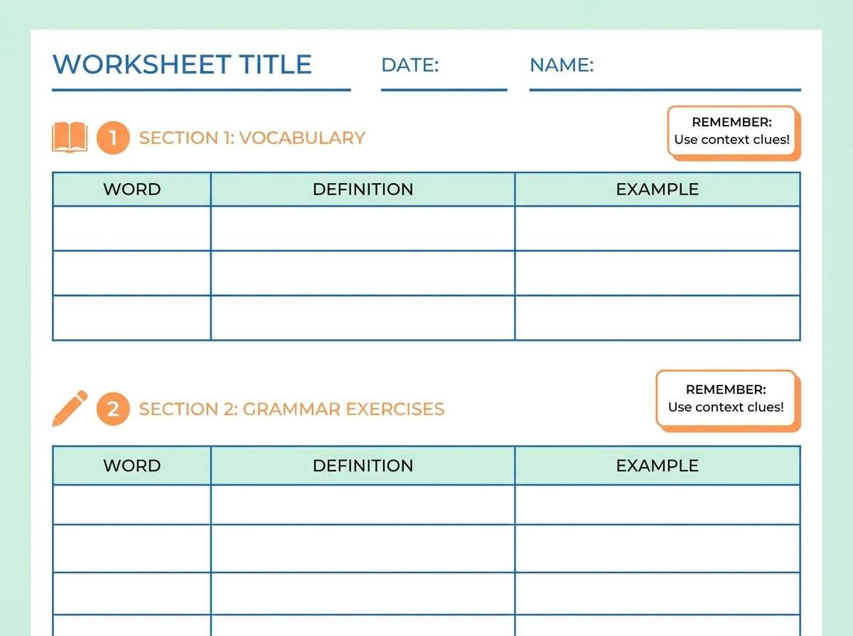
Mood: cheerful, organized, approachable
Best for: printable worksheets and lesson materials
Cheerful and organized, it feels like a bright classroom wall with neatly labeled bins. Use the pale mint as the page base to reduce glare, then bring in blue for headings and tables. Orange is perfect for section numbers, stars, and small prompts that guide the eye. Tip: stick to one blue for body text and save the darker blue for header bars only.
Image example of citrus classroom generated using media.io
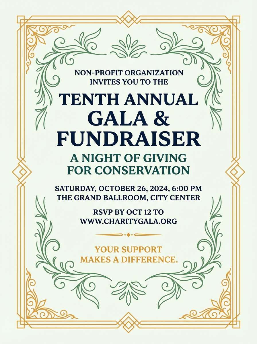
15) Harbor Lanterns
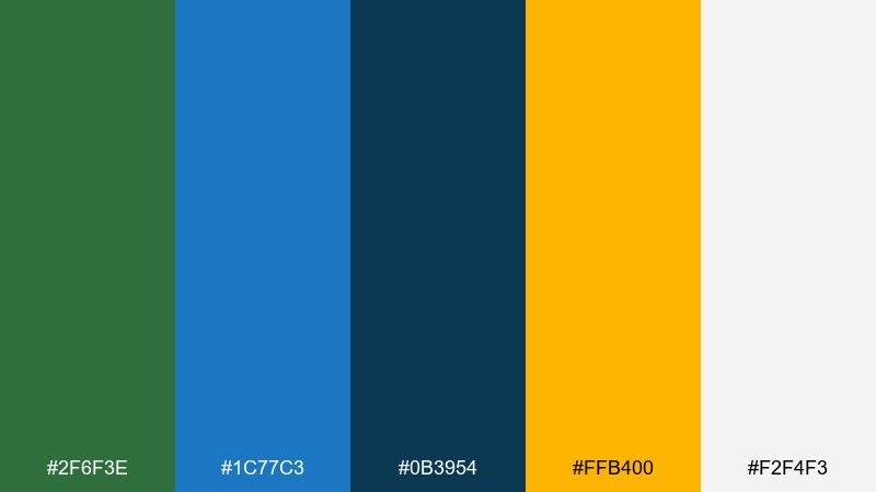
HEX: #2F6F3E #1C77C3 #0B3954 #FFB400 #F2F4F3
Mood: elegant, festive, evening
Best for: fundraiser invitations and gala flyers
Elegant and festive, it suggests harbor lights reflecting on water after sunset. The deep blue-green tones give you a formal base for typography and monograms. Use the golden orange as a foil-like highlight for dates, RSVP, and borders. Tip: keep the background very light and let the dark tones frame the content for a premium invitation look.
Image example of harbor lanterns generated using media.io
16) Terra Cotta Marina
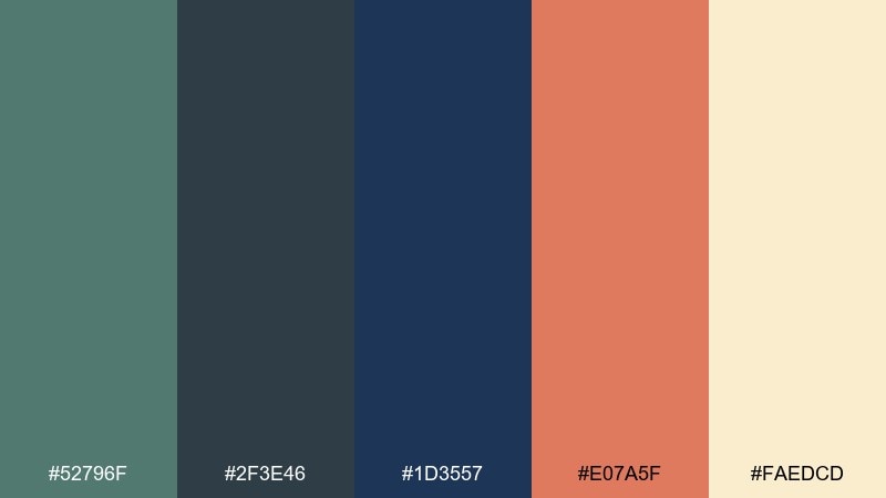
HEX: #52796F #2F3E46 #1D3557 #E07A5F #FAEDCD
Mood: cozy, refined, interior-inspired
Best for: interior design mood boards and lookbooks
Cozy and refined, these tones feel like terra cotta planters beside a calm marina at dusk. Use the cream as your canvas, then layer the slate and navy for text blocks and material labels. The warm orange works best as a small accent for pins, swatches, or section tabs. Tip: keep photo borders in the slate tone to unify mixed imagery.
Image example of terra cotta marina generated using media.io
17) Sunrise Circuit
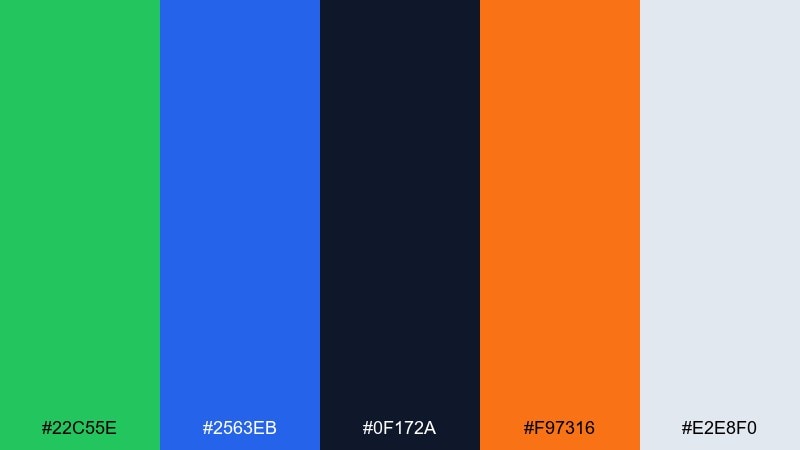
HEX: #22C55E #2563EB #0F172A #F97316 #E2E8F0
Mood: fast, modern, tech-forward
Best for: SaaS dashboards and analytics UI
Fast and tech-forward, it evokes a sunrise glow over a clean circuit board. These green blue orange color combinations are ideal for dashboards where status clarity matters. Use blue for navigation and primary charts, green for success states, and orange for warnings or key KPIs. Tip: keep the background light and let the near-black handle dense text to reduce eye strain.
Image example of sunrise circuit generated using media.io
18) Vintage Camper

HEX: #2E8B57 #2B59C3 #355070 #F4A259 #FCEFE3
Mood: nostalgic, friendly, road-trip
Best for: travel blog headers and illustrated banners
Nostalgic and friendly, it brings up a vintage camper rolling toward the coast. Use the cream for the sky or negative space, with blue as the main headline color for strong contrast. Green supports landscape elements, while the warm orange adds sun and highlight details. Tip: keep gradients subtle and lean on flat shapes so the palette stays retro, not glossy.
Image example of vintage camper generated using media.io

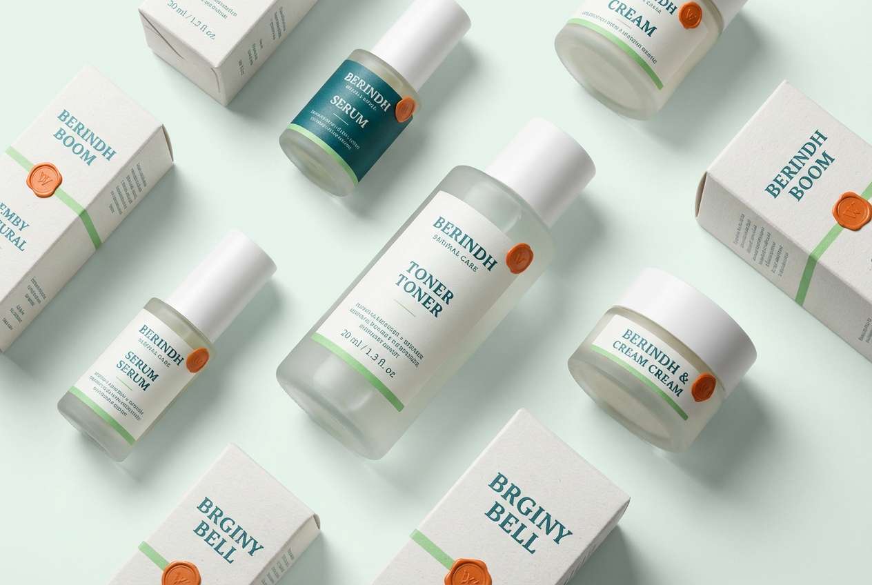
19) Orchard Undersea
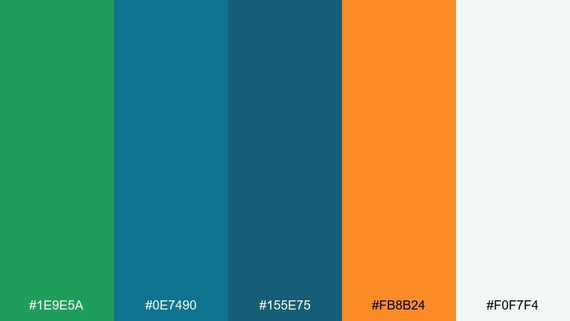
HEX: #1E9E5A #0E7490 #155E75 #FB8B24 #F0F7F4
Mood: fresh, clean, modern-organic
Best for: skincare packaging and ecommerce visuals
Fresh and clean, it feels like an orchard breeze drifting underwater through kelp. A green blue orange color palette like this shines on skincare packaging where you want natural cues with a modern edge. Use teal for the main label, keep the pale mint-white for breathing room, and add orange as a small seal or scent marker. Tip: set product names in the darkest teal and limit orange to one brand stamp per panel.
Image example of orchard undersea generated using media.io
20) Signal & Sage
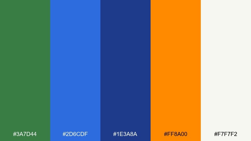
HEX: #3A7D44 #2D6CDF #1E3A8A #FF8A00 #F7F7F2
Mood: confident, sharp, presentation-ready
Best for: pitch decks and keynote templates
Confident and sharp, it suggests a clear signal line running through soft sage notes. For a green blue orange color scheme, use the deeper blue for slide titles and charts, and keep the off-white as your dominant background. Orange works best for one takeaway per slide, like a metric or a key bullet icon. Tip: repeat the green in section divider slides to build rhythm across the deck.
Image example of signal & sage generated using media.io
What Colors Go Well with Green Blue Orange?
Neutrals are the easiest win: warm off-whites, cream, and light grays keep green and blue feeling modern while giving orange room to act as a clean accent. For dark themes, charcoal and near-black help the three colors look sharper and more “UI-ready.”
If you want more depth, add a muted navy or slate to support typography and dense content areas. For softer, lifestyle-friendly work, try sand, beige, or pale mint to reduce contrast while staying fresh.
For an extra pop, a tiny touch of yellow (as a highlight, not a main color) can make charts, pins, or stickers feel more playful. Keep it limited so orange remains the primary attention color.
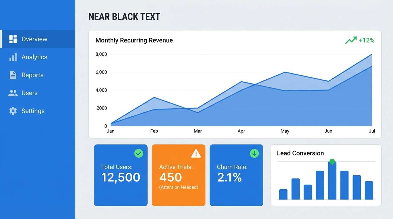
How to Use a Green Blue Orange Color Palette in Real Designs
Start with role-based assignments: use blue for structure (navigation, headings, charts), green for positive states or supporting blocks, and orange for actions (CTA, alerts, key stats). This keeps your interface consistent even as components scale.
In print and packaging, treat the darkest blue/green as your typography anchor and let a light neutral carry readability. Then use orange as a badge color for “new,” “limited,” “spicy,” “sale,” or any high-priority label.
When in doubt, keep orange under 10–15% of the composition. The palette stays premium and readable, and your highlights will still feel intentional.
Create Green Blue Orange Palette Visuals with AI
If you’re pitching a brand direction or testing a UI mood quickly, AI mockups can help you preview how green, blue, and orange interact across real layouts. The fastest approach is to describe the format (poster, app screen, packaging) and call out which color should be the main background vs. the accent.
Use your HEX codes as “color constraints,” then iterate on typography, spacing, and lighting. After you find a strong direction, you can refine contrast and accessibility in your design tool of choice.
Green Blue Orange Color Palette FAQs
-
What does a green blue orange color palette communicate?
It typically blends trust and clarity (blue), growth and stability (green), and energy or urgency (orange). That mix works well for brands that want to feel friendly, modern, and action-oriented. -
How do I keep orange from overpowering the design?
Use orange as an accent for CTAs, badges, or key metrics, and let blue/green handle larger areas like headers and panels. A light neutral background also helps orange feel controlled rather than loud. -
Which background colors work best with green blue orange schemes?
Off-white, cream, very light gray, and pale mint are strong choices for bright themes. For dark themes, charcoal or near-black makes the colors look crisp and improves perceived contrast. -
Is green blue orange good for UI and dashboards?
Yes—blue can define structure and navigation, green can map to success states, and orange can signal warnings or primary actions. Keep semantic meanings consistent across screens for better usability. -
What’s a simple proportion rule for these three colors?
Try 60-30-10: a neutral or light base at 60%, blue/green structure at 30%, and orange accents at 10%. Adjust based on contrast needs and how many interactive elements you have. -
Can I use this palette for print packaging?
Absolutely—use dark blue/green for readable type and brand marks, and reserve orange for flavor, scent, or “hero” callouts. Always run a small print test to confirm contrast and ink behavior on your chosen stock. -
How can I generate palette-based mockups quickly?
Use a text-to-image tool and specify the design format plus where each color should appear (background, typography, accent). Reuse the same prompt structure to iterate fast while keeping the palette consistent.


