

Gray green blue palettes sit right in the “calm but capable” zone—soft enough for wellness and lifestyle work, yet structured enough for modern UI and business design.
Below are 20 curated gray green blue color palette ideas with HEX codes, plus practical guidance on accents, contrast, and how to generate on-brand visuals fast.
In this article
Why Gray Green Blue Palettes Work So Well
Gray green blue color schemes feel instantly modern because they balance neutrality (gray), nature (green), and clarity (blue). That mix reads “trustworthy” without feeling too corporate or overly saturated.
They also scale well across mediums: light gray-mints make clean backgrounds, mid teals create UI hierarchy, and deep blue-grays deliver legible typography. You can stay minimal or add one warm accent for energy.
Most importantly, these muted coastal tones play nicely with photography and textures—linen, paper grain, concrete, and brushed metal—so branding and layouts feel premium with very little visual noise.
20+ Gray Green Blue Color Palette Ideas (with HEX Codes)
1) Misty Harbor
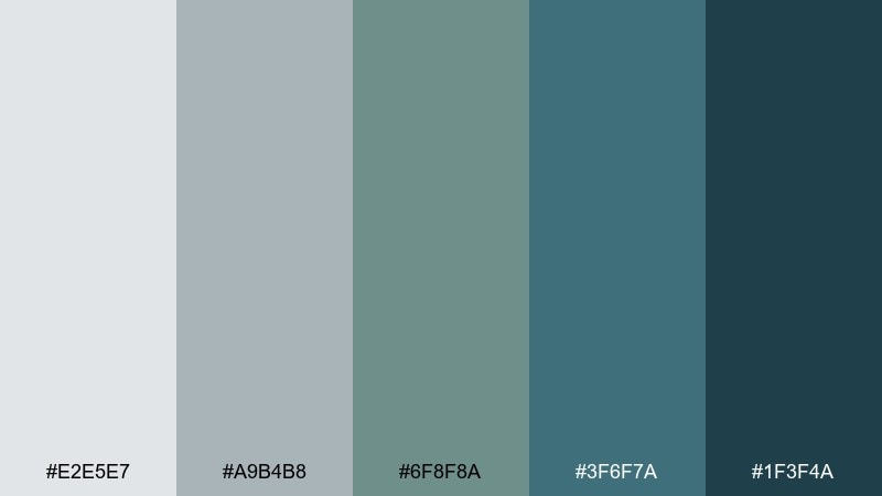
HEX: #e2e5e7 #a9b4b8 #6f8f8a #3f6f7a #1f3f4a
Mood: calm, coastal, refined
Best for: brand identity for wellness or travel
Calm harbor fog and deep water shadows give this set a quietly premium feel. It works beautifully for wellness, boutique travel, or any brand that needs trust without feeling corporate. Pair it with warm off-white and subtle paper textures to keep it human. Usage tip: reserve the darkest blue-gray for headlines and keep the mid tones for supporting shapes and dividers.
Image example of misty harbor generated using media.io
Media.io is an online AI studio for creating and editing video, image, and audio in your browser.

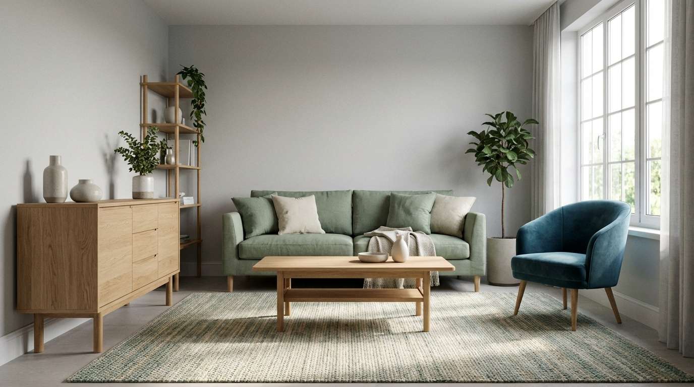
2) Sage Concrete
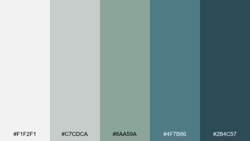
HEX: #f1f2f1 #c7cdca #8aa59a #4f7b86 #2b4c57
Mood: modern, grounded, airy
Best for: minimal interior paint planning
Soft concrete neutrals meet clean sage and a cool blue accent, like a bright loft near the sea. It suits modern interiors, especially living rooms and kitchens where you want freshness without stark white. Pair with light oak, brushed nickel, and linen to keep the look warm. Usage tip: use the pale gray as the main wall tone and bring the deeper teal in through textiles or cabinetry.
Image example of sage concrete generated using media.io
3) Glacier Fern
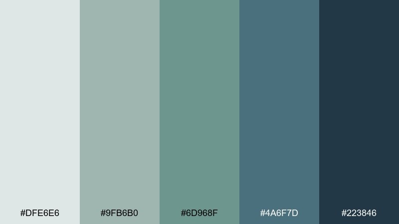
HEX: #dfe6e6 #9fb6b0 #6d968f #4a6f7d #223846
Mood: fresh, alpine, clean
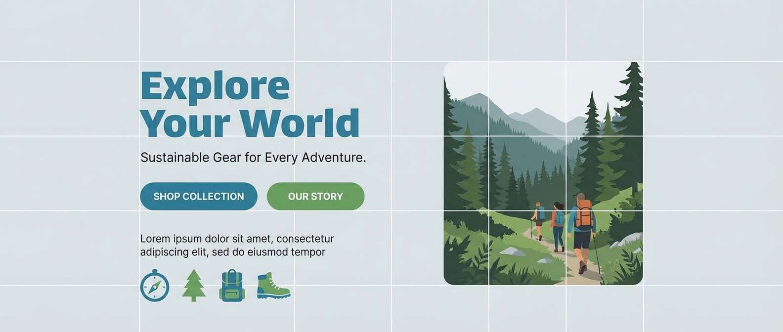
Best for: outdoor lifestyle landing page UI
Fresh alpine air and glacier meltwater energy make the tones feel crisp and athletic. As a gray green blue color palette, it fits outdoor, fitness, and eco tech pages where clarity matters. Pair with high-contrast charcoal type and plenty of whitespace for readability. Usage tip: keep CTAs in the mid teal-blue, then use the fern green for secondary highlights and icons.
Image example of glacier fern generated using media.io
4) Blue Spruce Fog
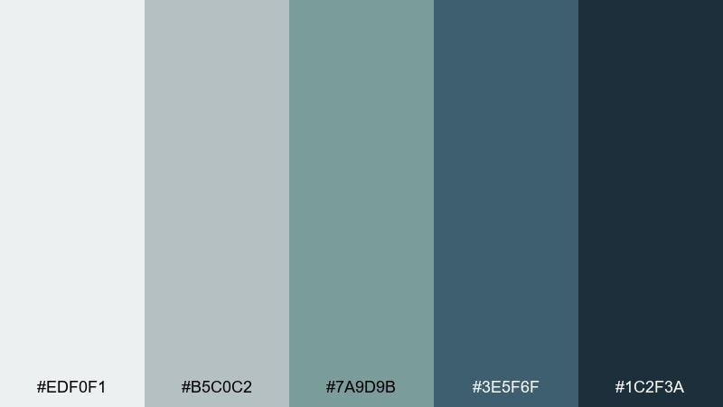
HEX: #edf0f1 #b5c0c2 #7a9d9b #3e5f6f #1c2f3a
Mood: moody, forested, sophisticated
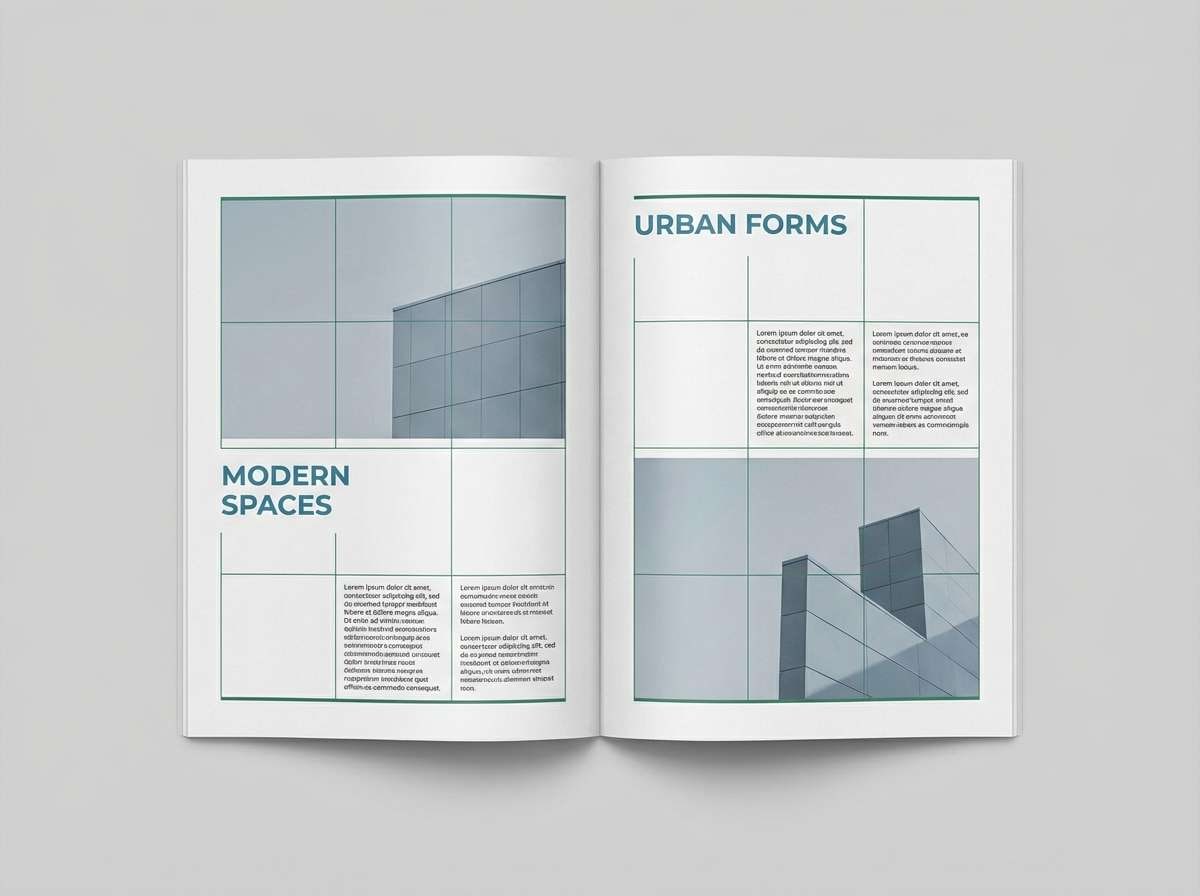
Best for: editorial layout for a design magazine
Blue spruce and morning fog bring a moody calm that still feels sharp and contemporary. It is ideal for editorial spreads, especially architecture and design features where images need a quiet frame. Pair with warm cream paper and a single metallic accent to avoid looking cold. Usage tip: set body text on the lightest gray and use the deep blue-gray for pull quotes and section headers.
Image example of blue spruce fog generated using media.io
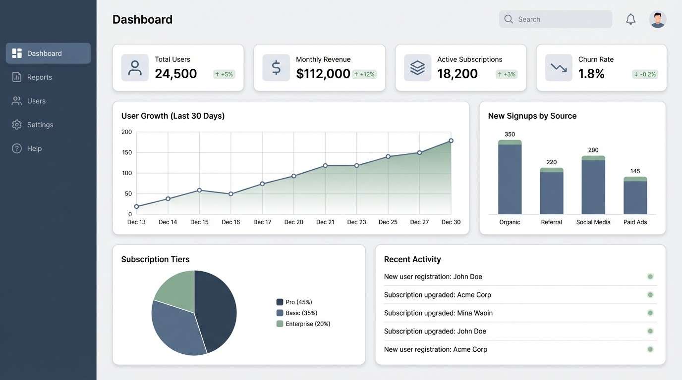
5) Coastal Slate
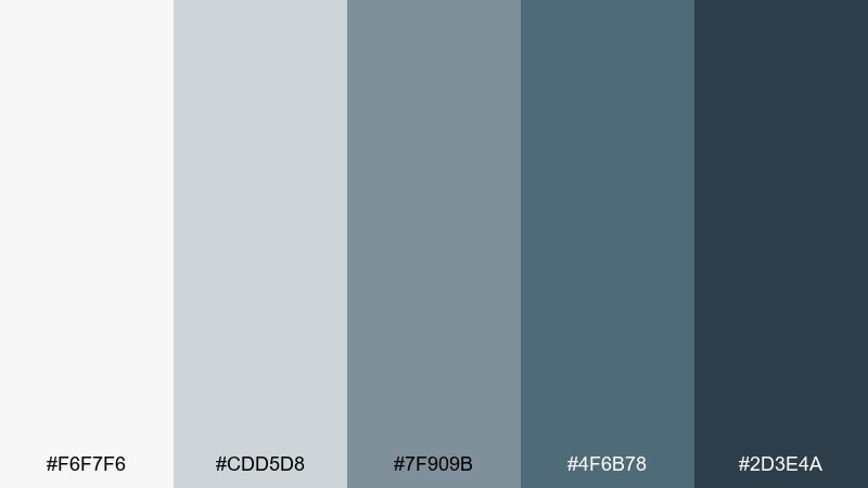
HEX: #f6f7f6 #cdd5d8 #7f909b #4f6b78 #2d3e4a
Mood: clean, professional, balanced
Best for: SaaS dashboard UI
Crisp slate and ocean-blue notes create a steady, professional feel without going dark. It is a strong match for SaaS dashboards where hierarchy, charts, and legible labels matter. Pair with a small warm accent like sand or soft peach for alerts and highlights. Usage tip: use the mid slate for borders and cards, then keep the deepest tone for navigation and key metrics.
Image example of coastal slate generated using media.io
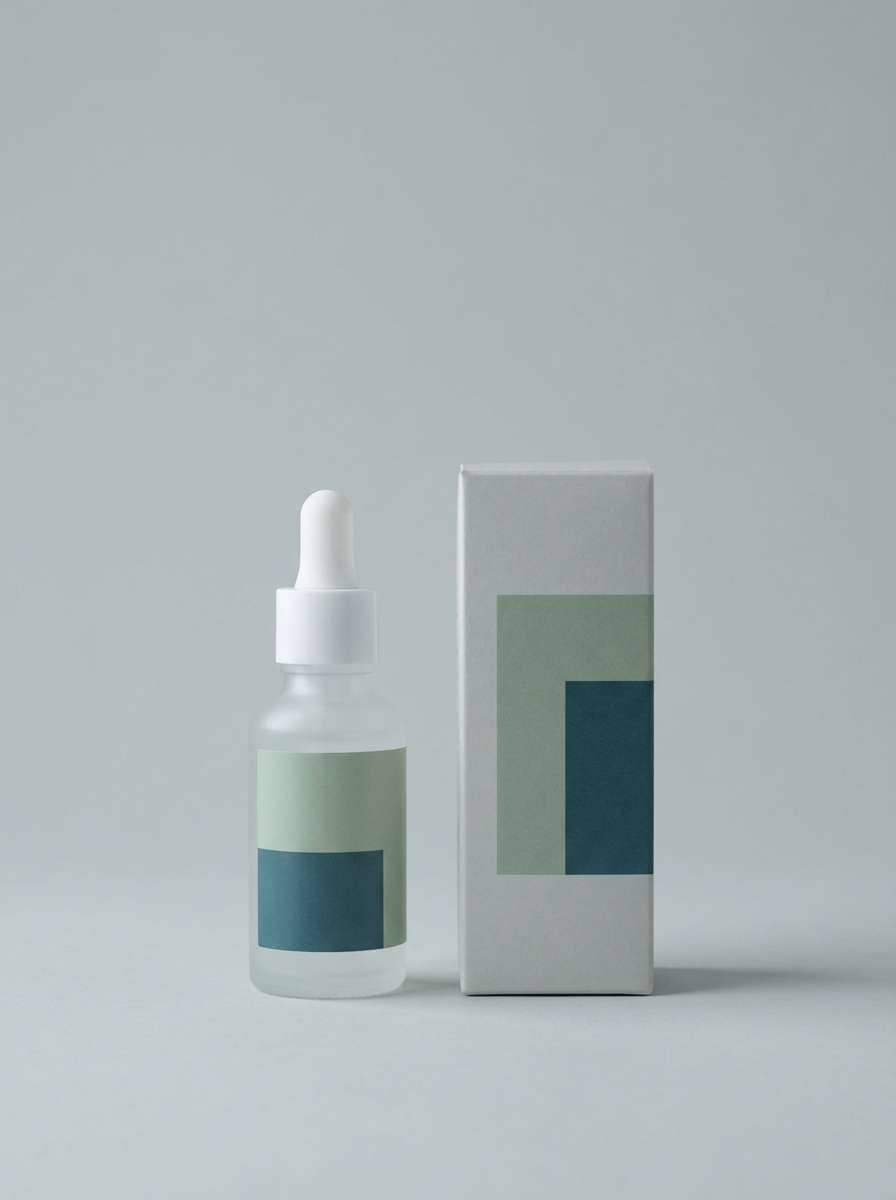
6) Rainy Botanica
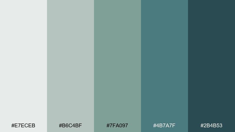
HEX: #e7eceb #b6c4bf #7fa097 #4b7a7f #2b4b53
Mood: rain-kissed, natural, soothing
Best for: skincare packaging and product ads
Rain on leaves and greenhouse glass gives these tones a soothing, clean-skin vibe. The gray green blue color combinations feel especially credible for skincare, apothecary, and spa packaging. Pair with uncoated paper, minimal line art, and a touch of warm beige to soften the coolness. Usage tip: keep labels high-contrast with the deep teal and let the lighter grays carry the background space.
Image example of rainy botanica generated using media.io
7) Nordic Lakehouse
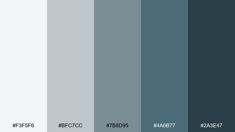
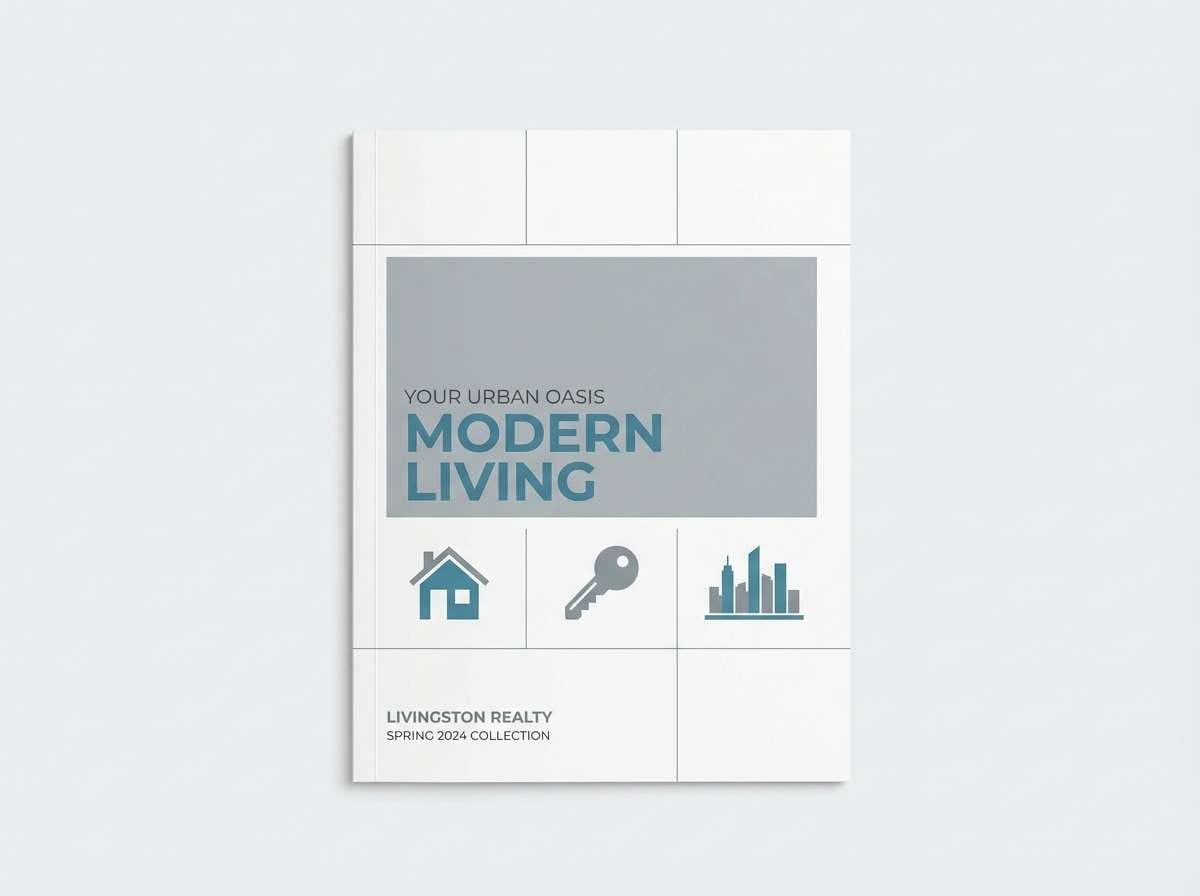
HEX: #f3f5f6 #bfc7cc #7b8d95 #4a6b77 #2a3e47
Mood: quiet, Nordic, structured
Best for: real estate brochure design
Quiet lake reflections and Nordic minimalism make the set feel orderly and approachable. It works well for real estate brochures, especially modern builds and waterfront listings. Pair with crisp photography and generous margins to keep the layout breathable. Usage tip: use the mid blue-gray for section bars and the darkest tone for pricing and key facts.
Image example of nordic lakehouse generated using media.io
8) Sea Glass Studio
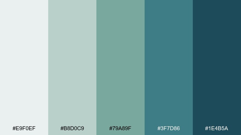
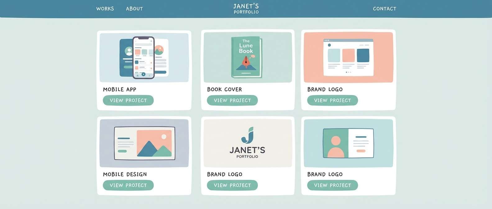
HEX: #e9f0ef #b8d0c9 #79a89f #3f7d86 #1e4b5a
Mood: bright, airy, creative
Best for: portfolio website for a designer
Sea glass brightness and clean teal depth make the palette feel creative but still tidy. It is excellent for portfolios where you want the work to stand out without a stark black-and-white frame. Pair with simple sans serif type and thin lines to emphasize the lightness. Usage tip: keep the background in the pale mint-gray and use the darkest teal only for hover states and key links.
Image example of sea glass studio generated using media.io
9) Graphite Lagoon
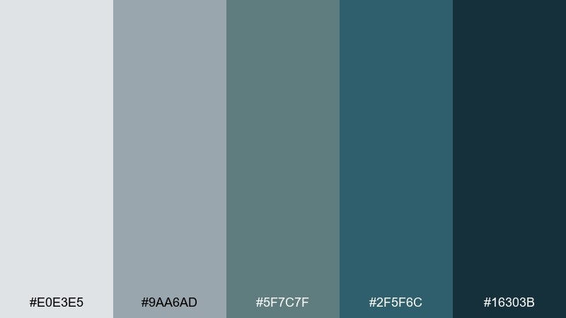
HEX: #e0e3e5 #9aa6ad #5f7c7f #2f5f6c #16303b
Mood: bold, urban, deep
Best for: event poster for a tech meetup
Deep lagoon blues and graphite grays set a confident, night-in-the-city tone. It is a strong option for tech meetup posters, conference signage, and social graphics that need contrast. Pair with white type and a single light mint highlight to keep the message crisp. Usage tip: use the darkest shade as a full-bleed background and build the hierarchy with lighter gray blocks.
Image example of graphite lagoon generated using media.io

10) Quiet Monument
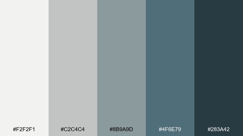
HEX: #f2f2f1 #c2c4c4 #8b9a9d #4f6e79 #283a42
Mood: classic, calm, timeless
Best for: corporate report and slide deck theme
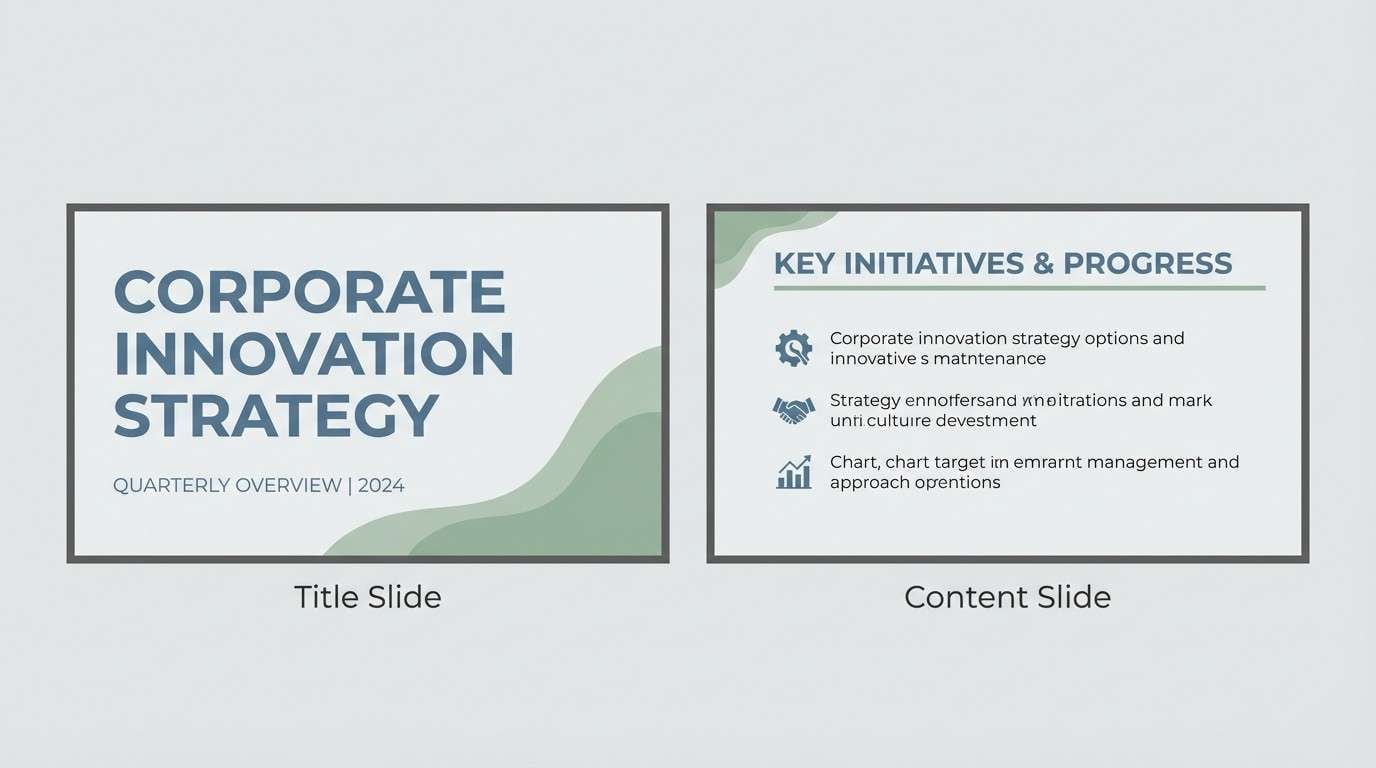
Stone monument neutrals mixed with restrained blue create a timeless, trustworthy mood. It fits annual reports, pitch decks, and professional documents that should feel stable rather than flashy. Pair with simple charts, thin rules, and plenty of negative space. Usage tip: keep graphs in the mid blue and reserve the darker tone for section titles and footers.
Image example of quiet monument generated using media.io
11) Mineral Meadow
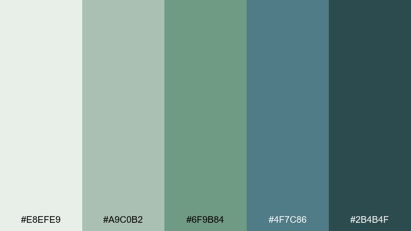
HEX: #e8efe9 #a9c0b2 #6f9b84 #4f7c86 #2b4b4f
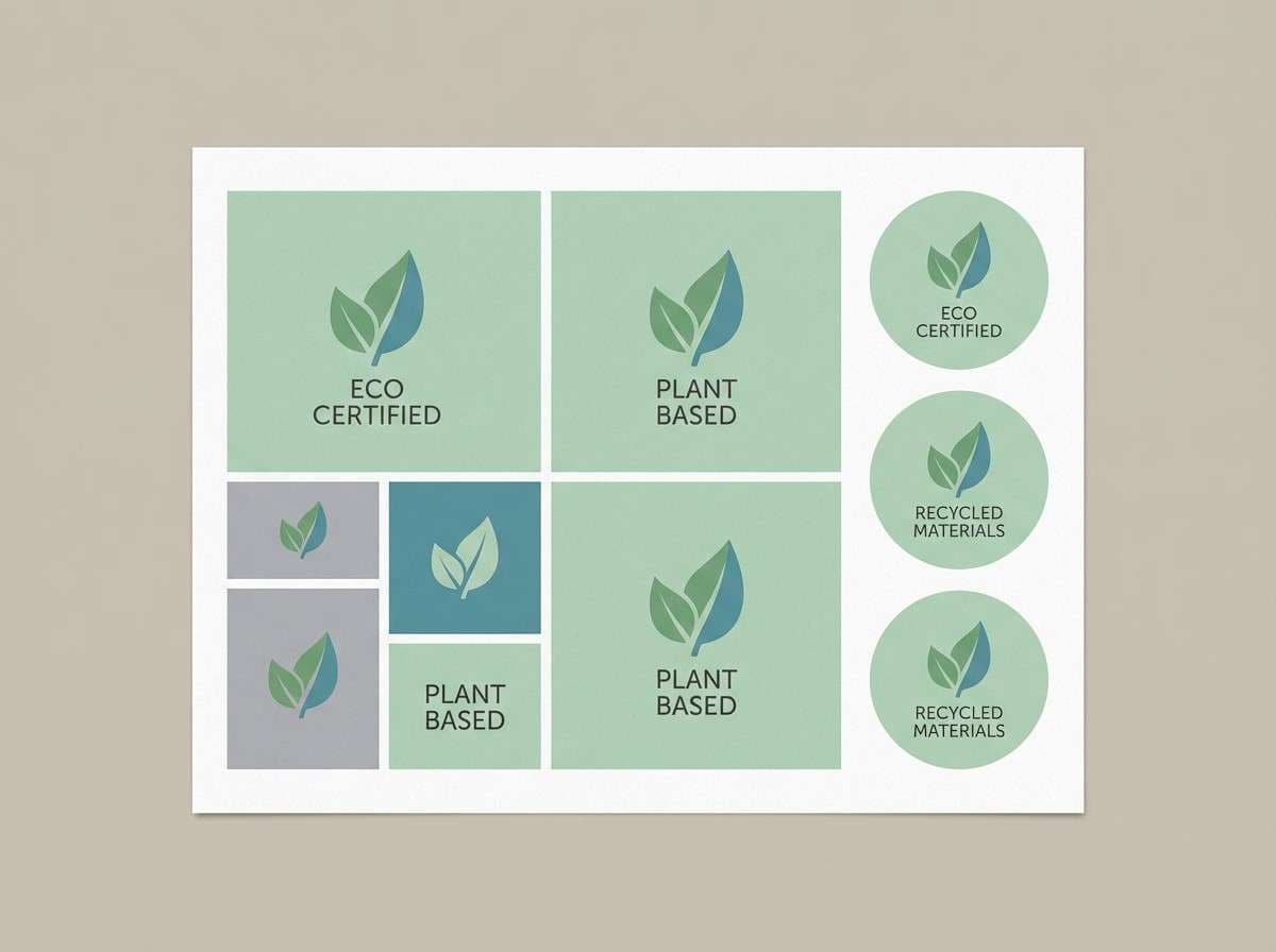
Mood: fresh, botanical, optimistic
Best for: eco product label design
Mineral greens and cool water blues feel like a clean hike after rain. As a gray green blue color palette, it reads instantly eco-friendly without leaning too rustic. Pair with kraft textures or bright white labels depending on how modern you want to go. Usage tip: keep the green as the brand anchor and use the blue-green for certification badges and small icons.
Image example of mineral meadow generated using media.io
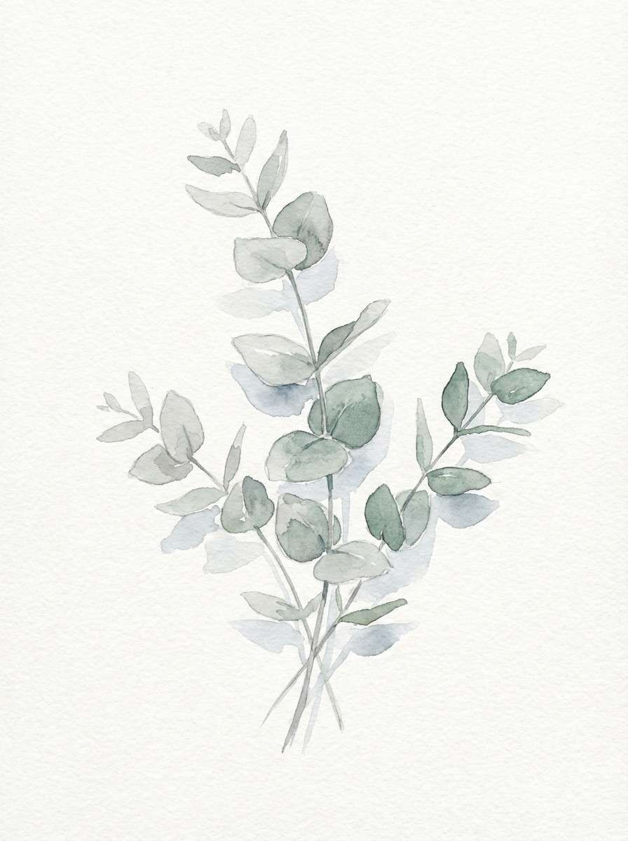
12) Eucalyptus Dusk
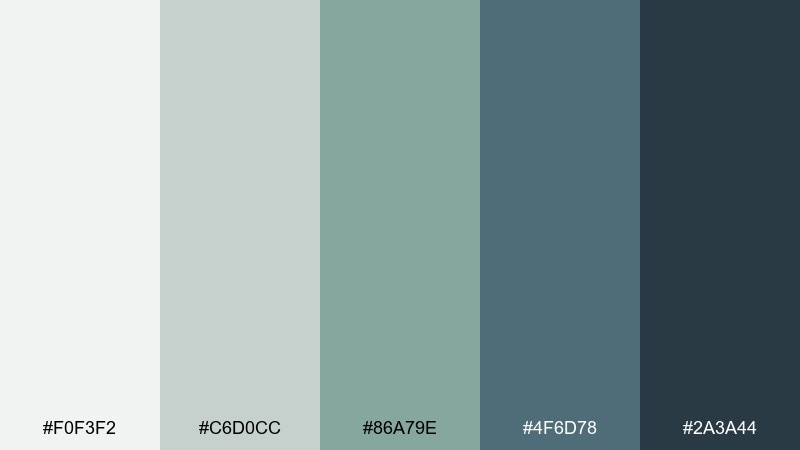
HEX: #f0f3f2 #c6d0cc #86a79e #4f6d78 #2a3a44
Mood: soft, evening, natural
Best for: watercolor botanical illustration set
Eucalyptus at dusk gives a soft, powdery calm with just enough cool depth. It is perfect for botanical illustration sets, stationery, or gentle social posts for wellness brands. Pair with warm ivory paper and fine pencil lines to keep it delicate. Usage tip: let the pale tones dominate and save the darkest blue-gray for stems, shadows, and small text.
Image example of eucalyptus dusk generated using media.io
13) Stormy Fjord
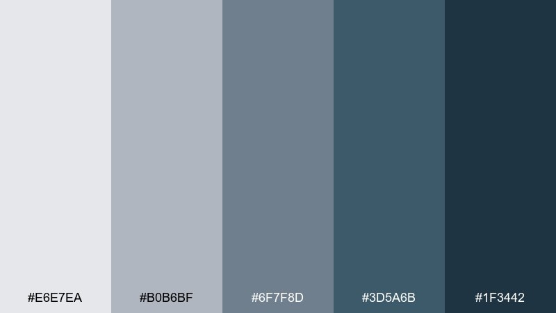
HEX: #e6e7ea #b0b6bf #6f7f8d #3d5a6b #1f3442
Mood: stormy, cinematic, cool
Best for: book cover design for a mystery novel
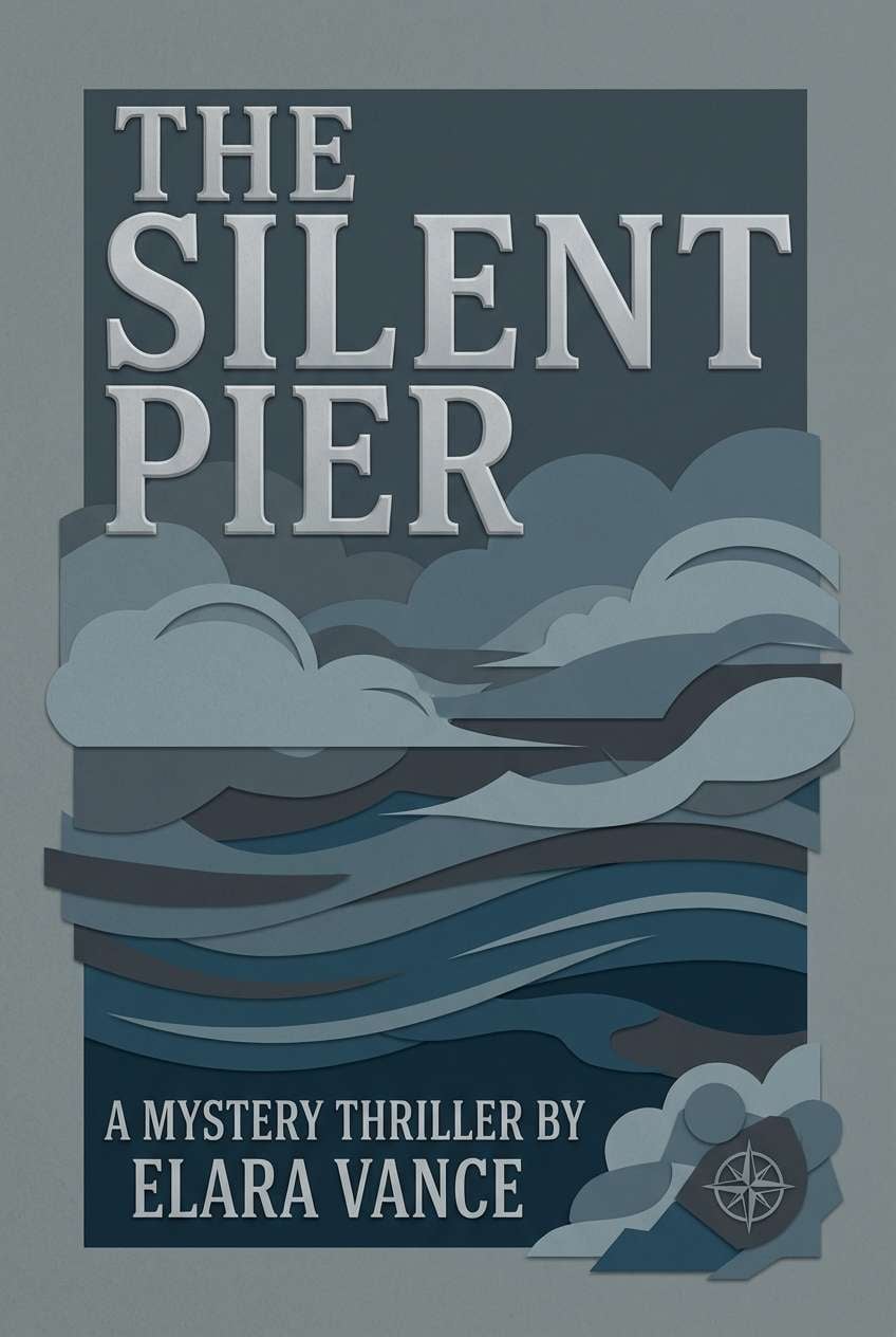
Storm clouds over a fjord bring cinematic tension and cool restraint. It works well for mystery and thriller book covers where mood is everything and typography needs to pop. Pair with one bright accent like icy white or a muted metallic foil for impact. Usage tip: set the title in the lightest gray and build depth with layered blue-gray gradients behind it.
Image example of stormy fjord generated using media.io
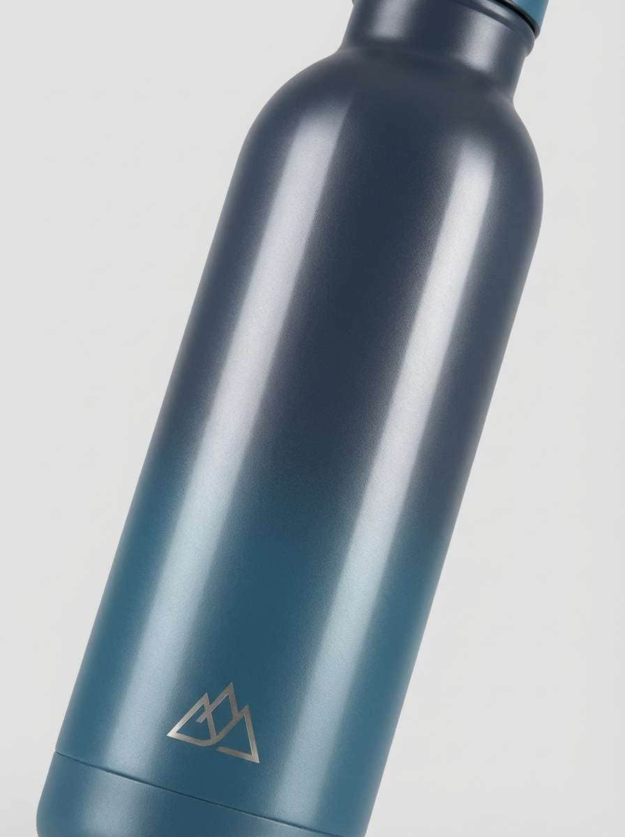
14) Deep Sea Canteen
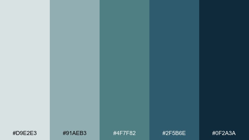
HEX: #d9e2e3 #91aeb3 #4f7f82 #2f5b6e #0f2a3a
Mood: adventurous, nautical, strong
Best for: reusable bottle product ad
Deep sea blues with a utilitarian green-blue edge feel rugged and ready for travel. It is great for outdoor gear ads, reusable bottles, and product pages that need a confident, technical look. Pair with clean sans typography and sharp lighting to keep it modern. Usage tip: use the darkest shade for the hero background and the lighter blue-gray for feature callouts.
Image example of deep sea canteen generated using media.io
15) Museum Calm
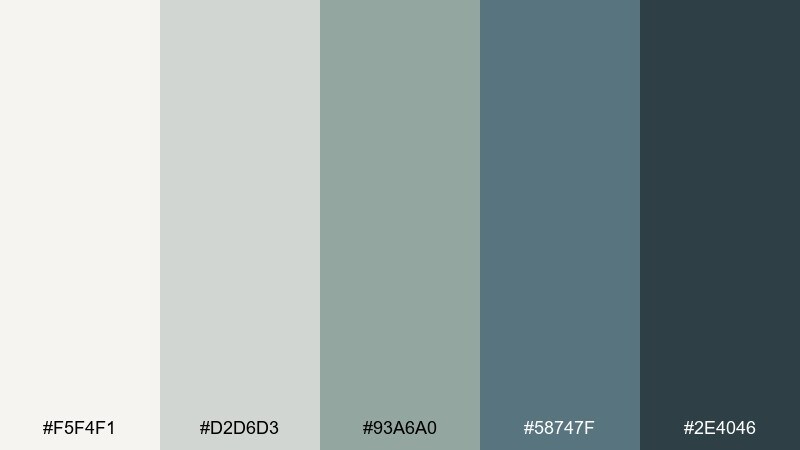
HEX: #f5f4f1 #d2d6d3 #93a6a0 #58747f #2e4046
Mood: quiet, cultured, warm-cool balance
Best for: gallery website and exhibition listings
Quiet gallery walls and cool-toned artifacts give this mix a cultured calm. It fits museum and exhibition sites where spacing, typography, and subtle contrast do the heavy lifting. Pair with warm off-white and a refined serif for headings to add elegance. Usage tip: keep listing pages mostly light, then use the deeper blue for filters, tabs, and selected states.
Image example of museum calm generated using media.io
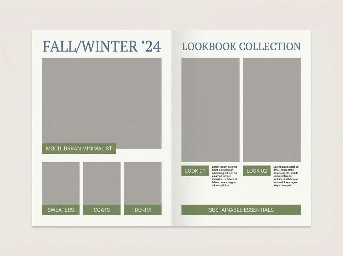
16) Urban Moss Denim
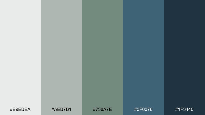
HEX: #e9ebea #aeb7b1 #738a7e #3f6376 #1f3440
Mood: street-smart, earthy, modern
Best for: casual apparel lookbook
Urban moss and worn denim vibes make this set feel casual, modern, and wearable. It is ideal for apparel lookbooks, sustainable fashion drops, and minimalist e-commerce banners. Pair with clean product photography and a restrained type system to keep the focus on fabric. Usage tip: use the moss tone for tags and labels, and keep the denim blue for buttons and links.
Image example of urban moss denim generated using media.io
17) Tidepool Typography
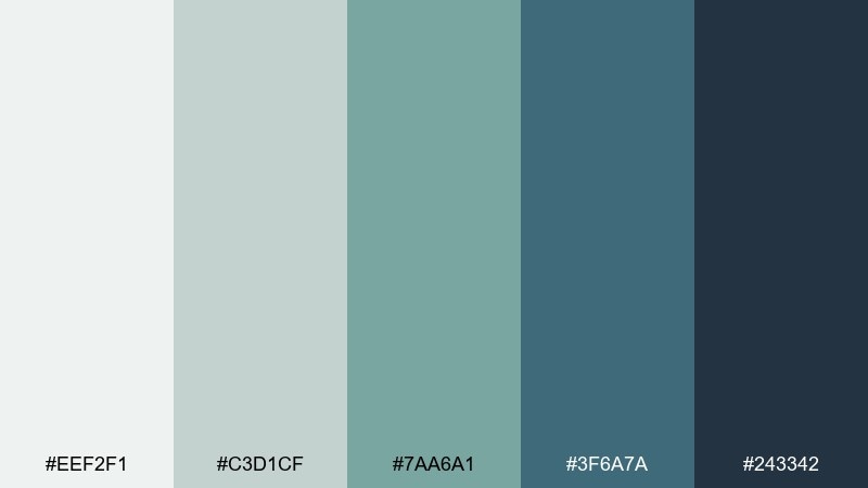
HEX: #eef2f1 #c3d1cf #7aa6a1 #3f6a7a #243342
Mood: clean, modern, design-forward
Best for: typography poster series
Tidepool clarity and inky letterforms make the set feel design-forward and intentional. These gray green blue color combinations shine in typographic posters where spacing and contrast matter more than imagery. Pair with a single type family in multiple weights to keep the series cohesive. Usage tip: use the pale gray as negative space and let the deepest tone carry the main wordmark.
Image example of tidepool typography generated using media.io
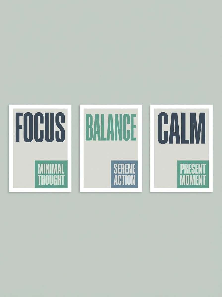
18) Slate Garden
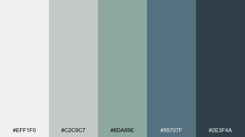
HEX: #eff1f0 #c2c9c7 #8da89e #55707f #2e3f4a
Mood: garden-fresh, tidy, relaxed
Best for: restaurant menu and signage
Slate paths and herb gardens create a relaxed, welcoming tone that still feels tidy. It is a great fit for modern cafes, seasonal menus, and storefront signage where you want calm confidence. Pair with creamy whites and a simple script accent for warmth. Usage tip: keep menu backgrounds light and use the deeper blue for section headers and pricing.
Image example of slate garden generated using media.io
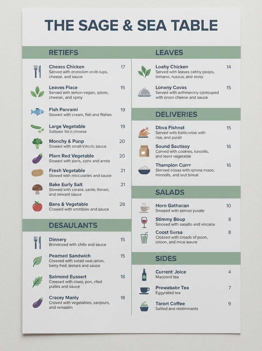
19) Winter River
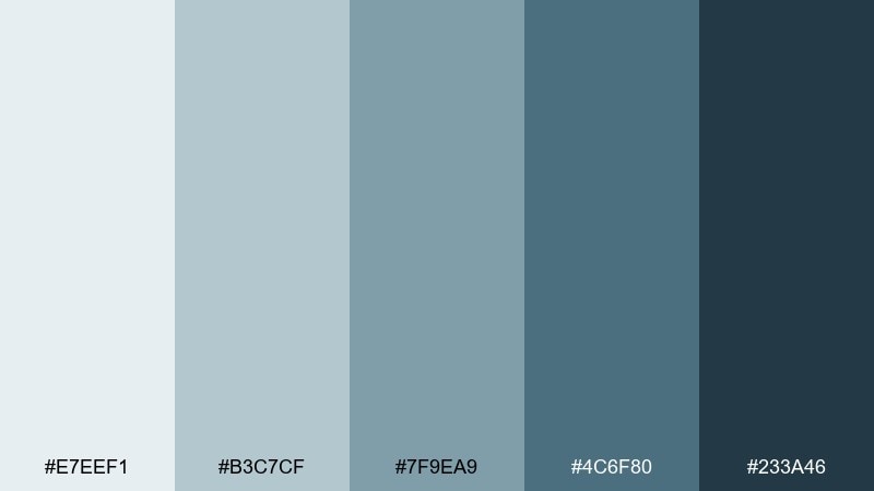
HEX: #e7eef1 #b3c7cf #7f9ea9 #4c6f80 #233a46
Mood: crisp, wintry, clear
Best for: travel flyer for a winter getaway
Crisp winter water and cold air brightness give the palette a clear, refreshing feel. It works well for travel flyers, resort promotions, and seasonal campaigns that need to look clean rather than festive. Pair with sharp photography and minimal icons to keep it modern. Usage tip: use the mid blue as the main brand color and the deep tone for fine print and details.
Image example of winter river generated using media.io
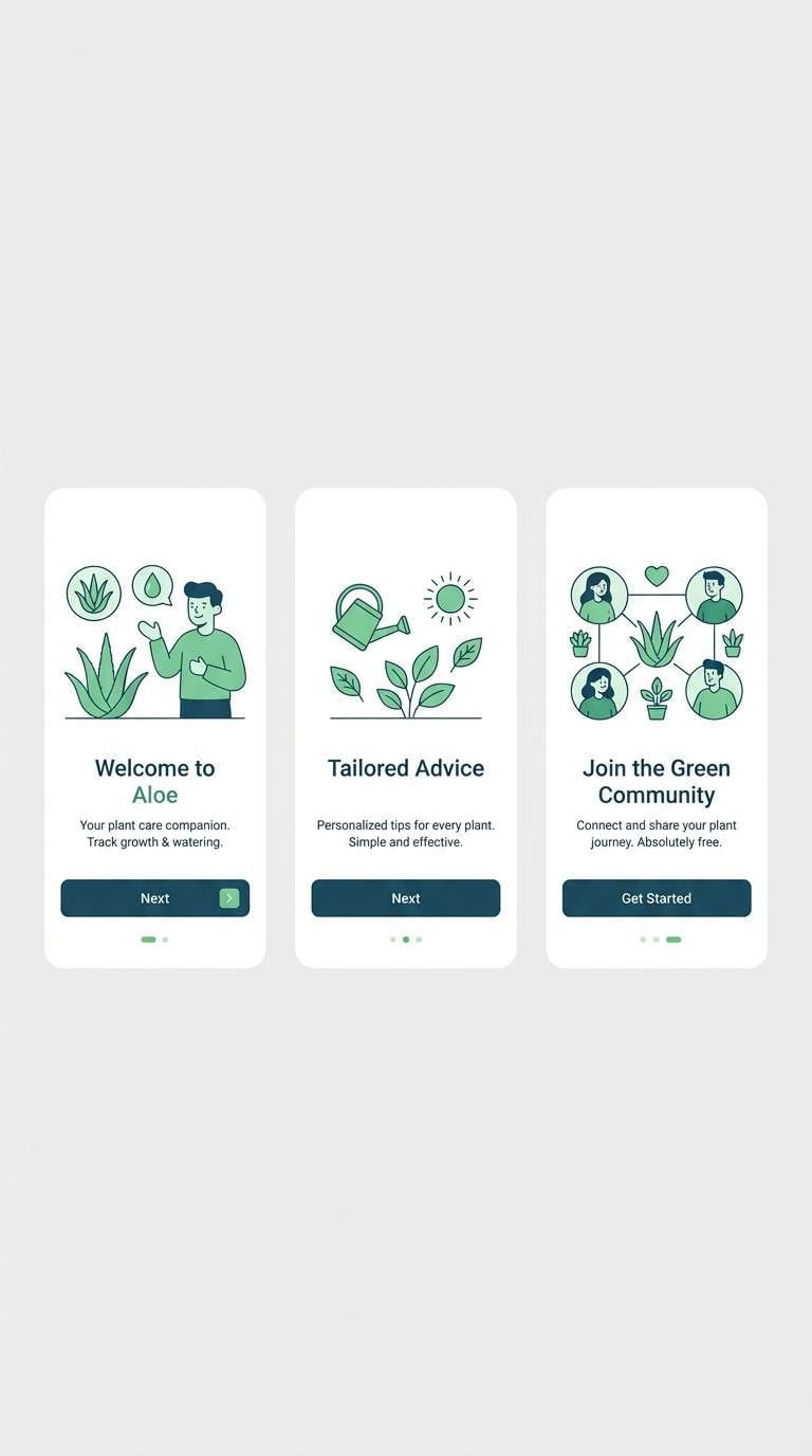
20) Anchor & Aloe

HEX: #f1f3f3 #c7d0d2 #8aa3a0 #426776 #1c3a45
Mood: steady, spa-like, contemporary
Best for: mobile app onboarding screens
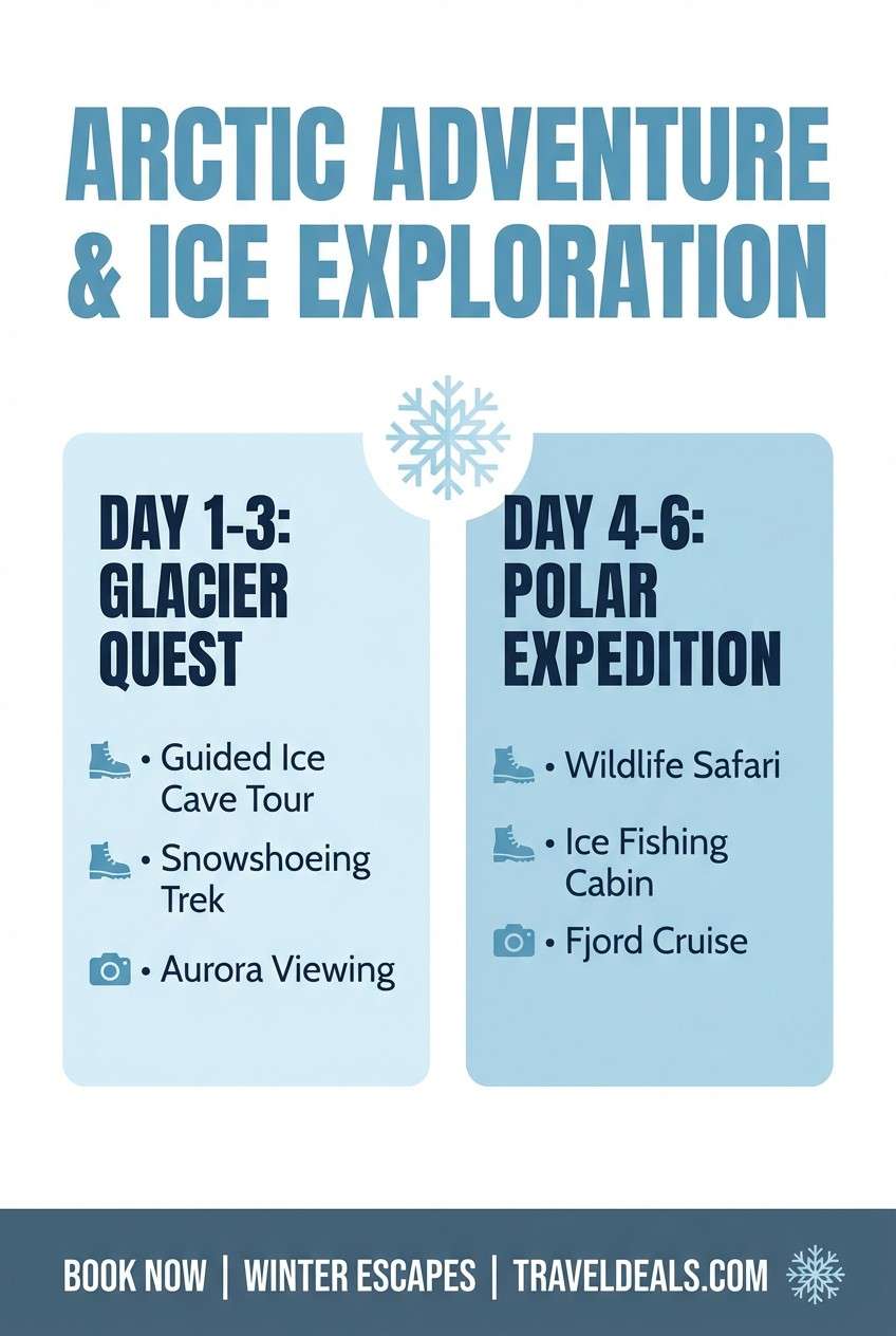
Steady anchor tones mixed with aloe-like softness feel reassuring and contemporary. It is ideal for onboarding screens where you want calm progress steps and readable UI components. Pair with simple illustrations and rounded cards for a friendly finish. Usage tip: keep the background very light and use the deep blue-green for primary buttons and active states.
Image example of anchor & aloe generated using media.io
What Colors Go Well with Gray Green Blue?
Warm neutrals are the easiest match: cream, sand, oatmeal, and soft beige add comfort and prevent gray green blue from feeling too cool. They also make interfaces and packaging feel more “human.”
For accents, try muted coral, terracotta, or a dusty peach for contrast that still stays sophisticated. If you need a sharper, tech-forward punch, a clean icy white or a bright mint highlight works well in small doses.
For typography, charcoal or deep blue-gray typically reads cleaner than pure black, while still delivering strong contrast—especially on pale gray-mint backgrounds.
How to Use a Gray Green Blue Color Palette in Real Designs
Build hierarchy with value first: use the lightest gray as your base, a mid sage/teal for UI components or sections, and reserve the darkest blue-gray for headings, navigation, and key data.
Keep saturation controlled so the palette stays cohesive. If you introduce a warm accent (like peach or sand), use it only for CTAs, badges, or highlights—this makes interaction and focal points feel intentional.
In print or branding, add texture (uncoated paper, linen, subtle grain) to keep the muted coastal tones from looking flat, especially when large areas of pale gray are used.
Create Gray Green Blue Palette Visuals with AI
If you have HEX codes but need real design context—posters, landing pages, packaging, or brand kits—AI image generation can help you explore layout and lighting quickly without starting from scratch.
Use prompts that mention your subject (e.g., “dashboard UI,” “skincare packaging,” “real estate brochure”), then specify your gray green blue mood and add notes like “minimal,” “flat design,” or “realistic studio lighting” depending on the output you want.
Media.io makes it easy to iterate: keep the prompt structure, swap the palette name, and adjust just one variable at a time (contrast, background brightness, or accent color) to stay consistent.
Gray Green Blue Color Palette FAQs
-
What does a gray green blue color palette communicate?
It typically communicates calm, trust, cleanliness, and modernity. Gray adds neutrality, green signals nature and balance, and blue brings clarity and reliability—great for wellness, tech, and lifestyle brands. -
Is gray green blue good for websites and UI design?
Yes. These tones create strong visual hierarchy with minimal glare. Use a light gray-mint background, mid teal/sage for components, and deep blue-gray for headings and navigation to keep readability high. -
What accent color works best with gray green blue?
Warm accents like cream, sand, peach, or muted coral pair especially well because they counterbalance the cool base. Use accents sparingly for CTAs, highlights, and status states. -
How do I keep a gray green blue palette from looking too cold?
Add warm neutrals (off-white/cream), natural textures (paper, linen, wood), and avoid using the darkest blue-gray everywhere. A small warm accent can also make the design feel more inviting. -
Which text color is best on pale gray green blue backgrounds?
Deep blue-gray or charcoal usually looks cleaner than pure black while maintaining contrast. For small text, prioritize accessibility by testing contrast and increasing font weight if needed. -
Can I use gray green blue for branding outside wellness?
Definitely. It works for SaaS, architecture/editorial, museums, travel, eco products, and apparel—anywhere you want a composed, premium, non-flashy aesthetic. -
How can I generate matching visuals for my palette quickly?
Use Media.io’s text-to-image generator and describe the design type (e.g., “brand kit,” “dashboard,” “packaging”), then specify the gray green blue mood and keep composition notes consistent across variations.
Next: Red Cream Color Palette


