

Gradients make color feel alive: they guide the eye, add depth, and create mood with fewer elements. A well-built gradient color palette can turn a simple layout into something premium and modern.
Below are 20+ gradient palettes with ready HEX codes, mood notes, and practical use cases for UI, branding, posters, and more.
In this article
- Why Gradient Palettes Work So Well
-
- sunset drift
- aurora pulse
- cotton candy haze
- ocean glass
- citrus bloom
- rosewood mist
- neon lagoon
- frosted lilac
- desert mirage
- midnight velvet
- spring meadow
- arctic skyline
- mango sorbet
- stormy slate
- peach blossom
- galactic berry
- ice cream mint
- copper twilight
- skyline neon
- soft sandstone
- tropical nightfall
- What Colors Go Well with Gradient?
- How to Use a Gradient Color Palette in Real Designs
- Create Gradient Palette Visuals with AI
Why Gradient Palettes Work So Well
Gradients create natural visual hierarchy by moving from high-contrast to low-contrast areas, which helps you place headlines, CTAs, and focal objects where they’ll be noticed first.
They also smooth transitions between brand colors, making bold combinations feel intentional rather than “clashing.” This is especially useful in UI, where gradients can separate sections without heavy borders.
Finally, gradient palettes add emotion fast—warm blends feel friendly and energetic, while cool blends feel clean and tech-forward—without requiring complex imagery.
20+ Gradient Color Palette Ideas (with HEX Codes)
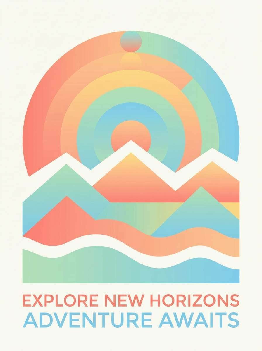
1) Sunset Drift
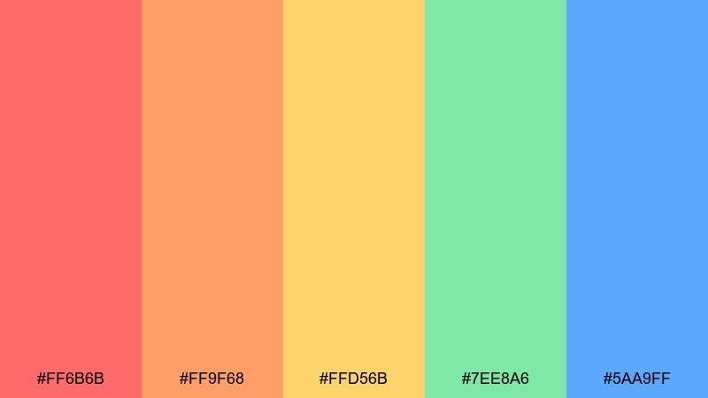
HEX: #ff6b6b #ff9f68 #ffd56b #7ee8a6 #5aa9ff
Mood: warm, optimistic, summery
Best for: travel poster
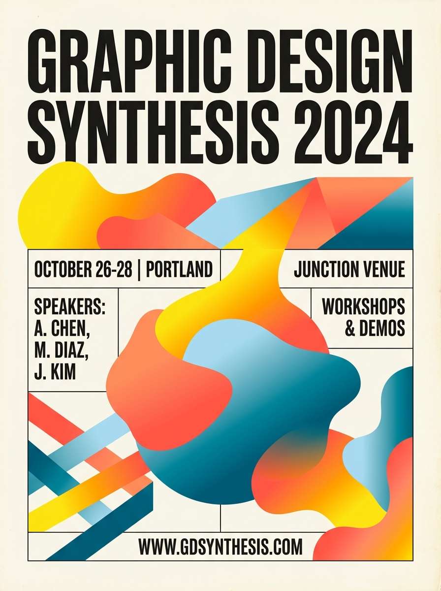
Warm and optimistic, it feels like the last hour of sunlight sliding into a clear sky. The peach-to-blue flow makes strong gradient color combinations for posters, hero headers, and cover art. Pair it with off-white space and a bold sans serif to keep it modern. Tip: use the coral as a focal highlight and let the blue carry backgrounds for balance.
Image example of sunset drift generated using media.io
Media.io is an online AI studio for creating and editing video, image, and audio in your browser.

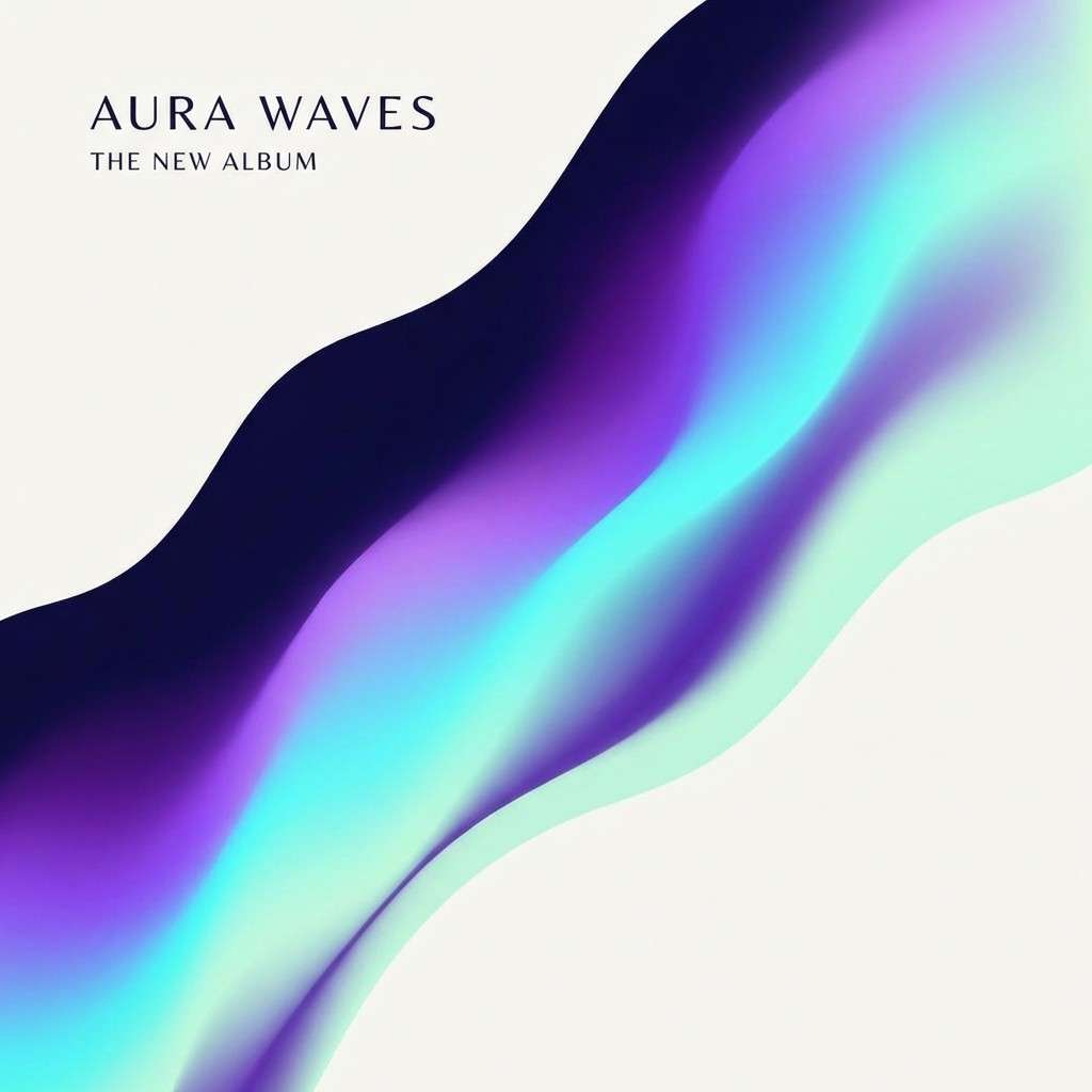
2) Aurora Pulse
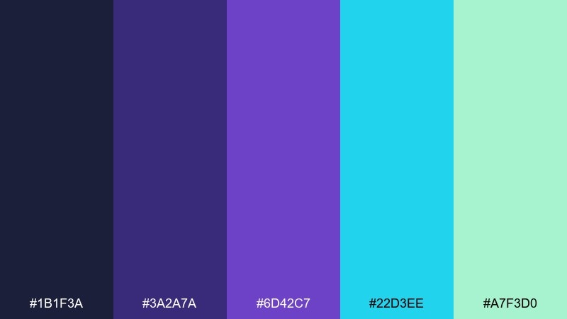
HEX: #1b1f3a #3a2a7a #6d42c7 #22d3ee #a7f3d0
Mood: electric, nocturnal, futuristic
Best for: music album cover
Electric and nocturnal, it echoes aurora ribbons over deep night. The indigo base gives your artwork weight, while cyan and mint add that neon shimmer without going harsh. Pair with black or very dark navy and keep text minimal for a premium feel. Tip: reserve the bright cyan for small highlights so the glow looks intentional.
Image example of aurora pulse generated using media.io
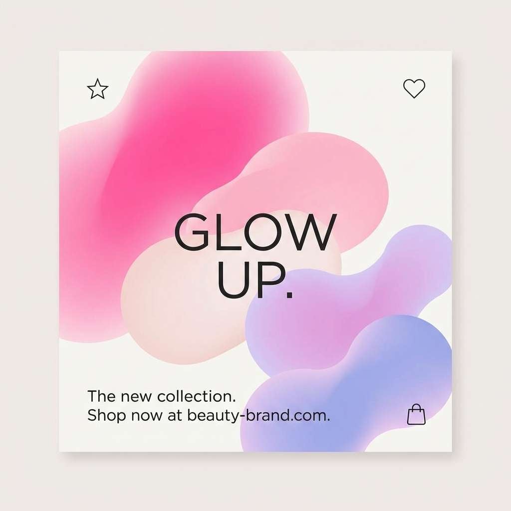
3) Cotton Candy Haze
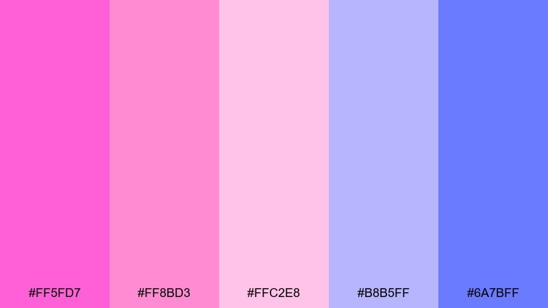
HEX: #ff5fd7 #ff8bd3 #ffc2e8 #b8b5ff #6a7bff
Mood: playful, dreamy, youthful
Best for: beauty brand social post
Playful and dreamy, these tones look like spun sugar fading into twilight. The pink-to-periwinkle range flatters beauty visuals and makes skin and product shapes pop. Pair it with crisp white and a charcoal caption color to avoid an overly sweet look. Tip: keep gradients large and soft, then add sharp text for contrast.
Image example of cotton candy haze generated using media.io
4) Ocean Glass
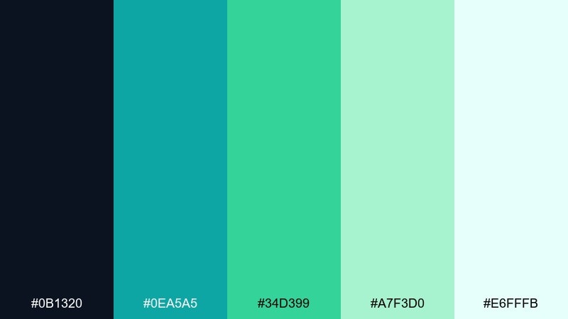
HEX: #0b1320 #0ea5a5 #34d399 #a7f3d0 #e6fffb
Mood: fresh, clean, coastal
Best for: saas landing page hero
Fresh and clean, it reads like light passing through shallow water and sea glass. As a gradient color scheme, it fits SaaS heroes, fintech trust pages, and onboarding screens where clarity matters. Pair with dark ink text and simple line icons to keep it airy. Tip: place the near-white tone behind copy blocks for instant readability.
Image example of ocean glass generated using media.io

5) Citrus Bloom
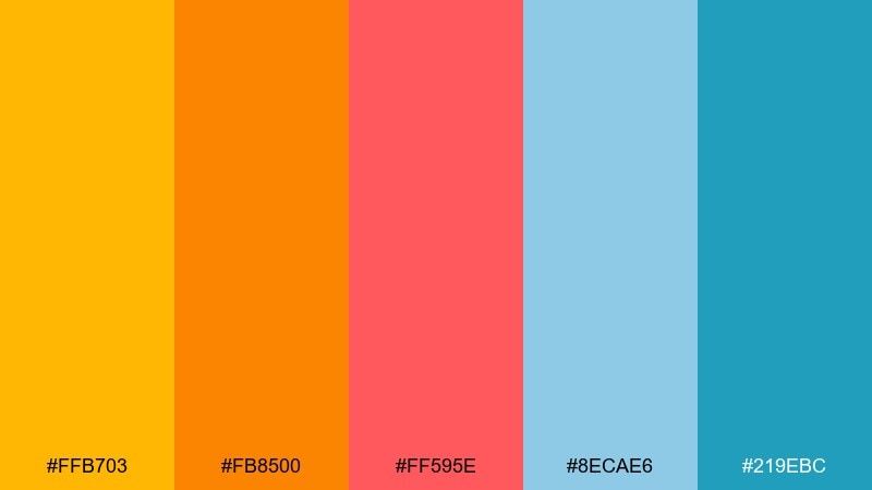
HEX: #ffb703 #fb8500 #ff595e #8ecae6 #219ebc
Mood: energetic, bold, upbeat
Best for: summer event flyer
Energetic and bold, it feels like citrus peel and bright daylight. The orange and coral tones drive attention fast, while the two blues keep the layout from overheating. Pair with chunky headlines and plenty of negative space so it stays readable. Tip: use the yellow for callouts and the darker blue for event details.
Image example of citrus bloom generated using media.io
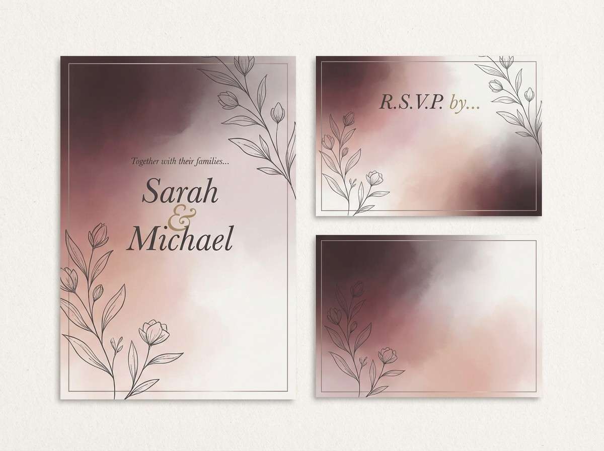
6) Rosewood Mist
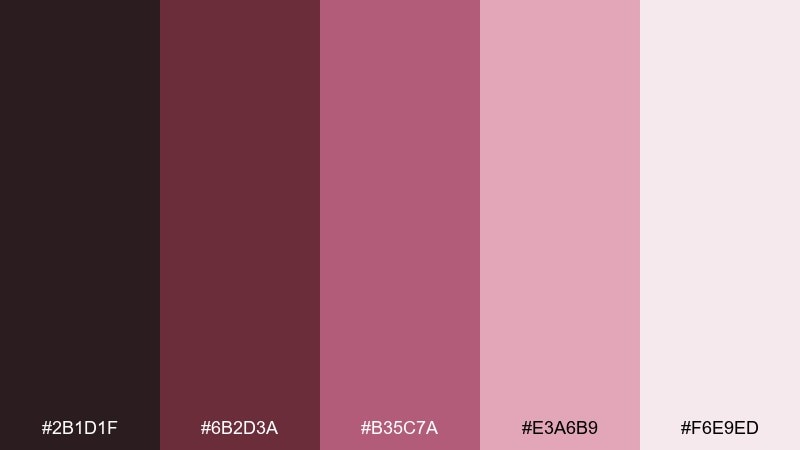
HEX: #2b1d1f #6b2d3a #b35c7a #e3a6b9 #f6e9ed
Mood: romantic, soft, vintage
Best for: wedding invitation set
Romantic and soft, it recalls pressed roses and velvety dusk. The deep rosewood grounds the lighter blush tones, making the whole set feel elegant rather than pastel. Pair with a serif headline and subtle textured paper grain for a timeless look. Tip: keep the darkest shade for names and borders, not background fills.
Image example of rosewood mist generated using media.io
7) Neon Lagoon
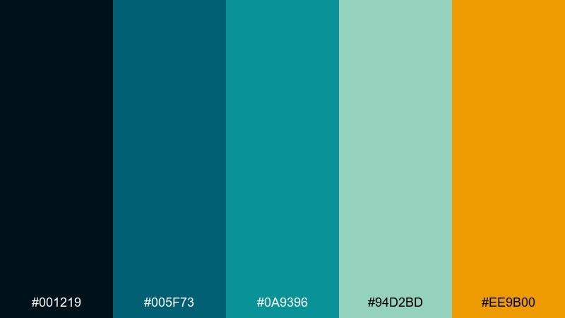
HEX: #001219 #005f73 #0a9396 #94d2bd #ee9b00
Mood: adventurous, modern, high-contrast
Best for: sports brand banner
Adventurous and modern, it looks like deep water lit by stadium lights. The teal stack creates crisp gradient color combinations, and the amber accent adds instant energy for buttons and badges. Pair with black, bold condensed type, and sharp diagonals for motion. Tip: use amber only in 5 to 10 percent of the layout to keep it punchy.
Image example of neon lagoon generated using media.io
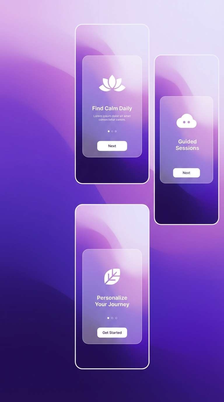
8) Frosted Lilac
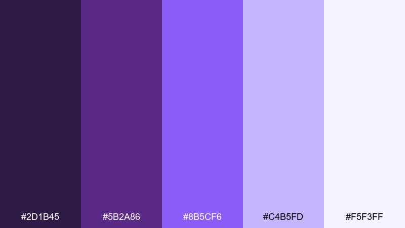
HEX: #2d1b45 #5b2a86 #8b5cf6 #c4b5fd #f5f3ff
Mood: calm, polished, slightly magical
Best for: meditation app onboarding
Calm and polished, it evokes twilight lavender and a quiet exhale. The mid violet feels friendly for onboarding screens, while the near-white keeps content light and readable. Pair with rounded UI shapes and gentle motion to reinforce the soothing tone. Tip: set primary CTAs in the saturated violet and keep other buttons in the pale lilac.
Image example of frosted lilac generated using media.io
9) Desert Mirage
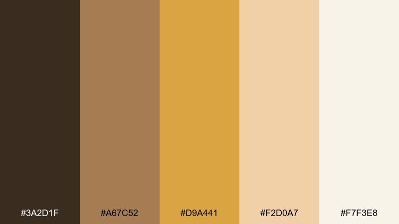
HEX: #3a2d1f #a67c52 #d9a441 #f2d0a7 #f7f3e8
Mood: earthy, sun-baked, welcoming
Best for: coffee shop menu
Earthy and sun-baked, it brings to mind dunes, cinnamon, and warm ceramic. The tan and caramel tones feel natural in food and hospitality designs, especially with simple illustrations. Pair with dark espresso text and a cream background for a comfortable, readable menu. Tip: use the golden shade for section headers to guide the eye.
Image example of desert mirage generated using media.io
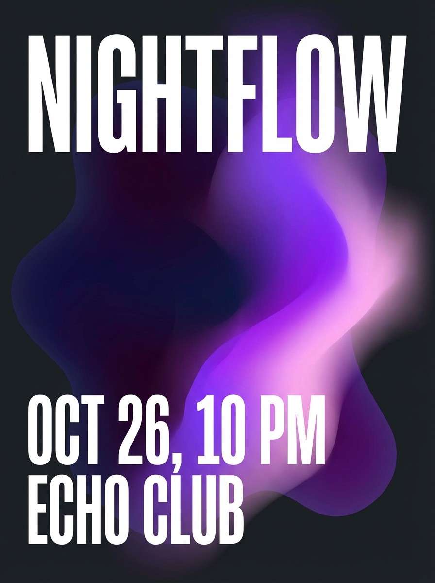
10) Midnight Velvet
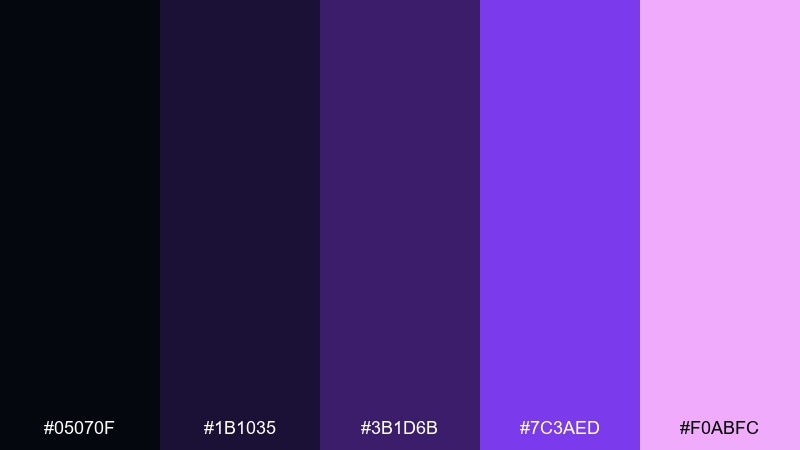
HEX: #05070f #1b1035 #3b1d6b #7c3aed #f0abfc
Mood: luxurious, dramatic, nightlife
Best for: nightclub poster
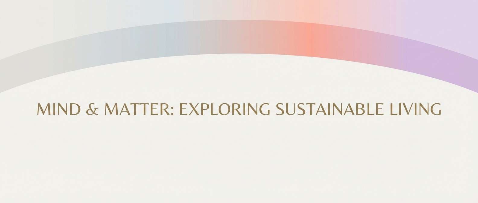
Luxurious and dramatic, it feels like velvet curtains and neon signage after dark. These tones form a gradient color palette that works beautifully for nightlife posters, DJ lineups, and high-impact typography. Pair with black space and glossy metallic accents for a premium finish. Tip: set the bright violet behind the main headline to make it glow without adding effects.
Image example of midnight velvet generated using media.io
11) Spring Meadow
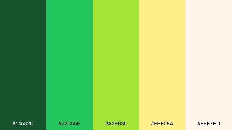
HEX: #14532d #22c55e #a3e635 #fef08a #fff7ed
Mood: fresh, botanical, cheerful
Best for: botanical illustration print
Fresh and botanical, it suggests new leaves, sunlight, and soft pollen. The greens stay vibrant without turning neon, and the pale yellow keeps the mix friendly. Pair with hand-drawn linework and plenty of cream background so the palette breathes. Tip: use the darkest green sparingly for stems and outlines to add structure.
Image example of spring meadow generated using media.io
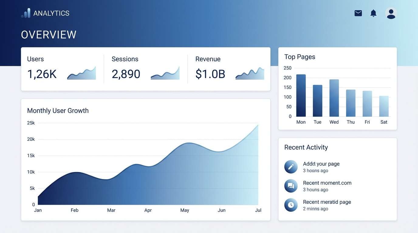
12) Arctic Skyline
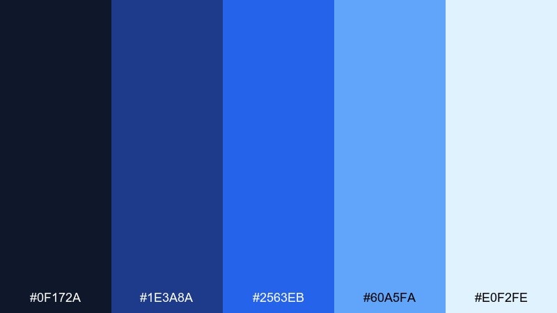
HEX: #0f172a #1e3a8a #2563eb #60a5fa #e0f2fe
Mood: cool, confident, tech-forward
Best for: dashboard UI
Cool and confident, it looks like winter air over a glassy city skyline. The blues provide clear hierarchy for charts, tabs, and navigation, especially with crisp white space. Pair with neutral grays and a single warm accent if you need alerts or warnings. Tip: keep the darkest navy for sidebars to reduce visual noise.
Image example of arctic skyline generated using media.io
13) Mango Sorbet
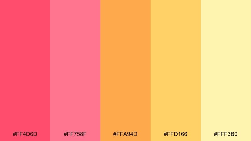
HEX: #ff4d6d #ff758f #ffa94d #ffd166 #fff3b0
Mood: sweet, lively, approachable
Best for: food delivery app promo
Sweet and lively, it feels like fruit slices and bright packaging on a sunny counter. The pinks add friendliness while mango and lemon tones boost appetite appeal. Pair with rounded corners and simple iconography to keep it playful, not messy. Tip: set promo prices in the deeper pink for quick readability.
Image example of mango sorbet generated using media.io
14) Stormy Slate
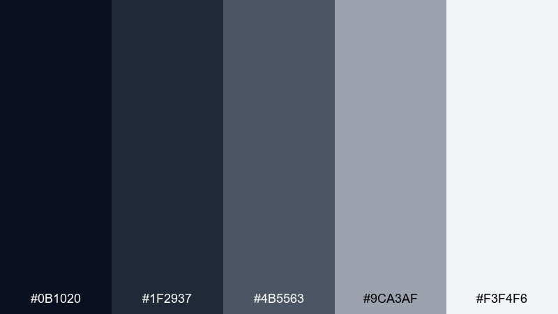
HEX: #0b1020 #1f2937 #4b5563 #9ca3af #f3f4f6
Mood: minimal, serious, editorial
Best for: corporate report layout
Minimal and serious, it reads like a raincloud sky over concrete. The slate range is perfect for reports, proposals, and presentations where content should lead. Pair with one saturated accent from your brand to highlight key figures and charts. Tip: use the lightest gray for tables so lines and numbers stay calm.
Image example of stormy slate generated using media.io
15) Peach Blossom
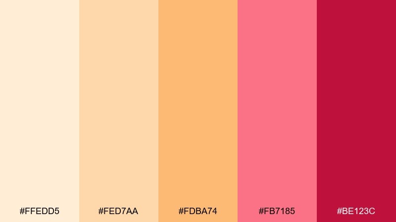
HEX: #ffedd5 #fed7aa #fdba74 #fb7185 #be123c
Mood: romantic, inviting, cheerful
Best for: valentines day poster
Romantic and inviting, it brings up peach petals with a berry-red finish. The warm light tones keep the palette friendly, while the deep crimson adds drama for headlines. Pair with cream backgrounds and delicate line art to keep it elegant. Tip: use the darkest red only for focal text to avoid overpowering the softer shades.
Image example of peach blossom generated using media.io

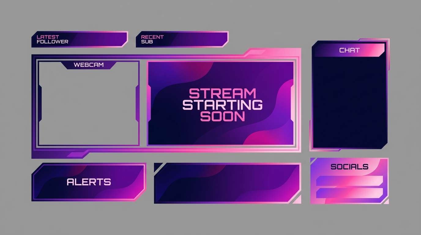
16) Galactic Berry
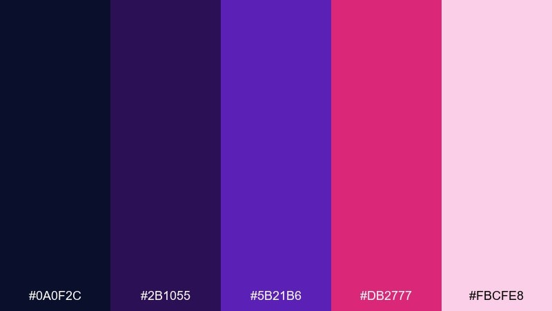
HEX: #0a0f2c #2b1055 #5b21b6 #db2777 #fbcfe8
Mood: cosmic, bold, expressive
Best for: gaming stream overlay
Cosmic and bold, it suggests star fields with a burst of berry neon. The deep blues and purples create strong contrast for alerts, labels, and stream panels. Pair with white text and thin outlines so the overlay stays legible over gameplay. Tip: keep the hot pink to badges and callouts for instant attention.
Image example of galactic berry generated using media.io
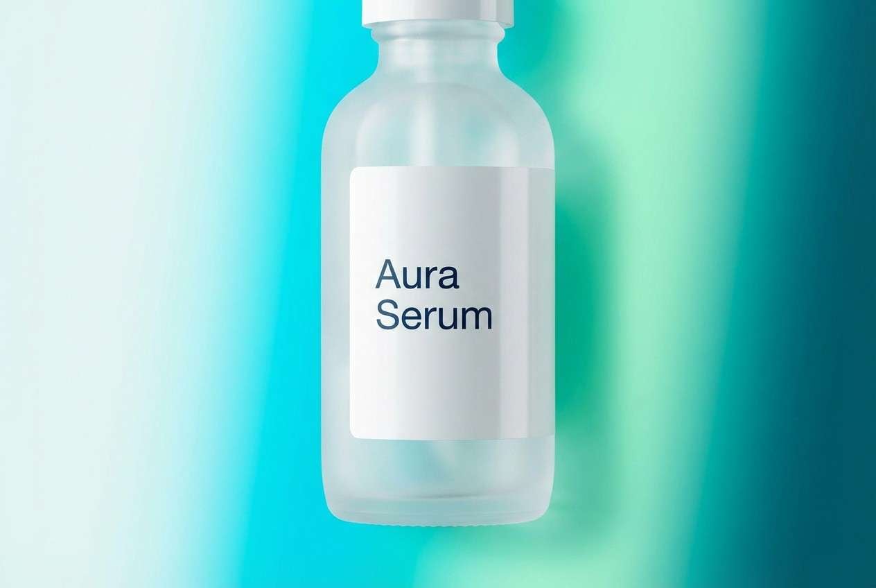
17) Ice Cream Mint
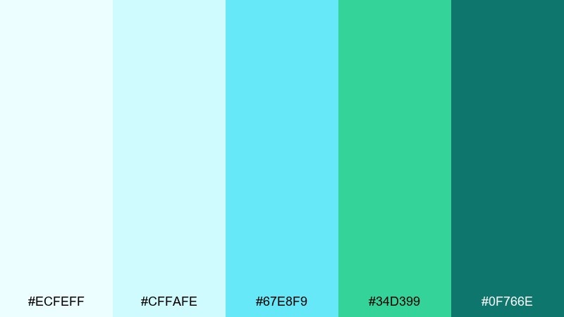
HEX: #ecfeff #cffafe #67e8f9 #34d399 #0f766e
Mood: refreshing, light, friendly
Best for: skincare product ad
Refreshing and light, it feels like cool mint and clean water. This gradient color palette suits skincare ads, wellness landing pages, and packaging where a hygienic look matters. Pair with minimal typography and plenty of white to keep it clinical but friendly. Tip: place the deepest teal only in the logo or small labels for a premium finish.
Image example of ice cream mint generated using media.io
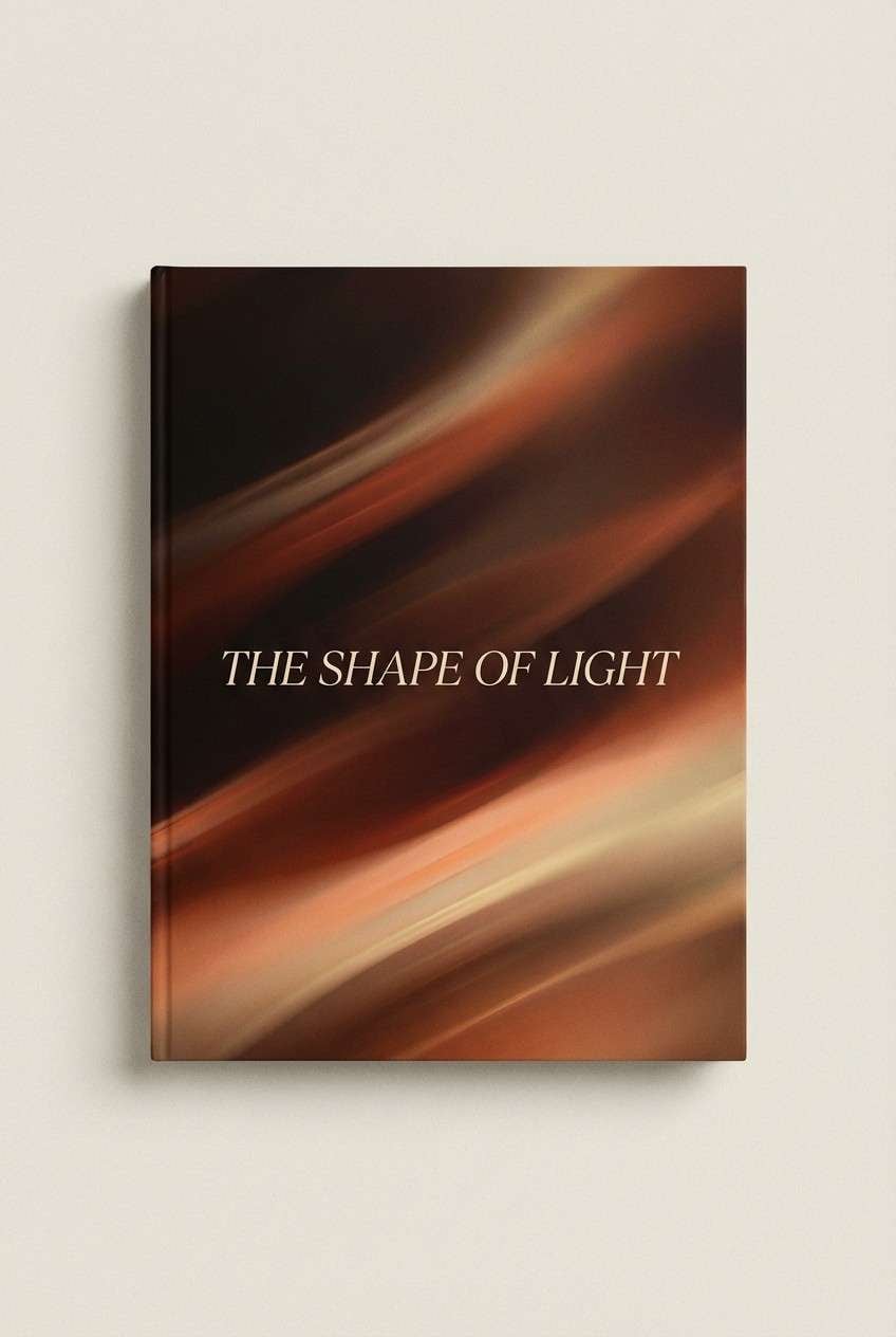
18) Copper Twilight
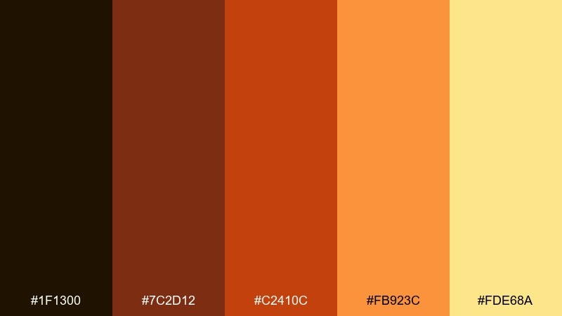
HEX: #1f1300 #7c2d12 #c2410c #fb923c #fde68a
Mood: cozy, cinematic, autumnal
Best for: book cover design
Cozy and cinematic, it brings out copper light against a deep evening backdrop. The burnt orange range feels perfect for fiction covers, podcast art, and editorial headlines. Pair with a classic serif and subtle grain to add warmth without losing clarity. Tip: let the pale gold sit behind the title for instant contrast.
Image example of copper twilight generated using media.io
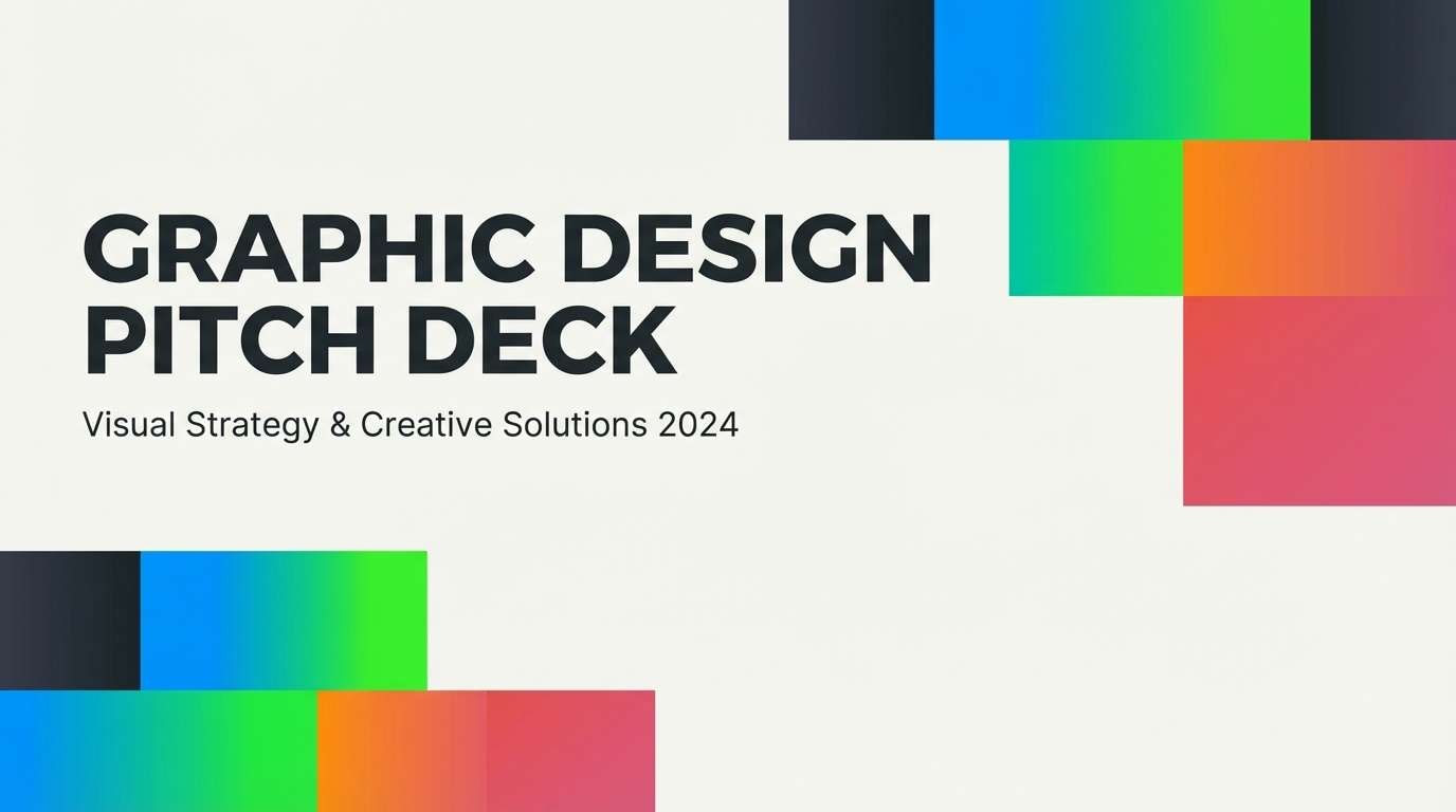
19) Skyline Neon
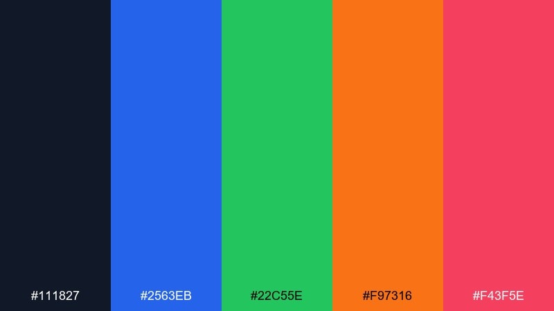
HEX: #111827 #2563eb #22c55e #f97316 #f43f5e
Mood: urban, bright, energetic
Best for: startup pitch deck cover
Urban and bright, it feels like city LEDs reflected in glass. The mix gives you flexible gradient color combinations for cover slides, section dividers, and highlight blocks. Pair with lots of charcoal space so the colors look intentional, not noisy. Tip: pick one dominant hue per slide and reuse it for icons and chart accents.
Image example of skyline neon generated using media.io
20) Soft Sandstone
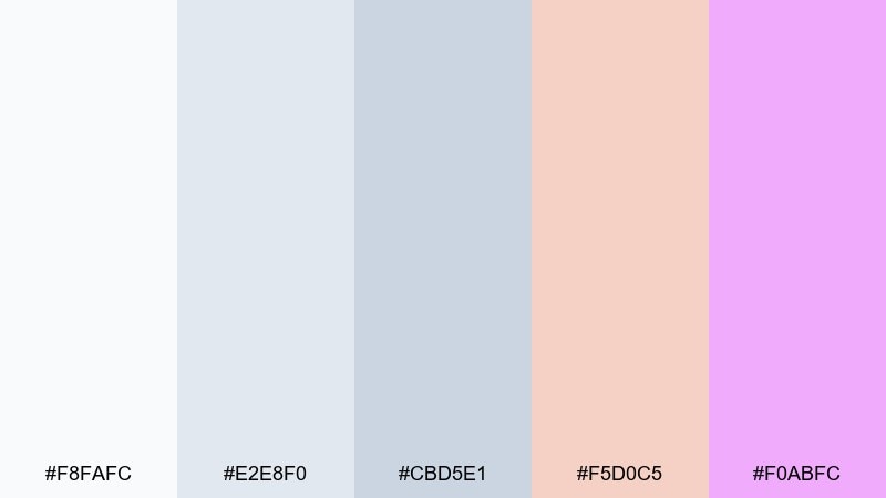
HEX: #f8fafc #e2e8f0 #cbd5e1 #f5d0c5 #f0abfc
Mood: gentle, airy, modern
Best for: minimal blog header
Gentle and airy, it looks like pale stone with a blush tint. The cool grays keep layouts structured, while the pink-lilac accents add personality without stealing attention. Pair with thin typography and generous spacing for a calm reading experience. Tip: use the soft gray as the base and reserve the pinks for small ornaments or underline effects.
Image example of soft sandstone generated using media.io
21) Tropical Nightfall
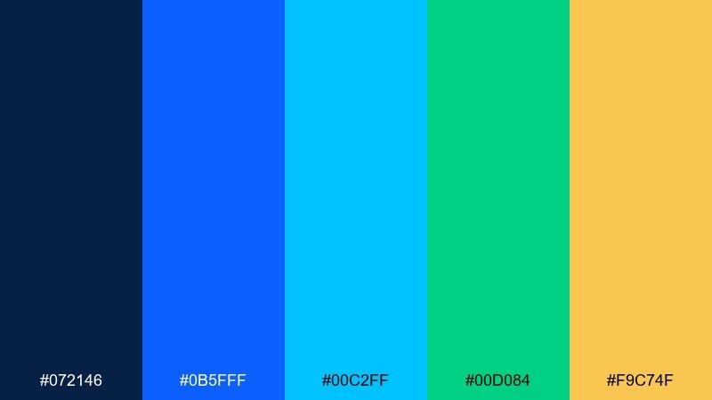
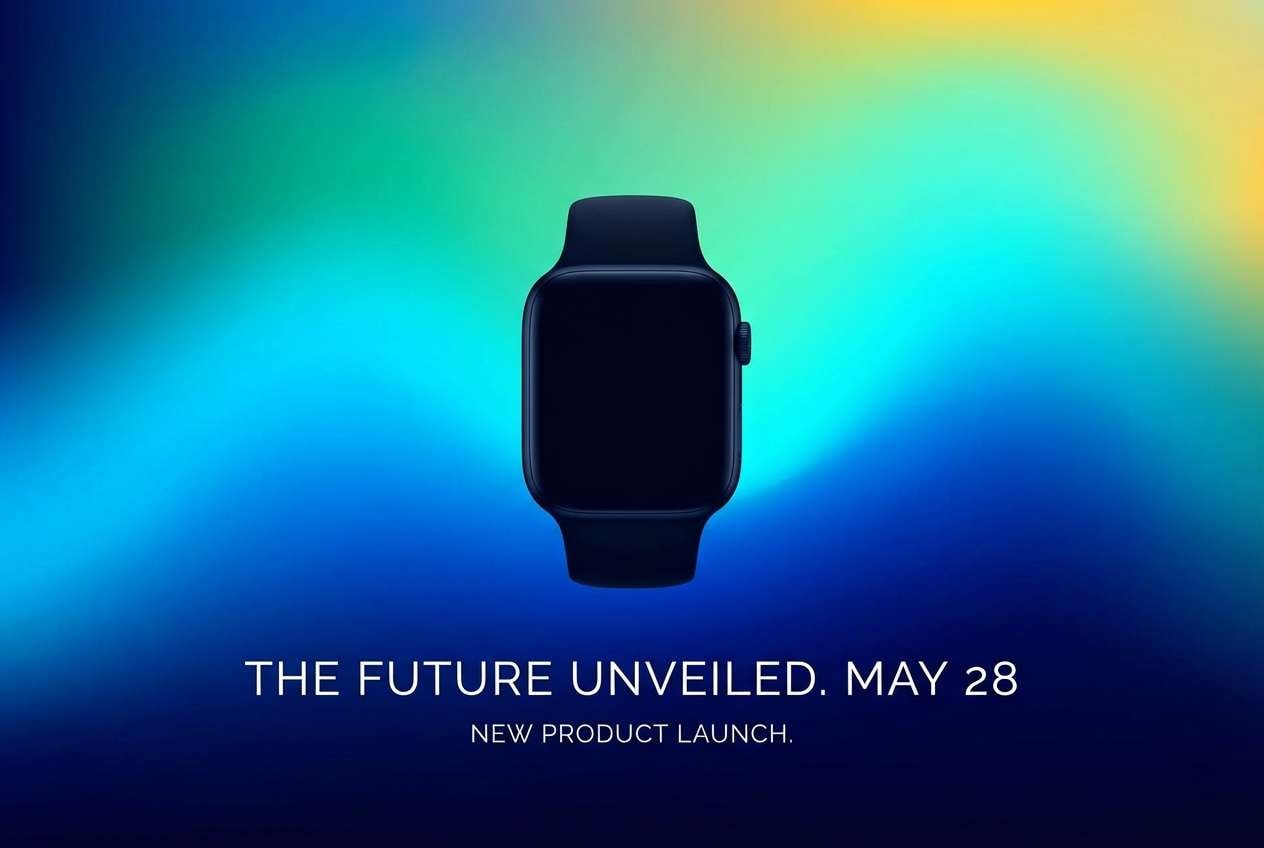
HEX: #072146 #0b5fff #00c2ff #00d084 #f9c74f
Mood: vibrant, tropical, confident
Best for: product launch banner
Vibrant and tropical, it blends deep ocean blue with bright pool water and a flash of sun. The cool tones keep it techy, while the yellow adds the excitement you want for a launch moment. Pair with simple product renders and strong left-aligned type so the banner stays sharp. Tip: use the yellow only for the CTA to create a clear click target.
Image example of tropical nightfall generated using media.io
What Colors Go Well with Gradient?
Neutrals (white, off-white, charcoal, and cool gray) pair extremely well with gradients because they give the blend room to “glow” without competing for attention. In UI, this usually means gradient backgrounds plus solid text and icons.
For higher contrast, add one controlled accent color (often the most saturated stop from your gradient) for buttons, badges, and small highlights. This keeps your gradient palettes consistent across pages and components.
If your gradient is already bright, use darker anchors (navy, deep purple, near-black) to stabilize the design and improve readability—especially for headlines and fine text.
How to Use a Gradient Color Palette in Real Designs
Start with roles: choose one or two stops for text and UI surfaces, then reserve the full gradient for hero areas, cover panels, or large shapes. This prevents “gradient everywhere” fatigue and keeps interfaces usable.
Use gradients to create depth: apply softer blends to backgrounds and stronger blends to focal shapes. For posters and social graphics, enlarge the gradient area and keep typography sharp for clean contrast.
Always test readability: place your main copy on the lightest stop (or add a subtle overlay) and confirm contrast on mobile. A gorgeous gradient color scheme only works if users can scan it quickly.
Create Gradient Palette Visuals with AI
If you want to preview these gradient color combinations as posters, landing page heroes, packaging, or UI mockups, generating quick visuals can help you choose faster than tweaking swatches manually.
Media.io Text-to-Image lets you turn a short prompt into gradient-based designs in seconds. You can iterate on style, aspect ratio, and composition while keeping your HEX direction consistent.
Pick a palette above, reuse its mood and “best for” note, then paste the prompt to generate an on-brand concept you can refine.
Gradient Color Palette FAQs
-
What is a gradient color palette?
A gradient color palette is a set of colors designed to blend smoothly from one to another (often 3–5 stops). It’s used to create background transitions, lighting effects, and modern depth in UI, branding, and posters. -
How many colors should a gradient palette have?
Most gradient palettes work best with 3 to 5 colors. Three stops are clean for UI, while five stops give you more control for posters, illustrations, and multi-layer backgrounds. -
How do I choose gradient color combinations that don’t look muddy?
Keep neighboring colors close in brightness or hue (for smooth blends), and avoid mixing multiple high-saturation complements across the whole gradient. If you need contrast, use a dark anchor color at one end and a light anchor at the other. -
What text colors work best on gradient backgrounds?
Use solid neutrals: white (#FFFFFF) on darker areas and near-black/charcoal (like #111827) on lighter areas. For mixed gradients, place text on the lightest stop or add a subtle overlay to stabilize contrast. -
Are gradients good for UI and branding?
Yes—gradients can make interfaces feel more premium and brand-forward when used intentionally. The key is restraint: use gradients for hero sections, headers, and highlights, and keep core UI surfaces and typography mostly solid. -
How can I create gradient palette visuals quickly?
You can generate fast concept images with Media.io Text-to-Image by describing the layout (poster, UI hero, packaging), the mood, and the gradient colors. Iterate on prompts to explore different compositions without redesigning from scratch. -
What’s the easiest way to keep gradients consistent across a project?
Define a small set of approved gradient directions (e.g., left-to-right, radial), reuse the same color stops, and assign roles (background, accent, CTA). Consistency matters more than adding extra colors.


