

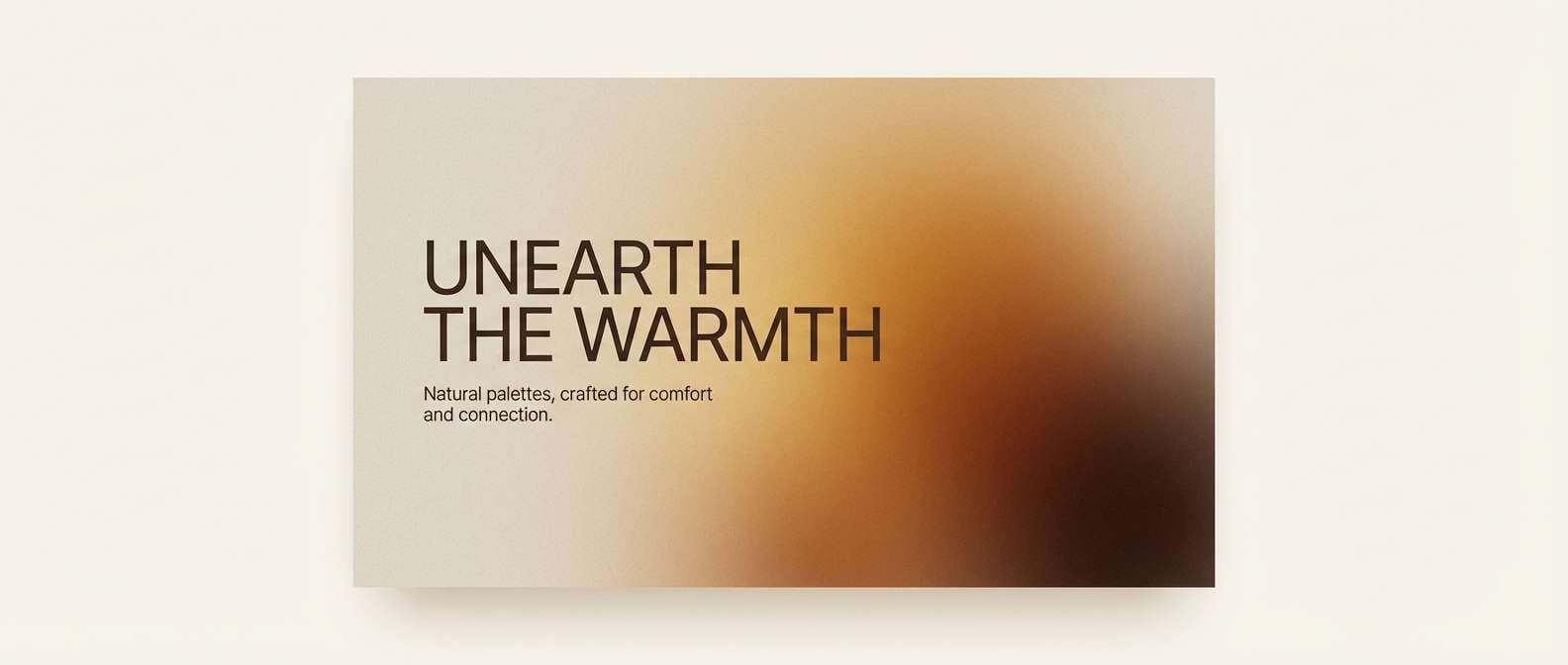
Beige orange sits right at the sweet spot between cozy neutrals and energetic warmth. It’s soft enough for backgrounds, yet vibrant enough for accents that guide attention.
Below are 20 ready-to-use beige and orange color combinations with HEX codes, plus practical pairing ideas for branding, UI, packaging, and print.
In this article
- Why Beige Orange Palettes Work So Well
-
- desert apricot glow
- citrus linen
- sunbaked clay
- creamsicle minimal
- autumn market stalls
- candlelit bistro
- sahara morning
- peachy stoneware
- terracotta textiles
- honeyed beige
- amber sand dunes
- apricot adobe
- soft rust & oat
- warm neutral interface
- tangerine latte
- apricot blossom paper
- spiced pumpkin bakery
- clay roof sunset
- marigold beige accent
- rusty peach gallery
- What Colors Go Well with Beige Orange?
- How to Use a Beige Orange Color Palette in Real Designs
- Create Beige Orange Palette Visuals with AI
Why Beige Orange Palettes Work So Well
Beige orange palettes feel friendly because they echo natural materials: sand, clay, baked stone, linen, and late-afternoon light. That “real-world” association makes them instantly approachable for brands and interfaces.
They also solve a common design problem: you get warmth without sacrificing breathing room. Beige keeps layouts calm and readable, while orange provides hierarchy for CTAs, highlights, prices, or key navigation states.
Finally, beige + orange is flexible across styles—from minimal and modern to rustic and handcrafted—so you can push it brighter for energy or deeper for a premium, earthy mood.
20+ Beige Orange Color Palette Ideas (with HEX Codes)
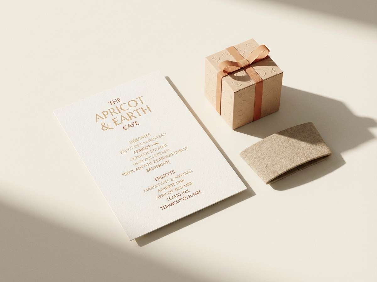
1) Desert Apricot Glow
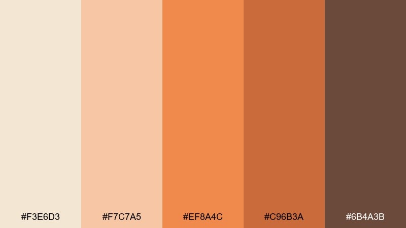
HEX: #f3e6d3 #f7c7a5 #ef8a4c #c96b3a #6b4a3b
Mood: sun-warmed, inviting, earthy
Best for: cafe branding and menu design
Sun-warmed dunes and apricot light give this set a cozy, welcoming feel. The beige orange color palette works beautifully for cafes, bakeries, and artisan food labels where warmth signals comfort. Pair it with creamy paper textures and dark brown type for readability. Tip: use the orange as a highlight color on buttons and prices, keeping beige as the main background for a calm look.
Image example of desert apricot glow generated using media.io
Media.io is an online AI studio for creating and editing video, image, and audio in your browser.

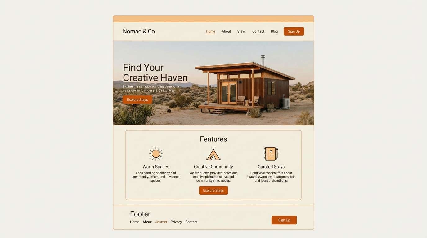
2) Citrus Linen
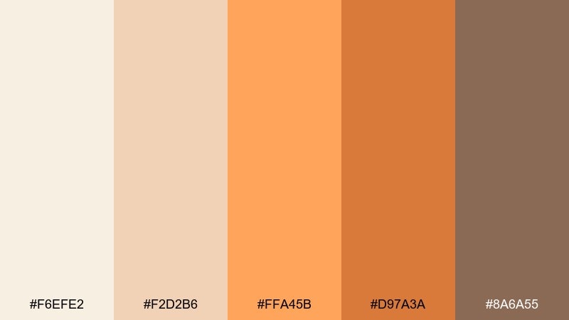
HEX: #f6efe2 #f2d2b6 #ffa45b #d97a3a #8a6a55
Mood: clean, bright, friendly
Best for: modern UI landing pages
Fresh citrus over soft linen reads bright without getting loud. The pale neutrals make generous space for content, while the orange tones add quick visual hierarchy. Combine it with plenty of white space and simple icons for a modern landing page. Tip: reserve the deeper orange for primary CTAs and keep body text in the warm brown for a softer contrast.
Image example of citrus linen generated using media.io
3) Sunbaked Clay
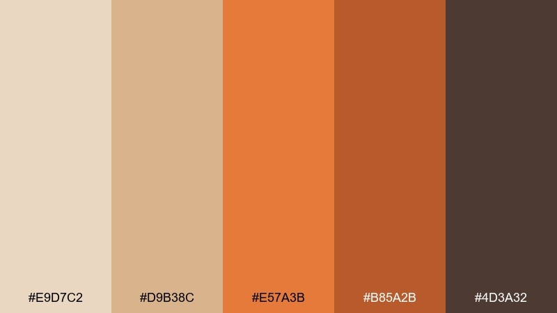
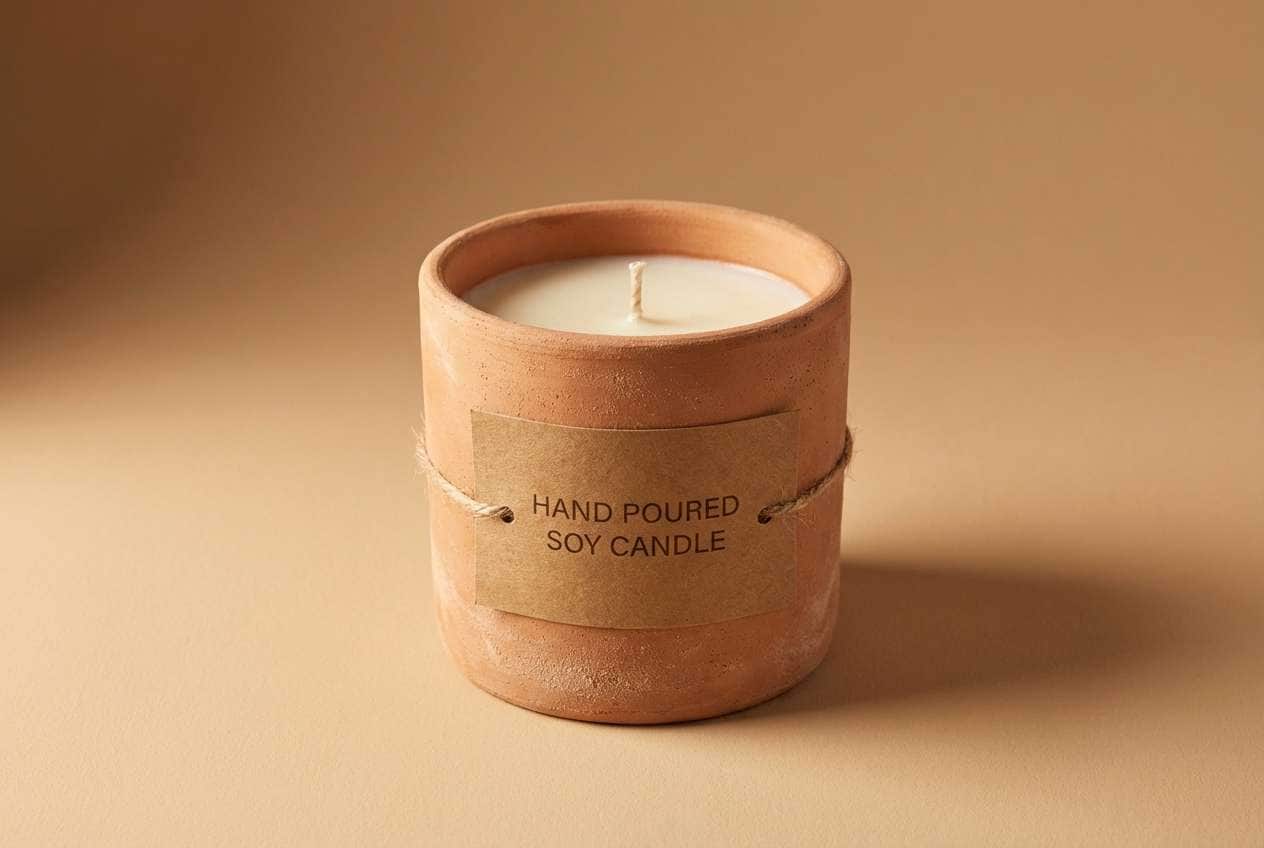
HEX: #e9d7c2 #d9b38c #e57a3b #b85a2b #4d3a32
Mood: rustic, grounded, handcrafted
Best for: ceramics and craft packaging
Sunbaked clay and kiln heat come through in the earthy midtones and deep browns. It suits handmade goods where a tactile, artisan story matters, especially on kraft or uncoated stock. Pair with simple line illustrations and generous margins to keep it premium. Tip: use the darkest brown for small details like batch numbers and seals so the orange stays the hero.
Image example of sunbaked clay generated using media.io
4) Creamsicle Minimal
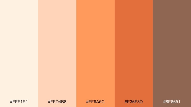
HEX: #fff1e1 #ffd4b8 #ff9a5c #e36f3d #8e6651
Mood: playful, airy, modern
Best for: social media post templates
Creamy pastels with a creamsicle pop feel light, upbeat, and instantly friendly. The soft beige base keeps layouts breathable, while the orange shades create clear focal points for headlines and stickers. Pair with rounded sans-serif typography and simple geometric blocks. Tip: keep the brightest orange to one or two elements per post so the feed stays cohesive.
Image example of creamsicle minimal generated using media.io

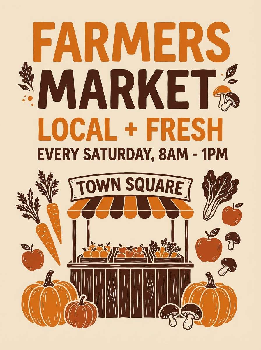
5) Autumn Market Stalls
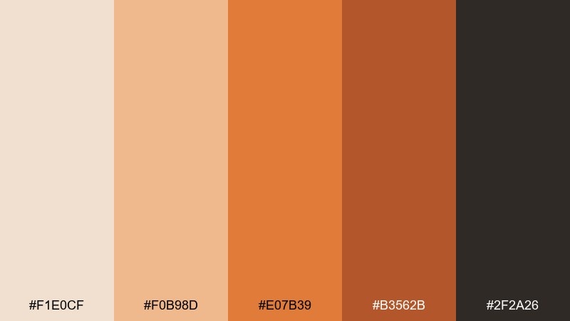
HEX: #f1e0cf #f0b98d #e07b39 #b3562b #2f2a26
Mood: seasonal, hearty, artisanal
Best for: farmers market posters and flyers
Cozy fall stalls and roasted squash vibes make this mix feel hearty and handmade. These beige orange color combinations are ideal for market posters, seasonal promos, and local food events that need warmth and urgency. Pair with textured paper grain and bold condensed type for a rustic look. Tip: set the headline in the near-black to keep contrast strong on light beige backgrounds.
Image example of autumn market stalls generated using media.io
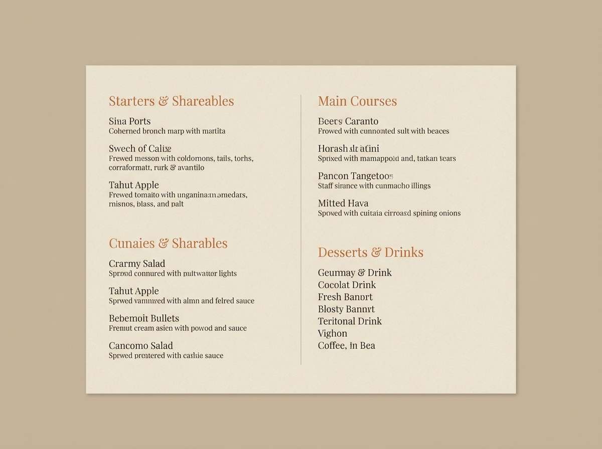
6) Candlelit Bistro
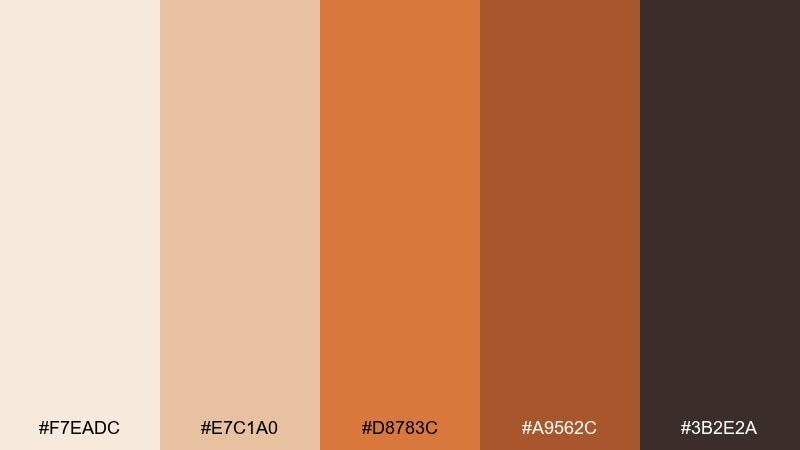
HEX: #f7eadc #e7c1a0 #d8783c #a9562c #3b2e2a
Mood: intimate, warm, sophisticated
Best for: restaurant menu and wine list design
Candlelight warmth and polished wood tones give this set an intimate, upscale mood. The creamy neutrals make menus feel premium, while the deeper oranges bring appetite appeal without looking flashy. Pair it with serif headings and thin divider rules for an editorial touch. Tip: use the mid orange for section headers and keep body copy in the espresso brown for comfort and clarity.
Image example of candlelit bistro generated using media.io
7) Sahara Morning
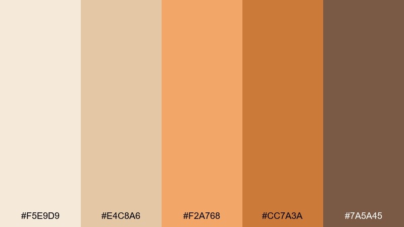
HEX: #f5e9d9 #e4c8a6 #f2a768 #cc7a3a #7a5a45
Mood: calm, optimistic, sunlit
Best for: wellness brand identity
Soft sunrise tones over sand create a calm, optimistic mood that feels restorative. It fits wellness and skincare branding where warmth should read gentle rather than loud. Pair with clean typography, subtle gradients, and lots of negative space. Tip: let the lightest beige carry most surfaces, then bring in the apricot as a friendly accent for badges and icons.
Image example of sahara morning generated using media.io
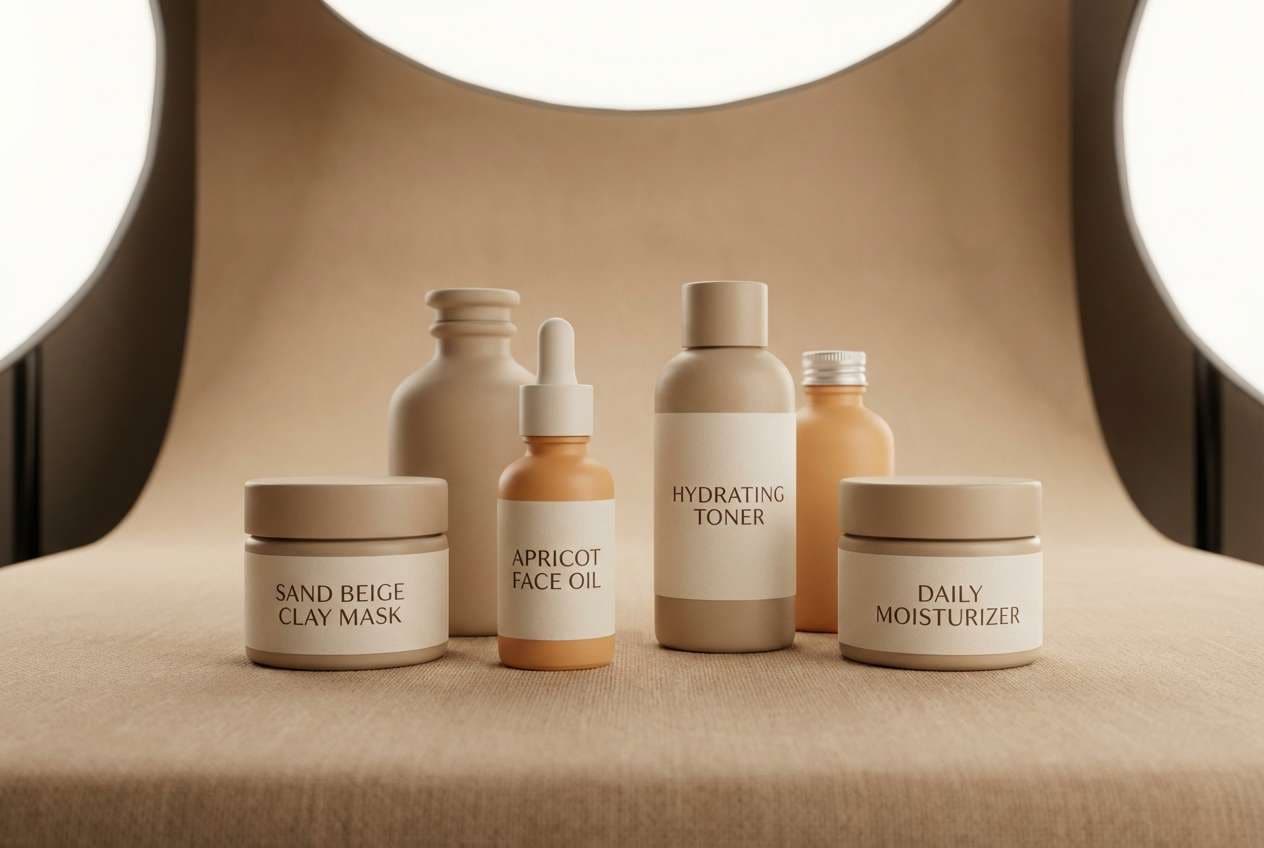
8) Peachy Stoneware
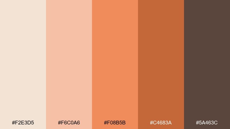
HEX: #f2e3d5 #f6c0a6 #f08b5b #c4683a #5a463c
Mood: homey, tactile, grounded
Best for: kitchen interior mood boards
Warm stoneware and baked peach tones feel homey, tactile, and easy to live with. It works well for kitchen concepts, cozy dining spaces, and lifestyle mood boards where you want warmth without heaviness. Pair with light wood, matte ceramics, and brushed brass accents. Tip: use the deeper terracotta sparingly on textiles or backsplash details to keep the space airy.
Image example of peachy stoneware generated using media.io
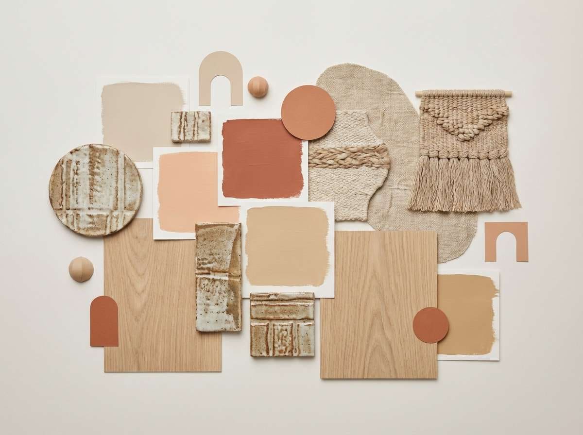
9) Terracotta Textiles
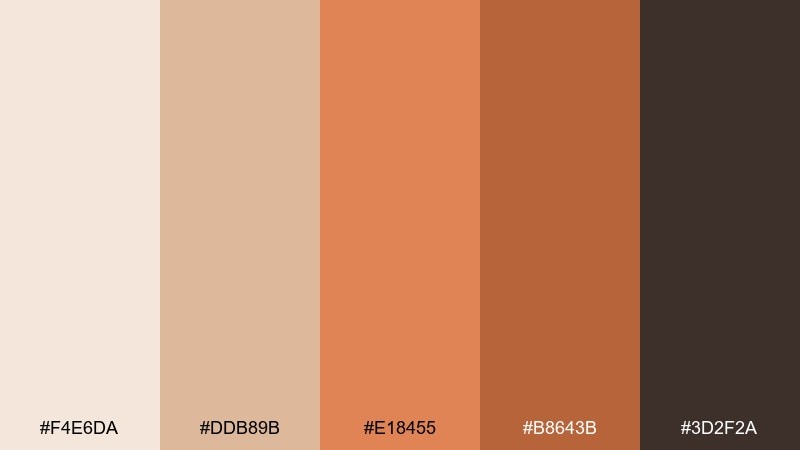
HEX: #f4e6da #ddb89b #e18455 #b8643b #3d2f2a
Mood: boho, cozy, artisanal
Best for: boutique ecommerce product pages
Woven rugs, clay pots, and sunlit studios are the vibe here, with soft beige balancing rich terracotta. This beige orange color combination is great for boutique ecommerce where product photos need a warm, flattering frame. Pair it with off-white backgrounds and subtle shadows to keep items looking crisp. Tip: use the darkest tone for prices and key UI labels so the palette stays readable on mobile.
Image example of terracotta textiles generated using media.io
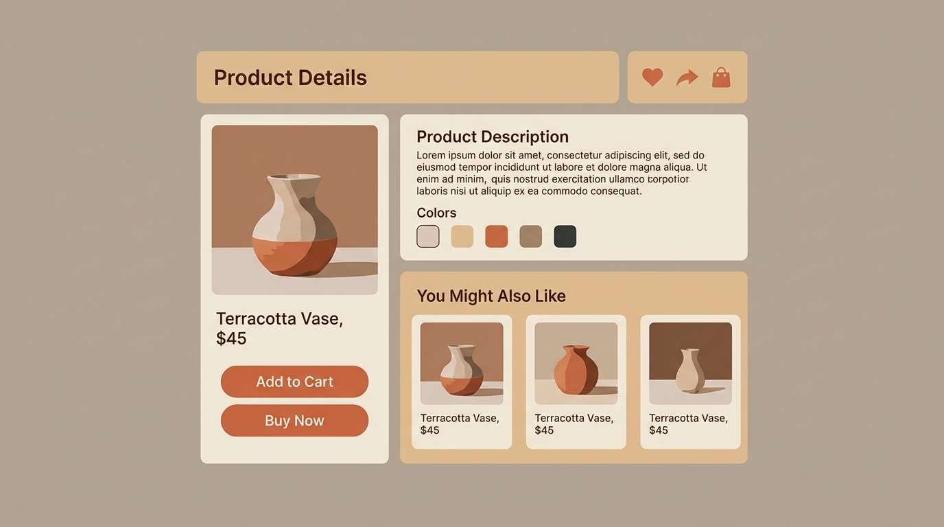
10) Honeyed Beige
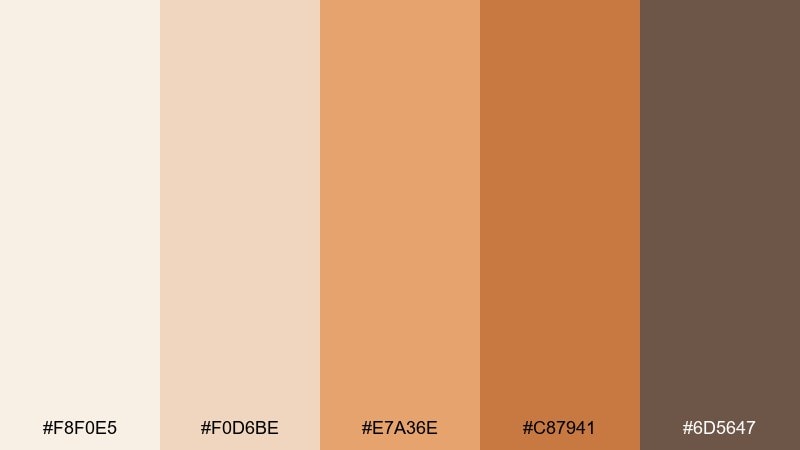
HEX: #f8f0e5 #f0d6be #e7a36e #c87941 #6d5647
Mood: soft, comforting, classic
Best for: presentation slides and decks
Honeyed neutrals and mellow orange notes feel comforting and polished, like a well-lit studio. It is a strong choice for slide decks where you want warmth while keeping charts and text legible. Pair with charcoal body text and minimal data-ink styling. Tip: use the mid honey tone for callout boxes and the deeper orange for one key metric per slide.
Image example of honeyed beige generated using media.io
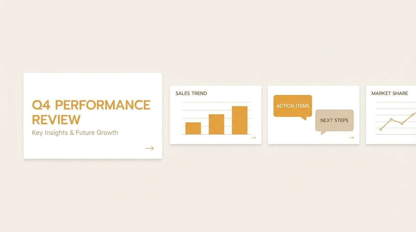
11) Amber Sand Dunes
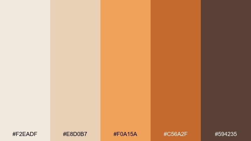
HEX: #f2eadf #e8d0b7 #f0a15a #c56a2f #594235
Mood: sunlit, natural, refined
Best for: travel blog headers and hero sections
Amber light over sand dunes gives this palette a natural, refined glow. It is ideal for travel and lifestyle headers where you want warmth that still feels sophisticated. Pair with airy photography and a restrained type scale to avoid visual noise. Tip: set overlay gradients from the darker brown into transparent to keep white headlines readable.
Image example of amber sand dunes generated using media.io
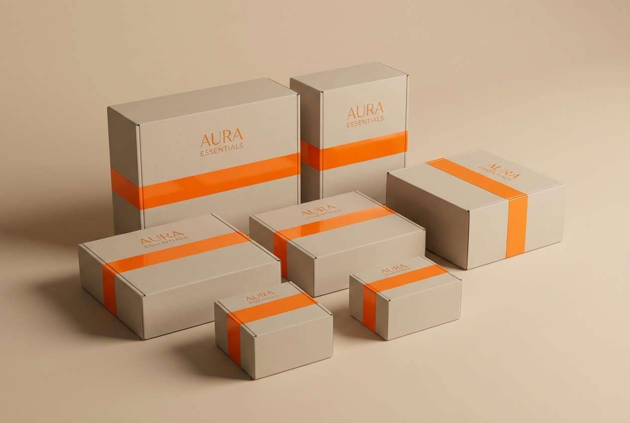
12) Apricot Adobe
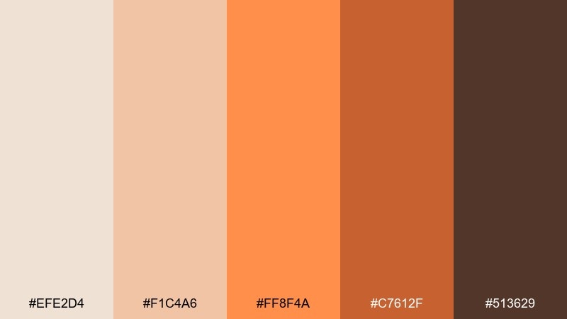
HEX: #efe2d4 #f1c4a6 #ff8f4a #c7612f #513629
Mood: bold, sunlit, architectural
Best for: brand marks and packaging accents
Apricot walls and adobe shadows make this set feel architectural and confident. The beige orange color palette suits brands that want warmth with a crisp, modern edge, especially for labels and mark systems. Pair with clean black linework and a lot of breathing room around the logo. Tip: keep the brightest orange for small signature moments like seals, stickers, or a single stripe on the box.
Image example of apricot adobe generated using media.io
13) Soft Rust & Oat
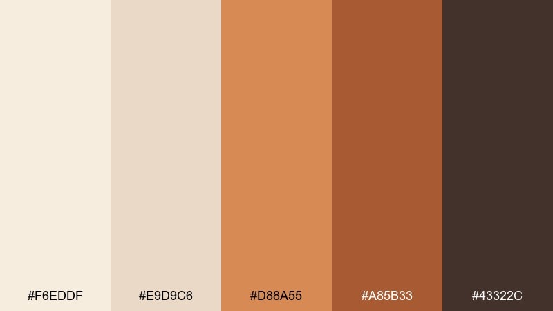
HEX: #f6eddf #e9d9c6 #d88a55 #a85b33 #43322c
Mood: muted, cozy, balanced
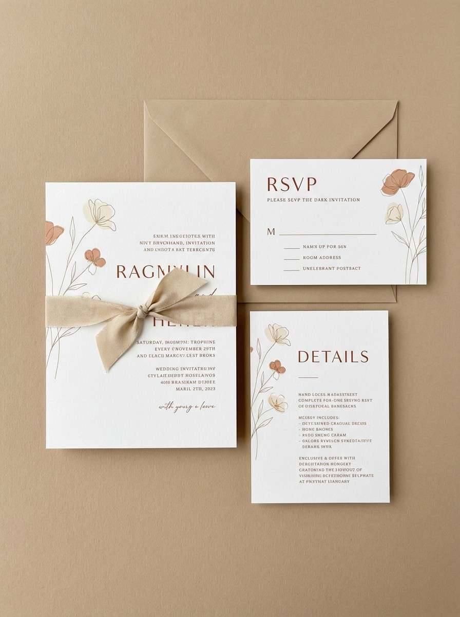
Best for: wedding invitations and stationery
Muted rust with oat-colored neutrals feels romantic and grounded, like dried florals and linen. It is perfect for wedding stationery when you want warmth without overly bright tones. Pair with letterpress textures, serif type, and delicate line florals. Tip: print the darkest brown for names and dates, then use the rust tone for borders and small embellishments.
Image example of soft rust & oat generated using media.io
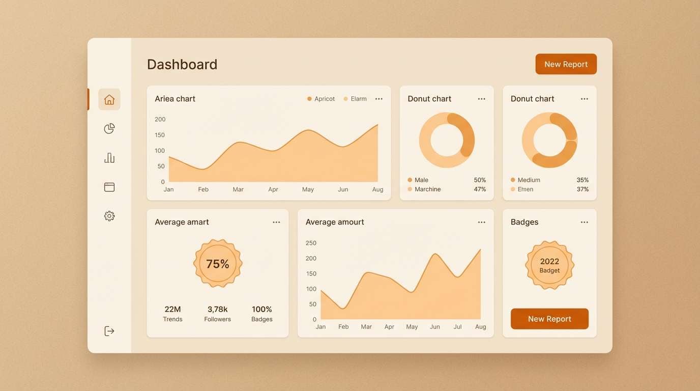
14) Warm Neutral Interface
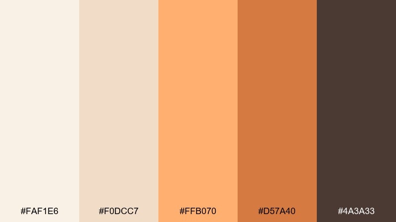
HEX: #faf1e6 #f0dcc7 #ffb070 #d57a40 #4a3a33
Mood: clear, friendly, modern
Best for: dashboard UI and design systems
Clean warm neutrals with a bright apricot accent feel friendly, modern, and highly usable. This beige orange color scheme is a strong fit for dashboards where you need hierarchy without harsh contrast. Pair with rounded cards, subtle borders, and warm gray dividers for structure. Tip: use the brightest tone only for active states and notifications, while the deeper orange handles primary actions.
Image example of warm neutral interface generated using media.io
15) Tangerine Latte
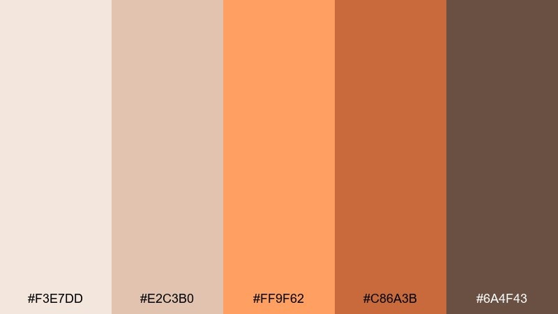
HEX: #f3e7dd #e2c3b0 #ff9f62 #c86a3b #6a4f43
Mood: creamy, upbeat, approachable
Best for: coffee product ads and banners
Creamy latte tones with a tangerine kick feel upbeat and approachable, like a morning pick-me-up. It works well for coffee ads, seasonal launches, and banners that need warmth and appetite appeal. Pair with soft gradients and simple copy blocks to keep the design modern. Tip: let the beige carry the background and use the tangerine as a single strong focal point around the product name.
Image example of tangerine latte generated using media.io
16) Apricot Blossom Paper
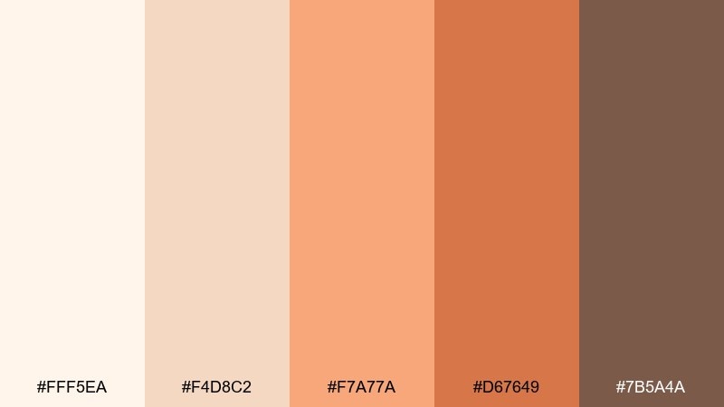
HEX: #fff5ea #f4d8c2 #f7a77a #d67649 #7b5a4a
Mood: gentle, romantic, airy
Best for: botanical illustration posters
Soft apricot petals on creamy paper create a gentle, romantic warmth. This set shines in illustrated posters and prints where the background should feel natural and calm. Pair with watercolor washes and fine ink outlines for a delicate finish. Tip: keep the mid peach as the main wash, then add the deeper orange only in small centers and shadows for depth.
Image example of apricot blossom paper generated using media.io
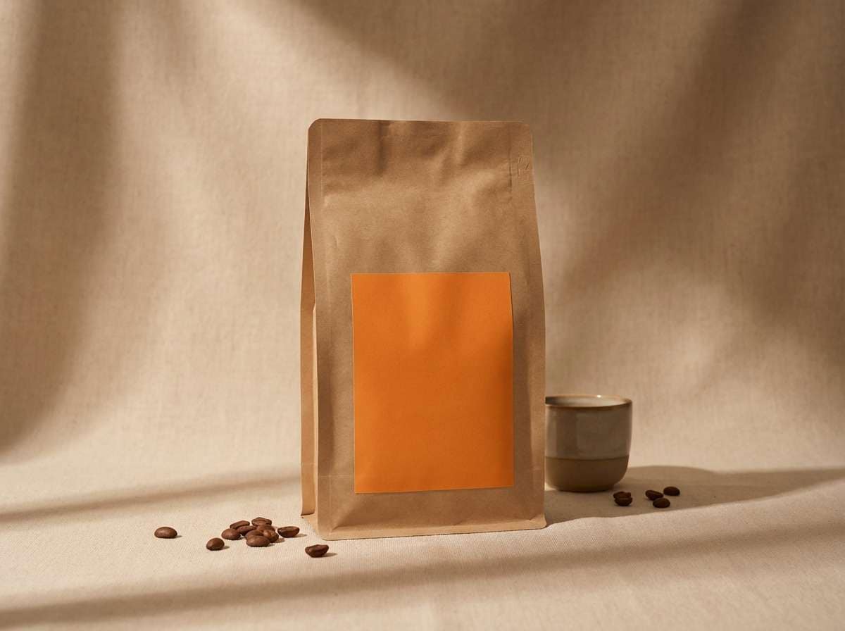
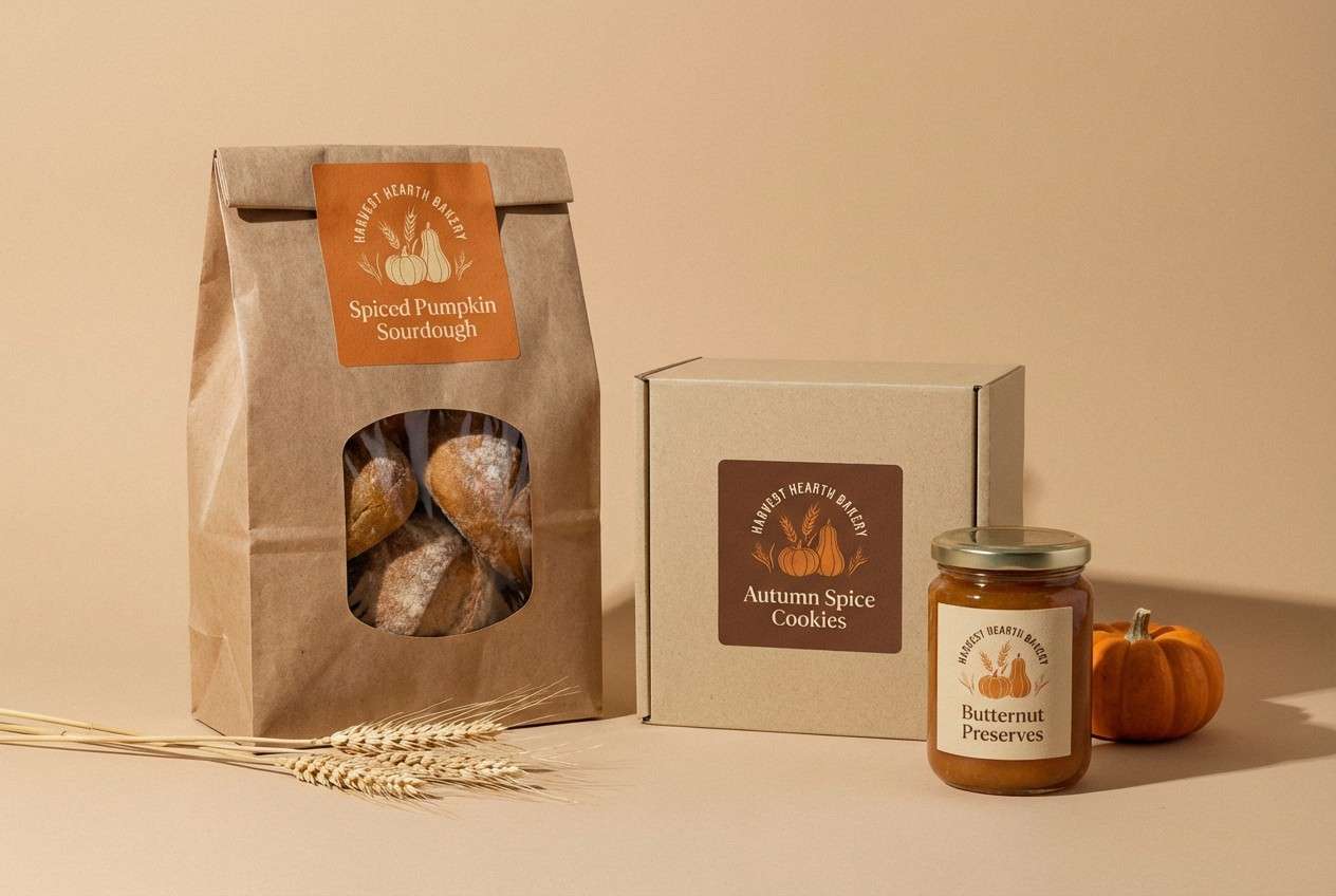
17) Spiced Pumpkin Bakery
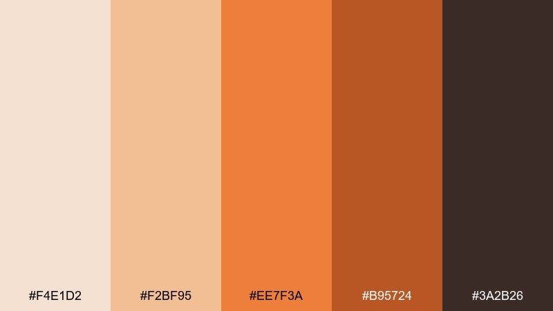
HEX: #f4e1d2 #f2bf95 #ee7f3a #b95724 #3a2b26
Mood: rich, cozy, indulgent
Best for: bakery packaging and stickers
Spiced pumpkin and toasted sugar tones feel rich, cozy, and a little indulgent. These beige orange color combinations are made for bakery packaging, stickers, and seasonal treat labels that need instant warmth. Pair with hand-drawn icons and playful type for a small-batch feel. Tip: keep the darkest shade for outlines and tiny text so the bright orange can stay clean and punchy.
Image example of spiced pumpkin bakery generated using media.io
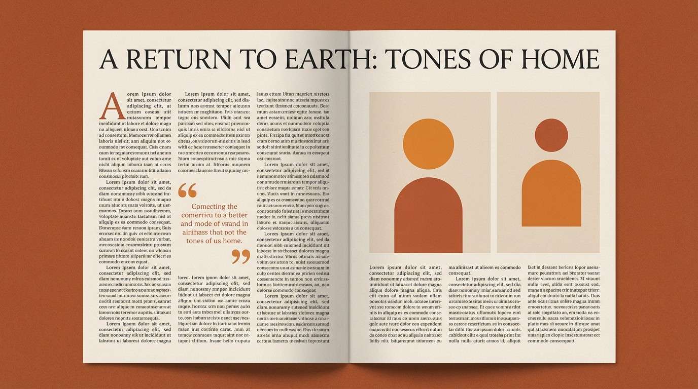
18) Clay Roof Sunset
HEX: #f7e8da #e5c2a3 #e98b52 #bf6a3d #5b4036
Mood: nostalgic, warm, cinematic
Best for: editorial magazine layouts
A clay-roof sunset mood comes through with nostalgic warmth and soft contrast. It fits editorial layouts where you want an inviting tone without sacrificing structure and readability. Pair with generous margins, serif headlines, and warm-tinted photo overlays. Tip: use the mid orange for pull quotes, and keep long-form text in the deep brown to reduce eye strain.
Image example of clay roof sunset generated using media.io
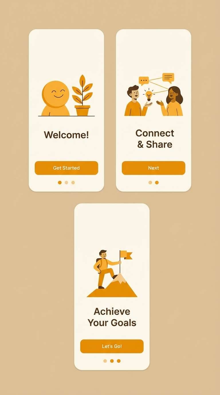
19) Marigold Beige Accent
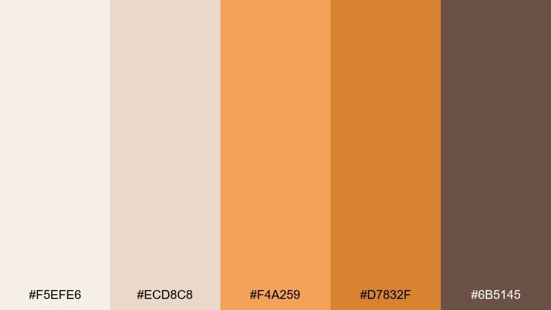
HEX: #f5efe6 #ecd8c8 #f4a259 #d7832f #6b5145
Mood: cheerful, confident, clean
Best for: app onboarding screens
Marigold energy over soft beige reads cheerful, confident, and clean. This set is great for onboarding screens where you want friendly guidance and clear next steps. Pair with simple illustrations and large rounded buttons for a welcoming feel. Tip: use marigold for progress indicators and success states, while the beige tones keep the interface calm.
Image example of marigold beige accent generated using media.io
20) Rusty Peach Gallery
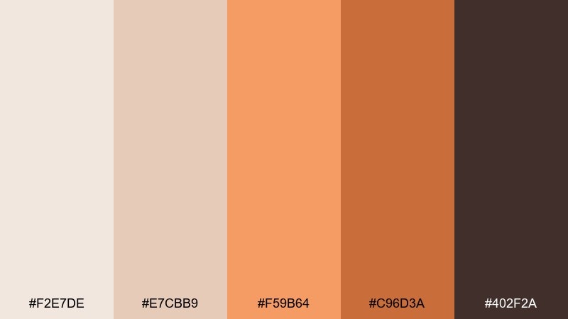
HEX: #f2e7de #e7cbb9 #f59b64 #c96d3a #402f2a
Mood: artful, warm, curated
Best for: portfolio website and case studies
Curated gallery warmth and soft peach lighting make this mix feel artful and considered. It is ideal for portfolios and case studies where the background should flatter work rather than compete with it. Pair with clean grids, subtle dividers, and a restrained accent color strategy. Tip: use the deeper terracotta only for links and hover states to keep the page feeling calm and premium.
Image example of rusty peach gallery generated using media.io
What Colors Go Well with Beige Orange?
Beige orange pairs naturally with earthy browns, espresso, and warm charcoals for readable contrast that still feels soft. For a cleaner modern look, add off-white and warm gray to keep surfaces quiet and let orange do the signaling.
If you want a fresher, more contemporary twist, try muted greens like sage or olive—these cool the warmth without clashing. Dusty blues (denim, slate) can also balance orange accents while keeping the palette grounded.
For premium or festive use, small touches of metallics work well: brushed brass, champagne gold, or copper. Keep them as details (icons, borders, foil) so the palette stays cohesive.
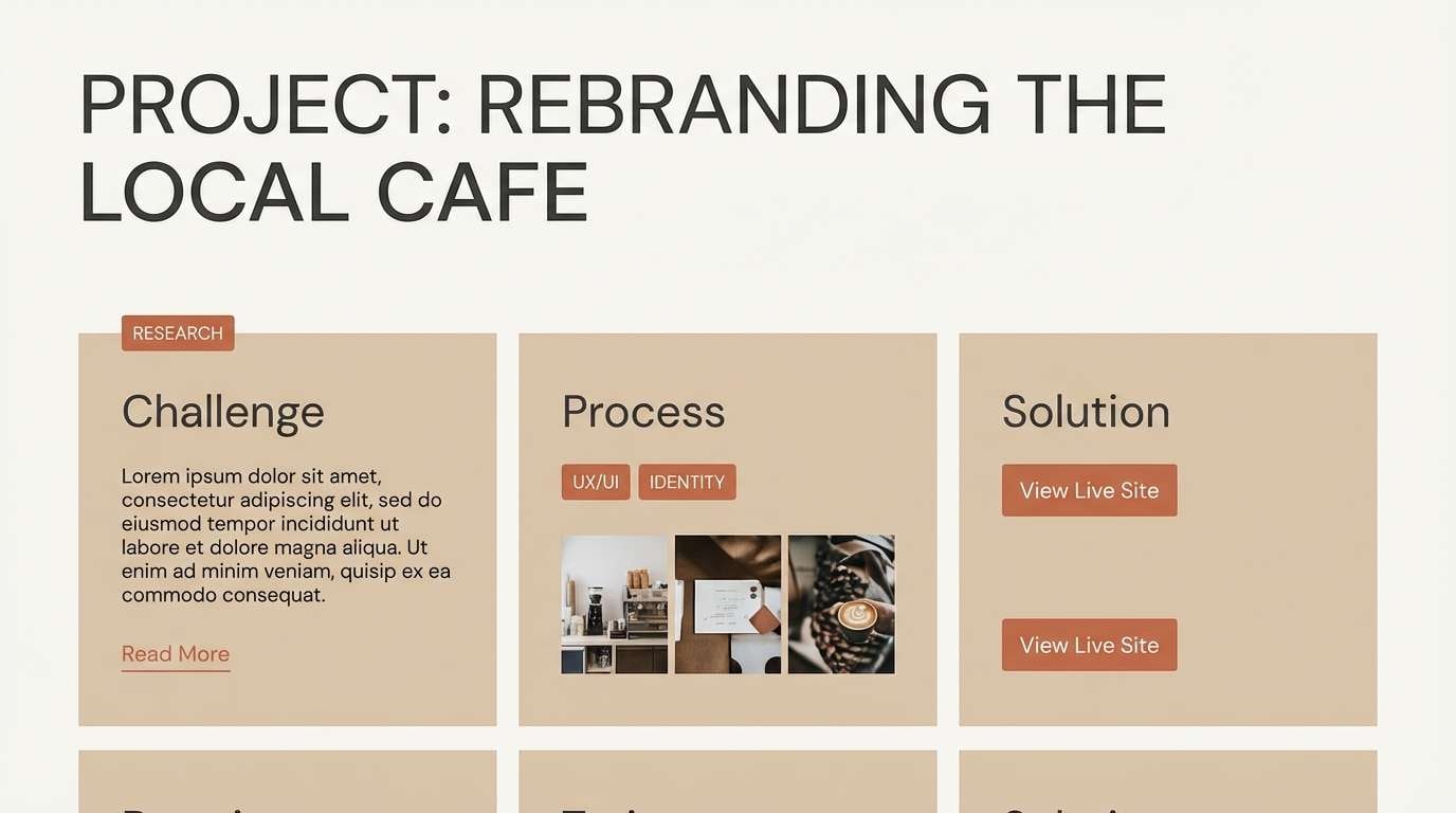
How to Use a Beige Orange Color Palette in Real Designs
Start with beige as your primary background and large surface color—it reduces glare and makes layouts feel welcoming. Use a mid orange for secondary hierarchy (section headers, tags, highlights), then reserve the most saturated orange for primary actions or key emphasis.
Maintain legibility by anchoring typography in deep warm browns or near-black rather than pure black. This keeps contrast strong while matching the palette’s natural warmth, especially in long-form text and menus.
In packaging and print, lean into texture: uncoated paper, kraft stock, watercolor washes, or subtle grain. Beige orange tones look more “real” when paired with tactile finishes and simple, confident spacing.
Create Beige Orange Palette Visuals with AI
Need to preview how a beige orange scheme looks on a menu, landing page, label, or onboarding screen? Generate realistic mockups and concept visuals in minutes using text prompts, then iterate colors until the warmth feels just right.
With Media.io, you can create palette-based images for brand presentations, mood boards, and UI explorations—without setting up complex files. Keep your prompts focused on materials (linen, clay, paper) and lighting (soft, warm, diffused) to match the vibe.
Beige Orange Color Palette FAQs
-
What is a beige orange color palette?
A beige orange palette combines warm neutral beiges (sand, oat, cream) with orange-family accents (apricot, amber, terracotta) to create designs that feel cozy, friendly, and easy to read. -
Is beige and orange a good combination for branding?
Yes. Beige establishes trust and calm, while orange adds energy and memorability. It’s especially effective for food, wellness, hospitality, lifestyle, and handmade-product brands. -
What text color works best on beige orange backgrounds?
Deep warm browns or near-black tones usually read best (espresso/charcoal). They keep contrast strong without the harsh feel of pure black against warm neutrals. -
What accent colors pair well with beige orange?
Sage/olive greens, dusty blues (slate/denim), and warm grays pair well. For a premium touch, use small metallic details like brass, copper, or champagne gold. -
How do I keep beige orange UI designs from looking too “fall themed”?
Use lighter beiges, reduce saturation of oranges, add clean whites/warm grays, and keep orange mainly for CTAs and states. Pair with modern typography and minimal borders to stay contemporary. -
Can I use beige orange palettes for weddings and invitations?
Absolutely. Muted rust, oat, and terracotta feel romantic and timeless. They print beautifully on textured papers and work well with delicate florals and serif typography. -
How can I generate beige orange palette mockups quickly?
Use Media.io’s text-to-image tool to create menu, packaging, UI, and poster visuals from prompts. Specify “warm beige background” plus your orange accent (apricot/terracotta) and keep lighting soft for realistic results.
Next: Earth Color Palette


