

Ancient Egyptian color palettes blend sun-baked neutrals, mineral blues, lush greens, and gilded accents—making them surprisingly versatile for modern branding, interiors, and UI.
Below are 20+ ancient egyptian colors with HEX codes, plus ready-to-use AI prompts you can recreate in Media.io for posters, packaging, dashboards, and more.
In this article
Why Ancient Egyptian Palettes Work So Well
Ancient Egypt palettes are built on high-contrast storytelling: light papyrus creams and desert sands create breathable space, while lapis, malachite, and gold add instant hierarchy.
They also feel both organic and designed. Mineral pigments read authentic and tactile, yet the combinations translate cleanly into modern grids, UI components, and packaging systems.
Most importantly, these color schemes naturally communicate meaning—heritage, ritual, luxury, and calm—so your visuals can feel intentional even with minimal graphics.
20+ Ancient Egyptian Color Palette Ideas (with HEX Codes)
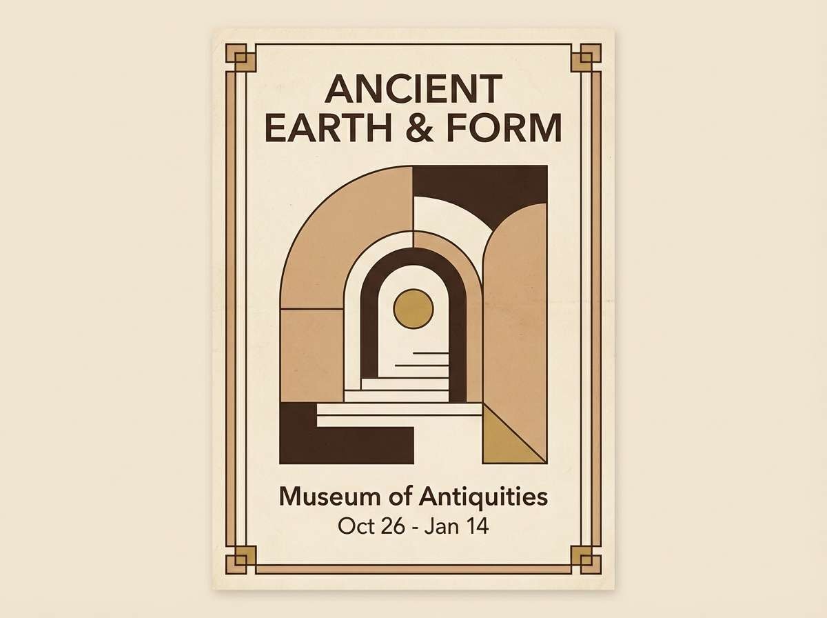
1) Temple Sandstone
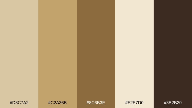
HEX: #D8C7A2 #C2A36B #8C6B3E #F2E7D0 #3B2B20
Mood: warm, grounded, historic
Best for: museum branding and cultural event posters
Warm sandstone and soot-brown feel like carved columns catching afternoon light. Use this ancient egypt color scheme for identity systems that need heritage and trust without looking dusty. Pair with crisp cream space and a single metallic foil accent for premium impact. Usage tip: keep the darkest tone for headlines only to preserve the airy, sunlit vibe.
Image example of temple sandstone generated using media.io
Media.io is an online AI studio for creating and editing video, image, and audio in your browser.

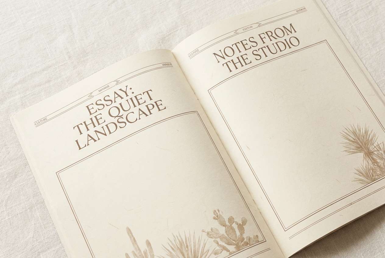
2) Papyrus Scroll
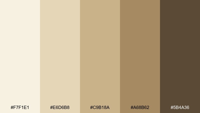
HEX: #F7F1E1 #E6D6B8 #C9B18A #A68B62 #5B4A36
Mood: soft, airy, timeless
Best for: editorial layouts and long-read blogs
Papyrus creams and weathered browns evoke handwritten scrolls and quiet libraries. The gentle contrast is ideal for text-heavy pages where readability matters. Pair with a modern serif and thin rules to suggest craftsmanship without looking themed. Usage tip: reserve the darkest brown for pull quotes and captions rather than body copy.
Image example of papyrus scroll generated using media.io
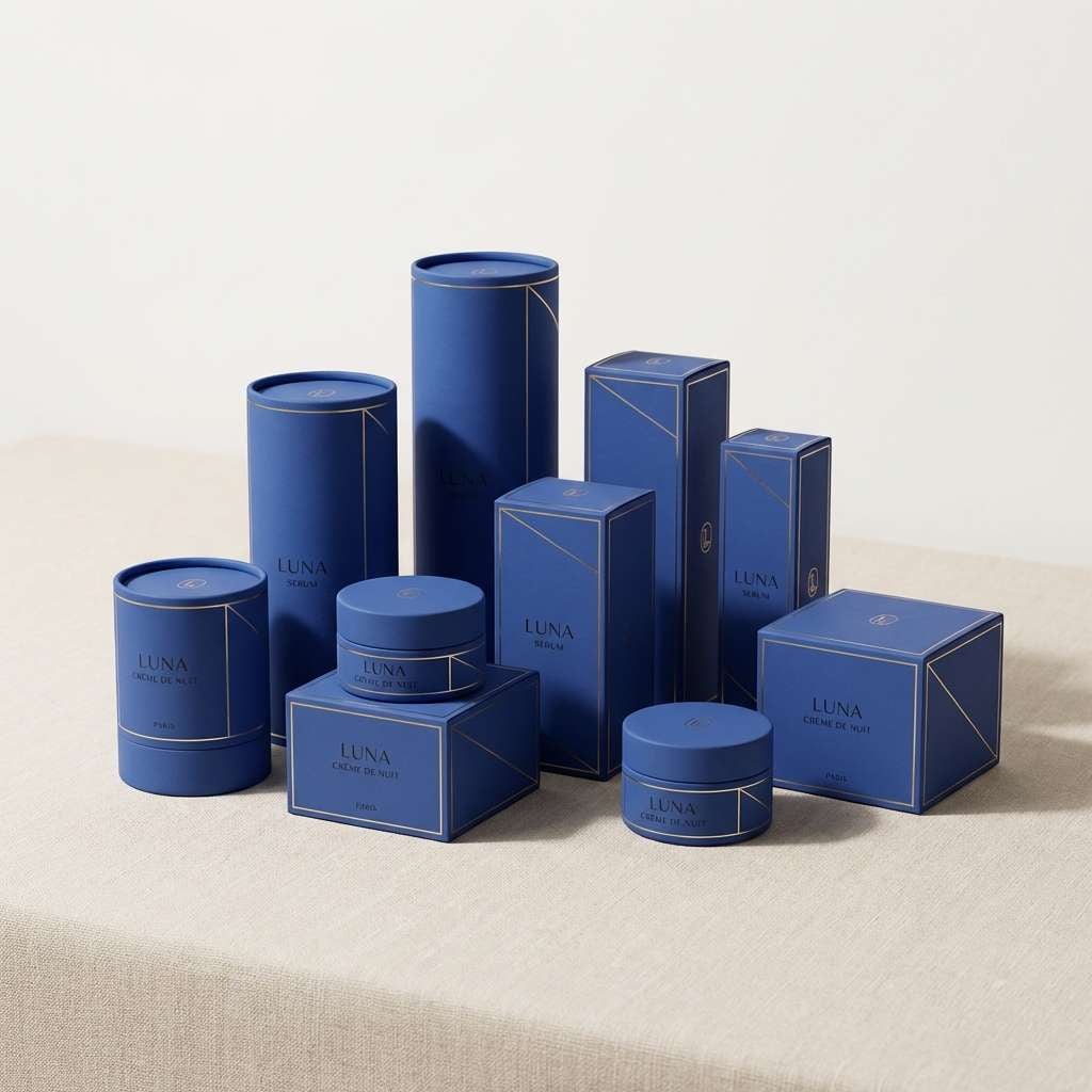
3) Lapis and Gold
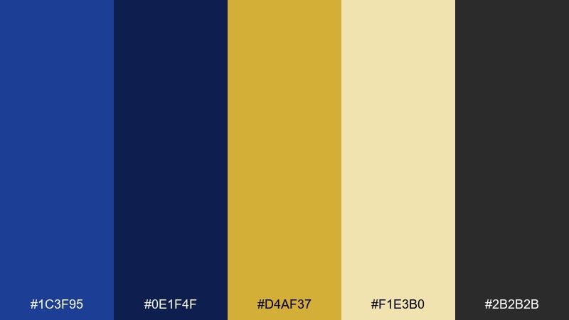
HEX: #1C3F95 #0E1F4F #D4AF37 #F1E3B0 #2B2B2B
Mood: regal, dramatic, polished
Best for: luxury logos and premium packaging
Deep lapis blues and bright gold read as ceremonial, jewel-like, and confident. These ancient egyptian tones shine on small surfaces like labels, seals, and monograms. Pair with matte black or charcoal typography to keep the shine controlled. Usage tip: let gold be the accent, not the background, to avoid overpowering the blue.
Image example of lapis and gold generated using media.io
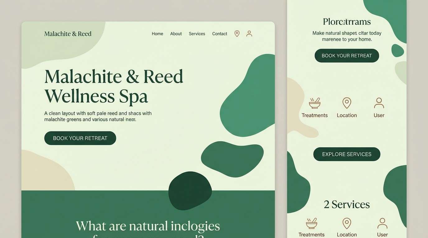
4) Malachite Garden
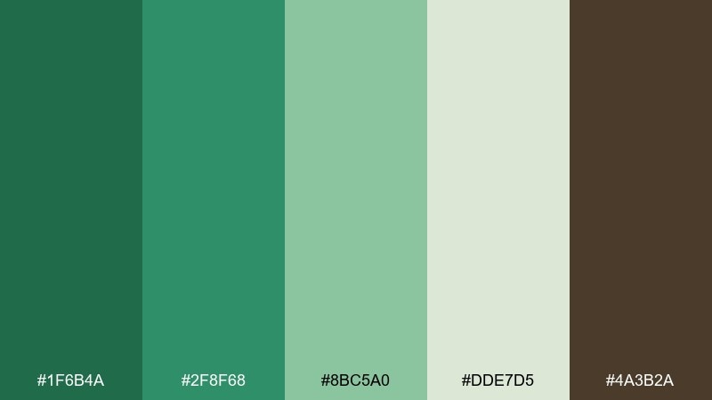
HEX: #1F6B4A #2F8F68 #8BC5A0 #DDE7D5 #4A3B2A
Mood: lush, refreshing, natural
Best for: spa branding and wellness websites
Malachite greens and pale reed tones evoke shaded courtyards and cool water. The ancient egyptian color palette works best when the light green stays dominant and the brown is used sparingly for grounding. Pair with minimal icons and plenty of soft negative space for a calm, modern feel. Usage tip: use the darkest green for CTAs to keep the interface soothing but clear.
Image example of malachite garden generated using media.io
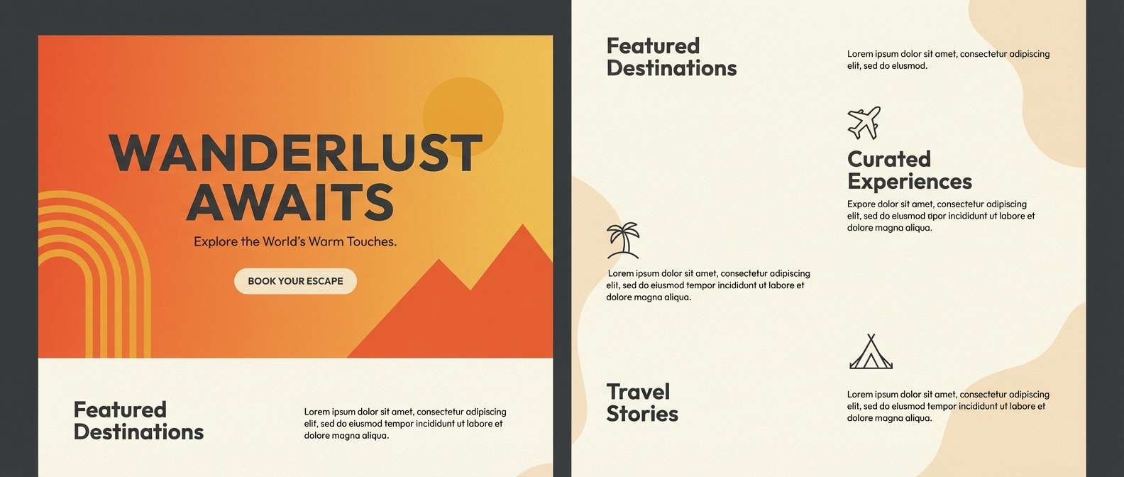
5) Karnak Sunset
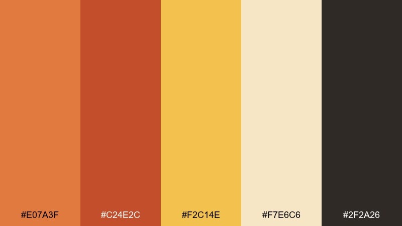
HEX: #E07A3F #C24E2C #F2C14E #F7E6C6 #2F2A26
Mood: energetic, sunlit, bold
Best for: travel ads and destination landing pages
Burnt orange and sun-gold feel like stone walls glowing at dusk. Use the warm tones for hero sections and headlines, then calm the layout with the creamy neutral. Pair with charcoal text for legibility and a modern, editorial edge. Usage tip: keep gradients subtle so the palette stays sophisticated rather than loud.
Image example of karnak sunset generated using media.io
6) Nile Midnight
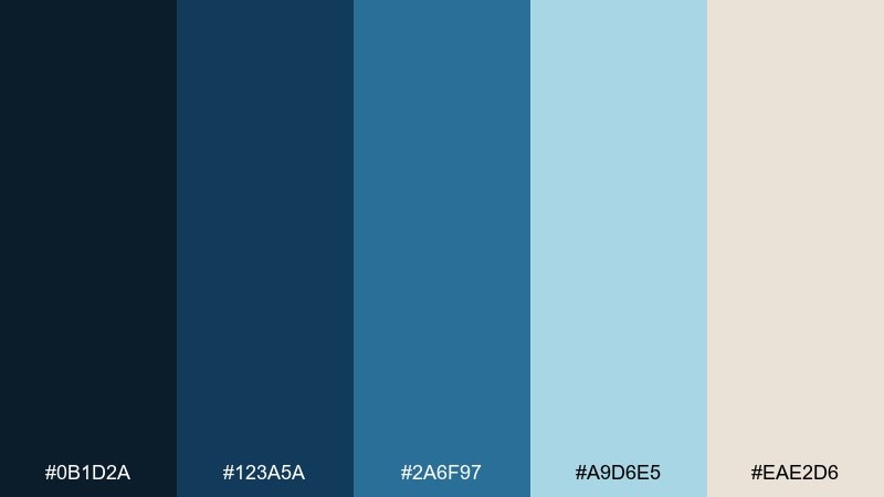
HEX: #0B1D2A #123A5A #2A6F97 #A9D6E5 #EAE2D6
Mood: cool, mysterious, refined
Best for: data dashboards and fintech UI
Inky blues and river-sky teal suggest night water and quiet depth. The contrast supports charts and navigation without relying on harsh black. Pair with warm parchment off-white to soften the tech feel and keep it human. Usage tip: use the light teal sparingly as a highlight color for key metrics only.
Image example of nile midnight generated using media.io

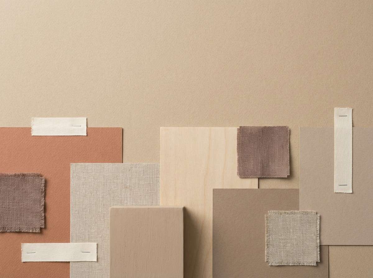
7) Desert Dusk
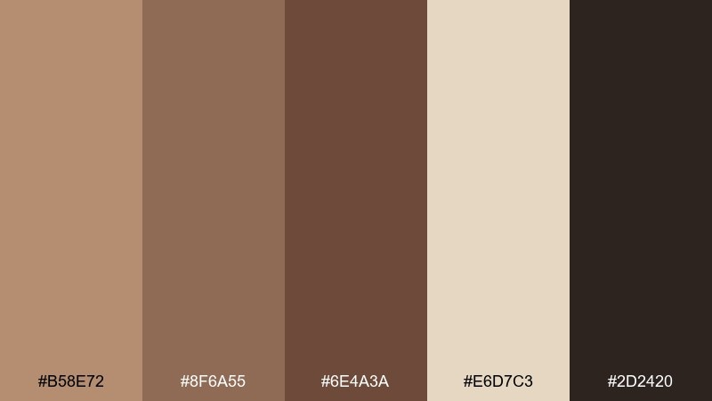
HEX: #B58E72 #8F6A55 #6E4A3A #E6D7C3 #2D2420
Mood: muted, earthy, cozy
Best for: interior design mood boards and lifestyle blogs
Muted clay browns and dusty beige feel like twilight over desert stone. These ancient egyptian tones are ideal for calm, natural layouts and warm home styling content. Pair with linen textures and understated photography to keep the palette believable. Usage tip: keep the near-black as a thin line or small type to avoid heavy blocks.
Image example of desert dusk generated using media.io
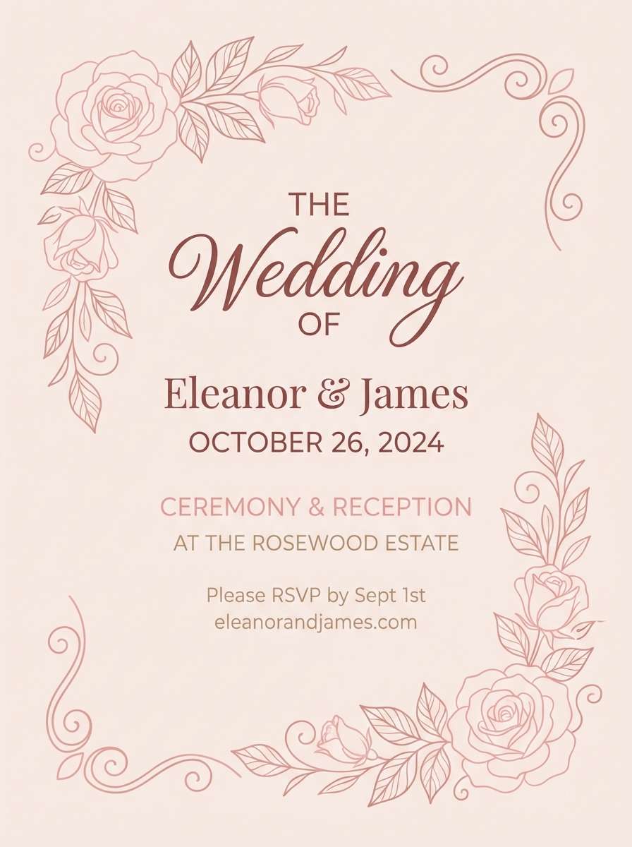
8) Lotus Blossom
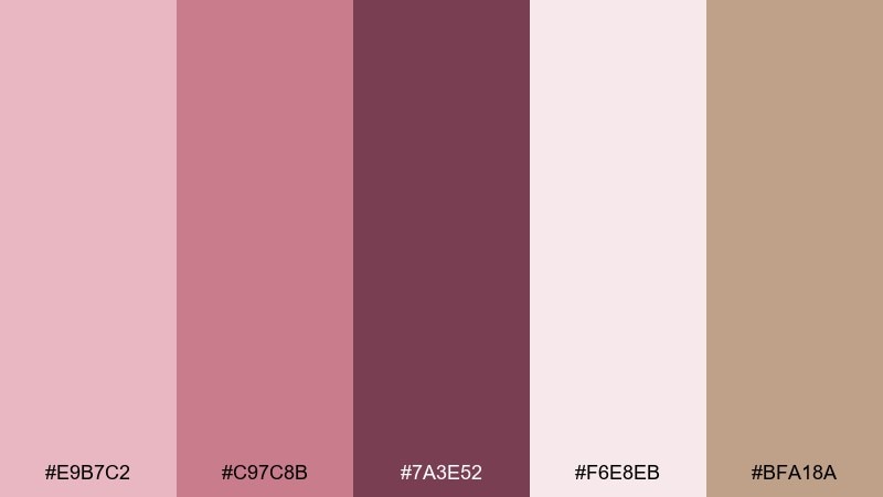
HEX: #E9B7C2 #C97C8B #7A3E52 #F6E8EB #BFA18A
Mood: romantic, soft, artisanal
Best for: wedding invitations and boutique stationery
Powdery pinks and rosewood deepen into a delicate, ceremonial feel. The creamy blush background keeps designs light while the plum tone adds elegant contrast. Pair with fine-line florals or geometric borders to avoid looking overly sweet. Usage tip: print the darkest color at slightly reduced opacity for a vintage-ink effect.
Image example of lotus blossom generated using media.io
9) Pharaoh Jewel Box
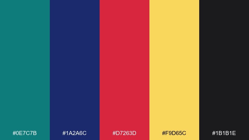
HEX: #0E7C7B #1A2A6C #D7263D #F9D65C #1B1B1E
Mood: vibrant, opulent, theatrical
Best for: music festival posters and bold social creatives
Teal, indigo, ruby, and gold feel like enamel inlays under torchlight. These ancient egypt color combinations are perfect for high-impact graphics when you need energy and a touch of drama. Pair with black or near-black to give the brights a strong frame. Usage tip: pick one dominant jewel tone and let the others appear as small bursts for balance.
Image example of pharaoh jewel box generated using media.io

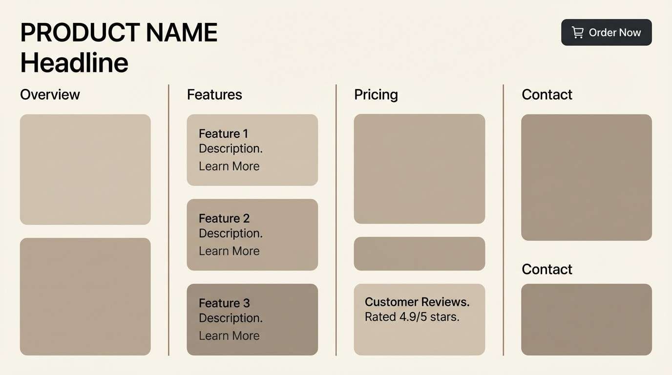
10) Obsidian Relief
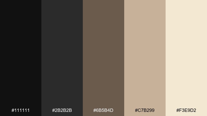
HEX: #111111 #2B2B2B #6B5B4D #C7B299 #F3E9D2
Mood: minimal, tactile, premium
Best for: modern product pages and typography-forward brands
Obsidian blacks and warm stone neutrals evoke carved reliefs and crisp shadows. The restrained range keeps layouts clean while still feeling textured and human. Pair with sharp sans-serif type and generous spacing for a gallery-like presentation. Usage tip: use the mid-brown for dividers and microcopy to soften heavy black sections.
Image example of obsidian relief generated using media.io
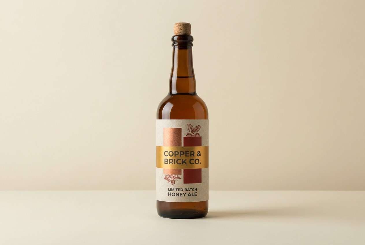
11) Copper Hieroglyphs
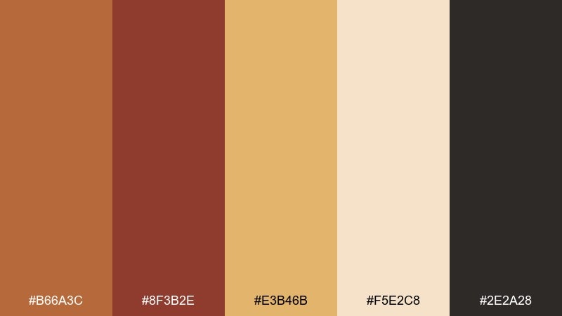
HEX: #B66A3C #8F3B2E #E3B46B #F5E2C8 #2E2A28
Mood: handcrafted, warm, storied
Best for: artisan packaging and craft beverage labels
Copper, brick, and honey-gold suggest hammered metal and sun-warmed clay. This ancient egypt palette feels handmade and works beautifully with stamp textures or rough paper stock. Pair with a deep charcoal for legibility and a touch of modern restraint. Usage tip: keep the honey tone as a highlight band to guide the eye across the label.
Image example of copper hieroglyphs generated using media.io
12) Oasis Mint
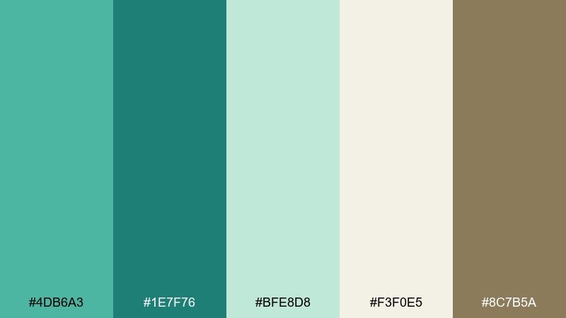
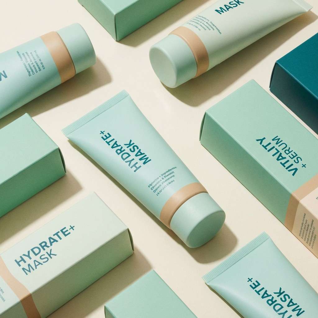
HEX: #4DB6A3 #1E7F76 #BFE8D8 #F3F0E5 #8C7B5A
Mood: clean, breezy, optimistic
Best for: skincare branding and ingredient callouts
Minty aqua and pale jade feel like cool shade near water. The palette reads fresh and modern, especially when the cream stays dominant. Pair with thin line icons and warm beige accents to keep it from turning too clinical. Usage tip: use the darker teal for ingredient highlights and small badges, not large backgrounds.
Image example of oasis mint generated using media.io
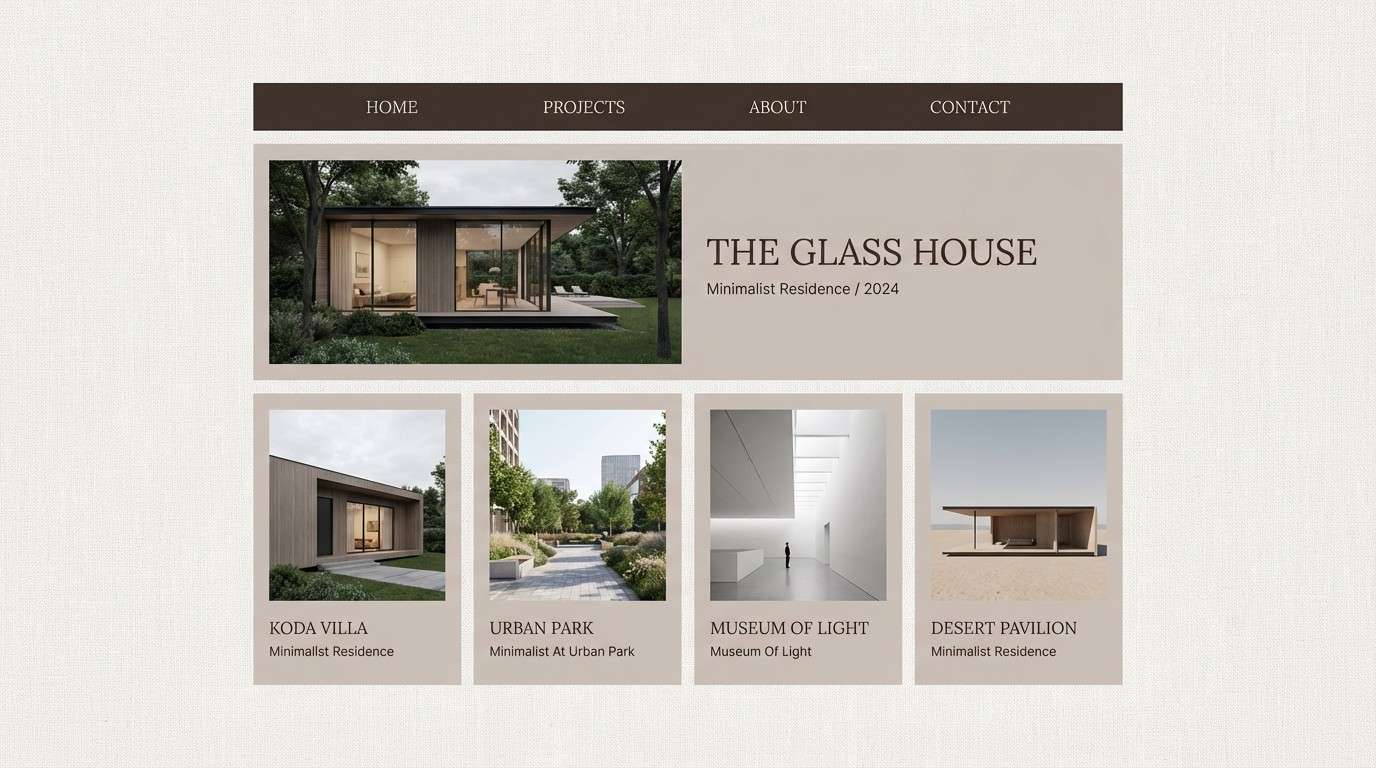
13) Royal Linen
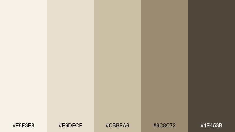
HEX: #F8F3E8 #E9DFCF #CBBFA6 #9C8C72 #4E453B
Mood: neutral, elegant, calming
Best for: portfolio sites and architectural presentations
Linen whites and soft taupes evoke woven cloth and sun-faded stone. The low contrast makes work samples and photography feel cohesive and elevated. Pair with charcoal-brown type and a single accent color if you need stronger hierarchy. Usage tip: use the darkest tone for navigation only and keep content areas light.
Image example of royal linen generated using media.io
14) Sun Disk Gold
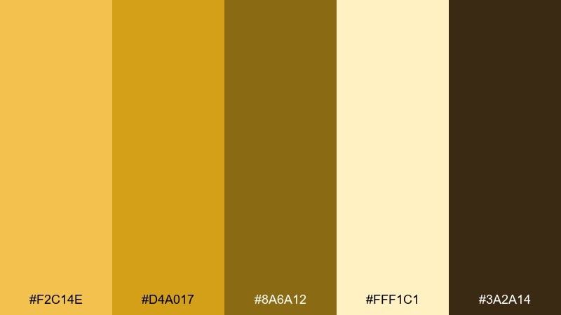
HEX: #F2C14E #D4A017 #8A6A12 #FFF1C1 #3A2A14
Mood: radiant, confident, celebratory
Best for: premium badges and award-style graphics
Radiant golds and sun-bleached cream feel ceremonial and bright, like a disk catching morning light. For an ancient egypt color palette that leans modern, keep the background pale and let gold appear in tight shapes and borders. Pair with deep brown type to avoid the harshness of pure black. Usage tip: add subtle grain to large gold areas to prevent banding in digital exports.
Image example of sun disk gold generated using media.io

15) Clay Shabti
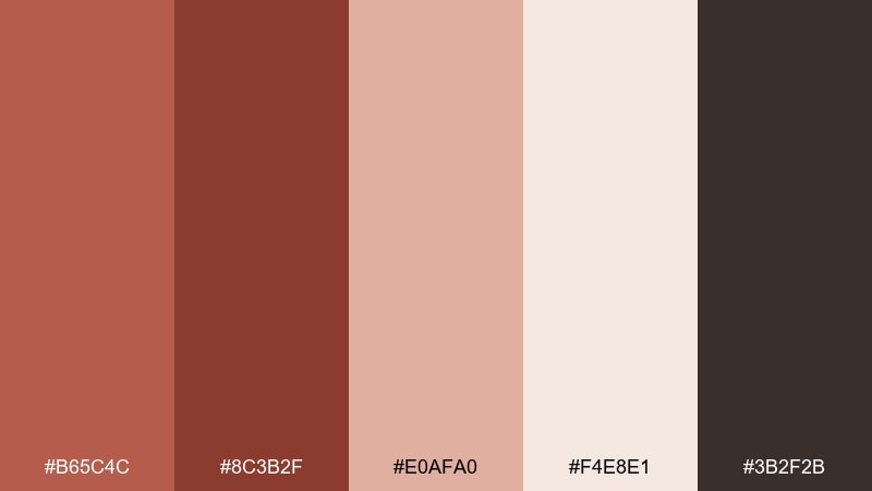
HEX: #B65C4C #8C3B2F #E0AFA0 #F4E8E1 #3B2F2B
Mood: earthy, warm, approachable
Best for: ceramics shops and handmade goods branding
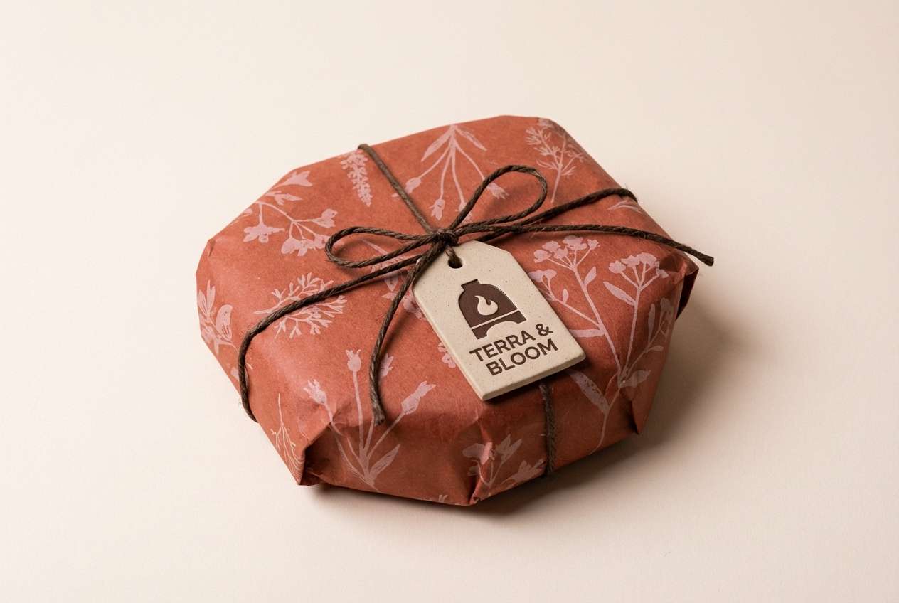
Clay reds and dusty blush feel tactile, like fired terracotta and soft pigment. These shades suit small-business branding that wants warmth without looking rustic. Pair with off-white space and simple stamp logos for a handcrafted finish. Usage tip: keep the darkest brown for outlines and avoid filling large areas with it.
Image example of clay shabti generated using media.io
16) Sphinx Stone
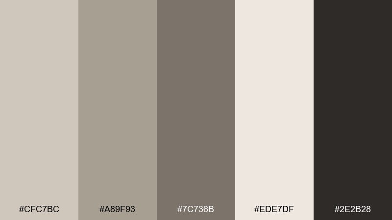
HEX: #CFC7BC #A89F93 #7C736B #EDE7DF #2E2B28
Mood: stoic, modern, understated
Best for: UI kits and neutral brand systems
Cool stone grays and warm off-white suggest weathered sculpture and clean modern minimalism. This ancient egyptian color palette is a strong foundation for systems that need flexibility across many components. Pair with one accent color, such as teal or gold, when you need emphasis. Usage tip: use the mid-gray for borders and disabled states to keep hierarchy consistent.
Image example of sphinx stone generated using media.io
17) River Reed
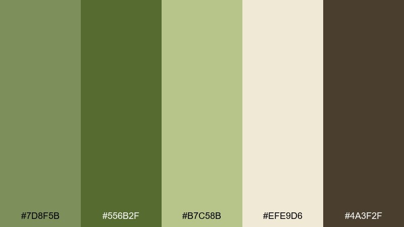
HEX: #7D8F5B #556B2F #B7C58B #EFE9D6 #4A3F2F
Mood: earthy, botanical, balanced
Best for: botanical illustrations and eco packaging
Reed greens and parchment beige evoke riverbanks, woven baskets, and dried grasses. Use it for nature-forward visuals that still feel warm and grounded. Pair with line-drawn botanicals and simple sans typography for a contemporary look. Usage tip: keep the darkest green as a spot color for labels and icons to maintain freshness.
Image example of river reed generated using media.io
18) Sacred Ink
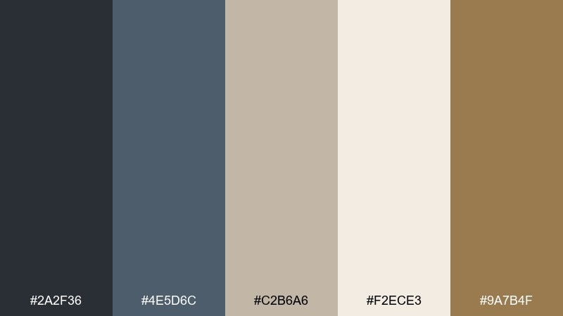
HEX: #2A2F36 #4E5D6C #C2B6A6 #F2ECE3 #9A7B4F
Mood: scholarly, calm, sophisticated
Best for: book covers and lecture series promos
Smoky ink blues and parchment neutrals feel academic, quiet, and precise. For an ancient egypt color scheme that reads more scholarly than decorative, keep the layout mostly light and use the blue-grays for type and rules. Pair with a subtle gold-brown accent to hint at antiquity without going full metallic. Usage tip: use the darkest ink tone for titles only and keep body text in the softer blue-gray.
Image example of sacred ink generated using media.io
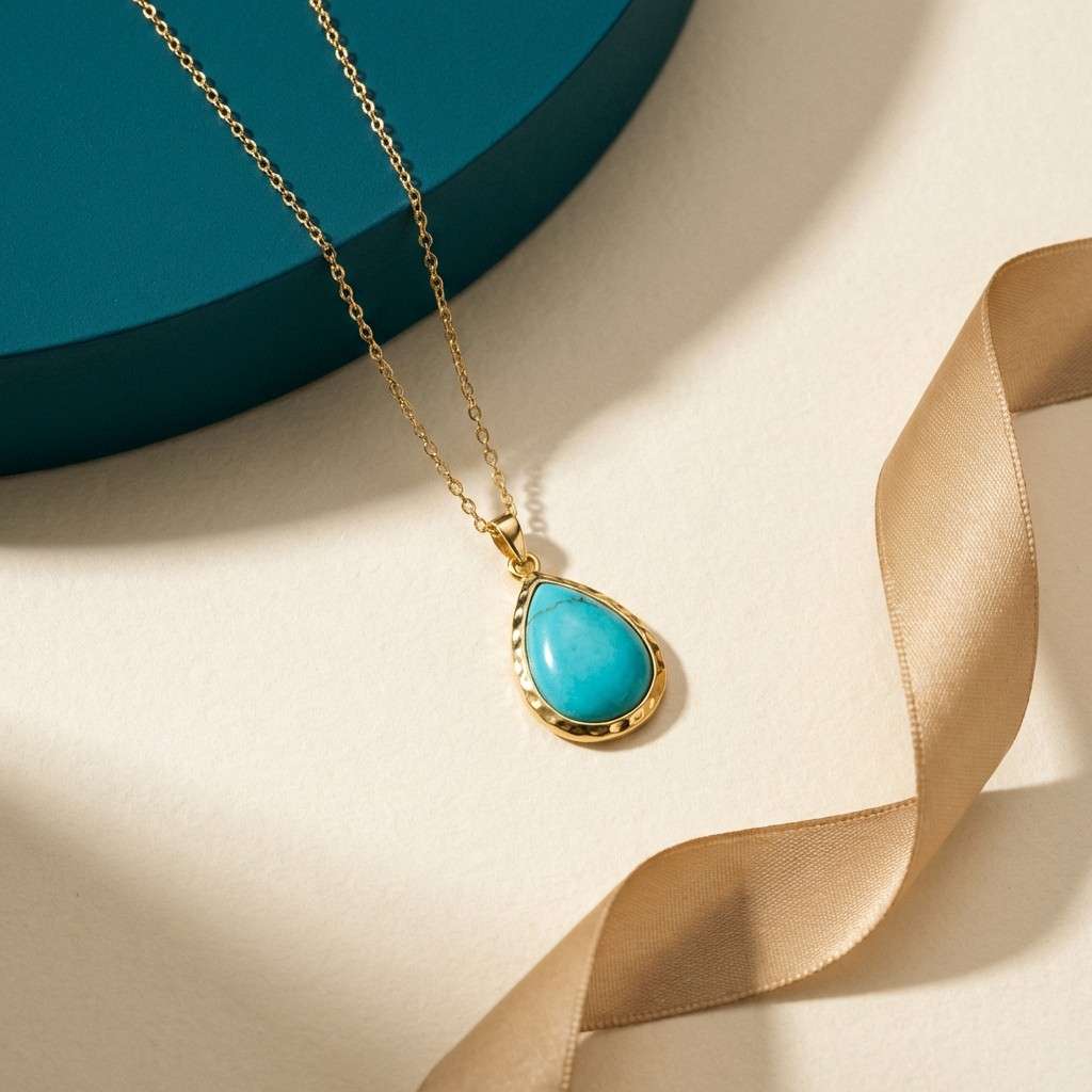
19) Turquoise Amulet
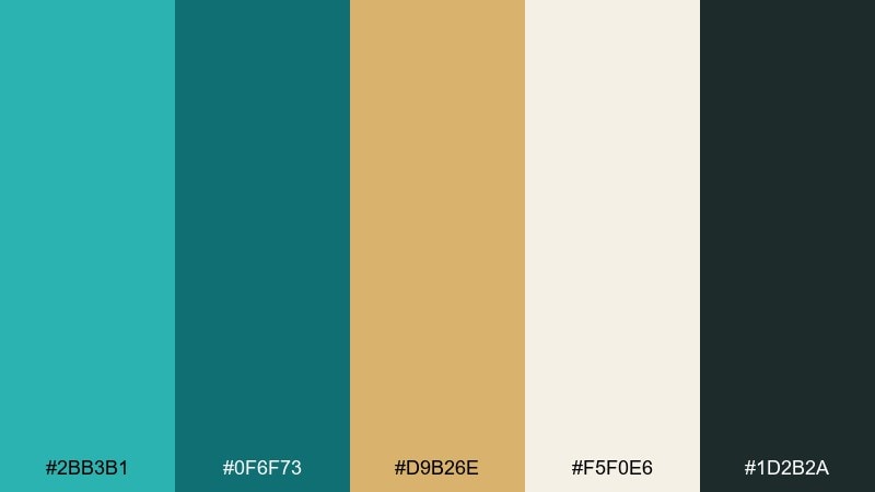
HEX: #2BB3B1 #0F6F73 #D9B26E #F5F0E6 #1D2B2A
Mood: bright, crafted, modern
Best for: jewelry ads and boutique ecommerce
Turquoise and deep teal feel like polished stone set in warm metal. The gold-beige keeps the palette grounded so the teal can pop without looking neon. Pair with clean product photography and minimal UI chrome for a premium boutique vibe. Usage tip: use the light cream as your main background so the turquoise reads crisp and saturated.
Image example of turquoise amulet generated using media.io
20) Pyramid Nightfire
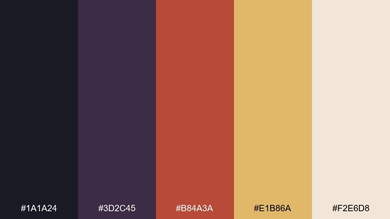
HEX: #1A1A24 #3D2C45 #B84A3A #E1B86A #F2E6D8
Mood: cinematic, moody, adventurous
Best for: movie posters and game key art typography
Midnight violet and ember red feel like torchlight against a night sky. The contrast makes dramatic headlines and punchy taglines easy to read. An ancient egypt color palette like this works best when the light cream is used as a small highlight, not a big field. Usage tip: keep the gold as a secondary glow color so the red remains the focal accent.
Image example of pyramid nightfire generated using media.io
What Colors Go Well with Ancient Egypt?
Ancient Egypt colors pair best with warm neutrals first: papyrus cream, sandstone beige, and linen off-white create the “sunlit” base that makes accents feel intentional instead of loud.
For contrast, add mineral tones like lapis blue or turquoise, then ground the layout with charcoal or deep umber. Metallic gold works best as a thin border, icon, or badge rather than a full background.
If you want a more modern twist, introduce one cool gray or muted teal for UI components while keeping the main surfaces in warm parchment shades.
How to Use a Ancient Egyptian Color Palette in Real Designs
Start with a dominant background neutral (papyrus/linen) and pick one hero color (lapis, malachite, or sunset orange). This keeps the theme clear without turning the design into a costume.
Use dark tones for structure: navigation, titles, and key dividers. Reserve gold and bright jewel colors for emphasis—CTAs, seals, price tags, or small geometric motifs.
In digital products, test contrast early. Many ancient-inspired palettes are intentionally soft, so assign roles (background, text, border, highlight) and keep the most saturated color for interactive states.
Create Ancient Egyptian Palette Visuals with AI
Want to see these ancient egypt color palette ideas in real layouts? Turn any palette into posters, UI mockups, packaging, or social creatives by reusing the prompts above.
In Media.io, you can tweak style keywords (minimal, editorial, realistic, flat vector) and aspect ratios to match your exact use case while staying consistent with your HEX direction.
Ancient Egypt Color Palette FAQs
-
What are the most iconic ancient egypt colors?
Lapis blue, turquoise, malachite green, gold, and papyrus-like creams are the most recognizable. They balance mineral saturation with sun-warmed neutrals for an instantly “Egyptian” feel. -
Is lapis blue and gold a good combination for branding?
Yes—lapis reads premium and authoritative, while gold adds a ceremonial accent. Keep gold as a detail (foil line, border, emblem) so the palette stays polished rather than overpowering. -
Which ancient egypt palette works best for modern UI?
Nile Midnight and Sphinx Stone are strong choices because they include clear darks and lights for hierarchy. Use teal/light blue as highlights and keep backgrounds warm off-white for a human tone. -
How do I make an Egyptian-inspired palette look modern (not themed)?
Limit ornament and rely on spacing, typography, and clean shapes. Use one signature accent (lapis, turquoise, or gold) and keep the rest neutral so the reference feels subtle. -
What colors pair well with papyrus beige?
Papyrus beige pairs well with charcoal/umber for text, plus mineral accents like teal, lapis, or olive. It also supports warm metals (gold/copper) when used sparingly. -
Can I use these palettes for printing (packaging, invitations, labels)?
Yes. For print, avoid large solid metallic-like areas in flat color; instead, use texture or foil effects. Always test a proof because warm neutrals and deep blues can shift across paper stocks. -
How can I generate ancient egyptian palette images with AI?
Use Media.io Text-to-Image and paste one of the prompts from the palette you like. Then refine the prompt (style, layout, subject) while keeping your key colors consistent with the HEX set.
Next: Rainforest Color Palette


