

A gold blue green color palette blends calm depth with a premium glow, pairing oceanic blues and greens with a warm metallic-like accent. It’s a go-to combo for brands that want to feel trustworthy, modern, and quietly luxurious.
Below are 20+ ready-to-use gold blue green color combinations with HEX codes, plus AI prompt examples you can recreate in Media.io for branding, UI, and print.
In this article
- Why Gold Blue Green Palettes Work So Well
-
- gilded ocean calm
- regal lagoon
- emerald harbor
- sunlit atlas
- museum brass and teal
- coastal botanical
- midnight mint accent
- art deco conservatory
- sapphire fern
- vintage map patina
- modern resort lobby
- alpine lake gold
- tropical night market
- classic bookcloth
- fresh finance ui
- jewelbox packaging
- garden party stationery
- minimal gallery poster
- deep sea brand kit
- satin medal and moss
- canal street classics
- What Colors Go Well with Gold Blue Green?
- How to Use a Gold Blue Green Color Palette in Real Designs
- Create Gold Blue Green Palette Visuals with AI
Why Gold Blue Green Palettes Work So Well
Gold brings instant “value” signals—premium, celebratory, and confident—while blue communicates stability and trust. When you add green, the palette gains freshness and a nature-forward feel that keeps it from looking too formal.
This trio is naturally high-contrast: dark navies and teals create clear hierarchy for typography and UI, while gold works as a controlled highlight for CTAs, key numbers, and icons. That makes the scheme both elegant and functional.
Because it spans warm (gold) and cool (blue/green), it also adapts well across mediums—screens, print, packaging, and environmental design—without losing its signature mood.
20+ Gold Blue Green Color Palette Ideas (with HEX Codes)
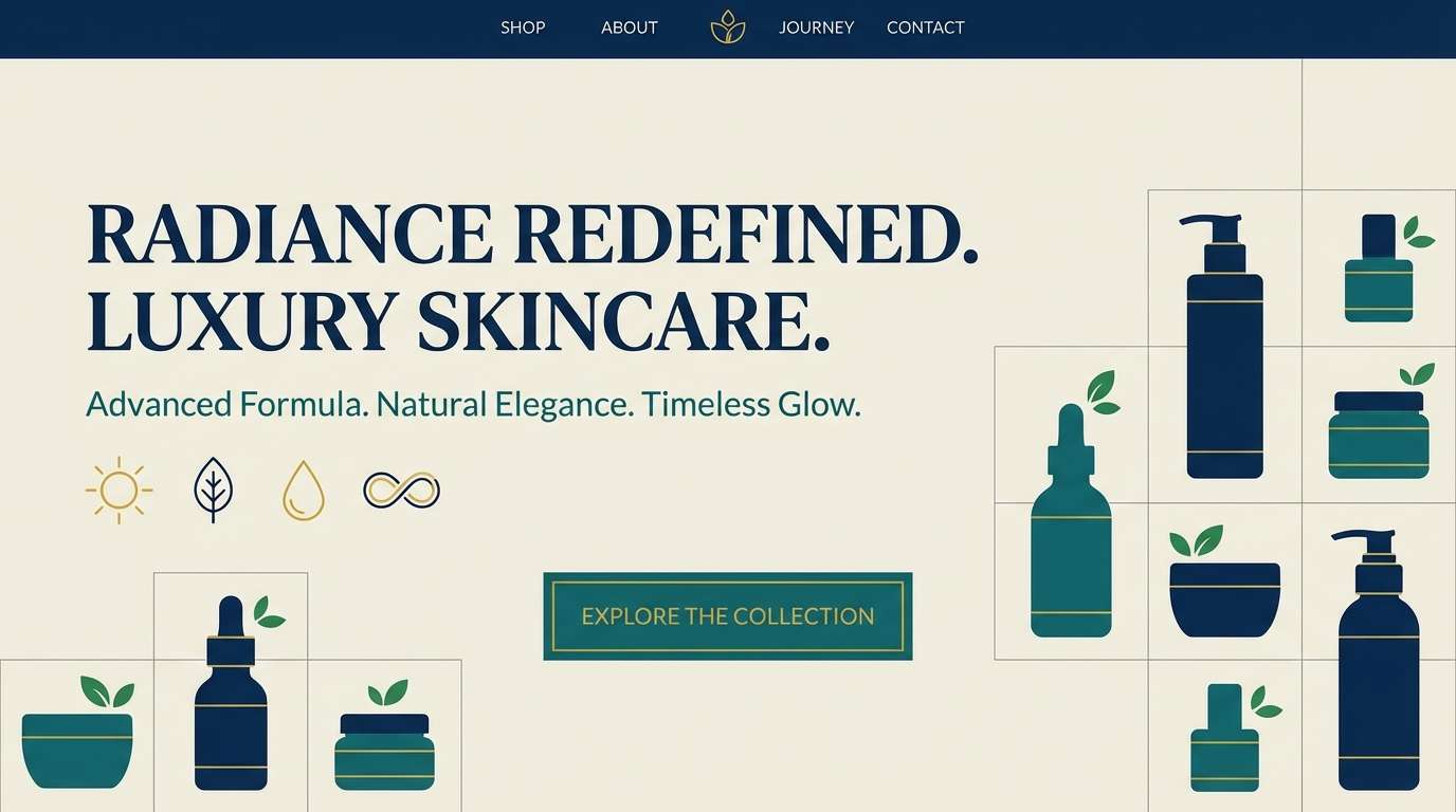
1) Gilded Ocean Calm
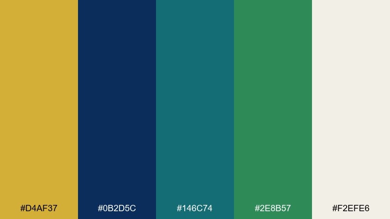
HEX: #d4af37 #0b2d5c #146c74 #2e8b57 #f2efe6
Mood: calm, premium, coastal
Best for: luxury skincare brand landing page
Calm coastal luxury comes through like sunlight on deep water and polished brass. Use the navy as your anchor, let teal and green carry supporting sections, and save gold for micro accents such as icons, dividers, and CTAs. Cream keeps the layout airy and prevents the darker tones from feeling heavy. Tip: keep gold at under 10 percent of the page to avoid a metallic overload.
Image example of gilded ocean calm generated using media.io
Media.io is an online AI studio for creating and editing video, image, and audio in your browser.

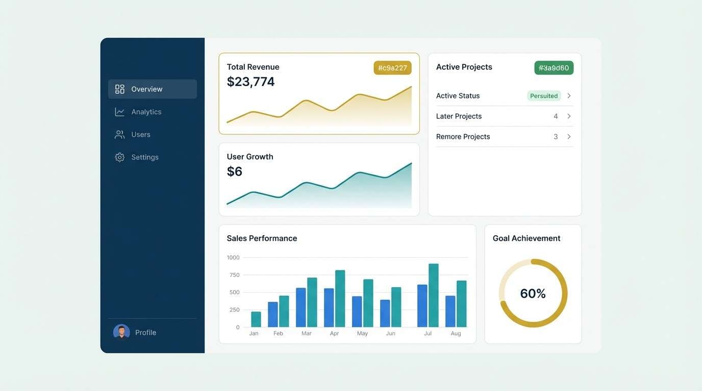
2) Regal Lagoon
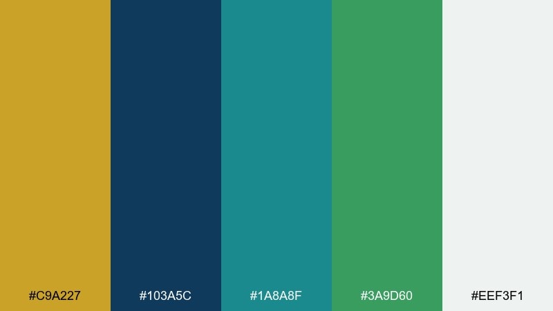
HEX: #c9a227 #103a5c #1a8a8f #3a9d60 #eef3f1
Mood: regal, fresh, confident
Best for: SaaS dashboard UI kit
Regal and clean, these tones feel like a lagoon at dusk with a glint of gold. For a gold blue green color combination that reads modern, keep the dashboard base in soft off-white, then build hierarchy with navy headers and teal panels. Use green for success states and gold for highlights like active tabs or key metrics. Tip: pair gold with navy, not teal, for the sharpest contrast.
Image example of regal lagoon generated using media.io
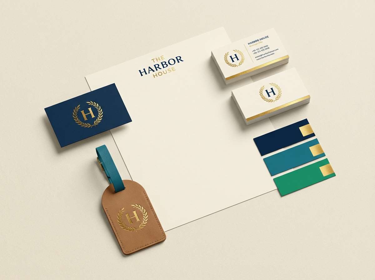
3) Emerald Harbor
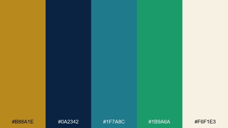
HEX: #b88a1e #0a2342 #1f7a8c #1b9a6a #f6f1e3
Mood: nautical, vibrant, upscale
Best for: boutique hotel brand kit
Nautical and upscale, it evokes harbor lights, emerald water, and brushed metal details. The deep blue sets a luxurious foundation, while teal and emerald bring energy to secondary graphics and patterns. Use the warm gold sparingly for logo marks, seals, and premium touches on stationery. Tip: add subtle texture in the cream background to make the palette feel more tactile.
Image example of emerald harbor generated using media.io
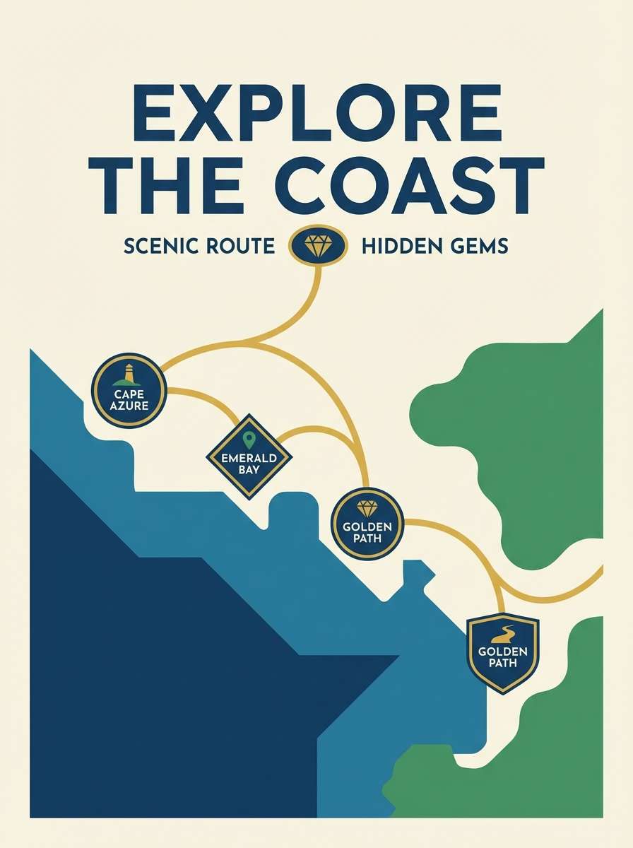
4) Sunlit Atlas
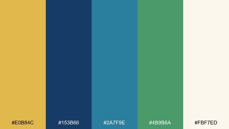
HEX: #e0b84c #153b66 #2a7f9e #4b9b6a #fbf7ed
Mood: adventurous, optimistic, polished
Best for: travel poster series
Adventurous and optimistic, it feels like a sunlit map with cool ocean routes and forest stops. Let the deep blue handle titles and silhouettes, then use teal for water shapes and green for land accents. Gold works beautifully for route lines, badges, or a small stamp motif. Tip: keep the background warm and light so the blues stay crisp, not gloomy.
Image example of sunlit atlas generated using media.io
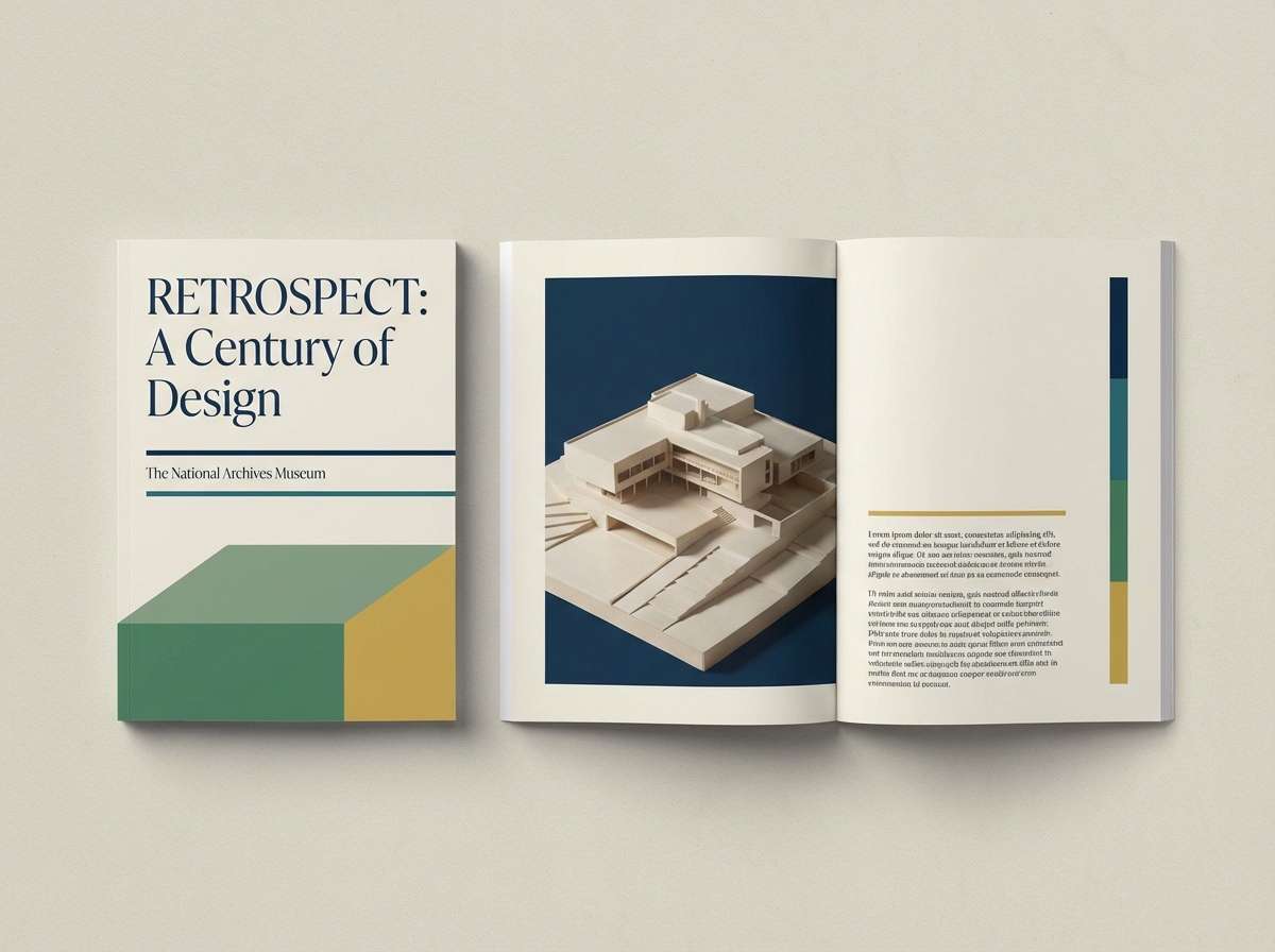
5) Museum Brass and Teal
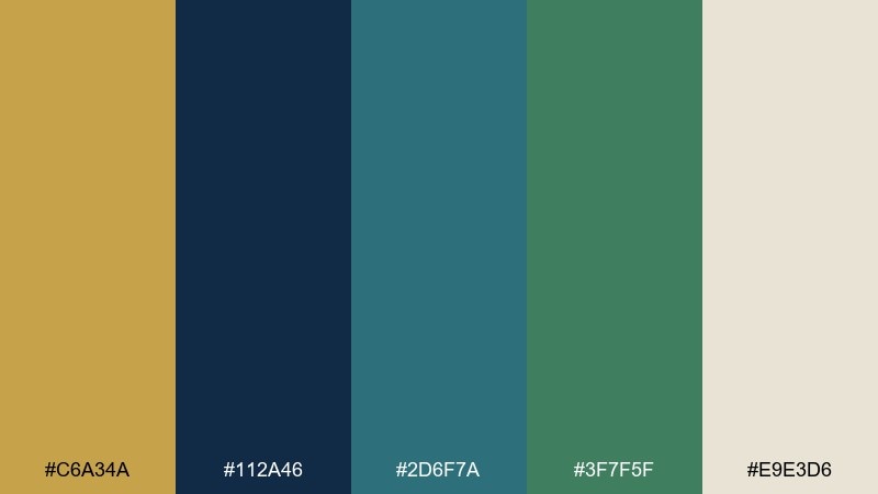
HEX: #c6a34a #112a46 #2d6f7a #3f7f5f #e9e3d6
Mood: cultured, timeless, refined
Best for: museum exhibition brochure
Cultured and timeless, it suggests gallery walls, aged brass fixtures, and quiet teal shadows. Use navy for body copy and headings to keep readability high, then layer teal and green for section bands and infographics. Gold is best as a small foil-like accent on covers or pull quotes. Tip: increase line spacing and margins to let the colors feel premium rather than busy.
Image example of museum brass and teal generated using media.io
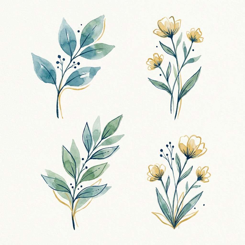
6) Coastal Botanical
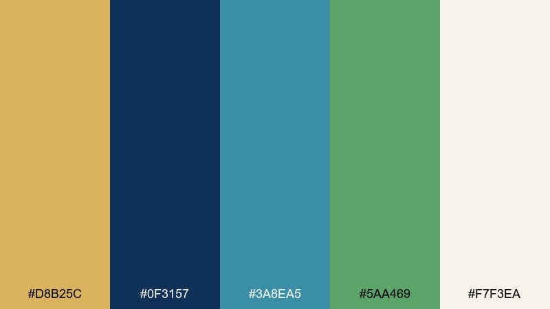
HEX: #d8b25c #0f3157 #3a8ea5 #5aa469 #f7f3ea
Mood: breezy, natural, uplifting
Best for: watercolor botanical illustration set
Breezy and natural, it brings to mind sea air, pressed leaves, and warm sand. The blue keeps the artwork grounded, while teal and green add freshness to stems, shadows, and washes. Use the sandy gold as a subtle highlight on petals or labels without overpowering the painting. Tip: limit your darkest value to the navy so the set stays soft and cohesive.
Image example of coastal botanical generated using media.io
7) Midnight Mint Accent
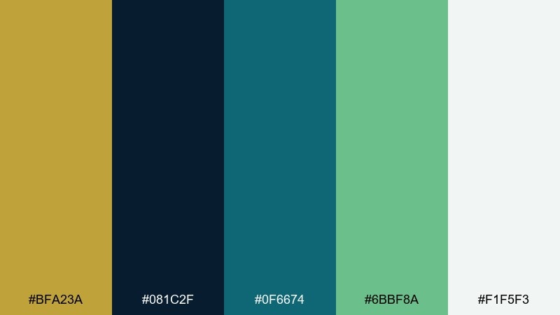
HEX: #bfa23a #081c2f #0f6674 #6bbf8a #f1f5f3
Mood: bold, crisp, tech-forward
Best for: mobile app onboarding screens
Bold and crisp, it feels like midnight UI with a minty, optimistic lift. Keep the darkest blue for backgrounds and large shapes, then use teal for secondary panels and mint for friendly callouts. Gold works best as a small attention cue on buttons or progress indicators. Tip: use mint as the primary accent and reserve gold for moments that need emphasis.
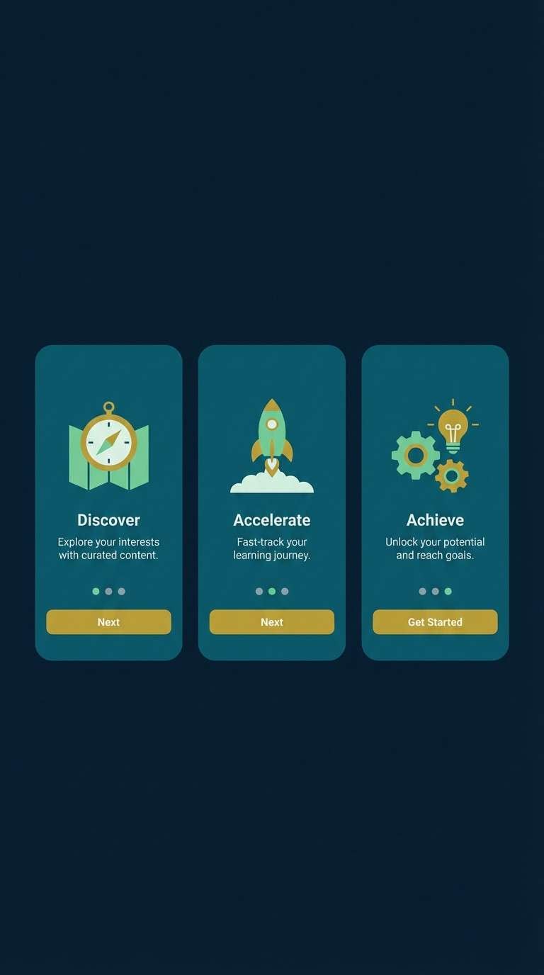
Image example of midnight mint accent generated using media.io
8) Art Deco Conservatory
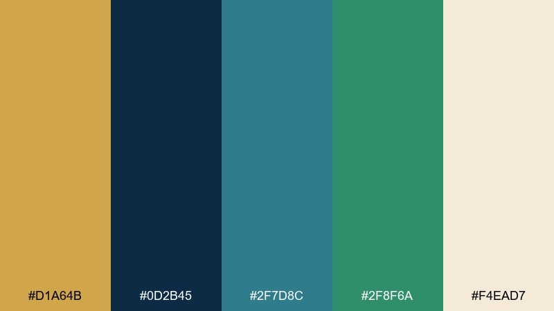
HEX: #d1a64b #0d2b45 #2f7d8c #2f8f6a #f4ead7
Mood: art deco, elegant, geometric
Best for: event invitation design
Elegant and geometric, it channels an art deco conservatory with deep shadows and gleaming trim. These gold blue green color combinations work well with strong symmetry, thin linework, and a high-contrast type pairing. Put navy behind the main headline, use teal and green for border motifs, and finish with gold for a luxe frame. Tip: print gold as a spot color or foil to elevate the invitation instantly.
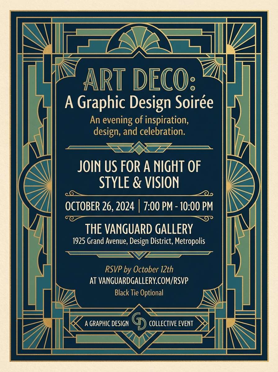
Image example of art deco conservatory generated using media.io
9) Sapphire Fern
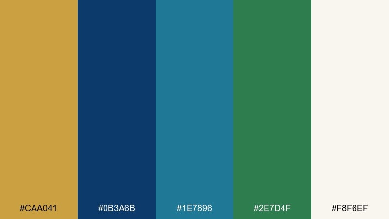
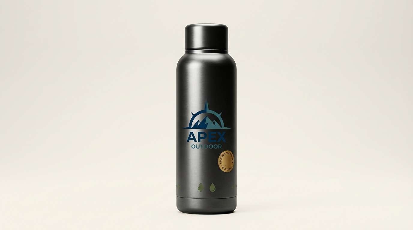
HEX: #caa041 #0b3a6b #1e7896 #2e7d4f #f8f6ef
Mood: refreshing, confident, outdoorsy
Best for: outdoor gear product ad
Refreshing and confident, it reads like sapphire water beside a fern-lined trail. Use deep blue for the product name and key claims, then bring in teal for backgrounds and gradients that feel sporty. Green supports eco cues, while gold adds a premium badge or limited edition tag. Tip: keep the ad lighting neutral so the gold stays warm, not orange.
Image example of sapphire fern generated using media.io
10) Vintage Map Patina
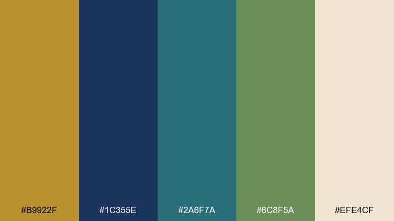
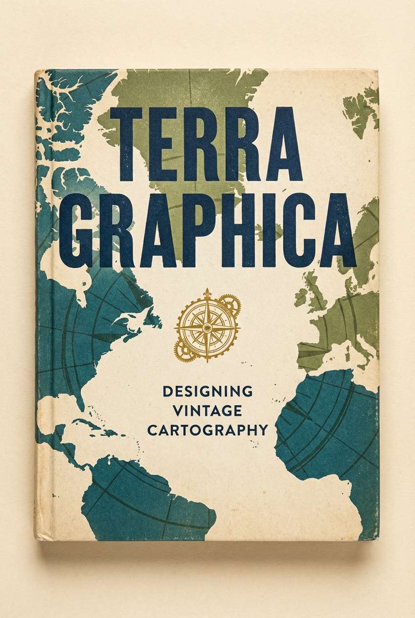
HEX: #b9922f #1c355e #2a6f7a #6c8f5a #efe4cf
Mood: heritage, warm, exploratory
Best for: book cover design
Heritage and warm, it evokes old atlases, patina ink, and faded coastline greens. Let the blue own the typography for legibility, then layer teal and mossy green as textured shapes or illustrated details. Gold makes a strong focal point for a title rule or emblem without feeling flashy. Tip: add subtle grain to the cream background to complete the vintage look.
Image example of vintage map patina generated using media.io
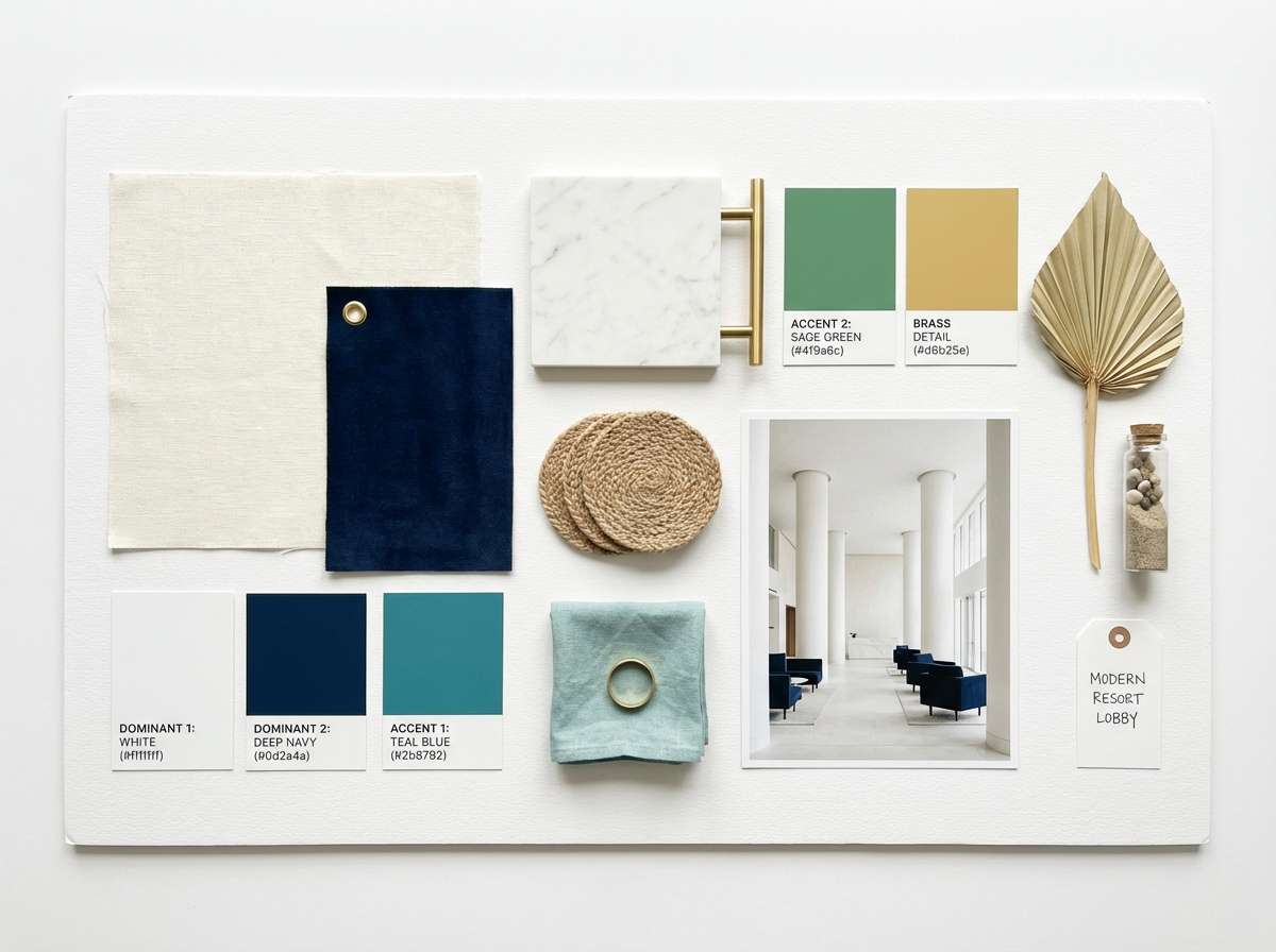
11) Modern Resort Lobby
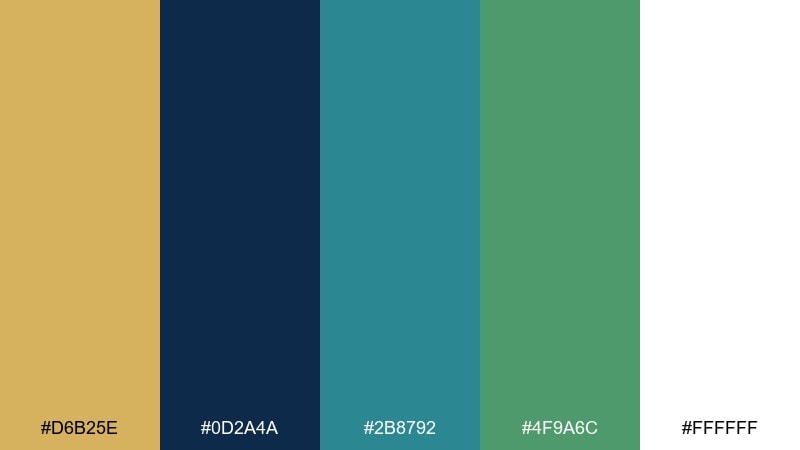
HEX: #d6b25e #0d2a4a #2b8792 #4f9a6c #ffffff
Mood: welcoming, modern, airy
Best for: hotel interior moodboard
Welcoming and airy, it feels like a modern resort lobby with glossy tiles and tropical greenery. Use white as the dominant field, then anchor with deep blue for furniture silhouettes and typography on the board. Teal and green read beautifully in fabric swatches and plant elements, while gold suggests brass hardware and lighting. Tip: keep teal and green in similar saturation so the board looks curated, not chaotic.
Image example of modern resort lobby generated using media.io
12) Alpine Lake Gold
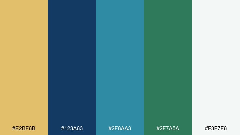
HEX: #e2bf6b #123a63 #2f8aa3 #2f7a5a #f3f7f6
Mood: cool, clean, optimistic
Best for: wellness newsletter template
Cool and clean, it brings to mind alpine water, fresh air, and a warm sunrise edge. Use the pale gray-blue background to keep emails readable, then set headings in deep blue for contrast. Teal and green are great for section dividers and icons, and gold works for a small highlight like a weekly tip badge. Tip: avoid heavy blocks of teal; use it in lighter tints so the layout stays calm.
Image example of alpine lake gold generated using media.io
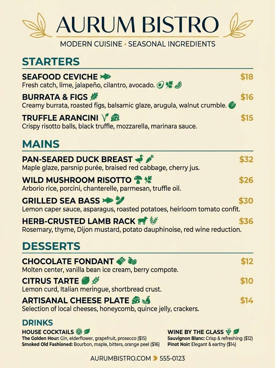
13) Tropical Night Market
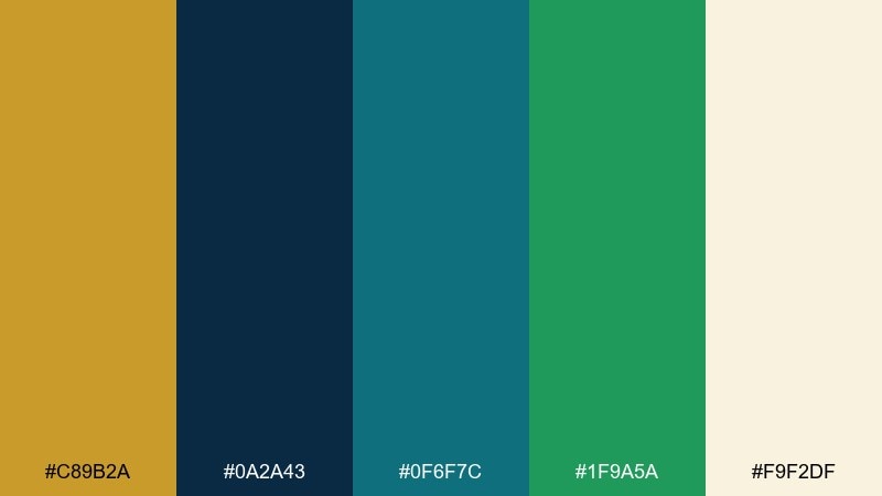
HEX: #c89b2a #0a2a43 #0f6f7c #1f9a5a #f9f2df
Mood: lively, exotic, high-contrast
Best for: restaurant menu design
Lively and high-contrast, it suggests a tropical night market with neon-like reflections and warm brass details. Build the menu base in cream for readability, then use deep blue for type and teal for section headers. Green brings freshness to ingredient callouts, while gold highlights chef specials and price markers. Tip: keep gold limited to one consistent element so it feels intentional, not decorative clutter.
Image example of tropical night market generated using media.io
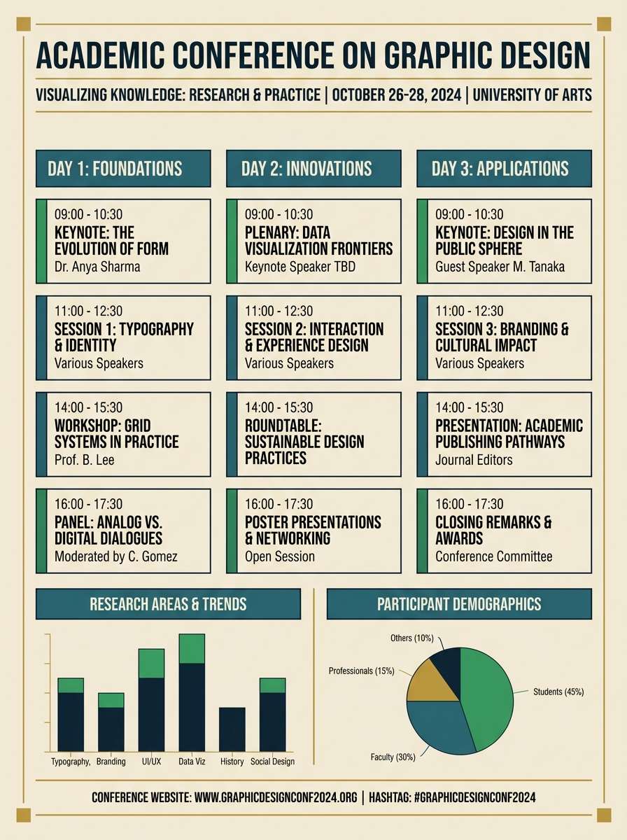
14) Classic Bookcloth
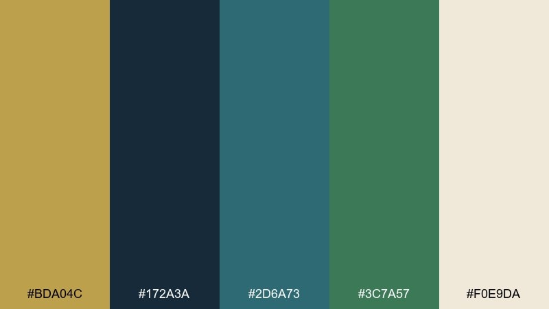
HEX: #bda04c #172a3a #2d6a73 #3c7a57 #f0e9da
Mood: scholarly, quiet, classic
Best for: academic conference poster
Scholarly and quiet, it feels like bookcloth covers and polished library rails. Use the dark blue for the title and speaker names, while teal and green support charts, schedules, and section bands. Gold gives a dignified accent for separators or a small crest at the top. Tip: choose one sans serif for data and one serif for headings to match the classic mood.
Image example of classic bookcloth generated using media.io
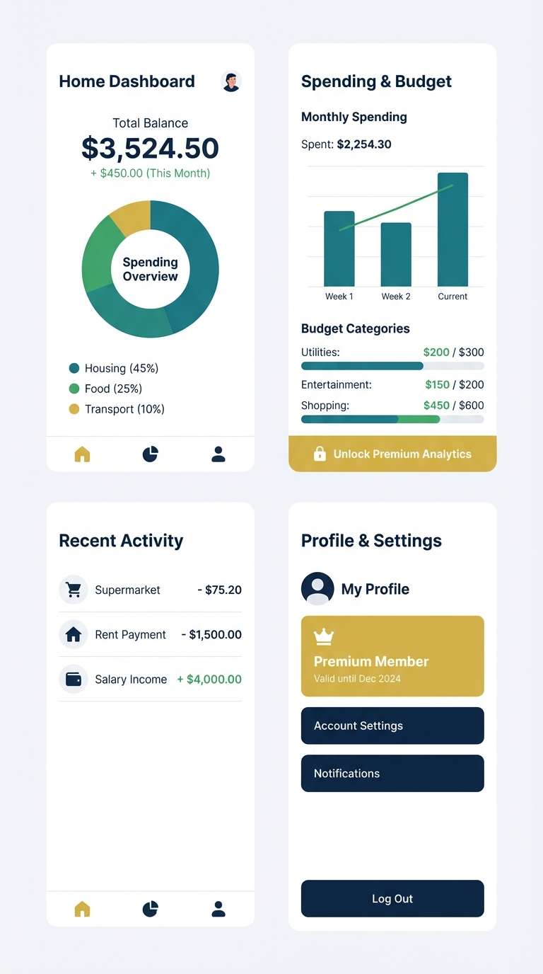
15) Fresh Finance UI
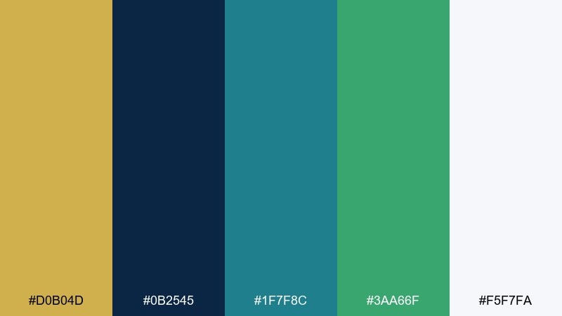
HEX: #d0b04d #0b2545 #1f7f8c #3aa66f #f5f7fa
Mood: trustworthy, clean, energetic
Best for: personal finance app UI
Trustworthy and crisp, it mixes bank-grade depth with a friendly, modern pop. This gold blue green color palette is ideal for finance screens where clarity matters, using navy for navigation and teal for charts and cards. Green naturally fits positive balances and growth states, while gold can mark insights or premium features. Tip: apply gold only to one action per screen to keep attention focused.
Image example of fresh finance ui generated using media.io
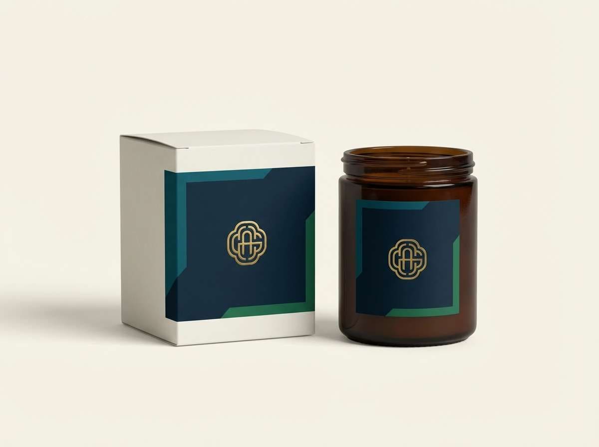
16) Jewelbox Packaging
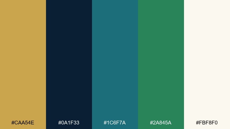
HEX: #caa54e #0a1f33 #1c6f7a #2a845a #fbf8f0
Mood: luxurious, dark, jewel-toned
Best for: premium candle packaging
Luxurious and jewel-toned, it feels like a velvet box with a polished gold clasp. Use the deep near-navy for the main label field, then set teal and green as secondary pattern details or scent variants. Gold sells the premium cue best as foil on the logo or rim. Tip: keep the typography minimal and let the color contrast do the heavy lifting.
Image example of jewelbox packaging generated using media.io
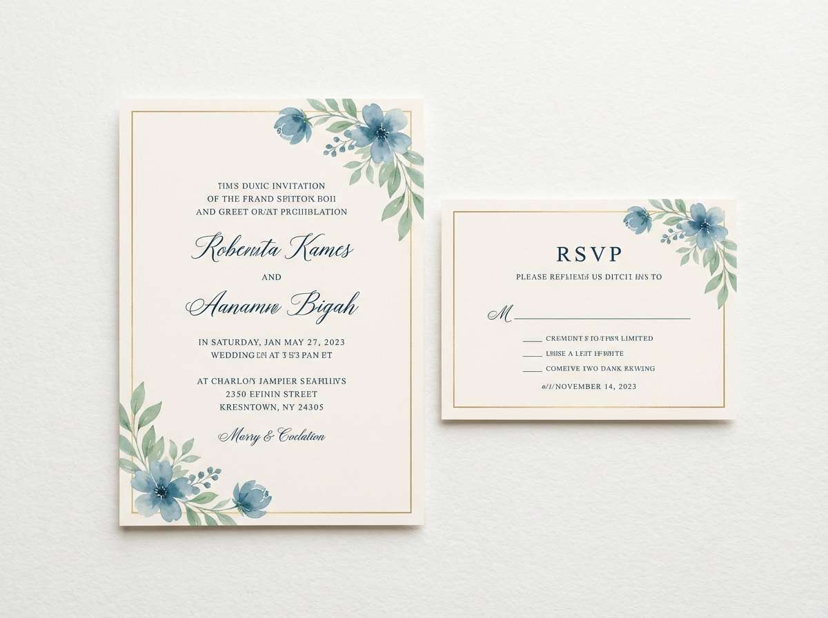
17) Garden Party Stationery
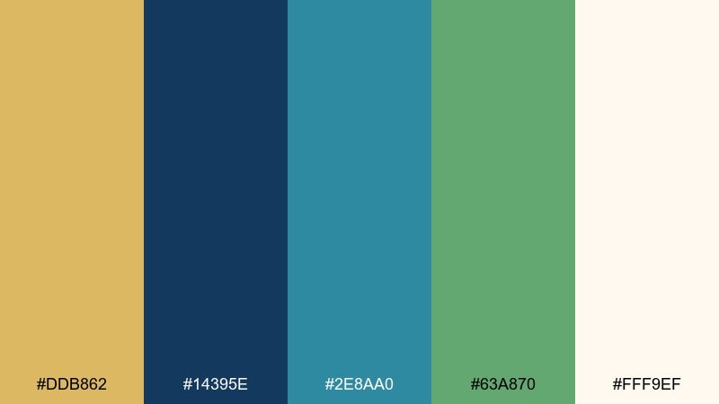
HEX: #ddb862 #14395e #2e8aa0 #63a870 #fff9ef
Mood: cheerful, elegant, spring-ready
Best for: wedding stationery suite
Cheerful and elegant, it evokes a garden party with bright ribbons and cool shade under trees. These gold blue green color combinations shine on stationery when the paper stays warm and light, letting the blues and greens feel crisp. Use navy for names and details, teal for motifs, and green for florals, then add gold as a thin border or monogram. Tip: test print teal slightly lighter than screen so it does not overpower the page.
Image example of garden party stationery generated using media.io
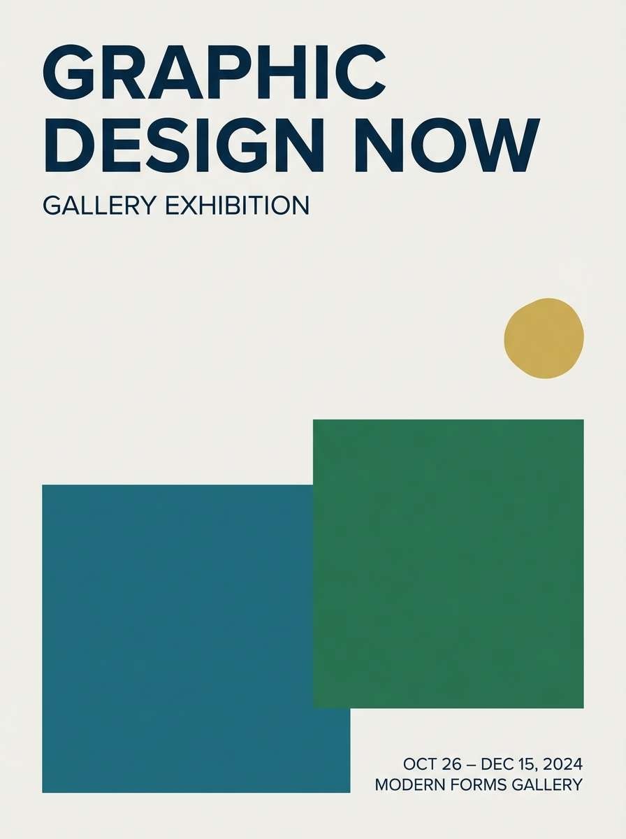
18) Minimal Gallery Poster
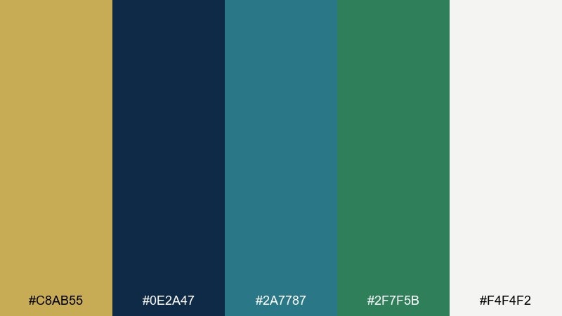
HEX: #c8ab55 #0e2a47 #2a7787 #2f7f5b #f4f4f2
Mood: minimal, modern, curated
Best for: gallery exhibition poster
Minimal and curated, it feels like a quiet gallery room with a single spotlight on a sculpture. Set the background in soft off-white, then use the deep blue for big type and negative-space-driven layouts. Teal and green can appear as restrained geometric blocks, with gold reserved for a small date highlight. Tip: keep shapes large and simple so the palette reads intentional from a distance.
Image example of minimal gallery poster generated using media.io
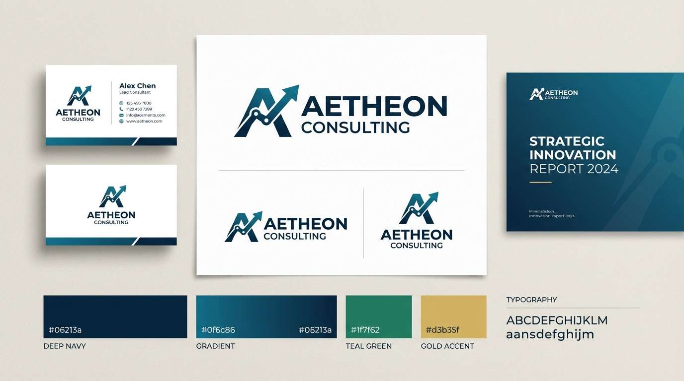
19) Deep Sea Brand Kit
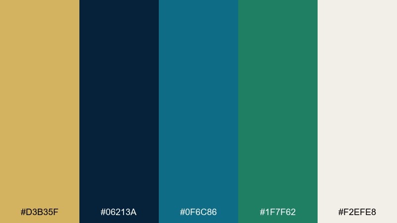
HEX: #d3b35f #06213a #0f6c86 #1f7f62 #f2efe8
Mood: mysterious, premium, modern
Best for: tech consulting brand identity
Mysterious and premium, it suggests deep sea depth with a clean metallic shimmer. As a gold blue green color palette, it supports confident identity work: use the darkest blue for the logo base, teal for digital gradients, and green for supportive badges or icons. Gold should stay as a signature accent on key touchpoints like the wordmark or section headers. Tip: define one teal-to-navy gradient and reuse it everywhere for instant consistency.
Image example of deep sea brand kit generated using media.io
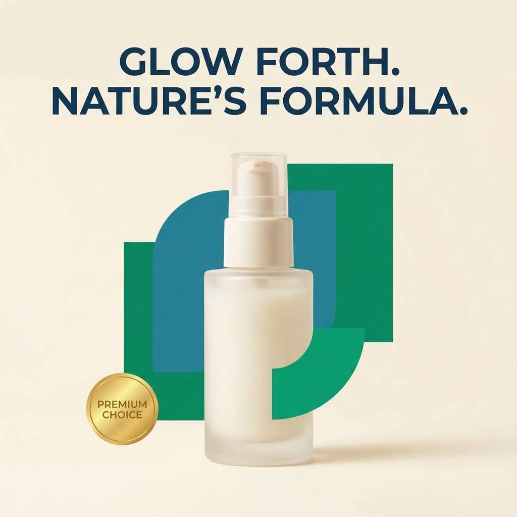
20) Satin Medal and Moss
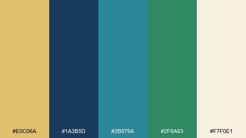
HEX: #e0c06a #1a3b5d #2b879a #2f8a63 #f7f0e1
Mood: soft, elegant, nature-luxe
Best for: beauty product social ad
Soft and nature-luxe, it feels like satin ribbon, warm medals, and mossy greenery. Use cream as the main canvas for product space, then set headlines in deep blue for clean contrast. Teal and green work as background shapes and ingredient cues, while gold adds that premium sparkle on a seal or limited offer. Tip: keep shadows subtle and cool so the palette stays refined, not muddy.
Image example of satin medal and moss generated using media.io
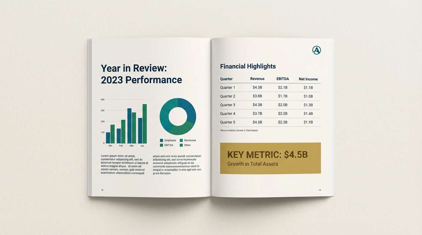
21) Canal Street Classics
HEX: #bfa34b #0c2f57 #1a6f8f #2e8f6e #f8f5ee
Mood: classic, urban, sophisticated
Best for: corporate annual report
Classic and sophisticated, it brings an urban feel with polished details and cool canal tones. For a gold blue green color combination that stays corporate, keep most pages light and let navy lead headings, charts, and footers. Teal and green can rotate through data visualizations, while gold highlights top-line numbers and section openers. Tip: use one consistent chart style so the color changes do not confuse readers.
Image example of canal street classics generated using media.io
What Colors Go Well with Gold Blue Green?
Neutrals are the easiest win: warm creams, soft ivories, and light grays help gold look refined and keep blue/green areas from feeling heavy. For darker layouts, charcoal or near-black can replace navy while maintaining a premium tone.
If you want extra contrast, try a controlled pop color like coral, blush, or terracotta—use it sparingly for illustrations or a single UI state. For a more understated look, add muted sand, taupe, or stone to make the palette feel editorial and timeless.
For gradients and backgrounds, subtle tints of teal or blue-gray work especially well, letting gold remain a crisp accent instead of fighting for attention.
How to Use a Gold Blue Green Color Palette in Real Designs
Start by assigning roles: navy (or deep blue) for typography and structure, teal for large UI surfaces or backgrounds, green for supportive states (success, eco cues, secondary highlights), and gold for “only-the-important-bits” accents like CTAs, badges, or active navigation.
To keep the palette modern, control saturation—match teal and green intensity so they feel like a family, then let gold be the warm standout. In print, gold can be simulated with a flat color, but it feels most premium when used as foil or spot ink on covers and packaging.
For accessibility, test contrast on navy/cream and teal/cream pairs, and avoid using gold as small text on light backgrounds; it works better for icons, strokes, and larger UI elements.
Create Gold Blue Green Palette Visuals with AI
If you want to see these palettes in action, generate mockups—landing pages, posters, packaging, or app screens—using consistent HEX-driven prompts. This helps you validate contrast, hierarchy, and mood before committing to a full design system.
In Media.io, paste one of the prompts above, swap in your brand subject (product, app, event, report), and keep the palette HEX codes intact. You can iterate quickly by changing layout style (minimal, editorial, art deco) while keeping color consistent.
Once you like a direction, reuse the same prompt structure across assets to keep your brand visuals cohesive.
Gold Blue Green Color Palette FAQs
-
What does a gold blue green color palette communicate?
It typically signals premium quality (gold), trust and stability (blue), and freshness or growth (green). Together, the mix feels modern, confident, and calm—ideal for brands that want to look elevated but approachable. -
How do I keep gold from overpowering the design?
Use gold as an accent, not a base color—think icons, thin dividers, badges, and one primary CTA. Keeping gold under roughly 5–10% of the layout usually maintains a refined, non-flashy look. -
Which background works best: white, cream, or dark navy?
White and cream create an airy, editorial feel and make gold look warmer and more premium. Dark navy backgrounds feel dramatic and luxe, but you’ll want strong spacing and lighter text to keep readability high. -
What are good type color choices with gold blue green palettes?
Deep navy is the safest choice for headings and body text on light backgrounds. On dark backgrounds, use off-white or very light gray for text, and reserve gold for emphasis rather than long-form reading. -
Are gold blue green palettes good for UI and dashboards?
Yes—navy and teal create clear hierarchy for navigation and cards, green maps naturally to success states, and gold can highlight key metrics or premium features. The key is consistency: keep gold tied to a single meaning (e.g., “featured” or “insight”). -
What colors pair well as an extra accent with gold, blue, and green?
Warm neutrals (ivory, sand, taupe) are the most natural additions. If you need a pop, coral or terracotta can work as a controlled complementary accent—use it sparingly so it doesn’t compete with gold. -
How can I generate palette-based mockups quickly?
Use Media.io’s text-to-image and include the exact HEX codes in your prompt, plus a clear design format (e.g., “SaaS dashboard UI” or “packaging mockup”). Then iterate by changing only the subject or layout style while keeping the color list stable.


