

Glitter color palettes aren’t just “sparkly”—they’re a smart way to add contrast, perceived texture, and celebration to modern design. With the right balance of dark anchors, light tints, and one high-shine accent, glitter-inspired schemes stay readable while still feeling special.
Below are 20 glitter palette ideas with HEX codes, plus practical tips and AI prompts you can use to generate matching visuals for UI, branding, and print.
In this article
Why Glitter Palettes Work So Well
Glitter-inspired palettes mimic what real glitter does: they mix a stable base tone with brighter “spark” highlights and soft reflective tints. That layered contrast naturally creates depth, even on flat screens or simple print layouts.
They also improve hierarchy. A deep anchor (navy, charcoal, espresso) makes text and UI structure feel grounded, while one vivid accent (gold, neon cyan, hot pink) acts like a spotlight for calls-to-action.
Finally, glitter palettes are versatile across mediums. In digital, you can suggest shimmer through gradients and glow; in print, you can translate the same scheme into foil, metallic ink, or coated stock for a premium finish.
20+ Glitter Color Palette Ideas (with HEX Codes)
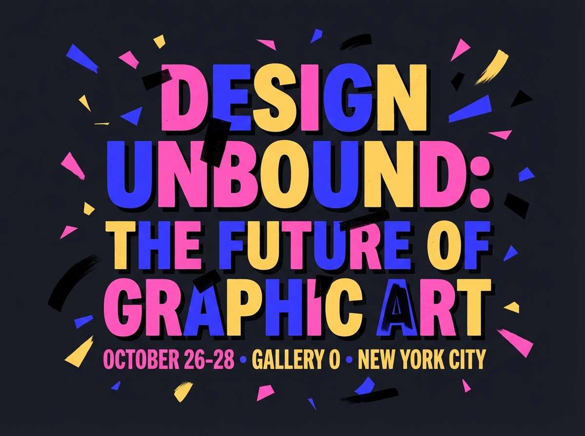
1) Disco Dust
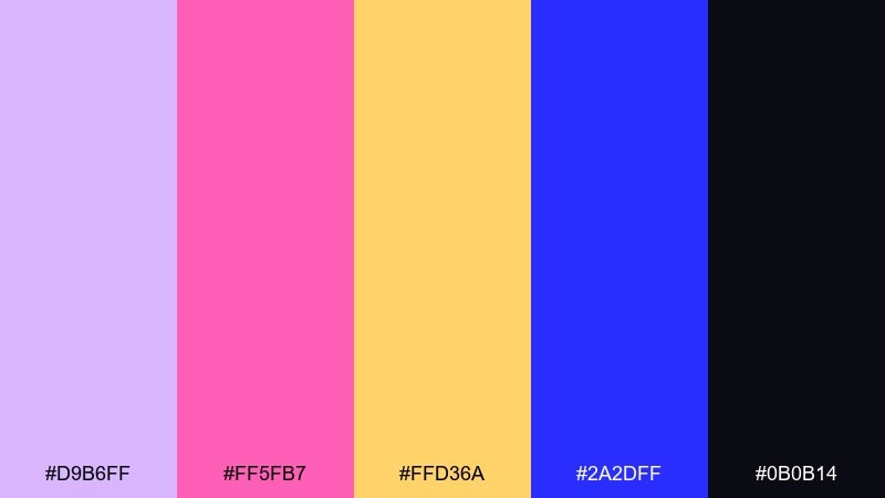
HEX: #d9b6ff #ff5fb7 #ffd36a #2a2dff #0b0b14
Mood: electric, playful, nightlife
Best for: nightlife event poster
Electric and punchy, like sequins under a spinning mirror ball. The hot pink and cobalt do the heavy lifting while the soft lavender keeps it wearable. Use it for club nights, DJ lineups, or bold launch posters where legibility matters. Tip: set type in near-black and reserve the yellow as a spotlight accent on key details.
Image example of disco dust generated using media.io
Media.io is an online AI studio for creating and editing video, image, and audio in your browser.

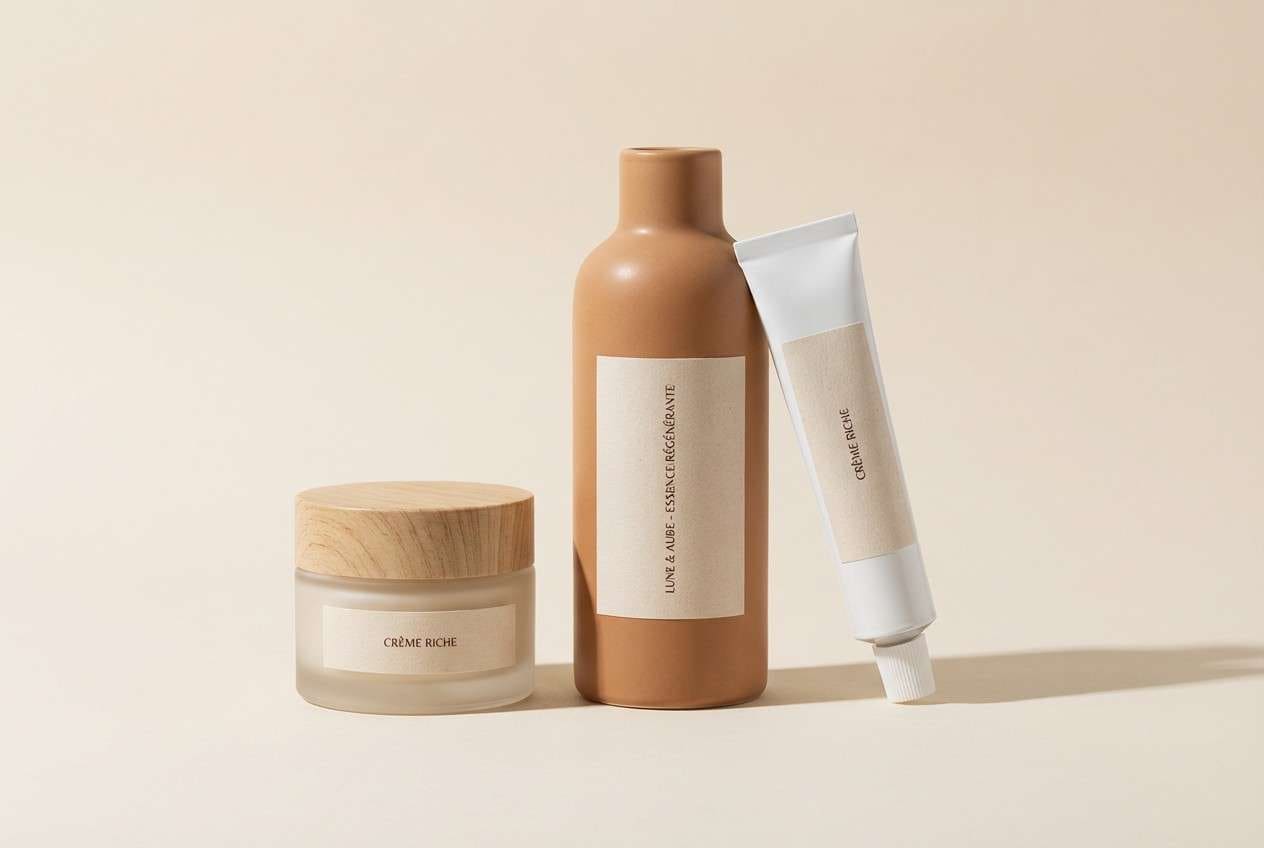
2) Champagne Spark
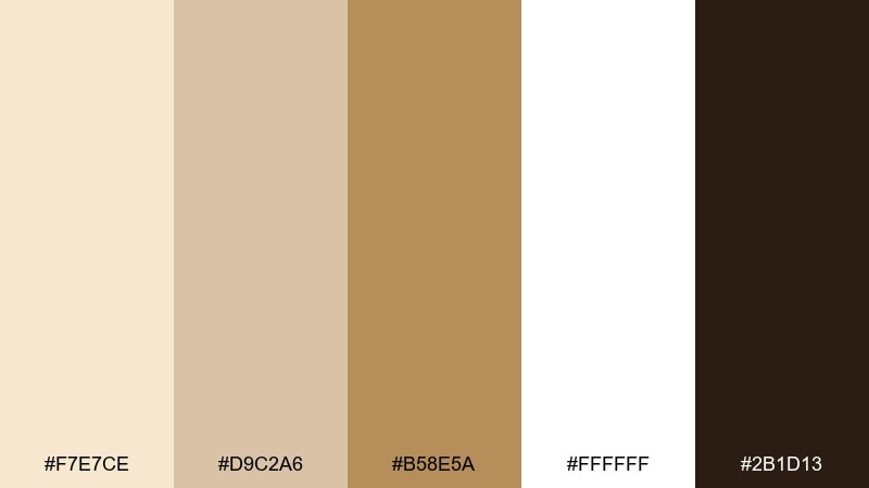
HEX: #f7e7ce #d9c2a6 #b58e5a #ffffff #2b1d13
Mood: luxurious, warm, refined
Best for: luxury skincare packaging
Warm and polished, like champagne bubbles catching candlelight. Creamy neutrals give you a premium base, while bronze brings that subtle shimmer effect. It works beautifully on cartons, jars, and minimalist ads where texture can do the talking. Tip: use the dark cocoa only for small text to keep the overall feel airy and expensive.
Image example of champagne spark generated using media.io
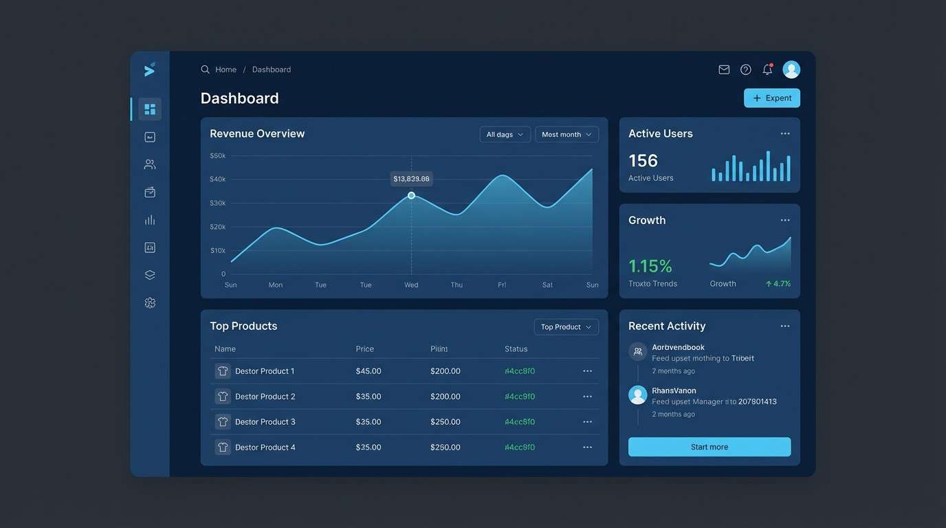
3) Starlit Navy
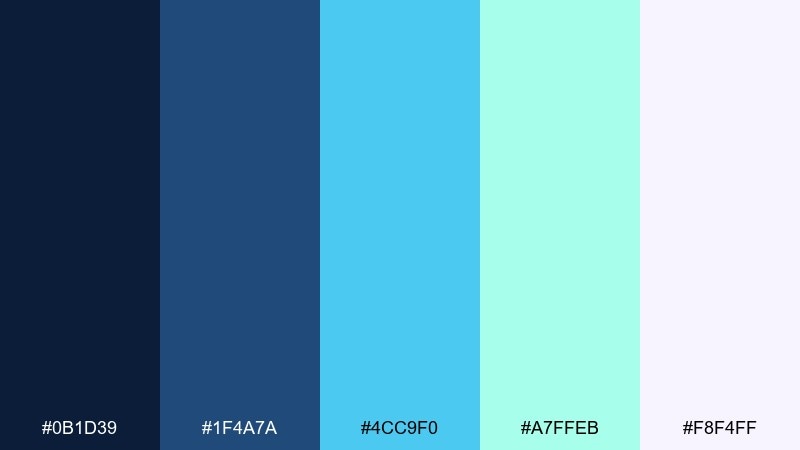
HEX: #0b1d39 #1f4a7a #4cc9f0 #a7ffeb #f8f4ff
Mood: sleek, cosmic, focused
Best for: SaaS dashboard UI
Sleek and night-sky cool, with bright aqua highlights that feel like starlight. The deep navy anchors data-heavy layouts, while the icy tints keep things crisp and modern. For dashboards, these glitter color combinations shine in charts, active states, and notification badges without overwhelming the screen. Tip: keep surfaces mostly navy and use the brightest cyan for only one primary action per view.
Image example of starlit navy generated using media.io
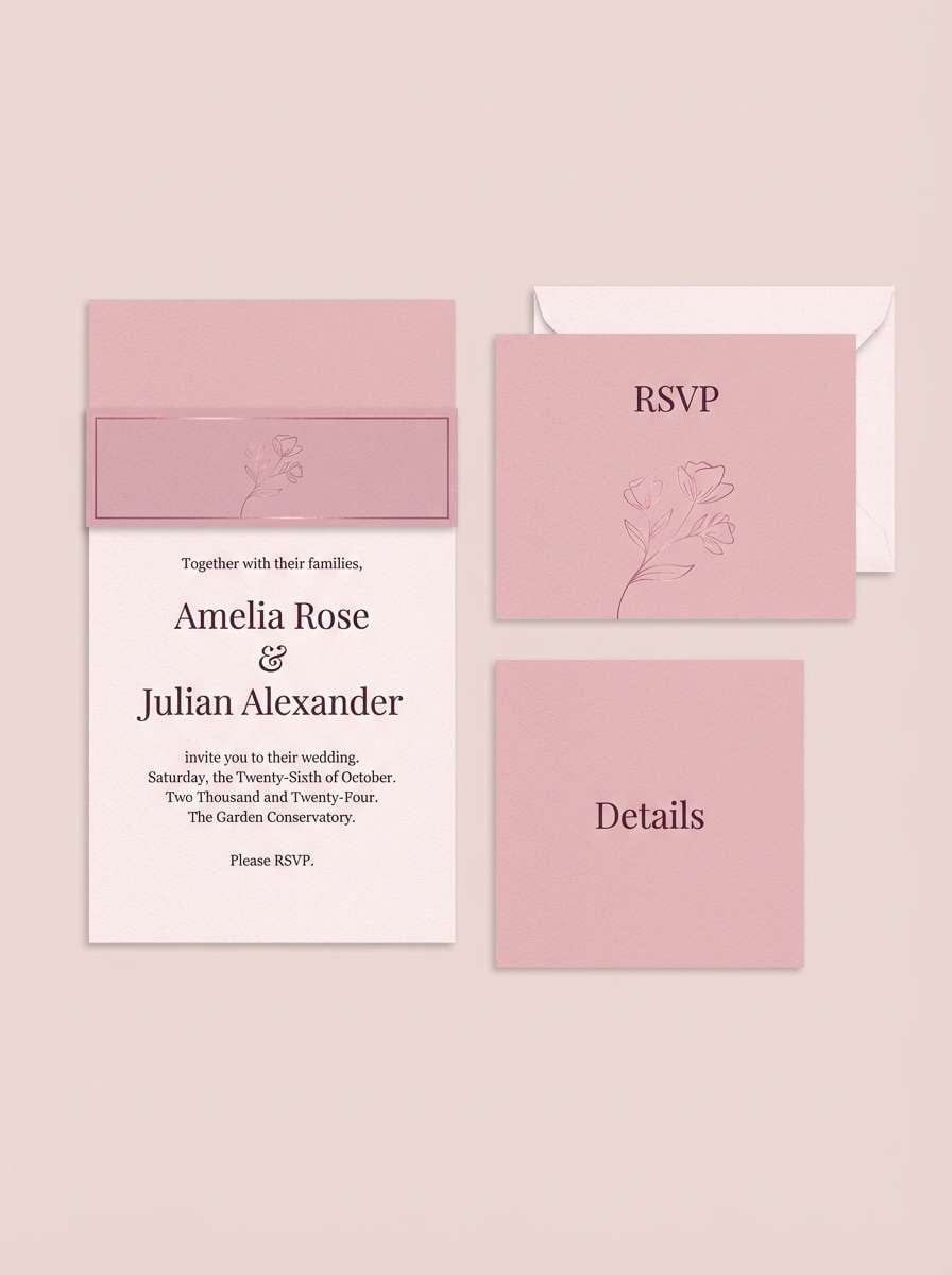
4) Rose Quartz Shimmer
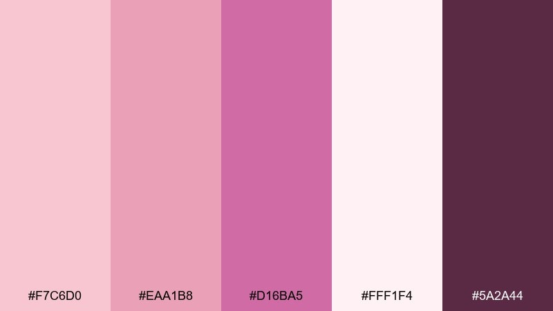
HEX: #f7c6d0 #eaa1b8 #d16ba5 #fff1f4 #5a2a44
Mood: romantic, soft, luminous
Best for: wedding invitation suite
Romantic and airy, like rose petals with a pearly sheen. The blush-to-mauve tones feel elegant on paper goods, especially with plenty of negative space. For a refined glitter color palette look, pair it with warm ivory stock and a single dark plum for type. Tip: foil the mauve accent sparingly on monograms or borders to keep it tasteful.
Image example of rose quartz shimmer generated using media.io
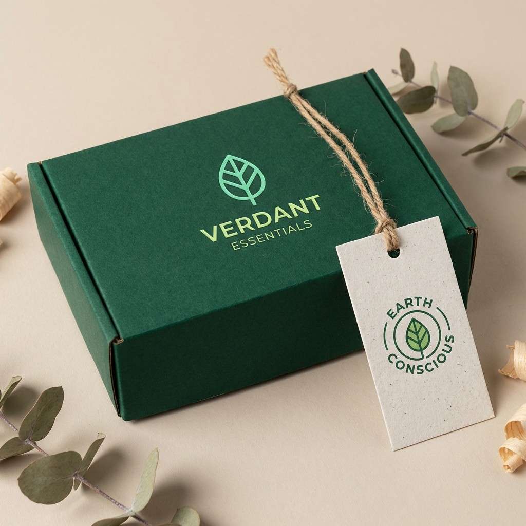
5) Emerald Confetti
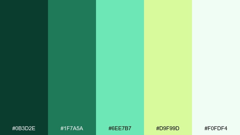
HEX: #0b3d2e #1f7a5a #6ee7b7 #d9f99d #f0fdf4
Mood: fresh, celebratory, natural
Best for: eco brand logo and labels
Fresh and optimistic, like sunlit leaves with little pops of confetti. The dark evergreen gives strong brand structure, while mint and lime add energy for highlights. It fits sustainable packaging, farmers market signage, and clean-label cosmetics. Tip: keep the lime as a small accent so the palette stays grounded and not too sporty.
Image example of emerald confetti generated using media.io
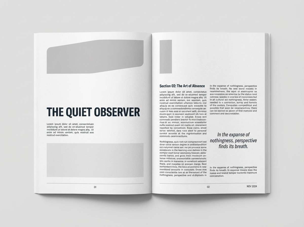
6) Moonstone Gray
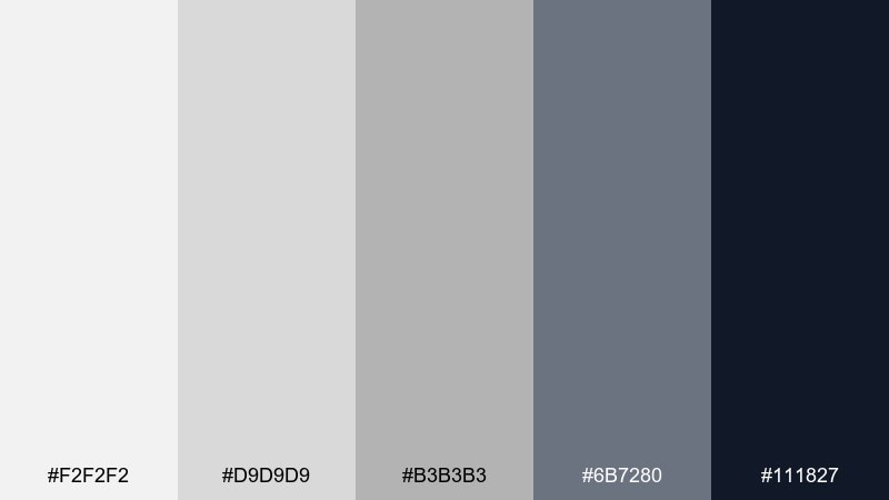
HEX: #f2f2f2 #d9d9d9 #b3b3b3 #6b7280 #111827
Mood: clean, modern, understated
Best for: minimalist editorial layout
Clean and cool, like moonstone with a barely-there glow. Layering these grays creates depth without relying on loud color, ideal for long reads and product storytelling. Use the darkest tone for headlines and the mid-gray for captions to keep hierarchy clear. Tip: add texture or subtle gradients to avoid flat blocks in large areas.
Image example of moonstone gray generated using media.io
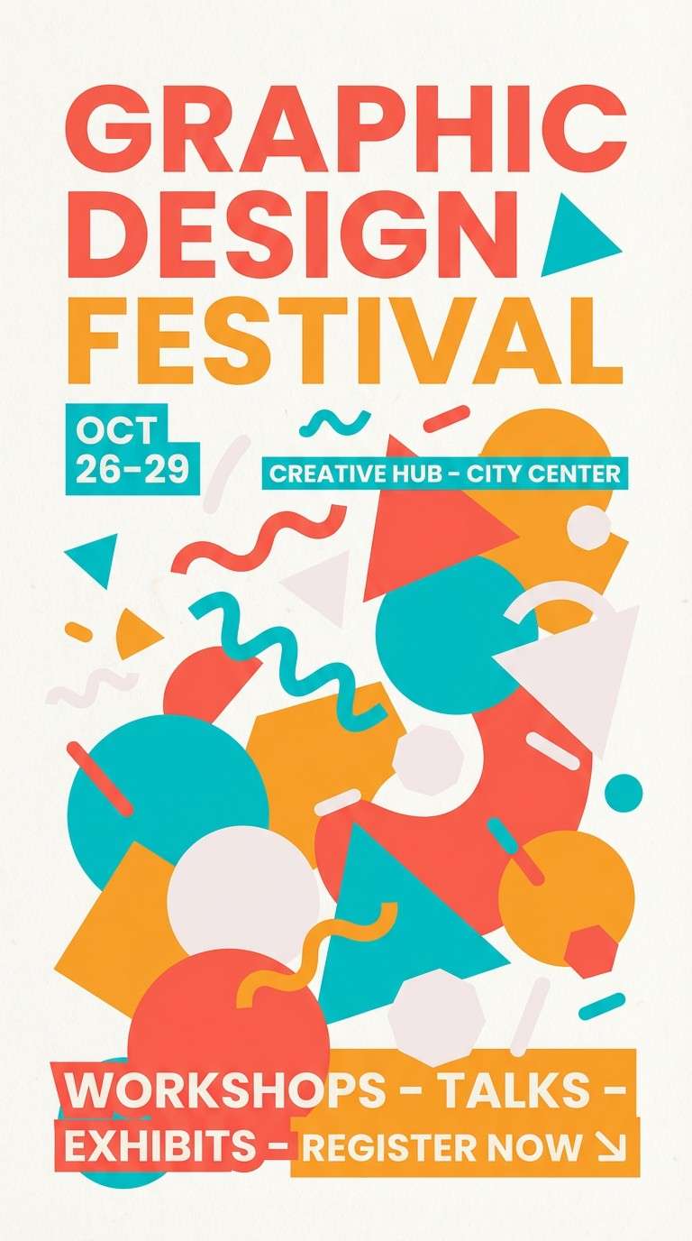
7) Sunset Sequin
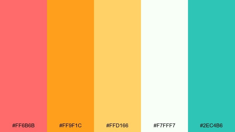
HEX: #ff6b6b #ff9f1c #ffd166 #f7fff7 #2ec4b6
Mood: joyful, sunny, energetic
Best for: summer festival flyer
Joyful and sun-warmed, like sequins flashing at golden hour. Coral and mango create instant excitement, while teal adds a fresh, modern counterpoint. It is perfect for festival flyers, pop-up markets, and seasonal promos that need quick readability. Tip: use the off-white as a calm field so the warm colors do not compete with your headline.
Image example of sunset sequin generated using media.io
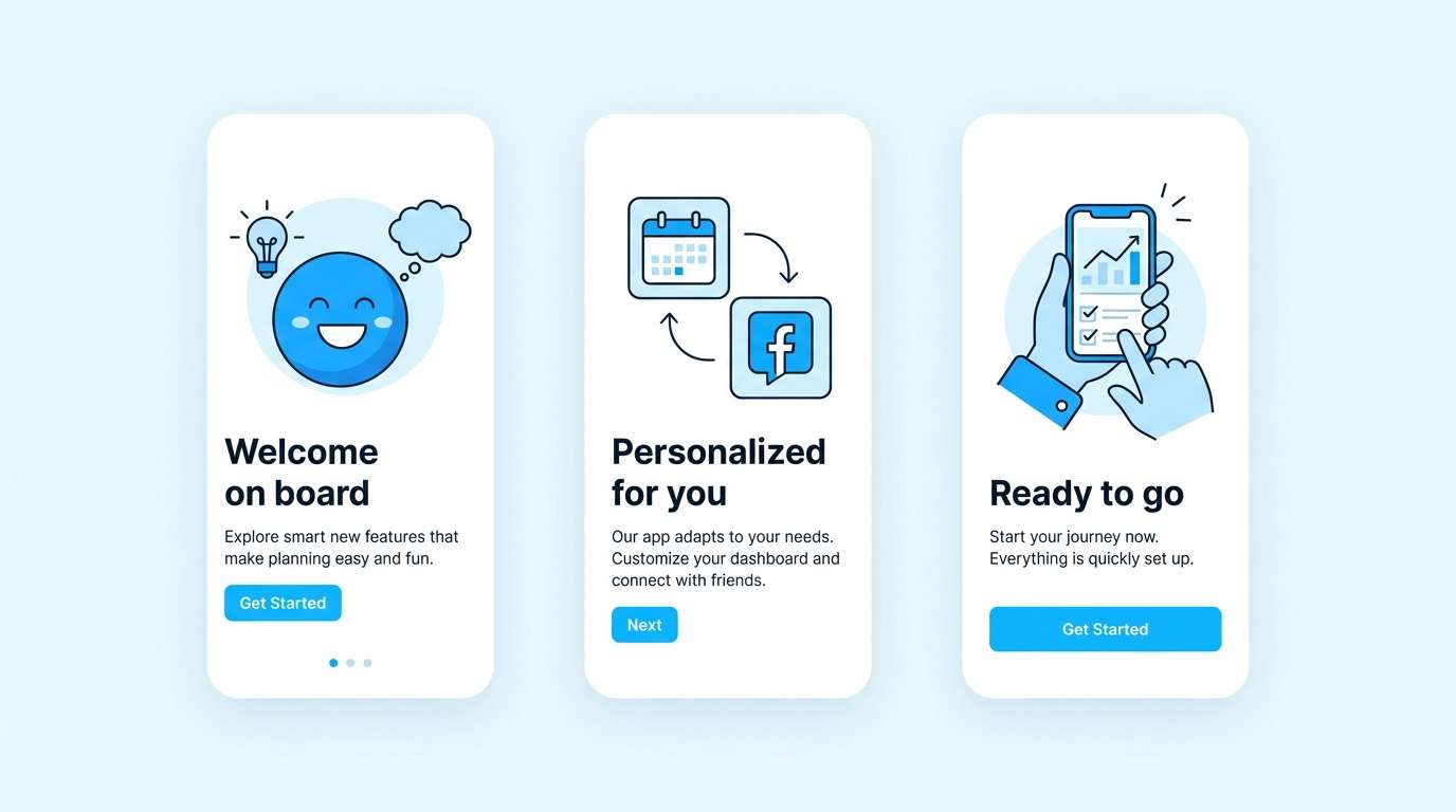
8) Arctic Glitter
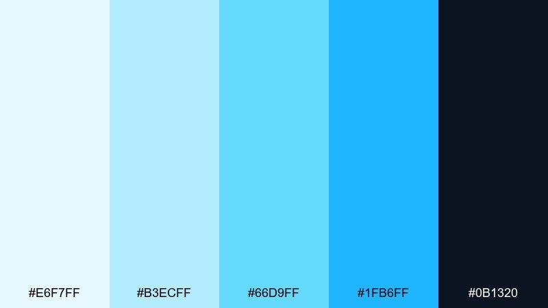
HEX: #e6f7ff #b3ecff #66d9ff #1fb6ff #0b1320
Mood: crisp, futuristic, bright
Best for: tech app onboarding screens
Crisp and futuristic, like ice crystals under LED light. The pale blues keep screens feeling open, while the deep ink tone delivers contrast for navigation and text. Use it for onboarding flows, feature callouts, and friendly fintech interfaces. Tip: reserve the brightest blue for progress indicators and primary buttons to guide the eye.
Image example of arctic glitter generated using media.io
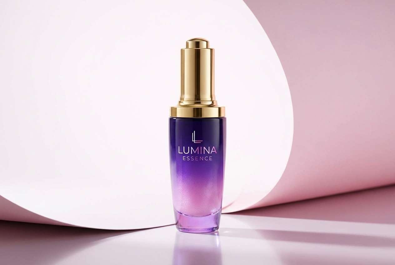
9) Violet Hologram
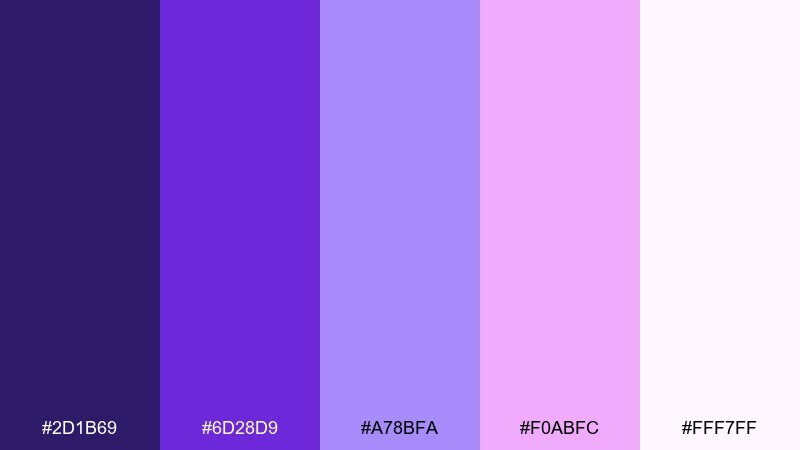
HEX: #2d1b69 #6d28d9 #a78bfa #f0abfc #fff7ff
Mood: dreamy, bold, trend-forward
Best for: beauty product ad
Dreamy and trend-forward, like holographic glitter shifting from violet to orchid. The deep purple adds drama, while lavender and pink lift the look for a playful finish. These glitter color combinations work especially well for beauty ads, limited-edition drops, and creator collabs. Tip: keep backgrounds near-white and let the purple carry the contrast for sharp product silhouettes.
Image example of violet hologram generated using media.io
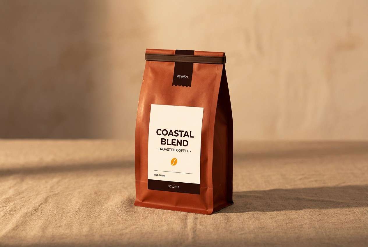
10) Copper Firefly
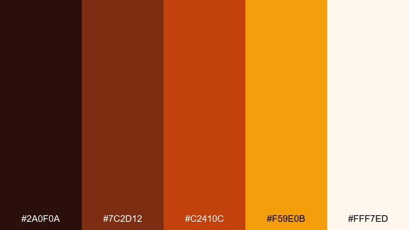
HEX: #2a0f0a #7c2d12 #c2410c #f59e0b #fff7ed
Mood: cozy, rustic, glowing
Best for: coffee shop packaging
Cozy and glowing, like fireflies over toasted caramel. The espresso-dark base feels grounded, while copper and amber bring warmth that reads as handcrafted. Use it for coffee bags, cafe menus, and autumn promos that need a welcoming tone. Tip: add small icon accents in amber to create shine without turning the whole design orange.
Image example of copper firefly generated using media.io
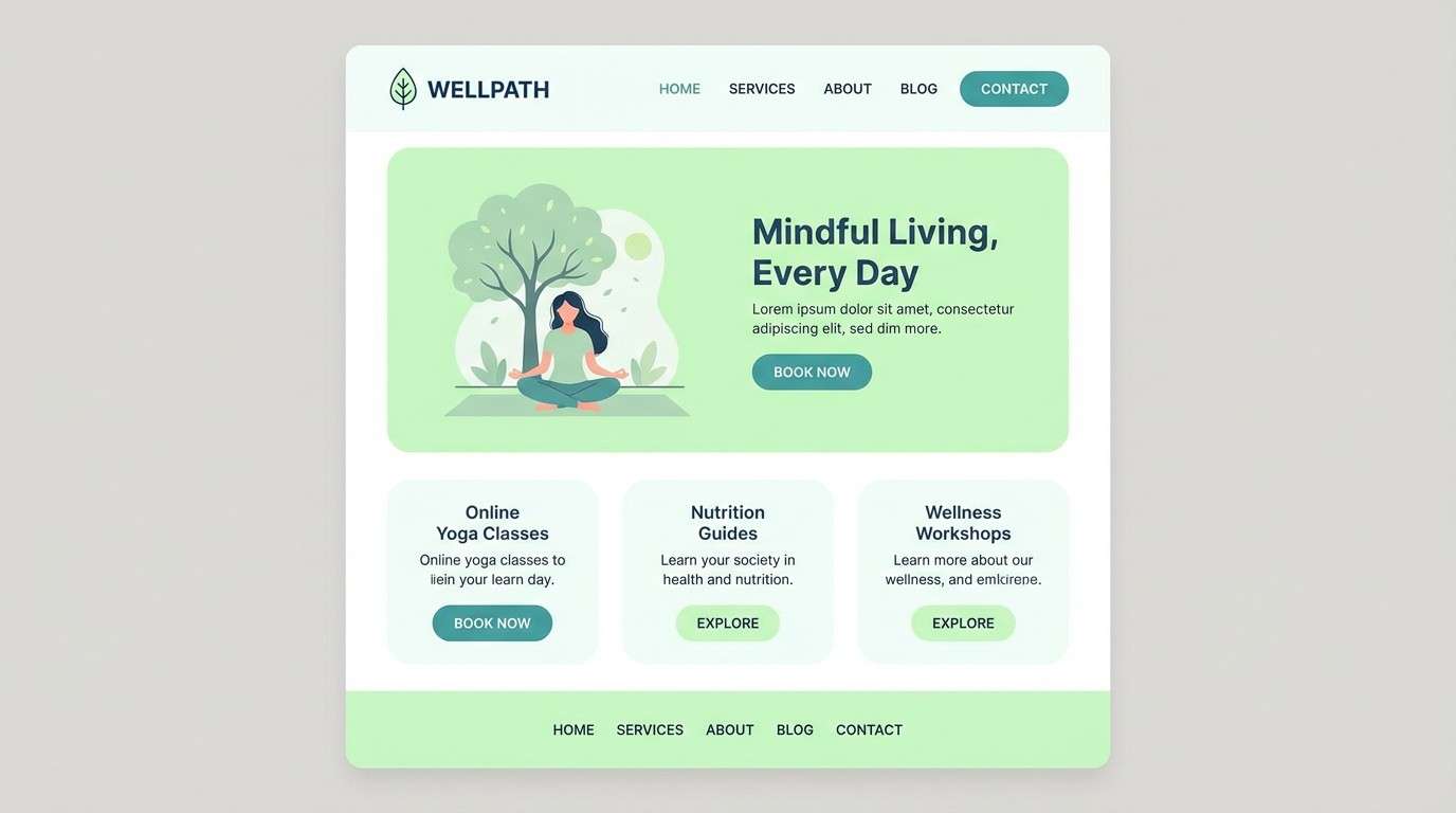
11) Pearl Mint
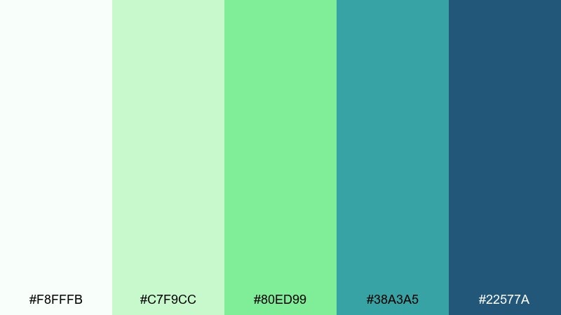
HEX: #f8fffb #c7f9cc #80ed99 #38a3a5 #22577a
Mood: calm, refreshing, friendly
Best for: wellness website UI
Calm and refreshing, like mint water with a pearly glow. Soft greens keep the experience soothing, while teal and navy provide trustworthy contrast for navigation. It fits wellness platforms, booking flows, and clean ecommerce where clarity matters. Tip: use navy for body text and let mint stay in backgrounds and supportive highlights.
Image example of pearl mint generated using media.io
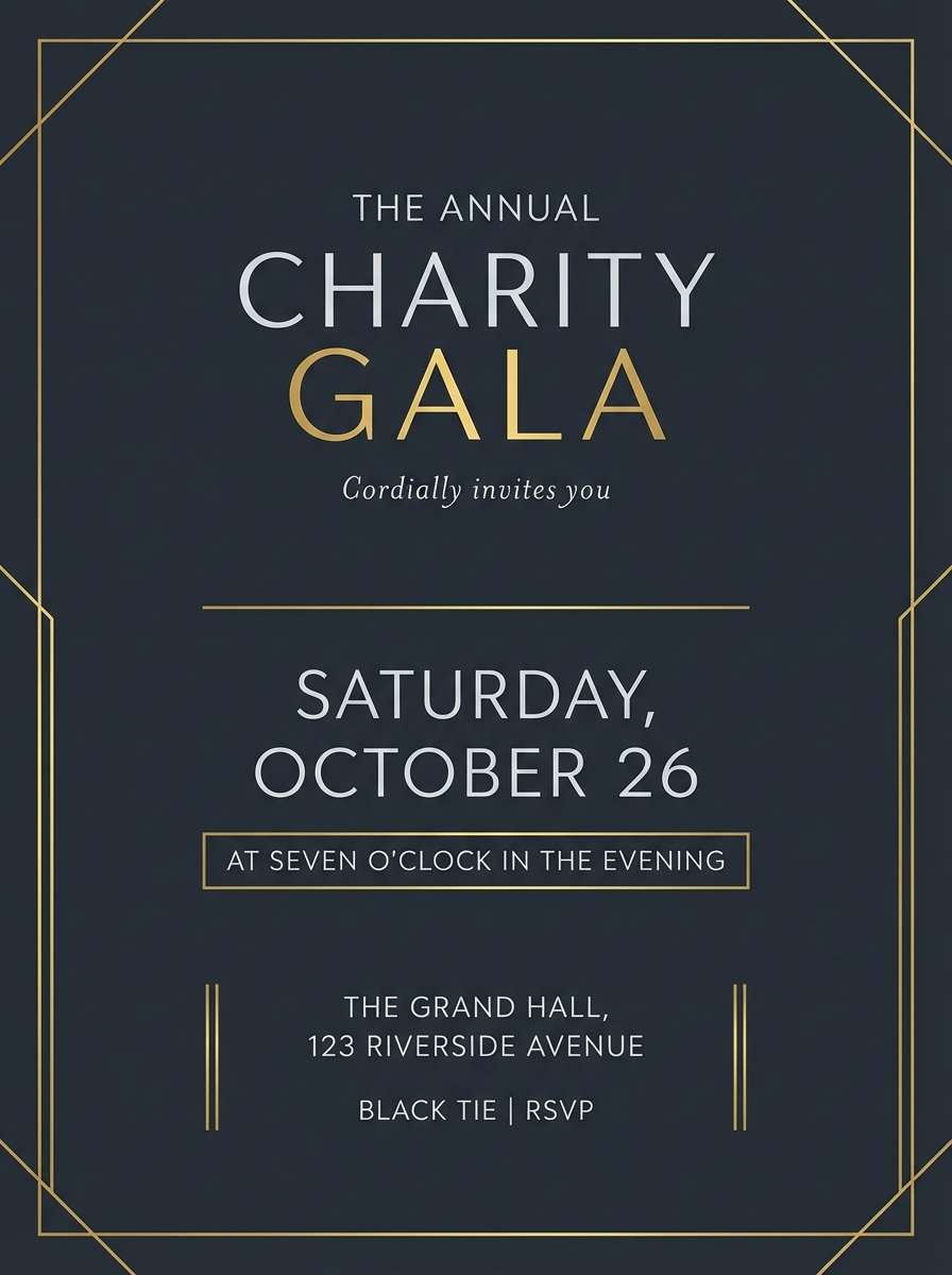
12) Black Tie Sparkle
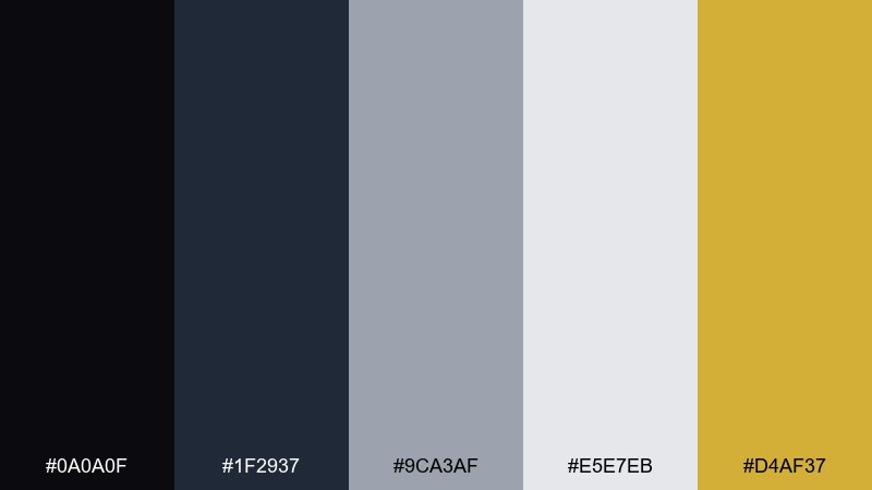
HEX: #0a0a0f #1f2937 #9ca3af #e5e7eb #d4af37
Mood: formal, sleek, celebratory
Best for: formal gala invitation
Formal and sleek, like a tuxedo with a gold pin catching the light. Charcoal and silver set a refined base, and the muted gold reads as sparkle without feeling flashy. For a timeless glitter color palette approach, keep the layout minimal and let the gold accent mark names, dates, or dividers. Tip: use the light silver as your paper tone so black text stays crisp and premium.
Image example of black tie sparkle generated using media.io
13) Candy Prism
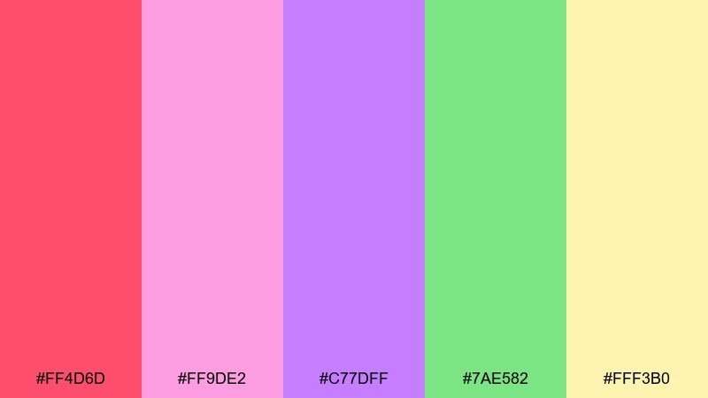
HEX: #ff4d6d #ff9de2 #c77dff #7ae582 #fff3b0
Mood: sweet, playful, upbeat
Best for: kids birthday invitation
Sweet and bouncy, like candy sprinkles under party lights. The pinks and lilac feel whimsical, while mint keeps it fresh instead of overly sugary. Great for kids invites, classroom posters, and fun social graphics. Tip: put the headline on pale yellow for readability and use the brighter pink only for icons and confetti.
Image example of candy prism generated using media.io

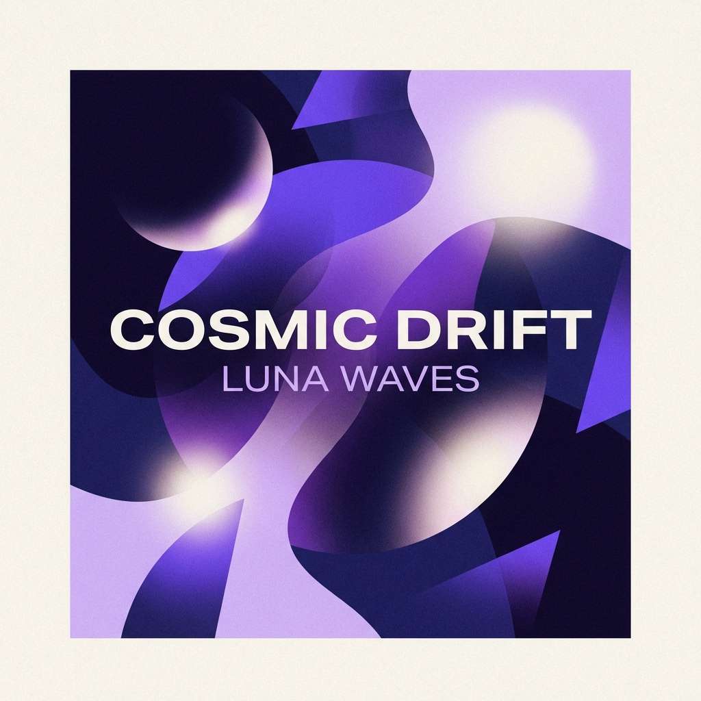
14) Galaxy Lilac
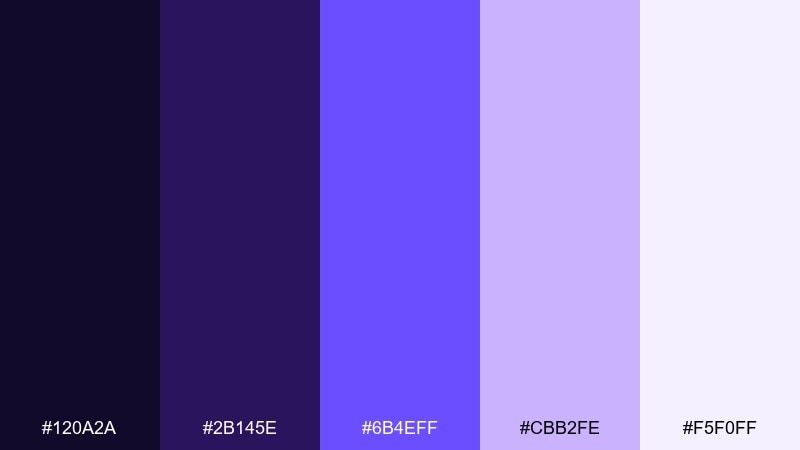
HEX: #120a2a #2b145e #6b4eff #cbb2fe #f5f0ff
Mood: mysterious, modern, cosmic
Best for: music album cover design
Mysterious and modern, like a lilac nebula fading into deep space. The inky violets add depth, while the bright periwinkle gives you a vivid focal point for titles. Use it on album covers, merch graphics, or motion backdrops where contrast sells the mood. Tip: keep the brightest color for one central element so the cover feels intentional, not busy.
Image example of galaxy lilac generated using media.io
15) Sea Glass Spark
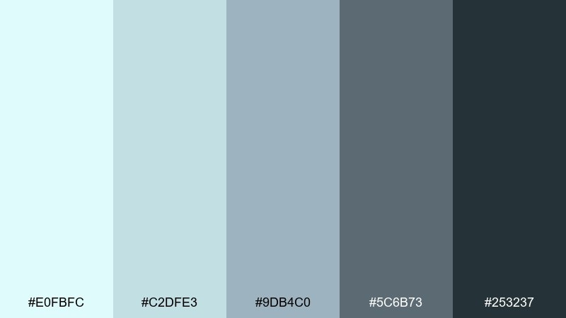
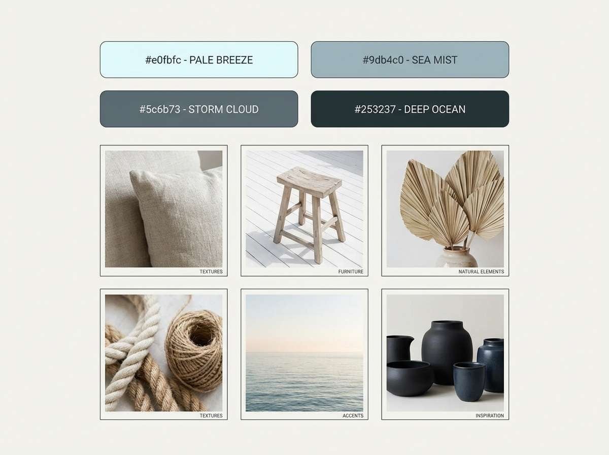
HEX: #e0fbfc #c2dfe3 #9db4c0 #5c6b73 #253237
Mood: coastal, calm, polished
Best for: coastal home decor moodboard
Coastal and calm, like sea glass smoothed to a soft sheen. The airy aqua tones feel breathable, while slate and deep blue-gray keep the look sophisticated. Ideal for decor boards, lifestyle branding, and calm product pages. Tip: use the darkest shade for small anchors like captions and borders to avoid a heavy, stormy feel.
Image example of sea glass spark generated using media.io
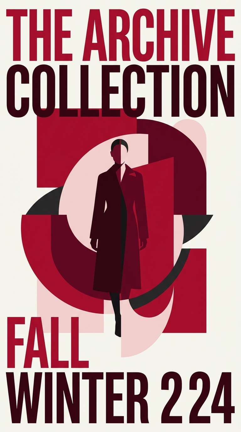
16) Ruby Glitter
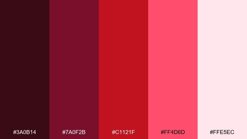
HEX: #3a0b14 #7a0f2b #c1121f #ff4d6d #ffe5ec
Mood: bold, romantic, high-impact
Best for: fashion campaign poster
Bold and romantic, like ruby sparkles against velvet. Deep wine tones give instant luxury, while the bright rose red brings runway energy. Use it for fashion posters, valentines promos, and statement editorials that need heat and contrast. Tip: set body copy in the palest pink and keep the deepest shade for headline blocks or striking silhouettes.
Image example of ruby glitter generated using media.io
17) Golden Hour Dust
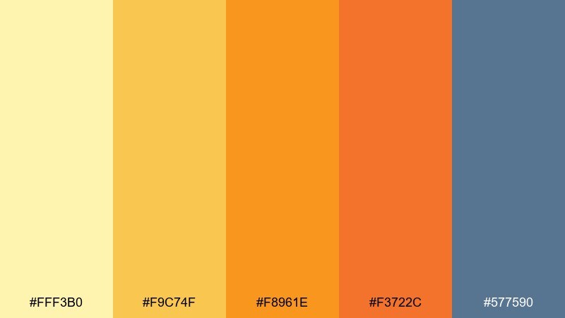
HEX: #fff3b0 #f9c74f #f8961e #f3722c #577590
Mood: warm, adventurous, optimistic
Best for: social media promo graphic
Warm and adventurous, like dusty sunbeams over a late-summer road. The yellows and oranges feel friendly and immediate, while slate blue cools the mix for balance. Perfect for promo tiles, sale announcements, and travel-themed content that needs motion without chaos. Tip: use the blue for buttons and small labels to keep the warm tones from flattening together.
Image example of golden hour dust generated using media.io

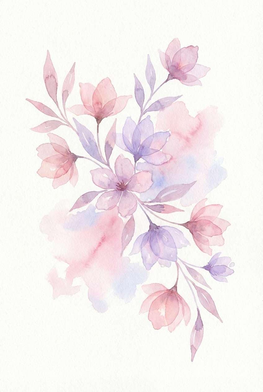
18) Icy Rose Confetti
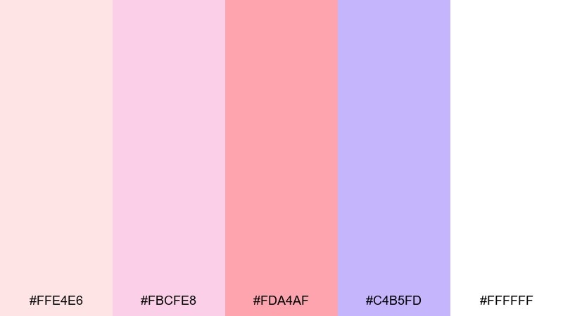
HEX: #ffe4e6 #fbcfe8 #fda4af #c4b5fd #ffffff
Mood: soft, airy, springlike
Best for: spring botanical illustration
Soft and airy, like pastel petals dusted with morning frost. The pinks stay gentle while lilac adds a little whimsy for depth. Use this mix for spring botanicals, stationery accents, and light lifestyle illustrations. Tip: keep outlines minimal and let the soft gradients do most of the work for a delicate finish.
Image example of icy rose confetti generated using media.io
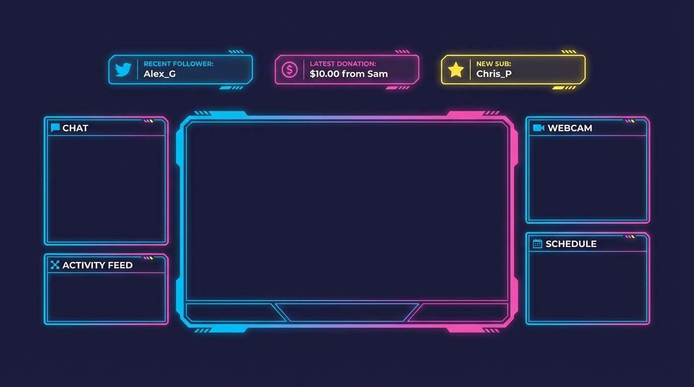
19) Neon Arcade
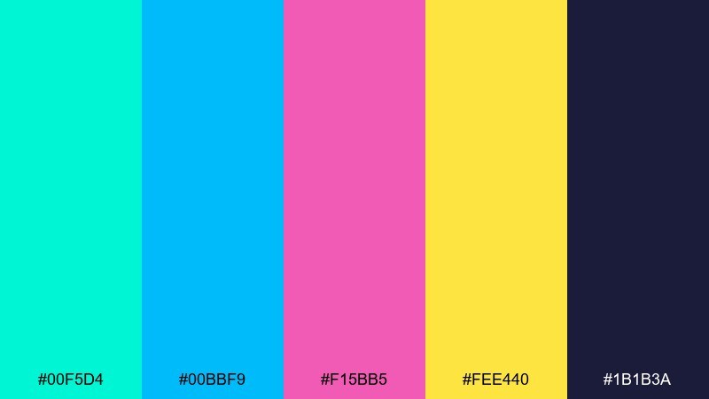
HEX: #00f5d4 #00bbf9 #f15bb5 #fee440 #1b1b3a
Mood: retro, energetic, techy
Best for: gaming stream overlay UI
Retro and energetic, like arcade lights reflecting off glossy plastic. The cyan and hot pink hit fast, while deep indigo keeps the interface readable. Great for overlays, alerts, and bold channel branding where the UI must feel alive. Tip: use indigo as the main canvas and limit yellow to small callouts so it does not overpower everything.
Image example of neon arcade generated using media.io
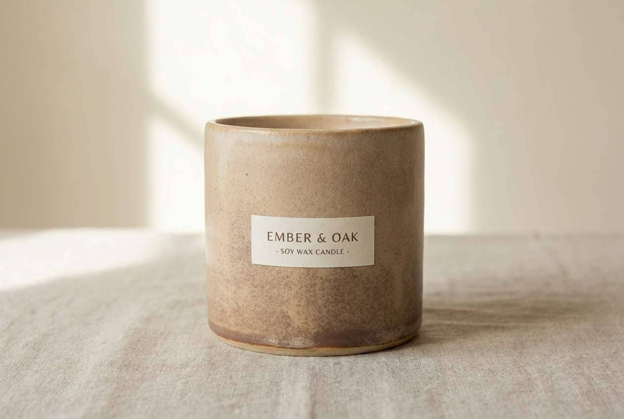
20) Antique Glitter
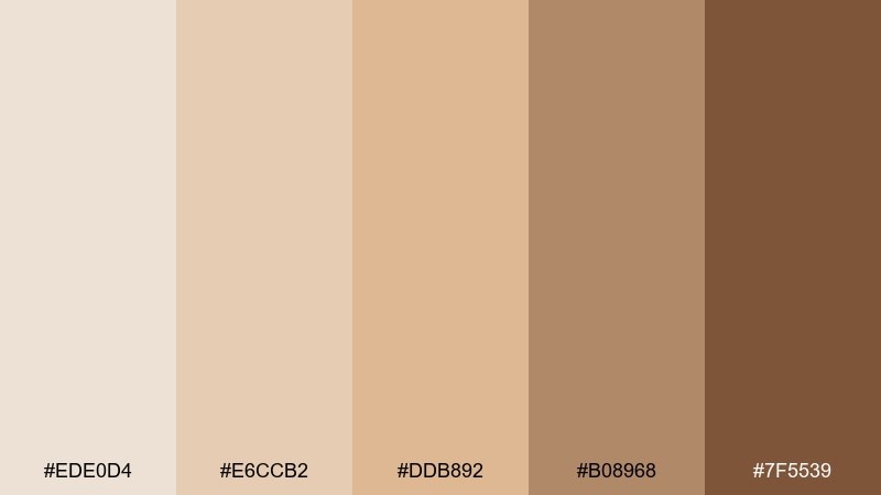
HEX: #ede0d4 #e6ccb2 #ddb892 #b08968 #7f5539
Mood: vintage, cozy, artisan
Best for: handmade candle label design
Vintage and cozy, like antique lace with a gentle glow. The warm beiges and browns feel handcrafted and calm, perfect for small-batch goods. Use it for candle labels, soap wraps, and maker-market signage where warmth sells the story. Tip: print on textured stock and use the darkest brown for brand marks to keep the label crisp.
Image example of antique glitter generated using media.io
What Colors Go Well with Glitter?
Glitter palettes pair best with steady “base” colors: deep navy, charcoal, espresso, or clean off-white. These tones act like a stage, making reflective accents (gold, neon cyan, hot pink) feel intentional rather than noisy.
Soft tints also help sell the shimmer illusion. Pale blush, icy blue, and warm cream mimic the way glitter catches light, so your highlights look brighter without needing extra saturation.
For a modern look, add one surprising contrast—like teal with coral, or cobalt with yellow—then keep the rest neutral so the sparkle reads as premium instead of chaotic.
How to Use a Glitter Color Palette in Real Designs
Start with hierarchy: choose one dark anchor for typography and structure, one light surface color for breathing room, and one “spark” accent for buttons, prices, badges, or key poster details. This keeps the palette readable across devices and print sizes.
Use shimmer cues sparingly. In UI, try subtle gradients, glow, or noise textures on accent elements; in print, translate the accent into foil, spot UV, or metallic ink while keeping body copy on matte tones.
Always test contrast for text and icons. Glitter-inspired schemes look vibrant, but accessibility still depends on sufficient contrast between foreground and background.
Create Glitter Palette Visuals with AI
If you want palette-matched visuals fast, generate mockups with AI using a clear subject, a clean background, and your key HEX colors. Prompts like the examples above help you control style, lighting, and composition while keeping the “glitter” vibe consistent.
For branding and UI exploration, create multiple variations with the same prompt and swap only the accent color. You’ll quickly see which glitter highlight reads best for your audience and medium.
When you find a direction you like, reuse the prompt format for posters, packaging, social tiles, and UI screens so everything feels like one coherent system.
Glitter Color Palette FAQs
-
What is a glitter color palette in design terms?
A glitter color palette is a color scheme built around high-contrast anchors (very dark or very light) plus a few bright “spark” accents that mimic the look of shimmer, sequins, or metallic shine—even on flat digital surfaces. -
How do I keep glitter palettes from looking messy?
Limit sparkle to one primary accent color, keep backgrounds neutral, and use a single dark tone for most text. The more structure your neutrals provide, the more intentional the shimmer feels. -
What’s the best background color for glitter palettes?
Near-black, deep navy, clean white, and warm cream are the easiest backgrounds. They create “stage lighting” for bright accents and help maintain contrast for UI and print readability. -
Are glitter palettes suitable for professional branding?
Yes—when the sparkle is subtle. Palettes like Champagne Spark or Black Tie Sparkle work well for luxury, beauty, and events because the shimmer is implied through warm neutrals and muted metallic accents. -
How can I translate a glitter palette into print?
Use the accent color as foil or metallic ink, keep body text in a dark neutral, and choose paper stock that supports the mood (matte for modern, textured for artisan, coated for high-gloss). -
Which glitter palette is best for UI?
Dark-base palettes like Starlit Navy or Neon Arcade are strong for UI because the anchor colors keep screens readable, while bright accents can be reserved for primary actions, charts, and alerts. -
Can I generate glitter-style visuals with AI using HEX codes?
Yes. Include your key HEX colors in the prompt, describe lighting (glossy, holographic, soft shadows), and keep the background simple. Then iterate by changing only one accent color to explore variations.
Next: Tea Rose Color Palette


