

Tea rose is a soft, warm pink that sits between blush and muted coral, making it easy to style across modern and classic aesthetics. It can feel romantic, editorial, cozy, or clean—depending on the neutrals and contrast you pair with it.
Below are 20 curated tea rose color palette ideas with HEX codes, plus practical tips for branding, weddings, UI, packaging, and layouts.
In this article
- Why Tea Rose Palettes Work So Well
-
- blush linen studio
- vintage rose bouquet
- soft coral latte
- dusty petal neutrals
- rosewater minimal ui
- cozy clay comfort
- garden party pastels
- modern mauve contrast
- champagne glow bridal
- rosy terracotta home
- plum kiss evening
- peach bloom branding
- warm sand editorial
- berry cream dessert
- quiet sakura stationery
- copper rose packaging
- misty pink landscape
- bold rose accent
- urban rose concrete
- antique lace romance
- What Colors Go Well with Tea Rose?
- How to Use a Tea Rose Color Palette in Real Designs
- Create Tea Rose Palette Visuals with AI
Why Tea Rose Palettes Work So Well
Tea rose palettes feel instantly welcoming because they carry warmth without the intensity of hot pink. That “soft warmth” makes them adaptable for calm, premium design as well as playful seasonal concepts.
They also pair naturally with modern neutrals—creams, taupes, warm grays, cocoa browns—so layouts stay readable and grounded. With the right dark anchor color, tea rose can support accessible contrast for UI and editorial type.
Finally, tea rose photographs beautifully. It complements skin tones, natural materials (linen, clay, paper), and warm lighting, which helps branding and campaigns look cohesive across web and print.
20+ Tea Rose Color Palette Ideas (with HEX Codes)
1) Blush Linen Studio
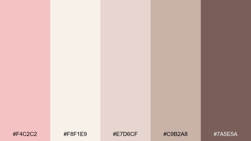
HEX: #F4C2C2 #F8F1E9 #E7D6CF #C9B2A8 #7A5E5A
Mood: airy, calm, refined
Best for: lifestyle branding moodboards and lookbooks
Airy and calm like blush linen in soft window light, these tones feel quietly premium. Use the warm cream and taupe to keep layouts spacious, then anchor headings with the cocoa brown for contrast. It works beautifully for skincare, boutique retail, and creator media kits. Tip: keep the blush as a large background field and reserve the deep brown for small, high-impact typography.
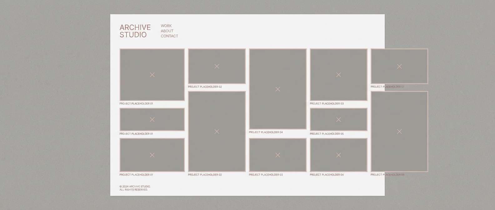
Image example of blush linen studio generated using media.io
Media.io is an online AI studio for creating and editing video, image, and audio in your browser.

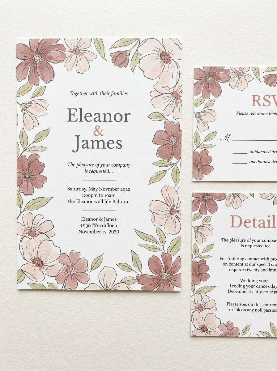
2) Vintage Rose Bouquet
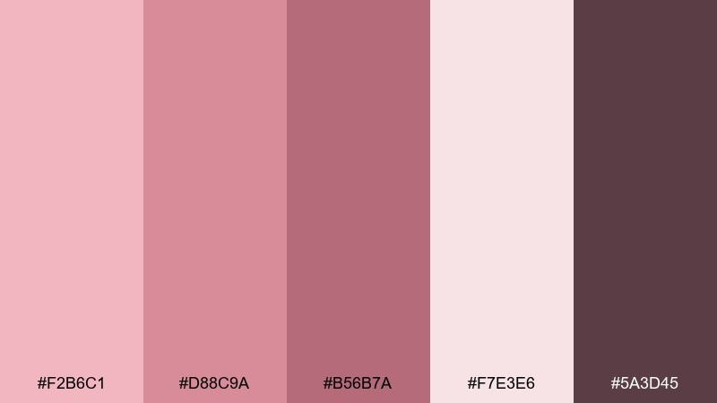
HEX: #F2B6C1 #D88C9A #B56B7A #F7E3E6 #5A3D45
Mood: romantic, nostalgic, painterly
Best for: wedding invitations and floral stationery
Romantic and nostalgic, it reads like pressed petals tucked into an old book. Pair the dusty rose and berry tones for names and monograms, then soften the page with the pale blush wash. It suits wedding suites, thank-you cards, and boutique event signage. Tip: print the darker berry as foil or letterpress to keep the look elevated without going harsh.
Image example of vintage rose bouquet generated using media.io
3) Soft Coral Latte
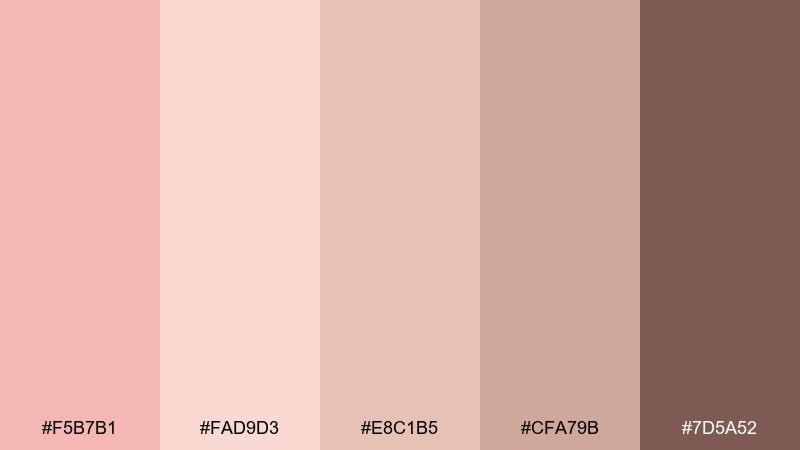
HEX: #F5B7B1 #FAD9D3 #E8C1B5 #CFA79B #7D5A52
Mood: cozy, warm, café-chic
Best for: coffee shop menus and pastry packaging
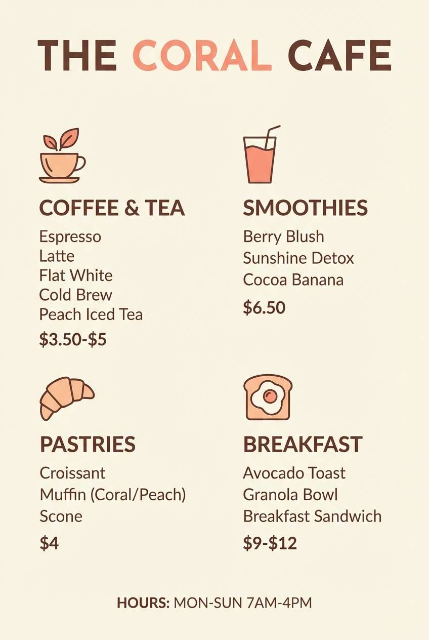
Cozy and warm like coral foam on a latte, the palette feels friendly without turning sugary. Use the pale peach as the base, then layer caramel-taupe for sections and dividers. It shines on menus, bakery labels, and social graphics for food brands. Tip: keep body text on the light peach and use the cocoa tone for prices and calls to action.
Image example of soft coral latte generated using media.io
4) Dusty Petal Neutrals
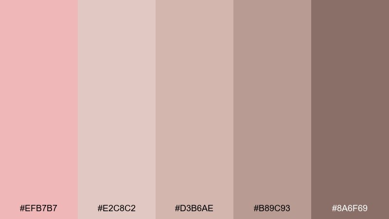
HEX: #EFB7B7 #E2C8C2 #D3B6AE #B89C93 #8A6F69
Mood: muted, grounded, timeless
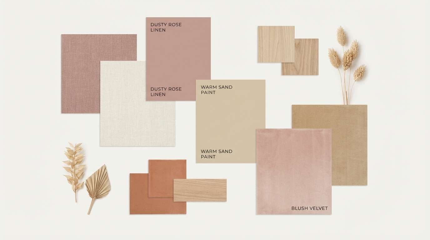
Best for: interior design palettes and real estate branding
Muted and grounded, it feels like dried petals against warm stone. The mid-tone beiges keep everything neutral-first, while the dusty pink adds just enough softness. Use it for interior moodboards, property brochures, and calm landing pages. Tip: let the darkest brown act as your single contrast color so the neutrals stay cohesive.
Image example of dusty petal neutrals generated using media.io
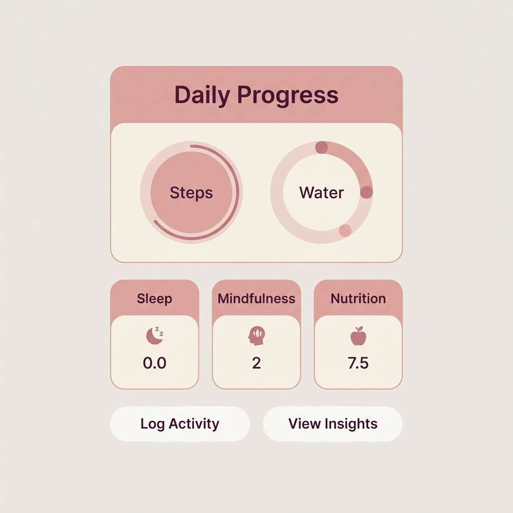
5) Rosewater Minimal UI
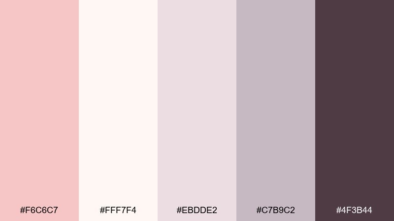
HEX: #F6C6C7 #FFF7F4 #EBDDE2 #C7B9C2 #4F3B44
Mood: clean, modern, gentle
Best for: wellness app UI and dashboard components
Clean and gentle, it evokes rosewater mist and soft ceramic surfaces. This tea rose color palette is ideal for light UI backgrounds, with the charcoal-plum used sparingly for navigation and key metrics. Pair the blush with warm off-white for breathing room and use the lilac-gray for cards and dividers. Tip: keep contrast accessible by using the darkest tone for text and icons on the lightest background.
Image example of rosewater minimal ui generated using media.io
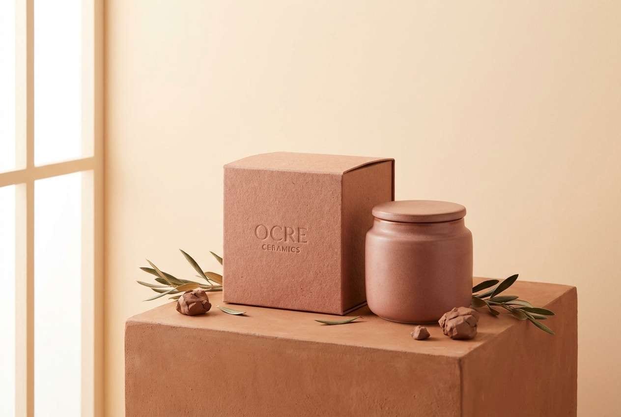
6) Cozy Clay Comfort
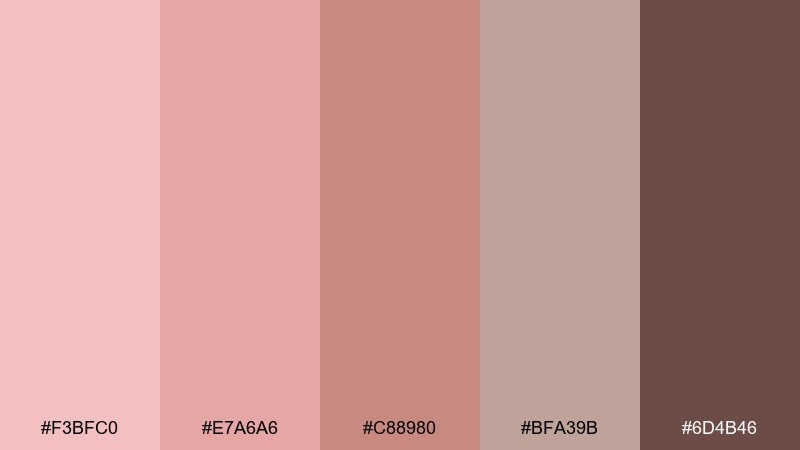
HEX: #F3BFC0 #E7A6A6 #C88980 #BFA39B #6D4B46
Mood: warm, handcrafted, comforting
Best for: ceramics brands and handmade marketplace listings
Warm and comforting, it recalls clay mugs, rosy glazes, and sun-baked studio shelves. Use the deeper terracotta tone for logos and badges, while the softer pinks carry product backgrounds. It works well for artisan packaging, maker shop banners, and craft tutorials. Tip: add texture through grain or paper effects so the colors feel tactile rather than flat.
Image example of cozy clay comfort generated using media.io
7) Garden Party Pastels
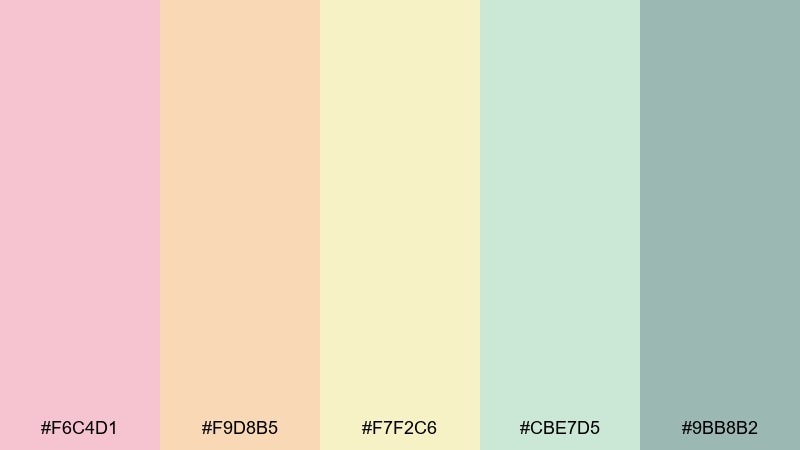
HEX: #F6C4D1 #F9D8B5 #F7F2C6 #CBE7D5 #9BB8B2
Mood: playful, springy, light
Best for: spring event flyers and botanical illustrations
Playful and springy, it feels like macaron pastels and fresh-cut blooms. Let the pink and butter-yellow lead, then use mint and dusty teal to keep the palette from becoming overly sweet. It fits seasonal promos, party flyers, and cheerful packaging sleeves. Tip: keep typography simple and dark-gray so the pastel mix stays readable.
Image example of garden party pastels generated using media.io
8) Modern Mauve Contrast
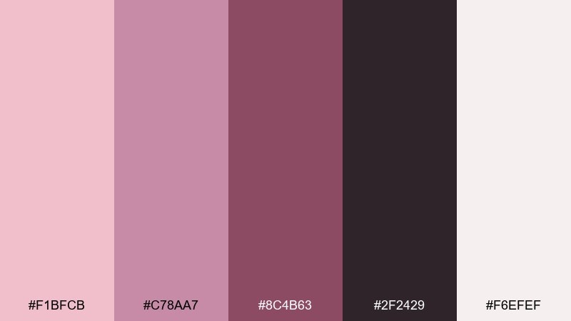
HEX: #F1BFCB #C78AA7 #8C4B63 #2F2429 #F6EFEF
Mood: bold, editorial, dramatic
Best for: fashion branding and campaign graphics
Bold and editorial, it channels mauve lipstick against a near-black backdrop. These tea rose color combinations work best when the deep plum is the stage and the blush is the spotlight. Use the off-white for breathing room in layouts and the mid mauve for secondary type or lines. Tip: limit the darkest tone to large blocks so the pink accents feel intentional, not busy.
Image example of modern mauve contrast generated using media.io
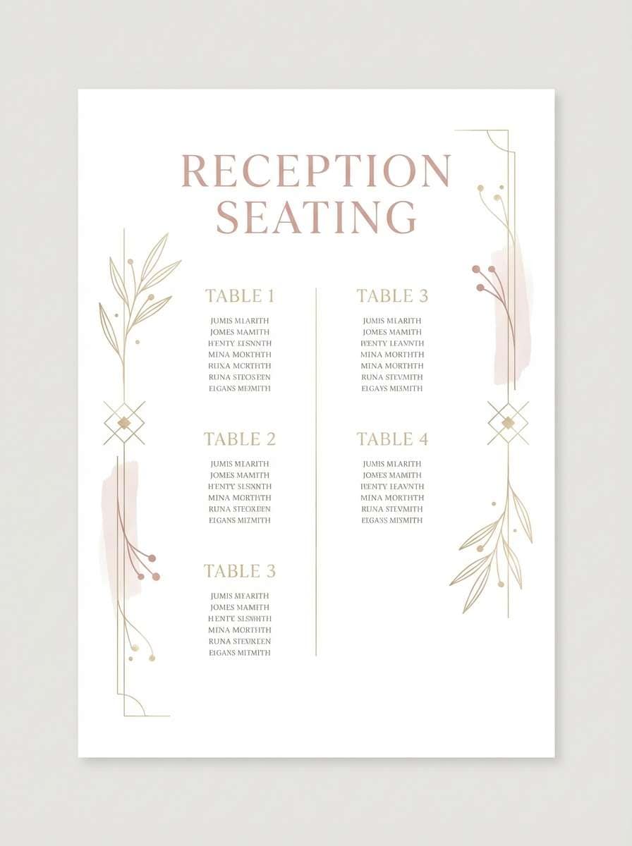
9) Champagne Glow Bridal
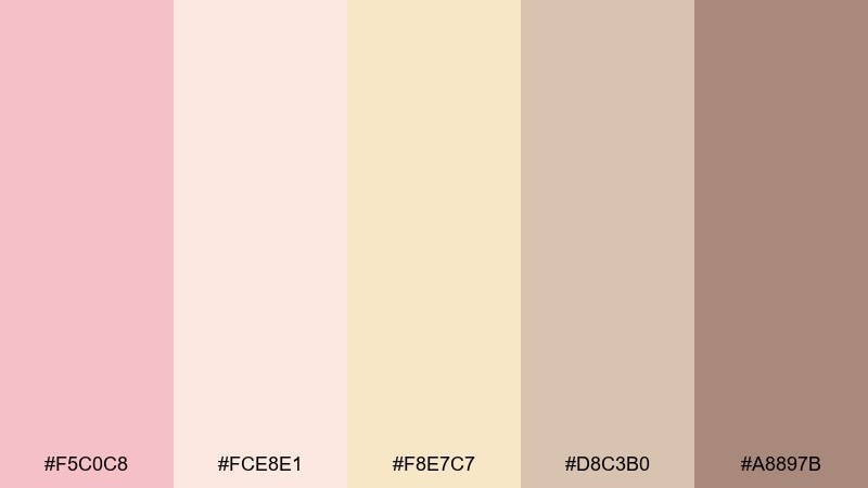
HEX: #F5C0C8 #FCE8E1 #F8E7C7 #D8C3B0 #A8897B
Mood: elegant, luminous, celebratory
Best for: bridal websites and reception signage
Elegant and luminous, it feels like champagne sparkle over blush silk. Use the creamy tones for backgrounds and the warm taupe for structure, then add the muted brown for readable headers. It is a natural fit for bridal sites, seating charts, and thank-you cards. Tip: add metallic accents in print while keeping screens matte so the palette stays soft.
Image example of champagne glow bridal generated using media.io
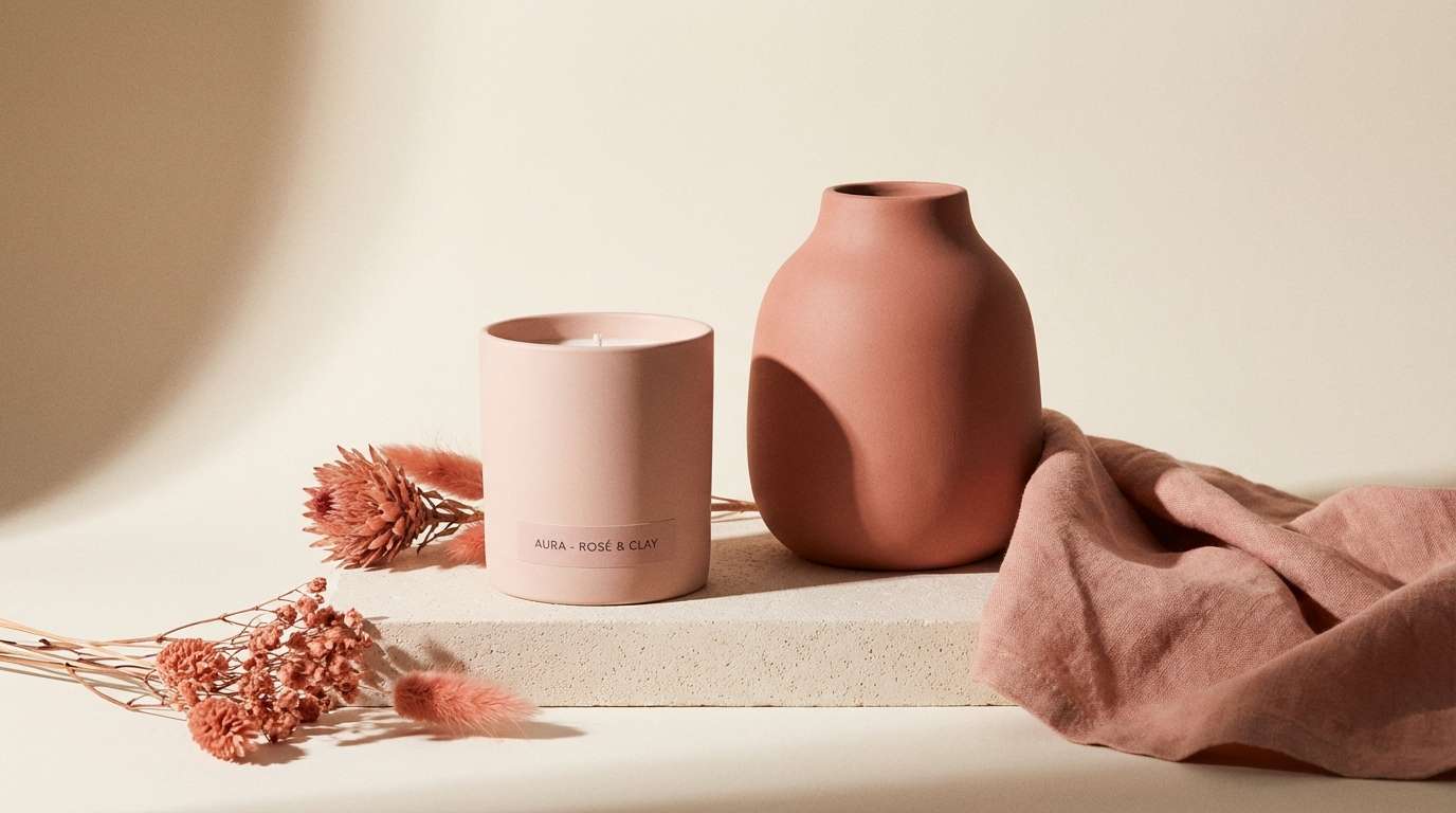
10) Rosy Terracotta Home
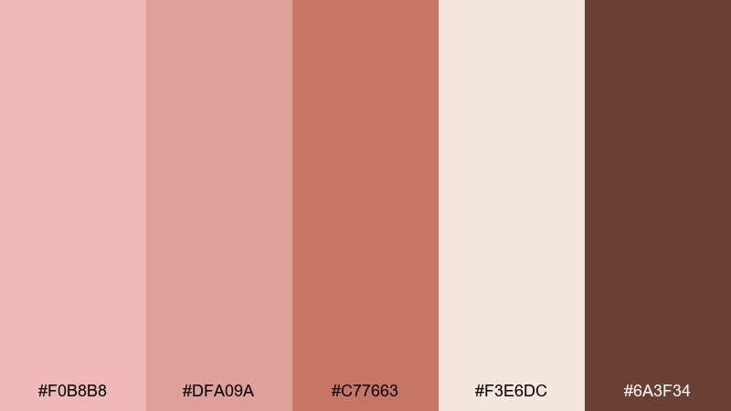
HEX: #F0B8B8 #DFA09A #C77663 #F3E6DC #6A3F34
Mood: sun-warmed, earthy, inviting
Best for: home decor ads and renovation moodboards
Sun-warmed and earthy, it suggests terracotta tiles, rosy plaster, and cozy wood beams. Use the light cream to open up layouts, then lean on terracotta for feature blocks and highlights. It works for home decor ads, DIY guides, and moodboards that need warmth without orange overload. Tip: pair with natural photography and keep overlays at low opacity for a grounded look.
Image example of rosy terracotta home generated using media.io
11) Plum Kiss Evening
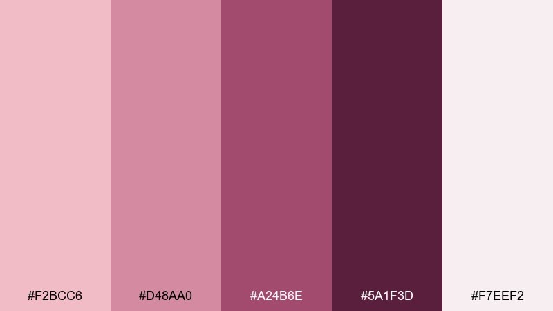
HEX: #F2BCC6 #D48AA0 #A24B6E #5A1F3D #F7EEF2
Mood: moody, romantic, night-out
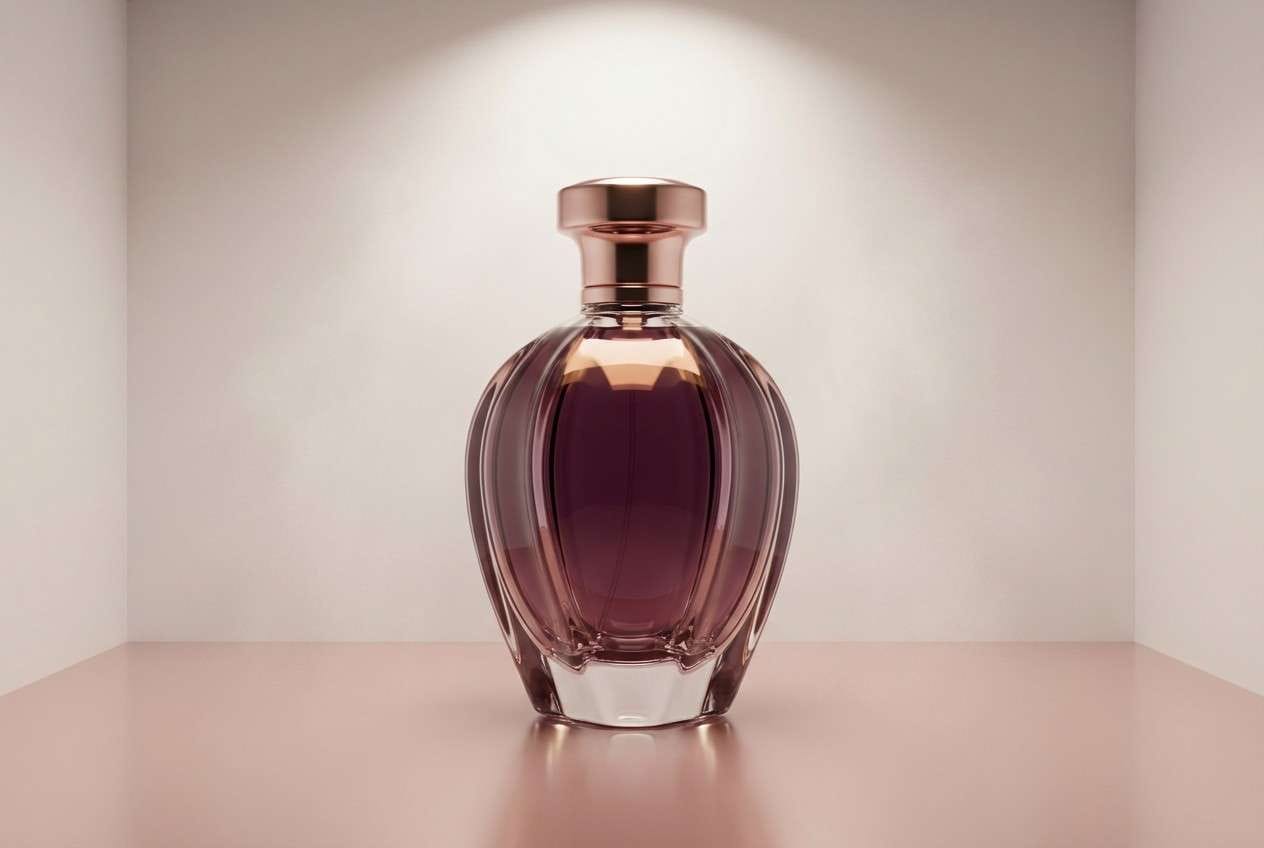
Best for: beauty product ads and nightlife flyers
Moody and romantic, it feels like twilight blush with a plum velvet edge. Keep the pale pink for negative space, then build depth with berry and wine tones for headlines. It is strong for beauty launches, fragrance campaigns, and evening event flyers. Tip: use a subtle gradient from blush to plum to make layouts feel luxe rather than heavy.
Image example of plum kiss evening generated using media.io
12) Peach Bloom Branding
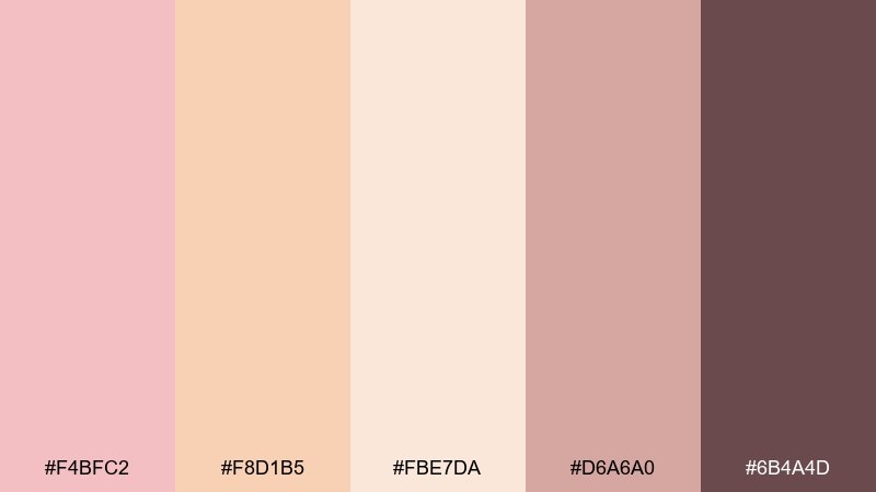
HEX: #F4BFC2 #F8D1B5 #FBE7DA #D6A6A0 #6B4A4D
Mood: friendly, fresh, modern
Best for: small business logos and brand kits
Friendly and fresh, it reads like peach bloom petals with a warm, approachable finish. This tea rose color palette pairs beautifully with creamy backgrounds and a single dark neutral for type. Use the peach as a supporting accent on buttons, tags, and highlight shapes to keep the blush from feeling too monochrome. Tip: set brand photography with warm white balance so the tones stay cohesive across platforms.
Image example of peach bloom branding generated using media.io
13) Warm Sand Editorial
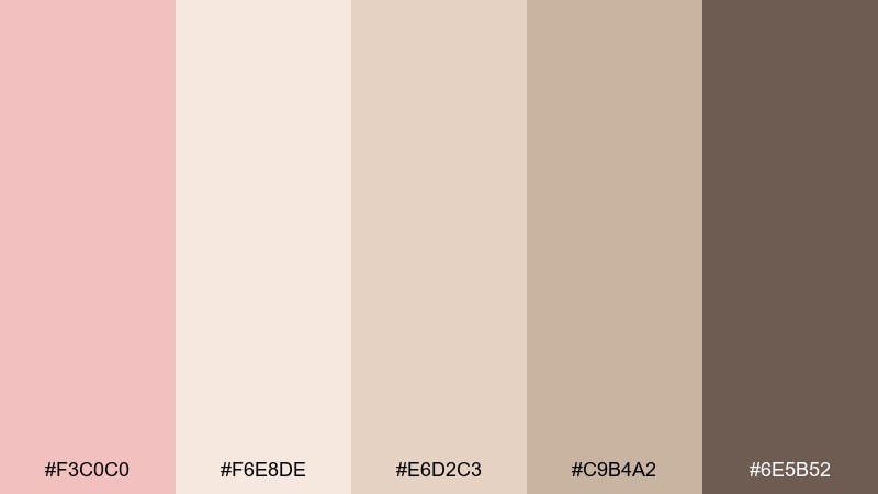
HEX: #F3C0C0 #F6E8DE #E6D2C3 #C9B4A2 #6E5B52
Mood: neutral, polished, magazine-like
Best for: editorial layouts and blog headers
Neutral and polished, it feels like warm sand, soft blush, and matte paper stock. Use the creams for margins and columns, then rely on taupe for subheads and pull quotes. It is great for magazine-style blogs, long reads, and portfolio case studies. Tip: keep line rules and UI dividers in the light taupe to avoid harsh contrast.
Image example of warm sand editorial generated using media.io
14) Berry Cream Dessert
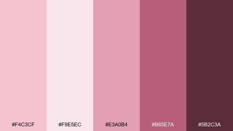
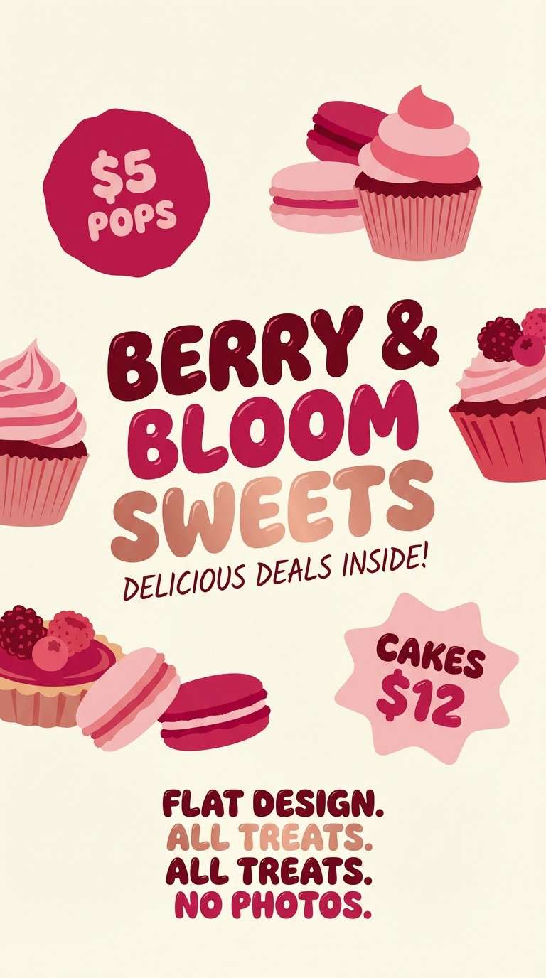
HEX: #F4C3CF #F9E5EC #E3A0B4 #B65E7A #5B2C3A
Mood: sweet, playful, punchy
Best for: dessert shop promos and social posts
Sweet and punchy, it brings to mind berry mousse topped with whipped cream. Let the pale pink act as your canvas and use the brighter berry for stickers, price bursts, and highlights. It performs well for dessert promos, limited-time offers, and cute merch. Tip: keep the darkest berry for small type only, so the overall look stays light and tasty.
Image example of berry cream dessert generated using media.io
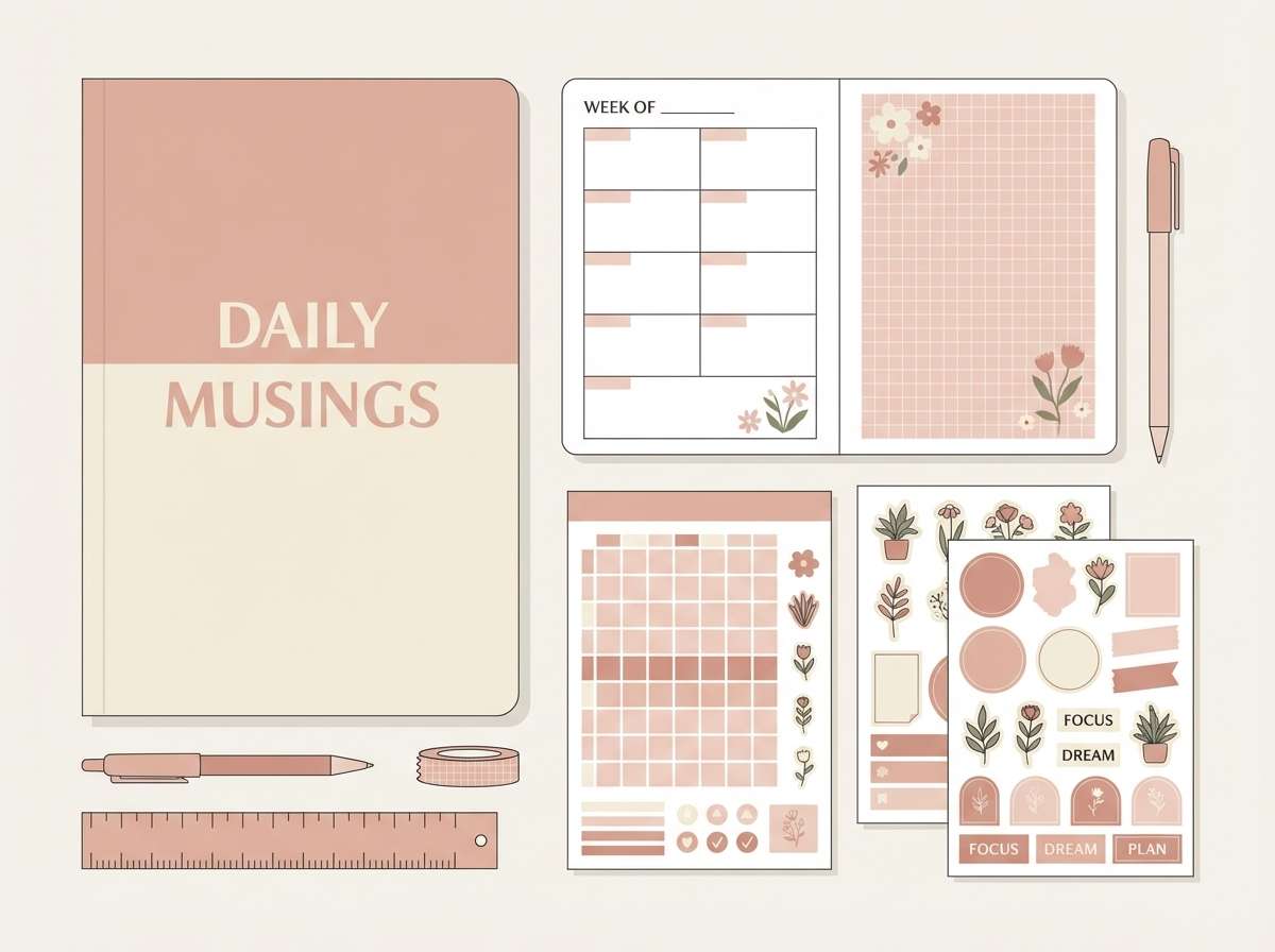
15) Quiet Sakura Stationery
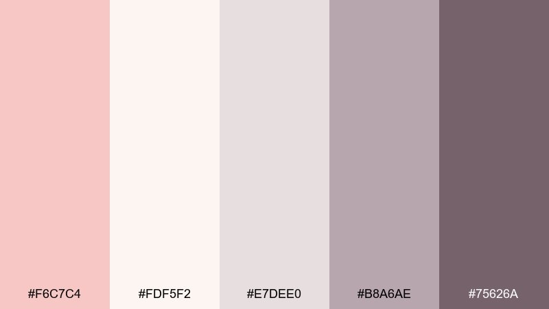
HEX: #F6C7C4 #FDF5F2 #E7DEE0 #B8A6AE #75626A
Mood: soft, calm, understated
Best for: journals, planners, and stationery sets
Soft and understated, it feels like sakura petals drifting over warm paper. Use the off-white as the dominant background and keep the gray-lilac for lines, grids, and tabs. It fits planners, journals, and minimal stationery where readability matters. Tip: choose a slightly heavier font weight in the darkest tone to maintain contrast on pastel paper.
Image example of quiet sakura stationery generated using media.io
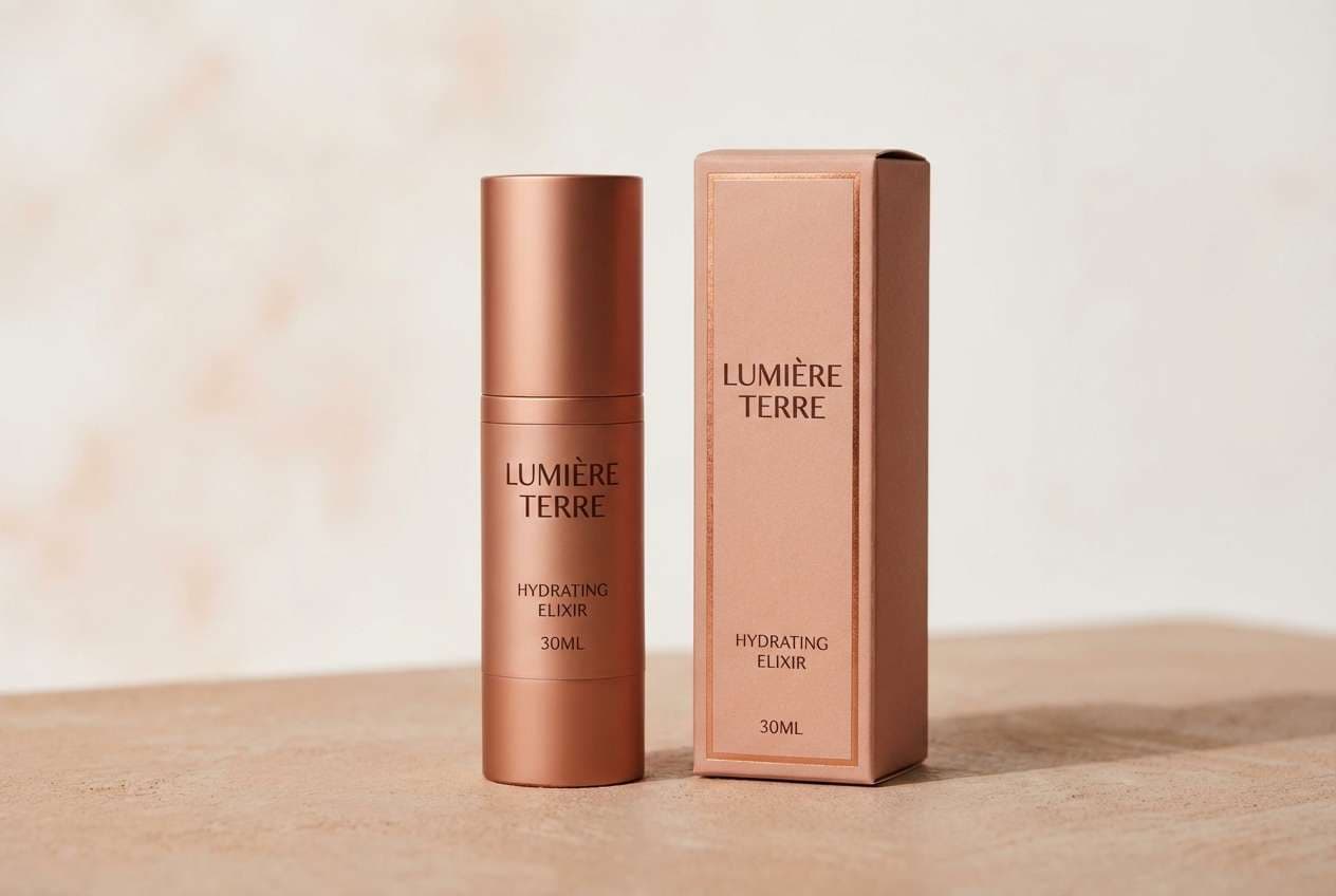
16) Copper Rose Packaging
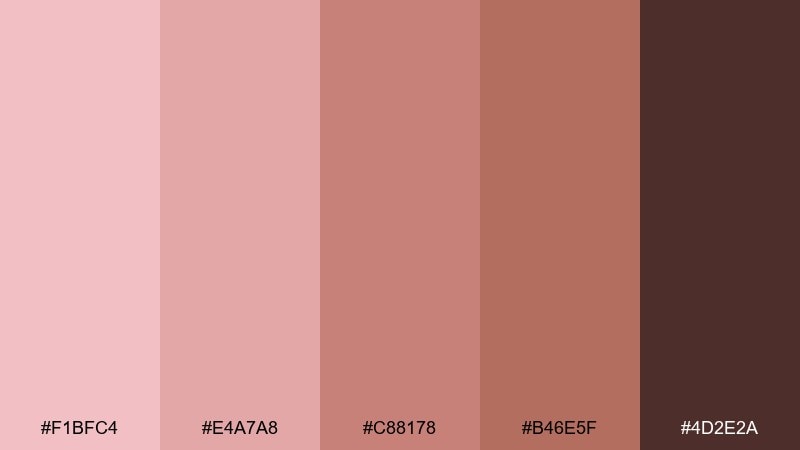
HEX: #F1BFC4 #E4A7A8 #C88178 #B46E5F #4D2E2A
Mood: rich, warm, artisanal
Best for: cosmetic packaging and premium labels
Rich and warm, it echoes copper foil, rosy glaze, and deep cocoa ink. Use the mid copper-rose for the main pack color and reserve the darkest brown for typography and ingredient panels. It suits cosmetics, candles, and premium food labels that want warmth over stark minimalism. Tip: add a soft matte finish in print so the darker tones do not overpower the blush.
Image example of copper rose packaging generated using media.io
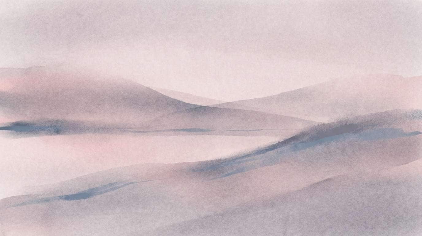
17) Misty Pink Landscape
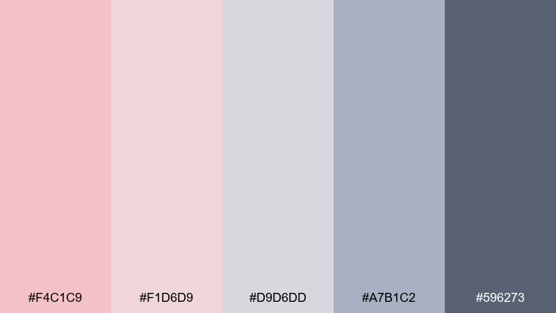
HEX: #F4C1C9 #F1D6D9 #D9D6DD #A7B1C2 #596273
Mood: dreamy, cool, atmospheric
Best for: wellness blog headers and calm hero images
Dreamy and atmospheric, it feels like pink fog rolling into a cool gray horizon. Balance the blush with misty lavender-gray so the overall look stays serene rather than sugary. It is perfect for meditation content, spa landing pages, and gentle hero sections. Tip: keep accents in the slate blue-gray to guide the eye without breaking the calm.
Image example of misty pink landscape generated using media.io
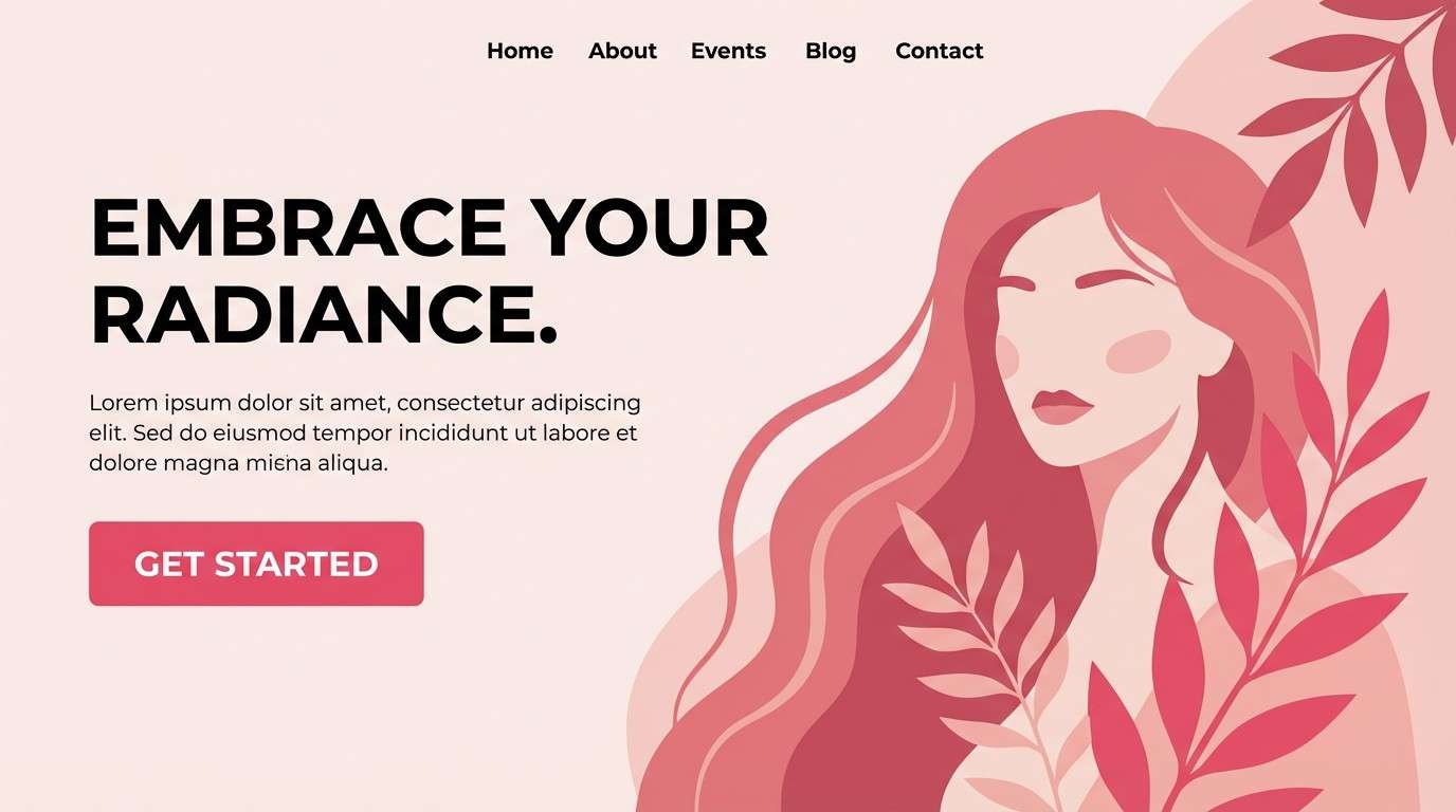
18) Bold Rose Accent
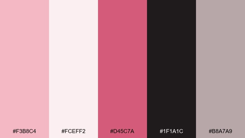
HEX: #F3B8C4 #FCEFF2 #D45C7A #1F1A1C #B8A7A9
Mood: confident, modern, punchy
Best for: CTA-driven landing pages and promo banners
Confident and modern, it feels like a blush backdrop with a bold rose lipstick swipe. These tea rose color combinations are strongest when the vivid rose is used as the single accent for buttons and key numbers. Keep the near-black for headlines to preserve clarity, and let the pale pink carry most of the surface area. Tip: test your button contrast on mobile and increase padding so the accent color feels intentional.
Image example of bold rose accent generated using media.io
19) Urban Rose Concrete
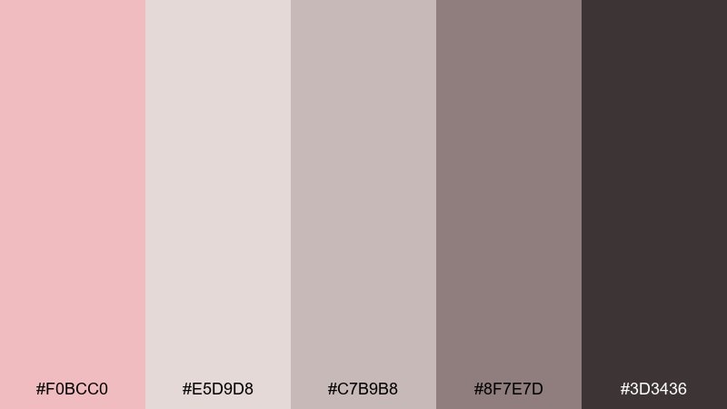
HEX: #F0BCC0 #E5D9D8 #C7B9B8 #8F7E7D #3D3436
Mood: industrial, muted, contemporary
Best for: architecture portfolios and modern brand systems
Industrial and muted, it looks like blush paint softening raw concrete. Use the light gray-pink as a base, then stack mid grays for sections, cards, and captions. It fits architecture portfolios, product decks, and modern brand systems that want softness without losing edge. Tip: keep photography in neutral tones so the palette stays the hero.
Image example of urban rose concrete generated using media.io
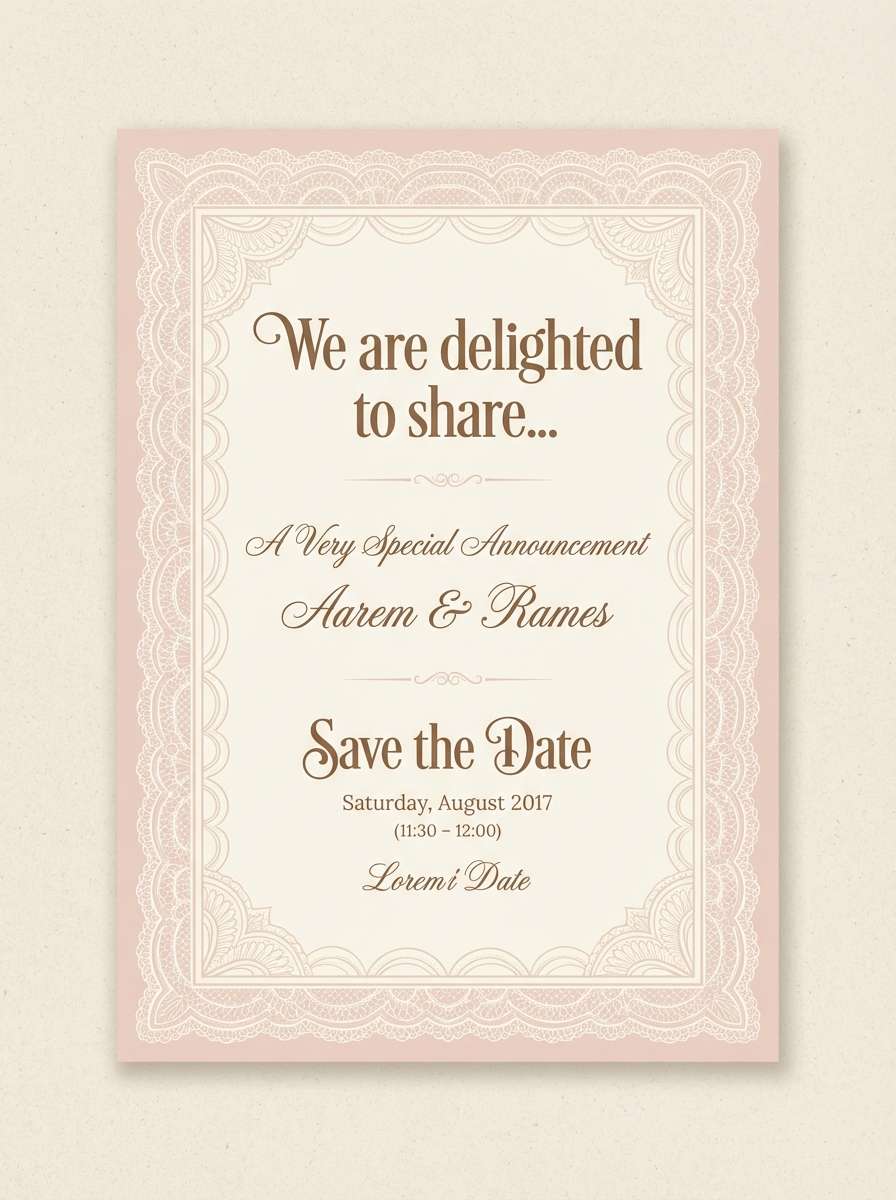
20) Antique Lace Romance
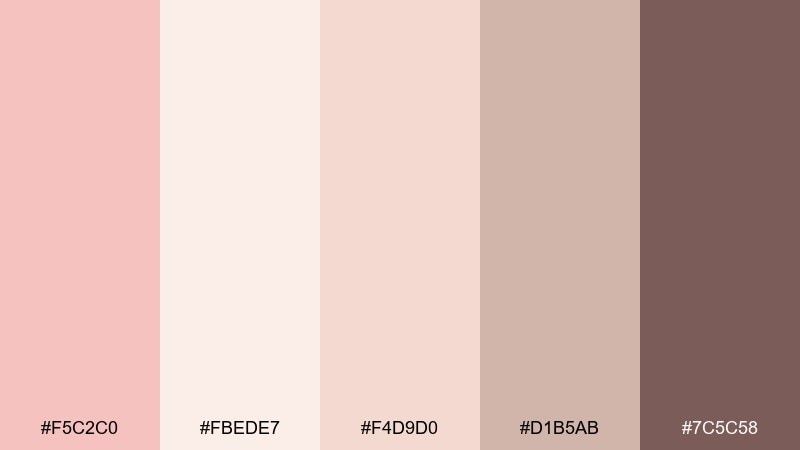
HEX: #F5C2C0 #FBEDE7 #F4D9D0 #D1B5AB #7C5C58
Mood: delicate, vintage, heartfelt
Best for: announcements, baby showers, and keepsake prints
Delicate and vintage, it brings to mind antique lace, handwritten notes, and soft blush ribbons. Use the creamy tones for background and borders, while the warm brown supports readable text and monograms. It is lovely for announcements, baby showers, and keepsake prints that need a gentle touch. Tip: add thin line art in the taupe shade to mimic lace detail without cluttering the page.
Image example of antique lace romance generated using media.io
What Colors Go Well with Tea Rose?
Tea rose pairs best with warm neutrals like ivory, cream, linen, sand, and taupe—these keep the pink feeling elevated rather than candy-like. For typography and structure, reach for cocoa, espresso, charcoal-plum, or near-black.
For a fresher, spring-forward look, add soft pastels such as butter yellow, mint, or dusty teal. If you want a more editorial mood, lean into mauves, berries, and deep wine tones to create depth and drama.
How to Use a Tea Rose Color Palette in Real Designs
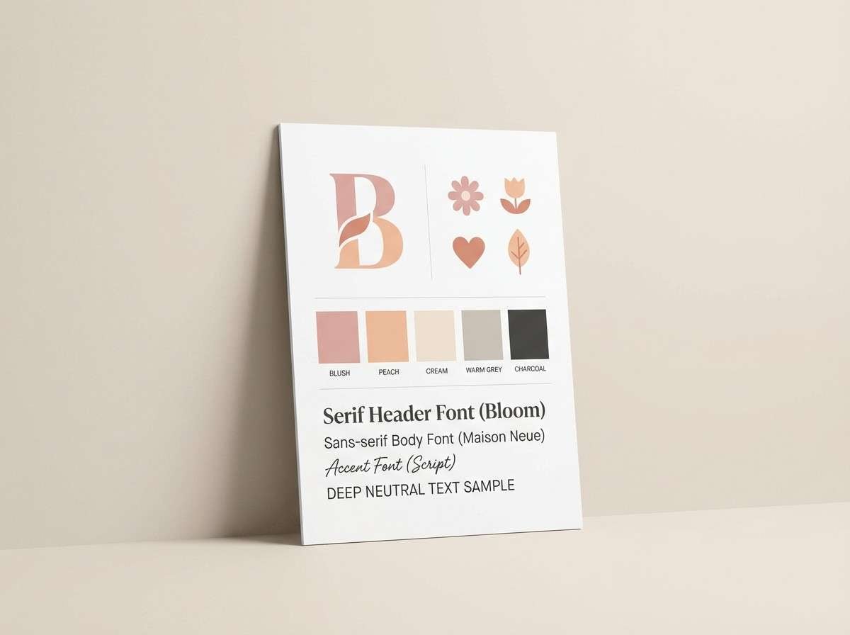
In branding, use tea rose as the “emotion color” (backgrounds, shapes, packaging fields) and assign a single dark anchor for logos and text. This keeps the system consistent across web, print, and social templates.
For UI, tea rose works best as a tint: apply it to surfaces and cards, then use a deep plum/charcoal for text to protect readability. In editorial layouts, let creams carry margins and whitespace, and use taupes for rules, captions, and secondary hierarchy.
For weddings and events, tea rose shines when layered with champagne and soft browns—great for invitations, signage, and menus. Add texture (paper grain, linen, matte finishes) so the palette feels tactile instead of flat.
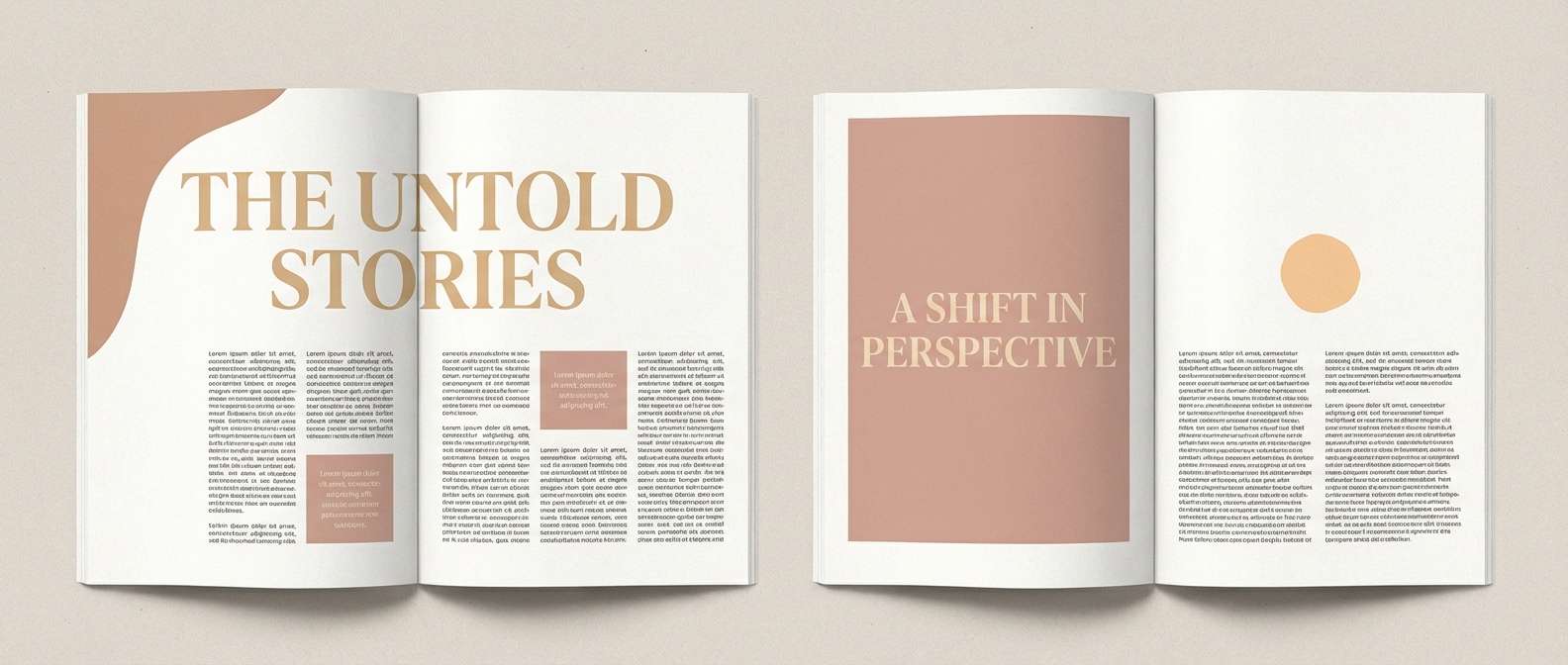
Create Tea Rose Palette Visuals with AI
If you want to preview a tea rose palette in a real layout—like a landing page hero, invitation suite, packaging mockup, or moodboard—generate quick concepts with AI. It’s a fast way to test contrast, hierarchy, and vibe before committing to a full design.
Start with one palette above, reuse the included prompts, and swap keywords like “menu poster,” “brand kit,” or “app dashboard” to match your project. You can iterate variations in minutes and keep what feels most on-brand.
Tea Rose Color Palette FAQs
-
What is the HEX code for tea rose?
Tea rose is commonly represented by soft blush-pink HEX values like #F4C2C2, but “tea rose” can shift warmer (peachy) or cooler (mauve) depending on the palette and lighting. -
Is tea rose more pink or coral?
Tea rose sits between pink and coral. It’s typically a warm blush that can lean peachy when paired with creams and sands, or read more rosy when paired with mauves and berries. -
What neutral colors match tea rose best?
Ivory, warm white, linen, sand, taupe, and cocoa brown are the easiest neutrals to pair with tea rose. They keep the palette soft, modern, and usable for long-form layouts. -
What accent colors work with tea rose?
Dusty teal, muted mint, butter yellow, slate blue-gray, and berry/wine accents all work well. Choose cool accents for calm balance and deep berry accents for a more dramatic, editorial feel. -
Can I use tea rose in UI design without hurting accessibility?
Yes—use tea rose on backgrounds and surfaces, then reserve a deep charcoal or plum for text and icons. Always check contrast ratios, especially for buttons and small type on mobile. -
What wedding colors pair well with tea rose?
Tea rose looks elegant with champagne, ivory, warm taupe, and muted browns. For a fresher spring palette, add pastel yellow or soft sage/mint as a supporting color. -
How do I keep a tea rose palette from looking too “sweet”?
Add structure with taupes and grays, and include a single dark anchor (cocoa, plum, or near-black) for typography. Using matte textures and plenty of whitespace also makes the palette feel more premium.
Next: Instagram Color Palette


