

A floral color palette is more than “pink and green”—it’s a flexible mix of petal brights, botanical neutrals, and stemmy greens that can look romantic, modern, or bold depending on contrast.
Below are 20 floral color palette ideas with HEX codes, plus real design use-cases and AI prompts you can use to generate matching visuals fast.
In this article
Why Floral Palettes Work So Well
Floral palettes feel instantly familiar because they mirror real-world color relationships: soft petals against creamy light, deeper berry shadows, and a grounding green stem tone. That natural balance makes them easy to apply across branding and print.
They also scale well from subtle to high-contrast. You can keep things airy with blush + cream + sage, or push impact with coral, magenta, and near-black—while still feeling “floral” rather than purely geometric.
Most importantly, floral schemes are emotional. Pastels signal tenderness and care; saturated blooms suggest energy and celebration; botanical neutrals keep everything modern and premium.
20+ Floral Color Palette Ideas (with HEX Codes)
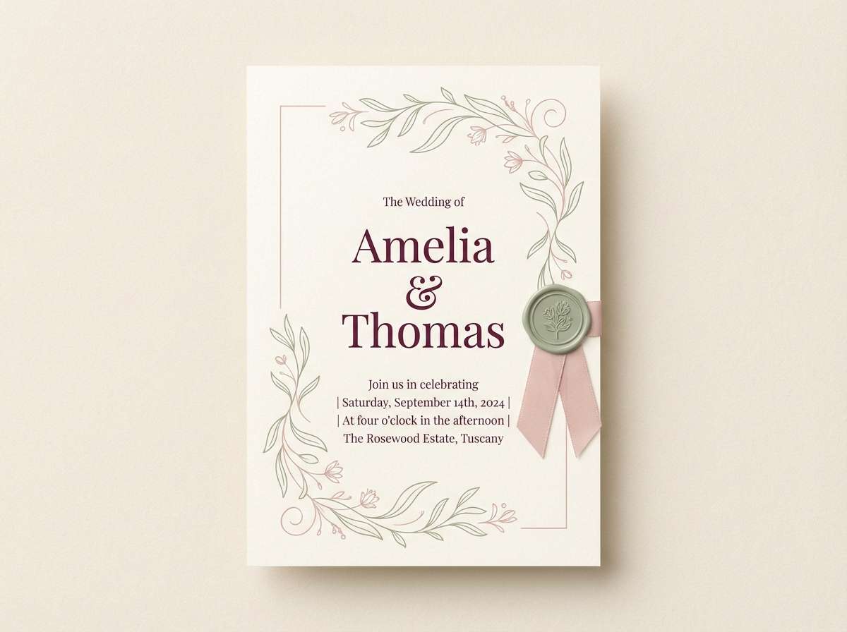
1) Peony Blush
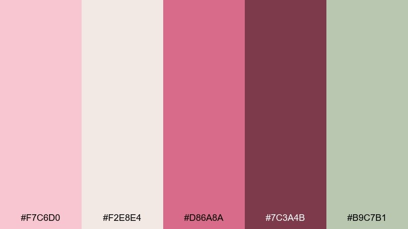
HEX: #F7C6D0 #F2E8E4 #D86A8A #7C3A4B #B9C7B1
Mood: romantic and airy
Best for: wedding invitation design
Romantic and airy, these peony-like pinks feel like satin ribbons, soft petals, and a calm garden morning. Use the cream as breathing room, then let the deep berry add legibility for names and dates. Sage green keeps the look grounded and modern instead of overly sweet. Tip: reserve the darkest tone for typography and small dividers to keep the invitation crisp.
Image example of peony blush generated using media.io
Media.io is an online AI studio for creating and editing video, image, and audio in your browser.

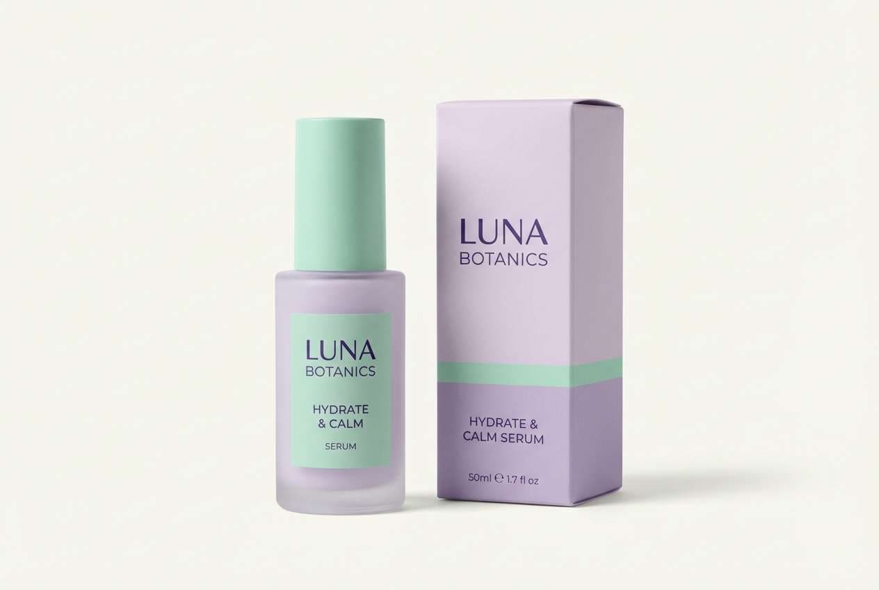
2) Lavender Meadow
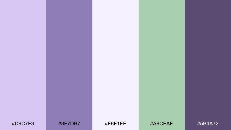
HEX: #D9C7F3 #8F7DB7 #F6F1FF #A8CFAF #5B4A72
Mood: calm and dreamy
Best for: skincare branding
Calm and dreamy, lavender haze meets fresh meadow greens for a soothing, clean-beauty vibe. The pale lilac works beautifully as a label base, while the deeper violet keeps logos and ingredient lists readable. Add the mint green as a quiet accent for seals, icons, or secondary packaging. Tip: use matte paper and keep color blocks large for a more premium feel.
Image example of lavender meadow generated using media.io
3) Rosewater and Sage
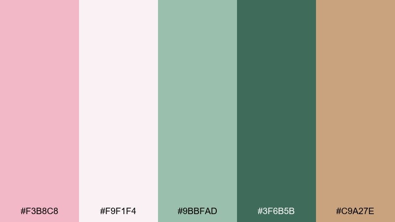
HEX: #F3B8C8 #F9F1F4 #9BBFAD #3F6B5B #C9A27E
Mood: fresh and balanced
Best for: boutique cafe menu
Fresh and balanced, rosewater pink and herbal sage feel like a garden brunch with linen napkins and greenery on the table. These floral color combinations shine on menus when you keep the light blush for the background and the dark green for headings and prices. Warm sand adds a cozy, baked-goods note without stealing focus. Tip: pair with a classic serif and simple icon set to keep it upscale yet approachable.
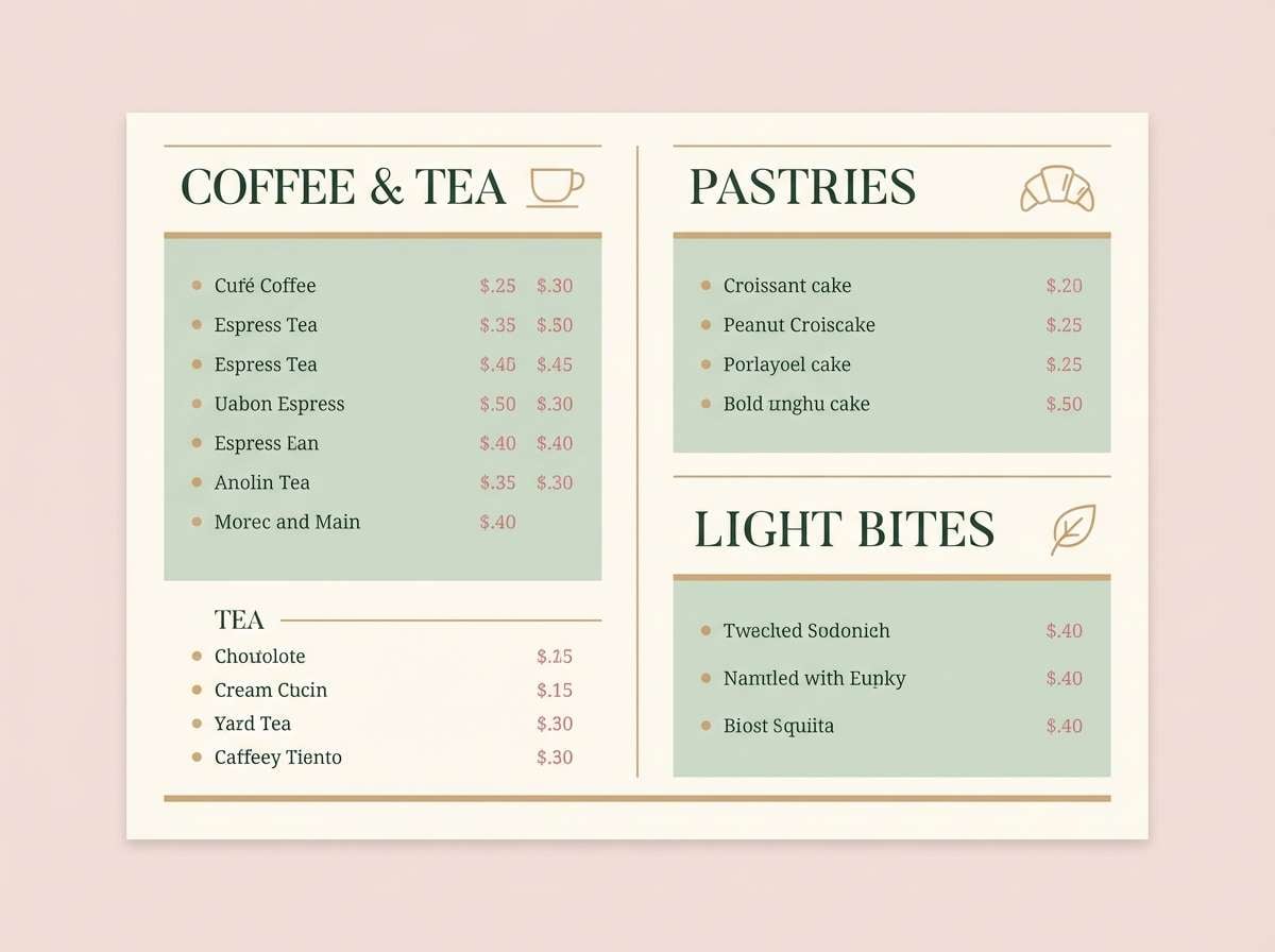
Image example of rosewater and sage generated using media.io
4) Marigold Petal
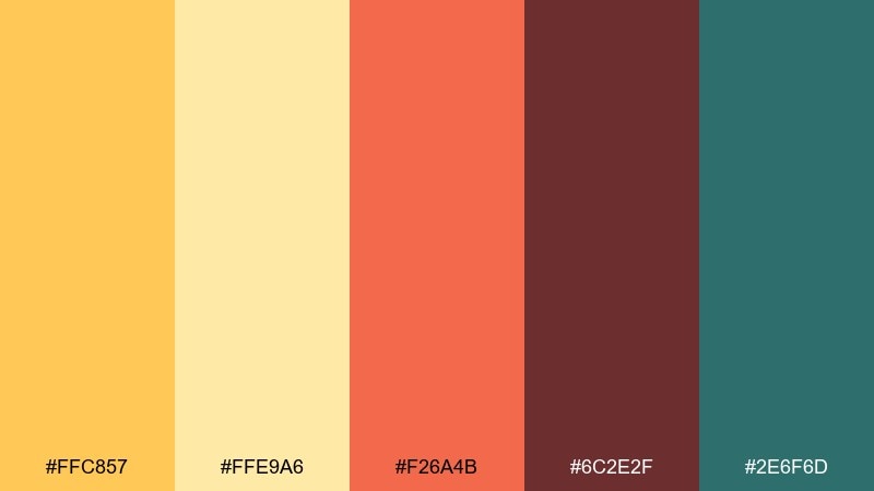
HEX: #FFC857 #FFE9A6 #F26A4B #6C2E2F #2E6F6D
Mood: sunny and bold
Best for: summer event poster
Sunny and bold, marigold gold and coral feel like late-afternoon light and bright petals in full bloom. Use the buttery yellow for large background areas, then punch up calls to action with coral and deep wine. Teal is the modern counterweight that keeps the palette from feeling too warm. Tip: limit teal to small shapes or a footer bar so the poster stays energetic, not busy.
Image example of marigold petal generated using media.io

5) Daisy Cream
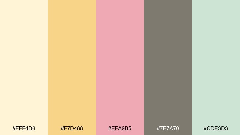
HEX: #FFF4D6 #F7D488 #EFA9B5 #7E7A70 #CDE3D3
Mood: gentle and cozy
Best for: baby shower invitation
Gentle and cozy, creamy petals and soft pink feel like sunshine through curtains and a vase of daisies. The warm cream is ideal for the main canvas, while the gray-brown keeps text readable and refined. Add the minty green as a tiny accent for borders or RSVP details. Tip: keep the pink to headings only to maintain a calm, airy invite.
Image example of daisy cream generated using media.io

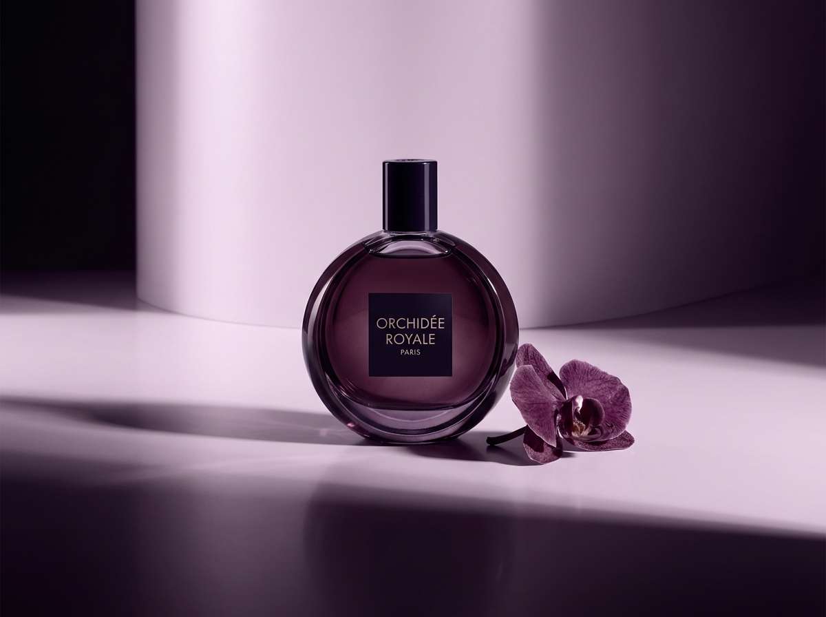
6) Orchid Noir
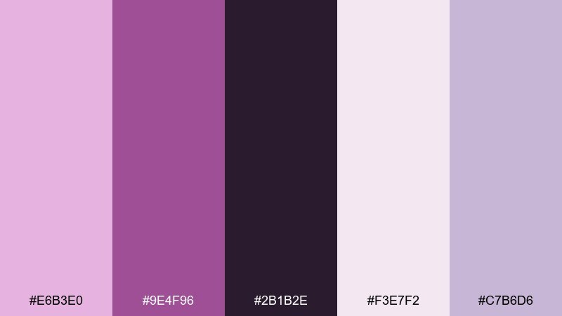
HEX: #E6B3E0 #9E4F96 #2B1B2E #F3E7F2 #C7B6D6
Mood: dramatic and luxe
Best for: beauty product ad
Dramatic and luxe, orchid purples against near-black feel like velvet petals under gallery lighting. Let the pale lilac act as negative space, then use the deep plum for headlines and product names. The mid purple reads as a rich accent for buttons, badges, or decorative shapes. Tip: add subtle gradients only within the purple range to keep the ad premium and cohesive.
Image example of orchid noir generated using media.io
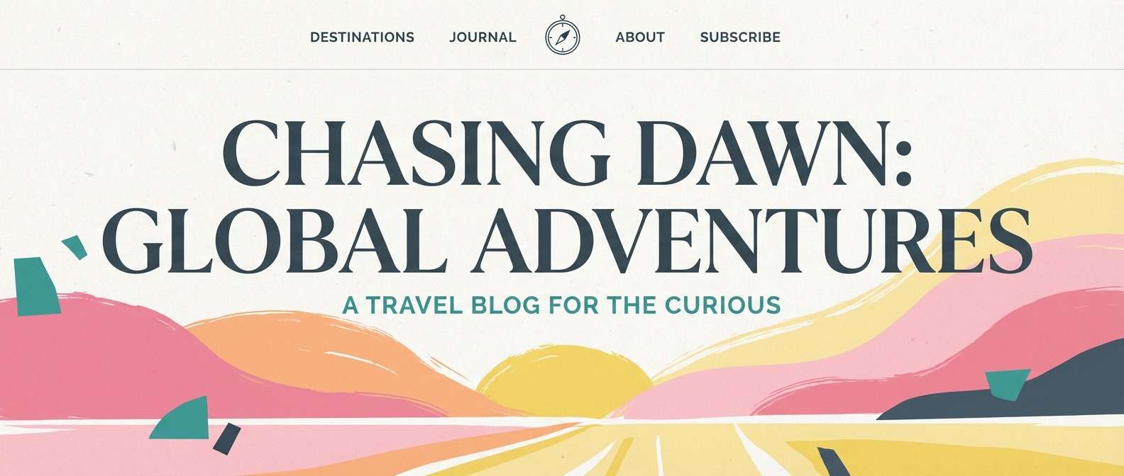
7) Tulip Sunrise
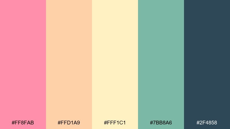
HEX: #FF8FAB #FFD1A9 #FFF1C1 #7BB8A6 #2F4858
Mood: bright and optimistic
Best for: travel blog hero banner
Bright and optimistic, tulip pink and apricot glow like sunrise over a spring market. Use the buttery light yellow as your open sky, then layer pink for overlays and badges. The teal-green reads as a fresh supporting accent, while the deep slate anchors titles with strong contrast. Tip: keep text mostly slate and use pink only for a single key highlight per section.
Image example of tulip sunrise generated using media.io
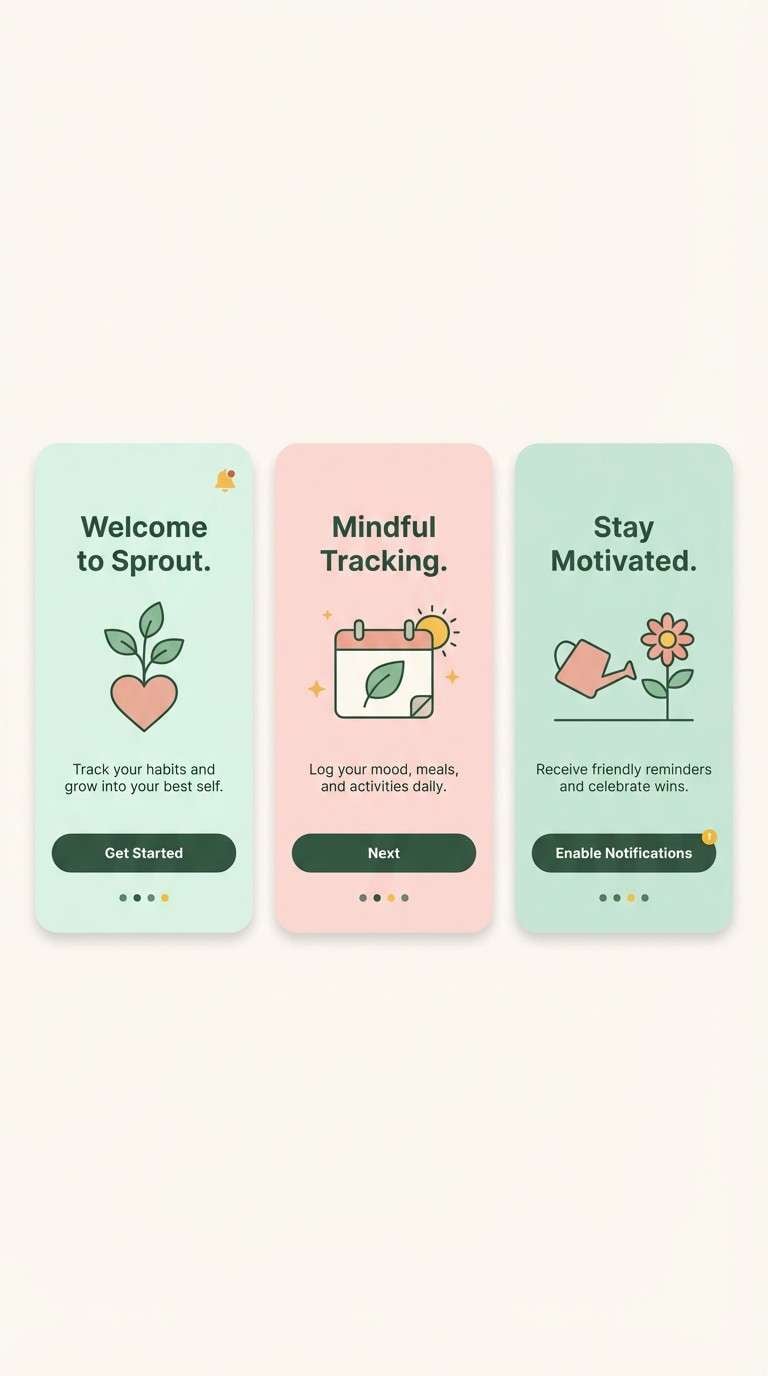
8) Garden Mint
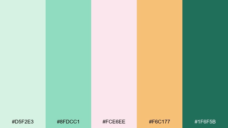
HEX: #D5F2E3 #8FDCC1 #FCE6EE #F6C177 #1F6F5B
Mood: fresh and playful
Best for: mobile app UI onboarding screens
Fresh and playful, minty greens and petal pinks feel like a clean greenhouse with a hint of candy. Use the pale mint as your main UI surface, then bring in dark green for primary buttons and active states. Pink works best for friendly illustrations or onboarding highlights, while the warm yellow is perfect for tiny notification dots. Tip: keep the UI mostly green and cream, using pink sparingly to guide attention.
Image example of garden mint generated using media.io
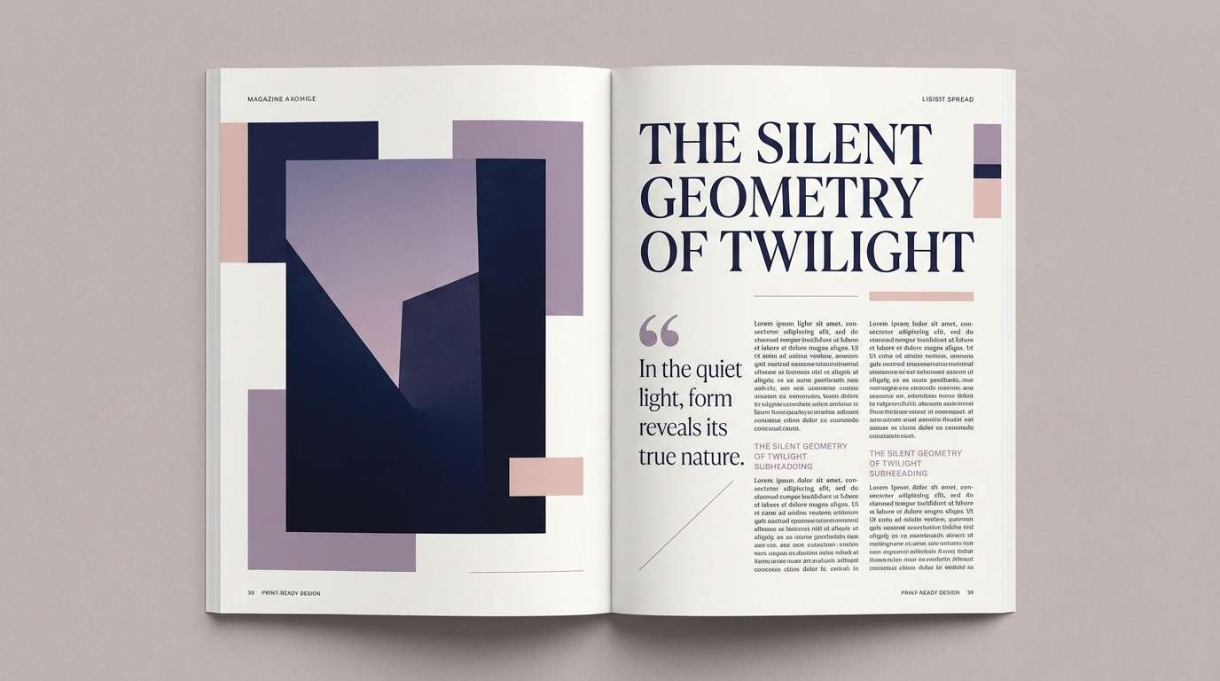
9) Wildflower Dusk
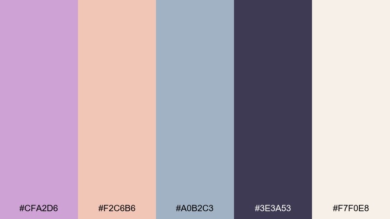
HEX: #CFA2D6 #F2C6B6 #A0B2C3 #3E3A53 #F7F0E8
Mood: moody and modern
Best for: editorial magazine spread
Moody and modern, dusty lilac and blush sit under a twilight navy that feels quiet, confident, and fashion-forward. Use the warm off-white as the page base, then let the navy handle headlines and body text for readability. The muted blue-gray makes a great grid line, caption, or pull-quote tint. Tip: keep imagery desaturated so the palette remains the star of the spread.
Image example of wildflower dusk generated using media.io
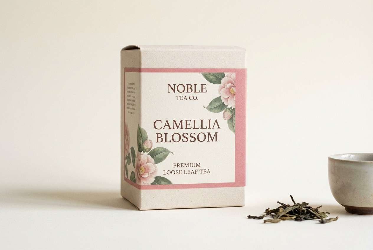
10) Camellia Tea
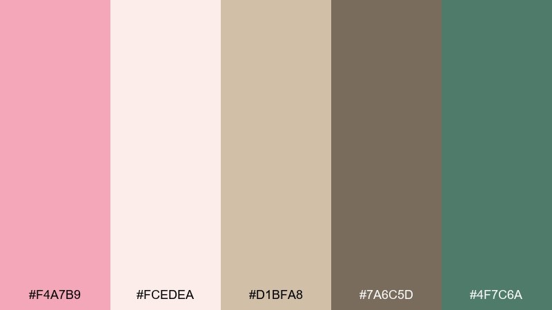
HEX: #F4A7B9 #FCEDEA #D1BFA8 #7A6C5D #4F7C6A
Mood: warm and refined
Best for: tea packaging design
Warm and refined, camellia pink and creamy paper tones evoke a tea house, porcelain cups, and gentle steam. Use the cream for the main label field and the cocoa-brown for text to keep ingredients and origin details clear. The muted green adds a botanical cue that feels authentic, not loud. Tip: try a small pink seal or stamp mark to create a premium focal point on the box.
Image example of camellia tea generated using media.io
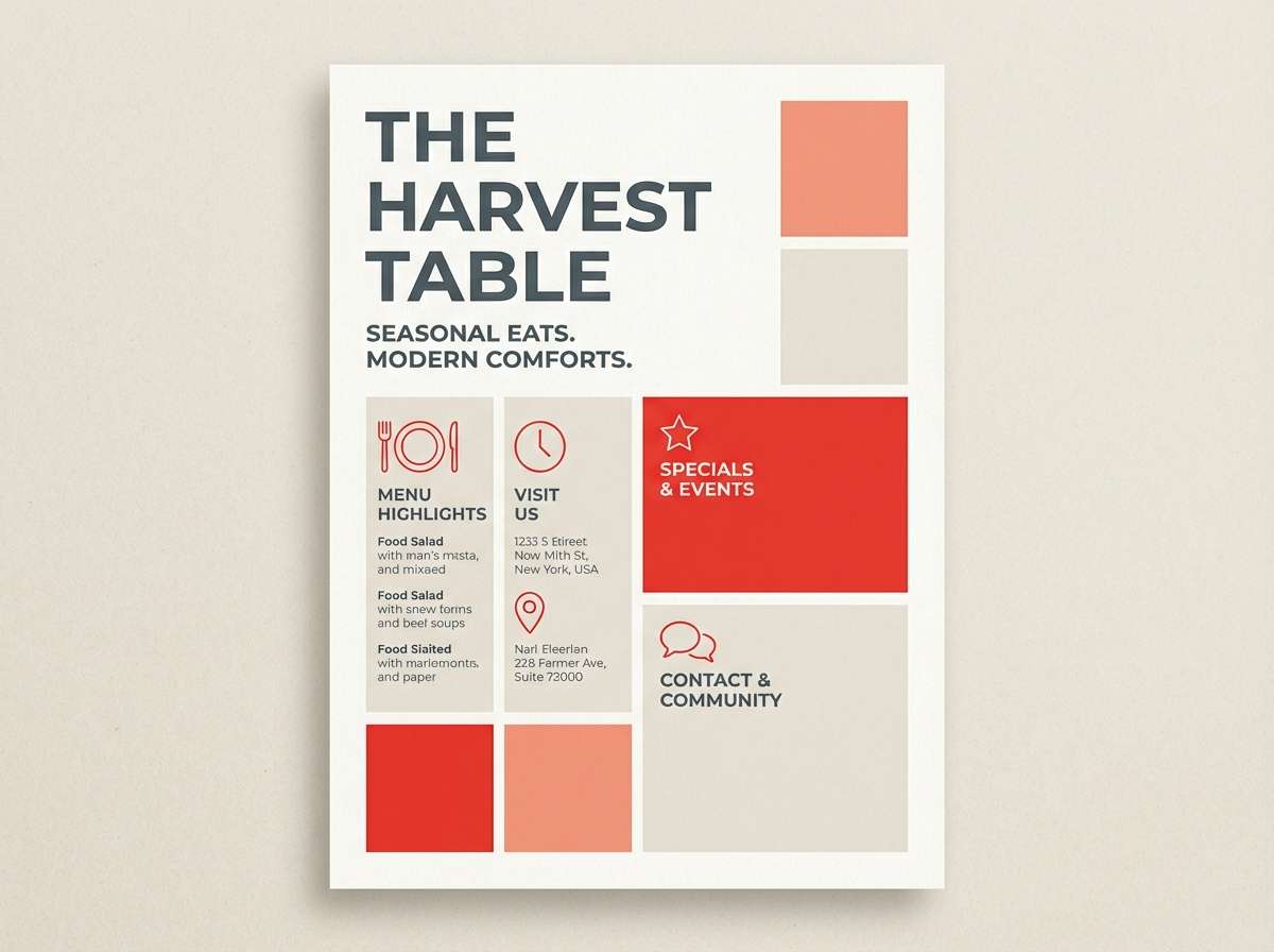
11) Poppy and Linen
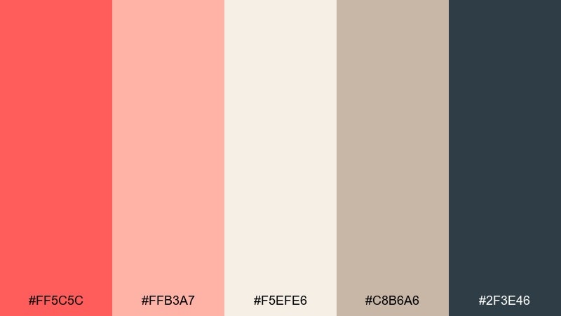
HEX: #FF5C5C #FFB3A7 #F5EFE6 #C8B6A6 #2F3E46
Mood: energetic and clean
Best for: restaurant flyer
Energetic and clean, poppy red brings appetite appeal while linen neutrals keep the layout tasteful. Set the flyer background in warm off-white, then use red for the main offer and hero elements. The deep slate is your workhorse for menus, hours, and small print that must stay readable. Tip: balance red with plenty of spacing so the design feels modern rather than crowded.
Image example of poppy and linen generated using media.io
12) Hydrangea Mist
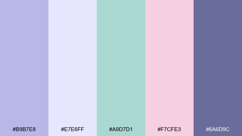
HEX: #B9B7E8 #E7E6FF #A9D7D1 #F7CFE3 #6A6D9C
Mood: soft and serene
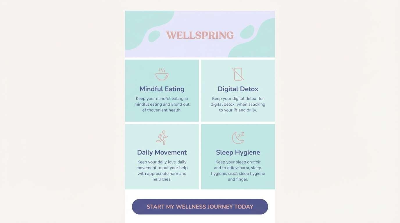
Best for: wellness newsletter template
Soft and serene, hydrangea purples and misty aqua feel like a quiet spa room and clean fresh air. Use the pale lavender as the main email background, then rely on the deeper periwinkle for headings and links. The aqua works nicely for section dividers and icons, while the blush adds gentle emphasis for tips or quotes. Tip: keep buttons in the darker purple so they stand out without shouting.
Image example of hydrangea mist generated using media.io
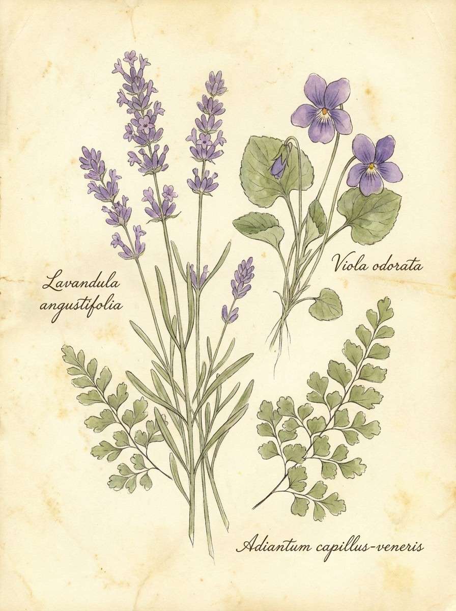
13) Violet Herbarium
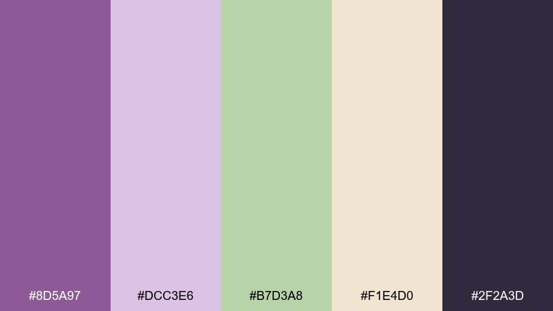
HEX: #8D5A97 #DCC3E6 #B7D3A8 #F1E4D0 #2F2A3D
Mood: vintage and scholarly
Best for: botanical illustration print
Vintage and scholarly, violet ink tones and pressed-leaf greens evoke an old herbarium book and carefully labeled specimens. Use the parchment cream as the paper base, then lean on the deep charcoal for annotation text. The soft purple is perfect for petals and shadows without overpowering the page. Tip: add fine linework in charcoal and keep fills slightly translucent for a true archival feel.
Image example of violet herbarium generated using media.io
14) Sunlit Bouquet
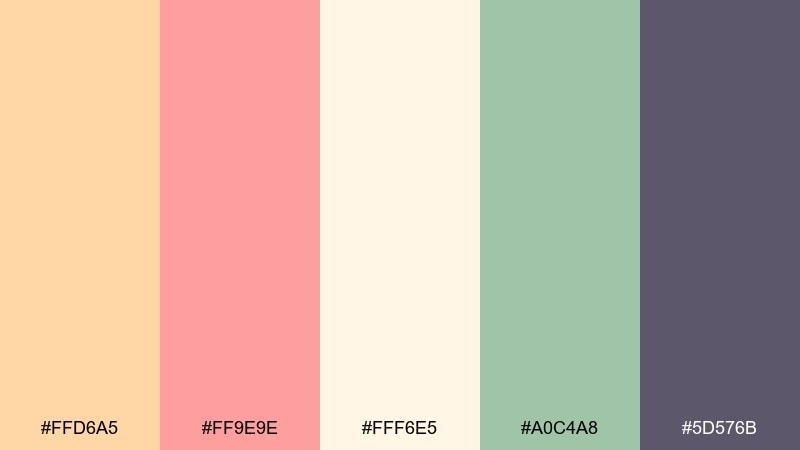
HEX: #FFD6A5 #FF9E9E #FFF6E5 #A0C4A8 #5D576B
Mood: cheerful and inviting
Best for: instagram story promo
Cheerful and inviting, peach and petal pink glow like a sunlit bouquet on a kitchen counter. These tones work especially well for quick social promos where you need friendly energy and clear hierarchy. A floral color combination like this benefits from using the deep mauve for text and the light cream for breathing room. Tip: stick to two dominant blocks (peach and cream) and use green only as a small sticker-style accent.
Image example of sunlit bouquet generated using media.io
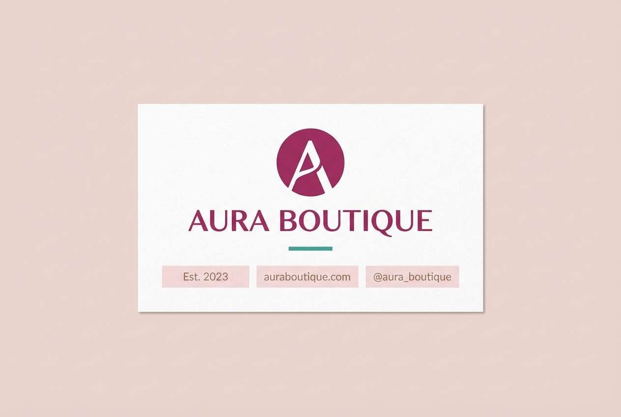
15) Berry Blossom
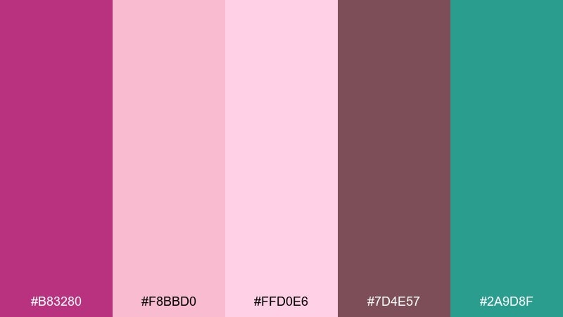
HEX: #B83280 #F8BBD0 #FFD0E6 #7D4E57 #2A9D8F
Mood: bold and romantic
Best for: boutique brand logo and card
Bold and romantic, berry magenta feels like fresh lipstick and deep petals against airy blush. Use the light pinks as your card stock or negative space, then set the logo in magenta for instant recognition. Teal is a surprising accent that modernizes the look and works well for icons or a single line detail. Tip: keep teal to under 10 percent of the design so the berry tone stays in charge.
Image example of berry blossom generated using media.io
16) Magnolia Stone
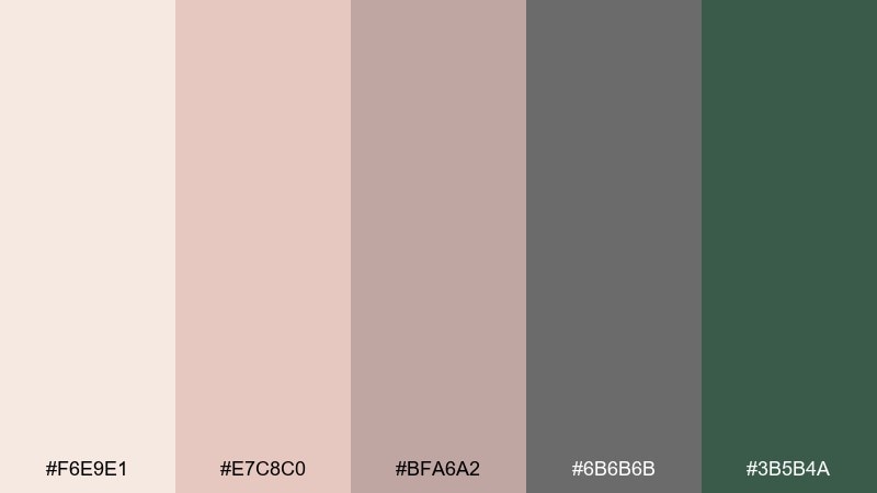
HEX: #F6E9E1 #E7C8C0 #BFA6A2 #6B6B6B #3B5B4A
Mood: minimal and grounded
Best for: interior design moodboard
Minimal and grounded, magnolia blush meets warm stone neutrals for a calm, architectural feel. Use the soft cream as the background of the moodboard and layer blush swatches for warmth without turning overly pink. Charcoal-gray keeps notes readable, while the deep green adds a natural, plant-like anchor. Tip: pair with natural textures like linen, oak, and matte ceramic to keep the palette believable.
Image example of magnolia stone generated using media.io
17) Iris Frost
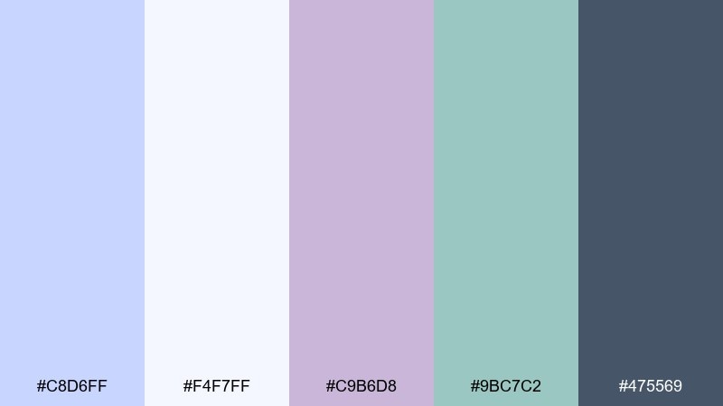
HEX: #C8D6FF #F4F7FF #C9B6D8 #9BC7C2 #475569
Mood: cool and polished
Best for: saas dashboard UI
Cool and polished, frosty iris blues and lilacs feel crisp like glass, morning light, and tidy data tables. Use the near-white as the main canvas, then bring in slate for text, nav, and chart labels. The soft blue and lilac can highlight cards, tags, and selected states without overwhelming the interface. Tip: reserve the aqua for one key action so users always know where to click next.
Image example of iris frost generated using media.io

18) Antique Petals
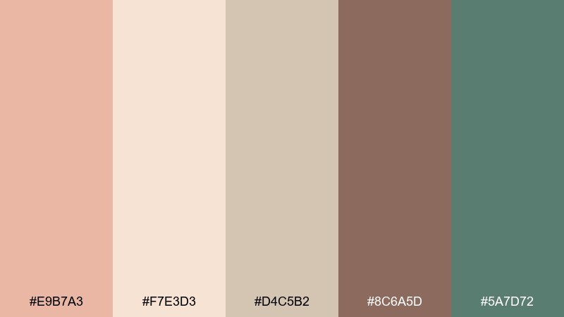
HEX: #E9B7A3 #F7E3D3 #D4C5B2 #8C6A5D #5A7D72
Mood: nostalgic and warm
Best for: rustic wedding signage
Nostalgic and warm, antique peach and parchment feel like dried petals, kraft paper, and candlelight. Use the lightest tone for the sign base, then pick the cocoa-brown for readable directions and seating notes. The muted green is perfect for tiny leaf motifs and border accents. Tip: choose a slightly condensed serif to keep long names elegant and easy to scan.
Image example of antique petals generated using media.io

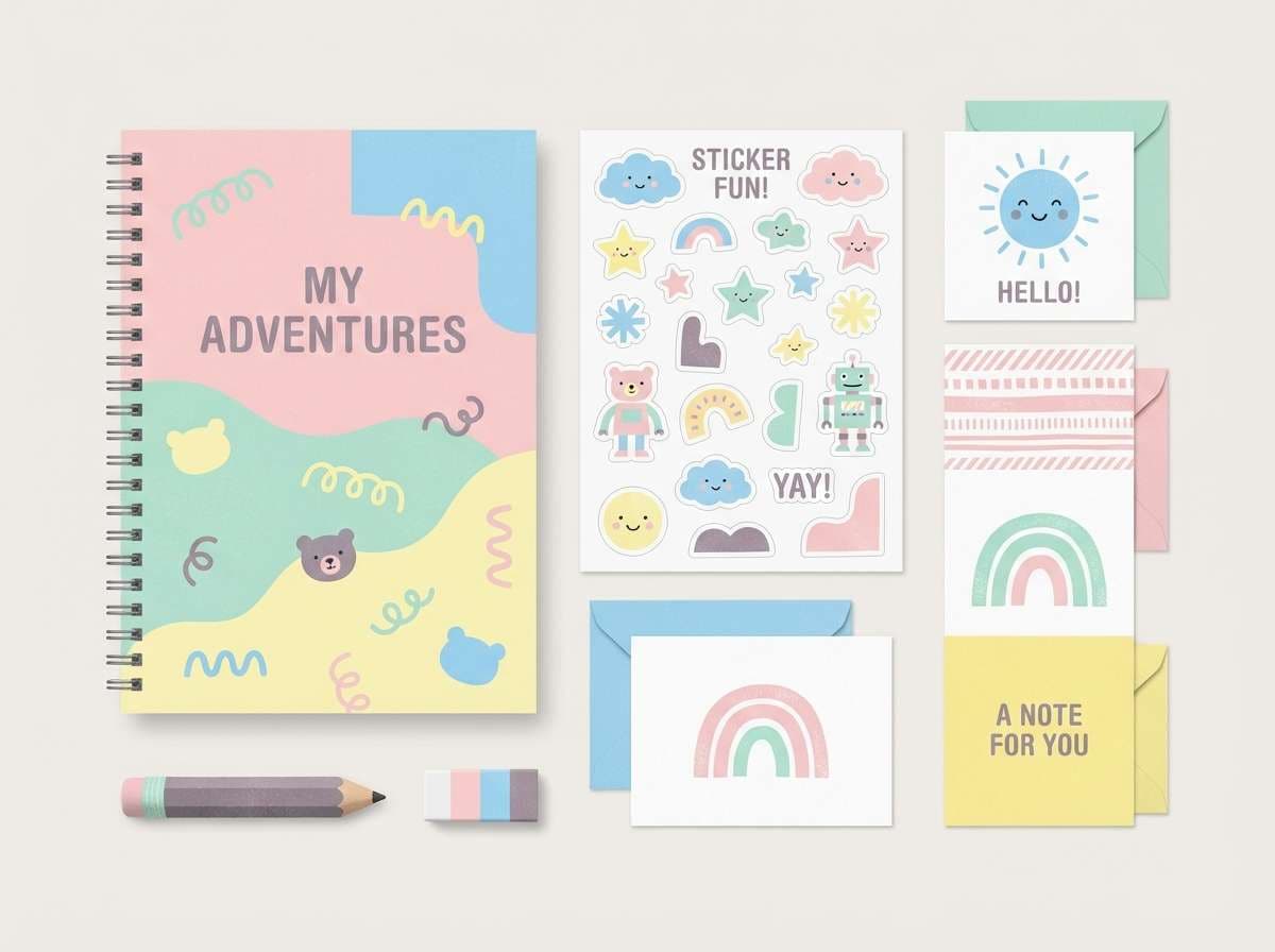
19) Spring Market
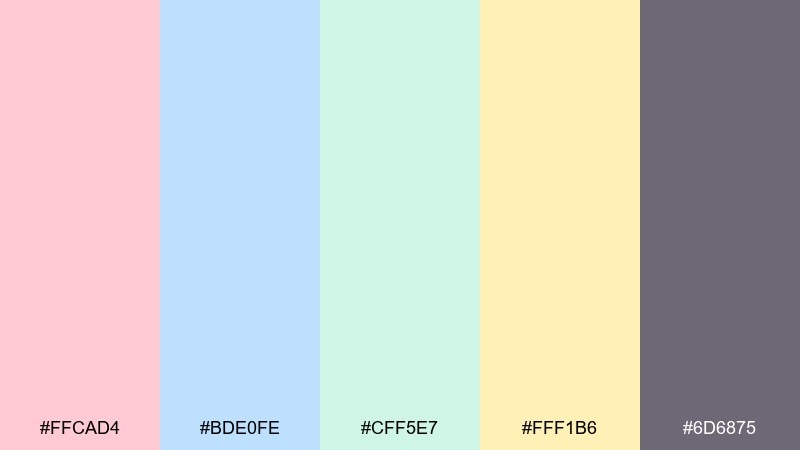
HEX: #FFCAD4 #BDE0FE #CFF5E7 #FFF1B6 #6D6875
Mood: fun and youthful
Best for: kids stationery set
Fun and youthful, candy-soft pink, sky blue, and mint read like stalls at a spring market with bright paper goods. Use the pale yellow as your main page tone to avoid glare, then rotate pink and blue for headers and playful icons. The muted purple-gray helps type stay sharp and stops the set from feeling too sugary. Tip: keep patterns simple (dots, stripes, checks) so the colors do most of the work.
Image example of spring market generated using media.io
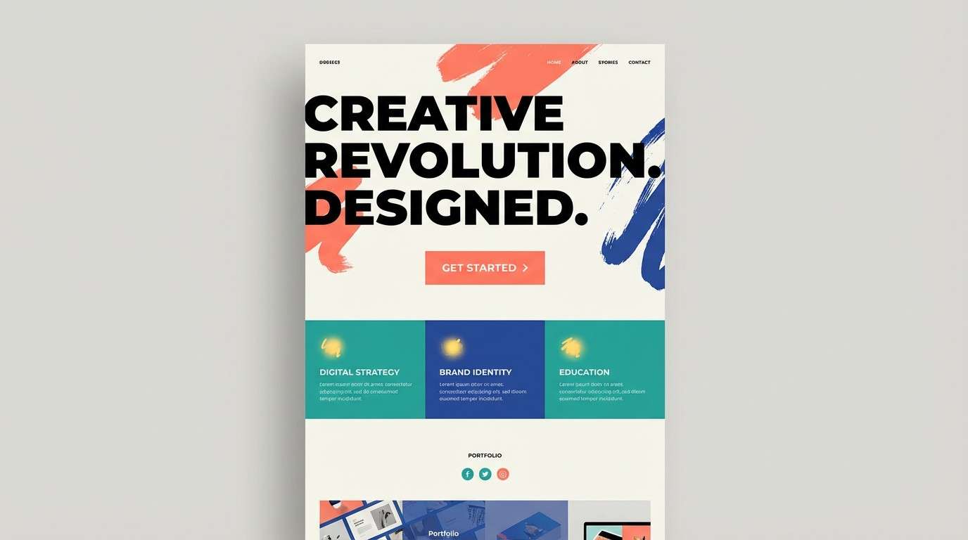
20) Bouquet Contrast
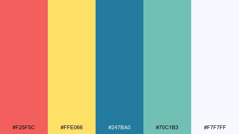
HEX: #F25F5C #FFE066 #247BA0 #70C1B3 #F7F7FF
Mood: bold and contemporary
Best for: creative agency landing page
Bold and contemporary, punchy coral and teal feel like a modern bouquet with graphic edges and confident contrast. Use the off-white as your main page base, then place coral as the hero CTA for instant focus. The blue and aqua work well for sections, badges, and illustrations, while yellow adds quick highlights for stats or icons. Tip: keep the floral color palette balanced by choosing one dominant accent (coral) and letting the cool tones support it.
Image example of bouquet contrast generated using media.io
What Colors Go Well with Floral?
Floral palettes pair best with supportive neutrals: warm ivory, parchment, linen, and soft stone tones help “petal” hues feel intentional rather than loud. These backgrounds also make layouts easier to read.
For contrast, add one deep anchor (navy, charcoal, deep plum, cocoa brown). This keeps headlines, menus, labels, and UI text crisp while still preserving the romantic floral vibe.
To modernize florals, introduce a cool counter-accent like teal, aqua, or slate blue. Even a small amount can make traditional pinks and peaches feel more contemporary.
How to Use a Floral Color Palette in Real Designs
Start by assigning roles: a light base (cream or near-white), a primary floral hue (blush/coral/lilac), and a dark text color (plum/navy/charcoal). This gives you clear hierarchy before adding extra accents.
Keep saturation in check by using big blocks of neutrals and smaller areas of bright “bloom” colors. In print, that often looks like neutral paper + floral header + deep typography; in UI, it’s a near-white canvas with soft-tint cards and one high-contrast button.
When you need pattern, let color do the heavy lifting: simple stripes, dots, line florals, and minimal shapes look premium with floral tones—without competing with your content.
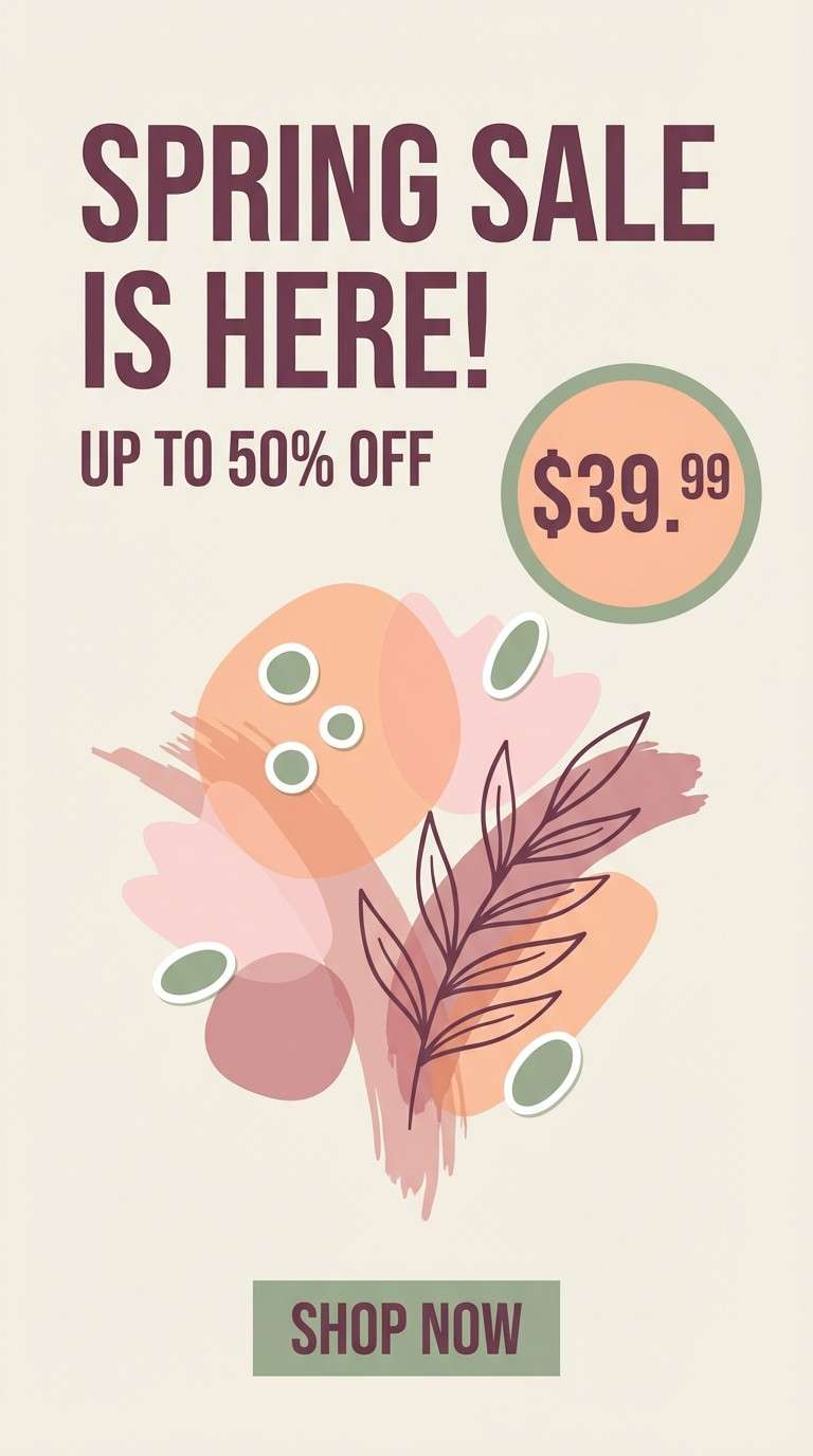
Create Floral Palette Visuals with AI
If you already have HEX codes, you can generate matching mockups (invitations, packaging, posters, UI screens) by describing the layout and letting the palette guide the styling. This is ideal for quick client previews or A/B concepting.
To keep results consistent, repeat a few constraints in every prompt: background type (cream/off-white), lighting (soft diffused), style (minimal, print-ready), and where the accent colors should appear (buttons, seals, badges, dividers).
Use the prompts above as templates, then swap in your brand text, product type, and aspect ratio to create cohesive floral visuals in minutes.
Floral Color Palette FAQs
-
What is a floral color palette?
A floral color palette is a set of colors inspired by flowers and gardens—typically a mix of soft petal tones (pinks, peaches, lilacs), botanical greens, and grounding neutrals (cream, linen, stone) for balance. -
Are floral palettes only for spring designs?
No. Pastel florals lean spring, but deeper combinations (orchid + near-black, berry + plum, antique peach + cocoa) work beautifully for fall/winter branding, luxury beauty, and editorial layouts. -
How do I keep floral colors from looking too “sweet”?
Add a darker anchor (charcoal, navy, deep plum) and increase negative space with warm neutrals. You can also introduce a cool accent like teal to make pinks feel more modern. -
What’s the best text color for floral backgrounds?
For readability, use deep slate, charcoal, cocoa brown, or deep plum. Save lighter florals for backgrounds, borders, and large decorative shapes rather than body text. -
How many colors should a floral palette have?
Five is a practical sweet spot: one light base, one primary floral, one secondary floral, one botanical accent, and one dark contrast color for type and key UI elements. -
Can I use a floral palette for a modern brand?
Yes—choose cleaner neutrals, reduce gradients, and limit accents. Palettes like Bouquet Contrast, Magnolia Stone, and Iris Frost are especially suited to modern landing pages and UI. -
How can I generate floral palette mockups quickly?
Use an AI image generator and describe the design type (packaging, invitation, UI), background, typography style, and where each palette color should appear. Reusing a consistent prompt structure helps keep variations cohesive.
Next: New Year Color Palette


