

Black, blue, and green is a modern trio that can feel calm, technical, or cinematic—depending on how much contrast and saturation you use.
Below are curated black blue green color palette ideas with HEX codes, practical use cases, and copy-paste prompts to generate matching visuals fast.
In this article
Why Black Blue Green Palettes Work So Well
Black anchors the scheme with structure and contrast, while blue adds reliability and clarity—making the combination feel immediately “designed,” not accidental.
Green brings balance and a sense of life, which softens the coolness of blue and keeps dark layouts from feeling too harsh or corporate.
Together, they create a flexible range: from sleek dark-mode UI to coastal editorial looks, with accent greens and teals guiding attention to what matters.
20+ Black Blue Green Color Palette Ideas (with HEX Codes)
1) Midnight Reef
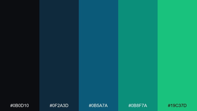
HEX: #0b0d10 #0f2a3d #0b5a7a #0b8f7a #19c37d
Mood: moody, sleek, aquatic
Best for: tech branding, website hero sections
Moody and aquatic, these tones feel like deep water lit by a clean LED glow. They shine on modern landing pages, SaaS branding, and dark-mode headers where contrast matters. Pair with crisp white type and thin line icons to keep it sharp. Usage tip: reserve the bright green as a micro-accent for CTAs and active states.
Image example of midnight reef generated using media.io

Media.io is an online AI studio for creating and editing video, image, and audio in your browser.

2) Urban Kelp
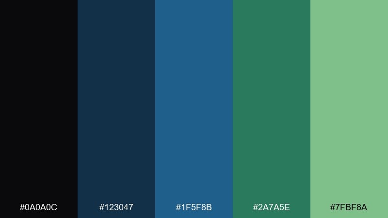
HEX: #0a0a0c #123047 #1f5f8b #2a7a5e #7fbf8a
Mood: grounded, urban, natural
Best for: interior moodboards, architecture presentations
Grounded and urban, this mix evokes wet stone, steel shadows, and seaweed greens after rain. It works well in interior moodboards, architectural decks, and materials palettes where you want calm sophistication. Pair with warm oak textures or concrete grays for a believable, livable look. Usage tip: keep the soft green for large fills and let the blue do the outlining and labels.
Image example of urban kelp generated using media.io
3) Neon Tide
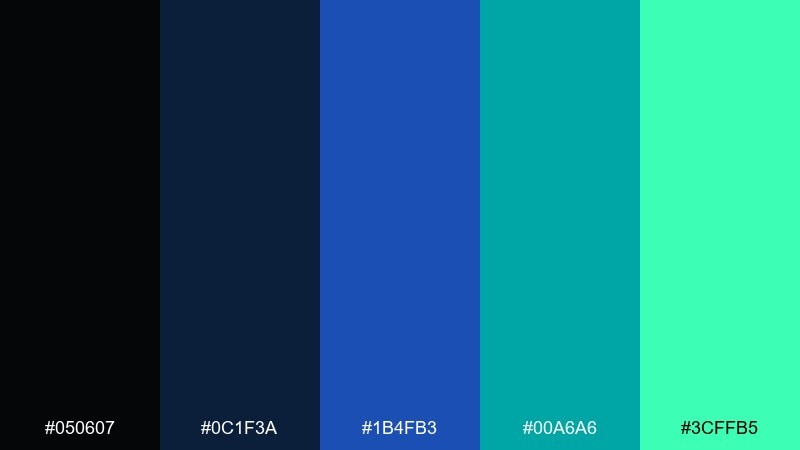
HEX: #050607 #0c1f3a #1b4fb3 #00a6a6 #3cffb5
Mood: energetic, futuristic, electric
Best for: sportswear ads, nightlife posters
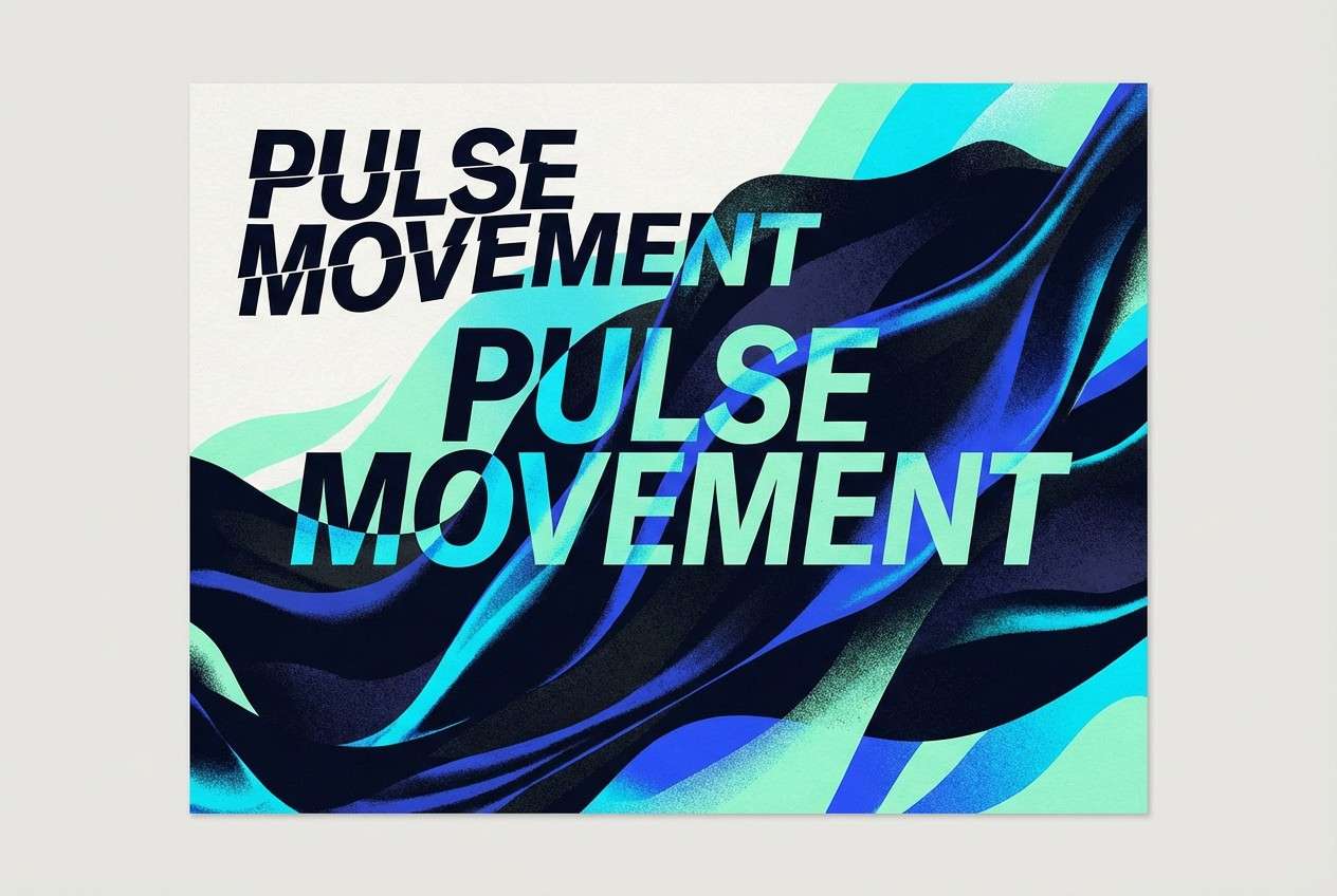
Electric and futuristic, the colors hit like city lights reflecting off moving water. These black blue green color combinations are ideal for sportswear ads, nightlife posters, and bold social graphics. Keep backgrounds dark so the cyan and mint pop without turning neon-chaotic. Usage tip: use the vivid blue for the headline, and the mint for highlights and motion cues.
Image example of neon tide generated using media.io
4) Deep Forest Ink
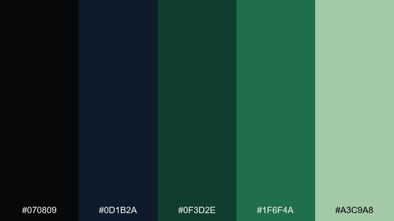
HEX: #070809 #0d1b2a #0f3d2e #1f6f4a #a3c9a8
Mood: quiet, earthy, bookish
Best for: book covers, eco reports
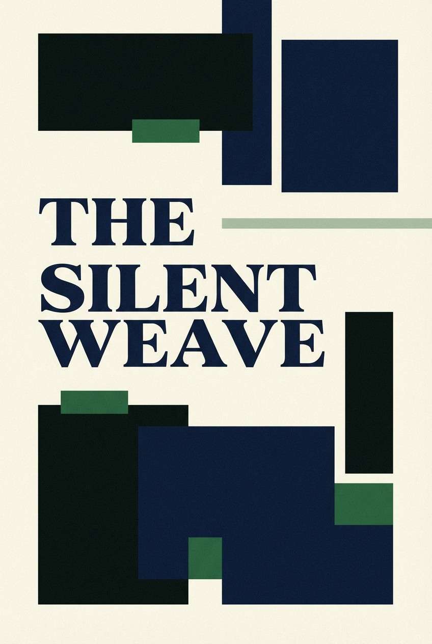
Quiet and bookish, these tones feel like ink on rough paper with a forest shadow behind it. They suit book covers, eco reports, and documentary branding where you want credibility over flash. Pair with serif headlines and off-white paper textures for a tactile finish. Usage tip: set long text in the deep navy instead of pure black to reduce glare.
Image example of deep forest ink generated using media.io
5) Arctic Circuit
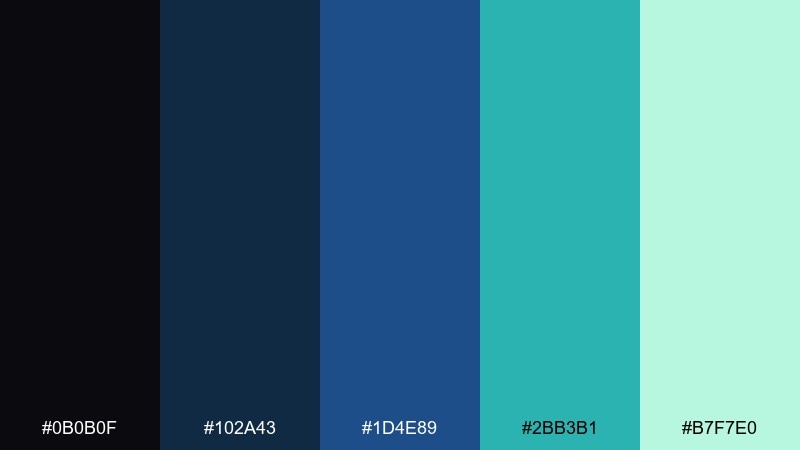
HEX: #0b0b0f #102a43 #1d4e89 #2bb3b1 #b7f7e0
Mood: clean, icy, technical
Best for: analytics dashboards, B2B SaaS UI
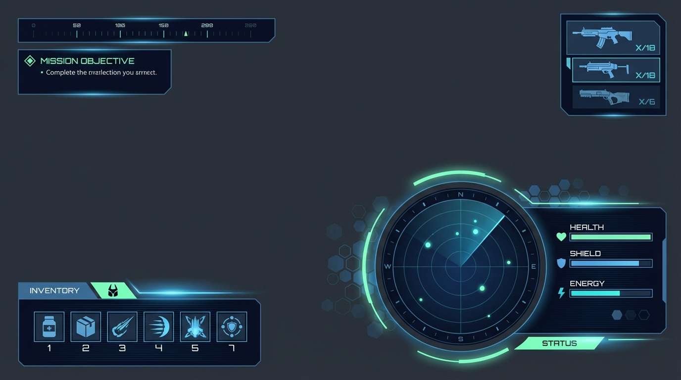
Clean and technical, the palette reads like cold air, glass, and precise circuitry. It performs especially well in analytics dashboards and B2B SaaS UI where clarity and hierarchy are crucial. Pair with light neutrals and subtle dividers to keep the layout breathable. Usage tip: use the icy mint only for success states and key data points to avoid visual noise.
Image example of arctic circuit generated using media.io
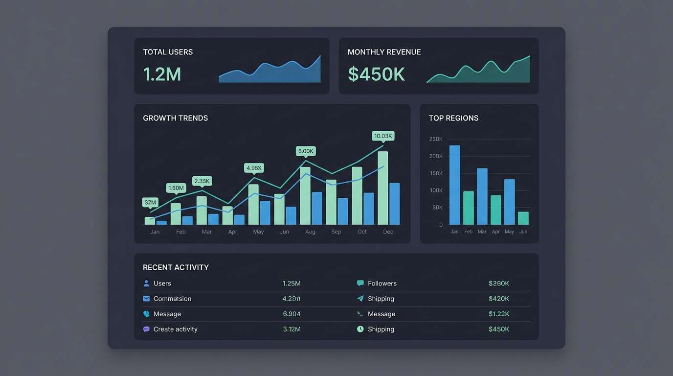
6) Museum Night
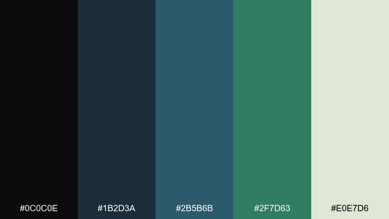
HEX: #0c0c0e #1b2d3a #2b5b6b #2f7d63 #e0e7d6
Mood: refined, quiet, gallery-like
Best for: editorial layouts, cultural event programs
Refined and quiet, these shades feel like a museum after hours with soft spotlights on glass. They fit editorial layouts, cultural programs, and premium brochures that need calm authority. Pair with generous margins and a warm off-white background for an upscale look. Usage tip: let the muted teal carry section headers while the cream supports readability.
Image example of museum night generated using media.io
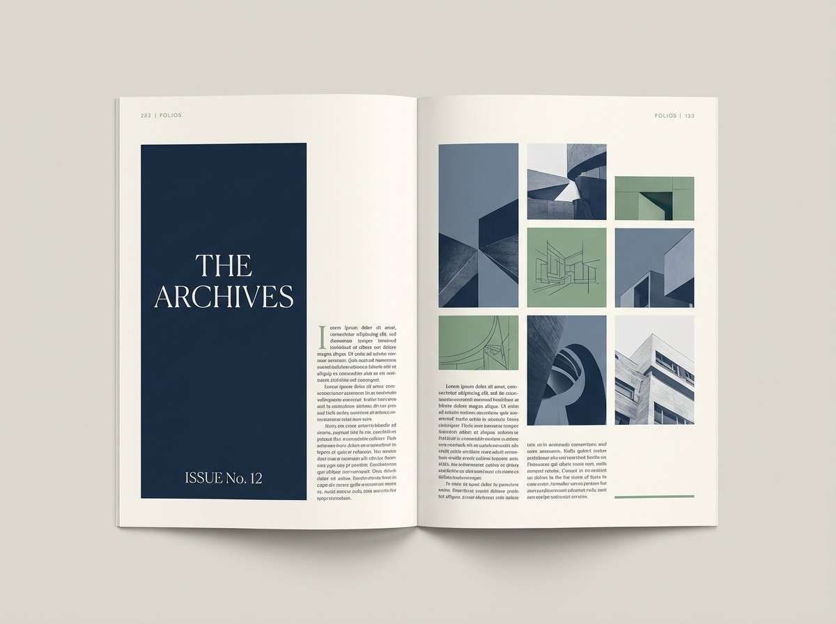
7) Rainy Harbor
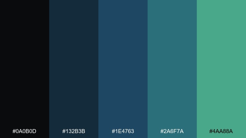
HEX: #0a0b0d #132b3b #1e4763 #2a6f7a #4aa88a
Mood: cool, coastal, understated
Best for: cafe menus, travel brochures
Cool and coastal, it suggests wet docks, overcast skies, and calm water lines. Use it for cafe menus, travel brochures, and brand systems that need a relaxed but polished vibe. Pair with simple sans-serif type and a touch of texture to keep it from feeling too corporate. Usage tip: set the darkest tone as the background and brighten the design with teal icons and separators.
Image example of rainy harbor generated using media.io
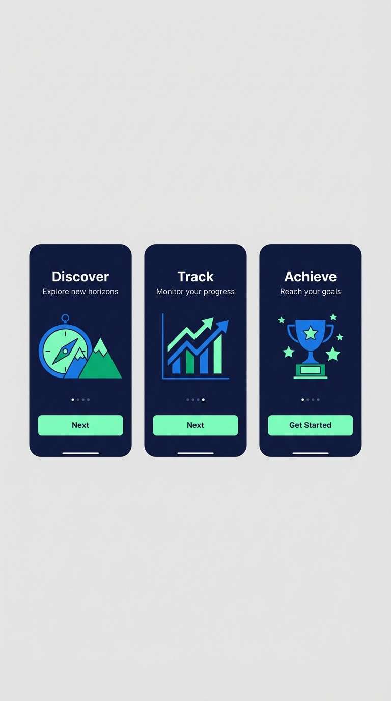
8) Emerald Blueprint
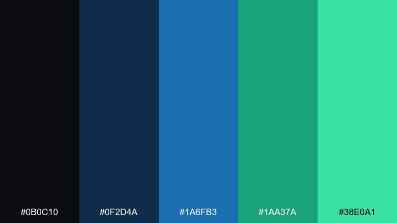
HEX: #0b0c10 #0f2d4a #1a6fb3 #1aa37a #38e0a1
Mood: confident, crisp, modern
Best for: startup branding, app onboarding
Confident and crisp, it feels like a blueprint sketched in bright ink with a fresh emerald twist. This black blue green color palette works for startup branding and onboarding flows where you want energy without losing trust. Pair with geometric shapes and a restrained icon set to keep the look intentional. Usage tip: use the bright green as a progress indicator and save the bold blue for key screens.
Image example of emerald blueprint generated using media.io
9) Dark Lagoon
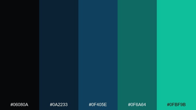
HEX: #06080a #0a2233 #0f405e #0f6a64 #0fbf9b
Mood: mysterious, calm, aquatic
Best for: podcast covers, cinematic thumbnails
Mysterious and calm, these colors evoke a lagoon at night with a hint of bioluminescence. They suit podcast covers, cinematic thumbnails, and moody channel branding. Pair with high-contrast type and subtle gradients to create depth without clutter. Usage tip: keep the brightest teal for a single focal element like a title underline or badge.
Image example of dark lagoon generated using media.io
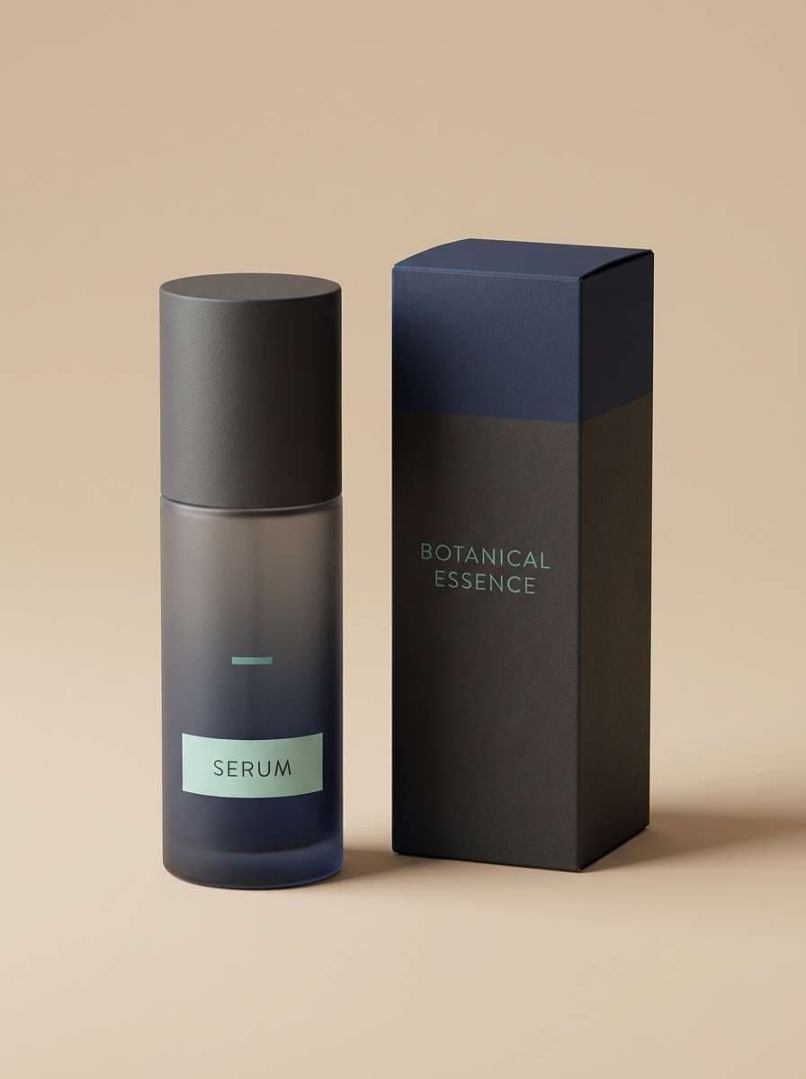
10) Mint on Charcoal
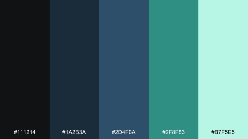
HEX: #111214 #1a2b3a #2d4f6a #2f8f83 #b7f5e5
Mood: fresh, balanced, minimal
Best for: skincare packaging, wellness brands
Fresh and balanced, it feels like cool mint against charcoal stone. Use it for skincare packaging, wellness branding, and clean e-commerce visuals where trust and calm are priorities. Pair with plenty of negative space and matte materials to keep the palette feeling premium. Usage tip: print the mint as a soft tint on labels and reserve the deep tones for typography.
Image example of mint on charcoal generated using media.io
11) Coastal Cyber
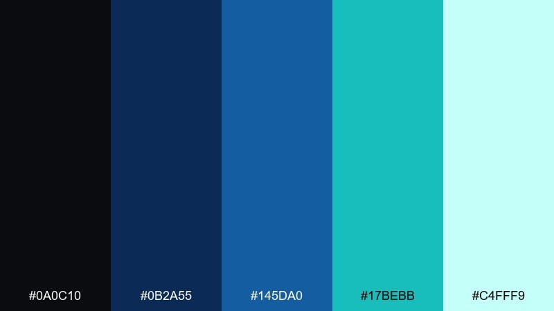
HEX: #0a0c10 #0b2a55 #145da0 #17bebb #c4fff9
Mood: bright, digital, breezy
Best for: developer tools, landing pages
Bright and digital, it mixes ocean clarity with a cyber edge. It fits developer tools, docs sites, and landing pages that need strong affordances and friendly contrast. Pair with a neutral background and thin outlines so the cyan stays readable. Usage tip: use the light aqua as a hover fill and keep the darker blues for navigation.
Image example of coastal cyber generated using media.io
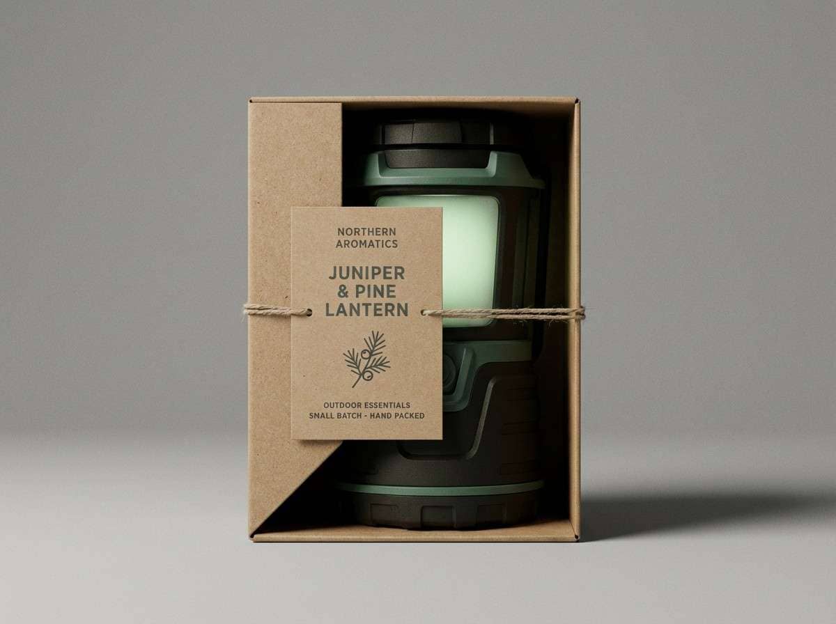
12) Juniper Shadow
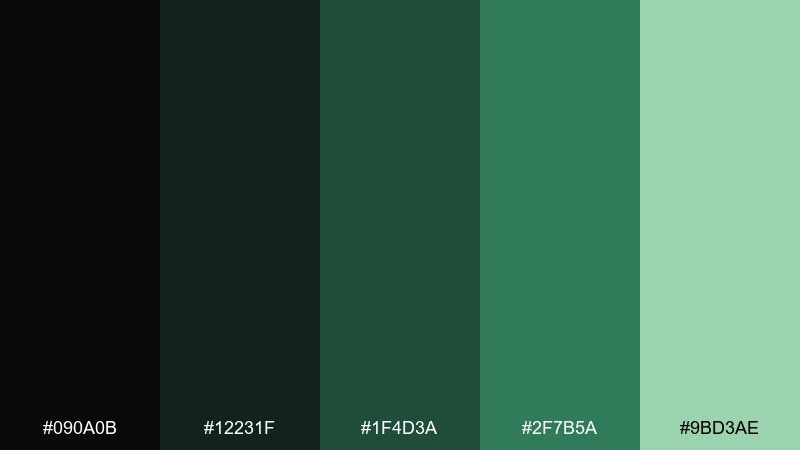
HEX: #090a0b #12231f #1f4d3a #2f7b5a #9bd3ae
Mood: organic, moody, woodland
Best for: outdoor brands, nature packaging
Organic and moody, it brings to mind juniper branches in deep shade. These tones work beautifully for outdoor brands, nature packaging, and conservation messaging. Pair with kraft paper textures and simple stamp-like icons for authenticity. Usage tip: keep the pale green as a small highlight to avoid washing out the rugged feel.
Image example of juniper shadow generated using media.io
13) Oceanic Minimal
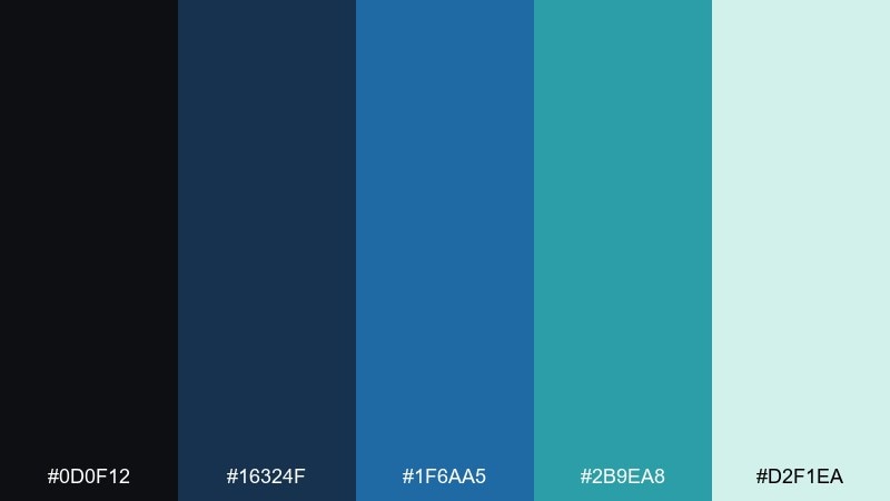
HEX: #0d0f12 #16324f #1f6aa5 #2b9ea8 #d2f1ea
Mood: minimal, airy, coastal
Best for: presentation templates, product pages
Minimal and airy, the palette feels like open water and clean typography. It suits slide templates, product pages, and portfolios where you want calm structure with a hint of color. Pair with light backgrounds and a strict grid to keep everything feeling modern. Usage tip: use the soft aqua for large panels and the blue for links and key numbers.
Image example of oceanic minimal generated using media.io
14) Pine and Petrol
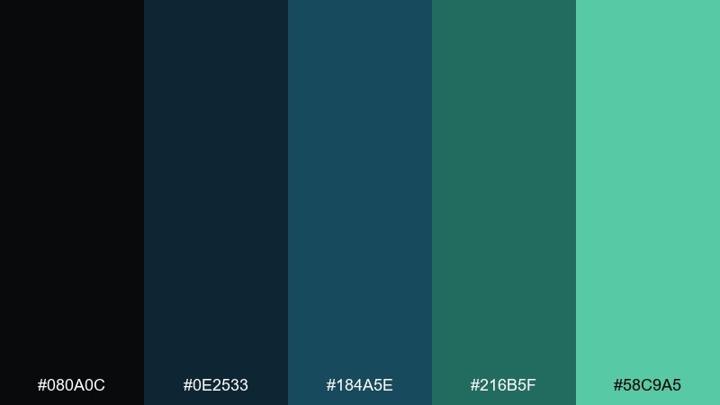
HEX: #080a0c #0e2533 #184a5e #216b5f #58c9a5
Mood: adventurous, steady, cool
Best for: travel posters, boutique hotel branding
Adventurous and steady, it reads like pine needles against petrol-blue water. Use it for travel posters, boutique hotel branding, and signage that needs to feel calm but confident. Pair with condensed typography and subtle topographic line art for a sense of place. Usage tip: let the mint-green act as a wayfinding accent for arrows and location pins.
Image example of pine and petrol generated using media.io
15) Glacier Botanica
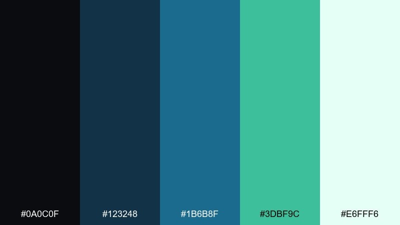
HEX: #0a0c0f #123248 #1b6b8f #3dbf9c #e6fff6
Mood: fresh, botanical, light
Best for: watercolor illustrations, spring campaigns
Fresh and botanical, it feels like glacier water feeding bright new leaves. These colors are great for spring campaigns, eco blog headers, and gentle illustration work. Pair with watercolor textures and airy spacing so the palette stays soft. Usage tip: keep the near-black only for small details like outlines and tiny type.
Image example of glacier botanica generated using media.io
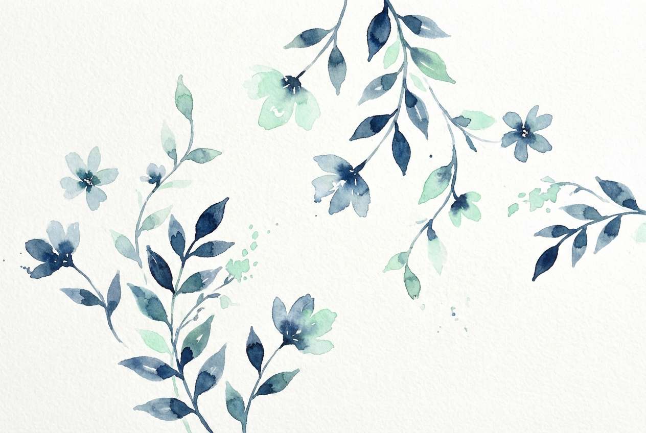
16) Stormglass
HEX: #0b0c10 #152238 #2a4b7c #2a7f6d #8ee6cf
Mood: stormy, elegant, modern
Best for: fintech dashboards, data-heavy UI
Stormy and elegant, it resembles dark glass with a clean teal refraction. This black blue green color palette is a strong fit for fintech dashboards and data-heavy UI where trust and precision matter. Pair with subtle shadows and rounded cards to soften the seriousness. Usage tip: apply the pale mint to confirmation states and keep the deeper blues for charts and navigation.
Image example of stormglass generated using media.io
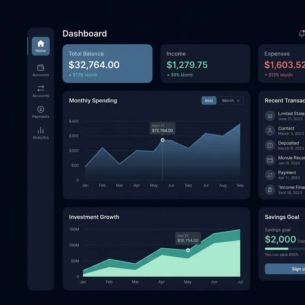
17) Night Market
HEX: #0b0a0c #1a2433 #223a6b #1b7f8a #44d9b6
Mood: lively, nocturnal, bold
Best for: food posters, street event flyers
Lively and nocturnal, it captures the buzz of a night market under cool lamps. Use it for food posters, street event flyers, and punchy social stories that need instant contrast. Pair with bold type, simple shapes, and a limited set of icons for speed and clarity. Usage tip: let teal dominate the graphics while the darkest shades anchor the text blocks.
Image example of night market generated using media.io
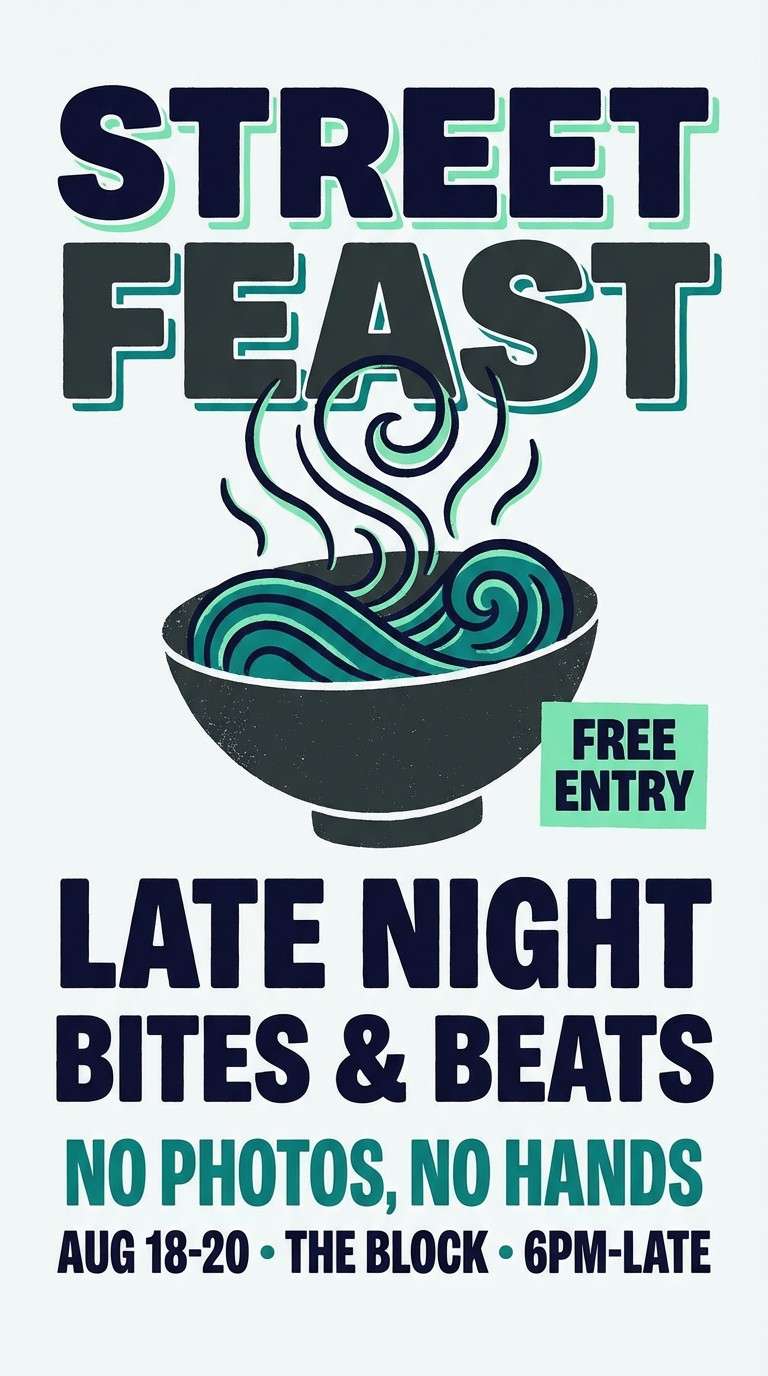
18) Sage in the City
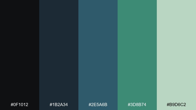
HEX: #0f1012 #1b2a34 #2e5a6b #3d8b74 #b9d6c2
Mood: calm, metropolitan, soft
Best for: corporate reports, lifestyle blogs
Calm and metropolitan, it feels like a quiet park tucked between glass buildings. It fits corporate reports, lifestyle blogs, and service brands that want a softened, approachable look. Pair with light gray backgrounds and clean photography to keep it contemporary. Usage tip: use sage as a large section color and keep the darkest tone for headings only.
Image example of sage in the city generated using media.io
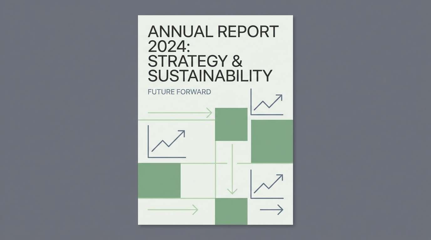
19) Aurora Terminal
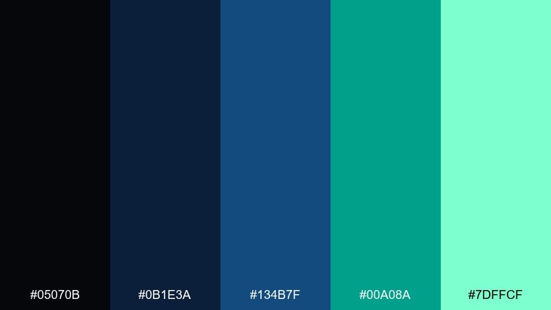
HEX: #05070b #0b1e3a #134b7f #00a08a #7dffcf
Mood: sci-fi, luminous, high-contrast
Best for: game UI, streaming overlays
Sci-fi and luminous, it looks like an aurora cutting through a dark terminal screen. It is great for game UI, streaming overlays, and esports graphics that need energy and legibility. Pair with monospaced type and sharp grid lines to lean into the tech feel. Usage tip: keep the bright mint for status indicators and avoid using it for long text.
Image example of aurora terminal generated using media.io
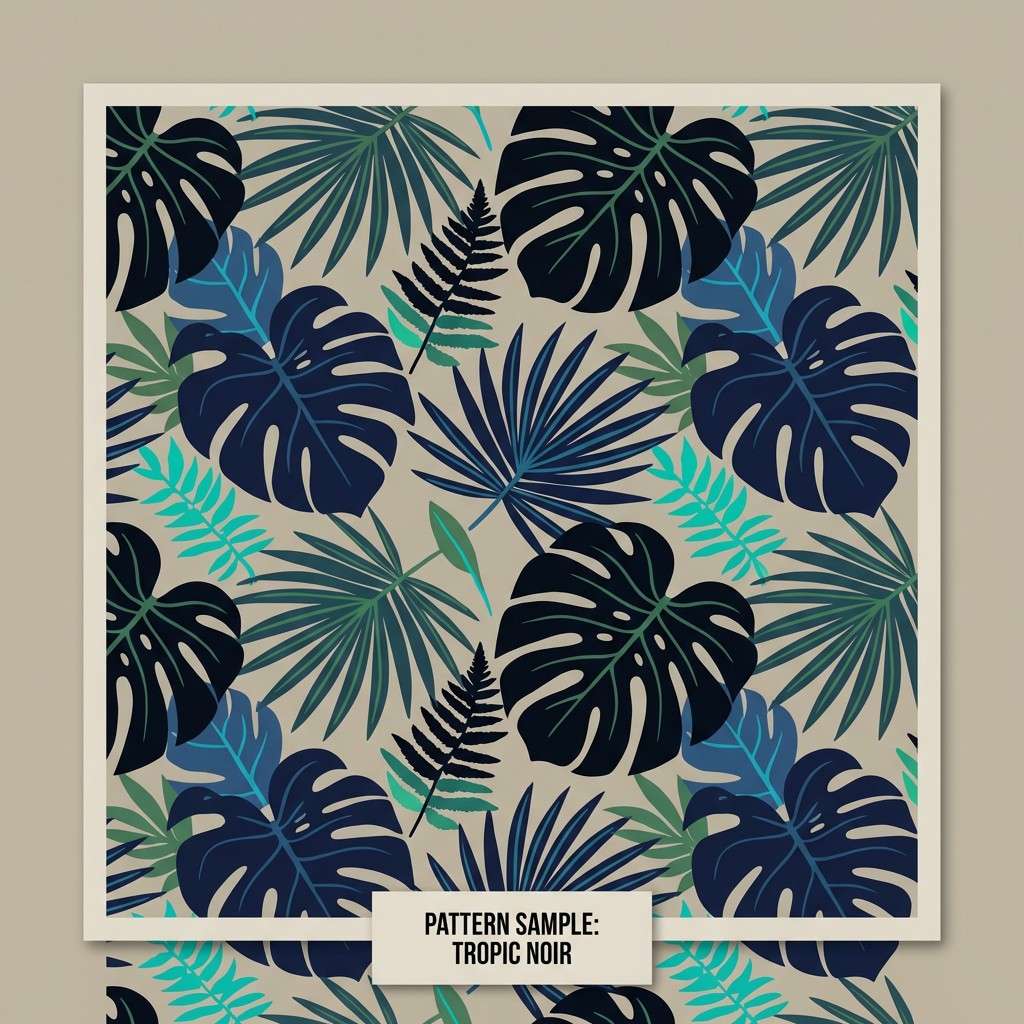
20) Velvet Mangrove
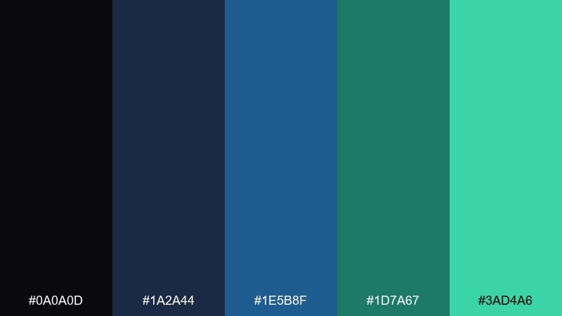
HEX: #0a0a0d #1a2a44 #1e5b8f #1d7a67 #3ad4a6
Mood: luxurious, tropical, dramatic
Best for: textile patterns, premium packaging
Luxurious and tropical, it evokes velvet shadows and mangrove greens at dusk. For premium packaging or pattern work, these tones offer drama without losing sophistication. Pair with gold-foil accents sparingly and let the deep navy do the heavy lifting. Usage tip: test small swatches in print, since the near-black and navy can merge under low lighting.
Image example of velvet mangrove generated using media.io
What Colors Go Well with Black Blue Green?
Warm neutrals (ivory, sand, warm gray) are the easiest match—they keep the palette readable and add a premium editorial feel without competing with teal accents.
For contrast, try small hits of coral, amber, or copper. Warm accents create instant hierarchy against navy/teal while still looking modern and intentional.
If you want an extra-clean digital vibe, pair with cool whites and pale mints; just keep the lightest tones for backgrounds, hover states, and success feedback.
How to Use a Black Blue Green Color Palette in Real Designs
Start with roles: use near-black for backgrounds or main typography, deep navy for surfaces and navigation, and teal/green for interactive states like links, toggles, and CTAs.
Control saturation to avoid “neon overload.” In dark UI, one bright mint or teal is often enough—repeat it consistently for buttons, focus rings, and key data points.
For print and branding, test dark swatches in different lighting. Near-black and navy can merge, so add spacing, outlines, or a lighter support tone to keep details crisp.
Create Black Blue Green Palette Visuals with AI
If you already have HEX codes but need matching imagery, generate on-brand mockups using a single prompt and consistent aspect ratio.
Use the prompts under each palette as a starting point, then swap the subject (dashboard, poster, packaging) to fit your project while keeping the same color language.
To move faster, create a few variations and pick the one with the best contrast and focal point for your design.
Black Blue Green Color Palette FAQs
-
What does a black blue green color palette communicate?
It typically signals trust and clarity (blue), growth and balance (green), and sophistication/contrast (black). Together, it can feel modern, calm, and tech-forward. -
Is black blue green good for website design?
Yes—especially for dark-mode interfaces, SaaS sites, and dashboards. Use black/near-black for structure, navy for surfaces, and teal/green for interactive accents to keep hierarchy clear. -
How do I keep a dark teal/navy palette from looking too harsh?
Add a warm off-white or soft mint as a background/support color, reduce pure black usage, and rely on spacing and subtle dividers rather than heavy outlines. -
What accent colors pair well with black, blue, and green?
Coral, amber, copper, and soft beige work well as warm accents. For a cooler look, use icy mint or very light aqua—but keep accents limited for readability. -
Which palette is best for dashboards and data-heavy UI?
Try Arctic Circuit or Stormglass. Both include a restrained mint highlight that works well for success states and key metrics without adding visual noise. -
How can I generate matching visuals for a palette quickly?
Use Media.io Text-to-Image with a prompt that specifies the design type (e.g., dashboard, poster, packaging), a clean background, and the palette mood (navy/teal/mint with high contrast). -
Do these HEX codes work for print too?
They’re a great starting point, but convert to CMYK and run a proof. Deep near-blacks and navies can look similar in print, so test small swatches and adjust contrast if needed.


