

Ferrari red is built for impact: it reads fast, feels premium, and instantly creates hierarchy in layouts. When you pair it with the right neutrals or a cool counter-accent, it stays modern instead of overwhelming.
Below are 20+ ferrari red color palette combinations with HEX codes, plus practical tips for branding, UI, and content design.
In this article
- Why Ferrari Red Palettes Work So Well
-
- pit lane classic
- rosso corsa sunset
- carbon fiber luxe
- cherry espresso
- racing stripe cool
- aperitivo pastels
- museum minimal
- matte red clay
- neon circuit
- autumn leather
- valentine modern
- sportswear pop
- botanical contrast
- concrete and crimson
- warm metals
- showroom gloss
- retro diner dash
- night drive purples
- city popup sale
- monochrome editorial punch
- kids arcade heat
- What Colors Go Well with Ferrari Red?
- How to Use a Ferrari Red Color Palette in Real Designs
- Create Ferrari Red Palette Visuals with AI
Why Ferrari Red Palettes Work So Well
Ferrari red is a high-energy hue with strong visibility, so it naturally pulls attention to the most important element on the page—CTAs, labels, prices, and key navigation states.
Because it’s saturated and warm, it pairs especially well with deep darks (black, charcoal, navy) for a premium feel, or with clean whites and soft grays for a sharp editorial look.
The trick is restraint: keep ferrari red as the “signal” color and let supporting neutrals carry spacing, typography, and long-form reading comfort.
20+ Ferrari Red Color Palette Ideas (with HEX Codes)
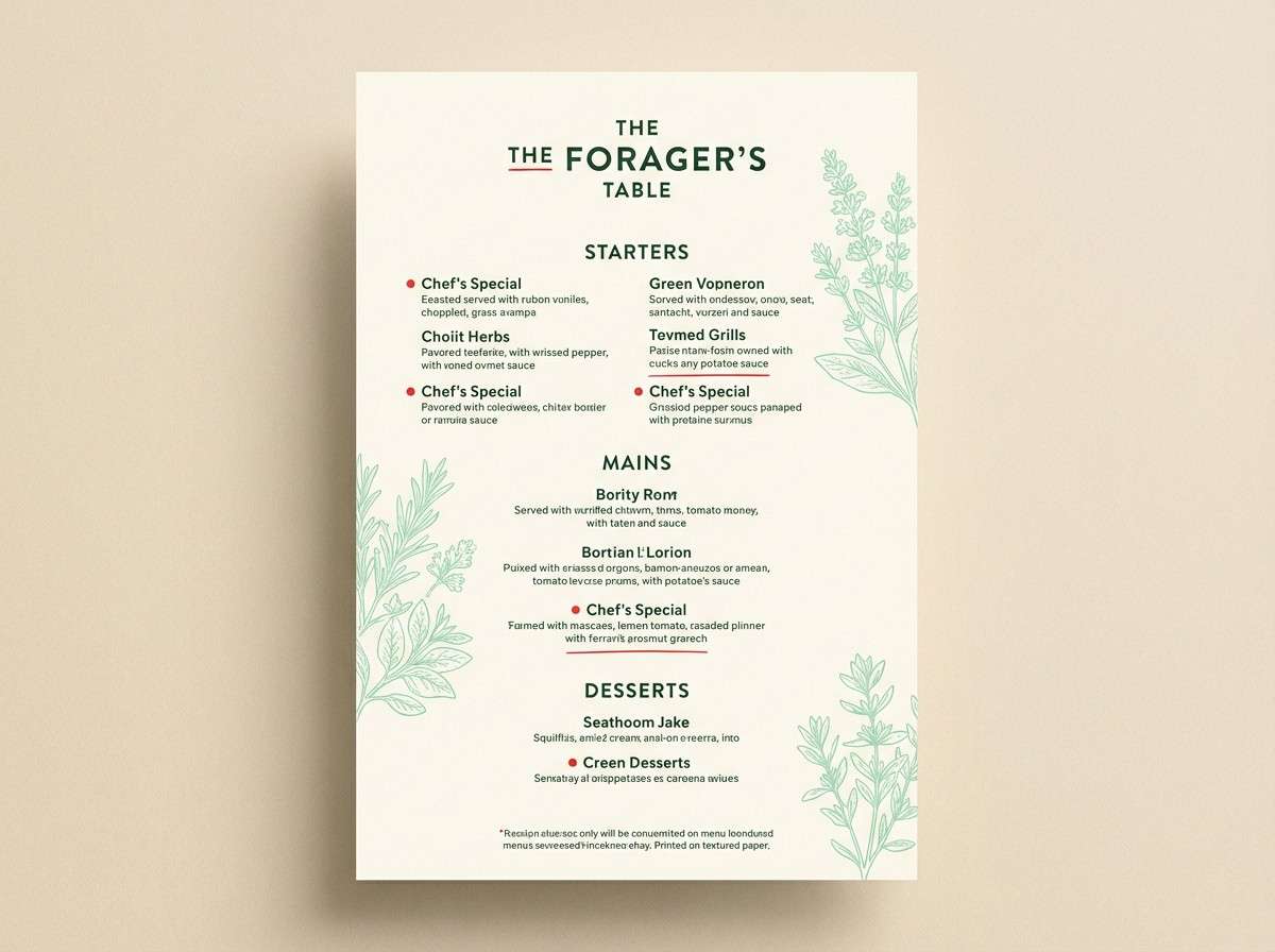
1) Pit Lane Classic
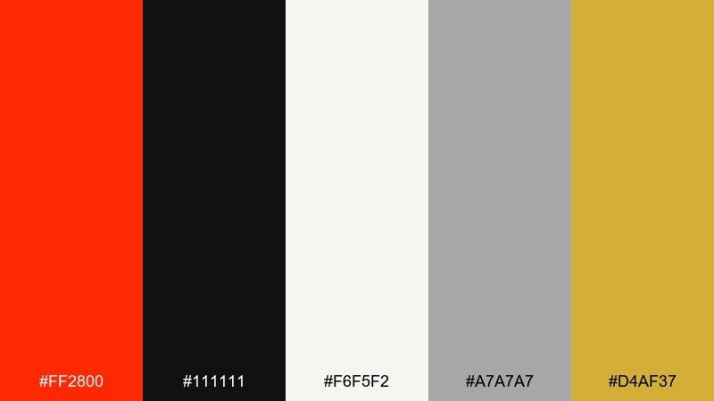
HEX: #FF2800 #111111 #F6F5F2 #A7A7A7 #D4AF37
Mood: bold, premium, high-contrast
Best for: luxury branding and product packaging
Bold and premium like a glossy car hood under pit lights, this mix balances heat with clean neutrals. Use the red as the hero, then let black and off-white carry typography and spacing. Gold works best as a small accent for logos, seals, or trim lines. Keep gradients minimal so the contrast feels sharp and modern.
Image example of pit lane classic generated using media.io
Media.io is an online AI studio for creating and editing video, image, and audio in your browser.

2) Rosso Corsa Sunset
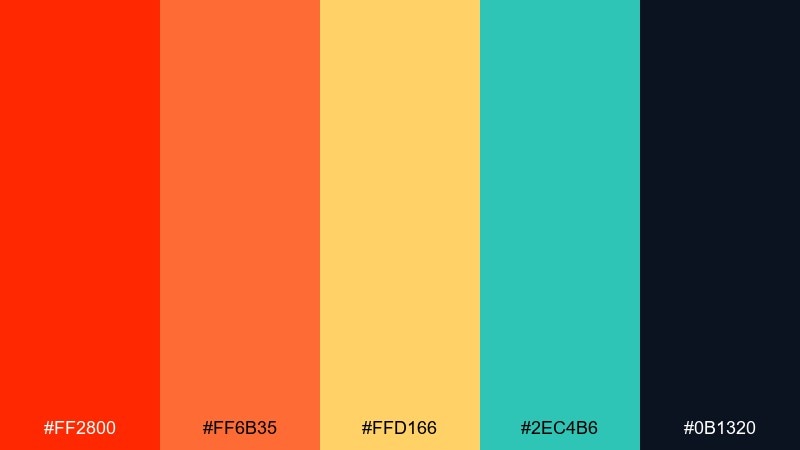
HEX: #FF2800 #FF6B35 #FFD166 #2EC4B6 #0B1320
Mood: energetic, summery, playful
Best for: event posters and social ads
Energetic and sunlit, it feels like a late-afternoon drive with warm reflections on paint. Pair the two oranges for large shapes and headings, and use the dark navy for legible copy. Teal is a punchy counterpoint for buttons, dates, or small callouts. Limit the yellow to highlights so the design stays crisp rather than noisy.
Image example of rosso corsa sunset generated using media.io

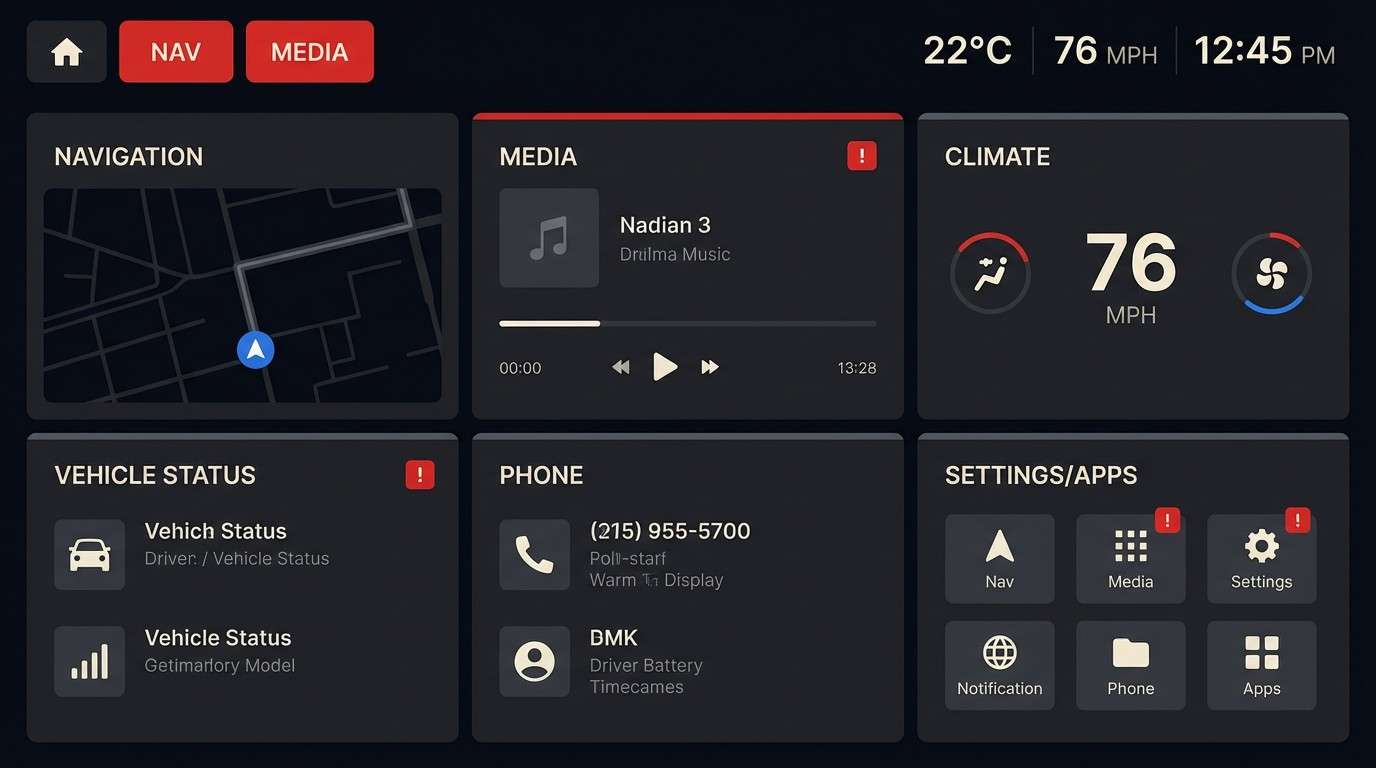
3) Carbon Fiber Luxe
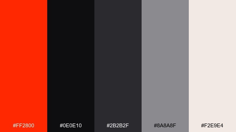
HEX: #FF2800 #0E0E10 #2B2B2F #8A8A8F #F2E9E4
Mood: sleek, technical, upscale
Best for: automotive UI and dashboard design
Sleek and technical, it evokes carbon weave, matte metal, and a single red warning light. These ferrari red color combinations shine in dark mode when you reserve the red for active states and critical alerts. Use the warm off-white only for key numbers or headings to avoid glare. A good tip is to keep red under 10 percent of the UI to maintain that premium restraint.
Image example of carbon fiber luxe generated using media.io
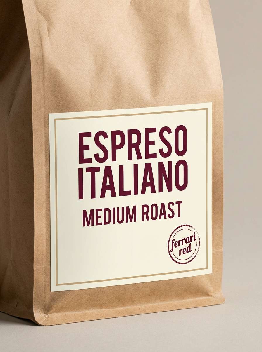
4) Cherry Espresso
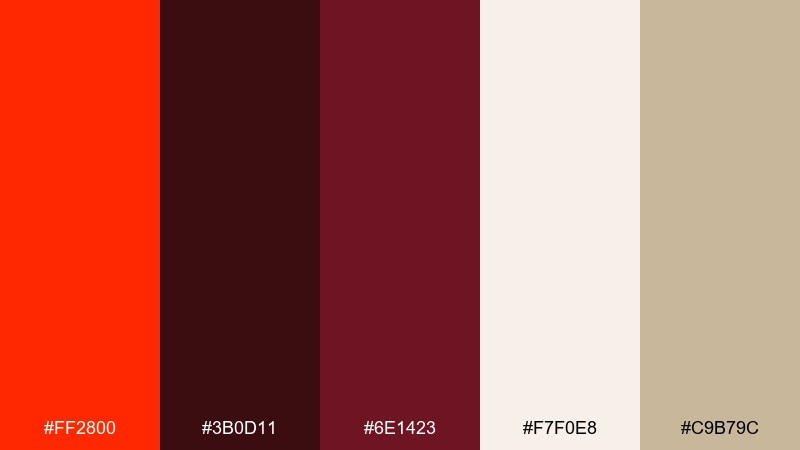
HEX: #FF2800 #3B0D11 #6E1423 #F7F0E8 #C9B79C
Mood: rich, cozy, romantic
Best for: coffee labels and boutique menus
Rich and cozy, it reads like cherry syrup over espresso crema. The deep maroons support the red without competing, making it great for elegant headings and badges. Use the cream background for readability and the tan as a subtle paper or kraft cue. Try adding fine-line icons in tan to keep the layout warm and refined.
Image example of cherry espresso generated using media.io
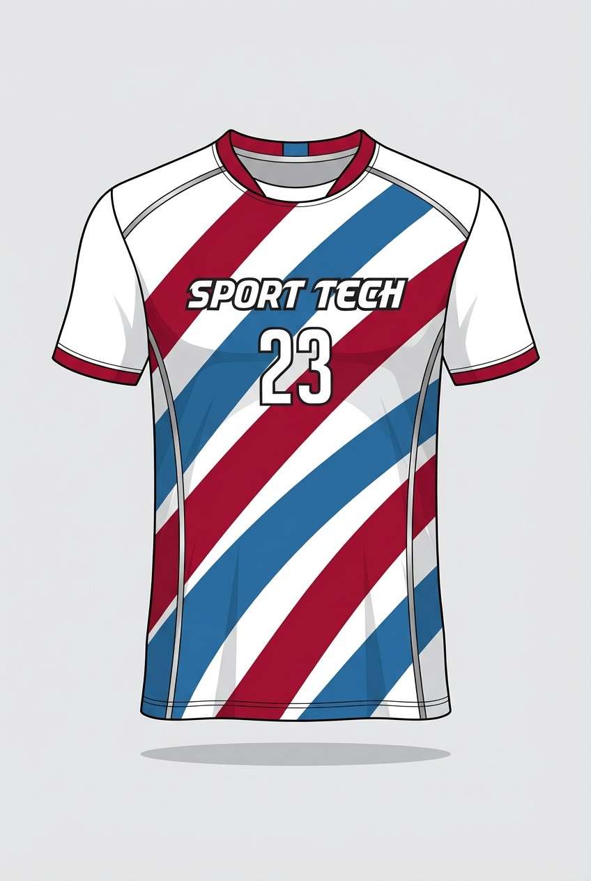
5) Racing Stripe Cool
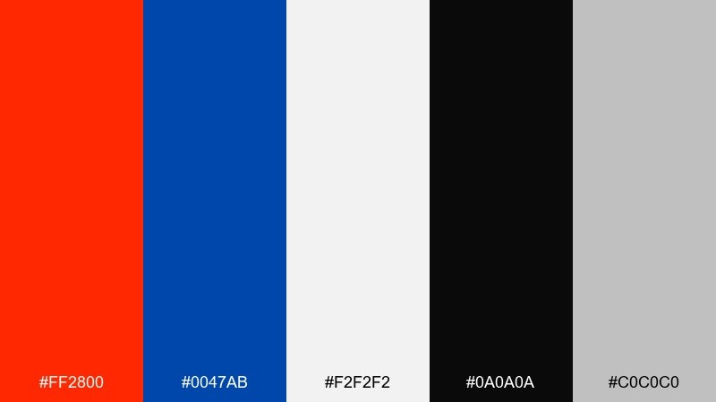
HEX: #FF2800 #0047AB #F2F2F2 #0A0A0A #C0C0C0
Mood: sporty, crisp, competitive
Best for: sports apparel graphics and team kits
Sporty and crisp, it feels like a clean stripe pattern at full speed. Let the blue play the cool counterbalance in secondary panels while red owns the focal marks. White and silver keep the look airy, especially on fabric prints and numbers. Use black sparingly for outlines so the kit stays sharp from a distance.
Image example of racing stripe cool generated using media.io
6) Aperitivo Pastels
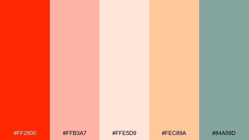
HEX: #FF2800 #FFB3A7 #FFE5D9 #FEC89A #84A59D
Mood: friendly, airy, lifestyle
Best for: spring invitations and lifestyle posts
Friendly and airy, it brings to mind an aperitivo table at golden hour with soft ceramics and citrus. Use the red in small bursts for names, icons, or a single headline so the pastels stay in control. Sage works beautifully for borders and subtle background shapes. Keep plenty of breathing room and the palette will feel effortlessly modern.
Image example of aperitivo pastels generated using media.io
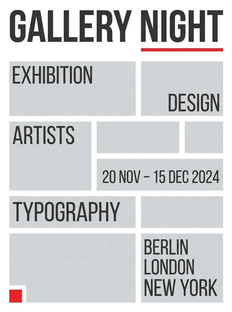
7) Museum Minimal
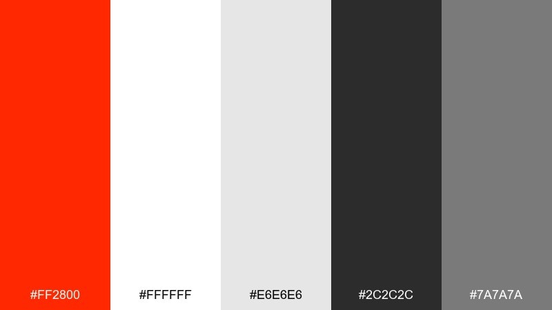
HEX: #FF2800 #FFFFFF #E6E6E6 #2C2C2C #7A7A7A
Mood: clean, editorial, modern
Best for: gallery posters and typographic layouts
Clean and editorial, it feels like a modern exhibit wall with one bold label. Use white as the main field, then anchor hierarchy with charcoal type and light gray spacing blocks. Red is best as a single underline, a date highlight, or a logo mark. A useful trick is to keep all caps headings in charcoal so the red stays special.
Image example of museum minimal generated using media.io
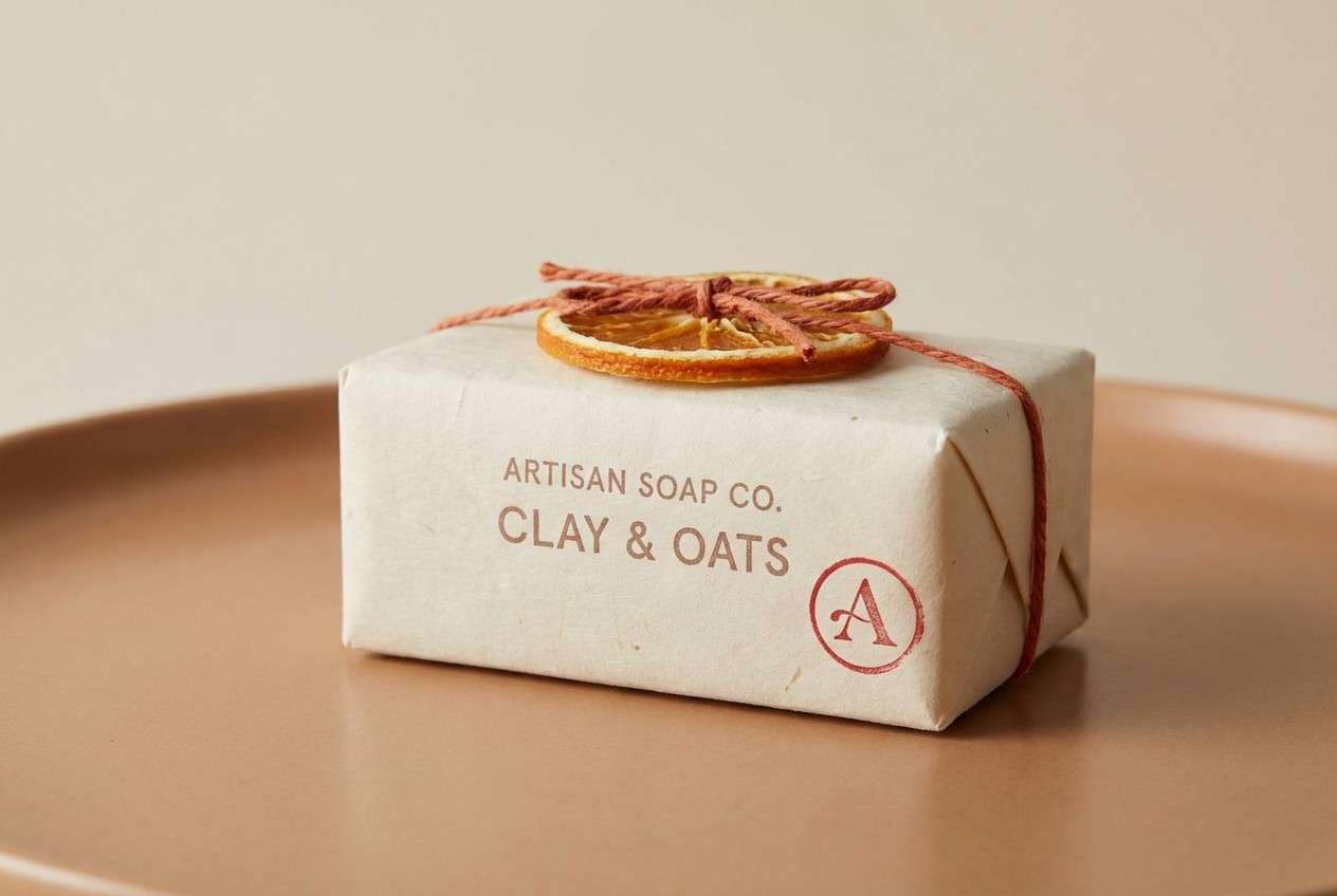
8) Matte Red Clay
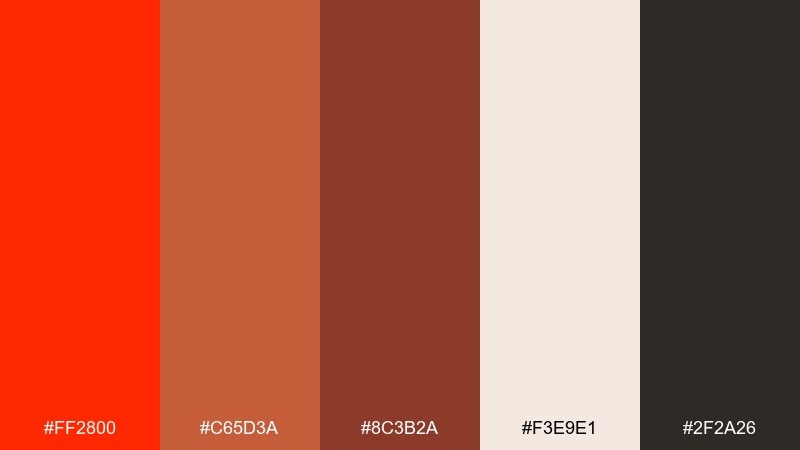
HEX: #FF2800 #C65D3A #8C3B2A #F3E9E1 #2F2A26
Mood: earthy, grounded, handcrafted
Best for: ceramic brands and artisan shop branding
Earthy and grounded, it reads like matte paint, clay dust, and warm studio light. A ferrari red color palette like this works best when the darker brown handles body text and the red stays on marks and calls to action. Use the creamy neutral for packaging backgrounds and product cards. Try a subtle paper texture to amplify the handcrafted feel without dulling contrast.
Image example of matte red clay generated using media.io
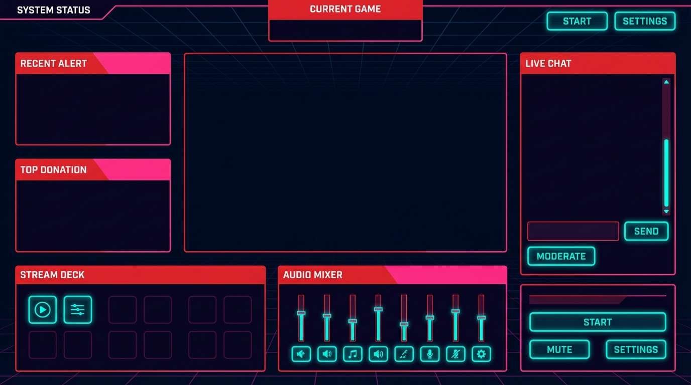
9) Neon Circuit
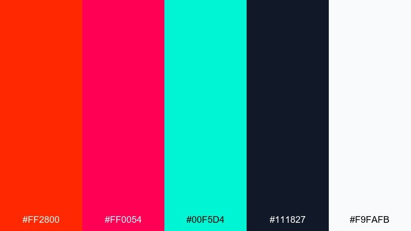
HEX: #FF2800 #FF0054 #00F5D4 #111827 #F9FAFB
Mood: electric, futuristic, night-life
Best for: gaming banners and stream overlays
Electric and futuristic, it feels like neon signage cutting through a midnight street. Use the dark base for panels, then stack red and hot pink for badges, progress, and high-impact headlines. Teal is the perfect contrast for interactive elements like buttons and toggles. Keep white for small text only, so the glow effect stays believable.
Image example of neon circuit generated using media.io
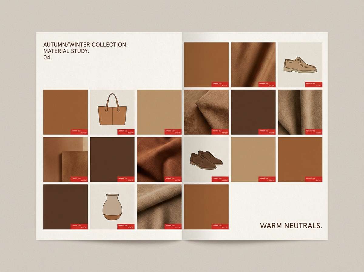
10) Autumn Leather
HEX: #FF2800 #A63D2A #D89C60 #3D2B1F #F6F1EB
Mood: warm, rustic, heritage
Best for: menswear lookbooks and retail tags
Warm and heritage-driven, it evokes worn leather, polished wood, and a bright red accent stitch. Let the brown and tan carry the base surfaces, with red reserved for price tags, buttons, or small icons. The off-white keeps layouts readable and gives photos room to breathe. A good tip is to pair this with serif headings for a classic, upscale feel.
Image example of autumn leather generated using media.io
11) Valentine Modern
HEX: #FF2800 #FF4D6D #FFF0F3 #590D22 #2B2D42
Mood: romantic, modern, punchy
Best for: beauty promos and email headers
Romantic but modern, it looks like glossy lipstick swatches with a clean editorial edge. Use the red for the primary offer, then lean on pink for supporting shapes and soft emphasis. The deep wine shade adds depth for headlines, while the navy keeps small text sharp. Keep gradients subtle so the palette stays polished rather than sugary.
Image example of valentine modern generated using media.io
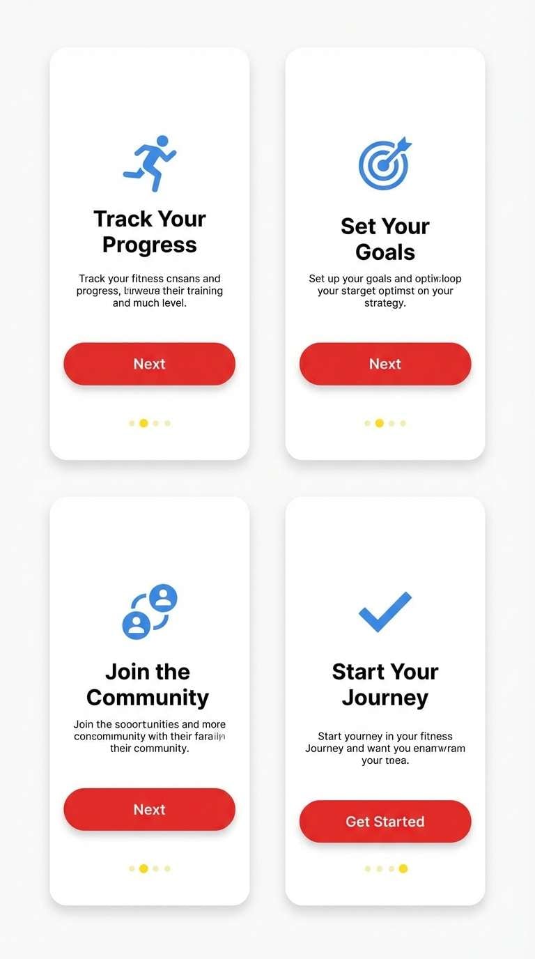
12) Sportswear Pop
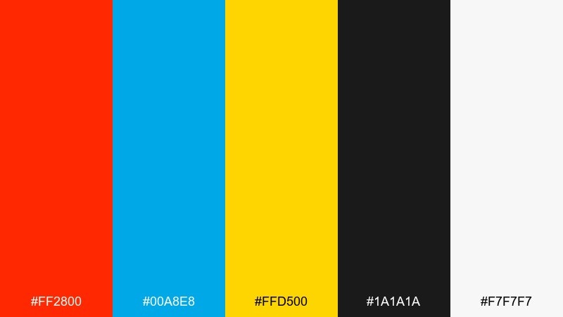
HEX: #FF2800 #00A8E8 #FFD500 #1A1A1A #F7F7F7
Mood: bright, athletic, youthful
Best for: fitness app onboarding screens
Bright and athletic, it feels like stadium lights and fast movement. These ferrari red color combinations work well when you choose one secondary pop color per screen, either blue or yellow. Use black for strong typography and the near-white for spacious panels. Tip: keep CTA buttons red and save yellow for tiny notification dots to avoid visual fatigue.
Image example of sportswear pop generated using media.io
13) Botanical Contrast
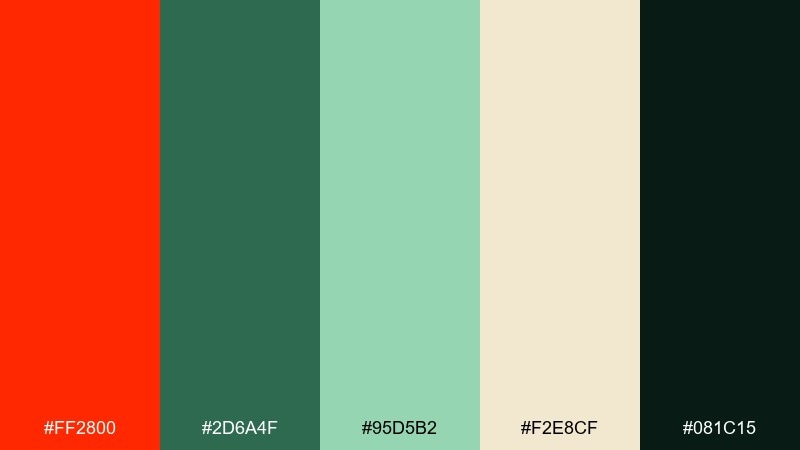
HEX: #FF2800 #2D6A4F #95D5B2 #F2E8CF #081C15
Mood: fresh, natural, confident
Best for: restaurant menus and farm-to-table branding
Fresh and confident, it pairs garden greens with a red accent like ripe tomatoes on a cutting board. Use the cream for menu pages, then bring in dark green for text and structure. The bright red is best as a callout for specials, icons, or section headers. Keep the minty green to backgrounds and small illustrations to maintain contrast.
Image example of botanical contrast generated using media.io
14) Concrete and Crimson
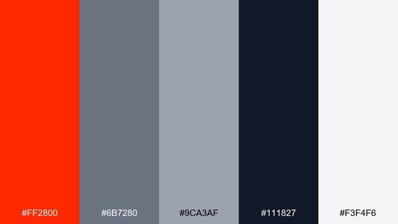
HEX: #FF2800 #6B7280 #9CA3AF #111827 #F3F4F6
Mood: urban, practical, contemporary
Best for: construction brands and service websites
Urban and practical, it feels like concrete textures with a bright safety stripe. Gray tones handle layouts and cards, while the deep navy-black anchors navigation and headings. Use red for key actions, contact buttons, and status tags. A simple rule is to avoid red body text and keep it for UI highlights only.
Image example of concrete and crimson generated using media.io
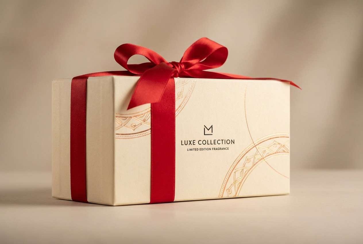
15) Warm Metals
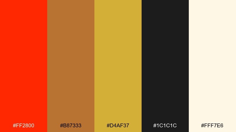
HEX: #FF2800 #B87333 #D4AF37 #1C1C1C #FFF7E6
Mood: opulent, warm, celebratory
Best for: premium gift boxes and holiday campaigns
Opulent and warm, it suggests copper, gold, and a flash of red ribbon. Use the cream as the main base so metallic tones can breathe without looking heavy. Red works best as a focal seal or ribbon element, while black keeps the typography elegant. Tip: mimic foil with small high-contrast highlights rather than big flat gold shapes.
Image example of warm metals generated using media.io
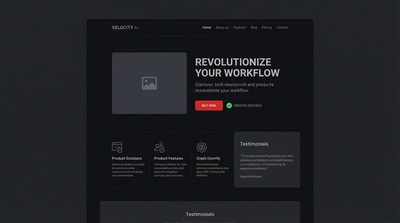
16) Showroom Gloss
HEX: #FF2800 #0B0B0C #2A2A2E #E8E8EA #00A86B
Mood: sleek, glossy, high-end
Best for: tech product landing pages
Sleek and glossy, it feels like a showroom floor with reflections and a clean spotlight. A ferrari red color palette like this benefits from using emerald as a rare confirmation color, not a competing accent. Keep backgrounds near-black and let the light gray handle body copy and spacing. Tip: use red for primary CTAs and reserve green for success states only.
Image example of showroom gloss generated using media.io
17) Retro Diner Dash
HEX: #FF2800 #00B2CA #FBE8A6 #2E2E2E #FFFFFF
Mood: retro, cheerful, nostalgic
Best for: food truck branding and sticker packs
Retro and cheerful, it channels diner signage, chrome edges, and bright menu boards. Use white as a big base and let red and teal share the spotlight in stripes or badges. The warm yellow works best for highlights and stars, not full backgrounds. Try thick outlines in charcoal to keep the retro shapes readable on any surface.
Image example of retro diner dash generated using media.io
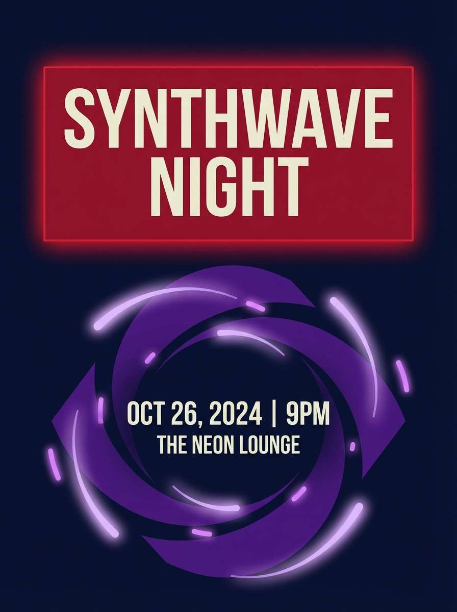
18) Night Drive Purples
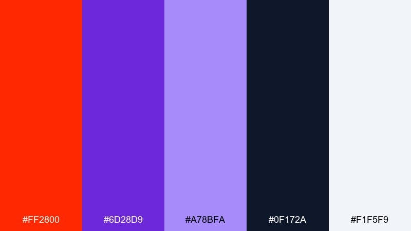
HEX: #FF2800 #6D28D9 #A78BFA #0F172A #F1F5F9
Mood: dramatic, modern, night-time
Best for: music cover art and digital flyers
Dramatic and night-time, it looks like tail lights cutting through violet street glow. Use navy as the stage, then set red against purple for high-impact titles. Lavender is great for secondary text and soft gradients behind the headline. Tip: keep the red in solid shapes so it does not muddy when layered over purple tones.
Image example of night drive purples generated using media.io
19) City Popup Sale
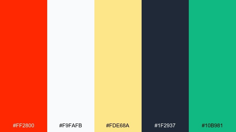
HEX: #FF2800 #F9FAFB #FDE68A #1F2937 #10B981
Mood: fresh, commercial, attention-grabbing
Best for: retail sale banners and web promos
Fresh and commercial, it feels like bold street signage with clean digital polish. Let red own the main discount callout, while charcoal handles the legal text and details. Use the pale yellow as a soft spotlight behind pricing and the green for limited-time cues. Tip: keep the green only for positive signals so it does not fight the red.
Image example of city popup sale generated using media.io

20) Monochrome Editorial Punch
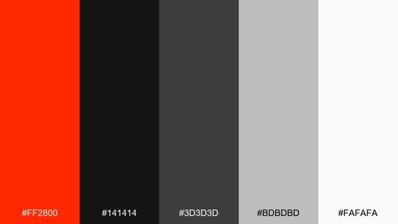
HEX: #FF2800 #141414 #3D3D3D #BDBDBD #FAFAFA
Mood: serious, editorial, confident
Best for: magazine layouts and portfolios
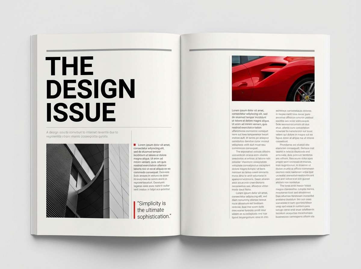
Serious and editorial, it reads like a black-and-white spread with a single red annotation. A ferrari red color scheme like this is ideal when you want the content to feel sharp and expensive. Use light gray for spacing and image captions, then reserve red for section markers and pull quotes. Tip: keep the red aligned to a strict grid so it feels intentional.
Image example of monochrome editorial punch generated using media.io
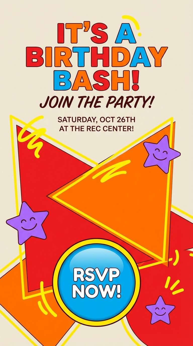
21) Kids Arcade Heat
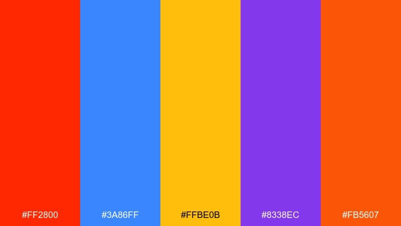
HEX: #FF2800 #3A86FF #FFBE0B #8338EC #FB5607
Mood: playful, loud, high-energy
Best for: birthday flyers and kids app promos
Playful and loud, it feels like arcade tickets, blinking lights, and fast mini games. Use red and orange as the main duo, then bring in blue for contrast on buttons and icons. Purple adds depth for headers or background shapes without turning the design too dark. Tip: keep one neutral margin area so the bright colors stay readable.
Image example of kids arcade heat generated using media.io
What Colors Go Well with Ferrari Red?
Ferrari red pairs best with deep darks (black, charcoal, midnight navy) when you want a high-end, performance look. These shades sharpen contrast and keep red feeling intentional.
If you need a cleaner, more editorial vibe, combine ferrari red with white, off-white, and cool grays. This keeps typography readable and gives the red room to “pop” without dominating.
For bolder modern contrast, use cool counter-accents like teal, emerald, or royal blue—just keep them secondary so your UI still has one clear hero color.
How to Use a Ferrari Red Color Palette in Real Designs
Start with role assignment: make ferrari red your primary action color (CTAs, selected states, key badges), and let neutrals carry backgrounds, long text, and UI containers.
Maintain consistency by setting limits—many modern systems work well with red used in small percentages, especially in dark mode. Reserve red body text for short labels only, not paragraphs.
Finally, test contrast early. Ferrari red can appear brighter on light backgrounds and more dramatic on near-black, so check readability across buttons, links, and small text sizes.
Create Ferrari Red Palette Visuals with AI
If you’re pitching a brand, building a UI kit, or preparing social templates, generating quick palette visuals helps stakeholders decide faster than swatches alone.
With Media.io Text to Image, you can turn each palette into mock posters, packaging, landing pages, and UI examples—then iterate on mood, lighting, and layout in seconds.
Ferrari Red Color Palette FAQs
-
What HEX code is commonly used for Ferrari red?
A widely used digital equivalent is #FF2800. It’s a vivid, high-saturation red that works well for UI accents and bold branding. -
Is Ferrari red the same as Rosso Corsa?
They’re often used interchangeably in design conversations, but “Rosso Corsa” is a broader racing-red concept. In palettes, #FF2800 is a common “Ferrari red” baseline you can adjust lighter or deeper as needed. -
What colors complement Ferrari red best?
Neutrals like black, charcoal, off-white, and cool gray are the safest complements. For contrast accents, teal, emerald, and royal blue can work if used sparingly. -
How do I keep a Ferrari red color scheme from looking too aggressive?
Use ferrari red as a highlight color (CTAs, tags, underlines) and let soft neutrals handle backgrounds and long text. Red feels more modern when it’s controlled by spacing and hierarchy. -
Does Ferrari red work in dark mode UI?
Yes—especially for active states and alerts. Pair it with near-black and charcoal surfaces, and limit red coverage so the interface stays premium and readable. -
Can I pair Ferrari red with metallics like gold or copper?
Yes. Gold or copper accents can make ferrari red feel luxury and gift-ready. Keep metallics to small details (rules, seals, icons) so the layout doesn’t get heavy. -
What’s the best way to preview Ferrari red palette combinations before designing?
Generate quick mock visuals—posters, packaging, or UI screens—so you can judge contrast and vibe in context. Media.io’s AI image generation is a fast way to test multiple directions.


