

Fern green is one of the most versatile earthy green tones: natural enough for organic brands, but structured enough for modern UI. It reads calm, healthy, and grounded without feeling dull.
Below are 20 fern green color palette ideas with HEX codes, plus practical tips for contrast, accents, and real-world use across branding, interiors, and digital design.
In this article
- Why Fern Green Palettes Work So Well
-
- woodland calm
- botanical linen
- mossy terracotta
- fern and brass
- rainy greenhouse
- vintage herbarium
- coastal eucalyptus
- dark fern noir
- matcha studio
- cottage kitchen
- modern olive concrete
- spring fern blush
- alpine lodge
- minimal sage paper
- meadow at dusk
- fern and denim
- citrus fern pop
- spa stone
- autumn fern plaid
- electric fern tech
- What Colors Go Well with Fern Green?
- How to Use a Fern Green Color Palette in Real Designs
- Create Fern Green Palette Visuals with AI
Why Fern Green Palettes Work So Well
Fern green sits in a sweet spot between “true green” and muted olive, so it feels botanical and fresh while still reading as mature and stable. That balance makes it easy to use across industries—from wellness to finance—without looking out of place.
It also pairs naturally with green neutrals (stone, paper, sand, concrete) which helps you build layouts with comfortable negative space. Those softer supports let fern green stay present as an anchor instead of becoming visually heavy.
Finally, fern green handles contrast well: you can push it toward luxe with near-black and brass, or keep it airy with off-white and pale sage. The same core green can support calm minimalism or bold seasonal energy depending on accents.
20+ Fern Green Color Palette Ideas (with HEX Codes)
1) Woodland Calm
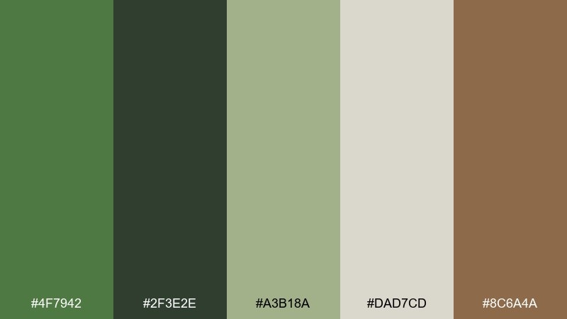
HEX: #4F7942 #2F3E2E #A3B18A #DAD7CD #8C6A4A
Mood: grounded, quiet, natural
Best for: eco brand identity and stationery
Grounded and hushed, like a shaded trail with bark, leaf, and soft light. Use the deep fern as your anchor, then let warm brown and parchment neutrals keep the look approachable. This fern green color palette works especially well for sustainable brands, labels, and calm editorial headers. Tip: keep the light beige as the dominant background so the greens feel fresh, not heavy.
Image example of woodland calm generated using media.io
Media.io is an online AI studio for creating and editing video, image, and audio in your browser.

2) Botanical Linen
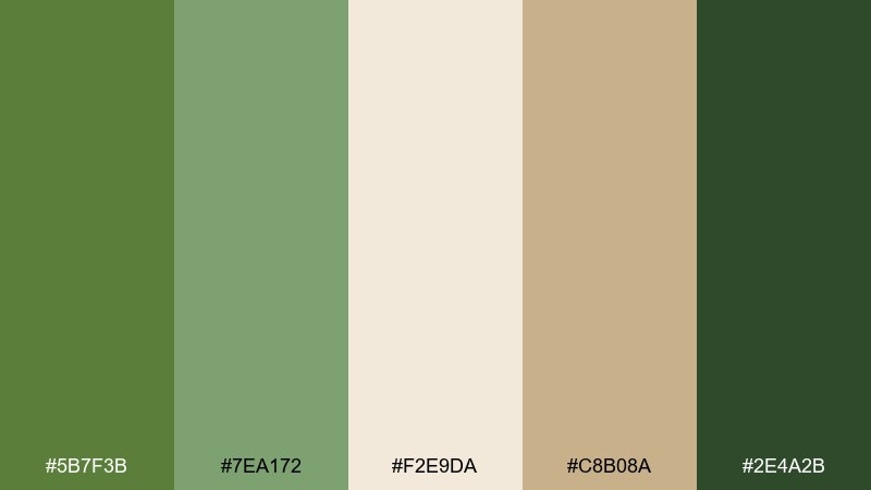
HEX: #5B7F3B #7EA172 #F2E9DA #C8B08A #2E4A2B
Mood: fresh, soft, botanical
Best for: wedding invitations and printed menus
Fresh and airy, like pressed leaves on sun-warmed linen. The gentle greens pair beautifully with creamy paper tones for a romantic, understated look. This fern green color palette shines on invitations, menus, and day-of signage when you want nature without going rustic. Tip: print the darker green for text and use the pale green as a subtle border or motif.
Image example of botanical linen generated using media.io
3) Mossy Terracotta
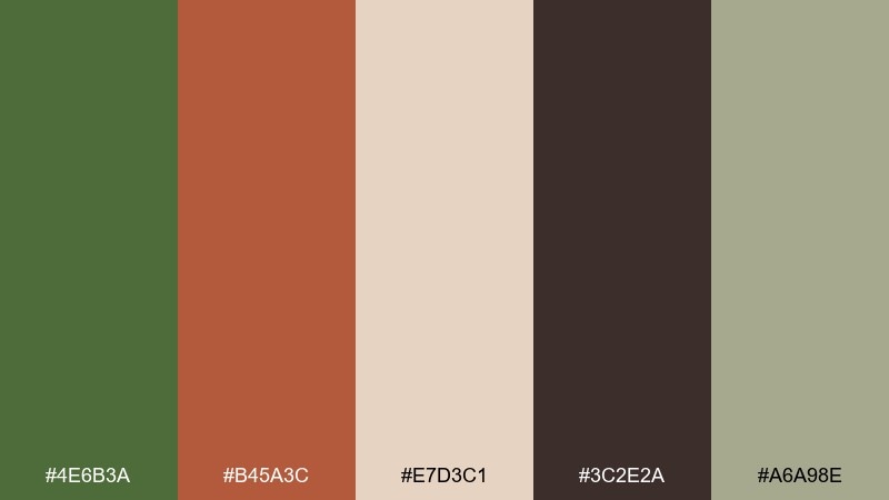
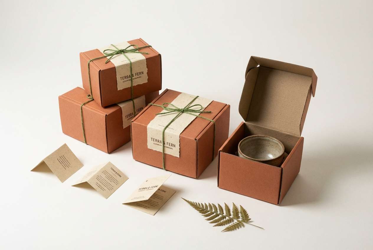
HEX: #4E6B3A #B45A3C #E7D3C1 #3C2E2A #A6A98E
Mood: earthy, creative, cozy
Best for: ceramics branding and artisan packaging
Earthy and tactile, like moss on clay pots drying in a studio. Terracotta brings warmth while the fern tone keeps it grounded and organic. Use this mix on artisan packaging, hang tags, and small-batch product labels where you want handmade energy with polish. Tip: reserve the dark brown for tiny type and outlines so the terracotta can stay the star.
Image example of mossy terracotta generated using media.io
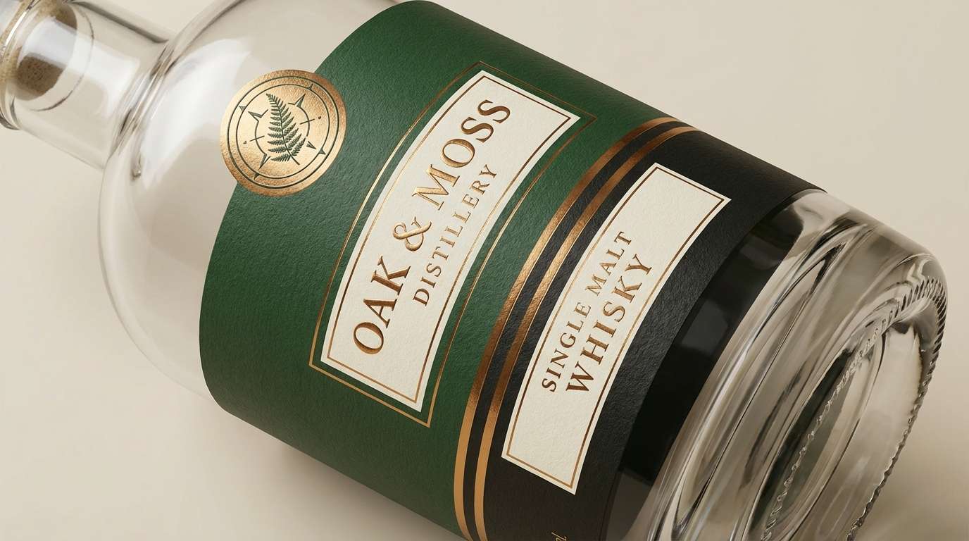
4) Fern and Brass
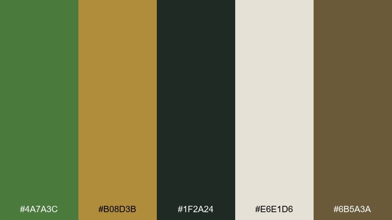
HEX: #4A7A3C #B08D3B #1F2A24 #E6E1D6 #6B5A3A
Mood: heritage, polished, confident
Best for: premium whiskey label and signage
Heritage and polished, like brass hardware against dark wood in a quiet bar. The gold-brass note adds instant premium energy to fern green color combinations without feeling flashy. Use the near-black for backgrounds and let brass highlight key details like borders, seals, or icons. Tip: keep metallic tones limited to small accents for a refined finish.
Image example of fern and brass generated using media.io
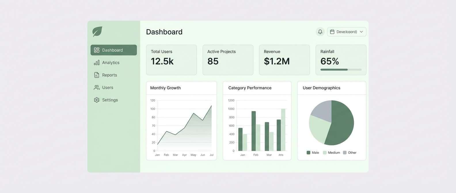
5) Rainy Greenhouse
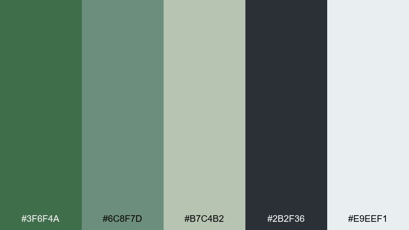
HEX: #3F6F4A #6C8F7D #B7C4B2 #2B2F36 #E9EEF1
Mood: cool, tranquil, modern
Best for: dashboard UI and data cards
Cool and tranquil, like misted glass and wet leaves after a summer shower. The desaturated greens feel modern when paired with graphite and a clean icy white. Use the darker green for primary buttons and the gray for navigation to keep hierarchy clear. Tip: lean on the pale green for card backgrounds to reduce eye strain in long sessions.
Image example of rainy greenhouse generated using media.io
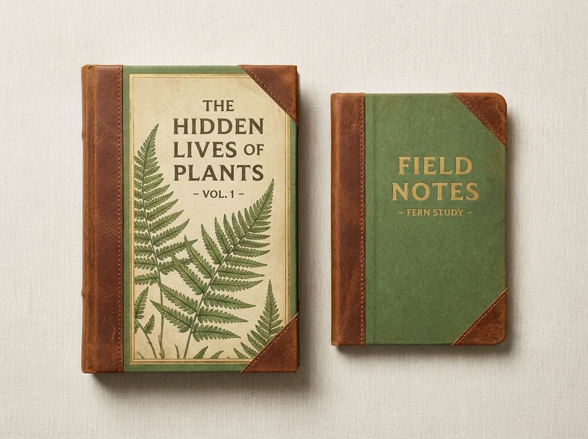
6) Vintage Herbarium
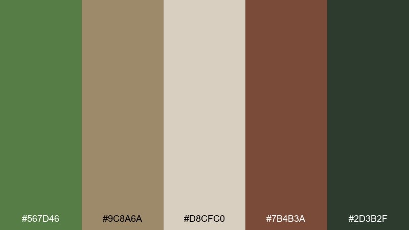
HEX: #567D46 #9C8A6A #D8CFC0 #7B4B3A #2D3B2F
Mood: nostalgic, scholarly, warm
Best for: book covers and museum gift shop goods
Nostalgic and scholarly, like old specimen books and hand-labeled folders. The muted browns and parchment tones make the greens feel aged in the best way. Use it for book covers, museum gift products, and heritage-inspired packaging where texture matters. Tip: add subtle grain or paper fiber to backgrounds so the palette feels authentically archival.
Image example of vintage herbarium generated using media.io
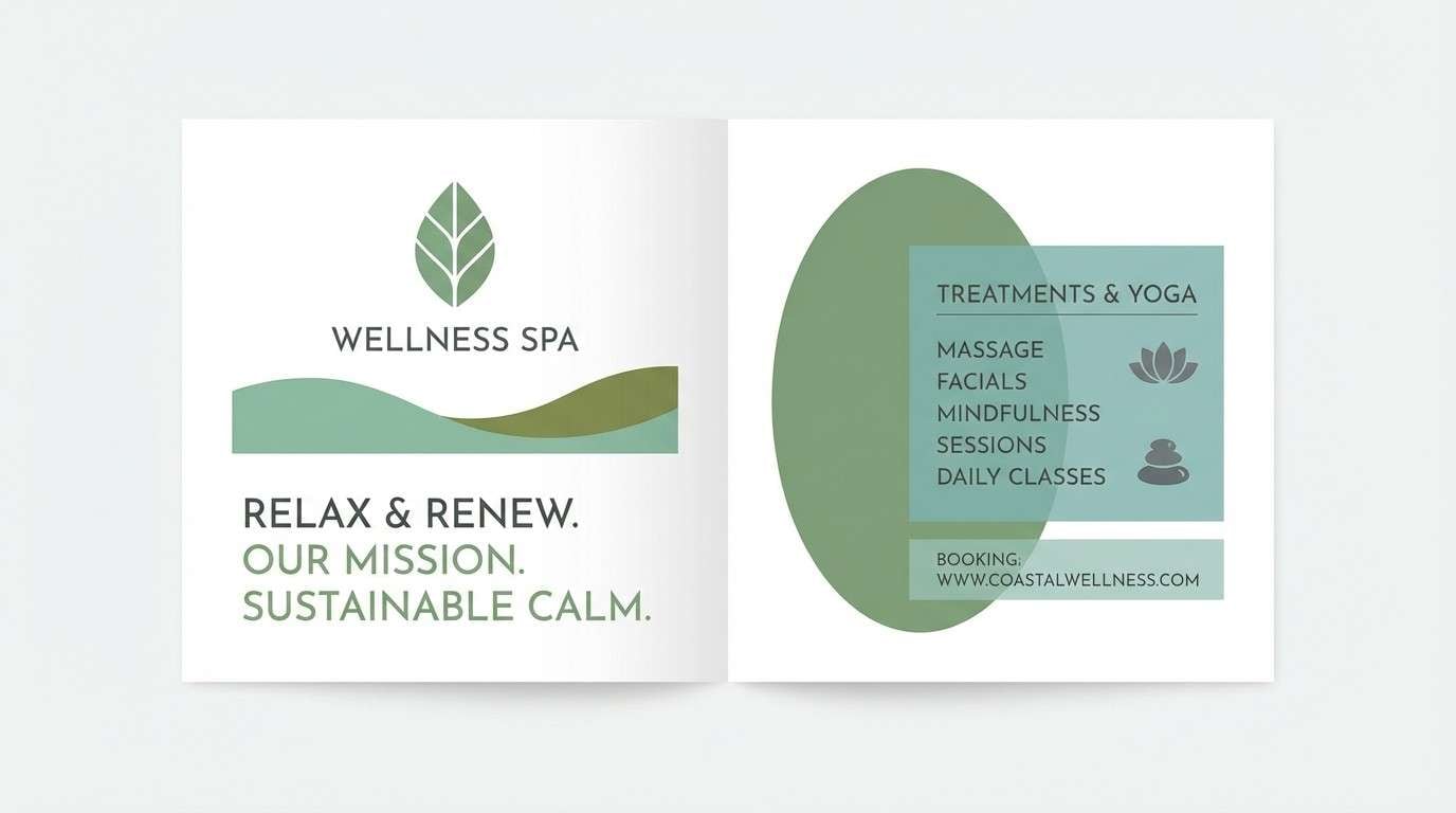
7) Coastal Eucalyptus
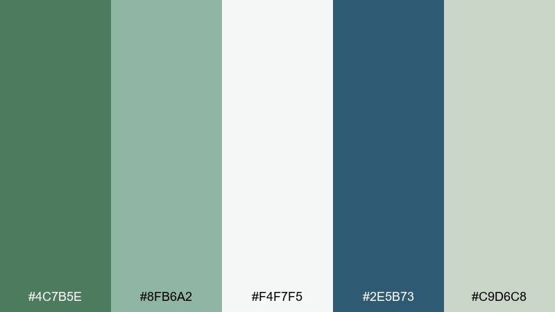
HEX: #4C7B5E #8FB6A2 #F4F7F5 #2E5B73 #C9D6C8
Mood: breezy, clean, restorative
Best for: spa brochures and wellness websites
Breezy and restorative, like eucalyptus leaves near cool ocean air. The blue-green accent adds depth without pulling the palette too cold. Use it for wellness sites, spa brochures, and calm landing pages where whitespace and softness matter. Tip: keep contrast high for readability by pairing the deep teal with the near-white background.
Image example of coastal eucalyptus generated using media.io
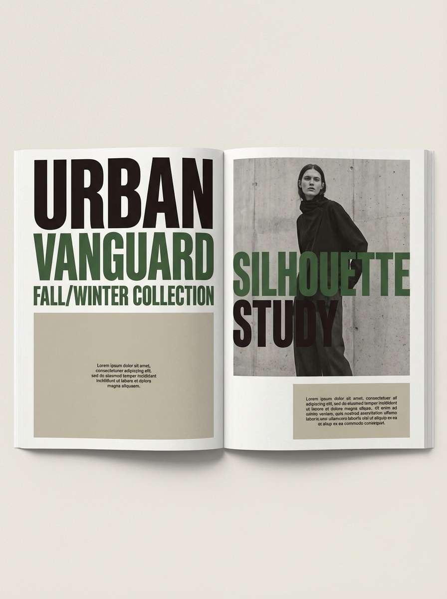
8) Dark Fern Noir
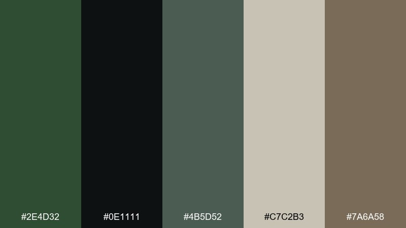
HEX: #2E4D32 #0E1111 #4B5D52 #C7C2B3 #7A6A58
Mood: moody, cinematic, luxe
Best for: fashion lookbooks and campaign headers
Moody and cinematic, like a midnight garden lit by a single lamp. Deep greens and near-black create drama, while the stone beige keeps it editorial instead of gothic. Use it for fashion lookbooks, premium campaign headers, and typography-forward posters. Tip: set body text in the beige and use green only for headings and key highlights.
Image example of dark fern noir generated using media.io
9) Matcha Studio
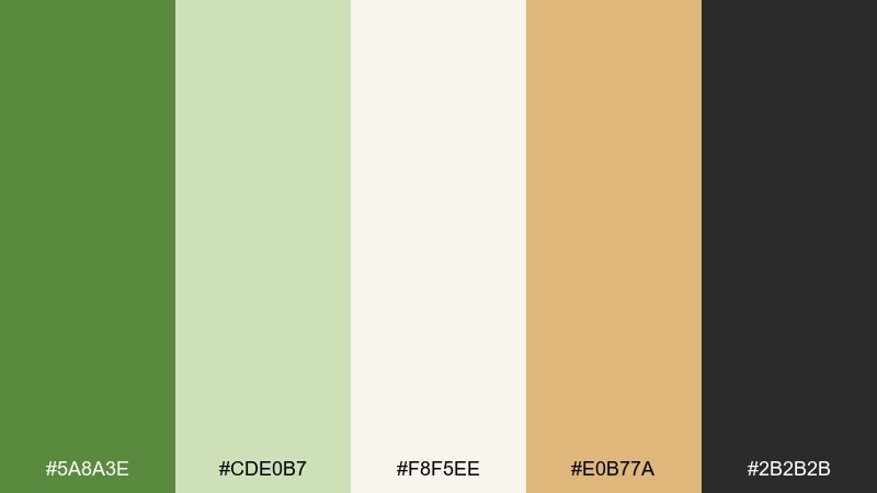
HEX: #5A8A3E #CDE0B7 #F8F5EE #E0B77A #2B2B2B
Mood: bright, friendly, craft-focused
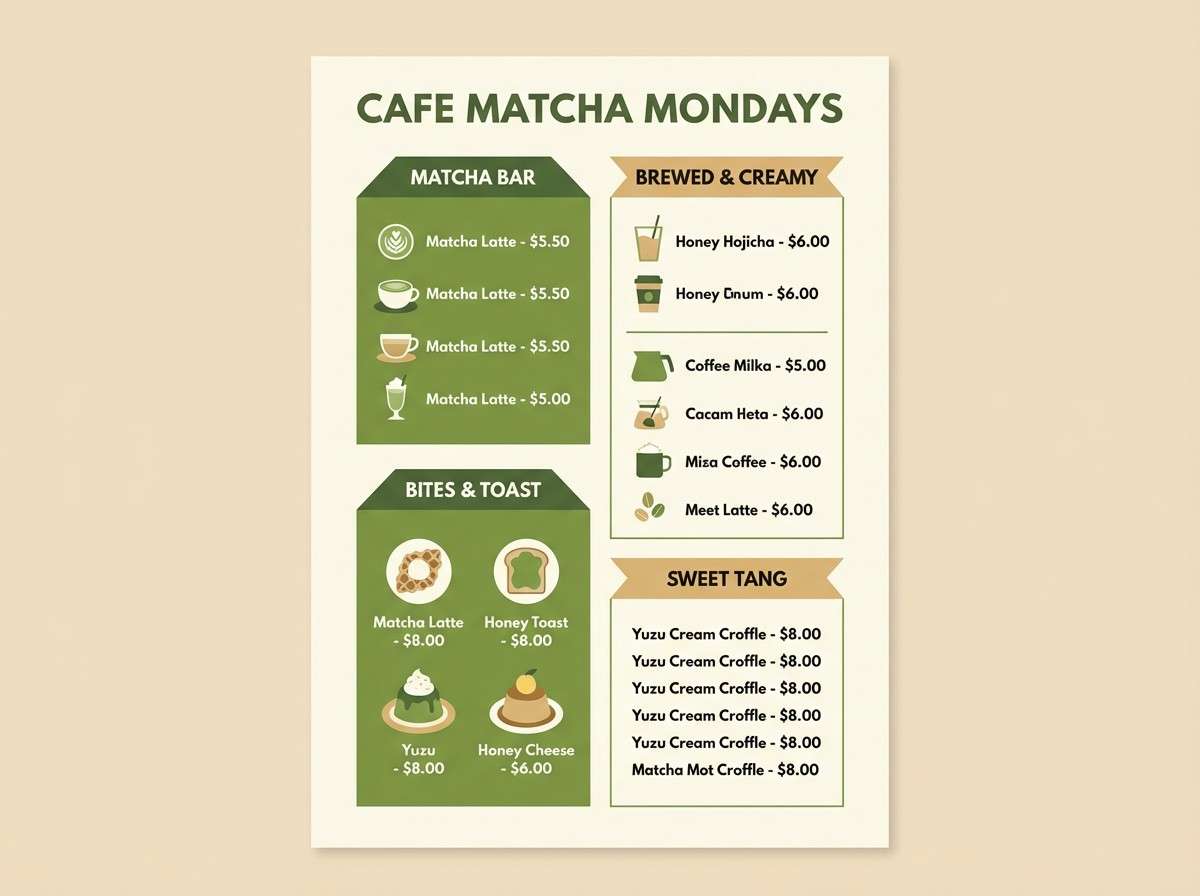
Best for: cafe menu design and social templates
Bright and friendly, like matcha foam and warm pastries under morning light. The creamy off-white keeps the greens clean, while the honey tan adds appetite appeal. Use it for cafe menus, recipe cards, and social templates that need a modern handmade vibe. Tip: make the tan your call-to-action color so buttons and prices pop without harsh contrast.
Image example of matcha studio generated using media.io
10) Cottage Kitchen
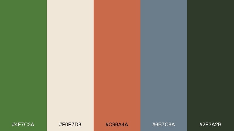
HEX: #4F7C3A #F0E7D8 #C96A4A #6B7C8A #2F3A2B
Mood: homey, cheerful, rustic-modern
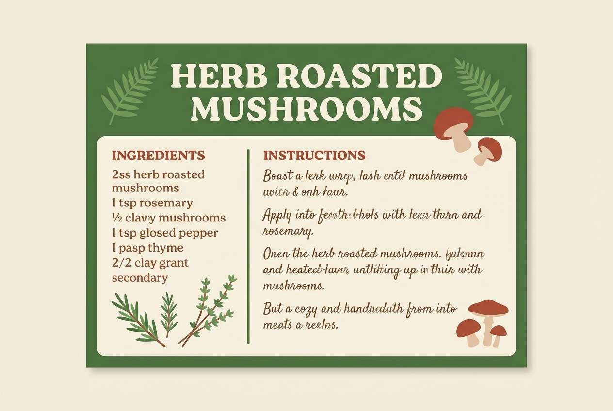
Best for: food blog branding and recipe cards
Homey and cheerful, like herbs on a windowsill beside a steaming pot. The tomato-clay accent brings warmth, while the muted blue-gray adds a lived-in, vintage touch. Use it for recipe cards, food blog branding, or packaging for baked goods that want a welcoming feel. Tip: limit the blue-gray to secondary elements like dividers to keep the greens in control.
Image example of cottage kitchen generated using media.io
11) Modern Olive Concrete
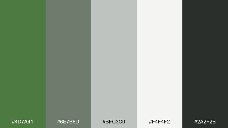
HEX: #4D7A41 #6E7B6D #BFC3C0 #F4F4F2 #2A2F2B
Mood: minimal, urban, balanced
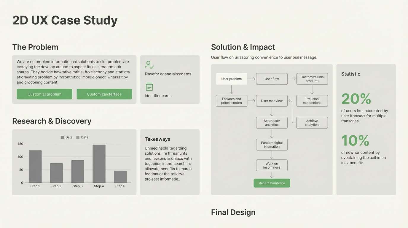
Best for: architecture portfolios and UX case studies
Minimal and urban, like greenery against smooth concrete and steel. The neutrals give you breathing room while the fern tone adds life to otherwise grayscale layouts. This fern green color palette is a strong fit for architecture portfolios, UX case studies, and clean presentations. Tip: use the dark charcoal for headings and reserve the fern for icons, links, and progress states.
Image example of modern olive concrete generated using media.io
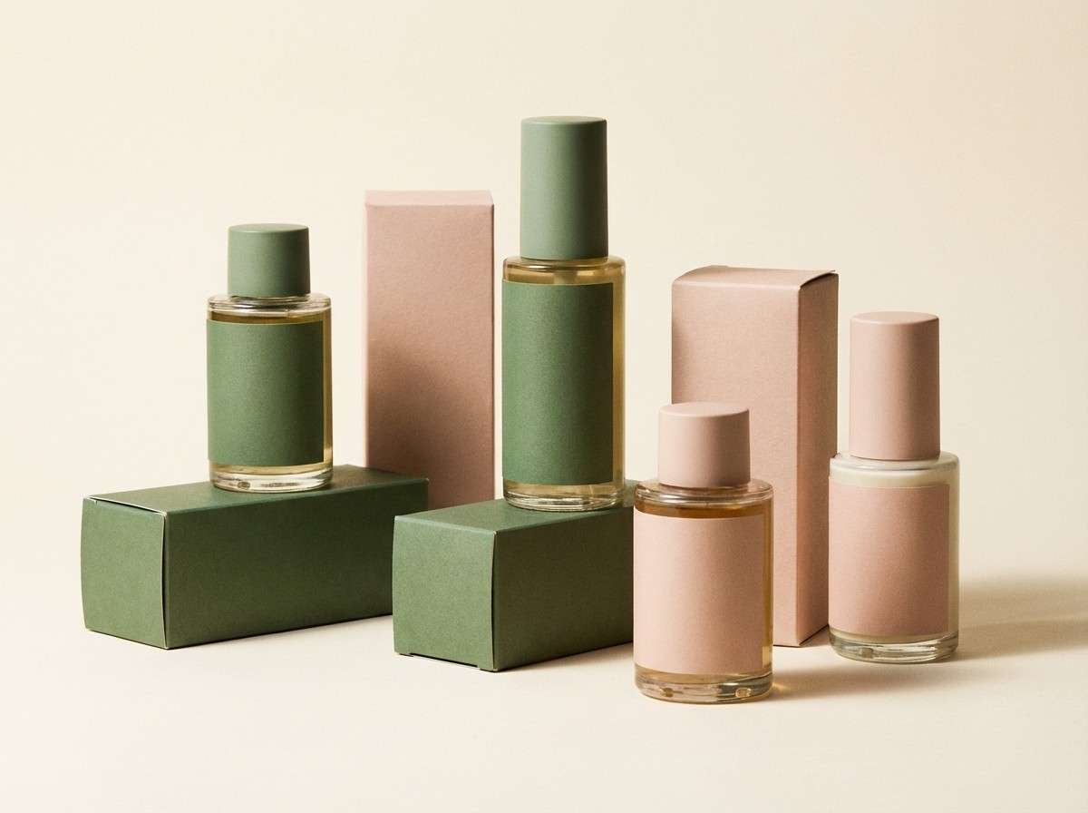
12) Spring Fern Blush
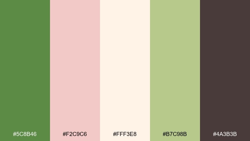
HEX: #5C8B46 #F2C9C6 #FFF3E8 #B7C98B #4A3B3B
Mood: soft, playful, optimistic
Best for: beauty product ads and skincare packaging
Soft and optimistic, like new leaves paired with a blush sunrise. The warm cream and pink keep the greens from feeling too serious, making it ideal for gentle, friendly beauty. Use it for skincare packaging, promo banners, and product ads where you want clean but not clinical. Tip: set the darkest brown only for small text so the overall look stays airy.
Image example of spring fern blush generated using media.io
13) Alpine Lodge
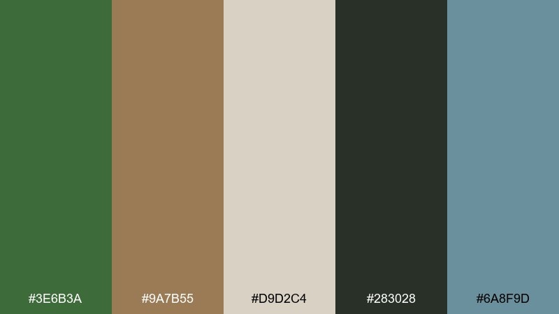
HEX: #3E6B3A #9A7B55 #D9D2C4 #283028 #6A8F9D
Mood: outdoorsy, sturdy, inviting
Best for: travel posters and cabin rental branding
Outdoorsy and sturdy, like pine needles, leather boots, and cool mountain air. The slate blue adds a crisp alpine note while tan and oatmeal keep it welcoming. Use it for travel posters, cabin rental branding, and outdoor gear tags that need warmth without losing clarity. Tip: pair the deep green with oatmeal for text blocks and reserve slate for secondary accents.
Image example of alpine lodge generated using media.io

14) Minimal Sage Paper
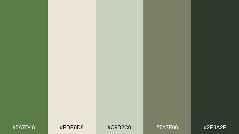
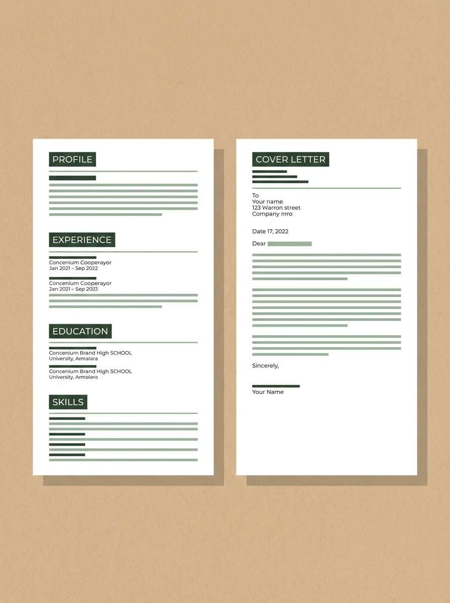
HEX: #5A7D48 #EDE6D8 #C9D2C0 #7A7F66 #2E3A2E
Mood: calm, clean, understated
Best for: resume templates and portfolio sites
Calm and understated, like recycled paper with a soft green tint. The gentle middle tones make layouts feel organized without looking sterile. Use it for resume templates, personal portfolios, and simple business docs where readability comes first. Tip: set your background to warm paper, then use the darkest green for headings to maintain strong contrast.
Image example of minimal sage paper generated using media.io
15) Meadow at Dusk
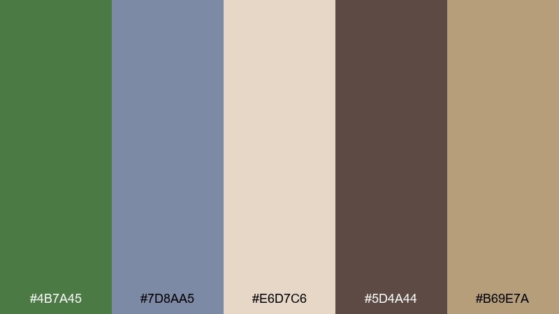
HEX: #4B7A45 #7D8AA5 #E6D7C6 #5D4A44 #B69E7A
Mood: poetic, muted, reflective
Best for: novel covers and longform blog headers
Poetic and muted, like tall grass fading into twilight. The dusty blue-gray cools the greens, while the warm oat tones keep it human and cozy. Use it for novel covers, longform blog headers, and calm editorial sections that benefit from a gentle emotional pull. Tip: add a large beige margin around your type to let the darker accents breathe.
Image example of meadow at dusk generated using media.io
16) Fern and Denim
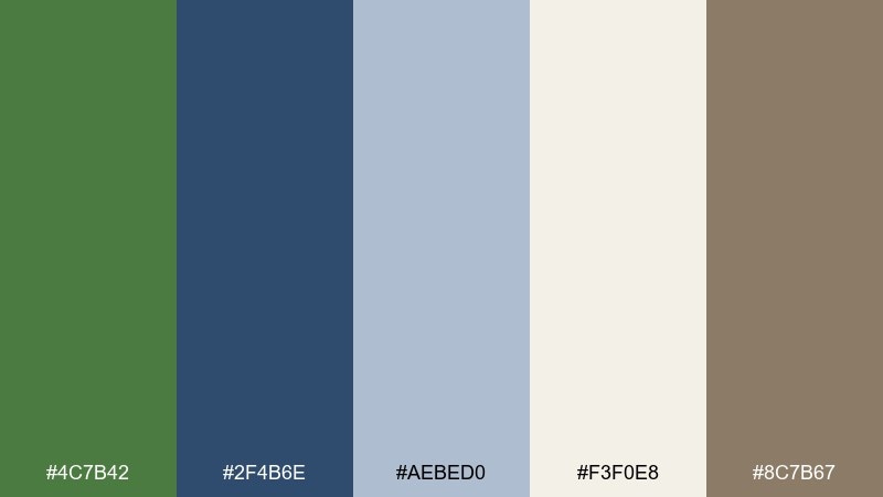
HEX: #4C7B42 #2F4B6E #AEBED0 #F3F0E8 #8C7B67
Mood: modern, casual, confident
Best for: streetwear lookbooks and ecommerce banners
Modern and casual, like a crisp field jacket with worn-in denim. The navy adds structure, making fern green color combinations feel sharper and more contemporary. Use it for streetwear lookbooks, ecommerce banners, and product category pages where you need contrast that still feels natural. Tip: keep the background off-white and let navy carry typography while green highlights prices or tags.
Image example of fern and denim generated using media.io

17) Citrus Fern Pop
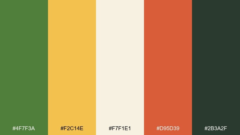
HEX: #4F7F3A #F2C14E #F7F1E1 #D95D39 #2B3A2F
Mood: energetic, sunny, bold
Best for: event flyers and summer promos
Energetic and sunny, like lemon peel and leafy stems on a bright afternoon. The citrus yellow lifts the green instantly, while the coral-red adds playful punch. Use it for event flyers, summer promos, and bold callouts where you want friendliness without going pastel. Tip: let yellow lead for highlights, and use the dark green to frame content so it stays readable.
Image example of citrus fern pop generated using media.io
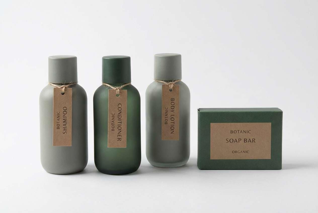
18) Spa Stone
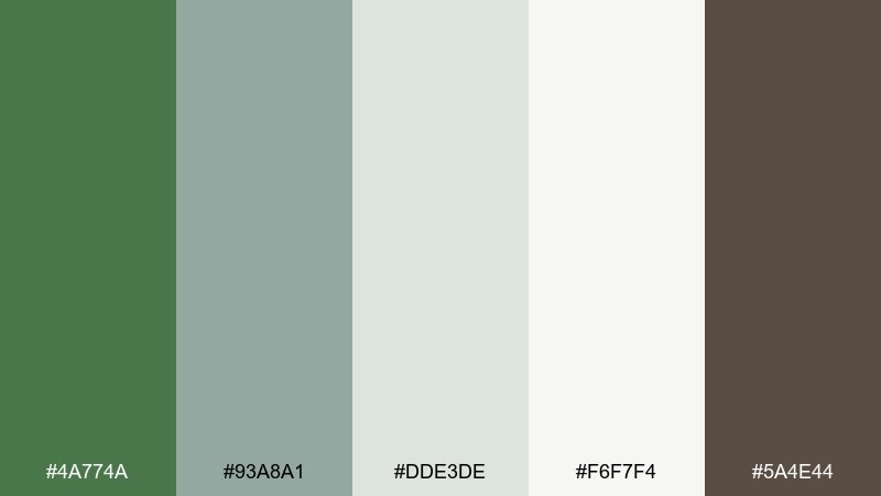
HEX: #4A774A #93A8A1 #DDE3DE #F6F7F4 #5A4E44
Mood: clean, soothing, balanced
Best for: hotel toiletries packaging and labels
Clean and soothing, like warm steam over smooth river stones. The soft gray-greens keep everything calm, while the earthy brown adds a natural, grounded note. Use it for hotel toiletries, soap labels, and wellness packaging that needs to feel premium but quiet. Tip: print labels on off-white and use the medium green-gray for secondary text to avoid harsh contrast.
Image example of spa stone generated using media.io
19) Autumn Fern Plaid
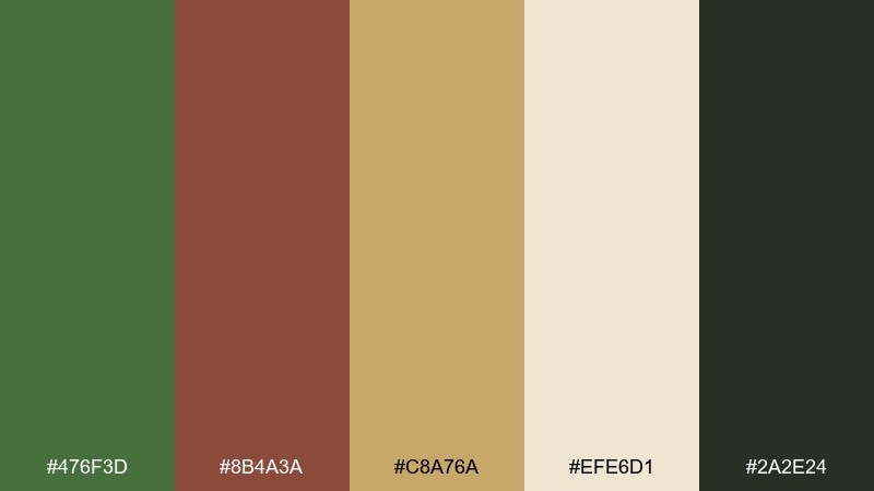
HEX: #476F3D #8B4A3A #C8A76A #EFE6D1 #2A2E24
Mood: warm, rustic, seasonal
Best for: fall market posters and craft labels
Warm and rustic, like fallen leaves woven into a cozy plaid. The gold and brick notes make the green feel seasonal and welcoming. Use it for fall market posters, craft labels, and seasonal collections where a little nostalgia sells the story. Tip: keep the darkest shade for thin lines and type so the palette stays warm, not muddy.
Image example of autumn fern plaid generated using media.io

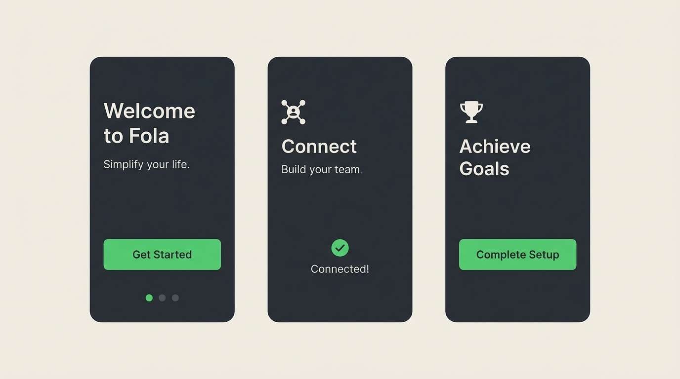
20) Electric Fern Tech
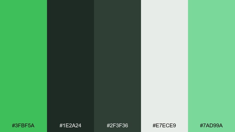
HEX: #3FBF5A #1E2A24 #2F3F36 #E7ECE9 #7AD99A
Mood: fresh, techy, high-clarity
Best for: app onboarding screens and CTA sections
Fresh and techy, like a bright status light in a dark interface. The vivid green reads as progress and success, while the layered charcoals keep it sleek. Use it for onboarding screens, pricing pages, and CTAs when you need clear hierarchy and modern energy. Tip: save the brightest green for one primary action per screen to avoid visual noise.
Image example of electric fern tech generated using media.io
What Colors Go Well with Fern Green?
Fern green pairs best with warm, natural neutrals like parchment, oatmeal, stone, sand, and soft taupe. These backgrounds keep the palette breathable and make fern green feel fresh rather than heavy.
For stronger contrast, add near-black, charcoal, or deep navy—great for typography, UI navigation, and clean hierarchy. If you want a premium lift, small accents of brass/gold work especially well with fern’s earthy base.
To make fern green more playful or seasonal, introduce warm accents like terracotta, clay, coral, or citrus yellow. These colors bring energy without fighting the botanical vibe.
How to Use a Fern Green Color Palette in Real Designs
Start with role assignment: choose one fern green as your brand/UI anchor, then pick a light neutral for backgrounds and a dark neutral for text. This simple structure prevents muddiness and keeps contrast predictable.
In branding and packaging, fern green looks best when supported by texture cues (paper, linen, matte labels) and restrained accents. In digital design, reserve the most saturated green for states that matter—primary buttons, success, active tabs—so it stays meaningful.
When mixing multiple greens, separate them by value: one dark, one mid, one pale. That value ladder makes icons, cards, and sections feel intentional instead of “all green.”
Create Fern Green Palette Visuals with AI
If you already have HEX codes, you can turn them into quick mockups for moodboards, landing pages, labels, posters, and social templates. Generating a few visual directions helps you validate contrast and the “feel” of the palette before you commit.
With Media.io’s text-to-image tool, you can paste a clear prompt (like the examples above), specify layout style (flat design vs. realistic mockup), and iterate fast until the palette reads exactly how you want.
Try creating multiple variations by changing only one element at a time—background material (paper vs. concrete), lighting (studio vs. soft daylight), or accent color (brass vs. terracotta)—to see where fern green performs best.
Fern Green Color Palette FAQs
-
What is a fern green color palette?
A fern green color palette is a set of coordinating colors built around fern green—typically pairing it with soft neutrals (paper, stone, sand) and a few accents (terracotta, brass, navy) to control contrast and mood. -
Is fern green warm or cool?
Fern green is usually a muted, slightly warm green (often with subtle yellow/olive influence), but it can lean cooler when paired with blue-gray or teal accents. -
What is the best neutral to pair with fern green?
Warm off-whites like parchment, oatmeal, and cream are the safest neutrals for fern green because they keep the palette organic and readable across print and digital. -
What accent colors make fern green pop?
Brass/gold, citrus yellow, coral, and terracotta create high-impact contrast against fern green. Use accents sparingly so the palette stays grounded instead of loud. -
Can I use fern green in a UI palette?
Yes—fern green works well in UI when you anchor typography in charcoal/near-black and use fern green for interactive states (primary buttons, active tabs, success). Add pale green-gray surfaces to reduce eye strain. -
How do I avoid a fern green palette looking muddy?
Use a light dominant background, keep dark neutrals for text, and limit the number of mid-tone earth colors. If you add brown, make it either clearly dark (for type) or clearly light (for background), not medium. -
Is fern green good for branding?
Fern green is excellent for branding because it signals nature, trust, and balance. It’s especially strong for eco, wellness, food, outdoor, heritage, and craft-focused identities.
Next: Amethyst Color Palette


