

A fairy tale color palette blends soft pastels, enchanted jewel tones, and storybook neutrals to create designs that feel dreamy, nostalgic, and a little magical.
Below are 20+ fairy tale color palette ideas with HEX codes—plus practical pairing tips and AI-ready prompts you can reuse for branding, invites, UI, and more.
In this article
- Why Fairy Tale Palettes Work So Well
-
- enchanted rose
- moonlit lavender
- forest sprite
- golden carriage
- mermaid lagoon
- castle stone
- dragon ember
- pixie dust
- royal tapestry
- gingerbread cottage
- swan lake
- starfall night
- apple orchard
- crystal slipper
- spellbook sepia
- winter kingdom
- sunlit meadow
- midnight masquerade
- honeyed lanterns
- cloud kingdom
- aurora crown
- velvet briar
- river nymph
- What Colors Go Well with Fairy Tale?
- How to Use a Fairy Tale Color Palette in Real Designs
- Create Fairy Tale Palette Visuals with AI
Why Fairy Tale Palettes Work So Well
Fairy tale palettes feel instantly familiar: they echo bedtime stories, classic animation, and fantasy worlds where light, shadow, and symbolism are exaggerated for emotion.
They also balance contrast beautifully—pastel “innocence” against deep jewel tones—so your design can feel airy while still having strong focal points for headlines, CTAs, or key details.
Most importantly, whimsical colors translate across mediums: invitations, packaging, book covers, and UI all benefit from a palette that tells a story before the first word is read.
20+ Fairy Tale Color Palette Ideas (with HEX Codes)
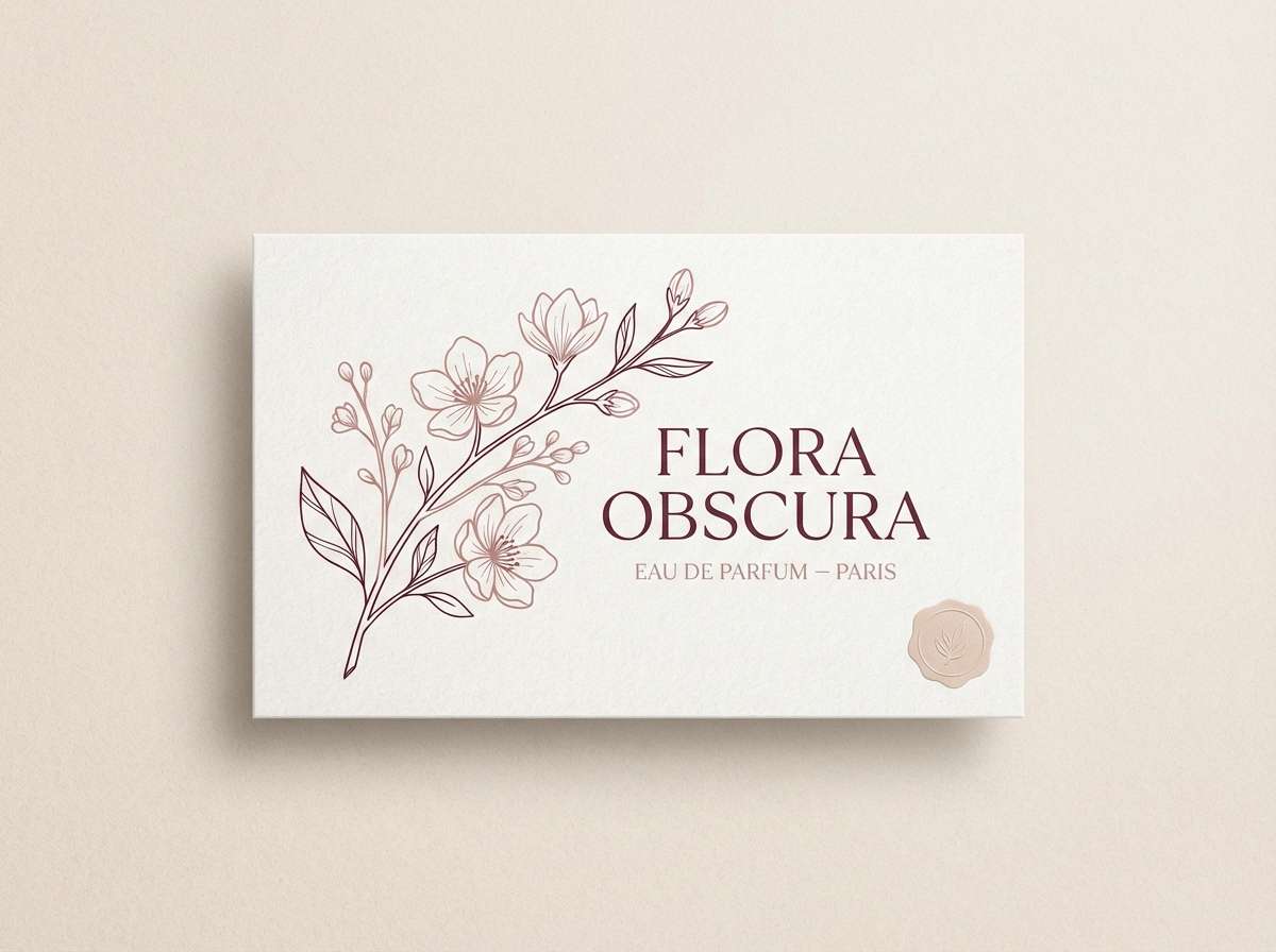
1) Enchanted Rose
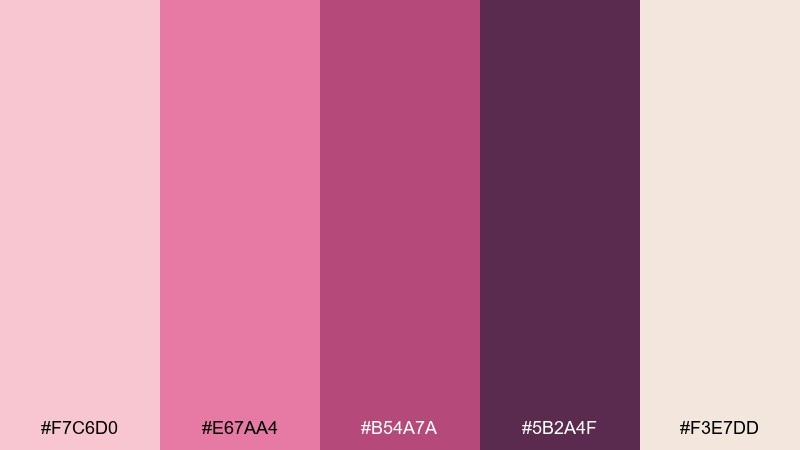
HEX: #f7c6d0 #e67aa4 #b54a7a #5b2a4f #f3e7dd
Mood: romantic, dreamy
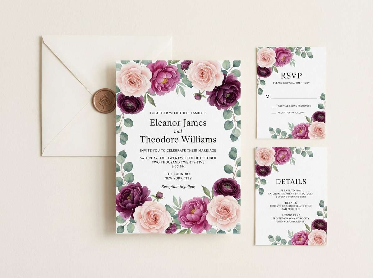
Best for: wedding invitation suite
Romantic and petal-soft, these tones feel like a moonlit garden by the castle gates. Use the blush and cream as your base, then bring in magenta for headings and accents. Pair with elegant serif typography and subtle floral line art. Tip: keep the deep plum for small details like monograms so the design stays airy.
Image example of enchanted rose generated using media.io
Media.io is an online AI studio for creating and editing video, image, and audio in your browser.

2) Moonlit Lavender
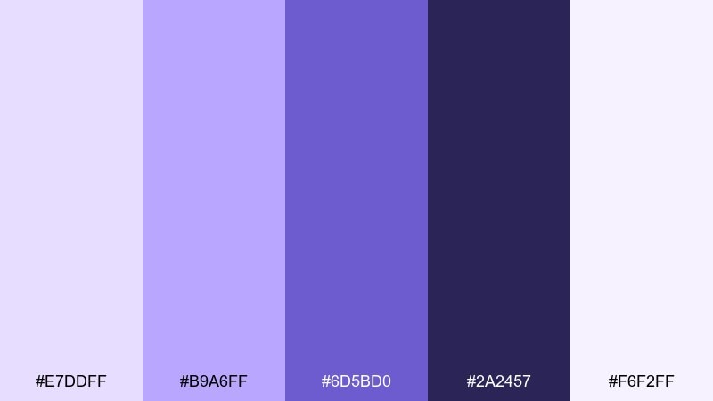
HEX: #e7ddff #b9a6ff #6d5bd0 #2a2457 #f6f2ff
Mood: mystical, calm
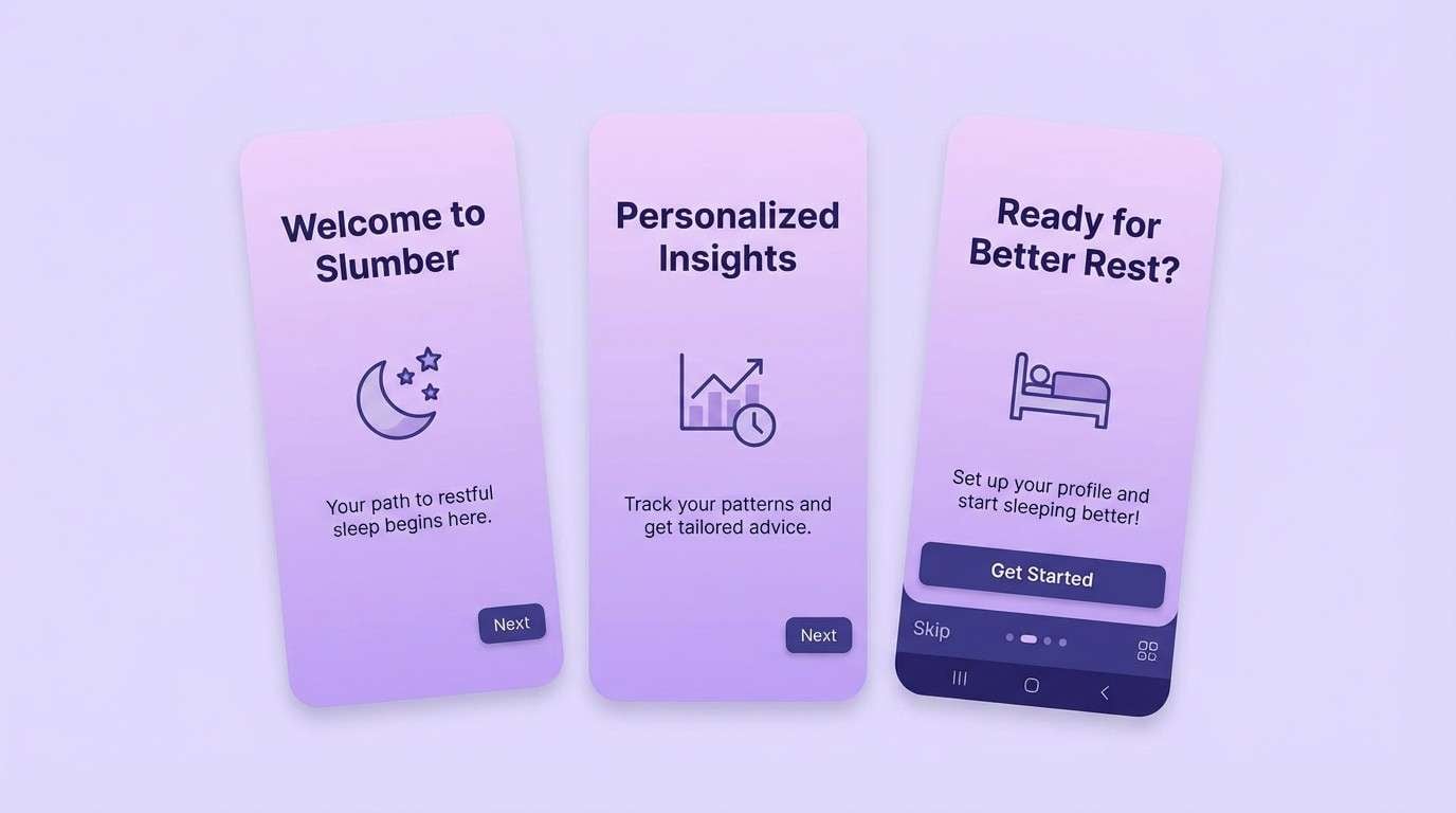
Best for: sleep app onboarding UI
Misty lavender and inky violet evoke quiet spells and midnight pages. Build screens with the pale lilac background, then use the indigo for navigation and primary buttons. Pair with rounded UI components and soft gradients to keep it soothing, not sharp. Tip: reserve the darkest tone for text to maintain accessibility on light panels.
Image example of moonlit lavender generated using media.io
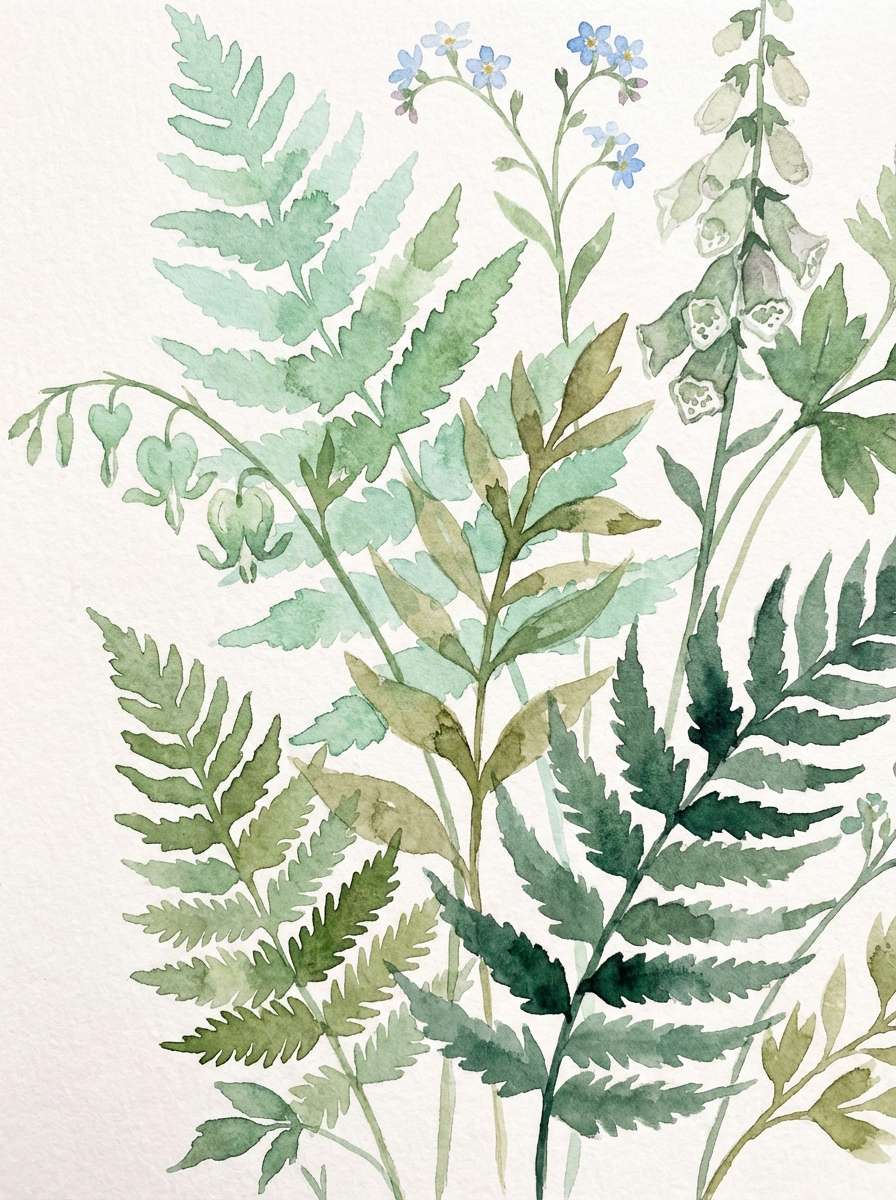
3) Forest Sprite
HEX: #d8f1d7 #7dcf9b #2f8f68 #1f3b2d #f2efe6
Mood: fresh, woodland
Best for: botanical watercolor illustration
Fresh greens and mossy shadows feel like tiny footsteps in an enchanted grove. For a clean look, let the mint and cream do most of the work, then layer mid-green for leaves and textures. These fairy tale color combinations pair beautifully with hand-drawn botanicals and light paper grain. Tip: keep the dark evergreen for outlines so the watercolor stays luminous.
Image example of forest sprite generated using media.io
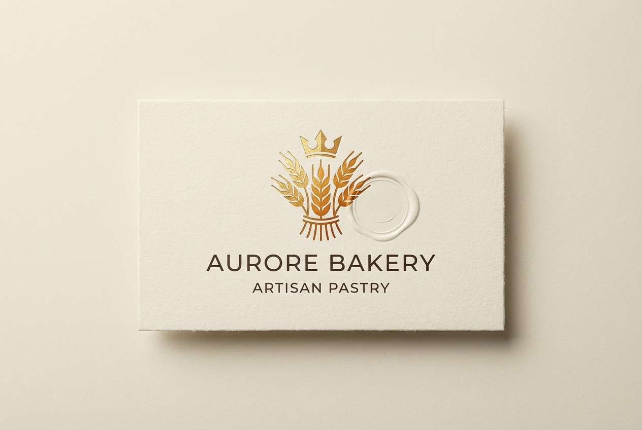
4) Golden Carriage
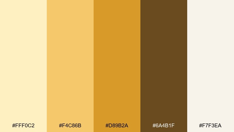
HEX: #fff0c2 #f4c86b #d89b2a #6a4b1f #f7f3ea
Mood: regal, warm
Best for: luxury bakery packaging label
Warm golds and toasted caramel read like candlelight on a royal carriage. Treat the cream and pale gold as your background, then use the amber for stamps, seals, and key brand marks. In a fairy tale color palette like this, a small touch of deep brown adds instant premium contrast. Tip: use foil-style effects sparingly so the label still feels modern.
Image example of golden carriage generated using media.io
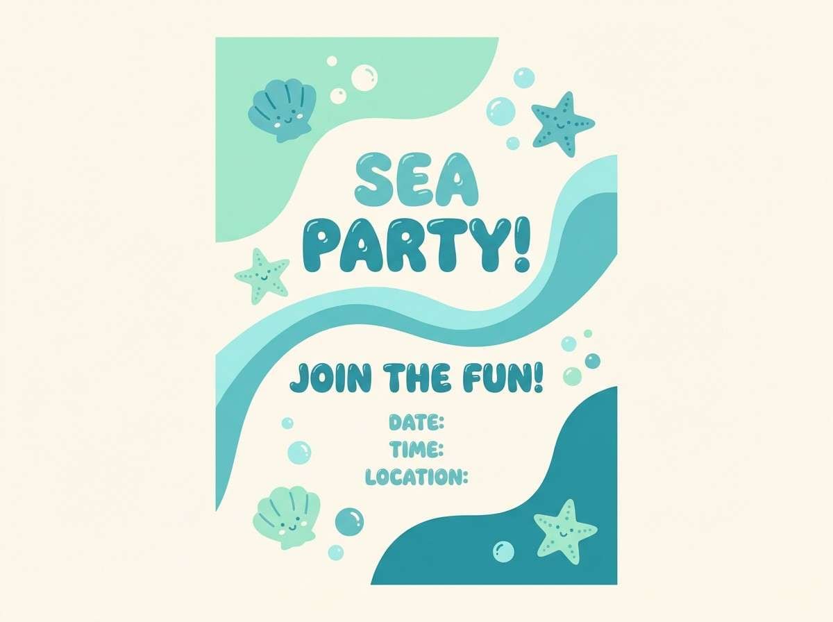
5) Mermaid Lagoon
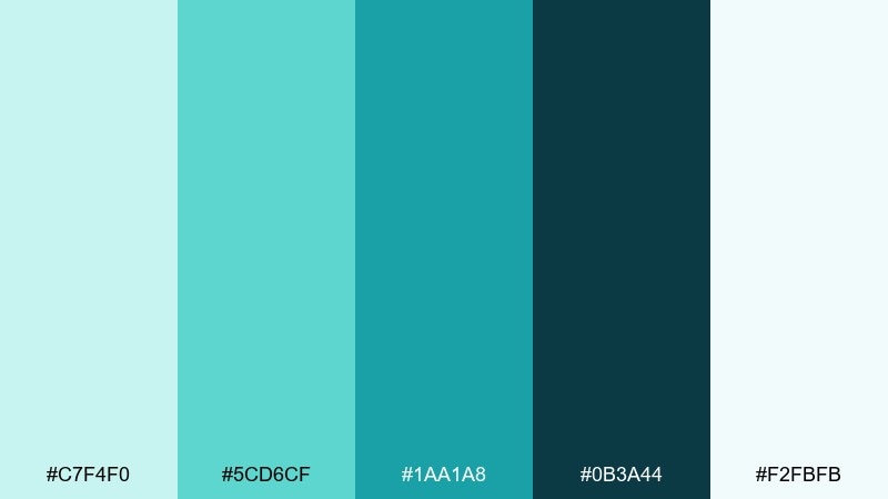
HEX: #c7f4f0 #5cd6cf #1aa1a8 #0b3a44 #f2fbfb
Mood: playful, aquatic
Best for: kids party flyer
Sparkling aqua tones feel like sunbeams dancing on lagoon water. Use the pale mint as a clean base and let teal carry the main shapes and headings. Pair with bubbly display fonts and simple wave patterns to keep it kid-friendly. Tip: add the deep sea tone only for small shadows so the flyer stays bright.
Image example of mermaid lagoon generated using media.io
6) Castle Stone
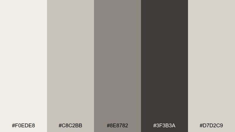
HEX: #f0ede8 #c8c2bb #8e8782 #3f3b3a #d7d2c9
Mood: classic, grounded
Best for: editorial magazine layout
Stone neutrals and soft graphite evoke castle halls and parchment maps. Use the lightest tones for generous margins and whitespace, then rely on charcoal for strong type hierarchy. Pair with a muted accent color from photography to avoid a flat look. Tip: keep body text on warm off-white to prevent the layout from feeling cold.
Image example of castle stone generated using media.io
7) Dragon Ember
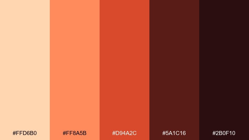
HEX: #ffd6b0 #ff8a5b #d94a2c #5a1c16 #2b0f10
Mood: bold, fiery
Best for: game event poster
Smoky ember reds and scorched browns feel like sparks lifting off dragon scales. Let peach act as a highlight, with orange-red powering the main graphics and callouts. Pair with sharp sans fonts and high-contrast shapes for impact. Tip: keep the near-black for background panels to make the warm tones glow.
Image example of dragon ember generated using media.io

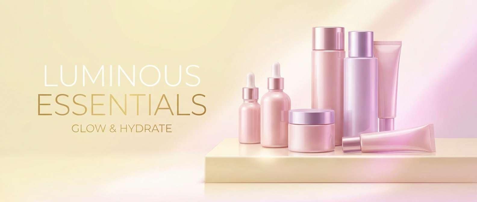
8) Pixie Dust
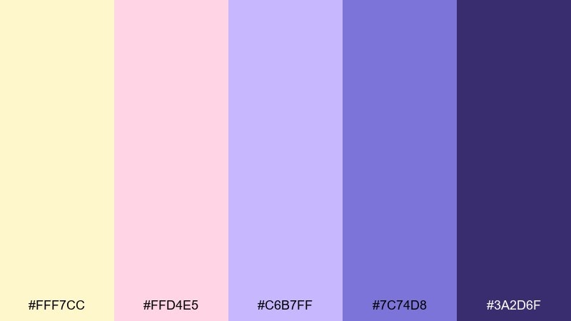
HEX: #fff7cc #ffd4e5 #c6b7ff #7c74d8 #3a2d6f
Mood: sparkly, whimsical
Best for: beauty product ad banner
Soft buttercream and cotton-candy pink sparkle like pixie dust in a sunbeam. Use the pale yellow as a clean backdrop, then layer pink and lilac for gradients and soft highlights. A fairy tale color combination like this shines with glossy effects and minimal product copy. Tip: keep the deep violet only for logo or price text to avoid overpowering the pastels.
Image example of pixie dust generated using media.io
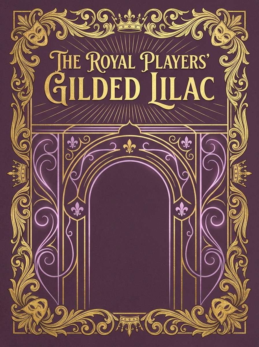
9) Royal Tapestry
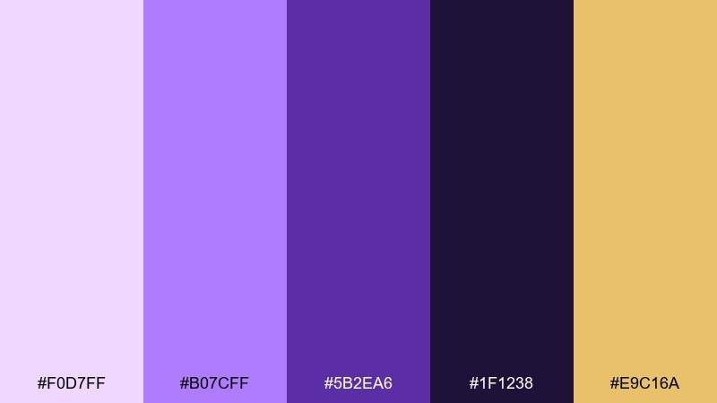
HEX: #f0d7ff #b07cff #5b2ea6 #1f1238 #e9c16a
Mood: opulent, dramatic
Best for: theater playbill cover
Velvet purple and gilded highlights bring to mind royal tapestries and secret chambers. Use deep plum as the stage-like base, then pull in gold for title accents and ornament. Pair with classic serif type and symmetrical borders for a formal look. Tip: limit the light lilac to small flourishes so the cover stays rich and dramatic.
Image example of royal tapestry generated using media.io
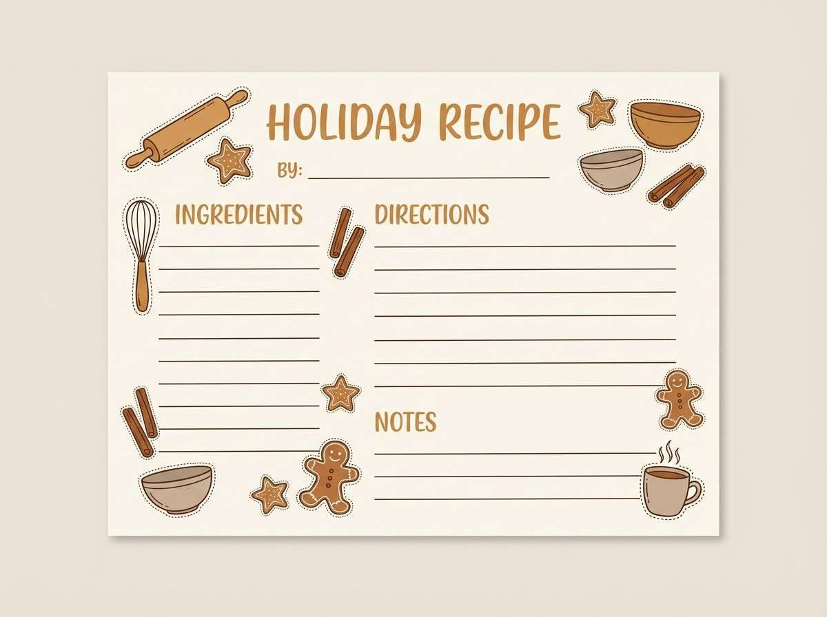
10) Gingerbread Cottage
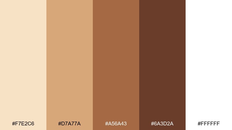
HEX: #f7e2c6 #d7a77a #a56a43 #6a3d2a #ffffff
Mood: cozy, sweet
Best for: holiday recipe card
Toasty browns and creamy vanilla feel like a warm kitchen and sugared roofs. Use white or cream as the main field, then bring in caramel for headers and section dividers. Pair with hand-drawn icons like cinnamon sticks and stars for charm. Tip: keep the darkest brown for small text and measurement units to preserve readability.
Image example of gingerbread cottage generated using media.io
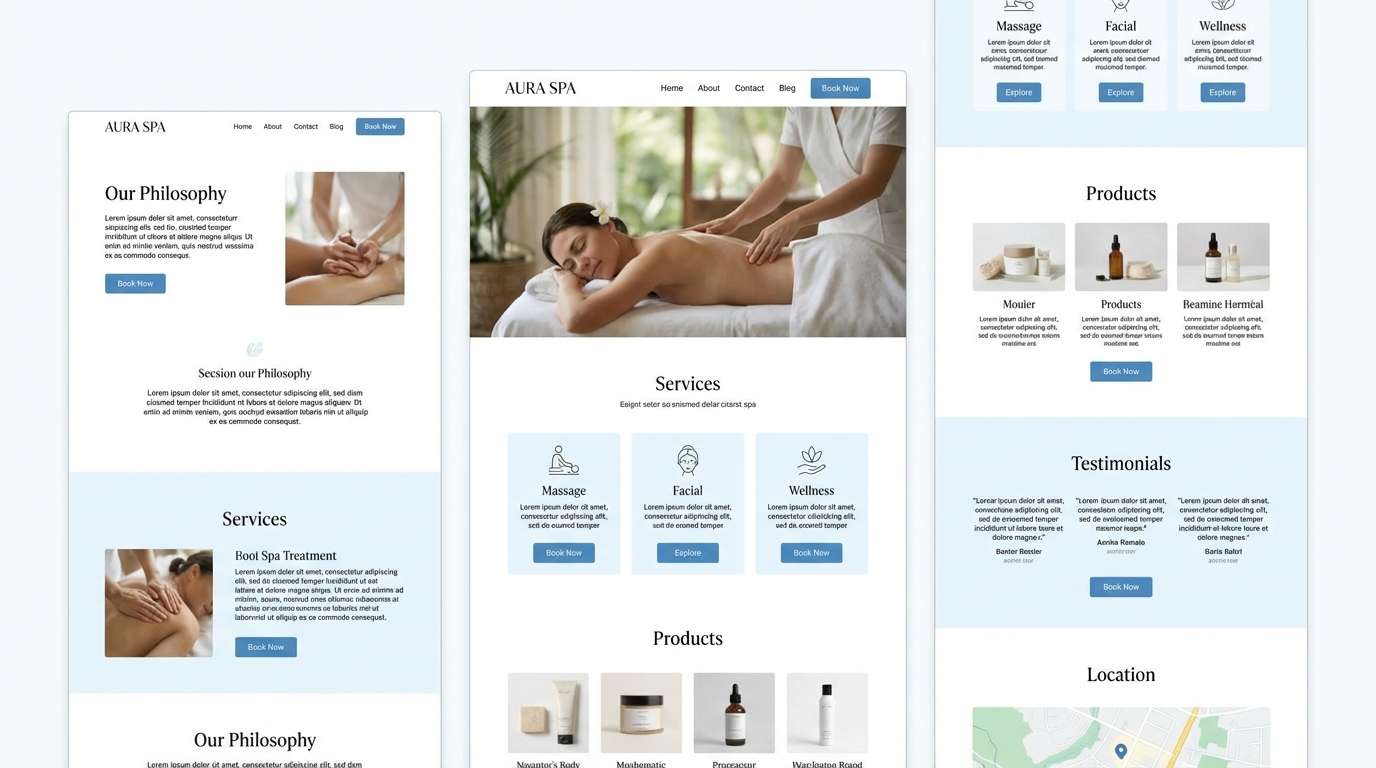
11) Swan Lake
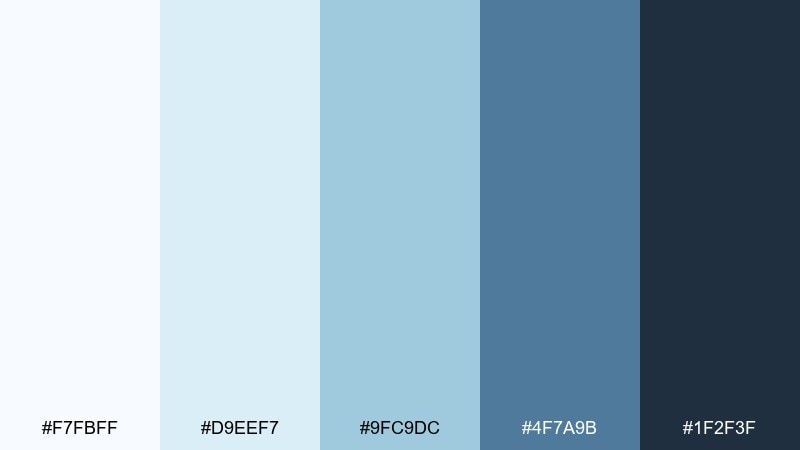
HEX: #f7fbff #d9eef7 #9fc9dc #4f7a9b #1f2f3f
Mood: graceful, serene
Best for: spa brand landing page UI
Cool blues and soft misty whites evoke still water and satin ballet ribbons. Build sections with lots of whitespace, using the pale blue for panels and the medium blue for buttons. Pair with thin-line icons and elegant typography for a calm, premium feel. Tip: use the darkest navy for headings only, keeping body text in the slate tone.
Image example of swan lake generated using media.io
12) Starfall Night
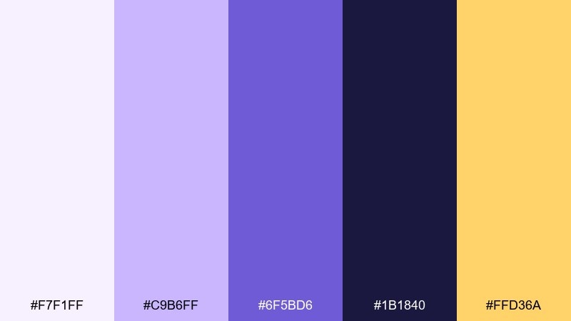
HEX: #f7f1ff #c9b6ff #6f5bd6 #1b1840 #ffd36a
Mood: celestial, magical
Best for: fantasy book cover
Celestial purples with a comet-gold spark feel like a wish made under falling stars. Use deep indigo for the background, then layer violet for clouds, glows, and decorative type. Pair with minimal constellations and a single gold highlight to guide the eye. Tip: keep the light lavender for subtle rim light so the cover stays readable at thumbnail size.
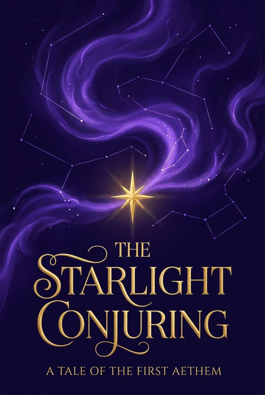
Image example of starfall night generated using media.io
13) Apple Orchard
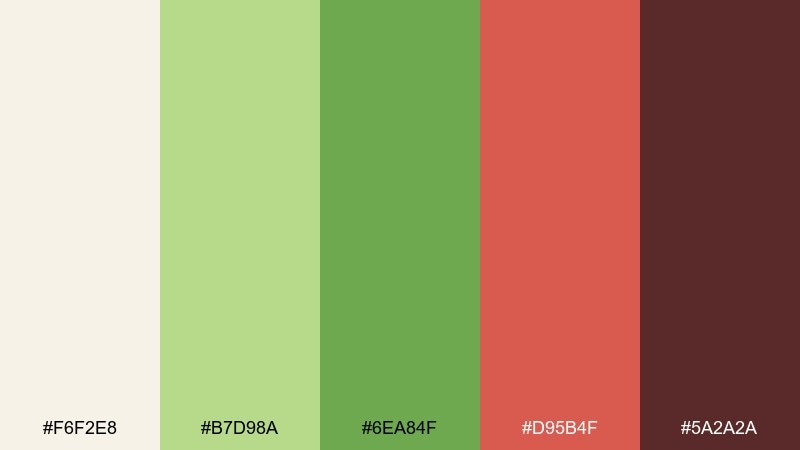
HEX: #f6f2e8 #b7d98a #6ea84f #d95b4f #5a2a2a
Mood: fresh, storybook
Best for: farm-to-table menu design
Leafy greens with a crisp apple red evoke orchard paths and harvest baskets. Use the warm cream as your menu base, then set sections in green for a natural rhythm. Pair with simple illustrations and plenty of breathing room so it feels artisanal. Tip: use red only for specials or small badges to keep the palette balanced.
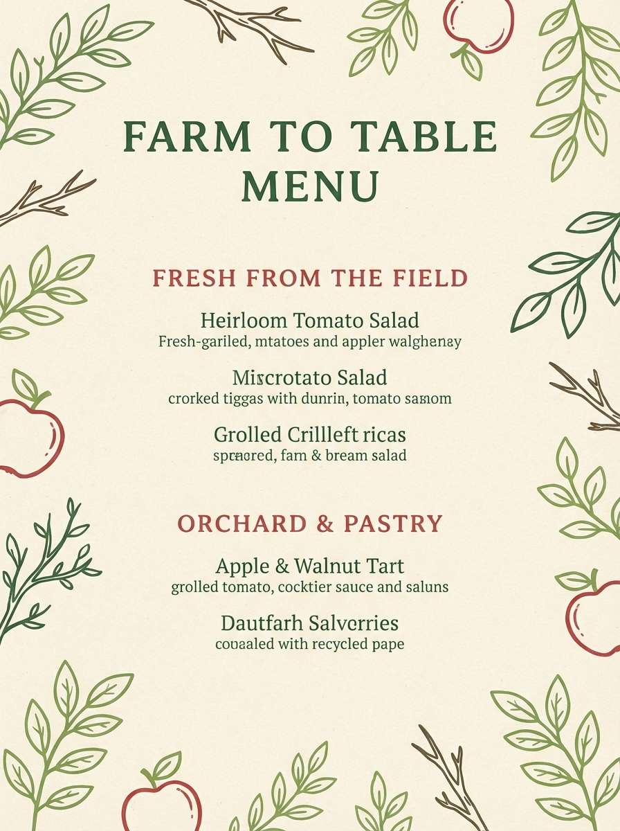
Image example of apple orchard generated using media.io
14) Crystal Slipper
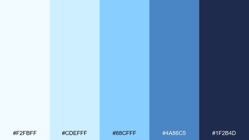
HEX: #f2fbff #cdefff #88cfff #4a86c5 #1f2b4d
Mood: clean, luminous
Best for: tech startup brand kit
Icy blues and polished navy feel like light refracting through crystal. Use the pale tones for backgrounds and brand patterns, then anchor with the deeper blue for typography and logos. These fairy tale color combinations work well with sleek gradients and minimal iconography. Tip: keep contrast high by using the navy for small text and fine lines.
Image example of crystal slipper generated using media.io
15) Spellbook Sepia
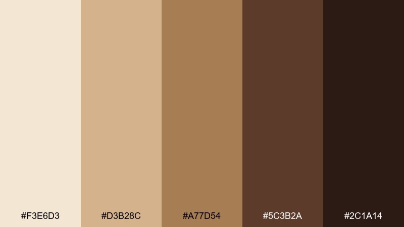
HEX: #f3e6d3 #d3b28c #a77d54 #5c3b2a #2c1a14
Mood: antique, mysterious
Best for: vintage podcast cover art
Sepia parchment and ink-dark browns feel like notes scribbled in a spellbook. Use the light tan for the background texture and the cocoa tones for type and frames. Pair with engraved-style illustrations and subtle grain for authenticity. Tip: keep the darkest shade for the show title so it stays legible on small screens.
Image example of spellbook sepia generated using media.io

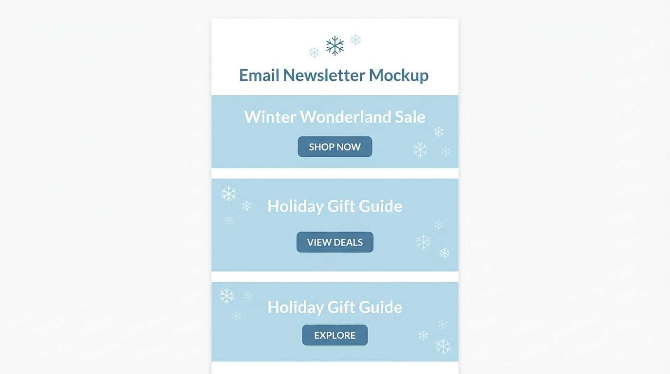
16) Winter Kingdom
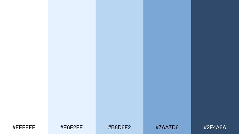
HEX: #ffffff #e6f2ff #b8d6f2 #7aa7d6 #2f4a6a
Mood: crisp, elegant
Best for: holiday email newsletter
Crisp icy blues and clean whites evoke frosted windows and quiet snowfall. Use white as the main canvas, then create sections with pale blue blocks and cool-toned buttons. Pair with minimal snowflake motifs and plenty of padding to keep it modern. Tip: use the deep steel blue sparingly for headings and CTAs to guide clicks.
Image example of winter kingdom generated using media.io
17) Sunlit Meadow
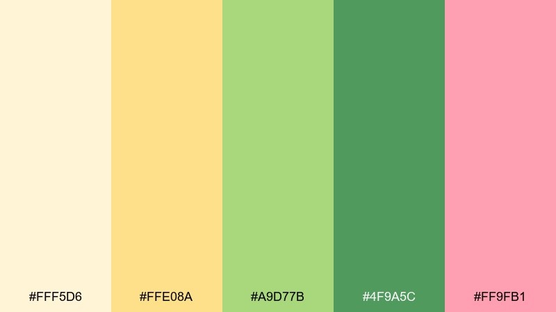
HEX: #fff5d6 #ffe08a #a9d77b #4f9a5c #ff9fb1
Mood: cheerful, airy
Best for: spring event poster
Sun-warmed yellow with fresh greens feels like dancing through a meadow at noon. Use buttercream as the background, then let green define blocks, shapes, and decorative borders. Pair with a tiny touch of pink for highlights like dates or icons. Tip: keep typography bold and simple so the soft tones do not wash out.
Image example of sunlit meadow generated using media.io
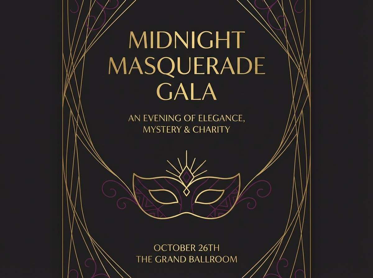
18) Midnight Masquerade
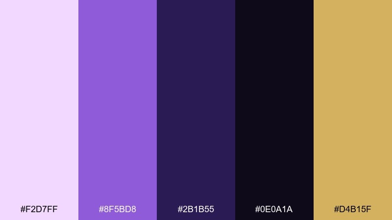
HEX: #f2d7ff #8f5bd8 #2b1b55 #0e0a1a #d4b15f
Mood: mysterious, luxe
Best for: gala invitation flyer
Deep midnight tones with gilded accents evoke velvet masks and candlelit halls. Use near-black as the base, then bring in purple for decorative shapes and elegant type hierarchy. Pair with thin gold lines and small icons to keep it refined. Tip: print on textured paper so the dark background feels intentional and premium.
Image example of midnight masquerade generated using media.io
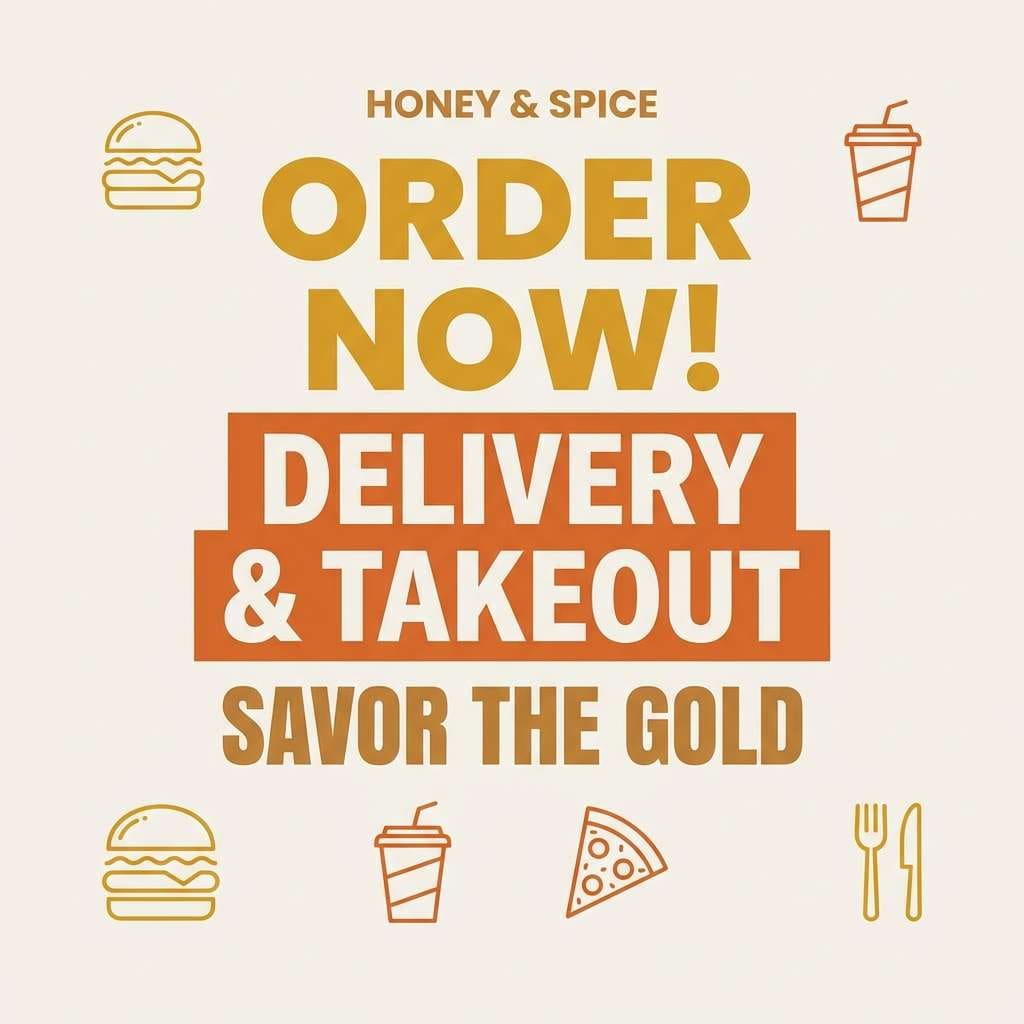
19) Honeyed Lanterns
HEX: #fff1c9 #ffd27a #ff9d4d #a84f2a #3b1f1a
Mood: glowing, festive
Best for: restaurant social media promo
Honey gold and warm amber glow like lanterns along a cobblestone street. Use pale gold for negative space, then let orange carry the appetizing hero shapes and highlight stickers. Pair with food photography that leans warm and avoid cool filters. Tip: keep the dark espresso tone for pricing and fine print to maintain clarity.
Image example of honeyed lanterns generated using media.io
20) Cloud Kingdom
HEX: #fff7fb #f0d8ff #c2b2ff #8aa6ff #4a5bd6
Mood: soft, uplifting
Best for: kids story app UI
Cottony pastels and sky-blue purples feel like drifting through a cloud kingdom. Use the light pink-white as the base, then create friendly buttons in periwinkle and cornflower. Pair with rounded illustrations and gentle drop shadows to keep it playful. Tip: choose one dominant accent for CTAs so the interface stays easy for kids to scan.
Image example of cloud kingdom generated using media.io
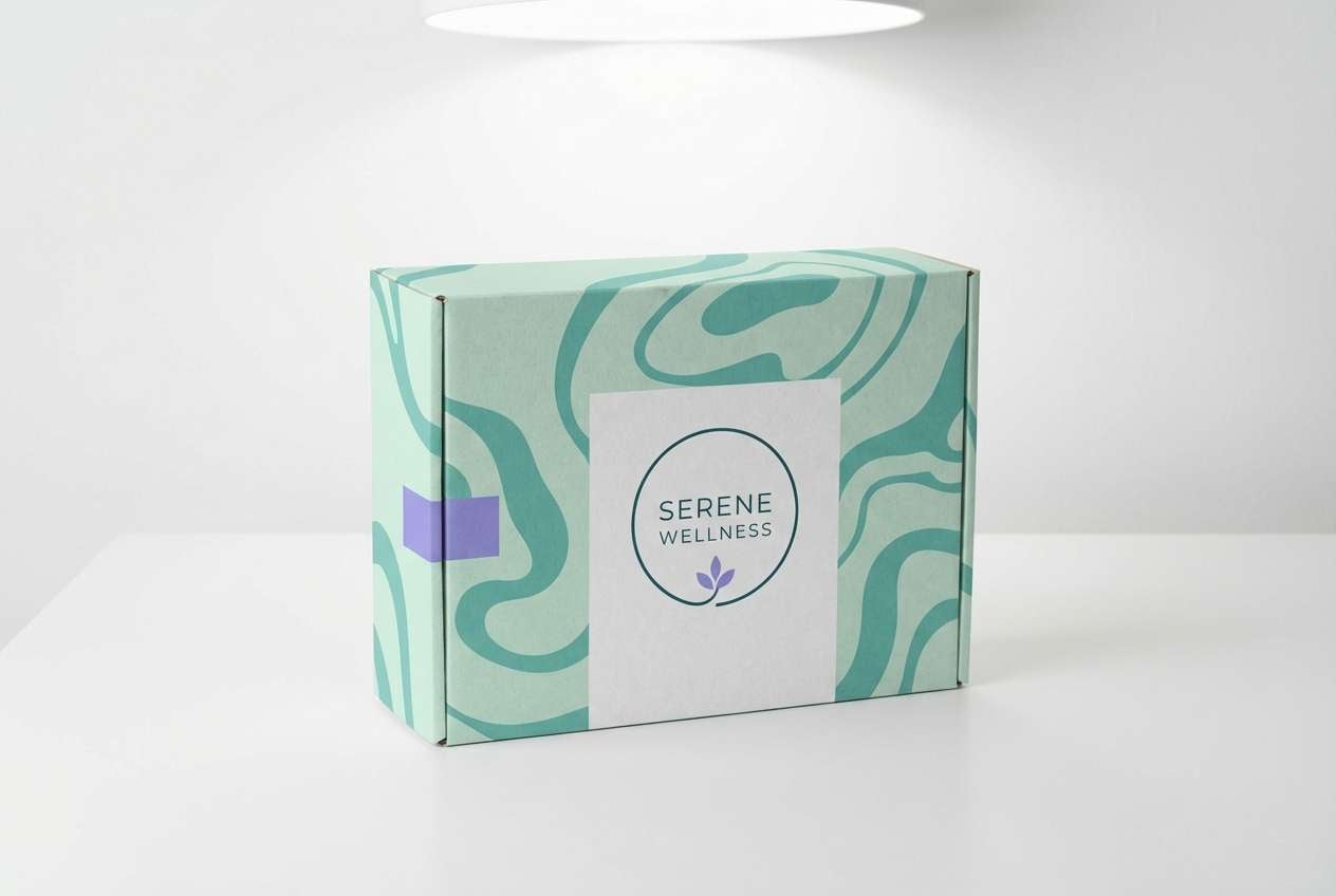
21) Aurora Crown
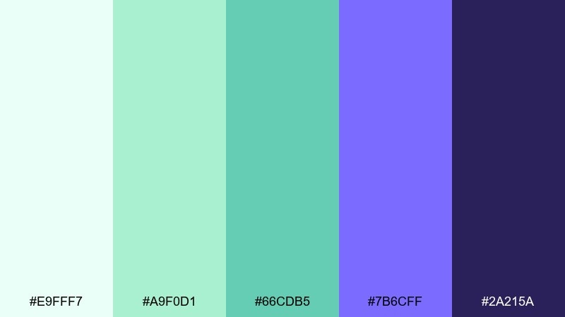
HEX: #e9fff7 #a9f0d1 #66cdb5 #7b6cff #2a215a
Mood: ethereal, modern
Best for: wellness brand logo and packaging
Glowing mint and aurora violet feel like a crown of light at dawn. Keep the pale mint for the box base, then use teal for patterns and a hint of violet for signature accents. This fairy tale color palette works best with minimal marks and lots of breathing room. Tip: limit the dark purple to the logo wordmark so the overall look stays fresh.
Image example of aurora crown generated using media.io
22) Velvet Briar
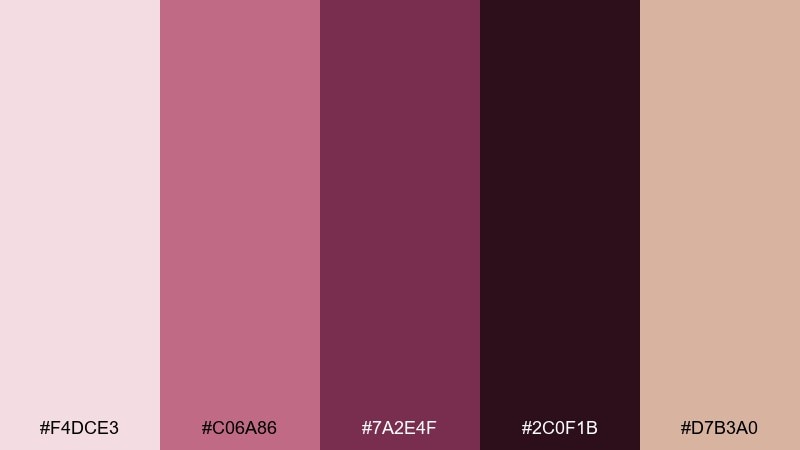
HEX: #f4dce3 #c06a86 #7a2e4f #2c0f1b #d7b3a0
Mood: moody, romantic
Best for: perfume label design
Velvet rose and thorny plum feel like a secret garden at dusk. Use the dusty pink as a soft field, then anchor the label with deep burgundy for typography. Pair with minimal botanical line art and a warm nude tone to avoid harsh contrast. Tip: keep the near-black only for micro-text so the label stays elegant, not heavy.
Image example of velvet briar generated using media.io
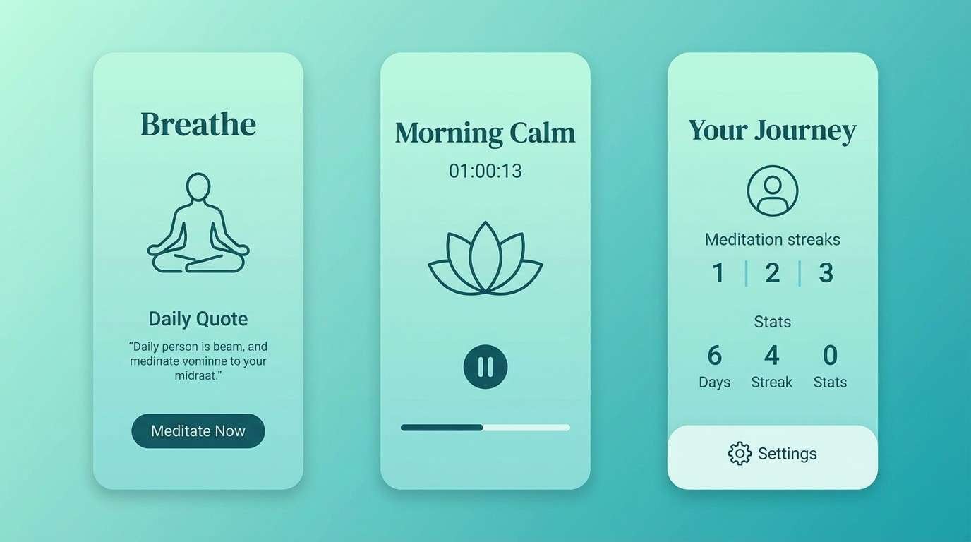
23) River Nymph
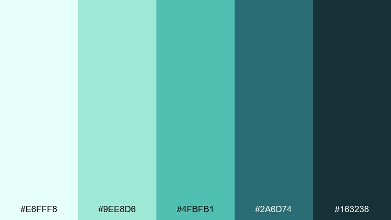
HEX: #e6fff8 #9ee8d6 #4fbfb1 #2a6d74 #163238
Mood: cool, tranquil
Best for: meditation app UI screens
Cool river mints and deep teal shadows evoke calm pools and whispered water magic. Use the pale aqua for backgrounds and cards, then bring in teal for progress states and key controls. Pair with soft gradients and minimal illustrations to keep the screens uncluttered. Tip: test contrast for small labels against the light mint so the UI remains readable.
Image example of river nymph generated using media.io
What Colors Go Well with Fairy Tale?
Fairy tale colors pair best when you mix a light “storybook base” (cream, misty white, pale blush, soft lilac) with one deeper anchor (navy, plum, charcoal, evergreen) to create contrast and hierarchy.
For extra magic, add a single “spark” accent like gold, comet yellow, or jewel teal. Keeping the accent limited helps the palette feel intentional instead of chaotic.
If your design feels too sweet, ground it with warm neutrals (sepia, stone, caramel). If it feels too dark, lift it with airy tints and gentle gradients rather than adding more saturated hues.
How to Use a Fairy Tale Color Palette in Real Designs
Start with roles, not swatches: pick one background color, one primary text color, one UI/shape color, one highlight, and one “deep shadow.” Most fairy tale schemes work because they follow clear hierarchy.
Match palette to material. Pastel fairy tale tones look great with paper grain, watercolor textures, and soft shadows, while jewel-toned palettes shine with velvet-like gradients, gold linework, and high-contrast typography.
Always test small-size readability (thumbnails, mobile UI, RSVP cards). A tiny boost in contrast—often by using the darkest shade for text—keeps whimsical colors practical.
Create Fairy Tale Palette Visuals with AI
If you already have HEX codes, you can generate on-brand visuals faster by describing the layout, mood, and dominant colors—then iterating on details like typography, borders, and texture.
Reuse the prompts above as templates: swap the subject (invitation, app UI, label) while keeping the palette’s dominant colors and lighting style consistent.
To turn any fairy tale color palette into banners, mockups, and concept art in minutes, try Media.io’s text-to-image tool.
Fairy Tale Color Palette FAQs
-
What is a fairy tale color palette?
A fairy tale color palette is a story-driven mix of dreamy pastels, enchanted jewel tones, and grounded neutrals (like parchment cream or castle stone) designed to feel whimsical, nostalgic, and magical. -
Are fairy tale colors always pastel?
No. Pastels are common for “soft magic,” but many fairy tale palettes rely on deep anchors like plum, navy, evergreen, or near-black to add drama and improve readability. -
What are good accent colors for fairy tale designs?
Gold, comet yellow, rose-magenta, or bright teal work well as accents. Use just one accent color for CTAs, seals, or icons to keep the look cohesive. -
How do I make a fairy tale palette look modern (not childish)?
Limit the number of saturated colors, add plenty of whitespace, use one strong dark for typography, and choose clean typefaces (or a refined serif). Subtle gradients and minimal line art also help. -
Which fairy tale palettes work best for branding?
For modern brands, try Crystal Slipper (clean blues), Aurora Crown (mint + violet), or Castle Stone (neutral editorial). For luxury, Midnight Masquerade and Royal Tapestry are strong choices. -
How can I keep text readable on whimsical backgrounds?
Use the darkest color in the palette for body text, avoid placing small text on mid-tone gradients, and check contrast on mobile. If needed, add a light overlay panel behind text. -
Can I generate fairy tale visuals from these palettes with AI?
Yes. Use the provided prompts as a base, keep the “dominant colors” consistent with your HEX choices, and iterate on style words like “watercolor,” “minimal,” “ornate border,” or “premium glossy feel.”
Next: Gradient Color Palette


