

Electric blue is a high-impact hue that instantly signals energy, clarity, and modernity. It’s bold enough for attention-grabbing hero sections, yet clean enough for data-heavy UI when paired with calm neutrals.
Below are curated electric blue color palette ideas with HEX codes, plus practical pairing tips for branding, web design, posters, packaging, and more.
In this article
- Why Electric Blue Palettes Work So Well
-
- neon harbor
- arctic pulse
- citrus circuit
- midnight arcade
- cloudline tech
- ocean glass
- blueprint minimal
- electric lavender glow
- sandstone surf
- emerald voltage
- steel and ink
- sunset magnet
- retro pool tile
- glacier nightfall
- candy pop studio
- forest signal
- mono electric
- royal pop
- coastal neon
- cosmic vinyl
- clean contrast studio
- kinetic gradient
- What Colors Go Well with Electric Blue?
- How to Use a Electric Blue Color Palette in Real Designs
- Create Electric Blue Palette Visuals with AI
Why Electric Blue Palettes Work So Well
Electric blue sits in a “high-visibility” zone: it reads as crisp and confident on screens, and it holds up well against both deep darks and bright whites. That makes it a natural choice for product UI, fintech, and modern brand systems.
It also pairs easily across moods. Add cyan or mint for a clean, futuristic feel; add coral, peach, or amber for warmth and human energy; or keep it monochrome for a refined, cohesive interface.
Most importantly, electric blue creates hierarchy fast. A single electric-blue button, link, or chart highlight can guide the eye without needing extra decoration—especially when the rest of the palette uses soft neutrals.
20+ Electric Blue Color Palette Ideas (with HEX Codes)
1) Neon Harbor
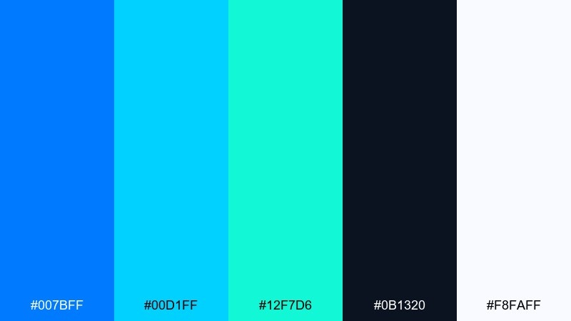
HEX: #007BFF #00D1FF #12F7D6 #0B1320 #F8FAFF
Mood: neon, crisp, coastal-tech
Best for: app splash screen and SaaS hero banner
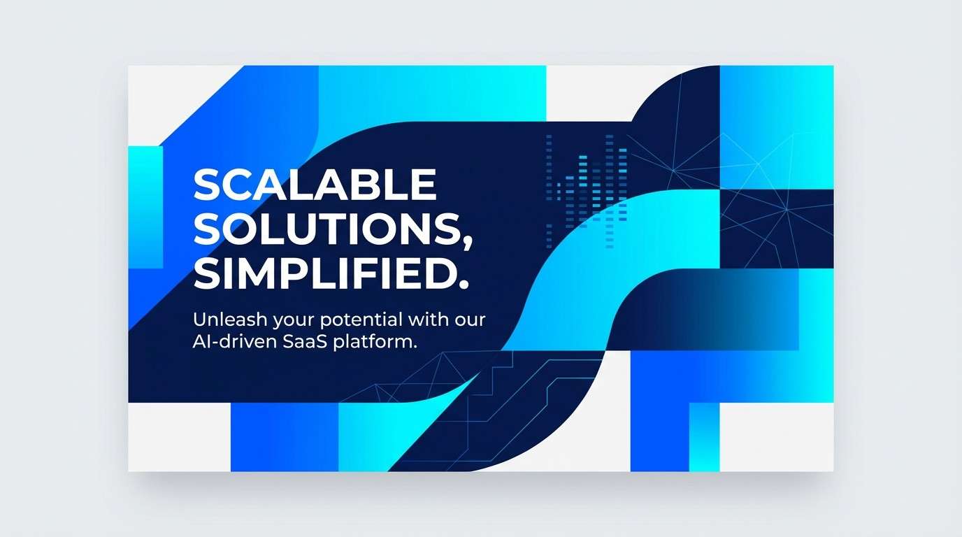
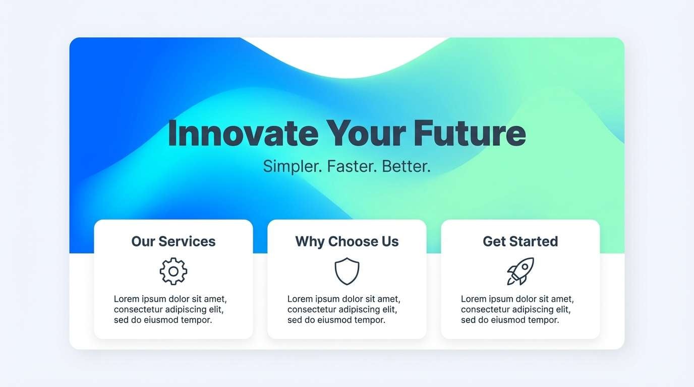
Neon and crisp like harbor lights reflecting on midnight water, this mix feels fast and clean. It works brilliantly for a high-energy electric blue color palette in product launches, fintech, or SaaS. Pair the bright blues with deep navy for readability, then use the aqua as the single attention color. Usage tip: keep the background dark and reserve white for typography and icons to prevent glare.
Image example of neon harbor generated using media.io
Media.io is an online AI studio for creating and editing video, image, and audio in your browser.

2) Arctic Pulse
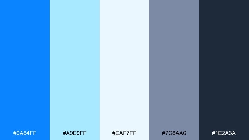
HEX: #0A84FF #A9E9FF #EAF7FF #7C8AA6 #1E2A3A
Mood: icy, airy, precise
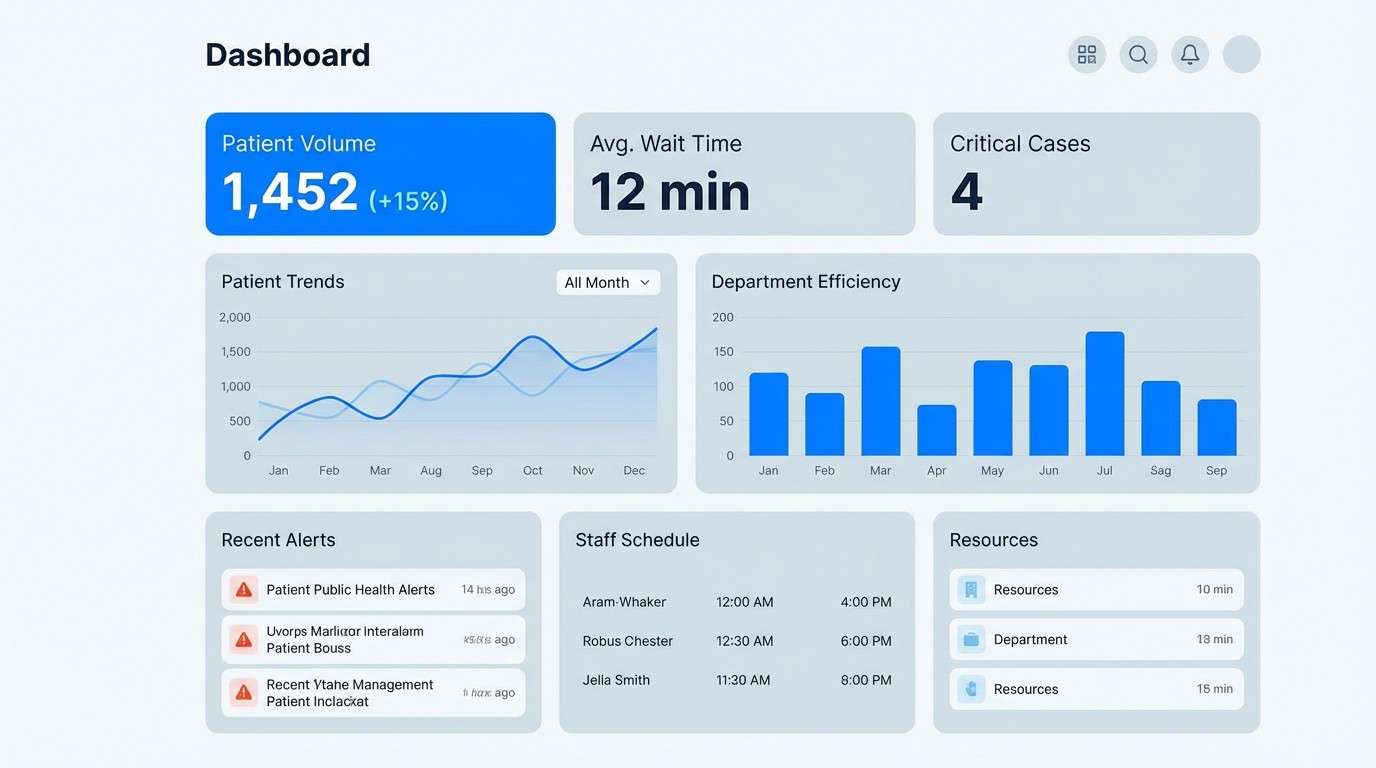
Best for: medical dashboard UI and data visualization
Icy and airy, it evokes clean labs, cool air, and calm confidence. The pale tints keep charts readable while the saturated blue anchors key metrics. Pair with charcoal text and use the gray-blue for gridlines and secondary controls. Usage tip: apply the bright blue only to primary actions and the highest-value data points.
Image example of arctic pulse generated using media.io
3) Citrus Circuit
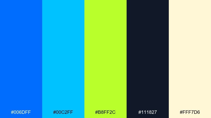
HEX: #006DFF #00C2FF #B8FF2C #111827 #FFF7D6
Mood: playful, zesty, energetic
Best for: gaming poster and event flyer
Playful and zesty, it feels like arcade glow with a squeeze of lime. These electric blue color combinations shine on posters where you need instant contrast at a distance. Pair the lime as a sparing accent against dark charcoal so the blues stay dominant. Usage tip: place the lime only on dates, prices, or callouts to guide the eye.
Image example of citrus circuit generated using media.io

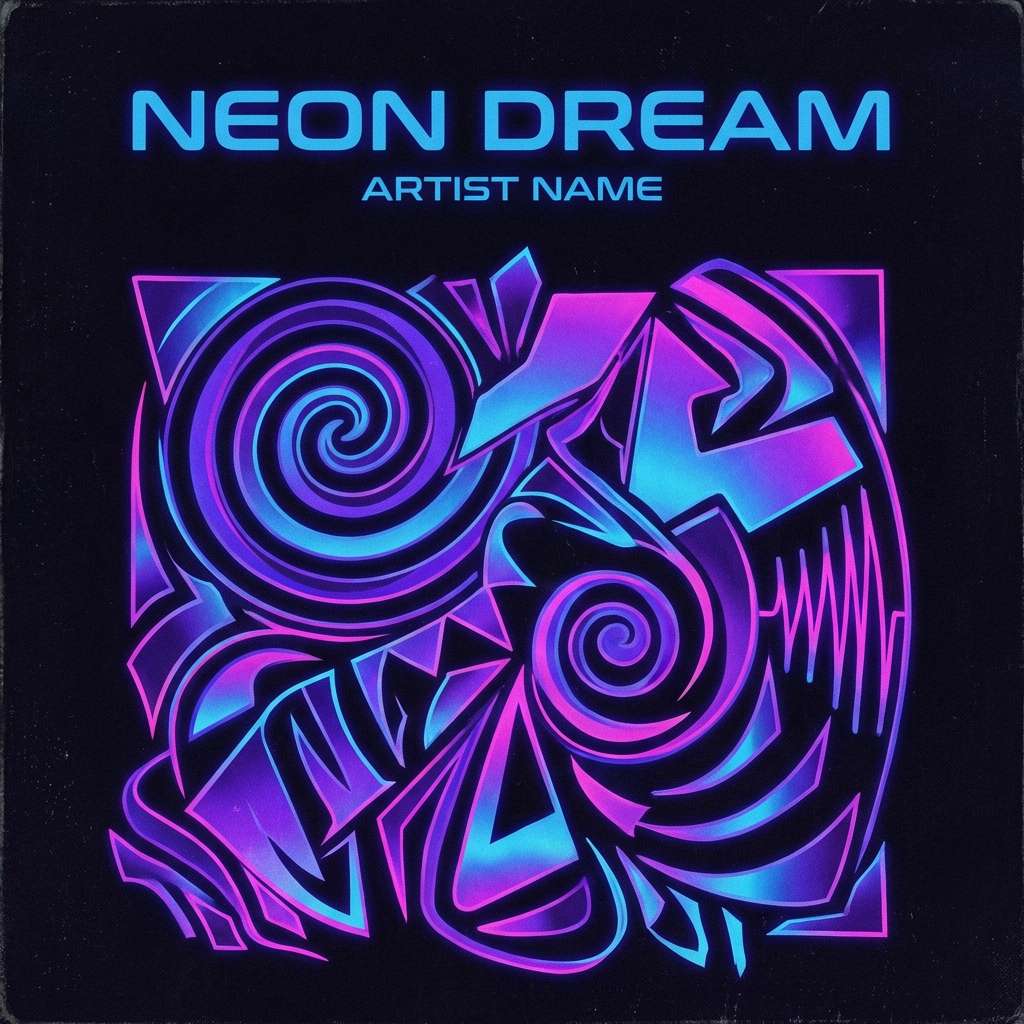
4) Midnight Arcade
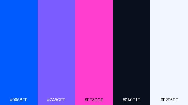
HEX: #005BFF #7A5CFF #FF3DCE #0A0F1E #F2F6FF
Mood: bold, nocturnal, synth
Best for: music single cover art and social promo
Bold and nocturnal, it brings back synth nights, glossy lights, and deep shadows. The violet and magenta create a lively counterpoint to the saturated blue without turning messy. Pair with near-black backgrounds and keep white for small text elements only. Usage tip: use a soft glow effect around the brightest hue to create depth without adding new colors.
Image example of midnight arcade generated using media.io
5) Cloudline Tech
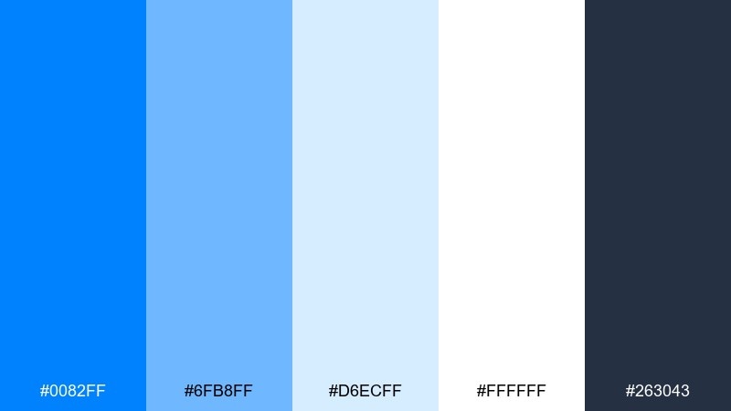
HEX: #0082FF #6FB8FF #D6ECFF #FFFFFF #263043
Mood: clean, friendly, trustworthy
Best for: B2B website UI and onboarding screens
Clean and friendly, it feels like bright sky gradients and well-lit workspaces. The soft blues help long-form UI feel less heavy while the dark slate keeps copy readable. Pair white space with gentle panels to avoid a sterile look. Usage tip: build a three-step hierarchy using slate for text, mid-blue for navigation, and bright blue for primary buttons.
Image example of cloudline tech generated using media.io
6) Ocean Glass
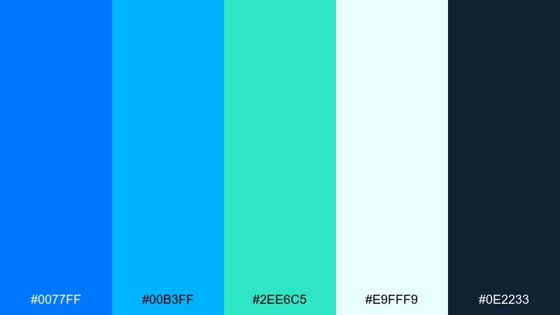
HEX: #0077FF #00B3FF #2EE6C5 #E9FFF9 #0E2233
Mood: fresh, aquatic, luminous
Best for: travel landing page and resort branding
Fresh and aquatic, it evokes sunlit water, sea glass, and breezy afternoons. The teal adds a natural twist that keeps the blues from feeling overly corporate. Pair with deep blue-green for headings and use the mint tint as generous background space. Usage tip: try a top-to-bottom gradient from electric blue to aqua for hero sections.
Image example of ocean glass generated using media.io

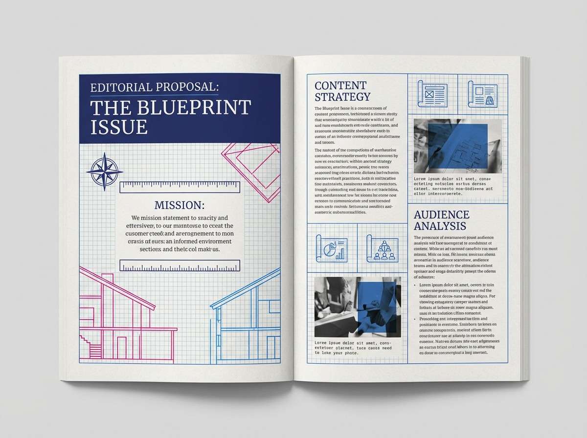
7) Blueprint Minimal
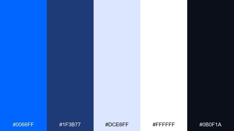
HEX: #0066FF #1F3B77 #DCE6FF #FFFFFF #0B0F1A
Mood: minimal, engineered, focused
Best for: architect portfolio and proposal deck
Minimal and engineered, it reads like blueprint lines on crisp paper. The limited tones keep layouts disciplined and professional across slides and documents. Pair white and pale blue as the base, then use the deep navy for structure and captions. Usage tip: keep the bright blue only for section dividers and key callouts.
Image example of blueprint minimal generated using media.io
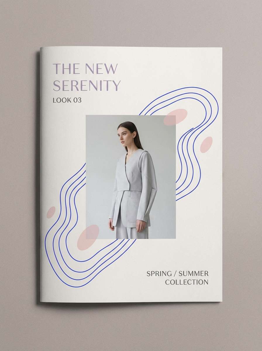
8) Electric Lavender Glow
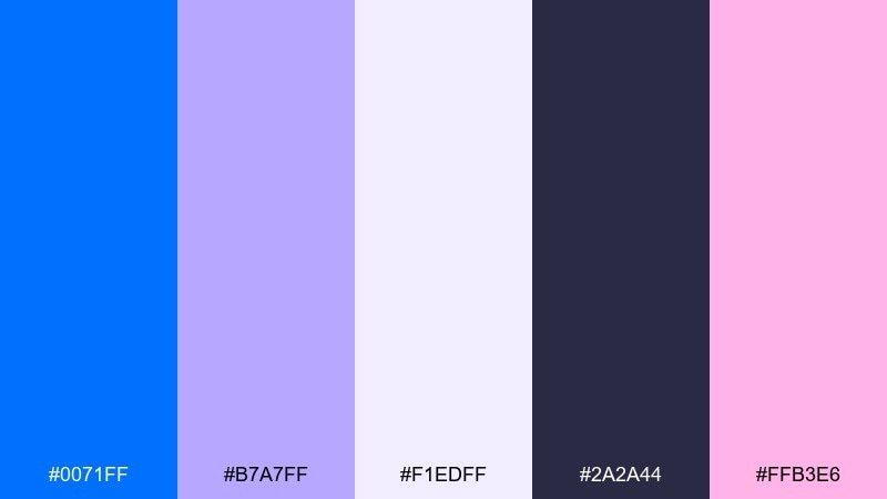
HEX: #0071FF #B7A7FF #F1EDFF #2A2A44 #FFB3E6
Mood: dreamy, modern, expressive
Best for: beauty brand social templates and lookbook
Dreamy and modern, it feels like soft studio lights with a futuristic tint. Lavender and blush smooth out the intensity while the blue keeps everything sharp. Pair the pale lilac as background and let the deeper slate handle text. Usage tip: use the pink as a tiny highlight for prices or limited-edition badges.
Image example of electric lavender glow generated using media.io
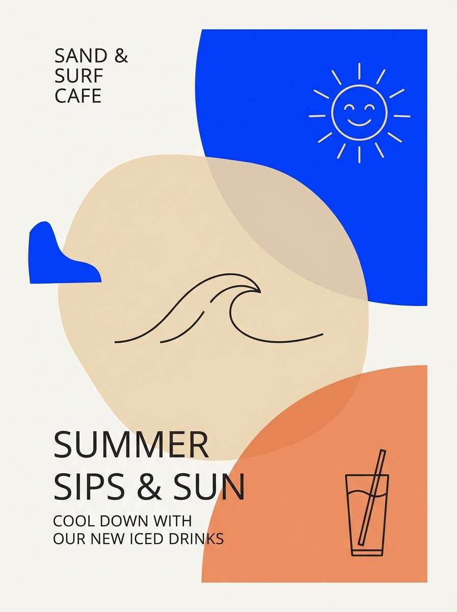
9) Sandstone Surf
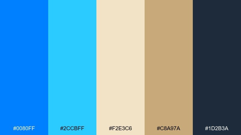
HEX: #0080FF #2CCBFF #F2E3C6 #C8A97A #1D2B3A
Mood: sunny, relaxed, coastal
Best for: cafe menu and summer promo poster
Sunny and relaxed, it mixes beach sand with bright water tones. The warm tans keep the blue from feeling cold, making it ideal for seasonal promotions and friendly brands. Pair the darker slate for text and use the sand tint for generous margins. Usage tip: print tests matter here, so slightly increase contrast for small type on tan backgrounds.
Image example of sandstone surf generated using media.io
10) Emerald Voltage
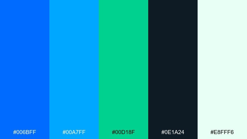
HEX: #006BFF #00A7FF #00D18F #0E1A24 #E8FFF6
Mood: sleek, energetic, sporty
Best for: fitness app UI and product feature tiles
Sleek and energetic, it feels like a night run lit by LED signs and fresh air. The green adds a performance edge without fighting the blues. Pair with deep navy for headers and use the mint tint as breathing room around stats. Usage tip: reserve the green for success states and progress indicators to build intuitive meaning.
Image example of emerald voltage generated using media.io
11) Steel and Ink
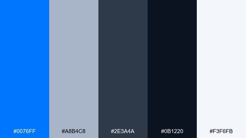
HEX: #0076FF #A8B4C8 #2E3A4A #0B1220 #F3F6FB
Mood: serious, modern, industrial
Best for: enterprise branding and pitch deck
Serious and modern, it suggests steel surfaces, inked plans, and strong structure. The grays keep the palette grounded while the bright blue signals clarity and speed. Pair the light gray as a base for slides and use black-navy for dense text blocks. Usage tip: avoid overusing the saturated blue on large areas; keep it for headings and icons.
Image example of steel and ink generated using media.io
12) Sunset Magnet
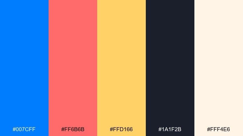
HEX: #007CFF #FF6B6B #FFD166 #1A1F2B #FFF4E6
Mood: warm, magnetic, upbeat
Best for: product launch banner and ad creative
Warm and magnetic, it feels like a late-day skyline with bright signage. The coral-red and golden yellow make the blue pop without tipping into neon chaos. Pair the dark charcoal for contrast and keep the cream as a soft buffer around copy. Usage tip: use the yellow sparingly for price tags or limited-time bursts to avoid visual fatigue.
Image example of sunset magnet generated using media.io
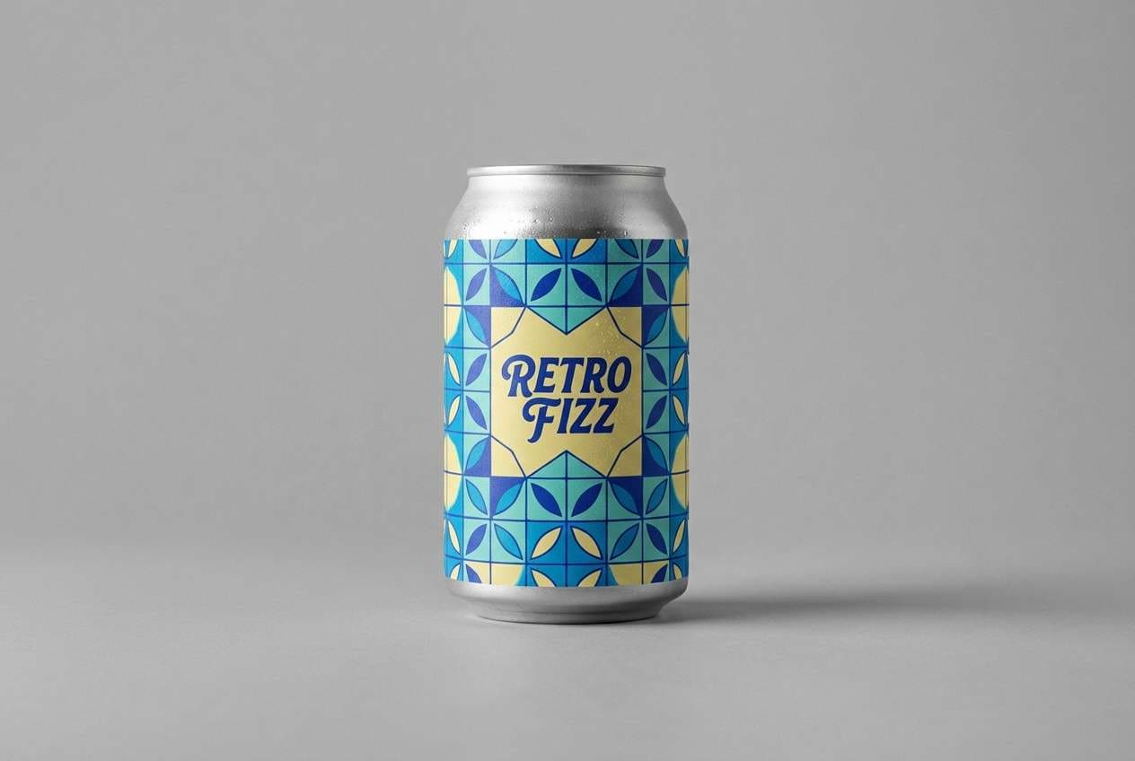
13) Retro Pool Tile
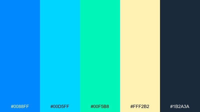
HEX: #0088FF #00D5FF #00F5B8 #FFF2B2 #1B2A3A
Mood: retro, playful, summer
Best for: packaging for beverages and snacks
Retro and playful, it brings to mind pool tiles, sun glare, and weekend treats. The aqua and mint keep it light while the navy adds structure for labels. Pair the butter yellow as a small highlight to soften the overall coolness. Usage tip: use repeating tile patterns in two blues to create a memorable shelf look.
Image example of retro pool tile generated using media.io
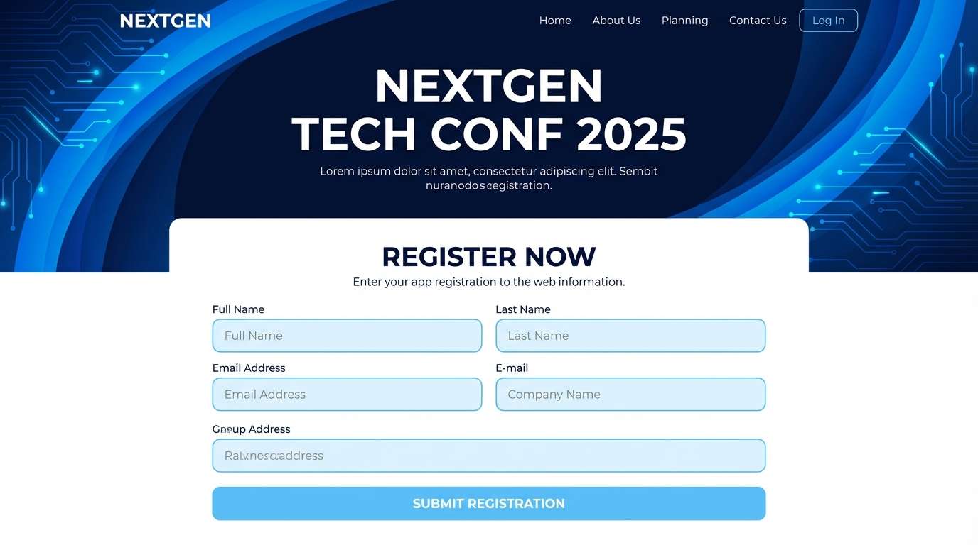
14) Glacier Nightfall
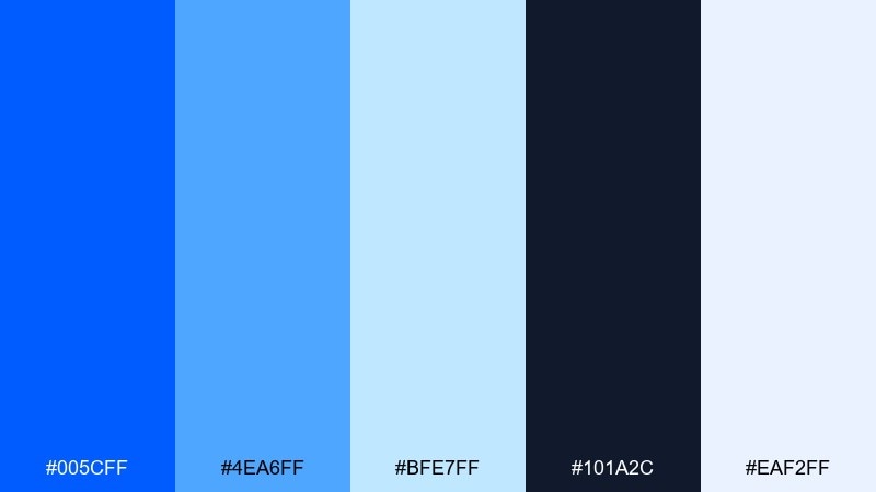
HEX: #005CFF #4EA6FF #BFE7FF #101A2C #EAF2FF
Mood: cool, cinematic, calm
Best for: tech conference website and registration flow
Cool and cinematic, it feels like glacier light fading into deep night. The layered blues give you instant depth for headers, cards, and section breaks. Pair the darkest navy with generous spacing to keep the page premium and legible. Usage tip: use the palest tint for form fields so the primary blue can stay reserved for calls to action.
Image example of glacier nightfall generated using media.io
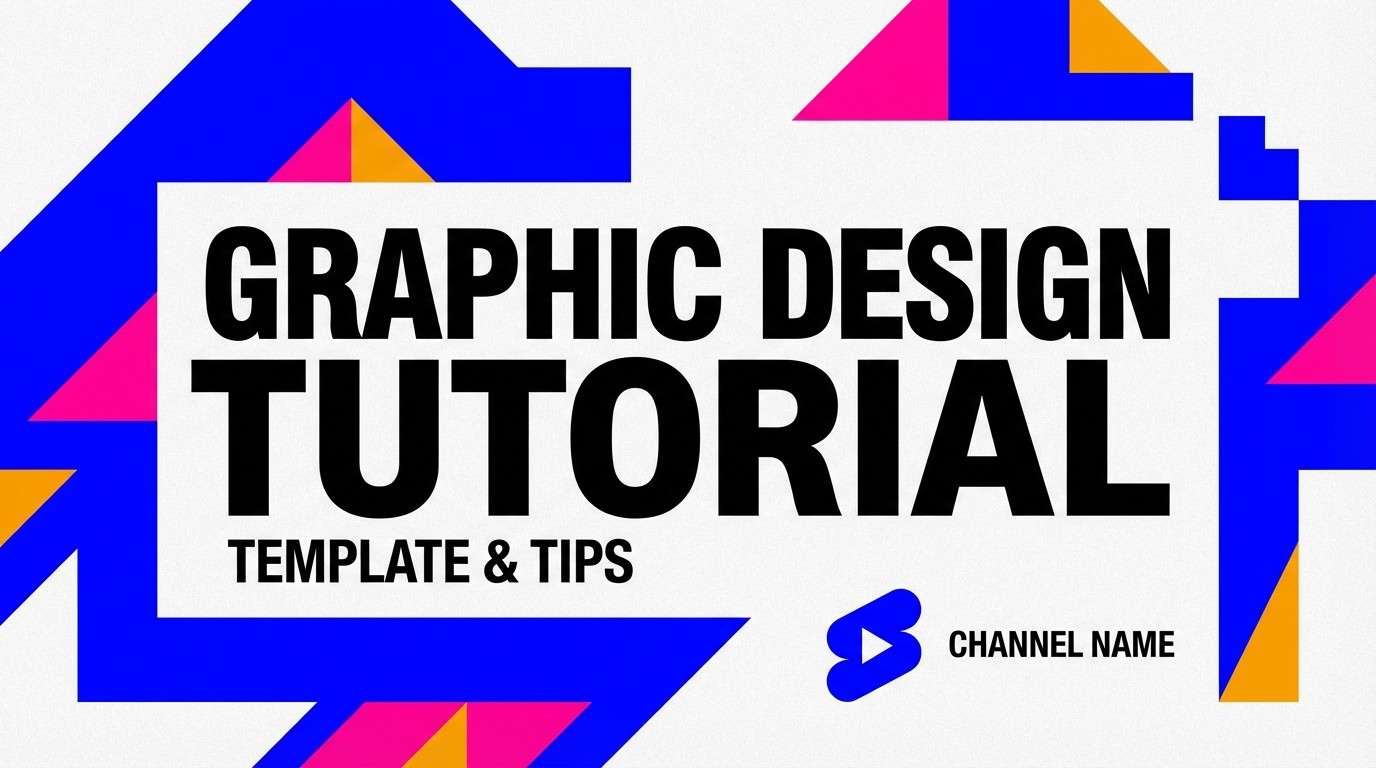
15) Candy Pop Studio
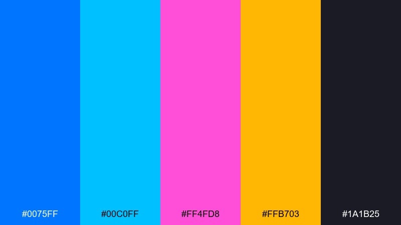
HEX: #0075FF #00C0FF #FF4FD8 #FFB703 #1A1B25
Mood: loud, fun, creator-first
Best for: YouTube thumbnail template and creator branding
Loud and fun, it looks like studio LEDs and candy-colored props. These electric blue color combinations work best when you need instant attention in crowded feeds. Pair the blue with charcoal backgrounds and keep the pink and amber to short bursts around focal elements. Usage tip: outline text in off-white or cyan to protect readability over saturated blocks.
Image example of candy pop studio generated using media.io
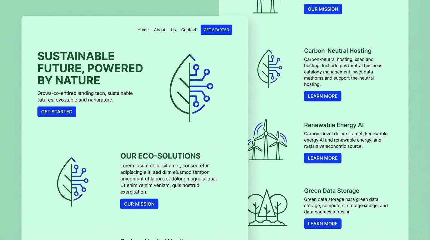
16) Forest Signal
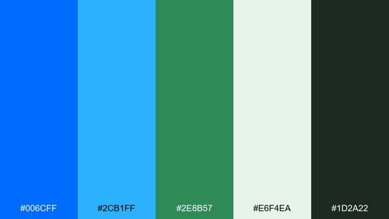
HEX: #006CFF #2CB1FF #2E8B57 #E6F4EA #1D2A22
Mood: outdoor, grounded, fresh
Best for: eco tech startup branding and web sections
Outdoor and grounded, it suggests trail markers, clean streams, and new growth. The green keeps the blues feeling more natural than corporate. Pair the pale mint as the main background and use the deep forest tone for headings and long copy. Usage tip: keep the bright blue for interactive elements so links and buttons always read as actions.
Image example of forest signal generated using media.io
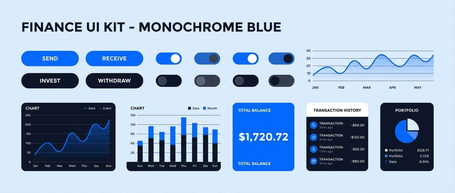
17) Mono Electric
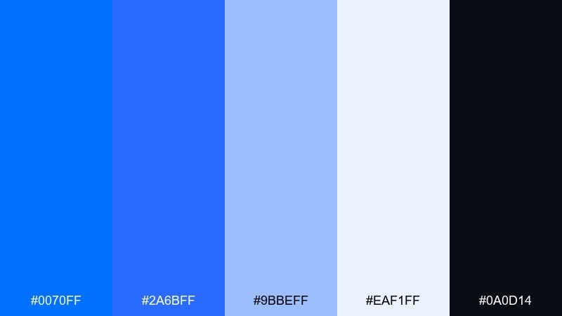
HEX: #0070FF #2A6BFF #9BBEFF #EAF1FF #0A0D14
Mood: focused, modern, monochrome
Best for: finance app UI kit and component library
Focused and modern, it feels like a single spotlight across layered blue shadows. Sticking to one hue family makes complex interfaces feel cohesive and calm. Pair near-black for text and use the palest blue as your default surface color. Usage tip: define states using saturation steps so hover, active, and disabled are instantly recognizable.
Image example of mono electric generated using media.io
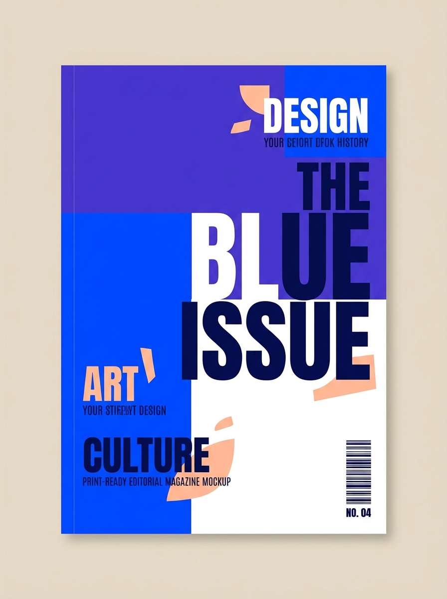
18) Royal Pop
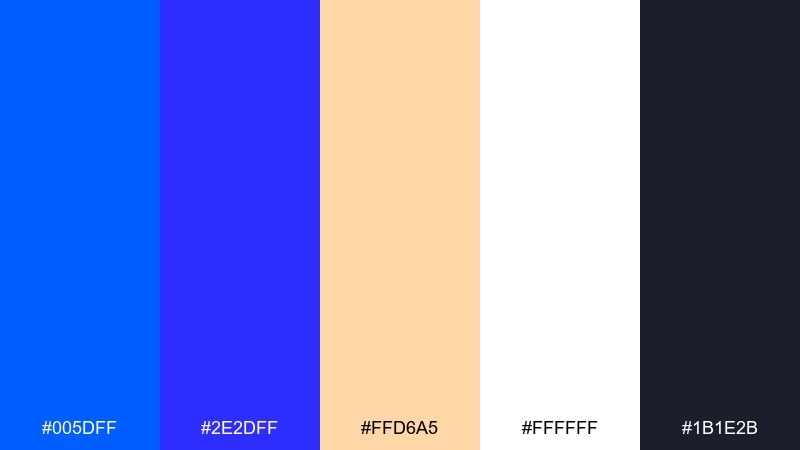
HEX: #005DFF #2E2DFF #FFD6A5 #FFFFFF #1B1E2B
Mood: bold, premium, editorial
Best for: magazine cover concept and editorial layouts
Bold and premium, it reads like royal ink with a modern pop edge. The creamy peach softens the blues and adds a fashion-forward highlight. Pair white as the main canvas and let the darkest tone carry headlines and captions. Usage tip: keep accents to one warm element per spread so the blues remain the signature.
Image example of royal pop generated using media.io
19) Coastal Neon
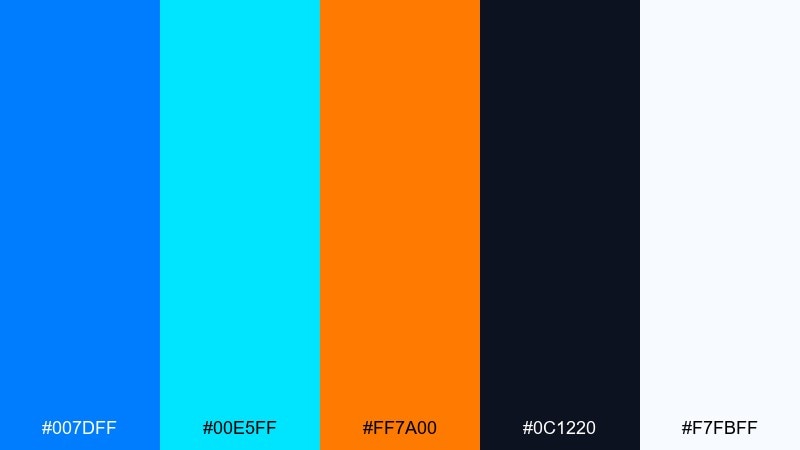
HEX: #007DFF #00E5FF #FF7A00 #0C1220 #F7FBFF
Mood: fresh, punchy, high-contrast
Best for: sports event poster and ticket graphic
Fresh and punchy, it feels like bright surf paired with a flash of sunset orange. The contrast is ideal for bold headlines and quick scanning in crowded venues. Pair the orange only with key information while cyan supports secondary shapes and dividers. Usage tip: use the dark base for the poster field so the bright hues stay saturated in print.
Image example of coastal neon generated using media.io

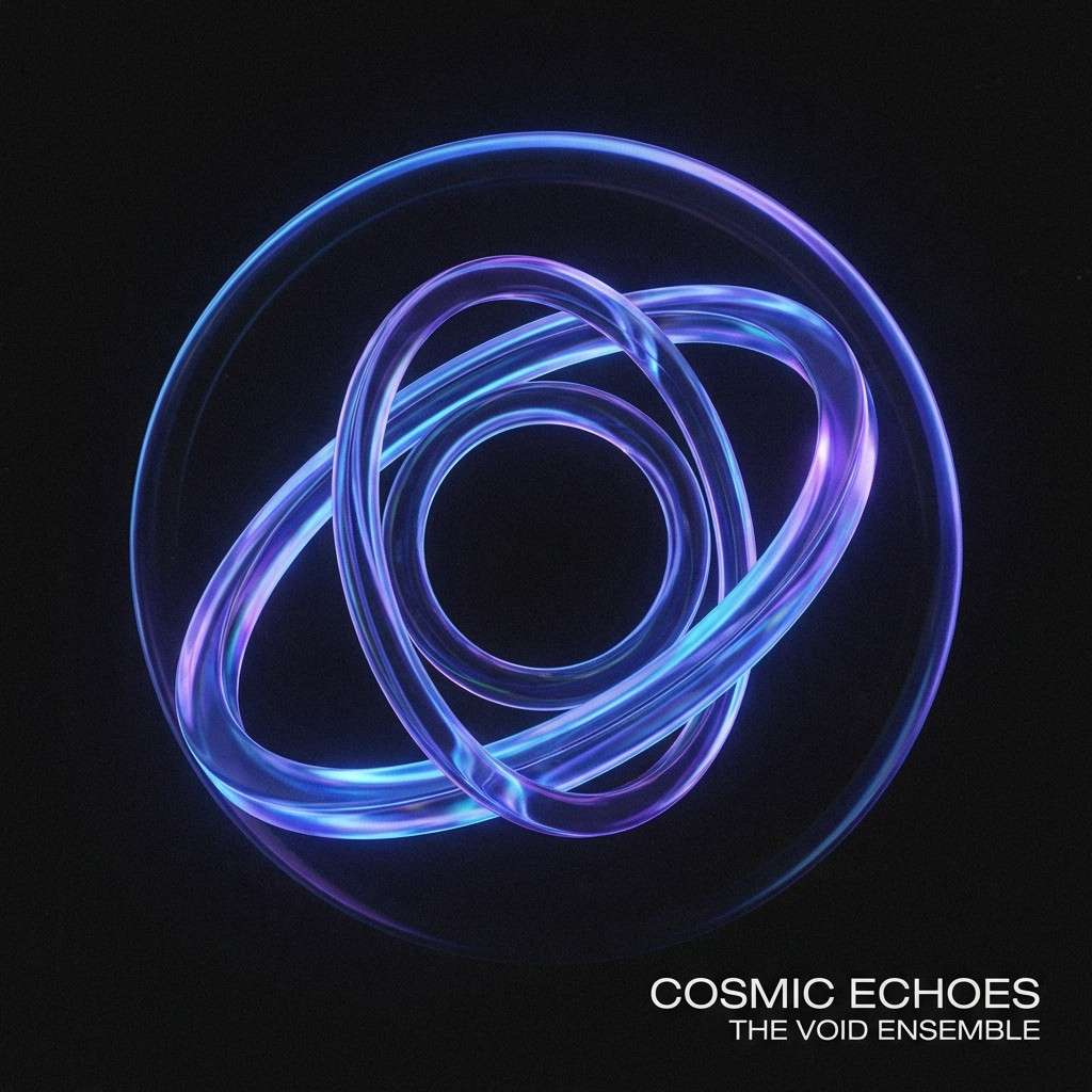
20) Cosmic Vinyl
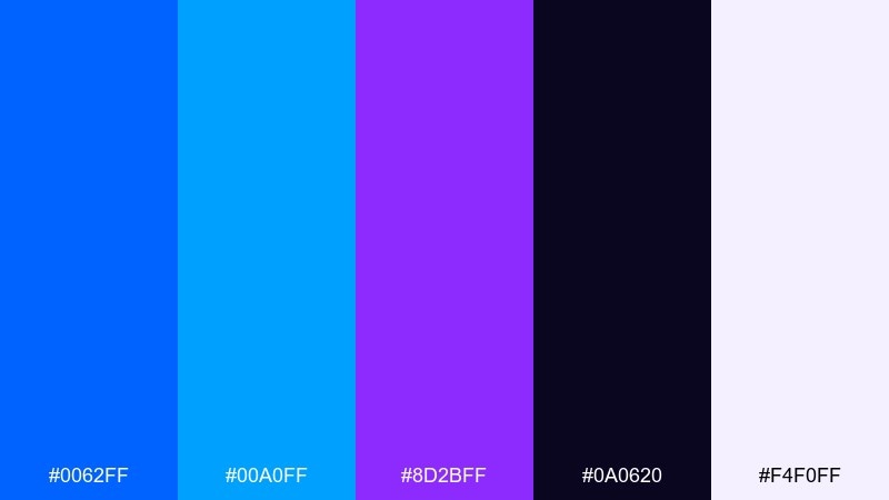
HEX: #0062FF #00A0FF #8D2BFF #0A0620 #F4F0FF
Mood: cosmic, glossy, immersive
Best for: album cover and merch graphics
Cosmic and glossy, it suggests vinyl shine, deep space, and neon halos. The violet adds mystery while the blue stays in control as the main spotlight. Pair the pale lavender for small text blocks and keep the background near-black for drama. Usage tip: add subtle grain texture so gradients look rich without banding.
Image example of cosmic vinyl generated using media.io
21) Clean Contrast Studio
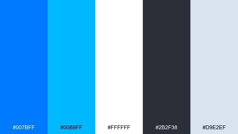
HEX: #007BFF #00B8FF #FFFFFF #2B2F38 #D9E2EF
Mood: sharp, professional, high-clarity
Best for: brand system and logo presentation
Sharp and professional, it feels like a bright studio with crisp edges and clear decisions. As an electric blue color palette, it is built for brand systems where accessibility and consistency matter. Pair the blues with graphite for text and use the light gray-blue for subtle panels or spec sheets. Usage tip: test your primary blue against white at small sizes to confirm contrast for icons and marks.
Image example of clean contrast studio generated using media.io
22) Kinetic Gradient
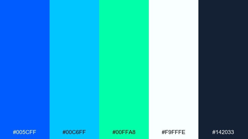
HEX: #005CFF #00C6FF #00FFA8 #F9FFFE #142033
Mood: dynamic, optimistic, futuristic
Best for: startup homepage gradient sections
Dynamic and optimistic, it reads like motion trails and clean airflow. These electric blue color combinations are especially strong for gradients that still feel modern and readable. Pair the deep blue-gray for text and keep the mint-white as your main surface to avoid visual noise. Usage tip: limit gradients to one or two large areas and keep the rest flat for balance.
Image example of kinetic gradient generated using media.io
What Colors Go Well with Electric Blue?
Electric blue pairs beautifully with deep neutrals like navy, charcoal, and ink-black because they increase contrast and make the blue feel even more luminous. White and cool light grays keep layouts airy and help electric-blue accents read as “interactive.”
For a warmer, more emotional look, combine electric blue with coral, peach, salmon, or amber. This warm-cool contrast feels modern and attention-grabbing for ads, product launches, and posters.
For fresh, nature-leaning palettes, add teal, mint, or emerald. These neighbors on the color wheel maintain the “clean tech” vibe while softening the corporate edge.
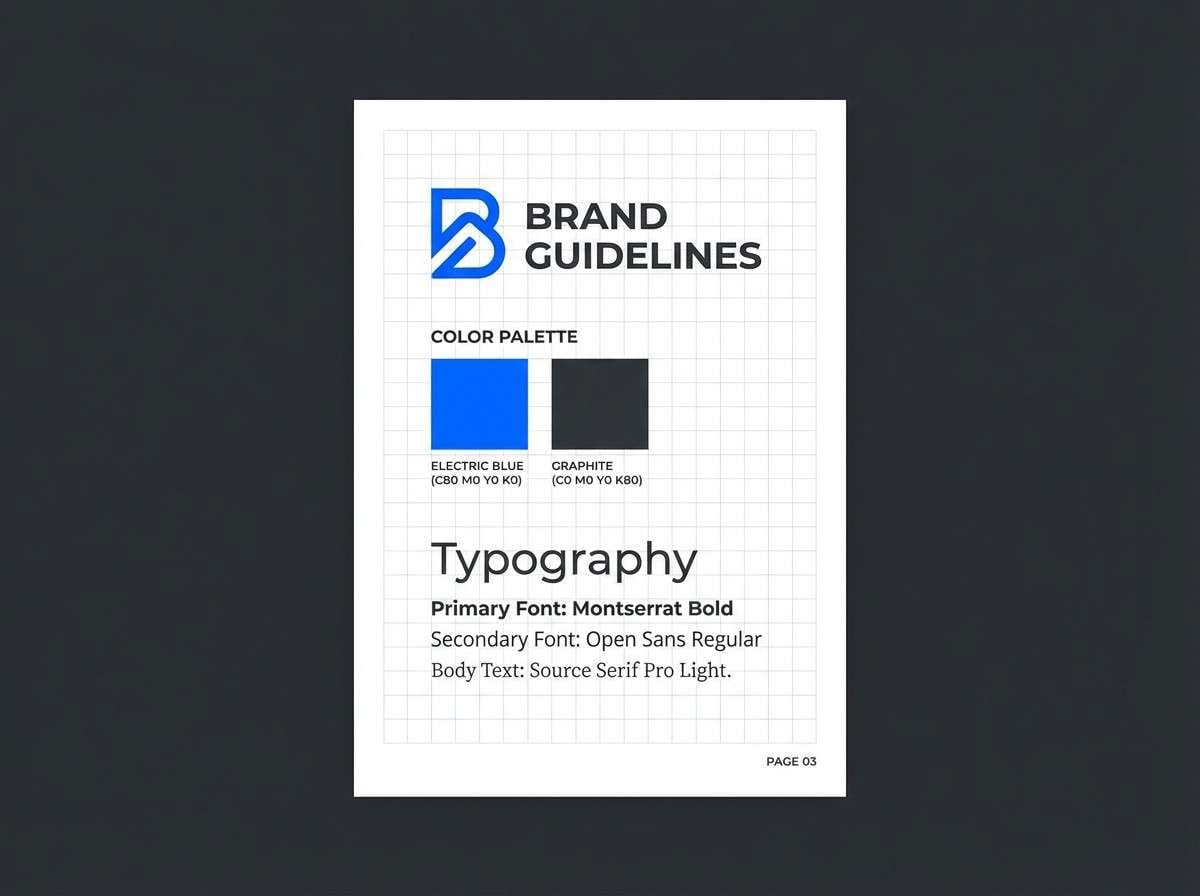
How to Use a Electric Blue Color Palette in Real Designs
Use electric blue as a hierarchy tool: reserve the most saturated blue for primary buttons, links, and key data points. Build the rest of the UI with pale tints and sturdy neutrals so users don’t feel overwhelmed.
For branding, lock in one signature electric blue, then define supporting tones (a darker navy for typography and a pale blue for backgrounds). This creates consistency across logos, pitch decks, packaging, and social templates.
In print, watch saturation and readability. Electric blue can shift depending on paper and ink, so test small type and consider using darker blues for text-heavy areas while keeping the brightest hue for headlines and callouts.
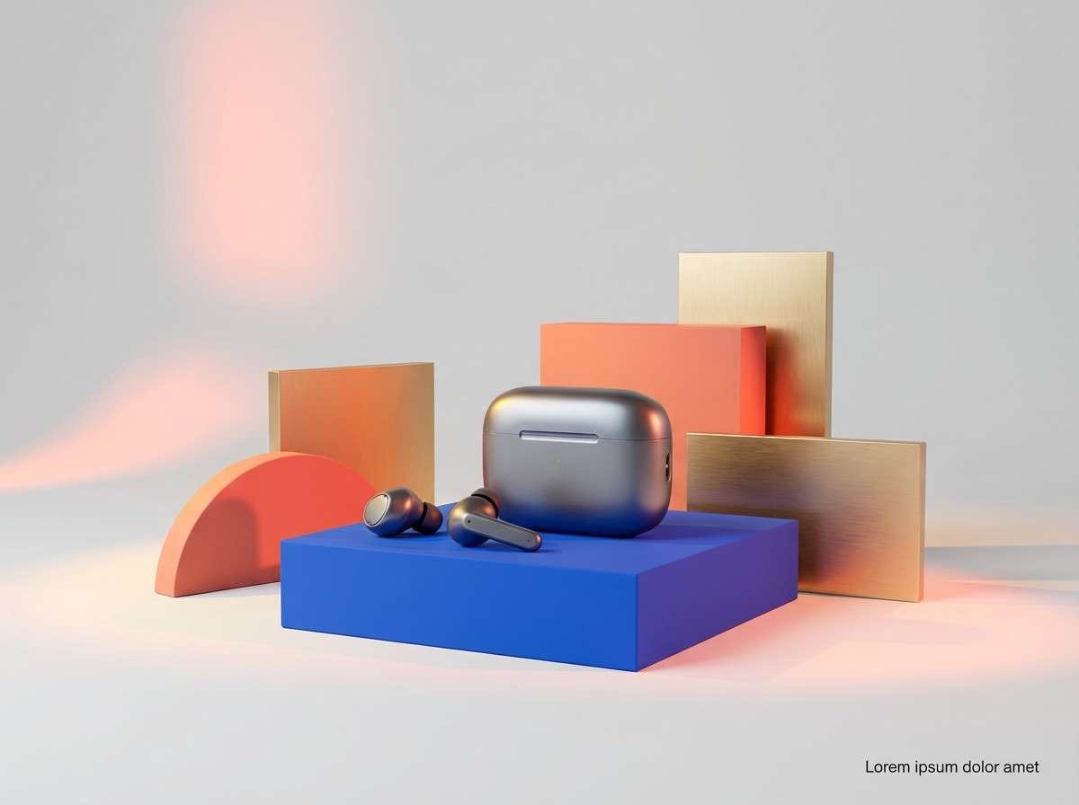
Create Electric Blue Palette Visuals with AI
If you want to preview how an electric blue palette looks in a real layout, generate fast mockups (posters, UI screens, cover art, packaging) with AI. It’s an easy way to validate contrast, mood, and hierarchy before committing to a full design.
Start from a clear prompt, mention your key HEX colors, and specify composition (minimal, editorial, bold, dark mode, gradient). Then iterate by adjusting one variable at a time, like background tone or accent intensity.
Electric Blue Color Palette FAQs
-
What HEX code is commonly used for electric blue?
A popular electric blue starting point is #007BFF, but electric blue can range from slightly deeper (#005CFF) to more cyan-leaning tones (#00B8FF) depending on your design goals. -
Is electric blue good for UI and app design?
Yes—electric blue is excellent for UI because it’s highly legible as an accent color. Use it for primary actions and key highlights, while keeping surfaces in white/light blue and text in charcoal or navy. -
What neutral colors work best with electric blue?
Charcoal, deep navy, graphite, and cool light grays pair best. These neutrals stabilize the intensity of electric blue and help maintain strong contrast for accessibility. -
What warm accent colors match electric blue?
Coral, salmon, peach, and amber are strong warm complements. They create a modern, high-contrast look that’s great for ads, posters, and product launches. -
How do I keep an electric blue palette from looking too neon?
Limit electric blue to 10–20% of the layout, add soft tints for backgrounds, and choose one accent color max. Avoid stacking multiple saturated brights unless your style is intentionally synth/neon. -
Can I use electric blue in print designs?
Yes, but do a print test—bright blues can shift on different paper stocks. Increase contrast for small text, and consider using a darker blue for body copy while reserving electric blue for headlines. -
How can I generate electric blue palette mockups quickly?
Use Media.io text-to-image to generate UI, poster, or packaging concepts from a prompt. Include your intended mood and mention electric blue plus supporting colors to keep outputs consistent.


