

Earthy color palettes are built from grounded hues you already trust: clay, sand, bark, stone, and soft botanicals. They instantly feel calm, natural, and timeless across digital and print design.
Below are 20 earth tone color palette ideas with HEX codes—each with a practical “best for” use case and an AI prompt you can reuse to generate matching visuals.
In this article
Why Earth Tone Color Palettes Work So Well
Earth tones feel familiar because they’re rooted in materials we see every day—wood, soil, stone, linen, leather, and sun-warmed clay. That familiarity makes designs feel approachable and “real,” which can increase trust in brands and products.
They’re also naturally flexible: you can go warm (terracotta, amber, cocoa) or cool (sage, stone, misty greens) while keeping the overall look cohesive. This makes it easier to build systems for UI, packaging, and editorial layouts.
Finally, earthy colors tend to be gentler on the eyes than highly saturated brights, so they work well for reading-heavy interfaces, long-form content, and premium product presentation—especially when you manage contrast carefully.
20+ Earth Color Palette Ideas (with HEX Codes)
1) Canyon Clay
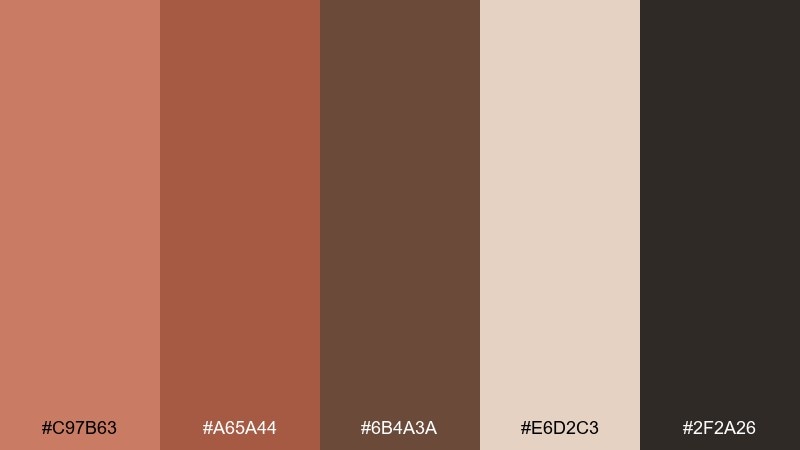
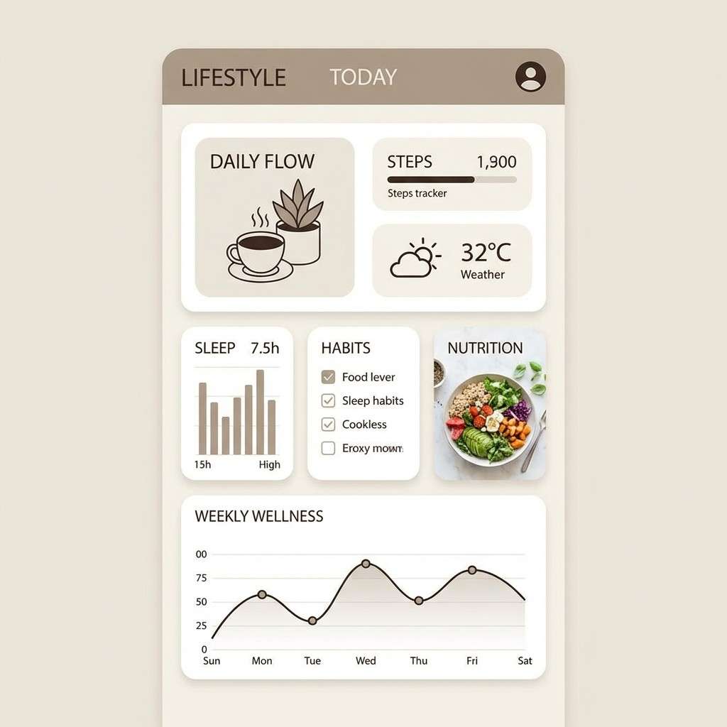
HEX: #C97B63 #A65A44 #6B4A3A #E6D2C3 #2F2A26
Mood: sunbaked, grounded, rustic
Best for: branding for artisan goods
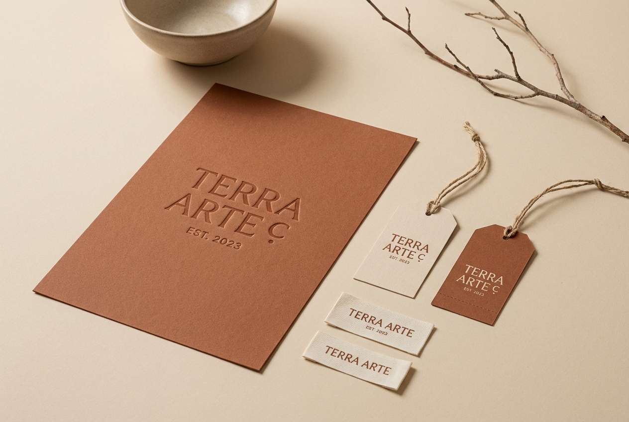
Sunbaked clay and canyon shadows give this earthy mix a warm, handmade feel. It suits craft branding, café menus, and packaging that needs an honest, tactile vibe. Pair the terracotta and cocoa tones with plenty of the soft beige for breathing room. Tip: use the near-black as your logo and type color to keep contrast strong without looking harsh.
Image example of canyon clay generated using media.io
Media.io is an online AI studio for creating and editing video, image, and audio in your browser.

2) Sage Meadow
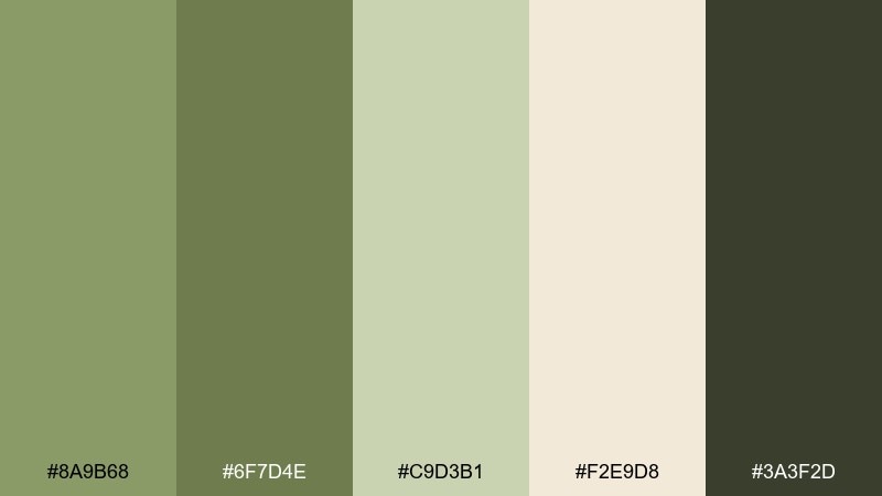
HEX: #8A9B68 #6F7D4E #C9D3B1 #F2E9D8 #3A3F2D
Mood: calm, airy, botanical
Best for: wellness blog visuals
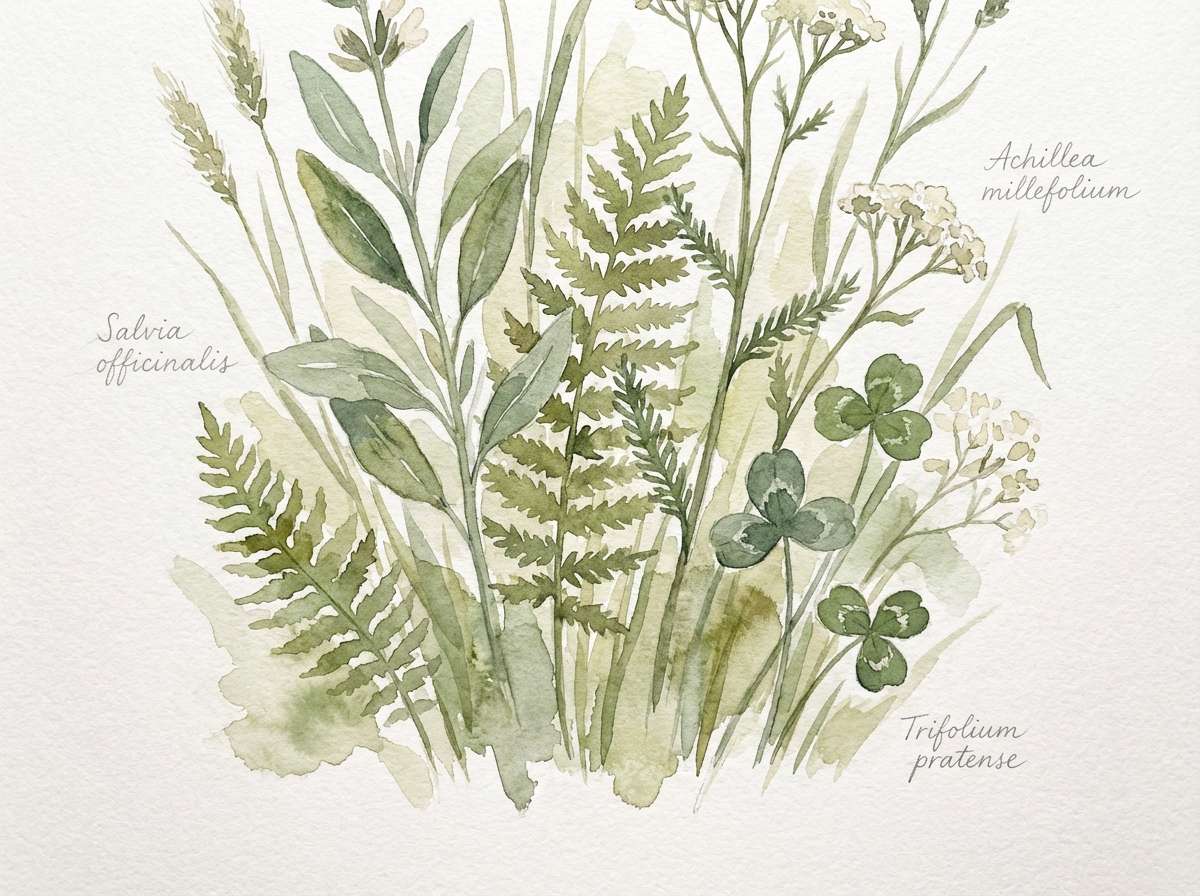
Soft sage greens and creamy light neutrals feel like a quiet morning walk through meadow grass. Use this earth color scheme for wellness blogs, sustainable brands, or packaging that needs to read clean and soothing. The deeper olive is ideal for headings, while the pale cream works as an easy background. Tip: keep gradients subtle between the two greens to avoid a muddy look.
Image example of sage meadow generated using media.io
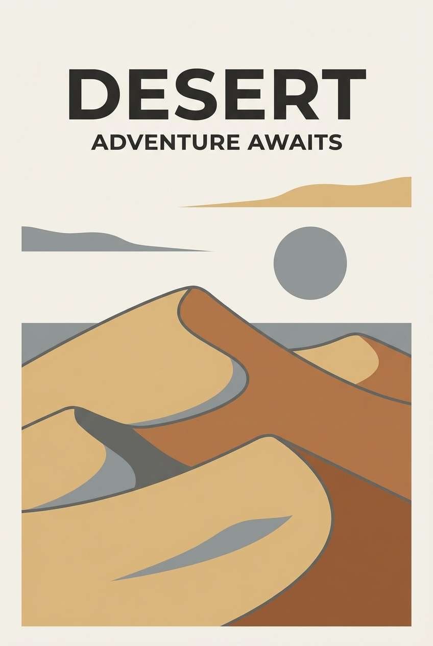
3) Desert Dusk
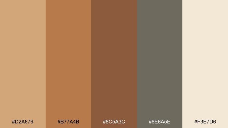
HEX: #D2A679 #B77A4B #8C5A3C #6E6A5E #F3E7D6
Mood: golden-hour, adventurous, muted
Best for: travel poster design
Golden sand and muted stone create a sunset-in-the-desert atmosphere. These earth color combinations work beautifully for travel posters, outdoor events, and editorial graphics that need warmth without brightness. Pair the sandy tan with the light cream for big shapes, then anchor the layout with the dusky gray. Tip: use the mid brown for icons and dividers to keep the piece cohesive.
Image example of desert dusk generated using media.io
4) Riverbank Stone
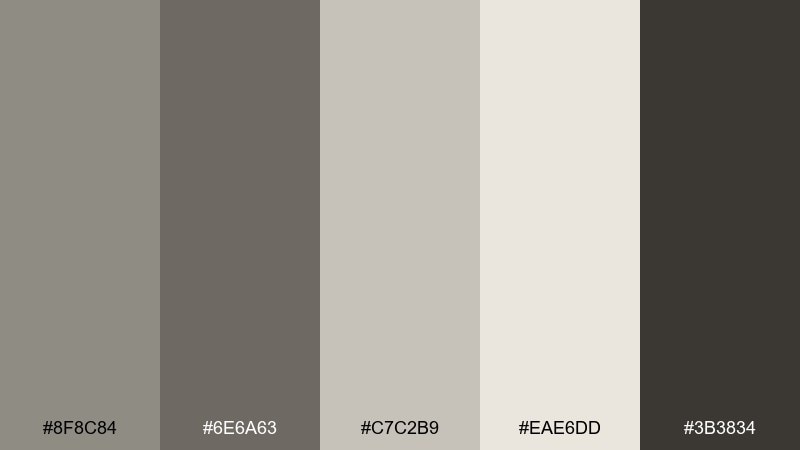
HEX: #8F8C84 #6E6A63 #C7C2B9 #EAE6DD #3B3834
Mood: quiet, balanced, modern-neutral
Best for: architectural portfolio layouts
Cool pebbles and weathered driftwood tones bring a composed, gallery-like calm. This earth tone color palette fits architectural portfolios, product catalogs, and minimal websites that rely on texture rather than loud color. Use the off-white and light stone as the canvas, then reserve the charcoal for titles and navigation. Tip: add one warm accent (like copper foil) sparingly if you need a focal point.
Image example of riverbank stone generated using media.io
5) Forest Floor
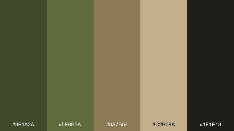
HEX: #3F4A2A #5E6B3A #8A7B54 #C2B08A #1F1E18
Mood: woodsy, rugged, grounded
Best for: outdoor apparel ads
Mossy greens and bark browns feel like damp leaves under boots. The earthy palette is great for outdoor apparel ads, camping brands, and rugged product pages where authenticity matters. Pair the tan and khaki for backgrounds, then punch up CTAs with the mid green. Tip: keep the darkest tone for small areas only so it reads rich, not heavy.
Image example of forest floor generated using media.io

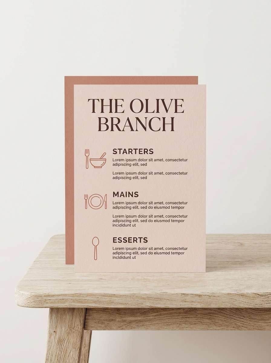
6) Terracotta Bloom
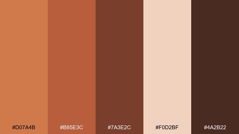
HEX: #D07A4B #B85E3C #7A3E2C #F0D2BF #4A2B22
Mood: warm, romantic, handcrafted
Best for: restaurant menu design
Clay-red warmth and blushy neutrals evoke pottery, dried florals, and candlelit tables. This earth color palette is a natural fit for restaurant menus, wine bars, and boutique food branding. Pair the pale peach with generous whitespace, then use the deeper brick for section headers and pricing. Tip: keep body text in the dark cocoa to maintain readability on warm backgrounds.
Image example of terracotta bloom generated using media.io
7) Olive Grove
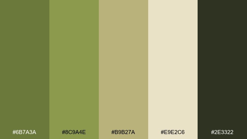
HEX: #6B7A3A #8C9A4E #B9B27A #E9E2C6 #2E3322
Mood: sunlit, organic, Mediterranean
Best for: olive oil packaging
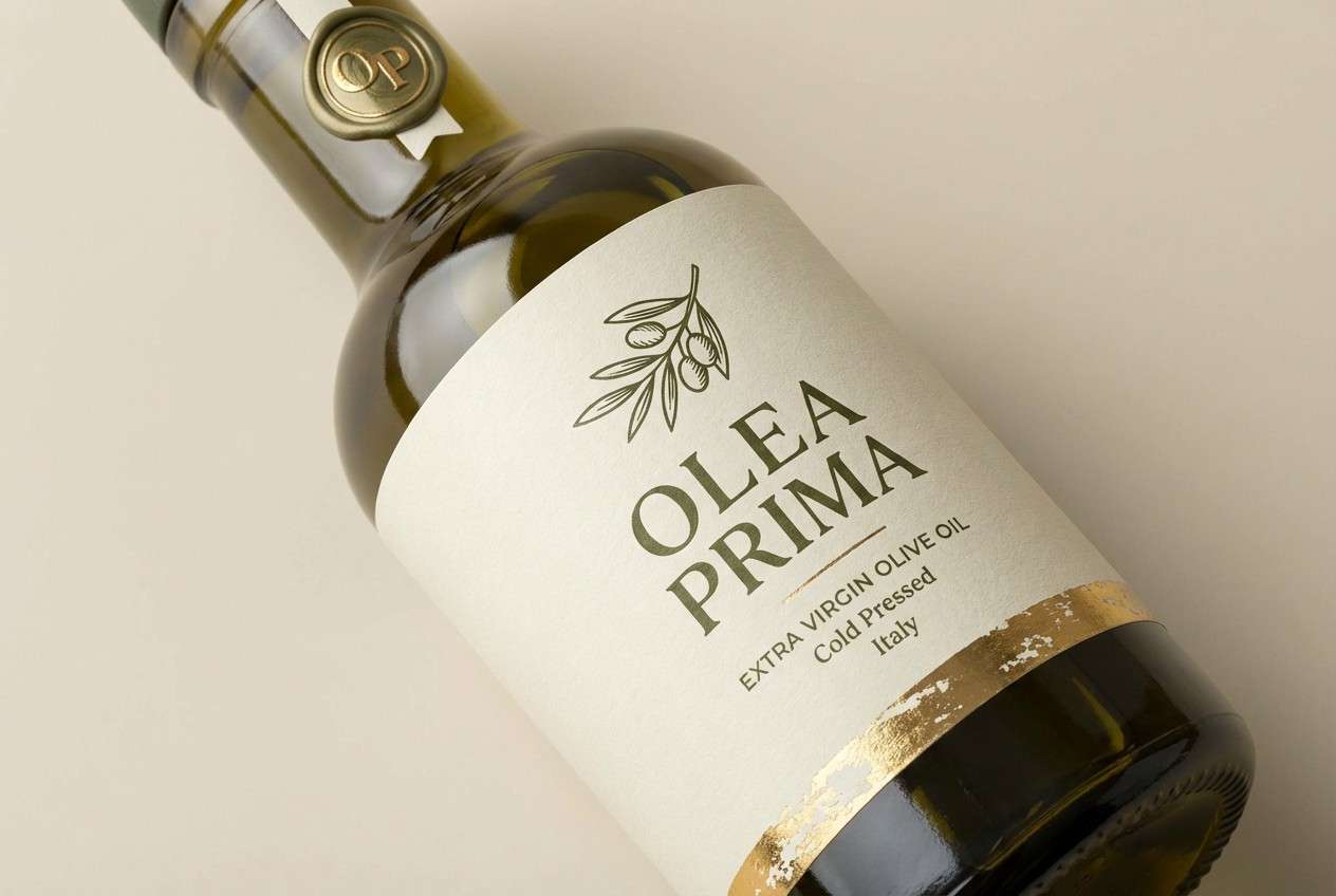
Olive leaves and golden pits give this set a sunlit, Mediterranean mood. It works well for gourmet food labels, farm-to-table branding, and rustic packaging. Pair the creamy beige with the yellow-olive for a friendly base, then use the dark green for stamps and brand marks. Tip: print the lighter tones on uncoated paper to keep the natural feel.
Image example of olive grove generated using media.io
8) Sandstone Trail
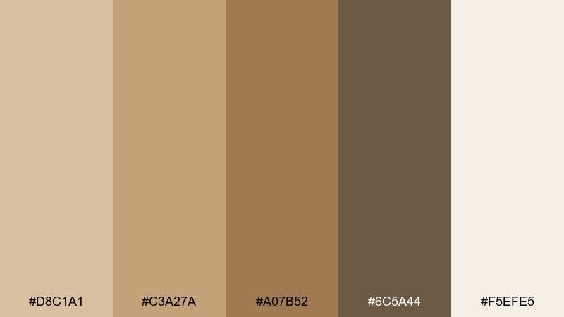
HEX: #D8C1A1 #C3A27A #A07B52 #6C5A44 #F5EFE5
Mood: soft, sun-warmed, approachable
Best for: home decor ecommerce banners
Sun-warmed sandstone and gentle browns make everything feel inviting and lived-in. Use it for home decor banners, lifestyle blogs, or clean product pages that need warmth without loud color. Pair the cream and light sand as your base, then introduce the deeper brown for buttons and key labels. Tip: keep shadows and borders in the taupe range to avoid a stark, gray look.
Image example of sandstone trail generated using media.io
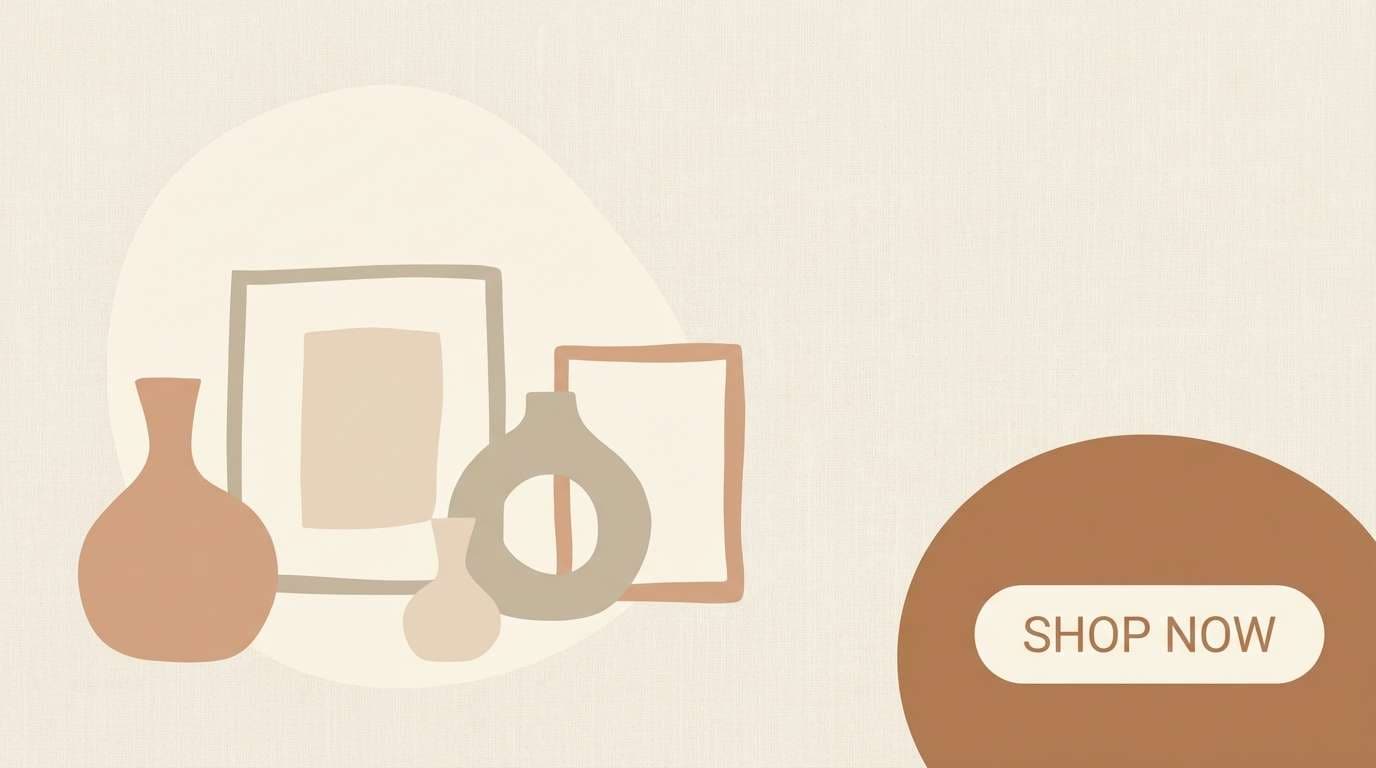
9) Mushroom Latte
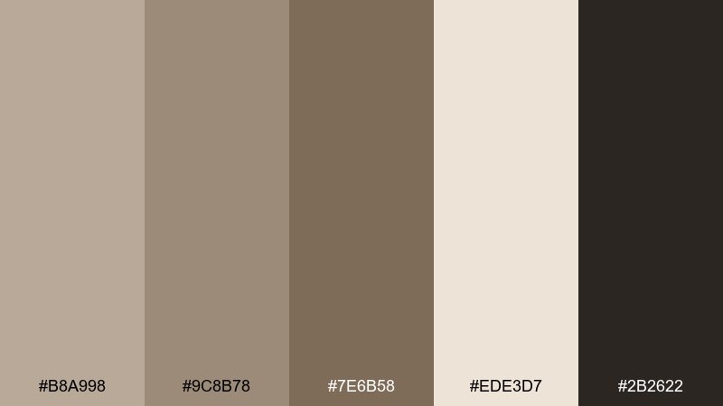
HEX: #B8A998 #9C8B78 #7E6B58 #EDE3D7 #2B2622
Mood: cozy, minimal, café-chic
Best for: minimal UI for lifestyle apps
Creamy latte tones and soft mushroom browns create a calm, cozy baseline. It reads premium in interfaces, making it a great earth color scheme for lifestyle apps, journaling tools, and subscription dashboards. Pair the light cream with muted taupe cards, and use the deep espresso for text and icons. Tip: keep interactive states subtle by shifting one step darker instead of jumping to high contrast.
Image example of mushroom latte generated using media.io
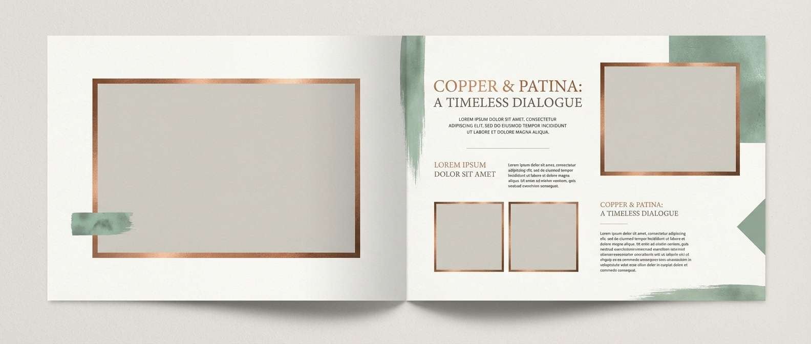
10) Copper Patina
HEX: #A45A3A #C47A4E #6D7B68 #D8D2C6 #2A2A27
Mood: industrial, refined, vintage-modern
Best for: editorial magazine spreads
Burnished copper against softened patina green feels like old hardware in a renovated loft. These earth tones shine in editorial spreads, lookbooks, and product stories where you want warmth plus sophistication. Pair the light greige as the page base and use copper for pull quotes or section markers. Tip: keep the green muted and secondary so the copper remains the hero.
Image example of copper patina generated using media.io
11) Harvest Grain
HEX: #D9B56C #C9963C #8A6A2E #F3E5C5 #3A2E1E
Mood: cheerful, rustic, seasonal
Best for: farmers market flyers
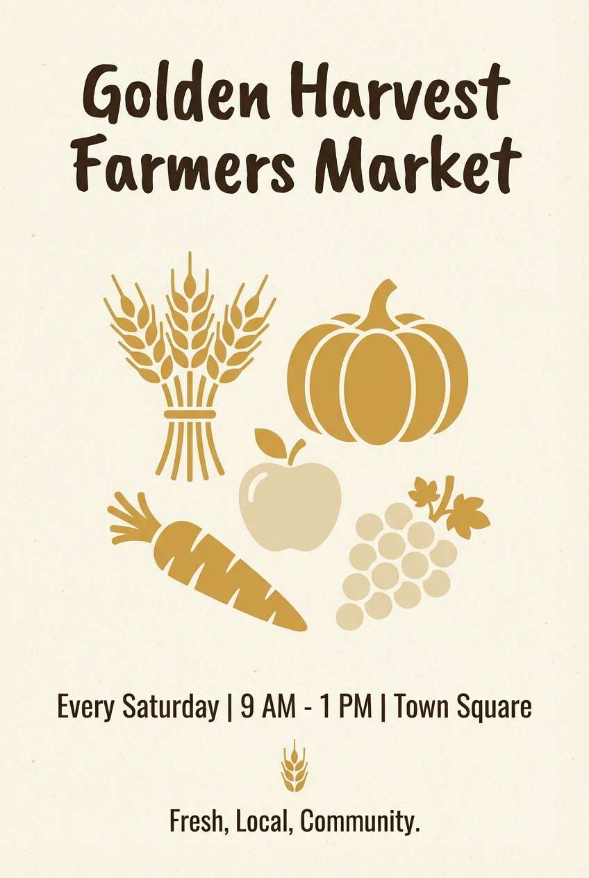
Golden grain and toasted spice tones bring an upbeat, late-summer energy. Use it for farmers market flyers, food festivals, or seasonal promotions that should feel welcoming and handmade. Pair the pale cream with the gold for large blocks, then use the deep brown for text and borders. Tip: add simple grain or leaf illustrations in the olive-brown for extra character.
Image example of harvest grain generated using media.io
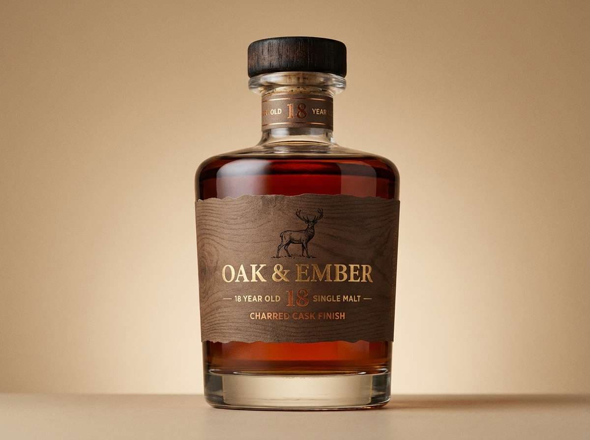
12) Charred Bark
HEX: #2B241E #4A3A2B #7A5B3E #BFA68A #E7DED2
Mood: moody, smoky, luxurious
Best for: premium whiskey branding
Smoky browns and charred-wood depth create a dramatic, fireside mood. These earth color combinations are perfect for premium spirits, leather goods, or masculine packaging that needs weight and restraint. Pair the warm beige as a label base and keep the darkest tone for seals, monograms, and key typography. Tip: emboss or spot-gloss the mid brown to add richness without adding new colors.
Image example of charred bark generated using media.io
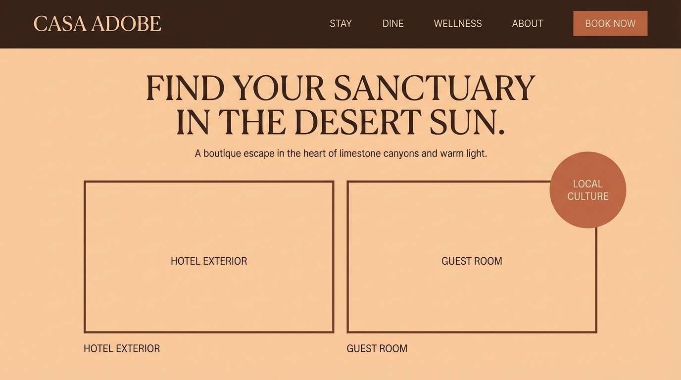
13) Sunbaked Adobe
HEX: #E1A07A #C77A55 #9E5A3E #F6E2D3 #4D3328
Mood: warm, friendly, southwestern
Best for: boutique hotel landing pages
Sunbaked walls and soft clay shadows make this set feel welcoming and relaxed. It works beautifully on boutique hotel pages, travel itineraries, and lifestyle branding where warmth matters. Pair the pale peach with the adobe tan for backgrounds, then reserve the dark brown for navigation and footers. Tip: keep photos warm-toned so the UI and imagery feel like one story.
Image example of sunbaked adobe generated using media.io
14) Rustic Linen
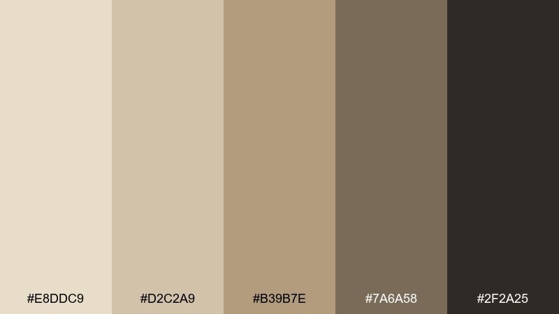
HEX: #E8DDC9 #D2C2A9 #B39B7E #7A6A58 #2F2A25
Mood: soft, understated, timeless
Best for: wedding website themes
Washed linen and antique taupe create a timeless, understated elegance. These earth hues suit wedding websites, stationery systems, and minimal brands that want warmth without heavy color. Pair the two light neutrals for backgrounds and sections, then use the deeper taupe for button states and dividers. Tip: combine with subtle paper grain textures to keep the palette from feeling flat.
Image example of rustic linen generated using media.io

15) Pebble Creek
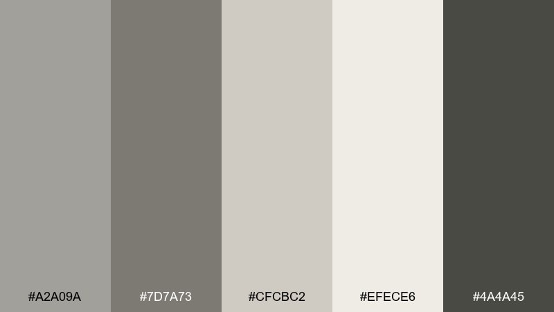
HEX: #A2A09A #7D7A73 #CFCBC2 #EFECE6 #4A4A45
Mood: clean, quiet, contemporary
Best for: SaaS dashboard UI
Smooth pebbles and creekside stone give a clean, modern neutrality. Use it for SaaS dashboards, finance tools, or data-heavy screens where clarity is the priority. Pair the near-white with light gray panels, then keep the darker slate for labels and chart axes. Tip: add a single warm accent color for alerts to avoid confusing status states.
Image example of pebble creek generated using media.io

16) Clay Pottery
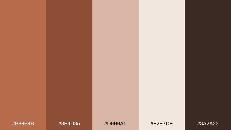
HEX: #B86B4B #8E4D35 #D9B6A5 #F2E7DE #3A2A23
Mood: artisanal, warm, soft
Best for: ceramic product photography
Hand-thrown pottery and warm kiln tones make this palette feel intimate and artisanal. It fits ceramic shops, maker portfolios, and product pages that lean on texture and craft. Pair the light cream with the rosy clay for backgrounds and packaging inserts, then ground the look with the deep brown. Tip: use matte finishes so the soft tones stay true under lighting.
Image example of clay pottery generated using media.io

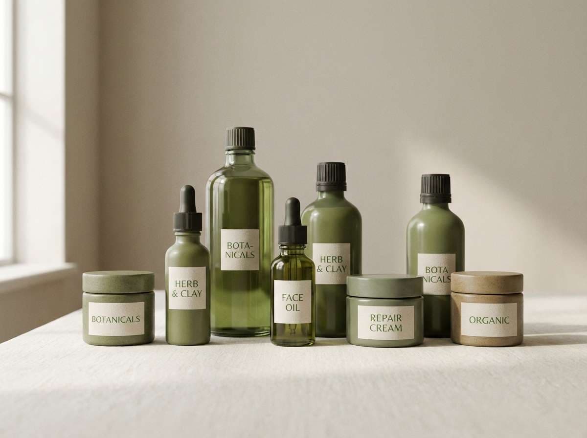
17) Wild Herb
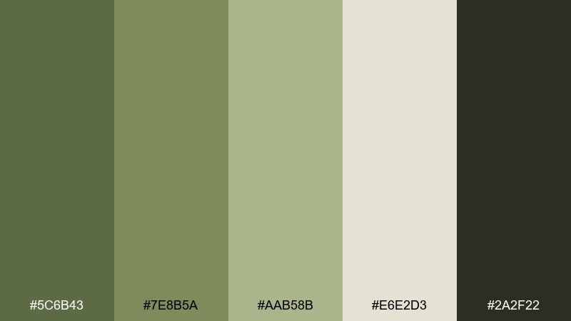
HEX: #5C6B43 #7E8B5A #AAB58B #E6E2D3 #2A2F22
Mood: fresh, natural, slightly rustic
Best for: organic skincare ads
Crushed herbs and leafy stems bring a fresh, natural energy with a rustic edge. It works for organic skincare ads, refillable products, and eco-friendly landing pages. Pair the pale neutral with the muted greens for a clean base, and use the darkest shade for ingredient callouts. Tip: keep typography simple and let the green tones carry the story.
Image example of wild herb generated using media.io
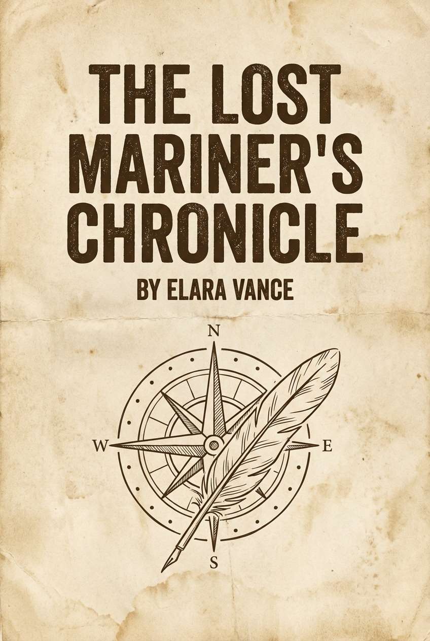
18) Sepia Journal
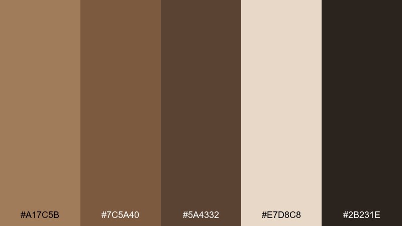
HEX: #A17C5B #7C5A40 #5A4332 #E7D8C8 #2B231E
Mood: nostalgic, literary, warm
Best for: book cover concepts
Sepia ink and aged paper tones evoke notebooks, letters, and library shelves. This earth tone color palette is ideal for book cover concepts, author branding, and podcast art that wants a thoughtful, classic feel. Pair the paper beige as the base and use the darker browns for title hierarchy and frames. Tip: add subtle grain and keep contrast high enough for thumbnail readability.
Image example of sepia journal generated using media.io
19) Woodland Mist
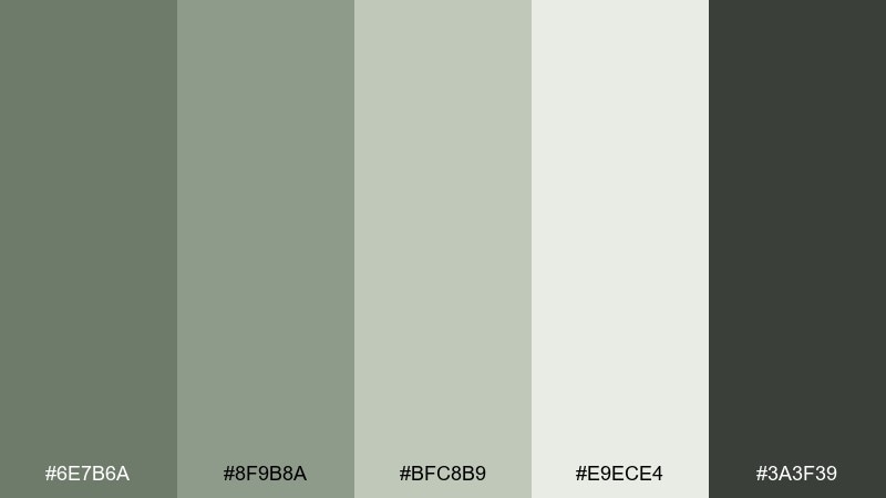
HEX: #6E7B6A #8F9B8A #BFC8B9 #E9ECE4 #3A3F39
Mood: cool, quiet, nature-modern
Best for: presentation slide decks
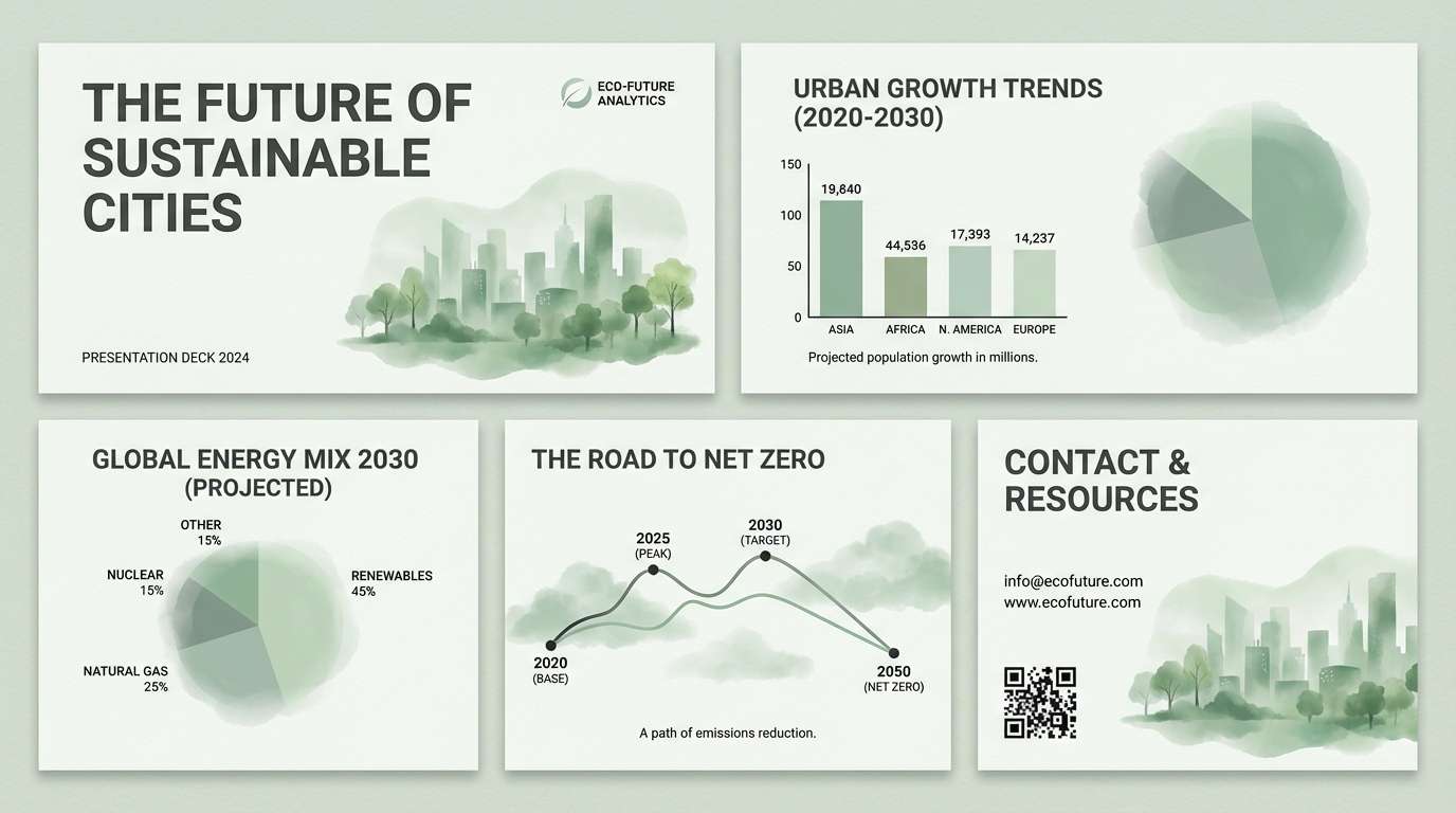
Mist through trees and muted evergreens make this set feel calm and modern. It suits presentation decks, corporate sustainability reports, and calm tech brands that want a nature-forward tone. Pair the pale mist with the mid sage for charts and callouts, then use charcoal-green for headings. Tip: stick to flat fills for graphs so the soft colors stay distinct.
Image example of woodland mist generated using media.io
20) Amber Soil
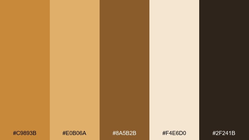
HEX: #C9893B #E0B06A #8A5B2B #F4E6D0 #2F241B
Mood: warm, optimistic, earthy
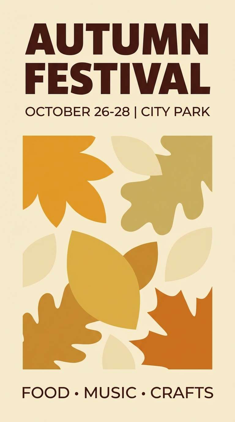
Best for: autumn event posters
Amber light and rich soil browns create a lively, seasonal warmth. It works for autumn event posters, craft fairs, and community announcements where you want friendly energy with grounded tone. Pair the cream and light amber for large shapes, then add contrast using the deep brown for key details. Tip: keep any additional colors neutral so the amber stays the star.
Image example of amber soil generated using media.io
What Colors Go Well with Earth?
Earth tones pair beautifully with soft whites, warm grays, and creamy neutrals because they keep the palette breathable and premium. These light supports also help darker browns and olives maintain legibility in UI and print.
For accents, try muted blues (slate, denim, dusty navy) or desaturated greens (sage, eucalyptus) to keep the natural story consistent. If you need stronger emphasis—like a CTA—use a controlled pop such as terracotta, amber, or copper instead of neon brights.
When in doubt, match color temperature: warm earth palettes (clay, sand, caramel) look best with warm neutrals, while stone-and-mist palettes feel cleaner with cooler whites and charcoal greens.
How to Use a Earth Tone Color Palette in Real Designs
Start with a neutral base (cream, greige, off-white) for backgrounds, then choose one mid-tone earth color for primary UI components like buttons, tabs, or section headers. Reserve the darkest shade for typography and navigation to keep readability strong.
In branding and packaging, let texture do the heavy lifting: uncoated paper, subtle grain, or matte finishes make earthy colors feel more authentic. Use metallic accents (copper/bronze) sparingly as a highlight rather than a core color.
For print and social templates, aim for clear hierarchy: big warm shapes in light tan/peach, supporting elements in mid browns/greens, and details in a near-black. This keeps layouts grounded without feeling dull.
Create Earth Palette Visuals with AI
If you already have HEX codes, the next step is making visuals that match—product mockups, posters, menus, UI screens, or brand identity sets. With AI generation, you can keep the same color mood across multiple assets quickly.
Use one palette as your “art direction,” then reuse a consistent prompt style (studio product shot, clean UI mockup, editorial spread) so everything looks like one cohesive system. Small prompt tweaks—materials, lighting, and background—go a long way for earthy aesthetics.
Generate a few variations, pick the strongest composition, and then align your final design elements (type, icons, layout) on top of the image while keeping contrast accessible.
Earth Color Palette FAQs
-
What is an earth color palette?
An earth color palette is a set of hues inspired by natural materials and landscapes—think terracotta, sand, bark brown, olive green, stone gray, and warm cream neutrals. -
Are earth tones warm or cool?
Earth tones can be both. Clay, amber, and cocoa are warm earth tones, while sage, misty green, and river-stone grays lean cool. Most “earthy” palettes mix them in muted, natural saturation. -
How do I keep earth palettes from looking dull?
Increase contrast with a deep charcoal/espresso for text, add texture (grain, paper, linen), and choose one “hero” accent (copper, amber, or terracotta) used consistently for emphasis. -
What’s the best background color for an earthy UI?
Soft off-whites and creamy neutrals are the easiest backgrounds because they keep the interface light while letting browns/greens feel intentional. Examples include warm cream, greige, or very light stone. -
Do earth colors work for modern branding?
Yes—earth tones can look very modern when paired with clean typography, minimal layouts, and balanced spacing. The key is avoiding muddy mid-tones by keeping neutrals bright and using dark tones for structure. -
What accent colors go with earth tones?
Muted blues (slate/denim), soft whites, charcoal, and warm metallics (copper/bronze) are reliable accents. For more energy, use controlled warm pops like amber or terracotta. -
Can I generate earth-tone images with AI and keep colors consistent?
Yes. Reuse a fixed palette “mood” prompt (materials, lighting, background) and iterate with small changes. Then select the most on-palette result and match your design elements to those dominant tones.


