

Champagne beige is a warm neutral that feels polished without looking stark. It’s a go-to base for modern branding, cozy interiors, and clean UI because it softens contrast while keeping layouts readable.
Below are 20+ curated champagne beige color palette ideas with HEX codes, plus practical pairing tips and ready-to-use AI prompts you can turn into visuals in minutes.
In this article
- Why Champagne Beige Palettes Work So Well
-
- brut blossom
- golden linen
- oat silk
- desert champagne
- pearl biscuit
- candlelit sand
- rosé beige
- apricot veil
- taupe truffle
- vanilla oak
- stone champagne
- satin almond
- vintage ecru
- honeyed parchment
- malted cream
- soft bronze
- dune lace
- champagne clay
- latte pearl
- evening biscotti
- blush drift
- warm minimalist
- cocoa cream
- What Colors Go Well with Champagne Beige?
- How to Use a Champagne Beige Color Palette in Real Designs
- Create Champagne Beige Palette Visuals with AI
Why Champagne Beige Palettes Work So Well
Champagne beige sits in the “warm neutral” zone, so it flatters photography, skin tones, and natural materials while still reading clean and modern. It’s soft enough for calm backgrounds, but not so pale that everything feels washed out.
These palettes also make contrast easier to manage: you can build hierarchy with layered taupes and browns instead of jumping straight to pure black. That keeps designs elegant, premium, and easier on the eyes for long-form reading.
Finally, champagne beige plays well with both minimal and decorative styles. Whether you’re designing a UI, a menu, or packaging, it supports detail (type, icons, borders) without competing for attention.
20+ Champagne Beige Color Palette Ideas (with HEX Codes)
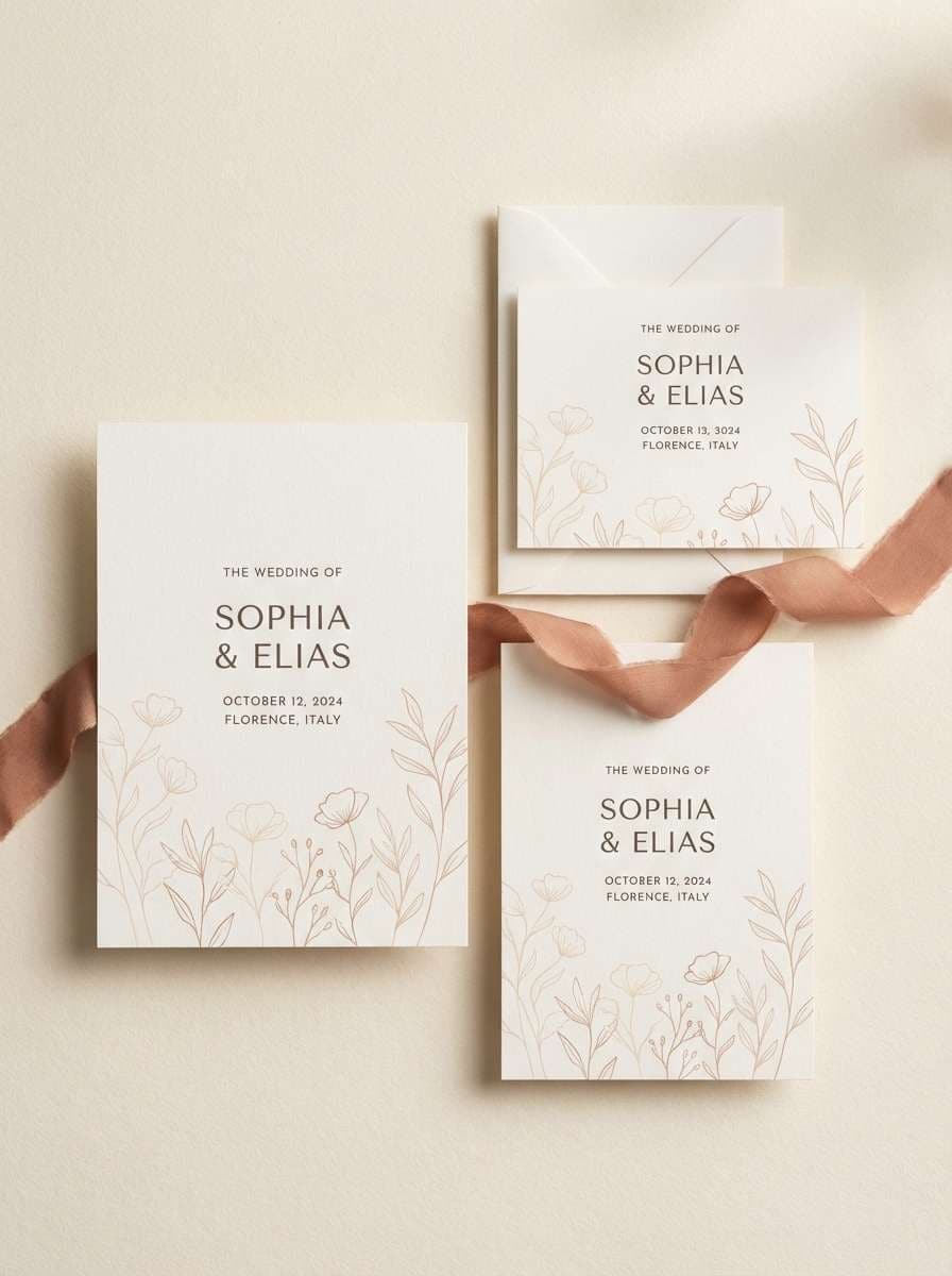
1) Brut Blossom
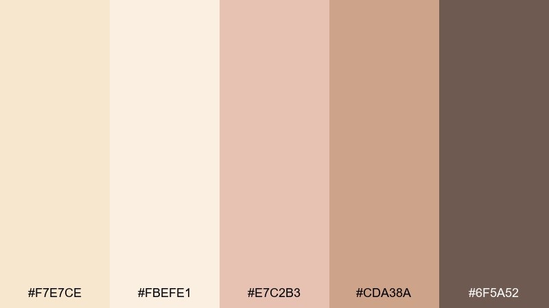
HEX: #F7E7CE #FBEFE1 #E7C2B3 #CDA38A #6F5A52
Mood: romantic, airy, refined
Best for: wedding invitations and stationery
Romantic and airy like a toast at golden hour, these tones feel soft yet polished. Use the light champagne base for paper and margins, then bring in blush for florals and headings. Deep cocoa grounds names and details so everything stays readable. For a timeless look, keep metallic foil minimal and let the warm neutrals do the work.
Image example of brut blossom generated using media.io
Media.io is an online AI studio for creating and editing video, image, and audio in your browser.

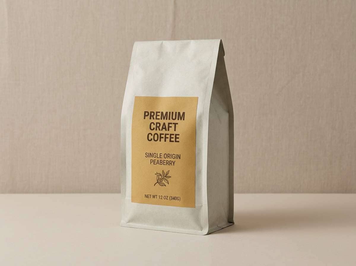
2) Golden Linen
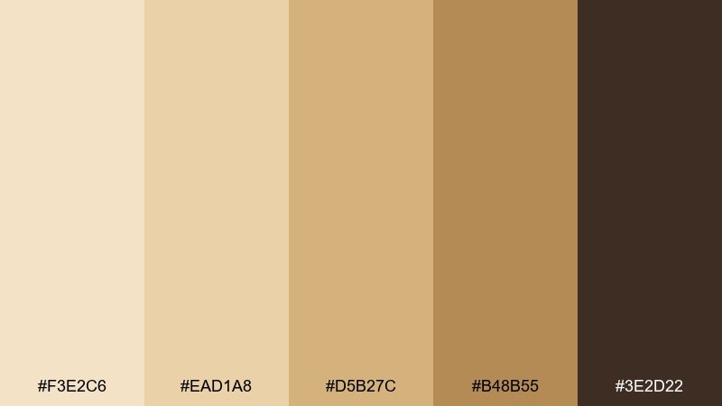
HEX: #F3E2C6 #EAD1A8 #D5B27C #B48B55 #3E2D22
Mood: sunlit, rustic, premium
Best for: coffee packaging and craft labels
Sunlit and rustic like folded linen and toasted caramel, this mix reads artisanal and premium. Let the pale base carry the label background, then use honey and brass tones for badges or flavor notes. The dark espresso shade is ideal for typography and barcode clarity. A matte finish pairs best with these warm grains and keeps it feeling handcrafted.
Image example of golden linen generated using media.io
3) Oat Silk
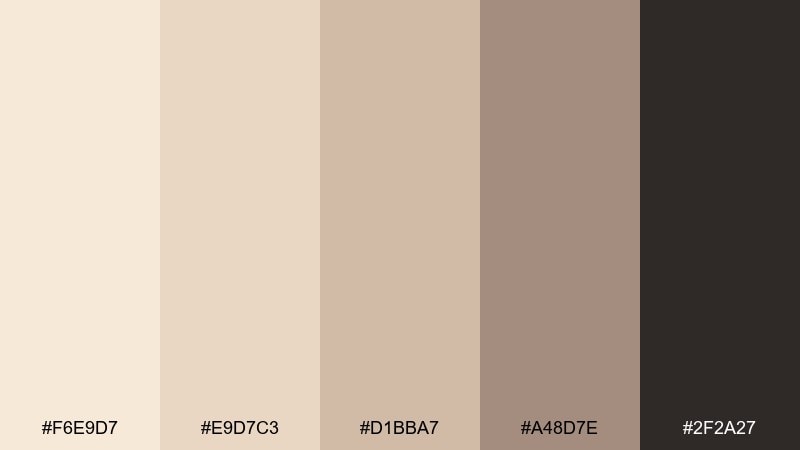
HEX: #F6E9D7 #E9D7C3 #D1BBA7 #A48D7E #2F2A27
Mood: calm, minimal, cozy
Best for: skincare branding and product ads
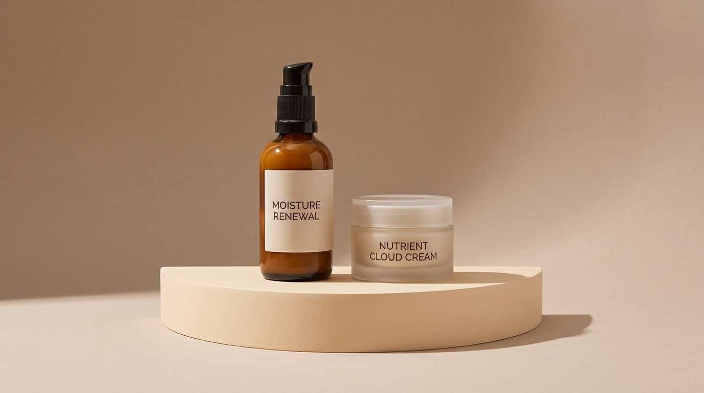
Calm and minimal like oatmeal steam and soft satin, these neutrals create instant comfort. Keep the lightest tones for backgrounds and negative space so product silhouettes feel clean. Use the taupe midtones for secondary blocks and icons, then reserve near-black for ingredient text. For a modern finish, pair with simple sans serif type and plenty of breathing room.
Image example of oat silk generated using media.io
4) Desert Champagne
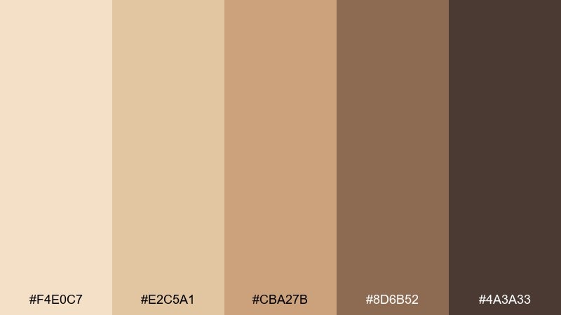
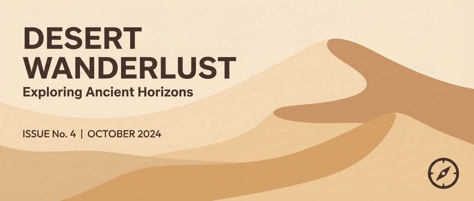
HEX: #F4E0C7 #E2C5A1 #CBA27B #8D6B52 #4A3A33
Mood: warm, grounded, adventurous
Best for: travel blog headers and hero banners
Warm and grounded like dune shadows at sunset, this palette feels adventurous without being loud. Use the sandy lights for sky-like space and the cinnamon browns for headings or overlays. Midtone caramel works well for buttons that need contrast while staying earthy. Add subtle grain or film noise for a desert editorial vibe.
Image example of desert champagne generated using media.io
5) Pearl Biscuit
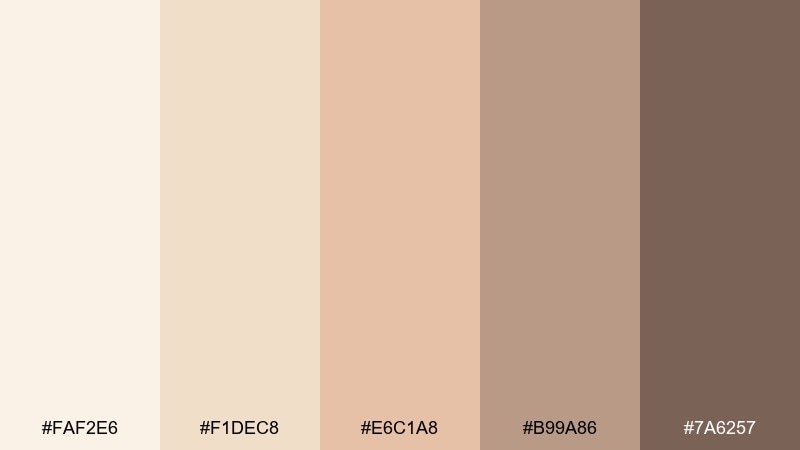
HEX: #FAF2E6 #F1DEC8 #E6C1A8 #B99A86 #7A6257
Mood: soft, sweet, welcoming
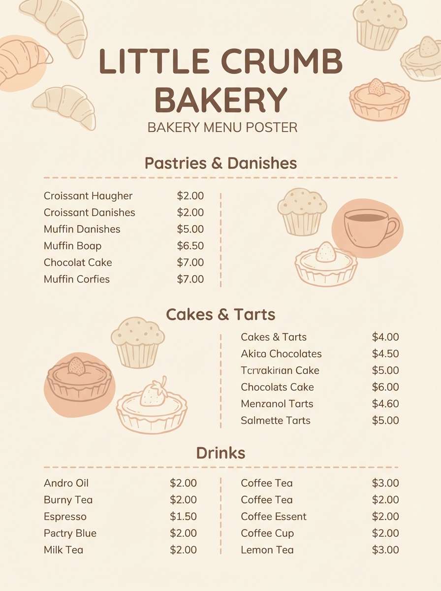
Best for: bakery branding and menu design
Soft and sweet like sugar dust on shortbread, these tones feel welcoming and handmade. Keep pearl cream as the menu base, then add warm biscuit for section dividers and price highlights. The muted rose brings just enough charm for icons or stamps. For legibility, set body text in the deeper taupe and avoid ultra-light type on the pale background.
Image example of pearl biscuit generated using media.io
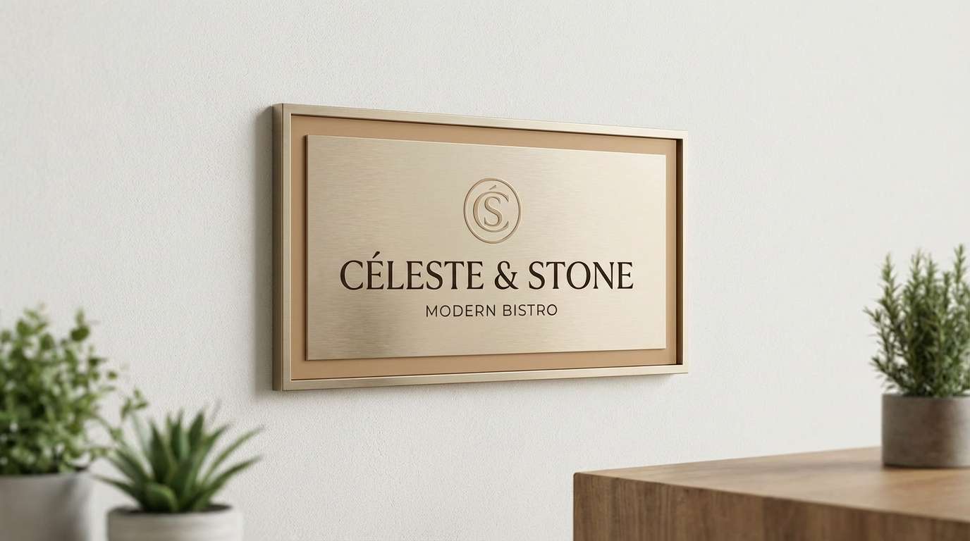
6) Candlelit Sand
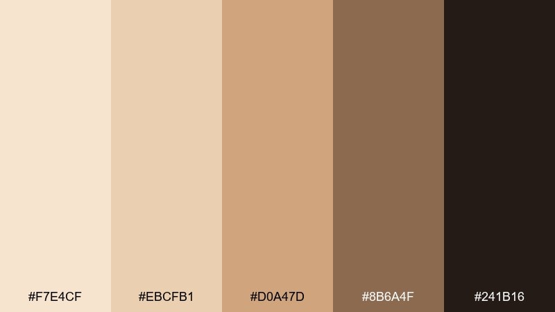
HEX: #F7E4CF #EBCFB1 #D0A47D #8B6A4F #241B16
Mood: intimate, elegant, dramatic
Best for: restaurant brand identity and signage
Intimate and elegant like candlelight on stoneware, this mix leans upscale and dramatic. Use the pale sand as a base for menus and packaging, then layer in amber and bronze for dividers and icons. The inky espresso shade gives signage and wordmarks strong contrast. A single spotlight gradient can make the warm tones feel even richer.
Image example of candlelit sand generated using media.io
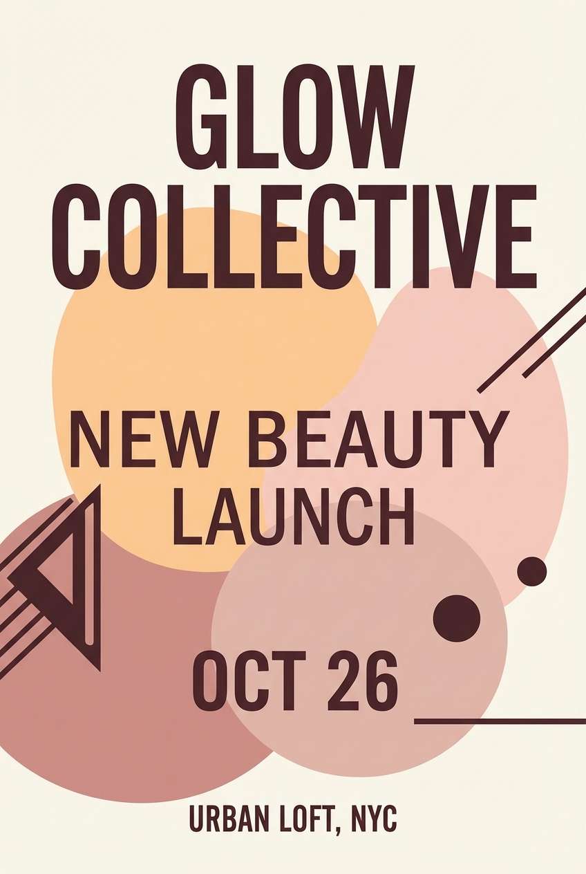
7) Rosé Beige
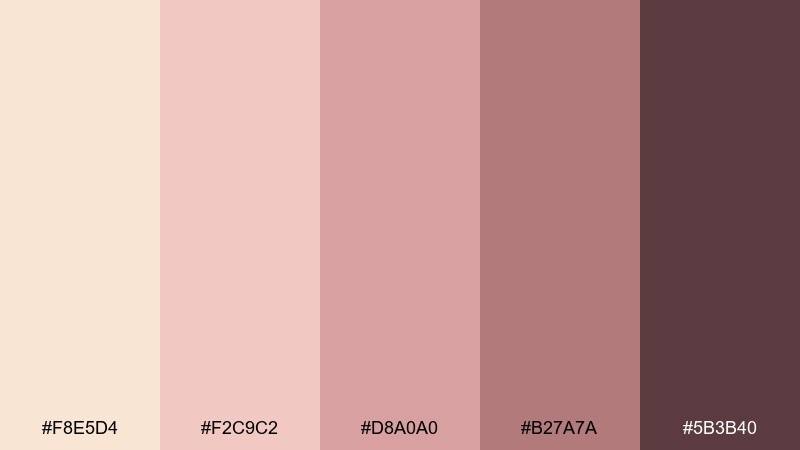
HEX: #F8E5D4 #F2C9C2 #D8A0A0 #B27A7A #5B3B40
Mood: flirty, soft, modern
Best for: beauty launch posters
Flirty and soft like rose petals in warm light, these hues feel modern and approachable. Push the blush midtones for headlines and callouts while keeping the champagne base clean behind imagery. The plum-brown anchor makes small text and logos crisp. For a striking poster, use large type and a single geometric shape in the deepest shade.
Image example of rosé beige generated using media.io
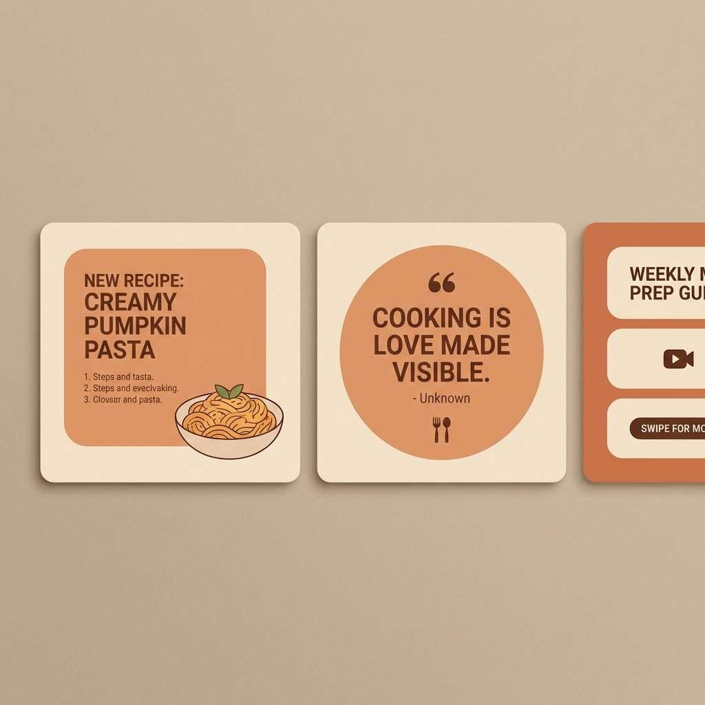
8) Apricot Veil
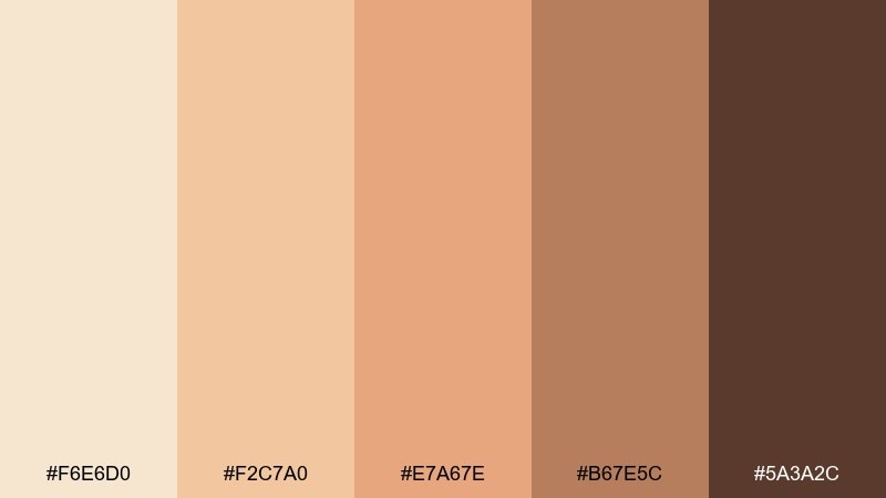
HEX: #F6E6D0 #F2C7A0 #E7A67E #B67E5C #5A3A2C
Mood: fresh, sunny, friendly
Best for: food photography overlays and social templates
Fresh and sunny like apricot jam on warm toast, these tones brighten without turning neon. Use the creamy base for template space and the apricot for buttons, stickers, or highlight bars. The cinnamon brown holds typography and frame lines together. Keep overlays at low opacity so photos stay natural and the color feels like a warm filter rather than a mask.
Image example of apricot veil generated using media.io
9) Taupe Truffle
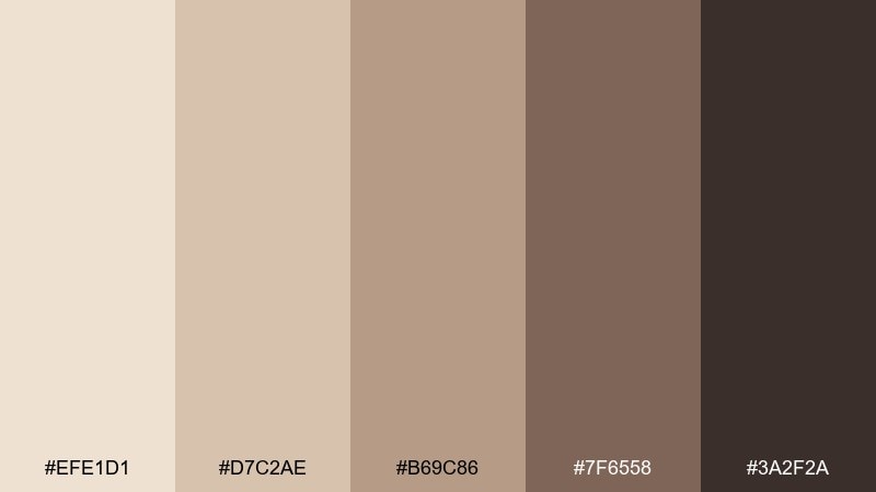
HEX: #EFE1D1 #D7C2AE #B69C86 #7F6558 #3A2F2A
Mood: moody, sophisticated, grounded
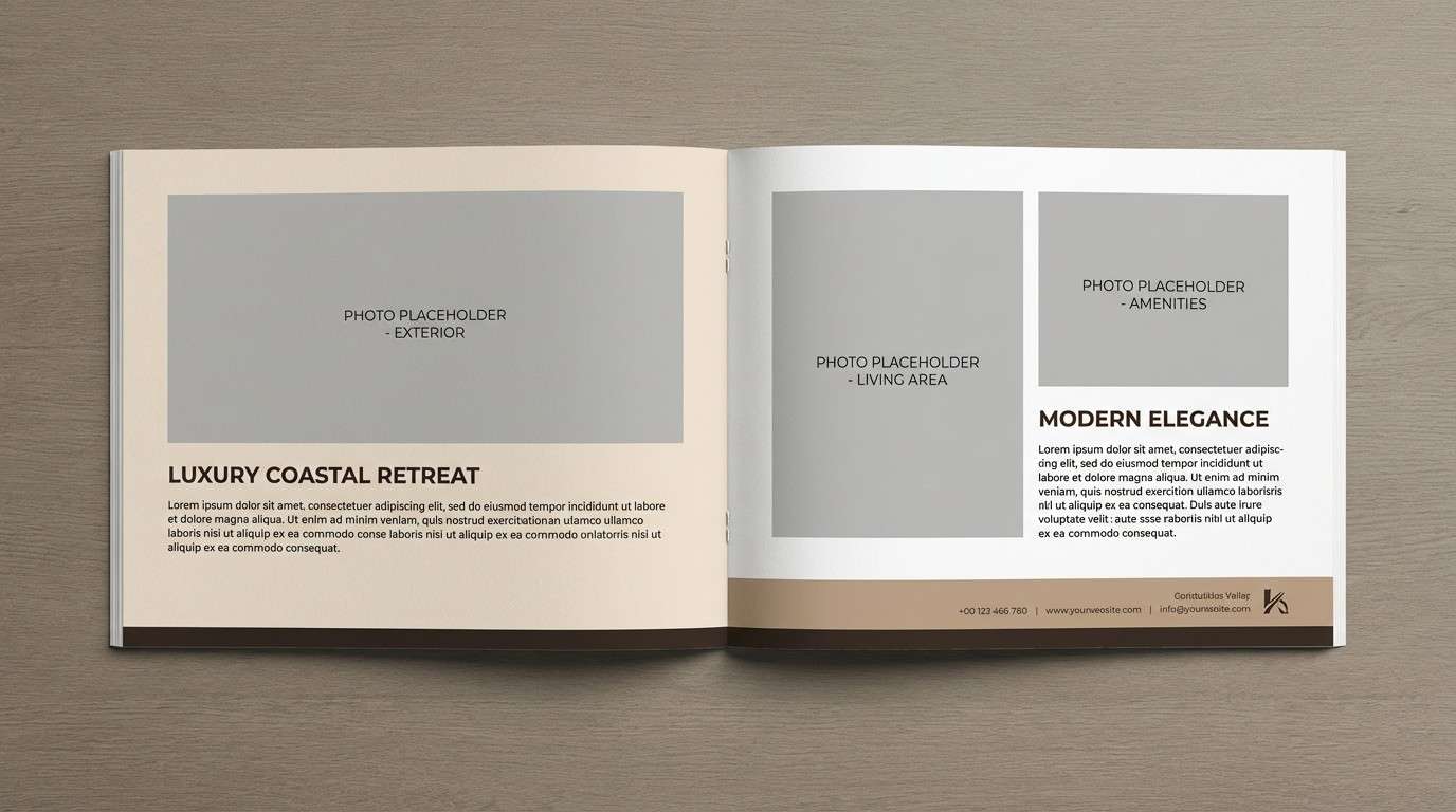
Best for: luxury real estate brochures
Moody and sophisticated like truffle suede, this neutral stack feels expensive and grounded. Build the grid on pale cream, then use mid taupes for section panels and captions. The deepest brown is perfect for property titles and fine-print clarity. For an elevated look, stick to two font weights and let the contrast come from the tones.
Image example of taupe truffle generated using media.io
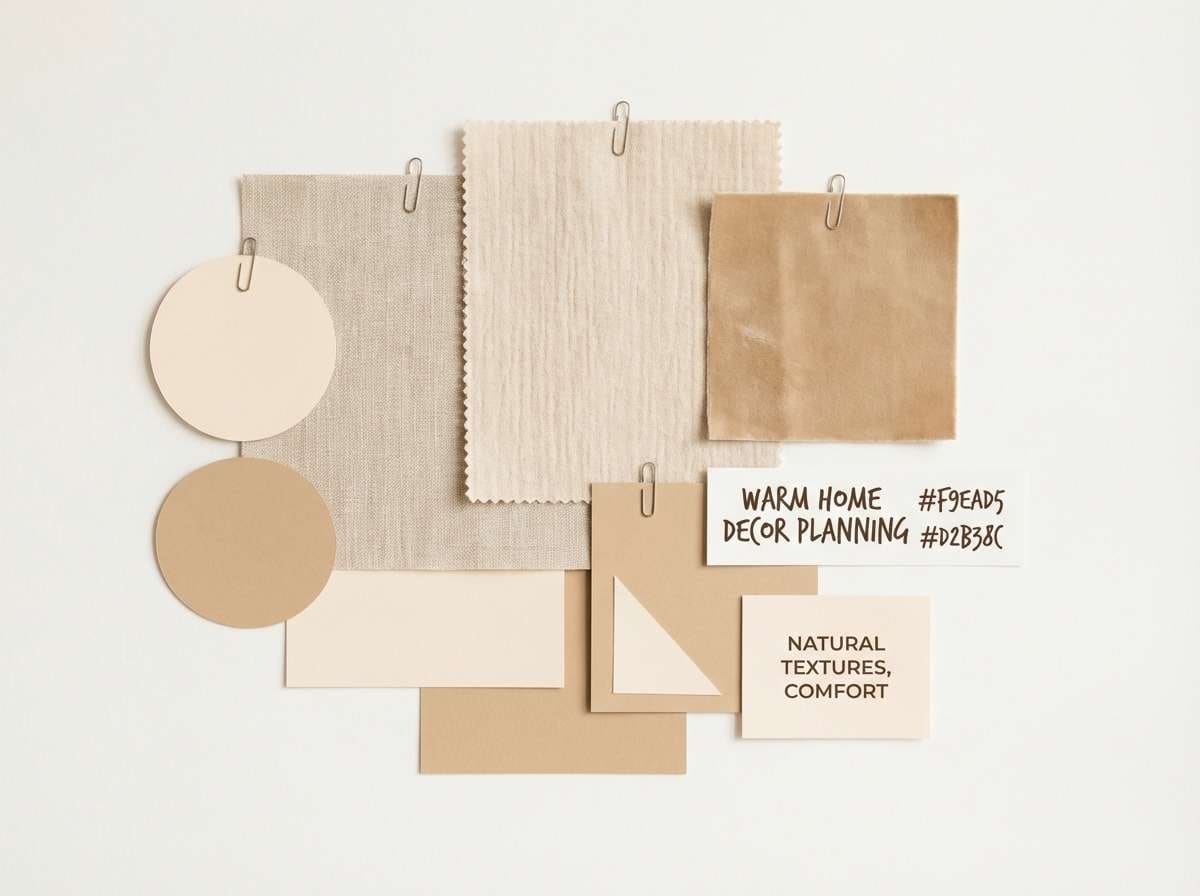
10) Vanilla Oak
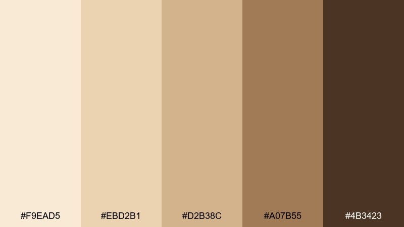
HEX: #F9EAD5 #EBD2B1 #D2B38C #A07B55 #4B3423
Mood: homey, classic, warm
Best for: kitchen and home decor moodboards
Homey and classic like vanilla bean and oak shelves, these tones suit cozy interiors. Use the light cream for wall swatches and negative space, then layer in tan and wood shades for furniture and trim notes. The deep brown works well for annotations and moodboard labels. Tip: balance the warmth with a small amount of crisp white so the board does not look muddy.
Image example of vanilla oak generated using media.io
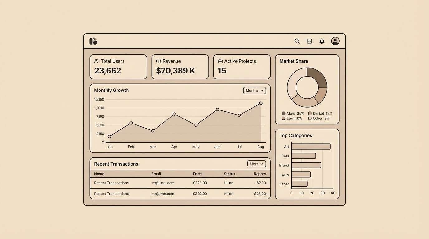
11) Stone Champagne
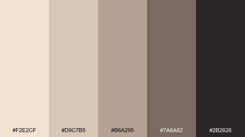
HEX: #F2E2CF #D9C7B5 #B6A295 #7A6A62 #2B2626
Mood: modern, balanced, architectural
Best for: UI dashboards and data cards
Modern and architectural like smooth stone in soft light, these neutrals stay calm around data. Use the lightest tone for the main canvas, then separate cards with gentle taupe panels. The slate midtone is great for borders and inactive states, while near-black keeps labels sharp. A champagne beige color combination like this benefits from clear spacing and one accent state color for alerts.
Image example of stone champagne generated using media.io
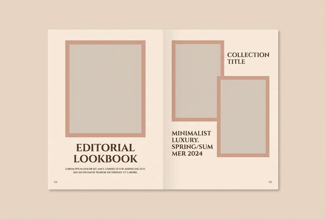
12) Satin Almond
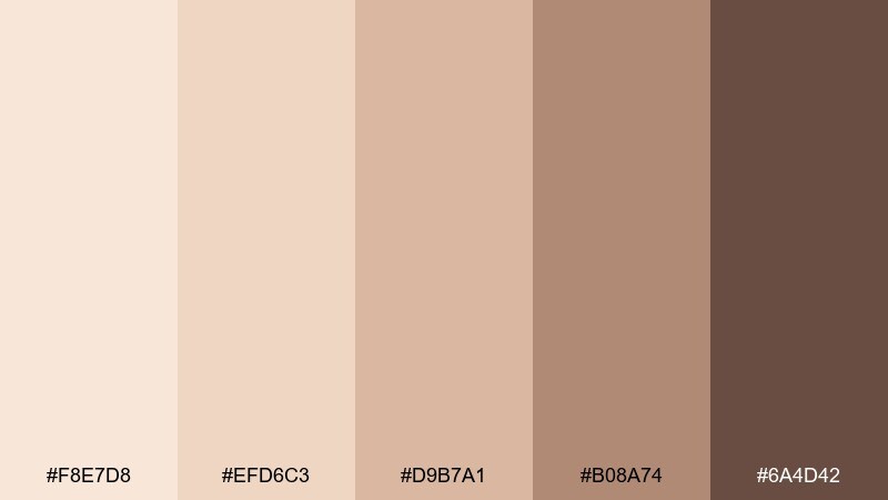
HEX: #F8E7D8 #EFD6C3 #D9B7A1 #B08A74 #6A4D42
Mood: soft, tactile, elegant
Best for: fashion lookbooks and editorials
Soft and tactile like satin lining, these shades feel elegant and wearable. Put the pale tones behind full-bleed images so skin tones and fabrics look natural. Use the almond and clay midtones for section headers and pull quotes. Keep captions in the deepest brown and avoid pure black to maintain the gentle finish.
Image example of satin almond generated using media.io
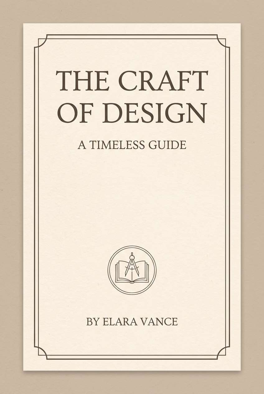
13) Vintage Ecru
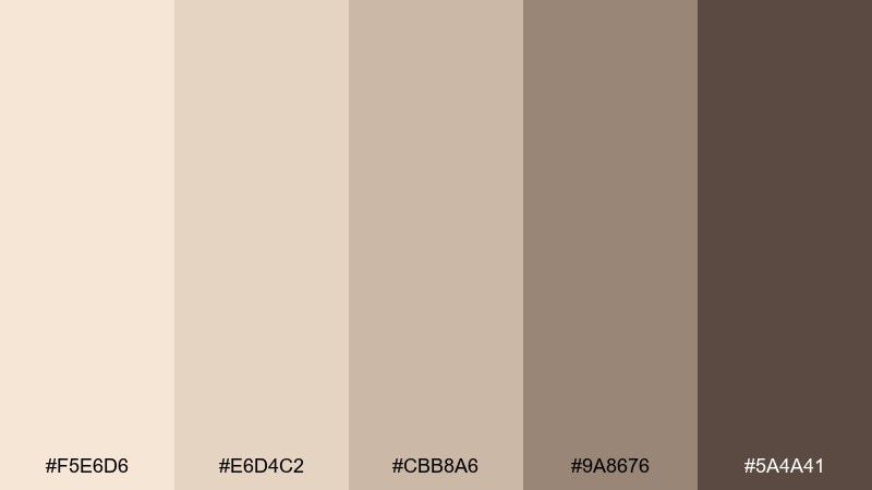
HEX: #F5E6D6 #E6D4C2 #CBB8A6 #9A8676 #5A4A41
Mood: nostalgic, gentle, timeless
Best for: book covers and literary posters
Nostalgic and gentle like aged paper and well-worn bindings, this mix feels timeless. Use the ecru base for the cover field, then bring in the muted taupe for frames and subtitle blocks. The darker brown delivers crisp title contrast without harshness. Add subtle paper texture to amplify the vintage mood and make the neutrals feel lived-in.
Image example of vintage ecru generated using media.io
14) Honeyed Parchment
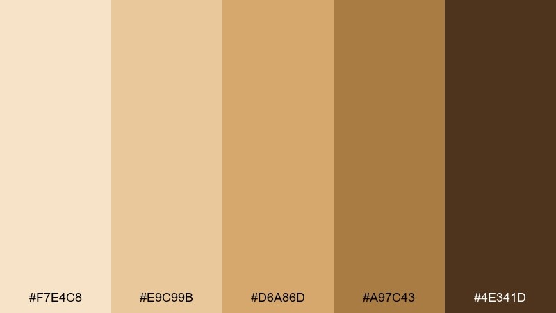
HEX: #F7E4C8 #E9C99B #D6A86D #A97C43 #4E341D
Mood: rich, inviting, traditional
Best for: certificate designs and awards
Rich and inviting like honey on parchment, these tones bring tradition with a warm glow. Use the light base as the paper field, then layer gold-brown bands for seals and headings. The deep brown keeps signatures and fine lines crisp. For a classic finish, pair with serif type and a thin border in the darker midtone.
Image example of honeyed parchment generated using media.io

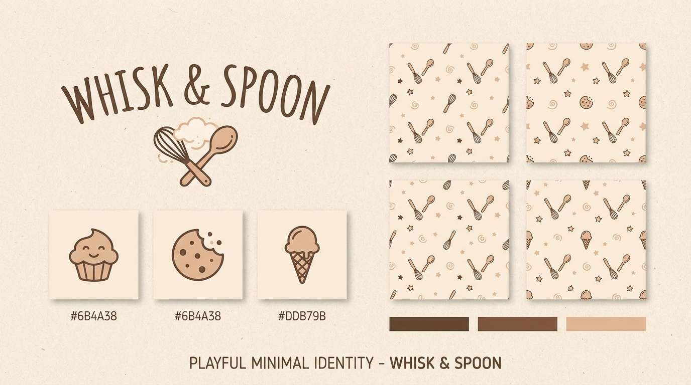
15) Malted Cream
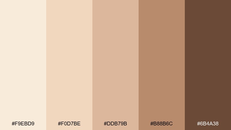
HEX: #F9EBD9 #F0D7BE #DDB79B #B88B6C #6B4A38
Mood: comforting, playful, creamy
Best for: dessert shop logo and brand kit
Comforting and playful like a malted shake, this set is creamy with a friendly edge. Keep the lightest cream for backgrounds and packaging space, then use the rosy tan for brand shapes and stickers. The toasted caramel shades add depth for outlines and icon fills. A rounded logotype and simple mascot illustration will match the softness of the tones.
Image example of malted cream generated using media.io
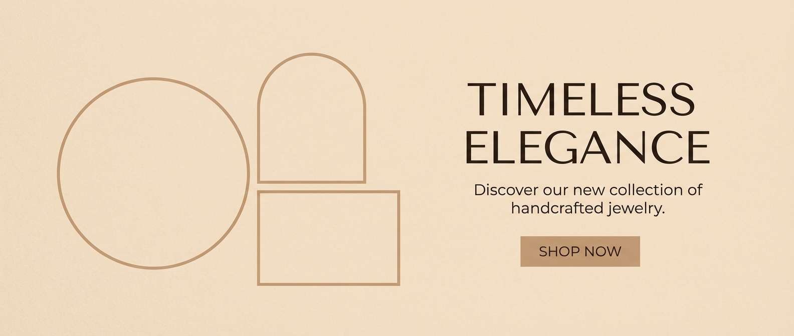
16) Soft Bronze
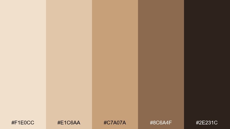
HEX: #F1E0CC #E1C6AA #C7A07A #8C6A4F #2E231C
Mood: polished, warm, confident
Best for: jewelry product pages and banners
Polished and warm like brushed bronze, these shades feel confident and refined. Use pale beige for page backgrounds so product photography stands out, then pull bronze midtones into buttons and price highlights. The deep brown is ideal for navigation and product names. For a luxurious rhythm, repeat the bronze accent sparingly and keep everything else quiet.
Image example of soft bronze generated using media.io
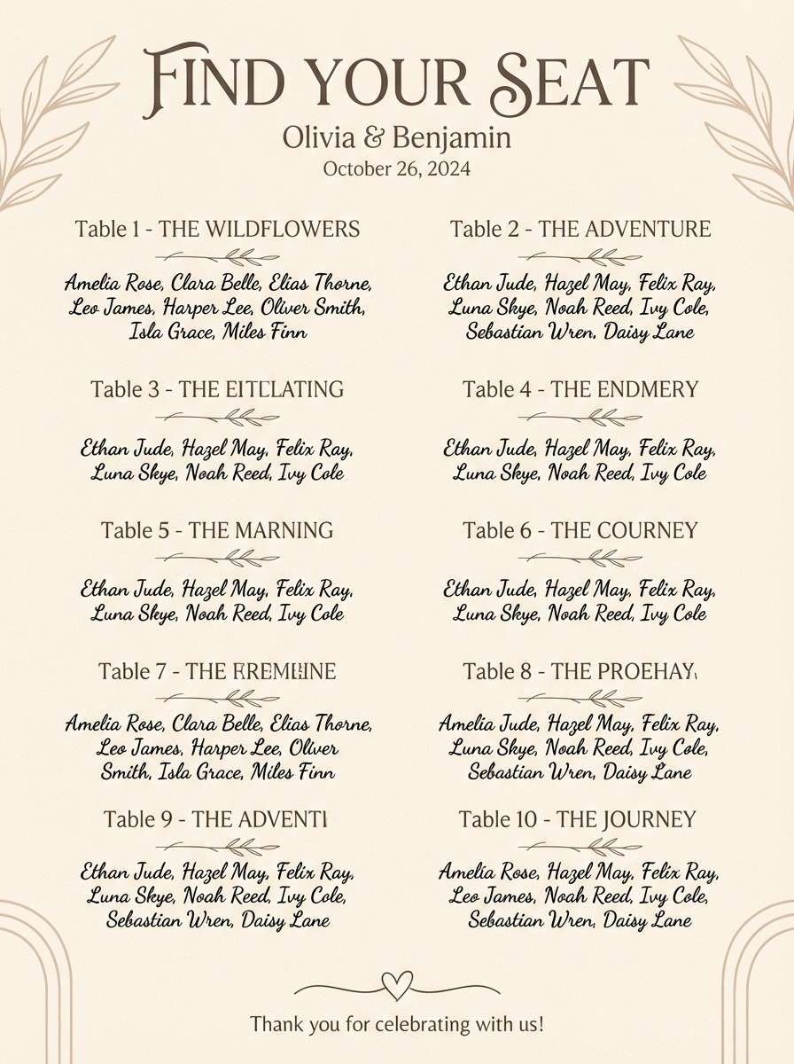
17) Dune Lace

HEX: #FAF0E3 #F0DDCF #D7BFAF #B69B8C #6A564E
Mood: delicate, serene, airy
Best for: boho wedding signage and seating charts
Delicate and serene like lace over sunlit dunes, this mix reads airy and romantic. Use the pale cream for large signage backgrounds and keep text in the deeper taupe for distance readability. The dusty rose-tan adds charm for table numbers, icons, and borders. Tip: use generous line spacing and avoid overly thin fonts so the soft colors still feel crisp.
Image example of dune lace generated using media.io
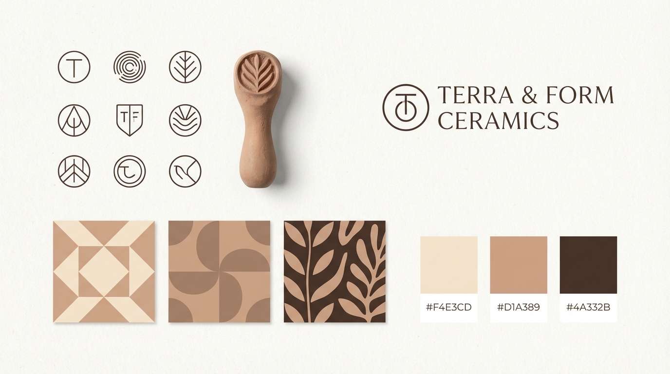
18) Champagne Clay
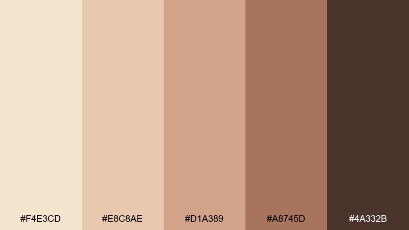
HEX: #F4E3CD #E8C8AE #D1A389 #A8745D #4A332B
Mood: earthy, creative, modern
Best for: ceramics studio branding
Earthy and creative like wet clay on a potter wheel, these warm neutrals feel modern and handcrafted. The champagne base keeps labels and social posts clean, while terracotta mids add personality to stamps and patterns. Use the darkest brown for a strong maker mark and clear contact text. A champagne beige color palette like this shines with tactile textures such as speckle, paper grain, or embossing.
Image example of champagne clay generated using media.io
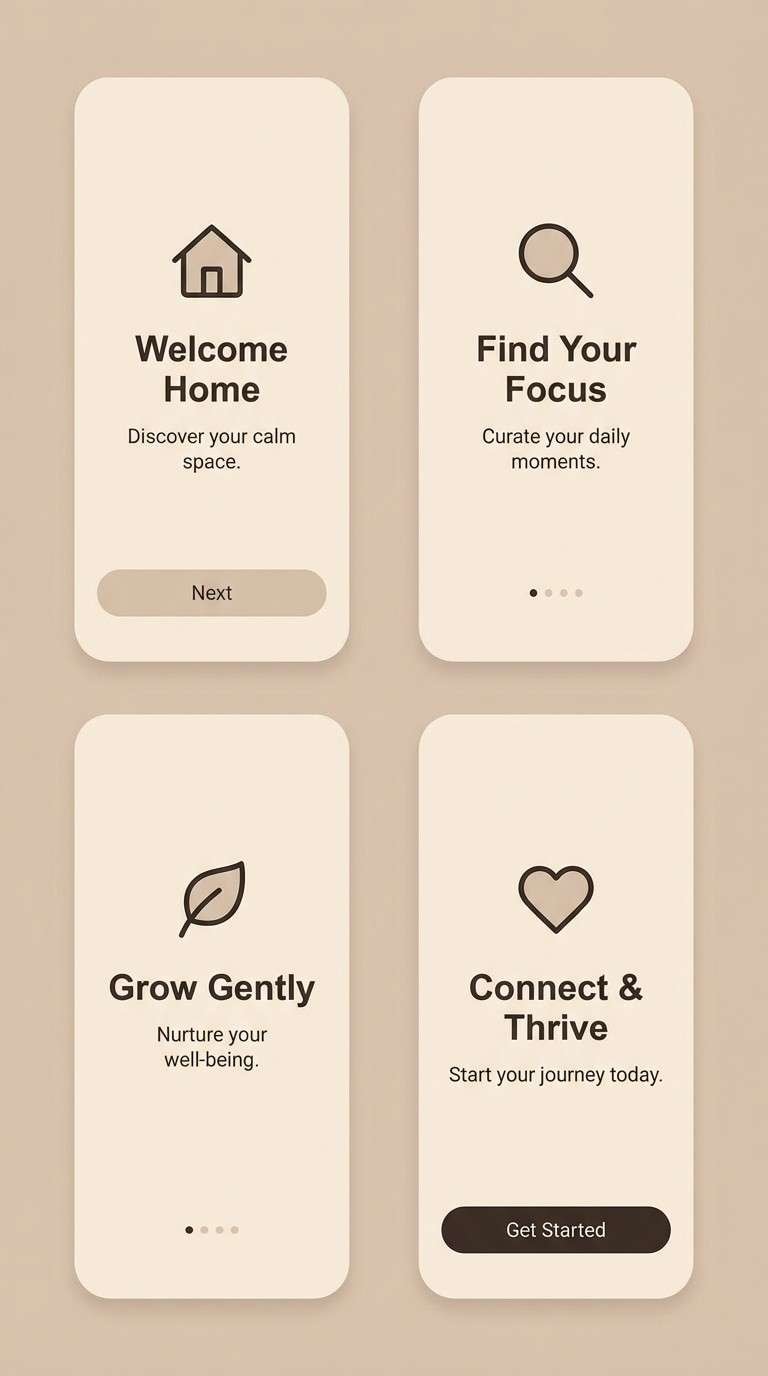
19) Latte Pearl
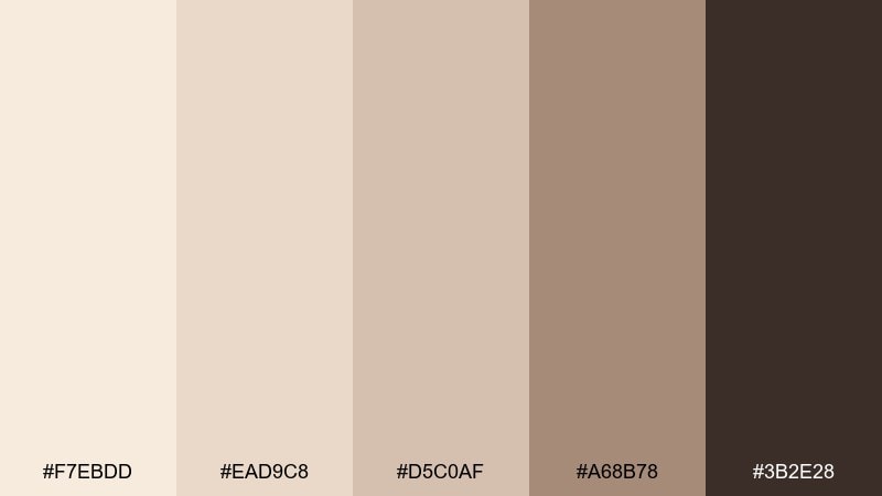
HEX: #F7EBDD #EAD9C8 #D5C0AF #A68B78 #3B2E28
Mood: smooth, cozy, contemporary
Best for: app onboarding screens
Smooth and cozy like a latte with glossy foam, this set feels contemporary and calming. Use pearl cream as the base, then bring in soft taupes for cards and progress steps. The cocoa accent makes CTA buttons and headings clear without feeling stark. When you need approachable champagne beige color combinations, keep gradients subtle and rely on contrast between light panels and dark type.
Image example of latte pearl generated using media.io
20) Evening Biscotti
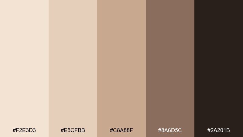
HEX: #F2E3D3 #E5CFBB #C8A88F #8A6D5C #2A201B
Mood: cozy, intimate, upscale
Best for: cafe flyers and event posters
Cozy and intimate like biscotti beside an evening espresso, these tones feel inviting and upscale. Use the pale cream as the poster field and place the mid browns into headers, frames, and date blocks. The deepest shade gives strong contrast for venue details and QR codes. A champagne beige color combination works best here with minimal illustration and bold type hierarchy.
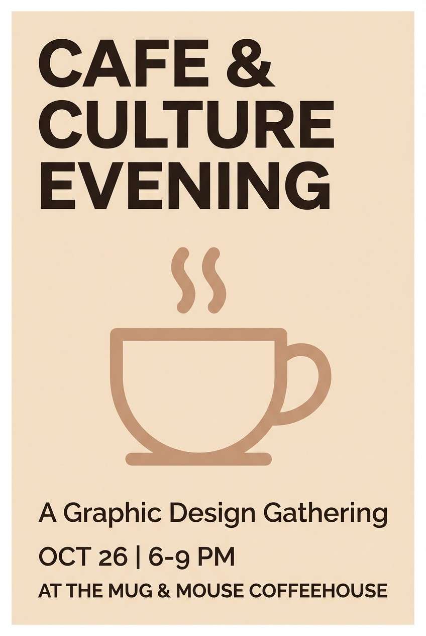
Image example of evening biscotti generated using media.io
21) Blush Drift
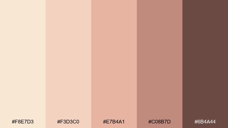
HEX: #F8E7D3 #F3D3C0 #E7B4A1 #C08B7D #6B4A44
Mood: gentle, dreamy, feminine
Best for: bridal boutique social ads
Gentle and dreamy like a blush veil catching light, these shades feel soft without fading away. Use the light champagne tones as the ad canvas and let blush midtones frame product shots. Deep mocha keeps discount text and buttons readable on mobile. Tip: stick to one accent shape and repeat it across the carousel for cohesion.
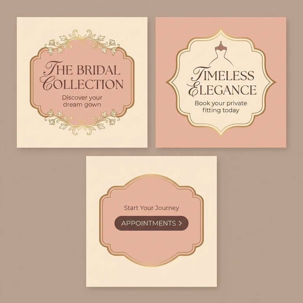
Image example of blush drift generated using media.io
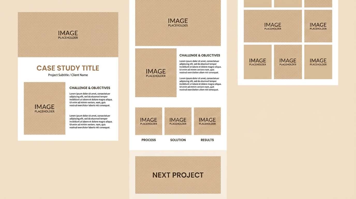
22) Warm Minimalist
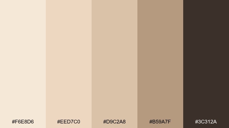
HEX: #F6E8D6 #EED7C0 #D9C2A8 #B59A7F #3C312A
Mood: clean, calm, modern
Best for: portfolio websites and case studies
Clean and calm like a gallery wall in warm daylight, these neutrals keep the focus on work. Use the lightest shade as the site background, then add soft panels for project sections and callouts. The darker brown supports headings and navigation while staying warmer than pure black. For a professional finish, keep shadows very subtle and lean on spacing for structure.
Image example of warm minimalist generated using media.io
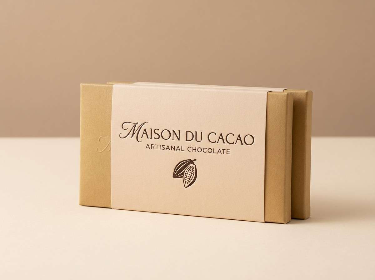
23) Cocoa Cream
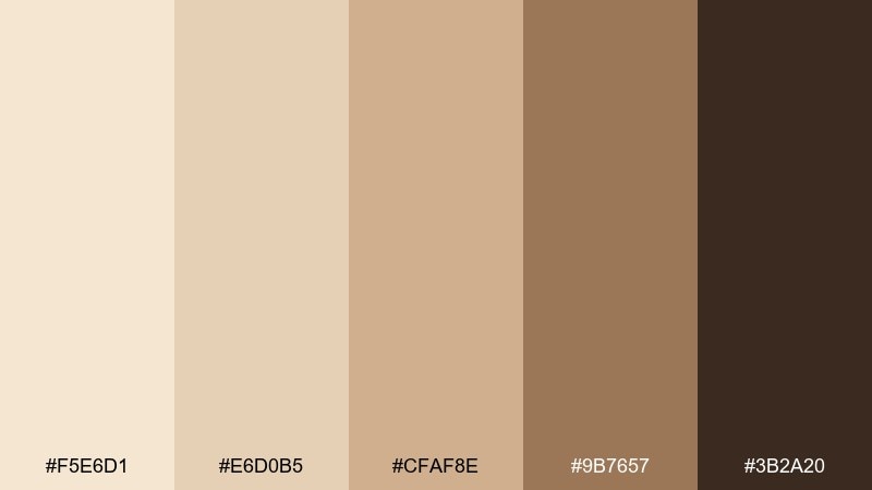
HEX: #F5E6D1 #E6D0B5 #CFAF8E #9B7657 #3B2A20
Mood: rich, cozy, indulgent
Best for: chocolate brand packaging
Rich and cozy like cocoa stirred into cream, these tones feel indulgent and giftable. Use the pale base for wrappers and labels, then layer caramel browns for flavor systems and patterns. The deep cocoa shade makes the logo and ingredient panel feel premium and readable. A small repeating motif in the midtone can add detail without cluttering the pack.
Image example of cocoa cream generated using media.io
What Colors Go Well with Champagne Beige?
Champagne beige pairs beautifully with deeper warm browns (cocoa, espresso, walnut) for dependable contrast in type and UI elements. This keeps the palette cohesive while making headings and CTA buttons pop.
For a softer, romantic direction, add muted blush, dusty rose, or clay tones. If you want something cooler and more modern, lean into stone taupes and near-black accents rather than bright white.
Metallics can work too—think brushed gold or bronze—but use them sparingly so the overall look stays calm and premium instead of flashy.
How to Use a Champagne Beige Color Palette in Real Designs
Start with champagne beige as your main background, then layer 1–2 midtones for cards, panels, or section dividers. Reserve the darkest shade for text, navigation, and any must-read details.
In print (menus, certificates, packaging), these warm neutrals look best with subtle texture: paper grain, embossing, or a soft vignette. In digital design, keep shadows light and rely on spacing to create structure.
If you need an accent, choose one “hero” tone (blush, bronze, or caramel) and repeat it consistently across buttons, badges, or highlights to avoid a muddy neutral stack.
Create Champagne Beige Palette Visuals with AI
Want mockups fast? Turn any palette above into posters, packaging, UI screens, or moodboards by reusing the included prompts and swapping out the subject (for example: “skincare” to “candle label”).
With Media.io Text-to-Image, you can generate cohesive variations for A/B tests, social templates, and brand explorations—without rebuilding the design from scratch each time.
Keep your results consistent by repeating the same prompt structure and only changing one variable at a time (layout, object, or ratio).
Champagne Beige Color Palette FAQs
-
What is champagne beige (as a color)?
Champagne beige is a warm, light neutral with soft golden undertones—less yellow than cream and more refined than standard beige. It’s commonly used as an elegant base color in branding, interiors, and web design. -
Is champagne beige warm or cool?
It’s typically warm because it leans toward golden, sand, and creamy undertones. You can make it feel cooler by pairing it with stone taupes, slate browns, and crisp near-black typography. -
What colors complement champagne beige the best?
Deep cocoa/espresso browns for contrast, blush/dusty rose for softness, caramel/bronze for richness, and muted taupes for a modern neutral system. Metallic gold can work as a light accent if used sparingly. -
How do I keep a champagne beige palette from looking “muddy”?
Use clear value separation: one very light background, one midtone for panels, and one dark tone for text. Add a small amount of crisp white space and avoid stacking too many similar midtones in the same area. -
What text color works on champagne beige backgrounds?
Dark warm browns (like espresso) or near-black give the cleanest readability while staying softer than pure black. Very light text on champagne beige usually fails contrast, especially on mobile. -
Is champagne beige good for UI design?
Yes—especially for calm dashboards, onboarding screens, and lifestyle apps. Use champagne beige for the canvas, taupes for cards, and a dark cocoa tone for labels, then introduce a single accent color for states (success/error/alert). -
How can I generate champagne beige palette images quickly?
Use the prompts provided under each palette and generate visuals with a text-to-image tool. Keep the same prompt structure and palette hex references to produce consistent brand-like variations.


