

Desert sand palettes sit right in the sweet spot between warm minimalism and natural depth. They’re easy to live with, easy to print, and versatile enough for branding, web UI, interiors, and packaging.
Below are modern desert sand tones—airy off-whites, clay accents, and grounded browns—organized as ready-to-use palettes with HEX codes and AI image prompts.
In this article
Why Desert Sand Palettes Work So Well
Desert sand colors are naturally balanced: light creams and beiges create breathing room, while browns add structure and legibility. That makes them ideal for designs that need to feel calm without looking flat.
They also translate well across mediums. In digital, warm neutrals reduce visual fatigue; in print, they look premium on uncoated stocks, kraft textures, and matte finishes where bright colors can feel harsh.
Most importantly, desert sand tones are flexible. You can keep them minimal for modern branding, push them rustic with terracotta and cocoa, or add a single accent color for a clean, contemporary system.
20+ Desert Sand Color Palette Ideas (with HEX Codes)
1) Dune Dawn
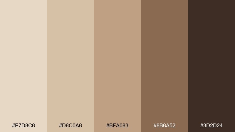
HEX: #E7D8C6 #D6C0A6 #BFA083 #8B6A52 #3D2D24
Mood: soft, airy, grounded
Best for: minimal brand identity and stationery
Soft morning dunes and hazy sunlight set a calm, grounded tone. Use these warm neutrals for logos, letterheads, and premium stationery where you want quiet confidence. Pair with uncoated paper textures, subtle embossing, and plenty of negative space. Tip: keep the darkest brown for small type and marks so the layout stays light.
Image example of dune dawn generated using media.io
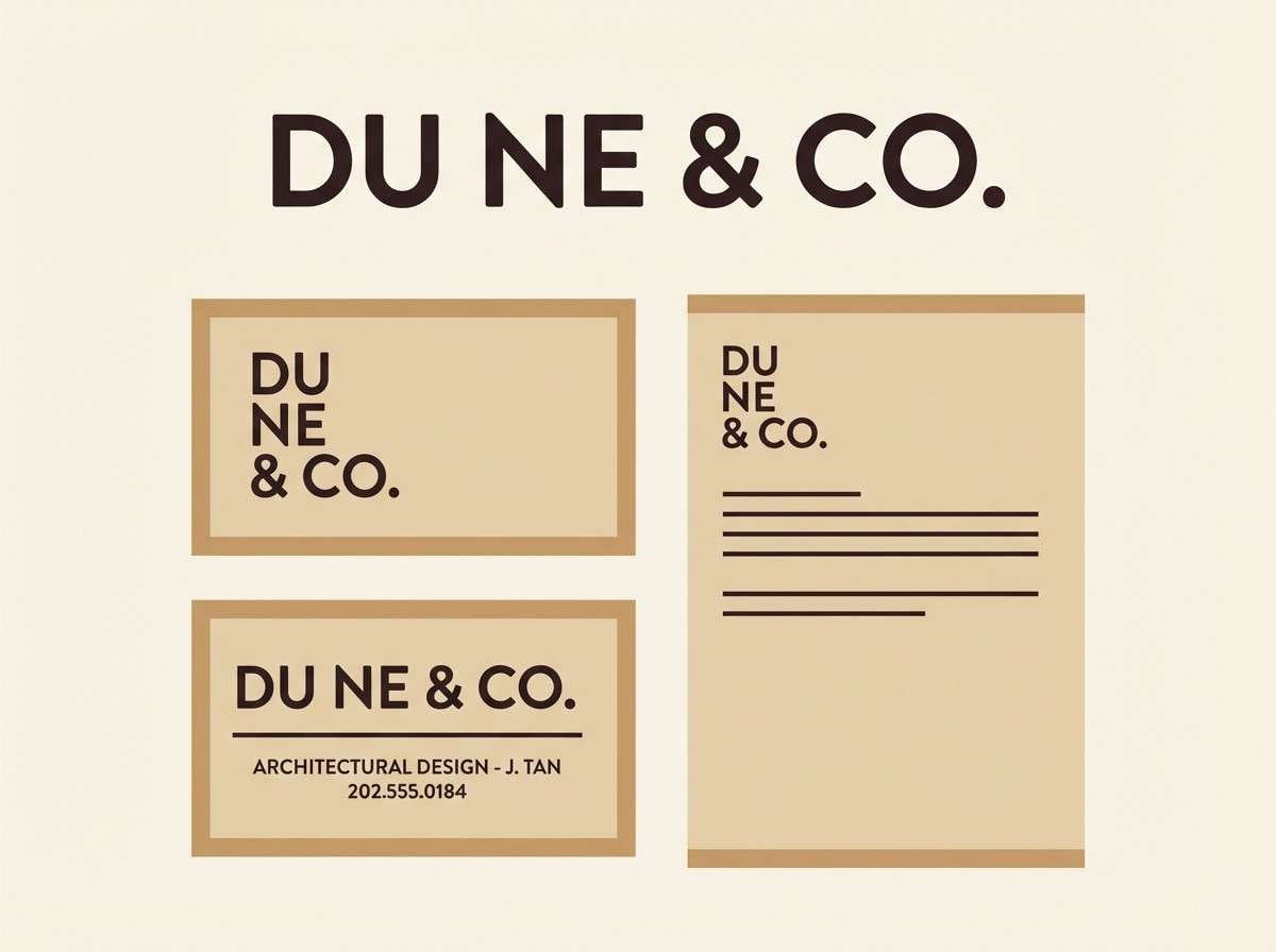
Media.io is an online AI studio for creating and editing video, image, and audio in your browser.

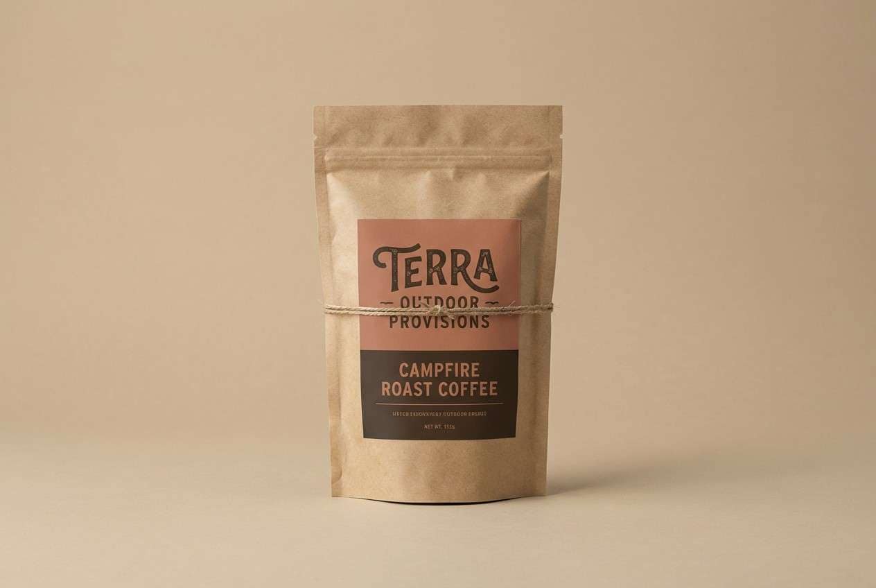
2) Canyon Clay
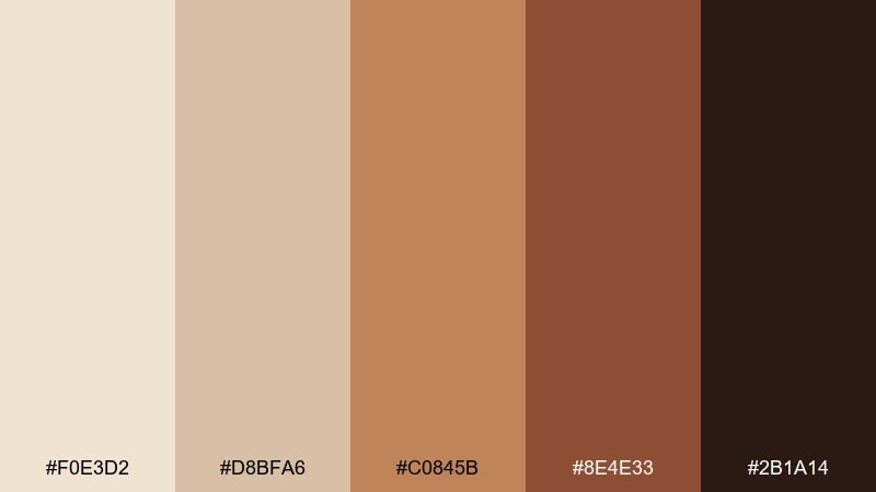
HEX: #F0E3D2 #D8BFA6 #C0845B #8E4E33 #2B1A14
Mood: rugged, bold, sunbaked
Best for: outdoor brand packaging
Rugged canyon walls and sunbaked clay bring a bold, adventurous feel. This mix works well for outdoor goods, coffee bags, and craft packaging where contrast matters. Pair the terracotta with matte black ink and a kraft-paper backdrop for a natural finish. Tip: use the darkest shade for barcodes and compliance text to keep print crisp.
Image example of canyon clay generated using media.io
3) Oasis Linen
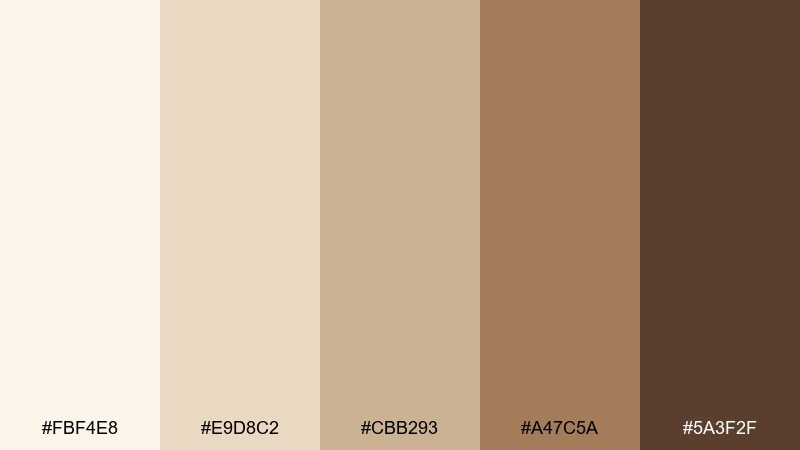
HEX: #FBF4E8 #E9D8C2 #CBB293 #A47C5A #5A3F2F
Mood: clean, cozy, refreshing
Best for: home decor and interior mood boards
Crisp linen, pale sand, and warm wood create a relaxed, breathable atmosphere. Use it for interior mood boards, upholstery choices, or ecommerce imagery that needs a calm backdrop. Pair with natural fibers, pale oak, and soft daylight photography. Tip: reserve the medium brown for shadows and edges to add depth without heaviness.
Image example of oasis linen generated using media.io
4) Sunbaked Adobe
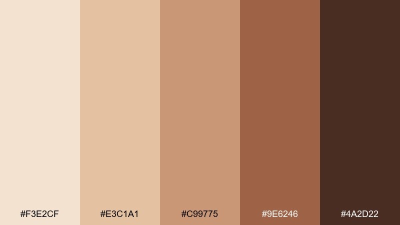
HEX: #F3E2CF #E3C1A1 #C99775 #9E6246 #4A2D22
Mood: warm, rustic, inviting
Best for: restaurant menus and signage
Sunbaked adobe and toasted spice tones feel welcoming and handcrafted. They shine on restaurant menus, cafe signage, and small-batch food branding where warmth sells. Pair with serif headlines, paper grain, and a simple icon set for an artisan look. Tip: keep body text in the deep cocoa so readability stays strong under warm lighting.
Image example of sunbaked adobe generated using media.io
5) Palm Shadow
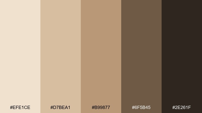
HEX: #EFE1CE #D7BEA1 #B99877 #6F5B45 #2E261F
Mood: moody, modern, grounded
Best for: fashion lookbooks and editorial layouts
Palm shadows over pale sand give this set a modern, editorial mood. It works beautifully for lookbooks, magazine spreads, and minimalist photography portfolios. Pair with high-contrast black-and-cream images and clean grid systems. Tip: use the charcoal-brown sparingly for dividers and captions so the page feels airy.
Image example of palm shadow generated using media.io
6) Saffron Sand
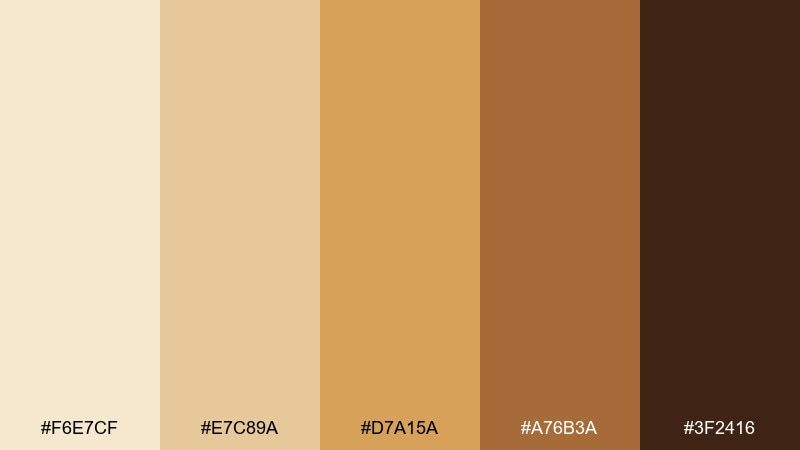
HEX: #F6E7CF #E7C89A #D7A15A #A76B3A #3F2416
Mood: bright, spicy, upbeat
Best for: food photography overlays and social posts
Golden saffron and sandy beige bring an upbeat, appetizing glow. Use it for recipe cards, social templates, and food photography overlays that need warm energy. Pair with creamy backgrounds and bold sans-serif type for clean contrast. Tip: keep the amber shade for buttons and callouts so the design stays punchy.
Image example of saffron sand generated using media.io
7) Terracotta Trail
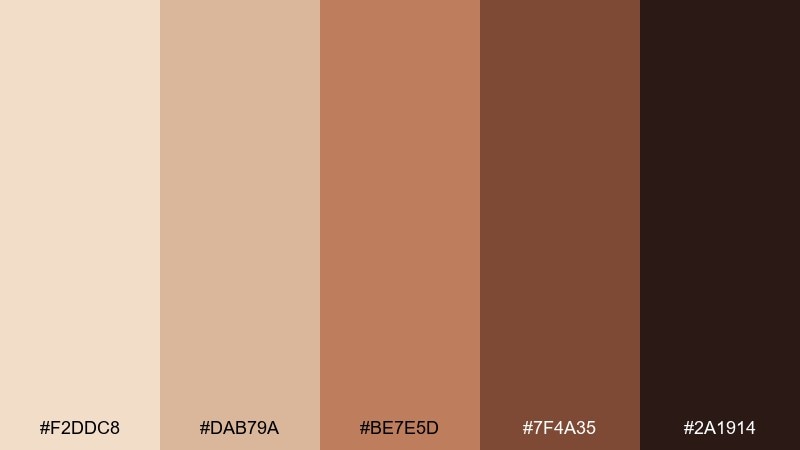
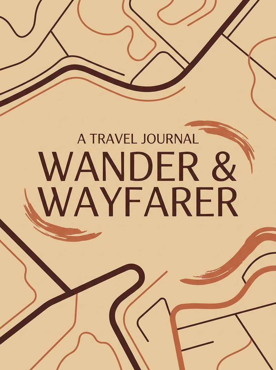
HEX: #F2DDC8 #DAB79A #BE7E5D #7F4A35 #2A1914
Mood: earthy, handcrafted, adventurous
Best for: travel blog branding and covers
Earthy terracotta and dusty tan evoke canyon hikes and well-worn trails. Try it for travel blog covers, guide PDFs, and creator branding that leans natural. Pair with documentary-style photography and simple map linework. Tip: set headlines in the darker brown to anchor the page against lighter sand blocks.
Image example of terracotta trail generated using media.io
8) Creamy Mirage
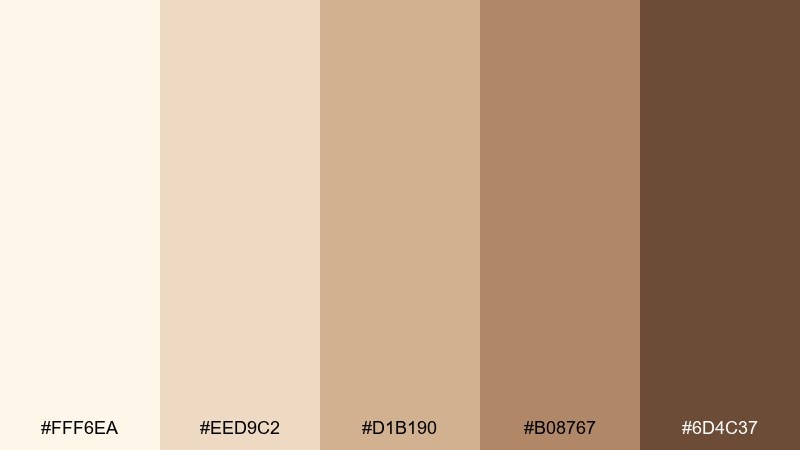
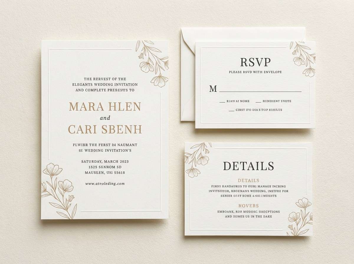
HEX: #FFF6EA #EED9C2 #D1B190 #B08767 #6D4C37
Mood: soft, dreamy, elegant
Best for: wedding invitations and event suites
Creamy mirage tones feel like a warm breeze and soft candlelight. They are ideal for wedding invitations, event suites, and premium announcements that need gentle elegance. Pair with delicate florals, gold foil details, and generous margins. Tip: use the mid-tan for borders and monograms to keep everything refined.
Image example of creamy mirage generated using media.io
9) Copper Quartz
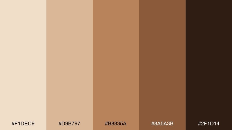
HEX: #F1DEC9 #D9B797 #B8835A #8A5A3B #2F1D14
Mood: polished, warm, luxe
Best for: beauty product packaging
Polished copper warmth and quartz-like neutrals create a quietly luxe vibe. Use it on skincare packaging, cosmetic labels, and product ads where you want richness without loud color. Pair with minimal typography, metallic accents, and soft gradient lighting. Tip: keep the copper tone as the hero color and let the pale beige do the breathing room.
Image example of copper quartz generated using media.io
10) Dusty Rose Ridge
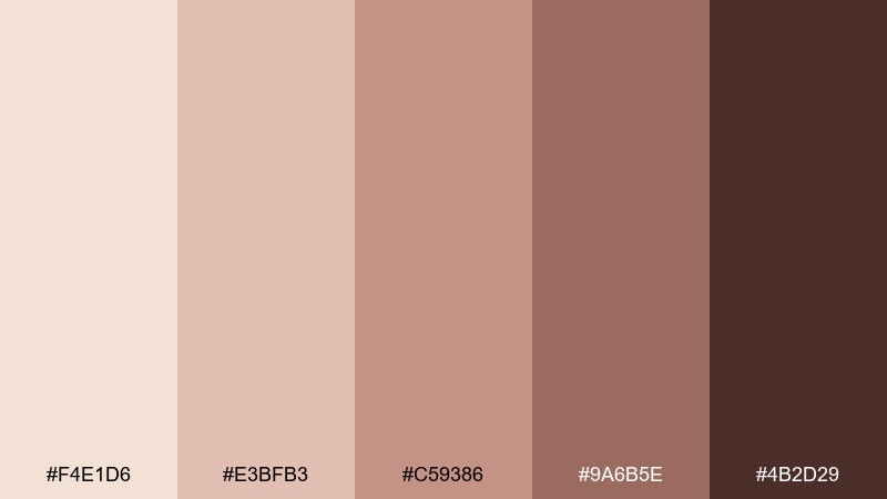
HEX: #F4E1D6 #E3BFB3 #C59386 #9A6B5E #4B2D29
Mood: romantic, muted, modern
Best for: lifestyle branding and creator kits
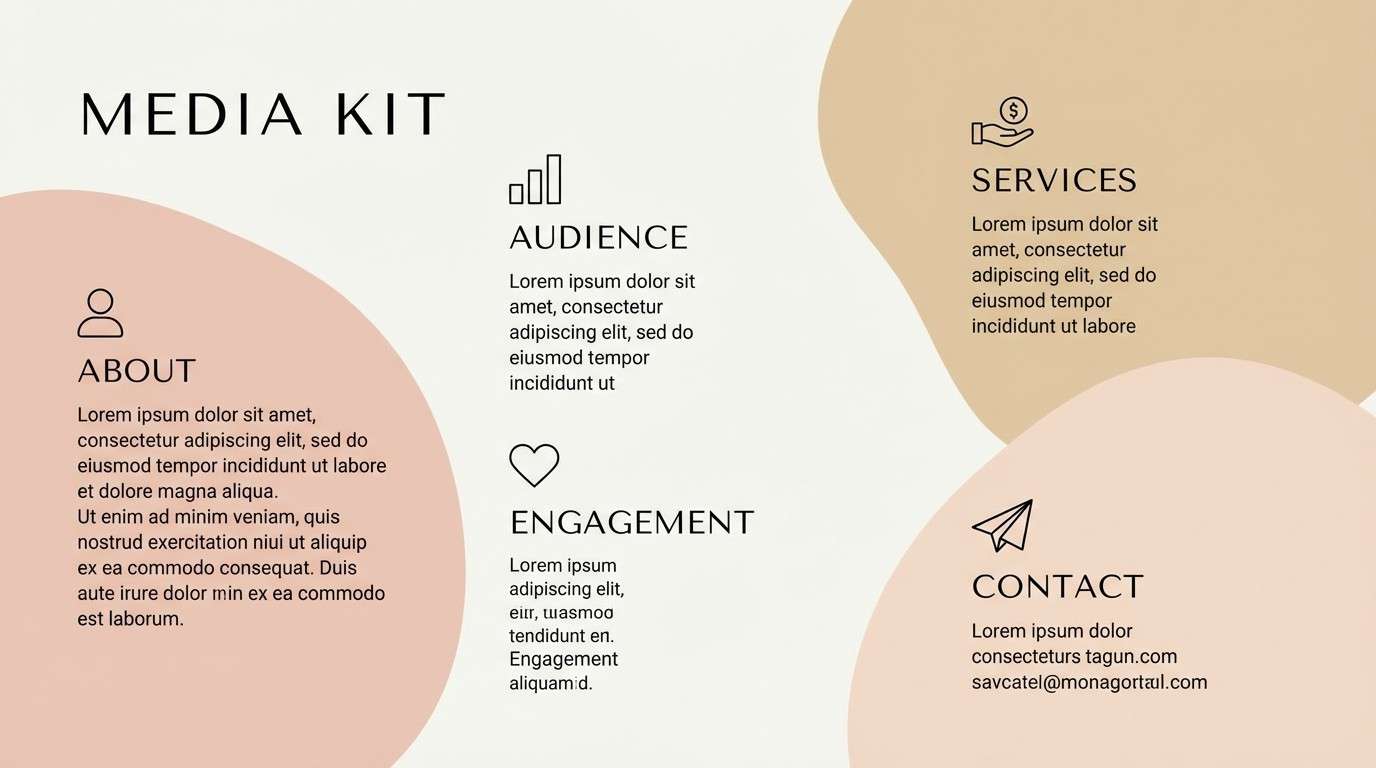
Dusty rose drifting over sandy neutrals feels modern, romantic, and calm. These tones work well for lifestyle branding, creator media kits, and gentle product storytelling. Pair with soft portrait photography and simple line icons for a clean, approachable look. Tip: use the deepest shade only for key headings to keep the blush tones airy.
Image example of dusty rose ridge generated using media.io
11) Sepia Sage
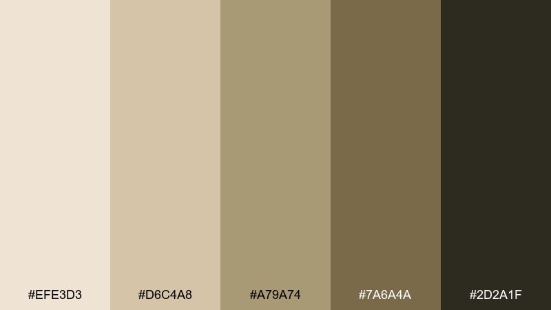
HEX: #EFE3D3 #D6C4A8 #A79A74 #7A6A4A #2D2A1F
Mood: earthy, herbal, balanced
Best for: wellness labels and botanical brands
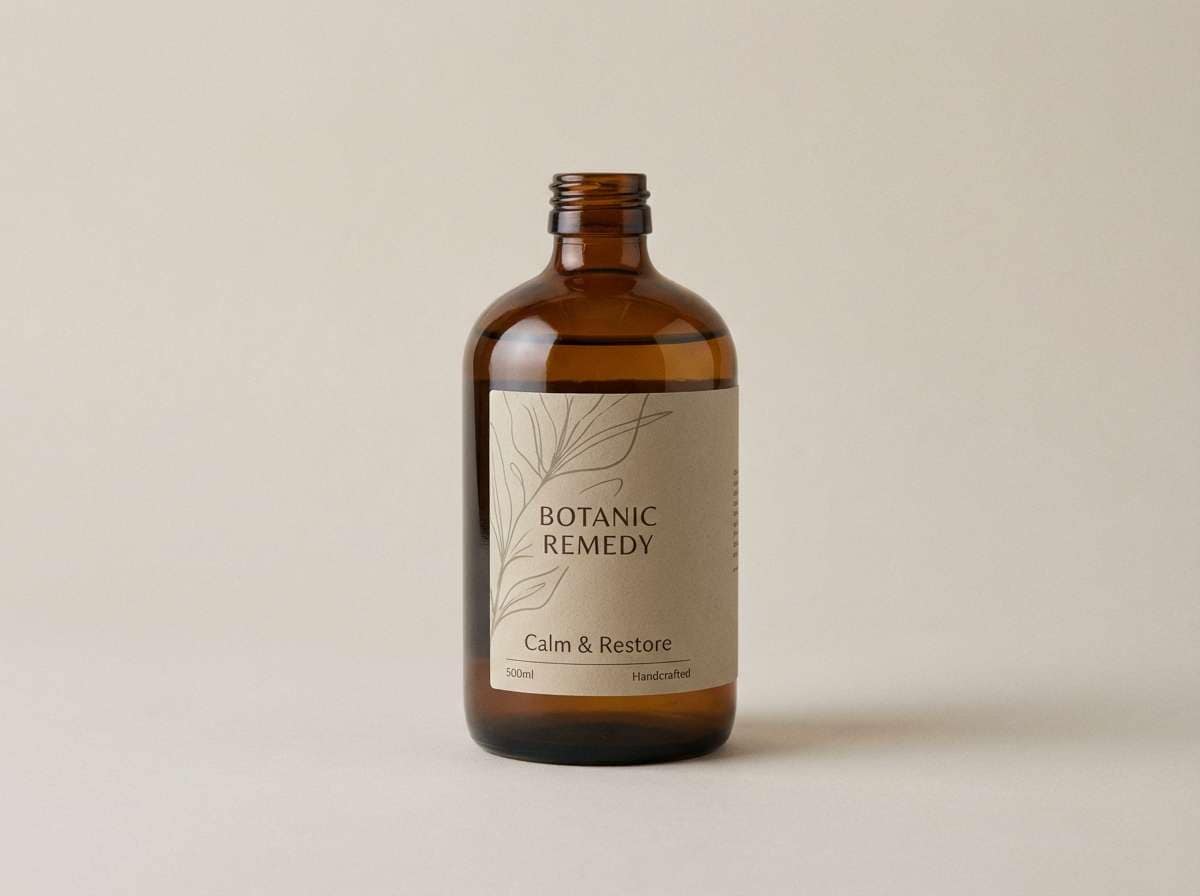
Herbal sage notes mixed with sepia sand feel grounded and restorative. Use it for wellness labels, botanical brands, and apothecary-style packaging that needs calm credibility. Pair with botanical line drawings, recycled paper textures, and clear ingredient hierarchy. Tip: keep the greenish taupe for accent panels so it reads natural, not muddy.
Image example of sepia sage generated using media.io
12) Mocha Drift
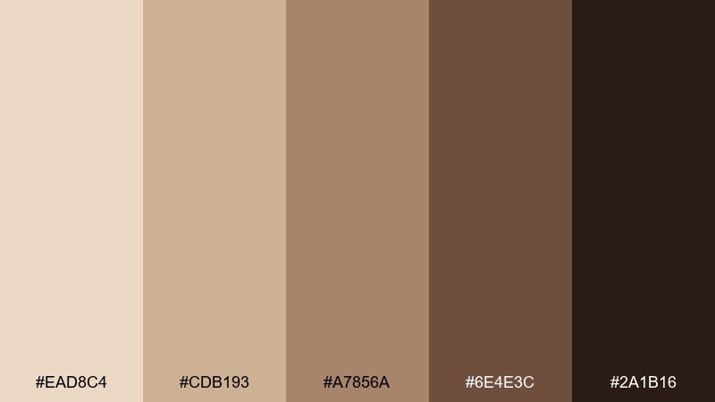
HEX: #EAD8C4 #CDB193 #A7856A #6E4E3C #2A1B16
Mood: cozy, rich, dependable
Best for: coffee branding and cafe menus
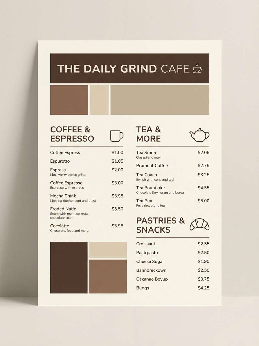
Mocha richness layered over sandy beige feels cozy and dependable. It is a natural fit for coffee branding, cafe menus, and loyalty cards that should feel warm and familiar. Pair with cream backgrounds, bold pricing, and a single accent stamp for character. Tip: use the darkest espresso for small print so it stays readable on textured stocks.
Image example of mocha drift generated using media.io
13) Spiced Nougat
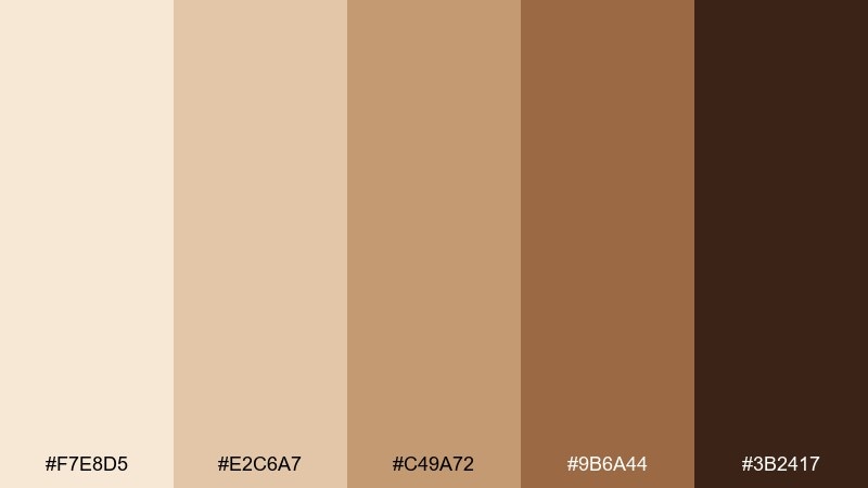
HEX: #F7E8D5 #E2C6A7 #C49A72 #9B6A44 #3B2417
Mood: sweet, warm, comforting
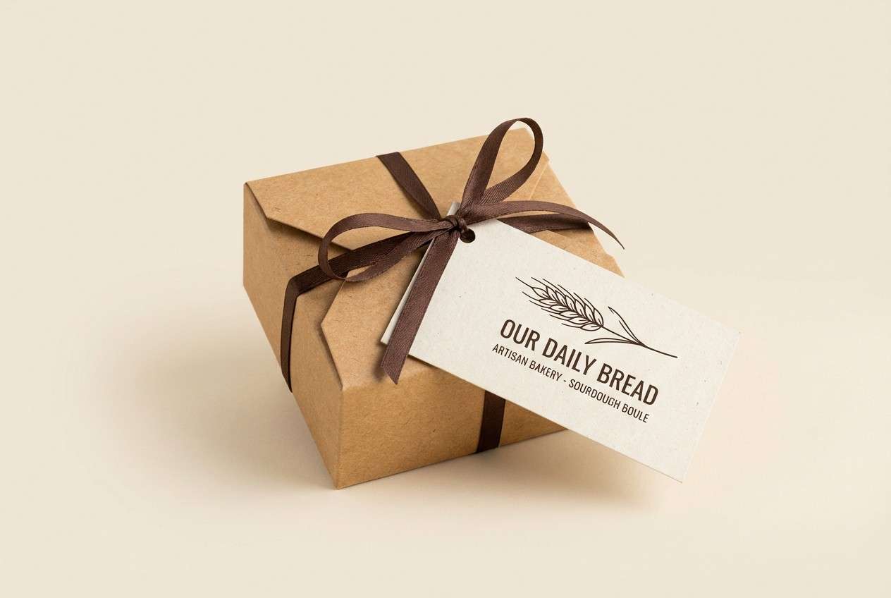
Best for: bakery packaging and labels
Spiced nougat tones feel like warm pastries and toasted sugar. Use them for bakery packaging, jar labels, and seasonal promos where comfort is the message. Pair with hand-drawn illustrations and rounded type to keep things friendly. Tip: highlight offers with the caramel shade, then ground everything with the cocoa brown.
Image example of spiced nougat generated using media.io
14) Pebble Path
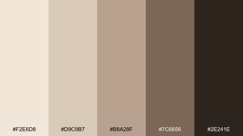
HEX: #F2E6D8 #D9C9B7 #B8A28F #7C6656 #2E241E
Mood: neutral, quiet, structured
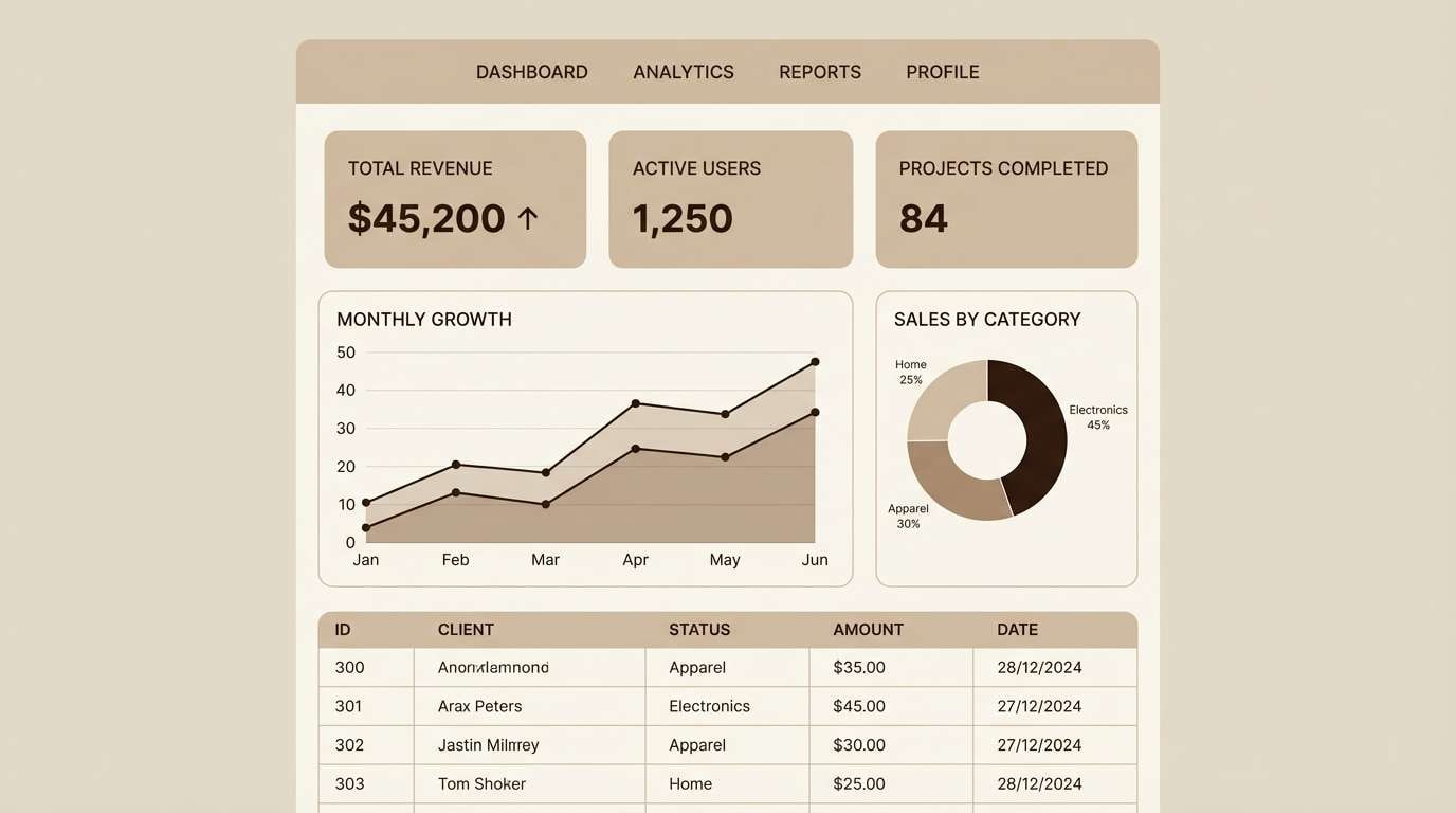
Best for: dashboard UI and data-heavy screens
Quiet pebble neutrals create a structured, no-drama foundation. These tones are great for dashboard UI, analytics screens, and enterprise tools where clarity beats flair. Pair with subtle dividers, soft shadows, and one restrained accent color for states. Tip: set primary text in the deepest brown and keep panels in the lightest cream for contrast.
Image example of pebble path generated using media.io
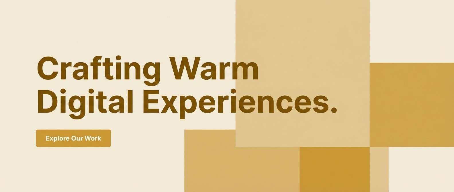
15) Golden Hour Grain
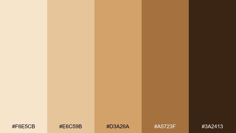
HEX: #F6E5CB #E6C59B #D3A26A #A5723F #3A2413
Mood: golden, optimistic, natural
Best for: landing pages and hero sections
Golden hour grain tones feel sunny, optimistic, and natural. They work well on landing pages, especially for lifestyle products that benefit from warmth. Pair with soft photography, rounded corners, and a clean sans-serif to keep it contemporary. Tip: use the honey tone for primary buttons and keep backgrounds light for easy scanning.
Image example of golden hour grain generated using media.io
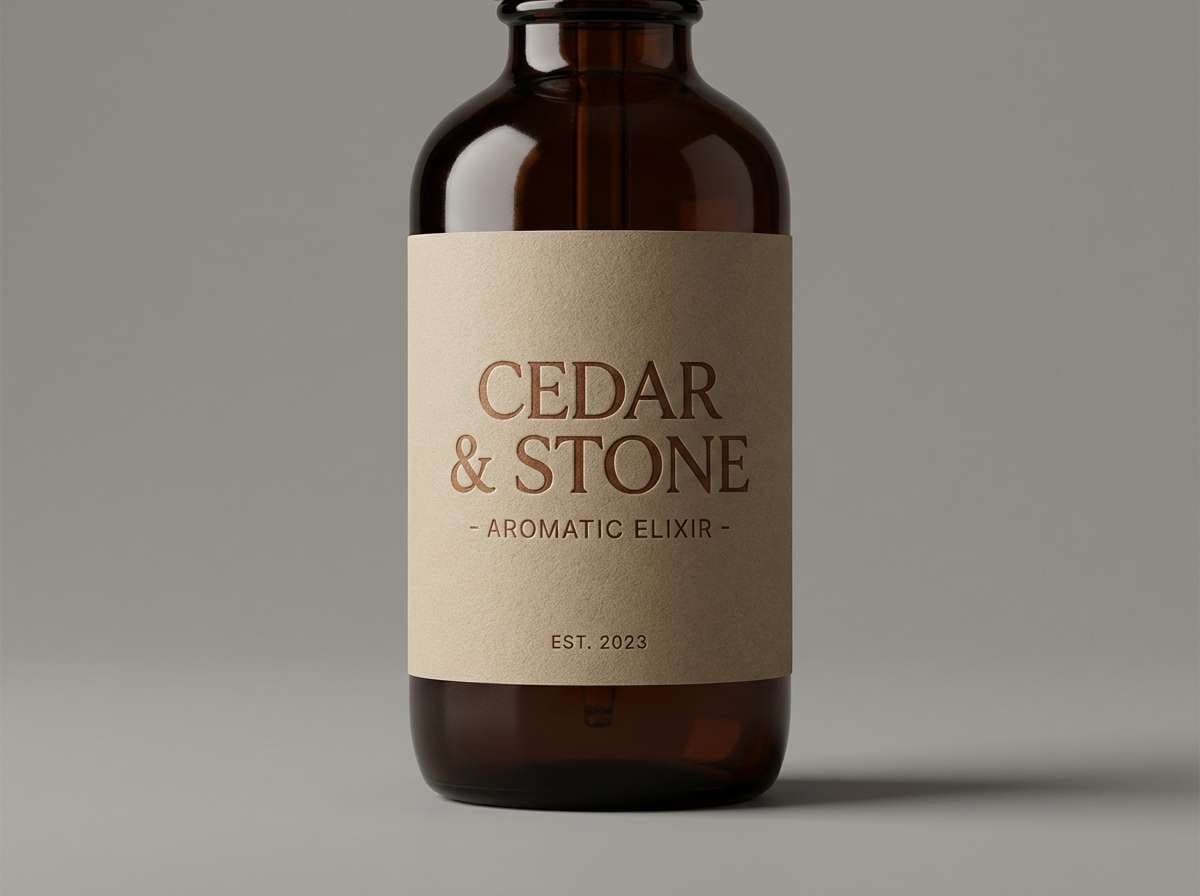
16) Cedar Smoke
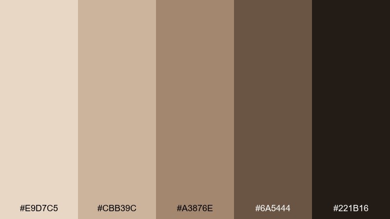
HEX: #E9D7C5 #CBB39C #A3876E #6A5444 #221B16
Mood: smoky, mature, rustic
Best for: whiskey labels and premium packaging
Smoky cedar browns with sandy highlights feel mature and premium. Use this set for whiskey labels, luxury candles, or heritage packaging that leans classic. Pair with engraved-style typography and minimal ornamentation to keep it upscale. Tip: keep the light sand as a label background so dark type stays sharp.
Image example of cedar smoke generated using media.io
17) Almond Wash

HEX: #FFF1E2 #E8D2BC #D0B397 #B58F73 #6A4A38
Mood: gentle, clean, friendly
Best for: app onboarding and UI components
Gentle almond and washed sand tones feel clean and friendly. They are ideal for app onboarding screens, settings pages, and UI components that should not overwhelm. Pair with soft shadows, generous padding, and warm illustrations for approachability. Tip: use the medium tan for active states and keep backgrounds near-ivory to reduce visual noise.
Image example of almond wash generated using media.io
18) Bronze Breeze
HEX: #F1E0CC #D9BEA0 #C0956B #8E6848 #2E1F16
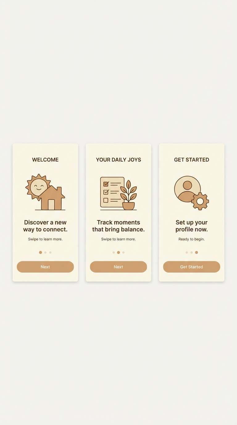
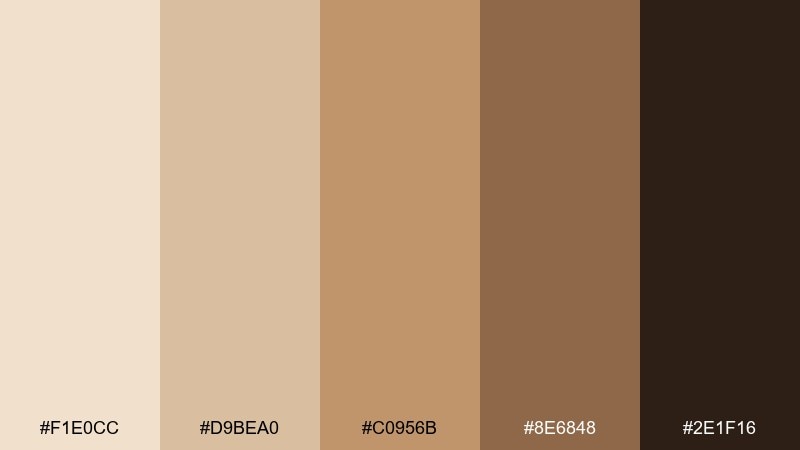
Mood: breezy, refined, confident
Best for: portfolio websites and case studies
A bronze breeze over pale sand feels refined and quietly confident. Use these tones for portfolio websites, case study pages, and creative resumes that need warmth without distraction. Pair with large typography, crisp grids, and subtle motion. Tip: treat the bronze as an accent only, letting light neutrals carry most sections.
Image example of bronze breeze generated using media.io
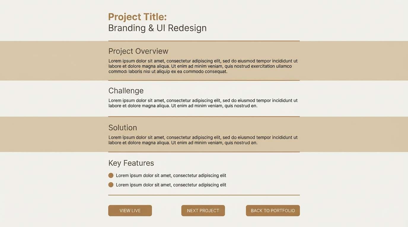
19) Caramel Tarmac
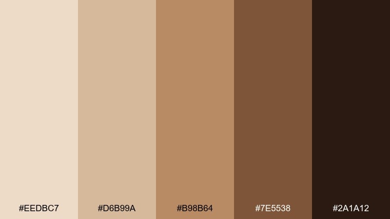
HEX: #EEDBC7 #D6B99A #B98B64 #7E5538 #2A1A12
Mood: urban, warm, high-contrast
Best for: event posters and bold typography
Caramel warmth against deep tarmac brown gives a modern, urban edge. This is great for event posters, bold typography experiments, and announcements that need punch without neon. Pair with oversized type and simple geometric shapes for a strong rhythm. Tip: keep backgrounds light and use the darkest tone for titles to maximize impact.
Image example of caramel tarmac generated using media.io
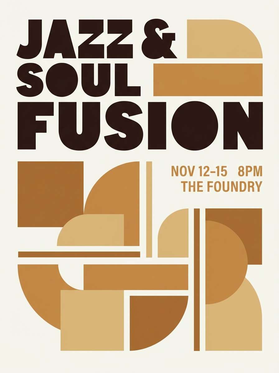
20) Peachy Mesa
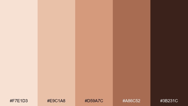
HEX: #F7E1D3 #E9C1A8 #D59A7C #A86C52 #3B231C
Mood: sunset, friendly, creative
Best for: social ads for handmade goods
Peachy mesa tones echo a sunset glow over warm sand. These are friendly, creative desert sand color combinations for handmade goods, small shops, and social ads that need warmth fast. Pair with textured paper backdrops and simple product shots for authenticity. Tip: make the peach the hero and use the deep brown only for prices and key labels.
Image example of peachy mesa generated using media.io
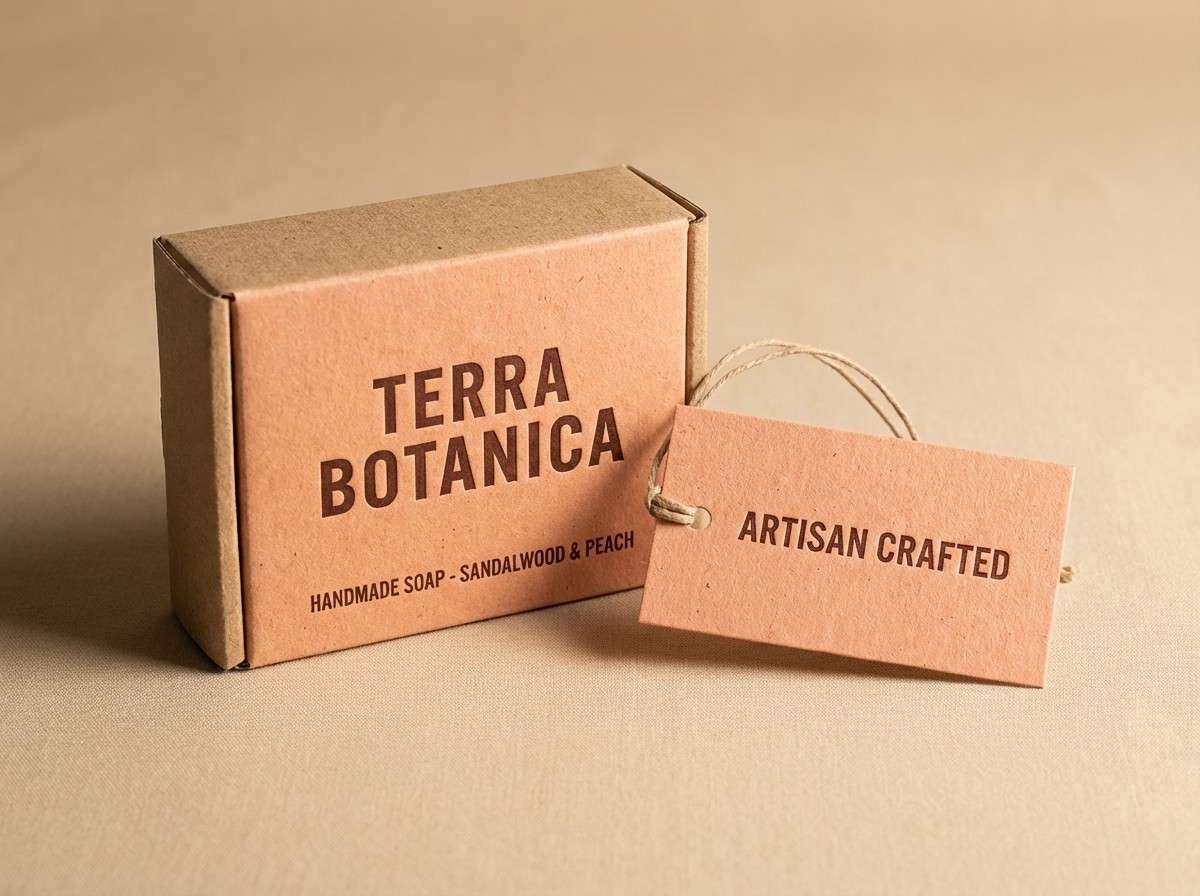
21) Silt and Silk
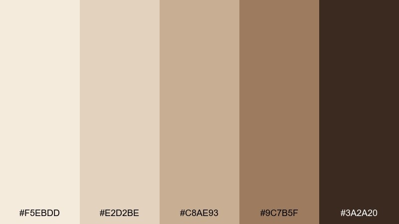
HEX: #F5EBDD #E2D2BE #C8AE93 #9C7B5F #3A2A20
Mood: elegant, tactile, understated
Best for: luxury editorial and catalog design
Silky creams and silted browns feel tactile, elegant, and understated. Use this desert sand color palette for luxury catalogs, editorial spreads, and product stories that rely on texture. Pair with soft gradients, fine rules, and high-end serif typography for a quiet premium look. Tip: keep the darkest shade for page numbers and microcopy to avoid visual heaviness.
Image example of silt and silk generated using media.io
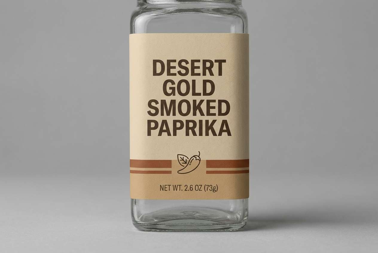
22) Dune Spice Blend

HEX: #F3E0CA #E0C1A0 #C78F62 #9B5E3C #341F15
Mood: spiced, energetic, artisanal
Best for: spice jar labels and ecommerce banners
Toasty spice and dune beige create an energetic, artisanal feel. These shades make a strong desert sand color combination for spice jar labels, ecommerce banners, and market signage. Pair with bold ingredient typography and simple icons to keep it legible at small sizes. Tip: use the lightest beige as a label base and keep the reddish-brown for flavor callouts.
Image example of dune spice blend generated using media.io
What Colors Go Well with Desert Sand?
Desert sand pairs naturally with earthy companions like terracotta, clay red, cocoa brown, and warm taupe—great when you want a grounded, handcrafted look. For a fresher feel, add muted greens like sage or olive to bring in a botanical contrast without breaking the calm.
If you need more pop for UI or marketing, choose one accent and keep the base neutral: saffron/amber for energy, dusty rose for softness, or a deep espresso for strong typography. Cool accents can work too—think slate blue or charcoal—when you want a modern, editorial edge.
For print, metallics are a natural upgrade: gold foil on cream, copper on tan, or bronze on sand. The key is restraint—one “hero” accent with plenty of light neutrals keeps desert sand palettes looking premium instead of muddy.
How to Use a Desert Sand Color Palette in Real Designs
Start with hierarchy: use the lightest cream as your background, mid-sand tones for sections or cards, and the deepest brown for text and key UI elements. This approach maintains readability and gives your layout a clean, airy rhythm.
In branding and packaging, let texture do the work. Uncoated paper, kraft stocks, embossing, and matte finishes amplify desert sand tones and make simple designs feel intentional. Keep contrast high for compliance text, ingredients, and barcodes by reserving the darkest shade for small print.
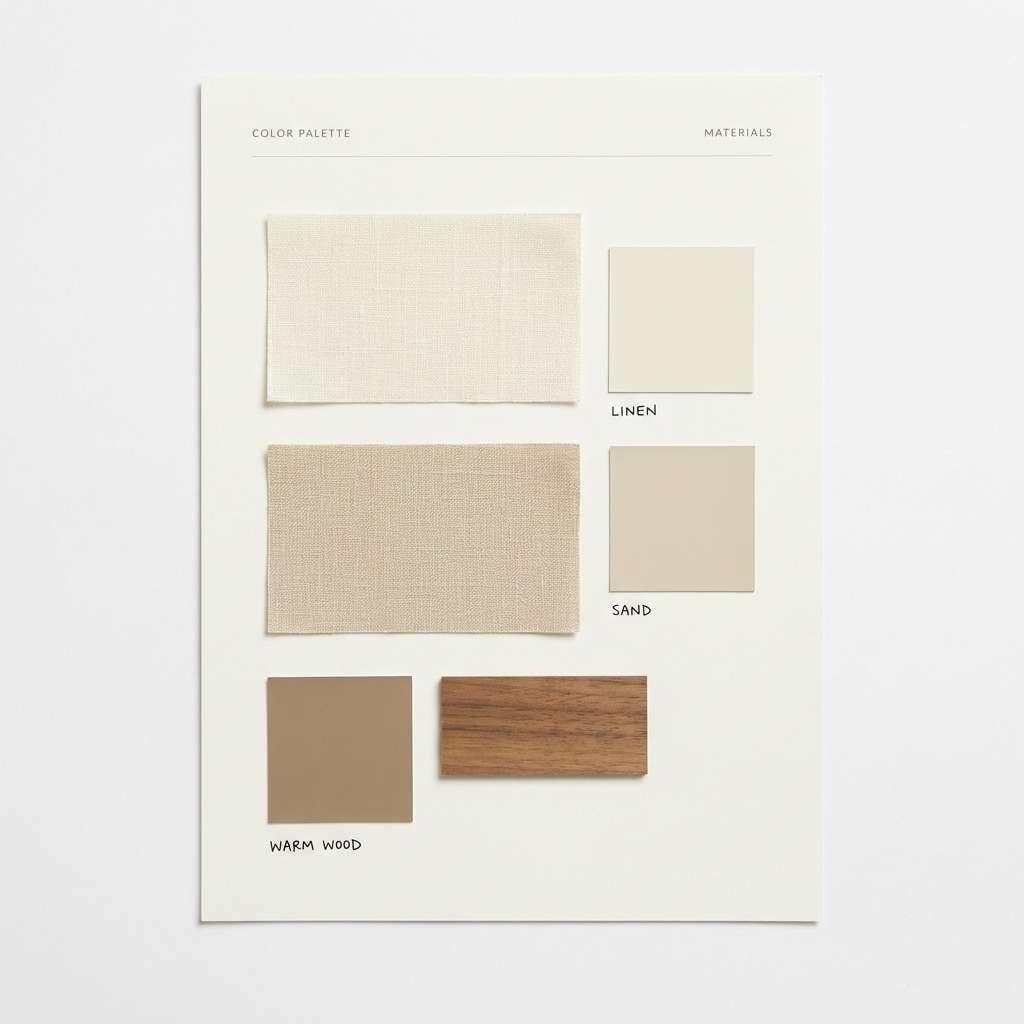
For interiors and mood boards, combine sand neutrals with natural materials—linen, oak, leather, clay—then repeat one accent (terracotta, copper, or sage) across small details. Repetition makes the palette feel cohesive without becoming monotone.
Create Desert Sand Palette Visuals with AI
If you have HEX codes but need visuals—mockups, social templates, landing heroes, or packaging concepts—AI can help you prototype faster. The prompts above are designed to generate clean, usable compositions that match each palette’s mood.
On Media.io, you can iterate quickly: swap “kraft pouch” for “cosmetic tube,” change the aspect ratio, or refine typography style while keeping the same desert sand tones. It’s a simple way to explore multiple directions before moving into final design work.
Desert Sand Color Palette FAQs
-
What is a desert sand color palette?
A desert sand palette is a set of warm neutrals inspired by dunes and sunbaked earth—typically ivory/cream, beige, tan, and grounding browns, sometimes with clay or peach accents. -
Is desert sand a good choice for modern branding?
Yes. Desert sand tones feel minimal and premium, and they work especially well with clean typography, lots of whitespace, and subtle texture (uncoated paper, soft gradients, or matte finishes). -
How do I keep desert sand designs from looking dull?
Increase contrast (use the darkest brown for type), add one strong accent (amber, terracotta, or copper), and introduce texture through shadows, grain, or paper-like backgrounds. -
What accent colors pair best with desert sand?
Terracotta/clay, saffron/amber, dusty rose, sage/olive, and deep espresso are the most natural pairings. For a cooler modern twist, try slate blue or charcoal as a single accent. -
Are desert sand palettes good for UI and dashboards?
They can be excellent for low-fatigue UI. Use near-ivory backgrounds, mid-sand panels, and dark espresso text to maintain clarity, then reserve one accent color for states like active, warning, or success. -
Do desert sand palettes print well?
Generally yes—especially on matte and uncoated stocks. For best results, keep small text in the darkest shade, avoid ultra-light text on light backgrounds, and check proofs for contrast. -
How can I generate desert sand palette images quickly?
Use Media.io’s text-to-image tool with a clear design prompt (mockup type, layout style, lighting) and specify your desert sand tones as dominant colors for consistent results.


