

Brown peach palettes blend grounded cocoa browns with softly blushed peaches, creating warmth that feels natural, modern, and approachable.
Whether you’re building a brand, styling an interior, or designing social graphics, these brown peach color combinations make it easy to look premium without feeling cold or overly saturated.
In this article
- Why Brown and Peach Color Combinations Work So Well
-
- cocoa blush
- peachy saddle
- sandstone apricot
- clay petal
- toasted nectar
- rosewood cream
- cinnamon sorbet
- mocha sunrise
- copper peach fizz
- almond terracotta
- desert rose
- caramel bloom
- sienna silk
- maple macaron
- latte peony
- umber melon
- bronze bouquet
- nutmeg rose
- biscuit coral
- warm hearth
- cacao petals
- peach bark
- What Colors Go Well with Brown Peach?
- How to Use a Brown and Peach Color Combination in Real Designs
- Create Brown Peach Palette Visuals with AI
Why Brown and Peach Color Combinations Work So Well
Brown peach is a naturally flattering mix: brown adds stability and depth, while peach contributes brightness and softness. Together, they read as “warm neutral” and stay versatile across digital and print.
This pairing also creates easy hierarchy. You can use deeper browns for text, logos, and structure, then let peach tones highlight calls to action, product features, or key information.
Because the palette sits close to skin tones and earthy materials, it feels familiar and comforting—ideal for lifestyle brands, wellness, food, and romantic or handcrafted aesthetics.
20+ Brown Peach Color Palette Ideas (with HEX Codes)
1) Cocoa Blush
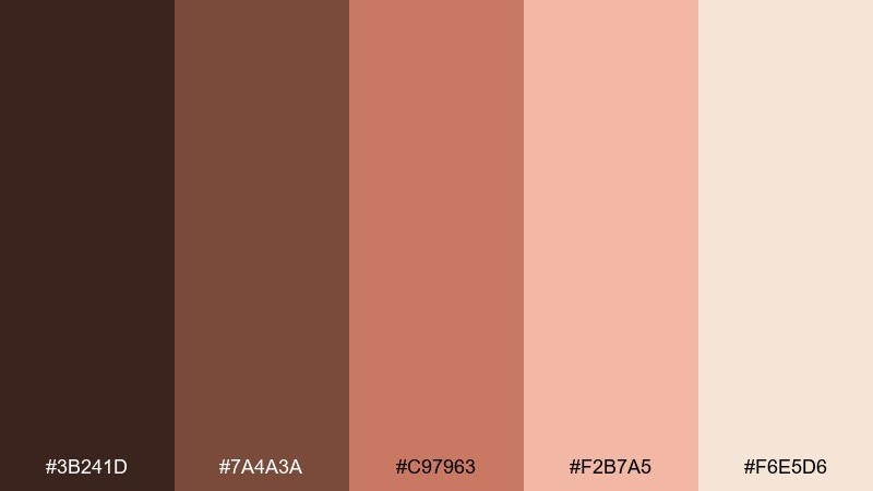
HEX: #3b241d #7a4a3a #c97963 #f2b7a5 #f6e5d6
Mood: cozy, romantic, grounded
Best for: beauty branding and packaging
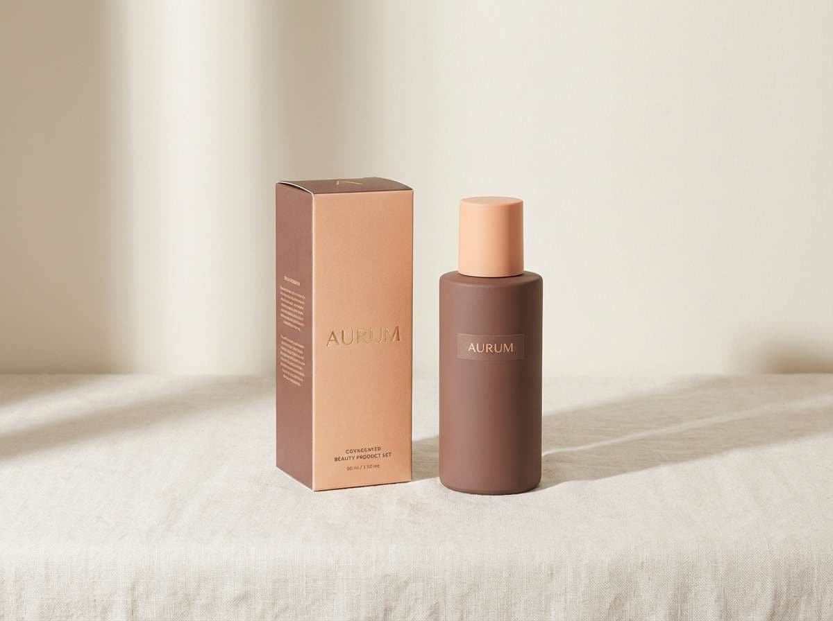
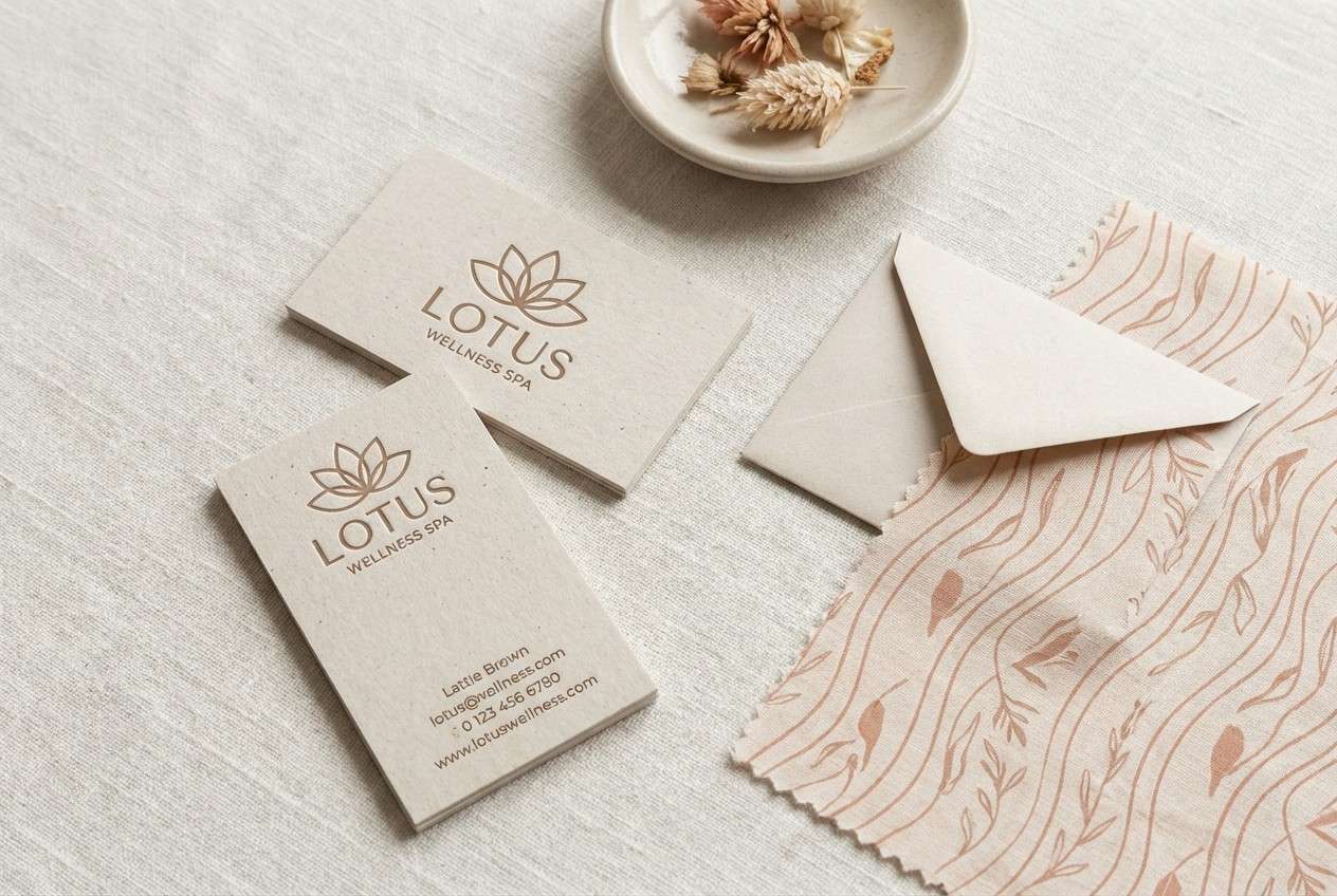
Cozy and softly romantic, this brown and peach color combination feels like cocoa, rose petals, and warm light at dusk. Use it for beauty labels, boutique branding, or product packaging that needs an approachable premium vibe. Pair with warm cream backgrounds and subtle matte gold accents for a polished finish. Tip: reserve the deep cocoa for type and logos so the peaches can glow without losing contrast.
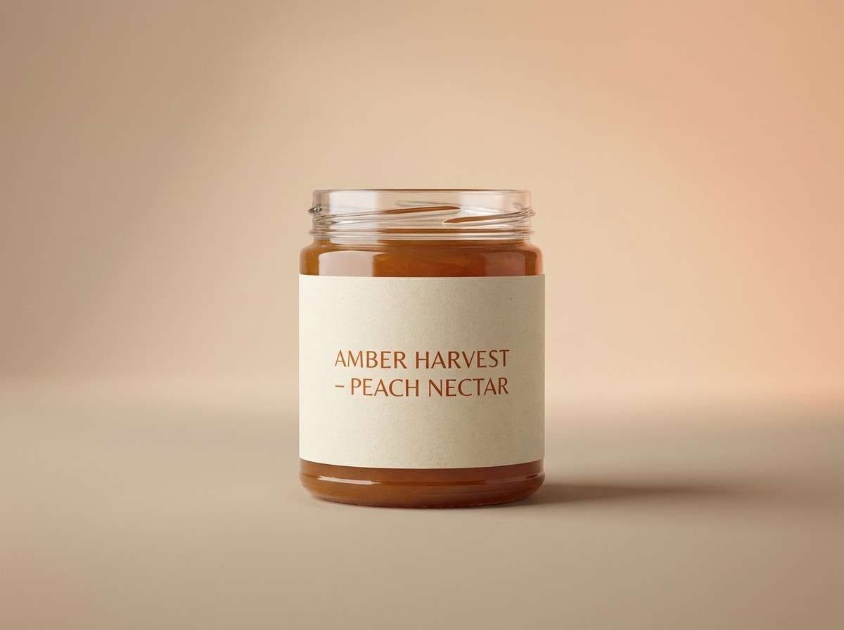
Image example of cocoa blush generated using media.io
Media.io is an online AI studio for creating and editing video, image, and audio in your browser.

2) Peachy Saddle
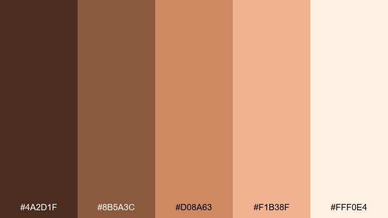
HEX: #4a2d1f #8b5a3c #d08a63 #f1b38f #fff0e4
Mood: rustic, sunny, welcoming
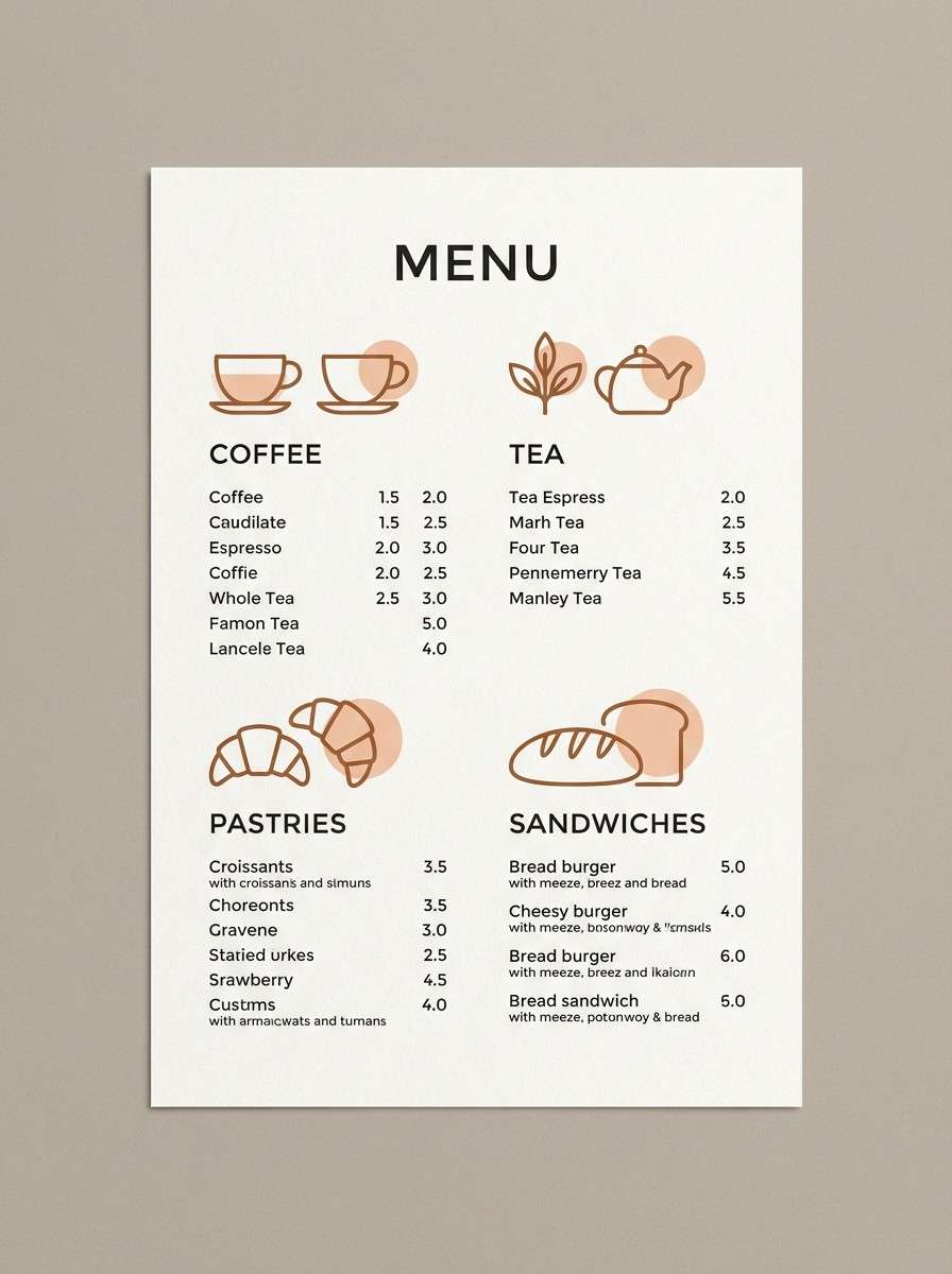
Best for: cafe menu design
Rustic and sunny, this brown peach color palette evokes leather saddles, baked goods, and late-afternoon warmth. It works beautifully on cafe menus, chalkboard-style signage, and takeout print pieces where you want instant comfort. Pair with simple line icons and plenty of off-white space to keep it modern. Tip: use the mid caramel tone for section headers to guide scanning.
Image example of peachy saddle generated using media.io
3) Sandstone Apricot
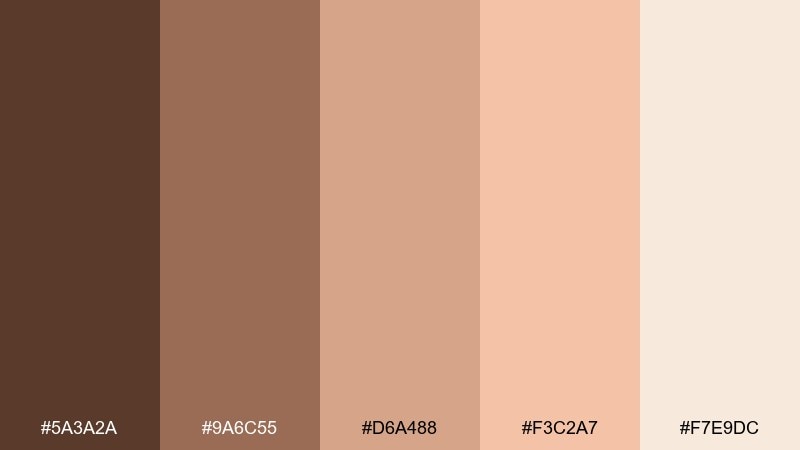
HEX: #5a3a2a #9a6c55 #d6a488 #f3c2a7 #f7e9dc
Mood: soft, airy, natural
Best for: interior mood boards
Soft and airy, it brings to mind sunlit sandstone and fresh apricots on linen. Use it in interior mood boards, home decor lookbooks, and real estate staging graphics for an inviting, neutral-forward feel. Pair with natural textures like rattan, oak, and plaster to reinforce the warmth. Tip: keep the lightest cream as your main canvas and layer darker tones in small, confident blocks.
Image example of sandstone apricot generated using media.io
4) Clay Petal
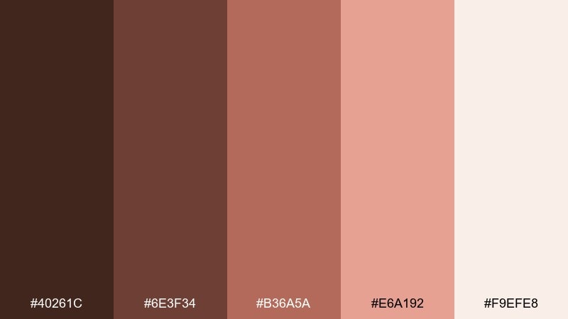
HEX: #40261c #6e3f34 #b36a5a #e6a192 #f9efe8
Mood: artisanal, calm, intimate
Best for: handmade ceramics shop branding
Artisanal and calm, it feels like kiln-fired clay with a hint of delicate petals. The brown peach color palette suits handmade ceramics branding, craft marketplaces, and small-batch product labels where texture is part of the story. Pair with deckled edges, subtle grain, and understated serif type. Tip: use the dusty rose tone for stamps and seals to add warmth without shouting.
Image example of clay petal generated using media.io
5) Toasted Nectar
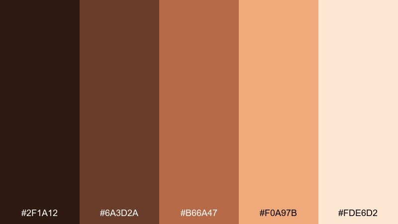
HEX: #2f1a12 #6a3d2a #b66a47 #f0a97b #fde6d2
Mood: bold, warm, appetizing
Best for: food product ads
Bold and appetizing, it suggests toasted sugar, roasted spice, and sticky nectar. Use it for food product ads, recipe cards, or social promos that need warmth and contrast. Pair with crisp white space and close-cropped product photography for a modern edge. Tip: keep the bright nectar tone as the accent, not the background, to avoid overpowering your headline.
Image example of toasted nectar generated using media.io
6) Rosewood Cream
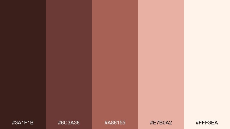
HEX: #3a1f1b #6c3a36 #a86155 #e7b0a2 #fff3ea
Mood: elegant, moody, refined
Best for: editorial layouts
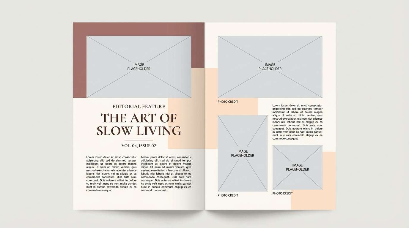
Elegant and slightly moody, this brown and peach color combination recalls rosewood furniture against creamy paper stock. It fits editorial layouts, beauty articles, and lookbooks where you want richness without going full dark. Pair with high-contrast serif headlines and thin rules in the mid rosewood. Tip: let the cream dominate page backgrounds and use the deepest tone sparingly for maximum sophistication.
Image example of rosewood cream generated using media.io
7) Cinnamon Sorbet
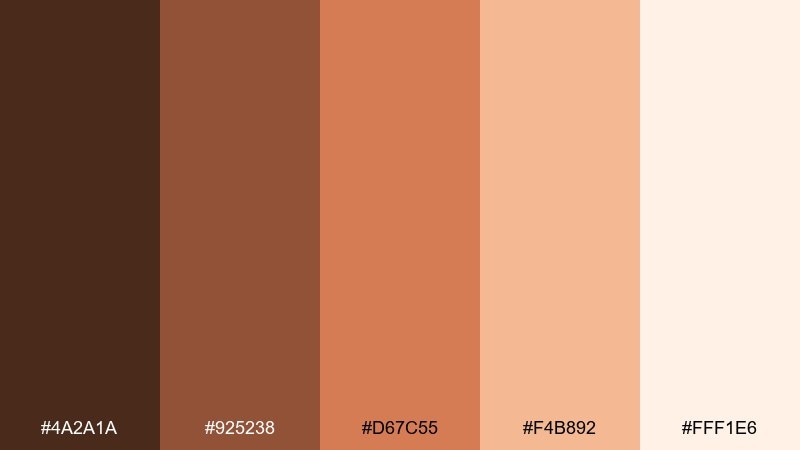
HEX: #4a2a1a #925238 #d67c55 #f4b892 #fff1e6
Mood: playful, sweet, energetic
Best for: summer event flyers
Playful and sweet, it feels like cinnamon dust over a scoop of sorbet. Use it for summer event flyers, pop-up announcements, and social graphics that need friendly energy. Pair with rounded sans-serif type and simple geometric shapes to keep it contemporary. Tip: build hierarchy with the darker cinnamon for titles and the light peach for highlights and stickers.
Image example of cinnamon sorbet generated using media.io

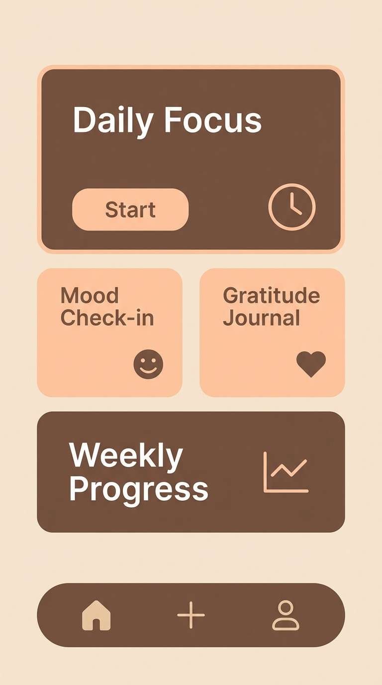
8) Mocha Sunrise
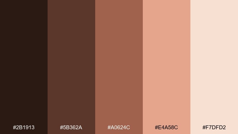
HEX: #2b1913 #5b362a #a0624c #e4a58c #f7dfd2
Mood: calm, modern, optimistic
Best for: mobile app UI
Calm and modern, it reads like a mocha morning with the first blush of sunrise. This brown and peach color combination works well for wellness apps, journaling tools, and subscription dashboards that need warmth without distraction. Pair with soft gradients and minimal icons for a gentle, premium feel. Tip: ensure buttons use the mid peach tone with dark text for accessible contrast.
Image example of mocha sunrise generated using media.io
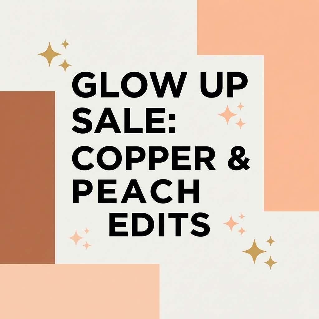
9) Copper Peach Fizz
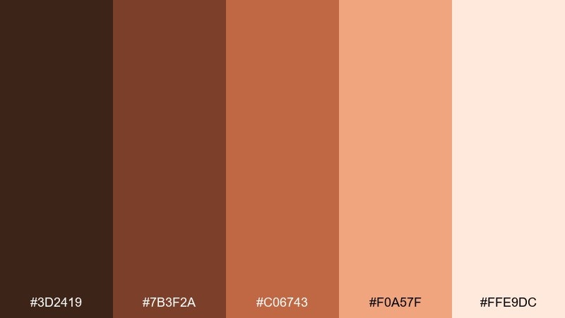
HEX: #3d2419 #7b3f2a #c06743 #f0a57f #ffe9dc
Mood: sparkly, upbeat, trendy
Best for: social media promos
Sparkly and upbeat, this brown peach color scheme suggests copper bubbles and peach soda in a tall glass. Use it for social promos, sale banners, and creator announcements where you want warmth plus a touch of shine. Pair with thin metallic-like lines, subtle grain, and punchy typography. Tip: keep the fizz peach for callouts and badges so the feed stays readable at a glance.
Image example of copper peach fizz generated using media.io
10) Almond Terracotta
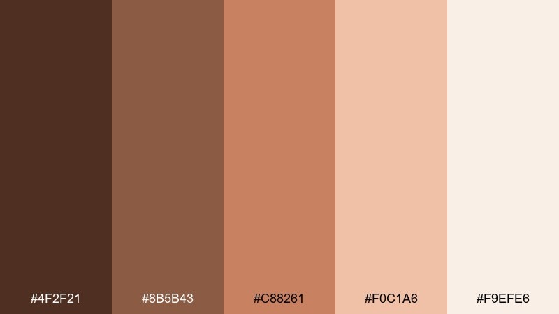
HEX: #4f2f21 #8b5b43 #c88261 #f0c1a6 #f9efe6
Mood: earthy, serene, Mediterranean
Best for: home and lifestyle branding
Earthy and serene, it feels like almond plaster walls and terracotta pots in warm shade. It fits home and lifestyle branding, boutique ecommerce, and calm content templates. Pair with olive greenery photography and natural paper textures for an effortless look. Tip: use terracotta for primary buttons and keep the almond cream for spacious layouts.
Image example of almond terracotta generated using media.io
11) Desert Rose
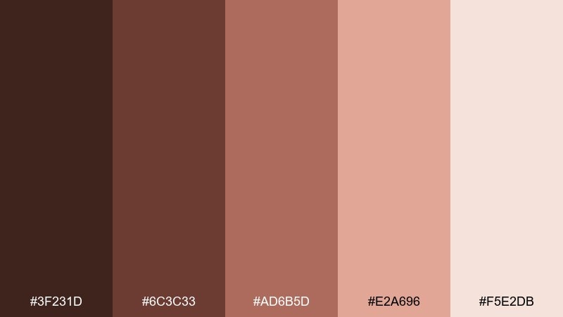
HEX: #3f231d #6c3c33 #ad6b5d #e2a696 #f5e2db
Mood: romantic, dusty, sophisticated
Best for: wedding invitations
Romantic and dusty, it brings desert roses and sun-warmed stone into the same frame. It shines on wedding invitations, RSVP cards, and save-the-date sets where softness still feels grown-up. Pair with letterpress-style textures and fine-line floral illustrations. Tip: keep body text in the deeper brown for legibility on blush paper.
Image example of desert rose generated using media.io
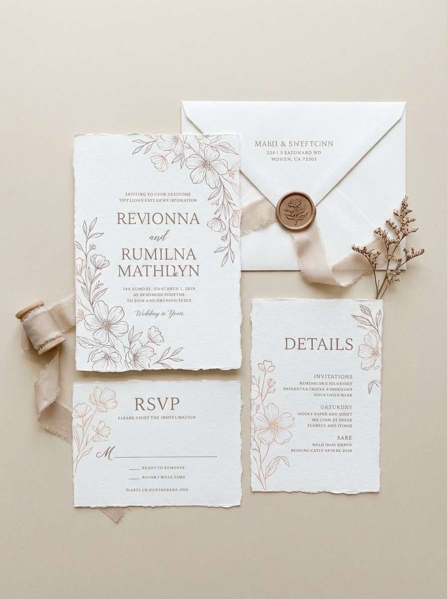
12) Caramel Bloom
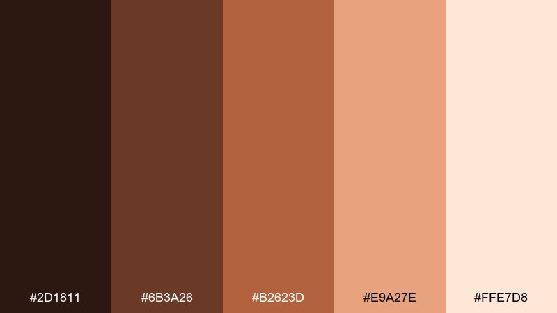
HEX: #2d1811 #6b3a26 #b2623d #e9a27e #ffe7d8
Mood: warm, confident, inviting
Best for: boutique ecommerce banners
Warm and confident, this brown and peach color palette feels like caramel glaze with fresh blooms nearby. Use it for boutique ecommerce banners, category headers, and seasonal landing pages that need a welcoming lift. The brown peach color combinations here pair well with clean product cutouts and soft shadows. Tip: use the darkest tone for prices and the peachy tan for highlight ribbons to guide attention.
Image example of caramel bloom generated using media.io
13) Sienna Silk
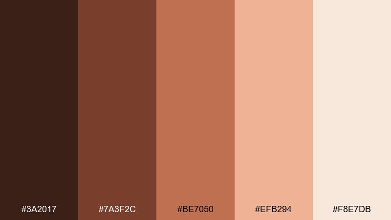
HEX: #3a2017 #7a3f2c #be7050 #efb294 #f8e7db
Mood: luxurious, smooth, artistic
Best for: fashion lookbooks
Luxurious and smooth, this brown and peach color combination reads like sienna dye on soft silk. It works for fashion lookbooks, collection pages, and editorial promo graphics where warmth should feel refined. Pair with plenty of whitespace and simple black-and-white photography to let the tones lead. Tip: use the peach shade for pull quotes and section dividers to keep pages airy.
Image example of sienna silk generated using media.io
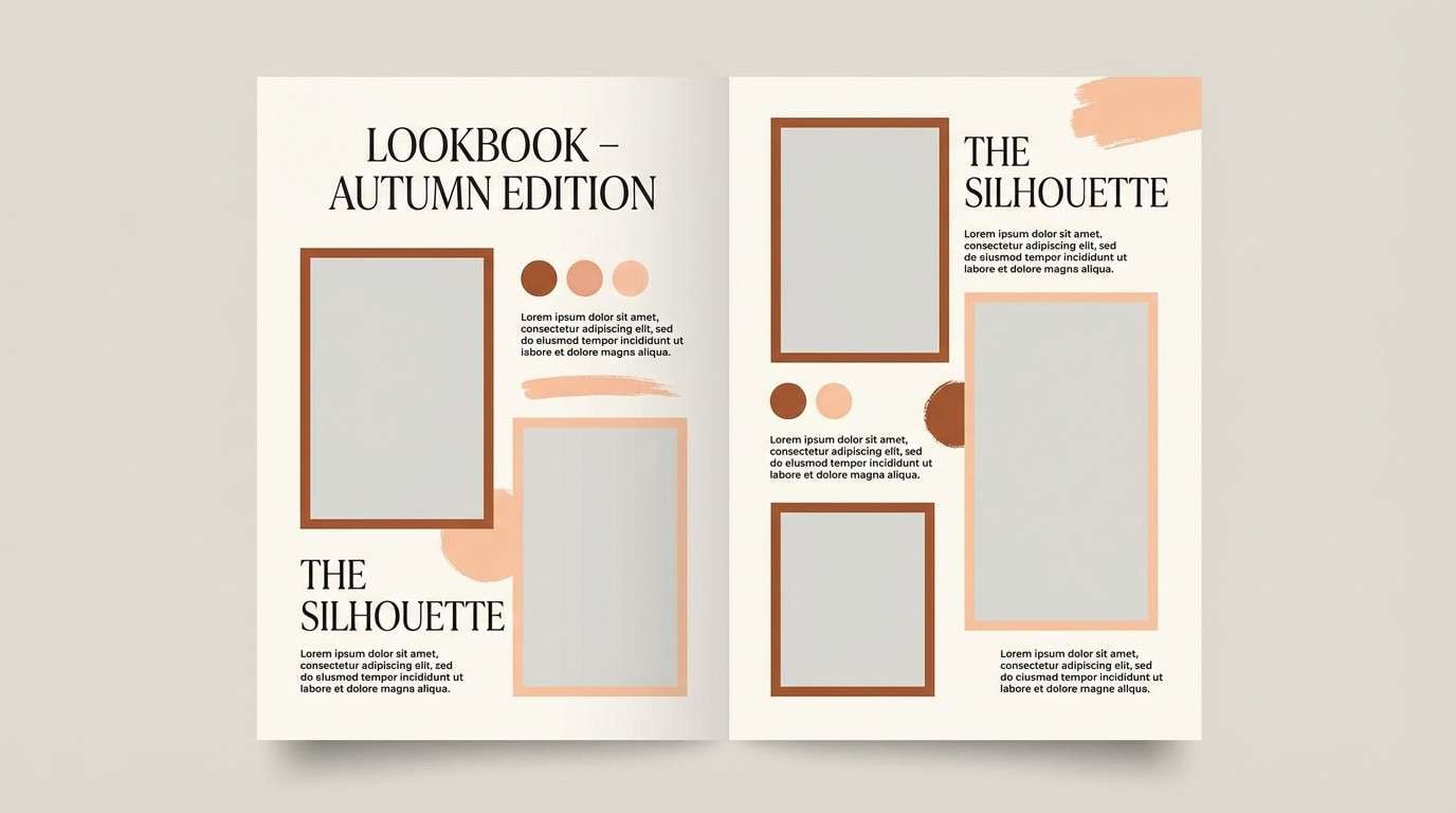
14) Maple Macaron
HEX: #402419 #7f4a34 #c07855 #f1b897 #fff4ea
Mood: cute, cozy, dessert-like
Best for: bakery branding
Cute and cozy, it feels like maple syrup drizzled over a tray of macarons. It suits bakery branding, pastry box stickers, and cafe loyalty cards that lean sweet but still sophisticated. Pair with hand-drawn doodles and rounded badges for charm. Tip: keep the light cream as your label base and use maple brown for stamps and QR codes.
Image example of maple macaron generated using media.io
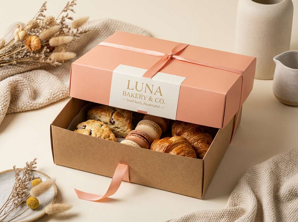
15) Latte Peony
HEX: #2a1712 #5f3629 #9b5f4a #e7a994 #f9ece4
Mood: soft, feminine, calm
Best for: spa and wellness branding
Soft and feminine, it evokes a latte foam swirl beside pale peony petals. It works for spa branding, appointment cards, and calming email headers where comfort is the message. Pair with gentle gradients and minimal line art to maintain a clean, modern look. Tip: use the mid brown for small text and the blush tone for large, soothing background fields.
Image example of latte peony generated using media.io
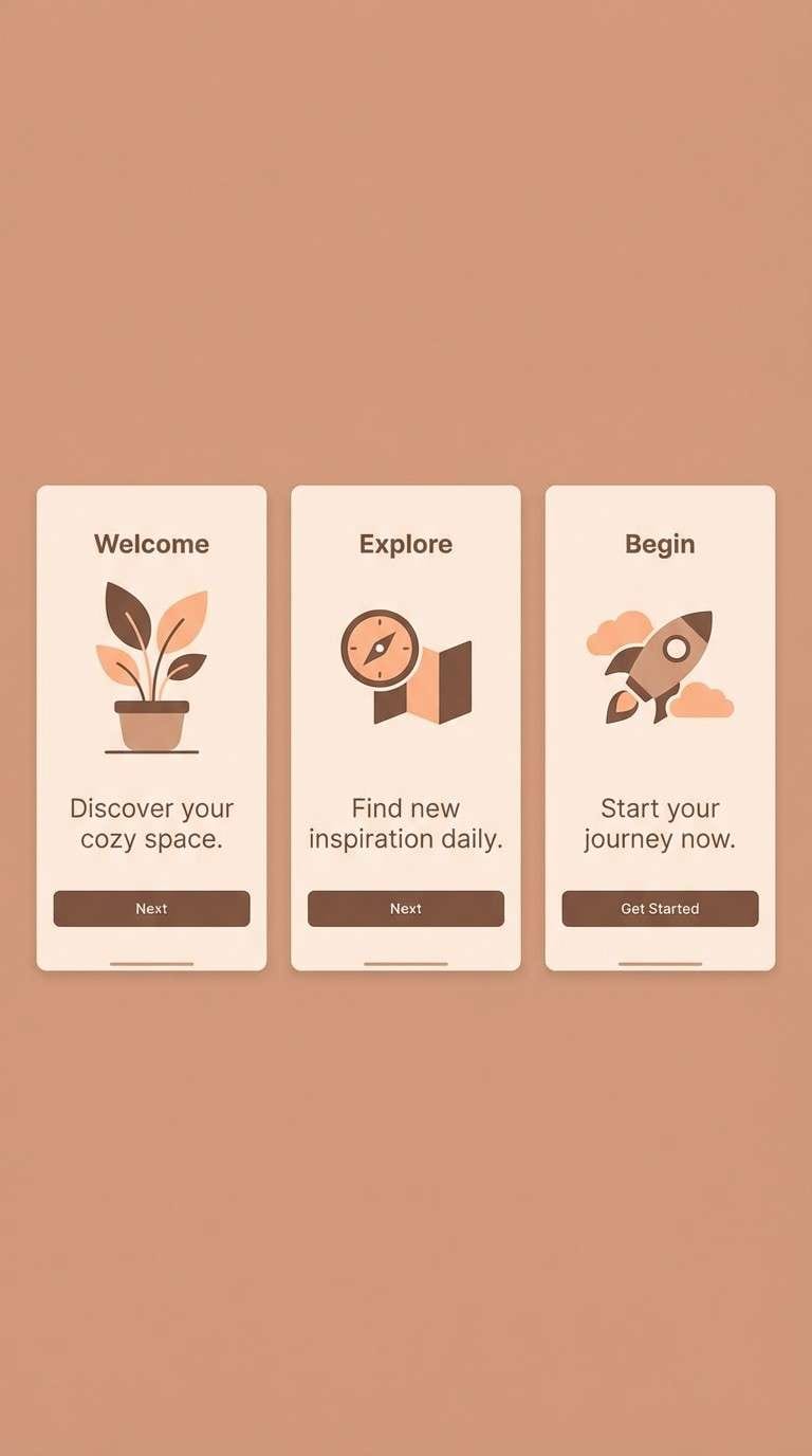
16) Umber Melon
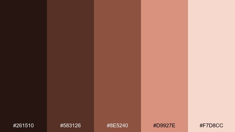
HEX: #261510 #583126 #8e5240 #d9927e #f7d8cc
Mood: grounded, modern, slightly bold
Best for: app onboarding screens
Grounded and modern, it feels like deep umber balanced by ripe melon flesh. Use it for app onboarding screens and feature callouts where you want warmth without looking childish. Pair with simple illustrations and generous spacing for clarity. Tip: use the melon shade for progress indicators and the deepest umber for headings to keep the flow readable.
Image example of umber melon generated using media.io
17) Bronze Bouquet
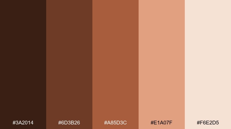
HEX: #3a2014 #6d3b26 #a85d3c #e1a07f #f6e2d5
Mood: warm, festive, elegant
Best for: autumn posters
Warm and festive, this brown and peach color combination suggests bronze leaves wrapped around a soft bouquet. It is great for autumn posters, seasonal market signage, and campaign key art that needs cozy energy. Pair with textured backgrounds and subtle grain to enhance the fall feel. Tip: keep the peach highlight for dates and locations so the important info pops instantly.
Image example of bronze bouquet generated using media.io

18) Nutmeg Rose
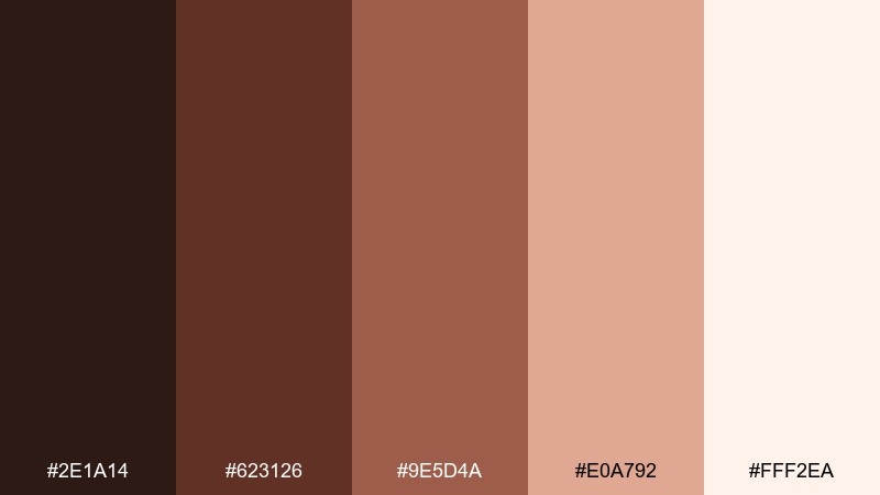
HEX: #2e1a14 #623126 #9e5d4a #e0a792 #fff2ea
Mood: nostalgic, gentle, handmade
Best for: scrapbook and stationery designs
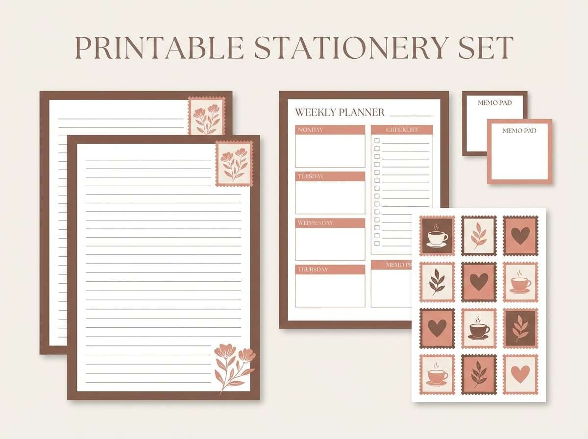
Nostalgic and gentle, it feels like nutmeg spice with a pressed rose tucked into a journal. Use this brown and peach color combination for scrapbook kits, stationery templates, and printable planners where warmth matters more than contrast. Pair with kraft textures, torn-paper edges, and simple stamps. Tip: limit the darkest brown to small outlines so the overall page stays soft.
Image example of nutmeg rose generated using media.io
19) Biscuit Coral
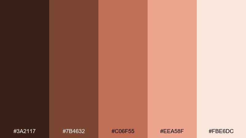
HEX: #3a2117 #7b4632 #c06f55 #eea58f #fbe6dc
Mood: cheerful, modern, friendly
Best for: brand social templates
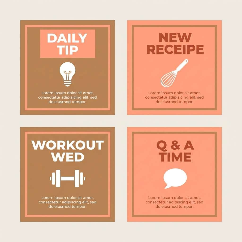
Cheerful and modern, it feels like warm biscuits with a bright coral blush. This brown peach color palette is ideal for reusable social templates, highlight covers, and creator kits that need consistency without feeling flat. Pair it with bold sans type and simple iconography for fast readability. Tip: keep coral as the primary CTA color and let biscuit tones support backgrounds and frames.
Image example of biscuit coral generated using media.io
20) Warm Hearth

HEX: #24130f #553026 #8d5342 #d89b86 #f6d9cd
Mood: cozy, intimate, dramatic
Best for: podcast cover art
Cozy and intimate, it feels like a warm hearth glow in a quiet room. Use it for podcast cover art, storytelling thumbnails, and creators who want a comforting but slightly dramatic tone. Pair with high-contrast typography and simple portrait silhouettes for instant recognition. Tip: place the light peach behind the title to keep text crisp at small sizes.
Image example of warm hearth generated using media.io

21) Cacao Petals
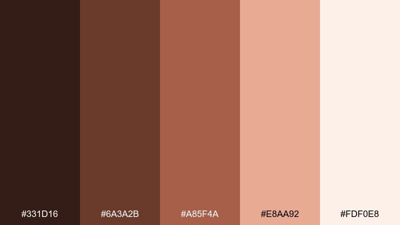
HEX: #331d16 #6a3a2b #a85f4a #e8aa92 #fdf0e8
Mood: romantic, soft, elevated
Best for: valentines landing pages
Romantic and soft, it reads like cacao nibs scattered across pale petals. It fits Valentines landing pages, gift guides, and gentle promotional banners without leaning overly bright. The brown peach color combinations pair nicely with thin heart motifs and understated gradients. Tip: keep the deepest tone for headings and use the blush for hover states and small UI highlights.
Image example of cacao petals generated using media.io
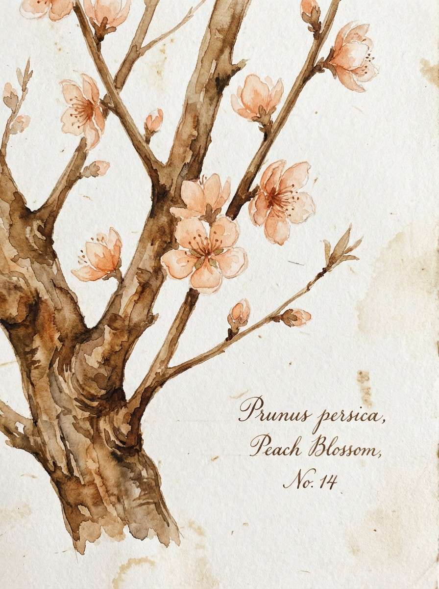
22) Peach Bark
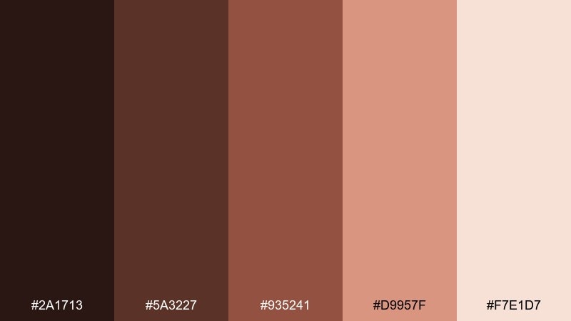
HEX: #2a1713 #5a3227 #935241 #d9957f #f7e1d7
Mood: natural, grounded, botanical
Best for: watercolor botanical prints
Natural and grounded, it looks like peach tree bark with soft fruit tones drifting in. Use this brown and peach color combination for watercolor botanical prints, spring stationery, or gentle wall art where warmth should stay subtle. Pair with hand-painted leaves and light paper textures for authenticity. Tip: keep the mid brown as the outline tone so the peach washes remain luminous.
Image example of peach bark generated using media.io
What Colors Go Well with Brown Peach?
Brown peach pairs beautifully with warm whites (cream, ivory) and soft neutrals (sand, oatmeal) for a clean, airy look. These keep the palette feeling modern and give your peach tones room to glow.
For contrast, add deep anchors like espresso, charcoal, or near-black for typography and UI components. This keeps layouts readable while preserving the cozy mood.
If you want a fresh twist, try muted greens (sage, olive) or blue-greens for a balanced complementary feel—great for lifestyle visuals and interior-style graphics.
How to Use a Brown and Peach Color Combination in Real Designs
Start with a light cream as your base, then use mid browns to create structure: headers, frames, cards, and dividers. Reserve the darkest brown for text and key icons so accessibility stays strong.
Use peach as the emotional cue: buttons, badges, highlights, and small background panels. When peach is used too broadly as a full background, it can flatten contrast—keep it intentional.
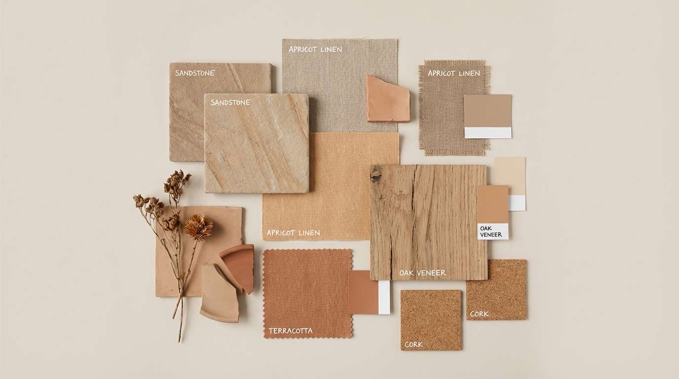
In photography-heavy designs, match warm lighting and natural textures (linen, wood, ceramics) to reinforce the palette. Consistent warmth across images and UI will make the whole system feel cohesive.
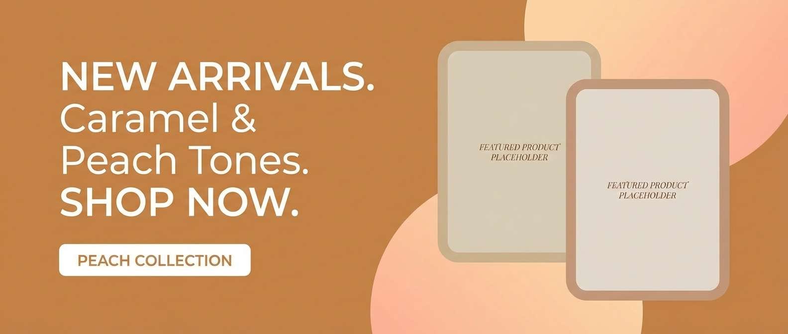
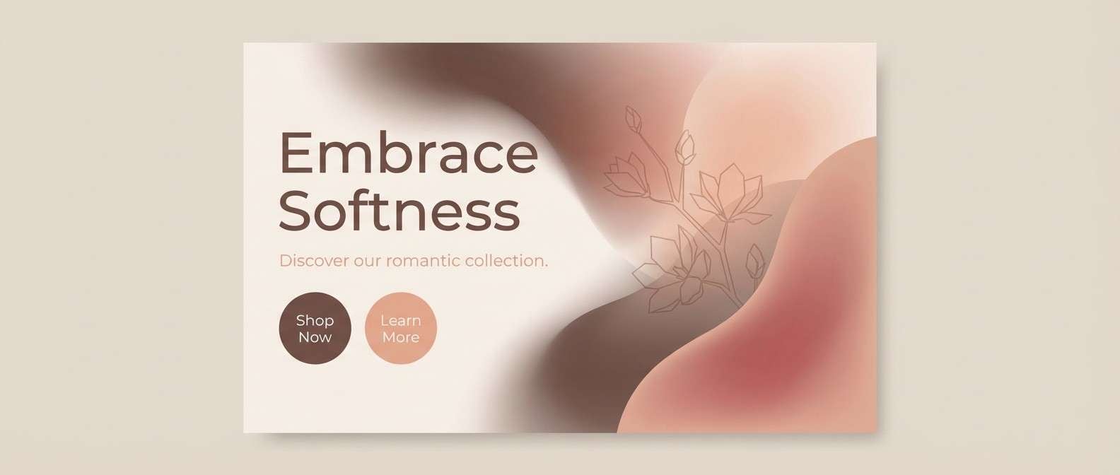
Create Brown Peach Palette Visuals with AI
If you want quick, consistent visuals for ads, mockups, or social templates, generate images that already match your brown peach color scheme. This helps your brand look unified across multiple formats.
With Media.io, you can turn a short prompt into on-brand graphics, then iterate by adjusting materials, lighting, and composition while keeping the same warm neutral mood.
Brown Peach Color Palette FAQs
-
What is a brown peach color palette?
A brown peach palette combines warm browns (cocoa, caramel, umber) with peach and blush tones, usually finished with a light cream. The result is a cozy, earthy-neutral scheme that still feels soft and bright. -
Is brown peach good for branding?
Yes. Brown signals stability and craft, while peach adds friendliness and approachability. Together they’re popular for beauty, wellness, food, home, and boutique ecommerce brands. -
What text color works best on peach backgrounds?
Use a deep brown (espresso/umber) for body text on peach, or near-black for maximum readability. For light peach/cream backgrounds, mid-to-deep browns keep the tone warm while staying legible. -
What colors complement brown peach?
Cream and beige are the easiest companions, while sage/olive greens add a natural balance. For a cooler contrast, try muted teal or blue-green accents (especially in small doses). -
How do I keep a brown peach design from looking too “rustic”?
Increase white/cream space, use cleaner typography (modern sans or refined serif), and keep textures subtle. Use peach as accents rather than large background fields to maintain a contemporary feel. -
Can I use brown peach in UI design?
Definitely—use cream as the main canvas, browns for headings and navigation, and peach for buttons or states. Always check contrast for accessibility, especially on peach-toned UI elements. -
How can I generate on-theme brown peach visuals quickly?
Use Media.io’s text-to-image generator and include your vibe (e.g., “minimal, warm, premium”) plus materials and lighting. Iterate prompts to keep composition consistent while exploring different shades of peach and brown.
Next: Verdigris Color Palette


