

Dark violet sits right between mystery and luxury—deep enough to feel cinematic, but flexible enough for modern UI, branding, and print.
Below are 20+ dark violet color palette ideas with HEX codes, plus practical tips on pairing accents, neutrals, and contrast so your designs stay bold and readable.
In this article
- Why Dark Violet Palettes Work So Well
-
- midnight orchid
- velvet amethyst
- noir lavender
- plum eclipse
- royal grape
- smoky lilac
- cosmic mulberry
- aubergine ink
- blackberry cream
- iris shadow
- twilight dahlia
- wine violet
- mystic fig
- deep wisteria
- neon plum nights
- dusty mauve velvet
- gothic lilac glow
- bordeaux violet
- night bloom bouquet
- opal violet mist
- amethyst noir jewelry
- ultraviolet stationery
- deep violet gradient night
- What Colors Go Well with Dark Violet?
- How to Use a Dark Violet Color Palette in Real Designs
- Create Dark Violet Palette Visuals with AI
Why Dark Violet Palettes Work So Well
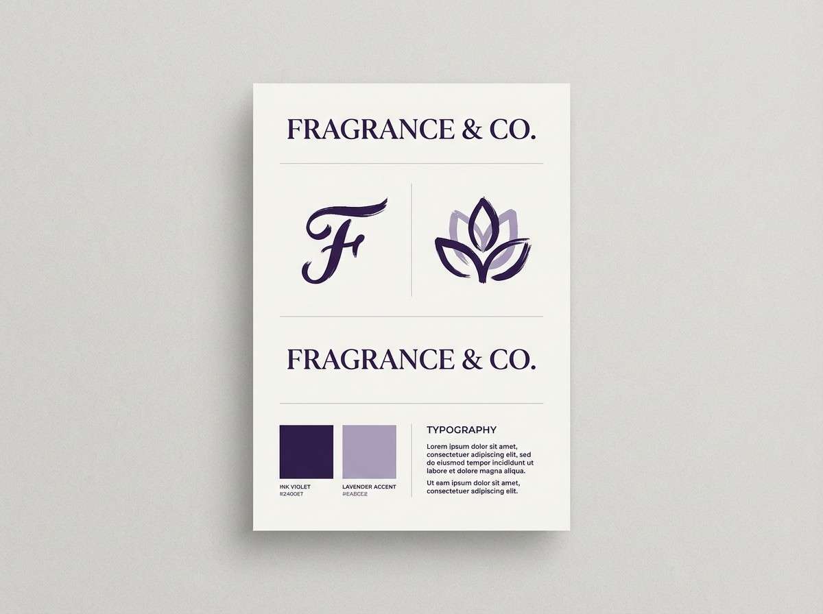
Dark violet feels premium because it carries the depth of near-black while keeping a distinct hue. That makes it ideal for brand systems that need sophistication without looking plain.
It’s also a strong “structure color”: you can use it for navigation, headers, and frames, then layer lighter lavenders and off-whites for clean hierarchy and comfortable readability.
Finally, dark violet pairs beautifully with both warm accents (gold, blush, beige) and cool accents (mint, periwinkle, icy tints), so you can shift the mood from moody to energetic without changing the base.
20+ Dark Violet Color Palette Ideas (with HEX Codes)
1) Midnight Orchid
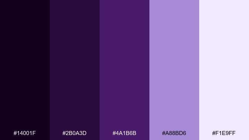
HEX: #14001F #2B0A3D #4A1B6B #A88BD6 #F1E9FF
Mood: mysterious, elegant
Best for: luxury brand identity and logo systems
Mysterious and velvety, it feels like orchids lit by a single spotlight at midnight. Use the near-black base for wordmarks and the brighter violet for emphasis in monograms or seals. Pair the soft lavender and misty white with ample negative space to keep it premium, not heavy. Tip: reserve the lightest tint for small highlights so the contrast stays crisp in print and web.
Image example of midnight orchid generated using media.io
Media.io is an online AI studio for creating and editing video, image, and audio in your browser.

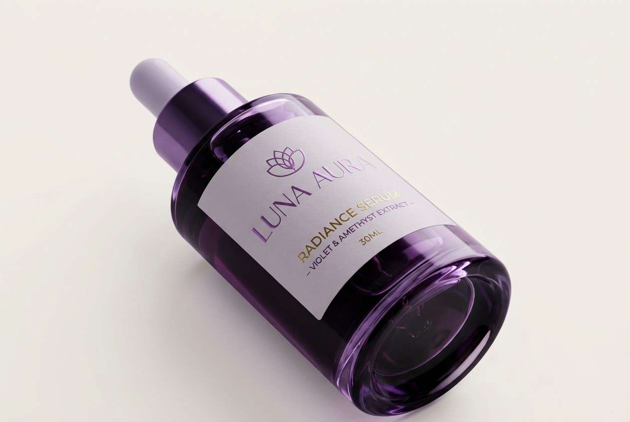
2) Velvet Amethyst
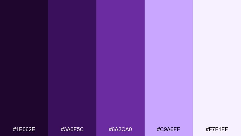
HEX: #1E062E #3A0F5C #6A2CA0 #C9A6FF #F7F1FF
Mood: luxe, romantic
Best for: beauty packaging and premium labels
Lush and romantic, it reads like crushed velvet and polished amethyst. The deep tones make metallic foils and embossing feel richer, while the pale lilac keeps layouts airy. Pair it with minimal typography and a warm neutral substrate for a boutique look. Tip: use the mid amethyst for ingredient callouts so they stay legible against the dark base.
Image example of velvet amethyst generated using media.io
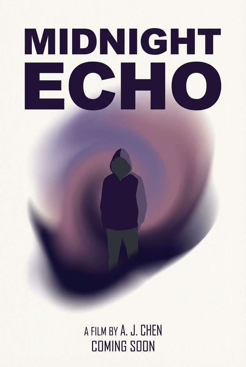
3) Noir Lavender
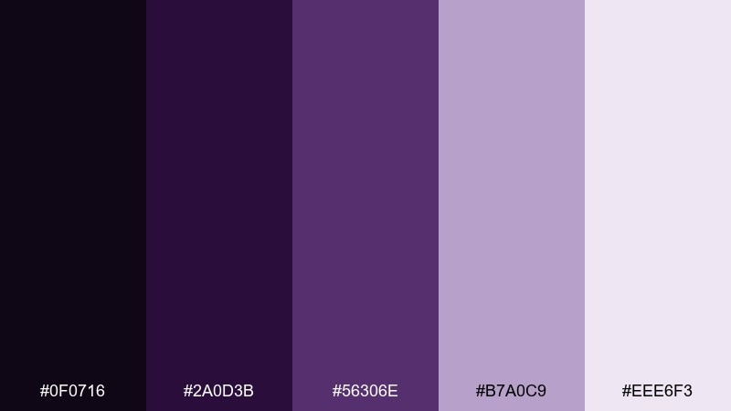
HEX: #0F0716 #2A0D3B #56306E #B7A0C9 #EEE6F3
Mood: cinematic, calm
Best for: film poster and cover art layouts
Cinematic and calm, it evokes lavender haze drifting through a dark theater. These dark violet color combinations work best with big typography and soft gradients to avoid harsh edges. Balance the noir base with the warm gray-lilac so faces, titles, or silhouettes do not disappear. Tip: add a subtle vignette using the deepest shade to guide the eye toward the center title.
Image example of noir lavender generated using media.io
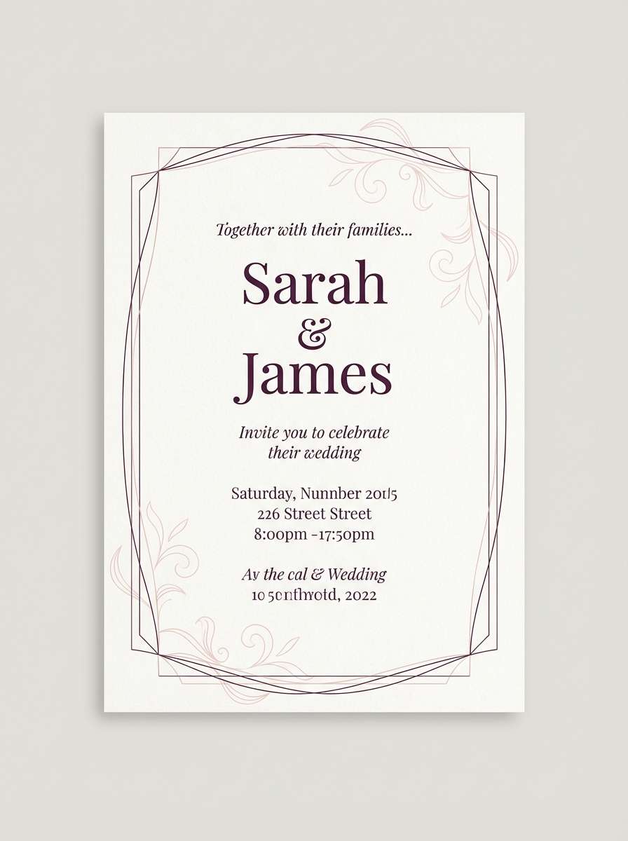
4) Plum Eclipse
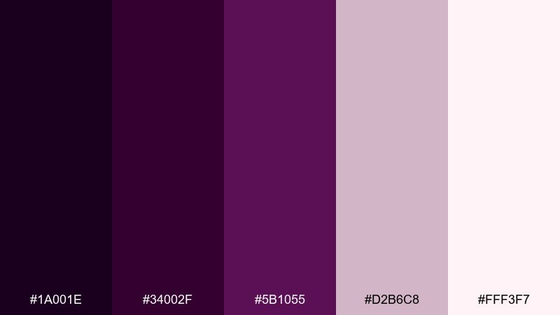
HEX: #1A001E #34002F #5B1055 #D2B6C8 #FFF3F7
Mood: dramatic, refined
Best for: wedding invitations and formal stationery
Dramatic and refined, it looks like a plum-toned eclipse with a soft blush ring. The deep plum is ideal for headings and monograms, while the powdery mauve keeps the page feeling romantic. Pair with fine-line ornaments or simple serif type to maintain elegance. Tip: print the darkest tone in rich ink and keep backgrounds in the lightest tint for maximum readability.
Image example of plum eclipse generated using media.io
5) Royal Grape
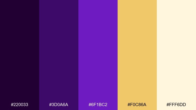
HEX: #220033 #3D0A6A #6F1BC2 #F0C86A #FFF6DD
Mood: bold, regal
Best for: event posters and headline-driven campaigns
Bold and regal, it channels royal grape robes with a flash of warm gold. The yellow accent brings instant hierarchy for call-to-action buttons or date blocks on posters. Keep the background in deep violet and use gold sparingly so it reads as intentional, not loud. Tip: try gold as a thin underline or icon accent to keep the layout premium.
Image example of royal grape generated using media.io

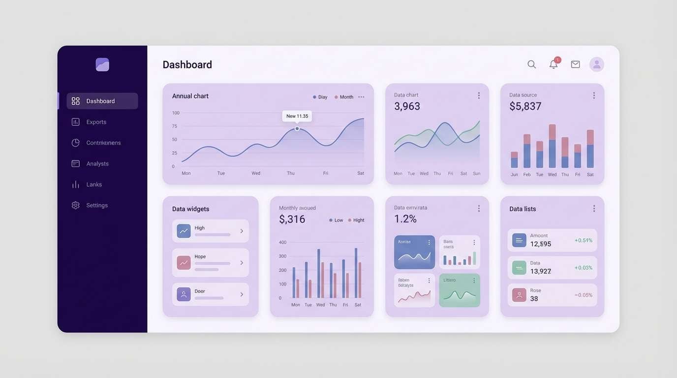
6) Smoky Lilac
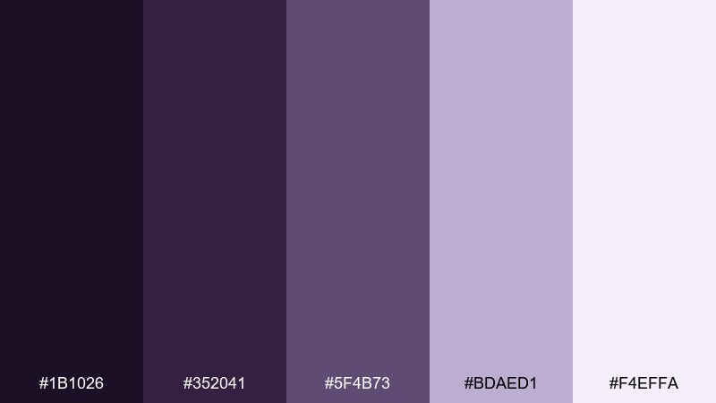
HEX: #1B1026 #352041 #5F4B73 #BDAED1 #F4EFFA
Mood: soft, contemporary
Best for: minimal UI dashboards and analytics screens
Soft and contemporary, it feels like lilac smoke across a twilight skyline. Use the darkest shade for the nav and the mid lilac for cards to keep depth without stark contrast. The pale tints work well for chart grids and background panels, especially with rounded components. Tip: reserve the deepest violet only for active states so the interface stays calm.
Image example of smoky lilac generated using media.io
7) Cosmic Mulberry
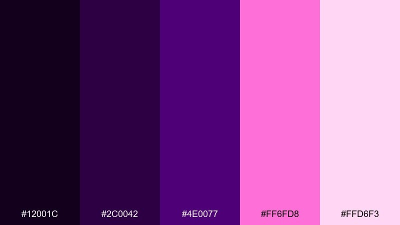
HEX: #12001C #2C0042 #4E0077 #FF6FD8 #FFD6F3
Mood: electric, futuristic
Best for: music cover art and streaming thumbnails
Electric and futuristic, it suggests mulberry nebulae with a hot magenta pulse. Keep the brightest pink for focal points like artist name or a glow ring, and let the violets do the heavy lifting. Pair with condensed sans type and high-contrast lighting effects to lean into the sci-fi feel. Tip: apply the pink only at edges and highlights to prevent color clipping on small thumbnails.
Image example of cosmic mulberry generated using media.io
8) Aubergine Ink
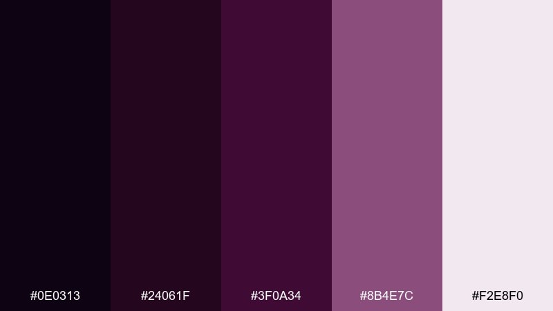
HEX: #0E0313 #24061F #3F0A34 #8B4E7C #F2E8F0
Mood: literary, intimate
Best for: book covers and long-form editorial headers
Literary and intimate, it feels like aubergine ink soaking into textured paper. The deep shades create strong title contrast, while the dusty mauve adds warmth for subtitles and ornaments. Pair with cream stock and restrained illustration for a classic, bookstore-ready finish. Tip: keep body text on the palest tint and use the darkest color for display type only.
Image example of aubergine ink generated using media.io
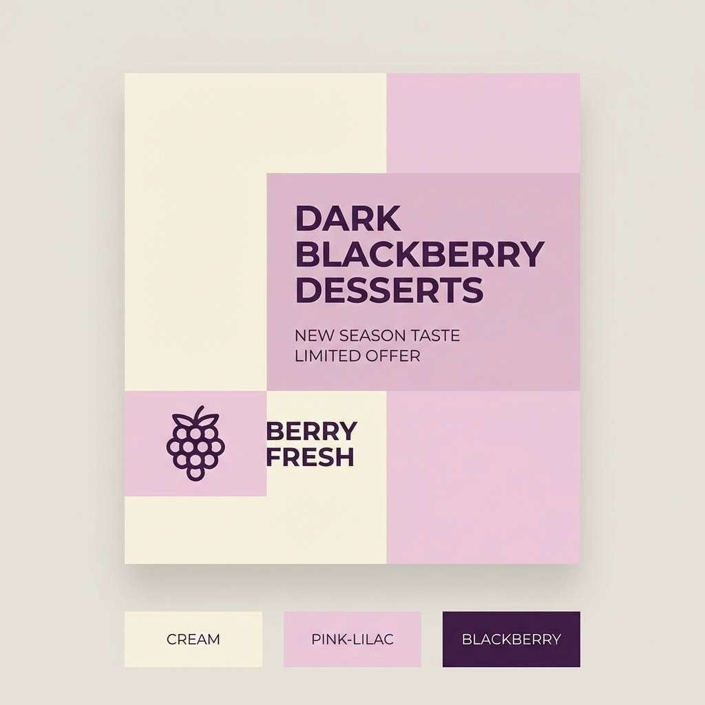
9) Blackberry Cream
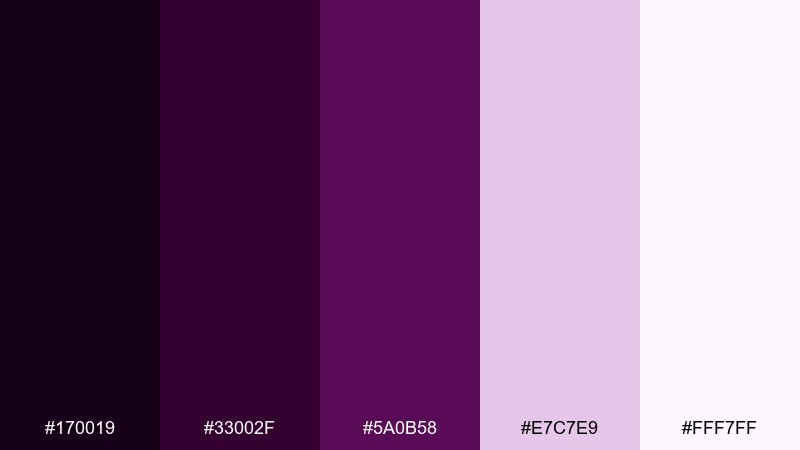
HEX: #170019 #33002F #5A0B58 #E7C7E9 #FFF7FF
Mood: sweet, polished
Best for: dessert shop branding and social posts
Sweet and polished, it brings to mind blackberry syrup swirled into whipped cream. Use the dark berry for logo and headline text, then layer pale pink-lilacs for backgrounds that feel light and appetizing. Pair with clean product photography and simple icons to keep it modern. Tip: add thin separators in the mid berry tone to organize menus and carousel slides.
Image example of blackberry cream generated using media.io
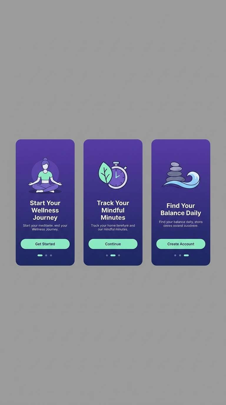
10) Iris Shadow
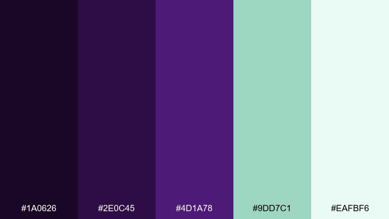
HEX: #1A0626 #2E0C45 #4D1A78 #9DD7C1 #EAFBF6
Mood: moody, refreshing
Best for: health app onboarding and wellness UI
Moody yet refreshing, it feels like iris petals under shade with a cool mint breeze. This dark violet color palette shines when mint is treated as a calm signal color for success states and gentle progress indicators. Keep primary backgrounds in violet and use the light mint only for highlights to avoid a candy look. Tip: test accessibility by placing mint text on the deepest violet and increasing weight if needed.
Image example of iris shadow generated using media.io
11) Twilight Dahlia
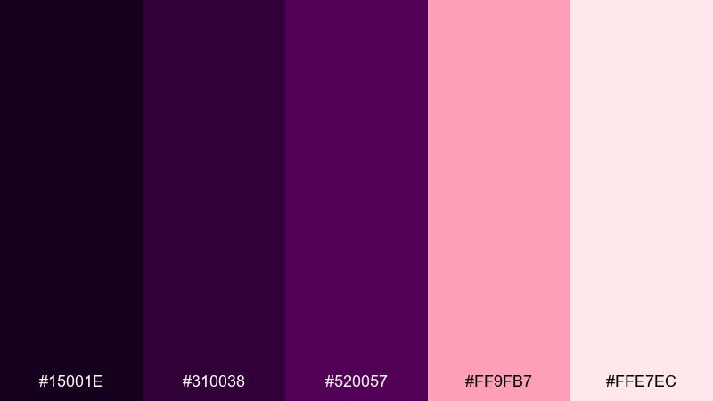
HEX: #15001E #310038 #520057 #FF9FB7 #FFE7EC
Mood: romantic, energetic
Best for: valentine campaigns and beauty promos
Romantic and energetic, it resembles dahlia petals at twilight with a rosy pop. The blush accent is strong for buttons and discount badges, while the violets keep the mood sophisticated. Pair with soft gradients and rounded shapes for a friendly, modern look. Tip: keep the lightest pink as the background so small violet text stays sharp.
Image example of twilight dahlia generated using media.io
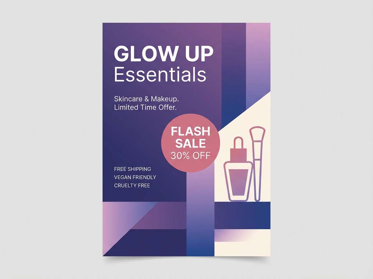
12) Wine Violet
HEX: #190014 #3A001E #6D0038 #C7B6A2 #F7F0E6
Mood: sensual, classic
Best for: restaurant menus and wine bar identity
Sensual and classic, it evokes red wine in a dim lounge with linen on the table. The warm beige tones soften the deep violet-red so menu layouts feel welcoming. Pair with elegant serif headings and plenty of spacing to avoid a heavy page. Tip: use the mid wine shade for section dividers to create structure without adding extra graphics.
Image example of wine violet generated using media.io
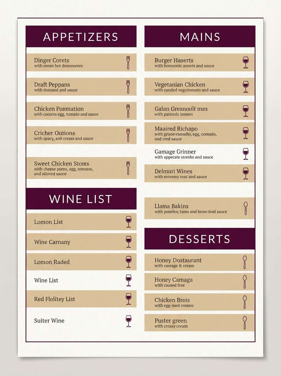
13) Mystic Fig
HEX: #130015 #2A0A2F #4B1C53 #7E6A86 #F1EDF2
Mood: earthy, mystical
Best for: interior mood boards and decor planning
Earthy and mystical, it brings to mind dried figs, incense, and dusky velvet. Use the charcoal-violet for anchor elements like headings and swatches, then layer the softer mauves to create an inviting rhythm. Pair with walnut wood, warm brass, and off-white textiles for a grounded feel. Tip: keep one dominant dark tone and let the mid shades carry most surfaces to prevent the room from feeling closed in.
Image example of mystic fig generated using media.io
14) Deep Wisteria
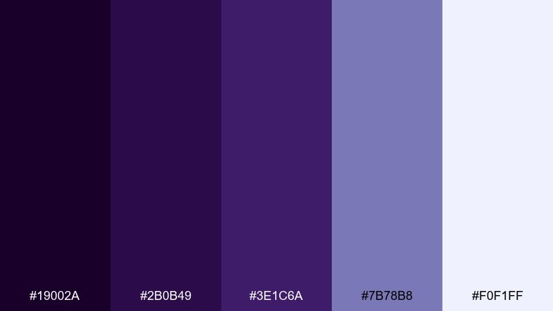
HEX: #19002A #2B0B49 #3E1C6A #7B78B8 #F0F1FF
Mood: serene, modern
Best for: SaaS landing pages and hero sections
Serene and modern, it feels like wisteria shadows across a bright morning wall. Build a clean hero with deep violet for navigation and a cool periwinkle accent for primary buttons. Pair with crisp white space and subtle gradients for a polished tech vibe. Tip: keep the accent color consistent across CTAs and links to reinforce scanning patterns.
Image example of deep wisteria generated using media.io
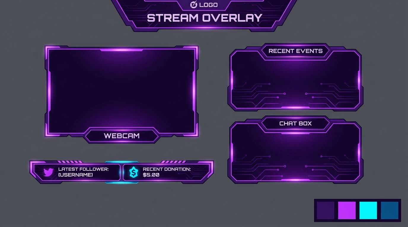
15) Neon Plum Nights
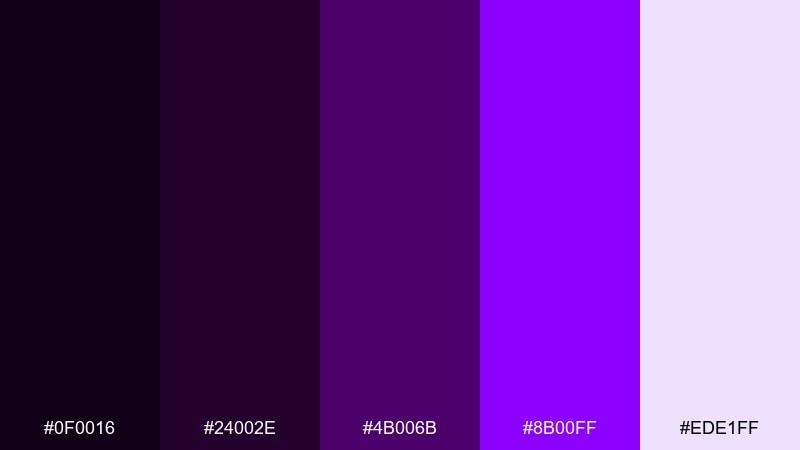
HEX: #0F0016 #24002E #4B006B #8B00FF #EDE1FF
Mood: high-impact, nightlife
Best for: gaming stream overlays and creator branding
High-impact and nightlife-ready, it looks like neon plum signage on a rainy street. The vivid purple is best kept for alerts, live badges, and focus elements, while the darker shades hold the frame. Pair with bold sans typography and simple geometric panels for a pro streamer look. Tip: add thin outlines in the light tint so widgets stay readable over darker panels.
Image example of neon plum nights generated using media.io
16) Dusty Mauve Velvet
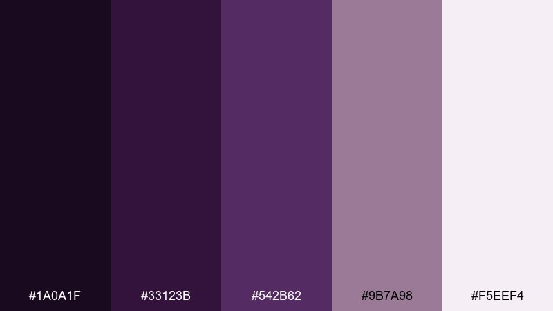
HEX: #1A0A1F #33123B #542B62 #9B7A98 #F5EEF4
Mood: vintage, soft
Best for: fashion lookbooks and editorial layouts
Vintage and soft, it recalls mauve velvet drapes in an old atelier. The muted midtones make excellent background blocks behind text columns and pull quotes. Pair with monochrome photography and a clean grid to keep it editorial rather than nostalgic. Tip: use the deepest shade for small captions and folios to add quiet structure across spreads.
Image example of dusty mauve velvet generated using media.io
17) Gothic Lilac Glow
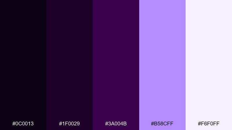
HEX: #0C0013 #1F0029 #3A004B #B58CFF #F6F0FF
Mood: dramatic, luminous
Best for: club flyers and nightlife posters
Dramatic and luminous, it feels like a gothic hallway lit by lilac LEDs. These dark violet color combinations thrive on contrast, so push the glow tint for the headline and keep supporting text in pale lavender. Pair with sharp geometric shapes and high-contrast type to make details readable at a glance. Tip: avoid large areas of the glow color and use it as a halo or outline for maximum punch.
Image example of gothic lilac glow generated using media.io
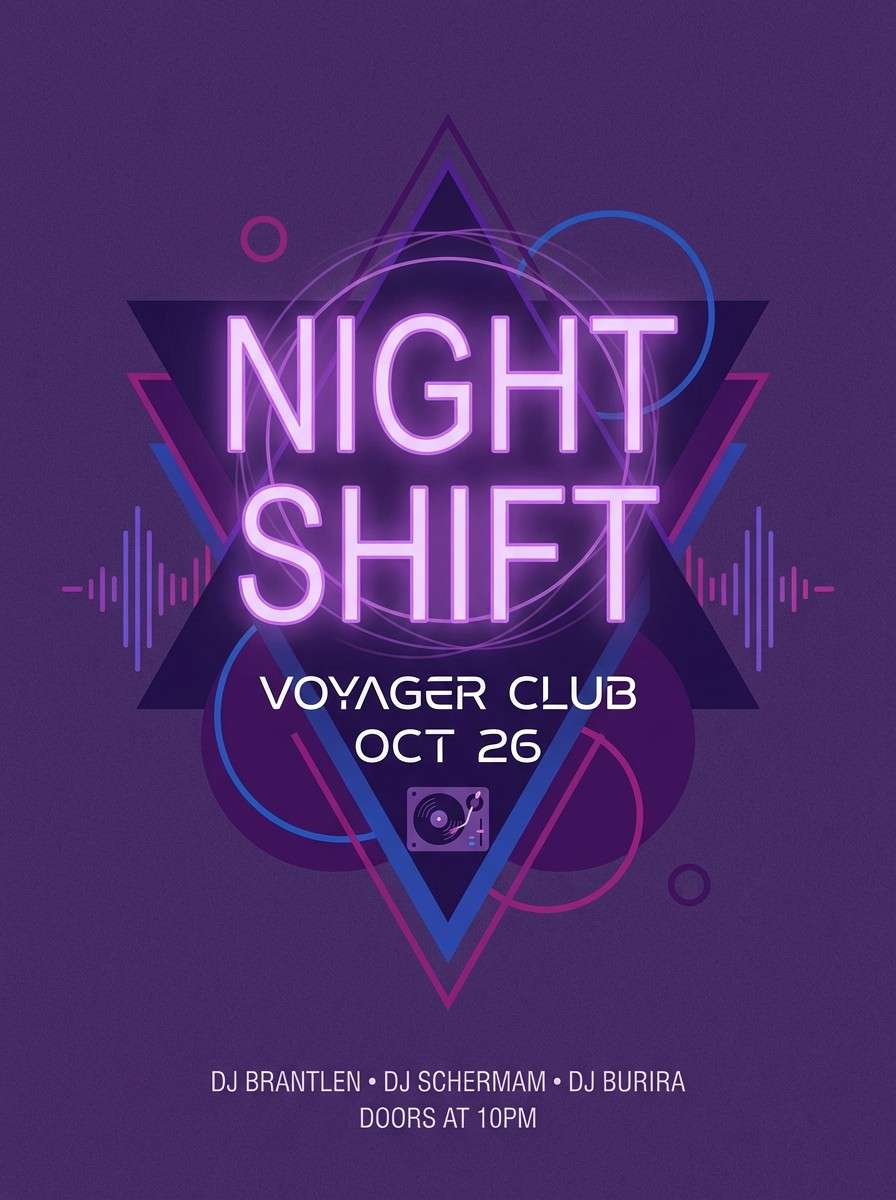
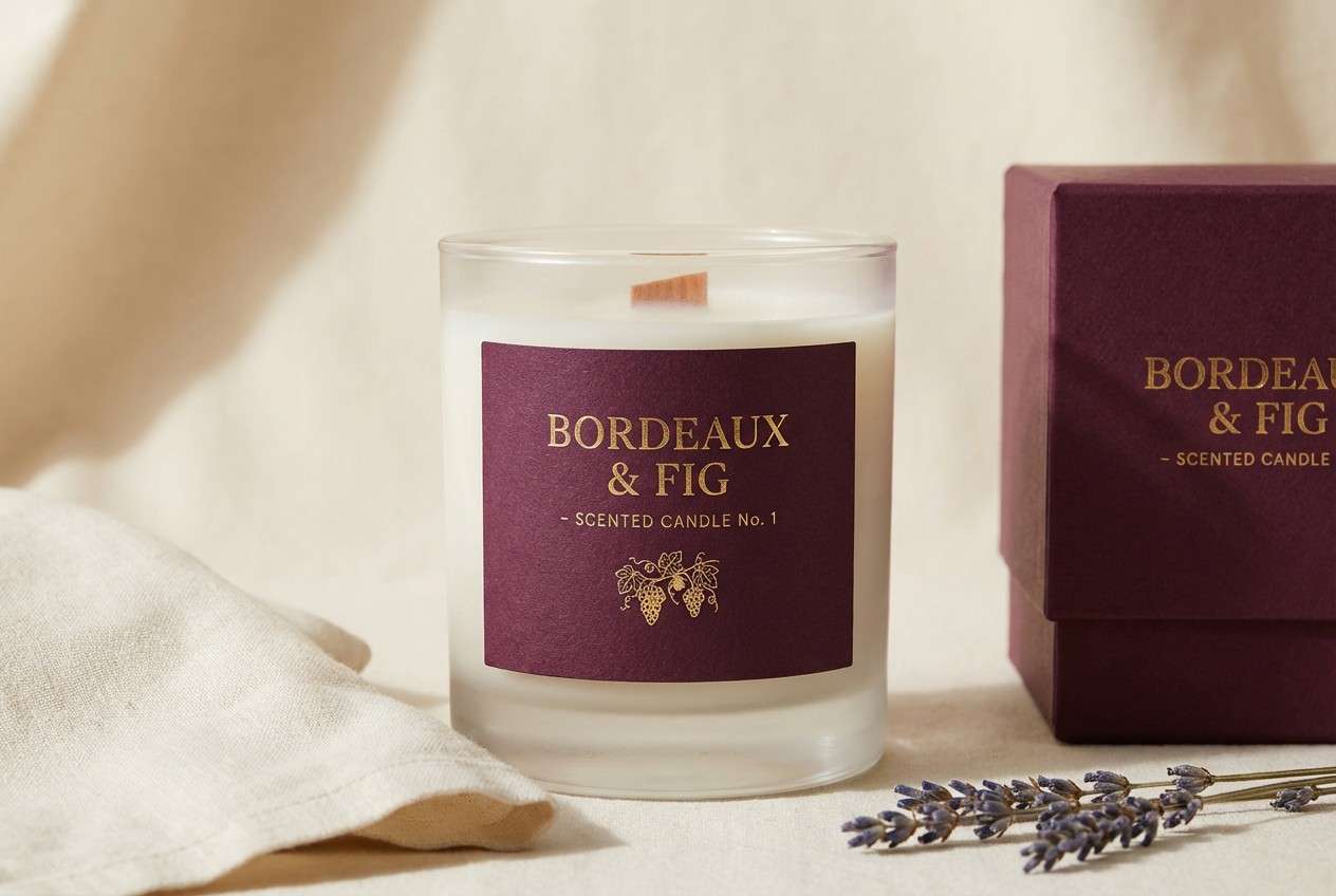
18) Bordeaux Violet
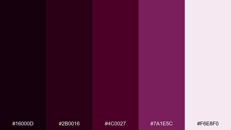
HEX: #16000D #2B0016 #4C0027 #7A1E5C #F6E8F0
Mood: moody, upscale
Best for: candle labels and boutique packaging
Moody and upscale, it suggests bordeaux velvet with a violet twist. Use the darkest tones for label backgrounds and let the rose-violet serve as a refined accent for scent names. Pair with cream paper and minimal line art to keep it boutique. Tip: choose one accent spot per label, like a small crest or border, to avoid muddy prints.
Image example of bordeaux violet generated using media.io
19) Night Bloom Bouquet
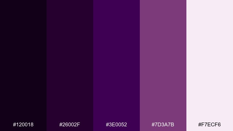
HEX: #120018 #26002F #3E0052 #7D3A7B #F7ECF6
Mood: floral, dreamy
Best for: botanical art prints and stationery patterns
Floral and dreamy, it resembles night-blooming petals against a soft powdery backdrop. The layered purples are ideal for illustrated linework and gentle watercolor washes. Pair with creamy paper tones and delicate repeats to create patterns that feel calm, not busy. Tip: keep the deepest shade for stems and shadows so the flowers stay dimensional.
Image example of night bloom bouquet generated using media.io
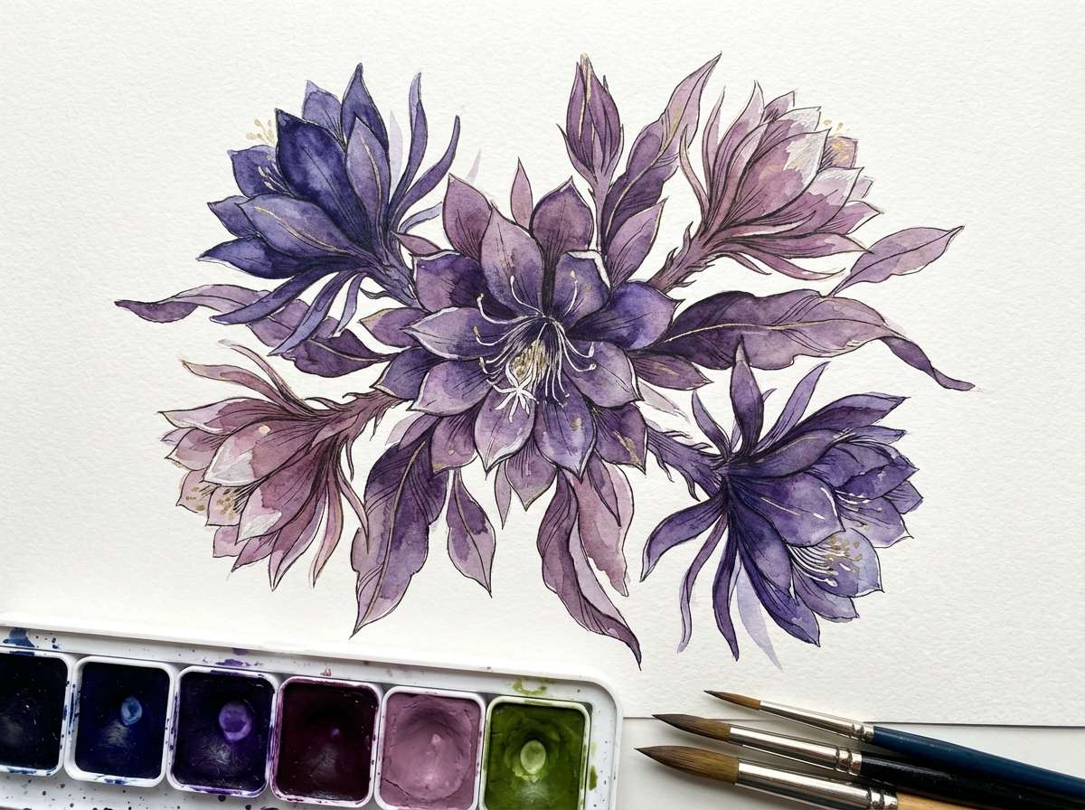
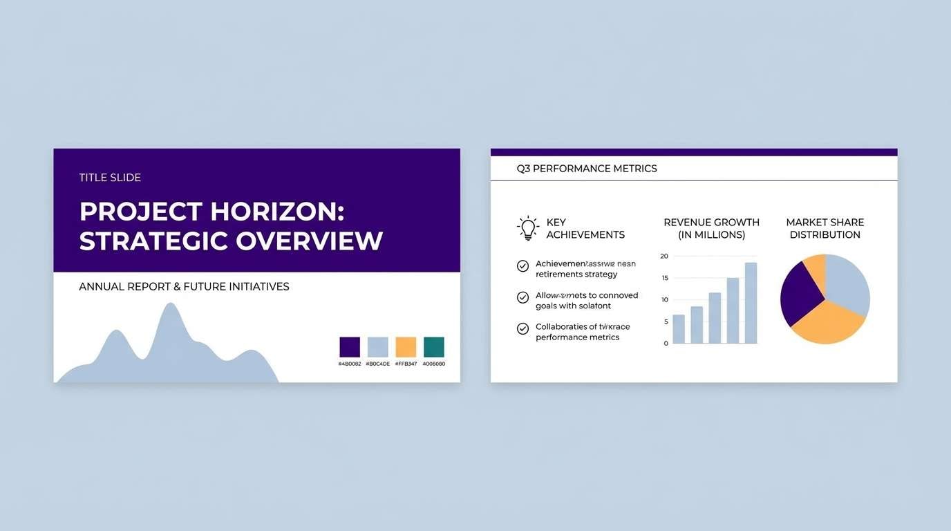
20) Opal Violet Mist
HEX: #1A0620 #2C0B3C #47205B #9AA1C8 #F2F4FF
Mood: airy, techy
Best for: slide decks and presentation templates
Airy and techy, it feels like opal mist drifting over a dark horizon. The cool gray-blue accent adds clarity for charts, tables, and section headers without breaking the purple mood. Pair with clean sans-serif fonts and thin dividers to keep slides tidy. Tip: set most slide backgrounds to the palest tint and use the darkest violet only for title slides and key metrics.
Image example of opal violet mist generated using media.io
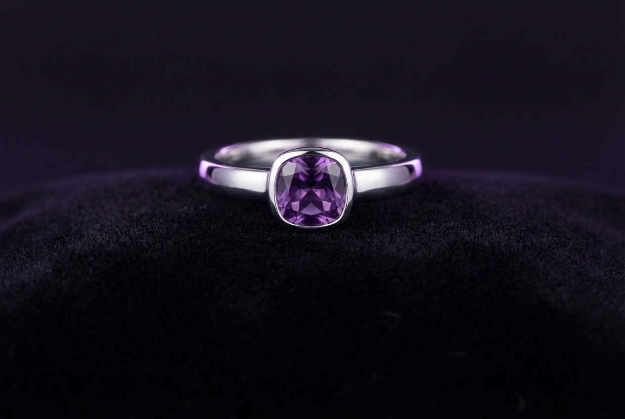
21) Amethyst Noir Jewelry
HEX: #110013 #24001F #3B0039 #6E2A8B #F6EEFA
Mood: glam, dramatic
Best for: jewelry product ads and e-commerce hero shots
Glam and dramatic, it reads like amethyst facets against a noir stage. A dark violet color combination like this excels when the background stays almost black and the gemstone tone is used as rim light and highlights. Pair with minimal copy and a single product focus to keep it editorial. Tip: use the lightest tint for small sparkle accents so the ad still feels luxurious, not busy.
Image example of amethyst noir jewelry generated using media.io
22) Ultraviolet Stationery
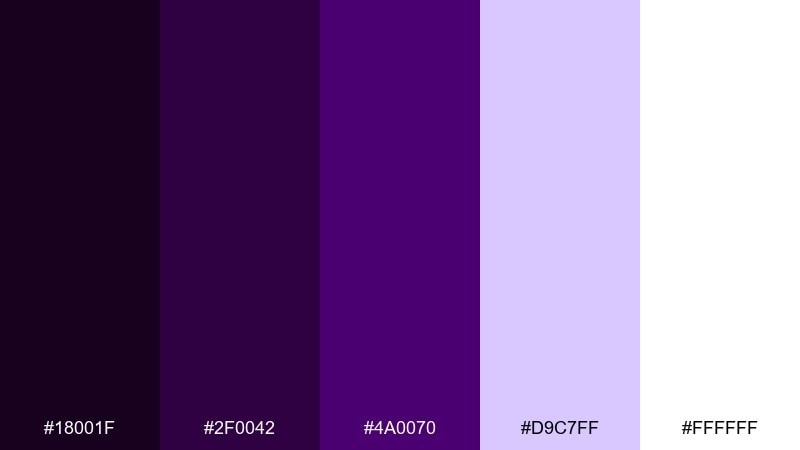
HEX: #18001F #2F0042 #4A0070 #D9C7FF #FFFFFF
Mood: clean, creative
Best for: stationery sets and modern print collateral
Clean and creative, it feels like fresh ink on crisp paper with an ultraviolet edge. Use the deep tones for letterheads and business card backs, then bring in the pale lavender for subtle patterns or watermarks. Pair with bright white and minimal line icons to keep everything sharp. Tip: for print, increase spacing and keep large fills to a single dark tone to avoid banding.
Image example of ultraviolet stationery generated using media.io
23) Deep Violet Gradient Night
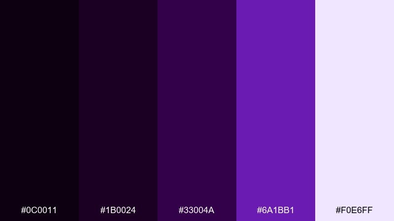
HEX: #0C0011 #1B0024 #33004A #6A1BB1 #F0E6FF
Mood: modern, immersive
Best for: wallpapers and background gradients
Modern and immersive, it looks like a night sky fading into a bright violet flare. The palette is built for smooth gradients, so blend the mid and bright purples and keep the near-black as the anchor. Pair with minimal icons or a single line of text for lock screens and headers. Tip: add fine grain using the darkest shade to prevent gradient banding on large displays.
Image example of deep violet gradient night generated using media.io
What Colors Go Well with Dark Violet?
Dark violet plays well with soft neutrals like misty white, cream, and warm beige—these lift the palette and keep typography readable. If you want a more editorial feel, try muted mauves and gray-lilacs as in-between tones.
For high contrast, pair dark violet with gold/yellow accents or bright lilac “glow” tints. Use those accents for hierarchy (CTAs, badges, icons) rather than large fills to avoid visual noise.
For a fresh, modern twist, add cool accents like mint, periwinkle, or gray-blue. They keep the purple base moody while making UI states and data visuals feel clearer.
How to Use a Dark Violet Color Palette in Real Designs
Start with one dominant dark violet as your anchor (headers, navigation, frames), then choose a light tint for backgrounds and spacing. This “dark + airy” structure prevents designs from feeling heavy.
Limit strong accents to one job: CTAs, highlights, or status colors. When everything is saturated, nothing stands out—so keep vivid purples, pinks, or golds for intentional moments.
Test contrast early, especially for small text and thin UI elements. Dark violet can swallow detail on screens, so increase font weight, add subtle outlines, or move body copy to lighter backgrounds.
Create Dark Violet Palette Visuals with AI
If you already have HEX codes, you can turn them into fast mockups for posters, UI screens, packaging, or brand sheets. The key is describing the layout and lighting while keeping colors “palette-based” so outputs stay consistent.
Try generating multiple variations of the same concept (for example: hero banner, product ad, and social square) using one palette. This helps you validate how your dark violet color scheme behaves across formats.
With Media.io, you can create dark violet palette visuals directly in your browser—no complex setup needed.
Dark Violet Color Palette FAQs
-
What does dark violet communicate in branding?
Dark violet often signals luxury, mystery, creativity, and depth. It’s a strong choice for premium brands, beauty, entertainment, and modern tech—especially when paired with clean whites or metallic accents. -
Is dark violet the same as deep purple?
They’re close, but not always identical. “Dark violet” usually leans slightly bluer than some “deep purple” shades, which can lean warmer or redder (plum/aubergine). -
What are good accent colors for a dark violet color scheme?
Gold/yellow for bold hierarchy, blush/pink for romantic energy, mint for freshness, and periwinkle/gray-blue for a techy, data-friendly look. Use accents sparingly for buttons, icons, and highlights. -
How do I keep dark violet designs from looking too heavy?
Use a light tint (lavender-white, misty white, or cream) for backgrounds and spacing, and reserve the darkest violet for headers, frames, and key type. Negative space is essential with deep palettes. -
What text color works best on dark violet backgrounds?
Off-white and very light lavender usually read best. For accessibility, avoid mid-lavenders as body text on dark violet; increase contrast by going lighter, increasing font weight, or placing text on a light panel. -
Can I use dark violet in UI design?
Yes—dark violet works well for nav bars, sidebars, and dark-mode components. Pair it with calm midtones for cards and a consistent accent color for interactive states to keep the interface readable. -
How can I generate dark violet palette mockups quickly?
Use an AI text-to-image tool and describe the design type (poster, dashboard, label, slide) plus “use palette colors only.” Generate a few variations and pick the one with the cleanest contrast and hierarchy.
Next: Celestial Color Palette


