

Celestial palettes blend deep “space” bases with luminous accents, giving designs instant contrast, clarity, and atmosphere. They’re especially useful when you want a modern, tech-forward look without leaning cold.
Below are celestial color palette ideas with HEX codes, plus practical guidance for balancing dark backgrounds, readable UI, and bright highlights that feel intentional.
In this article
Why Celestial Palettes Work So Well
Celestial colors work because they naturally build hierarchy: a dark, quiet base (space) makes bright accents (stars, aurora, comets) feel sharper and more meaningful. That contrast helps users find what matters fast—CTAs, key stats, headings, or product names.
They also communicate emotion without extra illustration. Navy, charcoal, and deep violet add depth and credibility, while cyan, coral, gold, or mint inject energy and optimism. The result feels modern, cinematic, and premium in both digital and print.
Most importantly, celestial palettes handle “busy” content well. With controlled saturation and a strong neutral ladder, you can support charts, type-heavy layouts, or packaging info while keeping the overall aesthetic calm and intentional.
20+ Celestial Color Palette Ideas (with HEX Codes)
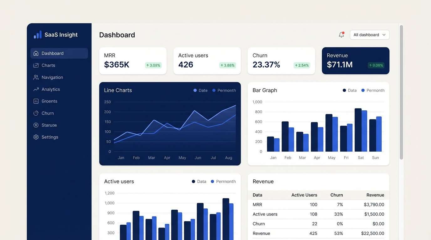
1) Starlit Midnight
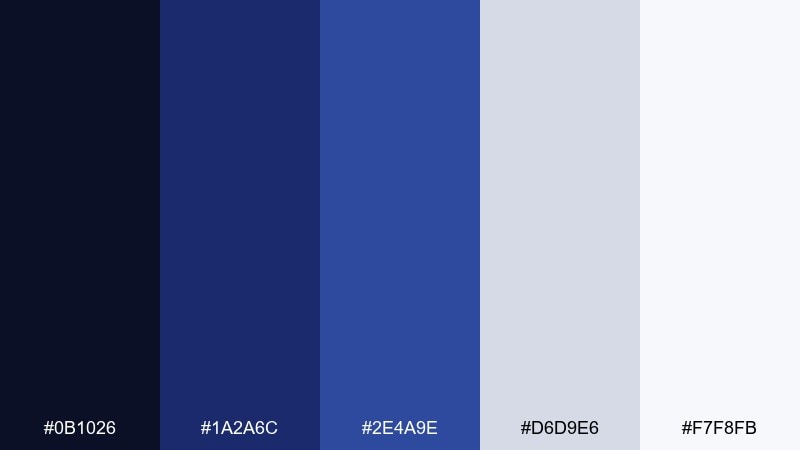
HEX: #0b1026 #1a2a6c #2e4a9e #d6d9e6 #f7f8fb
Mood: mysterious, crisp, nocturnal
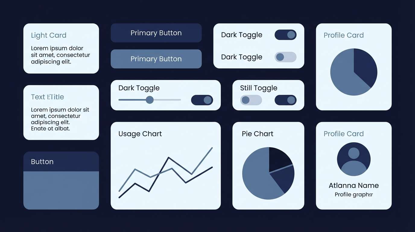
Best for: SaaS analytics dashboard UI
Mysterious and crisp like a clear night sky, these tones feel focused and high-contrast without turning harsh. Deep navy and cobalt keep attention on charts, while pale neutrals protect readability. Use the lightest shade for surfaces and reserve the brightest blue for active states and key metrics. Pair with thin dividers and restrained shadows so the interface stays calm.
Image example of starlit midnight generated using media.io
Media.io is an online AI studio for creating and editing video, image, and audio in your browser.

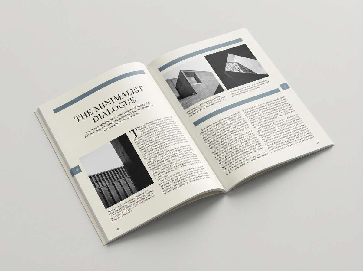
2) Lunar Pearl
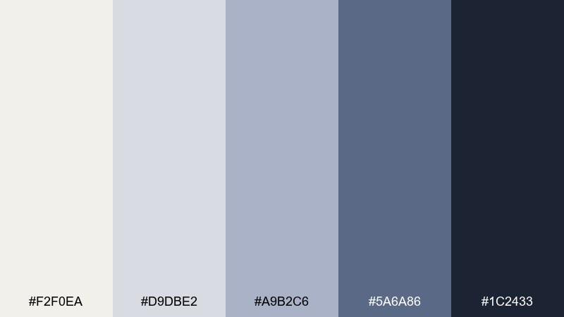
HEX: #f2f0ea #d9dbe2 #a9b2c6 #5a6a86 #1c2433
Mood: calm, airy, editorial
Best for: editorial magazine layout
Calm and airy like moonlight on paper, this mix reads refined and quietly premium. The creamy whites give generous breathing room, while slate and ink tones add structure for headings and captions. Keep body text in the deepest shade and use the mid gray-blue for rules, pull quotes, and page numbers. It pairs beautifully with monochrome photography and subtle grain.
Image example of lunar pearl generated using media.io
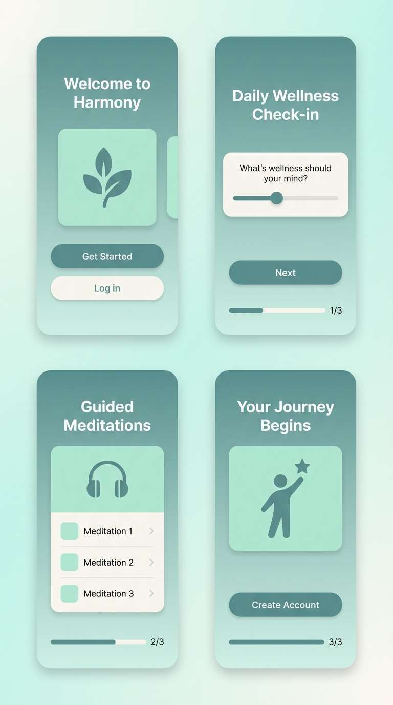
3) Aurora Drift
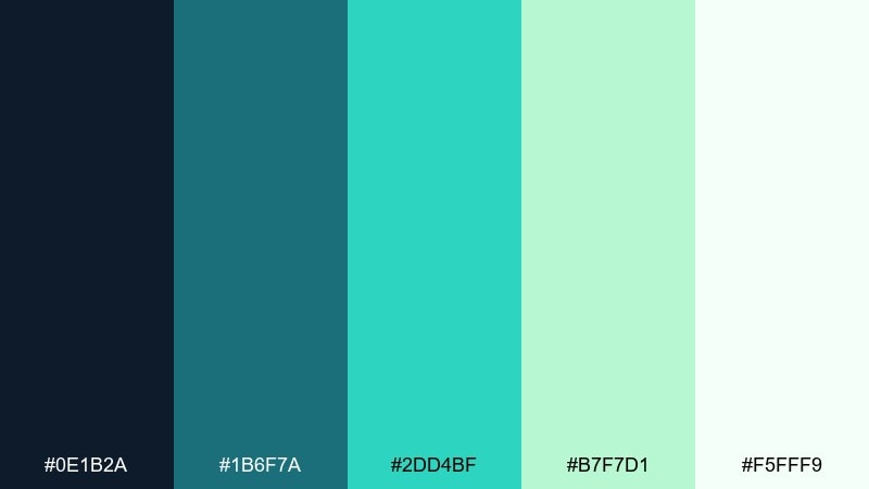
HEX: #0e1b2a #1b6f7a #2dd4bf #b7f7d1 #f5fff9
Mood: fresh, soothing, luminous
Best for: wellness app onboarding screens
Fresh and soothing like aurora curtains moving across a dark horizon, the teal-to-mint range feels restorative. This celestial color palette works best with roomy layouts, rounded components, and soft gradients. Let the deep blue-black anchor headlines and navigation, then bring in bright aqua for progress and positive feedback. A gentle vignette in the background helps the glowing accents feel intentional, not loud.
Image example of aurora drift generated using media.io
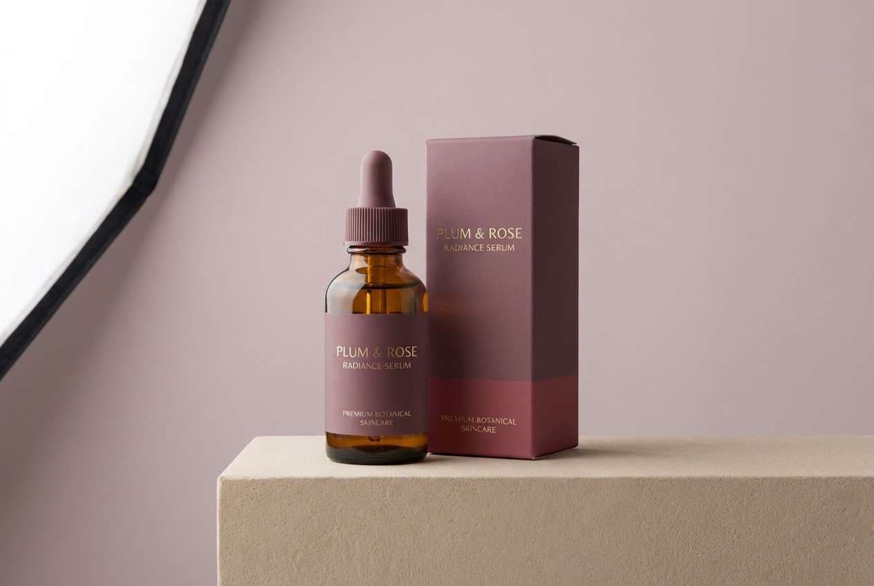
4) Nebula Rose
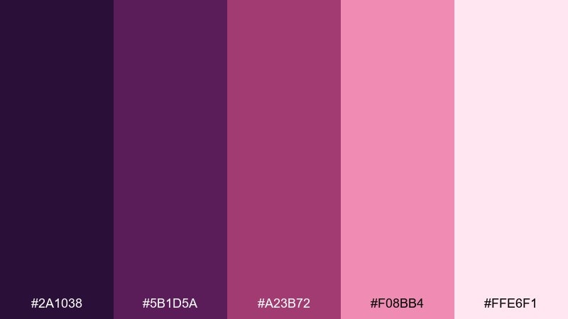
HEX: #2a1038 #5b1d5a #a23b72 #f08bb4 #ffe6f1
Mood: romantic, dreamy, bold
Best for: beauty product packaging
Romantic and dreamy like a nebula bloom, these berry tones feel luxurious with a hint of drama. The deep plum makes packaging look premium, while rosy midtones keep it approachable. Use the pale blush as negative space so labels stay legible and the product feels clean. Pair with metallic foil details or a soft matte finish for extra depth.
Image example of nebula rose generated using media.io
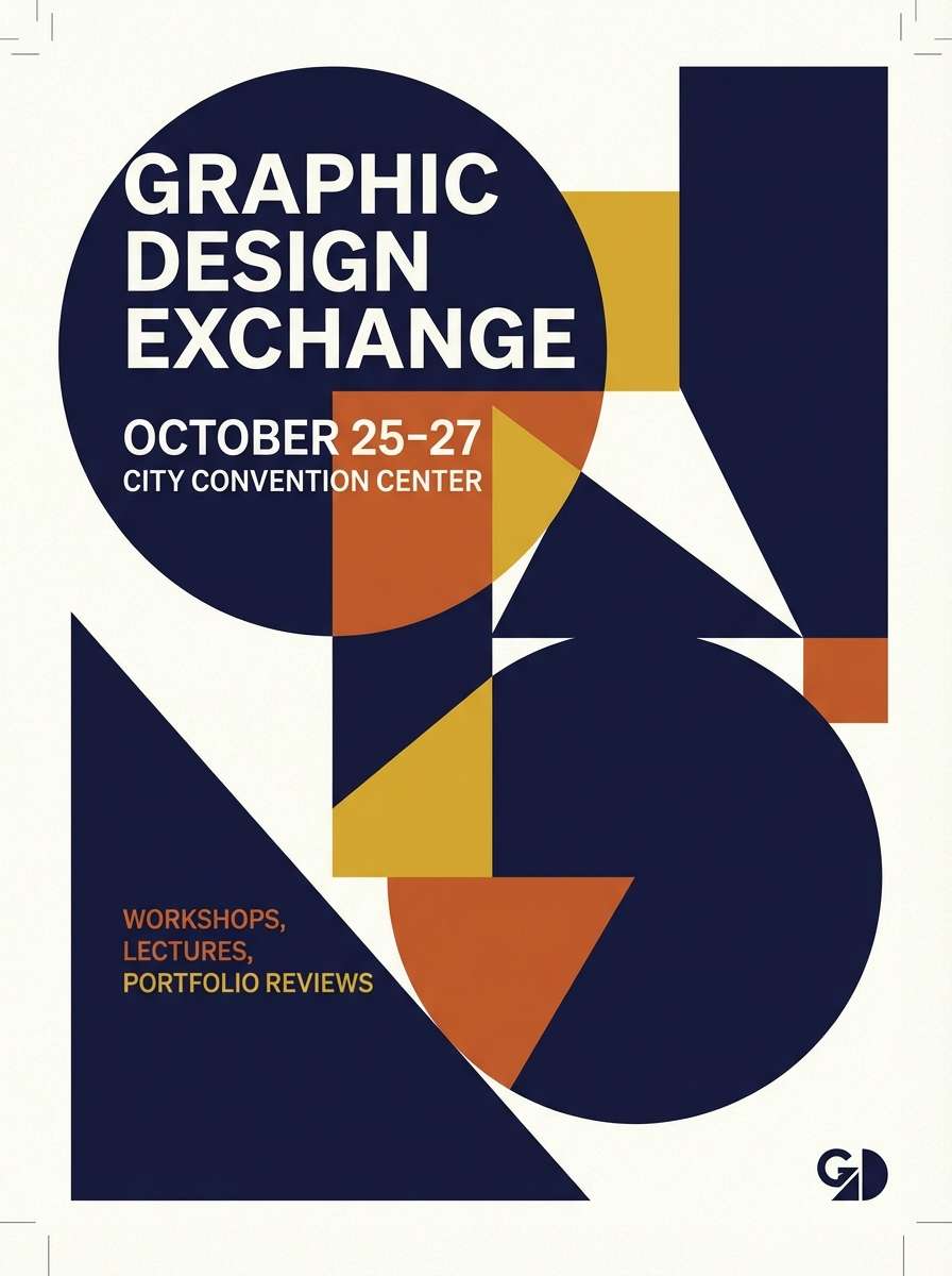
5) Cosmic Citrus
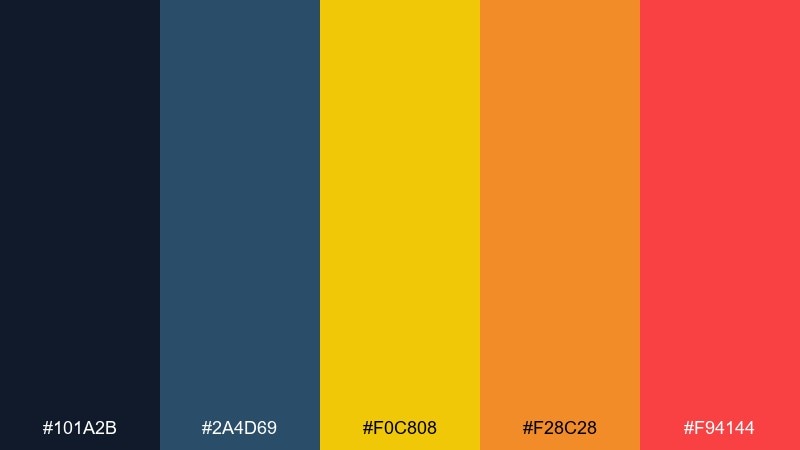
HEX: #101a2b #2a4d69 #f0c808 #f28c28 #f94144
Mood: energetic, playful, high-contrast
Best for: event flyer poster
Energetic and playful like bright comets against space, this set is built for attention. The dark base keeps the yellow and orange from feeling neon, and the red adds urgency for calls to action. Use one warm accent at a time for hierarchy, then reinforce it with simple geometric shapes. It pairs well with bold sans type and large date blocks.
Image example of cosmic citrus generated using media.io
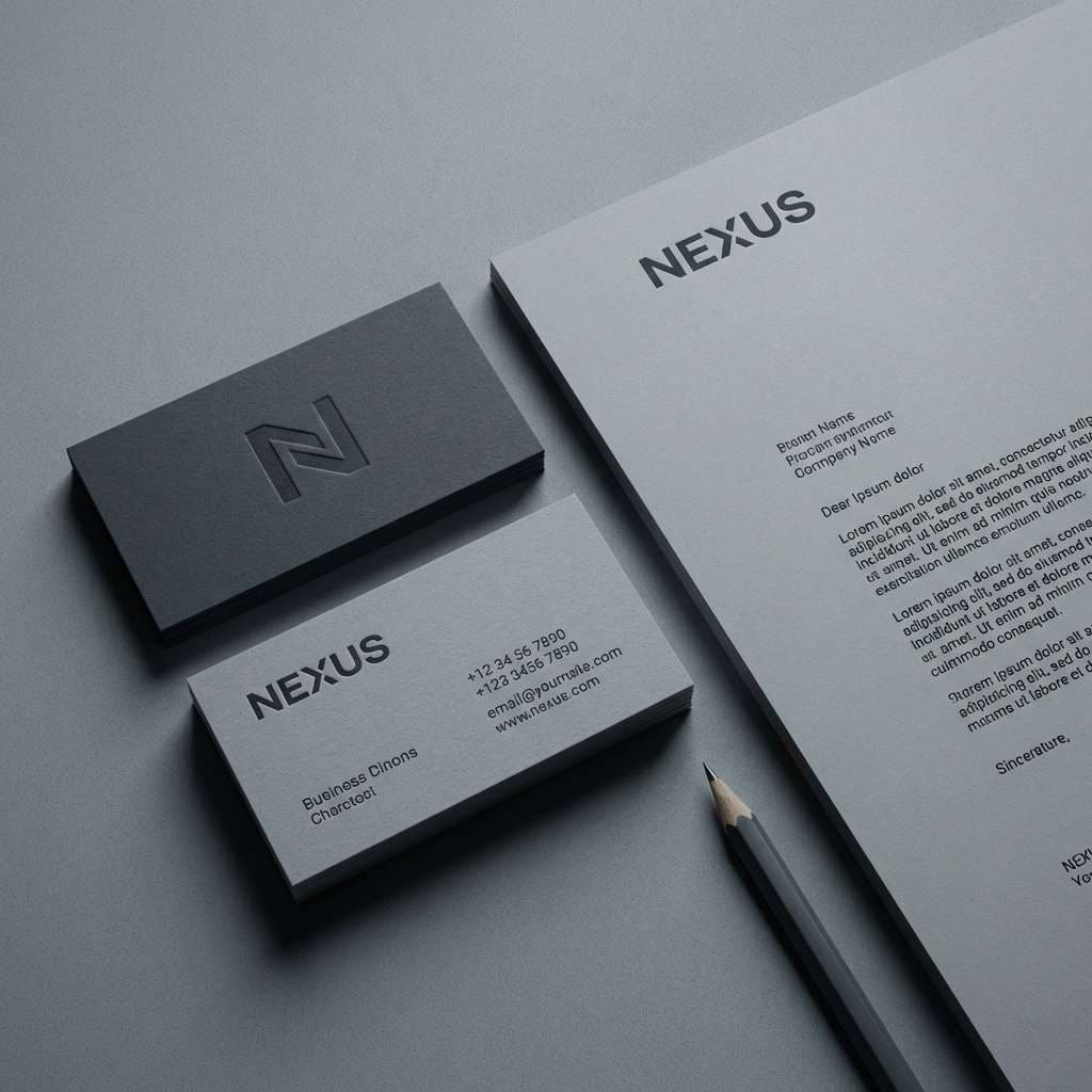
6) Eclipse Stone
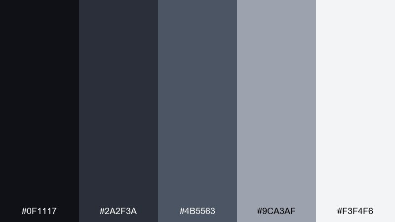
HEX: #0f1117 #2a2f3a #4b5563 #9ca3af #f3f4f6
Mood: minimal, sleek, professional
Best for: tech brand identity and stationery
Minimal and sleek like an eclipse edge, these neutrals feel modern and confident. The celestial color scheme is ideal when you want typography and spacing to do most of the talking. Keep the darkest shades for logos and headers, then step down through grays for secondary information and UI-like details. Add texture through paper stock, embossing, or a single glossy spot element instead of extra color.
Image example of eclipse stone generated using media.io
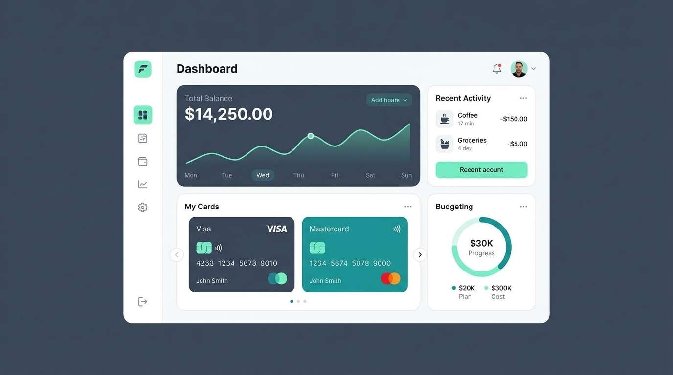
7) Orbit Mint
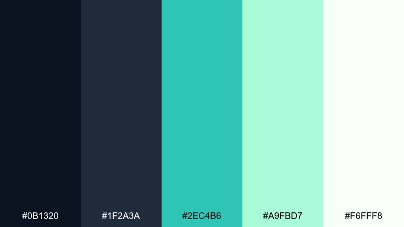
HEX: #0b1320 #1f2a3a #2ec4b6 #a9fbd7 #f6fff8
Mood: clean, friendly, modern
Best for: fintech app card and widget UI
Clean and friendly like a cool orbit trail, the mint accent feels trustworthy without looking clinical. The dark blue-grays are perfect for financial data, while the lighter mint supports positive states and confirmations. Use the bright teal sparingly on primary buttons, and keep backgrounds near-white for contrast. Pair with simple iconography and consistent spacing to maintain a secure, polished vibe.
Image example of orbit mint generated using media.io
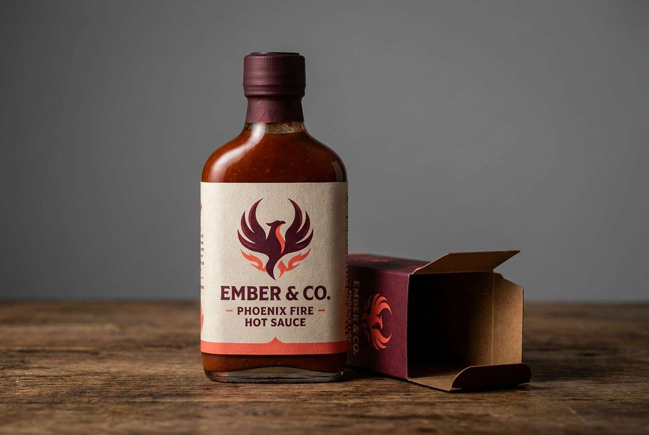
8) Meteor Ember
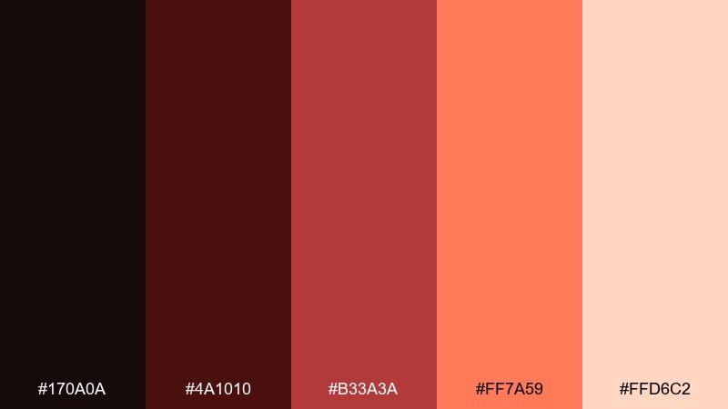
HEX: #170a0a #4a1010 #b33a3a #ff7a59 #ffd6c2
Mood: smoky, spicy, dramatic
Best for: hot sauce label packaging
Smoky and spicy like a meteor burn, these reds feel bold but still curated. The near-black base makes the warm coral pop, which is ideal for flavor cues and shelf impact. Use the light peach as a label panel so ingredients remain readable. Pair with rough textures or stamp-like graphics to push the craft look.
Image example of meteor ember generated using media.io
9) Galaxy Denim
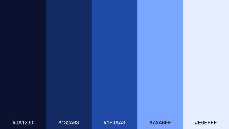
HEX: #0a1230 #132a63 #1f4aa8 #7aa6ff #e6efff
Mood: confident, crisp, tech-forward
Best for: startup landing page hero
Confident and crisp like starlight on denim-blue space, these blues feel modern and reliable. For a fast, approachable look, build your hero section around a deep navy base with a bright periwinkle highlight. This celestial color palette pairs well with white space, thin line icons, and subtle gradient buttons. Keep the lightest blue for supporting panels so the CTA stays the clearest focal point.
Image example of galaxy denim generated using media.io

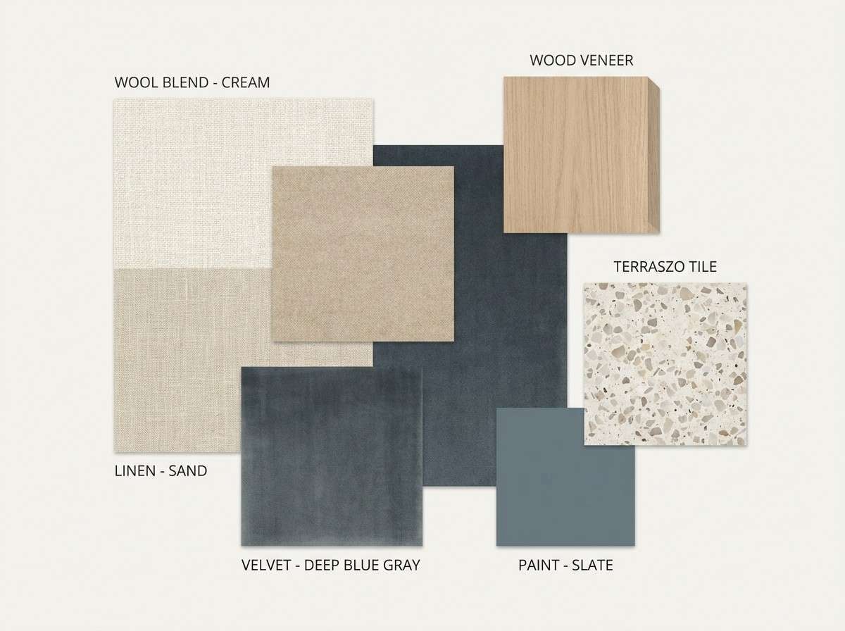
10) Comet Sand
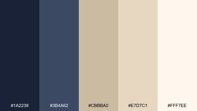
HEX: #1a2238 #3b4a62 #cbbba0 #e7d7c1 #fff7ee
Mood: warm, grounded, elegant
Best for: interior design mood board
Warm and grounded like a comet tail fading into desert light, this mix balances cool structure with soft neutrals. The sandy tones make a welcoming base, while the dark blue-grays add definition for headings and swatches. Use the cream as the board background and layer fabrics, wood, and metal samples in the mid tones. A single dark accent block keeps the whole arrangement from feeling washed out.
Image example of comet sand generated using media.io
11) Zodiac Plum
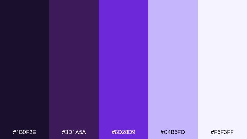
HEX: #1b0f2e #3d1a5a #6d28d9 #c4b5fd #f5f3ff
Mood: mystical, bold, electric
Best for: album cover design
Mystical and electric like a zodiac chart glowing in the dark, these purples bring instant drama. The deep violet supports high-contrast titles, while the bright purple works as a punchy focal element. Keep gradients subtle and let the pale lavender carry negative space around the artist name. Pair with thin constellation lines or grain to make the cover feel textured, not flat.
Image example of zodiac plum generated using media.io
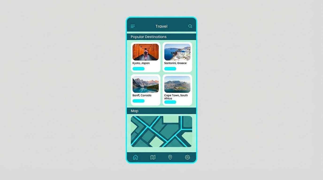
12) Andromeda Teal
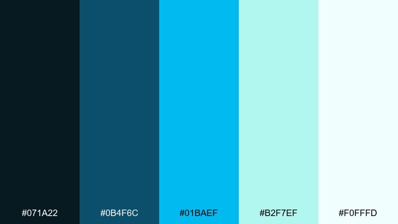
HEX: #071a22 #0b4f6c #01baef #b2f7ef #f0fffd
Mood: bright, clean, oceanic
Best for: travel app UI
Bright and clean like light passing through deep water, the teal range feels adventurous and modern. The darkest shade makes a strong header and tab bar, while the sky-blue accent is perfect for primary actions. These celestial color combinations work best with simple map shapes, rounded chips, and plenty of whitespace. Tip: reserve the brightest cyan for one action per screen to keep focus clear.
Image example of andromeda teal generated using media.io
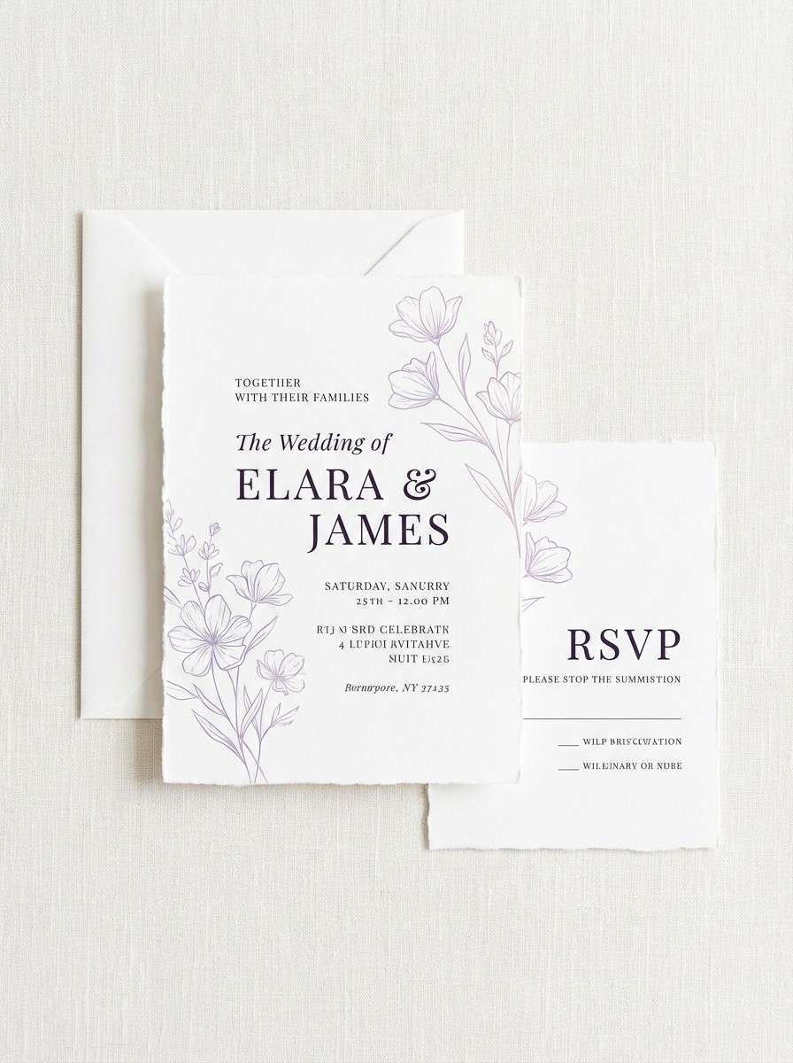
13) Astral Lilac
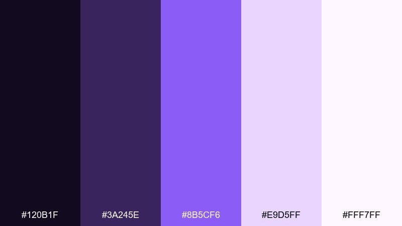
HEX: #120b1f #3a245e #8b5cf6 #e9d5ff #fff7ff
Mood: soft, romantic, whimsical
Best for: wedding invitation suite
Soft and romantic like stardust on lilac paper, these tones feel modern yet tender. The deep purple makes elegant headings, while the pale lavender creates a gentle background for details. Use the brighter violet for monograms or wax-seal motifs, but keep it minimal so the suite stays airy. Pair with delicate line florals and warm white envelopes for balance.
Image example of astral lilac generated using media.io
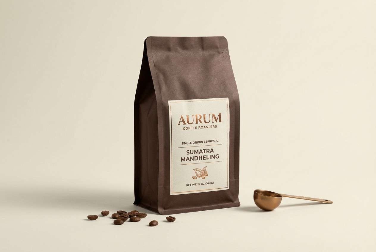
14) Saturn Bronze
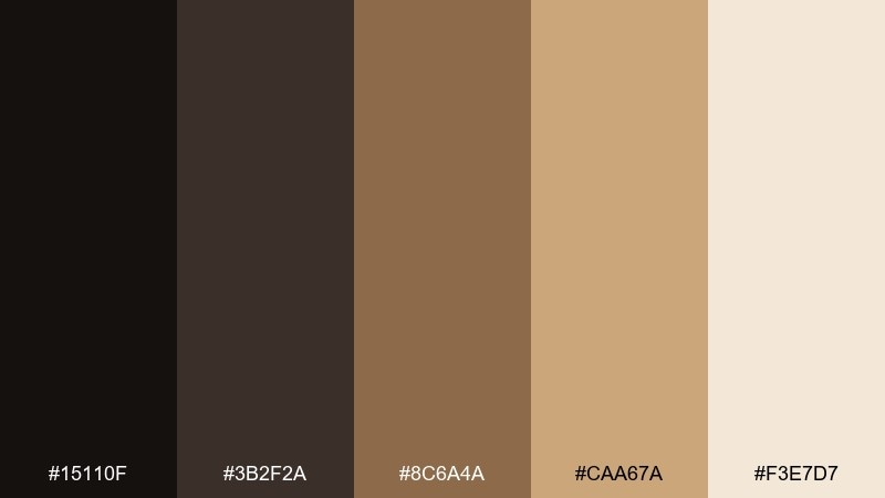
HEX: #15110f #3b2f2a #8c6a4a #caa67a #f3e7d7
Mood: earthy, vintage, premium
Best for: coffee packaging
Earthy and premium like Saturn rings in bronze light, this palette feels crafted and grounded. The dark espresso shades build contrast for logos, while the bronze and tan tones add warmth for roast notes and origin details. Use the light cream for label panels to keep text sharp and legible. Pair with embossed marks or foil accents for an elevated shelf presence.
Image example of saturn bronze generated using media.io
15) Moonshadow Blue
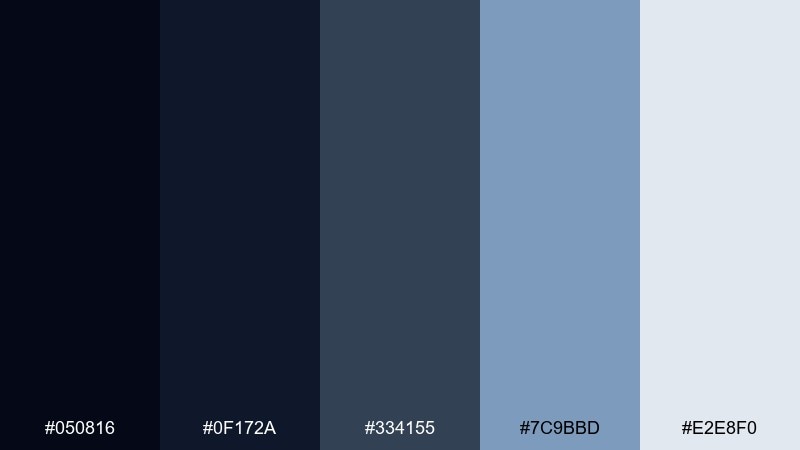
HEX: #050816 #0f172a #334155 #7c9bbd #e2e8f0
Mood: moody, quiet, refined
Best for: night mode UI kit
Moody and quiet like moonshadows on water, these blues are gentle on the eyes. The near-black and navy shades work for backgrounds, while slate and dusty blue keep components readable without glare. Use the pale gray-blue for text and icons, and save the soft mid blue for focus rings and toggles. Pair with subtle gradients and reduced saturation imagery to avoid visual noise.
Image example of moonshadow blue generated using media.io
16) Solar Flare
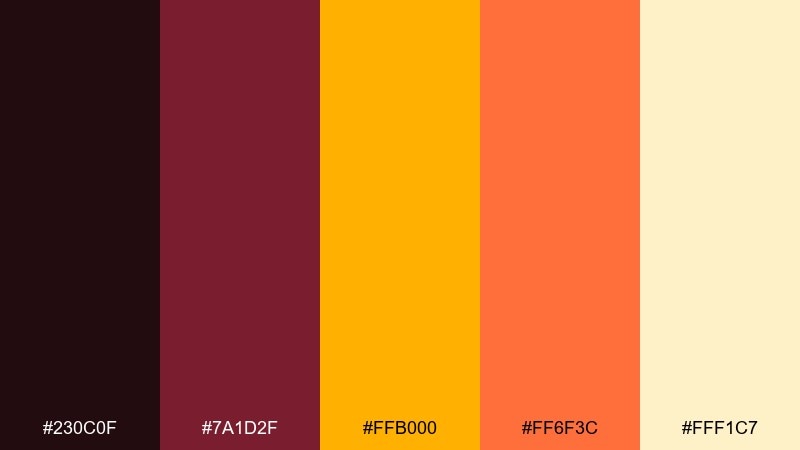
HEX: #230c0f #7a1d2f #ffb000 #ff6f3c #fff1c7
Mood: bold, hot, cinematic
Best for: sports promo poster
Bold and hot like a solar flare breaking the horizon, these warm tones feel fast and cinematic. The dark maroon anchors the layout so the gold and orange can hit hard without overwhelming the page. Use the pale yellow as a glow behind key text, and keep shadows tight for a punchy look. Pair with condensed type and diagonal shapes to reinforce motion.
Image example of solar flare generated using media.io

17) Nova Coral
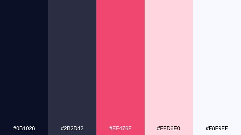
HEX: #0b1026 #2b2d42 #ef476f #ffd6e0 #f8f9ff
Mood: modern, punchy, playful
Best for: social media ad template
Modern and punchy like a nova burst, the coral accent instantly grabs attention. The dark base keeps the design grounded, while the pinks add a friendly, consumer-ready feel. Use coral for the price or offer badge, and keep the rest of the copy in deep gray for clarity. Pair with rounded shapes and generous padding so the ad looks polished, not crowded.
Image example of nova coral generated using media.io
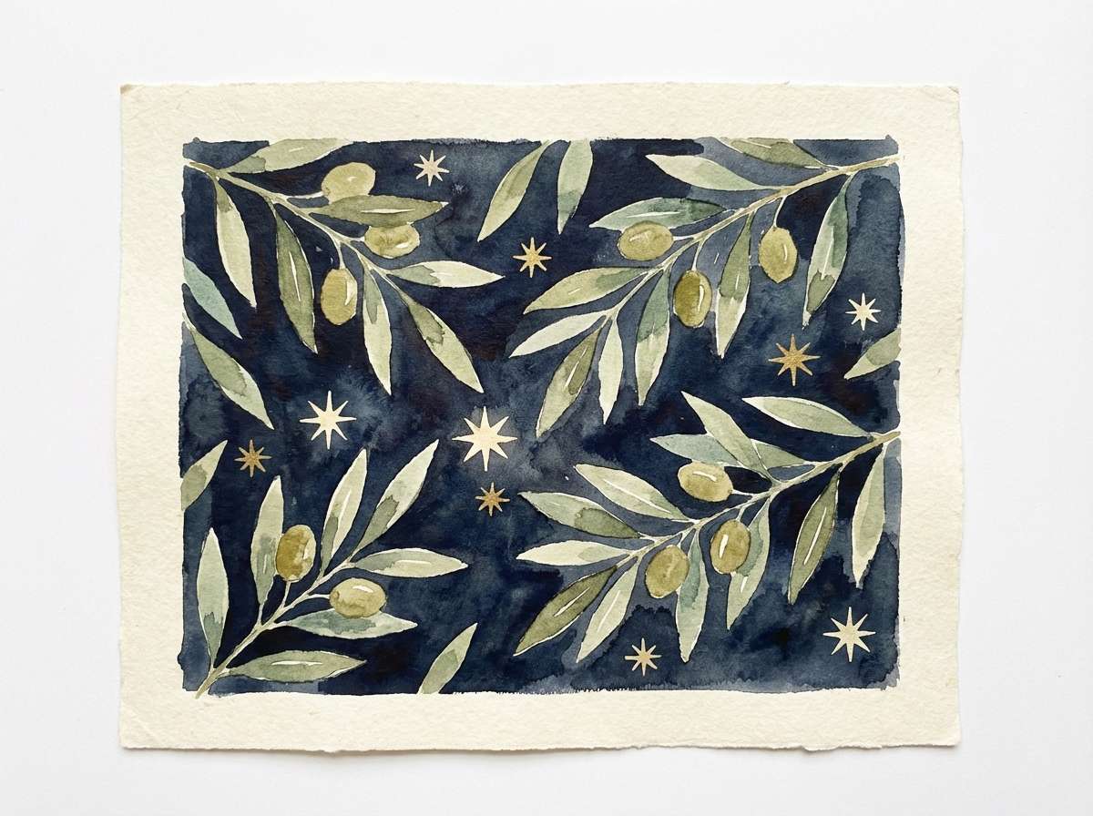
18) Starfield Olive
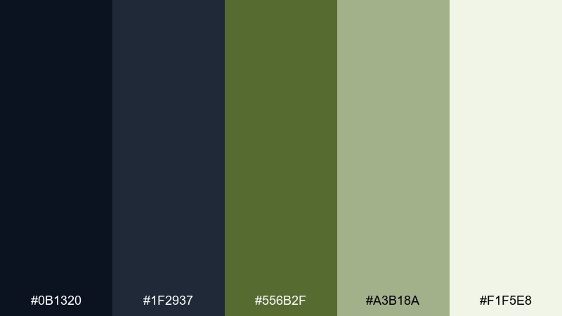
HEX: #0b1320 #1f2937 #556b2f #a3b18a #f1f5e8
Mood: calm, natural, night-garden
Best for: botanical watercolor illustration print
Calm and natural like a night garden under a starfield, these greens feel grounded and a little mysterious. The dark blue-grays create depth, while olive and sage add an organic, herbal tone. These celestial color combinations shine in illustration when you keep backgrounds dark and paint highlights with the lightest green and cream. Tip: add tiny star dots in off-white so the composition feels airy, not heavy.
Image example of starfield olive generated using media.io
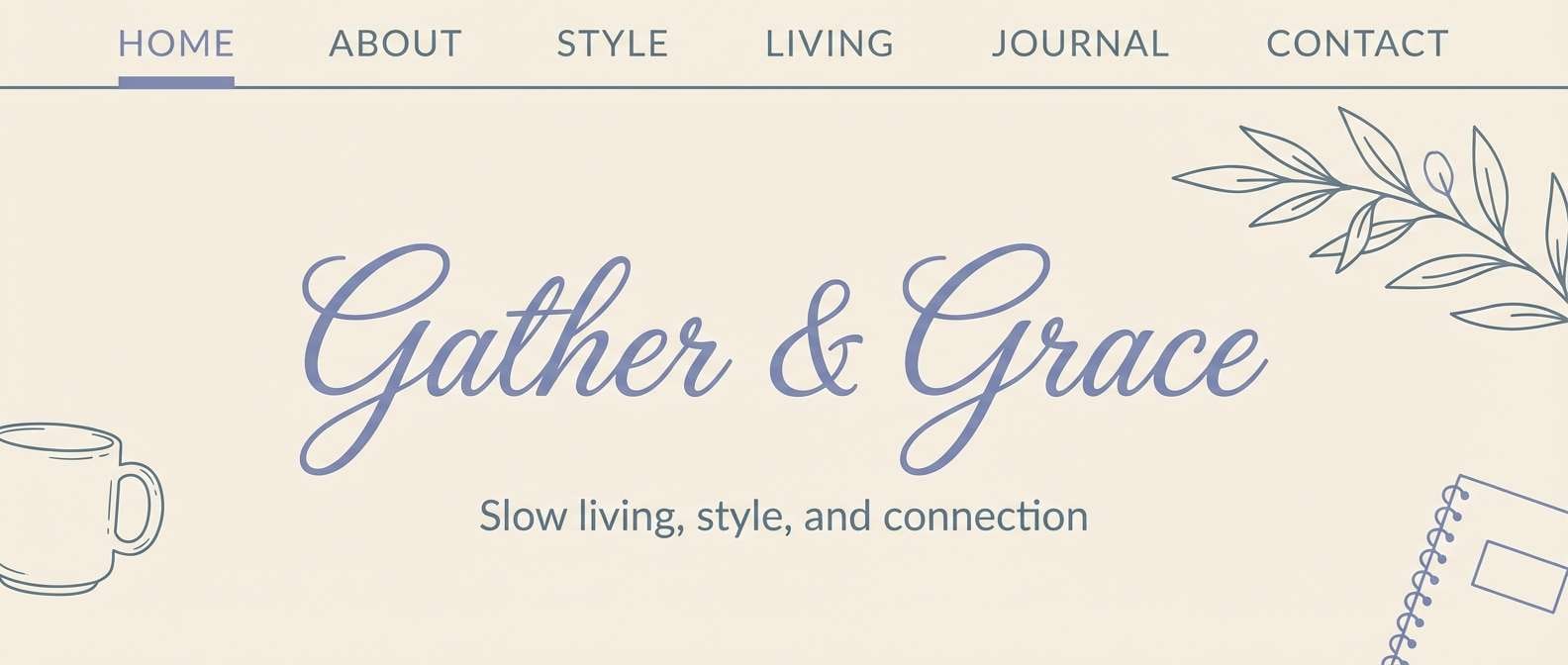
19) Celeste Cream
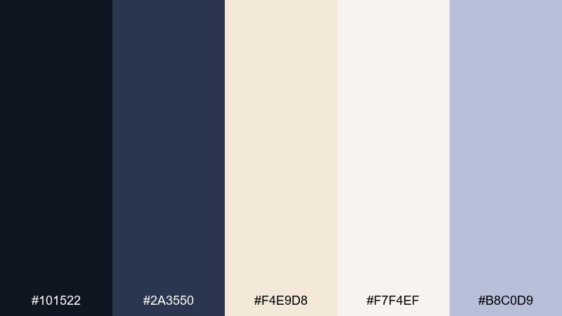
HEX: #101522 #2a3550 #f4e9d8 #f7f4ef #b8c0d9
Mood: soft, cozy, elevated
Best for: lifestyle blog header design
Soft and cozy like early dawn light, this mix feels welcoming without losing polish. The creams make an inviting canvas, and the blue-gray tones give structure for navigation and headings. Use the lightest cream as the main background and bring in the dusty periwinkle for subtle highlights like underline links. Pair with warm photography and minimal icons to keep the header clean.
Image example of celeste cream generated using media.io
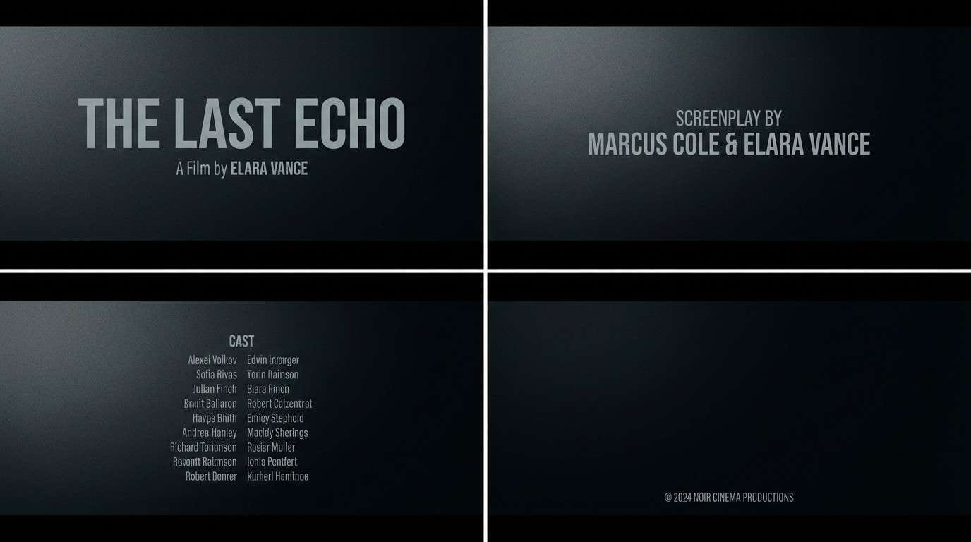
20) Dark Matter Charcoal
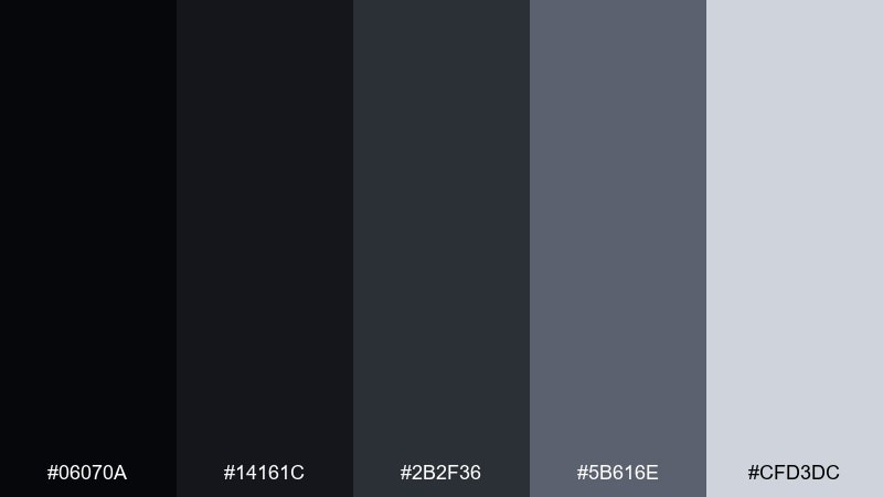
HEX: #06070a #14161c #2b2f36 #5b616e #cfd3dc
Mood: serious, cinematic, high-contrast
Best for: cinematic title card and credits
Serious and cinematic like deep space, these charcoals create instant drama. The near-black shades build rich backgrounds, while the cool grays keep credits readable and sharp. Use the lightest tone for names and key roles, and keep the rest a step darker to maintain hierarchy. Pair with subtle film grain and wide tracking for a premium finish.
Image example of dark matter charcoal generated using media.io
What Colors Go Well with Celestial?
Celestial palettes pair best with reliable neutrals and one “stellar” accent. Think ink navy, charcoal, slate, off-white, and cool gray for structure—then add cyan, periwinkle, coral, gold, or mint for emphasis.
For a softer look, combine space blues with creams and dusty lavenders; this keeps the theme atmospheric without looking overly sci-fi. For higher energy, match dark navy with warm comet tones like amber, orange, and red, but keep the warm colors to small areas for clean hierarchy.
Materials and finishes can act like colors too: subtle grain, matte paper, or metallic foil (silver/gold) amplify the “star” effect while keeping the core palette controlled.
How to Use a Celestial Color Palette in Real Designs
Start with a dark base for depth, then build a clear neutral ladder for text and surfaces. In UI, use the lightest neutral for cards and the mid neutral for dividers and secondary labels so contrast stays readable across states.
Limit bright accents to one primary action per screen or one focal element per poster. This keeps your galaxy color scheme from turning noisy and makes every highlight feel like a deliberate “star.”
In print (packaging, invitations, stationery), use deep shades for premium contrast and reserve the lightest tones as label panels. A small metallic detail or spot gloss can replace an extra color while still adding drama.
Create Celestial Palette Visuals with AI
If you want to preview a celestial color palette quickly, generate mockups that match your use case—UI screens, posters, packaging, or title cards—before committing to final design files. This is a fast way to test contrast, mood, and accent balance.
With Media.io’s text-to-image, you can paste a ready-made prompt (like the ones above), then iterate on layout, lighting, texture, and ratio while keeping your HEX-inspired palette consistent.
Celestial Color Palette FAQs
-
What is a celestial color palette?
A celestial color palette is a set of colors inspired by space themes—night-sky navies and charcoals paired with luminous accents like cyan, periwinkle, coral, or gold to mimic stars, auroras, and nebulae. -
Is #0b1026 a good base color for celestial designs?
Yes. #0b1026 is a deep, blue-leaning near-black that creates strong contrast for light typography and makes bright accents look more vivid without feeling neon. -
How do I keep celestial palettes readable in UI?
Use a neutral ladder: keep backgrounds very dark, surfaces slightly lighter, and text/icons in pale gray-blue or off-white. Save your brightest accent for primary actions and key states only. -
What accent color works best with dark “space tones”?
Cyan and aqua create a clean, modern glow; coral adds friendly energy; gold/amber adds cinematic warmth. Choose one main accent and repeat it consistently for hierarchy. -
Can celestial palettes feel warm and natural instead of sci-fi?
Yes. Pair navy or charcoal with cream, sand, bronze, olive, or blush tones (like Comet Sand, Saturn Bronze, or Starfield Olive) for a grounded, lifestyle-friendly look. -
What are common mistakes when using galaxy color schemes?
Overusing saturated accents, skipping mid-tone neutrals, and placing bright colors on large areas. Keep bright tones small and intentional, and use neutrals for most surfaces and text. -
How can I generate celestial-themed mockups fast?
Use an AI generator with a clear prompt describing the design type (UI, poster, packaging), your dominant dark base, and one or two accent colors. Then iterate on composition while keeping contrast consistent.


